From time to time we’ve discussed uni-related issues of trademark infringement and protection. But policing your trademark in lawsuit-happy America is one thing — doing it in a far-off land, where any clown with a heat press can run off a few jillion cheap logo-emblazoned knockoffs of your design, is something else, as reader Eric Trager has discovered. Here’s his long-distance report from the Middle East:
I’ve been living in Cairo since August on an Islamic Civilizations Fulbright grant, which has given me a decent opportunity to travel around the Middle East a bit. It seems like almost anywhere I go, I find familiar-looking caps, none of which are ever official, and almost all of which contain completely incorrect colors. At the famous Khan al-Khalili market in Cairo, for example, I spotted this orange Yankees cap among other mostly Cairo-appropriate headgear. In Casablanca, I spotted this cap stand; you can make out a number of Yankees caps (there’s a proper navy one on the 60 dirham level, though the rest are completely off), along with a 49ers cap, a Florida Gators cap, and a Berkeley cap. [The one I find most amusing is the FBI cap. — PL] Although the Yankees are, unfortunately, the most prominent in terms of merchandise in the region, I happened to find this cap stand in Sana’a, Yemen, featuring Dodgers caps (again, wrong colors). Finding these things in Yemen was particularly surprising, given that most men there dress like this, i.e., sans baseball cap.
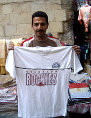
Though caps are the most prominent American sports gear I’ve come across in the region, I spotted kid in Jounieh, Lebanon, wearing a very decent Kobe Bryant jersey when I was there in 2004. It looks like it’s actually officially licensed, unlike this horrific Don Mattingly Yankees jacket I spotted in Rabat [Donnie Baseball never wore his stirrups like that! — PL] and this awful Rockies T-shirt I found at the Cairo tent market (although Uni Watch probably endorses the shirt’s use of red in place of purple, no matter how inaccurate).
Of course, the most common sports uniforms found in Middle Eastern markets are local soccer jerseys. I spotted these two brothers wearing al-Ahly jerseys in Cairo, and have purchased the jerseys of Maghreb Fez, Wydad (Casablanca), and the Moroccan national team as gifts for friends. Unfortunately, none of these are remotely authentic, though I was finally able to find an official al-Ahly jersey at the posh, Saudi-built mall in Cairo.
This is really just a small sampling of uni-relevant observations from my time in the region. Unfortunately, I didn’t get a picture of the hundreds of MLB, NBA, NFL, NCAA, and NHL T-shirts available in Hebrew in virtually any Israeli tourist area (similar to these online examples), though did happen to pick up this Mets yarmulke.
I’ll close with the most surprising uni-related find. Look closely at the religious insignia on the sports club t-shirt of the boy on the left in this photo — it was taken in a Palestinian refugee camp in the West Bank.
Pretty great stuff. The global, hegemonic reach of the baseball cap, even in cultures that wouldn’t know a baseball game if you plopped one down in their front yard, continues to amaze me.
And wait, there’s more: About a week after sending me that first note, Trager checked in with a nice little epilogue:
As I was packing up my things today to leave Egypt after a nine-month stint out here, I noticed that my Mets cap no longer fit. Fitted caps, as you might imagine, are extremely hard finds in Egypt, and all sorts of people — taxi drivers, camel merchants, children, restaurant owners, and tour guides — have asked me many times for some of my fitted caps right off my head, which I have always declined in the past. This time, however, rather than waste precious suitcase space on a Mets cap that didn’t fit, I went downstairs to find a kid to whom I could give it. He was very appreciative, and I think rather surprised. I might have just stumbled across a new mechanism for American public diplomacy.
Now we just have to get the kid to ditch the black.
Three Okay, TWO Blind Mice: Jamie Moyer’s stirrups occasioned lots of oh-so-adorable banter in the Mets’ broadcast booth last night. The chatter started after announcers approvingly noted that Moyer had busted it pretty hard while running out a ground ball. Here’s the transcript:
Gary Cohen: Not only is he running hard, but he’s running hard in stirrups.
Ron Darling: Yes.
Cohen: We’ve gotta get a shot of Moyer’s feet at some point. Nobody wears stirrups anymore! Maybe a couple of old coaches.
Darling: He wears ’em a little bit like you wore ’em, Keith.
Keith Hernandez: I’ll have to give ’em closer, uh, scrutiny. [Camera shows a close-up of Moyer’s stirrups.] Oh, I liked to wear ’em a little higher. That’s low. That’s minor league ugly.
Cohen: You didn’t have the Liberty Bell on your stirrups.
Hernandez: No. Those are the stirrups they gave you in the minor leagues.
Darling [struggling for something relevant to say]: Is that like coyote ugly? Minor league ugly.
Hernandez [ignoring Darling]: You had the wool uniforms in the minor leagues back in the early ’70s, and they were just itchy. And you were glad to have ’em, trust me, but I hated the stirrups. [As per usual during these hosiery discussions, the camera shows sacred Shea Stadium photo of Jerry Koosman celebrating the last out of the 1969 World Series.] See, that’s closer. I wore ’em a little bit higher than Kooz right there. [Camera now shows file photo of Hernandez’s favorite player.] Ah, there you go.
Cohen: There was a trend for a while there to show none of the top of the stirrup, right? Guys started adding extensions to the bottom so they rose that much higher.
Hernandez: Yes. I never liked that look. When we played for the Cardinals, we had those great socks with the stripes, like the Red Sox. You wanna show the stripes.
Cohen [who has clearly read either Ball Four or Uni Watch]: I guess it was Frank Robinson, wasn’t it, who first started wearing the high stirrups, that just showed white with a stripe on the side?
Darling [utterly lost but trying to sound engaged]: Yes.
Hernandez [also lost]: I think you may be right.
Cohen: Maybe it was someone else before that. I just†¦
Hernandez [now completely off on the wrong tack]: Was it with Cleveland? Remember those Cleveland uniforms, those red uniforms?
Cohen: Those were awful.
Darling [now barely treading water]: They were hideous!
Cohen: Of course, there were a lot of hideous uniforms in the ’70s. The Pirates†¦
Hernandez: The bumblebees!
Darling: How about Houston?
Hernandez: Ugh!
Cohen: How about the Padres?
Darling: That’s right, mustard and brown.
Cohen: Mustard and mud!
Hernandez: Contrary to Ron Darling, I love the A’s uniforms, love those swingin’ A’s unis.
[Inning mercifully ends.]
Uni Watch News Ticker: Plate umpires who wear the conventional-style mask always wear a cap, but umps who favor the hockey-style mask have always gone cap-free. Or at least that’s what I thought until seeing some footage from last night’s Rockies/Astros game, where plate ump Ed Hickox wore a cap under his hockey-style mask (you can see him holding his mask on the left side of this shot). … Tons of great uni- and equipment-related footages in this awesome WHA video (tremendous find by Tommy Gough). … Not quite uni-related, but still a worthwhile site. … Interesting query from Ryan Hickox, who writes: “This season, while watching Red Sox games, I’ve noticed a couple of narrow, dark objects behind the rubber on the mound, as seen here.” Anyone know what these are? … Newly minted Uni Watch member Michael Gargano recently bumped into a friend wearing a great Royals tee. †¦ According to this article, Jake Peavy inscribes “BP” on his underbill, in tribute to his late grandfather, Blanche Peavy (good spot by David Conley). … Pretty cool stuff upcoming in Tampa. … That ridiculous London Olympics logo is already getting some very negative reviews (some really great quotes in that article, including a description of the logo as “a toileting monkey”), plus there’s now a petition drive to do away with it (with thanks to Morris Bird). … Now that‘s a nameplate. Player in question is Washington State kicker Romeen Abdollmohammadi (as spotted by Michael Carman). … Some interesting factoids about the Diamondbacks’ uni protocol in the “In Case You Were Wondering” section of this page (good find by Doug Simpson). †¦ Jacob Reed wonders what Eddie Stanky had written under his bill. … Photo of the day comes from Uni Watch intern Vince Grzegorek who noticed Tim Hudson finding a new use for the rosin bag. … Great article here about a Milwaukee memorabilia hound who specializes in collecting bats (with thanks to the Cream City’s finest, Nicole Haase). … Brian Willette notes that Northwestern softballer Darcy Sengewald has been wearing eye black shaped like little hearts and dollar signs. … Beau Lynott sent along a screen shot of Russell Martin’s torn pants from last night’s Dodgers/Padres game. “He was sliding repeatedly in steal attempts with one out in the 7th inning, then fell down rounding second on a base hit and was tagged out in a pickle. Matt Vasgersian on Channel 4 Padres said, ‘What’s with the re-stitch? Get the man some new pants!'” … Want your logo rendered in pasta? Comments section stalwart Minna H. recommends these guys. … The Indians wore blue jerseys at home last night, marking the first time they’d done that since 2001 (although, as Tim Bennett notes, there was a lot more red trim back in those days). … According to an article in yesterday’s New York Times, dreadlocked Giants defensive back R.W. McQuarters recently had his first haircut since his rookie season and is now wearing a helmet two sizes smaller as a result. … Arsenal has unveiled its new white kit.
link pitching for the Mariners last night.
2 semi-related items…
The link has changed their name to the “Long Beach Armada of Los Angeles of California of the United States of North America Including Barrow, Alaska”
Also, it looks like the name & uniform changes for the Devil Rays may be coming out around the All-Star break. Sounds like the color scheme will change to blue and yellow. Info link.
The Cleveland article is an obvious, ridiculous hoax.
What I’d been hoping to see was a reference to the players who had three-digit numbers on scorecards. Before numbers were put on jerseys, players were often identified on scoreboards using numbers that changed frequently to keep scorecard sales high. (‘You can’t tell the players without a scorecard’, as they say.)
Some of these would have way-out numbers like 113 and 203; I never did figure out why they went that high. I’m trying to find a scorecard like that on the internet, but I can’t seem to find one.
The black stripes behind the pitching mound are brush-like protuberances that clean the crap off the bottom of the cleats, I believe. Like before you walk into the clubhouse after golfing.
The black on the back of the mound removes dirt stuck in pitchers cleats.
And the Giants CB is dreadlocked, not deadlocked.
I’m surprised Paul didn’t use another quote from the Olympic Logo article.
“The Mayor said he was never going to get into a “sub orgasmic ecstasy” over any logo.”
Anyone know what the “JC” sticker on the Lady Vols’ helmets stands for in the WCWS?
Oh, and a friend of mine has had me laughing for a day now–he thinks the London 2012 logo looks like Lisa Simpson on her knees…
Wow, over 40,000 people have signed that petition already, in a day! Considering the Olympics aren’t until 2012, let’s see if they do the right thing and change the logo!
[quote comment=”98432″]Anyone know what the “JC” sticker on the Lady Vols’ helmets stands for in the WCWS?
Oh, and a friend of mine has had me laughing for a day now–he thinks the London 2012 logo looks like Lisa Simpson on her knees…[/quote]
So did link.
Paul,
Do you mean ‘dread’locked NY Giant?
I’ve got a bat-boy issue. Watching the yanks-chisox last night I noticed the batboys from the sox had LAST names on their jerseys with the obligatory number “07” on the back. This is the first time I’ve seen last names on batboy jerseys. I am a much bigger fan of a blank back-of-jersey, or even the old-fashioned “BB”.
Regardless nothing is more pathetic than seeing “JOSH” or “MATT” or other assorted first names as the mets do.
I wonder what will happen when we get to 2010 and teams can no longer designate the year of the season on the backs of their ballboys? It is also interesting to see how these ball/bat boys wear their pants/unis in general.
Don’t know if this discussion will catch on, or if it has been discussed here before, but I am interested in what all 30 clubs do regarding the uni number/name/blank jerseys their ballboys wear. I know the orioles use “ball men” to run out baseballs to the umps, but I’m guessing they have young men who take care of the bats… I believe the red sox use females down their foul lines, but young men to retrieve bats…
speaking for “my” yankees, I can remember them featuring a “BB” for a few years but have been blank in recent seasons…
hope we can fill in the blanks…
[quote comment=”98436″][quote comment=”98432″]Anyone know what the “JC” sticker on the Lady Vols’ helmets stands for in the WCWS?
Oh, and a friend of mine has had me laughing for a day now–he thinks the London 2012 logo looks like Lisa Simpson on her knees…[/quote]
So did link.[/quote]
I don’t know who would do something like link.
[quote comment=”98432″]Anyone know what the “JC” sticker on the Lady Vols’ helmets stands for in the WCWS?[/quote]
Saw this on Yahoo! Answers
It stands for one of their former players who died of an accident.
Off the top of my head, Albert Belle wore 16 when he was “Joey”, not 108.
Here’s a link to all Browns numbers
link
Couldn’t find this guy on the Indians all-time roster or baseball-reference.com
#107 – Stan Lavatrici
Not going to waste any more time looking up any of the others.
Yesterday it was mentioned that after the tussle in the dugout that left Michael Barrett with stitches he switched to a hockey style helmet.
His explanation is given link. Scroll down to the part that says helmet cam.
[quote comment=”98443″]Off the top of my head, Albert Belle wore 16 when he was “Joey”, not 108.
Here’s a link to all Browns numbers
link
Couldn’t find this guy on the Indians all-time roster or baseball-reference.com
#107 – Stan Lavatrici
Not going to waste any more time looking up any of the others.[/quote]
I can’t believe you even wasted that much time. It says right on the top of the article ..”You’re missing out! This article was part of our April Fools Day 2006 spectacular.”
[quote comment=”98443″]Off the top of my head, Albert Belle wore 16 when he was “Joey”, not 108.
Here’s a link to all Browns numbers
link
Couldn’t find this guy on the Indians all-time roster or baseball-reference.com
#107 – Stan Lavatrici
Not going to waste any more time looking up any of the others.[/quote]
It’s a fake, don’t waste your time.
Matt Damon showed up on Letterman with a David Ortiz jersey:
link
hope this posts
[quote comment=”98418″]The Cleveland article is an obvious, ridiculous hoax.
[/quote]
Maybe it was just added in the last few minutes (which seems unlikely), but the very first line of the page is “You’re missing out! This article was part of our April Fools Day 2006 spectacular”. So, yeah, I can’t see how it could be more obvious.
[quote comment=”98438″]I’ve got a bat-boy issue. Watching the yanks-chisox last night I noticed the batboys from the sox had LAST names on their jerseys with the obligatory number “07” on the back. This is the first time I’ve seen last names on batboy jerseys. I am a much bigger fan of a blank back-of-jersey, or even the old-fashioned “BB”.
[/quote]
The White Sox have been doing this for a while. Some of them have even gotten pretty well known (the best one I can think of is Bafia, there was also a well-known one named Papi Hildago but I can’t remember if he had his name on his uniform or not). On a related note, at least one of Ozzie Guillen’s sons has been a bat boy, and he wore a Guillen 13 uniform.
Don Cherry was at the Twins/Angels game last night wearing the same suit he wore the previous night during his appearance on NBC.
I guess he was there to watch Justin Morneau, and he spent a half inning in the Twins TV booth.
No pic. Sorry.
Quick random question – In 1990, for the last week of the season (which was also the last week of old Comiskey Park), the White Sox wore their new 1991 home uniforms (which, with minor changes, are still the current uniforms). Based on comments here, it seems not uncommon for European soccer teams to do something like that, but can anybody list any other examples in baseball or other sports?
WOW! That Olympic logo is pretty bad. Whether or not the world will be a “different place” in 2012 as stated is not the point. As a graduate of the School Of Visual Arts with a degree in Graphic Design even I’m confused by the design. What exactly does it represent anyway? It’s not so much a log as it is an abstract take on what’s “cool & hip” these days which is to say, “Not much…”
OK, so I obviously didn’t pay very close attention to the details of that Cleveland article… Gonna take it down now.
[quote comment=”98458″]WOW! That Olympic logo is pretty bad. Whether or not the world will be a “different place” in 2012 as stated is not the point. As a graduate of the School Of Visual Arts with a degree in Graphic Design even I’m confused by the design. What exactly does it represent anyway? It’s not so much a log as it is an abstract take on what’s “cool & hip” these days which is to say, “Not much…”[/quote]
…I meant to say “logo”, not log. Freudian slip
I enjoyed the Where’s Waldo aspect of those hat vendors. But in link one, I think we see that this trademark infringement will come to an end. If you look closely, to the lower right of the red Ferrari hat, a Wisconsin flying W. They’ve gone and tempted the most ruthless trademark lawyers in the world.
These guys will be shut down in a matter of weeks.
[quote comment=”98453″][quote comment=”98438″]I’ve got a bat-boy issue. Watching the yanks-chisox last night I noticed the batboys from the sox had LAST names on their jerseys with the obligatory number “07” on the back. This is the first time I’ve seen last names on batboy jerseys. I am a much bigger fan of a blank back-of-jersey, or even the old-fashioned “BB”.
[/quote]
The White Sox have been doing this for a while. Some of them have even gotten pretty well known (the best one I can think of is Bafia, there was also a well-known one named Papi Hildago but I can’t remember if he had his name on his uniform or not). On a related note, at least one of Ozzie Guillen’s sons has been a bat boy, and he wore a Guillen 13 uniform.[/quote]
The Cubs did than when bullpen catcher/coach Juan Lopez’s kid had batboy duties with the team. In 2005-06, he had an older “Lopez 59” jersey even though the players’ jerseys didn’t have names on them.
I’m pretty sure that the Dodgers gave out individual numbers to those guys in the late ’80s and early ’90s — I remember reading an article about a Dodger batboy wearing number 91 (the year wasn’t 1991, BTW) and all his duties; it was fascinating. He was in his early 20s and his job was a serious one, not like some of the younger kids who serve as batboys.
While real numbers are nice, I also like the blanks myself, but I have to admit that even though I have no idea what their last names are, how old they were when with the team, or what they’re doing now, PAUL and MIKE from the 1986 Mets will never be forgotten.
The Eddie Stanky cap… I can make out
***
****H STANKY
his obit on TheDeadballEra.com says this about his family names:
Stanky is survived by his wife, Dickie; three daughters, Beverly, Kay and Marianne; and one son, Mike.
So, it doesn’t fit his wife or kids’ names.
In the talkback section of an online article in the London Times, a reader describes the 2012 olympic logo as resembling “an epileptic spider.”
Seeing those old Indians photos bring back memories – as a kid, it always bothered the hell out of me that they wore read shoes and I was happy they switched.
[quote comment=”98438″]I’ve got a bat-boy issue. Watching the yanks-chisox last night I noticed the batboys from the sox had LAST names on their jerseys with the obligatory number “07” on the back. This is the first time I’ve seen last names on batboy jerseys. I am a much bigger fan of a blank back-of-jersey, or even the old-fashioned “BB”.
Regardless nothing is more pathetic than seeing “JOSH” or “MATT” or other assorted first names as the mets do.
I wonder what will happen when we get to 2010 and teams can no longer designate the year of the season on the backs of their ballboys? It is also interesting to see how these ball/bat boys wear their pants/unis in general.
Don’t know if this discussion will catch on, or if it has been discussed here before, but I am interested in what all 30 clubs do regarding the uni number/name/blank jerseys their ballboys wear. I know the orioles use “ball men” to run out baseballs to the umps, but I’m guessing they have young men who take care of the bats… I believe the red sox use females down their foul lines, but young men to retrieve bats…
speaking for “my” yankees, I can remember them featuring a “BB” for a few years but have been blank in recent seasons…
hope we can fill in the blanks…[/quote]
Here’s a batboy with his name on the back. This may not have been what the other regular Cardinals batboys were wearing back in 1998 though…..
link
Here’s a 1989 Astros bat boy jersey (with BB on the back) for sale on Ebay:
link
Hi
Unfortunatly what was once Great Britain has become a haven for yougart knitting lillyliverd politicaly correct liberal morons who think you have to bow to the less desirable aspects of society,and underdtand them ,hence the 2012 logo a Graffiti based monstrosity bringing out everything that is wrong and discusting with this city and country.
Les
I think that the objects in the link picture are just another tool to clean off the pitchers spikes. In link picture you can see the spike mat to clean off mud, and I think the black objects are for cleaning the link of the cleats between the two sets of spikes.
[quote comment=”98462″][quote comment=”98453″][quote comment=”98438″]I’ve got a bat-boy issue. Watching the yanks-chisox last night I noticed the batboys from the sox had LAST names on their jerseys with the obligatory number “07” on the back. This is the first time I’ve seen last names on batboy jerseys. I am a much bigger fan of a blank back-of-jersey, or even the old-fashioned “BB”.
[/quote]
The White Sox have been doing this for a while. Some of them have even gotten pretty well known (the best one I can think of is Bafia, there was also a well-known one named Papi Hildago but I can’t remember if he had his name on his uniform or not). On a related note, at least one of Ozzie Guillen’s sons has been a bat boy, and he wore a Guillen 13 uniform.[/quote]
The Cubs did than when bullpen catcher/coach Juan Lopez’s kid had batboy duties with the team. In 2005-06, he had an older “Lopez 59” jersey even though the players’ jerseys didn’t have names on them.
I’m pretty sure that the Dodgers gave out individual numbers to those guys in the late ’80s and early ’90s — I remember reading an article about a Dodger batboy wearing number 91 (the year wasn’t 1991, BTW) and all his duties; it was fascinating. He was in his early 20s and his job was a serious one, not like some of the younger kids who serve as batboys.
While real numbers are nice, I also like the blanks myself, but I have to admit that even though I have no idea what their last names are, how old they were when with the team, or what they’re doing now, PAUL and MIKE from the 1986 Mets will never be forgotten.[/quote]
Biggio’s oldest son is a batboy for the Astros when he is not in school. He wears a jersey with “Biggio” and the number 7…which makes for a double-take seeing “Biggio” putting a bat in the rack at the same time as “Biggio” is walking to the batter’s box.
Oh, last night, Wandy Rodriguez did not have the two bottons from “Houston” to the botton above the belt bottoned. It must have happened sometime around the 4th inning and they were still undone when he was taken out in the 5th.
I devoted an ESPN column to the topic of batboys last year. Look link.
[quote comment=”98446″][quote comment=”98443″]Off the top of my head, Albert Belle wore 16 when he was “Joey”, not 108.
Here’s a link to all Browns numbers
link
Couldn’t find this guy on the Indians all-time roster or baseball-reference.com
#107 – Stan Lavatrici
Not going to waste any more time looking up any of the others.[/quote]
I can’t believe you even wasted that much time. It says right on the top of the article ..”You’re missing out! This article was part of our April Fools Day 2006 spectacular.”[/quote]
thats similar to the “fake” auburn uni updates run on ssur a few years back…
or sidd finch.
hey, does anyone else think that tennessee pitcher monica abbott is trying to mimi colorado states basketball floor in the way she wears her hair?
moby arena floor
link
abbotts hair
link
[quote comment=”98447″][quote comment=”98443″]Off the top of my head, Albert Belle wore 16 when he was “Joey”, not 108.
Here’s a link to all Browns numbers
link
Couldn’t find this guy on the Indians all-time roster or baseball-reference.com
#107 – Stan Lavatrici
Not going to waste any more time looking up any of the others.[/quote]
It’s a fake, don’t waste your time.[/quote]
Uh, yeah, coffee hadn’t kicked in yet. Sorry about that.
Thanks, Paul!
One thing about Biggio’s son Conor as a batboy, they both are about the same size now that Conor is older.
I’ve seen the same link at numerous gas stations (not kidding.) So that must be where they come from.
[quote comment=”98462″]While real numbers are nice, I also like the blanks myself, but I have to admit that even though I have no idea what their last names are, how old they were when with the team, or what they’re doing now, PAUL and MIKE from the 1986 Mets will never be forgotten.[/quote]
paul and mike… the single most famous bat boys of ALL TIME… perhaps even more famous than some mlb’ers…
[quote comment=”98468″]Hi
Unfortunatly what was once Great Britain has become a haven for yougart knitting lillyliverd politicaly correct liberal morons who think you have to bow to the less desirable aspects of society,and underdtand them ,hence the 2012 logo a Graffiti based monstrosity bringing out everything that is wrong and discusting with this city and country.
Les[/quote]
While your points about the logo being a monstrosity are valid, your disdain for Britons is not.
I’m not defending the logo. There have been some ugly logos of Olympics past. What I am saying is check the anger towards the British at the door. Most have indicated they hate the logo as well.
I enjoyed the dispatch from the mideast, but I don’t see whats so special about baseball caps with the wrong colors. I mean, I’ve seen worse come directly from New Era.
In searching for this link, I found this link. Which was found on this link. Which lead to this linkof images.
Enjoy.
I’m not defending the 2012 log but I am willing to give it some time to evolve. It is intended to evolve. This article below describes it not so much as a logo than a design concept for identity across many media. The days of one logo being recognizable across the internet, HD TV and print are over. Factor in mobile handsets and other newer technologies and the need for dynamic identity becomes a little more understandable.
link
Aramis Ramirez was wearing high socks for the Cubs last night. First time in a long time I have seen him do that.
About that London logo, apparently the BBC was victim to some prank involving alternate logos:
link
it was lost on me because I’m not familiar with Goatse, anyone else?
I’m still not convinced that new Arsenal kit is real. There’s something fishy about that photo, as many of the commenters at the linked site have pointed out.
[quote comment=”98480″][quote comment=”98462″]While real numbers are nice, I also like the blanks myself, but I have to admit that even though I have no idea what their last names are, how old they were when with the team, or what they’re doing now, PAUL and MIKE from the 1986 Mets will never be forgotten.[/quote]
paul and mike… the single most famous bat boys of ALL TIME… perhaps even more famous than some mlb’ers…[/quote]
We should track them down for an interview!
[quote comment=”98489″]In searching for this link, I found this link. Which was found on this link. Which lead to this linkof images.
Enjoy.[/quote]
This one is definately link.
Paul, you gotta check these out. They’re awesome.
encouraging to see pedro wearing his pants high in his first rehab workout!! unfortunately they weren’t blue.
I just returned from the Women’s College World Series in Oklahoma City, and apologize if the tournament was already covered here.
Two items of note: all 8 teams wore their pants appropriately, i.e., with socks showing. Thankfully, not one player wore pajama pants. A few of the teams, including Arizona (which plays for the national championship tonight), wore real stirrups.
There was an inconsistency with the WCWS sleeve patch on the players’ shirts: some players had the patch on their left sleeve, some on their right sleeve. I couldn’t figure out why, and the inconsistency existed even between players on the same team.
Sorry I don’t have photos to link.
Stanky’s bill says “Coach Stanky”
At Fenway Park, there is also a water spicket at the base of the back of pitchers mound. This is where the ground crew hooks up their hose when they water down the infield dirt (acutally clay) before the game.
Sounds like I was happy to be at last night’s Mets-Phillies game. Which reminds me – that makes THREE Moyer games that I saw this year. How odd is that? (I’ve been to 5 games this year.)
some nice commentary on the London 2012 logo on link as well.
Those black things behind the boston mound are cleat cleaners
I think Rusty Staub would be a nice addition to that Mets announcing team. Any pics of Rusty when he roamed the Mets outfield handy?
[quote comment=”98495″]I’m still not convinced that new Arsenal kit is real. There’s something fishy about that photo, as many of the commenters at the linked site have pointed out.[/quote]
the new kit isn’t debuting until July 5, so I don’t think that its the new one. however, the striped socks might be link. in all honesty i cannot see arsenal in a white shirt due to Tottenham always wearing white.
[quote comment=”98484″]I enjoyed the dispatch from the mideast, but I don’t see whats so special about baseball caps with the wrong colors. I mean, I’ve seen worse come directly from New Era.[/quote]
Thats exactly right. You can’t talk about Yankees hats being the wrong colors. Theyve sold them in every color imaginable for years. I can’t tell you the last time I actually saw an authentic one actually being worn in public.
looks like yahoo sports took a page out of the uniwatch notebook:
sorry
link
[quote comment=”98510″]I think Rusty Staub would be a nice addition to that Mets announcing team. Any pics of Rusty when he roamed the Mets outfield handy?[/quote]
Here’s 2 pics of Rusty with the Mets (none in the outfield though):
link
link
[quote comment=”98518″]looks like yahoo sports took a page out of the uniwatch notebook:
link[/quote]
And apparently they disliked the green red sox jerseys so much they included them twice…
[quote comment=”98519″]sorry
link
Actually, they copied cnnsi, who copied Uni Watch two days ago. haha
Article in defense of the London 2012 logo link. Some seemingly valid points.
The JC on the Tennessee softball helmets is a reference to the movie Hoosiers
[quote comment=”98525″][quote comment=”98519″]sorry
link
Actually, they copied cnnsi, who copied Uni Watch two days ago.
haha[/quote]
When you can’t think of something original, just copy someone else…like the D-backs and their new unis…
[quote comment=”98519″]sorry
link
There’s a great shot in there of Goose Gossage wearing shorts with the White Sox that I don’t think was included when this topic came up a little while ago. It’s photo number 12.
[quote comment=”98441″][quote comment=”98432″]Anyone know what the “JC” sticker on the Lady Vols’ helmets stands for in the WCWS?[/quote]
Saw this on Yahoo! Answers
It stands for one of their former players who died of an accident.[/quote]
One girl has them practically covering the back of her link.
[quote comment=”98524″][quote comment=”98518″]looks like yahoo sports took a page out of the uniwatch notebook:
link[/quote]
And apparently they disliked the green red sox jerseys so much they included them twice…[/quote]
Not to mention they haver their facts wrong! At least one if not both of our Rockets’ titles were won in the old red and yellow. And while we are on the subject of the Rockets uni design changes… the new ones are far worse than any of the ones in the past. Who allows a movie set designer to design the logo for a basketball team? That stupid lopsided R rocket would never fly! Trust me… I AM a rocket scientist!
[quote comment=”98457″]Quick random question – In 1990, for the last week of the season (which was also the last week of old Comiskey Park), the White Sox wore their new 1991 home uniforms (which, with minor changes, are still the current uniforms). Based on comments here, it seems not uncommon for European soccer teams to do something like that, but can anybody list any other examples in baseball or other sports?[/quote]
The Buffalo Sabres wore their new Black/Red Unis at the end of the season where they were originally ending/changing out of their Blue/Yellow uniform era.
[quote comment=”98525″][quote comment=”98519″]sorry
link
Actually, they copied cnnsi, who copied Uni Watch two days ago.
haha[/quote]
At least this is much better put together. Most of these uniforms really are aesthically un-pleasing, and there is justification for the reason each uniform is included.
Personally, I didn’t think the Bucs old unis were that bad, and gold shirt doesn’t really count as a “uniform” to me. I don’t really like the inclusion of Pittsburgh’s “turn ahead the clock day” unis either, because that was just a promotional gimmick–if you want to pick on the Pirates, just use their current red vests.
[quote comment=”98542″][quote comment=”98525″][quote comment=”98519″]sorry
link
Actually, they copied cnnsi, who copied Uni Watch two days ago.
haha[/quote]
At least this is much better put together. Most of these uniforms really are aesthically un-pleasing, and there is justification for the reason each uniform is included.
Personally, I didn’t think the Bucs old unis were that bad, and a golf shirt doesn’t really count as a “uniform” to me. I don’t really like the inclusion of Pittsburgh’s “turn ahead the clock day” unis either, because that was just a promotional gimmick–if you want to pick on the Pirates, just use their current red vests.[/quote]
Sorry, that should read “golf shirt” not “gold shirt”.
[quote comment=”98482″][quote comment=”98468″]Hi
Unfortunatly what was once Great Britain has become a haven for yougart knitting lillyliverd politicaly correct liberal morons who think you have to bow to the less desirable aspects of society,and underdtand them ,hence the 2012 logo a Graffiti based monstrosity bringing out everything that is wrong and discusting with this city and country.
Les[/quote]
While your points about the logo being a monstrosity are valid, your disdain for Britons is not.
I’m not defending the logo. There have been some ugly logos of Olympics past. What I am saying is check the anger towards the British at the door. Most have indicated they hate the logo as well.[/quote]
Hi
I am British ,Thats what I see every day.
Les
Quick random question – In 1990, for the last week of the season (which was also the last week of old Comiskey Park), the White Sox wore their new 1991 home uniforms (which, with minor changes, are still the current uniforms). Based on comments here, it seems not uncommon for European soccer teams to do something like that, but can anybody list any other examples in baseball or other sports?
The only other instance I can think of where a team debuted a new uni design during a season was the Pittsburgh Pirates in 1970.
The Pirates moved into newly-opened Three Rivers Stadium mid-season, and also debuted new uniforms. They changed from vests and belted pants to pullover jerseys and waistband pants. Also, they changed from an all black cap to a yellow with a black bill.
link is the graphic from Dressed to the Nines showing the two unis.
[quote comment=”98532″][quote comment=”98519″]sorry
link
There’s a great shot in there of Goose Gossage wearing shorts with the White Sox that I don’t think was included when this topic came up a little while ago. It’s photo number 12.[/quote]
Quint, you beat me to it. That stupid slide show doesn’t allow you to link to the pics.
Look for more of the blue Indians jersey at home…
Go blue:
The Indians wore their blue tops at home Tuesday for the first time since 2001.
Tribe players asked the front office and clubhouse manager Tony Amato about making the change. Look for them to wear the blue tops on Tuesday and Saturday home games although the starting pitcher can make the final decision.
The Indians will still wear their vest uniforms on Sunday and holidays at home.
As reported link.
[quote comment=”98514″][quote comment=”98495″]I’m still not convinced that new Arsenal kit is real. There’s something fishy about that photo, as many of the commenters at the linked site have pointed out.[/quote]
the new kit isn’t debuting until July 5, so I don’t think that its the new one. however, the striped socks might be link. in all honesty i cannot see arsenal in a white shirt due to Tottenham always wearing white.[/quote]
I’m not sure about that kit either. Primarily, it is different to the Arsenal kit shown on a link.
Also, surely, this is a new Arsenal Away kit, not home (which was new last season and therefore would likely not be changed again until 2008). Even so, this would be a departure from their more usual yellow away jersey.
Hilarious that the NBA themselves are capitalizing on Boobie.
link
does the 2007 zim bobblehead have a steel plate in the head?
I guess I’m not seeing the “lots more red trim” on the 2001 Indians jerseys. Are we including belts & shoes in that? I just see the same ugly Indians jerseys they’ve worn since the mid ’90s.
with the yahoo uniwatch, why does everyone always have it out for the baseball unis of the 70s/early 80s? they were unique and each team stood out … this compared to today were there are really only a couple uni designs mass produced with different colors.
Nifty Boobie shirt but generally what a load of rubbish the NBA has for sale for each of the teams. Would it be possible for what I assume are business and marketing grads to please have some ability, taste, or originality? If this is the best that can be created please request refunds on your tuition because your schooling didn’t take. Who would buy this nonsense?
link
link
[quote comment=”98539″][quote comment=”98524″][quote comment=”98518″]looks like yahoo sports took a page out of the uniwatch notebook:
link[/quote]
And apparently they disliked the green red sox jerseys so much they included them twice…[/quote]
Not to mention they haver their facts wrong! At least one if not both of our Rockets’ titles were won in the old red and yellow. And while we are on the subject of the Rockets uni design changes… the new ones are far worse than any of the ones in the past. Who allows a movie set designer to design the logo for a basketball team? That stupid lopsided R rocket would never fly! Trust me… I AM a rocket scientist![/quote]
You are in fact correct that the Rockets won both of their titles wearing the classic red, white, and gold uniforms. They switched to those pin striped monstrosities the season after winning their second title.
Hakeem battling Ewing in the 94 Finals: link
Hakeen and Clyde the Glide celebrating the 1995 sweep of the Magic: link
But why all the hatred for the current unis? Granted they’re not the best in the league, and I would like to have seen them add some gold trim, but they are worlds better than this: link
Just enjoy the fact that the pin stripes have been swept into the dustbin of uniform history.
I am not sure if I am being redundant here or if it has been brought up, but why are the Yankees the only team to have satin dugout jackets, while the rest of the MLB teams have the same Majestic template designed jackets.
I really liked most of the uniforms from the 70s and 80s, even the goofy shorts of the White Sox. The only things I can’t really abide are the non-white or non-gray monochrome uniforms, ugh.
[quote comment=”98494″]About that London logo, apparently the BBC was victim to some prank involving alternate logos:
link
it was lost on me because I’m not familiar with Goatse, anyone else?[/quote]
Trying to describe this in the cleanest, most non-disgusting way possible, it involves a guy bending over and stretching himself open. Look at the first logo again and use your imagination.
I live in Germany, and can provide witness to the atrocious world-wide disease of Yankees-cap wearing, almost always in the form of unlicensed caps. It’s probably the worst characteristic of Europeans in the past decade.
The floor decals are set for the NBA Finals. Like last year, the center court will have the Championshp trophy surrounding the team logo.
I am also assuming The Finals Patch with trophy will be on player jerseys on right side.
[quote comment=”98550″]Quick random question – In 1990, for the last week of the season (which was also the last week of old Comiskey Park), the White Sox wore their new 1991 home uniforms (which, with minor changes, are still the current uniforms). Based on comments here, it seems not uncommon for European soccer teams to do something like that, but can anybody list any other examples in baseball or other sports?
The only other instance I can think of where a team debuted a new uni design during a season was the Pittsburgh Pirates in 1970.
The Pirates moved into newly-opened Three Rivers Stadium mid-season, and also debuted new uniforms. They changed from vests and belted pants to pullover jerseys and waistband pants. Also, they changed from an all black cap to a yellow with a black bill.
[/quote]
The Pittsburgh Penguins also changed their jersey’s in the middle of the 1979-1980 season going from blue to gold and black – link
[quote comment=”98579″]with the yahoo uniwatch, why does everyone always have it out for the baseball unis of the 70s/early 80s? they were unique and each team stood out … this compared to today were there are really only a couple uni designs mass produced with different colors.[/quote]
Maybe it depends on when you became a fan. For me, it was the 60s, when everybody but the As wore white at home and gray on the road, with jerseys that matched the pants and team colors displayed only in caps, sleeves, and socks (and lettering). Oh, and buttons and belts, not pullovers and stretchbands. To me, that’s what a baseball uniform should look like, and I suspect that will always be true. A colored jersey to me screams “Softball!” and pullovers/stretchbands look utterly ridiculous. Maybe it’s different if you came of age in the 70s or 80s, maybe that look seems “normal” to you.
[quote comment=”98587″]I am not sure if I am being redundant here or if it has been brought up, but why are the Yankees the only team to have satin dugout jackets, while the rest of the MLB teams have the same Majestic template designed jackets.[/quote]
I would venture a guess that, similar to the edict that coaches and managers can wear MLB-issued pullovers in lieu of jerseys, they can probably also wear whatever MLB-issued jacket they want.
I would also guess that George Steinbrenner, who takes great pride in Yankee tradition, has something to do with the use of the classic Yankee jackets as opposed to the newer Premiere and Elevation models.
before last saturday, did anyone outside of ohio even know that boobie was gibsons nickname?
the only boobie i ever heard of was this guy…
also from texas…
link
Hi
I am British ,Thats what I see every day.
Les
We’ve always wondered what the view was like when one’s head is up one’s arse. Thanks for sharing.
I feel obligated to say some quip in with some type of joke about the logo emblazoned pasta in regards to Alabama, considering Paul picked the Auburn product to feature… but not even I can come up with something for that one. However, I really want to know the sales figures for the Alabama products because you know that any self-respecting BAMA fan would never eat a noodle shaped like the Bear’s head. …well, nevermind. I guess I made a joke anyway.
Also, I will say that the 2012 London logo resembles Pong getting a blow job from a Pac-Man that looks to have been disabled and disfigured after a tragic mining accident. Poor Pac-Man must be out on his luck….
[quote comment=”98602″][quote comment=”98587″]I am not sure if I am being redundant here or if it has been brought up, but why are the Yankees the only team to have satin dugout jackets, while the rest of the MLB teams have the same Majestic template designed jackets.[/quote]
I would venture a guess that, similar to the edict that coaches and managers can wear MLB-issued pullovers in lieu of jerseys, they can probably also wear whatever MLB-issued jacket they want.
I would also guess that George Steinbrenner, who takes great pride in Yankee tradition, has something to do with the use of the classic Yankee jackets as opposed to the newer Premiere and Elevation models.[/quote]
The Brewers wear blue satin jackets as part of their retro Friday uniforms.
[quote comment=”98624″]I feel obligated to say some quip in with some type of joke about the logo emblazoned pasta in regards to Alabama, considering Paul picked the Auburn product to feature… but not even I can come up with something for that one. However, I really want to know the sales figures for the Alabama products because you know that any self-respecting BAMA fan would never eat a noodle shaped like the Bear’s head. …well, nevermind. I guess I made a joke anyway.[/quote]
I already made a joke elsewhere about the Notre Dame version, which I’ll repeat here: What else besides “pasta” would you think of when you think of “Fighting Irish”?
[quote comment=”98579″]with the yahoo uniwatch, why does everyone always have it out for the baseball unis of the 70s/early 80s? they were unique and each team stood out … this compared to today were there are really only a couple uni designs mass produced with different colors.[/quote]
Many were also really loud. The all yellow, all red or tequila sunrise unis hurt to look at. I’m fine with the blue road unis (I think the link were great), but I know that’s a decidedly minority position.
[quote comment=”98549″]
Hi
I am British ,Thats what I see every day.
Les[/quote]
Hi, I’m Canadian, and we’re talking about the logo of the 2010 Olympic Games, not your views on the social and political plights of an entire nation. This is UniWatch, not PolySci/EuroCivilizationWatch.
The 1972 Red Sox may have debuted their new uniforms at the All-Star Game in Atlanta.
Would it be crazy to entertain the idea of the Olympics logo being intentionally terrible for the purpose of marketing? I mean, thousands of people who otherwise couldn’t care less about the Olympics (myself included) are now talking, blogging, and commenting about it, and most of them probably didn’t even know it was going to be in London until now. And in all likelihood, they will change the logo and it will look good that they “listened to the people”. Isn’t there no such thing as bad publicity?
Just another conspiracy theory to ponder…
[quote comment=”98625″][quote comment=”98602″][quote comment=”98587″]I am not sure if I am being redundant here or if it has been brought up, but why are the Yankees the only team to have satin dugout jackets, while the rest of the MLB teams have the same Majestic template designed jackets.[/quote]
I would venture a guess that, similar to the edict that coaches and managers can wear MLB-issued pullovers in lieu of jerseys, they can probably also wear whatever MLB-issued jacket they want.
I would also guess that George Steinbrenner, who takes great pride in Yankee tradition, has something to do with the use of the classic Yankee jackets as opposed to the newer Premiere and Elevation models.[/quote]
The Brewers wear blue satin jackets as part of their retro Friday uniforms.[/quote]
The Yankees wear it on an everyday basis, as opposed to the Brew Crew’s “retro Fridays”. Although, since they haven’t changed their pinstripes since 1936, I guess in essence their uniforms are throwbacks.
So Paul does this mean we can get the Middle Eastern’s Colorado Rockies colors for our membership cards?
[quote comment=”98606″]before last saturday, did anyone outside of ohio even know that boobie was gibsons nickname?
the only boobie i ever heard of was this guy…
also from texas…
link
There’s also the 1973 AFC Rookie of the Year.
link
Re: the White Sox bat boy’s suddenly wearing their names on their uniforms – my guess is that these are the “real” bat boys for the 07 season. They probably don’t start until school is out. In April and May, trainers and other personal do the bat boy duties, wearing jerseys without nameplates. I can’t see keeping kids out til 12 or 1am on school nights.
Back in the 60’s, the home team provided the batboys for the visiting team also, at least the Sox did at Comiskey. But get this – the visiting batboy’s at Comisley wore WHITE SOX road uni’s, not the visiting teams. Which was very cool after 1964, because the Sox were the only team with powder blue road uniforms. The rest of the visiting team would be wearing grey, with one or two kids in light blue CHICAGO uni’s. I’d point this out to my Dad, and anyone nearby, and nobody cared! Six years old, and I was the only uni watcher in the stands…
DenverGreg, I am right with you on those 1980-vintage pale blue/white pinstripe Cubs road uniforms. I love those.
Come to think of it, when did they quite wearing those? I have a 1983 Donruss Ryne Sandberg rookie card with him in the pale blue, which would imply that the Cubs wore those in ’82, but Lee Smith’s Topps card from the same year has him in the late-’80s dark blue jersey. Did they switch in mid-1982?
Another mid-season uniform switch is the Yomiuri Giants from 2002. Before mid-season they had the word “Tokyo” on the front of their road jerseys, and their link, but they suddenly switched to link. Nobody liked this very much.
In 2005, they went back to the link Now they have link, and given the Adidas logo creep and the bizarre black-and-silver road jersey, it’s just another reason to dislike that team.
Incidentally, the Giants fan club makes jerseys with individual numbers for fans, meaning that some of the later joiners get link.
And Paul and Mike from the ’86 Mets would be great interview candidates! I wanted to be those guys when I was a kid watching the Mets!
I just looked at the MLB shop, and the satin jacket is the Yankees Premiere jacket. I guess MLB allowed the Yankees to continue using their classic design as their on-field jacket.
That makes sense. I may have no love for the Yankees, but you don’t mess with classics. And they’ve been using those unis and those jackets for as long as I can remember.
Off topic, I don’t know if anyone else has seen this yet, but SI.com has posted a photo gallery of link. Some of them are genuinely hideous (i.e. Oregon, Rhode Island), but there are others I don’t mind. What does everyone else think?
Randy Moss just had a press conference today, and this was his response as to his number 6 he’s been wearing:
Tell us about your temporary jersey number – 6.
“Sometimes you can be able to go back and get your number and sometimes you can’t. They really told me 6 was the available number that they have back in the equipment room, so I said ‘just give me a number and I’ll make it.’ I guess there is a little buzz around right now with me and number 6. I don’t really care about a number, all I care about is suiting up and going out here and winning on Sundays.â€Â
Moss’s official jersey number has yet to be determined.
[quote comment=”98655″]DenverGreg, I am right with you on those 1980-vintage pale blue/white pinstripe Cubs road uniforms. I love those.
Come to think of it, when did they quite wearing those? I have a 1983 Donruss Ryne Sandberg rookie card with him in the pale blue, which would imply that the Cubs wore those in ’82, but Lee Smith’s Topps card from the same year has him in the late-’80s dark blue jersey. Did they switch in mid-1982?[/quote]
Wasn’t the blue jersey also their spring training jersey? I recall the spring training ones having blue trim on the sleves and the uniform ones having red trim (or vice versa; bottom line was that the sleeve trim was different). It’s possible that the Topps card of Lee Smith was him wearing the spring training jersey, while the Cubs continued using the powder blues for one more year.
[quote comment=”98643″]Would it be crazy to entertain the idea of the Olympics logo being intentionally terrible for the purpose of marketing? I mean, thousands of people who otherwise couldn’t care less about the Olympics (myself included) are now talking, blogging, and commenting about it, and most of them probably didn’t even know it was going to be in London until now. And in all likelihood, they will change the logo and it will look good that they “listened to the people”. Isn’t there no such thing as bad publicity?
Just another conspiracy theory to ponder…[/quote]
That makes no sense at all! Who would buy that retro crap? It isn’t cool retro – just plain gross. Isn’t the unfortunate point to make a cool logo so that every one buys tons of useless olympics goodies so they make lots of merchandising money?
Re: Colored/pullover unis vs. white and grey: I agree that is depends alot on what was the norm when you became a fan. For me it was the 50s and 60s. I love the Giants & Red Sox unis, and many others. Younger fans like the color. It’s interesting to note that for many years now, MLB has been marketing to the traditional fans. Notice that almost every team in existence in 1968 has gone back to wearing unis that are very similar to those worn in the 50s/60s. To appeal to younger fans, most teams (even Boston) have added colorful or black alternative unis and flashy jackets. I would not be surprised if in the next few years, some traditional unis will be replaced with the next generation design, whatever that turns out to be. I think some teams will also change the actual uni structure, like we are seeing in football.
[quote comment=”98664″][quote comment=”98643″]Would it be crazy to entertain the idea of the Olympics logo being intentionally terrible for the purpose of marketing? I mean, thousands of people who otherwise couldn’t care less about the Olympics (myself included) are now talking, blogging, and commenting about it, and most of them probably didn’t even know it was going to be in London until now. And in all likelihood, they will change the logo and it will look good that they “listened to the people”. Isn’t there no such thing as bad publicity?
Just another conspiracy theory to ponder…[/quote]
That makes no sense at all! Who would buy that retro crap? It isn’t cool retro – just plain gross. Isn’t the unfortunate point to make a cool logo so that every one buys tons of useless olympics goodies so they make lots of merchandising money?[/quote]
Wait, buying retro crap? I think you misunderstood me. All I was saying was, the terrible logo has created a huge buzz about the Olympics, and they’ll probably change it before any type of merchandising goes out. I think I read 19000 people have already signed a petition to change it, and those people will feel gratified if it does get changed. That will probably leave a good impression of the Olympics in the minds of those people, who otherwise would’ve had no impression at all (if there was no logo controversy, a lot of people wouldn’t be discussing the Olympics at all.
Hopefully I’ve made myself clearer, although i’ll admit it’s a bit of a stretch. Just throwing it out there.
PL, those Arsenal clash kits are cream with redcurrant, a bit of the reverse of the last season at Highbury IIRC sans the hooped socks. BTW, Highbury is being converted into condos.
[quote comment=”98524″][quote comment=”98518″]looks like yahoo sports took a page out of the uniwatch notebook:
link[/quote]
And apparently they disliked the green red sox jerseys so much they included them twice…[/quote]
Am I the only one who doesn’t remember those rediculous Pirates jerseys?
[quote comment=”98672″][quote comment=”98664″][quote comment=”98643″]Would it be crazy to entertain the idea of the Olympics logo being intentionally terrible for the purpose of marketing? I mean, thousands of people who otherwise couldn’t care less about the Olympics (myself included) are now talking, blogging, and commenting about it, and most of them probably didn’t even know it was going to be in London until now. And in all likelihood, they will change the logo and it will look good that they “listened to the people”. Isn’t there no such thing as bad publicity?
Just another conspiracy theory to ponder…[/quote]
That makes no sense at all! Who would buy that retro crap? It isn’t cool retro – just plain gross. Isn’t the unfortunate point to make a cool logo so that every one buys tons of useless olympics goodies so they make lots of merchandising money?[/quote]
Wait, buying retro crap? I think you misunderstood me. All I was saying was, the terrible logo has created a huge buzz about the Olympics, and they’ll probably change it before any type of merchandising goes out. I think I read 19000 people have already signed a petition to change it, and those people will feel gratified if it does get changed. That will probably leave a good impression of the Olympics in the minds of those people, who otherwise would’ve had no impression at all (if there was no logo controversy, a lot of people wouldn’t be discussing the Olympics at all.
Hopefully I’ve made myself clearer, although i’ll admit it’s a bit of a stretch. Just throwing it out there.[/quote]
Okay, I will buy that if they really went to that kind of effort knowing they would change it…. stranger things have happened. Shoot, Coke did it when they went to the New Coke just to go from the more expensive corn syrup to fructose.
[quote comment=”98681″][quote comment=”98672″][quote comment=”98664″][quote comment=”98643″]Would it be crazy to entertain the idea of the Olympics logo being intentionally terrible for the purpose of marketing? I mean, thousands of people who otherwise couldn’t care less about the Olympics (myself included) are now talking, blogging, and commenting about it, and most of them probably didn’t even know it was going to be in London until now. And in all likelihood, they will change the logo and it will look good that they “listened to the people”. Isn’t there no such thing as bad publicity?
Just another conspiracy theory to ponder…[/quote]
That makes no sense at all! Who would buy that retro crap? It isn’t cool retro – just plain gross. Isn’t the unfortunate point to make a cool logo so that every one buys tons of useless olympics goodies so they make lots of merchandising money?[/quote]
Wait, buying retro crap? I think you misunderstood me. All I was saying was, the terrible logo has created a huge buzz about the Olympics, and they’ll probably change it before any type of merchandising goes out. I think I read 19000 people have already signed a petition to change it, and those people will feel gratified if it does get changed. That will probably leave a good impression of the Olympics in the minds of those people, who otherwise would’ve had no impression at all (if there was no logo controversy, a lot of people wouldn’t be discussing the Olympics at all.
Hopefully I’ve made myself clearer, although i’ll admit it’s a bit of a stretch. Just throwing it out there.[/quote]
Okay, I will buy that if they really went to that kind of effort knowing they would change it…. stranger things have happened. Shoot, Coke did it when they went to the New Coke just to go from the more expensive corn syrup to fructose.[/quote]
Hardly.
link
[quote comment=”98666″]Re: Colored/pullover unis vs. white and grey: I agree that is depends alot on what was the norm when you became a fan. For me it was the 50s and 60s. I love the Giants & Red Sox unis, and many others. Younger fans like the color. It’s interesting to note that for many years now, MLB has been marketing to the traditional fans. Notice that almost every team in existence in 1968 has gone back to wearing unis that are very similar to those worn in the 50s/60s. To appeal to younger fans, most teams (even Boston) have added colorful or black alternative unis and flashy jackets. I would not be surprised if in the next few years, some traditional unis will be replaced with the next generation design, whatever that turns out to be. I think some teams will also change the actual uni structure, like we are seeing in football.[/quote]
It’s a cyclic phenomenon, and it happens in almost aspects of fashion and design, not just sports uniforms (at least to this observer). As certain elements tend to get stale with age, designers will often look to retro styles for inspiration, usually somewhere in the 25-30 years ago dept.
Styles from 10 years ago tend to look “dated” and “out of style”, whereas styles from 25 years ago may look “retro” or evoke fond memories of a more distant era.
Let’s hope the baggy pants style is one that becomes “dated” and stirrups make a comeback as a “classic look”.
[quote comment=”98683″][quote comment=”98681″][quote comment=”98672″][quote comment=”98664″][quote comment=”98643″]Would it be crazy to entertain the idea of the Olympics logo being intentionally terrible for the purpose of marketing? I mean, thousands of people who otherwise couldn’t care less about the Olympics (myself included) are now talking, blogging, and commenting about it, and most of them probably didn’t even know it was going to be in London until now. And in all likelihood, they will change the logo and it will look good that they “listened to the people”. Isn’t there no such thing as bad publicity?
Just another conspiracy theory to ponder…[/quote]
That makes no sense at all! Who would buy that retro crap? It isn’t cool retro – just plain gross. Isn’t the unfortunate point to make a cool logo so that every one buys tons of useless olympics goodies so they make lots of merchandising money?[/quote]
Wait, buying retro crap? I think you misunderstood me. All I was saying was, the terrible logo has created a huge buzz about the Olympics, and they’ll probably change it before any type of merchandising goes out. I think I read 19000 people have already signed a petition to change it, and those people will feel gratified if it does get changed. That will probably leave a good impression of the Olympics in the minds of those people, who otherwise would’ve had no impression at all (if there was no logo controversy, a lot of people wouldn’t be discussing the Olympics at all.
Hopefully I’ve made myself clearer, although i’ll admit it’s a bit of a stretch. Just throwing it out there.[/quote]
Okay, I will buy that if they really went to that kind of effort knowing they would change it…. stranger things have happened. Shoot, Coke did it when they went to the New Coke just to go from the more expensive corn syrup to fructose.[/quote]
Hardly.
link
Interesting read… yet I must question the source. We read a book back then that explained it a couple of years back. Of course, it could have been a theory – too long ago to remember. What I do know is that we saved the old coke and taste tested it with the Classic Coke – and it was different! My dad does not dring Coke to this day because of it – he drinks RC.
[quote comment=”98660″]Off topic, I don’t know if anyone else has seen this yet, but SI.com has posted a photo gallery of link. Some of them are genuinely hideous (i.e. Oregon, Rhode Island), but there are others I don’t mind. What does everyone else think?[/quote]
Check yesterday’s thread (Use Control+F once you get to that link). There’s a lot of comments on it there.
[quote comment=”98672″][quote comment=”98664″][quote comment=”98643″]
Okay, I will buy that if they really went to that kind of effort knowing they would change it…. stranger things have happened. Shoot, Coke did it when they went to the New Coke just to go from the more expensive corn syrup to fructose.[/quote]
Hardly.
link
Interesting read… yet I must question the source. We read a book back then that explained it a couple of years back. Of course, it could have been a theory – too long ago to remember. What I do know is that we saved the old coke and taste tested it with the Classic Coke – and it was different! My dad does not dring Coke to this day because of it – he drinks RC.[/quote]
Pretty much everything in the snopes article is acurate–I have a friend who used to be pretty high up on the coke food chain. When Coke swicted to new coke, not every american plant had fully converted to using HFCS (as I understand), but most were, and by the time the whole fiasco was over they all were. So, yes, it is possible that an “old” coke and a coke “classic” could have been made with different recipes…of course if you still had an “old” coke around to compare, it probably would have been just that, kinda old, and probably not taste exactly like it would have when it was first sold at the supermarket.
All in all though (and I remember sorta liking the New Coke), Coke Classic still tasted more like anything Coca-Cola ever produced than Pepsi (or RC) did.
[quote comment=”98703″][quote comment=”98672″][quote comment=”98664″][quote comment=”98643″]
Okay, I will buy that if they really went to that kind of effort knowing they would change it…. stranger things have happened. Shoot, Coke did it when they went to the New Coke just to go from the more expensive corn syrup to fructose.[/quote]
Hardly.
link
Interesting read… yet I must question the source. We read a book back then that explained it a couple of years back. Of course, it could have been a theory – too long ago to remember. What I do know is that we saved the old coke and taste tested it with the Classic Coke – and it was different! My dad does not dring Coke to this day because of it – he drinks RC.[/quote]
Pretty much everything in the snopes article is acurate–I have a friend who used to be pretty high up on the coke food chain. When Coke swicted to new coke, not every american plant had fully converted to using HFCS (as I understand), but most were, and by the time the whole fiasco was over they all were. So, yes, it is possible that an “old” coke and a coke “classic” could have been made with different recipes…of course if you still had an “old” coke around to compare, it probably would have been just that, kinda old, and probably not taste exactly like it would have when it was first sold at the supermarket.
All in all though (and I remember sorta liking the New Coke), Coke Classic still tasted more like anything Coca-Cola ever produced than Pepsi (or RC) did.[/quote]
I actually liked Crystal Pepsi. haha I thought it was a cool idea, but the rest of the public didn’t. Ok, back to uniforms……..
[quote comment=”98662″][quote comment=”98655″]DenverGreg, I am right with you on those 1980-vintage pale blue/white pinstripe Cubs road uniforms. I love those.
Come to think of it, when did they quite wearing those? I have a 1983 Donruss Ryne Sandberg rookie card with him in the pale blue, which would imply that the Cubs wore those in ’82, but Lee Smith’s Topps card from the same year has him in the late-’80s dark blue jersey. Did they switch in mid-1982?[/quote]
Wasn’t the blue jersey also their spring training jersey? I recall the spring training ones having blue trim on the sleves and the uniform ones having red trim (or vice versa; bottom line was that the sleeve trim was different). It’s possible that the Topps card of Lee Smith was him wearing the spring training jersey, while the Cubs continued using the powder blues for one more year.[/quote]
The spring training jersey had plain white numbers on the back, and the road jersey had red numbers with white borders, plus vertically arched names. The sleeves had a dobule red/white stripe as well.
The Sandberg photo can’t be from ’81 because he was with the Phillies then. The only theory I can come up with is that the Cubs kept the powder blue for spring training road games, and then changed over when the season started.
[quote comment=”98577″]I guess I’m not seeing the “lots more red trim” on the 2001 Indians jerseys. Are we including belts & shoes in that? I just see the same ugly Indians jerseys they’ve worn since the mid ’90s.[/quote]
I agree that the blues aren’t my cup of tea and am dismayed to see that they’ll be around a lot more.
Tribe went to red socks, shoes, belts, and trim when they overhauled jerseys and all franchise marks/logos for that matter in 1994 as they moved into the Jake.
In 2002, new ownership (Dolans, who bought the team in 2000) took out a lot of red (socks, shoes, trim and belts), and lined the script Indians on the chest with silver as well as the Chief Wahoo on the cap, shrinking the Chief in the process. They also added the sleeveless jerseys that year, along with the script I hat. And NOT to start a mascot discussion, but Chief Wahoo loyalists (myself included) all over Cleveland believe the gradual phasing out of Chief began with that, the shrinking of the Chief on the hats and the script I hat.
Check Creamer and/or Dressed to the Nines for all of the above.
link
link
I don’t think I saw this on here yet, but this is the funniest thing I’ve seen about the Olympic logo…
link
[quote comment=”98720″][quote comment=”98577″]I guess I’m not seeing the “lots more red trim” on the 2001 Indians jerseys. Are we including belts & shoes in that? I just see the same ugly Indians jerseys they’ve worn since the mid ’90s.[/quote]
I agree that the blues aren’t my cup of tea and am dismayed to see that they’ll be around a lot more.
Tribe went to red socks, shoes, belts, and trim when they overhauled jerseys and all franchise marks/logos for that matter in 1994 as they moved into the Jake.
In 2002, new ownership (Dolans, who bought the team in 2000) took out a lot of red (socks, shoes, trim and belts), and lined the script Indians on the chest with silver as well as the Chief Wahoo on the cap, shrinking the Chief in the process. They also added the sleeveless jerseys that year, along with the script I hat. And NOT to start a mascot discussion, but Chief Wahoo loyalists (myself included) all over Cleveland believe the gradual phasing out of Chief began with that, the shrinking of the Chief on the hats and the script I hat.
Check Creamer and/or Dressed to the Nines for all of the above.
link
link
As a person who spent his college years in Cleveland (and I even used to own a pair of “Cleveland Indians stockings” which were red), I’d like to see more red return to the Tribe. I like the blue, but the red bills on the caps and the red trim and socks just made the uniform.
Just out of curiosity what is the Cleveland article that was mentioned earlier?
Apparently, Ben Watson is willing to give up #84 for a price if Moss wants it.
link
in the [quote comment=”98730″]Just out of curiosity what is the Cleveland article that was mentioned earlier?[/quote]
In the news ticker, last night the Tribe wore blues at home for the first time since 2001. Then it was added in comments that in today’s Plain Dealer that it was mentioned that at the players’ request they’ll be around on Tuesdays and Saturdays at home unless the starting pitcher overrides that.
[quote comment=”98480″][quote comment=”98462″]While real numbers are nice, I also like the blanks myself, but I have to admit that even though I have no idea what their last names are, how old they were when with the team, or what they’re doing now, PAUL and MIKE from the 1986 Mets will never be forgotten.[/quote]
paul and mike… the single most famous bat boys of ALL TIME… perhaps even more famous than some mlb’ers…[/quote]
It’s all about MC Hammer being a batboy for the A’s back in the late 70’s. I hear that’s where he got the nickname “hammer” because he resembled a young Henry Aaron
On the Arsenal white away shirt, Arseblog (link) has this to say:
“Regarding the white kit and the speculation that the picture released yesterday might have been photoshopped: Well, I can tell you that the kit is 100% the real deal. That’s as much as I can say about it. Nike’s fucking pathetic attempts to garner credibility for it with this Herbert Chapman campaign are insulting though. The majority of fans made it quite clear that they did not want a white away kit but as always what the fans want is a mere aside to some marketing man’s (or woman’s) latest great idea. Vote with your wallets, folks. Just don’t buy it.”
This blogger has always come across to me as solid and reliable so I’d tend to believe him.
It was 20 years ago that the Braves and A’s got out of the ridiculous pullovers and made seriously retro uni moves – in the Braves’ case they’ve kept the same look but for the Sunday outfit and the A’s have made only minor changes. A few other teams kept pullovers into the early ’90s, but by the time the Rox started play in ’93, teams generally dressed in a more classic style.
It was only very recently that red jerseys started to be worn again. I hope that doesn’t mean that the pullovers are coming back any time soon!
I just got back from Italy and this entry reminded me of something I had wanted to email to Paul for a while. In Europe people sell soccer jerseys everywhere. The problem is that most are not “official” jerseys. The unofficial jerseys actually have the phrase “Not Certified Copy” died into the collar of the jersey. Paul, if you want a copy of this let me know and I’ll take a picture and send it to you.
Pretty much everything in the snopes article is acurate–I have a friend who used to be pretty high up on the coke food chain. When Coke swicted to new coke, not every american plant had fully converted to using HFCS (as I understand), but most were, and by the time the whole fiasco was over they all were. So, yes, it is possible that an “old†coke and a coke “classic†could have been made with different recipes…of course if you still had an “old†coke around to compare, it probably would have been just that, kinda old, and probably not taste exactly like it would have when it was first sold at the supermarket.
All in all though (and I remember sorta liking the New Coke), Coke Classic still tasted more like anything Coca-Cola ever produced than Pepsi (or RC) did.
In certain US markets, you can still get “old” or “original” Coke for a few weeks in the spring.
The Coca Cola Co makes batches of Kosher for Passover Coke each year. One of the foods that is banned during Passover for strictly observant Jews is corn. So the Kosher for Passover Coke is made with other sugars.
It is sold at least in the NY, Florida, LA and Chicago markets. (I.e, places where there are lots of members of the tribe.) Some people — Jews and non-Jews alike — wait all year and stock up on this “old” coke.
Just enjoy the fact that the pin stripes have been swept into the dustbin of uniform history.[/quote]
Speaking of link… this is, albeit old, a funny read! Even though, as you guess, I disagree with A LOT of it! Plus, the teeth were on the rocket were a nod to the link at the time (the one we have since gone back to after some ugly jet ones) and the Astros… hello…? ASTROnauts!
[quote comment=”98680″][quote comment=”98524″][quote comment=”98518″]looks like yahoo sports took a page out of the uniwatch notebook:
link[/quote]
And apparently they disliked the green red sox jerseys so much they included them twice…[/quote]
Am I the only one who doesn’t remember those rediculous Pirates jerseys?[/quote]
Good Grief, those Pirates jerseys are hideous. And the Mighty Ducks from the mid 90’s were just down right insane. A big bad hockey player wearing a cartoon duck popping out of his jersey. Good grief.
HELP!! PAUL AND FELLOW UNIWATCHERS!!
I am playing for a new team this summer and I am looking for a nice pair of striped stirrups to wear. The team is called the Cubs and the only blue stirrups I have found with red stripes are not big enough and they are low cut. I want high cut stirrups that show alot of calf. It’s very easy to find stirrups online but barely any striped ones. PLEASE HELP!! Thanks in advance!
[quote comment=”98577″]I guess I’m not seeing the “lots more red trim” on the 2001 Indians jerseys. Are we including belts & shoes in that? I just see the same ugly Indians jerseys they’ve worn since the mid ’90s.[/quote]
you are so right Andy, the Tribes blues are awful! :-(
Hey! The Mets are wearing their actual home uniforms tonight!
Ergo, they’re goin’ down tonight.
[quote comment=”98772″][quote comment=”98577″]I guess I’m not seeing the “lots more red trim” on the 2001 Indians jerseys. Are we including belts & shoes in that? I just see the same ugly Indians jerseys they’ve worn since the mid ’90s.[/quote]
you are so right Andy, the Tribes blues are awful! :-([/quote]
If ever a team needed to ditch their alts, it’s Cleveland. But I don’t like their other unis much better — in particular, it’s the font on the front I’m not a fan of. When they started wearing those unis in ’94, my first thought was they looked like something you’d see in an MTV Rock ‘N Jock Softball game. They’ve been linked to that in my mind ever since.
American and National League All-Star Jerseys:
link
[quote comment=”98789″]American and National League All-Star Jerseys:
link
Correction: AL and NL All-Star BATTING PRACTICE jerseys.
Aaron Heilman is rocking last year’s grey underbrim hat again.
link
[quote comment=”98800″]link[/quote]
Holy shit. Either someone spilled bleach on a black Mets jersey, or someone wore a white one while they changed the toner in the copy machine (quite badly, I might add).
So I am watching the Rockies-Astros game and the Rockies are at home, yet are wearing Colorado on their jersey — they are also black vest jerseys (I assume an alternate because not in dressed to nine). Is this normal or are they wearing their away jersey?
The bootleg shirts remind me of two trips I took.
When I was in Beijing, China wandering the street markets, I had my choice of any number of Juventus soccer jerseys of varying quality.
I also saw, and still kick myself to this day for not buying, a bootleg vintage Orioles baseball shirt with “BRETT 5” on the back!
I had a similar experience in Italy, where they used American sports logos as clip art, with no regard for color or other boring details. Two examples were a Minnesota Twins logo shirt in a lovely but not at all correct cream and brick red and also a blue and white shirt with a San Francisco “Giants” logo under the word “MICHIGAN”.
I can’t believe the reason the Mets wear black socks, sleeves, and caps so often is because of their dugout jackets. I just found link at distant replays, and it’s one of the most beautiful things i’ve ever seen. Someone needs to convince then to switch to that, so they won’t have an excuse to use black anymore.
Congrats to the Anaheim Ducks. Sorry once again, Canada. We’ll have to wait yet another year for the cup to go home.
One not about Reebok’s lack of originality: The Cup Champions hats look almost exactly like the Super Bowl Champs hats. I know hockey is second-fiddle to football, but c’mon. Come up with something new.
[quote comment=”98824″]Congrats to the Anaheim Ducks. Sorry once again, Canada. We’ll have to wait yet another year for the cup to go home.
One not about Reebok’s lack of originality: The Cup Champions hats look almost exactly like the Super Bowl Champs hats. I know hockey is second-fiddle to football, but c’mon. Come up with something new.[/quote]
link. Meh.
[quote comment=”98826″][quote comment=”98824″]Congrats to the Anaheim Ducks. Sorry once again, Canada. We’ll have to wait yet another year for the cup to go home.
One not about Reebok’s lack of originality: The Cup Champions hats look almost exactly like the Super Bowl Champs hats. I know hockey is second-fiddle to football, but c’mon. Come up with something new.[/quote]
link. Meh.[/quote]
About as exciting as their jerseys… er, sweaters!
In the article supporting the London Olympics logo, he mentions that having it so polarizing is good because people are talking about it. I think Timmer is on the right track with his conspiracy theory. No, not necessarily that there was a conspiracy to make a crap logo, but that they went for edgy in order to garner publicity, rather than safe, but boring which everybody would ignore. I still think the logo is damn ugly, however.
As for the pasta, I knew you guys could appreciate it. I only wish they had St. Olaf Oles in black and gold.
[quote comment=”98828″][quote comment=”98826″][quote comment=”98824″]Congrats to the Anaheim Ducks. Sorry once again, Canada. We’ll have to wait yet another year for the cup to go home.
One not about Reebok’s lack of originality: The Cup Champions hats look almost exactly like the Super Bowl Champs hats. I know hockey is second-fiddle to football, but c’mon. Come up with something new.[/quote]
link. Meh.[/quote]
About as exciting as their jerseys… er, sweaters![/quote]
Yeah, those Anaheim unis are pretty lane. The colors are ok, but the ‘Ducks’ logo/wordmark is unreadable at any distance.
Did anyone else pick up on Doc Emerick’s (sp) comments re: the Ducks going to ‘lower’ uniform numbers this season? Something like “if the low numbers were good enough for old time players…etc” Penner went from 77 to 17.
[quote comment=”98817″]So I am watching the Rockies-Astros game and the Rockies are at home, yet are wearing Colorado on their jersey — they are also black vest jerseys (I assume an alternate because not in dressed to nine). Is this normal or are they wearing their away jersey?[/quote]
According to their online store, it’s an alt (technically, it seems to be their link). They’ve done the same thing with their *PURPLE WARNING* link a few times before as well. It just isn’t right when MLB home teams nowadays wear their location on their jerseys. I think Texas does it too with their blue alts, but I (thankfully) can’t find a photo.
The Padres all donned special Trevor Hoffman 500 saves caps during tonight’s post-game celebration. I’m waiting for an AP photo to surface. It has 500 in flames on the crown with a Hoffman silhouette in the middle zero.
Great beard on Scott Niedermayer, but the salt and pepper makes him look 45 years old. I know he’s been in the league forever, but he’s only 33.
[quote comment=”98750″]Pretty much everything in the snopes article is acurate–I have a friend who used to be pretty high up on the coke food chain. When Coke swicted to new coke, not every american plant had fully converted to using HFCS (as I understand), but most were, and by the time the whole fiasco was over they all were. So, yes, it is possible that an “old†coke and a coke “classic†could have been made with different recipes…of course if you still had an “old†coke around to compare, it probably would have been just that, kinda old, and probably not taste exactly like it would have when it was first sold at the supermarket.
All in all though (and I remember sorta liking the New Coke), Coke Classic still tasted more like anything Coca-Cola ever produced than Pepsi (or RC) did.
In certain US markets, you can still get “old” or “original” Coke for a few weeks in the spring.
The Coca Cola Co makes batches of Kosher for Passover Coke each year. One of the foods that is banned during Passover for strictly observant Jews is corn. So the Kosher for Passover Coke is made with other sugars.
It is sold at least in the NY, Florida, LA and Chicago markets. (I.e, places where there are lots of members of the tribe.) Some people — Jews and non-Jews alike — wait all year and stock up on this “old” coke.[/quote]
Passover coke just recently came to Phoenix about 4 years ago. I grew up in Memphis and we had it every year…but I never was able to get it in Phx until the last few years.
hockey? finals? stanley cup? anaheim? ducks? WTF!?
Are the comments closed or something? Is there a limit of one link per post? Let’s try this again.
I think we lost one: Mark Ellis, who has been wearing high cuffs for the past couple seasons, is back to wearing them low again. Here he is in 2002 with them link, then he switched to wearing them link….
My comments are not going through, and I’m getting rather cheesed.
With my luck, this one will go through, but then any of my following comments will not.
Dang. Well, if it’s really working now, let’s try this again…
After seeing the Ducks win the Stanley Cup tonight in their first year of the post-purple era, it got me to thinking: Is there a relationship between a teams uniform and championships?
Being relatively young (I’m only 19), I have a rather narrow memory of sports. I really began to pay attention to sports in 1996. And in the years that followed, I have noticed a relationship to a team’s changing of uniform to their championship success.
Let’s start with hockey. In 1996, the Colorado Avalanche won their first Stanley Cup. Having been the link the year before, the Avalanche were obviously wearing new link. Mind you, their opponents, the Florida Panthers, were still relatively young, and, in turn, so were their link.
Then, two years later, as the Red Wings were repeating as champions, they defeated the Washington Capitols, who were wearing a link.
The following year, 1999, the Dallas Stars won the Cup while in the process of incorporating a link. Their opponents: the Buffalo Sabres, who were also sporting a link. The next year, the Stars, now fully switched to the link, were defeated in the finals by New Jersey (who, ironically enough for this post, were not sporting link).
In 2004, the Calgary Flames, who had incorporated some linkwere defeated by Tampa Bay (who, in my opinion, link) in the finals.
And then today, the Anaheim Ducks, link, won the Cup.
(Special note: link, did quite well for themselves this season.)
It’s getting rather late, and I need my some beauty rest. I need to look pretty so I can sport my link tomorrow. Gotta love the link. He was a link.
I’ll continue my analysis later, unless Paul beats me to it (or if he already has…I only started reading this blog a few months ago, and consistently only since the school year ended for me. So if I am just beating a dead horse hear, please stop me and provide a link to a previous analysis of this topic. Also, if I have neglected anything for this era, please feel free to fill in. And for those who are more knowledgeable (read: older) than me regarding the years prior to 1996, please help me out. Thank you.).
So far, I’ve been right: my further attempts at commenting have failed.
So, in a last ditch effort, I beg you to click on my name above this comment (i.e. where it says “Dave B”) to read what I was going to comment on this site. I’m not so sure what the problems have been, maybe I’m linking poorly and the filter is hating everything I do.
But either way, please click on my name, read my blog that I created as a result of it not going through in a comment, and please comment/contribute.
Thank you, and have a good day.
P.S. The topic of my comment/blog is the relationship between uniforms and championships.
link
There’s the URL. Don’t know why I didn’t think of that before, or why my links don’t work any way I do them. Oh well.
link
I can’t figure out why that is the only way that my links will go through. Can anyone help?
Anywho, the topic of my comment/blog is the relationship between uniforms and championships.
Please read and comment/contribute.
Thanks, and sorry for the annoying multi-posting.
[quote comment=”98817″]“So I am watching the Rockies-Astros game and the Rockies are at home, yet are wearing Colorado on their jersey — they are also black vest jerseys (I assume an alternate because not in dressed to nine). Is this normal or are they wearing their away jersey?”[/quote]
A. Yes, you are right. That’s one of their alternate jerseys, and…
B. When paired with the black undershirt, the jersey bites, blows, stinks and sucks at the same time. Why not wear it with a purple undershirt for :censored: cripes’ sakes?!
i wanna know why the yankees arent wearing the satin dugout jackets this season…they look like assholes without them! and i think girardi would def be looked at differently if he was wearing one