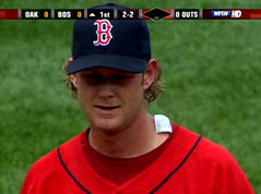
They say almost every baseball game features something you’ve never seen before. That was certainly true yesterday in Boston, where Red Sox starter Kyle Snyder spent the entire first inning with his undershirt tag sticking out and flapping in the breeze. It was sort of comical, especially when Snyder pumped his fist after a good play and strode confidently to the dugout after retiring the side, the tag silently mocking his every move. Apparently a teammate brought the situation to his attention between innings, because the tag had been fixed when he came out for the 2nd inning. (Kudos to Brandon Davis for catching this one.)
Logo Au Go Go Going, Going, Gone: On Friday I wrote about the MLB logo and mentioned that the page would have looked much better if the silhouetted batter had been executed in Uni Watch colors. I kinda figured a few people would take this as a challenge, or at least as an invitation. And, as usual, Uni Watch readers did not disappoint. Brian Stuart submitted this design. That same color scheme was one of several concepts whipped up by Mike Lindsay, who contributed an entire gallery of options. But all of these are two-color designs that leave the batter depicted in white; only Scott M.X. Turner had the balls to render a three-color version, thereby incorporating all the hues of the Uni Watch logo — I like this concept best. When Uni Watch is awarded an MLB franchise (should happen any day now), this is the logo that’ll appear on the back of our jerseys.
Speaking of which: You think maybe the use of the MLB logo is getting a little out of hand?
Uni Watch News Ticker: The Brewers wore their Cool Base jerseys yesterday, but apparently that wasn’t cool enough for Geoff Jenkins, who wore a batting practice jersey (with thanks to Ryan Mackman). … North Dakota State is getting a new secondary logo and new uniforms. … Remember last week’s discussion of the 1967 Senators and their white-accented unis? Todd Radom notes that one of the white caps was recently up for auction. … Soccer-related report from Dominic Litten, who writes: “Man. U unveiled their new uniforms in the London Tabloid the Sun on Friday. They resemble the uniform worn by the 1955-’56 championship squad. According to the Sun, ‘The retro design echoes the strip worn by Bobby Charlton and the 1950s Busby Babes. It celebrates 50 years since the Babes won their first league title.'” … More soccer: Andy Dowland turned up this site devoted to UK soccer uni history. … Seth Harris notes that newly acquired Aubrey Huff has become the first Astro to wear a CoolFlo helmet this season (he had previously worn the CoolFlo with the Rays). … Latest player to risk a fine by stretching his pant cuffs under his spikes: Coco Crisp. … Barry Bonds is sooooooo classy. … Sabres fans are so upset about the team’s new logo that there’s now a website devoted to having it revoked. … Really good view here of the lineup card and pen in Devil Rays skipper Joe Maddon’s pocket (as well as yet another display of Maddon’s apparently congenital predisposition toward clownish body language). … The Tigers and Royals wore Negro Leagues throwbacks on Saturday night. Great unis, but too bad they didn’t get special batting helmets for the occasion. Also would’ve been nice if Joel Peralta hadn’t left his jersey unbuttoned, thereby exposing his blue Royals undershirt (good catch by longtime Uni Watch softball pal Steve Bunnell). … Another player showing too much of his base layer over the weekend: Anthony Reyes. … Interesting article here, in which Ichiro is asked about his increased stolen base numbers and responds, “It is because I am wearing my pants higher and showing my socks. It makes me run faster.” Let’s hope this message filters through to other players. (Thanks to Andy Head for the tip.) … In more discouraging news, Bobby Crosby, who usually wears stirrups, went pajama-pantsed yesterday for the first time in his career. “Apparently he was wearing high-top shoes and felt that the high pants didn’t look good with the shoes,” says Brandon Davis. … Speaking of discouraging, check out this Logo Creep Alert from Dave D’Orazio:
This past week, while flying on an Air Tran Airways flight, I noticed something on the seat-pocket pamphlet that gives instructions in case of a crash. The diagram showing crash positions had a line of five people sitting in five seats — one woman and four men. Three of the four men are shown wearing dress shoes which were colored brown or black. The other gentleman was wearing blue sneakers — WITH AN UNMISTAKABLE NIKE SWOOSH! I apologize for the fuzzy picture, but I promise you it’s true. I turned to my girlfriend and said something along the lines of, “Do you believe this, honey? Where will it end?” Her response: “Maybe they just wanted him to look more normal.” AGGGGHHHHH!
I know I speak for everyone reading this when I wish D’Orazio well in his search for a new girlfriend.
I witnessed the Anthony Reyes show-all yesterday. He had his top button undone and it appeared that he almost had the top of shirt ironed so that it would stay folded down onto his jersey.
Also, the Cardinals should stay away from this link…I don’t know why they wear it, as their linkis one of the best in the league. Cap the team hats to 2 at most, there’s no reason for link.
BT
Dang, check out the sale price of that old Senators uniform. Wow.
And the Man U link shows Rooney doing what he does best… link
I slay me.
Maybe I should read through everything before I post a comment…
Maybe the Buffalo Sabres should just use the new NDSU logo.
That Bonds pic is disgusting and Reyes is Swooshified: 3 on the fielding glove and one on the baselayer.
The MLB logo is required on Nike’s Dri-FIT baselayers by the league itself, so don’t blame Nike for that one!
How did North Dakota State Univ. come up with a better buffalo logo than the Buffalo Sabres?!?!? Outrageous!
The Sabres need a logo with Sabres in it. What’s the point of having a nickname but then have no logos that are anything like the nickname. Thats why I’m calling the Sabres the Buffalo Flaming Buffaloes until they change their logo.
Shouldn’t a company hired to design logos/uniforms for teams do market research? It seems like this is not done. Buffalo residents seem pretty united behind their hatred for the Sabres new look so you have to wonder if the design firm market tested the logos.
The same goes for team ownership. Maybe they are the typical CEO types and would rather sit in their plush, leather clad offices and be told by someone else in a suit who has a plush office elsewhere that this is what his public thinks is hip and will buy. I see those types of decisions made every day.
What ever happened to the old days where a team would run contests and surveys in local papers and have the fans pick nicknames, unis, and logos? This way the fans have only themselves to blame. In Cleveland this is why our baseball team was nicknamed the Indians back in the 1910’s, why the Cavaliers went back to wine & gold (even though they have added a putrid blue alternate), and why we still have the Browns and not some new teamname and colors.
Power to the people.
I have been meaning to say this for a while now and after watching the ESPY awards last night with the Lotrimin commericials. How about the stirup sock combo on the guy in the elevator with athletes foot. I mean it was perefect from the high yellow and red striped sock to the white shoes. I hope the MLB was watching.
Another note, I was at a cornhole tourny this weekend and one of the guys showed up with a New Era fitted white Boston Red Sox hat. I know someone posted pics of it on here, but it was great to see it in real life. I took a picture of the guy. I just have to figure out how to get the pic of my cell phone and on the net.
Final note, The one off the field style I hate most of all is when people pop their polo shirt collars. Talk about lameO. Get a life. Saturday when I was watching USA play the Aussie team, the Aussie manager. BRUTAL.
Do we honestly know that EVERY Sabres fan hates the new logo? Just because some guy made a website and a couple of people spoke up in the media doesn’t mean research wasn’t done. Their is a good chanse that most of their fans LIKE the logo. I don’t think it’s too bad, and the alternate logo has a sword in it. Teams from Buffalo have almost always used a Buffalo in their design and Sabres fans should take a little more pride in where they live. The old jerseys had swords in the B wordmark, so I don’t know what all the fuss is about.
[quote comment=”2795″]Also, the Cardinals should stay away from this link…I don’t know why they wear it, as their linkis one of the best in the league. Cap the team hats to 2 at most, there’s no reason for link.
BT[/quote]
The “Sunday hat” is a tribute to the Cardinals of the 1940s, as seen link The current Cardinals also wear this hat with their bright red batting practice jerseys.
I agree with you, the red Cards’ cap is the best of ’em, but given MLB’s “market everything” philosophy, I’m just glad they don’t wear the BP shirts on Sunday!
An addendum to the e-mail I sent regarding soccer unis’
—
Also, the Glasgow-based Celtic Football club unveiled a new “international†uniform to be worn as the team tours the United States. The “pure white†uniforms were a change from the green away kits usually worn by Celtic. The kits were worn during Wednesday’s friendly with D.C. United, which the Scottish League champs lost 4-0.
Home Kit (green/white hoops): link link
Away Kit (all-green): link link
International Away (pure white): link
I really wish that more players on different teams would wear 2 color stir-ups like Bobby Crosy the green with yellow look really cool. Hey Paul could you send me the link to the white on white stir-ups. Thanks
[quote comment=”2808″]An addendum to the e-mail I sent regarding soccer unis’
—
Also, the Glasgow-based Celtic Football club unveiled a new “international†uniform to be worn as the team tours the United States. The “pure white†uniforms were a change from the green away kits usually worn by Celtic. The kits were worn during Wednesday’s friendly with D.C. United, which the Scottish League champs lost 4-0.
Home Kit (green/white hoops): link link
Away Kit (all-green): link link
International Away (pure white): link
Just to clarify, Celtic’s “International” kit had a double stripe going down the right side, Yellow on the inner stripe (left) Green on the outter (right), so it’s not “pure” white…It is a welcome departure from the typical Nike formulaic crap they come up with for Soccer. It reminds me of what Watford wore last season…btw, homage or not, those Man. U. stips suck! I wathced them in action against African squad Orlando Pirates last night on Setanta. They are hideous, the white frame for the crest is WAY too big…
Slainte’
Mike
Hey thanks for the email but that wasnt what I was looking for. In one of your blogs you showed a color photo of white on white stir-ups. thanks if you get it for me
The think the stir up used in the athletes foot commericail comes from the Uni Watch logo.
Seriously they are the same.
Lars,
I’m from Cleveland too. I remember they actually let us vote on the new uniforms. (I’m pretty sure they were going with wine and gold, but it was still pretty cool to vote)
Anyone know why the Browns always wear white? I checked on 15 games last year and 12 of them they were wearing white, both home and away. I heard it was for weather conditions, white in hot, brown in cold, but we wore white at Green Bay and white at home?? Any ideas?
That UK kit history page is great! I highly recommend people check it out, especially the 101 page, with the worst kits of all time.
link looks like the inspiration for the current Michigan helmets, no? Anybody know the history behind that helmet design?
Josh, I’ll bet they didn’t have a choice but to wear white when they were away, but, like the Cowboys, chose to wear white at home as well.
Jim, I don’t think they are quite the same. The stirrups in the commercial are a little thicker and connected, but same colors. It was a little annoying to see baseball stirrups and football cleats.
[quote comment=”2820″]link looks like the inspiration for the current Michigan helmets, no? Anybody know the history behind that helmet design?
Josh, I’ll bet they didn’t have a choice but to wear white when they were away, but, like the Cowboys, chose to wear white at home as well.
Jim, I don’t think they are quite the same. The stirrups in the commercial are a little thicker and connected, but same colors. It was a little annoying to see baseball stirrups and football cleats.[/quote]
That is why the Michigan helmet has the paint scheme, to pay homage to the leather helmets. link
Greg, great point about the football spikes.
I didnt realize it. Nice work.
[quote comment=”2810″]
Just to clarify, Celtic’s “International” kit had a double stripe going down the right side, Yellow on the inner stripe (left) Green on the outter (right), so it’s not “pure” white…It is a welcome departure from the typical Nike formulaic crap they come up with for Soccer. It reminds me of what Watford wore last season…btw, homage or not, those Man. U. stips suck! I wathced them in action against African squad Orlando Pirates last night on Setanta. They are hideous, the white frame for the crest is WAY too big…
Slainte’
Mike[/quote]
Mike, just to clarify, the term “pure white” is what is used by the club on their web site. Their terminology, not mine.
I can’t find a picture, but Gerald Laird, the Texas Rangers backup catcher was wearing a white mask on Saturday. They were at Baltimore, I haven’t seen this mask before, it went along with some white trimmed shin and chest guards. Looked unstable.
Is this a picture of the catcher that you were asking about. I cant see the white outline.
link
I’ll have more info on white/gray catchers’ masks tomorrow — stay tuned.
[quote comment=”2827″]Is this a picture of the catcher that you were asking about. I cant see the white outline.
link
Nope, that’s Rod Barajas. Not Gerald Laird. Trust me if you see the mask, you’ll know.
I fund it ironic that the Tigers wore those white throwback caps just after Paul’s blog entry about the Senators’ white caps that were banned by the American League.
I was watching the Rockies/Reds game the other day (thursday or friday) and I noticed one of the Reds players was wearing his socks up. I think it was #19 Chris Denorfia. I noticed this because Paul was saying none of the Reds players do this. Hopefully Chris will continue this look.
[quote comment=”2806″]Do we honestly know that EVERY Sabres fan hates the new logo? Just because some guy made a website and a couple of people spoke up in the media doesn’t mean research wasn’t done. Their is a good chanse that most of their fans LIKE the logo. I don’t think it’s too bad, and the alternate logo has a sword in it. Teams from Buffalo have almost always used a Buffalo in their design and Sabres fans should take a little more pride in where they live. The old jerseys had swords in the B wordmark, so I don’t know what all the fuss is about.[/quote]
A couple of people spoke up how about over 9800 signatures on the petition. And its fine to use a Buffalo as long as it looks like one not a slug. And their alt. logo is only used on the shoulder patches which is never seen.
[quote comment=”2832″]I was watching the Rockies/Reds game the other day (thursday or friday) and I noticed one of the Reds players was wearing his socks up. I think it was #19 Chris Denorfia. I noticed this because Paul was saying none of the Reds players do this. Hopefully Chris will continue this look.[/quote]
He was just called up the other night after the trade. Hopefully he will not bow to peer pressure and change his ways.
[quote comment=”2818″]Lars,
I’m from Cleveland too. I remember they actually let us vote on the new uniforms. (I’m pretty sure they were going with wine and gold, but it was still pretty cool to vote)
Anyone know why the Browns always wear white? I checked on 15 games last year and 12 of them they were wearing white, both home and away. I heard it was for weather conditions, white in hot, brown in cold, but we wore white at Green Bay and white at home?? Any ideas?[/quote]
They had already decided on wine and gold but that was because of a large movement for it. It was such an obvious choice that they didn’t need to poll the fans on it. Plus I think we would have all torn our eyes out if we would have been forced to watch LeBron in those baby blue and black unis of the Swawn Kemp years. Those were example A1 for owners not thinking before they made a choice. I never met a Clevelander who thought those unis were even OK.
Add those to the all red unis worn by the Indians in 1975 (luckily I was born that year so my eyes were spared) and the brown jersey and orange pants of the Browns and you have quite an ugly uni histiry here.
[quote comment=”2805″]I have been meaning to say this for a while now and after watching the ESPY awards last night with the Lotrimin commericials. How about the stirup sock combo on the guy in the elevator with athletes foot. I mean it was perefect from the high yellow and red striped sock to the white shoes. I hope the MLB was watching.
Another note, I was at a cornhole tourny this weekend and one of the guys showed up with a New Era fitted white Boston Red Sox hat. I know someone posted pics of it on here, but it was great to see it in real life. I took a picture of the guy. I just have to figure out how to get the pic of my cell phone and on the net.
Final note, The one off the field style I hate most of all is when people pop their polo shirt collars. Talk about lameO. Get a life. Saturday when I was watching USA play the Aussie team, the Aussie manager. BRUTAL.[/quote]
link was that the hat?
[quote comment=”2818″]
Anyone know why the Browns always wear white? I checked on 15 games last year and 12 of them they were wearing white, both home and away. I heard it was for weather conditions, white in hot, brown in cold, but we wore white at Green Bay and white at home?? Any ideas?[/quote]
I was under the impression that when the Browns started playing in the old AAFC, their entire uniform was white (including the helmet). The double whites (jersey and pants) is the traditional look of the team. The orange helmet wasn’t permanent until 1952.
When looking at football cards or images of Marion Motley, Otto Graham, Dante Lavelli or other early Browns (1948-early 1950s) note that finding the guys in brown jerseys is a lot more difficult than finding pics of Browns in white jerseys.
As for why the Browns wear white/brown these days, your guess is as good as mine. There is no logic as to white jersey or socks the team will be wearing. I am guessing the choice is at the behest of the equipment manager and/or the team captains.
Hopefully, that will change this year with the effort to more retro uniforms.
The “ghetto” baseball cap designers came up with another hideous design the link
DJL, thanks for the update. Always curious about those things.
Lars, cmon! The brown jersey and orange pants are a thing of beauty!… not joking.
As for Ichiro running faster. I always thought if you were comfortable with what you were wearing you performed or thought you were performing better. I always thought wearing long pants, a polo shirt, visor, sun glasses and a having a big hunk of red man chew made me golf better. Did it make me golf better… possibly. I do know chewing and spitting on your hand makes a better grip then any glove!
I had a baseball game yesterday, and I wore my pants low for warm ups for the first time in my entire life, and it was the strangest feeling, so right befor I took the field I pulled my socks up as I usually do. The high stir-up/sock look is not only asthetically pleasing, but I think overall performance enhancing at least for me.
The #44 was scribed into the back of the pitchers mound yesterday during Jake Peavey’s start at Petco. So far have not been able to find a photo, but it was clearly visible from the centre field camera. Can anyone shed some light on this, or are we witnessing the birth of a new phase of logo creep – Marking one’s territory! Up next, Jeter’s jumpman scratched into the infield dirt at short?
Am I wrong in thinking that one of the Uni Watch colors looks precariously close to PURPLE? I thought purple was a grievous sin on these pages…
[quote comment=”2853″]The #44 was scribed into the back of the pitchers mound yesterday during Jake Peavey’s start at Petco. So far have not been able to find a photo, but it was clearly visible from the centre field camera. Can anyone shed some light on this, or are we witnessing the birth of a new phase of logo creep – Marking one’s territory! Up next, Jeter’s jumpman scratched into the infield dirt at short?[/quote]
The starting pitcher’s number is put on the mound for all Padre home games
did anyone else notice that juan pierre was wearing a link shirt under his jersey yesterday against the mets. anyone know the story there? it looked totally strange when coupled with the throwback stylings of the high socks.
Regarding the Negro Leagues throwbacks: Unlike, say, the Astros, both the Royals’ and Tigers’ cap logos are the initials of the city in which they play, so you could argue that it’s ‘D’ for ‘Detroit Stars’ and ‘KC’ for ‘Kansas City Monarchs’. The Tigers white-on-navy batting helmets even match the central ‘R’ and collar on the Stars’ jersey.
Just watching the Jays-Rangers game and I noticed Ted Lilly had DJM written on the left side of his hat. I thought that was no longer allowed? Who’s DJM?
Are these the Braves’ anniversary in Atlanta patches?
link
was watching the Memphis Redbirds (Cardinals AAA) game and was impressed by the hosiery being supported by the entire team!
[quote comment=”2862″]Are these the Braves’ anniversary in Atlanta patches?
link
Yes, matt, they’ve worn them all season. and tonight i went to a rome braves and all of the braves were wearing their socks up.
[quote comment=”2854″]Am I wrong in thinking that one of the Uni Watch colors looks precariously close to PURPLE?[/quote]
You are very, v-e-r-y wrong.
[quote comment=”2804″]Shouldn’t a company hired to design logos/uniforms for teams do market research? It seems like this is not done. Buffalo residents seem pretty united behind their hatred for the Sabres new look so you have to wonder if the design firm market tested the logos.
[/quote]
Maybe the good people of Portland thought it was a good logo?
1. The Buffalo on the Sabres uniforms have always been white. They made it yellow. (yuck)
2. The big complaint about the current uniforms (other than the colors) is that there were no sabres.
3. Everyone in Buffalo was expecting an “updated version” of our old uniforms. Then they give us this crap…
They screwed this up big time and as a season ticket holder for nearly 10 years, I am nothing short of offended they did not ask what I was looking for in a new logo…
(P.S. – where the hell are it’s feet????)
[quote comment=”2826″]
The only color rule that the NFL has is that the home team chooses the color that they wear.
Most teams wear their dark uniforms at home. The Cowboys, Redskins, and Browns are the major exception. The Cardinals used to split their season, white the first half of the season, dark the second half.[/quote]
The Cardinals continued to wear their whites at home early last season before switching to red later in the year. This year, with the new stadium being indoors, I am interested to see if they continue to wear white at home (which is the look I prefer for them, especially with the white pants).
I’m currently stationed in Iraq, and even the Nike creep is out here. While surfing through some local arabic channels, I momentarily paused on this exercize show. It hilarious because the women were horribly out of synch and didn’t even look like they wanted to be there. But why I mention this is because the women all wore the same Nike baseball cap… a cap that featured nothing but THREE swooshes on the front and one large one on the brim.
Disgusting.
The Buffalo Sabres organization hasn’t confirmed the new logo or uniforms and that logo card looks suspicious, so why is everyone getting worked up?
The Bobby Crosby thing is even more distressing because Mark Ellis, his double play partner who also normally wears high socks, has followed his lead in abandoning them. The two of them look incredibly sloppy and I hope they go o-fer for a while so they think the sloppy-pants look is bad luck.
What bothers me most about Red Sox starter Kyle Snyder’s undershirt is not the tag,it’s the fact that it’s maroon. Red on red should be a crime. Wear white (short-sleeves), gray, black or navy undershirt not a red that doesn’t even match the uniform color. It’s too much red anyway….who’s doing the color combos for MLB teams, Queer Eye for the Straight Guys guys?