
Reader Ed Kozak recently tipped me off to some good uni-centric content in Dan Epstein’s recently published book, Stars and Strikes: Baseball and America in the Bicentennial Summer of ’76, which was published in late April.
Epstein is the same guy who wrote Big Hair and Plastic Grass, so I guess he’s becoming something of a 1970s-baseball specialist, which isn’t such a bad thing to be. His new book, as its title indicates, focuses on 1976, which is the year that White Sox owner Bill Veeck introduced the team’s untucked “leisure suit” uniforms (including the now-infamous shorts option).
The book has two multi-page sections that address the Sox and their unis. Here’s the first one, with one section of particular interest highlighted:
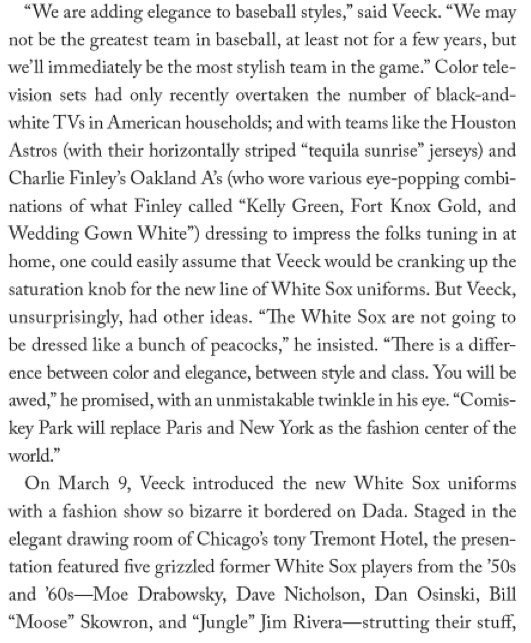
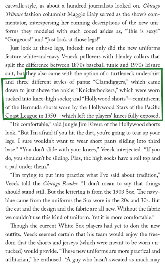
It’s all fun stuff, but the highlighted bit, about the three pants options, is particularly intriguing, no? Now, it’s true that White Sox players from this era wore their pants at differing lengths (as did players on all the other teams), but I don’t see that as one guy wearing “clamdiggers” and another wearing “knickers” — I just see two guys with different inseam preferences. Does anyone know more about these White Sox pants?
The book also has a couple of pages devoted specifically to the shorts. Here’s that section:
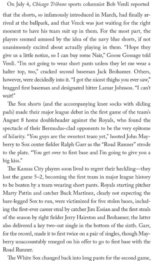
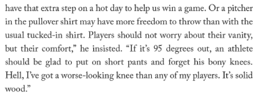
I raised an eyebrow at Lamar Johnson’s quote (“I got the nicest thighs you ever saw”), because he’s now the Mets’ hitting coach.
Big thanks to Ed Kozak for bringing these sections of the book to my attention.
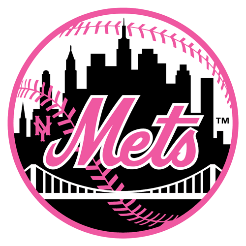
What might have been: Back in January, as you may recall uniform designer/historian Todd Radom uncovered the intriguing historical factoid that the Mets’ logo was originally rendered in pink and black. Unfortunately, he couldn’t figure out the reason for this unusual color scheme, and neither could anyone else.
I’m happy to report that Todd has now turned up the explanation for why the Amazin’s almost ended up wearing pink and black. All I’ll say here is that it involves horse racing. To get the full scoop, you’ll have to read Todd’s latest blog entry.

Collector’s Corner
By Brinke Guthrie
The NFL exhibition season begins soon, which means we’ll be getting our first on-field look at the Tampa Bay Bucs’ new uniforms — which, sadly, do not incorporate the classic Bucco Bruce look. If you miss Bruce, consider this varsity jacket from DeLong, a preferred Collector’s Corner brand.
Here’s the rest of this week’s eBay haul:
• Switching sports but sticking with DeLong, check out this Chicago White Sox varsity jacket, along with this NBA All-Star Game jacket with a Nestle’s patch.
• Remember this jacket template from Starter? True story: A Cincinnati radio station that I worked for did a grueling “Baby and Family Expo” indoor event north of town every year. Someone showed up wearing a UC Bearcats version of this jacket. They told me they were on sale across the way at a sporting goods box store. Got Bearcats and Bengals versions for like $20 each. Great quality with these.
• Starter’s competition in the 1990s included Logo Athletic, and their main design template was the “Sharktooth,” as seen on this Dolphins jacket.
• Nice-looking vintage 1960s St. Louis (football) Cardinals glass.
• This powder blue Cubbies T-shirt has a classic 1970s vibe, eh?
• The pennant itself is kinda beat up, but check out the old-school type font on this Virginia Squires ABA pennant. (They later changed to this font, which reminds me of a 1970s fast food burger chain.)
• Is it just me, or does Sweet Lou look a little silly wearing this Seattle Pilots cap?
• An Atlanta Falcons ”¦ bowling ball? Sure, why not.
Tick-Tock: Today’s Ticker was compiled and written by Garrett McGrath.

Baseball News: The Mets wore camo last night and will be wearing the “Los Mets” jerseys tonight. … Paul asked the Padres why they didn’t wear the Hall of Fame anniversary patch on Sunday. They said it was due to a logistical snag. … Great giveaway: The first 40,000 at Dodger Stadium get a Vin Scully 65th-anniversary talking microphone (thanks, Phil). … A Yankees fan returned a lost Red Sox World Series ring to its owner. … Uni Watch friend MLB Cathedrals sent in this photo from Cooperstown of the New York Giants’ 1905 uniform. Bring back the collar! … Minor league craziness: The Louisville Bats had their Star Wars night on Sunday and reader Zach Scantland and son were in attendance. Thank you for sending in pictures! … In a related item, the Tennessee Smokies, Double-A affiliate of the Chicago Cubs, are having a Star Wars night on Aug. 1 (thanks, Phil). … Not to be outdone, the Fresno Grizzlies are having a Teenage Mutant Ninja Turtles night on Aug. 2 (thanks, Phil). … The West Michigan Whitecaps are wearing six different uniforms from July 29th until August 3rd (thanks, Phil). … The Midland RockHounds are going camo for “Duck Family” night.

NFL News: The Packers have opened a 21,500-square-foot pro shop at Lambeau Field. … Washington TE Jordan Reed will not be wearing any special protective helmets this season. His 2013 rookie season was shortened due to concussions. … Packers RB Eddie Lacy, however, will be wearing a SpeedFlex helmet to reduce the concussion risk. He also had a shortened 2013 season due to head injuries. … Ravens WR Steve Smith now has SrOB (thanks, Phil).

College Football News: Effective immediately, teams wearing “non-contrasting” uni numbers will be penalized one time-out per quarter. … “I was checking out pictures of Notre Dame’s synthetic field turf installation,” says Scott Marakovits. “It looks like the end zones only have nine stripes, instead of the traditional 10. Kinda odd.” … Tulane Watch: Color change in their logo andnew unis. Here’s a look at the turf being laid down at the new Yulman Stadium, too (thanks, Phil). … Louisiana Tech has added a new flag decal to their helmets for this season (thanks, Phil). … The Longhorns have installed the new Big XII logo on their field (from Coleman Mullins). … Army’s head equipment manager posted a photo on Twitter that shows a lot different helmet variations (thanks, Phil). … The South Dakota State Jackrabbits will have this uniform for the upcoming season.

Hockey News: Designer Ann Frazier created a video of an animated map which shows every team and logo in the NHL by year and location dating back to 1917. Really cool stuff! … Some new roster numbers for the Ducks (thanks, Phil).

Soccer News: “I love when soccer goalies wear baseball hats,” says Benton Payne. “We had that happen in Vancouver on Sunday as the FC Dallas goalie, Raul Fernandez, sported a team-colored red and blue hat (which, of course, wildly contrasted with his neon green keeper’s outfit). The sun was blaring towards the away goal, but I guess the hat hurt more than it helped, as Vancouver scored a goal in the 11th minute and Fernandez went hatless the rest of the match.” … English football jersey styles from 1938-39, 1968-69, and 2014-14 in an infographic (from Graham Clayton).

NBA News: The Decision Part II-A: LeBron James number decision sent the Indianapolis Adidas plant into overdrive (thanks, Paul). … Comcast Sportsnet ranked the jerseys of the NBA’s 30 teams (thanks, Paul). … Is the NBA’s move toward advertisements on uniforms inevitable? At least one observer thinks so, but let’s hope he’s wrong (thanks, Phil).

Grab Bag: The UFC is discussing a potential uniform deal where all fighters would get similar apparel that they would wear during matches. … The 2015 Preakness logo has been unveiled. ”¦ “High-tech” workout apparel is selling briskly.

Notre Dame only has 9 stripes in endzone for a total of 18 and they are at an angle of 42 degrees to supposedly honor the founding year of the school (1842). Endzone stripes are also pointing toward the golden dome and Cathedral.
Basilica, not Cathedral. A cathedral is the home church of a bishop (“cathedral” comes from “cathedra,” Latin for “chair.”) The cathedral church in Notre Dame’s diocese is in Ft. Wayne.
“Basilica” is a title awarded by the pope to churches with religious or historical significance.
And it’s not really “the traditional ten.” There gave been various designs, or none at all, through the years. A couple of years ago, someone noticed that the stripes ran in the same direction. They called up the stadium crew, who said they had just begun doing so on their own, so that the lines pointed toward the Dome, Grotto, and Basilica. With the new field, they’re just adding to a new tradition.
I read that on the website too, that the stripes are at 42 degrees to honor 1842 and that they point at the Golden Dome. Is it one or the other? Or did they build the stadium and orientate the field specifically so that 42 degree lines in the end zone would point directly at the dome? I find it hard to believe that they would coincidentally do both.
That Bucco Bruce varsity jacket is awesome. Damn. Just re-emphasizes how bad Tampa Bay looks after this latest redesign. They should have just went back to the creamsicles. I could be in the minority with that opinion, however.
I agree. I had a Bucs jacket when I was 10 or so… wore the paint off those buttons!
If nothing else, the teams that are eternally rebranding give fans a nice variety of apparel and souvenirs to choose from.
I could be in the minority with that opinion, however.
Not if I have anything to say about it.
I had a jacket very similar to that one as an adolescent. It didn’t have the script name on the back or the NFC patch on the one sleeve, and instead of a freestanding Bucco Bruce on the breast, I believe there was a circular patch with Bruce in it.
For those of us who actually lived through that era (and were not just “alive during that era”), the creamsicles are fondly remembered, perhaps more so than the actual football. That does not mean they should or could or would go back to them. I loved seeing them once a year, and there were several years there where the cut and the color and the fabric were just perfect and a good photo of them is gorgeous.
That jacket is not only a thing of beauty, it looks like it’s in immaculate condition.
Are those practice jerseys shown in the Lebron jersey article? They have a white stripe on the side…
I thought the same thing… except it looks like a light gold, similar to the Cavs jerseys during the first Lebron era… and the sleeves and collar match that same look…
They are previous-era Cavaliers replicas (the side panel is gold). I cannot give a good excuse, however, why the new lettering is being printed on old jersey stock. I hope someone caught that before they went out.
Cleveland is spelled with the current word font though. These look like new unis
“Dueces are wild….”
One of my fave Vin sayings! I say it (in his voice) all the time.
Although it’s not actually a Vin Scully saying, I roll out “link” regularly.
When I was was living in L.A. in the early ’90’s I would bowl at the same place a group of Raider would bowl. Mar Vista lanes in Venice. They all had Raiders bowling balls similar to the Falcons ball in Collectors’ Corner.
I want to say Willie Gault and Tin Brown were oart of that group. I could be mistaken.
I would be more impressed if you bowled with Jeffrey Lebowski, Walter Sobchak and Donnie Karabatsis
Kerabatsos* According to IMDb
STFU Donnie.
I notice a few years in the NHL logo video are out of order.
1942, 1944, 1943, 1945.
Nothing apparently happened logo-wise in those however.
Does anyone else actually like the old 70s White Sox unis, as I do?
I didn’t at the time (always been a huge Astros fan). But, looking back, those Sox uniforms have an understated elegance… kinda like Penn State football.
I don’t care for the caps with just SOX. But the pants, shirts with collars, etc., I think they’re uniquely understated and could’ve had a lasting quality… perhaps if not for the shorts experiment. Those knicker pants look super comfortable. The socks look great with them, too. The mesh jerseys — loose, but not “Sabbathia baggy” and sloppy — they also look way comfortable. I’m no buff of the over-use of blue in baseball… but this is the way to do it.
They’re vastly superior to many of the styles seen on the diamond today, IMO.
In the first year of Jerry Reinsdorf’s ownership, he wanted to ditch Veeck’s uniforms, but the deadline had passed. So instead, they wore white pants with a dark blue stripe both home and away (Veeck had added the white pants option after a couple of seasons). That was also a cool look. As was the white undershirts that went with the blue jerseys.
From what I could see, the difference between the clamdigger trousers and the baseball pants was the clamdiggers lacked the elastic at the cuffs. I saw Wilbur Wood pitching against the Yankees that year (1981?) and remarked on how the pants didn’t meet up with the socks.
The article seems to be saying that the pants were tucked in to the socks. Tucked in? Did that actually happen?
I also liked those White Sox uniforms, despite my customary dislike for coloured jerseys. Their only problem was that the collars didn’t go all the way around the shirt, which tended to make the white shirt look a little silly.
But that shot of Steve Trout looks just great. On the blue shirt, the half-collar doesn’t really mar the look too much.
I’m with you, Ferdinand. I would love to see a collared jersey in baseball today. It would have been cool to see the collar extend around the back of the jersey in the White Sox. Thanks for letting us know who the pitcher was in the photo.
I liked the 80s Sox uniforms better, but I did like the 70s look.
The ’78 Cubs road uniforms were superior to both, though.
Yes, ScottyM. I loved the 1976-81 White Sox uniforms. Not the shorts, but the white shirts and navy pants I thought looked great. I wish the White Sox would wear them for a retro day.
The Mets camo link is broken (the link has is mistyped “hhttp://scores.espn.go.com/….”)
Fixed. Here’s the proper link:
link
My eyes preferred the broken link.
Apropos of pretty much nothing, can we talk about the link?
I really, really dislike Real, but there’s so much to like about the origami-style typeface.
Oh, wow — that’s really something.
How long have they used that?
It’s new, last year (and for a few years I think) they’ve used this one that’s somewhat cartoonish (at least IMO):
link
I like the creativity. Real always seems to have a very simple uni design, so it’s kind of cool to see them thinking outside the box with these numbers.
I thought I read that last year’s design was done by an autistic child, but now I can’t find any mention of it.
That was Barcalona, it was just for a single game and it was designed by a girl with Down syndrome: link
Wow, I was way off. But no wonder I couldn’t find a link. Thanks.
For those interested in jersey fonts, there are a couple of websites you might be interested in:
link
link
World Series rings and restrooms don’t mix.
Just ask link.
Great investigative work again from Todd on the pink and black!
In the early sixties, baseball was clearly being marketed mainly to men…and men of a different era at that. I have a hard time thinking a team would seriously consider wearing pink as a main color back then. Today, I think it might be considered, but still shot down as a primary scheme.
I’m not so sure about that. It was an era before merchandising, when men in the stands wouldn’t feel the need to wear pink just because the men in the field were. And if the uniforms were primarily black, I can see it working.
And taken from the comments of Todd’s blog, if the racing colors were salmon pink and black it might have looked more like link than the shocking pink mockup he made.
Looks pretty Googie to me.
Sorry, that’s from EddieAtari below. Great work!
Threw a link to the link in TR’s comment section yesterday.
The UFC article is wrong, both Jon Jones and Anderson Silva wear Nike in the octagon. The reverse is true GSP does not wear under armour in the octagon his endorsement deal is only for outside of the octagon.
Jon Jones’ walk out shirt is the only one I’ve seen in the UFC made by Nike. Here’s his last one: link
All the other guys shirts are from MMA companies like Badboy, Jaco, Hayabusa, TapOut, ect…
I’m really into UFC now. It’s cool each fighter comes out with their own shirt for the fight (walk out shirt)
Are those new Cavs Jerseys? They look like the current font on the old (Lebron-era) jerseys…
link
That’s some great detective work to uncover the pink / black Mets design and the reason why. When I think of that color combo, I always think of Palermo’s soccer team. I wonder how that would have translated to baseball in the USA?
link
If Greentree Stables’ racing colors were salmon pink and black, then the Mets’ colors would have looked more like link instead of hot pink.
So…wait…college football teams are permitted to change into different uniforms during the game?
I hope Nike doesn’t hear about this.
I’d suspect they’re only allowed to change if there’s a violation of some sort.
I’m pretty sure a few teams have changed at halftime during mud games in the past.
Interesting look at the Veeck era uniforms. That set was one of the oddest combination of being stuck in its time and way ahead of its time. I’ve compiled a surprising list of things that 76 Sox either did right or were presaged later trends:
1. Throwbacks. The script taken as Veeck said from the early days of the team. The cap logo taken from an old pennant. Even the collars were an attempt (albeit a spectacular failure) to replicate an older look. Many teams have gone retro since, but the Sox were the first.
2. Socks not stirrups. The 1976 Sox were the first club in baseball history to not wear stirrups. Given how today’s players favor socks over traditional hose, this was a vision into the future.
3. Custom number font. In 1976, only the Red Sox, Cubs, and Expos wore anything other than standard block numerals. The Red Sox and Cubs had both been wearing them for decades and the Expos had worn them since their inception. The Sox were the first team to create a unseen (and retro to boot) number font for a uniform overhaul.
4. Untucked. sigh. At least in 1976 they were tailored. link
5. The reverse softball top. Other than the Pirates a few years later, no team has ever worn a light jersey over dark pants.
6. Solid navy. A solid color on the road had only been done by the Charlie O’Finley A’s of 1973 and a solid navy road had not been seen since 1931.
7. Monochrome. In an era when colors were everywhere, the 1976 Sox looked more like the 2012 Brooklyn Nets. link
8. White Socks. Saved the best for last. Aside from the 1959 Series, these were the only White Sox teams since 1948 to wear hosery appropriate with their name.
Good points, but a few inaccuracies:
The 1976 Sox were the first club in baseball history to not wear stirrups.
Every team prior to approximately 1910 (which is when stirrups came into vogue) wore socks.
Other than the Pirates a few years later, no team has ever worn a light jersey over dark pants.
You’re forgetting the 1936 Reds:
link
Aha! Right on both accounts.
I also missed the 1969 and 1970 White Sox who wore white stirrups.
And while this isn’t exactly a ‘reverse softball top’, the Cleveland Indians once wore blue over red, an interesting look to be sure. That was 1975, so it predated the Sox.
More common than you’d guess. They wore that combo at least once every year the red uniform existed. Plus I recall Rick Manning taking out Tom Veryzer(?) in an AP photo when the Tribe wore white over red.
The 1970’s Philadelphia MLB team used what I’d consider a custom numeral font, though some of the numbers (1, 4, 7)could still be viewed as ‘block'(?).
Weren’t those Helvetica numerals chenille fabric in 1971 and ’72?
6. Solid navy. A solid color on the road had only been done by the Charlie O’Finley A’s of 1973 and a solid navy road had not been seen since 1931.
In the majors, sure. But Veeck himself had introduced an all-navy road uniform link.
Where can we find more shots of that one?
That’s all I have. If anyone can find more I’d be grateful.
It was a short-lived experiment, and in 1943 the Brews were back in traditional road grays, but Veeck seems to have filed it away for later reference.
The Chicago AL team also brought back the abandoned (since the 1930’s?) practice of using just the city name on both the home and away jerseys.
Oakland adopted that look for a while in the 80’s, and Texas and Miami use it today.
Oakland did it in 1968 right after moving.
link
The contrasting uniform/number rule is just asking for trouble for being so subjective. How does one define ‘contrasts enough’ to make the decision uniform throughout a season? One official may think it’s fine one game, two games later another says no way.
Looks like Army will be wearing Northwestern’s helmets this year, too. It appears as if they keep a collection of other teams’ helmets on top of the cupboards.
BTW, the background music in the NHL logo video is “Brass Bonanza” – the Hartford Whalers iconic theme song played after every goal (from 1979-1997, I think)
Very late in the day yesterday, someone posted a link to a set of NFL concepts. Many were pretty darned good. Artist had a bit of a fixation with a particular number.
The Virginia Squires Media Guide “this font” link says it’s from the Warner Fusselle collection. I remember him as the This Week in Baseball (TWIB) narrator who succeeded Mel Allen!
Indeed he was!
He also plays a prominent role in one section of Terry Pluto’s classic oral history of the ABA.
Marty Brennaman, the long-time voice of the Reds, also called Squires games in the early ’70s.
Two things:
Stars and Strikes is a must-read.
The Louisville Bats are auctioning off the Star Wars jerseys on their website. Proceeds benefit a local children’s hospital.
link
RE: college uniform numbers:
Allowed: link
Not Allowed: link
Allowed: link
Not Allowed: link
(unfortunately) Allowed: link
Knowing the rules editor he would basically say this should be enforced by the “smells test.” A skunk smells like a skunk and nothing else smells like a skunk … except maybe Old Style. If it smells like non-contrasting numbers then they’re non-contrasting. If there’s a question as to whether they’re contrasting enough then they are. But black numbers on a black jersey, even if separated by a bright yellow outline, are non-contrasting. Silver on white might be if the silver is dark enough, but you’ll know without a doubt if the silver is too close to white to be non-contrasting. Don’t over complicate it.
Or just don’t make a stupid rule about it in the first place. On the field, you can read those silver on white or neon outlined black on black numbers just fine, never mind that you don’t actually *need* numbers to play the game. The worst aspect of “unreadable” numbers is TV announcers making a few more mistakes than they usually do.
Actually numbers are one of the most critical parts of the game. Football would be impossible to officiate or manage without them on just about every level. It matters whether 80 did or did not do something and where he came from. It matters where someone lined up and what number he is wearing. Without numbers it’s just rec league. And being able to quickly identify who is whom quickly by players, coaches, officials, and yes even media would be impossible without numbers and being able to read them. I could go on.
test
link
“The Huskers will wear an alternate uniform this year. Pelini’s seen it and thinks it’ll be worn against Illinois, although “don’t hold me to it.”
link
Hope they’re at least red.
I had hoped Epstein would have gone a little deeper on the Sox uniforms in his book, but it all appears pretty accurate.
Here’s a more thorough look at that teams uniforms – link
Phil tweeted last night about Keith Hernandez asking what you’d call the color the Phillies wear… clearly he still has the maroon on the brain. That got me thinking:
With all the love for the 70s era Phillies and Brewers styles, will either team finally ditch the retro look that’s been so prevalent the last 25 years?
I could see both making some sort of change along the lines of the Os, Jays or Twins and blending old/new styles. (I think the Rangers are ripe for a makeover too.)
wouldn’t going back to the 70s era also be adopting a retro look? I don’t feel that any blending of styles really works, and I would hate to see the Phillies attempt this. I feel strongly that they won’t be making any changes any time soon – they have a lot invested in their brand right now, and despite their crappiness, it’s still pretty strong.
I’d love to see them go back to a maroon/columbia combination. Much more distinctive.
As for the Brewers, I’m not in love with the ball-in-glove logo like a lot of people are (I think it screams 1970s) but I see that more often than I see their current branding.
“Phil tweeted last night about Keith Hernandez asking what you’d call the color the Phillies wear…”
~~~
Indeed he did
It was a slightly longer exchange than what I could fit in there, but that (I rewound the DVR) was verbatim of the beginning of it. It bordered on comical. After Keith kinda demurred, Gary then asked him what he thought it was. “Carnation” was his first response, and I’m pretty sure Gary spat on his keyboard.
After regaining his composure, Gary offered that perhaps it was “crimson” or “scarlet” or just “red.”
That was some funny shit right there.
Phil, you catch the end of the game convo about Keith’s geography issues with New England and being a “royalist?” Ridiculous.
Best broadcasting team in baseball.
Keith, who I loved as a player, but have liked less and less ever since, really is ruining the TV broadcasts for me. He’s neither clever nor funny, and while I’ll cut him some slack for literally mailing it in early during blowouts (and close games), he’s almost un-listenable-to.
Met him once, at one of his book signings — I stood in line for literally 2 or 3 hours, and I was buying HIS book to get for a buddy as a birthday present. When I finally got to the front of the line, he wouldn’t shake my hand, and I asked him,
“Could you make it out ‘To Woody'”
Nothing more, nothing less. He signed “Keith Hernandez” and handed me back the book without so much as a word, not even a thanks or a smile.
Fucker.
Who does this guy think he is???
After Keith kinda demurred, Gary then asked him what he thought it was. “Carnation” was his first response, and I’m pretty sure Gary spat on his keyboard.
The spit then splashed off the
wristkeyboard, pauses – in mid air mind you – makes a left turn, and lands on Newman’s left thigh. That is one magic loogie.What’s the deal with those Cavs jerseys? Never seen that style before.
“… Tulane Watch: Color change in their logo and new unis. Here’s a look at the turf being laid down at the new Yulman Stadium, too (thanks, Phil). … ”
An improvement, I’d say. The Green Wave should have a green wave.
Kind of nice to see the Fresno Grizzlies thinking outside the box just a little. I’m sure they already had a Star Wars night, but I haven’t heard of a TMNT-themed night, and those jerseys are pretty freaking awesome. There is one thing I find odd about it, as well as the resurgence of apparel found in retail stores (I work at one such place), is that, while there is a new Turtles movie, all the stuff we’re seeing is designed to play on the nostalgia for the TV show that ran starting in the late ’80s. Presumably to get people in my demographic (male, 20s-early 30s) to buy stuff.
I think Lou Piniella looks great in the cap of the Seattle Pilots, but then I think everyone looks great in one of baseball’s best cap designs ever. I have a picture on my home-office wall of myself and two brothers proudly wearing Pilots caps in 1970, the summer after the team was sold and moved on to Milwaukee, to the dismay of us fans who were at the time based in the Pacific Northwest.
I do consider all the concepts you’ve offered in your post. They’re really convincing and can definitely work. Nonetheless, the posts are too quick for newbies. May just you please lengthen them a bit from subsequent time? Thank you for the post.