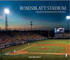
A few months ago, Phil wrote an entry about Rosenblatt Stadium, the Omaha ballpark that was hosting its final College World Series. Now the Omaha World-Herald has published a book about Rosenblatt, and reader Todd Hotz reports that it features several uni-notable photos. He’s generously scanned the relevant images, including some real stunners. Let’s take a look:
• I knew several minor league teams had worn shorts over the years (along with the Chisox, obviously), but I didn’t know it had ever been done by a college team. That’s Southern Illinois in 1969. Also note that everyone’s wearing a helmet — including the pitcher and the manager — and that the helmets have TV numbers.
• Another team that wore helmets in the field: Iowa, in 1972.
• Interesting to see that the tequila sunrise template had trickled down to the college ranks by 1978, only three years after it debuted in Houston.
• Here’s another tequila sunrise team. Also, note the very loose waistband on the infielder.
• Is this also a tequila sunrise design, or is it something else? Tough to tell with the black-and-white photo. Also, looks like the infielder is wearing a mesh-backed cap.
• The 1980 Hawaii team apparently wore a mesh-backed cap as well. Adjustable, too, looks like.
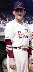
• The guy at far left in this shot is apparently future MLB pitcher Paul Splittorff. Note that the descender on his “j” appears to be falling off, or else it’s riding mighty low.
• Dave Winfield apparently liked to wear his pants skin-tight from an early age. Was that uni powder blue? Some other color?
• Here’s a jersey style you don’t often see: a zippered vest. (Yes, the Indians wore that style throughout much of the 1960s, but I’m not sure I can think of any other examples.)
• Apparently they should have planned a bit better when installing Rosenblatt’s light towers.
• Always fun to see a groundskeeper with a shotgun.
Great stuff, right? Big thanks to Todd for sharing these scans.
Update, 4pm: Turns out all the scans have been taken down by Flickr, due to a copyright claim by the World-Herald (who never contacted me to express their concerns). Lame move — here I am giving them free publicity for their book. And newspapers wonder why they’re going out of business.
ESPN Reminder: In case you missed it yesterday, my annual NFL season-preview column (which also includes a fresh round of college uni changes) is up.
Also, even if you read the column yesterday, you might have missed a coupla late-breaking college changes that were added to the column during the afternoon:
• San Diego State has a Don Coryell memorial decal.
• I had previously reported on Northern Illinois’s new uni set but didn’t realize they’d also gone from NNOB to NOB.
Also, a quick follow-up: Yesterday I mentioned that Maryland had white socks with stripes. What I didn’t mention — because I didn’t realize it until Matt Shevin told me — is that the socks are Under Armour-branded. Ew.
Beaver Shot Chronicles, Vol. 713: Mike Hersh has come up with what is likely to be the definitive view of the 1956 Portland Beavers’ striped undersleeves. The photo I showed on the site last week made it look like the stripes might have been sewn onto the sleeves (i.e., separate stripes of fabric), but this latest shot clearly shows they were knit in. And check out this great caption.
Uni Watch News Ticker: Big congrats to our own Jeremy Brahm, who just became the head coach of the varsity volleyball team at the Oregon School for the Deaf. ”¦ Tons of amazing 100-year-old football photos, plus some home movie footage, in this sensational video slideshow (big thanks to Jeff Wilk). ”¦ I originally reported that Boston College’s switch from Reebok to Under Armour resulted in no uni change except for the collar. But it turns out that the uni numbers got smaller, which has resulted in legibility issues. “The numbers have been difficult to read since BC went to a custom narrow/italic font in early 2000s, got harder last year when the numbers went from white to gold, and got impossible when made smaller on the new Under Armour version debuted last Saturday,” says Christian Eidt. “There just is not enough spacing to see the jersey contrast beneath the number.” ”¦ Ryan Connelly sent in some pics of Rick Dudley, one of the few hockey players to wear a headband (“and one of only four NHL players to wear #99!” adds Ryan). ”¦ Brian Schulz sent along some good pics of the Wild’s center-ice logo being applied. ”¦ Whoa, dig this old Bills sweater! ”¦ David Staples notes that the uni numbers on UCF’s new jerseys appear to be riding mighty low. ”¦ Hmmm, a Bengals-patterned race car helmet (with thanks to Michael Korczynski). ”¦ This Twitter post indicates that Miami will be wearing their “Storm Trooper” uniforms — that’s white on white — at Georgia Tech later this month. Which means, as another reader recently indicated, Tech will have to wear color at home after all (with thanks to Jesse Agler). ”¦ Wales, the only rugby power to be outfitted by Under Armour, has a new kit. “I’m not a big fan of the new design,” says Eric Bangeman. ”¦ Our own Vince Grzegorek has written a great piece about Felix Wright, the Browns’ uni policeman. ”¦ Nick Karaffa got a tour of Paul Brown Stadium as part of a sports law class he was taking last year. “It’s amazing the amount of gear each guy has in his locker,” he says. “Chad Ochocinco probably had the most stuff (multiple helmets, tons of gloves, cleats, etc.), but Carson Palmer had more Skoal than any other player. My buddy decided to use the bathroom in the locker room, simply because we realized we’d never be in a pro locker room again. As for Ochocinco’s ‘kiss the baby’ list, someone said it has something to do with him beating a corner or safety during each game.” ”¦ The situation with the Cubs’ 1957 stirrups gets curiouser and curiouser. Okkonen shows them being blue at the bottom, but yesterday’s Ticker had a photo in which they appeared white at the bottom, and now David Fetty has come up with a baseball card that shows them being red on the bottom. Very odd. ”¦ Dave Burns notes that Boise/VaTech game looked an awful lot like the futuristic football game shown in Starship Troopers. The color schemes even match! ”¦ The legitimacy of those new Sabres jerseys has now been confirmed, and I for one and happy about it. ”¦ Charlie Shields got a note from the Texas Rangers yesterday, as follows: “You will now be able to go to TexasRangers.com, sometimes as early as the night before any home game but in any event by the afternoon leading up to the game, to see what color jersey that night’s starting pitcher has chosen for the team to wear. The idea is to encourage fans who have Rangers red and blue and white in their closets to know which to wear before heading out to the Ballpark. The information will show up just below the fold on the front page of the website.” ”¦ Two new mask designs — presumably one home, one road — for Marty Turco (with thanks to Eric Lovejoy). ”¦ New hoops set for Navy. ”¦ Sicks Stadium, where the Raniers and Pilots used to play, no longer exists — it’s a Lowe’s hardware store. But the store has a little memorabilia case. Nice! Patrick Woody took that photo during a recent west coast road trip. ”¦ Wanna spend $300 on a pair of sneakers? Be my freaking guest. ”¦ The Pirates marked Roberto Clemente Night by wearing mustard throwback caps — with no MLB logo! — last night. Looked really good with their current uni. ”¦ The Bears will wear white at home against the Lions this Sunday. ”¦ Here’s a rarity: a Native American women’s basketball team, circa 1904. The initials on the collar stand for “Fort Shaw,” Oklahoma (great find by Matt Mitchell). ”¦ Here’s a good video of the Tennessee equipment staff prepping the Vols’ helmets for gameday (with thanks to Buddy Walker). ”¦ Back on Saturday I mentioned, without comment, that USC had changed from Oakley visors to Nike. Someone commented that the Nike version looked like shit, which led someone else to get all bent out of shape, and it became part of the day’s Nike-driven clusterfuck. But you know, the Nike visors really do look worse than all the other brands’, because they put the wordmark on one tab and the swoosh on the other, which makes the helmet feel unbalanced. This is one case when I’d actually prefer an added swoosh, just for the sake of symmetry. Of course, no logos on any visor tabs, regardless of brand, would be the best solution, but that’s obviously too sensible to happen.
My high school’s girls softball team wore tequila sunrises(in navy and gold no less) by 1980. I think they even had them in ’79, but am not completely sure on that.
Rainbow Guts/Tequila Sunrise/UltraStripe were marketed to youth and college baseball teams pretty heavily through Medalist/Sand-Knit and Gold Medal Sporting Goods catalogs throughout the 80s.
I know about Tulane, Seton Hall, Cornell College (the one out the midwest), and Denver University, and North Carolina wore them in 1987 and SOME team wore them while playing Frank Thomas’ Auburn team when the photo of his Topps rookie card was taken: link
I did not know, however, that Arizona State wore those in 1981.
Oh, and Furman’s cheerleaders wore them, too.
The Pirates’ mustard caps are inaccurate. The eyelets on the caps should not be black. Can’t believe a detail like that could be missed, given that different-colored eyelets on MLB caps are rare.
Great catch.
It looks like they’re wearing the American Needle version of the cap seen here: link
But in this shot, it looks as if they got it right:
link
Either way, I want the Pirates to wear this hat from now on. And I want an adjustable one.
Good time to show an old tweak from Daniel Chanelli, who suggested using the early 70s design with a button-down jersey:
link
It’s time to lose the Pirate font on the numbers. Use Daniel’s design or go with something else, but keep the mustard hats.
Yeah, that’s kind of confusing. Were there two different versions of the hat floating around last night?
Do you really expect attention to detail from the same franchise that put black stars on their gold throwback pillbox caps earlier this year, and wore black socks with their throwback black pants last year?
Actually, the former Sicks Stadium has a Lowe’s Home Improvement Store, not a Loews Theater, on the site.
My bad. Patrick simply said “Lowe’s” and I misinterpreted it. Will fix text now.
Doesn’t Okkonen in his book mention the variety of Cubs stirrups used in the ’50s and ’60s? I think in the narrative section he writes about the challenges of identifying all the different stirrups they wore – and that he may not have identified all of them. The unfortunate thing about only using Okkonen’s online database is that it misses a lot of what he wrote in the front of the book.
According to Google Maps, the former site of Sicks Stadium is a Lowe’s Home Improvement, not Loews Theater. Wikipedia says so too. Can anyone confirm which is correct?
Home Improvement. My bad.
I think Dave Winfield’s uni was yellow ( athletic gold )….wasn’t he a Golden Gopher…I’m too lazy to Google it…
You learn something every day. I didn’t know that part of the letter was called a “descender”…must have been cutting class that day…or that semester..
Typography term. Details here:
link
Paul you just ruined my day! For some reason I honestly did not know this:
“In typography, a descender is the portion of a letter in a Latin alphabet that extends below the baseline of a font.”
Now I am going to be thinking about descenders all day….to make it worse I texted my wife and my brother and they both know what a descender was…..I guess cutting English class to play handball in Tompkins Sq Pk was not a good idea!!
In the ’70s, when so much design work used all lower case letters, “ascenders” became much more a part of the vernacular, too.
—Ricko
Wouldn’t expect anyone to know ascender or descender except for designers and type nerds. I only know them because I edited graphic design books 20 years ago.
Those Gophers unis were a color somewhere between athletic gold and old gold…we could call it “Bright Old Gold” or something (not Vegas Gold, that’s for sure).
They wore them both home and road, as I recall, with the white sanis and white Riddell cleats.
—Ricko
Speaking of gold, I don’t know why Navy athletic teams wear that blase Vegas gold when the school’s color is bright gold (as is the color shared by the two services supported by the school, the Navy and Marine Corps). Check out the steps in the back of that Navy hoops photo.
link
Posted this over the weekend…
link
…and was thinking that (except for the helmet, of course) it’s very mindful of a Navy officer’s dress whites, what with the navy and bright gold pants stripe on the predominantly white uni and all.
Anyway…updated, that would make a nice set for Navy, I think.
—Ricko
That would make an interesting set. Would they be allowed to use different numbers of thin stripes on the shoulders to signify year instead of the NW stripes, similar to the diagonals on the Midshipmen’s shoulder boards?
linkwhere Sicks Stadium home place is located inside the Lowe’s home improvement store – if the Pilots used that batting stance, it’s no wonder the team only lasted one year.
Talk about an “open stance”!
Home plate next to the wheelbarrows. *sigh*. That’s the most depressing thing I’ve seen all week. I think KC Municipal Stadium may have a better memorial. Nothing at all.
Now out of commenting hiatus….due to ballpark talk of course.
Met Stadium home plate is in floor in the pathways of the Nickelodeon theme park in Mall of America.
—Ricko
And a tiny little chair bolted high up on a wall. A blank bare wall.
Not a Mets fan…but seeing this makes the sad for some reason:
link
This too….
link
To continue Home Plate Markers: The Vet link
My home plate picture of The Vet BTW.
Forbes Field’s home plate woulda been in the ladies room now, so it’s not in exactly the same place.
link
What’s really depressing about the Sicks Lowes is that, when I asked one of the employees where I could find the baseball memorabilia, she had no idea what the hell I was talking about. I’d missed the display case when I walked in because I was messing with my camera.
now i can’t get wagner out of my head
Since your post was right below the picture of Shea’s home plate, I thought you meant Billy, not Richard…
rpm and I exchanged comments about those ’57 Cubs stirrups over the long weekend (so probably no one saw it) and I posted that same Elmer Singleton card…
link
I hadn’t seen the white version until this year in the Life Archives photos from 1957 opening day at Wrigley. However, the blue stirrup with white stripes was most definitely the version that would have to be considered “their socks” for that season (as Okkonen shows them to be).
I’d seen that Singleton card in 1959, of course. Back then I assumed the red version had been a sock they considered for their new unis before settling on the blues (that’s a spring training shot from ’57, very likely taken at the same time as this one)…
link
Now my thinking is that perhaps their original intention was to wear the white version at home and the red on the road. Either way, those socks didn’t last long, because this is the sock they wore virtually all the time with those 1957 unis…
link
Here’s another 1957 shot on a 1959 card (such things were not uncommon back then)…
link
—Ricko
Paul, the resemblance of the Nike uniforms to those worn in the “Starship Troopers” movie just confirms your theory about our video game culture. If we keep taking this further — with instant replay, Field Turf, and more — eventually all our games will be played by robots in TV studios. Which is why I can’t wait for Alabama-Penn State this weekend.
Even better Alabama-Penn State in pouring rain on a muddy field…
Well, now, wait. If Nike has reached “Future Prescience” then they have proven their point. Not only are they showing us how wrong sports have been about how unis SHOULD be, they’re so all-knowing they’re also letting us glimpse how unis WILL be.
Or maybe it’s just that they can’t get enough of movies where Casper Von Dien takes a shower. I dunno. Tough call.
—Ricko
One thing to keep in mind before demonizing Nike too much – the Starship Troopers uniforms were clearly Adidas.
link
Gravity Ball – Schmavity Ball, REAL citizens play Rollerball!
How does any baseball team sport shorts during a game? do they plan on never sliding? I made the mistake of sliding while wearing shorts( trying to score w/o knocking down a woman in a mixed softball game). That was a fun Summer with those scabs up & down my legs. It is possible the anecdote of my chivalry got me laid once though. Mostly it got “Aws” from the women & “dumbass” from the men.
Yup, the ’80s (the “coaches shorts” era in slowpitch softball unis) were tough on the knees and hips.
—Ricko
It is possible the anecdote of my chivalry got me laid once though.
TMFI
Mostly it got “Aws” from the women & “dumbass” from the men.
what would the men have had you do? pete rose her fosse?
I think I’m going to start using “Pete Rose her Fosse” has a sex euphemism now.
“Hey man, did you Pete Rose her Fosse last night?”
“Nah, I just Giambi’d her Posada.”
And if you strike out alltogether, you’ll end up “taking your talents to South Beach”
What if you just A-Rodded her Arroyo?
If you A-Rod her Arroyo, then you probably won’t have to worry about many “hers” anymore.
“Even better, they’re now wearing the NFL’s most underused mascot character, Brownie the Elf, on their visor tabs.”
AMEN!
I’ve made several cornhole sets but saved the best for myself. I used the aforementioned Brownie the Elf…
link
The sleeve stripes are even a little off white for added effect
a link would help
link
Okkonen’s rendition of the ’57 Cubs uniform has Blue lettering outlined with Red, but the baseball card shown today shows Red lettering outlined with Royal. Which makes you wonder if Okkonen was working just from B&W photos or was the card colorized? If Mark was working from B&W photos and the lettering was actually Red with Royal outline then the brighter Red actually appears darker than Blue, hence the reversing of the colors by most people.
In ’57, when the roads said “CHICAGO CUBS” the letters were red edged in royal.
In ’58, when they dropped the striped stirrups and the white piping on the hats (don’t let ANYONE tell you they wore that set more than one year), the road changed to just “CHICAGO” in royal edged in red.
Also, and no one seems to note this: The “C” and its white outline on the caps was noticebly thicker than the subsequent version. Most of the white piping hats out there are wrong. They used the current “C”. That’s inaccurate.
Here’s how thick hat logo was for that one year…
link
link
link
link
—Ricko
A ’58 card not hand-tinted.
link
Ernie in the ’57 red lettered roads…
link
—Ricko
Went to this in ’58 (taken in SF’s Seals Stadium, btw)…
link
Also, note the road piping in ’57 was red-royal-red.
From ’58 on (until they eliminated it) it was royal-red-royal.
—Ricko
I have a real soft spot for those mustard Bucs caps. That’s what they were when I was a young kid and started to like baseball. I always thought they should bring them back permanently. I think they make a nice mate with the regular black ones. I’d like to see a throwback night with the old early 70s unis as well.
I enjoyed the old college photos and was shocked to see that ORU used to be the Titans. I have lived in the Tulsa area for 12 years and I have only known them as the Golden Eagles. I wikipediaed it and it said they changed it in 1993, and the original name came because ORU had a lot of east coast students that were fans of the New York Titans before they changed their name to the Jets. What I love about Uniwatch…You learn something new everday.
When I saw the caption about the ORU player, I thought it had to be a mistake when I saw the Titans wordmark on the jersey. I immediately thought they somehow got confused with Cal State Fullerton. Thanks for the info, Kevin!
There’s a couple good sports articles in today’s Wall Street Journal.
The first is an evaluation of the link, which is done by Nielsen (they’ve named it the Nielsen Sports Media Exposure Index). It takes into account their team website traffic, marketing reach, local and national television rankings, along with some other things like how often the franchise is mentioned on the internet. It’s pretty interesting.
The second is link, which chronicles the steps Dallas took to become “America’s Team”, which I know drives Paul absolutely nuts.
Both good reads.
I read the WSJ article..2 things are very surprising:
1. “The New York Giants generate more online buzz than any other National Football League team but garner just about the lowest local-TV ratings.”
I understand the lack of ratings. NYC is not really an “NFL” town, plus they have to split the city with the Jets, plus too much other stuff to do in the city on a Sunday. But I am shocked about the Blue Crew generating more online buzz than ANY OTHER TEAM in the league. Not sure exactly how this was measured, but really doesnt seem likely. I would think the Cowboys, Vikings or even the Jets would be more popular with the internet crowd….I mean I love the G-Men, but they are not exactly a “cool” team….
2.”Not surprisingly, the survey confirms that America’s team is, in fact, “America’s Team,” as in the Dallas Cowboys. In the final ranking, they were a stunning 23% more popular than the No. 2 team, their old rivals the Pittsburgh Steelers. The Giants were next, followed by three of the four teams in the NFC’s North division: the Chicago Bears, the Green Bay Packers and the Vikings”
Really Giants are 3rd most popular team in the NFL? Is this based on total number of fans?
I was surprised how low the Jets were, personally. Especially during this Hard Knocks year. Behind the Arizona Cardinals at 18? Odd…
Giants being third is based on exposure..
Nielsen ratings are a bunch of crap. I don’t know anyone who actually has a Nielsen box. I refuse to believe that they actually get an accurate account of the viewership of anything.
From that first article:
—
Nielsen counted the total number of viewers of a team’s national broadcasts from last season, rather than the average. So in most cases the more a team was picked to play in front of a national audience, the better it did. The Cowboys, who led the league last year with six national appearances, had a whopping 117 million viewers.
—
So… the team that was televised nationally the most often was also the most watched? Really? Imagine that. You mean people that want to watch football and don’t have NFL Sunday Ticket end up watching whatever game is televised? I would have never guessed that.
Merchandise sales would be a far better indication of a team’s popularity than TV ratings and web traffic. I’m a Raiders fan, but they aren’t televised in my area very often and I don’t have any reason to go to their website on a regular basis – so by the standards of this article, I don’t count. Yeah, whatever.
Merchandise sales would be a far better indication of a team’s popularity than TV ratings and web traffic.
what?
while i won’t say that the nielsens (IMHO) are a good indicator of true popularity, i refuse to believe that merch sales is any better indicator
by that line of reasoning, if a team has (at least in the case of MLB) a shitload of alt jerseys and caps, in theory, fans of that team would need to buy one of each, making that team very popular…yet the yankees, who sport a home & away, and one cap…are the most popular (and valuable) baseball team
now, do they do a lot of merch sales? probably, but not official gear (unless every yankee fan owns both a home and road authentic and replica and a cap)…
~~~
here on long island, for some reason…i see a boatload of burnt orange caps — but i’ll bet the kids wearing them don’t even know who the longhorns are (VY not withstanding)…but it’s a trendy cap in a great color…much more of a fashion statement than an indicator of fanhood…and i see at least as many fashion yankee caps as true midnight blue ones, but judging by the look and dress of those wearing the fashion caps, i doubt they’re fans of the team…but the caps colors’ match whatever sneakers they are wearing at that moment
anyway…enough babbling on my end, but i wouldn’t put any more credence in merch sales than i would in nielsens
probably the BEST measure of fandom would be home AND road attendance (esp in the mlb)…does the team draw opposing fans to the ballpark as well as their own?
maybe that’s not such a great indicator in the NFL, where many stadia sell out every week…but it would definitely be a good barometer in the show
Good point on the alt-Yankees fashion junk throwing off “fan” numbers, but I don’t think that applies quite as much to the NFL.
I suppose there’s still going to be some jerseys sold more for color than team loyalty, but at least it’s an actual concrete number, and not just an estimate based a small sample size.
Honestly, there’s probably no good way to measure true fandom, short of making it a mandatory question on the US Census form or something, and even then there’s enough bandwagon/casuals who root for whoever’s currently winning to throw that number off as well.
Nielsen boxes are like baby pigeons. Never seen either.
My mom has a Nielsen box, and if she were the only one, the only sports that would register are Purdue, tennis, and Colts now and then.
Funny you mention baby pigeons. When I was a kid, I raised pigeons and the doctor says they gave me an immunity to tuberculosis. Gotta love those avian diseases…
Meanwhile, I would like to see a color shot of UNC’s rainbow/tequila sunrise baseball unis…who knew?
You’ve never seen a Nielson box because there is no such thing.
Nielson ratings are based on people recording their viewing habits in a booklet and mailing the booklet back to them. I think Arbitron uses a box of some sort, but I’ve never used one so I can’t say for sure.
OTOH, I have filled out Nielson viewing diaries twice in a decade.
I wonder what the list would look like if you just put in win total over the last 5 years. Maybe weight the last 2 a little heavier.
My guess is the list is about the same.
Paul, thanks for the kind words – the book is spectacular for CWS enthusiasts.
After some research, I may have led you astray on the “Splittorff” picture – I can’t find any evidence that he played for USC (most sites say he went to Morningside College). That pic is from 1970 CWS, and per Baseball Reference, he made his MLB debut with the Royals in Sept. 1970
Although the guy in the picture could be his twin, is it possible the “Splittorff” tape above the locker was from his time with the minor-league Omaha Royals? Maybe Rod Dedeaux just had him pitch for the Trojans for a CWS game, hoping no one would notice?
Any USC folks out there who might know who the Splittorff doppelganger is?
Hey all, I was watching a video of the Bengals playing the Browns in 1980 (link) and saw something interesting (at least to me). In the clip, Pat McInally (Bengal TE and punter) gets crushed and toted off the field on a stretcher. This gives cause to show a picture of Jim Breech (place kicker) on the sidelines warming up to punt. He is wearing an insulated mitt on his kicking foot! The broadcasters note that Breech’s feet are a size 7 (but he wore a 5 on his kicking foot) and say that is why he could wear the mitt on his foot. Also interesting, Breech was wearing number 10 – he wore number 3 for a majority of his career.
Oh yeah, and those old Bengals unis are awesome!
Screen shots of Breech warming up with the oven mitt on his kicking foot:
link
link
Here you can really see that it’s a mitt:
link
He eventually takes it off, revealing standard cleats (not a bare foot):
link
thanks for doing that Paul! my computer skills are limited to writing in notepad and posting on a blog, oh – and putting comments on here
I remember watching that game. McInally actually game back in later and scored a TD. Not a Bengals fan, but I cheered like crazy when that happened. Justice was served.
link
Oh, and about Jim Breech’s different sized shoes…first time I heard Bob Costas call a football game he mentioned Breech’s feet before kickoff. He said one foot looked like a football player’s and the other one looked like Mary Tyler Moore’s.
Who said punters aren’t tough?
or ivy leaguers …
My little league team wore Tequila Sunrises but in varying shades of GREEN! Circa 1981-1983. We had white and green mesh-backed caps, too. I wore white sanis and kelly green stirrups.
I wish I had a picture.
Replicas of the shades-of-Carolina-blue tequilla sunrise jersey were sold in the Boshamer stadium shop this past season. Beyond my budget, but I was sorely tempted. A real one, worn by BJ Surhoff in his Carolina days, is displayed in the new baseball museum in same stadium.
Here’s a pic of Surhoff playing for UNC link
That helmet looks like Nike’s Pro Combat “Humpback Whale” skin motif
Umm, where are the actual stripes? It looks like a solid top, solid bottom and a white stripe in the middle.
Carolina was wearing dark blue in baseball years ago.
They still wear dark blue for one of their away jerseys. I can’t find a color picture of the tequila sunrise jersey. If you can wait til February, I can take a photo of the Surhoff one.
Watching the Phillies last night and noticed, for maybe the second time, their bat boy wears his pants with the high cuff. Sorry no screen shots.
Yeah, that’s not Paul Splittorf…Splitt played in Omaha 69-71…the locker to the right has the name Cram…Jerry Cram played for the O-Royals that year…I will say it does look a little like Splitt, but Splitt didn’t go to USC.
I wish BC would go back to this link…
Paul-
I am a Notre Dame fan and have heard that both Notre Dame and Michigan will wear a special jersey this weekend for 9/11. I have heard (not sure how credible the source is) that Notre Dame will have the interlocking ND on the shoulders in red white and blue (think MLB caps).
Any truth to this?
Also, on ND’s website they sell a “hero” hate with the logo like that.
link
Hadn’t heard that. Doesn’t mean it isn’t true, but it’s news to me.
Have you heard of any other schools doing anything on Saturday?
MVictors
Per adidas PR firm, Michigan one of several schools wearing special “Stars and Stripes” themed jersey Saturday.
Saw that on Twitter this afternoon too.
jeebus…
can’t anyone stop trying to make a buck off a tragedy?
i don’t see anyone selling ‘pearl harbor’ themed shit (im sure there are, but not in sports gear)…but then, not many were around when 12/7/41 took place, and they’re the wrong demographic
so…if im a notre dome fan, if i don’t buy the special cap, am i a bad american?
Nothing says “America” like “Fighting Irish”, right?
Oh I don’t like it at all. But am I surprised by it, not at all.
And regarding making a buck off of it, if the jerseys aren’t sold to the public it does seem more genuine than just a marketing ploy.
But the hat has been out all year. It is ugly. And I haven’t seen many of them around.
The only way I’ll believe this is actually genuine and not just a stupid pathetic marketing thing is if they did something similar in 2004. (The last time that Sept 11 fell on a Saturday)
Did they?
The Notre Dame coaching staff will reportedly wear clothing with an American flag pattern embedded in the ND Monogram. It’s possible that Michigan’s staff will do something similar within the Block M. Hadn’t heard anything about the players’ jerseys.
Either at last week’s game or on the radio post-game, there was a mention of t-shirts being sold with the stars & stripes in the “ND”. They had these at least one other time after 9/11 as well. Maybe someone mis-heard this announcement.
The are also dual-logo ND/interlocking NY items available for the game at Yankee stadium later this fall. Haven’t seen them online, but they are in the Bookstore catalog.
Found some more information at the bottom of this article. I will quote the relevant.
link
“Lest We Forget …
Saturday’s game will mark the ninth anniversary of 9/11, and both Notre Dame and Michigan will commemorate the tragedy on their uniforms, including the interlocking ND in red, white and blue.
Kelly wore a Notre Dame hat in Wednesday’s practice with the interlocking ND in red, white and blue.”
Just a FWIW: Andre Robertson, the infielder with the loose waistband in the posted photo, ended up playing with the Yankees for a few seasons in the early ’80s.
wasn’t Robertson’s career derailed by some off field injury- car accident or something?
probably could have found this before I asked the question….. link
Andre is a great guy – he was first guy to ever tell me the Rickey Henderson “Entire State Building” story…
I hate to be a stickler for details (even though that’s what makes this site thrive) but BC’s switch to gold #s outlined in white was for the 2007 season, not last year, and the legibility problems stem not from a decrease in the size of the numbers but from an increase in the weight of the white outline. That’s what eliminated the negative space and made the numbers harder to read from the stands and on TV.
My 1980s Winter Park High School hoop warm-up:
link
Oh my God! Full-on double rainbow!
Oh my god, it’s so bright and vivid!
And yes, that is a
Tequila SunriseTequila Vomit Arizona State jersey.This is apropos of absolutely nothing in today’s entry, but I was looking through the Dressed to the Nines database today and thinking about a problem that has long vexed me as dedicated uni-watcher: what should constitute a true uniform CHANGE as opposed to just a TWEAK? I wonder this because from time to time I think about creating a database that shows how long the current uniform set of any team has been in use, so I can see, in nice, spreadsheet form, which teams have maintained a singular look the longest.
But it’s the very definition of “singular look” that vexes me. There are times when, of course, there is no doubt a uniform change has taken place. For example, I am a Phillies fan myself, and after the 1991 season they changed from cherry red/,maroon to their current shade, and changed their logo entirely. That’s a change, no doubt about it. I don’t consider the marketing gimmicks of alternate uniforms or caps for this exercise in baseball, as they change with the wind: I only consider the primary home and road sets, with a heavy emphaiss on the home set (but I will consider the road set when it is unclear to me whether enough change has happened to the home set to consider the alteration from one year to the next a “new uniform”; I will explain more about this below). So, the Phillies have made remarkably little change, if any, to the designs of their two primary sets since 1992, so I think of them as having the same uniforms since that time.
Equally, there are times when something is clearly just a tweak: the Orioles playing around with their script from year to year is an example of this.
But the Orioles are a good launching point for explaining where I find the matter much more difficult to assess. The Orioles have really played around with their look over the last 20 years on their home jerseys, using orange lettering for the word mark and black lettering for it at varying points, and using or not using placket lining at different times. Their hats, too, sometimes are all black, and sometimes have an orange brim, and sometimes have a very orinthologically correct bird, and sometimes have one that is slightly more stylized, but is hardly catastrophic in its change. And any one of these things might change from year to year, but rarely do all three change at once. How do you handle “tweaks” that happen by degrees, but, over time, once enough of them have accrued, the uniform at the end of the period you are looking at is suddenly very different from how it started in the beginning?
Let’s take a difficult case, like the New York Mets. I am not even going to get into the whole introduction of black thing from the late 1990s, because a lot of that is what I would consider “alternate” looks, and thus not changes to the primary set. Let’s look back further, to 1981-1983 first, then 1986-1988, then 1992-1993, then 1994-1995. After the 1981 season, the Mets changed their ROAD uniform only, according to the Dressed to the Nines database, to include the now-famous racing stripes. The home uniform remained sans racing stripes for 1982. Then, this look was brought to the home uniform for 1983. Did enough change occur here even to label this a “change,” and if so, exactly when in time should I ascribe it? Part of me feels that the addition of stripes on the shoulders and side panels of a uniform, but no other change to that uniform – same wordmark, same hat – isn’t a dramatic enough of a change for me to consider it a “new uniform” in the strictest sense. If I were to try to trace every change to striping patterns on professional uniforms, I’d be up a creek without a paddle very quickly. However, in the Mets case, these stripes aren’t just accents at the ends of the sleeeves, nor are they relatively thin or unobtrusive to the look: they really change the landscape of that uniform. But they changed the road look in 1982, and then the home uniform in 1983. So should I date that look to 1982, or 1983?
It gets weirder with Mets road uniforms from 1986-1988, as they ran through three different designs in three years, without changing their home look. First, after 1986, they wanted to put their city name, “New York,” on the road uni, as is traditional (the road unis featured the “Mets” wordmark for several years before that). So they went with a script “New York” that seems to vaguely resemble the script used for “Mets.” That lasted only one season, and they switched to a block-lettering look for 1988 on the road unis, still saying “New York.” These are all changes to the road unis, while the home uni, their primary branding device, stayed as it was – so did the Mets really change their uniforms during this period, or not?
Finally, after the 1992 season, the Mets dropped the racing stripes off the home and away uniforms again, and now added a looping underline of the word “Mets” that originated off the end of the “s” and ended back underneath the “M” – similar to the way the “Orioles” script achieves its underlining. They also changed the road uniforms at this time, with a script “New York” again being used, also with an underline. I know Mets fans hated the underline, and it was eliminated after just two seasons, with the road uniform being changed again to essentially the design that remains today for the road grays. When you look at the 1993-1994 uniform, though, the change isn’t really that catasrophic – the same basic look remains. The Mets script is essentially the same, the stripes are gone, but an underline is present. Is that enough of a difference to constitute a change for the purposes of tracking such things in time? How about when the underline was eliminated after 1994, but no stripes were put back? Is just the elimination of the underline enough to say, for the purposes of tracking, that the Mets really changed their brand identity?
There are more subtle examples than the Mets where I find this to be a problem. The Cardinals, after the 1991 season, dropped the elastic waistband pants and pullover jerseys in favor of what is still their primary home uniform. But what they changed, really, were the methods of fastening the pants to the waist, and the shirt to the torso. The essential LOOK of the uniform – the word mark and hat – were basically unchanged. So is this a uniform change or just a “tweak”?
And if it is just a tweak, the Cardinals present other problems, as they were one of these teams that changed uniform designs by degrees, rather than in one swift motion (like the Phillies from 1969 to 1970, and then again from 1991 to 1992). In the 1950s, the Cardinals wore navy caps at home (like the ones they wear on the road now) with white jerseys which had red placket lining. Their iconic wordmark was more or less as it is now. For the 1956 season, they changed their jerseys radically, while keeping the same hat, eliminating the Cardinals sitting on either side of a bat, and changing the script. But that lasted only for 1956; in 1957, the old word mark was back, but now the home jersey had no placket lining, and they still wore a blue cap at home. In 1964, they switched to wearing a red cap at home, and their primary home look has only changed since with respect to the pants going elastic and the shirt going pull-over for awhile, before switching back.
Ordinarily, I wouldn’t consider a hat change with no corresponding shirt change enough to constitute a true “uniform change,” but the navy cap looks a lot different than the cardinal red cap. So when did the Cardinals adopt their current look exactly? When they dropped the placket lining but returned to their great wordmark in 1957? Or when they switched the home cap color to cardinal red in 1964? Or when they switch back to a button-front jersey and belted pants in 1992?
This problem isn’t restricted to just baseball. The Patriots are a vexing example for me. In football, where the helmet is probably just as or more responsible for one’s sense of what a particular team’s uniform is (and thus is more important, in relative terms, than hats to baseball uniforms), when a team retains the same helmet, but makes tweaks or even significant changes to their jerseys, I have a difficult time. The Patriots are the classic example: they definitely re-branded themselves after the 1992 season, to use the “Flying Elvis” look. That was a change. But, a few years later, for the 1999 season, they changed their jerseys to a much darker shade of blue, but left their helmets and wordmark essentially the same, save for darkening the blue up a bit to match the jerseys – is this a true uniform/brand identity change, or just a tweak?
I can give answers, but I won’t feel definitively about them the way I feel about obvious changes or obvious tweaks. It seems to me I am working toward a Potter Stewart definition of when a real uniform change has taken place: I can’t exactly define it, but “I know it when I see it.”
So, what is the threshold at which you all consider a uniform change to have taken place, and not merely a “tweak”? Discuss!
1,617 words…wow
that’s longer than most of my weekend articles
can you maybe resubmit that in the readers digest version?
LI Phil –
The notion of my post was to ask what the threshold point is for where we identify a uniform change as not merely a “tweak” but an actual “change.” I was thinking of compiling a database that simply listed what year each team in baseball adopted their current primary look (home and away, with home weighted more heavily than away – a major change could happen to away and still be considered just a tweak, because the primary look hadn’t changed: think teams in the eighties switching their road unis from powder blue back to gray, but otherwise leaving the design alone), but found that compiling such a database can be difficult because you need to define when a uniform look has “changed” versus when it has just been “tweaked.”
The best example in my post above is the Cardinals from 1991-1992: they dropped the elastic waistband pants, which eliminated the striping in that area, and switched to button-front jerseys rather than pull-overs. This resulted in a definite change in their look, but not really a change to their primary design: the wordmark and hat remained the same. So, was this a change, or just a tweak?
andrew,
thanks for the explanation — i actually did read your whole
diatribeanalysis, was just hoping you could shorten it for those who may have only limited time to read…anyway, paul (see below) basically says “a change is a change” (whether it be big or small), but since i host the “tweaks (concepts and revisions” stuff, i’ll try to give my quick thoughts
tweaks are just what the name implies: minor (sometimes unnoticeable to anyone but UWers) changes … perhaps the dropping of a stripe or an outline or a switch from a serifed numeral to a block, with no other changes
anything more major is a revision, if the color scheme is kept basically in tact…switching to (or dropping) stripes, loops etc.
full scale changes are what timmy b describes: wholesale changes — colorschemes, logos, wordmarks, etc.
but, like paul says, even a tweak is still a change…they’re just degrees thereof…for years, mlb teams were changing up small elements in their uniforms every year, but basically kept the general appearance constant…nowadays, teams are more apt to keep a uniform in tact for many years, opting for wholesale changes rather than minor ones…
im sure, if someone really wanted to document the yankee pinstripes over the years, there have been more than a few tweaks…but that basic uniform has remained in tact for decades…one obvious one is now the distance between the stripes is much smaller than it was during the flannel era…but it happened so slowly and so gradually that we never really noticed it … but look at the difference between george herman and carsten charles…cc may be “bigger” than the babe, but the pins have definitely migrated closer together over time
Also, see my post belowe, about the distinction between “brand identity” and “uniforms,” and the replies to it. It’s a fuzzy area, but when a team “overhauls” its brand identity, that usually comes with a complete uniform change, a la the 1991-1992 Phillies. A team can just change its uniforms, however, while leaving its brand identity alone: perhaps, one would argue that is what happened with the 1991-1992 Cardinals (or the Patriots from 1998-1999, as an NFL example). I still say there are some grey areas here, like the Mets of the 80s. For that, I’m afraid you’ll have to read my longer post :)
Looks like Fort Shaw was in Montana, not Oklahoma. Interesting little writeup on the team:
link
If any of you live in city, state or area of the country that does not have an NFL or MLB franchise, how did you come about to be a fan or whatever particular team you root for?
Did you ever choose a team to root for just because of a uni?
I had plenty of pro teams to root for the in NYC area, but also rooted for/against some college teams strictly because of uni or uni color. I rooted for the tarheels and columbia lions becuase the wore sky/powder blue like my high school…and rooted against any team that wore Navy and Orange ( Syracuse, Auburne etc ) because that was our rival school colors..
But going back to the pros, has anyone ever become a real fan of team, strictly based on its uni. Not because its your hometown or the team was succesful?
That is the reason I originally became a Raiders fan. I was 5 and I liked the colors. That was in 1986.
Honestly, I don’t see any better way to pick a team, whether you have a local one or not. With the internet, we have the ability to follow any team in the country, so why not pick one who has a uniform or color scheme that you like?
I guess things are different now, because of the internet, DirecTV baseball and football packages, MLB network, NFL network etc..
You can pretty much follow a team from anywhere. I live in North Carolina now, but my kids will probably grow up to be Yankee / Giants fans like me, because we can see / hear / read coverage on the teams just like if we still lived in NY…although my kids get bombarded with Panthers promotions in school and they are begining to think the Panthers logo / uni is pretty cool…I even saw my 11 year old eyeing a Carolina Jersey in the mall the other day…..but I still got him an Eli Manning!!
That’s how I got into Manchester United. My parents came across a few packs of soccer trading cards when I was like 4 or 5, and I liked their uniforms the best.
Jeff, you’re absolutely right, the internet gives fans the opportunity to follow any team in the country for any reason at all. And if you don’t have a hometown team growing up, it’s perfectly ok to attach yourself as a fan at an early age to any team you like. I’ve lived in areas apart from my hometown, where the opposite was true. Local media and fans actually criticized people who stayed loyal to their hometown teams. Last I checked, we don’t live in the old Soviet Union, so we don’t have to conform to what other people think.
In my own case, I really didn’t pick a team to follow, in a sense, the teams picked me. What I mean by that, is I was automatically following the teams in my hometown as far back as I can remember. Relatives told me stories at a young age about those players and teams, and by the age of 5, I was rooting for those clubs on both TV and radio. And that’s how those memories form, and become intertwined with our hometown and aspects of our lives growing up. I actually moved out of my hometown by my teens, to another state which had no pro sports team or heritage, so it didn’t make sense to me to switch over, even when they did become a major sports city.
I think being a fan is different, depending on the era you were born. In the time before computers and video games, kids were outside more, playing sports or other activities. The combination of playing those sports in your hometown, rooting for your team, and the memories being passed down just instills a loyalty which seems natural, win or lose.
I’m not referring to you, but we all know about those bandwagon fans who attach themselves to a team just because they win. Those “fans” just don’t have the experience of watching their club lose, then turn things around. And while sports is a fairly insignificant aspect of life in general, those early memories of following your hometown team are always linked to the places and people in our lives during that time. For example, I will always remember my grandfather telling me about Honus Wagner, a player he saw in action as a youngster. And someday, I hope to have the opportunity to tell my grandson about the exploits of Roberto Clemente and Willie Stargell, players I saw in action myself as a boy.
And so it goes.
Interesting question, my hometown did not have an NBA franchise in the 70s, so I started following the Washington Bullets. Always liked those uniforms, and the Bullets were on TV frequently in those days.
Otherwise, I tend to root for the underdog, regardless of the uniform style involved.
1972 Oilers.
link
I was a Vikings and Bears fan before that. When they switched from silver helmets to blue, I was hooked. I didn’t care that they went 1-13. They became my favorite team until they switched to white helmets.
The Denver Nuggets became one of my favorite NBA teams when they first wore the skyline unis. I still liked them after they switched, but not as much. With the last two changes, they’ve fallen way down my list.
Conversely, I liked the Falcons until Jerry Glanville turned them into Team Johnny Cash. And I liked the Seattle Sonics until these three link came along (That’s right, three – Payton, Kemp…and those unis).
Rooting for a team? No, but I’ve disliked teams because of their unis. The Flyers spring to mind, and I initially had a hard time watching the Seahawks when they switched to their current color scheme. (Though that has grown on me as of late. No lime-green, though.)
SIGN THIS GUY UP!
from the BC uniform boards….
link
<>
Someone on that thread linked to this shirt…
link
Awesome.
Re-reading my own post, part of the problem is the conflation of “brand identity” and “team uniform.” I suppose one might accurately say that the Patriots have retained the same “brand identity” since 1993, but that their UNIFORM changed for 1999. Of course, this make a clear distinction between “brand identity” and “team uniform” that, while perhaps useful for the purposes of this discussion, isn’t really so neat or cut-and-dried. The team uniform is a big part of “brand identity.” Part of what I am asking here, I guess, is what precisely is the relationship between the two?
One other point that I raised in my previous comment, but then never returned to, was how I use road uniforms in helping ot make a determination. Ordinarily, I consider the home uniform of a team its primary identifying vehicle. Thus, changing road uniforms rarely leads to a change in “brand identity,” and thus to “uniforms” in the broadest sense. For example, in 1989, the Phillies switched from a powder blue road uniform to the same design, but with grey as the primary color instead. Obviously, that’s a change, but I wouldn’t say that it was a change to the Phillies essential look – this is place where the difference between “team uniform” and “brand identity” might be very helpfully employed.
On the other hand, when the Mets addded that wordmark underlining in 1993, they also changed their road uniforms at the same time, to correspond to the home look. This strikes me as indicative of an effort by the Mets to re-brand themselves; because the road uniform changed wordmarks to correspond with the underlining added to the home uniform, I am more inclined to call the switch both to and away from those looks as “uniform changes” in the brand identity sense.
I think the difference between a tweak and a change is always going to be subjective.
If the colors or logo changes, I’d automatically call it a change. But if the colors and logo stay the same, then you start looking at subjective degrees. I don’t think you can really put a percentage on or it or something where there’s a definite distinction.
When the Philadelphia Eagles made their uniform modifications in 1985, I’d consider that to be a change, even though the helmet stayed the same.
On the other hand, when the St Louis Rams removed the gold side panels from their jerseys while changing nothing else, I’m ok with calling that merely a tweak.
I suggest another word for a complete and total change of everything…overhaul.
Examples: TB Bucs from creamsicles and Bruce to the pewter and red and jocky roger flag.
Sabres from blue & gold and sabre dancing buffalo to black, red and gray and red-eyed buffalo.
A tweak to me is change not noticable to the non-uniwatching public. Like adding an outline on numerals where there wasn’t one before. Or – going back in history – perhaps something like an in-season 1966 change for the Cowboys going from three sleeve stripes on the white jersey to two.
A change is where a change is noticable to the general public. Like the 2007 Charger change. Keeping the bolts, but making enough incidental changes that even a casual fan would notice.
In a nutshell:
Tweak: Not of concern to the Joe Six-Pack fan, but noticable to UW folx.
Change: Noticed by most everyone, but keeping the essence of the team’s identity.
Overhaul: Complete change to almost everything the team once stood for. Almost a completely new identity.
Just one man’s (?) opinion.
Not to rain on anyone’s parade, but the point of this discussion eludes me.
Uniforms are based on codified standards. Any change is a change. Some changes are big; some are small. Some are incremental; some involve wiping the slate clean and starting from scratch. But they’re ALL changes.
I don’t really see why you need to create labels like “tweak” vs. “change,” esp. since they’re gonna be impossible to define.
But that’s just me. Not trying to shut down this thread. If it gets you off, carry on.
from the Paul Brown Stadium tour
not only is this in somewhat poor taste, I imagine it violates a few statutes to boot
link
Lol, I say lighten up. :)
Love those shots of Rick Dudley rockin’ the headband, but more importantly, look at the third photo in the series ( the one where he’s sporting the Cinci Stingers jersey )Did Rick Dudley actually cut a 7″ record?
Paul Splittorff went to Morningside College, so I don’t think that’s him in the photo (though it does look like him, I’ll give you that). He was pitching for the Omaha Royals in the spring of 1970, which is the likely explanation for the nameplate in the background since they also played at Rosenblatt.
No Splittorff on the 1970 USC roster listed at link
Speaking of Jim Breech (as we were a few discussions earlier): When I think of Breech, I instinctively think of the really annoying angle that the camera was always forced to use when showing FG at PAT attempts from Riverfront Stadium. For whatever reason, the camera wasn’t able to set up directly behind the goalposts like at most stadiums — it was always a bit off-center. So you’d be watching highlights and they’d show Breech kicking a game-ending FG or something, and it always looked, well, *different.* And not in a good way. Always bugged me.
I get the same reaction when watching a hockey game from Long Island. The camera is just inside the blue line rather than at center ice.
Bugs me.
I whipped up a little something about the Starship Troopers connection:
link
link
Unrealized concepts. I think I’m in love with a(nother) website.
That’s a great site. I like how he manages to get photos of ballparks that nobody else would care to take, but are still interesting (to me at least). Stuff like concourses, concession areas, signage, logos on the seat-row-ends, and dedication plaques. There should be more sites like this for other types of stadia.
One last correction on the Sick’s entry, our Mountain and the team named after it is Rainier, memonic is Rain as in our usual weather and pronounced rainy-er which we are, more than most of the rest of you anyway.
The AAA farm team of the M’s in Tacoma are now the Tacoma Rainiers, which is something of a Seattle fuck you to our civic neighbors as they were once our rivals for regional commercial and civic dominance and one arena in which we struggled was the naming of the Mountain, Tacomans push for Mt Tahoma, as the local tribes styled it, while Seattle favored the Rainier moniker applied by the British explorer Vancouver after his friend the Admiral. Seattle won, and now we force our defeated neighbors to root for a team named after our choice. Fear us, we have no mercy!
By the way, I think I like the TV numbers on those SIU baseball helmets:
link
Although I’d like them better if they matched the jersey numbers…
link
A little background on the naming history of Mt Rainier
Nice to see the Yankee$ respect their heritage (this is low, even for them…)
Hey! let’s use Munson’s # to cross promote something!
link
(scroll down a little)
I meant to put that reply below here, so I’ll ask again what I’m missing. Munson was 15 and there’s no mention of him or number 15 anywhere in the article. Lou Gehrig was number 4, which is as bad a transgression. It probably has something to do with the difference between George Steinbrenner and his sons. I never liked George, but he definitely respected the history of the team and wouldn’t do something like that for money.
I agree with your statement…my Munson reference was sarcasm that translated poorly…I had originally written how we could re-associate each number in the most tasteless way, and then realized that I would be just as bad as the Yankee$.
Am I missing something? I didn’t see any mention of Thurman Munson or 15 in the article.
Nice to know someone else thinks Boston College’s number font leaves something to be desired.
Somewhere along the line something seems to be getting lost on SO many unis (in all sports, not only football). Namely, that numbers aren’t just decoration; they serve a purpose. Their first responsibilities, truly, are to be clearly seen and quickly deciphered.
—Ricko
Thank you. Now we just need you, me and 10,000 other people to write to the ‘sports designers’ and tell them this.
Late to the party today, after a quick look through the comments, I don’t see it mentioned, so I’ll ask.
Am I the only one who isn’t able to see Todd’s scans?
Were they taken down over a copyright violation issue or something?
Yes, based on a claim by the Omaha World-Herald (who published the book). Just got the notice from Flickr. What total dumb-asses they are at the OWH — here I am giving them free publicity for the book!
Provincial in the provinces, eh.
Knotheads.
The thing about those guys is … ummm … nevermind.
Speaking of knotheads…if that knothead in Florida actually does burn the Koran on Saturday, how safe is anyone gonna feel at football games this weekend? Or the following weekend?
My personal concern is that my daughter works at MOA. Grrrr…
—Ricko
Technically speaking, of course, the OWH folks are in the right, at least from a legal/copyright standpoint. But that’s an old-media/old-economy mindset, because that ship sailed ages ago — information wants to be free and all that. All they’ve done here is stopped 0.0000000001% of the copyrighted images floating around the internet — and pissed off at least one person who was thinking about buying the book.
Make it a couple of people that were considering buying the book…and would probably not have known about it if they didn’t see it here…..
Is this a joke?
link
I mentioned earlier that ND looks to be doing it as well.
KU just issued a press release. Sounds like it’s just side line apperal only. I believe Adidas has topped the MLB with those stupid hats.
link
From the “We REALLY Missed This One Coming” in 2011, the West Tennessee Diamond Jaxx have changed their name to the Jackson Generals, a name purloined from the o,ld Mississippi-based team now known as the Corpus Christi Hooks, this according to the link.
link from Monday’s announcement.
Major improvement in the whole aesthetic from the name to the unis. WTF were DiamondJaxx supposed to be anyway?
I like it, although they now become of the Unrelated-to-Nickname Animal in Primary Logo teams (think Canucks, old Blue Jackets, Wild, Sabres, Bills, AHL’s Syracuse Crunch). Lots of ’em in the minors. Not a bad thing at all, just a curiosity.
become ONE of
And I should have thought twice before including the Buffalo teams in that list. They should get a pass.
Much better uniforms for the ’11 season. Is the team using its new identity in the ’10 postseason/ playoffs.
From a Michigan Twitter account
“MVictors
Per adidas PR firm, Michigan one of several schools wearing special “Stars and Stripes” themed jersey Saturday.”
Seems like Michigan, and ND at this point but I wonder who else?
No joke. Per MVictors link
The Kansas Athletic department has this information:
This Saturday, college football coaches and sideline personnel at the University of Kansas and other schools, will honor the men and women that help keep America safe by wearing the Stars and Stripes Collection by adidas.
On-field staff will wear the red, white and blue themed apparel and headwear to celebrate, honor and thank those who have served the country.
The full list of adidas universities participating includes:
* Cincinnati
* Kansas
* Louisville
* Michigan
* Nebraska
* Notre Dame
* NC State
* Tennessee
* Texas A & M
* Wisconsin
link
Sideline staff only, thankfully — based on what I’m hearing, on-field jerseys are NOT part of the program.
Just to add to that. Michigan updated and corrected themselves.
RT @MVictors: PR guy confirms, only sideline personnel will have Stars and Stripes themed gear Sat, he misstated jerseys in original email.
ARE YOU FCKING KIDDING ME?
this is a gaddam outrage
seriously
I don’t know. If it’s done tastefully it could work. Of course, that’s always a very big ‘if,’ and the ‘all proceeds’ message at the bottom hints at merch, rather than just a show of support.
It doesn’t say “all proceeds”; it says A PERCENTAGE OF all proceeds. But we don’t know what that percentage is (and when I just called the PR firm to find out, I was transferred to a non-working extension). Why is it so hard for them to spell it out?
We’ve been down this road before, with MLB. It’s a self-serving promotion that tries to piggyback on a national tragedy. As we’ve seen, these “patriotic” gestures are like a ratchet — they only turn one way. Now that Adidas is doing it, next season Nike and UA will get in on it. Then it’ll be jerseys. Whatever. We’ve all seen this movie before…
UA pretty much did it last year with the Cammo
What UA did last year — and they’re doing it again this year — is a little different, because (a) it’s affiliated with the Wounded Warrior Project, an initiative that already existed for seven years before UA partnered with them, and (b) it doesn’t piggyback on a specific holiday or day of mourning.
I don’t like camo uniforms, and I don’t like that UA program. But it’s a lot better than trying to leverage the tragedy of 9/11.
At least they’re donating a portion to the armed forces. I don’t think Nike is donating proceeds from the sale of Pro Combat gear to the people who are, you know, actually in combat (or have the potential to be).
see paul’s comment above…which explains my feelings better than i can
mlb pulled the same shit
trading on a national day of mourning with this “patriotic” bullshit
i don’t care if they don’t wear it “ON THE FIELD”…
and i don’t care if nike isn’t giving any proceeds to the armed forces — they never said they were; in this instance i’ll defend them…what adidas is doing is even more repulsive
Always loved “a portion of the proceeds”.
If the cost of the promotion (including production of the actual garments) exceeds the revenue from the sales generated, there are, technically, NO proceeds for anyone to get a “portion of”.
—Ricko
If you’re unwilling to tell the public what percentage, then sorry- I’m not buying it.
It could be 0.01% of procedes, ya know.
And what do they mean by “proceeds” — net or gross? As Ricko notes above, if it’s net (i.e., profits), there might be NO proceeds. And why shouldn’t the percentage of profits that they donate be, um, 100%? Why should Adidas make one thin dime of profit on something like this?
I’m really not advocating ANY use of the flag on ANY uniform, but at least Nike had the sense to put a flag– and just a flag– on their Alabama Non-Pro Non-Combat uniforms for Veteran’s Day.
Not saying Nike is in the right here, but I’m glad they didn’t do the overblown stars-and-stripes patriotism crap with any of their wacky costumes.
The whole “stars and stripes in your logo” thing is just disgustingly tacky and cheapens the flag as patriotic symbol. They might as well be wearing Mr. T’s America pants on 9/11.
Not to mention illegal, though it’s also unconstitutional to punish anyone for violating flag code.
4 U.S.C. §8:
(d)The flag should never be used as wearing apparel, bedding, or drapery…
(e)The flag should never be fastened, displayed, used, or stored in such a manner as to permit it to be easily torn, soiled, or damaged in any way…
(g) The flag should never have placed upon it, nor on any part of it, nor attached to it any mark, insignia, letter, word, figure, design, picture, or drawing of any nature…
(j) No part of the flag should ever be used as a costume or athletic uniform…
Almost forgot,
4 U.S.C. §8
(i) The flag should never be used for advertising purposes in any manner whatsoever…
Hey Ricko, at least now you don’t have to worry about your daughter:
link
In a related item, Adidas will furnish stars/stripes attire for the pastor and imam to wear for their meeting. A portion of the proceeds will go toward buying ratchet screwdrivers….
Off to escape this silliness with a bike ride,
Paul
“Whew,” he said, genuinely.
The consequences of lowering yourself to the level of the opposition can sometimes be far worse than the single statement you hope to make.
—Ricko
Just saw the extremely rare feat of stealing home in the Reds vs. Rockies game on MLB Network. What made it strange was that the Rockies had runners on the corners in a 5-5 game, and the Cincinnati pitcher literally forgot about the Colorado runner on third base. He didn’t react until the Colorado player was nearly 40% home, and then, moved towards second base, as if he only had to worry about the runner on first base. Obviously, the Rockies took the lead, and the throw was so late to home, the Reds catcher received the ball standing up. One of the wackiest plays I’ve seen in baseball ever.
On a uniform note, those Colorado Rockies sleeveless vests almost appear to be replicas of the White Sox versions. The Rockies would have been better off making purple their primary color, with silver and black secondary colors.
Forgot to mention the additional weird aspect of this play: the Reds pitcher was right handed, so it seems impossible he would not notice the movement of the runner taking off in that situation.
link
great sleeves
Plenty more where that came from:
link
Don’t know if I like that Brownie-in-B logo. I’d rather see Brownie alone, in all his glory.
Not sure if it’s been covered. I apologize if it has, but it looks like the Saints are wearing a Super Bowl Champions patch tonight vs the Vikings. You can see the patch slipped into the pic that was on the Saints’ Twitter account from August 24. I asked several times about it but never received an answer:
link
All I know is..SUNDAY=BSDOTY.
Best Sports Day Of The Year.
Niners on the tube…..check
Giants on the tube…..check
USO Mens Final………check
Cowboys on at night….check
They’ll have to PRY the remote out of my hands.
If anyone’s DVRing the game, could you rewind back to the national anthem and get me a screen shot of Favre’s purple earplugs? Thanks.
Did I miss something? Padres wearing a Stand Up to Cancer patch on their jersey chest.
Holy sheep shit!
I saw a Viking wearing one of those REALLY stupid new helmet types. You know, the one with all the bumps and vents.
The viking horn is in two pieces.
I’m to the point where I judge a player by his choice of helmet style.
My apologies if this has already been mentioned.
Which helmet is it? The Schutt ION or the Revo Speed? ‘Cause if it’s the Schutt you won’t have to worry about it much longer.
I don’t know the names. It’s the one that Cutler and Roethlesberger switched to. It has a huge bump on the back and gigantic vents.
I just looked it up. It’s the Revo Speed. Lame.
you talkin’ about this marty?
(see #51)
Yes, the Padres are wearing a Stand Up to Cancer patch on their jerseys tonight vs. the Giants. Blue circular patch with the Stand Up to Cancer logo above an interlocking “SD”.
The Saints are wearing a SB XLIV Champions patch vs. the Vikings as Paul pointed out in his NFL preview article.
war damn eagle!
since when does Childress wear the full Motorola headset? He made a big stink about wearing that secretarial earpiece thing for disability purposes. Maybe he went double-earcuff because of the Superdome volume..
I heard somewhere Childress has a problem with his hearing, hence the older model headset. I don’t recall the specifics, but this was described during a game last season I was watching.
I’m not sure that this was mentioned earlier, but Favre’s helmet looked like it did not have the standard ear holes punched in the side, possibly to help reduce the noise?