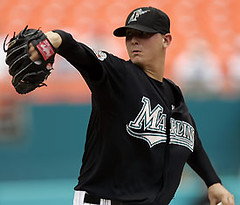
You’ve heard of a player’s uniform prompting a warning letter, and then there are the uniforms that lead to fines. But Marlins pitcher Scott Olsen has taken uni-related insubordination to a new level: In a roundabout way, his uniform got him suspended.
Here’s the deal: Yesterday the Marlins announced that Olsen would be suspended without pay for two games due to “conduct detrimental to the team” — code for “getting into a fight with teammate Sergio Mitre during the 5th inning of Sunday night’s Marlins/Nationals game” (and possibly also code for “being a total asshole for two seasons now,” but we’ll get to that in a sec). The beauty part is spelled out in this Palm Beach Post article, the crucial passage of which reads as follows:
The trouble apparently began with a faulty button on Olsen’s jersey. After Olsen came off the mound in the middle of the fifth inning, he tore off his jersey, threw it at a clubhouse attendant and demanded a new one. Sources said Mitre admonished Olsen for his behavior. That led to the scuffle while third baseman Miguel Cabrera was at bat.
The Miami Herald‘s version is that “Mitre was trying to calm Olsen, who was upset over a broken button on his uniform top.” Alas, neither Olsen’s jersey tirade nor the scuffle itself is visible on the game video. I watched the preceding half-inning to see if the broken button was evident, and it did look like Olsen’s lower jersey might have been flapping open a bit (here’s another view), but he apparently wears it pretty loose down there all the time, so it’s tough to be sure which was the offending piece of plastic.
In any case, this is, to my knowledge, the first time a button has led to a suspension, and maybe the first uni-related suspension, period. There’ve been plenty of equipment-related suspensions and ejections, of course — corked bats, pine tar in the glove, that sort of thing — but I can’t think of any other instances when a uniform issue resulted in a player being put on the shelf.
As for Olsen, if it hadn’t been this, it probably would’ve been something else. By all accounts, he’s a short-tempered prick who’s gotten into fights with teammates at least twice before and was fined just last month for making an obscene gesture to fans in Milwaukee. The press obviously can’t stand him either — my favorite bit is in the Herald‘s story, where writer Clark Spencer straight-facedly refers to him as a “cigarette-smoking southpaw” who “bristled when asked if he had ever thought about enrolling in an anger management course.” Hey, what’s not to love?
(Special thanks to Uni Watch bake-off queen and membership enrollee Elena Elms for bringing this situation to my attention.)
Travel Reminder: I’ll be heading off for an eight-day vacation starting tomorrow. During that time, please send tips, contributions, and questions to Vince, not to me. Fresh content will continue daily, and membership orders will be still be processed.
Also, remember that the next Uni Watch party will take place next Tuesday, July 24th, in Toronto, upstairs at the Imperial Pub and Library.
Uni Watch News Ticker: Yesterday’s entry about the Astros and Colt .45s prompted a contribution from Todd Radom, who forwarded some great pics of an Astrodome groundskeeper and a Colts Colts usher and event staff. … College football news from Idaho State media czar Frank Mercogliano, who writes: “While at the Big Sky Conference meetings [Monday], the coordinator of officials explained that referees will be emphasizing all players must wear their pants below the knee, and they must have their knee pads on. Apparently, there is an infection that some players have been getting from cuts on their exposed knees. Also, Portland State will have new uniforms, and with Jerry Glanville as their head coach, it should come as no surprise that they will wear black. Also, Sacramento State will be debuting a new helmet later this year with new jerseys (they altered their logo slightly).” No pics yet. … Longtime Uni Watch pal and softball comrade Josh Neufield drew this illustration to accompany a Washington Post article about Yankees fans who go to Shea Stadium just to annoy Mets fans. Note the striped tube sox and the complete absence of black from the Mets gear — that’s why Josh is my buddy. … Not quite uni-related, but still pretty interesting. … Still more sloppiness in San Francisco, as the team’s Rod Beck memorial sleeve patch was missing from Bengie Molina’s jersey last night (good catch by Tom Shieber). … Logo creep alert out of Brainerd, Minnesota, where Matt Konrad snapped this shot of a Paul Bunyan statue. No word on whether Babe the Blue Ox was wearing a Reebok nose ring. … Kudos to New York Times Yankees beat writer Tyler Kepner, whose Tuesday-night blog entry was very stirrups-centric and even included a little shout-out to Uni Watch. Thanks, bud. … While researching something else, I happened upon this photo of Mo Vaughn from August of 1999. Anyone know what the “T” on his cap might have been for? … Some killer new designs in the membership card gallery, including this and this. Check out the full gallery here.
Have a great trip. You’ve earned it!
-Wow, my alma mater (Sacramento State) gets a mention in Uni Watch. I’m so proud!
-Speaking of the Rod Beck patch, still no answer from the Giants as to why Beck gets a memorial patch and Jose Uribe, the longtime shortstop from the same era who died in Dec. 2006, does not. This is really bothering me for some reason.
-I caught a glimpse of the back of Reds reliever David Weathers jersey from last night’s game against the Braves and it looked like the ‘5’ in his ’25’ was askew. Can someone provide a screengrab?
Geez, the Redskins just did a throwback a couple of years ago for the 70th anniversay……oh, wait, Little Danny Snyder needs some more money, how could I have forgotten that tidbit….
Re: Mo Vaughn photo – What you can’t see in the link is the letter “E” on the other side of the cap emblem, neatly spelling out Mo’s mantra ;o)
IN an editorial in the Chicago Tribune today the writer asked if there is anything kids can learn from the Cubs. The very first comment read;
“Yea, the kids can learn from the Cubs and the rest of baseball on how not to dress. They all look like slobs. Who is responsible for this slob look of the pants not tucked into the socks? Are these guys ashamed of the traditional and unique baseball uniform? Where’s the commissioner? Oh I’am sorry what a stupid qiestion. How about it Cubs, start dressing like ball players. Ask Soriano he’ll show you how.”
Sign this person up for Uni Watch right now!
Speaking of Mo Vaughn, link is pretty funny.
LOOOVE today’s headline. Enjoy your vacation, Paul.
[quote comment=”121206″]Speaking of Mo Vaughn, link is pretty funny.[/quote]
That IS funny – so is link
Here’s the 2008 NBA All-Star Logo for New Orleans
link
That is a nice Yankees/Mets illustration, but is that a swoosh I see on the Yankees fan’s shoes? I hope it’s not logo creep coming from a Uni Watcher.
link
[quote comment=”121216″]Here’s the 2008 NBA All-Star Logo for New Orleans
link
Meh
I was hanging out on one of my photo forums and I saw a thread with images from the Boston Bruins recent prospect camp, and apparently they haven’t changed their practice jerseys to reflect the new logo (note that I pointed that out toward the bottom of the page lol)
link
Although the pants appear to have the new logo
link
[quote comment=”121218″]That is a nice Yankees/Mets illustration, but is that a swoosh I see on the Yankees fan’s shoes? I hope it’s not logo creep coming from a Uni Watcher.
link
Looks like Converse to me
Anyone else think the facemask on the throwback helmet looks a litte off???
so thats the third nfl throwback with a yellow helmet this year?
[quote comment=”121220″]I was hanging out on one of my photo forums and I saw a thread with images from the Boston Bruins recent prospect camp, and apparently they haven’t changed their practice jerseys to reflect the new logo (note that I pointed that out toward the bottom of the page lol)
link
Although the pants appear to have the new logo
link
Looks like they are really old practice shirts since the NHL Shield is wrong too. It has the writing going down.
Some killer new designs in the membership card gallery, including this and this. Check out the full gallery here
is that one a spirits of st louis card?
dont know if all read the “after work” comments from yesterday but there is a great link to an old toros jersey which i thought for sure would have been included into todays post…
[quote comment=”121205″]
“Who is responsible for this slob look of the pants not tucked into the socks? [/quote]
what? pants tucked into socks? what is he talking about?
[quote comment=”121205″]How about it Cubs, start dressing like ball players. Ask Soriano he’ll show you how.”[/quote]
soriano? skin tight pants worn to the knees? thats not what the traditionalists think looks like a ball player either! soriano, duque, a-rod, they think they go retro… no way man, in my opinion thats the ugliest look in baseball!
now, im a fan of what you traditionalists call the pajama pant look… david wright looks great in his uniform when he wears his pants baggy and with the long inseem. (jeez im sure ill hear it for that statement)
i know i cant speak for all you traditionalists but this guy should be the president of that club…
link
nice stirrups,
tailored baggy pants…
he is one of the few who actually understands how to look that way.
Looking at some Blackhawks prospect camp photos on their site I noticed some were wearing old CCM practice3 sweaters, eventhough the NHL went to the Reebock ones last year. It looks like it’s simply a way for the clubs to get a few extra miles out of stuff they already have.
in last night’s Redsox Kansas City game the KC starter, Leo Nunez, did not have the tilde over the n although his teammate Tony Pena Jr. had one. This strikes me as a glaring uni omission, and I am a Red Sox fan!
RE: The Redskins colors.
Yes, burgundy is one of their colors. But I gotta vent one of my biggest pet peeves. Gold is not yellow. Gold is, for one, a metallic color. And, as a color its more of a light brown.
The New Orleans Saints and Washington Wizards wear gold. The Washington Redskins, Pittsburgh Pirates, and the like wear yellow. Maybe the ‘Skins wear “yellow-orange”, but not gold.
The “T” on Mo Vaughn’s hat stands for: “Oh my God, these uniforms are TERRIBLE!”
[quote comment=”121230″][quote comment=”121205″]How about it Cubs, start dressing like ball players. Ask Soriano he’ll show you how.”[/quote]
soriano? skin tight pants worn to the knees? thats not what the traditionalists think looks like a ball player either! soriano, duque, a-rod, they think they go retro… no way man, in my opinion thats the ugliest look in baseball![/quote]
While I think that the pajamas/slacks are even worse, I am on board with the position that the supertight pants pulled up to the knees looks terrible.
If given a choice between non-baggy long pants that fit tight at the ankle and the Soriano look, give me the long pants every time.
[quote comment=”121227″]so thats the third nfl throwback with a yellow helmet this year?[/quote]
I sense a large collection of “yellow” NFL team logos coming.
[quote comment=”121235″]RE: The Redskins colors.
Yes, burgundy is one of their colors. But I gotta vent one of my biggest pet peeves. Gold is not yellow. Gold is, for one, a metallic color. And, as a color its more of a light brown.
The New Orleans Saints and Washington Wizards wear gold. The Washington Redskins, Pittsburgh Pirates, and the like wear yellow. Maybe the ‘Skins wear “yellow-orange”, but not gold.[/quote]
I have always felt the same way you have about the whole gold/yellow thing. However, the yellow that the Pirates, Packers, etc. wear is called Athletic Gold. The Saints “gold” is sometimes referred to as Vegas Gold, but there are about a million shades of that gold with about a million different names. Therefore, technically the Packers do wear gold. They aren’t fooling me though, I know yellow when I see it.
Those Houston staff photos make me want to cry in the face of today’s neon t-shirted beer shillers.
With the retro stadium phase we went through, it would have been nice if the owners retro-fied the stadium wardrobe closets too.
[quote comment=”121230″]Some killer new designs in the membership card gallery, including this and this. Check out the full gallery here
is that one a spirits of st louis card?[/quote]
Nope — link.
Uni related comment from the Cleveland Indians / Chicago White Sox game last night: Jason Michaels went from 2nd to home on a bloop single by Ryan Garko last night, to win the game in the bottom of the 11th inning.
Postgame interview:
“I couldn’t believe the way J-Mike took off,” Garko said. “That was a great piece of base running. I was just hoping the ball would fall in, and he’d get to third. He had the white cleats on; I guess that made him faster.”
From:
link
ed
[quote comment=”121240″]
[quote comment=”121235″]RE: The Redskins colors.
Yes, burgundy is one of their colors. But I gotta vent one of my biggest pet peeves. Gold is not yellow. Gold is, for one, a metallic color. And, as a color its more of a light brown.
The New Orleans Saints and Washington Wizards wear gold. The Washington Redskins, Pittsburgh Pirates, and the like wear yellow. Maybe the ‘Skins wear “yellow-orange”, but not gold.[/quote]
I have always felt the same way you have about the whole gold/yellow thing. However, the yellow that the Pirates, Packers, etc. wear is called Athletic Gold. The Saints “gold” is sometimes referred to as Vegas Gold, but there are about a million shades of that gold with about a million different names. Therefore, technically the Packers do wear gold. They aren’t fooling me though, I know yellow when I see it.[/quote]
There’s a huge difference between athletic gold and yellow. About as much as there is between teal and royal blue.
Metallic gold is a third color altogether.
Did anybody else see the travesty that I saw last night during the Reds and Braves game. I believe it was during the top or middle of the 6th inning. They showed a shot of the Reds dugout, and I think it was Javier Valentin that I saw with the bottom cuff of his pajama pants pulled over the heel, and the toe of his cleats. He didn’t play any that game, but he looked like a figure skater in the dugout.
Info request regarding NFL jersey personalization:
I have a blank replica Nike Steelers jersey and want to get a current NFL players name and number screen printed on the jersey.
Are there any restrictions since it is not a Reebok jersey?
Anybody know where I can get this done?
please respond to link
[quote comment=”121244″][quote comment=”121240″]
[quote comment=”121235″]RE: The Redskins colors.
Yes, burgundy is one of their colors. But I gotta vent one of my biggest pet peeves. Gold is not yellow. Gold is, for one, a metallic color. And, as a color its more of a light brown.
The New Orleans Saints and Washington Wizards wear gold. The Washington Redskins, Pittsburgh Pirates, and the like wear yellow. Maybe the ‘Skins wear “yellow-orange”, but not gold.[/quote]
I have always felt the same way you have about the whole gold/yellow thing. However, the yellow that the Pirates, Packers, etc. wear is called Athletic Gold. The Saints “gold” is sometimes referred to as Vegas Gold, but there are about a million shades of that gold with about a million different names. Therefore, technically the Packers do wear gold. They aren’t fooling me though, I know yellow when I see it.[/quote]
There’s a huge difference between athletic gold and yellow. About as much as there is between teal and royal blue.
Metallic gold is a third color altogether.[/quote]
Am I right in thinking teams like the Packers and Steelers wear Athletic Gold?
[quote comment=”121227″]so thats the third nfl throwback with a yellow helmet this year?[/quote]
We’re so focused on the Black, Teal, and Red trends of the last 15 years…we apparently missed the much less asthetically pleasing YELLOW FAD!
So that’s great. Last year, the Skins screwed with the uni combo almost all season long. White Jerseys on White pants. (NO! The skins wear white on burgundy pants. Period. End of discussion. White on White is for practice!) So at the end of the season, we finally get that combo back the way it belongs, and now this season, they’ll be wearing these?
I actually don’t mind the yellow helmet and the throwback jersey…I’d just prefer to go with the basic Redskins uniform…the way it’s supposed to be worn. (withOUT multiple pairs of striped socks, Mr. Taylor…ya schmuck.)
[quote comment=”121229″][quote comment=”121220″]I was hanging out on one of my photo forums and I saw a thread with images from the Boston Bruins recent prospect camp, and apparently they haven’t changed their practice jerseys to reflect the new logo (note that I pointed that out toward the bottom of the page lol)
link
Although the pants appear to have the new logo
link
Looks like they are really old practice shirts since the NHL Shield is wrong too. It has the writing going down.[/quote]
Those are the regular practice jersey’s from last season. That one image that looks like the NHL text is going top left to bottom right is probably just an image that was mirrored after the fact.
I have lived in Atlanta for a year now. There are no stores that sell decent sporting apparel here. It’s all Bulldogs, Yellow Jackets, Braves, Falcons, Hawks, Thrashers and of course the flavors of the month (Yankees, Red Sox and etc.) If you did want gear of a different team, it’s almost always of an urban motif.
This past weekend, I was taking my daughters to the Braves game and I would be damned if I let them parade around like hip hop clowns or let their skin burn off by dressing them in Atlanta gear.
So, I went to Distant Replays and let me tell you. That is the greatest store ever. I highly recommend going there. Browse for hours.
Bought my girls retro A’s and Raiders hats and off we went. Of course we were heckled by some KC transplant yokel who felt compelled to yell “chiefs rule. raiders suck.” at my daughters and I. I then told my girls to look the other way and promptly showed this dipshit number 1.
The party in Toronto couldnt come at a worse time…..the onllllly week of the whole summer im out of the city, dangggggit
for those who missed it – a lot of us are posting under our card designs on link. If you are not signed up for it, it is free and relatively painless to register. If you have a link account, I believe you are automatically registered…
It is interesting to see which cards have the most views – almost all of the generic UniWatch designs have virtually no views, but all the unusual ones do – here are some of the leaders: link, link, link.
Have a FUN trip Paul!
link
There has been another button uni malfunction.
On July 21, 2006, you wrote about Kenny Rogers button, popping off and having to change jerseys.
Rogers got a new jersey, but when he walked back on to the field, the umps wouldn’t let him pitch. I remembered this being very strange. Does anyone know why?
Regarding the membership cards… after all these kick-ass designs coming out, how sorry do you think the folks are who went with a generic look for theirs? :)
As per Scott Olsen I was at a Mets-Marlins game last year right before the All-Star break and he berated Miguel Cabrera for not diving for a ball down the third base line, I think they came to blows in the dugout but I couldn’t tell from my vantage point, needless to say he didn’t come out for the next inning…..Paul are all old ABA teams available for membership cards? My dad played for the Utah Stars and I would like to have one of those made.
[quote comment=”121261″]for those who missed it – a lot of us are posting under our card designs on link. If you are not signed up for it, it is free and relatively painless to register. If you have a link account, I believe you are automatically registered…
It is interesting to see which cards have the most views – almost all of the generic UniWatch designs have virtually no views, but all the unusual ones do – here are some of the leaders: link, link, link.
Have a FUN trip Paul!
link[/quote]
Just added my comments for my retro Nuggets card
link
[quote comment=”121242″][quote comment=”121230″]Some killer new designs in the membership card gallery, including this and this. Check out the full gallery here
is that one a spirits of st louis card?[/quote]
Nope — link.[/quote]
dammit! i freaking knew it! close though…
[quote comment=”121256″][quote comment=”121229″][quote comment=”121220″]I was hanging out on one of my photo forums and I saw a thread with images from the Boston Bruins recent prospect camp, and apparently they haven’t changed their practice jerseys to reflect the new logo (note that I pointed that out toward the bottom of the page lol)
link
Although the pants appear to have the new logo
link
Looks like they are really old practice shirts since the NHL Shield is wrong too. It has the writing going down.[/quote]
Those are the regular practice jersey’s from last season. That one image that looks like the NHL text is going top left to bottom right is probably just an image that was mirrored after the fact.[/quote]
While not really something argue over, the shirts are from the first post-lock out season. The practice jerseys were made during the lockout, hence the old sheild. If you looked close Anthony, everything else in the picture was not mirrored!
[quote comment=”121236″]The “T” on Mo Vaughn’s hat stands for: “Oh my God, these uniforms are TERRIBLE!”[/quote]
Strong contender for worst MLB uni ever.
[quote comment=”121264″]Regarding the membership cards… after all these kick-ass designs coming out, how sorry do you think the folks are who went with a generic look for theirs? :)[/quote]
Oh well. Like so many, I was just trying to be a team player. Just wait ’til next year . . . .
Any chance we could get college teams on the membership cards?
[quote comment=”121272″][quote comment=”121236″]The “T” on Mo Vaughn’s hat stands for: “Oh my God, these uniforms are TERRIBLE!”[/quote]
Strong contender for worst MLB uni ever.[/quote]
link one get’s my vote. But it’s very close.
[quote comment=”121265″]Paul are all old ABA teams available for membership cards?[/quote]
Case-by-case basis. If you can provide a rear-view photo, that increases your odds considerably.
[quote comment=”121243″]Uni related comment from the Cleveland Indians / Chicago White Sox game last night: Jason Michaels went from 2nd to home on a bloop single by Ryan Garko last night, to win the game in the bottom of the 11th inning.
Postgame interview:
“I couldn’t believe the way J-Mike took off,” Garko said. “That was a great piece of base running. I was just hoping the ball would fall in, and he’d get to third. He had the white cleats on; I guess that made him faster.”
From:
link
ed[/quote]
link
[quote comment=”121273″][quote comment=”121264″]Regarding the membership cards… after all these kick-ass designs coming out, how sorry do you think the folks are who went with a generic look for theirs? :)[/quote]
Oh well. Like so many, I was just trying to be a team player. Just wait ’til next year . . . .[/quote]
Hey, I’ve gotta stick up for the basic Uni Watch design treatment. It looks sharp, it matches the colors of the rest of the card, it’s a nice gesture of Uni Watch solidarity, and it avoids the one-upmanship factor. I chose that treatment myself, and I have no regrets.
Of course, I like the team designs too. But don’t make it sound like the Uni Watch design is some sort of loser option.
[quote comment=”121283″][quote comment=”121243″]Uni related comment from the Cleveland Indians / Chicago White Sox game last night: Jason Michaels went from 2nd to home on a bloop single by Ryan Garko last night, to win the game in the bottom of the 11th inning.
Postgame interview:
“I couldn’t believe the way J-Mike took off,” Garko said. “That was a great piece of base running. I was just hoping the ball would fall in, and he’d get to third. He had the white cleats on; I guess that made him faster.”
From:
link
ed[/quote]
link[/quote]
I’m more bothered by the ‘J-Mike’ nickname. Could you be more unoriginal?
[quote comment=”121256″][quote comment=”121229″][quote comment=”121220″]I was hanging out on one of my photo forums and I saw a thread with images from the Boston Bruins recent prospect camp, and apparently they haven’t changed their practice jerseys to reflect the new logo (note that I pointed that out toward the bottom of the page lol)
link
Although the pants appear to have the new logo
link
Looks like they are really old practice shirts since the NHL Shield is wrong too. It has the writing going down.[/quote]
Those are the regular practice jersey’s from last season. That one image that looks like the NHL text is going top left to bottom right is probably just an image that was mirrored after the fact.[/quote]
No, it definitely wasn’t mirrored (I don’t know how why any photographer would waste their time mirroring one logo in the photo). But if you look in the first link again you can notice some have the NHL logo the new way and some have it the old way (number 6 and the 2nd link above), which is odd really.
[quote comment=”121235″]RE: The Redskins colors.
Yes, burgundy is one of their colors. But I gotta vent one of my biggest pet peeves. Gold is not yellow. Gold is, for one, a metallic color. And, as a color its more of a light brown.
The New Orleans Saints and Washington Wizards wear gold. The Washington Redskins, Pittsburgh Pirates, and the like wear yellow. Maybe the ‘Skins wear “yellow-orange”, but not gold.[/quote]
How about “goldenrod”?
[quote comment=”121286″][quote comment=”121273″][quote comment=”121264″]Regarding the membership cards… after all these kick-ass designs coming out, how sorry do you think the folks are who went with a generic look for theirs? :)[/quote]
Oh well. Like so many, I was just trying to be a team player. Just wait ’til next year . . . .[/quote]
Hey, I’ve gotta stick up for the basic Uni Watch design treatment. It looks sharp, it matches the colors of the rest of the card, it’s a nice gesture of Uni Watch solidarity, and it avoids the one-upmanship factor. I chose that treatment myself, and I have no regrets.
Of course, I like the team designs too. But don’t make it sound like the Uni Watch design is some sort of loser option.[/quote]
This may or may not have played a part in anyone’s card design choice, but if someone else had wanted to get, say, the rainbow Nuggets jersey or the cable-car Warriors design, I hope they haven’t felt like they should come up with something else because their first choice was ‘taken’ by someone else. OK, that was a serious run-on sentence. Sorry.
[quote comment=”121244″][quote comment=”121240″]
[quote comment=”121235″]RE: The Redskins colors.
Yes, burgundy is one of their colors. But I gotta vent one of my biggest pet peeves. Gold is not yellow. Gold is, for one, a metallic color. And, as a color its more of a light brown.
The New Orleans Saints and Washington Wizards wear gold. The Washington Redskins, Pittsburgh Pirates, and the like wear yellow. Maybe the ‘Skins wear “yellow-orange”, but not gold.[/quote]
I have always felt the same way you have about the whole gold/yellow thing. However, the yellow that the Pirates, Packers, etc. wear is called Athletic Gold. The Saints “gold” is sometimes referred to as Vegas Gold, but there are about a million shades of that gold with about a million different names. Therefore, technically the Packers do wear gold. They aren’t fooling me though, I know yellow when I see it.[/quote]
There’s a huge difference between athletic gold and yellow. About as much as there is between teal and royal blue.
Metallic gold is a third color altogether.[/quote]
Athletic gold
link
OK Guys..I did the coolest thing I have ever done yesterday..I got to take BP and play a game at Camden Yards! It was part of a Miller Lite promo for top customers (my uncle works at a big bar).
Check out thelink. There is something too cool about being served a beer in the dugout by the Oriole Bird. We all got #8 cool base jerseys to wear, but the only downfall from the day was that my last name was misspelled on my uncle’s and my jerseys!
And now I know that like most of the O’s, I have warning track power! haha
[quote comment=”121220″]I was hanging out on one of my photo forums and I saw a thread with images from the Boston Bruins recent prospect camp, and apparently they haven’t changed their practice jerseys to reflect the new logo (note that I pointed that out toward the bottom of the page lol)
link
Although the pants appear to have the new logo
link
The practice jerseys are of little concern to Rbk Hockey at this point. The pants are part of the new “uniform system” so they would have the new logo attached to them.
Watching Bronx is Burning last night I noticed the Billy Martin charachter wore different jersey numbers. At batting practive he had on #1 and then later when he waqs dressing for a game letting Reggie pick the batting order, he had on 37 or 47 (don’t remember which one). Can any of you veterans explain?
Watching Bronx is Burning last night I noticed the Billy Martin charachter wore different jersey numbers. At batting practive he had on #1 and then later when he was dressing for a game letting Reggie pick the batting order, he had on 37 or 47 (don’t remember which one). Can any of you veterans explain?
[quote comment=”121251″][quote comment=”121244″][quote comment=”121240″]
[quote comment=”121235″]RE: The Redskins colors.
Yes, burgundy is one of their colors. But I gotta vent one of my biggest pet peeves. Gold is not yellow. Gold is, for one, a metallic color. And, as a color its more of a light brown.
The New Orleans Saints and Washington Wizards wear gold. The Washington Redskins, Pittsburgh Pirates, and the like wear yellow. Maybe the ‘Skins wear “yellow-orange”, but not gold.[/quote]
I have always felt the same way you have about the whole gold/yellow thing. However, the yellow that the Pirates, Packers, etc. wear is called Athletic Gold. The Saints “gold” is sometimes referred to as Vegas Gold, but there are about a million shades of that gold with about a million different names. Therefore, technically the Packers do wear gold. They aren’t fooling me though, I know yellow when I see it.[/quote]
There’s a huge difference between athletic gold and yellow. About as much as there is between teal and royal blue.
Metallic gold is a third color altogether.[/quote]
Am I right in thinking teams like the Packers and Steelers wear Athletic Gold?[/quote]
Funny that somebody else brought this up. This has always been one my utterly pointless pet peeves too. Here’s the simple answer for those of you who follow college sports, and particularly the Big 10.
link is yellow. link is gold.
[quote comment=”121286″][quote comment=”121273″][quote comment=”121264″]Regarding the membership cards… after all these kick-ass designs coming out, how sorry do you think the folks are who went with a generic look for theirs? :)[/quote]
Oh well. Like so many, I was just trying to be a team player. Just wait ’til next year . . . .[/quote]
Hey, I’ve gotta stick up for the basic Uni Watch design treatment. It looks sharp, it matches the colors of the rest of the card, it’s a nice gesture of Uni Watch solidarity, and it avoids the one-upmanship factor. I chose that treatment myself, and I have no regrets.
Of course, I like the team designs too. But don’t make it sound like the Uni Watch design is some sort of loser option.[/quote]
Loser option? No. However, it is a nice option for all you Viking, Rockie and Huskie fans.
[quote comment=”121299″][quote comment=”121244″][quote comment=”121240″]
[quote comment=”121235″]RE: The Redskins colors.
Yes, burgundy is one of their colors. But I gotta vent one of my biggest pet peeves. Gold is not yellow. Gold is, for one, a metallic color. And, as a color its more of a light brown.
The New Orleans Saints and Washington Wizards wear gold. The Washington Redskins, Pittsburgh Pirates, and the like wear yellow. Maybe the ‘Skins wear “yellow-orange”, but not gold.[/quote]
I have always felt the same way you have about the whole gold/yellow thing. However, the yellow that the Pirates, Packers, etc. wear is called Athletic Gold. The Saints “gold” is sometimes referred to as Vegas Gold, but there are about a million shades of that gold with about a million different names. Therefore, technically the Packers do wear gold. They aren’t fooling me though, I know yellow when I see it.[/quote]
There’s a huge difference between athletic gold and yellow. About as much as there is between teal and royal blue.
Metallic gold is a third color altogether.[/quote]
Athletic gold
link[/quote]
Well, here in DC, we have a the Yellow Cab Co, who’s cars are orange. I’ve never been able to figure that one out.
[quote comment=”121299″][quote comment=”121244″][quote comment=”121240″]
[quote comment=”121235″]RE: The Redskins colors.
Yes, burgundy is one of their colors. But I gotta vent one of my biggest pet peeves. Gold is not yellow. Gold is, for one, a metallic color. And, as a color its more of a light brown.
The New Orleans Saints and Washington Wizards wear gold. The Washington Redskins, Pittsburgh Pirates, and the like wear yellow. Maybe the ‘Skins wear “yellow-orange”, but not gold.[/quote]
I have always felt the same way you have about the whole gold/yellow thing. However, the yellow that the Pirates, Packers, etc. wear is called Athletic Gold. The Saints “gold” is sometimes referred to as Vegas Gold, but there are about a million shades of that gold with about a million different names. Therefore, technically the Packers do wear gold. They aren’t fooling me though, I know yellow when I see it.[/quote]
There’s a huge difference between athletic gold and yellow. About as much as there is between teal and royal blue.
Metallic gold is a third color altogether.[/quote]
Athletic gold
link[/quote]
The “link“
[quote comment=”121304″]Watching Bronx is Burning last night I noticed the Billy Martin charachter wore different jersey numbers. At batting practive he had on #1 and then later when he was dressing for a game letting Reggie pick the batting order, he had on 37 or 47 (don’t remember which one). Can any of you veterans explain?[/quote]
37 is Casey Stengel’s number. Don’t know why Billy Martin would be wearing it. BTW, why does John Turturro portray Billy Martin with a southern accent when Martin is from Oakland?
[quote comment=”121261″]for those who missed it – a lot of us are posting under our card designs on link. If you are not signed up for it, it is free and relatively painless to register. If you have a link account, I believe you are automatically registered…
It is interesting to see which cards have the most views – almost all of the generic UniWatch designs have virtually no views, but all the unusual ones do – here are some of the leaders: link, link, link.
Have a FUN trip Paul!
link[/quote]
Following the link, the comment that the Pilots are the only MLB team to play for only one season is incorrect. Each team in the Union Association and Players League played for only one season (both are considered major leagues), and numerous NL and American Association teams only lasted one season prior to 1900. Even if you only look at modern MLB history, the Milwaukee Brewers fielded a team in the American League’s first season, 1901, then moved to St. Louis and became the Browns.
[quote comment=”121309″][quote comment=”121304″]Watching Bronx is Burning last night I noticed the Billy Martin charachter wore different jersey numbers. At batting practive he had on #1 and then later when he was dressing for a game letting Reggie pick the batting order, he had on 37 or 47 (don’t remember which one). Can any of you veterans explain?[/quote]
37 is Casey Stengel’s number. Don’t know why Billy Martin would be wearing it. BTW, why does John Turturro portray Billy Martin with a southern accent when Martin is from Oakland?[/quote]
Did any of you see Transformers? Turturro played his whole character as an impersonation of the Any Given Sunday/Devil’s Advocate Al Pacino. I expected a “HOO-AHH!”
Kudos to the Sonics throwback design…I’ve been leaning towards the home version of that for my membership card.
[quote comment=”121261″
It is interesting to see which cards have the most views – almost all of the generic UniWatch designs have virtually no views, but all the unusual ones do – here are some of the leaders: link, link, link.
Have a FUN trip Paul!
link[/quote]
My card has quite a few views, and it is “just a generic card” (though it does have an unusual number).
[quote comment=”121309″][quote comment=”121304″]Watching Bronx is Burning last night I noticed the Billy Martin charachter wore different jersey numbers. At batting practive he had on #1 and then later when he was dressing for a game letting Reggie pick the batting order, he had on 37 or 47 (don’t remember which one). Can any of you veterans explain?[/quote]
37 is Casey Stengel’s number. Don’t know why Billy Martin would be wearing it. BTW, why does John Turturro portray Billy Martin with a southern accent when Martin is from Oakland?[/quote]
I think it was 47…
[quote comment=”121300″]OK Guys..I did the coolest thing I have ever done yesterday..I got to take BP and play a game at Camden Yards! It was part of a Miller Lite promo for top customers (my uncle works at a big bar).
Check out thelink. There is something too cool about being served a beer in the dugout by the Oriole Bird. We all got #8 cool base jerseys to wear, but the only downfall from the day was that my last name was misspelled on my uncle’s and my jerseys!
And now I know that like most of the O’s, I have warning track power! haha[/quote]
That’s very, very awesome. Looks like the weather cooperated as well. I’m pretty damn jeleous.
that Redskins throwback uni was brought in by Lombardi when he briefly was coach…it’s as close to the Packers design as he could get. the next coach, George Allen, introduced the current helmet, but kept the jersey (but back to burgundy), pants, stripe patterns, etc.
[quote comment=”121309″]BTW, why does John Turturro portray Billy Martin with a southern accent when Martin is from Oakland?[/quote]
I was wondering that too. Martin spent some time in Texas with Mickey Mantle, and he managed in Arlington for a short time, but he certainly didn’t spend enough time there to pick up the accent. Do people from Oakland even have an accent?
[quote comment=”121286″][quote comment=”121273″][quote comment=”121264″]Regarding the membership cards… after all these kick-ass designs coming out, how sorry do you think the folks are who went with a generic look for theirs? :)[/quote]
Oh well. Like so many, I was just trying to be a team player. Just wait ’til next year . . . .[/quote]
Hey, I’ve gotta stick up for the basic Uni Watch design treatment. It looks sharp, it matches the colors of the rest of the card, it’s a nice gesture of Uni Watch solidarity, and it avoids the one-upmanship factor. I chose that treatment myself, and I have no regrets.
Of course, I like the team designs too. But don’t make it sound like the Uni Watch design is some sort of loser option.[/quote]
Oh, not what I was trying to say at all. It’s a perfectly fine look by itself. As for the customs, who sees it as nyah-nyah-top-this one-upmanship? I see it as peoples’ creative juices flowing myself… that’s the beauty of this whole deal.
[quote comment=”121308″][quote comment=”121299″][quote comment=”121244″][quote comment=”121240″]
[quote comment=”121235″]RE: The Redskins colors.
Yes, burgundy is one of their colors. But I gotta vent one of my biggest pet peeves. Gold is not yellow. Gold is, for one, a metallic color. And, as a color its more of a light brown.
The New Orleans Saints and Washington Wizards wear gold. The Washington Redskins, Pittsburgh Pirates, and the like wear yellow. Maybe the ‘Skins wear “yellow-orange”, but not gold.[/quote]
I have always felt the same way you have about the whole gold/yellow thing. However, the yellow that the Pirates, Packers, etc. wear is called Athletic Gold. The Saints “gold” is sometimes referred to as Vegas Gold, but there are about a million shades of that gold with about a million different names. Therefore, technically the Packers do wear gold. They aren’t fooling me though, I know yellow when I see it.[/quote]
There’s a huge difference between athletic gold and yellow. About as much as there is between teal and royal blue.
Metallic gold is a third color altogether.[/quote]
Athletic gold
link[/quote]
The “link“[/quote]
As a WVU alum I am not so sure that color has really ever been “Old Gold”
[quote comment=”121300″]OK Guys..I did the coolest thing I have ever done yesterday..I got to take BP and play a game at Camden Yards! It was part of a Miller Lite promo for top customers (my uncle works at a big bar).
Check out thelink. There is something too cool about being served a beer in the dugout by the Oriole Bird. We all got #8 cool base jerseys to wear, but the only downfall from the day was that my last name was misspelled on my uncle’s and my jerseys!
And now I know that like most of the O’s, I have warning track power! haha[/quote]
joe! thats freaking awesome!!! but with your background, you should be able to make the necessary adjustments to change the name, no?
the best thing about that jersey now, is that after yesterday, it became a game worn jersey!
oh, and warning track power? worst power to have…
[quote comment=”121323″][quote comment=”121300″]OK Guys..I did the coolest thing I have ever done yesterday..I got to take BP and play a game at Camden Yards! It was part of a Miller Lite promo for top customers (my uncle works at a big bar).
Check out thelink. There is something too cool about being served a beer in the dugout by the Oriole Bird. We all got #8 cool base jerseys to wear, but the only downfall from the day was that my last name was misspelled on my uncle’s and my jerseys!
And now I know that like most of the O’s, I have warning track power! haha[/quote]
joe! thats freaking awesome!!! but with your background, you should be able to make the necessary adjustments to change the name, no?
the best thing about that jersey now, is that after yesterday, it became a game worn jersey!
oh, and warning track power? worst power to have…[/quote]
Except for maybe the Wonder-twin powers. I mean, what is that…”shape of an icicle?!” That’s a pretty lousy power.
That is really cool. We had a similar outting the Bowie stadium…but a HUGE thunderstorm moved through before I was able to bat.
[quote comment=”121318″][quote comment=”121309″]BTW, why does John Turturro portray Billy Martin with a southern accent when Martin is from Oakland?[/quote]
I was wondering that too. Martin spent some time in Texas with Mickey Mantle, and he managed in Arlington for a short time, but he certainly didn’t spend enough time there to pick up the accent. Do people from Oakland even have an accent?[/quote]
They sound like Joe Morgan.
[quote comment=”121244″][quote comment=”121240″]
[quote comment=”121235″]RE: The Redskins colors.
Yes, burgundy is one of their colors. But I gotta vent one of my biggest pet peeves. Gold is not yellow. Gold is, for one, a metallic color. And, as a color its more of a light brown.
The New Orleans Saints and Washington Wizards wear gold. The Washington Redskins, Pittsburgh Pirates, and the like wear yellow. Maybe the ‘Skins wear “yellow-orange”, but not gold.[/quote]
I have always felt the same way you have about the whole gold/yellow thing. However, the yellow that the Pirates, Packers, etc. wear is called Athletic Gold. The Saints “gold” is sometimes referred to as Vegas Gold, but there are about a million shades of that gold with about a million different names. Therefore, technically the Packers do wear gold. They aren’t fooling me though, I know yellow when I see it.[/quote]
There’s a huge difference between athletic gold and yellow. About as much as there is between teal and royal blue.
Metallic gold is a third color altogether.[/quote]
Of course there is. I just don’t like the term “Gold”. I mean… call it Athletic Yellow. BECAUSE IT IS! :)
I’m totally being picky, I know. And I’m a Saints fan so that opens me up to thing being a completely snarky biased comment…
But a printed 4 color photo of a brick of gold has more Cyan and Magenta combined than it does Yellow.
[quote comment=”121308″][quote comment=”121299″][quote comment=”121244″][quote comment=”121240″]
[quote comment=”121235″]RE: The Redskins colors.
Yes, burgundy is one of their colors. But I gotta vent one of my biggest pet peeves. Gold is not yellow. Gold is, for one, a metallic color. And, as a color its more of a light brown.
The New Orleans Saints and Washington Wizards wear gold. The Washington Redskins, Pittsburgh Pirates, and the like wear yellow. Maybe the ‘Skins wear “yellow-orange”, but not gold.[/quote]
I have always felt the same way you have about the whole gold/yellow thing. However, the yellow that the Pirates, Packers, etc. wear is called Athletic Gold. The Saints “gold” is sometimes referred to as Vegas Gold, but there are about a million shades of that gold with about a million different names. Therefore, technically the Packers do wear gold. They aren’t fooling me though, I know yellow when I see it.[/quote]
There’s a huge difference between athletic gold and yellow. About as much as there is between teal and royal blue.
Metallic gold is a third color altogether.[/quote]
Athletic gold
link[/quote]
The “link“[/quote]
Hmmmmm…. that athletic gold there looks a lot like organge, or yellow-orange to me?
It would be like calling a grey-blue “Athletic Silver”
:)
Count me in as hating the tight, hiked up A-Rod/Soriano pants look. While I can’t stand the pajama look, I’d take baggy and long over tight and hiked any day.
Obviously, the ideal is baggy and hiked, but sadly we pretty much only see that on throwback nights.
[quote comment=”121290″][quote comment=”121235″]RE: The Redskins colors.
Yes, burgundy is one of their colors. But I gotta vent one of my biggest pet peeves. Gold is not yellow. Gold is, for one, a metallic color. And, as a color its more of a light brown.
The New Orleans Saints and Washington Wizards wear gold. The Washington Redskins, Pittsburgh Pirates, and the like wear yellow. Maybe the ‘Skins wear “yellow-orange”, but not gold.[/quote]
How about “goldenrod”?[/quote]
This reminds me of an episode of the Simpsons where Lisa was at a copy shop having something printed. She said she wanted “25 on canary, 25 on goldrenrod, 25 on saffron, and 25 on sunflower [or something like that]” and the guy says “Ok, 100 yellow it is”.
From the Philadelphia Flyers:
“In preparation of the National Hockey League’s league-wide uniform innovation, the Philadelphia Flyers have announced an exclusive pre-order for their new jerseys. The pre-order will run through Sunday, September 16 when the jersey is officially unveiled at the Virtua Health Flyers Skate Zone at Voorhees.”
September 16th if you’re a Flyers fan will be a big day. Anyone wanna volunteer to go to the unveiling?
Thanks for the Kepner link. I’ve been wondering if Guidry has been wearing real stirrups or the 2-in-1 socks. It’s hard to tell link.
link. Looks like he wears a lower profile stirrup (is that even the correct term?). It looks kind of weird since he wears the pant legs low too.
On a side note, Donnie really needs to grow his mustache back.
[quote comment=”121327″][quote comment=”121318″][quote comment=”121309″]BTW, why does John Turturro portray Billy Martin with a southern accent when Martin is from Oakland?[/quote]
I was wondering that too. Martin spent some time in Texas with Mickey Mantle, and he managed in Arlington for a short time, but he certainly didn’t spend enough time there to pick up the accent. Do people from Oakland even have an accent?[/quote]
They sound like Joe Morgan.[/quote]
Ahem.
I am from Oakland and my accent has been described to me as black latino surfer with a hint of gay.
Take it or leave it.
[quote comment=”121336″][quote comment=”121327″][quote comment=”121318″][quote comment=”121309″]BTW, why does John Turturro portray Billy Martin with a southern accent when Martin is from Oakland?[/quote]
I was wondering that too. Martin spent some time in Texas with Mickey Mantle, and he managed in Arlington for a short time, but he certainly didn’t spend enough time there to pick up the accent. Do people from Oakland even have an accent?[/quote]
They sound like Joe Morgan.[/quote]
Ahem.
I am from Oakland and my accent has been described to me as black latino surfer with a hint of gay.
Take it or leave it.[/quote]
BTW. Billy Martin had a fascination with western wear. I believe he even owned a western wear store.
The dude had issues.
[quote comment=”121333″]From the Philadelphia Flyers:
“In preparation of the National Hockey League’s league-wide uniform innovation, the Philadelphia Flyers have announced an exclusive pre-order for their new jerseys. The pre-order will run through Sunday, September 16 when the jersey is officially unveiled at the Virtua Health Flyers Skate Zone at Voorhees.”
September 16th if you’re a Flyers fan will be a big day. Anyone wanna volunteer to go to the unveiling?[/quote]
1. Please tell me it’s no different, or I will go ballistic on Ed Snider.
2. I live fairly close, but still won’t be able to drive. Maybe my loving parents will take me. No promises.
How about “goldenrod”?[/quote]
“Hurry up link or you’re going to become a permanent resident!” So lame, but I thought of that line from Empire Strikes Back the second I read that post.
Anyway, I too have the pet-peave regarding yellow versus gold. I find that the Steelers (who I like) and Michigan (who I think wears the most overrated uniform in history) are the worst offenders. Both wear a color variation known as athletic gold, which is a cheesy way of saying “shade of yellow”. I don’t know what the hell maize is, but it sure looks like yellow to me. WVU wears athletic gold, but calls it link.
This fight happens about every three months.
I can’t find the link for the Redskins throwbacks, could somebody please post it. Thanks,
The LA Galaxy wore their white uniforms for the first half of last night’s “World Series of Football” (glorified exhibition) match against Mexican side Tigres (link) and then switched to the new Beckham-era uniforms in the second half (link).
They lost 1-0 with the whites and 2-0 with the blues for a 3-0 loss overall.
[quote comment=”121264″]Regarding the membership cards… after all these kick-ass designs coming out, how sorry do you think the folks are who went with a generic look for theirs? :)[/quote]
I went with the original custom (not generic by any stretch) UniWatch design and am glad I did. It includes my favorite color and the option for vertical arching. None of the designs available at initial sign-up for any of my teams had that going for them. It also marks me as a very early adopter. More than that, as someone else alluded, it’s a sign of solidarity with UniWatch all around.
BTW – I’d think twice before characterizing Mr. SMX Turner’s work as “generic”.
how cool is this picture?
link
Oh yea, maize is type of corn, so I did know what the hell maize is. Funny that Michigan doesn’t go by corn and blue.
[quote comment=”121346″]how cool is this picture?
link
Um… as cool as the rest of the gallery… which is not at all? :o)
Seriously… I don’t see anything cool about it aside from the striped socks.
[quote comment=”121347″]Oh yea, maize is type of corn, so I did know what the hell maize is. Funny that Michigan doesn’t go by corn and blue.[/quote]
You’d think that Iowa would adopt “corn and black” as their colors, following Jesse’s logic – and since I have friends from Iowa, I think they would be proud to advertise their school colors as such….now Iowa State – THAT’S yellow
[quote comment=”121347″]Oh yea, maize is type of corn, so I did know what the hell maize is. Funny that Michigan doesn’t go by corn and blue.[/quote]
I’m going to make an assumption that you have some sort of connection with Ohio State (who, thankfully, have is no argument about their colors)…
Maize, I believe, is a variation on the spanish word for “corn”, and I do believe it is a lot cooler word than “yellow” or “gold”.
Now, let’s talk about the “Cream and Crimson” that my school puts on its uniforms. I’ve been to enough sports games at this university to know that everything is WHITE. There hasn’t been a cream-colored uni element since, I think the 80s or 90s.
[quote comment=”121349″][quote comment=”121347″]Oh yea, maize is type of corn, so I did know what the hell maize is. Funny that Michigan doesn’t go by corn and blue.[/quote]
You’d think that Iowa would adopt “corn and black” as their colors, following Jesse’s logic – and since I have friends from Iowa, I think they would be proud to advertise their school colors as such….now Iowa State – THAT’S yellow[/quote]
Corn and Black would pretty quickly devolve into a pretty unpleasant visual.
[quote comment=”121341″]I can’t find the link for the Redskins throwbacks, could somebody please post it. Thanks,[/quote]
I second this motion. I combed the official website for that, but I can’t find whatever everyone’s referencing. (oh man, if they’re wearing the yellow “R” helmets, I will jump for joy)
BTW, why does John Turturro portray Billy Martin with a southern accent when Martin is from Oakland?
I thought he was impersonating James Caan impersonating Brian Piccolo. I hope at the end of the series, Reggie Jackson doesn’t say “I love Billy Martin”
[quote comment=”121326″][quote comment=”121323″][quote comment=”121300″]OK Guys..I did the coolest thing I have ever done yesterday..I got to take BP and play a game at Camden Yards! It was part of a Miller Lite promo for top customers (my uncle works at a big bar).
Check out thelink. There is something too cool about being served a beer in the dugout by the Oriole Bird. We all got #8 cool base jerseys to wear, but the only downfall from the day was that my last name was misspelled on my uncle’s and my jerseys!
And now I know that like most of the O’s, I have warning track power! haha[/quote]
joe! thats freaking awesome!!! but with your background, you should be able to make the necessary adjustments to change the name, no?
the best thing about that jersey now, is that after yesterday, it became a game worn jersey!
oh, and warning track power? worst power to have…[/quote]
Except for maybe the Wonder-twin powers. I mean, what is that…”shape of an icicle?!” That’s a pretty lousy power.
That is really cool. We had a similar outting the Bowie stadium…but a HUGE thunderstorm moved through before I was able to bat.[/quote]
I forgot to mention this too, duh –
I was lucky enough to spend some time with link, and I asked his about any uni-related tidbits from his career. First off he said he hated the switch from wool to knit polyesther. Although wool was heavier, he said it kept the players skin cool, which helped in the summer.
Then he talked about his shirt sleeves. He would have his cut down the seam and through the arm pit, then have a piece of elastic fabric sewn in because his arms were so big. He didn’t feel like he had any freedom of motion in the basic wool jersey.
This led him in 1966 to request that the team use a vest style jersey so he could wear a t-shirt. I was surprised that players had that kind of pull with the uni-decisions and he said, “We’ll I did hit 34 home runs, so they better listen.”
In link but it only lasted 1 year (despite what the HOF site says) because the pitchers, led by Jim Palmer, hated them. He was sad to see them go.
He was a very friendly guy who was very fun to share a beer with!
[quote comment=”121354″][quote comment=”121326″][quote comment=”121323″][quote comment=”121300″]OK Guys..I did the coolest thing I have ever done yesterday..I got to take BP and play a game at Camden Yards! It was part of a Miller Lite promo for top customers (my uncle works at a big bar).
Check out thelink. There is something too cool about being served a beer in the dugout by the Oriole Bird. We all got #8 cool base jerseys to wear, but the only downfall from the day was that my last name was misspelled on my uncle’s and my jerseys!
And now I know that like most of the O’s, I have warning track power! haha[/quote]
joe! thats freaking awesome!!! but with your background, you should be able to make the necessary adjustments to change the name, no?
the best thing about that jersey now, is that after yesterday, it became a game worn jersey!
oh, and warning track power? worst power to have…[/quote]
Except for maybe the Wonder-twin powers. I mean, what is that…”shape of an icicle?!” That’s a pretty lousy power.
That is really cool. We had a similar outting the Bowie stadium…but a HUGE thunderstorm moved through before I was able to bat.[/quote]
I forgot to mention this too, duh –
I was lucky enough to spend some time with link, and I asked his about any uni-related tidbits from his career. First off he said he hated the switch from wool to knit polyesther. Although wool was heavier, he said it kept the players skin cool, which helped in the summer.
Then he talked about his shirt sleeves. He would have his cut down the seam and through the arm pit, then have a piece of elastic fabric sewn in because his arms were so big. He didn’t feel like he had any freedom of motion in the basic wool jersey.
This led him in 1966 to request that the team use a vest style jersey so he could wear a t-shirt. I was surprised that players had that kind of pull with the uni-decisions and he said, “We’ll I did hit 34 home runs, so they better listen.”
In link but it only lasted 1 year (despite what the HOF site says) because the pitchers, led by Jim Palmer, hated them. He was sad to see them go.
He was a very friendly guy who was very fun to share a beer with![/quote]
One thing I will definitely miss about Camden Yards was that big cloud of barbeque smoke drifting in from right field. I never did get to try Boog’s BBQ because the lines were so long, so maybe I’ll get back there one of these days. Congrats on getting to take the field and hang out with these guys, Joe.
[quote comment=”121354″][quote comment=”121326″][quote comment=”121323″][quote comment=”121300″]OK Guys..I did the coolest thing I have ever done yesterday..I got to take BP and play a game at Camden Yards! It was part of a Miller Lite promo for top customers (my uncle works at a big bar).
Check out thelink. There is something too cool about being served a beer in the dugout by the Oriole Bird. We all got #8 cool base jerseys to wear, but the only downfall from the day was that my last name was misspelled on my uncle’s and my jerseys!
And now I know that like most of the O’s, I have warning track power! haha[/quote]
joe! thats freaking awesome!!! but with your background, you should be able to make the necessary adjustments to change the name, no?
the best thing about that jersey now, is that after yesterday, it became a game worn jersey!
oh, and warning track power? worst power to have…[/quote]
Except for maybe the Wonder-twin powers. I mean, what is that…”shape of an icicle?!” That’s a pretty lousy power.
That is really cool. We had a similar outting the Bowie stadium…but a HUGE thunderstorm moved through before I was able to bat.[/quote]
I forgot to mention this too, duh –
I was lucky enough to spend some time with link, and I asked his about any uni-related tidbits from his career. First off he said he hated the switch from wool to knit polyesther. Although wool was heavier, he said it kept the players skin cool, which helped in the summer.
Then he talked about his shirt sleeves. He would have his cut down the seam and through the arm pit, then have a piece of elastic fabric sewn in because his arms were so big. He didn’t feel like he had any freedom of motion in the basic wool jersey.
This led him in 1966 to request that the team use a vest style jersey so he could wear a t-shirt. I was surprised that players had that kind of pull with the uni-decisions and he said, “We’ll I did hit 34 home runs, so they better listen.”
In link but it only lasted 1 year (despite what the HOF site says) because the pitchers, led by Jim Palmer, hated them. He was sad to see them go.
He was a very friendly guy who was very fun to share a beer with![/quote]
That’s just the perfect O’s combo. The best hat and the best uniform(s).
You should have asked Boog Powell about the infamous “blood clot” uniforms in Cleveland, of which he was not so fond. I would love to know whether his opinion of them has changed in the intervening 30 years.
[quote comment=”121230″]He was a very friendly guy who was very fun to share a beer with![/quote]
And thanks for thinking to ask him about the Uni Issues. The information about the vests is really interesting.
At the University of Denver there’s a student movement to bring back the old Pioneers logo and mascot. The original logo was hand drawn by Walt Disney himself, the new one is a “non gender specific” mascot that they introduced in 1997. Check out the logos.
Current Logo
link
Old (and much better) Logo
link
I just found this travesty of manliness and logo creep from le Tour.
link
[quote comment=”121328″][quote comment=”121244″][quote comment=”121240″]
[quote comment=”121235″]RE: The Redskins colors.
Yes, burgundy is one of their colors. But I gotta vent one of my biggest pet peeves. Gold is not yellow. Gold is, for one, a metallic color. And, as a color its more of a light brown.
The New Orleans Saints and Washington Wizards wear gold. The Washington Redskins, Pittsburgh Pirates, and the like wear yellow. Maybe the ‘Skins wear “yellow-orange”, but not gold.[/quote]
I have always felt the same way you have about the whole gold/yellow thing. However, the yellow that the Pirates, Packers, etc. wear is called Athletic Gold. The Saints “gold” is sometimes referred to as Vegas Gold, but there are about a million shades of that gold with about a million different names. Therefore, technically the Packers do wear gold. They aren’t fooling me though, I know yellow when I see it.[/quote]
There’s a huge difference between athletic gold and yellow. About as much as there is between teal and royal blue.
Metallic gold is a third color altogether.[/quote]
Of course there is. I just don’t like the term “Gold”. I mean… call it Athletic Yellow. BECAUSE IT IS! :)
[/quote]
But it isn’t yellow, any more than teal ought to be called “green”. The names do mean things, after all. Gold the color is separate and distinct from yellow the color.
The color was originally intended to be a representation of the metal, so it has an historical claim on the name.
Has anyone seen photos of the New York Titans thrownback uniforms the J-E-T-S will wear this season?
Anybody intending to head to the Library Pub in Toronto on Tuesday(my old university drinking grounds of all places)?
[quote comment=”121360″]At the University of Denver there’s a student movement to bring back the old Pioneers logo and mascot. The original logo was hand drawn by Walt Disney himself, the new one is a “non gender specific” mascot that they introduced in 1997. Check out the logos.
Current Logo
link
Old (and much better) Logo
link
That has to be one of the worst logo changes ever. That currrent logo is just awful. If it wasn’t for the beak and the eyeball you wouldn’t be able to tell what it was.
Paul mentioned what should be worn to throw out a first pitch, but what about singing “Take Me Out to the Ballgame” (You may want to mute this)
link
[quote comment=”121360″]At the University of Denver there’s a student movement to bring back the old Pioneers logo and mascot. The original logo was hand drawn by Walt Disney himself, the new one is a “non gender specific” mascot that they introduced in 1997. Check out the logos.
Current Logo
link
Old (and much better) Logo
link
Viva Denver Boone!
Abajo prairie chicken – er- “pioneer hawk”!
[quote comment=”121348″][quote comment=”121346″]how cool is this picture?
link
Um… as cool as the rest of the gallery… which is not at all? :o)
Seriously… I don’t see anything cool about it aside from the striped socks.[/quote]
perhaps the best gallery theyve ever put together…
you will notice on the charlotte smith and marion jones pic the sides of the uni’s.
the girls uni’s were done for the 94-95 season when they got the nike contract. again by alexander julian who used pinstripes and pleats for when he designed the charlotte hornets, argyles for the mens team and those short lived paisley sided womens uni’s…
Picked up the new NCAA Football 08 yesterday…TONS, I mean TONS, of logo creep in that game
We’re talking manufacturer logos in the endzones, Russell logos on “practice” jerseys, etc. (can’t think of anymore right now)
[quote comment=”121371″][quote comment=”121360″]At the University of Denver there’s a student movement to bring back the old Pioneers logo and mascot. The original logo was hand drawn by Walt Disney himself, the new one is a “non gender specific” mascot that they introduced in 1997. Check out the logos.
Current Logo
link
Old (and much better) Logo
link
Viva Denver Boone!
Abajo prairie chicken – er- “pioneer hawk”![/quote]
Prairie Chicken…. I love it.
Always thought the new logo looked like a modified Batman symbol… or a pizza with a bite taken out of it.
[quote comment=”121355″][quote comment=”121354″][quote comment=”121326″][quote comment=”121323″][quote comment=”121300″]OK Guys..I did the coolest thing I have ever done yesterday..I got to take BP and play a game at Camden Yards! It was part of a Miller Lite promo for top customers (my uncle works at a big bar).
Check out thelink. There is something too cool about being served a beer in the dugout by the Oriole Bird. We all got #8 cool base jerseys to wear, but the only downfall from the day was that my last name was misspelled on my uncle’s and my jerseys!
And now I know that like most of the O’s, I have warning track power! haha[/quote]
joe! thats freaking awesome!!! but with your background, you should be able to make the necessary adjustments to change the name, no?
the best thing about that jersey now, is that after yesterday, it became a game worn jersey!
oh, and warning track power? worst power to have…[/quote]
Except for maybe the Wonder-twin powers. I mean, what is that…”shape of an icicle?!” That’s a pretty lousy power.
That is really cool. We had a similar outting the Bowie stadium…but a HUGE thunderstorm moved through before I was able to bat.[/quote]
I forgot to mention this too, duh –
I was lucky enough to spend some time with link, and I asked his about any uni-related tidbits from his career. First off he said he hated the switch from wool to knit polyesther. Although wool was heavier, he said it kept the players skin cool, which helped in the summer.
Then he talked about his shirt sleeves. He would have his cut down the seam and through the arm pit, then have a piece of elastic fabric sewn in because his arms were so big. He didn’t feel like he had any freedom of motion in the basic wool jersey.
This led him in 1966 to request that the team use a vest style jersey so he could wear a t-shirt. I was surprised that players had that kind of pull with the uni-decisions and he said, “We’ll I did hit 34 home runs, so they better listen.”
In link but it only lasted 1 year (despite what the HOF site says) because the pitchers, led by Jim Palmer, hated them. He was sad to see them go.
He was a very friendly guy who was very fun to share a beer with![/quote]
One thing I will definitely miss about Camden Yards was that big cloud of barbeque smoke drifting in from right field. I never did get to try Boog’s BBQ because the lines were so long, so maybe I’ll get back there one of these days. Congrats on getting to take the field and hang out with these guys, Joe.[/quote]
looks like boog is well versed in the science of product placement…
dont forget tom matte’s ribs either! that was back there too!
Um…where did the Skins helmet and Jersey go? I don’t see the links in the ticker anymore! Paul did you get a nasty-gram from the Evil Midget Emperor (Dan Snyder) to take the images down?
Seriously, am I just THAT tired? It was in the ticker area, right? And isn’t there now?
[quote comment=”121350″][quote comment=”121347″]Oh yea, maize is type of corn, so I did know what the hell maize is. Funny that Michigan doesn’t go by corn and blue.[/quote]
I’m going to make an assumption that you have some sort of connection with Ohio State (who, thankfully, have is no argument about their colors)…
Maize, I believe, is a variation on the spanish word for “corn”, and I do believe it is a lot cooler word than “yellow” or “gold”.
Now, let’s talk about the “Cream and Crimson” that my school puts on its uniforms. I’ve been to enough sports games at this university to know that everything is WHITE. There hasn’t been a cream-colored uni element since, I think the 80s or 90s.[/quote]
I thought Maize was a native american word.
So if that yellow is “Maize,” and Michigan is Maize and Blue…then Oregon would be “Highlighter and Hunter?”
[quote comment=”121350″][quote comment=”121347″]Oh yea, maize is type of corn, so I did know what the hell maize is. Funny that Michigan doesn’t go by corn and blue.[/quote]
I’m going to make an assumption that you have some sort of connection with Ohio State (who, thankfully, have is no argument about their colors)…
Maize, I believe, is a variation on the spanish word for “corn”, and I do believe it is a lot cooler word than “yellow” or “gold”.
Now, let’s talk about the “Cream and Crimson” that my school puts on its uniforms. I’ve been to enough sports games at this university to know that everything is WHITE. There hasn’t been a cream-colored uni element since, I think the 80s or 90s.[/quote]
I have no affiliation with, nor affinity for, Ohio State. Believe me on this.
It is my opinion that saying Maize instead of Yellow is a little pretentious. Getting really upset about it when called out on it (as many Michigan fans will do) is downright obnoxious. If you don’t believe me, try it out the next item the Wolverines are in Bloomington. Teasing the Michigan fans about wearing yellow is nice way to bring them down a peg or two, and they generally need it. I would do it a soccer game rather than football game though.
[quote comment=”121377″][quote comment=”121350″][quote comment=”121347″]Oh yea, maize is type of corn, so I did know what the hell maize is. Funny that Michigan doesn’t go by corn and blue.[/quote]
I’m going to make an assumption that you have some sort of connection with Ohio State (who, thankfully, have is no argument about their colors)…
Maize, I believe, is a variation on the spanish word for “corn”, and I do believe it is a lot cooler word than “yellow” or “gold”.
Now, let’s talk about the “Cream and Crimson” that my school puts on its uniforms. I’ve been to enough sports games at this university to know that everything is WHITE. There hasn’t been a cream-colored uni element since, I think the 80s or 90s.[/quote]
I thought Maize was a native american word.
So if that yellow is “Maize,” and Michigan is Maize and Blue…then Oregon would be “Highlighter and Hunter?”[/quote]
as the old commecials goes, “What you call corn, we call maize.”
Aren’t the Mets link??? [/sarcasm]
[quote comment=”121340″]WVU wears athletic gold, but calls it link.
[/quote]
I’m not sure that WVU has ever tried to pass link off as “old gold”. That particular shade of gold was introduced in 1980 when new head football coach Don Nehlen came over from Michigan.
The school has listed old gold and blue as their official colors for about the last 120 years and I think the link sports the more traditional colors.
[quote comment=”121384″][quote comment=”121340″]WVU wears athletic gold, but calls it link.
[/quote]
I’m not sure that WVU has ever tried to pass link off as “old gold”. That particular shade of gold was introduced in 1980 when new head football coach Don Nehlen came over from Michigan.
The school has listed old gold and blue as their official colors for about the last 120 years and I think the link sports the more traditional colors.[/quote]
That could be, those hats are sweet.
And link doesn’t even come close to lining up…
Just came across an interesting piece of uni-related material. July 7, 1964, All Star Game at Shea Stadium (The World’s Fair year) Phillies slugger Johnny Callison hits the game winning home run while wearing a Mets batting helmet. I will try to scan and post the picture.
[quote comment=”121364″]Anybody intending to head to the Library Pub in Toronto on Tuesday(my old university drinking grounds of all places)?[/quote]
Jason, I plan on being there. I live a couple of hours away, and will hopefully be there right around eight. See you there.
[quote comment=”121346″]how cool is this picture?
link
Did anyone notice how short L.T.’s pants were? They look like they were above the knee. Maybe it’s because he’s kneeling. Or were they shorter back then?
[quote comment=”121386″][quote comment=”121384″][quote comment=”121340″]WVU wears athletic gold, but calls it link.
[/quote]
I’m not sure that WVU has ever tried to pass link off as “old gold”. That particular shade of gold was introduced in 1980 when new head football coach Don Nehlen came over from Michigan.
The school has listed old gold and blue as their official colors for about the last 120 years and I think the link sports the more traditional colors.[/quote]
That could be, those hats are sweet.[/quote]
Also, how about Nike pants and russel athletic jerseys?
I’d say this photo clearly shows a button malfunction for Scott Olsen
link
For those wondering what happened to the ’Skins throwbacks: It was an unuathorized leak, and someone who I respect (not Dan Snyder) asked that I take down the image, so I did.
[quote comment=”121361″]I just found this travesty of manliness and logo creep from le Tour.
link
T-mobile has always had those stripes it seems. I actually never thought about it until one of the recent blogs talking about all the Addidas stripes on soccer unis (or kits). Searching for an original Telecom jersey to see if the Addidas traiangle is there…
[quote comment=”121396″]For those wondering what happened to the ’Skins throwbacks: It was an unuathorized leak, and someone who I respect (not Dan Snyder) asked that I take down the image, so I did.[/quote]
Awww, that’s just more incentive not to wake up at 12:00.
What link Duke Basketball Uni’s!!!
[quote comment=”121398″][quote comment=”121361″]I just found this travesty of manliness and logo creep from le Tour.
link
T-mobile has always had those stripes it seems. I actually never thought about it until one of the recent blogs talking about all the Addidas stripes on soccer unis (or kits). Searching for an original Telecom jersey to see if the Addidas traiangle is there…[/quote]
link… And in 1997 link. But look at the bright side, stripes mean no nike!
you mean these new york titans unis?
link
[quote comment=”121360″]At the University of Denver there’s a student movement to bring back the old Pioneers logo and mascot. The original logo was hand drawn by Walt Disney himself, the new one is a “non gender specific” mascot that they introduced in 1997. Check out the logos.
Current Logo
link
Old (and much better) Logo
link
I never knew that was supposed to be a hawk. I always thought it was an angry dinner roll.
[quote comment=”121374″][quote comment=”121371″][quote comment=”121360″]At the University of Denver there’s a student movement to bring back the old Pioneers logo and mascot. The original logo was hand drawn by Walt Disney himself, the new one is a “non gender specific” mascot that they introduced in 1997. Check out the logos.
Current Logo
link
Old (and much better) Logo
link
Viva Denver Boone!
Abajo prairie chicken – er- “pioneer hawk”![/quote]
Prairie Chicken…. I love it.
Always thought the new logo looked like a modified Batman symbol… or a pizza with a bite taken out of it.[/quote]
I can’t take credit for “prairie chicken”. That was some NoDak fan a few years back. They’re a rival, but they dress better than anyone and their fans really travel. (I know, if you lived in Fargo . . . . )
[quote comment=”121401″]What link Duke Basketball Uni’s!!![/quote]
Yikes! are those half pinstriped half solid blue shorts?
I play in the NECBL for the Pittsfield Dukes, a summer collegiate baseball league, and last night we played the Keene (NH) Swamp Bats. I understand that purple is the worst color to find on a uniform, particularly for baseball, but at gametime, when the Swamp Bats donned their home uniforms, it made me throw up in my mouth.
I present to you the ugliest uniforms ever created for a baseball team…
link
The pics are halfway down on the page. The uniforms are a purple to black gradient blend and look like they belong on a Motocross stadium. I couldnt believe my eyes. You will have to judge for yourself.
link
sorry for the link button not working
Hey paul, if a provide you with a rear view pic of my dominican winter league baseball team would you be able to do a membership card with that design?
[quote comment=”121403″]you mean these new york titans unis?
link
Yeah, but I was wondering if the Jets had released photos of the Titans uniforms they will wear this season. I would like to see how consistent the throwbacks are to the originals. Supposedly, the Jets will wear the Titans throwbacks for one home game this season. And, of course, there is speculation they also will wear the throwbacks for the Thanksgiving Day game at Dallas.
Looks like the link opted for a cheap Yankees ripoff chest and hat logo instead of the unique WV we’re used to seeing.
[quote comment=”121409″]http://www.swampbats.com/album.html
sorry for the link button not working[/quote]
link?????
[quote comment=”121413″][quote comment=”121409″]http://www.swampbats.com/album.html
sorry for the link button not working[/quote]
link?????[/quote]
That kid goes to Georgia, and was using his team shoes from the year.
[quote comment=”121361″]I just found this travesty of manliness and logo creep from le Tour.
link
…..then do us all a favor and don’t watch the link next May.
[quote comment=”121373″]Picked up the new NCAA Football 08 yesterday…TONS, I mean TONS, of logo creep in that game
We’re talking manufacturer logos in the endzones, Russell logos on “practice” jerseys, etc. (can’t think of anymore right now)[/quote]
What logos are in the endzones? Do you mean the bowl games’ stadiums?
I don’t think it’s technically logo creep because the actual bowl game logos now have the sponsor included in the logo.
As for the teams’ endzones, the artwork is accurate.
[quote comment=”121386″][quote comment=”121384″][quote comment=”121340″]WVU wears athletic gold, but calls it link.
[/quote]
I’m not sure that WVU has ever tried to pass link off as “old gold”. That particular shade of gold was introduced in 1980 when new head football coach Don Nehlen came over from Michigan.
The school has listed old gold and blue as their official colors for about the last 120 years and I think the link sports the more traditional colors.[/quote]
That could be, those hats are sweet.[/quote]
They used to sell those hats up at the Collseium (which means nothing to anyone who did not go to WVU, but anyway)and I have never been able to find them online or anywhere else. I got one a few years back, but it has shrunk up too much. Those guys definately sport the old gold….
[quote comment=”121411″][quote comment=”121403″]you mean these new york titans unis?
link
Yeah, but I was wondering if the Jets had released photos of the Titans uniforms they will wear this season. I would like to see how consistent the throwbacks are to the originals. Supposedly, the Jets will wear the Titans throwbacks for one home game this season. And, of course, there is speculation they also will wear the throwbacks for the Thanksgiving Day game at Dallas.[/quote]
I don’t think we’ve seen them yet, not even a leak.
[quote comment=”121419″][quote comment=”121386″][quote comment=”121384″][quote comment=”121340″]WVU wears athletic gold, but calls it link.
[/quote]
I’m not sure that WVU has ever tried to pass link off as “old gold”. That particular shade of gold was introduced in 1980 when new head football coach Don Nehlen came over from Michigan.
The school has listed old gold and blue as their official colors for about the last 120 years and I think the link sports the more traditional colors.[/quote]
That could be, those hats are sweet.[/quote]
They used to sell those hats up at the Collseium (which means nothing to anyone who did not go to WVU, but anyway)and I have never been able to find them online or anywhere else. I got one a few years back, but it has shrunk up too much. Those guys definately sport the old gold….[/quote]
According the WVU/MSN “link” page:
[quote]
Gold and Blue
West Virginia University’s official school colors were adopted by the school’s upperclassmen in 1890, according to West Virginia University: A Pictorial History, 1867-1979. The color choices were taken from the West Virginia state seal. The correct reference to West Virginia University’s color scheme is Old Gold and Blue, not Blue and Gold.
[/quote]
[quote comment=”121218″]That is a nice Yankees/Mets illustration, but is that a swoosh I see on the Yankees fan’s shoes? I hope it’s not logo creep coming from a Uni Watcher.
link
Those actually look more like old link.
[quote comment=”121416″][quote comment=”121361″]I just found this travesty of manliness and logo creep from le Tour.
link
…..then do us all a favor and don’t watch the link next May.[/quote]
Still the all-time best cycling uni link… Mario Cipollini link had link going on.
I was sorta bored so I weighed in on the best soccer kit redesigns and the worst on this blog here. Comment my blog please!
link
[quote comment=”121421″][quote comment=”121419″][quote comment=”121386″][quote comment=”121384″][quote comment=”121340″]WVU wears athletic gold, but calls it link.
[/quote]
I’m not sure that WVU has ever tried to pass link off as “old gold”. That particular shade of gold was introduced in 1980 when new head football coach Don Nehlen came over from Michigan.
The school has listed old gold and blue as their official colors for about the last 120 years and I think the link sports the more traditional colors.[/quote]
That could be, those hats are sweet.[/quote]
They used to sell those hats up at the Collseium (which means nothing to anyone who did not go to WVU, but anyway)and I have never been able to find them online or anywhere else. I got one a few years back, but it has shrunk up too much. Those guys definately sport the old gold….[/quote]
According the WVU/MSN “link” page:
[quote]
Gold and Blue
West Virginia University’s official school colors were adopted by the school’s upperclassmen in 1890, according to West Virginia University: A Pictorial History, 1867-1979. The color choices were taken from the West Virginia state seal. The correct reference to West Virginia University’s color scheme is Old Gold and Blue, not Blue and Gold.
[/quote][/quote]
again, as a WVU alum, I hate to do this, but they should change the lyrics to Hail, West Virginia, the fight song:
Let’s give a rah for West Virginia
And let us pledge to her anew,
Others may be black or crimson,
but for us it’s Gold and Blue.
Let all our troubles be forgotten,
Let college spirit rule,
We’ll join and give our loyal efforts
For the good of our old school.
It’s West Virginia, It’s West Virginia
The Pride of every Mountaineer.
Come on you old grads, join with us young lads,
It’s West Virginia now we cheer!
Now is the time, boys, to make a big noise
No matter what the people say,
For there is naught to fear; the gang’s all here,
So hail to West Virginia, Hail
[quote comment=”121426″][quote comment=”121421″][quote comment=”121419″][quote comment=”121386″][quote comment=”121384″][quote comment=”121340″]WVU wears athletic gold, but calls it link.
[/quote]
I’m not sure that WVU has ever tried to pass link off as “old gold”. That particular shade of gold was introduced in 1980 when new head football coach Don Nehlen came over from Michigan.
The school has listed old gold and blue as their official colors for about the last 120 years and I think the link sports the more traditional colors.[/quote]
That could be, those hats are sweet.[/quote]
They used to sell those hats up at the Collseium (which means nothing to anyone who did not go to WVU, but anyway)and I have never been able to find them online or anywhere else. I got one a few years back, but it has shrunk up too much. Those guys definately sport the old gold….[/quote]
According the WVU/MSN “link” page:
[quote]
Gold and Blue
West Virginia University’s official school colors were adopted by the school’s upperclassmen in 1890, according to West Virginia University: A Pictorial History, 1867-1979. The color choices were taken from the West Virginia state seal. The correct reference to West Virginia University’s color scheme is Old Gold and Blue, not Blue and Gold.
[/quote][/quote]
again, as a WVU alum, I hate to do this, but they should change the lyrics to Hail, West Virginia, the fight song:
Let’s give a rah for West Virginia
And let us pledge to her anew,
Others may be black or crimson,
but for us it’s Gold and Blue.
Let all our troubles be forgotten,
Let college spirit rule,
We’ll join and give our loyal efforts
For the good of our old school.
It’s West Virginia, It’s West Virginia
The Pride of every Mountaineer.
Come on you old grads, join with us young lads,
It’s West Virginia now we cheer!
Now is the time, boys, to make a big noise
No matter what the people say,
For there is naught to fear; the gang’s all here,
So hail to West Virginia, Hail[/quote]
One fellow WVU alum to another:
yeah, but lighten up–go grab beer and Let’s Go Mountaineers!
(I actually have the Pride of West Virginia’s rendition of Hail West Virginia as one of cell phone ring tones).
…oh yeah, and the baseball hats are sweet.
[quote comment=”121412″]Looks like the link opted for a cheap Yankees ripoff chest and hat logo instead of the unique WV we’re used to seeing.[/quote]
…also, the “link” is the Flying WV, and was adopted by the football team as it’s logo in 1980 when Don Nehland came on board–the university has since adopted it for many other purposes, but I’m pretty sure the baseball team has just never changed their traditional logo.
[quote comment=”121429″][quote comment=”121412″]Looks like the link opted for a cheap Yankees ripoff chest and hat logo instead of the unique WV we’re used to seeing.[/quote]
…also, the “link” is the Flying WV, and was adopted by the football team as it’s logo in 1980 when Don Nehland came on board–the university has since adopted it for many other purposes, but I’m pretty sure the baseball team has just never changed their traditional logo.[/quote]
WVU Tom: Don’t worry, I am super cool about all of it, they just make it hard to defend the old gold and blue….i will say the new football jerseys have a more toned down “yellow” than years past, but that new yellow jersey….ew
[quote comment=”121427″]Hail, West Virginia, the fight song:
Let’s give a rah for West Virginia
And let us pledge to her anew,
Others may be black or crimson,
but for us it’s Gold and Blue.
Let all our troubles be forgotten,
Let college spirit rule,
We’ll join and give our loyal efforts
For the good of our old school.
It’s West Virginia, It’s West Virginia
The Pride of every Mountaineer.
Come on you old grads, join with us young lads,
It’s West Virginia now we cheer!
Now is the time, boys, to make a big noise
No matter what the people say,
For there is naught to fear; the gang’s all here,
So hail to West Virginia, Hail!
[/quote]
Is it weird to hear The Pride playing it in your head and getting chills when reading that?? :0)
[quote comment=”121427″][quote comment=”121426″][quote comment=”121421″][quote comment=”121419″][quote comment=”121386″][quote comment=”121384″][quote comment=”121340″]WVU wears athletic gold, but calls it link.
[/quote]
I’m not sure that WVU has ever tried to pass link off as “old gold”. That particular shade of gold was introduced in 1980 when new head football coach Don Nehlen came over from Michigan.
The school has listed old gold and blue as their official colors for about the last 120 years and I think the link sports the more traditional colors.[/quote]
That could be, those hats are sweet.[/quote]
They used to sell those hats up at the Collseium (which means nothing to anyone who did not go to WVU, but anyway)and I have never been able to find them online or anywhere else. I got one a few years back, but it has shrunk up too much. Those guys definately sport the old gold….[/quote]
According the WVU/MSN “link” page:
[quote]
Gold and Blue
West Virginia University’s official school colors were adopted by the school’s upperclassmen in 1890, according to West Virginia University: A Pictorial History, 1867-1979. The color choices were taken from the West Virginia state seal. The correct reference to West Virginia University’s color scheme is Old Gold and Blue, not Blue and Gold.
[/quote][/quote]
again, as a WVU alum, I hate to do this, but they should change the lyrics to Hail, West Virginia, the fight song:
Let’s give a rah for West Virginia
And let us pledge to her anew,
Others may be black or crimson,
but for us it’s Gold and Blue.
Let all our troubles be forgotten,
Let college spirit rule,
We’ll join and give our loyal efforts
For the good of our old school.
It’s West Virginia, It’s West Virginia
The Pride of every Mountaineer.
Come on you old grads, join with us young lads,
It’s West Virginia now we cheer!
Now is the time, boys, to make a big noise
No matter what the people say,
For there is naught to fear; the gang’s all here,
So hail to West Virginia, Hail[/quote]
One fellow WVU alum to another:
yeah, but lighten up–go grab beer and Let’s Go Mountaineers!
(I actually have the Pride of West Virginia’s rendition of Hail West Virginia as one of cell phone ring tones).
…oh yeah, and the baseball hats are sweet.[/quote]
lids got em…
link
link
The Bronx Is Burning:
Billy Martin played for Casey Stengel and idolized him. The #37 jersey he was wearing while shaving on the show last night was a Stengel jersey. In the first episode, there was a #37 jersey framed and hanging in the Martin home when he got the call from Steinbrenner. There is even a picture of Casey and Billy on the desk in the background in Billy’s office.
[quote comment=”121431″][quote comment=”121429″][quote comment=”121412″]Looks like the link opted for a cheap Yankees ripoff chest and hat logo instead of the unique WV we’re used to seeing.[/quote]
…also, the “link” is the Flying WV, and was adopted by the football team as it’s logo in 1980 when Don Nehland came on board–the university has since adopted it for many other purposes, but I’m pretty sure the baseball team has just never changed their traditional logo.[/quote]
WVU Tom: Don’t worry, I am super cool about all of it, they just make it hard to defend the old gold and blue….i will say the new football jerseys have a more toned down “yellow” than years past, but that new yellow jersey….ew[/quote]
No worries, just like talking about WVU.
Also, it’s been a long day–obviously I meant to say Don Nehlen.
[quote comment=”121333″]From the Philadelphia Flyers:
“In preparation of the National Hockey League’s league-wide uniform innovation, the Philadelphia Flyers have announced an exclusive pre-order for their new jerseys. The pre-order will run through Sunday, September 16 when the jersey is officially unveiled at the Virtua Health Flyers Skate Zone at Voorhees.”
[/quote]
I have yet to see any of the changes, except Capitals, Bruins. I’m a bit behind now, damn vacation!
What’s the word with the Islanders? Kings added orange? whaaa?
[quote comment=”121425″]I was sorta bored so I weighed in on the best soccer kit redesigns and the worst on this blog here. Comment my blog please!
link
For the record, Real Madrid wear purple, not blue.
[quote comment=”121441″][quote comment=”121425″]I was sorta bored so I weighed in on the best soccer kit redesigns and the worst on this blog here. Comment my blog please!
link
For the record, Real Madrid wear purple, not blue.[/quote]
im color blind
[quote comment=”121440″][quote comment=”121333″]From the Philadelphia Flyers:
“In preparation of the National Hockey League’s league-wide uniform innovation, the Philadelphia Flyers have announced an exclusive pre-order for their new jerseys. The pre-order will run through Sunday, September 16 when the jersey is officially unveiled at the Virtua Health Flyers Skate Zone at Voorhees.”
[/quote]
I have yet to see any of the changes, except Capitals, Bruins. I’m a bit behind now, damn vacation!
What’s the word with the Islanders? Kings added orange? whaaa?[/quote]
The Kings did not add orange (as far as we know). That was just someone playing around with the NHL’s recent love affair with the color link Just a hypothetical if every team incorporated orange.
[quote comment=”121401″]What link Duke Basketball Uni’s!!![/quote]
Anything with Duke on it is UGLY
[quote comment=”121444″][quote comment=”121401″]What link Duke Basketball Uni’s!!![/quote]
Anything with Duke on it is UGLY[/quote]
That’s GOTTA be a Terps or Heels fan! lol.
[quote comment=”121433″]lids got em…
link
link
Those are the flimsy, stretch fit mesh hats made by Zephyr.
I’d love to have an authentic WVU baseball hat, but like was said earlier, they’re tought to find.
Meant “tough”.
[quote comment=”121445″][quote comment=”121444″][quote comment=”121401″]What link Duke Basketball Uni’s!!![/quote]
Anything with Duke on it is UGLY[/quote]
That’s GOTTA be a Terps or Heels fan! lol.[/quote]
As a University of Kentucky basketball fan, I would have to echo Marty Met’s sentiment.
[quote comment=”121445″][quote comment=”121444″][quote comment=”121401″]What link Duke Basketball Uni’s!!![/quote]
Anything with Duke on it is UGLY[/quote]
That’s GOTTA be a Terps or Heels fan! lol.[/quote]
Or anyone with the gift of eyesight! That being said..GO TERPS!
[quote comment=”121452″][quote comment=”121445″][quote comment=”121444″][quote comment=”121401″]What link Duke Basketball Uni’s!!![/quote]
Anything with Duke on it is UGLY[/quote]
That’s GOTTA be a Terps or Heels fan! lol.[/quote]
Or anyone with the gift of eyesight! That being said..GO TERPS![/quote]
Proud to be a Duke-hating member of Terrapin Nation! (eagerly awaiting my football season tix in the mail!)
[quote comment=”121409″]http://www.swampbats.com/album.html
sorry for the link button not working[/quote]
those unis are bad, but link are still the absolute worse, with link is a very close second
Broker75: I wrote link on my blog on June 23rd. It updates all the teams who have shown off their new jerseys to this point. Los Angeles and the NY Islanders both have pictures on there.
New NHL uniforms in action in NHL 08
link
[quote comment=”121312″]Kudos to the Sonics throwback design…I’ve been leaning towards the home version of that for my membership card.[/quote]
Thanks Justin. I think the white uni would look awesome. Go for it! For those who are considering getting a membership, I must admit that it was pretty exciting to choose my uni treatment and see it through to fruition. Getting props from Paul was especially cool.
[quote comment=”121453″][quote comment=”121452″][quote comment=”121445″][quote comment=”121444″][quote comment=”121401″]What link Duke Basketball Uni’s!!![/quote]
Anything with Duke on it is UGLY[/quote]
That’s GOTTA be a Terps or Heels fan! lol.[/quote]
Or anyone with the gift of eyesight! That being said..GO TERPS![/quote]
Proud to be a Duke-hating member of Terrapin Nation! (eagerly awaiting my football season tix in the mail!)[/quote]
i cant believe the spelling error here!!!
its DOOK!
[quote comment=”121234″]in last night’s Redsox Kansas City game the KC starter, Leo Nunez, did not have the tilde over the n although his teammate Tony Pena Jr. had one. This strikes me as a glaring uni omission, and I am a Red Sox fan![/quote]
Better still, the tilde is half on the nameplate, and half on the uniform!
link
[quote comment=”121457″]New NHL uniforms in action in NHL 08
link
wow…damn you reebok…damn you to hell!
those all-star jerseys really are the worst ever
and is it just me, or do the white bruins jerseys look funny? i think they should’ve kept the yellow shoulders with black stripe, now that i’ve seen them in “action”
Rumor has it that Aubrun will be wearing a throwback uniform for one game this season. The game will likely be the homecoming game, but I have no idea what a throwback uni would even look like. The last time our helmets looked different than they do now is when we had navy blue numbers on our helmets instead of the AU, but that was pre-facemask! Our jerseys have also remained almost unchanged for our history.
Paul Byrd button malfunction from last night:
link
I mean Auburn…man i gotta quit studying so much, my mind is fried
[quote comment=”121457″]New NHL uniforms in action in NHL 08
link
I love the Caps unis in action! And I thought it was really cool that in the Caps footage, in the stands some of the fans had the black or blue Caps jerseys…nice detail.
[quote comment=”121459″][quote comment=”121453″][quote comment=”121452″][quote comment=”121445″][quote comment=”121444″][quote comment=”121401″]What link Duke Basketball Uni’s!!![/quote]
Anything with Duke on it is UGLY[/quote]
That’s GOTTA be a Terps or Heels fan! lol.[/quote]
Or anyone with the gift of eyesight! That being said..GO TERPS![/quote]
Proud to be a Duke-hating member of Terrapin Nation! (eagerly awaiting my football season tix in the mail!)[/quote]
i cant believe the spelling error here!!!
its DOOK![/quote]
Wow. My bad. See, I’m in such a “football is coming!” mode that my full-on basketball, DOOK-loathing frame of mind slipped. Won’t let it happen again!
By the way, have you been watching those Terrapins Rising pieces on Comcast? Awesome.
[quote comment=”121410″]Hey paul, if a provide you with a rear view pic of my dominican winter league baseball team would you be able to do a membership card with that design?[/quote]
As I’ve said repeatedly, special requests will be assessed on a case-by-case basis. Send me the photo and I’ll let you know. Can’t tell anything without seeing it.
[quote comment=”121469″]Paul Byrd button malfunction from last night:
link
“this is dr. frasier crane, and, i’m listening.”
[quote comment=”121399″][quote comment=”121396″]For those wondering what happened to the ’Skins throwbacks: It was an unuathorized leak, and someone who I respect (not Dan Snyder) asked that I take down the image, so I did.[/quote]
Awww, that’s just more incentive not to wake up at 12:00.[/quote]
the original link showed the 1970 style helmet the redskins will wear as a throwback. it looks like this:
link
the jerseys:
link
scroll down on this page for a full uni view on the Larry Brown picture:
link
Since Ovechkin wore the blue visor in last year’s All-Star Game, I wonder if he’ll be sporting the blue visor in the EA Game as a member of the Eastern Conference All-Stars? I noticed he is not wearing it as a member of the Capitals in that video trailer.
Padres CEO Sandy Alderson is on the local San Diego XX Sports Radio right now and a question came up about the uniforms. He said next year they are trying to get the camo jersey approved as an official uniform, which would let them wear it more often. He probably means on Sunday home games, when they honor an entire section of new military recruits (in uniform) in between innings.
Only other interesting thing about the camo uniforms that Alderson said was that they’ve asked to wear it on the road for certain US holidays and have been denied by MLB.
I was just wondering why some people get all bent out of shape about ‘logo creep.’ It’s called marketing!
For example, lets say I owned a company called Chris Uniforms and I outfitted a popular team like the Texas Longhorns or Notre Dame. It doesnt exactly make sense to hide my affliation with them for the sake of a few people whining on the internet or counting how many Chris Uniforms logos they see in one picture. I still dont see how you can call it ‘logo creep’ when someone is wearing a jersey, gloves, sweat bands, shoes, pants etc from the same company. I mean what? Should a company not put their logo on certain items just because they might be worn in combination with other items?
[quote comment=”121489″]I was just wondering why some people get all bent out of shape about ‘logo creep.’ It’s called marketing!
For example, lets say I owned a company called Chris Uniforms and I outfitted a popular team like the Texas Longhorns or Notre Dame. It doesnt exactly make sense to hide my affliation with them for the sake of a few people whining on the internet or counting how many Chris Uniforms logos they see in one picture. I still dont see how you can call it ‘logo creep’ when someone is wearing a jersey, gloves, sweat bands, shoes, pants etc from the same company. I mean what? Should a company not put their logo on certain items just because they might be worn in combination with other items?[/quote]
i got into a logo creep debate with a friend of mine not too long ago, and i came up with how i’d do it if i was in charge of a league. the company logo should be proportionately sized with the price of an item, and you set the bar for that proportion, say that the neck collar rbk logo for the hockey jersey (that size logo to that price jersey), or perhaps even the logos on goalie pads…but to have all those big logos on something as stupid as a sweatband…that logo could be the size of a penny…but it isn’t, because it’s free advertizing, and out of control advertizing at that. there was an article posted on here about basketball players and temporary tattoos with ads on them, i think the difference between the two is very small at best.
[quote comment=”121489″]I was just wondering why some people get all bent out of shape about ‘logo creep.’ It’s called marketing!
For example, lets say I owned a company called Chris Uniforms and I outfitted a popular team like the Texas Longhorns or Notre Dame. It doesnt exactly make sense to hide my affliation with them for the sake of a few people whining on the internet or counting how many Chris Uniforms logos they see in one picture. I still dont see how you can call it ‘logo creep’ when someone is wearing a jersey, gloves, sweat bands, shoes, pants etc from the same company. I mean what? Should a company not put their logo on certain items just because they might be worn in combination with other items?[/quote]
Sigh. The point is not whether anyone’s “whining” or whether “marketing” is an appropriate activity. The point you’re overlooking is that a uniform is already a brand — the TEAM’S brand. The colors, the logos, the insignia, that’s what we root for. No other brand should be competing with the team’s brand on the uniform.
[quote comment=”121493″][quote comment=”121489″]I was just wondering why some people get all bent out of shape about ‘logo creep.’ It’s called marketing!
For example, lets say I owned a company called Chris Uniforms and I outfitted a popular team like the Texas Longhorns or Notre Dame. It doesnt exactly make sense to hide my affliation with them for the sake of a few people whining on the internet or counting how many Chris Uniforms logos they see in one picture. I still dont see how you can call it ‘logo creep’ when someone is wearing a jersey, gloves, sweat bands, shoes, pants etc from the same company. I mean what? Should a company not put their logo on certain items just because they might be worn in combination with other items?[/quote]
Sigh. The point is not whether anyone’s “whining” or whether “marketing” is an appropriate activity. The point you’re overlooking is that a uniform is already a brand — the TEAM’S brand. The colors, the logos, the insignia, that’s what we root for. No other brand should be competing with the team’s brand on the uniform.[/quote]
To further quote the great Paul Lukas: “The only logo that belongs on a team’s uniform is the logo of the team itself. The relationship between fan and team is very special — players come and go, they retire, they’re traded, and so on, but the fan stays loyal to the team, to the logo, to the uniform, no matter who’s wearing it. Let’s say I love the Mets and hate the Yankees — but if the entire Mets team is traded for the entire Yankees team, straight up, who do I root for? You can bet I’ll be rooting for whoever’s wearing the Mets uniform today, even if it’s someone I hated yesterday. That’s an unusually pure form of brand loyalty, and it shouldn’t be sullied or cheapened by the presence of any other brand logos.”
[quote comment=”121489″]I was just wondering why some people get all bent out of shape about ‘logo creep.’ It’s called marketing!
For example, lets say I owned a company called Chris Uniforms and I outfitted a popular team like the Texas Longhorns or Notre Dame. It doesnt exactly make sense to hide my affliation with them for the sake of a few people whining on the internet or counting how many Chris Uniforms logos they see in one picture. I still dont see how you can call it ‘logo creep’ when someone is wearing a jersey, gloves, sweat bands, shoes, pants etc from the same company. I mean what? Should a company not put their logo on certain items just because they might be worn in combination with other items?[/quote]
Also some things look right with logos – shoes, for instance – while others look forced (wristbands, anyone?). Keeping logos from taking over the look of the athlete is what we’re talking about.
[quote comment=”121493″][quote comment=”121489″]I was just wondering why some people get all bent out of shape about ‘logo creep.’ It’s called marketing!
For example, lets say I owned a company called Chris Uniforms and I outfitted a popular team like the Texas Longhorns or Notre Dame. It doesnt exactly make sense to hide my affliation with them for the sake of a few people whining on the internet or counting how many Chris Uniforms logos they see in one picture. I still dont see how you can call it ‘logo creep’ when someone is wearing a jersey, gloves, sweat bands, shoes, pants etc from the same company. I mean what? Should a company not put their logo on certain items just because they might be worn in combination with other items?[/quote]
Sigh. The point is not whether anyone’s “whining” or whether “marketing” is an appropriate activity. The point you’re overlooking is that a uniform is already a brand — the TEAM’S brand. The colors, the logos, the insignia, that’s what we root for. No other brand should be competing with the team’s brand on the uniform.[/quote]
Sure, the Longhorns, for example, are a brand. But in the end, what we call ‘logo creep’ benefits both parties. Nike elevates their brand prestige and awareness being tied to Texas…just as Adidas with Notre Dame, etc. The Longhorns don’t just get jerseys equipment and accessories from Nike but they reap monetary rewards from the association for having a swoosh on the jersey and from all the merchandise being sold. Its good for both parties. For all the swooshes, reebok, adidas, majestic logos on jersey nothing has been done to overshadow the team brand…at least in my opinion. The Yankees unis arent any less classic because there is a majestic m on the sleeve. Penn State is still classic with a swoosh on the thigh. No one confuses a Michigan helmet with anyone elses just because its Schutt on it or whatever company makes them.
I can see the other side, I just think a lot of reactions are too extreme. Wait until the NFL looks like Nascar, or college football unis say AIG on the front instead of TEXAS…then Ill be on your side.
[quote comment=”121418″][quote comment=”121373″]Picked up the new NCAA Football 08 yesterday…TONS, I mean TONS, of logo creep in that game
We’re talking manufacturer logos in the endzones, Russell logos on “practice” jerseys, etc. (can’t think of anymore right now)[/quote]
What logos are in the endzones? Do you mean the bowl games’ stadiums?
I don’t think it’s technically logo creep because the actual bowl game logos now have the sponsor included in the logo.
As for the teams’ endzones, the artwork is accurate.[/quote]
No, not bowl games – if you do the campus legend mode there is a nice big “BIKE” logo in the endzone and some other logo I don’t recognize
[quote comment=”121235″]RE: The Redskins colors.
Yes, burgundy is one of their colors. But I gotta vent one of my biggest pet peeves. Gold is not yellow. Gold is, for one, a metallic color. And, as a color its more of a light brown.
The New Orleans Saints and Washington Wizards wear gold. The Washington Redskins, Pittsburgh Pirates, and the like wear yellow. Maybe the ‘Skins wear “yellow-orange”, but not gold.[/quote]
Now link a jersey with Burgundy and gold, oppose to whoever(sorry i cant find the exact quote) said that the link were burgundy and gold
[quote comment=”121489″]I was just wondering why some people get all bent out of shape about ‘logo creep.’ It’s called marketing!
For example, lets say I owned a company called Chris Uniforms and I outfitted a popular team like the Texas Longhorns or Notre Dame. It doesnt exactly make sense to hide my affliation with them for the sake of a few people whining on the internet or counting how many Chris Uniforms logos they see in one picture. I still dont see how you can call it ‘logo creep’ when someone is wearing a jersey, gloves, sweat bands, shoes, pants etc from the same company. I mean what? Should a company not put their logo on certain items just because they might be worn in combination with other items?[/quote]
I agree to a point. I think a lot of people take it a bit too seriously, but I’ve always kind of liked the Nike logo on a Nike shoe. My problem is with stickers and patches. I don’t like the NCAA logo patch on jerseys, Buckeye or Tomahawk helmet stickers, or anything except the team name, or the team mascot. Numbers on the front or rear of the helmet are acceptable.
[quote comment=”121497″][quote comment=”121493″][quote comment=”121489″]I was just wondering why some people get all bent out of shape about ‘logo creep.’ It’s called marketing!
For example, lets say I owned a company called Chris Uniforms and I outfitted a popular team like the Texas Longhorns or Notre Dame. It doesnt exactly make sense to hide my affliation with them for the sake of a few people whining on the internet or counting how many Chris Uniforms logos they see in one picture. I still dont see how you can call it ‘logo creep’ when someone is wearing a jersey, gloves, sweat bands, shoes, pants etc from the same company. I mean what? Should a company not put their logo on certain items just because they might be worn in combination with other items?[/quote]
Sigh. The point is not whether anyone’s “whining” or whether “marketing” is an appropriate activity. The point you’re overlooking is that a uniform is already a brand — the TEAM’S brand. The colors, the logos, the insignia, that’s what we root for. No other brand should be competing with the team’s brand on the uniform.[/quote]
Sure, the Longhorns, for example, are a brand. But in the end, what we call ‘logo creep’ benefits both parties. Nike elevates their brand prestige and awareness being tied to Texas…just as Adidas with Notre Dame, etc. The Longhorns don’t just get jerseys equipment and accessories from Nike but they reap monetary rewards from the association for having a swoosh on the jersey and from all the merchandise being sold. Its good for both parties. For all the swooshes, reebok, adidas, majestic logos on jersey nothing has been done to overshadow the team brand…at least in my opinion. The Yankees unis arent any less classic because there is a majestic m on the sleeve. Penn State is still classic with a swoosh on the thigh. No one confuses a Michigan helmet with anyone elses just because its Schutt on it or whatever company makes them.
I can see the other side, I just think a lot of reactions are too extreme. Wait until the NFL looks like Nascar, or college football unis say AIG on the front instead of TEXAS…then Ill be on your side.[/quote]
haha, i was just going to say teh same thing as your last paragraph….but i tottally agree with you
[quote comment=”121425″]I was sorta bored so I weighed in on the best soccer kit redesigns and the worst on this blog here. Comment my blog please!
link
As a Chelsea fan, I was a little concerned about the “electric” Yellow kit this year, however after seeing it in action on TV last night, I must admit that I liked seeing it in action. Other than last night (when the opposition was a Korean team also sponsored by Samsung), you’ll know instantly when Chelsea is playing in those. Also somewhat traditional, as Chelsea has worn yellow road jerseys in the past.
I don’t like the fact that it is on a standard Adidas template, and wish that the accents and shorts could be in Chelsea Blue, but since it will primarily be worn against other blue colored teams, I guess that’s not possible.
[quote comment=”121503″][quote comment=”121497″][quote comment=”121493″][quote comment=”121489″]I was just wondering why some people get all bent out of shape about ‘logo creep.’ It’s called marketing!
For example, lets say I owned a company called Chris Uniforms and I outfitted a popular team like the Texas Longhorns or Notre Dame. It doesnt exactly make sense to hide my affliation with them for the sake of a few people whining on the internet or counting how many Chris Uniforms logos they see in one picture. I still dont see how you can call it ‘logo creep’ when someone is wearing a jersey, gloves, sweat bands, shoes, pants etc from the same company. I mean what? Should a company not put their logo on certain items just because they might be worn in combination with other items?[/quote]
Sigh. The point is not whether anyone’s “whining” or whether “marketing” is an appropriate activity. The point you’re overlooking is that a uniform is already a brand — the TEAM’S brand. The colors, the logos, the insignia, that’s what we root for. No other brand should be competing with the team’s brand on the uniform.[/quote]
Sure, the Longhorns, for example, are a brand. But in the end, what we call ‘logo creep’ benefits both parties. Nike elevates their brand prestige and awareness being tied to Texas…just as Adidas with Notre Dame, etc. The Longhorns don’t just get jerseys equipment and accessories from Nike but they reap monetary rewards from the association for having a swoosh on the jersey and from all the merchandise being sold. Its good for both parties. For all the swooshes, reebok, adidas, majestic logos on jersey nothing has been done to overshadow the team brand…at least in my opinion. The Yankees unis arent any less classic because there is a majestic m on the sleeve. Penn State is still classic with a swoosh on the thigh. No one confuses a Michigan helmet with anyone elses just because its Schutt on it or whatever company makes them.
I can see the other side, I just think a lot of reactions are too extreme. Wait until the NFL looks like Nascar, or college football unis say AIG on the front instead of TEXAS…then Ill be on your side.[/quote]
haha, i was just going to say teh same thing as your last paragraph….but i tottally agree with you[/quote]
being a hockey fan, i like to think we’re exposed to logo creep more than most, especially when you look at the AHL (where each team has one sponsor patch on it) or if you look across the pond to european leagues. the pages on here are excellent examples of advertizing logo creep, and it’s just plain atrocious. many times, you can’t even find the team logo on the jersey, or helmet, or goalies, or anything. Basically, i hate logo creep because without control, all sports can become like that, and i think preventing it from ever happening is far better than having it happen and then fixing it
link seriously, look at the pics on that first entry…appalling
The NBA. Jerseys: team logos and NBA logo. Socks, wristbands, headbands, etc.: mostly NBA logo, occasionally team logo (mostly vintage designs) (also must be a jersey color and headbands have to match). Almost no corporate logos aside from shoes. Dig it.
[quote comment=”121389″][quote comment=”121364″]Anybody intending to head to the Library Pub in Toronto on Tuesday(my old university drinking grounds of all places)?[/quote]
Jason, I plan on being there. I live a couple of hours away, and will hopefully be there right around eight. See you there.[/quote]
I’m going to try to make it too…
[quote comment=”121508″][quote comment=”121503″][quote comment=”121497″][quote comment=”121493″][quote comment=”121489″]I was just wondering why some people get all bent out of shape about ‘logo creep.’ It’s called marketing!
For example, lets say I owned a company called Chris Uniforms and I outfitted a popular team like the Texas Longhorns or Notre Dame. It doesnt exactly make sense to hide my affliation with them for the sake of a few people whining on the internet or counting how many Chris Uniforms logos they see in one picture. I still dont see how you can call it ‘logo creep’ when someone is wearing a jersey, gloves, sweat bands, shoes, pants etc from the same company. I mean what? Should a company not put their logo on certain items just because they might be worn in combination with other items?[/quote]
Sigh. The point is not whether anyone’s “whining” or whether “marketing” is an appropriate activity. The point you’re overlooking is that a uniform is already a brand — the TEAM’S brand. The colors, the logos, the insignia, that’s what we root for. No other brand should be competing with the team’s brand on the uniform.[/quote]
Sure, the Longhorns, for example, are a brand. But in the end, what we call ‘logo creep’ benefits both parties. Nike elevates their brand prestige and awareness being tied to Texas…just as Adidas with Notre Dame, etc. The Longhorns don’t just get jerseys equipment and accessories from Nike but they reap monetary rewards from the association for having a swoosh on the jersey and from all the merchandise being sold. Its good for both parties. For all the swooshes, reebok, adidas, majestic logos on jersey nothing has been done to overshadow the team brand…at least in my opinion. The Yankees unis arent any less classic because there is a majestic m on the sleeve. Penn State is still classic with a swoosh on the thigh. No one confuses a Michigan helmet with anyone elses just because its Schutt on it or whatever company makes them.
I can see the other side, I just think a lot of reactions are too extreme. Wait until the NFL looks like Nascar, or college football unis say AIG on the front instead of TEXAS…then Ill be on your side.[/quote]
haha, i was just going to say teh same thing as your last paragraph….but i tottally agree with you[/quote]
being a hockey fan, i like to think we’re exposed to logo creep more than most, especially when you look at the AHL (where each team has one sponsor patch on it) or if you look across the pond to european leagues. the pages on here are excellent examples of advertizing logo creep, and it’s just plain atrocious. many times, you can’t even find the team logo on the jersey, or helmet, or goalies, or anything. Basically, i hate logo creep because without control, all sports can become like that, and i think preventing it from ever happening is far better than having it happen and then fixing it
link seriously, look at the pics on that first entry…appalling[/quote]
The advetisment everywear is how european leagues and tournaments make money…if you watched the 2006 world juniors (in russia, i think) there was hardly anybody in the crowd(except for the canadian fans)
[quote comment=”121425″]I was sorta bored so I weighed in on the best soccer kit redesigns and the worst on this blog here. Comment my blog please!
link
OK, A second comment on the Soccer/Football kits top 10 bottom ten lists:
Not to pick on Fulham’s weak little sister in the EPL, but the FFC kits suck (#3 best new kit? wtf?), home and away. Reasons?:
1. Home kit stripes have one of my personal pet peaves in soccer jersey’s, vertical stripes where the edge of the stripes meet at the bottom of the collar, looks bad IMO. (ie last years Barca jersey = poor, this year = good)
2. Road kit, you’ve got to be kidding me, a total rip off od Tottenham. Now, it won’t be as contraversial as Arsenal’s white kit with it’s fan, but still, there is always somewhat of a rivalry with the East London v. North London thing going on, and Tottenham has the tradition of the white shirts (aka the Lillywhites). remove the sponsor, and swap Puma for Nike, and the shirts are identical!
[quote comment=”121497″]Sure, the Longhorns, for example, are a brand. But in the end, what we call ‘logo creep’ benefits both parties.[/quote]
I strongly, strongly disagree. It does nothing to benefit the team. The value of a team brand — the loyalty it inspires, the heritage, the history — goes WAY beyond the monetary value of merch sales or free equipment. It’s a sell-out, at a great cost.
[quote comment=”121497″]For all the swooshes, reebok, adidas, majestic logos on jersey nothing has been done to overshadow the team brand…at least in my opinion. The Yankees unis arent any less classic because there is a majestic m on the sleeve.[/quote]
It’s funny that you list that example, because the Yankees DON’T have a Majestic logo on their sleeve. They’re the only MLB team that doesn’t. And yes, I think they’re much the better for it.
[quote comment=”121497″]Penn State is still classic with a swoosh on the thigh.[/quote]
Not as classic as they were before the swoosh appeared there. What does Nike have to do with that design? Nothing. Penn State’s uniform was designed before Nike even existed. Nike is simply a vendor supplying a product. They have nothing to do with Penn State’s graphic heritage. OK, so they manufactured the garment — so let them have a label or tag where nobody can see it, just like on the T-shirt I’m wearing right now. The idea that vendor’s brand “deserves” exposure is humorous at best, offensive at worst.
[quote comment=”121424″][quote comment=”121416″][quote comment=”121361″]I just found this travesty of manliness and logo creep from le Tour.
link
…..then do us all a favor and don’t watch the link next May.[/quote]
Still the all-time best cycling uni link… Mario Cipollini link had link going on.[/quote]
If i’m not mistaken, the Lion King took a few fines from the UCI for those kits…
[quote comment=”121497″]Sure, the Longhorns, for example, are a brand. But in the end, what we call ‘logo creep’ benefits both parties.[/quote]
Speaking of the Longhorns… Roger Clemens is wearing the Longhorns logo on his cleats tonight, just behind what seems to be purple lettering that says “ROCKET.” YES showed it in the top of the 6th, and Michael Kay helped to identify it through Clemens’ laces.
[quote comment=”121513″][quote comment=”121425″]I was sorta bored so I weighed in on the best soccer kit redesigns and the worst on this blog here. Comment my blog please!
link
OK, A second comment on the Soccer/Football kits top 10 bottom ten lists:
Not to pick on Fulham’s weak little sister in the EPL, but the FFC kits suck (#3 best new kit? wtf?), home and away. Reasons?:
1. Home kit stripes have one of my personal pet peaves in soccer jersey’s, vertical stripes where the edge of the stripes meet at the bottom of the collar, looks bad IMO. (ie last years Barca jersey = poor, this year = good)
2. Road kit, you’ve got to be kidding me, a total rip off od Tottenham. Now, it won’t be as contraversial as Arsenal’s white kit with it’s fan, but still, there is always somewhat of a rivalry with the East London v. North London thing going on, and Tottenham has the tradition of the white shirts (aka the Lillywhites). remove the sponsor, and swap Puma for Nike, and the shirts are identical![/quote]
The white shirted strip is actually the home, and they’ve had it since about 1880, at least a few years before Spurs, going by link.
The away looks quite nice imhhhhhhhho, like old AC Milan when they had white home shorts
[quote comment=”121408″]I play in the NECBL for the Pittsfield Dukes, a summer collegiate baseball league, and last night we played the Keene (NH) Swamp Bats.[/quote]
Mitch,
I haven’t been able to be up there since the days of the NY/Penn League’s last stand. Had any sun delays at Wahconah Park this year?
tonight, Angles catcher Jose Molina played with his right back pocket hanging out.
Why is that on Bonds’ helmet?
link
[quote comment=”121549″]Why is that on Bonds’ helmet?
link[/quote]
That photo is from after Hurricane Katrina and Red Cross stickers were put on the helmets to show awareness of Hurricane Katrina and the Red Cross’s efforts.
link. In double digit numbers, the first number is higher on the jersey then the second. If you look at the banner on the team website, you can sort of see it. Kind of like this:
2
5
i always thought the new Denver Pioneers logo looked like some sort of bone left behind by the donner party.
Can’t believe noone has said a word today about the Nashville Predators unveiling their new sweaters tomorrow! I hate the team, but am really curious to see the new unis..
One of the umps in the Dodgers-Phillies game on Wednesday still had his ASG patch on his cap.
[quote comment=”121575″]Can’t believe noone has said a word today about the Nashville Predators unveiling their new sweaters tomorrow! I hate the team, but am really curious to see the new unis..[/quote]
they’re getting new unis? i knew they were getting a 10th anniversary patch…jeeze, i’ve been right on top of this jersey switch and i haven’t heard a stinking thing. be sure to post the new jerseys tomorrow!
Times has an entire link on Tour de France logo creep. Also in the interactive pop-up they have small graphics of all the teams jerseys.
[quote comment=”121519″]
I strongly, strongly disagree. It does nothing to benefit the team. The value of a team brand — the loyalty it inspires, the heritage, the history — goes WAY beyond the monetary value of merch sales or free equipment. It’s a sell-out, at a great cost.[/quote]
Teams (especially professional teams, but a lot of college teams aren’t far off from this either) exist to make money, and for no other reason. Anything else is just a byproduct. An owner that always worries about stuff like tradition and not about making money won’t be an owner very long. So I can’t see why people complain about anything that makes the team money, since teams that don’t make money tend to not exist for very long.
Mitch,
I play for the Holyoke Giants in the NECBL. Glad to see another player from the league is a uniwatch reader. :-)
What does everyone think of the Holyoke uniforms?
link
[quote comment=”121829″]What does everyone think of the Holyoke uniforms?
link
Very simple and classy. I especially like the “H” used on the caps.
I’m surprised I haven’t seen any mention of it here, but the San Jose Sharks unveiled a new logo today. I can’t find any signs of the new uniforms, but at least we know one thing: the tape finally wraps all the way around the stick! sjsharks.com has more details.