Click to enlarge
Everyone always complains when sports teams half-ass their “Hispanic” uniforms by just adding “Los” or “El” to their team name. Some teams, to their credit, have been a bit more creative but have still worked within the frameworks of their existing team identities.
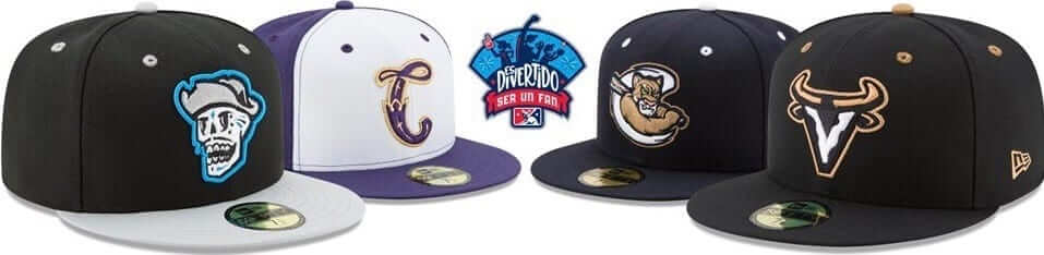
Minor League Baseball is trying something more expansive. MiLB yesterday announced a new program called “Es Divertido Ser un Fan” (Spanish for “It’s Fun to Be a Fan”). As part of the program, four MiLB teams — each located in a market with a large Hispanic population — will take on new identities, including new uniforms, for select games in August, with a national rollout planned for next year. As part of the initiative, stadiums will offer new concession items and have P.A. announcements in Spanish.
Here are the four teams participating next month:
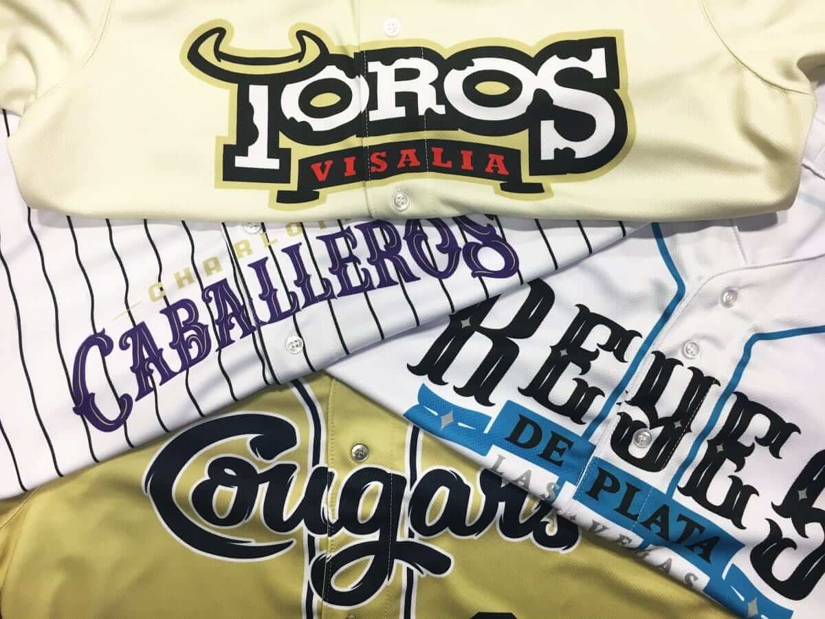
• Las Vegas 51s: The 51s will become the Las Vegas Reyes de Plata (“Silver Kings,” a nod to Nevada’s silver mining heritage) for Tuesday home games on Aug. 1, 8, and 22.
Las Vegas Reyes de Plata 🔥 #MiLBesDivertido pic.twitter.com/1IKJdU5PV6
— MiLB.com (@MiLB) July 24, 2017
One bit of irony here is that the 51s are the Mets’ Triple-A affiliate, and now they’re going to be wearing Mets shortstop Jose Reyes’s surname on their chests — appropriate, perhaps, given that Reyes has performed like a Triple-A player, for much of this season (although he’s stepped it up lately, to be fair).
• Charlotte Knights: The Knights will become the Charlotte Caballeros (Spanish for “Knights”) for the weekend of Aug. 18-20.
Desde el 18 de agosto hasta el 20 el equipo usará la camiseta los Caballeros de Charlotte. pic.twitter.com/8fgq8FNyYz
— Rafael Bastidas (@rbastidasRLM) July 24, 2017
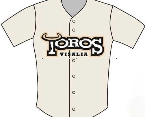
• Visalia Rawhide: The Rawhide — a Single-A Diamondbacks affiliate, in case you’ve never heard of them (as I hadn’t) — will become the Visalia Toros (i.e., Bulls) for the four games covering Aug. 3-6.
• Kane County Cougars: The Cougars, alas, will just be Los Cougars on Aug. 10-13. Unless I missed it somewhere (and believe me, I looked), they have not provided a good photo or mock-up of the uniform they’ll be wearing for this promotion. You can see the cap at the top of this page, and part of their jersey is visible in this group shot (click to enlarge):
———
Some of these are clearly better than others. It’s also a little disappointing that three of the four jerseys — all but Kane County’s — have the city name nested into the team name, which feels too template-y for my tastes.
Still, this shows MiLB’s continuing ability to go beyond the boilerplate Star Wars and Ninja Turtle uniforms. Those costumes always feel like everyone’s just ordering out of the same catalogs, but these new designs, along with all the food-based makeovers we’ve been seeing, are more interesting and show more imagination (well, except for Kane County’s). Interesting!
Also: The Durham Bulls will become Los Toros de Durham on Aug. 10. This promotion is distinct from the program that the other four teams are participating in:
Los Toros de Durham to celebrate Hispanic heritage night https://t.co/hnU99y3UhN
— Phil Hecken (@PhilHecken) July 25, 2017
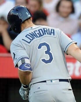
Those no-good sew-and-sews: Twitterer @keyvon212 mentioned something last night that caught me by surprise: “I believe the Rays [right] and Indians are the only two MLB teams that still use nameplates.”
My initial thought (which, thankfully, I didn’t tweet) was, “No way — there are several others.” But then I checked (it’s an easy thing to look up in Bill Henderson’s guide, which is yet another reason everyone should own it) and found that he was right! In fact, Tampa and Cleveland have been the last nameplated holdouts for several seasons now. Everyone else uses direct-sewn lettering. Well, except for the Yankees.
I count this as major progress. Nameplates are fine in football — the horizontal strip of fabric goes well with the broad expanse of the jersey as it’s stretched wider by the shoulder pads — but I dislike them for all other sports. I didn’t realize MLB was so close to achieving direct-sewn uniformity. Here’s hoping we can convert those last two holdouts next season.

That time of the year: We are fast approaching the month of August, which means it will soon be time for my annual August break from the blog. Beginning one week from today, deputy editor Phil Hecken will run the site on weekdays and webmaster John Ekdahl will handle weekends. Regular features like the Ticker and Collector’s Corner will continue as usual, but I won’t be the one coordinating them.
I’ll still be on the clock over at ESPN (indeed, one reason for my annual blogcation is so I can devote some time and energy to my annual college football and NFL preview columns), and I’ll likely make occasional cameos here to introduce new T-shirts or make other announcements. For the most part, though, the site will be Paul-free in August. That will no doubt be a disappointment for some of you and a big plus for others. Either way, I’ll be back before you know it.
Unfortunately, I have no major travels planned for August this year, although I hope to use the extra time to work on some long-delayed extracurricular projects. More on that soon-ish.
Anyway: I’m still here for another week, so don’t start mourning my absence (or celebrating it, as the case might be) just yet.
Click to enlarge
Collector’s Corner
By Brinke Guthrie
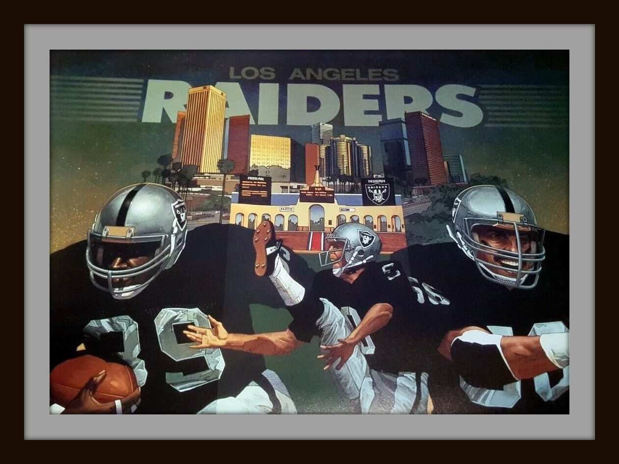
Just win, baby. Here we have a 1980s Los Angeles Ray-duhz poster from Damac. Yes, kids, they’re now in Oakland and are headed for Vegas, but they also spent a stretch of time down the coast in L.A., as you can tell from the City of Angels skyline on the poster. Looks like perhaps Bo and Ray Guy on there? Printed in and sold from the UK. Perfect condition!
Now for the rest of this week’s picks:
• One more poster for ya: This 1983 49ers poster from Damac is still in excellent condition, and features The Catch combo of Joe Cool and Dwight Clark.
• Proudly proclaim “It’s Hockey Night in Hartford” with this vintage Whalers bumper sticker.
• How about a nice-looking Pittsburgh Steelers 100% Orlon ® Acrylic zip-front cardigan from the Sears “Put-On Shop,” whatever that was. Comes with an embroidered patch and striping across the waist and sleeves and the trademark O-ring on the zipper.
• Luv Ya, Blue! Here’s a 1970s Oilers bike reflector. Packaging has some problems but the item itself has never been used.
• Here’s a dynamite-looking set of 16 Riddell pocket helmets commemorating the 1969 season, with those great division names — Capital, Century, Coastal and Central.
• Can’t say I’ve ever seen a helmet buggy T-shirt before. This Reebok one says “CB est. 68” on it, for Cincinnati Bengals and 1968. And here’s a Bengals sticker with a terrific logo from back in the day.
• This 1960s Toronto Maple Leafs bobble is in perfect shape.
• This 1970s NFL rug has a player on it that I know I’ve seen on other NFL items of the era.
• For some reason, this 1974 Baltimore Colts Frisbee has no team logo, but it has a $100 bill on it with a kicker or punter.
• No bells or whistles, just classic styling on these 1970s Lou Brock Converse sneakers.
The Ticker
By Mike Chamernik

Baseball News: The Indians and White Sox will wear 1917 throwbacks in Chicago on Saturday. Cleveland will wear this jersey and cap, and the Sox will have this hat. No pic of the jersey, but it will presumably resemble the promotional jerseys that fans will receive at the gate (from @ajenkinsCLE). … For Military Appreciation Day on Sunday, the Twins adjusted their alternate logo, with the Paul character in fatigues saluting his twin, Minnie (from Justin Barrientos). … The Greensboro Grasshoppers wore hot dogs on their nameplates and sleeves last night (from Scott Trembly). … A rare game-worn Philadelphia Blue Jays jersey, complete with a blue jay patch, is up for auction. The Phillies were known as the Blue Jays for a few years in the 1940s (from Samuel Heller). … The Cardinals have had a partnership with the R.J. Liebe Athletic Lettering Company since 1922. The suburban St. Louis shop used to embroider the Birds on a Bat logo onto the jerseys (from @2xAught7). … As we know, baseball jerseys are buttoned up, meaning that wordmarks across the chest have to be split up at some point. Ray Hund says his wife, a seamstress, is bugged by “broken” letters, listing the Diamondbacks, Padres, Blue Jays, and Rays as examples. … Here’s the story behind Bertman’s Ballpark Mustard, an iconic Cleveland condiment available at Indians games (from Eric Bunnell). … Mets SS Jose Reyes stole is 500th career base last night. After the game, he helped himself to the base. … Fans continue to remove the New Era logo from their caps. … The logo for the 2018 MLB All-Star Game will be revealed tomorrow afternoon at Nats Park (from Tim Haller).

Pro Football News: The Steelers unveiled a memorial patch for team chairman Dan Rooney, who died in April. The patch has his DMR initials in a shamrock, because he also served as a U.S. ambassador to Ireland. The Steelers already wear a team logo patch on the upper-left chest, so the Rooney patch will go on the other side. Fortunately, the Steelers do not wear captaincy patches, so there won’t be too much clutter. … The Packers and Bears will wear Color Rush uniforms for their Thursday-night game in Week 4 at Lambeau Field. They went mono-navy vs. mono-white last year, and we’ll likely see the same color pairing this year (from Phil). … Here’s a video feature on the woman who has sewn, cleaned, and repaired Colts uniforms for 33 years (from Dave Ciskowski). … The NFL released this year’s sideline caps (from Ben Matukewicz). … In 1992, Hamilton Tiger-Cats QB Don McPherson changed his number to 99 to honor Jerome Brown, a former teammate with the Eagles who died in a car accident that summer. McPherson normally wore 16, and switched back the next season (from Johnny Garfield). … New look last night for the Ottawa Redblacks. “They didn’t bring their usual road white helmets and white pants on the road,” says Wade Heidt. “Instead, they wore their home and primary black helmets and home black pants with their white jerseys.”
College Football News: Nebraska teased new uniforms, which will be unveiled on Thursday. It looks like the Cornhuskers will wear mesh jerseys as a throwback to the 1997 team that split that National Championship with Michigan (from Drew Doyle). … Iowa coach Kirk Ferentz said that the Hawkeyes will wear alternate uniforms once this season, for the first time since 2015 (from Phil). … New unis for James Madison. Here’s a few more pics (from several readers). … Maryland coach DJ Durkin said that the vast majority of his players want a single-digit number (from Cody Joakes). … Here’s how UCLA’s shoulder stripe has evolved since it was introduced in 1949 (from Marc Altieri).

Hockey News: New uniforms for the Macon Mayhem of the SPHL (from Mike Campos). … New Devil Marcus Johansson received a bag full of apparel from the team, which includes mostly Reebok gear, including an old Reebok jersey (from Zach Spencer).

Basketball News: The 76ers will have a new court this season (from John Kelemen). … Screenshots from NBA 2K18 show that the new Nike uniforms don’t have full armhole piping, and that the Thunder’s home uniforms are virtually unchanged (from @CylkDiamond and @OklasotaGal). … New court for Penn, who play at the legendary Palestra in Philadelphia (from Jeremy Fallis). … James Harden, playing in the Drew League, covered up his Nike logo creep (from @ezbutton11).

Soccer News: Sporting Kansas City will wear camo warm-ups against Atlanta next Sunday (from Joe Ryan). … New third kit for Celtic. “All three of their shirts this year are a shade of green,” notes Ed Å»elaski. “Not sure how that’ll work.”

Grab Bag: The Wisconsin State Journal named the winner of the Madison flag redesign contest. The city of Madison will consider officially adopting the concept, a blue, green, and white flag with a sideways M in the negative space of the stripes (from JohnMark Fisher). … New York Times readers chimed in on the topic of “appropriate” work attire (from Tom Turner). … Also from Tom: Auto racing has become an unlikely influence on contemporary men’s fashion. … IndyCar will have a new car design next year (from Tim Dunn).
I have to go to Manhattan for an ESPN meeting this morning, so I’ll be off the grid for a few hours. Play nice while I’m away, yes? Thanks. ”” Paul
Bo never wore a facemask like that. It’s link.
(King wore link, not 39.)
Definitely Ray Guy in the middle. On the right might be link with a mustache added; he wore that facemask early in his career.
Charlotte Caballeros…Horsemen…I’m not sure if someone is being clever or if this is just a happy coincidence. Charlotte will always be Horsemen Country. Woo!
Caballero is a direct translation to knight. It could also be translated to gentleman
Thanks, Omar. Text now updated.
and “Cougar” is a direct translation of “Puma”… no wait.
Uh, never mind, close enough for promotional purposes. At least MiLB is attempting the full Spanish translation (except for Kane Kounty).
It would be unfortunate if they were called the Kane Kounty Kougars.
Love, love, love the Twins logo. Tasteful, respectful and effective. Nice job, Twins!
Weird, though, because Minnie is on the right (east) side, when he’s always traditionally been on the left (west) side, reflecting Minneapolis’ location west of St. Paul.
Proofreading:
“to the Rooney patch will presumably go on the other side.” ‘so the’
The article says it will indeed be on the right side of the jersey.
Fixed.
The Durham Bulls will be doing this on August 10th as well:
link
(Just for one game, though, not a full series)
Already in the Ticker.
My apologies for missing it.
I really hope the Sixers beef with Well Fargo continues on the new court design.
link
A look at the photo in the link tells you the beef is over; based on last year’s court, it’s been over for a while.
The photo in that link looks like their practice facility.
I’m usually not a big fan of all white football uniforms, but Green Bay looked much better in all white last year versus the yellow pants.
That being said, green pants with striped socks would be the best look for the road.
The green pants on the road would give them a look similar to what the Edmonton Eskimos wore in the past a few years back:
link
It was actually a good look – but one cannot mess with the uniform for the Packers. I think most Packers fans would not be in favour of this. Packers will and should wear yellow pants always for primary home and road.
I figured a yellow color rash jersey was a no-brainer.
And I figured no color rash uniforms was the no brainer.
Regarding Charlotte Caballeros: “caballero” is the Spanish word for “knight” (and also gentleman, but I doubt that’s what they’re going for…), so I think it’s safe to say they are just going for a direct translation of the English team name, rather than “horsemen”.
I assume this is related to the fact that English has a larger number of words than most, if not all, other languages. English borrows a lot of words from other languages, and you end up with cases like knight, horseman, and cavalier all referring to a guy who rides around on horses.
What the hell is a horseman? I’ve heard of a cavalier, sure, even a cowboy, but never a horseman. Except for BoJack.
Never heard of the Four Horsemen of the Apocalypse?link
I’ve never really cared about Notre Dame football, tbh…
Me neither. If you clicked on the link I gave, you’d see it goes to an article about the original Four Horsemen, from the Bible. They are described in the book of Revelation (also known as the Apocalypse), which is a vision of future end of the world.
Whoever designed that Twins logo knew what they were doing. Paul is giving a proper thumb to palm salute. Minny is not. Then again, Paul shouldn’t have his cover off outdoors. ;)
“Cover?” Semper Fi!
Or Semper Paratus.
To my knowledge, it’s called a cover in all branches.
I think the Army and Air Force call covers “hats”.
The Colts lady is sewing on a $99 sewing machine.
I guess it gets the job done!
Right. It is just thread into fabric.
In the sub-lede on nameplates: “I could this as major progress.” That should be “I count this as major progress,” I’m guessing.
Fixed.
“Silver Kings” is such a better team name than “51s”. Stick with it, Vegas.
The Reyes uniforms are also much better than the 51s uniforms. Just switching to this, Spanish language and all, would be a major upgrade for the team. For Charlotte, the design of the Caballeros is also much better than their current uniforms. Take the Caballeros design, change the jersey text to Knights, and bam, major upgrade. The Visalia Rawhide have terrific uniforms, and the Toros unis, while not bad, are a slight downgrade. The Los Cougars? Ugh.
Since the 51’s use the alien theme couldn’t they change their name to “los extranjeros”?
Vegas cap not available on website, same goes for Visalia. Charlotte is pre-order only.
Pretty confident that the Nebraska jerseys will have numbers printed to look like a mesh jersey rather than actual mesh. There’s just no way they pull back from their full techfit campaign long enough to do anything actually creative.
Given that the “holes” don’t look like actual holes, that’s likely the case.
While I applaud Nebraska for throwing back to the awesomeness that was 90’s mesh jerseys, it looks as though they’re going with the updated “winning tradition” patch as opposed to the old (and better looking) patch they wore in ’97.
I never understood nameplates at the Major League level. Totally get it at the minor league level, what with all the roster moves and all. Perhaps it started with the uniforms being recycled to the minors at some point.
If it’s a legit shot of the new Nike unis, the “OKC” on PG’s shorts in the Thunder link is new. The Thunder didn’t have any logos on the front waistband of the traditional home and away shorts, just the wordmark “Thunder” on the back of the road shorts, and “Oklahoma City” on the home shorts.
That poor woman sewing the Colts’ jerseys… somebody get her a heat press and industrial strength sewing machine! Should only take her 30 mins to knock out a 1 color jersey once. Painful to watch.
Don’t count on Irsay doing it. Screw him and the Dolts.
Isn’t it about time for advertisers/manufacturers to drop the “2K_ _” from products? NBA 2K18? In 60 years is there going to be a NBA 2K78? Luckily I’ll be dead and won’t have to see it.
2K Sports uses that notation with their titles (currently NBA, NHL, & WWE), so it makes sense in that regard. But, along the lines of the Super Bowl using larger and larger numbers, and 20th Century Fox (and Century 21 realty in some 83 years), the names seem a little more prone to wear out, as it were.
Ray Hund says his wife, a seamstress, is bugged by “broken” letters, listing the Diamondbacks, Padres, Blue Jays, and Rays as examples.
She’s not the only one! And it more than bugs me…it aggravates me. Such a lazy-looking design.
It just takes a little bit of sizing/shaping/spacing/something to keep it from happening. Respect The Placket!
“Nameplates are fine in football”
What about hockey? I’m particularly thinking of the Philadelphia Flyers’ old contrasting nameplates, although I think a few other teams have used them.
If there’s a contrasting aspect, OK.
Otherwise, no.
At least three of the four MiLB teams are actually using the Spanish translation. I’m no fan of the NBA “Spanish” uinforms just adding a “Los” before the name. The Suns should change to “SOLS”. It would be hilarious if the Lakers or Clippers had a “Los Angeles” jersey, and did a “Los Los Angeles”.
*Soles.
Gracias.
The Angels could kill two birds with one stone with a “Los Angeles” jersey.
The Angels’ Spanish-language broadcasters call the team Los Angels de Los Angeles, i.e., “los ain-jels de los an-he-les”.
They have “Los Lakers” instead of “Los Laguneros” on Lakers Latino Nights jerseys, so “Los Angels” is at least consistent.
Not to get too of uni-track here, but does Charlotte really have a large hispanic community? I’m surprised to not see Tucson, Corpus Christi, or El Paso. I can maybe understand leaving San Antonio off the list since they are moving to Amarillo in a few years but it just seems odd to me that those markets were left off.
does Charlotte really have a large hispanic community?
If only there were a mechanism, perhaps on the internet, where one could look up the answer to this type of question…
Is the 2010 census stats open to the public?
If only there were a mechanism, perhaps on the internet, where you could look up the answer to that question.
I mean really, people, it’s not that hard.
Well, I’m not surprised that Tucson was omitted, since they don’t have an MiLB team right now. Their last team moved to El Paso.
Re: the picture of the Ottawa Red/Black look, while admittedly all CFL teams have several strikes against them from the start (i.e. the two adverts), the Toronto Argos look in that picture – IMO – is as good as it gets right now in the CFL. Yes the pant stripe should go all the way down, but the colours are vivid and the overall look is clean
Agree Argos uniform is attractive. I do prefer when they wear the navy (Oxford blue) helmet with this uniform combo. New navy helmet looks great. More signature look for the Argos with navy helmet combined with navy-over-white uni combo.
“This 1970s NFL rug has a player on it that I know I’ve seen on other NFL items of the era.”
Duane Thomas??
The newspaper-sponsored flag design for Madison is nice, but Madison already has a terrific city flag.
It’s like the Texas flag and the Mecca arena floor had a love child…
That design looks like something more appropriate for Milwaukee, which does not have a flag, but a crying towel.
link
I don’t see the point of having a contest to change Madison’s flag, unless the article was originally conceived as a think piece to gauge interest in a new design. What Madison already has is good enough.
link
It seems the original flag’s use of the Zia sun symbol was contentious, so they took the initiative to have a contest. If you ask me, the Zia sun there makes as much sense as a picture of an igloo on a flag for Florida.
I can’t believe that adidas waited until its final academic year with UCLA to get those stripes back on track. I figured Under Armour wouldn’t have that problem. UA did a great job.
Regarding the woman sewing the Colts jerseys, she looks like she does a good job, so she must not be the person that attached the “30 Seasons” patch that the Colts wore a few years ago. Take a look at this game used Andrew Luck jersey to see what I mean:
link
The new 2018 Indy car is wicked… and no dumb rear wheel pods!!! Real open wheels!
it looks like a sneaky cubs fan snuck their W logo into that flag sideways.
i smell a windy city rat!