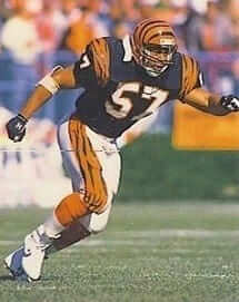
I’ve sometimes written about the first player to wear a given uniform (like Don Zimmer and Bob Miller being the first to wear Mets uniforms). Today we’re going to talk about the first player to wear the uniforms that the Cincinnati Bengals unveiled in 1981 — including their now-iconic bengal-striped helmet.
That player was Bengals linebacker Reggie Williams (shown at right). He and offensive lineman Glenn Bujnoch both suited up in the team’s new attire at an unveiling event in the spring of 1981 at the College Football Hall of Fame (which at the time was located north of Cincinnati at the Kings Island theme park). Although Williams and Bujnoch both wore the uniform, only Williams donned the helmet. The moment has been preserved in this video:
That’s some priceless stuff right there. But it also raises some questions: Why, for example, were Williams and Bujnoch selected to model the uniform? And why was Williams wearing a No. 40 jersey, instead of his familiar No. 57?
Williams, as it turns out, is friends with our Collector’s Corner columnist, Brinke Guthrie, who recently discussed the unveiling with him. Take it away, Brinke:
Reggie had no idea there was a new uniform in the works. “I only found out about the new uniform about a week before the unveiling, when the team asked me and Glenn Bujnoch to model the new unis,” he said. “Basically, we were two easily accessible players who lived in town — that’s why they chose us. The first time I saw the new design was at the unveiling.”
As for why Reggie wasn’t wearing his own number: “They had his Buj’s No. 74 but they didn’t have my No. 57. So I wore the uniform of running back Charles Alexander.”
And why did Reggie strap on the helmet, but not Bujnoch? “The helmet was too small. Buj’s head was a size 8, so there was no way he could try it on, so I squeezed down the first Bengals striped helmet in history.”
Other teams ridiculed the new helmet.”Other teams initially laughed until we went 12-4 and were in Super Bowl XVI. It’s a good thing we won — it became almost an ownership imperative that you better win, and win NOW, or you’ll be laughingstocks forever because of the helmet.”
The players had no say on the new look back then. “We had no input,” Reggie remembers. “At the time, there was no love lost for the old uniforms. To me, they were too similar to Cleveland. Now, however, I want to see them one more time.”
Great stuff. Big thanks to Reggie and Brinke for sharing that story with us.
Click to enlarge
Collector’s Corner
By Brinke Guthrie
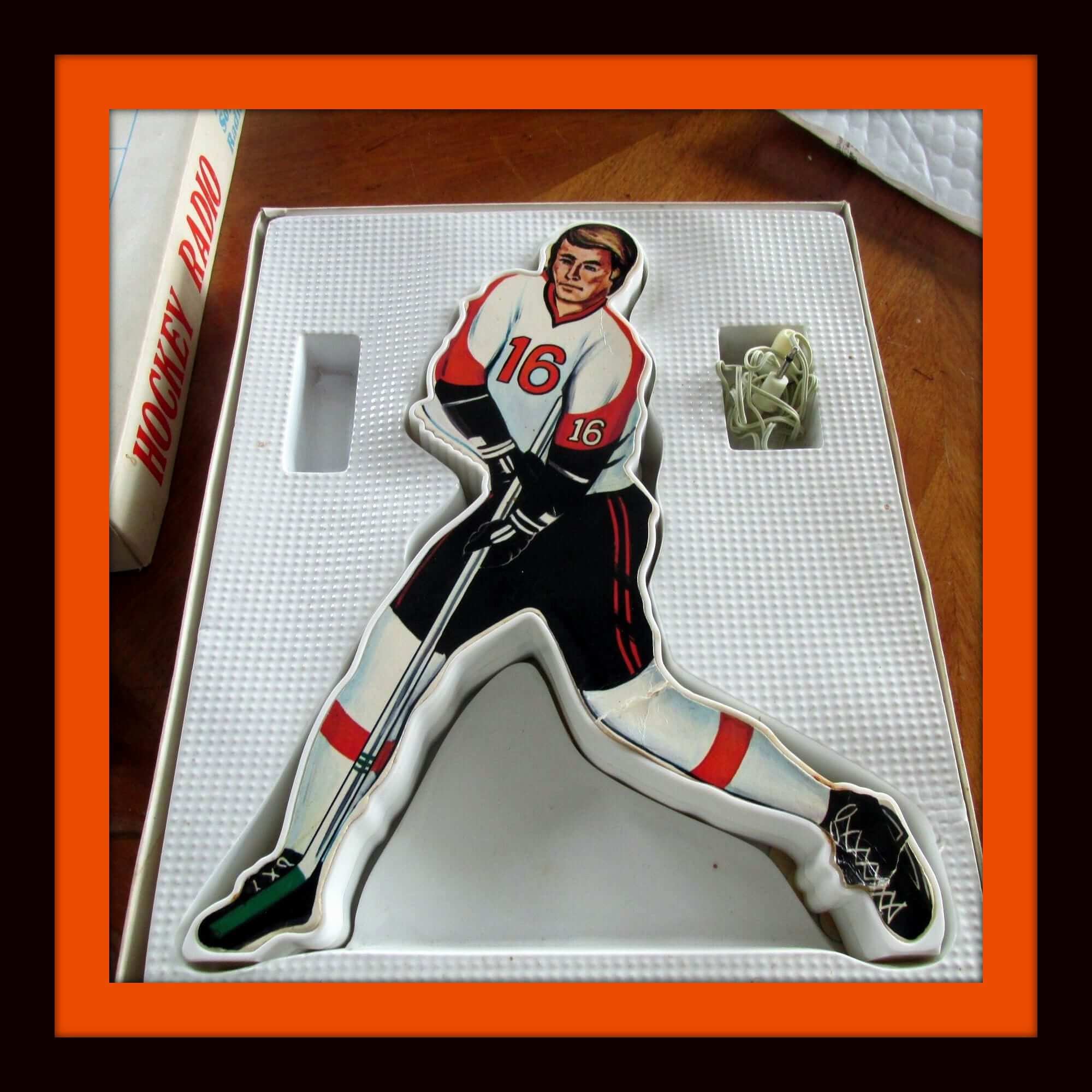
Let’s begin this week’s Collector’s Corner with a unique 1970s hockey radio. The seller says it works just fine. The interesting thing is, if you look at the box front art, he’s wearing black and yellow, or Bruins colors. The box says “Make your own player with our self-sticking decals of numbers.” So I’m not sure if you also got uniform stickers to turn him into a Flyers-style player like Bobby Clarke, or if there were different versions of this item. He kinda-sorta looks like Clarke in a generic way, no?
Now for the rest of this week’s picks:
• Here’s a decal from the Bay Area. This one highlights Oakland and includes teams like the A’s, the Ray-duhz, and the Seals, along with local landmarks like the stadium complex, BART, and the airport. The seller has another version here.
• We’ve shown the 1970s NFL and MLB light switch plates before, but here’s the first NBA version I’ve ever seen: This design features the Bulls. The seller also has the Lakers, as well as the Cubs and Astros.
• They gave it a good try, but the maker of this Reds cap didn’t get the wishbone-C quite right, did they?
• Speaking of the wishbone-C, they didn’t do a great job on this Bears helmet plaque, did they? The seller has several different teams for sale, including the Bengals — note that they didn’t come close to the right font on that one. The auction ends Tuesday morning, but you can still click on the image to see what I mean.
• Give a look to the lowercase “hawks” font used on the cover of one of these 1970s Atlanta Hawks game programs.
• This 1970s San Francisco 49ers bumper sticker proclaims “New Coach, New Approach.” This is the third straight season they could use that one around the Bay Area, in case you’re counting.
• Staying with the Niners, I’m betting this 1970s Niners belt buckle was not an NFL Properties-approved item.
• “Never surrender, no matter what the odds.” That’s the slogan on this 1970s Cleveland Cavaliers (or Cavaliers Cleveland to be precise) seat cushion.
• I initially went bonkers when I found this 1970s Westclox Team-Mate lollypop clock for the SF Giants — and then I found out it didn’t work. Looks nice, though. Had a Reds one just like it back in the day, around 1972-1973.
• This children’s 1980s sweatshirt just screams Sears, does it not?
• This design 1970s New York Nets ringer T-shirt is still in the package!
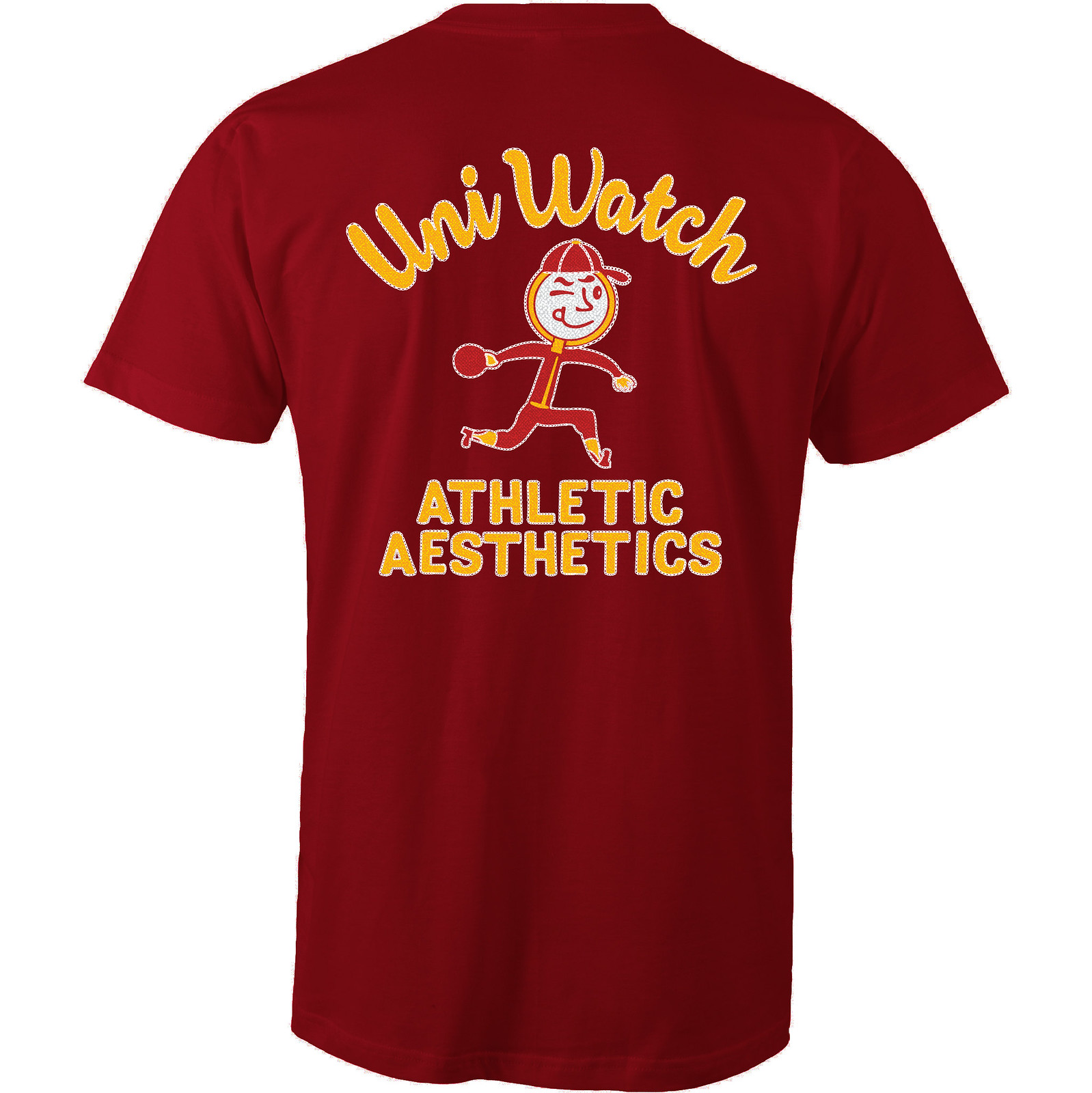
ITEM! New T-shirt launch: I’m excited ”” like, seriously excited ”” to show you our latest T-shirt in the Uni Watch Artist’s Series, designed by the great Scott M.X. Turner.
Here’s the concept: If Uni Watch had a bowling team, what would the team be called? The Athletic Aesthetics, of course! And what would the team wear? A classic bowling shirt with chain-stitched embroidery, of course!
Scott’s T-shirt is based on that idea, with a simple “Uni Watch” insignia faux-chain-stitched on the front-left chest and a spectacular design faux-chain-stitched on the back. First let’s look at the front (for all of these images, you can click to enlarge):
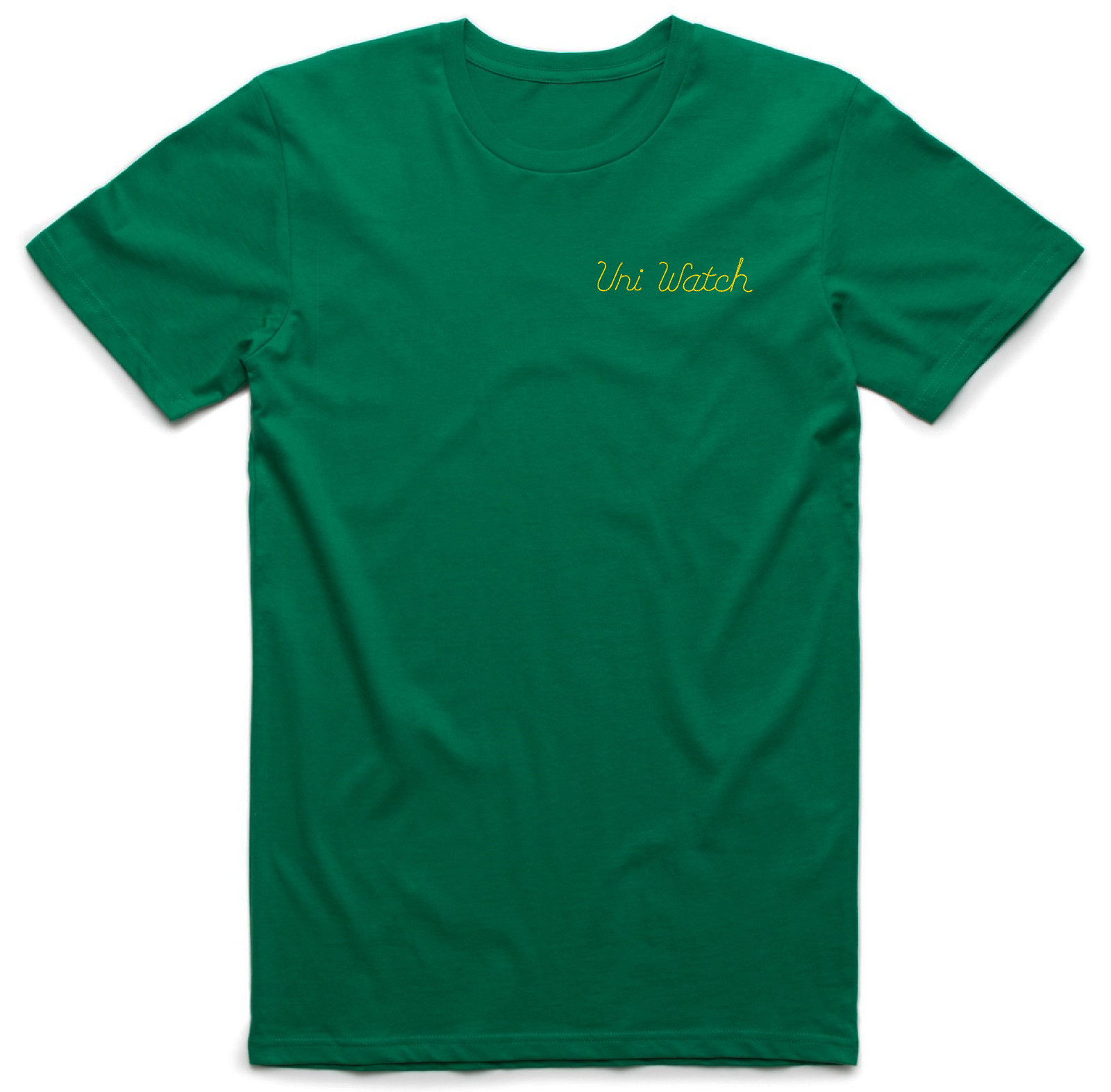
Pretty cool, right? Scott originally wanted to just draw the lettering, but I encouraged him to make it look chain-stitched (much like our 2015 “ugly sweater” T-shirt looked knitted), and I love how it turned out. But that’s nothing compared to the design on the back. Dig:
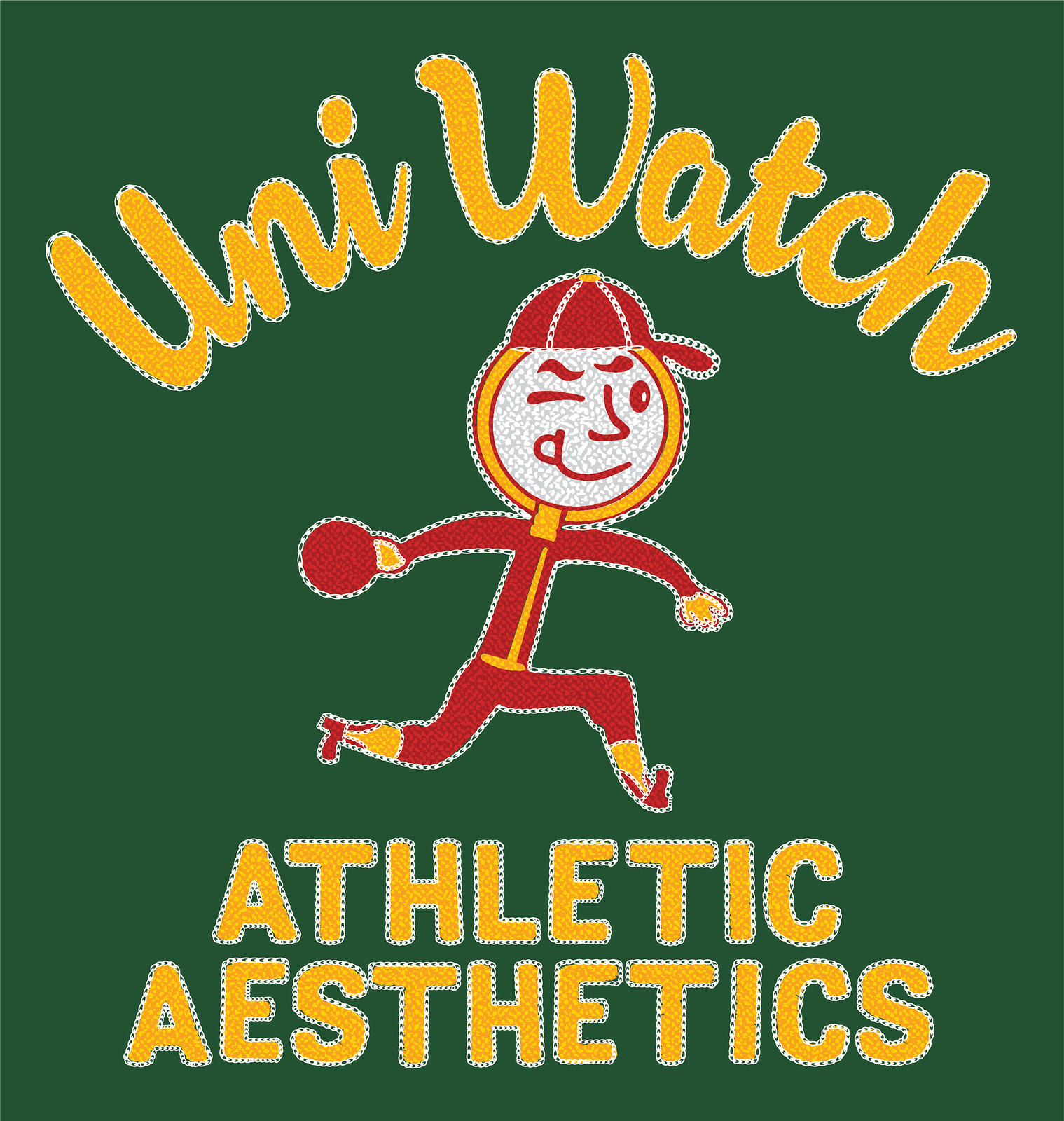
How great is that?! An anthropomorphized magnifying glass wearing a ballcap and stirrups — tremendous! The graphics really capture that old-school bowling shirt style, too. As a collector of vintage bowling shirts myself, I can’t say enough about how awesome this is. I’m super-proud to have the Uni Watch name on it.
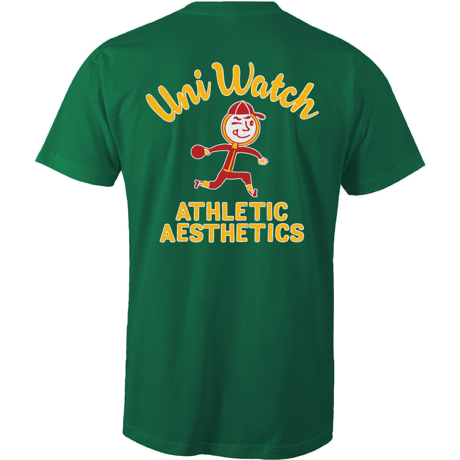
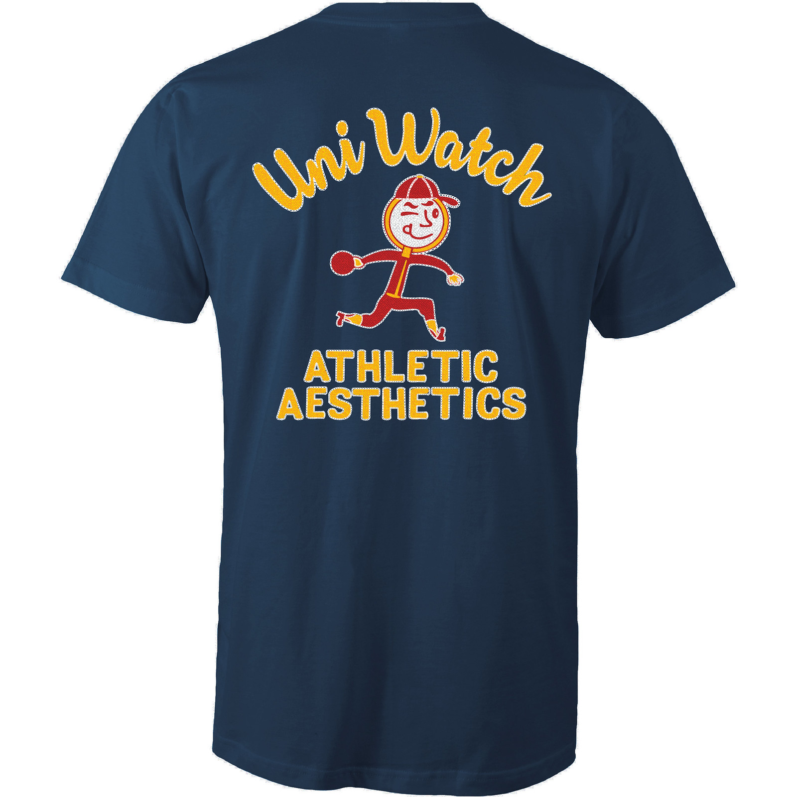
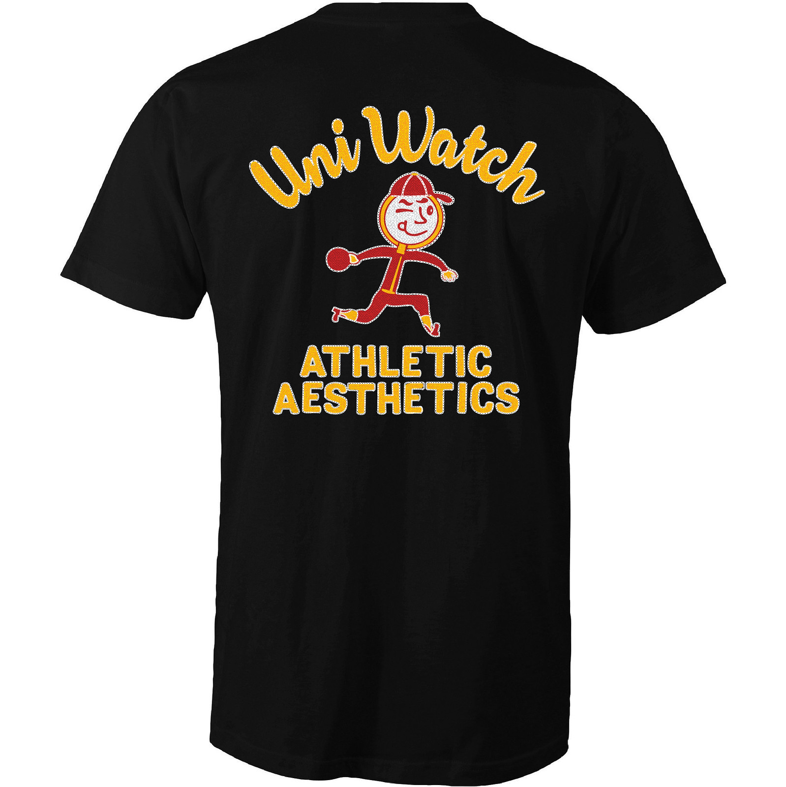
Even better, the design works well in a wide variety of shirt colors. Here are some of the ones we’re offering (there are several more on the sales listing page), just to show how flexible the design is:
Creating all of that chain-stitching texture on the back took a lot of work, and at one point Scott thought it might not be feasible. I was prepared to do the back design without the stitching effect (plenty of bowling shirts have silk-screened graphics on the back, so we could have said we were matching the silk-screened style), but Scott got some crucial assistance from the great Larry Torrez, who helped with crucial advice regarding faux-stitching techniques and then actually did a lot of the work on the back design. Thanks so much, Larry — this one wouldn’t have reached its full potential without your midwifery.
Okay, enough of my gushing. Like all of our Artist’s Series shirts, this one is a limited edition, available for 10 days. You can order it here. My thanks, as always, for your consideration.
The Ticker
By Mike Chamernik

Baseball News: The Cubs and Pirates went blue-vs.-black last night (from Andrew Cosentino). … Cubs SS Addison Russell asks fellow big leaguers to sign his Pokemon cards. He uses his collection to bond with his cousins, nieces, and nephews. … Alice Cooper wore a customized Cubs-themed T-shirt for a show in Springfield, Ill., on Sunday night. Cooper was apparently unaware that although Springfield is the state’s capital, he was firmly in Cardinals country. Or maybe he was trolling (from Kevin Eckhoff). … A Rockies coach wore a cap without a New Era logo last night (from John Toenniessen). … This is probably a normal thing for him, but the Padres’ Wil Myers took BP with his sunglasses on his cap, only backwards and upside-down. Patrick Thomas says he may do this to keep the cap logos visible. … Monte Irvin wore one high-top shoe and one regular low-top shoe in 1952. The high-topper was to provide more support for an ankle that he had broken in spring training. … Navy, whose mascot is Bill the Goat, is hosting a “Goat Tees For Goatees” event on Saturday for a doubleheader against Bucknell (from Eric Page). … New Era is selling a Yankees 2000 World Series cap that shows images of their new stadium, which was built in 2009 (from Jon McCue). … One observer suggested uniform tweaks for each team in the AL Central. He has some good ideas, particularly that the Twins should use the Minnie and Paul logo more (from Phil). … Here’s a good shot of the Nats’ 3D helmet logo on their road helmet.

NFL News: The Rams’ uniforms were strictly blue and white in 1969, but they had gold-lettered sideline capes. That color wouldn’t return to their uniforms until 1973 (from Marc Viquez). … A few people have applied for the federal rights to the name Las Vegas Raiders, but they most likely will not get it. While the Raiders have yet to officially secure the name, team owner Mark Davis was prescient enough to register the LasVegasRaiders.com domain name way back in 1998 (from Brinke). … Cowboys QB Craig Morton was missing his NFL 50th anniversary patch during a game in 1969 (from Ronnie Poore). … Nick Jones has mocked up how the 2017 Thursday-night uniform matchups could play out. … The Packers have been hosting monthly “History Night” events at their team Hall of Fame. This month’s installment, which takes place tonight, will look at the team’s helmets (from Phil).
College Football News: Western Kentucky is leaving Russell Athletic and will transition to Nike on July 1. Russell is headquartered in Bowling Green, Ky., and WKU had always partnered with them as a gesture of regional loyalty, but no more. With Ohio recently announcing that it would be moving from Russell to Adidas this summer, that leaves Georgia Tech and Southern Mississippi as Russell’s last two FBS schools. Tech’s contract with Russell expires next summer; not sure about Southern Miss’s.

Hockey News: About two dozen laborers work overnight to convert the floor of the Air Canada Centre from hockey to basketball. Between the Maple Leafs, Raptors, and various concerts, the ACC crew does about 200 conversions per year (from Ted Arnold). … Baseball legend Yogi Berra played hockey growing up and loved to attend NHL games during road trips with the Yankees. Here he is in uniform (from Alan Kreit). … North Dakota will have new jerseys next year. The school introduced a new logo and name, the Fighting Hawks, last summer (from Phil).

NBA News: Confirming earlier reports from last year, the Hornets quietly announced that they will wear Jordan-branded jerseys next year, instead of Nike like the rest of the league. Jordan is a part of Nike, and Michael Jordan owns the Hornets (from Andy Cook). … Pacers team president Larry Bird drove a Pacers Indy car outside the NBA office in New York City yesterday, as the team submitted its bid to host the 2021 NBA All-Star Game. Here are a few more looks at the car, which may have had a new Pacers alternate logo on it. … A prison gang in San Antonio has adopted the Spurs’ logo as one of its symbols, so local tattoo artists are warning their customers about getting a Spurs tat on a visible body part (from Jim Wagner). … Back in the mid-1970s, the Pistons had warm-up jackets with a neat racing car motif on the back. … Remember Paul’s recent discussion of the “@” symbol? The start of this Trail Blazers video clip provides another example of the symbol being used with a two-storey “a” (from @NYisBLUE).

Soccer News: Philippe Coutinho of Liverpool had a hole cut out of the heel of his right cleat for a match this past weekend. It may have been to provide relief for a blister (form Mark Emge). … The Spanish club Osasuna will wear a new kit on Wednesday against Barcelona. They’re being forced to adopt this new design because broadcasters say all their existing kits clash their opponents’ (from Mark Coale). … Sporting KC F Daniel Salloi’s NOB was just slightly askew the other night. The kitman later apologized for it (from Jose Palacios and Edward Gaug, respectively).

Grab Bag: New institutional logo for Oregon State. Here’s a breakdown of all the symbolism in the crest (from Mark Snider). … Premier League dart player Peter Wright wore a Flintstones lapel pin last Thursday to celebrate the 50th birthday of fellow player Raymond van Barneveld, who goes by the nickname “Barney.” … I went to a roller derby match on Saturday night. It was cool, but not quite as insane as vintage ’70s LA Thunderbirds derby action. Anyway, I noticed that the logo for the Women’s Flat Track Derby Association looks like the NBA logo crossed with Neapolitan ice cream. … If you don’t know the story of the Adidas/Puma rivalry, and how it’s rooted in a family feud, this story breaks it down pretty well (from Phil). … The USPS will introduce these sports ball stamps at some point in 2017. Interesting that they chose a striped football, which is not used in the NFL. “Where’s the hockey puck, though?” asks Michael Ortman. … The Mumbai Indians, a cricket team in India, have reflective accents on their uniforms (from David Jones). … A little tough to see, but yesterday I spotted a building constructed around a billboard sign post. The pole goes right through its center. … The 1932 film Hold ’Em, Jail features a prison football game, complete with prison-striped uniforms (from Dave Sikula). … Actor Bill Murray and his brothers have introduced a line of golf apparel (from Tommy Turner).
Really enjoyed that Bengals uniform news report. That was an era when uniforms and details weren’t often covered or noticed, so it was cool to see such a thorough examination of the new Bengal unis.
That’s a good example of how fashion is vulnerable to shifting sands of taste. In 1981, everyone howled at the Bengals’ “loud, tasteless” uniforms; if they restored that appearance today, it would be a Top Ten NFL look. Cincinnati deserved credit, because, like the Rams, they actually tried to look like the animal they’re named after.
“At the time, there was no love lost for the old uniforms. To me, they were too similar to Cleveland. Now, however, I want to see them one more time.”
I believe Reggie Williams is asking to see the 1970s uniform used as a throwback. I would like to see that, but the Bengals have always opted for the orange jersey alternate instead.
I always just love ledes like this one! Thanks, Paul!
“Pacers TEAM president”
Fixed.
Proofreading:
There are a couple of places where you spelled Bujnoch Bujnoh.
Fixed.
Poor ol Georgia Tech
The perils of having a second-tier apparel provider remind me of the travails my neighbors used to tell me about owning a car from a flailing corporation like Rambler or Studebaker. The company’s declining resources made it difficult to uphold minimum standards of quality, and loyal customers shook their heads and walked away. As my friend Jon was wont to say, “It’s like witnessing the long, sad decline of a beloved family pet.”
The NY Giants play the late late game on Thanksgiving, that is not considered a color rush game? Nice!!!
Tgiving game was considered part of the TNF program in 2015, but not last year, and not this year.
Man, the Giants are one of my favorite color rush jerseys. I would have liked to have seen those again. Maybe they can wear them as an alternate with blue socks. Almost all of the white color rush uniforms look great but just need contrasting socks.
I wonder if the Cowboys will get an alternate color rush this year? Maybe navy pants to go with the navy jersey? Yellow vs. white could potentially be another color blind issues game.
It might be bias but I think only the cowboys should be the only team to wear color rush at home everyone else should switch sides because then it looks weird watching other teams trying to copy what the cowboys do by wearing white at home
Atleast the white color rush uniforms
If you mean to say that the Cowboys should be the only team with a white color rush uniform… I think I mostly agree. I’d let the teams with white helmets go mono-white if they choose, but beyond that, there really is no reason for white to be worn if the entire concept of color rush is team colors. The Saints should be in black or gold, not white. The Raiders should be black or silver, not white. Etc, etc.
That’s exactly what I mean
Man, but some of the white color rush jerseys have been the best, like the Cowboys, Saints, and Giants. If all of these teams wore the appropriate contrasting socks they would be amazing alternates. I would like to see the Saints wear their CR jersey with their throwback pants and socks, and would like to see the Cowboys wear theirs with their blue jersey silver pants and navy socks.
Sure, the Saints jerseys with gold numbers and Raiders jerseys with silver numbers are awesome… but they shouldn’t be “color rush” jerseys. Both of those teams should wear those as standard road jerseys… but mono-white for either team is still bad.
One observer suggested uniform tweaks for each team in the AL Central. He has some good ideas, particularly that the Twins should use the Minnie and Paul logo more (from Phil).
Most baseball uniforms could be improved by removing the patch from the left sleeve. I think the Yanks, Cards, Braves and Tigers are the final holdouts. Mind you, I said most but not all; I like the Mets’ crest, the Athletics’, Royals’, Cubs’, and Twins’. Theirs actually have historical precedent; not the “me too” flavor of the others.
That “observer” must be a serious uni-watcher – lamenting black trim offenders, noticing something as minor as white outlines, and calling for widespread use of stirrups.
The insistence that the White Sox violate some silly literalism by not wearing white socks is tiresome. It comes up reflexively, nearly any time the White Sox uniforms are discussed, and it just isn’t the striking insight it’s usually presented as.
It may not be an original or striking insight, but I think the White Sox would look better with white socks. Just think of Shoeless Joe in Field of Dreams.
Error in the Grab Bag: unless you were at some sort of convention that didn’t have a game going, you went to a “roller derby game” and not a “roller derby show.” Flat track derby is a real sport.
My bad for not catching that when editing the Ticker. Changed to “match.”
Thanks! “Bout” would have been acceptable too, although we try to use “game” these days.
Really? Interesting! “Game” just doesn’t feel right to me (which is why I went with “match”), but I’ll keep it in mind for future uses. Thanks for educating us!
My bad. I didn’t mean to sound insensitive. Because, for sure, it’s a sport, and a grueling one at that!
I guess I used show because the night featured two derby bouts and a youth derby bout, so it was more than just one game.
“Triple-header.”
P.S. Where were you? Just curious. Here in NYC we have singleheaders with a juniors mini-bout at halftime all the time.
Responding for Mike (just for the sake of timeliness/efficiency/etc.): Mike lives in Chicago.
Couple of ‘first’ uniform wearers that you may or may not have on your list.
Charlotte Hornets (1988)-Kelly Tripucka
UNC Basketball (1991)-Hubert Davis
Alice Cooper played a show here in Charleston, SC back in 2012. During the show he put on a Charleston RiverDogs jersey. That’s our minor league team. His jersey number was of course was 18.
Friend of mine sound-engineers Alice’s satellite radio show. Says he’s an absolute peach.
At the old Arlington Stadium his seats were right in front of my dad’s behind home plate. Really nice guy.
I remember watching the NBC pregame show during the 1980 season (it must have been late in the season, or during the playoffs), and the hosts showed the new Bengals striped helmet for the very first time — even before this spring 1981 video. I conducted a quick search and can’t find it online, but it would be cool to contact NBC or the NFL and get that video of the helmet debuting for the first time.
The image on the underbrim of the 2000 Yankees World Series Hat is the grand entrance to the old Yankee Stadium, which the new Yankee Stadium Gates are modeled after.
A few gripes, mostly with the Color Rash Matchups:
-The Rams will probably go all-white again since they’re ditching the gold
-The Redskins are at home vs. the Giants on Thanksgiving and I doubt they’ll wear those golds. Think they want to keep it “traditional”
-Shouldn’t the bowling magnifying glass be left-handed for Paul?
Shouldn’t the bowling magnifying glass be left-handed for Paul?
That’s not a rule. Todd Radom’s shirt, for example, showed a right-handed outfielder:
link
Last year’s goalie shirt showed a right-handed goalie:
link
And so on. Also, we’ve had several shirts with left-handed batters, but I actually bat right-handed.
The Rams are trying to ditch the metallic gold. They could still wear the throwback yellow. As for Washington, since the Thanksgiving game apparently isn’t a color rush game, we’ll just get the standard burgundy over yellow vs white & gray.
That Washington/Dallas game actually is NOT on Thanksgiving, the guy who did the Color Rush thing was wrong. That game is on the following Thursday, 11/30. The Cowboys play the Chargers on Thanksgiving.
Sorry, just realized you meant washington vs. the Giants. When I saw white over grey I thought you meant Cowboys. I should have caught it when you didn’t say “white over mint green”
Sorry dude my bad.
Love the new shirt design. Is the character holding a regular bowling ball or a duckpin bowling ball? Lol. Perfect timing with yesterday’s post.
Looks duckpin to me!!!!!!!!!!!
I think Southern Miss still has a deal with Russell. They aren’t the greatest, but it kind of sucks to see them fading out. I wish someone else would get involved at that level.
You are correct! And although Mike’s byline is on today’s Ticker, that Russell item was a late-breaking item added by me, so the Southern Miss omission is my fault, not his. I’ll adjust the text now.
Boy, I used to wear Russell PRO COTTON (or something) T’s all the time. The best. Still have several pairs of their all-cotton T-shirt pants (that’s what I call them anyway,) and wear them all the time. Sadly, they went the all-poly route I think. Can’t stand those plastic-y shirts and shorts.
. . . . so is there maybe a chance for a Uni-Watch bowling shirt in the future?
A real bowling shirt is possible but tricky. Nobody (at least that I’m aware of) makes bowling shirts with the old rayon fabrics anymore, and chain-stitching is v-e-r-y hard to find as well. Ditto flocking. So it’s basically screen-printed designs on sucky fabrics that don’t drape particularly well. Not sure I’d want the Uni Watch name on something like that.
Any thought to a faux collar? I love bowling shirts and I know how hard it would be to do it right. But one of the things I always liked about them were the use of bold stripes or contrasting collars. Guess that would be hard to pull off on a T-shirt without making it look like a garish tuxedo T-shirt. Brilliant idea though.
Thought about a faux collar, faux pockets, and faux buttons. But ultimately decided against all of them. I prefer the simplicity of the approach we ended up taking.
Who makes them for the stuff we see on ESPN on the weekends and maybe even for the NCAA????????!
Mark me down as another person interested in a Uniwatch bowling shirt. As is, I think it’s one of the best t shirt graphics you’ve come up with.
The Yogi Berra article is pretty fascinating. Interesting to see him in a uniform that was pretty evidently patterned after the New York Americans as well.
One thing that stood out as odd to me was her referring to Interstate 64 separating Forest Park from The Hill and the old Arena, mainly because while it’s the current route, it wouldn’t have existed as such when Yogi was growing up. From what I can tell (based on historical USGS topographic maps of the Clayton Quadrangle), the Daniel Boone Expressway was completed westward to Skinker Blvd. at the west end of the park sometime between 1933 adn 1941, during Yogi’s adolescence, and was initially designated as a City route of US 50. By 1954, mainline US 40 had been routed onto it, and has remained there ever since, even after the addition of the I-64 designation decades later.
It’s that I-64 is mentioned without any qualifier that gets to me. Without saying something along the lines of “what is now Interstate 64″, it seems to imply that the Interstate was always there, at least back then.
Man the St. Louis Flyers had nice uniforms (very New York Americans – you almost wonder if they got passed down) –
some more great shots here link
I thin the @ sign with the two story “a” is just a font thing. I went through the fonts on my work laptop and there were several. My guess is a newer font that is used often has the two story “a” which is why we are noticing it more.
You know… with the number of fonts we have today and the various ways we have of writing the same letter… I really wonder how accurately we can actually translate ancient texts, and how accurately future civilizations will be able to translate us. What if (drawing of eagle) and (drawing of wolf) are actually synonyms instead of totally separate words/concepts?
C’mon ND Fighting Hawks! You call that a good new logo??
Where are the clenched fists? The muscles? The Teeth???!!
“Never surrender, no matter what the odds.” That’s the slogan on this 1970s Cleveland Cavaliers (or Cavaliers Cleveland to be precise) seat cushion
And part of the lyrics to one of the best team songs ever!
link
The Mumbai Indians, a cricket team in India, have reflective accents on their uniforms
The accents are alright, but they and the Royal Challengers Bangalore have gold reflective *numbers* on the back. Those are terribly hard to see at times. The IPL may be the highest level of T20 cricket in the world, but when it comes to uniforms they and Australia take a backseat to England’s T20 Blast league.
Noticed a couple things about the Larry Bird race car. First, it appears to be an older model, maybe mid to late 1990’s. Second, the car has been outfitted with rain tires, sporting treds, and the silver band around the Firestone name, as opposed to black banded primary, or red banded option tires.
So is the UW t-shirt guy snatching someone’s purse??
Is he bowling?
Is he curling?
Is he a referee?
Is he a clergyman?
Is that his tongue or a snarling mouth?
I guess he’s a Righty whatever he’s doing.
All of the above!
I made a mistake in my predictions. The cowboys and Skins play on November 30th, not Thanksgiving.
Found a great website that details all of the NBA, NFL, MLB, and, NHL logos, throughout the team’s existence.
link
Oh god, that “Goat-tees” thing gives me a bad image in my mind…
Color rush vikings vs. Dolphins. WOOF! That game is going to look like an accident at the popsicle factory.
SB
Just give the Packers Norwich City’s kits. Seattle Sounders and Atlanta FC have already adopted their NFL cousins.
Be interesting to consider change kits for NFL teams, throwback blue and gold for Packers?
Bengals – Hull City
Colts – Everton (or Leicester City)
Titans – Manchester City
Buccaneers – Blackpool
Saints – Swansea
Jets – Wigan
Also powder blue and gold change kits for Eagles.
How awesome do the 1981 Bengals uniforms look compared to today’s version? They were idiots to attempt to “update” them. They would be considered classics today if left untouched.