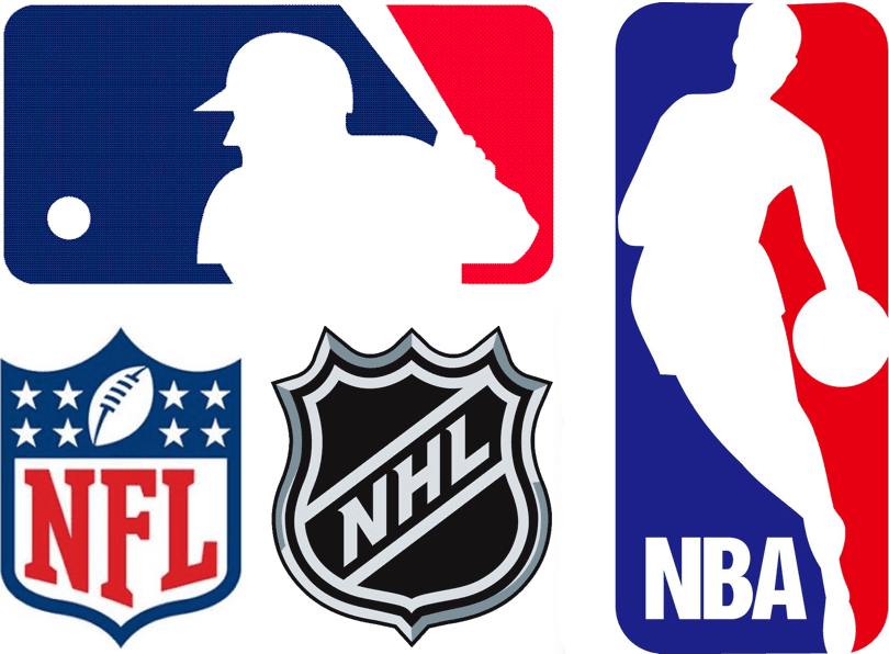
With the NBA logo moving from the front to the back of the jersey this fall, my latest ESPN column takes a look at the history of the Big Four league logos on uniforms. It was an interesting piece to work on, and I think you folks will like it. Check it out here. ”” Paul
Design contest reminder: In case you missed it last week, I’m currently accepting entries for an ESPN contest to redesign the Cavaliers. The entry deadline is this Friday, July 25. Full details here.

Baseball News: Yesterday’s Ticker included a photo of Royals 1B Eric Hosmer with some odd seams on the back of his pants, and then some commenters posted photos showing that these seams aren’t limited to Hosmer. I asked A’s equipment manager Steve Vucinich about this, and he said the seams are for an extra layer of fabric that functions as built-in sliding pads: “They are becoming more popular. Some order only them on one side. Also, a knee-only pad [also consisting of an extra fabric layer] is popular. We have about six position players with pads of some sort.” ”¦ The Cubs will be celebrating the 1970s on their upcoming homestand. That will include wearing the reverse-pinstripe road throwbacks on Sunday. ”¦ Brad Jackson was watching footage of Game 7 of the 1997 World Series and noticed that the little sunburst icon in the lower-left corner of the screen looks mighty similar to the Rays’ current logo. “Also, Bob Costas can be heard making a uni-relevant note just before that time mark, noting that the Marlins were wearing their vests for the first time in the Series because of the humidity,” says Brad. ”¦ The Norfolk Tides wore throwbacks last night. ”¦ “On SportsCenter’s ‘My Wish’ series, a kid who had open-heart surgery moments after his birth wanted to meet his favorite player, Dustin Pedroia,” says Intern Mike. “The Red Sox invited him to Fenway and gave him a Sox jersey with his own NOB. Inaccurate, but forgivable in this case, right?” ”¦ Rally stirrups: Ian Desmond of the Nats wore a pair of stirrups and promptly went 5-for-5 (from Bryan Martin Firvida). ”¦ “Salute to Cancer Survivors” jersey for the Brevard County Manatees. And yes, the Manatees are a Brewers affiliate, which explains their Brewers-esque chest insignia (thanks, Phil). … The Lehigh Valley IronPigs’ mascot is a sliced ham (from Gretchen Mittelstaedt). … Italian-heritage jerseys on tap this Friday for the Brooklyn Cyclones. ”¦ Gotta love this: The single-A St. Luice Mets wear a sleeve patch of Mr. Met decked out in cruisewear and sunglasses (thanks, Phil). ”¦ The padded pitcher’s cap, first worn about a month ago by Padres reliever Alex Torres, is not catching on with other pitchers. ”¦ The Mets are in Seattle this week, and I’ve been enjoying watching James Jones of the Mariners, who has a high uni quotient — he wears great stirrups and No. 99. ”¦ Speaking of the Mets: Eric Young Jr. fell into the stands while attempting to make a catch last night and ended up in the lap of a young boy. At the end of the inning, he went back to the boy and gave him one of his wristbands. ”¦ Here’s an odd couple from last night’s A’s/Astros game: 5’5″ Jose Altuve standing next to 6’8″ Nate Freiman (screen shot by Brian Crago). ”¦ A bill that would turn former Negro Leagues ballpark Hinchliffe Stadium in Paterson, New Jersey, into a national park is moving along in Washington (from Dave Rakowski).

NFL News: The Steelers had previously announced that they’d have a Chuck Noll memorial helmet decal this season. Now comes word that the decal design will be revealed on Opening Day — that’s Sept. 7. … Eric Wright received an email from Verizon that features a drop shadow-era Niners uni playing against who knows what. Very odd. ”¦ Speaking of the Niners, here’s their goodie pack for season ticket-holders. ”¦ Meanwhile, Colts season ticket subscribers get a license plate frame. ”¦ Speaking of the Colts: Can’t decide which Colts jersey to buy? Here’s a handy flowchart. ”¦ A bunch of Chargers players were on a softball team over the summer. You can see their attire here.

College Football News: The entrance to the Michigan State locker room has a sign with a fairly obvious grammatical error. “Was the English department unavailable for a quick edit?” asks Brian Hansen. … The rest of these are all from Phil: Matte helmets for Iowa State. … Wyoming is apparently going back to the old-school helmet. … New helmet for Nevada, too. … Check out Furman’s uniforms — past and present.

Hockey News: Concussion discussion: A new safety-rating system may lead to major changes in hockey helmet design. ”¦ Ted Arnold sent along some great shots from his youth league hockey team, which was called Jack’s Pack. Those shots from are 1969-70 and 1970-71, when Ted eight through 10 years old.

NBA News: I added this to yesterday’s main entry at 11:05am, but in case you missed it: The Wizards have released the alternate blue jersey that goes with those alt blue shorts. ”¦ Speaking of the Wiz: “When the Wizards decided to rebrand in 2011, I put together a logo and uniform concept — I’m pretty sure Phil linked to it one weekend,” says William Yurasko. “This past weekend I learned that somebody had taken that logo concept and had it tattooed on his arm.”

Soccer News: “English Championship side Charlton Athletic is using Barcelona’s away strip from last season as its third kit,” says Lewis English. “Maybe they fell off a truck in London on their way to the incinerator?” ”¦ Some third-division Spanish team you’ve never heard of is going with tuxedo-patterned jerseys (from Mark Emge). … More Big 10 soccer jersey concepts (thanks, Phil). … Also from Phil: Man U’s Chevy-branded kit will make its debut tonight. Meanwhile, here is Man U’s new road kit. … “EA’s FIFA 15 video game will have different covers — one with an Xbox-branded kit and the other without that uni on PlayStation,” says Tony Crespo. ”¦ New kits for Spartak Moscow (Phil again). ”¦ Jersey sales for James Rodriguez of Real Madrid are soaring. ”¦ Whoa, check out this Instagram feed devoted to classic soccer jerseys (nice find by David Wilson).

Grab Bag: “Nike” is apparently one of the words that can get you flagged as a security risk by the NSA if you use it too much in email. It’s unclear whether you can get off the shit list if you pair “Nike” with “sucks” (from Gregory Koch). ”¦ Good overview of Superman’s evolving uniform and chest logo (from Alan Kreit). … Here’s a look and some highs and lows from the last 20 years’ worth of Commonwealth Games uniforms. ”¦ New logo for the video game manufacturer Santa Monica Studio. ”¦ A county jail in Michigan is changing its inmate uniforms from orange to prison-striped, because the TV show Orange Is the New Black made orange uniforms too “trendy.” ”¦ Lots of rumors and leaks regarding the Apple logo on the upcoming iPhone 6. ”¦ “I was watching a rerun of Top Gear on BBC America and noticed the Nike logo on this audience member’s shirt,” says Richard Hill. “I do not recall ever seeing the Nike symbol on this type of shirt.” Me neither. … New kit for the Basque rugby team Biarritz Olympique. ” The away kit keeps the Basque flag motif, which I love, but the plague of BFBS has spread to the Pyrenees, as you can see by the third kit,” says Eric Bageman.

Here is the mets tweet of EY giving the young fan wristband and baseballs.
link
Yeah, but you can’t really see the wristband.
Everton, in the EPL, looks like it’s change/road kit will be black.
link
though, we’ll know for sure Friday.
It’s not the Niners in that verizon ad either. No helmet stripes.
I guess Verizon is NOT the official cell phone of the NFL.
That’s what’s so bizarre about link. Verizon is paying link for their exclusive NFL contract. Why is their graphics department going the bootleg route?
Eric Wright received an email from Verizon that features a drop shadow-era Niners uni playing against who knows what. Very odd.
That’s weird… but it’s not actually a Niners uniform either. The helmet has no stripes. It looks like an edited screenshot from a version of the Madden or NCAA video games. Are there any college teams that used a Niners-like jersey a few years ago?
That Biarritz link should go in the rugby union section of the ticker.
Also, you’ve forgotten to include the rugby union section of the ticker.
Meant to put that in the Grab Bag. Now moved.
Maybe if the MLS dropped the shadowing, changed their color scheme, and added a body to the foot, then they would be considered a legitimate sports league.
link
They’re already legitimate in my book. In fact, since they’re about the only soccer league that cracks down on flopping, I’d rather watch them than the World Cup.
A legitimate network TV deal would be nice, though. But they don’t need a new logo.
Pretty sure Scott was speaking in jest.
Anyway, MLS jerseys occasionally have the unique distinction of featuring link.
I prefer link. Much less cluttered.
It’s cleaner, but I can’t get over the repetition (“MLS” and “Major League Soccer”).
Though I guess that’s appropriate for a league whose website address is basically link.
Indeed, although Major League Baseball had a similar problem until they finally paid through the nose for mlb.com (it was the initials of a law firm, IIRC).
It’s worth noting that the old logo was sometimes used without the text below, just as the current logo is sometimes used with link.
“a player” = Clint Dempsey
“XBOX kit” = actual Sounders sponsor
“generic kit” = USMNT.
Couldn’t they have done a better job picking pictures of Dempsey that would better mesh with the pic of Messi, though?
The Sounders version (XBox) has poor composition. As it’s currently laid out, it’s very plain to see that it’s a cut-and-paste job. All they’d have to do is change their positions, putting Messi on the left side of the cover and Dempsey on the right, and it would look like it could actually be a single shot of the two from the same match.
The USMNT version (PS4) is just unsalvageable. The lighting on Dempsey is irreconcilable with the Messi image, and could they have picked a goofier-looking expression?
Brad Jackson was watching footage of Game 7 of the 1997 World Series and noticed that the little sunburst icon in the lower-left corner of the screen looks mighty similar to the Rays’ current logo.
If you skip ahead to 21:48, when the graphic showing Cleveland’s defense is introduced, you can see that the starburst was an animation used to fade in players’ names on the field. Not sure what happened that the graphic for the Marlins didn’t get animated, or why there was a frozen starburst well off the field.
“EA’s FIFA 15 video game will have different covers – one showing a player wearing an Xbox-branded knit and the other with a generic kit”
Generic kit?? Can’t even…
my email to Pual actually said
“EA’s FIFA 15 will have different covers. One with an Xbox logoed knit and the other without that uni on PlayStation “
Makes sense that the Sounders jersey with xbox ad wouldn’t appear on PS4 version of game. First time I’ve seen the bomb pop described as generic, but there’s a first for everything.
Have I mentioned that I don’t follow soccer?
Will fix.
I don’t follow soccer
Connie, Phil and I are planning an outing next summer. You should come, so Uni Watch will be well and truly represented.
You probably could have phrased that better, but yeah! Come to see the NYCFC with us!
I guess Clint Dempsey isn’t recognizable to everyone just yet.
Gotta say it’s been a while since I’ve seen a club squad take on a national team…
link
The first match I ever went to as a child was an Ireland vs. Celtic friendly in 1997 which served as a testimonial for goalkeeper Packie Bonner.
My favourite example of a club playing against a national side though was when Brazil played a “Shamrock Rovers XI” in 1973. It was essentially Brazil versus a combined North and South Ireland team but due to opposition from the Northern Irish association they had to line out as League of Ireland side Shamrock Rovers complete with these absolutely fantastic jerseys: link
Any of the colorizers interested in the Shamrock Rovers pic?
“… The first match I ever went to as a child was an Ireland vs. Celtic friendly in 1997…”
You were a child in 1997? Good Lord, by then I had started drooling.
I remember seeing Sheffield Wednesday vs the USMNT in Philly (Vet stadium) in 1991. John Harkes played for Sheffield Wednesday at the time.
In Japan, they refer to Clint Dempsey as link.
Twas also a weekend ticker item
scroll down to “soccer news”.
Today’s ESPN column is up:
link
The chart linked at the ESPN site showing team-custom versions of the MLB logo is nifty, but definitely out-of-date. Tampa Bay is still shown as Devil Rays, so it’s at least before 2008.
It may not be current, but it does still illustrate the point.
True — out of date. I don’t have a current one. Do you (or anyone)?
Current one now added. Here it is:
link
Very nice! It’s funny that the Tigers get two while everyone else only gets one.
It amuses me that the Tigers are the only team to have different MLB logo color treatments for home and away.
…and the Pirates’ are shown as red and black, so must have been when they were wearing their red alts & red brimmed hats. That chart is from sometime between 2000 and 2008
link
…and the Marlins one is before the “Miami” rebrand.
Paul, I noticed a commenter to the ESPN article mentioned that that the NBA patch first appeared on the uniform shirts in 1970-71. Here’s some visual proof:
link
link
link
(Although oddly, in the second picture Monroe is wearing it but not Frazier – and Monroe’s jersey and shorts are totally different shades of orange)
Also worn at the 1971 All-Star Game, apparently:
link
Nike is probably on the NSA list due to the USA’s Cold War-era Project Nike and it’s family of anti-aircraft & anti-ICBM missiles. NSA keeping an eye out for illegal sales of surplus and decommissioned materials and such.
Coincidentally, I’m frequently at former Nike site HM-95, using the facility as a practice canvas. “Street Art” and whatnot.
. . . or the shoe bomber and the underwear bomber as Phil Knight’s company makes both of those products.
That’s probably what it is, but doesn’t it also mean “victory” in Greek? (Byzantine Greek, perhaps?) I could imagnie patriotic anti-government types bringing back slogans from Athens and Sparta (“molon labe” is another popular one) when talking about how some kind of governmental overreach has to be stopped.
“it’s”
Can’t believe I wrote that.
then why is “Bob” on the list…?
Obviously it’s because Bob’s a terrorist.
RE: The NBA jersey logo: I seem to remember a gold version on jerseys for the 50th season (96-97) – maybe only on throwbacks or for part of the season? Anyone else remember this?
Wikipedia says the link was used for all unis.
Nice! I couldn’t find a picture. Admittedly, I didn’t look that hard. Thanks.
Charlton isn’t the only team wearing the Barça tequila sunrise jerseys. Iceland’s link against Celtic in Champions League qualifiers.
Oops, in the wrong place, sorry.
Good one! I missed that. Will see if I can get my editor to add.
I remember the hoohah when the nhl changed their logo from orange to silver and changed the lettering from diagonal down to diagonal up.
I think it was after the 94-95 lockout
Nope, that’s not when it was. If you read today’s ESPN column, you’ll learn the right answer, however.
“Road kit” is a weird and wonderful mashup of American and British lingo.
One major use that pro-sports leagues find for having the league logo on the jersey is anti-counterfeiting. Since each team controls its own intellectual property, the placing of the league crest allows the league itself to sue counterfeiters no matter which team’s jersey was sold.
Rather than having 30 separate teams engaging 30 separate law firms, the league can protect the interests of every team collectively. The Diamondbacks may not be as counterfeited as the Yankees but MLB can protect both brands by suing over misuse of the crest on the back.
Since each team controls its own intellectual property
Is that true? I thought the leagues were taking those over.
That is correct. The particular marks are all owned by the respective teams. The Yankees own the mark for their NY, the White Sox own the Gothic S-O-X, etc.
Yes, but do they control them? That’s not necessarily the same thing. The leagues might well have the ability to bring suit on a team’s behalf based on the franchise agreement.
Yes the team do control their own IP. Its the same reason why the NFL cannot compel Washington FC to change its name.
The team owns the mark (or it did pending appeal) and in court that is the determining factor.
Plus even if the league did own the marks for every team, would you rather file suit 30 suits for the infringement of 30 logos or just one suit covering the illegal use of one logo?
It dramatically simplifies the process, speeds up the time in court and puts damages into league pockets rapidly.
the team do control their own IP
Not in all cases.
I know that in the case of a nameless MLB team I have been associated with, the league stepped in to veto one particular use of their logo the team was planning.
What you’re saying does absolutely make sense, though, but putting the logos on the outside of jerseys wouldn’t have been necessary to facilitate lawsuits. Baseball in particular used to (still does?) put its logo on the interior tagging. Tagging which most if not all counterfeiters reproduce faithfully.
Plus (and I can’t believe I didn’t think of this before) league logos are already on all the jock tags.
So I think merchandising is a much more likely primary motivation than IP protection. Although that’s certainly important as well.
I’m sure there’s some measure of authority when it comes to usage in public negotiated via the franchise agreement. However its a different matter when it comes to the ownership rights to the mark.
I don’t think the placement of the league crest was originally motivated by anti-counterfeiting. At least not the kind we see today. Mass counterfeiting of team apparel really only began when the development of internet sales met the growth of overseas (especially Chinese)textile manufacturing.
What may have began as marketing has become very useful from an intellectual property perspective.
I think the placement of the logos tells us why leagues started this.
The NFL shield is front and center at the throat. Perfect for the league, because even if a fan throws a jacket over his jersey it’s still very visible.
With baseball (and now basketball), it’s now on the back. Again, the placement is very noticeable when you’re walking down the street behind a fan wearing a jersey.
Regarding the Cubs-Cardinals game in which the Cubs will wear their awesome-looking powder blue pinstriped road uniforms at home (the 1978 versions; in subsequent years they had NOBs and I was pleasantly surprised to see the team remember not to add them): in that year, the Cardinals also wore link.
So what will the “1978-inspired” Cards uniforms look like? They have to be a different color. Will they bring back the white home pullovers with sansabelts?
A gray faux-back (pullover) perhaps?
They could do that, but that would basically be their post-1985 road uniform, when they went back to gray but before they brought back the buttons.
And come to think of it, if the Cards do that, I hope they get that era’s NOB and number sizes correct; the NOBs weren’t quite as tall as they are now, and the numbers on the fronts were much bigger than now.
That’s asking an awful lot, considering how terrible the Cubs’ attempt at a Brewers’ throwback was. But maybe the Cardinals will be watching out.
I would not be surprised if the jerseys have the front number removed and numbers are placed on the left and right sleeves.
link
’79…’78…who’s gonna notice?
One throwback created for the then-Montreal Expos’ classic changed them from sky blue to grey. I don’t recall when the game was played, but it predated the Tampa Bay’s faux-back.
I never thought of it, but was that the first faux-back ever?
Oof, that is hideous. The best thing about the Expos’ uniforms is the powder blue, and when they dumped that in the 1990s they became another dull carbon-copy team. At least if the Cardinals trade blue for gray they’ll still be wearing a real Cardinals uniform, just from a different season.
The Iron Pigs mascot is not a sliced ham. The ham races in the meat race in between innings against a hot dog, a bacon strip and a sloppy joe sandwich a la Brewers sausage race or Nats Presidents race. The Iron Pigs real mascots are Ferrous and FeFe which look a lot like the Philly Fanatic except they’re gray and they kinda resemble a pig
Ferrous previously did actually look like a pig… at some point a few years ago they redesigned him to what he is now – which basically looks like a big grey camel.
Here, some before and after pics…
Old Ferrous (not a great looking mascot either, but at least a pig)
link
Ferrous and FeFe
link
Oh my, old Ferrous is terrible lol
That sliced ham appears to not be the IronPigs’ mascot, but a contestant in their pig-based meat race (think the Brewers’ sausage race or the Nationals’ presidents race).
The more traditional mascots are two pigs named Ferrous and FeFe (Fe being the chemical symbol for iron). link
Just came here to say this. Hambone is just one of the racers in the Pork Race, along with Chris P. Bacon, Diggety Dog, and Barbie Q. Ferrous and FeFe are the mascots.
Interestingly, Ferrous was originally named “Pork Chop”, but there was an outcry because can apparently be used as a slur for Hispanics. The bad press made them change the name before the team ever took the field. I’ve never heard pork chop used that way, but I’m glad they made the change. Ferrous is a better name for an IronPig, whose number is 26 (the atomic number for Iron)
Love the name Chris P Bacon
Stupid me. I wrote the wrong lockout year. I was thinking of the one that canceled the season and spaced on when it happened.
Thats whst happens when your league had 3 lockouts in 20 years.
Don’t they traditionally have a lockout to celebrate their CBA expiring?
Isn’t there a French version the the NHL shield? I remember a shield with the letters LNH for Ligue Nationale de Hockey. I also remember the French version being on the Montreal Canadiens jerseys, but maybe that was just merch jerseys and not the Habs actual game jerseys. Anybody know?
There is indeed a French version. But to my knowledge it was never used on game jerseys, even for the Habs. See, for example, the game-worn jerseys at the bottom of this page (click thumbnails to enlarge):
link
For what its worth, the Montreal Alouettes wear the French “LCF” version of the CFL logo.
link
That odd couple photo reminds me of Freddie Patek and an unnamed taller baserunner, during a stop in play leaning his elbow on the 5’5″ Patek’s shoulder with ease. Damned if I can find that old photo, tho.
Charlton isn’t the only team wearing the Barça tequila sunrise jerseys. Iceland’s link against Celtic in Champions League qualifiers.
It’s interesting that MLB color coordinates the logo for the various teams, but when the Jackie Robinson patch was worn for the 1997 season, only the Marlins used special colors for the patch. Are there other league-wide patches worn by MLB teams that have been different for some (like the Reds in 1994 and the American League centennial in 2001)?
I prefer the 2 previous NHL shields as the “L” looks more like a hockey stick.
This comment comes from a not very big NHL fan (so maybe it it rube-like)
Interestingly, Manchester United reserves played a friendly on the weekend in my hometown in which they wore last year’s jerseys sans advertising: link
It makes sense I guess that they would save the first on-field exhibition of the new kit for the A team, but missing an opportunity to use their abdomens to sell some crap? Very strange.
I wonder what type of economic analyses are done to find if jersey sponsoring leads to increased sales, especially if they are on a team like Man U. I suppose I could look it up, but I’m skeptical that there’s really a lot of benefit to this type of branding.
Does the fact that Chevys aren’t sold in Ireland anymore (perhaps anywhere in Europe) have anything to do with it? It’s one thing to sell Chevys when millions are watching on TV but another when it’s basically just the locals who are watching. Perhaps they are saving the ManU-Galaxy worn kits to give to the big wigs at Chevy.
But the picture from last year, when AON was still the sponsor.
I’m sure they’re not allowed to wear any AON branded kits anymore. It’s still odd but I’m sure the club wants to be able to say that the new kits are making their debut at the friendly match against LAG.
Manchester United is playing AS Roma in a friendly in my hometown on Saturday. Tickets are ridiculously overpriced, but now I’m curious as to what they’ll wear . . .
Were Celtic, Chelsea or Lazio playing, I’d go for sure.
Now it makes sense. I guess Jack White was so angry at the Cubs game last night because he found out they weren’t wearing the White Stripes jerseys until Sunday!
link
The NFL shield has been in use since before 1960, Paul.
I sent a link to you not long after I got this 1953 Yearbook, but I don’t recall if it ever made Uni Watch.
link
It goes back even further than that.
link
Chelsea’s third kit is officially out. They are opting for the black with “electric blue.” It’s in the same vein as some of their prior Tron-like uniforms.
From a functional perspective, the new unis have a “Powerband across the upper back to aid stability.”
link
One would think the NBA would lower the hemline of the shorts in their logo, ya know, the baggy look of todays players
link
The Michael Jordan one actually looks pretty good.
Fantastic ESPN article Paul, love the breakdown and the colorized MLB logos is something that I have seen but never even took into consideration that each team was unique in this way.
Those prison officials in Michigan must have never seen OITNB….The only inmates that wear orange are the newbies.
There typically aren’t many shown on the show and if they are to be featured more in the story, they get their “putty” colored uniforms fairly quickly.
Ha – I came here to say this exact thing
link
I bet CCM-Reebok/Bauer/Warrior/Easton just drool whenever there’s talk of upping safety standards in hockey.
I bought a top of the line Bauer 3000 helmet in 1996 for $50. Now the Bauer IMS 11.0 is $169, a price increase that’s 5x the rate of inflation. Added safety features and technology leads to added revenue opportunities.
I feel bad for the parents of kids playing at a decent level of youth hockey, these kids all want the top of the line stuff. It was an expensive sport back when I was a mite, I can’t imagine how parents manage today.
Especially with the type of foam used in hockey helmets now and the helmets having expiry dates.
Still wearing my Jofa 390, but my league days are long over and my days of playing with body checking are long, long, over. Not sure what type of foam Jofa used then, but it’s still soft unlike the yellowish type foam used by other companies (Cooper, CCM, etc.) back then than went hard after aging.
Actually the Lehigh Valley IronPigs have quite a few mascots. Hambone, the sliced ham, is from their mascot meat race. He races against Bacon, a Pulled-Pork sandwich, and a Hot Dog. They also have Ferrous and FeFe, a male and female pig
link
PL on vacation!
The Reds just announced that the All-Star game logo for 2015 will be unveiled on August 6.
Superheroes with corporte sponsors, that’s got to be one of the signs of the apocalypse!
link
I like the old school and new Furman uni display. But kind of goofy they put the shoulder pads outside?
link
link
I know everyone remembers the Piazza-era Mets for the fact that they wore black almost every game, but gray road unis with BLUE caps? I thought they exclusively wore the black and blue caps on the road without fail, aside from the last ever interleague game vs. the Yankees at the Stadium, but there appears to be at least one time they didn’t during Piazza’s tenure.
Drop shadow was added to road grays in 1998, which is the same year Piazza was acquired. Mets still wore blue caps/helmets on the road for many games that year. You can see lots of examples here:
link
That’s awesome. I had just assumed by that point they had added the drop shadow and switched over to the blue and black caps on the road. Good stuff.
Just wanted to point out that the Superman S logo evolution is just for “The Adventures of Superman” tv show, not for the character itself.
The NHL did have an alternate logo for a while
link
I don’t know if it ever made it onto game jerseys, but my Flames replica jersey from 2004 has that logo on the back-right hem.
Oooh, good one.
The puck logo, as far as I know, only appeared in-game in the 1994, 1996, and 1997 All-Star Games, as part of the conference logos on the link.
Video of Eric Young diving into the stands and then giving the kids baseballs and wristbands.
link
Thanks. Will add link to Ticker.
Why are Washington the only team to use red as the primary color in the MLB logo? It seems reasonable to assume they would use the same logo as St. Louis who share a color scheme (Pantone numbers aside).
i think i win a prize!
click this and you get the uni watch logo with the #7…
link
click the article and you get the uni watch logo with the #15…
link
surely that discovery should be worth something…
o_o
or wait, maybe that’s backwards, ha…
still, some of the pages have the #7 logo…
i just refreshed and they now both say “#15″…
there’s something weird going on…
did it again and they both have #7…must be some random thing in the website’s code…
It’s a browser cache issue.
Or something.
Paul, pretty sure the MLB logo started appearing on caps in 1992, not 1993. I know this because that year was when the Phillies re-designed their caps and the current Phillies cap never appeared without a logo. They also sold their old maroon caps during the 92 preseason, and they too had the logo.
Off topic, but here’s an article from 92 that discusses the new uniforms. They imply that the previous maroon era uniforms started out as red but the dye in the synthetic fabric faded or something and looked maroon so they just went with that.
link
here’s another interesting article about the Phillies switch, where the old owner of Mitchell & Ness confirms that the maroon wasn’t intended, it just “kinda happened.” Fascinating.
link