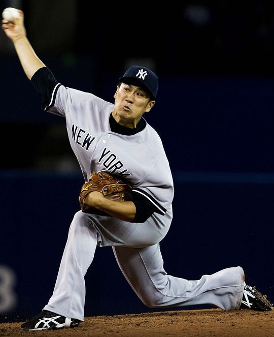
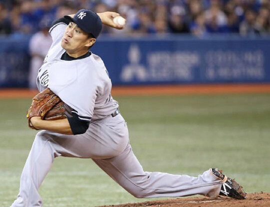
Masahiro Tanaka, the Yanks’ new Japanese import, made his MLB debut on Friday. And as you can see in the two shots above, he was pulling the old Barry Bonds move of keeping his pant legs anchored to his shoes with straps that went under the soles. The strap was supposedly banned years ago, along with a bunch of other anchoring moves, but you still see it from time to time. It appears to be one of those things that’s tolerated unless someone complains (“someone” meaning the opposing team, not me).
The strap is common in Japan, and it looks like Tanaka frequently used it while pitching over there. But here’s the weird thing: He apparently didn’t use the strap during spring training. Dig:
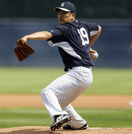

Those are just two photos, obviously, but I looked at several dozen spring training photos of Tanaka, and they all showed the same thing: no strap. So the Yanks apparently added the straps to his pants specifically for his big league debut.
The real problem with the strap, and with all the other pant leg-anchoring maneuvers (the heel-spike impalement, the shoelace tie-down, the Velcro strips, etc.), is that they’re tools of the pajamist, and pajamism is evil. If you need any additional evidence of that, look no further than this shot of Tanaka. Woof!
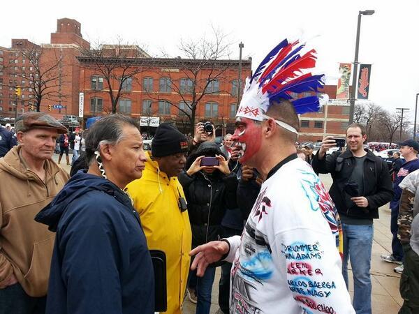
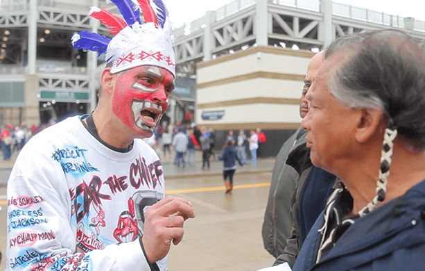

“But dude, I’m honoring you!”: As you may have heard, there was a particularly surreal encounter at the Indians’ home opener on Friday, as several photographers captured this jaw-dropping encounter between Robert Roche, a Chiricahua Apache tribal member and executive director of the American Indian Education Center in Cleveland, and an Indians fan named Pedro Rodriguez. The top photo, showing the two men in profile, quickly went viral on Friday afternoon (including on my own Twitter feed, where it was retweeted over 400 times) and prompted lots of media attention.
Several people have asked me about the photos’ backstory. Here it is: Roche was part of a group of protesters who’d turned out to call for Wahoo’s retirement. Cleveland Frowns blogger Peter Pattakos was on hand with a cameraman to shoot some footage of the protest, and they spotted Rodriguez, who agreed to appear on camera. Pattakos asked him about his costume, and Rodriguez responded with some rather unsympathetic comments about Native Americans who have any issues with Chief Wahoo. Pattakos asked him if he’d be willing to say those same things to an actual Native American, and Rodriguez said yes, so Pattakos brought him over to the protesters, where Roche and Rodriguez had their encounter. Pattakos has provided a more detailed account on his site (he’s also working on a video, which he tells me will be ready in a few days), and there’s another good overview, along with a slideshow, here.
Even the pro-Wahoo people seem to recognize how bad this looks, and I suspect they realize Rodriguez may have unwittingly hastened Wahoo’s ultimate demise. Just yesterday I phone-interviewed a pro-Wahoo fan who’d gotten in touch with me last Thursday to offer an equal-time rebuttal to my recent ESPN column on de-Chiefing. He’s still pro-Wahoo, but he said the Roche/Rodriguez incident had shaken his faith somewhat and that he’s now wavering.
The best the pro-Wahoo people can do now is say, “This guy, he’s just one asshole. Most of us pro-Wahoo fans would never do anything like that.” That’s true, of course. But it’s also true that this isn’t the first time Indians fans have gone the minstrelsy route. More importantly, keeping Wahoo on the active roster gives license and encouragement to this type of behavior. Like, if the Chief is an official team logo, why shouldn’t fans be painting their face with his likeness? That’s what fans do, right? As long as the Indians keep Wahoo around, they can’t credibly disavow this kind of stuff.
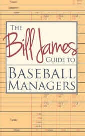
Book deal reminder: In case you missed it last week, our friends at Diversion Books have another exclusive offer for Uni Watch readers: The Bill James Guide to Baseball Managers, which is the definitive text on MLB skippers. It’s a great book (I first read it about 10 years ago), and Uni Watch readers can now download the e-version for only $2.99 — that’s 50% off the regular price.

’Skins Watch: Here’s how SI.com described a story they ran on Friday: “We set out to gauge the real sentiment regarding the name ”˜Redskins’ among Native American leaders and in grass-roots tribal communities around the country. The short answer: It’s complicated.” That’s a very good summary of their excellent article, which explores the complexities of the situation and quotes strong, well-reasoned voices from both sides of the debate. Probably the single best thing that’s been written about this issue — highly recommended. ”¦ My old high school pal Michael Grimm, who I haven’t seen in 30 years but still keep in touch with — and who lived in Cleveland for a spell in the 1990s, during which time he became an Indians fan — is the latest to de-Chief his Indians jersey.

Baseball News: Contrary to what I had hinted at last week, the Dodgers did not come out with a memorial patch for Dr. Frank Jobe on Friday. My source turned out to be wrong on that one. … Oh baby, this might be the best Sox in shorts photo ever (spectacular find by Comrade Robert Marshall). … A guy in Pittsburgh was doing some work on his old house when he found a bunch of old T-206 baseball cards — but not a Honus Wagner, alas — in the rafters (from Bryan Justman). ”¦ Cubs pitcher Jeff Samardzija wasn’t wearing the Wrigley Field centennial cap patch on Saturday (from David Taub). … The gold-trimmed championship jersey has spread to the minor leagues (from Peter Wallace). ”¦ Several of the Pirates wore old-school mustard stirrups with yesterday’s throwbacks. Some problems there — the extra white stripe, the inconsistent sannies, etc. — but it’s still better than pajamism (thanks, Phil). ”¦ Very, um, interesting uni for Notre Dame baseball. Here’s the rear view (from Warren Junium). ”¦ Ken Levin’s mother-in-law, Nina Elsohn, knitted him this amazing Orioles cardigan. “She couldn’t find any published patterns for this style of sweater, so she made it up on her own,” he says. “My contribution was the oriole patch, which is the hat logo the International League Orioles wore in 1921 and seemed stylistically appropriate.” ”¦ David Firestone has done some more analysis on the Washington Senators’ old 3-D numbers. ”¦ Hmmm, is this a photo from an intrasquad game? Nope — that’s Jacksonville State (on the left) and New Mexico, who wore extremely similar uniforms the other day (from Frank Frank Mercogliano). ”¦ Never seen this before: an old girls’ softball jersey with a “Pigtail League” sleeve patch. Here’s the full jersey. ”¦ Twins skipper Ron Gardenhire notched his 1,000th win the other day. After the game, his players saluted him with this rather amusing T-shirt (from Charley Collier). ”¦ Kansas State went G.I. Joe the other day. “What’s troubling to me as a K-State alumnus is the pitcher’s raggedy left undersleeve,” says Ray Schaefer.

College Football News: A professional illustrator has serious issues with the new Florida State logo (from Paul Leone). ”¦ NCAA honcho Mark Emmert says the Northwestern football team’s upcoming vote on unionization could set in motion a series of events that “would blow up everything about the collegiate model of athletics.” Gee, that would be a pity.

Soccer News: Three LigaMx teams this past week wore green jerseys, white shorts, and red socks, instead of their regular colors, as a gesture of support to the Mexican national team that will be competing in the World Cup. The three teams were Atlas, America, and Tijuana (from Omar Jalife). ”¦ New home kit for the Carolina RailHawks (from Andy Dunbar). ”¦ Good article on the growing debate regarding concussions in European soccer and rugby. ”¦ New home and road kits for the NASL’s Ft. Lauderdale Strikers (from Paul Mordente).

Pro and College Basketball News: NBA courts are currently emblazoned with the “NBA Green” logo (screen shot by Charley Collier). … Reprinted from Friday’s comments: Love this old photo showing the uniforms worn by the Nashville Women’s College squad (from Lee Wilds). ”¦ Killer UNLV jacket for Killers frontman Brandon Flowers the other day (from Douglas Ford).

Grab Bag: I don’t know why Robert Griffin III — or any athlete, for that matter — needs his own logo, but he now has one (from Alan Tompas). … I’m quoted in this article about the implications of advertising on uniforms. ”¦ “Jersey sponsorship has been a part of rugby for years, but the Western Force (the Super Rugby team from Perth, Australia) has a new twist,” writes James Vetter. “Each of the 15 starters wears the logo of a sponsor assigned to his jersey number. There’s more information here.” ”¦ More rugby news: The Springbok jersey that Albie Malan wore against Australia in 1963 was personally returned to South Africa after being discovered in the cupboard of the house belonging to former Wallaby Jim Miller (from Graham Clayton). ”¦ Latest team to defile the flag: Johns Hopkins lacrosse (from Jared Buccola). ”¦ What’s with the No. 18 on this guy’s back? That’s a photo from a 1950s shoeshine competition, which used to be a big deal in Wilson, North Carolina. Details and additional photos here (big thanks to Chap Godbey).
Looking ahead: I’m going to be off the grid today from about 11:30am until at least the late afternoon, maybe longer. That’s the start of what’s going to be a very busy three-week period for me. My datebook over the 20 days is pockmarked with all sorts of appointments and obligations — personal and professional, day and night, mundane (my annual tax appointment with my accountant) and special (my Mom’s 90th birthday). This will seriously disrupt my usual routines, which is a bit of a stressgasm, because I’m a pretty routinized fella.
So what does this mean for you? A few things:
• There’s a decent chance we’ll have a snow day (i.e., a day when the site is closed) at least once in the next three weeks, although I’d say that’s unlikely for this week.
• For the days that I’m on Ticker duty (as opposed to the days when Mike, Garrett, and Phil are on Ticker duty), I’ll likely be imposing a higher standard of Ticker-worthiness for the submissions that come in. My apologies in advance to those of you who send in things that end up not being used.
• I get a lot of reader queries pretty much every day (“Do the Pirates have a system that determines when they wear their throwbacks, or is it just whenever they feel like it?”). I usually try to respond to all of them, but I may be ignoring most or even all of them over the next three weeks. Sorry about that — nothing personal, just a matter of time-management. You might be better off posting queries in the comments, where other readers may be able to answer them.
• Speaking of the comments, I’ll likely be participating a bit less in some of the discussions there. (Yes, I realize many of you probably view that as a plus.)
• If you’re a member of the media looking to get a quote from me or have me on your radio show, or if you’re a student looking to pick my brain for a class project, I’m sorry but this is not a good time. Please check back with me at the end of the month Thanks.
LOVE that 1920’s-inspired Orioles cardigan sweater, great job!
yes! I agree, a black outline on the oriole would have made it perfect.
I am extremely jealous.
Been thinking about contacting some Etsy folk, see if anyone’s interested in a commission to make a 1910s Brewers cardigan…
I think the events in Pittsburgh demonstrate perfectly a point I was making in the comments yesterday. If you make the uniforms more interesting, more unique and make it clear that every element of the uniform from jersey to hosiery is important to the whole, players will be more likely to go all out (even if somewhat clumsily like yesterday). As it stands, the current crop of MLB uniforms is so staid and utilitarian that the players have no reason to feel like their appearance, the way they wear their uniform, matters. I grew up with school uniforms and the way the pros are wearing their uniforms these days is very reminiscent of the way we used to wear our school uniforms i.e. as half-assedly as possible. The difference of course is that school uniforms are supposed to be soul crushingly unstimulating.
Very, um, interesting uni for Notre Dame baseball.
By “interesting”, I assume you meant “awesome”, right?
My only gripe is the adidastripes down the back of the neck. A very stupid logo placement, but otherwise an awesome uniform.
Agreed. But the stripes probably wouldn’t look so bad if not for the equally unnecessary ND logo just below them.
Not to mention that stupid ND logo on the back above the number. Either ditch the stripes, or move the ND logo to the bottom so that it and the stripes frame the number. It would look a lot better like that.
that’s one solution.
A better solution would be to move the ND logo to the sleeve.
Oh wow, that Notre Dame uniform. It looks like the love child of a cycling jersey and a fast food joint uniform.
The 70’s called… and they have more polyester to share with us. Jeez, I lived through this period once, must we go through it again in the name of fashion?
Spoiler alert – for noobs born 80’s and beyond, the 70’s titanically sucked from a fashion standpoint (great music – lousy clothes), polyester and plaid dude! Men in speed suits, gold chains, hairy chests, the horror. The phrase “Old School” meets it’s evil twin. If you were a fan of Purple velvet and platform shoes (only two people on earth could rock that – James Brown and Elvis) this was the decade for you.
In complete and total fairness, the stirrups are all kinds of awesome, need the rest of the uniform to match.
70s? link, yo.
Yo,
1975…
link
Genius.
I am with The Jeff. Those Notre Dame baseball uniforms are awesome. The gold pants is different from what baseball teams usually wear and I think it ties into the overall university look.
You spelled “khaki” wrong.
Not the first time that Indians fans confronted protesters either. I saw it back during the 1995 (or was it 1997?) World Series. Some protesters were handing out leaflets that made their anti-Wahoo argument impossible to refute. The most memorable taunt I heard was from a pro-Wahoo fan -“Get out of here you damn Injuns!” – proving, I suppose, there was no racism.
I am sensitive to the image of Chief Wahoo and how it offends many people, and I feel we will either see a name change or just Chief Wahoo being eliminated all together. I have been a life long Indians fan thanks to my Dad. Spent many a summers in the 80’s and 90’s at the “Mistake on the Lake”. I associate Cleveland baseball with the name Indians. It would not make me abandon my loyalty to the club, but I just can’t wrap my mind around rooting for a baseball team in Cleveland called the Cleveland “insert new nickname”. However I think the change is imminent, and justified.
Many Native Americans self-identify as American Indians, so the name doesn’t necessarily have to change. The club just has to build an identity which *actually* honors Natives, with their input.
i don’t see them changing the name, because it’s really not that bad, but as much i hate to see it(being a tribe fan myself). i can see them caving into the minority opinion and totally abandening the chief
Doing the right thing totally sucks, man.
I think the ideal tack is to have American Indian graphic artists develop the new iconography. Has anyone tried this?
“I think the ideal tack is to have American Indian graphic artists develop the new iconography. Has anyone tried this?”
~~~
Ha! I said much the same thing, about 2 minutes after you (didn’t see your comment) down below in this thread.
I think that is EXACTLY the tack the team should take. Perhaps a logo that is designed by Native artists and that reflects their vision of an honorific logo (and not a racist caricature) can be achieved. But any such logo should be, if not designed by, designed in consultation with Native artists and leaders.
Is there anyway the Indians can create a logo that (a.) isn’t offensive to American Indians and (b.) isn’t so damn generic like the one they have now? Even as a pro-Wahoo person, I have to admit that minstreling should have died a long time ago, but really, I’d rather there be some degree of creativity in the logo rather than a boring C.
I actually like the letter as a logo, given that many of the great baseball logos are just that, letters. The interlocking NY of both the Yankees and Mets, the Cubs’ C, the Cardinals’ StL, the Dodgers’ LA. Heck, if you want to push it, even the Brewers glove and ball and the old Expos logo were letters. To me, it’s more traditional than a non-letter logo.
The best non-letter logos that jump to mind are the Orioles (although the bird is wearing a hat with an O on it, so..) and the Blue Jays. I also have a soft-spot for the jumping Marlins logo, but even that used a letter.
I think hodges14 isn’t objecting to a letter per se, but rather that the Indians block C is too boring. To which I strongly disagree – it’s an awesome mark for a Cleveland team, and if it’s so darn generic, how come no other team in baseball has a cap logo that even remotely resembles it? But let’s accept hodges14’s criticism, since it’s one that’s clearly widely shared. Personally, I think the Indians have the perfect post-Wahoo identity, including non-boring C cap logo, in their 1973-79 set. I’d even be inclined to stick Chief Wahoo’s feather on the logo, as I’ve posted here before:
link
“Is there anyway the Indians can create a logo that (a.) isn’t offensive to American Indians”
~~~
Perhaps if the team actually reached out to the Native population and, ya know, included them in a redesign process, we might find out.
Is there anyway the Indians can create a logo that (a.) isn’t offensive to American Indians and (b.) isn’t so damn generic like the one they have now?
Absolutely. See the Spokane Indians and to a lesser extent FSU. (As an aside, wonder what kind of input the Seminole tribe had in the Nike process.)
I “get” that the team (as a business) is trying not to alienate their core consumers who are most likely pro-Wahoo and NOT racist, but the longer they sit on their hands the worse it will get.
Talk to some mid-west tribes for input, hire some Indian designers for a new accurate logo, set up a non-profit for outreach and improvements on local reservations (not Snyder’s sham), and make the rebranding a “do-good, feel-good” story.
The longer the Dolan’s drag this out the more photos like the one’s from this weekend will tarnish their business and eventually hurt their bottom line.
Phil types faster than I.
I think hodges14 isn’t objecting to a letter per se, but rather that the Indians block C is too boring. To which I strongly disagree — it’s an awesome mark for a Cleveland team, and if it’s so darn generic, how come no other team in baseball has a cap logo that even remotely resembles it?
I’m with arr – I love that “C”. I really wish my Brewers had something in a similar style instead of the twisted and distorted logo they wear today.
ESPNCleveland.com has an interview with Pedro Rodriquez, where he says that he was set-up. Here’s the link:
link
That’s not exactly what he says.
I listened to the whole interview, and he was more emphatic about refuting the claims that he was drunk, or that he went to the ballpark looking for a fight with the AIM protesters. He doesn’t dispute the basic facts of the Cleveland Frowns report.
Rodriquez also (obviously) wants the Indians to keep the Wahoo logo, but (surprisingly) agrees that “the nose and skin’s gotta change”.
Was going to send this to Paul for the ticker, but given what he said, I’ll just post here.
Found the Seattle-Portland MLS game this past weekend nearly unwatchable given the uniforms the teams wore.
link
At least they didn’t go link like the last time they met.
Why the heck do they have just “XBOX” on their jerseys? Shouldn’t they be promoting the current system? Jersey sponsors are stupid, but one for a product that’s over a decade old and no longer in production is really stupid.
XBOX as a whole is the brand which encompasses all 3 systems.
and although the original xbox is no longer in production, the xbox 360 still is and it continues to sell relatively well.
Speaking of black alt jerseys in MLS, I’m kinda fond of link.
Perfect summation of why I can’t take MLS seriously. That isn’t Portland against Seattle – it’s the baggage handlers against the gamers.
““What’s troubling to me as a K-State alumnus is the pitcher’s raggedy left undersleeve,” says Ray Schaefer.”
I assume his concerns are simply that it looks tacky, but as I’ve opined on these comments before, athletes (and, I think, baseball players in particular) are a superstitious lot prone to obsession over a routine. I would bet that pitcher has used that undershirt in every game for some time, the so-called ‘lucky shirt’. And he’s not about to give it up just because it starts to fray a little bit. In fact, that might even make it more appealing to him.
I am guessing the Green Notre Dame jerseys will be shelved right next to the Green football jerseys after yesterdays performance in them. Lost 11-2.
Re: pajama pants
I was at the Durham Bulls game Saturday evening with a friend who is a die-hard Clemson Tigers fan. I pointed out to him that ALL of the Bulls were high-cuffed, while ALL of the opposing Gwinnett Braves were wearing pajama pants. He said, “You mean the Clemson cut? The pants go over the first two laces.”
I’d never heard the term, as a faithful uni-watch reader they’re “pajama pants” – but some googling lead me, of course, back here (2010 article). Still thought I’d share!
Browns uniform updates from redditor claims to have ties to the company that makes the NFL/College helmet logos
link
If that guy is legit, the city of Cleveland is going to riot. The Browns not having brown jerseys? Are you kidding me?
But, hey, at least they’ll be getting pretty much every uni fad from the last 10 years that’s already horribly played out so these won’t last long.
– GFGS
– matte helmet
– chrome accents
I hope that is not legit but the way things are going now who knows.
Apparently, this guy is claiming the Broncos are ditching orange – a rumor that came up elsewhere on Reddit in the aftermath of the Super Bowl.
For all we know, it could be accurate that the Browns design he mentions is one possible direction that is under consideration, but as it’s been previously reported, the team is in a 24-month development cycle that’s not due to be completed for another year.
As for the Broncos, unlike the Browns, unless you can show me a source that does not come from Reddit – namely, a team official going on record, as Jimmy Haslam has for the Browns – I’m going to remain skeptical about the Broncos changing.
I’m curious to see how different MLB teams determine their uniform schedules. I remember back in the ’90s, the Mariners let Griffey Junior decided what to wear.
Only on days when he pitched.
Griffey actually got credited for designing (with another player — Jay Buhner, maybe?) the Mariners’ sleeveless alts.
Didn’t that start with their “1946” TBTC game against the Brewers in ’93?
Maybe it’s the anti-Wahoo crowd doing stupid things to hasten the demise. Wouldn’t be surprised.
Sure, it’s a conspiracy. That must be the explanation!
Just like the KKK was really civil rights agitators. And the abortion clinic bombers were really radical feminists. And…
A little touchy about this huh? While probably not the case, I wouldn’t be at all surprised if the anti-Wahoo and Redskins crowd would pull a stunt like this. It seems to have taken over the top spot on this site every day which is certainly your prerogative since it is your site. I just find that the top billing it gets grows tiresome and most times just skip over it. It certainly seems to be a mission for you. With that said, it’s a free country, thank goodness. You have a right to voice your opinion, just the same as I have a right to voice mine. Hopefully that doesn’t go away anytime soon…………………
I think it’s pretty clear who the touchy one is, Randy.
If you float crazy conspiracy theories, they’ll be called out as such.
The Wahoo story does not have “top billing” today, nor has it had top billing on any day in the past year except for last Thursday. But I will continue to provide coverage of a developing story that’s right in Uni Watch’s wheelhouse. We’ve already been thru this — in case you missed it, here you go:
link
Paul,
It does appear Randy has hit a little nerve. While it is not “top billing,”‘ to steal a phrase from newspapers, it is definately front page below the fold.
The topic started out under the topics of baseball (Indians), football (Redskins), and Amaeteur (College and High School) and now has its own subsection, and is the first one in the group. More recently it has been making the jump above the groupings as a primary or secondary highlighted topic.
Is it a running story that’s receiving continuing coverage on the site? Yup. So call it that, instead of engaging in hyperbole by trotting out an inaccurate term like “top billing.”
And why is it a running story that’s receiving continuing coverage on the site? One more time:
link
Complaining about the coverage of this topic is like complaining about coverage of stirrups. Seriously.
Have to run now — everyone have a nice day.
I have said I am annoyed by the nonstop Redskins and now Chief Wahoo talk. But I do not own the site so we have to put up with it.
I have said I would be annoyed if the site was pro Wahoo or pro Redskin if it was talked about daily. And it is always near the top of the page.
Wahoo is a drawing, a cartoon it is not real. Luigi and Mario are not real either. I am not offended by them.
A couple years ago the Redskins and Chief Wahoo were not big issues on here. How is it that all of a sudden those are offensive and anger some white guys
Oh well I stayed out of this for a while.I will go back to having to be annoyed by the constant placement and minor stories such as so and so columnist in some city is not going to use Redskins in his columns. Big deal
Wahoo is a drawing, a cartoon it is not real.
So link? Mind blown.
What is the intent there and what was the intent for a sports team mascot??? Chief Wahoo is just a drawing and a mascot like for every other sports team.
Huge difference that maybe you are not able to see.
Whatever the intent, the effect is to represent a race of people with a dehumanizing caricature.
You should be surprised. The thing that bothers me about conspiracy theories is how stupid they are. It’s usually obvious that the person offering the conspiracy theory hasn’t spent even five seconds thinking about what he’s saying. So let’s game this out. One or more advocates of ditching Chief Wahoo decides to “make Cleveland fans look bad.” In this instance, that would mean having a crew of Indians fans dress up in red-face and elaborately hand-drawn shirts. Then you have to have the blogger’s collusion; he would have to know which Indians fans to seek out. Then all of them would have to have agreed in advance on a script, since the whole thing is being video recorded, and they’d all have to deliver their lines perfectly and with the proper intonation and emphasis.
So we have, what, five to seven people engaged in an elaborate scheme that requires each to display the skills of to professional stage actor and keep their involvement in the whole thing quiet? Hell, the actual United States government, including its intelligence community, cannot reliably pull off such a stunt. And this assumes that the actual Indian official in the exchange was a dupe and not in on it himself; assume that he’s also in on it, and you have the added problem of intra-tribal politics, where nothing stays secret, ever. Either way, the amount of effort and skill the conspiracy theory requires is akin to the Valkyrie plot to kill Hitler, all for the sake of scoring a minor, quickly forgotten news-cycle bump on a trivial issue. It beggars belief that someone would suggest this as a plausible theory.
Anyway, that’s always my challenge to conspiracy nutters: Spend thirty seconds gaming out the logistics involved. Conspiracy theories almost never stand up to even that level of scrutiny. If the conspiracy requires more than two or three people to perform nearly superhuman feats of skill in pursuit of a minor goal while keeping the whole thing secret, the conspiracy theory is bullshit.
PS: I’ve seen redfaced Indians fans confronting Native American anti-Wahoo protesters at the Metrodome in the early 1990s and looking like loudmouthed racist dipshits in the process. Were they in on the conspiracy too? Apparently this thing runs as deep as the Trilateral Masonic one-world-government plot! Those Chinese helicopters with UN markings in Nevada aren’t preparing to impose Communism in Washington, DC, they’re getting ready to kidnap Chief Wahoo from Cleveland!
C’mon, sheeple. This is clearly just a manufactured controversy designed to distract from Benghazi. Also, #ACORN!
But I digress …
“Even the pro-Wahoo people seem to recognize how bad this looks, and I suspect they realize Rodriguez may have unwittingly hastened Wahoo’s ultimate demise.”
When I first saw the top photo via Twitter, my initial thought was similar to what Paul noted above. There’s a definite “tipping point” feeling about this image, not only because of the redface (though that’s clearly the dominant factor) but also because of the contrast between the (apparently) loud-mouthed, lecturing/condescending body language of the white dude in redface vs. the stoicism of the Native American gentleman. This is particularly strong in the middle photo.
The other important note that Paul makes is that, as long as the team keeps Chief Wahoo as an official logo, it implicitly (hell, explicitly) condones this shameful behavior. Can’t honestly criticize someone who dressed up as a caricatured, minstrel-esque grinning red-faced “Injun” when your mascot is, um, a caricatured, minstrel-esque grinning red-faced “Injun.”
Not that this should matter, but for those who defend the Chief purely on the grounds of “tradition” or long-standing association with the team & its fans, I totally understand you – but I just think you’re wrong. When I was a kid growing up about 2 hours away from Cleveland in the 1970s, one of our family traditions during our annual trip to see Tribe game was a contest to see who would be the first to spot link as we drove down the highway toward the stadium.
The Chief is right up there with the caveman unis, Frank Robinson, and sitting behind a pole & freezing my ass off in July inside that cavernous, swept-with-lake-effect-wind stadium in my treasured childhood memories of Cleveland ballgames. I love those memories, and I love the family traditions that they’re associated with.
But none of that makes the Chief any less problematic. And the sooner he’s officially relegated to the team’s past, the better.
I think the Koch Brothers are the invisible hand(s) behind the fake confrontation.
Hugh, I agree with you 100%.
In particular, I think you’ve hit the nail on the head with the “tipping point” comment. Despite the fact that these protests have been going on for a while, despite the de-logoing of jerseys and hats, that second photo will oneday be remembered as the moment the tide turned.
Those last three paragraphs are a thing of beauty, Mr. McBride.
Part of creating a better world is having the maturity and good grace to recognize that some of the old world, even things we truly, dearly love, need to be abandoned.
The last time white guys conspired to don feathers and warpaint to foment insurrection, a bunch of tea got dumped in Boston Harbor.
Would the Cleveland equivalent be throwing a few bottles of Stadium Mustard into the Cuyahoga?
Most things that are faked fall apart pretty quickly too. The truth tends to come out quite fast. Example was the Tawana Brawley incident where she claimed she was raped and had racist things put on her body. Sharpton got all wrapped up in it but soon enough it came out that she had lied.
For this to be some sort of setup, as you said, takes a lot of people and logistics. Eventually, someone lets the cat out of the bag if you will and the truth comes out. Always happens that way. Maybe Pedro thought since he is hispanic he can’t be racist? Who knows. But, in the end, Wahoo has got to go. I also think the Indians need to take the high road NOW and retire him and then work with Native American leaders to make the team a true honor to Native Americans. Get those tribes directly involved and not in the sideshow sort of way either. A fitting tribute to honor them would be required. I believe, in the end, that’s all the Native Americans ask.
I thought it was an interesting conspiracy and I think it is plausible. However, other than uniwatch and its twitter feed, I don’t know if this got much coverage other than the Cleveland area. Maybe I am living in a dark cave?
A little Williams Lectric Shave helps before applying Occam’s Razor. The simple explanation is probably the correct one.
Article in the Sunday Champaign News-Gazette about the University of Illinois’s soon to be revealed “rebranding” and uniform redesign by Nike:
link
Some of our local Little Leaguers in Greenville, NC broke out some stirrups this past weekend.
link
Oh, interesting thing I noticed at the Mets game on Friday, although I didn’t get a photo.
The Mets Hall of Fame is selling game used jerseys, and I was pawing through them, obviously. One of the first ones I saw was a 2001 Glendon Rusch road. I’m surprised the team kept that one for so long, although interestingly enough, I remember going to a game last year and stopping off the memorabilia stand, (a common thing I do) and seeing a 1997 Jay Payton complete with the Jackie Robinson 50th Anniversary patch. Anybody have the urge to pick up a really old Mets jersey just for nostalgia’s (and hipsterism’s) sake?
“One of the first ones I saw was a 2001 Glendon Rusch road. I’m surprised the team kept that one for so long.”
~~~
Perhaps they’ve “kept (it) so long” because no one wants to buy it.
I’ve been scouring ebay for a while trying to find a reasonably priced and proper fitting link – the only years they wore that style.
There are A LOT of mid-90s Mets jerseys floating around, game worn by call ups and back of the bullpen guys. I seem to remember an auction a few years ago (as they were exiting Shea?) I’m assuming dealers purchased in bulk.
I have always stood on a middle ground, I don’t agree that all native american imagery must go but we can get rid of the truly worst of it, the Redskins name and the Indians logo.
As a Redskins fan, we should change our name to something like “Americans” and it makes it inclusive and a positive thing rather than something that can be taken as a negative. It allows the team to keep some of its old identity because you can keep the logo’s and team colors.
That is the truly Washington D.C. style solution to a problem, where neither side gets what they want but you solve the real issue witch is an offensive word and logo. It keeps the teams identities while making them no different than the word “Yankees”, turning something that was once offensive into something positive.
As for that bama looking dude in Cleveland, some folks just need to not be let outside.
Compromise is the old Washington way of doing things. The new way is mostly wrapping oneself in the flag, calling your opponents names, and absolutely refusing to give even an inch. This is as true on the left as on the right.
So, many of us are already doing this “Washington style.”
Re: the “Pigtail League” sleeve patch, I seem to recall that back when I was a young ‘un in Ohio, our community youth softball leagues were divided by ages into “Pigtail” (younger girls, maybe 8-10) & “Ponytail” (I’m thinking ages 11-13).
Ooooh, I like that!
Robert Griffin III must have a closet baseball fetish, because his new personal logo looks like home plate. But hey, nice upside-down Adidas logo as incorporated in the bottom of it.
That was my first thought too, though overall, I like it.
The shape also vaguely looks like a couple of “hi-tech” feathers, I wonder if there was any ‘Skins consideration in its design evolution.
Feathers? Not saying you’re wrong, but I don’t see it at all. And I think it would be unwise with respect to design and purpose. You want a logo for a personal brand? OK, then it should not have any elements that would automatically necessitate a change.
The Jordan Jumpman? Super generic in that way, thus a very strong personal graphic. LeBron James? He actually needed a total redesign when he changed from Cleveland 23 to Miami 6. Michael Vick will also need a logo tweak because Geno Smith is keeping the Jets’ #7. Obviously, RGIII will always be RGIII because that is his name, but he will not necessarily be with Washington forever.
Good thing Lew Alcindor’s logo didn’t have any Bucks references.
Come on, we all know his logo features sport goggles and a sky hook! ;-)
“Most of us pro-Wahoo fans would link.”
Why does that idiot’s name have to be Pedro?? (sigh)….anyway, I find it interesting that there’s few players that wore green in recognition of the Mexican National Team that play or have played for the USMNT. The ones that come to mind all play for Club Tijuana: Hercules Gomes, Edgar Castillo, and Joe Corona.
Sorry, for you, but to some degree I find it comforting that this photo points to some equal opportunity bigotry. You don’t have to be a Mayflower descendant to be a jackass.
It would’ve been especially awkward if Puebla had gone green too – DaMarcus Beaseley was really unhappy about not being released to play for the US midweek.
If anyone is likely to complain about Tanaka’s pants straps my bet is on Buck Showalter. Tanaka is pitching against the O’s on Wednesday. We shall see.
Paul,
Is this your Chicken Sexing patch that Ebbets has “temporarily” gotten their hands on?
link
I found the picture of Club Tijuana from the LigaMx teams that wore Mexican national team inspired uniforms interesting. Two of the players in that picture, Edgar Castillo and Joe Corona, are dual-nationals (Corona is actually a tri(?)-national, his parents being from Mexico and El Salvador, but being born in the US) that decided to play for the USMNT instead of Mexico. I’d love to see Rafa Marquez in the old denim star and stripes USA World Cup kit.
That Notre Dame link is a train wreck. Contrasting front panel lid, AND beach blanket pullover jersey, AND striped stirrups? No. You can have no more than two of the three.
No, the real problem isn’t that they went with all three elements, it’s that the stripes on the stirrups are the wrong pattern. Just imagine those if they had gone with the same pattern as the chest/sleeve stripes.
Exactly. The contrast-front caps actually go better with the jersey than they would without that Sox-style stripe. (And kudos to the Irish for not going with a white contrast-front cap; unless you’re the Expos, contrast-panel caps should never be white.) The whole thing looks terrific, but if they’d repeated the shirt stripe pattern on the stockings, it would have gone down in history.
You’re both on crack. Too much of a good thing.
I have a feeling idiots will still dress up like that even if the Indians get rid of Chief Wahoo.
Quite possibly, at least for a while. But at least they’ll be operating without the team’s tacit permission/encouragement/etc., and eventually they’ll become an isolated remnant of the fan base, as a new, post-Wahoo generation will come of age.
The best kit to come from the Nike design department this year and they aren’t even going to the World Cup: Finland.
link
It is a thing of beauty!
How did Paul not end up at Marquette just for the basketball unis?
link
Re: the article quoting Paul on uni ads
While I’m by no means in favor of American teams adopting the practice of selling ad space on their uniforms, I would be slightly more okay with it if it meant fewer commercial breaks. It seems to me that, in a team sport that twice plays non-stop for 45+ minutes in a single game, uni advertising was concocted as a way for the owners to make money in lieu of being able to air commercials every 5 minutes.
Obviously this doesn’t negate Paul’s stance (“just because you can doesn’t mean you should”), but MLB and NFL games would be a little more pleasant to watch if you could watch the game all the way through without a stoppage every few minutes. It makes it particularly insufferable when you’re actually attending a game, and you realize how quick and easy it is for the other team to run out of the dugout to its positions, or for the offense & defense to switch in football, and how much time is wasted because of TV timeouts and commercial breaks.
Right. But have you ever heard anyone from the NBA (or any other league) suggest that they’d be trading uni ads for commercials? And is there anything to indicate that they’d do that type of swap, instead of just adding the uni ad revenue to their existing TV revenue?
Can anyone identify the “D” logo in the lower left of the Final Four floor? It’s one I’ve never seen. Thanks in advance.
1986 Final Four? Not sure why this is worth noting in 2014. link
Nice shoutout on Olbermann!
Looks like I did hit your nerve, Mr. Lukas, and whether you know it or not, that is exactly what I was trying to do and it was very easy. You definitely are the touchy one and an easy target on this subject. Have fun on your crusade!
Randy, you seem more concerned with me than with the issue at hand.
I’m flattered by your attentions, naturally, but you might want to keep your eye on the actual situation. While you’re worrying about me, your side is losing the argument (which, of course, is why you’re trying to make it about me, because that’s all you have left).
Sweet dreams.