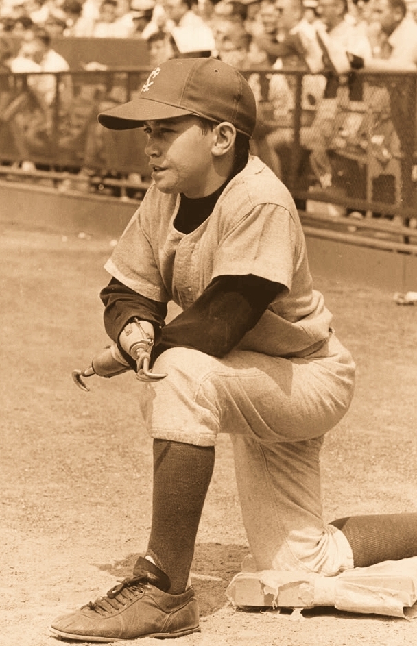
Reader Bruce Menard recently clued me in regarding a chapter from fairly recent MLB history that I hadn’t been aware of. It involves a guy named Jay Mazzone, who worked as a batboy for the Orioles in the late 1960s. The unusual thing about Mazzone is that he’d lost his hands when he was two years old after his snow suit caught on fire, so he used metal hooks in lieu of fingers. This certainly made him an unusual sight on the field (for all of these images, you can click to enlarge):

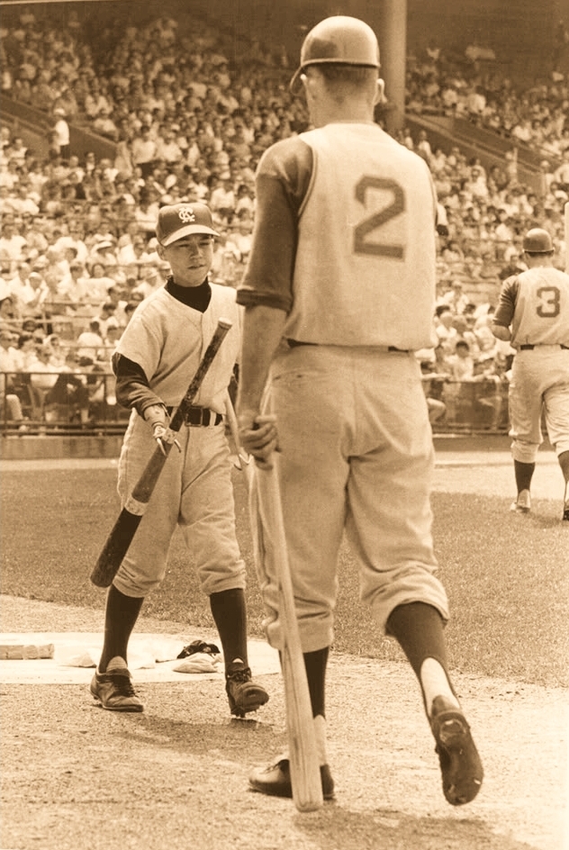
Mazzone began working for the Orioles in 1966. He apparently started as a batboy for the visiting teams, as you can see in these ’66 shots of him in a Kansas City A’s uniform:
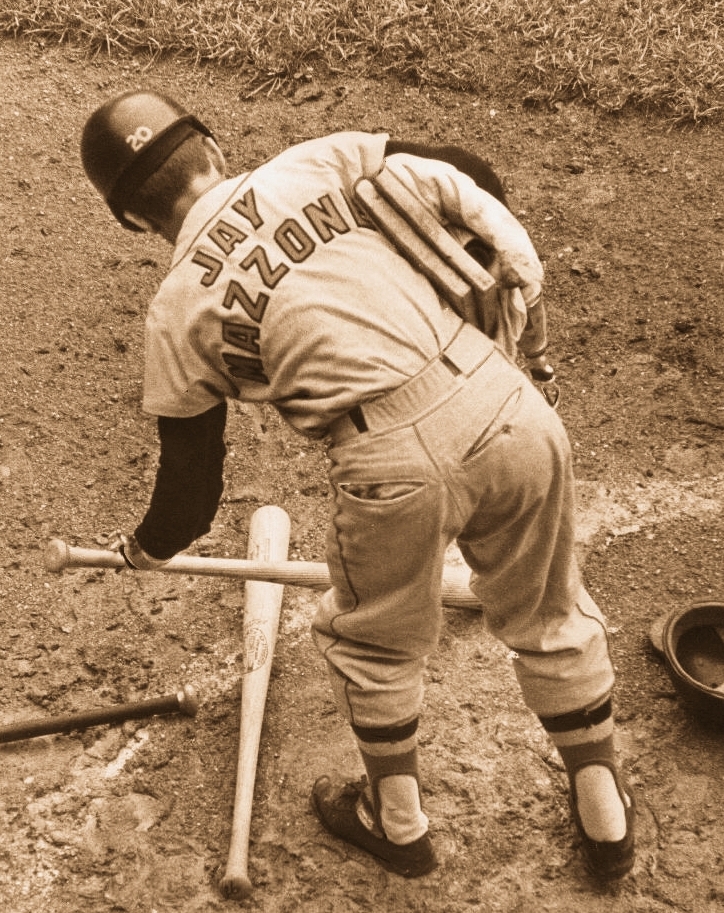
It didn’t take long for Mazzone to become something of a media sensation, and the Orioles soon had him working for the home team. He became so well-known that they even gave him a FNOB jersey:
Note the “20” on his batting helmet — Frank Robinson’s number. Could Mazzone have been wearing one of Robby’s helmets?
By 1971, Mazzone had become such a celebrity in the baseball world that he was presented with his own signature Louisville Slugger bat:

Looks like ol’ Jay was getting a bit mod in his high school years, eh? That suit is priceless, and the facial stubble is a nice touch. Hey, I’m sure you can smoke a joint just as effectively with metal hooks as you can with fingers (maybe better, since you don’t have to worry about burning your fingertips).
Want to know more? The Baltimore Sun did one of those “Where are they now?” pieces on Mazzone in the summer of 2007. You can check that out here.
Collector’s Corner
By Brinke Guthrie
CC is all-NFL this week, as we gear up for this weekend’s conference championship games. Ready? Here we go:
• This 1970s Patriots switchplate cover looks to have been modeled after Earl Campbell (who never played for the Pats, obviously). Even looks like he’s wearing No. 34!
• I like this Patriots helmet buggy. Why don’t they still have these on field?!
• New England fans, suit up in this 1960s Pats snowsuit before heading to your next game at Gillette.
• I’ve never seen a 49ers Starter warm-up before, but seeing is believing.
• This 1960s 49ers Technigraph plaque is priced to move…kinda.
• Here’s something you don’t often (or ever) see: a vintage Niners hand puppet. What?
• Here’s a 1960s Niners serving tray — perfect for your NFC championship game TV party.
• Different 1970s Falcons helmet plaques here and here.
• Here we have a very nice 1970s Falcons gym bag.
• Really nice 1968 Falcons poster, in excellent condition according to the seller. And here’s a Damac one, too.
• Some Fleer Falcons big signs here. Is that Bartkowski wearing a Muncie facemask?
• Not much in the way of vintage Ravens merch, for obvious reasons. So let’s search for vendors who lost their NFL license. I recall the Logo Athletic style of this Ravens cap to be quite horrid.
• Did I say horrid cap design? This Ravens cap from Starter qualifies.
• And I must say, I like this Ravens logo a lot better than the cartoon bird.
Seen something on eBay or Etsy that you think would make good Collector’s Corner fodder? Send your submissions here.
ABA Photo Contest: Our friends at Grey Flannel Auctions have launched a new project to create a completely ABA uniform database. This is a trickier proposition than you might think — there are lots of gaps in the ABA’s visual record. So the Grey Flannel folks are issuing a challenge, in the form of contest: Take the rest of this week to dig through your archives, poke around on Google, or whatever. (Hint: Don’t bother with RememberTheABA.com — that stuff is already covered.) If you can find any ABA uniforms not already shown on the Grey Flannel site, send them to me. The person who comes up with the best find(s) will win a $250 Grey Flannel gift card.
Deadline: This Friday, Jan. 18, 7pm Eastern. Happy hunting!

PermaRec update: You’ve heard about found photographs, but what about a found memory card? That’s the basis of the latest entry on the Permanent Record Blog.
Uni Watch News Ticker: If you like the Braves’ new BP cap, you’ll just love these new “sportswear” designs from Adidas. Perfect for that 10K race down the Trail of Tears, or wherever your Manifest Destination might be. No word on whether you get a free headdress with each purchase (thanks, Kirsten). … I’m still calling it Cleveland Browns Stadium (from Johnny Bruno). ”¦ Very interesting piece about why cell service at sporting events often sucks (thanks, Teebz). … Here’s a chart showing the evolution of the Superman logo (from Kurt Esposito). … Gideon Black asked why I didn’t say anything about the Texans wearing solid-white on the road on Sunday. Honestly, I didn’t realize it was a noteworthy look for them. But sure enough, they only went solid-white one time this season, and that was at home. “They usually only wear the all-white at home for the first couple weeks of each season (I guess because of heat), while on the road it’s always blue pants,” says Gideon. So there you go. … New logo for the Kentucky state high school basketball tourney (from Josh Claywell). … FNOB alert! That’s Mark Hammerstein (duh) of the 1986 Michigan football team (from Mako Mameli). … MLB is on a communications kick: Last week it was cell phones in the dugout, this week it’s interpreters on the mound (and no corporate tie-in either, not bad!). … Latest college hoops team to wear those NBA/Xmas-style uniforms: Baylor (from Curtis Schroeder). … What’s that wrapped around Josh Johnson’s left knee — tape? Elastic? (From Marc Bauche.) … What was the deal with Marshawn Lynch’s socks on Sunday? “Those are Strideline socks,” explains Joe Mueller. “They have city skylines on them.” ”¦ Lots of photos of Korea’s WBC uniform here (from Dan Kurtz). … I’m off to Long Island to see my Mom today. Play nice while I’m away, yes? Yes.
I had been unaware that interpreters weren’t allowed to come to the mound until now! Why wouldn’t they be allowed to? The pitching coach can come out whenever he likes, can’t he? And an interpreter is really just another kind of coach.
Linked story doesn’t say whether interpreters will wear team uniforms like a coach, or khakis and polos like trainers. If the latter, will there be translator caps?
if the interpreters don’t have to wear a uniform, then i say it’s about time our beloved, out of shape coaches ditch the uniforms!
clint hurdle will look just fine in a polo shirt & slacks, and we’ll know exactly who he is, MLB…
and hell, new era… coaches caps!
I am sure it will be like the trainer where they have to wear SOME kind of team apparel – with a preference for a jacket involved.
Baseball back in the late 40’s did a comprehensive overhaul of the rules, where they cleaned up a lot of rules that had been neglected since the 1800’s, and also cleaned up the way game LOOKED. That was when, for example, they made the players bring their gloves in from the field instead of flipping them on the field as they came off. That is also when they codified the manager having to be in uniform. They grandfathered (literally!) two people – Kindly Old Burt Shotton and, who else, Connie Mack. Even then you see pics from the day of Shotton wearing Dodger jackets with regular slacks. Besides making the dugout look more ‘professional’, there is also a practical reason: Technically, an MLB manager is listed on the team’s roster, and, correct me if I am mistaken, is TECHNICALLY eligible to play in the game! Frank Robinson actually did that as manage of the Indians a couple of times; and I suppose, if Don Mattingly really, REALLY needed a pinch hitter he could go out there himself sometime. Again, someone correct me if I am wrong about this.
But the point is that, yes again, baseball is a totally different game that the rest of the team sports. it is the only game where the coach/manager actively goes out on the field, and baseball, in ‘cleaning up’ the game, deemed it proper that anyone on the field has to be in uniform – or as close as you can get to it. And anyone who is not on the roster, and is in the dugout has to be in SOME kind of team clothing.
The manager is absolutely not allowed to play unless he is signed to a player-manager contract and activated on the 25-man roster (or 40-man roster in September). Frank Robinson played in games because he was a player-manager for 2 years in Cleveland.
As someone who was keen to become an interpreter a few years ago, I’ve been paying attention to that.
The Hiroshima Carp gave one of their interpreters a uniform (and jersey number) but with most teams they usually wear team caps and jackets but only have uniforms if they have other on-field practice duties. If they don’t, they basically look like the medical trainers do.
I thought Baseball was like the aviation industry–It’s all in English. Maybe that’s old school?
I’m not usually an ugly American jingoist, but I admit that my first reaction to the translator thing was exactly that. This is America, so if your employees need you to speak Spanish, then it’s on you to learn enough Espanol to get along. But it kind of mystifies me to see Asian players, particularly those who have already had a professional career in Japan or Korea, come to play in America without knowing English. For one thing, English proficiency is pretty common in Japan and Korea, comparatively with the world at large. How did these guys make it through their educations without learning it? For another, if you pursue a profession where success means winding up playing in America, why wouldn’t you actively seek to learn English in preparation? Or Spanish; a Korean superstar who could converse with all of his Latin American teammates but had to use pidgin Spanglish to talk to the press or his coach would actually be kind of awesome.
Side note: If there were a deaf pitcher, then the ADA would likely have required that an ASL translator be permitted on the field as a reasonable accommodation even if spoken-language translators were not permitted. Which raises the intriguing possibility of caps or even jerseys with the team initials or name in hand signs.
When I read about the interpreter rule, I just assumed it was referring to deaf players (are there any in MLB?). That, to me, would make more sense than verbal language translators.
“…This is America, so if your employees need you to speak Spanish, then it’s on you to learn enough Espanol to get along…”
Might have to disagree on that.
There’s plenty of English-language instruction in Japan and Korea, but their curricula are notoriously formalistic and theoretical–few students come out of their English classes prepared for a real-world spoken conversation with an actual native English speaker.
There may be a pride thing involved as well. I seem to remember a few years ago reading that while Ichiro speaks English, he was not confident enough to interview in English because he didn’t want to misspeak.
Can you imagine a pitching coach or a catcher bringing an American Sign Language interpreter to the mound? What would they do to hide their talk from the other team? A player covers his mouth with his glove. A coach might cover his face with a clipboard. (more in football?) Is there a way to sign “kinda small” so the other team can’t see the coaching? Or maybe the ASL interpreter would put a curtain up around the mound for some privacy.
I ask out of curiosity/ignorance. Let’s see if the Gallaudet Bison have a FAQ for ignorant baseball fans.
@Dumb Guy
I’ve got to disagree with your post almost entirely. Apologies in advance for being so oppositional:
But it kind of mystifies me to see Asian players, particularly those who have already had a professional career in Japan or Korea, come to play in America without knowing English.
Well, in their defense, English is just another high school subject; one they might not be very interested in. You might as well ask an American player to calculate the distance from home plate to second base in his head, insisting that we’ve all had trigonometry in school so it should be easy.
For one thing, English proficiency is pretty common in Japan and Korea, comparatively with the world at large.
It really isn’t. Japan infamously has one of the lowest average TOEFL scores in Asia, and their conversational ability is no better than those of typical Americans with whatever language they studied in high school. Some basic phrases, some passive vocabulary, and that’s it.
And being good at a foreign language doesn’t hurt your reputation among your friends in America — at worst, it labels you an eccentric — but in Japan yuo can find yourself ostracized if you’re a little too fluent in a foreign language, particularly if you didn’t grow up there or have some reason to have gotten good.
How did these guys make it through their educations without learning it? For another, if you pursue a profession where success means winding up playing in America, why wouldn’t you actively seek to learn English in preparation?
Success doesn’t mean winding up in America for everyone. It’s only in the last 15 or so years that playing in the majors has been a regular goal for Japanese players, and only in the last decade that young players will express that desire while still in high school or college. Those guys — Yu Darvish, those kids Saito and Otani — are probably hitting the books in the off-season.
And it’s not like English and Spanish speakers who go to Asia are linguistic geniuses themselves. Japanese being a rarely-studied language in the US, the only Americans that get really fluent are the ones who play there for many years, and even they sometimes stay in English-language bubbles and never learn anything more than the basics. Tuffy Rhodes got very good. Bobby Valentine is pretty decent. A lot of the 4-A guys who never get much of a shot in the majors will buckle down, study, and have good careers in Japan because they integrated themselves with the team.
Translators routinely come out on the field in JPBL, correct?
I propose that a better name for the number-on-same-color uniforms is “Ballard uniforms”, which is smoother than trying to use both NBA and Christmas.
I’m down with that!
Did Grey Flannel acquire Dick’s Courtroom, and if so, did they sell off the collection?
Love the Falcons’ Red/Red/White look – Pre-Grey Britches …. Love the Chuck Muncie facemask …. who can argue that the look in this poster isn’t vastly superior to the current Falcons’ wear ….?
Seconded. Their red helmet was unique. And I always think of the original Falcon insignia before the fussy, overdone one they have now.
I love the Falcons’ original 1960s look, but hope they’re never tempted to return to the red helmet/red jersey look … way too monotonous. Reclaim the original insignia, sez I, and use a red helmet/black jersey combo (or vice versa).
I like the original Black jersey/Red Helmet look too, but I truly love the Red Helmet/Red Jersey/White pants look. I believe when the Falcons (went to the Silver britches in the late 70s, it ruined a great uniform. Every year they would add more detail and trim and Gray numerals and on and on until Glanville came in with the
Black Helmet/Jersey/Gray pants “Elvis Comeback concert” look.
Less is more, and here, older uniforms for the Falcons would look prety “new”, and pretty good!
Lots of quality Falcon merchandise available…I wonder what the lead content of that 49er serving tray might be.
A&M wore the Christmas-style jerseys when they beat Kentucky last weekend! Why does Baylor get the shoutout but not my Aggies?
Duh, because I have a vendetta against A&M, obviously….
Tennessee also going NBA Christmas/Ballard style tonight against Kentucky on ESPN.
In the fourth picture, what is Jay holding in his right armpit (the things that look like yearbooks)?
Thanks.
Regarding ballboy Jay Mazzone wearing Frank Robinson’s helmet…..I think he placed Robinson’s helmet on top of his cap (you can see his hat sticking out from underneath the batting helmet) so he would be able to carry more gear. Just as in the first photo, where he looks like he’s walking off the field wearing an over-sized helmet on top of his cap.
RE: Jay wearing Frank Robinson’s lid….
Looks like he’s picking up all the gear from batting practice. Probably just easier to put one helmet on your head (notably on top of his own cap), than to try to carry it.
“… Looks like ol’ Jay was getting a bit mod in his high school years, eh?…”
What a great era for fashion!
And thanks, Kurt, for the Superman logo chart.
Thanks for using my Mazzone pics as the lead today Paul (or ‘lede’ if you’re nostalgic).
Cheers!
~Bruce
Thank YOU for the great images and the history lesson, Bruce!
In the photo of Mazzone as KC A’s batboy, he doesn’t appear to be wearing an A’s uniform, just an A’s cap. The uniform itself looks to be unadorned gray flannel. I can’t tell whether Mazzone’s stirrups are Kelly green but they aren’t the same color as his undershirt (which is much darker than the cap and ‘rups).
I’d be curious to know if the O’s just had their visiting team batboys wear the plain gray uni and swap out caps, or if they had visiting unis for the other teams but just none for the A’s, or… what? I don’t know the history of MLB batboy unis, though I suspect there are those here who do.
I was a Junior Oriole during the Mazzone “era,” remember him vividly. Here’s another pic of him wearing an “AL” cap, which I presume means he served as a batboy in the 1969 MLB All-Star Game that was played at RFK Stadium in DC, as the only All-Star Game ever played at Memorial Stadium took place in 1958…
link
I will see if I can dig the pics up, but in the 1971 ASG at Tiger Stadium, the bat boys wore little ‘American League’ and ‘National League’ UNIFORMS.
Here is a more recent interview too
link
I usually don’t comment and I generally agree with Paul regarding the use of native American imagery, however I think the comments regarding the new addidas line are off-base. The Braves cap is offensive because it features a cartoon image of a Native American, same as the Cleveland baseball team. The Washington football team is offensive because it clearly uses a slur as a team name. However some teams, like Florida State we accept as politically correct because the Seminole community embraces the team and imagery they use, they see it as a way to recognize their culture. The addidas line in no way marginalizes Native Americans. They simply claim the designs are inspired by totem pole art. To me this is closer to a recognition and tribue to Native American culture than a blast to it. We see tribal print sportswear all of the time and we do not frame it as offensive to aboriginal cultures.
Yeah, because there’s no better way to “tribute” someone than to steal their sacred imagery, transform it into corporate lifestyle branding, and profit off of it by selling it at inflated prices. A win-win!
Agreed. They could easily have come up with equally garish imagery in lieu of the native American imagery which wouldn’t have changed the feel of the garments at all, and without bringing any controversy into it.
link is intrigued…
No, it’s ok, he’s only inspired by native art, he’s not a blatant ripoff of it.
Also he looks kinda cool, whereas those Adidas things are just brutally ugly, regardless.
he’s only inspired by native art, he’s not a blatant ripoff of it
-This is total bullshit
those Adidas things are just brutally ugly
-This is not
If Christians have to endure WWJD merchandise and “bodybuilder Jesus” T-shirts, the American Indian religions can take their lumps too.
Poor Christians, they always get treated so badly. My heart really bleeds for them.
I’m sad now.
Glad to see those damn injuns finally take their lumps though.
Who markets those “especially for Christians” tchotkes? Druids? It’s a Christian on Christian crime.
We were at Six Flags Arlington a few years ago, on what turned out to be Baptist Youth Day. 40,000 kids in “This Blood’s For You” t-shirts does not make for a fun day at the park.
Regardless of who’s doing it to whom, pretty much every religion out there suffers from a certain degree of kitsch produced in its name; it’s ever been so. Indian religions deserve the same degree of public courtesy as any others, but not more than others.
So how do you feel about the Seahawks and Canucks logos which are strongly inspired by NW native art?
Great point.
Gotta agree with Todd here. There’s nothing of Chief Wahoo about the Adidas track suits. It’s important to remember that ugly does not equal inappropriate. Native art really is part of the broader national cultural heritage, and it’s fair game for just this sort of use. Either that, or white musicians recording and selling black spiritual music is inherently racist.
What did strike me as inappropriate was the cavalier reference to the Trail of Tears in a joke by Paul. First, it trivializes something that ought not be trivialized. (It’s like the Holocaust: You don’t joke about it, and if you do, the joke had better be Monty Python-level funny.) Second, the Trail of Tears was part of ethnic cleansing, arguably genocide, against Indian nations of the American Southeast, mainly the Cherokee, Chickasaw, Creek, Chocktaw, and Seminole nations. The Adidas stuff is drawing on imagery common to native peoples of the American Northwest, Alaska, and the Canadian West. So a Trail of Tears line in reference to the Adidas clothing makes as much sense as a Mayan apocalypse joke in a conversation about Lakota Indians: It works only so long as we accept the premise that they all look alike, so who cares about the particularities of each nation’s culture and history?
So does that mean that the Seahawks need to change their name and logo now too? After all, they were named and designed to reflect the Salish culture native to the area.
As a child, I learned I was good with a pencil, so I consumed everything I could copy. That included the American Indian article of the World Book Encyclopedia, because Indians have a rich history of decorative artwork and symbols. I can’t fault Adidas (yes, I know it’s not capitalized; it’s my quirk, humor me) even though I wouldn’t wear those fucking rags to a dogfight. It’s a motif in my artistic bullpen, like Celtic knotwork, Hellenic key patterns, or Japanese tile patterns. If anything, Adidas demonstrates a tin ear publishing Indian-themed products while this controversy rages.
And here’s great way to remember how Paul views the world:
link
“I wouldn’t wear those fucking rags to a dogfight.”
~~~
What do you normally wear to a dog fight?
An Eagles jersey?
These blanket statements about Native American culture are just absurd. While some uses of their imagery are offensive, (Redskins, Chief Wahoo, the new Braves cap) many others are simply not.
Rolling the use of ANY native culture, art, or imagery in the offensive, insensitive pile is ignorant and overly harsh. The idea of whitewashing all it from our sports isn’t helpful to advancing Native American causes or respecting their heritage or ours as a nation. In fact, I believe it accidentally reflects the very jingoistic culture the opponents of improper uses of the culture so abhor.
This argument that Adidas, or Nike, or whoever is raiding Native heritage for big profits is equally ridiculous. Aren’t those companies doing that to every sector of society they decide to borrow from? Do the families of Pirates feel taken advantage of for every sale of a Raiders, Bucs, or Pitt Pirates jersey? What about Steel workers? What about the families of homesteaders who’s ranching and cowboy culture is repeated almost as frequently? I obviously realize the significant differences in that overly simplistic analogy, but can’t we agree that some uses are appropriate, dignified, and pay homage to a great and important piece of our history? Can’t we be proud of that when its done with respect?
I would not argue that these Adidas outfits are garish. They’re an eyesore.
But I would argue that there is some benefit to the production of these outfits. They take Alaska Native artwork and amplify it to an audience that would not traditionally be exposed to it. Perhaps that is good for Native’s market and drives new interest in their direction… giving them an opportunity to tell their story and advance the cultural understanding of their place in the world.
And the idea that this artwork is purely sacred is also shortsighted.
They’re important figures, spiritually and traditionally, no doubt. But they’re also a profit center. I grew up in Alaska, spent time in Tlingit/Haida towns (the tribes who produce totem poles and the corresponding artwork). These images are sold at a marked up value already. Galleries in the NorthWest are flooded with similar pieces, selling from trinket prices to thousands of dollars. Even the Smithsonian Museum of the American Indian sells representations of native imagery for profit.
I would even guess that Adidas may have commissioned a Tlingit/Haida native artist to help craft these designs you find so offensive.
I am with you when it comes to eradicating socially abusive, insensitive, and racist images from our sports and popular culture. They are shameful and inexcusable. But simply decrying any use of Native culture simply because its used doesn’t help that cause and probably creates a problem you also wish to avoid.
That “where are they now” article was, how you say, lacking in interesting stories. Never mind that the kid was disabled, there must have been stories he could have told about the players that would have been worth publishing more than that what roads the company he works for paved recently.
Not sure I’ve mentioned it here before, but I only have one hand. Which is why I’m such a huge Jim Abbott fan even today.
I wore a hook just like the ones Jay is shown wearing as a kid, although I never wore it for sports. The hooks are pretty useful for someone who has no hands, but for someone like me, who had another fully functional hand, it just got in the way. By 6th grade I had given it up completely.
But I think the thing that struck me most is seeing the hooks juxtaposed against a baseball uniform. I never wore mine while in uniform… but my mom got me a batboy uniform for my 2-year pictures (complete with stirrups that she cut down from my dad’s softball uniform) and had me wearing my hook in the photos. It’s the only time I ever wore my hook in uniform, and to this day that photo stands out in my memory. I’ll have to see if I can find it.
To me, MUCH more important than the MLB “Translator Rule” was the third rule change mentioned in that story:
“The fake-to-third, throw-to-first pick-off move now would be considered a balk.”
Hallelujah!
I saw that that, too. But my reaction is the opposite.
What’s wrong with faking a throw to catch another runner off guard?
Perhaps the fact that it has never worked in the history of organized baseball?
under normal circumstances, I’d agree, but I remember a Rockies/Mets game a few years ago at Shea when my pathetic Rockies fell for it TWICE……in the same inning!! I’d have to search hard to give you the exact game, but that’s something you don’t forget
From MLB.com:
8.05
If there is a runner, or runners, it is a balk when —
…
(h) The pitcher unnecessarily delays the game;
That settles it, I think!
So… they should be calling balks every other pitch? Wouldn’t that just delay the game even more?
You’re assuming that professional baseball players won’t learn from their mistakes and will continue to break the rules even when the existing rules are enforced.
Good point. I retract my statement.
The ‘pop-under’ has turned into a ‘pop-up’ the last two days. Not sure if that was intentional or not, but I haven’t changed any settings on my end.
Me, too. Not today…but yesterday one popped up and went scrolling across the bottom 1/4 of my screen. I went to my immediate reaction of killing it and then remembered I should have at least gotten as many details as I could for Paul before I did that.
But yes, it appears as if it may become a recurring problem if others are experiencing it, too.
More 1960s & 1970s NFL junk? How many posters, helmet plaques & trays did they make??
Come on, Brinke. NHL starts this weekend & you couldn’t even feature a hockey piece?
The items shown are all playoff-team based.
The NFL is king nowadays.
For many of us, the NFL season ended weeks ago. Some of us like other sports over the NFL & won’t even bother with the bloated Super Bowl.
What Dumb Guy said.
We’ll have a few more weeks of football, then a week or two of hockey before the first soft tosses of pitchers and catchers.
Then it’s back to baseball and all will be right with the world.
What about the NBA?
What about it?
link Rawlings jersey, circa 1975-78. An absolute gem.
If that’s too expensive, how about a link from 1981-91 era.
Classic link road jersey. For the sweet spot, a link jersey (in white as it should be) featuring the 1990-99 era sweater logo with the outline.Some game wornlink on the cheap.
Killer stuff.
you must have taken the time and sent a bunch of hockey stuff in and I overlooked it. totally my fault.
Here’s a view of Mike Hammerstein (Mark’s brother) with stacked FNOB from the 1986 Fiesta Bowl via MVictors.com
link
And that QB #4 dodging the incoming Notre Dame rush is Jim Harbaugh. (Michigan won the game 24-23)
Until Sunday, the Texans only ever wore white for the first home game of the season. It’s one of those “encourage fans to wear the same color” things like the Heat or Texas A&M do.
Since they’re in a retractable-roof stadium, heat isn’t really an issue (they close the roof if it’s hotter than 80 degrees at kickoff).
I was surprised to see them wear all white in Foxboro; I assume it’s because they got whipped so badly in their usual blue-white-blue roadies the first time around that they wanted to do something different.
I meant to say the first home game for the past couple of seasons.
Pats vs. Texans yields one of those games where it’s hard to tell the teams apart. So I was rather grateful Houston put more white on.
Paul, Josh Johnson is using athletic tape to keep his pants legs up. Never seen a baseball player do that till now.
In the Jay Mazzone photo showing the backs of the A’s players, it clearly shows the style of number, now known as the “Red Sox” style. More than a few teams wore that numeral style during the flannel uniform era, but only Boston wears it now.
This is more accurately known as the McAuliffe font, after the sporting goods manufacturer that popularized it.
OK, I’m off to Long Island. Everyone have a swell day, and I’ll see you tomorrow.
“Looks like ol’ Jay was getting a bit mod in his high school years, eh? That suit is priceless, and the facial stubble is a nice touch. Hey, I’m sure you can smoke a joint just as effectively with metal hooks as you can with fingers (maybe better, since you don’t have to worry about burning your fingertips).”
For someone who’s in a constant state of high dudgeon over stereotypes, I’m surprised to see the implication that the former Orioles batboy must be an illegal drug user due to his sideburns and “mod” jacket. Interesting.
“this week it’s interpreters on the mound (and no corporate tie-in either, not bad!)”
I’m assuming Rosetta Stone is in double-secret talks with the MLB on this very subject.
If anyone is interested, here’s a design contest for a brand new NPSL soccer club. link
Their home site is here: link
They can’t have Rough Riders, so the new Ottawa CFL team is thinking outside the box for their new name.
link
Ugh.
Well alrighty then.
If they go with that name, their logo should be a checkerboard, complete with game pieces.
I love it. Old school and unique.
I also love a red and black color scheme, so I may be a bit biased, but still. I’m all in for the Red Blacks.
Thinking about it some more – it occurred to me that two college teams in Quebec have colour names – the Laval Rouge et Or, and the Sherbrooke Vert et Or.
The Ottawa region is on the Quebec border and spills into Quebec – maybe this is a plan to mimic the college teams and go to a “Rouge et Noir” nickname?
Rockford East High School’s nick name is E-rabs. East Red and Black.
The University of Wisconsin-Eau Claire teams are known as the “Blugolds”.
The three finalists for the Milwaukee Brewers “YOUniform” contest have been revealed.
link
The designs are pretty good, but nothing really reaches out and grabs me. I just hope they wear stirrups with the uniforms.
Opinions on the three finalists:
1. Good to see the old shades of blue and gold. Best-designed of the three and most traditional – had the Brewers just announced this as an alternate, it probably would get good marks.
2. Pepsi-style lettering? Why not? What makes this one is the Barrelman cap – I would so buy one of those. For a one-off, I like it, but I don’t know if I’d like seeing it multiple times in a year.
3. Clearly the weakest – hard to read back lettering, too much around the collar and sides, and I’ve never been a fan of the M/state logo with its poorly-drawn Wisconsin outline. But if Nike ever takes over baseball as it did the NFL, this will show up someplace.
Two very nice fashion jerseys and one near-masterpiece from a dude who will certainly not be named the winner on account of living in Minnesota.
I’m slightly underwhelmed. Arr put it well. Two are fashion jerseys and OK for the gift shop but not what I would want to see on the field (full disclosure: I’ve never been a fan of the Ball/Glove logo and what I call the “trucker” hat look). The other is so-so close to being perfect. Love the use of the Barrel Man logo but the size on the hat is a tad to big for my taste (reminds me of the large M on the Miami Marlins hat – big for bigs sake). I think there may have been better font choices for the numbers as they are a bit ornamental. I did see on FB that someone said they liked it best but won’t vote for it because the guy is from MN. That’s really sad – lots of Crew fans (and WI sports in general) in eastern MN.
I can’t believe Ryan-Waukesha,WI ‘s design didn’t make the finals – ‘Brewers’ in Braves script and Bernie the Brewer as Chief Nockahoma – creative.
I voted for Ben Peters’ design only in hopes of seeing the Barrelman hat come to fruition.
Thanks for the link…
BORING. I’ve seen better.
I Voted for Ronnie Verrecchio’s version (despite him being my cousin) – IMHO by far the best of the three offered.
I would tweak it a bit.
Add a bit more color on the “Swinging Barrel Man” shoulder patch, and perhaps a different logo on the chest of the jersey – why use the same logo as the cap? This isn’t the redundant, ignorant NFL with the same logo on the uni in seven places.
Also, why doesn’t anyone – anywhere – anymore – use dual placket striping as done in the pre-1960s era? That would make it perfect.
Also, somebody – somewhere – should bring back a Yellow/Gold cap in MLB. That would be a great Alternate cap with this version. perhaps the best use of a Yellow/Gold cap in MLB ….
Thanks Nick but seriously no love for the vertically arched NOB? No love for the stirrups and optional socks? You call yourself a Uni Watcher? Shame! Thanks for the vote though. I actually designed for something I thought they would actually make and shot for the stars with VANOB. Even if I win I bet it won’t happen. Also, I love the ball and glove logo. Right up there with the Hartford Whalers. It deserves to be on a jersey.
Hey, Ronnie. Your design is an “A”, I’m looking to tweak up an “A+”.
Stirrups and VANOB are a given – expected from you and any good uni-man. MLB should require pants stopping at the top of the calf muscle, unless you have Dr. James Andrews’ excuse note stating otherwise ….
I’m on to the next level. We have Yellow – let’s use it! Love the numerals – didn’t we see on UW the 1930s Boston Bees wearing something like them? Awesome break from the mundanity that is modern MLB templates.
Query – Why doesn’t anyone use the double placket trim anymore? The single trim looks lacking, totally misses the point. Why don’t teams ever use rear pocket flaps and pocket trim (less TBTC games)? How great would a Yellow (crown & brim) cap look on a team using Yellow as a significant color – at least for an Alternate?
Give it a go and see what it looks like.
I’m asuming Black shoes – these aren’t the 1971 NHL Golden Seals!
Go get it. Great uni overall.
Disappointed to see the yakyushop website is no more.
They were always my source for getting japanese baseball stuff. (2 giants hats and basubaru cards)
Are the Korean WBC unies at least two or more different shades of blue, based on those photos? The BP stuff (?) looks lighter.
now i have no idea how you think the totem pole stuff is offensive. Yes I think it is stupid looking but it is an object and it is funny how you make a refrence to the trail of tears. Should learn a little history, the trail of tears involved the relocation of native americans in the east. Totem poles were used by tribes on the pacific north coast so that reference doesn’t make sense. and it is just a shirt the resembles a totem pole get over it and your self.
I am a Native American, and the only thing that offends me in the Adidas “Eagle” line (or whatever they call it) is the hideous style. Seriously. That’s hard to look at. Blegh.
Regarding the Browns naming rights: From article:
Until now, the Browns have never had sponsorship rights attached to the stadium, which opened in 1999. Here are other NFL stadiums without deals for naming rights: Cowboys Stadium (Dallas), Arrowhead Stadium (Kansas City), Lambeau Field (Green Bay), Ralph Wilson Stadium (Buffalo), Georgia Dome (Atlanta), Candlestick Park (San Francisco), Paul Brown Stadium (Cincinnati) and Soldier Field (Chicago).
A little misleading.
Lambeau Field, naming rights? NEVER.
Soldier Field? NEVER.
Paul Brown? NEVER.
Candlestick? Duh, getting torn down after 8 more home games.
Buffalo DID have a sponsor (Rich).
Arrowhead..maybe tradition?
The only one that is curious is in Dallas.
For the record, The ‘Stick link: “3Com Park” for a number of years, then “Monster Park” (or, as Mr. Lukas might put it “Obscure Cable Equipment Maker Park”) for a few more, but they refreshingly reverted.
As Wiki notes, the name never stuck anyway — if there was *ever* a park known to locals by its “old” name, it’s Candlestick — which is the ultimate irony of this naming rights nonsense to me: not only do you “still call it (whatever)”, most locals do *anyway*.
Candlestick also had a sponsor for a few years – remember “3Com Park”?
This was supposed to be a reply to brinke.
Dammit.
Oh yeah, I know of all the names…
Candlestick Park (1960—1995, 2008—present)
3Com Park at Candlestick Point (1995—2002)
San Francisco Stadium at Candlestick Point (2002—2004)
Monster Park (2004—2008)
And of course we also have: PacBell/SBC/AT&T Park.
And across the Bay:
Oakland—Alameda County Coliseum (1966—1998, 2008—2011)
Network Associates Coliseum (1998—2004)
McAfee Coliseum (2004—2008)
Overstock.com Coliseum (May 2011)
Cisco already had it’s name on the A’s proposed place in Fremont, but I think that deal’s a goner, don’t know.
Here’s the new Niners stadium, they are moving FAST on this. This is all since like April. Only 8 more regular season games and they tear down the Stick. In fact, Saturday may already have been the last postseason game there.
link
Popular thought is it will be like Google Field, Yahoo Stadium, Oracle Park, etc.
Only been to the Stick once, believe it or not, and that was in 1999. Niners games are too costly, and when they move into SC Stadium, it sure isn’t gonna get cheaper.
And Mike Brown’s family will -never- sell that team.
Nah, A’s aren’t going anywhere for a while (can’t say about the Raiders, though). So they’ll still play in The Coliseum. That’s … The … Coliseum … like it’s been to any East Bay fan since about 1968.
Honestly, if it weren’t for the web we wouldn’t remember or care what fly-by-night corporate names were previously plastered on a well-known ballpark. Seems like only the new ones stick, and that’s (alas) because fans don’t know it by any other name.
I can see the bengals selling the rights if mike brown were to sell the team.
The Texans worr blue/blue and white/white in the playoffs because RB Arian Foster thought it’d be a good idea. So they would’ve worn blue/white and white/blue if the team didn’t agree on Foster’s idea.
Sometimes you’re a quirky smartass in the best way possible. That’s what makes your work so much fun to read. Today, you were just an asshole. The joint smoking line in the Oriole’s batboy story was totally uncalled for and completely out of line. I can’t believe you thought that was funny. I think you owe him and his family an apology.
You act as if there’s something wrong with smoking a joint.
Chill out man, you’re harshing our mellow here.
Dude, it’s weed, not kiddy porn. It was the ’60s and ’70s, I bet the bat boy came across a joint once or twice in his life.
You realize that like the last four presidents have all smoked weed or done ‘harder’ drugs, right? I mean, have you seen ’70s Bill Clinton? link
It was said on local Houston news that it was Arian Foster’s idea to wear solid colors (blue/blue & white/white) for the Texans’ playoffs games. If the team hadn’t agreed, then the Texans would’ve gone with the scheduled blue/white and white/blue combos.
Not uni-related but sports content related so;
CNN dropping SI.com as their content provider for…”Bleacher Report.”
link
Seeya CNN.
Maybe they’ll make Bleacher Report better?
Ok, yeah, probably not. We can hope, though… right?
Yeah there is gonna be a lot of slideshows over there
Courtesy of Puck Daddy on Yahoo!, a “behind-the-scenes” video of the making of the camo jerseys the AHL’s Chicago Wolves will wear this week.
link!
Paul – appears that the ‘stubble’ below the sideburns is actually a burn mark from his unfortunate accident. I have read an article where he says his face and body were burned in addition to his hands.
Hey Paul, will you do me a favor and link us all of your favorite articles about all the native American tribes who have been offended all these years about sports mascots?
They don’t need another white man making decisions for them. Quite getting so fucking offended every time you see a nike swoosh, sponsor logo or a fucking native american symbol! Totem poles fucking existed; so what if adidas wants to design some sportswear after them. Who the fuck cares?! Get over it! You act like a two year old girl!
If I designed a shirt with your face on it and gave you nothing in return, would you be ok with it? Or would you cry like “a two year old girl”?
It’s not about doing what’s popular. It’s about doing what’s right. I don’t own the image of your face, so why should I be allowed to profit from it?
Is there anyway to block BleacherReport links from showing up in the You Might Like box?
link
Thanks. Glad I’m not the only one with this problem.
Cleveland Browns uni changes coming in 2014 :-( link
and somewhere in Beaverton, the NFL Uniform department gets the memo to get to work….
Logo oops….
link
H/t Joel Quenneville’s Mustache
This might be better than the fb link:
link
That’s why you shouldn’t subscribe to the Sun-Times…
Hokey Smoke!
Someone did Auburn U baseball jerseys in historic styles from each of the 30 MLB franchises: link. Freaking genius.
That’s fantastic. Hate that the Mets one is black.
Can someone explain the point of Tennessee having names on the back of the jerseys they’re wearing tonight? I like seeing mew and different types of jerseys, but if you’re going to put letters on said jerseys, one should at least be able to read them, no?
All of Adidas’s NBA/Xmas-style jerseys have that NOB style (even though the NBA Xmas jerseys did not). Very annoying, I agree.
Yet another memorial patch: according to SJ Mercury News’ David Pollak, San Jose Sharks will wear “GGIII” helmet decals and jersey patches, in honor of recently-deceased original owner George Gund III.
link
link
…recently-deceased original owner George Gund III.
“Recently”? Dude passed away today!
That’s pretty recent.
I’m confused… I thought part of the deal for NCAA basketball teams to wear maker’s marks on their jerseys was that they had to comply with new NCAA guidelines (which included no numbers matching the color of the jersey). I know this because my Boilermakers were wearing black on black at the time, and had to adjust the uni to get the Nike logo on it. Did this standard change?