MLB already has game caps, BP caps, Elmer Fudd caps, St. Paddy’s Day caps, All-Star Game caps, World Series caps, throwback caps, futuristic caps, G.I. Joe caps, flag-desecration caps, wild card winner caps, division champion caps, league champion caps, World Series champion caps, snap-back caps, low-profile caps, distressed caps, and probably a few other caps I can’t think of right now.
Any reasonable person surveying this headwear landscape can only come to one possible conclusion: We need more motherfucking caps.
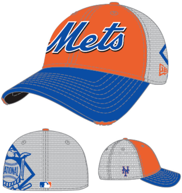
Fortunately, the folks at MLB have taken heroic steps to alleviate this tragic cap shortage before it reaches Irish Potato Famine-like proportions. Behold what they have magnanimously bestowed upon a cap-benighted world: the interview cap.
Every team will supposedly have one, but for now only the Mets’ version has leaked. No word yet on whether the Braves’ version will feature an Indian being interviewed. (Also no word on whether Cleveland will produce a special Albert Belle commemorative edition that says, “Fuck you, go away.”)
The Mets’ interview cap design was first leaked yesterday afternoon by a blog that now wishes to remain anonymous. According to that blogger, “From what I hear its purpose is to be worn during interviews and off-the-field stuff (charity events, blood drives, etc.). Unlike the NHL’s version, however, it will not be mandatory for players/coaches to wear the cap during interviews. It’s more if just a ‘Here if you want it’ type of thing.”
Yes, well, who wouldn’t want it?
Of course, as longtime readers may be aware, I have nobody to blame for all this but myself.
(Oh, nearly forgot: That is one ass-ugly cap.)
Meanwhile: New ESPN column today. Here you go.
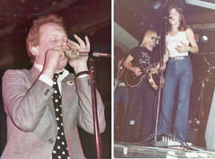
PermaRec update: A cache of old rock and roll photos found at a flea market — including shots of Joe Jackson and Suzi Quatro, shown at right — lead down some interesting roads in the latest entry on the Permanent Record Blog.
Uni Watch News Ticker: In a story that’s basically just a branding boondoggle for T-Mobile, MLB is replacing dugout phones with cell phones. The phone system, which will look like this, is supposedly very high-tech and all that, but you just know there’ll be some snafus. Soon they’ll figure out that they can just slap a headset on the manager and put a green dot on the back of the bullpen coach’s cap — problem solved! … Very nice article about 49ers gold satin jackets. ”¦ Yesterday I Ticker-linked to a bunch of Penn State fencing photos. Now Zack Kurland has pointed out that several of the PSU fencers in that photo gallery were wearing “JVP” leg bands — presumably a memorial for Joe Paterno, whose middle name was Vincent. ”¦ As global climate change continues to result in ever-higher temperatures, Australian meteorologists have had to add new colors to their temperature maps — and one of the new colors, for the most beastly hot temperature range of all (at least for now), is purple. ”¦ “During the NHL lockout, the Pittsburgh Penguins’ players that stayed in North America and held their own practices wore NHLPA sweaters,” says Mike Slavonic. “But following the CBA deal, they were back in their normal practice sweaters on Monday.” ”¦ Justin Eller has written a summary of UVA’s 2012 uniform program. ”¦ Got a note yesterday from a company called Rock ’Em Apparel, which specializes in customizing the Nike Elite basketball sock. “We sponsor several top high schools in Florida and are also in the works of outfitting a few colleges, including Florida, Kentucky, and Ohio State,” says company spokesman Daniel George. This stuff looks horrific to me, but hey, different strokes and all that. … Boy, Alabama’s 1973 cheerleading pants looked like Indiana surplus (from Todd Herzog). … Another school with a counterintuitive color scheme and team name: Brown City High School in Michigan (from Christian Zummer). … New lacrosse uniform for Syracuse (from Joshua T. Gallo). … Here’s a nice video of the 2013 pro cycling kits, “though it’s much better with the sound off,” says <>Sean Clancy. … Korean baseball expert Dan Kurtz reports that Korea’s uniforms for the World Baseball Classic will be unveiled on Jan. 15. … Another example of Alabama’s helmet TV numbers being used to track the Tide’s national championships: Check out this gumball helmet set. That’s reader Steve Johnston’s son posing with his recent Christmas gift. I guess Riddell will have to update the ’Bama helmet. … The latest MLB video game has some serious throwback uniforms (from Paul Quinn). … The U. of Miami, of all places, has a new club hockey team. Their primary uniform is fairly predictable, but they also have this somewhat groovier alternate. “I’m not a complete fan of using the University’s crest when Sebastian the Ibis would have been a more appropriate choice, but all in all it’s a unique look,” says Miami alum Brian Bellows. … New soccer kits for FC Tokyo (from Jeremy Brahm) ”¦ Also from Jeremy: New alternate uniform for the Seibu Saitama Lions. “The right-patch is the Saitama Prefectural seal, which the government approved for use on the uniform,” says Jeremy. ”¦ Ever wonder what the storage archives look like at the Pro Football Hall of Fame? Glad you asked (from Thomas Langan). ”¦ Love this slideshow of old-fashioned soccer illustrations (from Robin Griffiths).
As I look at those caps, al I can do is just sit back and laaaaaaaugh. Nice job, PL. you can now say you brought forth the notion of the post game interview cap.
Yikes. Are those distress marks on the brim, BTW?
The only thing that could make these WORSE … is if there was a sponsor logo shown prominently on the cap, as well.
(You know, besides the hatmaker, New Era.)
Thankfully, MLB isn’t as much of a corporate shill as the NBA, so that probably will never happen…unless another game is played in Japan.
Great…more trash to be clogging up the landfills in a few years.
-Jet
Only? Nah. There are going to be special camo/flag desecration/pinkout/BFBS/commemoratives that will make these look dignified.
. . . . and will there be a “meats” interview hat for those who want to interview butchers?
The interview cap.
New Era? NFL Properties on line 1.
And somewhere, Starter sees their Romo Freebie..disappear.
I like it. I hope they do some Negro League teams like that.
oh PLEASE. It’s the Jimmy Fallon / Jim Belushi / Tom Arnold / Kim Kardashian of baseball caps.
It looks like some hipster doofus asshat.
You hit the nail on the head! lmao
Of course you do.
On Paul’s tombstone or urn:
Paul Lukas – The inventor of the Interview Cap
–
The world is now a worse place because of the interview cap.
Now, a purple interview cap would just about be the cherry on the cake.
Crossing my fingers for the Rockies to debut a purple interview cap.
OH! MY! GOD!
First the Seahawks neon snot, then the Mets ditching the black, and now this. Brendan the Aspie asks: Can the return of mono-black baseball uniforms be far behind?
Incidentally, what happened to the top uni moments of 2012 thing you were doing?
Decided not to do it.
Hopefully there will be other options for the 3930 or else I better buy up a bunch of 2012 BP caps. I assume there will be other fashion 3930’s though, so I should be safe.
What the heck is a Green Devil – it’s one way of saying: we don’t want “brown” as a school color.
In the picture of the Alabama cheerleader in striped pants, the school logo on his shirt resembles the then future Under Armour logo more than just a bit.
Looks a lot like Tulane Stadium. Is that from the 1973 New Years Eve Night-played Sugar Bowl? Bama v. Notre Dame?
It also looks like an… shudder… Auburn logo. Obviously an interlocking “UA” can only look a certain number of ways, but yeah. Glad they don’t use that anymore.
I think using the number of championships as a marketing tool has only come along in recent years. Seems like I remember that helmets shown back in the 90s would correspond to the year. That didn’t translate so well when the Aughts fell upon us. I remember as a kid having one of those Wilson (or maybe Riddell?) full uniforms that used “15”. That wasn’t even done for a recognizable player at the time, because the player that had that number then? The placekicker. Argh.
Don’t be dissing the placekicker. He’s a part of the team, same as any other player.
Speaking of kickers…great interview on Colbert last night with Chris Kluwe.
I haven’t seen that yet, but I love Kluwe far more than a Packer fan ever ought to love a Viking.
Partially because he’ll never let you get away with dissing a placekicker.
Sure, 29 year old me knows that. But 8 year old me in the backyard did not feel too cool putting on that guy’s jersey. And when my friends didn’t pick me to play QB, or RB, or any other meaningful position, I attributed it all to that number. My relative lack of any athletic ability in no way contributed to it, I’m positive.
link
Kluwe’s a punter. Dumbasses.
Did anyone in this thread say Kluwe was a placekicker? I said he was a “kicker” (which includes punters), and Chance said he wouldn’t let anyone get away with dissing a placekicker.
Reading comprehension, Brendan. Try it before posting next time.
Wow, language!…Looks like I won’t have the kids reading from “The Obsessive Study of Athletics Aesthetics”, and one more thing…GO Braves!
Eat your heart out, Robert Altman.
Interesting PermaRec entry. It’ll be interesting to see where (if anywhere) it leads.
What makes MLB think that managers will get a cell signal when the majority of the time you cant get one at a ballpark due to the local towers being overloaded?
Also, those interview caps are ghastly if thats the template.
I don’t have the details, but I don’t think these are running off of the standard local towers.
You’re right – these are part of a closed system, with a very narrow radius. Not only do they not use the same towers, but apparently they won’t work if you take them out of the dugout.
“the majority of the time you cant get one at a ballpark due to the local towers being overloaded”
is this really a problem? lol
Sadly, it is. At least here in San Diego, when there are more than 12,000 people at Petco Park.
Does that ever happen?
Re.:Pro Football Hall of Fame storage area.
Are there more photos?
Good to see some non-NFL stuff there.
I’ve never been to PFHOF so I don’t know how many other PRO football leagues are represented there.
(Since it’s not called the NFL Hall of Fame, or American Hall of Fame for Pro Football)
There’s a hall of defunct leagues (at least when I was last there) that includes the AAFC, AFL, WFL, and XFL. That’s where you’ll see a vertically striped sock that survived the Broncos’ bonfire.
That pink cell phone crap in the dugout is horrible.
Is Bud Selig dead yet?
Sadly, not yet.
That is a ghastly execution in deed.
Is Jim Leyland even going to know how to work a cell phone?
Pink phone? Cross Merchandising Opp: What month features..pink.
Those soccer illustrations are absolutely gorgeous.
Those “post-game” caps on the other hand… Yikes.
Indeed. The Gunners one features the gorgeous Highbury facade: link
Never dawned on me when I lived there, but is this England’s answer to Old Yankee Stadium?
That would probably be old Wembley Stadium.
link
I would say yes, since Arsenal Stadium (actual name!) is a listed building, they weren’t allowed to change the Art Deco facades so it really had an old school feel. Places like Old Trafford, Stamford Bridge, White Hart Lane have been in use for a very long time but with redevolopment they don’t look it. I really really wish Arsenal had stayed there, but there was no room to expand. First time I was there I recall walking through someone’s backyard to get to the entrance to the Lower West Stand. Filling in the corners (which was done in the past) would not have added enough seats plus the locker room/offices/facilities were very out-dated. The tunnel to the pitch was only wide enough for one person at a time! I was lucky enough to get there twice before they moved. Still haven’t been to the new place.
Now they get rid of the dugout phone to the bullpen? When I copied down the phone number for the Red Sox bullpen during an after-the-season on field/dugout visit?
There goes my plan to get Aceves up in the 2nd inning every day.
I feel for ya, Lose…..That’s something that would happen to me……
Is your nickname a reference to this guy?
link
don’t lose hope, this experiment might be a colossal failure.
The whole cell phone idea does not work in Canada we don’t have T mobile. Although The Blue Jays are owned by Rogers Communication so I guess we can expect to see more red white in our dugouts. Those interview hats will be pretty popular with the casual fans. I actually liked the script on the Mets hat just have to lose the tattoo like logo on the side.
According to the article about the cell phones in the dugout, it says the current dugout phones will remain, so I don’t see this as a big deal.
Hey, look…it’s Leather Tuscadero!
*slap* *slap* *point*
“Fortunately, the folks at MLB have taken heroic steps to alleviate this tragic cap shortage before it reaches Irish Potato Famine-like proportions. Behold what they have magnanimously bestowed upon a cap-benighted world: the interview cap.”
“Behold what they have magnanimously bestowed upon a cap-benighted world: the interview cap.”
INTERVIEW CAP
.
.
.
.
.
………. link
Also, that T-Mobile dugout phone booth is the most ass thing that I’ve laid eyes on all year.
Those are gumball helmets. They are pocket pro helmets. And is that kid flipping us off?
You forgot the word “not”. But, yeah. I was thinking about posting the same thing. For some reason it really bothers me when people call them gumball helmets – they’re a little bit larger, and much higher quality.
I wonder if the set came with a sheet of numbers for the Alabama helmet, so it can be updated?
Wrong Finger.
Oregon has a pack that size just for *their* helmet variations.
Interesting alts for Miami’s club team. Hockey is probably the only time we could refer to “The U” as “that other Miami”, though, right?
I’m guessing Mr. Bellows is not related to the former NHLer by the same name, who spent 10 years with the North Stars and won the Cup with the Canadiens?
No, I’m not related to the NHL player, but I did meet him when he was playing for the Tampa Bay Lightning in 1996. The guy was a real class act, gave me a signed stick!
Today’s ESPN column is up:
link
#14 is missing a blue polka dot on his left shoulder
Great column today Paul. It makes me think, could such strict uniform rules/regulations in high school athletics today have a large influence on all these kids wanting to wear such flashy uniforms in college?
I’m assuming these new bullpen phones will not come to Toronto for several reasons. Rogers the biggest cell phone service provider in Canada owns the team and t-mobile doesn’t operate in Canada although if the jays make the playoffs (which there is a good chance of that happening) this could be another gatorade dugout mandate scandal waiting to happen!
I know when I worked in a call centre for T-Mobile they did have a roaming partnership with Rogers.. That said though, I don’t see the Jays using the T-Mobile branded phones when they could just use the Rogers service..
If you want to cover more polka dots, McPherson College in Kansas…their track team (maybe cross country too) has “special” uniforms for whoever makes it to the NAIA National Track & Field Championships. They definitely stick out!
link
What team helmet or logo is on the red football helmet, bottom right of the HOF pic? It looks like a red flame with black outlines on red background.
Chicago Fire, 1974 WFL.
Look up one row to the right. Only about half of the helmet is visible but that’s the helmet of the 1974 Southern California Sun of the World Football League. Their colors were Magenta and Orange.
“Ever wonder what the storage archives look like at the Pro Football Hall of Fame?”
i spotted two wfl helmets from ’74 chicago fire and ’74 or ’75 southern california sun…also looks like the redskin helmet from 1959-64 two helmets away from the sun…
can’t tell what’s in between those two, and not sure what the one with the stars on top is (top left)…all-star game or pro bowl, i’m guessing…flankers mask on that one would make it within my lifetime, so most likely a pro bowl…?
that should read: two helmets away from the *fire…
Fucking Christ, what a horrible setup.
I don’t even want to see the damage done to the pictures and paintings leaning against each other, not to mention the crumpled and rolled up papers.
What a fucking disgrace.
agreed…would love to spend about a week back there helping them clean up, just going thru everything and enjoying all the hidden history…
The piece on the 49er gold jackets reminded me of what I need to do the next time I holiday in my wife’s home town in Mexico- go to any public place with retirees and see all kinds of vintage sports gear being worn. Last year I saw a sweet block letter pre-phil knight Oregon Ducks satin jacket.
Back in the 1980’s, a friend of mine living in the Delaware Valley was a 49ers fan (odd enough for that area) and had the jacket shown with “Forty Niners” on the back. I didn’t like the Niners, but I thought it was one the coolest jackets I had ever seen.
By the way, nice URL today, Paul.
Regarding the interview cap and the cellphone kiosk, I can only think of one phrase to fit both of them. It’s a phrase I’ve come to use more frequently of late…
What a shitload of fuck.
Ha! Didn’t even notice the URL. Priceless.
Uni error in a movie.
link
The blurb doesn’t even mention that the guy in the picture is wearing a stripped-down old Jacksonville Jaguars jersey (something that was discussed here on Uni Watch a while back, when pics from the movie first circulated). However, for all I know it might make sense in the context of the movie, since I haven’t seen it (and I’m not likely to see it in the theaters).
Looking through the other films’ errors, it’s interesting that they note the Boba Fett figure in Argo being anachronistic, but they give an inaccurate reason – yes, his figure wasn’t introduced until the 1980 wave of The Empire Strikes Back figures, but the character technically did not debut in Empire – his first appearance was in the animated segment of The Star Wars Holiday Special in 1978. It’s understandable that people might overlook that, seeing as how George Lucas sees the special as an old shame, and refuses to release it (though, to be fair, he really didn’t have a lot of involvement in its production).
The blurb doesn’t even mention that the guy in the picture is wearing a stripped-down old Jacksonville Jaguars jersey
…because he isn’t. He’s wearing a freakin Eagles jersey – which would seem to be the one thing the movie got right. The number font is COMPLETELY WRONG for any incarnation of the Jaguars.
Thought it was, because of the goldish-looking outline… but yeah, upon further review, I guess it was right after all.
I remembered the conversation, some of the debate, but I didn’t feel like going back into the archives to find the discussion, so I don’t know if that’s how it was resolved.
I stand by my Boba Fett comment, though.
And here I was, almost making a Star Wars related reference in an earlier comment, but chose not to do to suppress my inner nerdom. Silly me.
Actually, Kenner was already selling Boba Fett action figures as early as 1979.
link
The cap idea is useless, but it will probably sell. The one thing I like about it is that it made an attempt at having the NL logo on it. I think it would be neat if teams in each league wore their respective league logo on the back of the jersey instead of the MLB logo.
Cubs wear the N.L. logo as a sleeve patch on their blue alternate jersey. But yeah, that’s the only other current example.
Purely from a marketing standpoint, isn’t that whole Von Dutch trucker cap thing totally over? This cap looks to be about three years behind the curve.
“… but it will probably sell.”
Now, see, this I don’t get. Go to any team store, any Lids store, any sporting goods or “shoe” store, and you’ll find a wall full of basically identically decorated caps for your local team. These caps are already selling. No need to market them by using players as shills. If it’s a player-comfort issue, which I can totally see, then why not just make the actual game cap in a stretch-fit version and double-down on the cap as the team’s icon?
The Interview hats remind me of the Draft Day/Pre-season hats that I’ve seen in the past for the NFL and NHL. The hat looks bad enough as it is, but they are way behind the curve, as well.
So, Major League Baseball can get the technology to have cell phones in the bullpen that won’t work outside of it (more or less), but they can’t get the technology to have instant replay?
No, because instant replay would destroy the sanctity of the sport. Human error is an important part of the baseball tradition.
You make it sound like umps get the majority of the calls wrong, when in fact, even with replay, only a very few calls are *blown.* They use I/R for home runs now, and that’s plenty. I’m not defending blown calls (and there are no question some), but the human element is a very big part of the game.
Some games are made to be played outdoors in the sun with a mistake here and there and not as *perfect* as cave-dwelling gamers would like.
This is a really important point.
Mistakes are an important, even necessary part of every game. They’re part of the lore, Don Denkinger and Reggie Jackson’s hip. The imperfections are part of what makes the game perfect.
A key reason that pro football is an unbearable, agonizing, borderline fascistic endeavor is that one of the enduring images of today’s NFL is watching a handful of muddle aged men in stripey polyester uniforms, huddled over a TV screen. And they STILL get things wrong.
Perfection is a poisoning desire.
What Phil & Cort said.
There are plenty of imperfections, missed calls & mistakes in EVERY sport & life for that matter. Not everybody who speeds gets a ticket, not everybody parks within a parking spot, a wife can’t lose that nagging 5 pounds. It happens. No need to get OCD about it.
If you want perfection, go play a video game or a start a Facebook page about it.
And every weekend I tune into the NFL and see a terrible call, then the announcers tell me “that’s not a reviewable play.” Well, dammit, why not? Can’t every single play, every single call, be reviewed by instant replay?
Bottom Line?
Life is NOT a video game.
I realize some are confused about that, but it’s true.
Because it would just be so horrible for games of skill to be decided by said skill, and not by a mistake that could be easily corrected by technology. I guess that just wouldn’t be entertaining enough, would it? No, we need to have controversy so the big sports network has something to talk about during their 24/7 coverage.
…and by the way, the video games have those errors programmed into them as well. They like to call it realism.
Whatever.
I’m just tired of comments on how games should be played from people whose athletic experience apparently has been gained sitting on the couch giving great thumb.
(not meaning you, The)
MLB Network currently has a nice film called The Third Team running occasionally. It shows the behind the scenes of the umpiring crew from last year’s snoozer of a WS. I dare ANYone to watch it, and not come away with a huge shitload of respect for these guys – even Joe West. It really gives you the idea of how hard these guys have worked to get where they are, and how much they really put into their jobs.
Its done as well as any thing NFL Films has ever done.
oh and on topic, you get a quick glance of someone pressing the WS logos on the guys caps as they walk out for Game One. And there is a fairly emotional bit where Brian O’Nora, I believe, points out the MS and HW memorial patches on the jacket sleeves, and explains how much Marty Springstead and Harry Wendelstadt meant to just about everyone on the crew.
Those skilled players miss blocking assignments, drop passes, throw interceptions, and commit stupid penalties.
If we demand perfection from the referees, shouldn’t we demand perfection from the players, too?
scott | January 9, 2013 at 1:14 pm |
And every weekend I tune into the NFL and see a terrible call, then the announcers tell me “that’s not a reviewable play.” Well, dammit, why not? Can’t every single play, every single call, be reviewed by instant replay?
Would you want basically every single play that potentially could be put under review? Games would take 9+ hours to play, then. Also good refs & umps can keep track of bad calls & if possible, try to make up for it later in the game.
Hike the damn ball, throw the damn ball, shoot the damn ball, etc. Get the game going & over with. It’s bad enough we have so many TV timeouts as it is.
One example of why baseball will be ruined if they ever extend replay beyond Homeruns: Runners on 1st and 2nd no outs and batter hits a line drive to right field. RF catches the ball but it is ruled a trap and no catch. The runners were off with the pitch and each advance two bases. Replay reverses the call and rules it a catch. What happens with the runners? There are many timing plays such as that in baseball that make it so non-condusive to replay.
Apropos of what Lou said, there is a fantastic book by Bruce Weber about umpires, mostly MLB, but at all levels.
Probably THE definitive book on the subject. I never gained more respect for blue (and former goats like Don Denkinger) and later respected Jim Joyce more, than after I read this book.
The crap umpires have to put up with is largely due to fan ignorance and showmanship of coaches who want their 15 minutes. I highly recommend this, and defy anyone who does NOT to have a completely different opinion of the guys who call games for a living.
You want to eliminate that managerial showmanship? Give the coach the opportunity to require the umpire to watch the replay. An umpire will inevitably make a mistake, and most of the time, it doesn’t really matter. That failure is acceptable. But, if there’s a time where it does matter, there’s no argument against it. Because the “human element” is more important? Not a chance. Fix the blown calls.
Trap plays are going to be reviewable; this is inevitable. In the scenario with the trap, my solution would be when the trap is ruled an out, treat it as a dead ball play. Like a foul ball not being caught when a player is trying to steal second, the base runners would have to return to their original bases.
HATE the faux-worn edges on the bill the “interview cap”.
faux-worn edges look stupid without faux-sweat/dirt. LOL
It will be interesting to see how this T-Mobile tie-in works in Toronto, where there is no T-Mobile service, and the team is actually owned by one of Canada’s cellular telecommunications giants, Rogers.
Well, since the T-Mobile thing isn’t mandatory, it probably would be a non-issue..
However, if it were mandatory, I used to work in a call centre for T-Mobile.. They had a roaming agreement with Rogers here in Canada. Basically the T-Mobile phone would work off the Rogers towers..
That said, I can’t imagine the Jays, being owned by Rogers, would want to pay another company for that service, not to mention roaming fees from using their own towers..
I can see Rogers trying to set up their own service in the Dome..
Same issue for the San Francisco Giants and the Chicago White Sox. But, like many others have said, since the use of the T-Mobile devices are not mandatory, I see it being a non issue.
The U. of Miami alternate hockey jerseys are indeed groovy…except for the FAIL orange-on-orange portion of the shoulder patch…
link
-Jet
Definitely needs a thicker white outline.
I suppose making the orange part of the logo white in that context is out of the question.
The Brown City Green Devils should have taken it a step further and chosen blue and yellow as their colours.
I see what you did there.
In Westchester County, we have the Village of Southeast. A dream of mine is to put a minor league baseball team there and call it the Northwest Southeast CatDogs.
the phone thing won’t be an issue in Toronto until playoff time when it will probably be mandated for all dugouts. sucks for the jays clubhouse team as the jays also serve powerade and between ripping out phones and replacing water jugs and all sorts of other mandated garbage they’ll be busy as hell for stupid mlb product placement.
Perhaps the “interview caps” are fabricated from material specifically developed to be resistant to shaving cream and/or whipped cream.
‘Cuz, y’know, that would make them essential.
Like, totally.
Fersure.
(eyeroll)
Not quite. The caps are made with a specially engineered “sandwich” of three advanced fabrics that rub against each other when stretched to produce a constant noise roughly equivalent to standing under a helicopter’s rotor. This allows the interviewee to cup his hands to his ears and shrug, Gipper style, whenever asked a question he doesn’t want to answer.
Sacramento Kings moving to Seattle.
A return of the…SuperSonics?
link
If this happens, it would be the franchise’s fifth* home city, which extends their record.
* — not counting Omaha.
I wonder if the cell phone arrangement will result in some real world problems. Will they lose the phones because they didn’t put them back in that stand? Will they then ask someone to dial the number simply so they can find the phone? Will the bullpen get pocket dialed?
Looks like the Sacramento Kings are possibly moving to Seattle:
link
Are we witnessing the return of the SuperSonics?
whoops, didn’t see brinke’s comment above
Worth noting here that Seattle is in King County, WA.
Speaking of which:
link
Wait, so Virginia isn’t getting its first pro team after all? Well darn. #RichmondJaguars
Deadspin on ESPN’s insistence on using the full (read, corporate) names for bowl games.
link
I had forgot about the Seattle Kings. I did a fictional book report on them, even designed unis for them. This woulda been Dec of 74. Wrote in in a hotel room in NYC, my only trip there..wrote it while my dad went to business meetings.
Still have those uni drawings?
Just saw this, DC mayor pushing for Redskins name change
link
In an unrelated story, everyone in city pushing for DC mayor change.
Having a guy so likely on his way out in disgrace announce for the name-change campaign now is probably a net negative for the rename-the-Redskins movement.
OTOH, DC city government objections probably made the difference in MLB ditching “Senators” in favor of “Nationals” when the Expos moved to town, so you never know …
@Arr Scott (Sens/Nats comment)
Rangers own the Washington Senators trademark.
And yet the Nationals have used the Senators’ curly W logo from day one. If ownership of Senators IP was actually an issue in the naming process, then the Nats would not have been able to use that trademarked logo. They did, which demonstrates that it was not an issue.
Seriously, were the Rangers going to say No when the commissioner informed them of his wish to revive the Senators name?
I’m with Arr Scott here — the Rangers may *own* the Senators’ trademark, but I’m pretty sure there is some kind of deal which allows the current Washington to use the Curly “W” as well as return to the name, should they so desire. I’m pretty sure “Senators” was rejected due to the fact that, well, no one wants to be associated with Congress in any way, shape or form. Talk about getting people to hate you right off the bat.
I do believe, especially since we’ve seen the Rangers throwback in Senators’ clothing, they have their own rights to use/wear it, and may even have right of first refusal to permitting any other teams to wear said gear. But I think that’s as far as it goes.
No, the newly-relocated Expos were never going to be called the “Senators” (or “Congressmen” or “lawmakers” or anything to do with politicians); Nationals worked, had its own history, and that was that.
Yea having Mayor Grey on your side on a DC political issue isn’t going to win you many points with Washingtonians at this point. The man make Marion Barry look like a saint.
The interview cap looks like it would be a hot seller at interstate truck-stops.
Creamer just posted a gallery of NHL teams’ unique red-line designs for this season. The Stars’ photo also shows a 20th-anniversary logo that I haven’t seen anywhere else.
link
This is a couple of weeks old, but this (and what’s described in the last couple of paragraphs) sure sounds like evidence of a Permanent Record movement!
link
Marge, get me your address book, four beers, and my conversation hat.
Who do I need to screw over to get my “Fuck you, go away” cap?
Is the URL supposed to be intentionally mispelled? If not, the correct word is “asinine”.
Brian Anderson just questioned a players aggressiveness in the Minnesota/Illinois game because he is wearing a blood jersey…
They also acted as if they’ve never heard or seen such a thing when the player came back in.
Paul, you forgot the special hats the MLB players wear on Earth Day!
Why is there a gun with a slash over it on the right-hand side? Are you against my guns?
link
link