There hasn’t been an NHL All-Star Game in nearly two years (remember, last season’s game was cancelled due to the Olympics). But with this season’s showcase game only two months away, the league still hasn’t announced what the uniforms will look like. And that’s a thornier question than usual this time around, because the traditional conference-vs.-conference set-up is being replaced by a new format.
But now, thanks to reader Matt Kuekes, we finally have some word on how the new design is shaping up. Here’s his report:
Monday night there was a party for Carolina Hurricanes season ticket-holders at the arena, and I overheard some people talking with the manager of the team’s pro shop about this season’s NHL All-Star game uniforms. He described the design as follows:
• The team colors will be white vs. blue.
• The jerseys will have the NHL crest on the front, along with the player’s uni number below the collar and above the NHL crest. Someone asked if this was similar to Buffalo with the small numbers on the front, and he reiterated that there would be a number centered but below the neckline, and above the main NHL logo.
• He also noted that players will have the regular sleeve and back numbers in addition to the small number on the front.
• No info on logos from that players team on the jerseys, but I would guess on the shoulders like in years past.
• Last bit of info: He said that players will all keep their normal uni numbers, so we could have multiple number Xs on the ice for the same team. If Eric Stall and Jerome Iginla are on the same side, for example, they’d both wear No. 12.
He also said that the new format was causing problems for him, because he didn’t know which jerseys to order. For example: If Crosby and Eric Staal end up on the same team, he will sell out of that color jersey instantly.
All very interesting. The centered front number sounds awful, but let’s wait and see how it looks. eh, may as well go ahead and start hating it now.
ESPN reminder: In case you missed it yesterday, my latest ESPN column is available here.
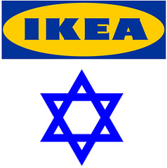
My latest million-dollar idea: Okay, maybe half a million. As I mentioned yesterday, I spent last weekend helping some friends who are working on their new house upstate. They’d loaded up on lots of Ikea furnishings, which reminded me of something I’d completely forgotten about: Back in the late 1990s, I had come up with the idea of a parody web site for a Jewish-themed Ikea, called Oykea. Slogan (spoken in a mild Yiddish accent): “It’s a big country. What, you expect it to furnish itself?”
The furnishings would have names like Shlomo, Yehudi, Hymie, and Elijah (which of course would be a chair that nobody’s allowed to sit in). The café would serve matzo brei and gefilte fish. Price tags would say things like, “For you, $58.” And all the you-assemble-it furniture would have the following statement printed on the box: “Put it together yourself! A little hard work won’t kill you.” Closed on Saturdays, natch.
For whatever reason, I never got around to executing this idea. Thirteen years later, I still think it’s pretty good. It could be anything from a home page (essentially a virtual poster) to a full-fledged site with various sections, departments, etc. I don’t really have time to work on it now, but what the hell, that’s never stopped me before. If anyone out there is (a) intrigued and (b) sufficiently design-y and web-savvy to work on this with me, give a holler. Thanks.
Probably the only time you’ll ever hear me say, “sports bra” out loud: Another one of my talking-head segments with NFL Films is now on the web. This one’s about the disappearance of sleeves, and I think they did a really good job producing it. The only fly in the ointment: They got this site’s URL wrong. Grrrrrrr.
Uni Watch News Ticker: Some Giants fan should definitely snap up this old patch. ”¦ Here’s more about John Peckinpaugh, the basketball player with the boxing headgear. I interviewed Peckinpaugh myself a few days ago and will have more on him soon. ”¦ New logo for the Altoona Curve (with thanks to Guy Finelli). ”¦ This is pretty great: a family whose Thanksgiving tradition is to stage a re-creation of the Iron Bowl in their back yard (nice find by Benjamin Guest). ”¦ New court design for Hofstra (with thanks to Max Sass). ”¦ The Flip Flop Fly Ball guy has parlayed his excellent charts and graphics into a book. Here’s the cover — I like it. ”¦ Lelands is auctioning off one of those Denver Bears strike-zone uniforms as part of a larger lot of minor league flannels (with thanks to Paul Wiederecht). ”¦ The newly renamed Connecticut Whale — formerly the Hartford Wolfpack — have had their first jersey unveiling. ”¦ New hoops uniforms for Duquesne (with thanks to Josh P.). ”¦ Brinke is all ga-ga over these Giants World Championship tube socks. ”¦ “Just heard from the MISL’s Baltimore Blast,” writes Jim Vilk. “They said they will be wearing early-’80s retro uniforms [based on this design] all season long. The only exceptions will be for an Army night, and for some yet-to-be-announced special game.” ”¦ Latest basketball teams to have those sublimated Nike designs: Washington and UVA (with thanks to Kyle Ferramola and Kevin Zdancewicz, respectively). ”¦ Love the pants piping on the 1960 Ottawa Rough Riders (with thanks to Jeremy Brahm). ”¦ Also from Jeremy: After winning the Grey Cup in 1970, the Montreal Alouettes wore a championship sleeve patch the following year. ”¦ Excellent catch by Joe Hilseberg, who noticed a blunder in this Ohio State Pro Combat photo. Can you spot it? Look closely at the two numerals — the drop shadows are going in the opposite directions. ”¦ New hoops uniforms for Albany (with thanks to Aaron Scholder). ”¦ The New Zealand All Blacks rugby team will be memorializing the fallen NZ miners. And what sort of memorial do you wear on a black uniform? According to the fourth-to-last graf of this article, they’ll be wearing white armbands (with thanks to Caleb Borchers). ”¦ UW-Milwaukee wore some Sonics-ish throwbacks last night. Groovy warm-ups, too (as noted by Jason Goede). ”¦ Another school with new hoops uniforms: Wofford (with thanks to proud Wofford alum Geoffrey Thomas). … Went down to the Bell House last night and entered a Ping-Pong tournament. Hadn’t played in two or three years, but it all came back relatively quickly. Won my first match and then got soundly thumped by a 20something gal in cowboy boots who said she learned to play after her brother got a Ping-Pong table for his bar mitzvah. I’m sure there’s a lesson in there somewhere.
Holiday schedule: I’ll leave the site open for comments tomorrow. Phil has something special planned for Friday, I’ll be returning the favor for him on Saturday, and then he’ll be back on Sunday. On Monday we’ll get back to normal.
Everyone have a great Thanksgiving, travel safe, and let’s hope the Jets don’t wear solid green again. See you in a few days.
Got a project for you Paul.
As you may know, the WWL brokered a game between UGA and Boise State for next year. There is a rumor floating around down here in GA that there are UGA Pro Combat unis making their debut in that game. Supposedly, they favor the Raiders look- silver helmet, black jerseys and silver britches.
Also, there is a rumor that these unis are in existence already and there are pictures. Have you heard or seen anything about this? As an alum, I am proud my school hasn’t lowered itself to this level yet, but I wouldn’t doubt this is legit.
Thanks for your insight as always.
Oh God please no. Every time (well, with one exception) Georgia under Richt has tried something funky with the uniforms, the team has lost in spectacular fashion.
Georgia has had a fairly classy look ever since swapping the silver helmets for red under Vince Dooley. Their track record of success since then should’ve cemented the look as classic. This smells like yet more fake juice designed to generate revenue and pump up a program that has rapidly lost its relevance.
the UGA concept wouldn’t happen to be based on this mock by any chance?
as long as this template is floating around, there are going to be more fakes (pro and college) than ever…better take each one with a grain of salt
a tweaker even sent me a few NFL ones (different from the viral set that were going around last week)…which i’ll probably put in the tweak section soon
not saying UGA wouldn’t consider pro combat — just don’t believe anything you hear until nike says it’s so
You’d think that whoever produced that mock would at least have changed the red to the brighter shade Georgia actually wears. As posted it looks too similar to a South Carolina uniform (except for the swoosh, of course) for UGa to even consider.
What Phil said.
In any case, I’ve heard nothing about it. Doesn’t mean it isn’t true, but I have no inside info to offer.
The only error with that OSU uniform, is that the guy sewing the numbers on dropped the ball. That’s a 9, not a 6. Put it where it belongs and the drop shadow is on the left hand side where it belongs.
What he said.
This is the good thing about tackle twill: you can just rip out the stitches and re-sew the number back on properly. Good luck doing that with junky-ol’ screenprint.
The “6” on the Ohio State uni must be an upside down “9”. If you turn it over, the drop shadow goes the same way as the 2. Plus, the top of the 6 looks really weird. It would look better as a 9.
oykea?
fuck yeah!
Paul,
link is available for sale!
When we started the site back in 2006, someone (in Panama) had squatted on that domain name. We tried contacting them but go no response. That’s how we ended up going with uniwatchblog.com.
Perhaps it’s time to revisit that….
Speaking of upside-down numbers, remember when Miguel Batista got into some kind of tiff with Miss Iowa, implying that Iowa was somehow inferior to other states (or something; I forget)?
Clearly, it was a subconscious reaction to the fact that the zero on her jersey is upside-down (check the beveling):
link
And I think they added a third layer to the lettering in the NOB.
(Looking at it again, I’d like that red jersey a lot if they dumped the NOB entirely and also removed two of the borders on the numbers. Just white with gold bevels; two colors like the NY Rangers. Would look great.)
Batista got booed by the hometown fans because he was starting in place of Strasburg, and said fans were expecting Miss America but instead got him, Miss Iowa.
Paul, great segment for NFL films! It was surreal hearing your voice. After reading Uni Watch for years I guess I had my own version of your “voice” in my head, so it was cool to hear the real thing.
LOL…I thought the same thing!!
Oykea = genius. With ideas like that Paul, your mother can’t be disappointed that you didn’t become a doctor.
Happy Thanksgiving everyone!
My mom, like most people of her generation, can’t really process irony, or even sarcasm, so I think Oykea would just confuse her. But she’s proud of my work anyway, even though she doesn’t really get most of it.
And I’m happy to say she never, ever tried to push me toward being a doctor or lawyer.
Go ahead, break ya mother’s heart… :) Seriously, I’m sure she’s very proud. Your piece on your dad was one of the best things I’ve read in years.
And when you go out on Thanksgiving..remember your mittens.
Why can’t the NFL mandate sleeves (to the elbows) for everyone? If they can be such sticklers about socks, what’s stopping them from dictating the rest of the uni? Can the players’ union nix it? Don’t they understand that nobody would be at a disadvantage if *everybody* had to wear them.
Professional football players wore sleeves for 80 some years before this nonsense started. Over the course of almost a century there have been a few innovations in the uniform with regard to safety which I applaud, of course–face masks, padding, shoes.
Jersey graphics–the heart and soul of why we’re here, why many of us were drawn to the game in the first place–have changed, evolved, devolved, reflected the times, whatever. The jersey was where it begins and ends if you care abut what the game looks like. Helmets, too, yes…but the jersey is what we wear (or did).
link
But now that pleasure has been stripped away (literally). For what? Performance enhancement? It’s a manufacture marketing ploy and I call BS.
Oykea! Yes.
And this helmet logo makes me happy…
link
No “pit chub” on this guy:
link
Interesting Ottawa jersey here:
link
Here’s the road jersey with an equally interesting helmet:
link
And here’s an all-star jersey from 1970:
link
The Oykea idea is hilarious.
Answering Ricardo Leonor…I worked for a Retail/Wholesale sporting goods store in Rochester for 21 years. But we were very close with our factory reps such as from Sand, Spanjian and Powers who worked directly for the factories. Other companies such as Russell, Coane and Southland worked with rep. groups that had many other lines in addition to the clothing line.
Companies like Russell would sell dealers a case of 144 football jerseys for one set price for the case. We would often find new sample jerseys and mistakes with a printed name spelled wrong in with the “seconds.” These went on our summer sidewalk sale table. The blank practice jerseys would be sold with a local team’s name and numbers plus NOB that we did with our own heat-seal machine. We bought the first such press in Rochester in 1969. The salesman brought it in to show us, my boss gave him an offer and we bought it. One of the best things we ever did.
As to specials or returns, these were very rare. We did buy a set of Sand-Mark IX basketball jerseys with the twill bulls-eye and numbers for $3.00 each lettered. We sold them to a local CYO team for $10 per. And we also got a set of unlettered Columbia Blue with Cardinal Red and White trim basketball uniforms (Carolina Cougars colors) from Russell for $6.00 per uni. We had our seamstress letter them with twill and sold the set to a high school for around $25 per copy.
But these events were rare. In sporting goods once you as a dealer ordered a special uniform you had bought it. No exceptions. It was the dealer’s responsibility to sell it.
Manufacturers didn’t normally letter garments in advance, no matter how common the nickname. What probably happened with your school was they got a deal on the jerseys and the local dealer lettered them.
As to “financially troubled” schools, we had a poorer school whose colors were Royal and White buy a set of Columbia Blue uniforms that a local semi-pro team returned to us when they went belly-up. This high school wore the unis home and away for three years. Hey, they were top-quality unis and they were Blue. Done deal.
Re Oykea: This is just the latest reminder that Paul is freakin’ brilliant. And such a nice boy…
I should have seen that one coming from a mile away but I’ll be damned if it didn’t make me laugh (yes, out loud).
I read it… went back and read it again, then then I too LOL’d. Funny stuff, Paul!
I don’t care for the new NHL all-star format. I’m joining Messier and would like to see the defending NHL champion against the rest of the league.
That format worked great when there were 6 teams but nowadays, way too many guys would get snubbed. Plus, most of the ice time for the “defending champs” would probably end up being the 3rd & 4th liners + a few AHL call-ups.
I do agree that the new format is stupid, though. I really don’t see what’s wrong with conference vs. conference.
It’s a gimmick, nothing more, nothing less. They’re just trying to stir up interest in the game, because there hasn’t been any for years.
I fear the uniforms are going to end up looking something like this, only even more Edge-ified: link
Personally, I’d like to keep the conference format, bring back the Wales and Campbell Conference names, and maybe even rock the throwback design again: link
Seriously, though, on the conference names… does Bettman and the NHL really think that we have so little brainpower that we can’t figure out the geographical alignment of the conferences without having them named as such? Sure, when the conferences were first named in 1974, the divisions were so randomly aligned that geography couldn’t possibly factor into it, but that changed with the 1981 realignment. Still, if you keep the division names geographical (since you’d otherwise have to come up with two more names to add to Adams, Patrick, Norris, and Smythe), then you can have the Wales and Campbell back, get back some of that unique identity, and it’d still make sense!
At least, that’s what I think.
Rob S,
I’d love to have the old conference and division names come back–it was one thing that made the NHL unique and Gary Bettman’s renaming them was another example of him not caring about NHL tradition. As far as names for the Northwest and Southeast Divisions–I would call the former the O’Brien Division (after Ambrose O’Brien, who founded the NHA, the predecessor of the NHL, and his father M.J. O’Brien, a Canadian Senator who donated a trophy to the league in Ambrose’s honor). The latter, another UW member (aflfan) suggested King Clancy, which IMHO is a brilliant suggestion.
Even hockey fans dislike the All-Star game, moreso because it is one of those things that gets lots of hype from the league but isn’t actually worthwhile. The Pro Bowl, at least, is as ignored by the NFL as its fans.
This has been floated by wiser people than me, but the NHL should squash the All-Star game entirely and use the Winter Classic as its big showcase activity.
All you guys are wrong about the drop-shadows being wrong, upside down 9’s and whatnot on the Ohio State uniform.
Clearly the drop shadows go in different directions because it’s some newfangled Nike thing that helps them run faster, play harder, and otherwise act like warriors and soldiers out on that battlefield.
You may now return to your regularly scheduled programming…
George, I am shocked, nay appalled that you would make sport of Nike’s latest efforts to make athletes “run faster, play harder, yadda, yadda”… Have you no shame, sir?
Oykea HAS to sell the “Zayde” recliner. Complete with a cupholder so he doesn’t have to reach down to pick his Dr. Brown’s cream soda off the floor.
Of course, there will be an inevitable rip-off site for those of us gentiles who are trying to fake our way onto JDate with bad New Yawk accents and sitting in the back at Shul…
Called Goykea, naturally.
The NHL “Fantasy All-Star Game” will be a success only if fans are allowed to submit votes for team names as well, and they must be in the vein of actual fantasy team names. Jagrbombs, Multiple Scorgasms, Dateline Predators, Peter North Stars, etc. etc. etc.
Lots of questions about the Whale unveiling.
1. What’s with the “ers” on the mascot’s jersey? Obviously, it’s a not-so-subtle reference to the Whalers. But what’s the angle behind it? Is the mascot named “ers” or something like that? If it’s there just for nostalgic’s sake, then that’s pretty lame. It’s like they’re saying, here’s a grade-school rebus for you to figure out what we really wanted to name the team.
2. Is the mascot jersey the road white jersey? Or is it just the mascot’s jersey?
3. Why isn’t the mascot blue?
Not just a reference to the Whalers – that’s link on his sweater. And he’s green to match that old logo, not the current one.
Strange.
Actually, I think I just found the answer. The mascot has been around since before he bought and renamed the Hartford Wolf Pack (at least since link).
Is that an old Whalers mascot? Or something created in that style? Either way, it explains the sweater.
And, for the second time in a row, I answer my own question.
“Pucky” is a new mascot, an anthropomorphization
of the old shoulder patch logo, which indeed made its debut at the Fan Fest.
link
The logo was used from 1972-85. As for the jersey the mascot’s wearing, it seems to be an odd mash-up. The stripes around the waist are similar to the stripes on the old 1979-92 Whalers home uniforms, except the bottom blue stripe is right on the hemline. The sleeve stripes, however, invert the traditional Whalers’ blue-green-blue pattern, kind of like how the Buffalo Sabres’ original home uniforms had alternating patterns on the sleeves and waist.
When I was a kid, my family used to attend Hershey Bears’ games. As soon as I saw the Connecticut Whale (Are they trying to save printing costs by dropping the “S” although, Walt Disney did that in the 1930’s by not drawing Mickey Mouses’ tail. But I digress.) logo, I immediately thought of the Springfield Indians. Harford swithed affiliates from Binghamton to Springfield in the early 1990’s. Thankfully, I was not alone in that thought…
Check it out: link
Oykea=meshugenah but I love it
OK, goyim here. Can someone explain the Elijah reference? Thanks.
google “elijah’s chair”
and you will have your answer
Actually, “goy”, since “goyim” is plural…
Malachi 4:5-6 (or 3:23-24 in the Hebrew Bible) prophesies the return of Elijah the prophet before the Day of the Lord. Anticipating this return, Jews leave a seat open for Elijah at the Passover meal.
Old or New Testament?
Seriously?
completely serious
Yahoo Serious
Thanks for the explanation and the correction!
Rubin Kazan & Copenhagen playing now- using the orange ball & orange/red field lines. But no snow yet-field’s atill green
link
Looks like Kellen Winslow and Nike aren’t the only ones comparing sports to the military
link
Sorry if this was posted earlier, but interesting uni-related expression the other night from Capitals coach Bruce Boudreau: link
That’s really good — thanks!
si.com’s college hoops guy Luke Winn opines on these coroporate logo covered courts link
I thought the NCAA had already outlawed those stick on logos because players were slipping on them
A K-State player totally went down on the Reese’s logo in the first half last night.
Yeesh, poor Gov. Rell, that CT Whale jersey looks like it was sized for a whale! Is that common practice for jersey unveilings? That is, do they usually make it XXXXL for the sake of photos?
RE: The Jets – as the game was winding down, I thought to myself: “Well, after giving this one away, at least they won’t wear green over green again.” Of course, I’m glad they won, but the green-out has to go!
I sent the IKEA idea blurb to a designer fellow I know of.
Ravens may go mono-black Sunday. Black jerseys definitely link
They’ve never worn white pants with the black jersey before. Though I would enjoy the look, I doubt it will happen.
link.
Last paragraph of that article:
Oops. screwed up the tags in that one. Trying again…
link.
Last paragraph of that article:
It is, by far, their best look (and I’m not a purple-hater).
damn…spanky beat me to it but i was gonna say — they haven’t worn the black pants with the black jerseys in like two years…nttawwt
but they went black over white against the bears last year and against the skins in 2008 (i think)
I stand corrected. I thought I had payed close enough attention, but I guess not. Bring on the BOW!
Damn, Hofstra got a new court done and I didn’t get a call to bid on it. I painted the old logo on their court back in the mid-80’s, along with some of the graphics on the wall.
-Jet
Re: UNLV. San Jose State also wore gray at home last Wednesday against USF. Who knows what it’ll be tonight. Even the AD didn’t know if those were new home uni’s or just an alternate. He and I were bothing hoping for the alternate…
The Anaheim Ducks have formally announced the unveiling of their new third jersey to occur on Friday: link|ANA|home
… and I have issues.
“The new jersey will serve as the fourth alternate “look” in club history and first to debut in more than seven years. The club sported a black with dark plum, silver and white alternate jersey beginning on September 29, 2003 that was worn for the 2003-04 and 2005-06 seasons. The Ducks also donned two versions of an alternate sweater beginning with the 1997-98 season. The home jersey was white with a jade panel across the chest, while the road jersey was jade with an eggplant panel across the chest. Both the home and road jerseys contained the original Mighty Ducks crest consisting of a white goaltender’s mask shaped to fit a duck, with crossed yellow hockey sticks centered over the mask. Anaheim’s original third jersey was worn during the 1995-96 season and depicted a cartoon Duck posing as a hockey player breaking through a sheet of ice.”
When they say “panel across the chest”, one thinks of something like the Montreal Canadiens’ iconic red jersey (or the white c.1945 throwback last worn as part of the centennial celebrations).
link – Does that look like “across the chest” to any of you?
Also, nice that they can’t even bother to acknowledge that the cartoony 1996 jersey was an image of the team’s own mascot, Wild Wing, who incidentally is still the mascot even though the team hasn’t been owned by Disney in years.
Jade … Eggplant … this is hockey?
my favorite plaid uni ever… link
Very anxious to see these Buckeye uniforms on Saturday. In HD
Can’t work on the Oykea project, but would like to work on the project you propose next week called Okrea with all the African-American stereotypes rolled out. OK? OK.
I always wanted to open the Jewish Chick-Fil – A… Call it Chick -fil Oy… Closed Friday night and Saturday morning.
We have a Kosher certified Krispy Kreme in Charlotte, NC… Why can’t we make this a reality too?
OK, first time I have seen the Atlanta Thrasher blue jersey for an extended period of time (The Red Wings play tonight). Hideous is the word that leaps to mind. One sleeve has a dark blue strip down the sleeve with Atlanta on it. The other sleeve is all light blue with the number. I am so glad the Wings don’t play them eight time a season.
the new Columbus Blue Jackets sweaters are inclredible!
link
Im a fan. I think they are pretty sweet. Much different than their normal red whit and blues. But then this is an alternate. I’d wear that!
I really like them, but again as with the Rangers, the printing on the inside of the neckline is stupid.
I’ve always thought about that kind of stuff that it is there more for the players than the viewers.
wow…some really good and some really bad
the good: beautiful crest; nice colorscheme, uncluttered jersey; solid breezers
the bad: slogan on inside of collar, square numbers…wtf?
meh: yoke; navy, powder, gray and white…really, blue AND gray?
not too sure about mr. mac’s initials on the collar…
as an alt, it’s very good…i’d need to see them in action, but i might even like these better than the normal unis
grade: B+
I don’t mind the square numbers as long as they are the only team that does it.
It’s nice to see somebody put a stripe on their breezers. However, they could have done better than a solid stripe.
Not terrible, but I don’t like the square numbers so much.
And why do we have yet another shirt with that stupid freaking tie? Excuse me, shoelace? The lace-up neck is gaudy, outdated uniform technology, and the Edge collar design renders it totally useless anyway.
I just blame the Rangers for this. They’re the ones who re-introduced the damn shoelaces back in 1997. And what has it gotten them? Moving away from the 1978 base version of their uniform (with the wider, separated stripes and the red-white-red collars) that they won the Stanley Cup in, to go back to a design they wore for nearly thirty years of futility, and they’ve only made the playoffs four times since – all after the lockout, and getting bounced in the first or second round each time.
Meh.
It looks nice but I’m getting pretty tired of teams going with different color schemes for their alts. It’s OK for throwbacks/fauxbacks, but even that’s pushing it in some cases (I’m looking at you, Rangers).
Let’s see…
Throwback/Fauxback:
Penguins
Blackhawks
Sabres
Flames
Oilers
Rangers
Because they felt like doing it:
Blue Jackets
Panthers
Kings (I guess you could argue that it’s a fauxback — the color scheme, at least)
Predators
Coyotes (borderline — there is black in the logo on their regular jerseys)
Blues
Some meh and some good. I like the cannon. Square numbers don’t bother me. All blue is very bad. Need different color breezers, socks, something. I hate monochrome in hockey. BORING. Wow, another round logo. BORING. Gray and blue and such are okay, but as that JTH guy said, just not team colors which is disappointing.
There is a lot to like about the new uni set, the cannon logo looks great and the Blue Jackets brand/unis have really looked great since they got away from the neon green bug based unis they had for their inception.
With the release of this set I think its time to recognize a very strong trend in the NHL (and in other sports) BBFBBS that is Baby Blue for Baby Blues Sake. The Blue Jackets are just the latest of now 4 teams to make heavy use of the color in the past 7 years. Atlanta 2003, Florida 2009, Pittsburgh 2007, 2010 (while throw/fauxbacks the creating of a second alternate with the same color scheme would suggests they are capitalizing on the trend), and now Colombus. I wouldn’t be surprised to see this trend continue with a team like Nashville incorporating Baby Blue into the blues used in their color scheme.
Boring!
The Blue Jackets thirds are … very nice. I’ve always thought they could or should develop an alternate logo of a Union soldier. Then it occurred to me that it might draw unwanted comparisons to the rival Blackhawks’ Indian head. It seems that the cannon has gained a lot of resonance with the fans over the years, so it was probably wise to go with it. Extra points for what I believe is an old-school felt crest.
Amare Stoudemire of the Knicks lost the 1 on the front of his jersey tonight. I was just flipping through the channels, and it looked like he realized it was missing with about 4 seconds left in the game. No screengrab because I am at my parents’ place and they are still living in the 1980s when it comes to TV.
Screenshot I found online:
link
Paul, Phil, everyone,
Have a Happy Thanksgiving!
From WKRP?
Saw a Giants Brian Wilson T-shirt today- Majestic brand- with his facial silhouette on the front and the slogan,
ZEUS IS LOOSE
Never heard that one before- never been used in local media, for sure.
I know he’s a little nuts, but he is the best Beach Boy.
An interesting note on the West Virginia Pro Combat unis about 2/3 of the way down this page: link
—
“Student equipment managers were given a monumental mid-season task of getting the helmets, jerseys, pants and cleats ready to be worn by the athletes. As they began applying decals to the helmets, however, they quickly realized a small problem. The bumper on the back of each Schutt helmet (Riddell helmets will also be worn) was white, whereas the sticker that would be placed there is black.
Eager to make the helmets as appealing as possible, the managers decided to use black sharpies to color in the back of each one of the 100-plus helmets.
“It was definitely tedious and a lot of extra work, but we all knew this coming into ‘combat week,’” says junior equipment manager Robbie Johnson. “It will be worth it once we see it all put together Friday afternoon and especially worth it if we get to the BCS and get to wear them again.”
—
hmmm… is this a common occurrence or just a Nike screwup?
I’ve been reading all the BBFBBS comments on the new Jackets third jersey. If you go back to the original Stinger logo, he is in baby blue, so it is not like they had never used the color in franchise history unlike Atlanta, Florida, or others. Besides that, I love it. Simple and classy.
So, by that logic, if the Blackhawks decided to scrap their current alts for blue jerseys trimmed in orange, gold, green and yellow, that’d be perfectly acceptable?