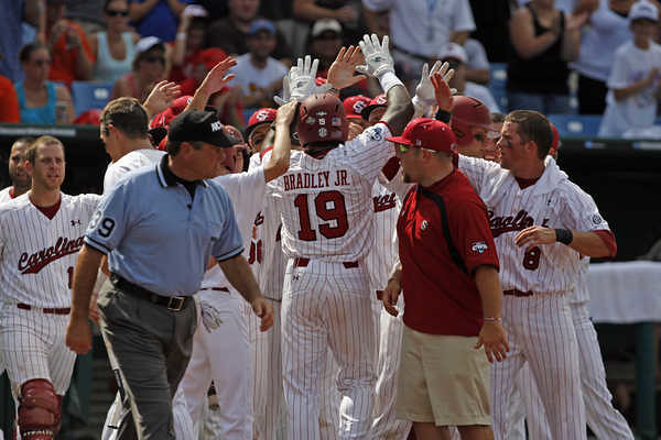
Reader Ronnie Poore recently sent me this photo of South Carolina outfielder Jackie Bradley Jr. Always odd to see “Jr.” or “Sr.” on an NOB — it’s not as though the “Jr.” is part of his family name, right? Similarly, I’ve never understood why announcers sometimes say things like, “Great play by Griffey Jr.!” or “That’s the third time Matthews Jr. has struck out tonight.” The guy’s surname isn’t Matthews Jr.; it’s just Matthews.
Anyway: New ESPN column today — look here.
Sock Giveaway Reminder: I’m currently giving away a pair of very cool soccer-inspired socks. Details here.
Uni Watch News Ticker: Yesterday I mentioned that three-way exhibition game between the Giants, Dodgers, and Yankees and said, “Now we need to find the box score.” Dan Cichalski promptly found it, along with a photo. ”¦ The French soccer team Olympique Lyonnais has quite the doozy of a new shirt (with thanks to Florian Michot). ”¦ Hey, check it out: a T-shirt with lots of jerseys on it (with thanks to Carlos Fenny). ”¦ Here’s the fan-designed uni that the Brooklyn Cyclones wore the other day. Not bad, except that the Cyclones don’t have pinstriped pants. D’oh! ”¦ Why are the NY Rangers using CCM jerseys for their rookie camp? (As noted by Alan Kreit.) ”¦ Marc Swanson notes that George Hendrick was in the odd habit of wearing an Indians visor for his mid-1970s Topps cards. ”¦ Our latest DIYer: Ricko, who made this mid-’50s Kansas City Blues cap by cutting out some white felt and cee-menting it onto a navy cap. Here’s the genuine article for comparison. ”¦ Soccer news from Adam Elkana-Hale, who writes: “FC St Pauli of Hamburg, newly promoted to the top tier of German soccer, will also be celebrating their 100th season in 2010-11. Recently they unveiled their home kit, which is unlike anything I have ever seen. It’s reversible; the montage side of the shirt is a collection of photographs depicting the team’s history; and the copper color is a bit of controversy, as the team usually wears (intentionally ugly) brown, red, and white. The away kit, which is inspired by the team’s original kit, is pretty plain save for the neckline.” ”¦Todd Helton was wearing glasses in the dugout last night (as spotted by Alex Higley). ”¦ Jacob Kubuske reports that Baskin-Robbins is currently running an MLB helmet sundae promotion. ”¦ Nice panoramic team portrait of the 1908 St. Louis Browns wearing pea coats! (Great find by Scot Little.) ”¦ Okay, so we’ve all seen this Kurt Bevacqua bubble-blowing card. But did you know Bevacqua wasn’t wearing shoes for the occasion? That news comes from an amazing post on the Fleer Sticker Project, which has the full story on that bubble competition — including video! Not to be missed, people — check it out here.
Paraguay wore red & white hooped socks instead of their usual blue socks against Japan, looked very snazzy.
link to photo:
link
The red-and-white hooped socks are part of their primary kit this time around.
The reason it looked “different” was because they had to wear their white shorts since their normal blue would clash with Japan.
link
Bevaqua was interesting. Check out the above story.
Paul — no interest in the Pirates-Mets all-pinstripes affair at Shea?
Personally, I have no interest in the Pirates-Phillies all pinstripes affair at The vet in a Sunday of 1977.
The Red Sox have a uniform shirt like the Cubs’ shirt (and I’ve seen one for the Astros, too, though I can’t find it at the moment. I’m guessing Majestic has made one for almost every team.
link
Those are cool. I saw the Cardinals one in a local shop the other day. Lids.com has the Brooklyn Dodgers version up on their website under the Cooperstown collection.
“FC St Pauli of Hamburg, newly promoted to the top tier of German soccer, will also be celebrating their 100th season in 2010-11. Recently they unveiled their home kit, which is unlike anything I have ever seen.”
Munich 1860 did a similar reversible shirt earlier this year- although just a one-off(ironically against St. Pauli), not their first choice for the whole season. link
I can’t say that the new Hamburg kit is attractive, or even slightly pretty, but it is kinda cool and interesting and, well, educational. Maybe the same can be said for that eyesore of a new jersey for Olympique Lyonnais, mais merde alors!
I like the St. Pauli shirt more and more every time I stare at it. I might even buy one.
For those who might not be familiar with the German club, they have hipster street cred the world over…
link
The only think I will add that as a reversible the TSV 1860 (Munich) jersey uses a reversible collar which is more interesting than the reversible T-shirt. However, the TSV 1860 jersey is hideous.
Brown is the St. Pauli color but I think it has looked good with their shade of orange and the use of white over the years. Just brown is not as good.
Lots of discussion at the end of last night’s post on the Pirates. Just to clear things up: Still awaiting visual proof, but the all-pinstripes game was when the Pirates wore both pinstripes jerseys and pants at Shea and the Mets wore their home pinstripes too. Also, once the Pirates went to white uniforms in 1980, they did not mix and match them with any other uniforms and they wore them only at home.
GEEMAN…
is the email you list not your actual e-mail?
i sent you something last evening — please contact me
No. I’ve updated it.
Updated.
Am I crazy, or is Keith Hernandez wearing a mismatched jersey/pants combo here? The pants look noticeably darker to me, but perhaps they were just filthy or wet or something. Compare the white striping against the jersey and pants.
link
link
Compared to Acie Law’s “Law IV,” “Jr.” is downright tame. It’s a mystery for the ages.
Another mystery, albeit of smaller scope, is why SC doesn’t have crescents on their caps. The state uses the crescent as a symbol because it was worn on Patriot caps during the American Revolution. You’d think it would be a logical move to work it into baseball caps, particularly on a team nicknamed after a Revolutionary War general. Their current logo is aesthetically fine, but it isn’t really distinctive of Carolina (or even of SC as against that other USC).
I beg to differ. SC native here though not a Gamecock alum. The interlocking “SC” is very much a part of the state’s history, though you’d have to be an antique liquor bottle collector to know it. The monogram, link, appeared on many of the bottles issued by the state-run South Carolina Dispensary at the turn of the 20th century.
First of all – giving a son your exact name, making him a junior indicates a lack of understanding about being an individual on this planet. It’s dynastic & demeaning on every count. Jock media are only responsible for being guilty of the same mindset.
More to the point regarding the NY Rangers rookie camp sweaters CCM or not- why is the red so dominant?
In camp and in practices lines/D pairings are preassigned and each line will be wearing green/blue/yellow/red/black sweaters/socks. For rookie camps updating equipment is not that much of a priority when you sing bums like Brashear for twice as much as anybody was willing to pay, then waive him when you learn he doesn’t do the thing you wanted him to do(fight)
I’m guessing Slats will now go for Laraque.
Wow! I dig that FC St. Pauli shirt… Will we see more reversible uni’s and kits in the future? Unlike like super-heavy double nylon jerseys, new lightweight-fiber and dye technologies might make ‘bringing the wrong kit’ a thing of the past….
The only reason why most clubs don’t do it is because it’s saves money for the fans.
FC St. Pauli isn’t most clubs. It really is badass.
My guess is that the copper is the base material, while the reverse is dye sublimation. It’s amazing how cheap dye sub has become.
Small thing (but then Uni Watch is all about small things): The favicon — i.e., the little magnifying glass icon on next to the URL on your browser’s address bar — has been updated. It’s now much punchier, less washed-out-looking.
I know some of you miss the stirrup favicon, but I was never happy with it. It always looked weird upside-down all by itself, since it wasn’t hanging off of anything. I considered rotating it so it’d look right-side-up, but that didn’t look right either.
For now, I’m very happy with the magnifying glass, although at some point I could see changing the favicon to just a stripe pattern.
It is an improvement. Thanks! Suggestion for future evolution: the magnifying glass over a stripe patter, with the stripe pattern magnified inside the glass.
That tiny stirrup always looked like a beer bottle to me.
you know what I think would look cool? A block green U with yellow.
Have you ever thought of going with a varsity chenile letter look? UW, sorta like U of Washington.
I like the idea of combining the magnifying glass with a stripe pattern or some sort of fabric. The glass alone sort of suggests “search engine” to me.
What’s with Wally Shang? Is that an early version of the A’s different uniforms for coaches/managers than players?.
link
no…i’ve seen that pic before (probably have it somewhere) — that’s his 1905 (i believe) uniform — the year they won the world series (the following year they wore those in your face “world champions” unis)
But there are four uniforms represented: Brooklyn, Giants, New York, and NY. Somebody’s gotta be double-represented, don’t they?
As alluded to by Phil, link are double-represented.
Hooks Wiltse is the one in the early 20th century Giants uni, as he played with the team at the time. Maybe he was there for some kind of old-timers thing (honoring their past championship teams).
Wally Schang is the one wearing the Yankees road uni.
I wonder if they put a number on the back of Hooks Wiltse’s black uniform. My guess is that they didn’t.
I also wonder how they handled the three-layer line score on the actual stadium scoreboard… any photos?
I’m not positive, but my guess would be they used the out-of-town scoreboard for the three linescores.
Pic of old scoreboard: link
Replica with scores: link…
By the way, the box score for Giants/Dodgers/Yankees was also shown on the page that you originally linked for the program cover–or on a page whose link appeared there. It was a much more easily readable version than the one from the newspaper article although the details from the article weren’t there.
Sorry–just realized that you said “box score,” not “line score.”
I like the colors on the FC St. Pauli kit. Very unique. BUT, how terrible does the ‘Do You Football?’ logo look on a shirt? The badge plus the sponsor plus the most obnoxious logo creep I’ve ever seen is not a good combo at all.
In the lead picture … what’s with the guy to Jr’s left (mostly obscured by the ump)? He’s lost his pinstripes! My first thought was maybe that’s a trainer or support member, but why would they be out on the field celebrating a home run (or other similar event)?
Bat boy?
Player moving to the left behind ump is wearing pinstripes. Can see one of his legs. Guy touching Bradley’s helmet looks like a trainer or something. He’s wearing a white t-shirt, not a jersey, with apparently no undersleeves of any kind…with often-typical white trainer’s trousers
—Ricko
I believe the poster who said bat boy is correct. The gentleman most likely to be a trainer is the man in the red shirt. On top of that, I haven’t seen a college baseball trainer wearing the “typical” white pant in, well… forever. Khaki pants, khaki shorts nowaday.
Marseille also with an interesting away shirt for the 10-11 season. link
They also had an interesting away shirt in 08-09.
link
Loved the 08-09 shirt. The latest one… not so much.
My thoughts exactly Kev!
Re: the updated favicon.
Not a night-and-day difference, but it’s a subtle change that’s definitely an improvement. You can really see the difference between the old one and the new one in link of the dropdown list from my live bookmark.
(I always thought the stirrup all by itself looked like a beer bottle. It probably inspired me, on a subconscious level, to make the stirrup glasses.)
My only contribution is that I find a reversible jersey to actually be better than sliced bread. I have the ’03-’05 England top that I am now once again allowed to wear and love that it drastically reduces my need to do laundry by two days. The ones we’ve seen today could use some work, but the concept is awesome. Now, if we could figure out how to do a reversible MLB top so that the buttons will properly align, we’ll be all set.
link
Interesting. I have a link as well. Did they actually wear them? I always assumed (and still do) that mine is a replica or a fashion jersey or whatever.
And I have no idea what that “kick off/full time” tag is supposed to signify, but I love the St. George’s cross design in the collar.
Do “kick off” and “full time” signify the period during which the team will wear the jersey? 26:03:02 = March 26, 2002 to March 2004?
Yes. England introduces new kits every two years alternating between home and away.
The link of my jersey is definitely the design they wore in link, but England didn’t actually wear reversible jerseys, did they?
I’m not sure about your top, JTH, but I know when England wore the white top I have they only wore the design that has red on it. I would be very surprised if they wore the reversible top on the field, but it is a great option for a fan.
For whatever its worth, I’ve been a frequent if not daily reader of Uniwatch and have put up with your god Rickos “take” on things uniform…..I’m also a DIYer and must comment that his attempt at duplicating the KC Blues cap is off the mark. Thanks for providing the comparison. If you split hairs on things as Ricko is known to do, this one is wayyyyy off. Better luck next time Ricko!
You’re definitely correct. I’d caught glimpses of the early ’50s Blues on video somewhere, then drew the pattern from memory, and I guess my brain may have gone to school more on the proportions of the one-year wonder 1960 KC Athletics hat with the red KC…or something.
Wasn’t until I got hold of some Blues photos and could get a good close look, that I realized that—for one thing—on their version the “K” is decidedly more vertical, and extends farther above and below the “C”. But, by then the hat was long done.
So thanks for pointing out something I already knew. I included the comparison photo for those who may not have known of the similarity in the hat logos of the ’60s A’s and their American Association ancestors, and to show you can have a little fun with felt and some fabric glue…not to display what a nifty job I’d done on the project.
I’ve done plenty of other hats that turned out a whole lot better.
—Ricko
PDiddy, I hope it feels so good to be right. There’s nothing more exhilarating than pointing out the shortcomings of others, is there?
well…this is the last time i post here
You’ll be missed.
That makes sense, Phil … next time you post, it’ll be further down the page. If it was in the same place, it’d be hard to read!
you’re not familiar with kevin smith, are you?
Randy, make sure when you participate in discussions with Ricko you are correct or he will straighten you out.
I enjoyed your hat and gave me some motivation for my next project. I made a UTEP blanket for my daughter with some stripes for my last DIY.
Ricko the only reason I jumped on this is you have an annoying habit of correcting people on the details. While I can appreciate that, I also have a very keen eye and felt that your KC hat was NOT PERFECT and that needed to be pointed out. I realize that this is a DIY project, but from you I EXPECT PERFECTION.
Y’know, come to think of it…if I were trying to pass it off as perfect, why would I bother to include a photo of the actual hat?
—Ricko
Hey Ricko,
Your DIY project inspired me to try one of my own. I’m going to try to do a Cleveland Indians cap from the 1921-36 era (link below)
link
I actually bought that cap from the Indians team shop site, but wasn’t particularly pleased with the fit or the shade of navy (It’s much lighter than it appears in that picture, which is not what they used until about 7 or 8 years ago). Anyway, while I don’t wear that cap anymore, I saved it, so I would think the ‘C’ would make a good template for me on a DIY cap.
My question regards supplies: Specifically, what should I look for in terms of a felt to use for the ‘C’ and is there a particular brand of adhesive I should use?
Thanks for any help you can provide.
I’m sure everyone knows what a KC Blues cap looks like. No comparison…no good! I’ll just take your word for it.
There is another movement to correct the statue of a sports hero: link
Now, I actually love the style of the statue as it looks like drawn art I have seen from the 20’s – 40’s, but when the guy the statue depicts says he hates it, you know it is time to give “The Man” what he wants.
Is the guy on the left in the Rangers rookie camp picture the Pete Gray of hockey?
link
“Why are the NY Rangers using CCM jerseys for their rookie camp? (As noted by Alan Kreit.)”
Hopefully if we are all lucky it would be signaling the demise of the horrid RBK edge designs. Not very likely but we can dream.
You’re right. It is highly unlikely, considering Reebok owns CCM.
The NHL officials’ jerseys are still CCM-branded, right? It’s possible that the rookie jerseys are CCM as well and the players need to “graduate” to have the “honor” of wearing the Rbk Edge.
Or they could just be leftovers from a previous year.
Ahh, the good ol’ MLB bubblegum blowing contests. My how times have changed.
Running the same photo of Stephen Strasburg’s “Washhington” jersey twice doesn’t actually count as double the proof that button-front jerseys “look really stupid.”
I always wondered how long until this happened …
link
Meh. If they want to abandon the hotpants, something like link from Donna Troy’s brief tenure as Wonder Woman would have been a better choice.
“Wonder Woman Trading in Star-Spangled Hot Pants for Leggings”
That’s almost what was coming to pass in NBA over the last 40 years, wasn’t it?
Except they staved it off just in time by banning the leotards under the shorts, because would have begun the final transition phase.
—Ricko
At least they didn’t put her in flip-flops…
I suppose an upgrade was in order, but not sure this is it.
This is a job for…the weekend tweakers!
No World Cup today…after 18 straight days of soccer…don’t know what to do…must…hold on…until Friday…
Just 41 hours to go… No, 40 hours and 53 minutes… You don’t have any chewing gum, do you?… No, no, fine,thanks… Ummm…
Just had a fantastic idea while reading your wrap-up of the several throwback uniforms worn over the last weekend of interleague play.
Would it not be the most fantastic idea EVER to have an All-Star game where every player wore a throwback from his team’s history? Imagine some of the juxtapositions. You could have a Detroit Star pitching to a Rainbow Guts Astro, or a gradient Devil Ray outfielder tracking a fly ball off the bat of a black-and-gold Pirate. Some teams with particularly – uh – “rich” histories (Astros and Indians for two good examples) could have multiple players with different throwbacks, if they were so inclined. Even the Yankees have old-school unis. You’d have garish color-on-color, but this isn’t basketball or football, where the teams are on the field at the same time and need to be explicitly differentiated. Most teams already have throwbacks in their regular arsenal, so it would only represent an investment for teams like the Yankees (who, despite popular image, do have historical uniforms, like the giant white NY on navy jerseys). Besides the investment, though, it would be a great marketing gimmick. People already love the throwbacks. This would have been a perfect idea for the ’99 game in Boston at venerable Fenway Park, but since that’s come and gone, we could shoot for Wrigley Field in 2014, if the Cubs get the game for the 100th anniversary of that park. Yes, parts of this game would probably look ugly, but wouldn’t this idea make for the all-time best starting lineup picture (when both teams line the baselines)?
I LOVE this idea! I think it’d be cool to see the Yankees in the unis with the team name across the front. The Mets could go with the original ’62 unis, with no numbers on the front or names on the back, or the late ’70s pullovers with the two buttons at the collar. So many possibilities!
Lovin the concept! It’d give Fox a chance to pull out the “anti-techology” they did a few years back, broadcast in camera angles, graphic, and photographic styles of the decades of broadcast baseball. The closer the end of the game got, the more modern the graphics, inning by inning.
That was WGN celebrating the 100th anniversary of being on the air with Cubs baseball. I have yet to find the footage of that game, but the Cubs and whoever they played wore 1908 uniforms, the broadcast aged as the innings progressed.
Dang it, miss read the comment.
I should have said:
Kid of like what WGN did when they celebrated the 100th anniversary of being on the air with Cubs baseball. The broadcast aged as the innings progressed.
You are correct, sir … I think. It messed me up those years where Chip spent Saturdays on Fox and Sunday through Friday on WGN. I never knew what I was watching. :)
I definitely remember Fox doing it on one of their national Saturday broadcasts once. At least 10 years ago, probably a little longer.
100 years of broadcasting? Even with radio I don’t think anyone’s gotten that far yet. ;D
The WGN broadcast was in 2008 (the 60th anniversary of WGN televising Cubs games), and it was Len Kasper and Bob Brenly doing the game. It was Cubs vs. Braves at Wrigley. The Cubs wore link.
The Fox game was in 2000 with Buck/McCarver, and it was Cubs vs. Dodgers at Wrigley. I think they just wore their regular unis for that one.
I love this idea as well. The All-Star game is (supposed to be) an exhibition. Why not?
Plus, you’d be exposing the entire nation to a bunch of throwbacks they rarely see (throwback games tend not to make it on the few network broadcasts.)
What would be even cooler is seeing, say, a 1983 White Sox infielder flipping the ball to a 1967 White Sox first baseman (Yeah, I know the White Sox don’t have any all-star infielders, but you get the point).
Konerko actually has a shot. Beckham, Ramirez and 3rd baseman du jour? Not so much.
Alex Rios also — so you could have an 83 Sox outfielder firing it to a 67 Sox first baseman.
The proper way to do such a turn-back-the-clock All-Star Game would be to pick a specific year and have every team wear the uni from that year.
For example, if one picked 1954, Yankees, Cleveland, White Sox, Red Sox, Tigers, Phillies, Reds, Cubs, Cardinals, and Pirates wear what they wore in ’54.
The rest of the current teams wear the unis worn by the city’s franchise in that year. Mariners wear Rainiers, Athletics wear Oaks, Royals wear Blues, Padres wear Padres, Dodgers wear LA Angels, Toronto wears Maple Leafs, Rockies wear Bears, Nationals wear Senators, Astros as Houston Buffaloes, and so forth.
That’s the way to do a turn back the clock All-Star Game.
That might be a little more “orderly”, but does it really matter? Have two members of the same team wear two different throwback uniforms. Say, Soriano in the powder pins of the 1980 Cubs plays side by side with Derek Lee wearing the Blue jerseys and white pants of the 1984 Cubs. I don’t think everything has to be so neat and tidy. No minor league unis in the big league allstar game though.
No minor league unis in the big league allstar game though.
so, the orioles aren’t allowed to send a rep?
/oh…you said unis, not teams
carry on
Hope this isn’t double-posted… my first comment hasn’t show up yet. Wouldn’t it be great if we had an MLB All-Throwback All-Star Game? I would love to see the rosters lined up on the baselines with baby blue ’80s Royals and Blue Jays, ’80s Rainbow Guts Astros, early 20th century navy-with-white-NY Yankees, ’80s softball Tigers, ’70s faux-collared White Sox, ’50s Reds with navy trim, ’30s Cardinals with piping, ’90s Rainbow gradient Devil Rays. The possibilities are endless. Wikipedia says that Chicago wants to host to 2014 game to celebrate the 100th anniversary of Wrigley. Wouldn’t this be a perfect tie-in? MLB, please steal my idea. I don’t even care if you give me credit. If I can see this beautiful monstrosity come to life, I can die happy.
I don’t mind seeing “Jr” on a jersey. For that matter, I don’t mind hearing announcers call a junior by his “title.” It does bother me a bit when people refer to Ken Griffey Jr as “Junior Griffey.” I lived in the Seattle area during his first tour of duty with the M’s, and I don’t recall any of the locals ever calling him that.
Peter Gammons always called him Junior Griffey — often on first reference. Always annoyed me.
Peter Gammons always
called him Junior Griffey – often on first reference. Alwaysannoyed me.(fixed)
Vuvuzelas, Gammons, Redskins, DH, I don’t think we’re ever going to get along. Maybe on the BFBS thing. But that’s it. From now on, Phil’s my litmus test. You can put it in a lock box. :)
Vuvuzelas, Gammons, Redskins, DH, I don’t think we’re ever going to get along. Maybe on the BFBS thing. But that’s it. From now on, Phil’s my litmus test. You can put it in a lock box. :)
thanks, al
in all seriousness, you’ve got issues ;) i mean, you can’t even RECOGNIZE bfbs (just because it’s *halloween* it’s still bfbs, buddy)…and i don’t mind purple, but i’ve been advised not to post any more pics of you in said color…so don’t send me any (personally, i LOVED the so cal sun, but i don’t speak for the readership…the cats lavender over purple? not so much)
and if you LIKE the DH i’m not sure we can still be friends :O
Agreed 100%, and he really should know better.
great work on the hat ricko!!! looks awesome!
okay ricko, i deleted the other two, and fixed link
AS for Jr. on a NOB, did you ever think the guy might just be showing respect for his dad? I had a dad. If I had been a Jr., I would have done the same thing. He deserved at least that much.
Let’s not get too nit-picky here.
Let’s not get too nit-picky here.
Hahahahahahahahahaha.
But right now you ARE named after your dad- you have the same last name and the names on the backs of your jerseys would be identical.
I’m just wondering- if you WERE a Jr., how would making the name on the back of your jersey different from his be honoring him?
And since you’re not a Jr., why would you not honor him now by putting your first name on there?
Does anyone have an idea why St. Pauli’s normal kits are “intentionally ugly”? Paul kinda threw that in there, and now I’m intrigued!
It has to do with the culture of the club itself:
link
Yeah, I did look that up. I guess my point is by “intentionally ugly”, was Paul saying “intentionally different but ugly”.
Or was there some sort of movement by the club to actually be genuinely “ugly”?
I actually included that description when I submitted the item to Paul. DJ’s right, it has to to with the culture of the club itself: they’ve been brown and white since their inception, but have really played up their unfashionable color scheme in the last… two decades or so.
Woo hoo! New toy! (or I’m just really unobservant)
“Your comment is awaiting moderation.”
Today’s ESPN column is finally up:
link
sweet…and now i know what in situ means
Is there no one in the Sharks organization, a decision maker of some sort, who has looked at that jersey and said, “There’s so much crap on there that it’s hard to look at, really. What were we thinking? Let’s fix it!”
Nice article, though it’s a little jarring to see ” the Ft. Duquesne Bridge” without “is undergoing crippling construction” or “is currently akin to a parking lot” immediately following.
Just be happy it’s not the Bridge to Nowhere anymore.
It’s a big deal that Baskin Robbins has a helmet sundae promotion now? The Dairy Queen near me has had them for decades now. They even have one of the giant standings boards full of them, although they are only listed in alphabetical order and not standings order.
BR used to offer them back in the day and then stopped. Outside of the ballparks, and a few local places in the baseball cities, you couldn’t find these helmet bowls anywhere other than BR. When they took them away, a lot of people were upset. Now BR has seen the light and are offering them again, much to the cheers of more than just kids.
But the helmets are a tad dated. I bought an Orioles helmet sundae last week and the helmet was all-black. They don’t wear that anymore; they started wearing the one with the orange brim last year. In fact, the reason I bought the Orioles is because that helmet is no longer worn by the team.
I don’t think they ever colored the brims or front panel area on those things. And it seems like the Expos one was always solid blue.
The Indians one in the pic has a colored brim.
Is it just me or does the Kings throwback that debuted at the drift look nothing like a RBK Edge jersey? It looks like a pretty classic CCM style cut.
My bet on the NY Rangers Rookie camp CCM is that they’re old stock still knocking around.
In 2000, Manchester United sold a reversible shirt, white on one side, gold on the back. The shirt is double-thick. Players had non-reversibles in both colours.
link
In 1997, they sold a shirt with their home stadium, Old Trafford sublimated on the shirt.
link
SB
Nice observation on the Kings jersey. Once I looked at it that way, it made me think of a 1980s MLB pullover – old and outdated. Don’t get me wrong, I appreciate the old-school effort, and don’t mind the jersey, but I think if all jerseys were made that way again, it would be a step backward. Much like the return of powder blue in baseball.
“Much like the return of powder blue in baseball.”
and that would be bad because???
granted, there were several teams on whom it looked like total shite (twins, cards, phillies — pretty much anyone with a red tonality to it), but that’s not the fault of the powder blue…it looked pretty damn good on some teams
now…if you’re talking powder blue polyester pullovers with multistriped sansabelt pants and garish side stripes…then i’ll agree with you; but they didn’t look any better in white or gray
but powder blue in and of itself was never a problem
Not easy for a Cub fan to have a good perception of powder blue. It’s one of the few things the organization’s done badly in the last 100 years.
link
(that’s right – powder blue and winning)
while, admittedly, the cubs haven’t exactly done powder blue proud, that’s no reason to hate on it for everyone
especially those who rocked it in the pre polyester days
Powder blue, winning and link.
2010/11 away jersey for Benfica
link
Let’s see.
Federer got whacked.
G-Men swept by LA.
Great day today.
That Olympic Lyonnais jersey is interesting, immediately reminded me on this Stade Francais (Paris team) rugby jersey from a few years back…surprisingly also made by Adidas
link
They have had some particularly crazy ones over the years
*not surprisingly
and not to waste a post, other stade francais jerseys:
link
link
link
link
link
link
All this talk about FC St. Pauli reminded me of a DIY project undertaken at the National Sports Center in Blaine, MN. In 2006, a few Minnesota St. Pauli supporters went to Hamburg’s Millerntor Stadium in the Reeperbahn link and were inspired by the Manual Scoreboard with an analog clock that stood there at the time. They built one like it that is in use this season for the NSC Minnesota Stars, details here: link
It’s great to hear about St. Pauli, they are Punk Rock Soccer in the finest way. Hopefully they will stay up in the Bundesliga for a while…
On Red Sox-Rays broadcast tonight, Don Orsillo and Jerry Remy had a brief exchange about the Rays’ new stirrups:
Orsillo: Here’s former Red Sox catcher Kelly Shoppach, who also elects to show a lot of stirrup tonight…As I recall, this is a look you were favoring at times.
Remy: Yeah, the Red Sox used to have some really nice socks, red, white and blue socks. Of course, at one time there was a rule on the Red Sox that you had to show red, white and blue on your socks. Of course, that rule is long, long gone now.
Orsillo: It’s rare to see. The Rays are trying to mix it up here, do a little something different. They’ve had a bad run…
[Then a runner stole and that was the end of that]
The Sox sure did have a great stirrup design. Wish we could still see it out there.
Not sure if anyone would have kept this, but a while back Uni Watch linked to a photo that depicted NFL animal logos with helmets similar to the Dolphins’ “M” helmet. The link no longer works and I can’t seem to find it anywhere online. If anyone saved a copy of the image, please let me know. I’d love to see it again and put it online for good. The original was called logoswhelmets.png on the site it was on so you may have saved it under that name as well. Thanks!
Here’s what it looks like as a thumbnail:
link
Sorry fellas. I’m just not liking this new comments setup. Having to search back up the scroll for what’s new is losing my interest and focus. Someone mentioned changing the color of everything that is new since one’s last refresh might be an option, but I still like just tacking them on at the bottom the best. I know the poll suggested that more people like the new format, keep in mind it’s unscientific nature. Still lots of people prefered the old way, and I’d bet many were just being nice and pleasing by saying they like it better now. But I (I know, too many “I”s in this comment) much prefer the old way.
Oh, and Jr. as a NOB? Never like it. I’m not much for hyphens in last names either. Keep it one name only. Or Johnnie “Boo” LeMaster style.
Just being nitpicky gripey complainey tonight. Forgive me. Kids just got hammered by the mercy 15 run rule.
Just an idea – can we throw active threads down to the bottom? As a placeholder above there can be a quicklink down the page to the active conversation going on? That would put everything in sequential order again. Don’t no much about computers, so don’t know if it’s possible or not.
Traxel said: Having to search back up the scroll for what’s new is losing my interest and focus.
Yeah, that’s kinda how I feel, too.
“Yesterday I mentioned that three-way exhibition game between the Giants, Dodgers, and Yankees and said, “Now we need to find the box score.” Dan Cichalski promptly found it, along with a photo.”
Thanks Dan and Paul. That’s an interesting boxscore, couldn’t even fit the Giants in one column, let alone the pitching. I guess that’s another reason 3-way games don’t happen anymore.