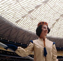
Yesterday I mentioned that the Astros’ throwback game this Saturday will feature throwback grounds crew and usher uniforms. I showed some pics of the old spaceman uniforms that the grounds crew used to wear, but I couldn’t find any shots of the old “Spacette” attire worn by the female ushers back in the ’60s.
Fortunately, a gaggle of readers quickly came to my rescue, and then some. The first was Jon Helf, who runs the mighty Fleer Sticker Project site. Here’s the note he sent me:
Here are some Spacette photos, and also a link to a post I previously did on an upcoming documentary about the Astrodome. The embedded video has some great footage of the construction of the dome and the famous “Home Run Spectacular” from the Astros scoreboard. Thus far the documentary hasn’t been released, but I’m hoping it will be soon, as it looks great.
Next up, about an hour later, was reader Douglas Hirschman. He came up with this photo, along with a bonus shot of a groundskeeper (both from a book about ballparks, he said).
And about an hour after that I got a barrage of communiqués from Lance “Squiddie” Smith. The first one featured these two Spacette photos, both taken from this old Astrodome promo movie (which I strongly recommend — highly entertaining).
A few minutes after that, he sent me an absolutely essential video that is required viewing, people — it’s barely over a minute long, so check it out (the first 20 seconds are blank for some reason, so skip ahead to the 0:20 mark):
Those early drawings look amazing, right? I was thinking to myself, “Dang, if only we could see the original sketches” when Lance sent me yet another note: “Those Astrodome uniforms were designed by Evelyn Norton Anderson. Her papers are at the Houston Metropolitan Research Center, Houston Public Library. They have a page listing what’s available.”
Whoa — that looks like the freakin’ mother lode of stadium personnel uniform artwork! And not just Astrodome staffers, but Colt .45s material too (before there were Spacettes, there were Triggerettes). I want to see it. I need to see it.
According to Google Maps, I live 1,633 miles away from the Houston Public Library — not so far in the grand scheme of things, but I’m guessing a few of you are situated a bit more advantageously. So here’s what I’m proposing: Howzabout if one of you (or more, if you’d like to make it a group outing) goes down to the library and makes copies of, oh, every single Colts- and Astros-related page in Anderson’s archive. I’ll happily underwrite the copying costs. And then you can make scans of of the copies and either upload them to an image-hosting site or e-mail them to me. And then I’ll take it from there.
If you live less than 1,633 miles from the Houston Public Library and would like to be part of this project, you know what to do.

Too Good for the Ticker: I think most of us would agree that the history’s greatest uni number design is the cable car treatment on Golden State’s old “The City” jerseys. But
my ESPN colleague and longtime Uni Watch buddy Rob Neyer has come up with a strong contender for second place. Rob was looking through this book about the Carolina League and came upon a photo of Chuck Weatherspoon of the Wilson (N. Carolina) Tobs — check it out.
Thing of beauty, right? Can’t tell if it was a giant circular patch (which would’ve been really uncomfy) or just some a lot of extra piping. Either way, looks awesome.
The date of the photo is uncertain, but Weatherspoon played for the Tobs in 1960, ’61, ’65, and ’66, so it’s presumably from one of those years.
Uni Watch News Ticker: Cool postcard showing the evolution of football uniforms here (good find by Mike Hersh). ”¦ Yesterday I asked why a Louisville Colonels player would have a “W” on his jersey. Terence Schull has an theory: “The Braves’ minor league affiliate prior to the Louisville Colonels was the Wichita Braves from 1956-58. I’m guessing that the jersey in the photo was in the process of being stripped of the Wichita lettering to be re-used as a Colonels jersey.” ”¦ Another follow-up from yesterday: I asked if anyone could think of a bench player who’d worn a captaincy “C.” Andy Chalifour came up with one: Davey Concepcion, in his final season. ”¦ Dr. Dre is marketing Red Sox headphones (with thanks to Richard Stover). ”¦ Tons of awesome old wrestling photos here (with thanks to Chad Todd). ”¦ “My mom, Julie Zoss, made two cheerleading uniforms for my four-year-old daughter’s doll,” writes Jeff Zoss. “The maroon and gold EP uniform is for East Peoria High School in East Peoria, Illinois, where I am an assistant football coach. My mom used my daughter’s Illinois uniform as a template for the doll’s other uniform.” I can’t decide if these are brilliant or creepy. Probably both. ”¦ Fairly mortifying look at how brands are gaining even more exposure in movies these days here. ”¦ Speaking of branding, Matt Benedict reports that Big Papi conducted an interview the other day with his chest swoosh scratched out and “Reebok” written in. ”¦ Patrick Runge reports that Birmingham City is letting its fans vote on the team’s kit. ”¦ No photo, but Matthew Robins says a West Virginia player got blood on his jersey on Saturday. They apparently didn’t have a blood jersey handy, because the player ended up wearing someone else’s jersey, with black electrical tape covering up the NOB. Anyone know more, and/or have any images? ”¦ Last April I ran a guest entry from Idaho State media director Frank Mercogliano, who wrote about the DIY scoreboard he made for the school’s softball team. A year later, he reports that the scoreboard is still going strong. ”¦ Latest Gazoo devotee: the Phillies’ batboy (screen shot courtesy of Wojciech Gluszak). ”¦ The Mets’ new cream-retro pinstripes look pretty much the same as the old white pinstripes. Additional pics here. ”¦Noteworthy first-pitch attire: President Obama in a Nationals jacket and a Chisox cap, Kurt Warner in a D-Backs jersey, and Roger Staubach in a Rangers cap. ”¦ A little birdie tells me the Jazz may have a significant uni-related announcement at their final home game, which is next Tuesday. ”¦ CBS’s lineup shot for Butler’s starting five last night showed very inconsistent NCAA patching (with thanks to Chris Mycoskie). ”¦ Well, that didn’t take long. Tim Haller spotted that guy at yesterday’s Nats opener. ”¦ Great work by Mike Mattison, who spotted a “Frenchy” label on the back of Jeff Francoeur’s helmet. ”¦ Speaking of Mets helmets, Dan Cichalski caught something really interesting yesterday: After swiping a base in the 3rd inning, Luis Castillo switched from the left-handed helmet he’d been wearing to a right-handed helmet. ”¦ Things I really liked yesterday: the Astros’ anniversary patch and the Twins’ new road grays — except for Orlando Hudson, whose front uni number was inexplicably missing, plus he should’ve worn a navy arm sleeve instead of that red one (big thanks to David Teigland for the screen shot). … New logos for the Everett Aquasox. “Love the sideways Mariners trident!” says Ethan Allen.
In regards to the West Virginia player who had to change jerseys, here is a pic of guard Joe Mazzulla in his replacement jersey (no. 24).
Joe Mazzulla’s jersey was torn so he switched to 24:
Then, with 6:56 remaining in the first half, referee Curtis Shaw informed the WVU bench during a timeout that Mazzulla’s jersey was torn and the guard needed another one.
While WVU trainer Randy Meador headed to the locker room to find a spare jersey, Shaw told WVU assistant coach Billy Hahn the game couldn’t be delayed for the shirt switch, so Mountaineer walk-on Cam Payne removed his warmup and then took off his No. 20 jersey to give to Mazzulla.
About the time, Meador arrived on the scene with a No. 24 jersey, which Mazzulla wore for the rest of the game.
The last Mountaineer player to wear no. 24 was Josh Sowards, in 2006. It was Joe Herber’s number from 2001-02 through 2004-05.
link
…and a pic: link
Better jersey, also at the Nats opener: link
Actually, I thought the Mets unis did look like cream on TV. I could tell a difference. Looked sharp. Blue hats, pinstripes = win. Maybe they should take the hint.
Thanks for the Astrodome stuff. My first MLB games were in Dome and I loved that place. Wish the Astros would tweak the old logo (can’t have the Astrodome in it), go back to navy and orange and go back to the shooting star uniforms. Love those — by far, my favorite.
Those might have been the worst championship hats ever last night. I’m not sure how to link to a picture, but what a mess.
Not a fan of those dull gray Twins road jerseys. At least the previous ones had pinstripes to liven them up a little.
I would have preferred something like link, only maybe with less prominent sleeve hems.
I’ll never understand the appeal of gray, especially when a team has blue. It’s a very neutral color; in some languages, there’s no word for gray, and they use the same word as a shade of blue. Who wants to join a “Gray, Go Away!” movement alongside the “Ditch the Black” diehards?
[quote comment=”384267″]Actually, I thought the Mets unis did look like cream on TV. I could tell a difference. Looked sharp. Blue hats, pinstripes = win. Maybe they should take the hint.[/quote]
agreed…you could definitely tell they were “different”…the drop shadow looks even worse on the ‘creams’…but the blue caps and pins on opening day was welcome…on pace for 162-0
best new uni’s of the season (so far) are definitely the twins roadies…not the best pic, but i love the script, and thank god they got rid of the pins on the roadies
only *complaint* is possibly the patches on the right shoulder and the cap (but they’ll be gone after this season)…jury’s still out on the red brim/blue crown, but so far i like it
Does anyone know where I can find a (somewhat) hi-res picture of the MLB ‘Opening Day 2010’ logo with banner behind it? The only ones I’ve been able to find so far are little tiny graphics. I went to the Sox/yanks game with my dad and brothers the other night, and I’m looking to frame the tickets along with game photos as gifts for each of them. Hopefully I can include the logo, too. Thanks everyone.
$400 for those Dr. Dre headphones? Puh-lease!
[quote comment=”384270″][quote comment=”384267″]Actually, I thought the Mets unis did look like cream on TV. I could tell a difference. Looked sharp. Blue hats, pinstripes = win. Maybe they should take the hint.[/quote]
agreed…you could definitely tell they were “different”…the drop shadow looks even worse on the ‘creams’…but the blue caps and pins on opening day was welcome…on pace for 162-0
best new uni’s of the season (so far) are definitely the twins roadies…link, but i love the script, and thank god they got rid of the pins on the roadies
only *complaint* is possibly the patches on the right shoulder and the cap (but they’ll be gone after this season)…jury’s still out on the red brim/blue crown, but so far i like it[/quote]
I didn’t think the off-white uniforms looked half bad. The color was less noticeable over Slingbox; I noticed it more when I got home and watched highlights in HD.
I still think the black drop-shadow is barely noticeable when the Mets wear blue caps and undersleeves, and I have to disagree with Phil that it seems even less noticeable on the off-white jersey (less contrast with the white, maybe).
If the Mets are smart, which we all know they’re not, and if we are lucky, they’ll wear this combination a lot early in the season to show off the “new” jersey and get people to buy it, and then people will like it so much that they’ll essentially do what they’ve been doing for 12 years, i.e., wear the “alternate” as the regular home uniform, and treat the now-“official” home uniform (the plain whites) as the alternate.
I know, I know, we’ve all been hoping too long. At least there’s a chance that we’ll see the blue caps more often this year, with either the white or the off-white.
Never noticed this before, but I can not stand how the tail is floating under the Minnesota script. It’s fine like that under the Twins wordmark because it would be unnatural to connect a tail to non-cursive lettering for the same reason it looks unnatural to have a floating tail underneath the cursive script. I assume the floating tail is supposed to tie the Minnesota script to the Twins wordmark, but c’mon, connect the tail to the A.
Also, I like grey. I love textured heather greys and flannel grays even more, but the solid greys are decent, and I prefer them to colored jerseys.
I like the warmness of cream instead of white as well. Looks subtle, but excellent. Should be the standard home color for baseball teams.
I could be wrong about this, but is seems to me that this idea of off-white being a “retro” look may be the result of the way flannel uniforms of the past accumulated dirt over the course of the season. The uniforms may have started out white, but as they got dirty game after game after game, and were laundered (not bleached) time after time after time, the white would gradually fade to an off-white; since the dirt was brown, the off-white would become a very light beige or cream color.
Just guessing.
Here’s a good shot of Mazzulla’s backup, backup jersey.
link
1. Mets looked great yesterday.
2. Nice touch by Obama.
3. Twins roadies look good.
4. Mark Buehrle made the play of the year, on OPENING DAY!
5. I was rooting for Duke but would have LOVED to see that last shot go in.
6. From the AquaSox link, check out this website which seems to have been created just for me:
link
[quote comment=”384273″]I still think the black drop-shadow is barely noticeable when the Mets wear blue caps and undersleeves, and I have to disagree with Phil that it seems even less noticeable on the off-white jersey (less contrast with the white, maybe).
[/quote]
oh, it’s definitely noticeable…the “mets” looks clunky, too ‘fat’ if you will…i don’t so much mind it (well, i do, but it’s not nearly as ‘bad’) on the snow whites…
but on the pins it’s unneeded
look how good it looks on the ‘cream’s’ M&N made for the farewell to shea…THAT’S what they should have done on these
[quote comment=”384274″]I love textured heather greys and flannel grays even more[/quote]
I’ll concede that heathered gray looks pretty good. More so when the player’s socks (preferably with stripes on them) are highly visible. There’s a long way from (flannel gray + high socks + colorful sleeves) to (dull double-knit solid gray all the way down to the shoes).
Is it possible to reproduce the heathered effect with modern fabrics? If they did this, and also made some more color visible (sleeveless jersey with colored undershirt? or colored sleves, KC Monarchs style? mandatory high cuff pants?), it would go a long way.
[quote comment=”384274″]Never noticed this before, but I can not stand how the tail is floating under the Minnesota script. It’s fine like that under the Twins wordmark because it would be unnatural to connect a tail to non-cursive lettering for the same reason it looks unnatural to have a floating tail underneath the cursive script. I assume the floating tail is supposed to tie the Minnesota script to the Twins wordmark, but c’mon, connect the tail to the A.[/quote]
ya beat me to it. i love the uniform… except for that tail. your point about tying it to the “twins” jersey is likely why they did it and i think we’d agree two wrongs don’t make a right. i’ve never cared for the “twins” jersey ’cause a.) i hate the floating tail and b.) i hate that font. they should go back to link.
Twins need to bring back the pinstripes on the road uniforms. Definite downgrade in the new look.
Not sure if anyone had posted this already but Texas Tech wore some serious throwbacks last week in their game against Kansas St. VERTICAL LETTERING AND STIRRUPS!!!!! Not sure if this is gonna work:
link
Fail on the Twins roads. Aside from the obvious and fatal problems we knew about going into the season – looking just like the Nats roads, script that clashes with the home lettering, the dangling final A disconnected from the tail, the lack of road pinstripes, which have been a franchise tradition off and on dating to before the Yankees wore pins at home – the red/blue balance was completely wrong. The red outlines, on both the lettering and the piping, is much too strong. On TV, the Twins roads now look vaguely purple.
This wouldn’t be a problem if the script were red, or if it had no or thinner red outlines, or if the script were in the thicker style of the home script. But the combination of style, relative thickness, and colors is a perfect storm of jersey-lettering craptitude. The hazy purple uni details may work as a shout-out to hometown heroes Prince or the Vikings, but on the road the Twins now look completely unrelated to the team that plays home games in Minneapolis.
Majestic needs to contact Under Armor and get this material
link
and re-create this jersey for the Tigers road uniform
link
[quote comment=”384269″]Not a fan of those dull gray Twins road jerseys. At least the previous ones had pinstripes to liven them up a little.
I would have preferred something like link, only maybe with less prominent sleeve hems.
I’ll never understand the appeal of gray, especially when a team has blue. It’s a very neutral color; in some languages, there’s no word for gray, and they use the same word as a shade of blue. Who wants to join a “Gray, Go Away!” movement alongside the “Ditch the Black” diehards?[/quote]
No, no, no. Red hats and powder blues represent, and remind us of, the absolute suckiest era in Twins history. Dressed badly, played badly. Uni was disconnected, theme-less, a blight. So was the organization in the final Griffith years. That uni absolutely represents that era.
Unis, for any team, have to considered in their context, too. I’m guessing most who like the Twins powders simply haven’t been on the planet long enough to know how abysmal those Twins teams were. Yeah, they got more interesting at the end of that uni’s run with the addition of Hrbek, Puckett and others, but it was the return to pinstripes in ’87 that marked the end of that long spell in Loserland.
Red hats and powder blues should stay buried. And this new red-billed cap never should have made it past “what if”.
rpm made the best point: Were the “Minnesota” on the new roads red edged in navy (which would match both front and back numbers, btw) and the hat sans the red visor, at least the new roads would be, element by element, a reflection of the homes. That would make sense. What they wore last night doesn’t.
Really, really pedestrian. Look like a high school team. Or the Indians. Or the Natinals. Sort of.
And don’t be knocking the dark pins on the former roads. Twins and Padres brought that look back to MLB, and they were unique, one in each league. The Rockies, Diamondbacks, Angels and Reds deciding they’d be unique, too, was what beat it to death.
—Ricko
Note on the NCAA patches: Those patches have adhesive on the back and can fall off after long use (or laundering). Remember the play-in (or opening-round) game when Arkansas-Pine Bluff didn’t have the logos in the first half but did after halftime? Just as easy as peel & stick!
[quote comment=”384278″][quote comment=”384273″]I still think the black drop-shadow is barely noticeable when the Mets wear blue caps and undersleeves, and I have to disagree with Phil that it seems even less noticeable on the off-white jersey (less contrast with the white, maybe).
[/quote]
oh, it’s definitely link…the “mets” looks clunky, too ‘fat’ if you will…i don’t so much mind it (well, i do, but it’s not nearly as ‘bad’) on the snow whites…
but on the pins it’s unneeded
look how good it link M&N made for the farewell to shea…THAT’S what they should have done on these[/quote]
Don’t get me wrong; the jersey looks much, much better without it. That goes for the link, the link, and the link.
[quote comment=”384282″]Not sure if anyone had posted this already but Texas Tech wore some serious throwbacks last week in their game against Kansas St. VERTICAL LETTERING AND STIRRUPS!!!!! Not sure if this is gonna work:
link
Under Armor is producing some great baseball unis. The TT throwbacks and the Mizzou grays are fantastic. Coupled with the fact that Rawlings? isnt able to do some of these things (entry last week on Delaware HS team), I’d definitely like to take a look at them when we are able to order new baseball unis for my HS.
I think the cream for the Mets new pins is closer to this color:
link
link
Which is to say it’s lighter than the color used by the Giants for their home uni.
link
For some reason I feel like the Giants uni is more cream than the Mets or Indians.
Why do the Mets even have a pinstripe uni? neither the NY Giants or Bklyn Dodgers traditionally wore them. As for the reader who said the Twins wore pins before the NYY? In what universe? While a few other teams sported a pinstripe on & off, Yankees started using them regularly before the Minn. Twins were even a franchise.
[quote comment=”384285″][quote comment=”384269″]Not a fan of those dull gray Twins road jerseys. At least the previous ones had pinstripes to liven them up a little.
I would have preferred something like link, only maybe with less prominent sleeve hems.
I’ll never understand the appeal of gray, especially when a team has blue. It’s a very neutral color; in some languages, there’s no word for gray, and they use the same word as a shade of blue. Who wants to join a “Gray, Go Away!” movement alongside the “Ditch the Black” diehards?[/quote]
No, no, no. Red hats and powder blues represent, and remind us of, the absolute suckiest era in Twins history. Dressed badly, played badly. Uni was disconnected, theme-less, a blight. So was the organization in the final Griffith years. That uni absolutely represents that era.
Unis, for any team, have to considered in their context, too. I’m guessing most who like the Twins powders simply haven’t been on the planet long enough to know how abysmal those Twins teams were. Yeah, they got more interesting at the end of that uni’s run with the addition of Hrbek, Puckett and others, but it was the return to pinstripes in ’87 that marked the end of that long spell in Loserland.
Red hats and powder blues should stay buried. And this new red-billed cap never should have made it past “what if”.
rpm made the best point: Were the “Minnesota” on the new roads red edged in navy (which would match both front and back numbers, btw) and the hat sans the red visor, at least the new roads would be, element by element, a reflection of the homes. That would make sense. What they wore last night doesn’t.
Really, really pedestrian. Look like a high school team. Or the Indians. Or the Natinals. Sort of.
And don’t be knocking the dark pins on the former roads. Twins and Padres brought that look back to MLB, and they were unique, one in each league. The Rockies, Diamondbacks, Angels and Reds deciding they’d be unique, too, was what beat it to death.
—Ricko[/quote]
I’ll have to disagree. I don’t think they should have the solid navy hat and all lettering red outlined in navy. Someone already does that:
link
The Rockies are unique, now. Only team left with road pinstripes.
link
[quote comment=”384281″]Twins need to bring back the pinstripes on the road uniforms. Definite downgrade in the new look.[/quote]
Couldn’t disagree more (respectfully of course). Watching last night I was thinking the Twins are finally grown up, and looking respectable on the road. There is a reason only the Rockies wear pinstriped gray – it looks like shit.
Ricko, I admit, I had no idea how bad those Twins teams were. The first time I ever thought about the Twins was in fact 1987, and I’d love to see them return to the number-only pinstripe jerseys rather than anything with names on them.
But I still dislike these dull gray jerseys. The pinstriped roads were better than this, and anything with some color in it is better than this.
Maybe the Twins needs a new color scheme? There are already so many red-white-and-blue teams in the majors; it’s hard to come up with anythign distinctive now. What kinds of colors did the old Minneapolis Millers wear?
[quote comment=”384290″]Why do the Mets even have a pinstripe uni? neither the NY Giants or Bklyn Dodgers traditionally wore them. [/quote]
The apocryphal answer is that they wanted to incorporate a Yankee element into their uniform, in addition to the Dodger blue and Giants NY crest and orange trim. Maybe they used pinstripes because the Dodgers and Giants didn’t, to avoid looking too much like either one. Or maybe they just liked how they looked.
Here’s the problem with the Twins new roads: the inauthenticity of the script. It looks somehow…manufactured. You know how the great original Twins script looks like it was drawn by hand, kinda sloppy, with a sense of immediacy? This new ‘Minnesota’ looks like it’s struggling to fit onto the jersey, like the designer said, “Dammit, I KNOW I can find a cursive font to work here.” But just look at that M…Shouldn’t it be larger, bolder, than the rest of the letters?
The previous road lettering fit so nicely across the chest. And the font was classic and simple.
I’m down with the elimination of the pinstripes…but the script is off.
[quote comment=”384275″]I could be wrong about this, but is seems to me that this idea of off-white being a “retro” look may be the result of the way flannel uniforms of the past accumulated dirt over the course of the season. The uniforms may have started out white, but as they got dirty game after game after game, and were laundered (not bleached) time after time after time, the white would gradually fade to an off-white; since the dirt was brown, the off-white would become a very light beige or cream color.
Just guessing.[/quote]
Nothing to do with dirt, other than that unis need to washed/laundered.
Pure wool (which flannel is, of course) was (and kinda still is) almost impossible to make pure white…and keep pure white. It virtually always reverts to a “cream” color over time. Might be the lanolin content, I don’t know. Ask the science guys here.
All unis of the flannel era that were described as “white” had a cream cast to them, but that was the only way white could be. Some teams, like the Giants, went to a cream intentionally, just not wanting to fight the chemistry, literally.
Wasn’t til blends came along in the 50s that a whiter white could be achieved. That’s why Yogi in that cream uni at the Yankee Stadium opener last looked, well, flat-out wrong. The overwhelming majority of Yogi’s career was spent in a much whiter uni, much more like the unis that followed his career.
Sorry to disappoint Mitchell & Ness and others who think every white uni before doubleknit was disinctly cream colored, but Don Larsen did NOT pitch his perfect game in noticeably cream-colored uni.
And the original Mets homes were a lot more white than what they wore yesterday.
You had to look hard to notice unis of the ’50s and ’60s had a cream tone to them. You couldn’t see it from the second deck. These new allegedly accurate creams you can see from the parking lot.
Newspapers weren’t printed on cream-colored paper back then, either. It’s aging we see in old clipping. Same thing happens to old jerseys. That what’s misleading everyone.
—Ricko
The Aquasox second logo only has three toes in the socks, while the frog has four. Way to go graphic artists.
link
Also, the script is similar to the old Seattle Mariners script from the 1970s.
link
This is how it starts, people. First he starts by convincing us that purple is evil and stirrups are all that are holy. He’s got us worshiping his every word and even sending him gifts. Now, when the timing is just right, he starts pulling the strings and sending us on innocent seeming tasks all over the country. Sure a trip to the library seems harmless enough, but what next, Paul? WHAT NEXT? No, I will not do your bidding! Be cautious followers, for you know not his master plan!
[quote comment=”384291″][quote comment=”384285″][quote comment=”384269″]Not a fan of those dull gray Twins road jerseys. At least the previous ones had pinstripes to liven them up a little.
I would have preferred something like link, only maybe with less prominent sleeve hems.
I’ll never understand the appeal of gray, especially when a team has blue. It’s a very neutral color; in some languages, there’s no word for gray, and they use the same word as a shade of blue. Who wants to join a “Gray, Go Away!” movement alongside the “Ditch the Black” diehards?[/quote]
No, no, no. Red hats and powder blues represent, and remind us of, the absolute suckiest era in Twins history. Dressed badly, played badly. Uni was disconnected, theme-less, a blight. So was the organization in the final Griffith years. That uni absolutely represents that era.
Unis, for any team, have to considered in their context, too. I’m guessing most who like the Twins powders simply haven’t been on the planet long enough to know how abysmal those Twins teams were. Yeah, they got more interesting at the end of that uni’s run with the addition of Hrbek, Puckett and others, but it was the return to pinstripes in ’87 that marked the end of that long spell in Loserland.
Red hats and powder blues should stay buried. And this new red-billed cap never should have made it past “what if”.
rpm made the best point: Were the “Minnesota” on the new roads red edged in navy (which would match both front and back numbers, btw) and the hat sans the red visor, at least the new roads would be, element by element, a reflection of the homes. That would make sense. What they wore last night doesn’t.
Really, really pedestrian. Look like a high school team. Or the Indians. Or the Natinals. Sort of.
And don’t be knocking the dark pins on the former roads. Twins and Padres brought that look back to MLB, and they were unique, one in each league. The Rockies, Diamondbacks, Angels and Reds deciding they’d be unique, too, was what beat it to death.
—Ricko[/quote]
I’ll have to disagree. I don’t think they should have the solid navy hat and all lettering red outlined in navy. Someone already does that:
link
That’s the problem. Somebody’s already doing EVERYTHING the Twins are doing on the road..
That’s why I said last night, “Can you spell o-r-d-i-n-a-r-y?”
—Ricko
[quote comment=”384292″]The Rockies are unique, now. Only team left with road pinstripes.
link
tick…tick…tick
~~~~~~~~~~~[quote comment=”384293″][quote comment=”384281″]Twins need to bring back the pinstripes on the road uniforms. Definite downgrade in the new look.[/quote]
Couldn’t disagree more (respectfully of course). Watching last night I was thinking the Twins are finally grown up, and looking respectable on the road. There is a reason only the Rockies wear pinstriped gray – it looks like shit.[/quote]
thank you dwight…i like that the best…the twins have “finally grown up”
well said
[quote comment=”384297″][quote comment=”384275″]I could be wrong about this, but is seems to me that this idea of off-white being a “retro” look may be the result of the way flannel uniforms of the past accumulated dirt over the course of the season. The uniforms may have started out white, but as they got dirty game after game after game, and were laundered (not bleached) time after time after time, the white would gradually fade to an off-white; since the dirt was brown, the off-white would become a very light beige or cream color.
Just guessing.[/quote]
Nothing to do with dirt, other than that unis need to washed/laundered.
Pure wool (which flannel is, of course) was (and kinda still is) almost impossible to make pure white…and keep pure white. It virtually always reverts to a “cream” color over time. Might be the lanolin content, I don’t know. Ask the science guys here.
All unis of the flannel era that were described as “white” had a cream cast to them, but that was the only way white could be. Some teams, like the Giants, went to a cream intentionally, just not wanting to fight the chemistry, literally.
Wasn’t til blends came along in the 50s that a whiter white could be achieved. That’s why Yogi in that cream uni at the Yankee Stadium opener last looked, well, flat-out wrong. The overwhelming majority of Yogi’s career was spent in a much whiter uni, much more like the unis that followed his career.
Sorry to disappoint Mitchell & Ness and others who think every white uni before doubleknit was disinctly cream colored, but Don Larsen did NOT pitch his perfect game in noticeably cream-colored uni.
And the original Mets homes were a lot more white than what they wore yesterday.
You had to look hard to notice unis of the ’50s and ’60s had a cream tone to them. You couldn’t see it from the second deck. These new allegedly accurate creams you can see from the parking lot.
Newspapers weren’t printed on cream-colored paper back then, either. I figured it had something to do with the fact that white clothing, whether wool or cotton, doesn’t stay white if it’s not regularly bleached. Looking through my Cooperstown photos, most of the ’50s-and-later jerseys look pretty white to me, while the older ones look off-white.
I have one photo that clearly shows the difference (I need to set up a flickr account or something to post it online), of DiMaggio and Mantle’s locker, with two jerseys in it, one white, one off-white.
The Twins oughta wear purple & yellow. There’s too many blue & red teams, and why not wear the same colors as the football team? It works for Pittsburgh.
[quote comment=”384297″][quote comment=”384275″]I could be wrong about this, but is seems to me that this idea of off-white being a “retro” look may be the result of the way flannel uniforms of the past accumulated dirt over the course of the season. The uniforms may have started out white, but as they got dirty game after game after game, and were laundered (not bleached) time after time after time, the white would gradually fade to an off-white; since the dirt was brown, the off-white would become a very light beige or cream color.
Just guessing.[/quote]
Nothing to do with dirt, other than that unis need to washed/laundered.
Pure wool (which flannel is, of course) was (and kinda still is) almost impossible to make pure white…and keep pure white. It virtually always reverts to a “cream” color over time. Might be the lanolin content, I don’t know. Ask the science guys here.
All unis of the flannel era that were described as “white” had a cream cast to them, but that was the only way white could be. Some teams, like the Giants, went to a cream intentionally, just not wanting to fight the chemistry, literally.
Wasn’t til blends came along in the 50s that a whiter white could be achieved. That’s why Yogi in that cream uni at the Yankee Stadium opener last looked, well, flat-out wrong. The overwhelming majority of Yogi’s career was spent in a much whiter uni, much more like the unis that followed his career.
Sorry to disappoint Mitchell & Ness and others who think every white uni before doubleknit was disinctly cream colored, but Don Larsen did NOT pitch his perfect game in noticeably cream-colored uni.
And the original Mets homes were a lot more white than what they wore yesterday.
You had to look hard to notice unis of the ’50s and ’60s had a cream tone to them. You couldn’t see it from the second deck. These new allegedly accurate creams you can see from the parking lot.
Newspapers weren’t printed on cream-colored paper back then, either. It’s aging we see in old clipping. Same thing happens to old jerseys. That what’s misleading everyone.
—Ricko[/quote]
Allright, that got messed up somehow.
I figured it had something to do with the fact that white clothing, whether wool or cotton, doesn’t stay white if it’s not regularly bleached. Looking through my Cooperstown photos, most of the ’50s-and-later jerseys look pretty white to me, while the older ones look more off-white.
I have one photo that clearly shows the difference (I need to set up a flickr account or something to post it online), of DiMaggio and Mantle’s locker, with two jerseys in it, one white, one off-white.
Both good points that (a) the off-white appearance of old jerseys is deceptive; and (b) even if not, the Mets never wore jerseys that were off-white or that became off-white over time. Not that these look bad, but still…
[quote comment=”384303″]The Twins oughta wear purple & yellow. There’s too many blue & red teams, and why not wear the same colors as the football team? It works for Pittsburgh.[/quote]
I would be interested to see the Twins switch colors to be more unique, but I’m afraid that it might be to purple and gold like the Vikings. Eww. I wouldn’t be against the green/red scheme the Wild have (or even better, green and cream like the Wild alts).
How many MLB teams in history have worn essentially the same uniform – just swapping white for gray in the background?
(example: 1982-1993 Astros)
link
I think the Twins road greys probably look worse in night games than they would during the day. The blue underline on the jersey just makes the whole thing seem too dark.
I think they were sort of handcuffed if they were making an effort to avoid looking like the Nats’ greys.
As Clark Kellogg would say, they need a “second chance opportunity”.
[quote comment=”384306″]How many MLB teams in history have worn essentially the same uniform – just swapping white for gray in the background?
(example: 1982-1993 Astros)
link
I guess even a gray pinstripe will count in this area (like my World Champion Chicago Cubs!)
link
[quote comment=”384306″]How many MLB teams in history have worn essentially the same uniform – just swapping white for gray in the background?
(example: 1982-1993 Astros)
link
The Dodgers for years until they put “Los Angeles” on the roadies, and the Angels have done it for a long time. The only time since the 80’s the Halos uniforms have been different was during the brief period when their unis read “Anaheim” on the road.
Have enjoyed all the good stuff on Opening Day. Terrific.
But we can’t let the occasion pass without somebody saying something about
“… Tons of awesome old wrestling photos here (with thanks to Chad Todd). … ”
Unbelievably rich lode. Thanks, Chad!
[quote comment=”384308″][quote comment=”384306″]How many MLB teams in history have worn essentially the same uniform – just swapping white for gray in the background?
(example: 1982-1993 Astros)
link
I guess even a gray pinstripe will count in this area (like my World Champion Chicago Cubs!)
link
The 1980s Cubs did this with the big C-UBS logo both at home (white w/pinstripes) and on the road (blue). The Mets were the same way, and continued it when they switched from blue tops to gray in ’85. Phillies with light blue on the road and red pinstripes at home. Pirates (“PIRATES” both home and road; no “Pittsburgh”). I think a lot of teams were like this in the 1980s.
And I’d love to see the Twins wear either Vikings or Wild colors. No team in the majors wears those, or has in recent memory — they’d be very distinctive.
here’s that mantle & dimaggio cream/white comparison from Graf Zeppelin
[quote comment=”384303″]The Twins oughta wear purple & yellow. There’s too many blue & red teams, and why not wear the same colors as the football team? It works for Pittsburgh.[/quote]
No, they shouldn’t. They should keep the colors of the franchise. It’s as simple as that.
And the Vikings should not wear navy blue and red.
Where do you come up with this stuff?
And the Mets’ cream-colored uniforms look awful. Just bring back the whites with pinstripes and grey roadies. Wear a black or royal blue alternate jersey once in a while at home or on the road, even an alternate cap. But have some tradition for God’s sake!
[quote comment=”384298″]The Aquasox second logo only has three toes in the socks, while the frog has four. Way to go graphic artists.
link
Also, the script is similar to the old Seattle Mariners script from the 1970s.
link
Great Catch!
[quote comment=”384306″]How many MLB teams in history have worn essentially the same uniform – just swapping white for gray in the background?
(example: 1982-1993 Astros)
link
The 73-88 Orioles were identical and the 2004-2008 were the same except the home uni had an orange brimmed cap:
link
Also, did anyone else think the backs of the Twins roads looked EXACTLY like the Braves?
Twins:
link
Braves:
link
[quote comment=”384314″]And the Mets’ cream-colored uniforms look awful. Just bring back the whites with pinstripes and grey roadies. Wear a black or royal blue alternate jersey once in a while at home or on the road, even an alternate cap. But have some tradition for God’s sake![/quote]
Amen, brother. Never understood what they thought was wrong with link link.
As for my two cents, I don’t like how the Everett Aqua Sox are recycling an old logo, and not a very good old logo at that. As for the logos & wordmark, too much mismatching & two different punctuations on the team name.
Personally I like the new Twins roads, because they’re different, no pinstripes & the script is navy with red trim, as opposed to the common red with navy / blue trim. Floating flourishes really don’t bother me. The home & road scripts aren’t any more connected than the previous set were.
[quote comment=”384305″][quote comment=”384303″]The Twins oughta wear purple & yellow. There’s too many blue & red teams, and why not wear the same colors as the football team? It works for Pittsburgh.[/quote]
I would be interested to see the Twins switch colors to be more unique, but I’m afraid that it might be to purple and gold like the Vikings. Eww. I wouldn’t be against the green/red scheme the Wild have (or even better, green and cream like the Wild alts).[/quote]
I wouldn’t hold my breath on the Twins changing colors. Mocking up purple and gold Twins unis would be a serious waste of time, energy and brainpower.
In fact, only maybe a third of MLB teams have a history of playing fast-and-loose with their team-color schemes during the last 50 years or so: White Sox, Astros, D-Backs, Padres, Rays, Mariners, Blue Jays, Braves (don’t forget the royal years) and A’s (although their changing ended for all intents and purposes with the first green & golds 47 years ago). Brewers and Phillies can kinda ago either way.
The other two-third’s (or so) of the teams’ changes have been essentially variations on a theme (Pirates using different golds, for ex.), or no changes at all to team colors.
So if anyone wants to heal a sick MLB uni, you might want to see what you can do using the current colors…for most teams, anyway.
—Ricko
[quote comment=”384314″]And the Mets’ cream-colored uniforms look awful. Just bring back the whites with pinstripes and grey roadies. Wear a black or royal blue alternate jersey once in a while at home or on the road, even an alternate cap. But have some tradition for God’s sake![/quote]
NO BLACK!!!!!
Royal Blue would be suitable, or even an orange.
Steve Czaban has presented a novel idea on his Czabecast…Throwback STADIUMS! Here is the clip:
link
I posted this yesterday, but I think it is worth posting again. Manager of the Brewers, Ken Macha, has taken some interest in the new XProTex batting gloves. Not too sure if any Brewers are wearing them, but I will be on the look out…
link
link
link
[quote comment=”384315″][quote comment=”384298″]The Aquasox second logo only has three toes in the socks, while the frog has four. Way to go graphic artists.
link
Also, the script is similar to the old Seattle Mariners script from the 1970s.
link
Great Catch![/quote]
Actually, the frog’s front feet have four toes, and the back feet have five.
Have *any* animals evolved that way in the real world?
(Love the rotation of the ’80s Mariners’ “M”, though!)
[quote comment=”384313″][quote comment=”384303″]The Twins oughta wear purple & yellow. There’s too many blue & red teams, and why not wear the same colors as the football team? It works for Pittsburgh.[/quote]
No, they shouldn’t. They should keep the colors of the franchise. It’s as simple as that.
And the Vikings should not wear navy blue and red.
Where do you come up with this stuff?[/quote]
Others complained that the Twins look too much like a few other teams. So I offered a solution.
[quote comment=”384312″]here’s that link from Graf Zeppelin[/quote]
Thank you.
(I don’t make this shit up, you know; been watching unis a long, long time)
Strange how that little detail like the COLOR OF THE UNIFORM could get missed by Mitchell & Ness and others. Guess they just want to say how they THINK something was and call it correct, rather than checking to see if they’re actually right.
(Insert photo of Barry Zito’s never-before-seen-in-baseball-but-known-worldwide-in-soccer socks here, lol).
—Ricko
[quote comment=”384285″][quote comment=”384269″]Not a fan of those dull gray Twins road jerseys. At least the previous ones had pinstripes to liven them up a little.
I would have preferred something like link, only maybe with less prominent sleeve hems.
I’ll never understand the appeal of gray, especially when a team has blue. It’s a very neutral color; in some languages, there’s no word for gray, and they use the same word as a shade of blue. Who wants to join a “Gray, Go Away!” movement alongside the “Ditch the Black” diehards?[/quote]
No, no, no. Red hats and powder blues represent, and remind us of, the absolute suckiest era in Twins history. Dressed badly, played badly. Uni was disconnected, theme-less, a blight. So was the organization in the final Griffith years. That uni absolutely represents that era.
Unis, for any team, have to considered in their context, too. I’m guessing most who like the Twins powders simply haven’t been on the planet long enough to know how abysmal those Twins teams were. Yeah, they got more interesting at the end of that uni’s run with the addition of Hrbek, Puckett and others, but it was the return to pinstripes in ’87 that marked the end of that long spell in Loserland.
Red hats and powder blues should stay buried. And this new red-billed cap never should have made it past “what if”.
rpm made the best point: Were the “Minnesota” on the new roads red edged in navy (which would match both front and back numbers, btw) and the hat sans the red visor, at least the new roads would be, element by element, a reflection of the homes. That would make sense. What they wore last night doesn’t.
Really, really pedestrian. Look like a high school team. Or the Indians. Or the Natinals. Sort of.
And don’t be knocking the dark pins on the former roads. Twins and Padres brought that look back to MLB, and they were unique, one in each league. The Rockies, Diamondbacks, Angels and Reds deciding they’d be unique, too, was what beat it to death.
—Ricko[/quote]
Jeez. Those teams must’ve been REALLY bad.
link
Comment #60
;)
[quote comment=”384320″][quote comment=”384314″]And the Mets’ cream-colored uniforms look awful. Just bring back the whites with pinstripes and grey roadies. Wear a black or royal blue alternate jersey once in a while at home or on the road, even an alternate cap. But have some tradition for God’s sake![/quote]
NO BLACK!!!!!
Royal Blue would be suitable, or even an orange.[/quote]
Not saying I’m a fan of the black; just conceding realities. That said, I’d love to see black go away and a royal blue alternate return a la 1982-85.
[quote comment=”384324″][quote comment=”384313″][quote comment=”384303″]The Twins oughta wear purple & yellow. There’s too many blue & red teams, and why not wear the same colors as the football team? It works for Pittsburgh.[/quote]
No, they shouldn’t. They should keep the colors of the franchise. It’s as simple as that.
And the Vikings should not wear navy blue and red.
Where do you come up with this stuff?[/quote]
Others complained that the Twins look too much like a few other teams. So I offered a solution.[/quote]
The solution is not to discard your history willy-nilly. The solution is a better uniform (though many folks seem to like the new threads).
Adam Jones just tweeted pics of his new road cleats:
link
link
link
Pretty nice!
[quote comment=”384328″][quote comment=”384324″][quote comment=”384313″][quote comment=”384303″]The Twins oughta wear purple & yellow. There’s too many blue & red teams, and why not wear the same colors as the football team? It works for Pittsburgh.[/quote]
No, they shouldn’t. They should keep the colors of the franchise. It’s as simple as that.
And the Vikings should not wear navy blue and red.
Where do you come up with this stuff?[/quote]
Others complained that the Twins look too much like a few other teams. So I offered a solution.[/quote]
The solution is not to discard your history willy-nilly. The solution is a better uniform (though many folks seem to like the new threads).[/quote]
For that matter, the Cardinals and Red Sox look alike, so maybe they should switch to different colors. And, oh, the Dodgers and Cubs both wear royal blue, so a change is in order there. And all those teams in college basketball that wear black, they DEFINITELY need to change their colors — or go back to their traditional ones.
[quote comment=”384325″]
(Insert photo of Barry Zito’s never-before-seen-in-baseball-but-known-worldwide-in-soccer socks here, lol).[/quote]
done and done
and zito fixed
Are these hats for guys who want to wear it backwards but still want to show the team logo?
link
From Darren Rovell: This is what Tiger will be wearing this week in Augusta…
link
New Era is at it’s worst yet again.
They have created a Twisted line of NCAA caps:
link
What would be the worst…a tOSU cap in Wolverine colors?
[quote comment=”384311″]
And I’d love to see the Twins wear either Vikings or Wild colors. No team in the majors wears those, or has in recent memory — they’d be very distinctive.[/quote]
I don’t know why the Twins would want to look like the Vikings. Ugly color scheme, no championships. Generally unless you’re trying to use a city’s flag colors, mimicking another pro team’s color in town kinda looks like “yeah we need borrow your identity because ours isn’t good”. The Twins tried to be more red a few times and it didn’t stick. The real problem is there’s not enough different colors on other teams; teams that are sporting navy & black that shouldn’t be.
The Mets look like the Mets, crummy. They need to change the colors of the team and create there OWN identity. They used the Giants and Dodgers colors with the YANKEE Pinstripes b/c they were returning NL Baseball back to NYC in the day… it is time for something NEW AND ORIGINAL
[quote comment=”384324″][quote comment=”384313″][quote comment=”384303″]The Twins oughta wear purple & yellow. There’s too many blue & red teams, and why not wear the same colors as the football team? It works for Pittsburgh.[/quote]
No, they shouldn’t. They should keep the colors of the franchise. It’s as simple as that.
And the Vikings should not wear navy blue and red.
Where do you come up with this stuff?[/quote]
Others complained that the Twins look too much like a few other teams. So I offered a solution.[/quote]
Lotta teams looked alike in 1957, too.
Imagine these with everyone in pajamas…
link
Amazing how stirrups (with or without stripes; one isn’t right and the other wrong) make it SO much easier to identify the teams, and give them a uni identity, isn’t it.
—Ricko
[quote comment=”384319″][quote comment=”384305″][quote comment=”384303″]The Twins oughta wear purple & yellow. There’s too many blue & red teams, and why not wear the same colors as the football team? It works for Pittsburgh.[/quote]
I would be interested to see the Twins switch colors to be more unique, but I’m afraid that it might be to purple and gold like the Vikings. Eww. I wouldn’t be against the green/red scheme the Wild have (or even better, green and cream like the Wild alts).[/quote]
I wouldn’t hold my breath on the Twins changing colors. Mocking up purple and gold Twins unis would be a serious waste of time, energy and brainpower.
In fact, only maybe a third of MLB teams have a history of playing fast-and-loose with their team-color schemes during the last 50 years or so: White Sox, Astros, D-Backs, Padres, Rays, Mariners, Blue Jays, Braves (don’t forget the royal years) and A’s (although their changing ended for all intents and purposes with the first green & golds 47 years ago). Brewers and Phillies can kinda ago either way.
The other two-third’s (or so) of the teams’ changes have been essentially variations on a theme (Pirates using different golds, for ex.), or no changes at all to team colors.
So if anyone wants to heal a sick MLB uni, you might want to see what you can do using the current colors…for most teams, anyway.
—Ricko[/quote]
Oh, I definitely understand that it will probably never happen, but if thinking about this stuff is a waste of brain power, what are any of us doing here?
[quote comment=”384294″]
Maybe the Twins needs a new color scheme? There are already so many red-white-and-blue teams in the majors; it’s hard to come up with anythign distinctive now. What kinds of colors did the old Minneapolis Millers wear?[/quote]
link. :D
Although in their later years, they like many minor league teams adopted the colors and livery of their parent club, in the Millers’ case the link New York Giants.
The best thing about the Twins’ new road uniforms? No white outline. I’ve always hated that.
[quote comment=”384336″]The Mets look like the Mets, crummy. They need to change the colors of the team and create there OWN identity. They used the Giants and Dodgers colors with the YANKEE Pinstripes b/c they were returning NL Baseball back to NYC in the day… it is time for something NEW AND ORIGINAL[/quote]
Not to burst your bubble, because I have heard this idea from others, but the Mets have been around for almost 50 years. They’ve been around longer than the Dodgers played at Ebbets Field. Regardless of its origins, and link link aside, they’ve had essentially the same visual identity for all that time. In other words, they have their own identity.
Since the Nationals are using a red script with a dark blue outline (as are the Indians, Red Sox, Angels, et al), I think the Twins should run with the coloring of their road script, which is pretty unique. The dark blue letters with the red outline are really nice looking. I think they should use it on the numerals as well, and carry it over to the home jersey. Better yet, the home jersey should have the classic Twins script in dark blue with a red outline. All with the solid blue cap. Maybe add some dark blue stirrups with two red stripes. Y’know, something hosiery-related that’s new, but classic-looking. That’d be a great look, if you ask me. Even greater with the flannel-look fabric that Missouri uses.
[quote comment=”384340″][quote comment=”384336″]The Mets look like the Mets, crummy. They need to change the colors of the team and create there OWN identity. They used the Giants and Dodgers colors with the YANKEE Pinstripes b/c they were returning NL Baseball back to NYC in the day… it is time for something NEW AND ORIGINAL[/quote]
Not to burst your bubble, because I have heard this idea from others, but the Mets have been around for almost 50 years. They’ve been around longer than the Dodgers played at Ebbets Field. Regardless of its origins, and link link aside, they’ve had essentially the same visual identity for all that time. In other words, they have their own identity.[/quote]
Also, I believe the Yankee-pinstripe aspect of the original Mets uniform saga is apocryphal. It’s been discussed on this board before.
[quote comment=”384328″][quote comment=”384324″][quote comment=”384313″][quote comment=”384303″]The Twins oughta wear purple & yellow. There’s too many blue & red teams, and why not wear the same colors as the football team? It works for Pittsburgh.[/quote]
No, they shouldn’t. They should keep the colors of the franchise. It’s as simple as that.
And the Vikings should not wear navy blue and red.
Where do you come up with this stuff?[/quote]
Others complained that the Twins look too much like a few other teams. So I offered a solution.[/quote]
The solution is not to discard your history willy-nilly. The solution is a better uniform (though many folks seem to like the new threads).[/quote]
That depends entirely on the team. Uniform or color change is almost always done merely for it’s own sake – so the question becomes whether or not the team’s history is worth holding on to, or if letting go and starting over is a better idea. Well, do 2 championships in 50 years really mean that much? That’d be up to them to decide.
I don’t even know why I’m bothering to reply. It was just a top-of-the-head suggestion. I don’t really give a crap what they wear, nor do I expect them to actually change their colors.
Chill out man.
[quote comment=”384341″]Since the Nationals are using a red script with a dark blue outline (as are the Indians, Red Sox, Angels, et al), I think the Twins should run with the coloring of their road script, which is pretty unique. The dark blue letters with the red outline are really nice looking. I think they should use it on the numerals as well, and carry it over to the home jersey. Better yet, the home jersey should have the classic Twins script in dark blue with a red outline. All with the solid blue cap. Maybe add some dark blue stirrups with two red stripes. Y’know, something hosiery-related that’s new, but classic-looking. That’d be a great look, if you ask me. Even greater with the flannel-look fabric that Missouri uses.[/quote]
Beyond that, wasn’t the coloring a nod to the 60s uniforms (script “Twins” in blue with red outline)?
link
Personally, put me in the column of those who love it (not crazy about the red brim, but it beats the hell out of those red crowned hats they had last year)
[quote comment=”384290″]As for the reader who said the Twins wore pins before the NYY? In what universe? While a few other teams sported a pinstripe on & off, Yankees started using them regularly before the Minn. Twins were even a franchise.[/quote]
The New York Yankees link dates to 1915. (First worn in 1912, but for one season only.)
The Washington Senators, the franchise known today as the Minnesota Twins, wore link from 1912 to 1923, and again in the late 1920s. Then again starting a quarter century ago in 1986.
So yes, Minnesota’s American League team was wearing road pinstripes consistently several years before the Yankees regularly wore pinstripes at home.
[quote comment=”384336″]The Mets look like the Mets, crummy. They need to change the colors of the team and create there OWN identity. They used the Giants and Dodgers colors with the YANKEE Pinstripes b/c they were returning NL Baseball back to NYC in the day… it is time for something NEW AND ORIGINAL[/quote]
How about they just say the colors of the NYC flag? Honestly, the Mets have a great logo, a great look and a really great color scheme in royal & orange. They just need to ditch the black & leave everything else alone. Here’s a concept I made years ago with today’s updated numbers, and I think the Mets would look pretty sharp in these:
link
[quote comment=”384336″]The Mets look like the Mets, crummy. They need to change the colors of the team and create there OWN identity. They used the Giants and Dodgers colors with the YANKEE Pinstripes b/c they were returning NL Baseball back to NYC in the day… it is time for something NEW AND ORIGINAL[/quote]
I love blue-and-orange. Excellent graphic combo, imo, and extremely well-suited for any Gotham representative.
NYC’s official colors are blue and orange, e.g., the NYC flag; the bunting on City Hall; the colors of the 1939 World’s Fair; all sorts of municipal iconography; the uniforms of the Knickerbockers. Of course, it’s all about homage to the Dutch, our original European colonizers. In the early 1600s, the Dutch ensign consisted of three horizontal stripes of orange, white and blue, in that order. It turns out that orange fades to a sickly pale yellow when exposed to the sun for an appreciable period, and mariners were having trouble seeing the top orange stripe. Hence it became a red stripe and the Netherlands national flag is today red-white-blue, not orange-white-blue. [But any soccer fan (or speedskating fan) will tell you that orange remains the Dutch national color. Oranje Boven!] New York City decided to stick with the old pre-English colors of the flag.
Now I’m not saying that the story that the Mets’ colors were taken from Dodger Blue and Giant Orange is untrue, but I’ve never seen any documentation. Urban legend, methinks. It would have been a natural thing for a municipally-enabled ball club to take on the city colors, but I don’t believe there’s any documentation for that, either. I just like all that Dutch stuff, and I am so so tired of red-and-blue and its variations.
I agree about dropping the pinstripes, though, and losing the drop-down lettering, and banishing black. But blue-and-orange is to die for.
[quote comment=”384342″][quote comment=”384340″][quote comment=”384336″]The Mets look like the Mets, crummy. They need to change the colors of the team and create there OWN identity. They used the Giants and Dodgers colors with the YANKEE Pinstripes b/c they were returning NL Baseball back to NYC in the day… it is time for something NEW AND ORIGINAL[/quote]
Not to burst your bubble, because I have heard this idea from others, but the Mets have been around for almost 50 years. They’ve been around longer than the Dodgers played at Ebbets Field. Regardless of its origins, and link link aside, they’ve had essentially the same visual identity for all that time. In other words, they have their own identity.[/quote]
Also, I believe the Yankee-pinstripe aspect of the original Mets uniform saga is apocryphal. It’s been discussed on this board before.[/quote]
As much as the Mets would love to pretend it wasn’t the case, the pinstripes were clearly seen as the uniform’s third New York baseball reference link. From the April 13, 1962 New York Times comes this article about Casey Stengel’s boyish enthusiasm for his new uniform:
“When Edna Stengel summoned her husband to dinner that day, the ancient pixie was still attired in the pin-strip uniform with the orange and blue insignia – a tripe-threat outfit which borrows the pinstripe from the Yankees, the orange from the Giants and the blue from the Dodgers.”
[quote comment=”384336″]The Mets look like the Mets, crummy. They need to change the colors of the team and create there OWN identity. They used the Giants and Dodgers colors with the YANKEE Pinstripes b/c they were returning NL Baseball back to NYC in the day… it is time for something NEW AND ORIGINAL[/quote]
Adding on to everyone else’s comments, New Yorks National league teams wore pins before the Yankees
link
[quote comment=”384348″]Now I’m not saying that the story that the Mets’ colors were taken from Dodger Blue and Giant Orange is untrue, but I’ve never seen any documentation. Urban legend, methinks.[/quote]
I don’t know about that.
When the Mets unveiled their logo (link):
“Dodger Blue, Giant Orange
The emblem is in the form of a baseball, and the buildings are colored in the former Brooklyn Dodger blue. The orange-colored letters “N. Y.” are the same style, color and shape as those on the caps of the Giants.”
[quote comment=”384347″][quote comment=”384336″]The Mets look like the Mets, crummy. They need to change the colors of the team and create there OWN identity. They used the Giants and Dodgers colors with the YANKEE Pinstripes b/c they were returning NL Baseball back to NYC in the day… it is time for something NEW AND ORIGINAL[/quote]
How about they just say the colors of the NYC flag? Honestly, the Mets have a great logo, a great look and a really great color scheme in royal & orange. They just need to ditch the black & leave everything else alone. Here’s a concept I made years ago with today’s updated numbers, and I think the Mets would look pretty sharp in these:
link
I like those, except for Mr. Met on the chest. The skyline or NY logo would look better there.
Never understood what they thought was wrong with this link. Or even this.
Allright, let’s try this again.
Never understood what they thought was wrong with link link. Or even link.
Those Astros grounds crew uniforms look downright sweltering. I realize that the Astrodome was a climate controlled environment, but it was still Houston, in th emiddle of the bleeping summer. I bet those guys lost five pounds of sweat every game.
[quote comment=”384347″][quote comment=”384336″]The Mets look like the Mets, crummy. They need to change the colors of the team and create there OWN identity. They used the Giants and Dodgers colors with the YANKEE Pinstripes b/c they were returning NL Baseball back to NYC in the day… it is time for something NEW AND ORIGINAL[/quote]
How about they just say the colors of the NYC flag? Honestly, the Mets have a great logo, a great look and a really great color scheme in royal & orange. They just need to ditch the black & leave everything else alone. Here’s a concept I made years ago with today’s updated numbers, and I think the Mets would look pretty sharp in these:
link
yup
great job on those
the “city flag as uni colors”…if you check out this post (can scroll down to NY, but all the teams are rep’ed)…
the royal and orange (whether or not it was giants orange, dodger blue, yankee pins, some form of that, or none) has been a new york city color for centuries
and has always been the mets colors
[quote comment=”384349″][quote comment=”384342″][quote comment=”384340″][quote comment=”384336″]The Mets look like the Mets, crummy. They need to change the colors of the team and create there OWN identity. They used the Giants and Dodgers colors with the YANKEE Pinstripes b/c they were returning NL Baseball back to NYC in the day… it is time for something NEW AND ORIGINAL[/quote]
Not to burst your bubble, because I have heard this idea from others, but the Mets have been around for almost 50 years. They’ve been around longer than the Dodgers played at Ebbets Field. Regardless of its origins, and link link aside, they’ve had essentially the same visual identity for all that time. In other words, they have their own identity.[/quote]
Also, I believe the Yankee-pinstripe aspect of the original Mets uniform saga is apocryphal. It’s been discussed on this board before.[/quote]
As much as the Mets would love to pretend it wasn’t the case, the pinstripes were clearly seen as the uniform’s third New York baseball reference link. From the April 13, 1962 New York Times comes this article about Casey Stengel’s boyish enthusiasm for his new uniform:
“When Edna Stengel summoned her husband to dinner that day, the ancient pixie was still attired in the pin-strip uniform with the orange and blue insignia – a tripe-threat outfit which borrows the pinstripe from the Yankees, the orange from the Giants and the blue from the Dodgers.”[/quote]
Hey, Chance, wassup? I am too cheap to spend $3.95 to download that old Arthur Daley column, so maybe you can tell us. Does Daley (or anybody else) attribute the blue-and-orange-is-a-Dodger/Giants-homage to any particular person or statement or whatever? Or is he just waxing poetic? It may be right, for all I know, but is there any evidence that would stand up to historiographical scrutiny? I dunno, it just seems to me that people assumed that blue-and-orange was a Dodger-Giant thing — it’s certainly a reasonable assumption — but I haven’t seen enough yet. Enlighten me!
c wearing benchers in other sport – adonyl foyle of your golden state warriors.
[quote comment=\”384333\”]From Darren Rovell: This is what Tiger will be wearing this week in Augusta…
link
Tiger wears a Medium? And think about this, if he gets a brand new shirt for every round he plays, how many shirts does he have at home?
The baseball team at Green Bay East High School — — has been wearing a stylized “E” similar to that of the Everett Aquasox. In this case, it’s a pitchfork and not a trident.
As i recall at the time, the blue and orange for the Mets being derived from the teams that had left town such widespread common knowledge that I don’t know that the Mets organization thought it necessary to make some kind of formal announcement.
They may HAVE, but it was more like they said they were gonna do it, they did it, and everyone knew about it.
Ask a trial attorney, one of the most difficult—nay, almost impossible—things to prove in court is something that is “common knowledge”.
—Ricko
The baseball team at Green Bay East High School in Wisconsin — link — has been wearing a stylized “E” similar to that of the Everett Aquasox. In this case, it’s a pitchfork and not a trident.
Forgive my dreadful HTML skills. The Green Bay East baseball team is the Red Devils, thus the “E” as a pitchfork.
link
[quote comment=”384356″][quote comment=”384349″][quote comment=”384342″][quote comment=”384340″][quote comment=”384336″]The Mets look like the Mets, crummy. They need to change the colors of the team and create there OWN identity. They used the Giants and Dodgers colors with the YANKEE Pinstripes b/c they were returning NL Baseball back to NYC in the day… it is time for something NEW AND ORIGINAL[/quote]
Not to burst your bubble, because I have heard this idea from others, but the Mets have been around for almost 50 years. They’ve been around longer than the Dodgers played at Ebbets Field. Regardless of its origins, and link link aside, they’ve had essentially the same visual identity for all that time. In other words, they have their own identity.[/quote]
Also, I believe the Yankee-pinstripe aspect of the original Mets uniform saga is apocryphal. It’s been discussed on this board before.[/quote]
As much as the Mets would love to pretend it wasn’t the case, the pinstripes were clearly seen as the uniform’s third New York baseball reference link. From the April 13, 1962 New York Times comes this article about Casey Stengel’s boyish enthusiasm for his new uniform:
“When Edna Stengel summoned her husband to dinner that day, the ancient pixie was still attired in the pin-strip uniform with the orange and blue insignia – a tripe-threat outfit which borrows the pinstripe from the Yankees, the orange from the Giants and the blue from the Dodgers.”[/quote]
Hey, Chance, wassup? I am too cheap to spend $3.95 to download that old Arthur Daley column, so maybe you can tell us. Does Daley (or anybody else) attribute the blue-and-orange-is-a-Dodger/Giants-homage to any particular person or statement or whatever? Or is he just waxing poetic? It may be right, for all I know, but is there any evidence that would stand up to historiographical scrutiny? I dunno, it just seems to me that people assumed that blue-and-orange was a Dodger-Giant thing — it’s certainly a reasonable assumption — but I haven’t seen enough yet. Enlighten me![/quote]
It’s more than just Daley waxing. I can’t find a direct quote from anybody on the Mets, but the press didn’t quite work the way then that it does now. Instead of press releases on the web, you had press conferences with reporters taking it all down. And all the coverage of the new Mets make reference to them taking the colors from New York’s old NL clubs.
When the Mets announced their nickname, the club’s chairman of the board, Don Grant, said that ‘Mets’ would be “acceptible and palatable to the former followers of the local Giants and Dodgers.”
So you take that statement, a confirmation that the Mets were indeed courting fans of Gotham’s two departed NL clubs, add to it the fact that the cap logo was a direct lift from the Giants, as well as the ubiquitous reporting that the logo’s colors were specifically referencing the Giants and Dodgers, and I’m pretty much convinced that “blue from the Dodgers, orange from the Giants” is not urban legend but was in fact official Mets policy.
[quote comment=”384360″]As i recall at the time, the blue and orange for the Mets being derived from the teams that had left town such widespread common knowledge that I don’t know that the Mets organization thought it necessary to make some kind of formal announcement.
They may HAVE, but it was more like they said they were gonna do it, they did it, and everyone knew about it.
Ask a trial attorney, one of the most difficult—nay, almost impossible—things to prove in court is something that is “common knowledge”.
—Ricko[/quote]
May also have been reversed engineered/justified, sort of.
“Hmmm, Knicks wear orange and royal, city flag is orange and royal…and that also happens that’s one color from each of the teams that left for California. Hey, perfect.”
—Ricko
My wife usually gives me a hard time about religiously reading UniWatch… Last night when the Dukies took the floor for warm-ups, she asked me, “Why in the hell Duke had black warm-ups?” And she said, “I suppose they think it makes them look tough.” I hadn’t the heart to tell her that is why I read UniWatch.
[quote comment=”384306″]How many MLB teams in history have worn essentially the same uniform – just swapping white for gray in the background?
(example: 1982-1993 Astros)
link
The Rays currently wear the same uniform both at home and on the road, except for the road uni is gray.
[quote comment=”384353″]Allright, let’s try this again.
Never understood what they thought was wrong with link link. Or even link.[/quote]
There’s not a single thing wrong with them. It was the trends of the 1990s that killed them, and I have no hard data to back this up, but I think the Mets gear didn’t sell very well in the mid-to-late 1990s before the addition of black.
[quote comment=”384301″][quote comment=”384292″]The Rockies are unique, now. Only team left with road pinstripes.
link
tick…tick…tick
~~~~~~~~~~~[quote comment=”384293″][quote comment=”384281″]Twins need to bring back the pinstripes on the road uniforms. Definite downgrade in the new look.[/quote]
Couldn’t disagree more (respectfully of course). Watching last night I was thinking the Twins are finally grown up, and looking respectable on the road. There is a reason only the Rockies wear pinstriped gray – it looks like shit.[/quote]
thank you dwight…i like that the best…the twins have “finally grown up”
well said[/quote]
I’m going to throw myself into oncoming traffic again, but I loved the road pins. The new look is so drab, and the script is a hot mess (as is the throwback home script). The update to the home script was so good, but the roads are so, so bad.
Long live road pins.
[quote comment=”384363″]When the Mets announced their nickname, the club’s chairman of the board, Don Grant, said that ‘Mets’ would be “acceptible and palatable to the former followers of the local Giants and Dodgers.”
So you take that statement, a confirmation that the Mets were indeed courting fans of Gotham’s two departed NL clubs, add to it the fact that the cap logo was a direct lift from the Giants, as well as the ubiquitous reporting that the logo’s colors were specifically referencing the Giants and Dodgers, and I’m pretty much convinced that “blue from the Dodgers, orange from the Giants” is not urban legend but was in fact official Mets policy.[/quote]
Yes. It was indeed common knowledge. Remember, Grant and Joan Payson had been on the Giants’ board of directors (they were the only board members to vote against the team’s move to SF), so that connection was already obvious. When I was growing up in the early ’70s, it was still a big deal when the Giants or Dodgers would come to Shea for a series — there were still LOTS of fans who cared about the departed teams (my father didn’t fully switch allegiances from the Giants to the Mets until about ’72). The color scheme was no accident. It was intended to honor and evoke the city’s two previous N.L. clubs. It was also no accident that the Mets chose former local heroes like Gil Hodges and Duke Snider for their inaugural roster (good for marketing but bad on the field, since those players were largely washed up by then).
[quote comment=”384364″][quote comment=”384360″]As i recall at the time, the blue and orange for the Mets being derived from the teams that had left town such widespread common knowledge that I don’t know that the Mets organization thought it necessary to make some kind of formal announcement.
They may HAVE, but it was more like they said they were gonna do it, they did it, and everyone knew about it.
Ask a trial attorney, one of the most difficult—nay, almost impossible—things to prove in court is something that is “common knowledge”.
—Ricko[/quote]
May also have been reversed engineered/justified, sort of.
“Hmmm, Knicks wear orange and royal, city flag is orange and royal…and that also happens that’s one color from each of the teams that left for California. Hey, perfect.”
—Ricko[/quote]
Possibly, although I hasten to point out that Dodger Blue (and the original Met blue) is a very dark royal, darker than the colors of the city’s flag.
And were the Knicks big enough in town at the time to have influenced a major league baseball team? Seriously, I don’t know.
Based on the Don Grant quote, it seems most likely to me that it happened the other way around – somebody with the Mets (perhaps Ray Gatto, designer of the logo – the first references I’m finding to the color scheme correspond with the unveiling of his contest-winning entry) took one color from each of the departed clubs, and matching the city’s colors was a bonus.
[quote comment=”384367″][quote comment=”384353″]Allright, let’s try this again.
Never understood what they thought was wrong with link link. Or even link.[/quote]
There’s not a single thing wrong with them. It was the trends of the 1990s that killed them, and I have no hard data to back this up, but I think the Mets gear didn’t sell very well in the mid-to-late 1990s before the addition of black.[/quote]
That’s true, it didn’t. May have something to do with…
1991: 77-84.
1992: 73-90.
1993: 57-103.
1994: 55-58.
1995: 69-75.
1996: 71-91.
[quote comment=”384371″][quote comment=”384367″][quote comment=”384353″]Allright, let’s try this again.
Never understood what they thought was wrong with link link. Or even link.[/quote]
There’s not a single thing wrong with them. It was the trends of the 1990s that killed them, and I have no hard data to back this up, but I think the Mets gear didn’t sell very well in the mid-to-late 1990s before the addition of black.[/quote]
That’s true, it didn’t. May have something to do with…
1991: 77-84.
1992: 73-90.
1993: 57-103.
1994: 55-58.
1995: 69-75.
1996: 71-91.[/quote]
Probably right. The all-white uniform is good, but it’s unnecessary if you have the white pinstripe uniform.
Who wants to wear black on a hot summer day anyway?
[quote comment=”384285″]quote comment=”384269″]
No, no, no. Red hats and powder blues represent, and remind us of, the absolute suckiest era in Twins history. Dressed badly, played badly. Uni was disconnected, theme-less, a blight. So was the organization in the final Griffith years. That uni absolutely represents that era.
Unis, for any team, have to considered in their context, too. I’m guessing most who like the Twins powders simply haven’t been on the planet long enough to know how abysmal those Twins teams were. Yeah, they got more interesting at the end of that uni’s run with the addition of Hrbek, Puckett and others, but it was the return to pinstripes in ’87 that marked the end of that long spell in Loserland.
Red hats and powder blues should stay buried. And this new red-billed cap never should have made it past “what if”.
rpm made the best point: Were the “Minnesota” on the new roads red edged in navy (which would match both front and back numbers, btw) and the hat sans the red visor, at least the new roads would be, element by element, a reflection of the homes. That would make sense. What they wore last night doesn’t.
Really, really pedestrian. Look like a high school team. Or the Indians. Or the Natinals. Sort of.
And don’t be knocking the dark pins on the former roads. Twins and Padres brought that look back to MLB, and they were unique, one in each league. The Rockies, Diamondbacks, Angels and Reds deciding they’d be unique, too, was what beat it to death.
—Ricko[/quote]
Ricko is absolutely correct.
Twins in powder blue remind me of a series in 1983 (?) when we first got cable TV in the boonies of NoMinn and I got to see virtually every game on KMSP…There was a road series where they played New York and Cleveland and I swear that they entered the 9th with the lead every time and every game ended with Ron Davis giving up a walk-off homer and muttering to himself as he walked off the mound.
[quote comment=”384371″]
1993: 57-103.[/quote]
ah yes…the year bobby boo~nilla told bob klapisch “i’ll show you the bronx”
good times, good times in ’93
[quote comment=”384366″][quote comment=”384306″]How many MLB teams in history have worn essentially the same uniform – just swapping white for gray in the background?
(example: 1982-1993 Astros)
link
The Rays currently wear the same uniform both at home and on the road, except for the road uni is gray.[/quote]
Off the top of my head, I think the Royals had that going on for a while in the 1980s, except the road uniform was powder blue.
Dodgers’ road uniforms then were not an exact duplicate of the home uniforms because they had outlining and trim that the home unis did not, and they were grey.
Red Sox in 1978 had an grey duplicate on the road, except for BOSTON on the jersey.
I am sure there are many more examples.
[quote comment=”384355″][quote comment=”384347″][quote comment=”384336″]The Mets look like the Mets, crummy. They need to change the colors of the team and create there OWN identity. They used the Giants and Dodgers colors with the YANKEE Pinstripes b/c they were returning NL Baseball back to NYC in the day… it is time for something NEW AND ORIGINAL[/quote]
How about they just say the colors of the NYC flag? Honestly, the Mets have a great logo, a great look and a really great color scheme in royal & orange. They just need to ditch the black & leave everything else alone. Here’s a concept I made years ago with today’s updated numbers, and I think the Mets would look pretty sharp in these:
link
yup
great job on those
the “city flag as uni colors”…if you check out link (can scroll down to NY, but all the teams are rep’ed)…
the royal and orange (whether or not it was giants orange, dodger blue, yankee pins, some form of that, or none) has been a new york city color for centuries
and has always been the mets colors[/quote]
Thanks. I’ve been meaning to send in some tweaks for the weekends but I still need to fine-tune most of them.
I was watching this YouTube video of
link
(It includes a slide show of odds and ends plus a bonus of the intro to the radio broadcast of the first Mets game.)
Can anyone tell me what’s going on at about the 1:33 minute mark? I’m assuming some sort of beauty pageant, but are those wobble boards?
[quote comment=”384370″][quote comment=”384364″][quote comment=”384360″]As i recall at the time, the blue and orange for the Mets being derived from the teams that had left town such widespread common knowledge that I don’t know that the Mets organization thought it necessary to make some kind of formal announcement.
They may HAVE, but it was more like they said they were gonna do it, they did it, and everyone knew about it.
Ask a trial attorney, one of the most difficult—nay, almost impossible—things to prove in court is something that is “common knowledge”.
—Ricko[/quote]
May also have been reversed engineered/justified, sort of.
“Hmmm, Knicks wear orange and royal, city flag is orange and royal…and that also happens that’s one color from each of the teams that left for California. Hey, perfect.”
—Ricko[/quote]
Possibly, although I hasten to point out that Dodger Blue (and the original Met blue) is a very dark royal, darker than the colors of the city’s flag.
And were the Knicks big enough in town at the time to have influenced a major league baseball team? Seriously, I don’t know.
Based on the Don Grant quote, it seems most likely to me that it happened the other way around – somebody with the Mets (perhaps Ray Gatto, designer of the logo – the first references I’m finding to the color scheme correspond with the unveiling of his contest-winning entry) took one color from each of the departed clubs, and matching the city’s colors was a bonus.[/quote]
Wasn’t saying that’s what happened. Lord, no.
Just saying there were a whole lot of ways they could have ended up where they ended up, though I do think their full intent was to take one color from each team…and that notion dovetailed with enough other elements that there was no reason NOT to do it.
—Ricko
As an M’s fan since their beginning, I hate that the lovable Everett AquaSox have adapted the M’s logo from the 80’s, as mentioned in a comment about the Twins, “when they looked bad and played bad”. That logo and uni-style was adopted for the 1979 All-Star Game at the Kingdome, and the cheap ownership of the time kept the uniform for the better part of the following decade. Emerging talent, that was exported for cash; bad look, kept. I hope the AquaSox dump the sideways trident quickly, too much bad juju.
And yes, great catch on the toe count! Equally great concept though.
Still looking on Google for a quote, but I did find some evidence that the Mets’ public courting of former Giant and Dodger fans worked. From the February 20, 1962 New York Times, in a Spring Training article entitled “A Baseball Team Is Born”:
[quote]The Mets also acquired their first avowed fan. He was Louis Kleppel, a ponderous, loud man, distinguished for long and vocal bleacher support in the Polo Grounds when the Giants played there.
“You want I should go to Candlestick Park?” he bellowed. “The Mets are my team now, I give them my voice. I will support them all the way.”[/quote]
Kleppel? link for the new Mets.
I post this today for obvious reasons.
AND because Tom’s two buddies were, appropriately enough, Roger and Astro.
Also, notice “Mitchell” Miller. Later to become “Mitch” Miller, of course.
link
—Ricko
Hey, I have this comic at home!
link
—Ricko
[quote comment=”384374″][quote comment=”384371″]
1993: 57-103.[/quote]
ah yes…the year bobby boo~nilla told bob klapisch “i’ll show you the bronx”
good times, good times in ’93[/quote]
That was my first year covering games at Shea. Things fell apart fairly quickly, as I recall. By that summer, and all through the mid-90s, there were maybe 2-3,000 people in the stands on any given night, if that. If you had a ticket, you could sit anywhere you wanted. Even in ’96, after a promising second half of ’95, when Gilkey, Johnson and Hundley broke most of their offensive club records, they still managed to lose 91 games. They didn’t start to draw again until Piazza arrived.
also…the mets original unis didn’t quite turn out the way they were originally sketched out…note the huge tail swoosh underlining the “mets” and the striped stirrups (one would assume orange stripes on blue)…
i had also sworn i saw an even earlier sketch (can’t locate now) that DID NOT include pins on the home unis…
i often wonder if they showed it to casey, and said “anything you’d like to add?” and he wanted to add pins as an homage to his time with the yanks
no proof of course, just wondering…
I’d be fascinated were that the case. The only early Met mockups I’ve seen had the pins on them.
Guys, DIY a hat with this, and you’ll really impress the girls!!!
link
[quote comment=”384385″]also…the mets original unis didn’t quite turn out the way link…note the huge tail swoosh underlining the “mets” and the striped stirrups (one would assume orange stripes on blue)…
i had also sworn i saw an even earlier sketch (can’t locate now) that DID NOT include pins on the home unis…
i often wonder if they showed it to casey, and said “anything you’d like to add?” and he wanted to add pins as an homage to his time with the yanks
no proof of course, just wondering…[/quote]
If you look closely at that pic that Casey’s holding up, the uni appears to have pinstripes.
[quote comment=”384377″]I was watching this YouTube video of
link
(It includes a slide show of odds and ends plus a bonus of the intro to the radio broadcast of the first Mets game.)
Can anyone tell me what’s going on at about the 1:33 minute mark? I’m assuming some sort of beauty pageant, but are those wobble boards?[/quote]
Banner Day….
[quote comment=”384334″]New Era is at it’s worst yet again.
They have created a Twisted line of NCAA caps:
link
What would be the worst…a tOSU cap in Wolverine colors?[/quote]
the “pitt state nittnay panthers”. LOL
[quote comment=”384387″]Guys, DIY a hat with this, and you’ll really impress the girls!!!
link
The girls will really be impressed if you get yourself a link. Nicely done, Al’s Barbershop!
[quote comment=”384386″]I’d be fascinated were that the case. The only early Met mockups I’ve seen had the pins on them.[/quote]
From The Ricko Files, Vol. 1, from The Sporting News descriptions of team unis for 1962, including the expansion Mets…
link
—Ricko
[quote comment=”384390″][quote comment=”384334″]New Era is at it’s worst yet again.
They have created a Twisted line of NCAA caps:
link
What would be the worst…a tOSU cap in Wolverine colors?[/quote]
the “pitt state nittnay panthers”. LOL[/quote]
As a Columbus resident, I would totally wear a blue & maize OSU hat, purely for the WTF reaction from people.
[quote comment=”384392″][quote comment=”384386″]I’d be fascinated were that the case. The only early Met mockups I’ve seen had the pins on them.[/quote]
From The Ricko Files, Vol. 1, from The Sporting News descriptions of team unis for 1962, including the expansion Mets…
link
—Ricko[/quote]
Mets never wore than uni, of course, but it does indicate the pins may have been something of a late addition. Mets must have filed the “pinless” description withe league office somewhere along the line.
—Ricko
[quote comment=”384385″]also…the mets original unis didn’t quite turn out the way link…note the huge tail swoosh underlining the “mets” and the striped stirrups (one would assume orange stripes on blue)…
i had also sworn i saw an even earlier sketch (can’t locate now) that DID NOT include pins on the home unis…
i often wonder if they showed it to casey, and said “anything you’d like to add?” and he wanted to add pins as an homage to his time with the yanks
no proof of course, just wondering…[/quote]
The script looks like the script they experimented with in the early 1990s.
ricko sent me an e-mail directing me to “the ricko files, vol. 1“…if you scroll down, you’ll note this entry:
Here’s the Sporting News’s season-opening uniform descriptions – A.L. and N.L. – for 1962. The interesting thing is that the Mets are listed as wearing “white with orange piping” at home (no mention of pinstripes) and “gray with orange trim” on the road. Obviously, that never happened; to my knowledge, the only time the Mets have ever worn orange trim was in the Civil Rights Game back in March. Also, note the mention of the “black belt,” when the team always wore blue belts in the early days. (This isn’t the only instance of the Mets’ inaugural uniforms being erroneously described, by the way: In January of ’62, Casey Stengel posed for this photo, which showed the Amazin’s set to wear striped stirrups and a flashier chest insignia. By the time pitchers and catchers reported a month later, the design had changed.)
~~~
and yes, jay…i know that photo shows a player wearing pins…i SWEAR i once saw a mockup without the pins, but i can’t locate it now
[quote comment=”384301″]thank you dwight…i like that the best…the twins have “finally grown up”
well said[/quote]
What the hell does Dwight even mean by that comment? The Twins looked like a championship club on the road before, now they look like amateur hour…
ok, lol..i see ricko found it himself
that’s what happens when i try to eat lunch
[quote comment=”384285″]
And don’t be knocking the dark pins on the former roads. Twins and Padres brought that look back to MLB, and they were unique, one in each league. The Rockies, Diamondbacks, Angels and Reds deciding they’d be unique, too, was what beat it to death.
—Ricko[/quote]
Actually, when I think of the first pinstripe roads of my lifetime, I think of these awful ones:
link
I’m pretty sure I’ve seen these powder blues with royal pinstripes as well, And I’m sure you probably could graciously tell us if it did exist or not.
[quote comment=”384395″][quote comment=”384385″]also…the mets original unis didn’t quite turn out the way link…note the huge tail swoosh underlining the “mets” and the striped stirrups (one would assume orange stripes on blue)…
i had also sworn i saw an even earlier sketch (can’t locate now) that DID NOT include pins on the home unis…
i often wonder if they showed it to casey, and said “anything you’d like to add?” and he wanted to add pins as an homage to his time with the yanks
no proof of course, just wondering…[/quote]
The script looks like the script they experimented with in the early 1990s.[/quote]
link
[quote comment=”384399″][quote comment=”384285″]
And don’t be knocking the dark pins on the former roads. Twins and Padres brought that look back to MLB, and they were unique, one in each league. The Rockies, Diamondbacks, Angels and Reds deciding they’d be unique, too, was what beat it to death.
—Ricko[/quote]
Actually, when I think of the first pinstripe roads of my lifetime, I think of these awful ones:
link
I’m pretty sure I’ve seen these powder blues with royal pinstripes as well, And I’m sure you probably could graciously tell us if it did exist or not.[/quote]
Nope, no royal pins on road. Not in the TV era, anyway.
And, in my defense, I did say the Twins and Padres brought back “dark pins” on the road.
Between you and me, I LOVED those Cubs road unis. Not as something a team should do forever. But for that era, and for a couple seasons, great fun.
First game I ever saw on cable TV was Cubs at Padres from that era. Pads in white with brown and yellow gold. White shoes, gold sanis. Now that there was a game to see. Yikes a’mighty.
—Ricko
[quote comment=”384396″]ricko sent me an e-mail directing me to “link“…if you scroll down, you’ll note this entry:
Here’s the Sporting News’s season-opening uniform descriptions – A.L. and N.L. – for 1962. The interesting thing is that the Mets are listed as wearing “white with orange piping” at home (no mention of pinstripes) and “gray with orange trim” on the road. Obviously, that never happened; to my knowledge, the only time the Mets have ever worn orange trim was in the Civil Rights Game back in March. Also, note the mention of the “black belt,” when the team always wore blue belts in the early days. (This isn’t the only instance of the Mets’ inaugural uniforms being erroneously described, by the way: In January of ’62, Casey Stengel posed for this photo, which showed the Amazin’s set to wear striped stirrups and a flashier chest insignia. By the time pitchers and catchers reported a month later, the design had changed.)
~~~
and yes, jay…i know that photo shows a player wearing pins…i SWEAR i once saw a mockup without the pins, but i can’t locate it now[/quote]
All of which begs the question (and I wondered this at the time because that “sans pins” description had to have been supplied by the Mets; TSN didn’t just make it up)…was the decision to wear pins made AFTER Stengel was hired? No saying it was his idea, but might the club have made that choice?
Always been curious about that.
—Ricko
Politics aside, the Obama act was lame (again). Wearing a non-participant’s jersey or hat to a game is stupid. Yes, there are a few exceptions to the rule. But throwing out the first pitch (which is supposed to be an honor) is not one of them.
My theory is that he is uncomfortable on the mound, and he used the hat as an excuse. That way, if he was booed (either from ring-wingers or because of bad form) he can say people were booing him because of his loyalty to the Sox.
[quote comment=”384403″]Politics aside, the Obama act was lame (again). Wearing a non-participant’s jersey or hat to a game is stupid. Yes, there are a few exceptions to the rule. But throwing out the first pitch (which is supposed to be an honor) is not one of them.
My theory is that he is uncomfortable on the mound, and he used the hat as an excuse. That way, if he was booed (either from ring-wingers or because of bad form) he can say people were booing him because of his loyalty to the Sox.[/quote]
Any maybe it’s nice to know a President really does pay attention and actually HAS a favorite team from back home…instead of wearing whatever hat some spin doctor hands him.
I, for one, would have had no problem with President Bush wearing a Rangers hat. Ever. I mean, he once owned the team, for pete’s sake.
Nice to have someone in the White House who isn’t faking an interest in baseball, no matter what party he belongs to.
—Ricko
[quote comment=”384404″][quote comment=”384403″]Politics aside, the Obama act was lame (again). Wearing a non-participant’s jersey or hat to a game is stupid. Yes, there are a few exceptions to the rule. But throwing out the first pitch (which is supposed to be an honor) is not one of them.
My theory is that he is uncomfortable on the mound, and he used the hat as an excuse. That way, if he was booed (either from ring-wingers or because of bad form) he can say people were booing him because of his loyalty to the Sox.[/quote]
Any maybe it’s nice to know a President really does pay attention and actually HAS a favorite team from back home…instead of wearing whatever hat some spin doctor hands him.
I, for one, would have had no problem with President Bush wearing a Rangers hat. Ever. I mean, he once owned the team, for pete’s sake.
Nice to have someone in the White House who isn’t faking an interest in baseball, no matter what party he belongs to.
—Ricko[/quote]
Oh dammit I agree with Ricko about something. Crap.
[quote comment=”384402″]All of which begs the question (and I wondered this at the time because that “sans pins” description had to have been supplied by the Mets; TSN didn’t just make it up)…was the decision to wear pins made AFTER Stengel was hired? No saying it was his idea, but might the club have made that choice?
Always been curious about that.[/quote]
yeah…sorta the same thing i said in #120
which is why im 98.6% positive i saw an original mockup which was without pinstripes
and that dovetails with the question as to how much (if any) influence casey had on the uni…and if he did…did HE add the pinstripes???
[quote comment=”384406″][quote comment=”384402″]All of which begs the question (and I wondered this at the time because that “sans pins” description had to have been supplied by the Mets; TSN didn’t just make it up)…was the decision to wear pins made AFTER Stengel was hired? No saying it was his idea, but might the club have made that choice?
Always been curious about that.[/quote]
yeah…sorta the same thing i said in link
which is why im 98.6% positive i saw an original mockup which was without pinstripes
and that dovetails with the question as to how much (if any) influence casey had on the uni…and if he did…did HE add the pinstripes???[/quote]
Honestly, I don’t think Casey gave a shit either way.
But I CAN imagine someone with the Mets thinking that the Ol’ Perfessor just wouldn’t look right managing a NY team in NY and not wearing pins.
And, they also may have reasoned that while pins were like the Yankees, they also gave them a strong visual point of distinction from the Giants and Dodgers.
—Ricko
[quote comment=”384405″][quote comment=”384404″][quote comment=”384403″]Politics aside, the Obama act was lame (again). Wearing a non-participant’s jersey or hat to a game is stupid. Yes, there are a few exceptions to the rule. But throwing out the first pitch (which is supposed to be an honor) is not one of them.
My theory is that he is uncomfortable on the mound, and he used the hat as an excuse. That way, if he was booed (either from ring-wingers or because of bad form) he can say people were booing him because of his loyalty to the Sox.[/quote]
Any maybe it’s nice to know a President really does pay attention and actually HAS a favorite team from back home…instead of wearing whatever hat some spin doctor hands him.
I, for one, would have had no problem with President Bush wearing a Rangers hat. Ever. I mean, he once owned the team, for pete’s sake.
Nice to have someone in the White House who isn’t faking an interest in baseball, no matter what party he belongs to.
—Ricko[/quote]
Oh dammit I agree with Ricko about something. Crap.[/quote]
Snowball fight going on in Hades right about now, I imagine.
—Ricko
At least Obama wore a favorite cap from a team in another league. Props to him for sticking with the Sox, too, instead of the Cubs.
[quote comment=”384403″]Politics aside, the Obama act was lame (again). Wearing a non-participant’s jersey or hat to a game is stupid. Yes, there are a few exceptions to the rule. But throwing out the first pitch (which is supposed to be an honor) is not one of them.
My theory is that he is uncomfortable on the mound, and he used the hat as an excuse. That way, if he was booed (either from ring-wingers or because of bad form) he can say people were booing him because of his loyalty to the Sox.[/quote]
I disagree.
I thought that the act was clever.
Whether he was comfortable on the mound or not, it’s something that I could have seen myself doing…
[quote comment=”384404″][quote comment=”384403″]Politics aside, the Obama act was lame (again). Wearing a non-participant’s jersey or hat to a game is stupid. Yes, there are a few exceptions to the rule. But throwing out the first pitch (which is supposed to be an honor) is not one of them.
My theory is that he is uncomfortable on the mound, and he used the hat as an excuse. That way, if he was booed (either from ring-wingers or because of bad form) he can say people were booing him because of his loyalty to the Sox.[/quote]
Any maybe it’s nice to know a President really does pay attention and actually HAS a favorite team from back home…instead of wearing whatever hat some spin doctor hands him.
I, for one, would have had no problem with President Bush wearing a Rangers hat. Ever. I mean, he once owned the team, for pete’s sake.
Nice to have someone in the White House who isn’t faking an interest in baseball, no matter what party he belongs to.
—Ricko[/quote]
I agree and I’ve seen a few things like this today about how Obama can’t name a White Sox player.
link
Well I think that is stupid because sometimes things get in the way of sports (oh like, running the country, for instance). But despite that, your favorite team is still your favorite team.
And I wouldn’t have cared if Bush could name a Ranger. Being able to pronounce “nuclear” on the other hand, now that bothered me.
[quote comment=”384403″]Politics aside, the Obama act was lame (again). Wearing a non-participant’s jersey or hat to a game is stupid. Yes, there are a few exceptions to the rule. But throwing out the first pitch (which is supposed to be an honor) is not one of them.
My theory is that he is uncomfortable on the mound, and he used the hat as an excuse. That way, if he was booed (either from ring-wingers or because of bad form) he can say people were booing him because of his loyalty to the Sox.[/quote]
Agreed. I will just add my 2 cents by saying, LAME!
[quote comment=”384402″][quote comment=”384396″]ricko sent me an e-mail directing me to “link“…if you scroll down, you’ll note this entry:
Here’s the Sporting News’s season-opening uniform descriptions – A.L. and N.L. – for 1962. The interesting thing is that the Mets are listed as wearing “white with orange piping” at home (no mention of pinstripes) and “gray with orange trim” on the road. Obviously, that never happened; to my knowledge, the only time the Mets have ever worn orange trim was in the Civil Rights Game back in March. Also, note the mention of the “black belt,” when the team always wore blue belts in the early days. (This isn’t the only instance of the Mets’ inaugural uniforms being erroneously described, by the way: In January of ’62, Casey Stengel posed for this photo, which showed the Amazin’s set to wear striped stirrups and a flashier chest insignia. By the time pitchers and catchers reported a month later, the design had changed.)
~~~
and yes, jay…i know that photo shows a player wearing pins…i SWEAR i once saw a mockup without the pins, but i can’t locate it now[/quote]
All of which begs the question (and I wondered this at the time because that “sans pins” description had to have been supplied by the Mets; TSN didn’t just make it up)…was the decision to wear pins made AFTER Stengel was hired? No saying it was his idea, but might the club have made that choice?
Always been curious about that.
—Ricko[/quote]
When was that TSN booklet printed, I wonder? We know the Mets had settled on pins by January of 1962 (from that Corbis photo of Casey holding the mockup).
Would it really have been published that long before Spring Training? Wouldn’t it have had team rosters, etc., which would have necessitated a later publishing?
more from the beating a dead horsey dept.
mets timeline/history…
among the salient points:
* March 6, 1961 – The New York Metropolitan Baseball Club Inc., formally receives a certificate of membership from National League President Warren Giles.
* May 8, 1961 – New York’s National League club announces that the team nickname will be “Mets,” a natural shortening of the corporate name (“New York Metropolitan Baseball Club, Inc.”)
* The Mets’ colors are Dodger blue and Giant orange, symbolic of the return of National League baseball to New York after the Dodgers and Giants moved to California. Blue and Orange are also the official colors of New York State.
[quote comment=”384397″][quote comment=”384301″]thank you dwight…i like that the best…the twins have “finally grown up”
well said[/quote]
What the hell does Dwight even mean by that comment? The Twins looked like a championship club on the road before, now they look like amateur hour…[/quote]
It means that in my humble opinion, pinstriped grays are the worst possible choice for a road uni in baseball. That goes for the Twins (formerly), Rockies, and Tennessee too. I’d rather have drop shadows (Mets)and full-time color alternates (Padres & Cubs).
[quote comment=”384370″][quote comment=”384364″][quote comment=”384360″]As i recall at the time, the blue and orange for the Mets being derived from the teams that had left town such widespread common knowledge that I don’t know that the Mets organization thought it necessary to make some kind of formal announcement.
They may HAVE, but it was more like they said they were gonna do it, they did it, and everyone knew about it.
Ask a trial attorney, one of the most difficult—nay, almost impossible—things to prove in court is something that is “common knowledge”.
—Ricko[/quote]
May also have been reversed engineered/justified, sort of.
“Hmmm, Knicks wear orange and royal, city flag is orange and royal…and that also happens that’s one color from each of the teams that left for California. Hey, perfect.”
—Ricko[/quote]
Possibly, although I hasten to point out that Dodger Blue (and the original Met blue) is a very dark royal, darker than the colors of the city’s flag.
And were the Knicks big enough in town at the time to have influenced a major league baseball team? Seriously, I don’t know.
Based on the Don Grant quote, it seems most likely to me that it happened the other way around – somebody with the Mets (perhaps Ray Gatto, designer of the logo – the first references I’m finding to the color scheme correspond with the unveiling of his contest-winning entry) took one color from each of the departed clubs, and matching the city’s colors was a bonus.[/quote]
Thanks, Chance. I think that last paragraph is probably right on the mark. You’re a solid researcher. Less persuasive (just to me, perhaps) is when a young guy instructs an old coot like me — very much alive and obsessively interested in New York baseball from 1953 on, raised in the Irish Catholic shrine of the Polo Grounds, a wretched follower of Horace Stoneham, an avid witness to Branch Rickey’s Continental League gambit, blah, blah, blah —— as to what was “common knowledge” at the birth of the Mets. I forget my telephone number but I remember my early teens.
[quote comment=”384293″][quote comment=”384281″]Twins need to bring back the pinstripes on the road uniforms. Definite downgrade in the new look.[/quote]
Couldn’t disagree more (respectfully of course). Watching last night I was thinking the Twins are finally grown up, and looking respectable on the road. There is a reason only the Rockies wear pinstriped gray – it looks like shit.[/quote]
Disagreeing even “more repectfully” … I don’t believe it’s possible to look bad sporting pinstripes on the road or at home, no matter the jersey color.
Make that “more respectfully.” Sorry ….
I have seen a lot of dumb arguments in my day, but a debate over pinstripes on a road uniform might just be #1
[quote comment=”384414″]more from the beating a dead horsey dept.
link…
among the salient points:
* March 6, 1961 – The New York Metropolitan Baseball Club Inc., formally receives a certificate of membership from National League President Warren Giles.
* May 8, 1961 – New York’s National League club announces that the team nickname will be “Mets,” a natural shortening of the corporate name (“New York Metropolitan Baseball Club, Inc.”)
* The Mets’ colors are Dodger blue and Giant orange, symbolic of the return of National League baseball to New York after the Dodgers and Giants moved to California. Blue and Orange are also the official colors of New York State.[/quote]
I don’t think that’s correct. Official colors of the City of New York, yes. But the state? I don’t think so.
Right. The Mets. ;)
[quote comment=”384413″][quote comment=”384402″][quote comment=”384396″]ricko sent me an e-mail directing me to “link“…if you scroll down, you’ll note this entry:
Here’s the Sporting News’s season-opening uniform descriptions – A.L. and N.L. – for 1962. The interesting thing is that the Mets are listed as wearing “white with orange piping” at home (no mention of pinstripes) and “gray with orange trim” on the road. Obviously, that never happened; to my knowledge, the only time the Mets have ever worn orange trim was in the Civil Rights Game back in March. Also, note the mention of the “black belt,” when the team always wore blue belts in the early days. (This isn’t the only instance of the Mets’ inaugural uniforms being erroneously described, by the way: In January of ’62, Casey Stengel posed for this photo, which showed the Amazin’s set to wear striped stirrups and a flashier chest insignia. By the time pitchers and catchers reported a month later, the design had changed.)
~~~
and yes, jay…i know that photo shows a player wearing pins…i SWEAR i once saw a mockup without the pins, but i can’t locate it now[/quote]
All of which begs the question (and I wondered this at the time because that “sans pins” description had to have been supplied by the Mets; TSN didn’t just make it up)…was the decision to wear pins made AFTER Stengel was hired? No saying it was his idea, but might the club have made that choice?
Always been curious about that.
—Ricko[/quote]
When was that TSN booklet printed, I wonder? We know the Mets had settled on pins by January of 1962 (from that Corbis photo of Casey holding the mockup).
Would it really have been published that long before Spring Training? Wouldn’t it have had team rosters, etc., which would have necessitated a later publishing?[/quote]
It’s from a regular weekly issue TSN (they didn’t publish annuals back) that was their MLB season preview, so likely was a weeek or so before Opening Day. I assumed those descriptions were picked up the the league’s Red and Green Books, which would have been assembled and printed much earlier. Those books has written descriptions of unis most every year.
—Ricko
D@mn, a whole day of Mets convo and I’m late to the party!
Was at the game yesterday, could hardly notice the cream color from the upper deck – but was overjoyed with the blue hats after a whole ST of black & blue and those terrible ST hats. Liked how the cream looked on TV. A minor change, nothing earth shattering, but at least they’re moving in the right direction (away from black).
Suppose this would be an opportune time to share a couple of my DIY projects. I’ll call them design it yourself, because 7th grade home ec did not instill the skill or patience it takes to sew all that down by hand. Keep in mind I created these to give myself a couple of unique looks at the ballpark, not to be worn by the team. (I think a fully designed tweak may be in order for that.)
I love the old style New York text so I threw it on a link, and a link. The blue has now seen both Opening Days at Citi, the gray is in the shop getting professionally sewed down and #7 added on the front and back – and I may work to shorten the arm holes, a bit big for my frame. NNOB for either, or on my snow white #42 which I “built” over the years.
My next project will be the classic blue pins with New York across the chest – strictly blue and orange, no drops.
[quote comment=”384421″][quote comment=”384413″]When was that TSN booklet printed, I wonder? We know the Mets had settled on pins by January of 1962 (from that Corbis photo of Casey holding the mockup).
Would it really have been published that long before Spring Training? Wouldn’t it have had team rosters, etc., which would have necessitated a later publishing?[/quote]
It’s from a regular weekly issue TSN (they didn’t publish annuals back) that was their MLB season preview, so likely was a weeek or so before Opening Day. I assumed those descriptions were picked up the the league’s Red and Green Books, which would have been assembled and printed much earlier. Those books has written descriptions of unis most every year.
—Ricko[/quote]
Interesting. Somebody here has to have that Green Book in their collection, right? Help us out?
also, multiple Mets uniforms link in the new museum at the park
[quote comment=”384424″]also, multiple Mets uniforms link in the new museum at the park[/quote]
The blue 42 jersey is a batting practice jersey. The blue road jersey they wore from 1982 to 1985 had gray letters with orange trim.
[quote comment=”384361″]The baseball team at Green Bay East High School in Wisconsin — link — has been wearing a stylized “E” similar to that of the Everett Aquasox. In this case, it’s a pitchfork and not a trident.[/quote]
A “trident” is a fork with only three tines and was commonly used way back when for catching [i.e., impaling] fish. In Roman gladiatorial games there was a combatant wielding only a fishing net and a trident vs. a heavily-armored opponent.
A “pitchfork” commonly has more than three tines and is specifically designed for “pitching” hay.
[quote comment=”384419″]I have seen a lot of dumb arguments in my day, but a debate over pinstripes on a road uniform might just be #1[/quote]
Then you’re on the wrong website, brother.
this is very interesting, ben
not saying i’d be for the mets actually wearing it, but in lieu of the black, i’d be behind it…
how did you come up with that? similar to a dodgers or a royals fashion jersey but with white piping…
interesting
[quote comment=”384426″][quote comment=”384361″]The baseball team at Green Bay East High School in Wisconsin — link — has been wearing a stylized “E” similar to that of the Everett Aquasox. In this case, it’s a pitchfork and not a trident.[/quote]
GB East’s mascot is the Red Devil, so it is a “pitchfork” in that that is what people call the thing a devil commonly carries, though that thing really would be better termed a trident as it has three barbed tines. So everybody is right!
A “trident” is a fork with only three tines and was commonly used way back when for catching [i.e., impaling] fish. In Roman gladiatorial games there was a combatant wielding only a fishing net and a trident vs. a heavily-armored opponent.
A “pitchfork” commonly has more than three tines and is specifically designed for “pitching” hay.[/quote]
[quote comment=”384426″][quote comment=”384361″]The baseball team at Green Bay East High School in Wisconsin — link — has been wearing a stylized “E” similar to that of the Everett Aquasox. In this case, it’s a pitchfork and not a trident.[/quote]
A “trident” is a fork with only three tines and was commonly used way back when for catching [i.e., impaling] fish. In Roman gladiatorial games there was a combatant wielding only a fishing net and a trident vs. a heavily-armored opponent.
A “pitchfork” commonly has more than three tines and is specifically designed for “pitching” hay.[/quote]
Sorry, screwed up that last post. It should have looked like this.
GB East’s mascot is the Red Devil, so it is a “pitchfork” in that that is what people call the thing a devil commonly carries, though that thing really would be better termed a trident as it has three barbed tines. So everybody is right!
[quote comment=”384427″][quote comment=”384419″]I have seen a lot of dumb arguments in my day, but a debate over pinstripes on a road uniform might just be #1[/quote]
Then you’re on the wrong website, brother.[/quote]
Kind of my thought Schmeltzer.
[quote comment=”384412″][quote comment=”384403″]Politics aside, the Obama act was lame (again). Wearing a non-participant’s jersey or hat to a game is stupid. Yes, there are a few exceptions to the rule. But throwing out the first pitch (which is supposed to be an honor) is not one of them.
My theory is that he is uncomfortable on the mound, and he used the hat as an excuse. That way, if he was booed (either from ring-wingers or because of bad form) he can say people were booing him because of his loyalty to the Sox.[/quote]
Agreed. I will just add my 2 cents by saying, LAME![/quote]
Shortly after Harry Carey died and they started having “guest conductors” for the …
aw heck … just watch this (can’t believe I couldn’t find any better footage). You’ll get the idea. Even as a Cub fan – I think he did the right thing.
link
Did anyone see in Heyward’s in home run video there’s 2 gentleman wearing what almost appears to be the new stars and stripes cap. It looks white with a red brim with the Chief on it. I’m sure the Braves won’t have the Chief on it, but it looks like a similar concept.
[quote comment=”384428″]this is link, ben
not saying i’d be for the mets actually wearing it, but in lieu of the black, i’d be behind it…
how did you come up with that? similar to a link or a link fashion jersey but with white piping…
interesting[/quote]
Thanks Phil. I’d actually put together a number of link and the blue one got the best response from friends. I really like the Royals look, although the link cap they wore yesterday gets a thumbs down.
I know link has gotten a poor response around here, but I personally like the pins with blue sleeves.
[quote comment=”384428″]this is link, ben
not saying i’d be for the mets actually wearing it, but in lieu of the black, i’d be behind it…
how did you come up with that? similar to a link or a link fashion jersey but with white piping…
interesting[/quote]
Don’t the Royals actually wear that?
[quote comment=”384435″][quote comment=”384428″]this is link, ben
not saying i’d be for the mets actually wearing it, but in lieu of the black, i’d be behind it…
how did you come up with that? similar to a link or a link fashion jersey but with white piping…
interesting[/quote]
Don’t the Royals actually wear that?[/quote]
i don’t think they have the white piping down the placket anymore…i guess they once did
[quote comment=”384435″]
Don’t the Royals actually wear that?[/quote]
link They’re calling it Home Alternate 2 in link The Light Blue is Alt 1.
Phil’s right, no piping.
[quote comment=”384433″]Did anyone see in Heyward’s in home run video there’s 2 gentleman wearing what almost appears to be the new stars and stripes cap. It looks white with a red brim with the Chief on it. I’m sure the Braves won’t have the Chief on it, but it looks like a similar concept.[/quote]
Here’s the video link
There’ve been years when I couldn’t have named any player on the Twins roster even though I regularly attended games. So I don’t knock any fan for ignorance of the details of his favorite team’s roster. Sports are entertainment, and if someone wants to use sports as a mindless escape, that’s fine by me.
What I mind is the president dressing up in team-supplied fan gear and throwing a pitch from the mound like a slob. This goes back to Reagan (who at least wore dress slacks and a tie underneath the frumpy team jacket). link is how the president should throw out the first pitch: In a suit, from the stands, behind a bank of bunting. The first president of any party who restores the dignified traditional first-pitch practice wins my vote for reelection.
[quote comment=”384440″]There’ve been years when I couldn’t have named any player on the Twins roster even though I regularly attended games. So I don’t knock any fan for ignorance of the details of his favorite team’s roster. Sports are entertainment, and if someone wants to use sports as a mindless escape, that’s fine by me.
What I mind is the president dressing up in team-supplied fan gear and throwing a pitch from the mound like a slob. This goes back to Reagan (who at least wore dress slacks and a tie underneath the frumpy team jacket). link is how the president should throw out the first pitch: In a suit, from the stands, behind a bank of bunting. The first president of any party who restores the dignified traditional first-pitch practice wins my vote for reelection.[/quote]
1. Suits and kevlar body armor probably look silly together.
2. There’s not nearly as much pomp and circumstance when throwing from the stands as there is when you go to the center of the diamond.
They’re not gonna do it. Wouldn’t be prudent.
[quote comment=”384439″][quote comment=”384433″]Did anyone see in Heyward’s in home run video there’s 2 gentleman wearing what almost appears to be the new stars and stripes cap. It looks white with a red brim with the Chief on it. I’m sure the Braves won’t have the Chief on it, but it looks like a similar concept.[/quote]
Here’s the video link
If you stop it at the 23 second mark, it’s hard to see in that video but there’s a gentleman with the white hat. If there’s a better quality video out there this could help!
Paul,
your love of green and yellow as an athletics jersey and your love of stripes and stirrups will be tickled pink by this news.
While digging through the back storage room at the high school looking for a XXL jersey for one of our players we found two usable pair of green mid-cut stirrups with three yellow stripes. While our head coach hates high socks and really hates stirrups he allowed me to convince our freshman and our little lead-off guy to wear them…with yellow undersocks. When we get on the field in a game I’ll get some photographic evidence to pass along.
[quote comment=”384405″][quote comment=”384404″][quote comment=”384403″]Politics aside, the Obama act was lame (again). Wearing a non-participant’s jersey or hat to a game is stupid. Yes, there are a few exceptions to the rule. But throwing out the first pitch (which is supposed to be an honor) is not one of them.
My theory is that he is uncomfortable on the mound, and he used the hat as an excuse. That way, if he was booed (either from ring-wingers or because of bad form) he can say people were booing him because of his loyalty to the Sox.[/quote]
Any maybe it’s nice to know a President really does pay attention and actually HAS a favorite team from back home…instead of wearing whatever hat some spin doctor hands him.
I, for one, would have had no problem with President Bush wearing a Rangers hat. Ever. I mean, he once owned the team, for pete’s sake.
Nice to have someone in the White House who isn’t faking an interest in baseball, no matter what party he belongs to.
—Ricko[/quote]
Oh dammit I agree with Ricko about something. Crap.[/quote]
Sorry, I don’t agree. I think its cool that he is loyal to his team. I just don’t understand the point of saying “this is my team” at a Phillies-Nationals game. Also, the way he did it was weird. He hid the hat in his glove, and then unveiled it on the mound. I really think he did it to get a mockingly booing reaction. Otherwise, he would have just worn it as he walked out, as if it were no big deal.
Seeing McNabb hold up a No. 5 Redskins jersey after 11 years with the Eagles was odd sight, with McNabb saying he’s “starting a new chapter in the book of Donovan.”
McNabb said he believes “in finishing what you started,” but he spoke in positive terms of his time in Philadelphia, even saying he hopes he’ll be cheered when he plays there with the Redskins this season.
Doubt it.
That new Twins road uni looks kind of like something the White Sox would have worn in the ’80s.
link
I realize that not the best picture to tell, but from what’s there, that COULD be Heath Shuler. Good chance he’d be in DC and of course he’d have access to a #5 Skins jersey. Perhaps someone put him up to it?
[quote comment=”384447″]http://farm3.static.flickr.com/2722/4495840870_17099ec716_o.jpg
I realize that not the best picture to tell, but from what’s there, that COULD be Heath Shuler. Good chance he’d be in DC and of course he’d have access to a #5 Skins jersey. Perhaps someone put him up to it?[/quote]
I already have McNabb supplanting Curt Knight as the greatest Skin to wear 5.
[quote comment=”384369″][quote comment=”384363″]When the Mets announced their nickname, the club’s chairman of the board, Don Grant, said that ‘Mets’ would be “acceptible and palatable to the former followers of the local Giants and Dodgers.”
So you take that statement, a confirmation that the Mets were indeed courting fans of Gotham’s two departed NL clubs, add to it the fact that the cap logo was a direct lift from the Giants, as well as the ubiquitous reporting that the logo’s colors were specifically referencing the Giants and Dodgers, and I’m pretty much convinced that “blue from the Dodgers, orange from the Giants” is not urban legend but was in fact official Mets policy.[/quote]
my father didn’t fully switch allegiances from the Giants to the Mets until about ’72)[/quote]
And 1972’s when Willie “came home”
[quote comment=”384361″]The baseball team at Green Bay East High School in Wisconsin — link — has been wearing a stylized “E” similar to that of the Everett Aquasox. In this case, it’s a pitchfork and not a trident.[/quote]
Strange that Green Bay East would pick that logo since Notre Dame de la Baie Academy in Green Bay has the school nickname of the Tritons (the school merged three schools into one in 1990)
Not only does Notre Dame Academy steal parts of the motion W for their logo…:
link
…they do an obvious lift on the Little Mermaid character:
link
Now, GB East and ND Academy are not in the same conference, but still, kind of a weird choice for East. Even though they are the Red Devils.
Watching the 1979 NCAA Championship game. What kind of shoes did Michigan St wear??? I belive they were called Betas but can’t remember. I was in the 6th and thought they were cool shoes.
Thanks
[quote comment=”384451″]Watching the 1979 NCAA Championship game. What kind of shoes did Michigan St wear??? I belive they were called Betas but can’t remember. I was in the 6th and thought they were cool shoes.
Thanks[/quote]
not sure, but it looks like at least 3 brands are represented, including adidas; magic and his teammate are both wearing the shoes with the “arrow” (forgive me, not a sneakerhead) design…
mother of corn! thank you very much michael gonzalez, and thank you hitters who went 1 for 13 with runners in scoring position. i don’t care how good angel and manfra are, i might regret getting the mlb radio package if the season is going to go like this every night.
[quote comment=”384444″][quote comment=”384405″][quote comment=”384404″][quote comment=”384403″]Politics aside, the Obama act was lame (again). Wearing a non-participant’s jersey or hat to a game is stupid. Yes, there are a few exceptions to the rule. But throwing out the first pitch (which is supposed to be an honor) is not one of them.
My theory is that he is uncomfortable on the mound, and he used the hat as an excuse. That way, if he was booed (either from ring-wingers or because of bad form) he can say people were booing him because of his loyalty to the Sox.[/quote]
Any maybe it’s nice to know a President really does pay attention and actually HAS a favorite team from back home…instead of wearing whatever hat some spin doctor hands him.
I, for one, would have had no problem with President Bush wearing a Rangers hat. Ever. I mean, he once owned the team, for pete’s sake.
Nice to have someone in the White House who isn’t faking an interest in baseball, no matter what party he belongs to.
—Ricko[/quote]
Oh dammit I agree with Ricko about something. Crap.[/quote]
Sorry, I don’t agree. I think its cool that he is loyal to his team. I just don’t understand the point of saying “this is my team” at a Phillies-Nationals game. Also, the way he did it was weird. He hid the hat in his glove, and then unveiled it on the mound. I really think he did it to get a mockingly booing reaction. Otherwise, he would have just worn it as he walked out, as if it were no big deal.[/quote]
Defend Obama all you want about not being able to name a player. The true crime in the video clip is him saying how he fell in love with the white sox going to “comiNskey” park. Yes, Cominskey, with the “N”.
How in the love of Abner Doubleday can you claim a favorite team when you can’t even pronounce the name of the ballpark right? It’s COMISKEY Park!!!
[quote comment=”384446″]That new Twins road uni looks kind of like something the White Sox would have worn in the ’80s.[/quote]
I was thinking the same thing — only thing missing was the number on the uniform pants.
[quote comment=”384454″][quote comment=”384444″][quote comment=”384405″][quote comment=”384404″][quote comment=”384403″]Politics aside, the Obama act was lame (again). Wearing a non-participant’s jersey or hat to a game is stupid. Yes, there are a few exceptions to the rule. But throwing out the first pitch (which is supposed to be an honor) is not one of them.
My theory is that he is uncomfortable on the mound, and he used the hat as an excuse. That way, if he was booed (either from ring-wingers or because of bad form) he can say people were booing him because of his loyalty to the Sox.[/quote]
Any maybe it’s nice to know a President really does pay attention and actually HAS a favorite team from back home…instead of wearing whatever hat some spin doctor hands him.
I, for one, would have had no problem with President Bush wearing a Rangers hat. Ever. I mean, he once owned the team, for pete’s sake.
Nice to have someone in the White House who isn’t faking an interest in baseball, no matter what party he belongs to.
—Ricko[/quote]
Oh dammit I agree with Ricko about something. Crap.[/quote]
Sorry, I don’t agree. I think its cool that he is loyal to his team. I just don’t understand the point of saying “this is my team” at a Phillies-Nationals game. Also, the way he did it was weird. He hid the hat in his glove, and then unveiled it on the mound. I really think he did it to get a mockingly booing reaction. Otherwise, he would have just worn it as he walked out, as if it were no big deal.[/quote]
Defend Obama all you want about not being able to name a player. The true crime in the video clip is him saying how he fell in love with the white sox going to “comiNskey” park. Yes, Cominskey, with the “N”.
How in the love of Abner Doubleday can you claim a favorite team when you can’t even pronounce the name of the ballpark right? It’s COMISKEY Park!!![/quote]
Nope, can’t lay that one on him. If anything, shows he IS a Sox fan. That’s a Chicago thing. I’ve known truly DOZENS of Chicagoans who call it “Cominskey”.
rpm, you around to corroborate?
—Ricko
[quote comment=”384444″][quote comment=”384405″][quote comment=”384404″][quote comment=”384403″]Politics aside, the Obama act was lame (again). Wearing a non-participant’s jersey or hat to a game is stupid. Yes, there are a few exceptions to the rule. But throwing out the first pitch (which is supposed to be an honor) is not one of them.
My theory is that he is uncomfortable on the mound, and he used the hat as an excuse. That way, if he was booed (either from ring-wingers or because of bad form) he can say people were booing him because of his loyalty to the Sox.[/quote]
Any maybe it’s nice to know a President really does pay attention and actually HAS a favorite team from back home…instead of wearing whatever hat some spin doctor hands him.
I, for one, would have had no problem with President Bush wearing a Rangers hat. Ever. I mean, he once owned the team, for pete’s sake.
Nice to have someone in the White House who isn’t faking an interest in baseball, no matter what party he belongs to.
—Ricko[/quote]
Oh dammit I agree with Ricko about something. Crap.[/quote]
Sorry, I don’t agree. I think its cool that he is loyal to his team. I just don’t understand the point of saying “this is my team” at a Phillies-Nationals game. Also, the way he did it was weird. He hid the hat in his glove, and then unveiled it on the mound. I really think he did it to get a mockingly booing reaction. Otherwise, he would have just worn it as he walked out, as if it were no big deal.[/quote]
It seems to me that he (oh-god-no!) had a little fun with it. Being a baseball is fun? Rivalries can be good natured? What the hell was he THINKING!!!!
—Ricko
[quote comment=”384456″][quote comment=”384454″][quote comment=”384444″][quote comment=”384405″][quote comment=”384404″][quote comment=”384403″]Politics aside, the Obama act was lame (again). Wearing a non-participant’s jersey or hat to a game is stupid. Yes, there are a few exceptions to the rule. But throwing out the first pitch (which is supposed to be an honor) is not one of them.
My theory is that he is uncomfortable on the mound, and he used the hat as an excuse. That way, if he was booed (either from ring-wingers or because of bad form) he can say people were booing him because of his loyalty to the Sox.[/quote]
Any maybe it’s nice to know a President really does pay attention and actually HAS a favorite team from back home…instead of wearing whatever hat some spin doctor hands him.
I, for one, would have had no problem with President Bush wearing a Rangers hat. Ever. I mean, he once owned the team, for pete’s sake.
Nice to have someone in the White House who isn’t faking an interest in baseball, no matter what party he belongs to.
—Ricko[/quote]
Oh dammit I agree with Ricko about something. Crap.[/quote]
Sorry, I don’t agree. I think its cool that he is loyal to his team. I just don’t understand the point of saying “this is my team” at a Phillies-Nationals game. Also, the way he did it was weird. He hid the hat in his glove, and then unveiled it on the mound. I really think he did it to get a mockingly booing reaction. Otherwise, he would have just worn it as he walked out, as if it were no big deal.[/quote]
Defend Obama all you want about not being able to name a player. The true crime in the video clip is him saying how he fell in love with the white sox going to “comiNskey” park. Yes, Cominskey, with the “N”.
How in the love of Abner Doubleday can you claim a favorite team when you can’t even pronounce the name of the ballpark right? It’s COMISKEY Park!!![/quote]
Nope, can’t lay that one on him. If anything, shows he IS a Sox fan. That’s a Chicago thing. I’ve known truly DOZENS of Chicagoans who call it “Cominskey”.
rpm, you around to corroborate?
—Ricko[/quote]
sorry, long studio day. yes, i can back you up on that ricko, cominsky is common vernacular believe it or not, a born chicagoan, and bred sox fan on my softball team says it, drives me nuts. shicawgoans have a way about their speech, we had/still have the same curious mistakes in bawlmer, like long “a” before “o”, which makes it gao ao’s, or wudder instead of water, and the german practice of “v” pronounced “b”. i could go on about pronounciation, but to be honest though, who cares if he just plain got it wrong, it means nothing, i would hope he has more important things to concern himself with. and as far as wearing a hat that isn’t being played that day, really?!!!? while i wouldn’t wear a sox hat into weeghman if the sox were not playing because i am not a jerk for jerk’s sake, as a non cubs fan, why wouldn’t i wear my orioles hat? who the hell cares? it’s a baseball game. besides, he was throwing out the first pitch for baseball, not the natinals for corn’s sake, and he is “from” chicago, good golly. sometimes i wonder about people mr. rick.