
Time for another round of wire service pics. Some great stuff this time around, so feast your eyes thusly:
• According to Dressed to the Nines, the Cubs had two different home uniforms in 1934 — and here they are together in one photo! In addition to the different caps, stirrups, placket styling, and chest insignia, note that the uni on the left has colored buttons (and some Pedro Porthole action). Dang, wish we could see that chest logo better — don’t think I’ve ever had a good look at it.
• Speaking of the Cubs, here’s a good look at the early-’40s design that I love and most of you hate. Additional views here, here (note the addition of the Hale America patch for 1942), and here (check out the Cincy skipper’s ribbed turtleneck!).
• And as long as we’re talking about Chicago baseball, you don’t often see good photos of the 1933 Chisox alternate uni (here’s their full wardrobe from that year). Ditto for their 1940 design.
• Here’s a rare look at the white umpire’s pants that MLB umps wore for some games in the late 1930s and early ’40s. That photo is from 1939, and the manager is Casey Stengel.
• Speaking of umpires, check out this shot from the 1979 umps strike. Love that they used signs shaped like an American League chest protector. The guy in that photo, by the way, is 1985 St. Louis Man of the Year Don Denkinger.
• Here’s a nice look at how the Indians wore the 1969 MLB Centennial patch on the chest of their vest.
• Here’s a rare shot of Fred Biletnikoff as a college all-star.
• I’ve always found this St. Looey Browns design to be very odd. Why interrupt “Louis” with that thick colored placket? (This photo would be a great candidate for colorization, by the way — note that the brown placket had orange piping.)
• This awesome AFL shot is another image that has “Colorize me!” written all over it.
• Mmmmm, Colt .45s chain-stitching — dee-lish.
• Speaking of chain-stitching, look at this! That’s Don Deacon, who was on the 1936 U.S. Olympic team. Not sure why his jersey includes the UK Civil Ensign flag (the games were held in Germany that year, although England won the hockey gold medal). Anyone know more about that?
• Major find here: According to this shot, Blackhawks defensemen were slated to wear football-style helmets in 1935. Teebz and all you other hockey mavens, anyone know more about that? Also: Dig that jacket!
• And we wrap up with some seldom seen shots of the Tigers’ 1960 uniform — the only year since 1934 that they didn’t wear the stylized “D” at home.
Giveaway Results: The ten winners of the game-used NFL footballs are Ari Cohen, Colin Redick, Jeff Drybread, Clark Farrand, Tim Zelmanski, Brian Thompson, Michael Edwards, Bob Nolte, Brig Slaughter, and Sheldon Choo (all of whom should send me their shipping addresses, if they haven’t already done so). I’ll have yet another giveaway later this week, so stay tuned.
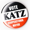
And don’t leave any hanging chads: Cooperstown’s mayoral election is March 16th — a month from tomorrow — and Uni Watch is proud to endorse deputy mayor Jeff Katz for the position. Granted, I know nothing about the other candidate(s) running, or about any of the pressing issues in Cooperstown, but Jeff is an old college buddy of mine and an accomplished baseball author, so that’s good enough for me. Vote early and often, Cooperstownites!
And speaking of Cooperstown”¦: The winning entry for the Cooperstown Hawkeyes logo contest, designed by Kevin Bennett, has now been revealed. In addition, I’ve gathered all the non-winning entries into this Flickr set. In each case, the file name is the designer’s name. If you either (a) would prefer not to have your design shown here, or (b) submitted an entry but don’t see it represented here, let me know and I’ll take care of it.
Uni Watch News Ticker: According to this story, college football players will no longer be able to wear messages on their eye black next season — just solid black. Also, pants will no longer be required to cover the knees, which means the biker shorts look is headed for the NCAA — great. ”¦ Rob Ullman just got back from a vacation in Hawaii, where he learned that uni-watching never takes a holiday. “I saw a story in the Maui News about Na Koa Ikaika Maui unveiling their new baseball uniforms. There are better photos in the web version of the story, but I sent along the scan of the newspaper clipping just to prove that I brought the sports section ALL THE WAY BACK WITH ME in case I couldn’t find the story online!” Now that’s devotion, people. ”¦ Good roundup of minor league baseball uni/logo changes for the upcoming season here (with thanks to David Rosenthal). ”¦ When’s the last time you saw a puck leave an imprint on a helmet? That’s what happened after Josh Georges’s head was on the receiving end of a Mike Green one-timer in last Wednesday’s Habs/Caps game (with thanks to John Muir). ”¦ Very cool 1964 Minnesota Twins merch catalog available here (as spotted by Mike Hersh). ”¦ Daniel Primo sent along a bunch of proposed MLB uni tweaks. ”¦ Hey, check this out: Joe Posnanski has a Cleveland Browns bowling ball (with thanks to Clayton Snodgrass). ”¦ Apolo Ohno has been wearing a gold-tipped glove. ”¦ You could do a whole lot worse for your computer’s wallpaper than these historical Canadian hockey jerseys (with thanks to Nick Evans). ”¦ Here’s one of those “Best athletes by uni number” breakdowns for the city of Seattle (with thanks to John Doodigian). ”¦ Michigan State is changing its shade of green. ”¦ Lots of great Minnesota back yard ice rinks showcased on this page. And here’s a good video report on the back yard rink phenomenon (great stuff from Patrick Donnelly). ”¦ David Raglin noticed that NBC made a bad typo in the first line of this graphic. ”¦ Last September I linked to this photo of Rabbit Maranville wearing a swastika cap. When Bruce Menard sent me that shot, he said the swastika was a response to the sinking of the Lusitania, but now Hall of Fame curator Tom Shieber has provided his own superbly researched theory as to why Maranville was wearing the cap. Highly recommended reading. ”¦ The Miami (Ohio) hockey team has added a memorial patch in honor of their student manager Brendan Burke, son of Maple Leafs GM Brian Burke, who was killed in a car accident last Friday. “The logo will also be placed at center ice for the rest of the season,” says Matt Sajna. ”¦ More college hockey news from the Buckeye State, this time from Bryan Grupp: “As part of Ohio State’s Military Appreciation Week (which must be new, because I graduated in June and this is the first I’m hearing of it), the men’s hockey team wore these on Friday night against Alaska.” ”¦ Tulsa wore gold alternates against Memphis on Saturday (with thanks to Ryan Atkinson). ”¦ Dan Chichalski was checking out the Richard Avedon photo exhibit at MoMA over the weekend and saw this aweome shot of Lew Alcindor. ”¦ Turns out that several Uni Watch readers are avid curlers, including Chris Kite and Steve Mandich. That’s actually Steve’s wife, Eliza Truitt, but I think Steve’s one of the guys shown in these shots. Those pics were taking at the Granite Curling Club in Seattle, which has a truly spectacular logo. ”¦ Steve and Eliza also have a blog devoted to Quatchi, the mascot of the Winter Olympics. They were recently so inspired by Uni Watch’s assorted DIYers that they decided to make their own Quatchi pennants. ”¦ A’s uni number news from Mike Rowinski, who writes: “Ben Sheets has always worn No. 15, but they A’s introduced him with No. 21. That’s because 15 was being worn by Ryan Sweeney. But Sweeney has now switched to 21, allowing Sheets to go with his usual 15.” ”¦ This photo of Ichiro was on the front page of yesterday’s Seattle Times sports section. “The printed version didn’t really do the colors justice,” says John Kimmerlein. ”¦ Mike Carpenter recently took part in a very cool-looking back yard hockey tournament (that’s him in the Bruins and Kings jerseys). “There were about 10 teams, two players apiece,” he says. “First round of games went to five goals to win, second round six goals, final round seven goals first wins. I ended up in fourth. The homeowner plays on my adult hockey team and has had this tourney for the last three years. First through fourth place even get trophies!” ”¦ Lots of good WLAF footage in this 1992 promo clip (with thanks to Alex Acosta). ”¦ The Ohio State basketball team wore a “3407” patch yesterday. “It was a tribute to those who died on Continental flight 3407 in Buffalo just over a year ago,” explains Ben Teaford. “The girlfriend of the team’s video coordinator was on that flight.” ”¦ So what’d y’all think of the color-on-color All-Star Game? I didn’t watch the game myself, but it looks like they had an interesting sock design. Also appears that there at least one uniform that could have used a bit of an adjustment. … RIP, Dale and Doug — very different, but I’ll miss both of them.
Oh, I really, really like those white umpire slacks. However, I know how much of a giant pain in the ass it is to keep white slacks clean even if you’re just wearing them in school, so I couldn’t imagine trying to keep them looking sharp on a dirty, dusty baseball diamond.
Also, the Brendan Burke story was one of the most tragic things I’ve ever read about.
Lastly, I have an eyeblack message, Bible-style, for college football players:
SMU 19:87 — Hell hath no fury like the NCAA.
Maybe my coffee hasn’t kicked in yet, but both O’s memorial armbands are on the right sleeve of each player
[quote comment=\”377820\”]Maybe my coffee hasn\’t kicked in yet, but both O\’s memorial armbands are on the right sleeve of each player[/quote]
Yeah, I was gonna say the same thing (minus the coffee, haha).
I had to do a double take…def on the same arm though.
Copy editor me can’t resist this:
It’s Joe Posnanski, not Pananski.
Another thing about the swasti-cap, is that Nazi swastikas were rotated 45 degrees. Most references to good luck swastikas are like those in the image, where the two lines that make the swastika make an S as opposed to a 2 and are square to the sides of the surface to which it is drawn.
FYI, those Tulsa Golden Hurricane unis aren’t just “alternates,” they’re retro from around ’80 – ’81, I believe.
I remember marveling them in SI back in the day.
Stellar.
[quote comment=”377822″]Copy editor me can’t resist this:
It’s Joe Posnanski, not Pananski.[/quote]
And Cooperstown.
Good Girls Don’t. So sad.
[quote comment=”377820″]Maybe my coffee hasn’t kicked in yet, but both O’s memorial armbands are on the right sleeve of each player[/quote]
Shit, you’re right. Oops.
[quote comment=”377822″]Copy editor me can’t resist this:
It’s Joe Posnanski, not Pananski.[/quote]
Shit, you’re right. Oops.
Doesn’t the NCAA require kneepads to be worn by all players? That will certainly add a new twist to the bicycle pants look.
[quote comment=”377825″][quote comment=”377822″]Copy editor me can’t resist this:
It’s Joe Posnanski, not Pananski.[/quote]
And Cooperstown.[/quote]
Shit…. All now fixed.
[quote comment=”377828″][quote comment=”377822″]Copy editor me can’t resist this:
It’s Joe Posnanski, not Pananski.[/quote]
Shit, you’re right. Oops.[/quote]
Don’t worry, I’m on the tail end of a near-all-nighter. I’ve been making stupid errors too.
Regarding the ChiSox & Cubs pix of the 1940s – that’s the way a baseball cap should be in design & shape. Not the gangsta/ hand me down too big fo’ mah haid -travesty of early 21st century MLB.
It still says “Vote early and often, Coopertownites!” Shouldn’t it be Cooperstownites?
Some non-traditional styling for the Norwegian curling team:
link
You can view the winning Cooperstown Hawkeyes logo here: link
I was sort of expecting the Cleveland Browns bowling ball to be all orange with a brown/white/brown stripe.
Notice that they get rid of eye black messages right AFTER Tim Tebow leaves. When are we going to quit giving this douche bag a free pass? Hopefully just after he gets picked in the 4th round of the draft.
[quote comment=”377835″]You can view the winning Cooperstown Hawkeyes logo here: link
Oh — didn’t know Tom (the team owner) had gone public with it. Yes, that’s the winning design. I’ll add it to today’s text.
Did you see the sleeves stripes on this Cub …
link
?
“Know Your Last of the Mohicans OR Hawkeye was the Caucasian “- Natty Bumppo nicknamed Hawkeye (Pathfinder) was a long rifle marksman/scout attached to the British. So all those excellent Native American logos for the Cooperstown Hawkeyes would be great if it was the Cooperstown Chingachgooks. Can’t wait to see the winner-because some of those were OUTSTANDING despite the error lol
BTW … I have a new theory on the 1977 MLB All Star Mystery Player …
Mitchell Page.
Doing research. Will let you know if it turns to fact.
Speaking of chain-stitching, look at this! That’s Don Deacon, who was on the 1936 U.S. Olympic team. Not sure why his jersey includes the UK Civil Ensign flag (the games were held in Germany that year, although England won the hockey gold medal). Anyone know more about that?
Looks like it may be the Canadian flag that was used back then. The same flag (?) is on the Blackhawks jacket in the next link.
And by coincidence, Feb 15 is National Flag of Canada Day up north.
From the bit on minor league baseball uniform changes, etc.:
[quote]
“Lehigh Valley IronPigs — The IronPigs are hosting the Triple-A All-Star Game, and the big news is that the uniforms will mark “the first time that league-specific uniforms will be worn by respective All-Stars in either Triple-A or the Major Leagues.”
[/quote]
Unless you count the NL in 1933, right?
[quote comment=”377838″][quote comment=”377835″]You can view the winning Cooperstown Hawkeyes logo here: link
Oh — didn’t know Tom (the team owner) had gone public with it. Yes, that’s the winning design. I’ll add it to today’s text.[/quote]
I dig it!
link
Got to say, the winning Hawkeyes logo blows away all of those other logos in that league. Some, if not most, are really quite bad. I’ll have to wait and see all the other entries tonight.
Also appears that there at least one uniform that could have used a bit of an adjustment.
I am in love.
Re: photo of the two Cubs home unis from 1934
Looks like Dressed to the Nines has the stirrups backwards on the Cubs home unis from that year. The striped stirrups in the photo are with the more rounded C on the chest while the stirrups without stripes were worn with the “Cincinnati” C.
If you’re gonna buy a player’s jersey, you should at least learn how to spell his name:
link
Missed yesterday’s curling post…. I’ll be delving into that tonight in the comforts of the leather chair…..
1. I’d wear Biletnikoff’s college allstar jersey!! AWESOME
2. John Sheehan’s Hawkeye treatment is tops w/ me. Next come Parisi: Simple but most effective to me, followed by Wittle’s Canadiens/Whalers inpired logo and the other two that registered the most w/ me: Stafford and Gipson’s Braves’ Warpaint/basement stitching—- superb idea!
The sleeveless Cubs uniform should be the template for a new Cubs road uniform. No capped undershirt, though, and it wouldn’t work with the Cubs bullseye logo. The uni even works with sleeves, just piping and the old logo.
They should even go back to the wishbone C. For the road unis.
But I also think the Cubs (as a season ticket holder I say this) should go to NAVY blue, midnight even. Navy has been used for BP jerseys and hats and looks good. At least for the road unis, but possibly for the home as well.
The Cubs used to use Navy and had better success in navy. Royal has been generally unkind over the years. Navy is more of a presence.
New century, new blue.
the o’s memorial armband thingy paul was referring to actually comprised two different pictures…of the same player…but they must have been from different seasons, yes? (note the cap patch in one pic)
that’s george sherrill…obviously…but one pic has the memorial band on his left arm while the other is on the right arm
anyone know what’s up with that?
Looked through all the non-winning entries for the Cooperstown contest, and just wanted to give props to a few of the designs…
Rick Stromwell – Absolutely gorgeous script, ’nuff said
Alex Beam – Love the primary logo badge, and the curling “C” feather
Thomas Stafford – Would be considered non-PC, but I still love the design, love the carry-over stitching onto the face
Matthew Rose – I like the dreamcatcher look to the logo, even if not intended
And congrats to Kevin Bennett! Glad that Cooperstown will have a logo that beats everybody else’s in their league
It’s Apolo Ohno’s other glove that is more interesting to me (than the gold tipped one). It looks like a Footjoy golve glove with a blacked out logo. I would have expect the short track guys to wear something padded and cut resistant due to all the crashes and flying blades.
Re: Michigan State color change
link
I don’t know about some of the lesser televised sports, but Football and Basketball seems to have been using the “new” green for awhile. For example, looking at the football team from the late 90’s:
link
To the current version:
link
ditto for the b-ball team:
link
vs.
link
So I don’t know if this change is going to rock the boat, but rather just make sure that all of the teams/signage are on the same page. The bad thing is that it gives Nike the go ahead to dick around with the uniform design. Didn’t go too well last time…
link
Another Uniwatch Monday treasure trove.
The Minnesota backyard rinks, the Cubs unis, the winning entry in the Cooperstown logo contest…but the most spectacular image of all…..
Richard Avedon’s Lew Alcindor photograph. My god.
Re: Mike Carpenters’ backyard hockey tourney.
Is the gentlemen in the coat and shoes wearing an old Saginaw Gears IHL sweater from the late 70/early 80s? If so, I’m extremely jealous.
Also in the new NCAA rules for next season, socks must still be of the same color and design but now there is no reference to length of the socks.
This has sure been a great winter for pond hockey in Michigan. Lots of cold weather, not too much snow.
Looking at the minnesota pond rink gallery, i notice a lot of rinks are painting lines on the ice. Isn’t that bad for outdoor ice, since they would absorb the sun’s radiant energy and cause premature melting on the dark ice? Just checking if anyone has experience with that because when i finally become a home owner i will be building the best damn outdoor rink known to man.
Article about olympic snowboarders wearing tight pants and how it is not a competitive advantage, but rather how it does NOT go against establishment, and therefore is wrong. I don’t care so much about railing against THE MAN, I just wish I didn’t have to see peoples junk bulging out in those plum-smugglers.
link
[quote comment=”377852″]the o’s memorial armband thingy paul was referring to actually comprised two different pictures…of the same player…but they must have been link, yes? (note the cap patch in one pic)
that’s george sherrill…obviously…but one pic has the memorial band on his left arm while the other is on the right arm
anyone know what’s up with that?[/quote]
Go back to the archives shortly after the 2008 MLB ASG at Yankee Stadium v1.5 (you know, after the renovation, but before the physical move).
The armband on the left is the anomaly, and the armband on the right was how the team wore it the other 99.9% of the time. (Unusual, in that the O’s don’t have a sleeve patch on the left.) The armband was for NBC broadcaster Jim McKay, who was a minority owner of the O’s. (So in other words, funny stuff happens at the ASG. Players improvise with helmets, the Yankees catch a Majestic bug on their jerseys, and stuff lands on the wrong sleeve from time to time.)
On a side note, I know of only one other example of a black armband on the right: The Minnesota Twins had one in early 2008, until a patch was produced for Herb Carneal. Anybody have a picture of that? And/or of other armbands on the right?
[quote comment=”377860″]Article about olympic snowboarders wearing tight pants and how it is not a competitive advantage, but rather how it does NOT go against establishment, and therefore is wrong. I don’t care so much about railing against THE MAN, I just wish I didn’t have to see peoples junk bulging out in those plum-smugglers.
link
great article…best part of it was the GFY at the end:
Look, bro: Team USA Snowboarding sponsors include Nike, Microsoft, and Visa. That’s about as “establishment” as you can get. So relax about “the integrity of the sport.”
Not to mention you’ll be competing in a branded pair of fake distressed jeans.”
ouch…that’s gonna leave a mark
[quote comment=”377862″][quote comment=”377860″]Article about olympic snowboarders wearing tight pants and how it is not a competitive advantage, but rather how it does NOT go against establishment, and therefore is wrong. I don’t care so much about railing against THE MAN, I just wish I didn’t have to see peoples junk bulging out in those plum-smugglers.
link
great article…best part of it was the GFY at the end:
Look, bro: Team USA Snowboarding sponsors include Nike, Microsoft, and Visa. That’s about as “establishment” as you can get. So relax about “the integrity of the sport.”
Not to mention you’ll be competing in a branded pair of fake distressed jeans.”
ouch…that’s gonna leave a mark[/quote]
There are Olympic snowboarders?
[quote comment=”377836″]I was sort of expecting the Cleveland Browns bowling ball to be all orange with a brown/white/brown stripe.[/quote]
I’D BUY THAT FOR A DOLLAR!
Not a lot of color photos of that 1960 Detroit plain home uni with script “Tigers” instead of piping and the Old English “D”.
Here’s one I recall (although imagining navy on white isn’t exactly difficult, is it)…
link
–Ricko
[quote comment=”377864″]
I’D BUY THAT FOR A DOLLAR![/quote]
damn… screwed up link.
[quote comment=”377863″]
There are Olympic snowboarders?[/quote]
there’s a lot of stuff at the olympics now
they’re always adding shit that doesn’t belong — like excuse me, but WTF is this?
i do like when the dudes ski around a circle then shoot at shit…a/k/a “biathlon”
and we’ve still got the skeleton — which is kinda like the luge except they go face first
[quote comment=”377867″][quote comment=”377863″]
There are Olympic snowboarders?[/quote]
there’s a lot of stuff at the olympics now
they’re always adding shit that doesn’t belong — like excuse me, but link?
i do like when the dudes ski around a circle then shoot at shit…a/k/a
“biathlon”the Norwegian drive-by shootingand we’ve still got the skeleton — which is kinda like the luge except they go link[/quote]
(fixed)
[quote comment=”377867″][quote comment=”377863″]
There are Olympic snowboarders?[/quote]
there’s a lot of stuff at the olympics now
they’re always adding shit that doesn’t belong — like excuse me, but link?
i do like when the dudes ski around a circle then shoot at shit…a/k/a “biathlon”
and we’ve still got the skeleton — which is kinda like the luge except they go link[/quote]
And yet they won’t accept women’s ski jumping.
(BTW, no comment on your first link: good try, though).
Is it just me, or do some of the raffle-winners names seem a little fake? No offense toward anyone, just curious. I mean, I know Cohen isn’t exactly a rare name, but isn’t Ari Cohen Jeremy Piven’s character on Entourage? Add to that Brig Slaughter and Jeff Drybread and well, I’m just sayin’…
Does anyone know of a place where I can buy old school authentic MLB caps from the past two decades? I’m a collector of the lesser known caps of the MLB and I have been looking for places where I can buy these. Here are several specifics I have been looking for.
link
link
link
link
Thanks!
[quote comment=”377870″]Is it just me, or do some of the raffle-winners names seem a little fake? No offense toward anyone, just curious. I mean, I know Cohen isn’t exactly a rare name, but isn’t Ari Cohen Jeremy Piven’s character on Entourage? Add to that Brig Slaughter and Jeff Drybread and well, I’m just sayin’…[/quote]
good point, Grape Sours
[quote comment=”377870″]Is it just me, or do some of the raffle-winners names seem a little fake? No offense toward anyone, just curious. I mean, I know Cohen isn’t exactly a rare name, but isn’t Ari Cohen Jeremy Piven’s character on Entourage? Add to that Brig Slaughter and Jeff Drybread and well, I’m just sayin’…[/quote]
Their screen names, perhaps?
(don’t mean in the movies)
One thing I learned for sure at the Deep Freeze is that there are TONS of people who read UW regularly but virtually never post.
I mean, there was one guy at the Bonspeil (Curling) who recognized Paul. I’m hearing one of curlers saying things like, “You’re here for the Pond Hockey, right?”…”read every day”…”only posted a couple times”. When he left I asked Paul what happened. Guy just walked up to him and said, “You’re Paul Lukas, aren’t you?”
—Ricko
at the 1:10 mark on the WLAF clip, is that Bernie Kosar in black and white in the back ground? I know he didn’t play in that league but i swear i have seen that photo before
How much better is the blue than the black as an accent colour on Canadian hockey jerseys and in the Hockey Canada logo? The blue represents Québec, whereas the black is for black’s sake. Hockey Canada needs to ditch the black.
[quote comment=”377842″]Speaking of chain-stitching, look at this! That’s Don Deacon, who was on the 1936 U.S. Olympic team. Not sure why his jersey includes the UK Civil Ensign flag (the games were held in Germany that year, although England won the hockey gold medal). Anyone know more about that?
Looks like it may be the Canadian flag that was used back then. The same flag (?) is on the Blackhawks jacket in the next link.
And by coincidence, Feb 15 is National Flag of Canada Day up north.[/quote]
…good thought about the linkof that era. I have no idea about the accuracy though. In the 1932 games, Canada and the US finished gold then silver, respectively. Potentially it’s a nod to the prior games? Check out the link, complete with a fantastic schematic of bobsleds.
[quote comment=”377849″]If you’re gonna buy a player’s jersey, you should at least learn how to spell his name:
link
Way back in 1992 I bought a Packers jersey at Gabriel Brothers, a chain of stores in western PA that gets all the effed up merchandise that is unsellable in regular shops (Kek, RyCo, back me up on this). It’s not unusual to find a t-shirt with a Chicago Bulls graphic on the front and Arizona Diamondbacks screen on the back.
Anyway, the Pack jersey in question was a #4, but with “Favre” spelled “FAURE”…they had a whole huge rack of ’em. Aware of the mistake, I still bought one, of course, for something like $3…but the funniest thing of all was when my quick-thinking roommate pointed out that my jersey was spelled wrong. To which I replied, “I know.”. To which he replied, “Yeah, “Failure” has an “I” and and “L” in it!”
[quote comment=”377877″][quote comment=”377849″]If you’re gonna buy a player’s jersey, you should at least learn how to spell his name:
link
Way back in 1992 I bought a Packers jersey at Gabriel Brothers, a chain of stores in western PA that gets all the effed up merchandise that is unsellable in regular shops (Kek, RyCo, back me up on this). It’s not unusual to find a t-shirt with a Chicago Bulls graphic on the front and Arizona Diamondbacks screen on the back.
Anyway, the Pack jersey in question was a #4, but with “Favre” spelled “FAURE”…they had a whole huge rack of ’em. Aware of the mistake, I still bought one, of course, for something like $3…but the funniest thing of all was when my quick-thinking roommate pointed out that my jersey was spelled wrong. To which I replied, “I know.”. To which he replied, “Yeah, “Failure” has an “I” and and “L” in it!”[/quote]
Strange world. You take a team that without you probably would have, at best, finished 9-6 and maybe not made the playoffs to the NFC Championship, where your teammates’ inability to hold onto the football keeps them from putting away a game they pretty much otherwise dominated…and you’re a failure.
That’s why, if Favre is smart, he’ll hang it up. The truth is, there is really only one way to top 2009…and it’s an ungodly long shot, all things considered.
Best to let it end with an incredible season where it all was right there for them and the team (from fumbles to 12 men in the huddle after a timeout), not Brett Favre, let it slip away.
Trust me, as someone who watched virtually every play of every game all season long, that is EXACTLY the story of the 2009 Vikings. Period.
—Ricko
[quote comment=”377870″]Is it just me, or do some of the raffle-winners names seem a little fake? No offense toward anyone, just curious. I mean, I know Cohen isn’t exactly a rare name, but isn’t Ari Cohen Jeremy Piven’s character on Entourage? Add to that Brig Slaughter and Jeff Drybread and well, I’m just sayin’…[/quote]
Except for Jeff D., who I haven’t heard back from yet, all the others have given me their shipping info, and those appear to be their real names.
Tracking down boxes to ship 10 footballs is a mild pain in the ass, incidentally. But all for the greater Uni Watch good….
Got a chance to run home and look at the other entries for the Hawkeye’s and must say it was a blast looking at them all. Special praise goes to Rich Stromwell’s clean old school flowing curvy script w/feather, Bryan Flynn’s bold circle C with arrow through the center, & Jason Epstein’s wonderful H w/feather.
After having a look at the other entries, I feel inspired to retouch mine up some. I feel it’s a little messy, and possibly doing something a little simpler with the feathers.
[quote comment=”377873″]Guy just walked up to him and said, “You’re Paul Lukas, aren’t you?”[/quote]
Hope that wasn’t one of the times when I responded, “Who wants to know?”
It’s a little weird being recognized. Happens to me around NYC sometimes, always throws me. Celebrity (a very relative concept, obviously) is such a bizarre phenomenon. I mean, I like attention, and I’m obviously working on my 16th or 17th minute by now, which is fun, but sometimes things get a little weird.
Way back in 1996, I appeared on Conan O’Brien (Andy Richter’s wife was a fan of the zine I was publishing at the time, plus I had a book coming out). When I exited the studio, I had to walk from the building to a car that was gonna take me home, and they had police barricades set up on the sidewalk, forming a little corridor for me to walk thru. An NBC page was escorting me down this little corridor when I heard someone shout, “Hey Paul!” I figured it was someone I knew, so I turned and looked for a familiar face. Instead, I saw several people leaning over the police barricades and holding out pads and pens — they wanted my autograph.
The NBC page was shaking her head in these teeny-tiny little “No, don’t indulge them” motions, but the whole thing was so surreal that I just sort of walked over in a daze and signed two autographs. As I signed, one guy said, “Great job, Paul, great job.”
I’m fairly certain none of these people had any idea who I was, what I did, or why I was appearing on the show. All they knew was that I was a guest on Conan, and that was enough for them — I was famous, I was important, and I was a celebrity.
I found the whole incident sort of disturbing.
[quote comment=”377878″][quote comment=”377877″][quote comment=”377849″]If you’re gonna buy a player’s jersey, you should at least learn how to spell his name:
link
Way back in 1992 I bought a Packers jersey at Gabriel Brothers, a chain of stores in western PA that gets all the effed up merchandise that is unsellable in regular shops (Kek, RyCo, back me up on this). It’s not unusual to find a t-shirt with a Chicago Bulls graphic on the front and Arizona Diamondbacks screen on the back.
Anyway, the Pack jersey in question was a #4, but with “Favre” spelled “FAURE”…they had a whole huge rack of ’em. Aware of the mistake, I still bought one, of course, for something like $3…but the funniest thing of all was when my quick-thinking roommate pointed out that my jersey was spelled wrong. To which I replied, “I know.”. To which he replied, “Yeah, “Failure” has an “I” and and “L” in it!”[/quote]
Strange world. You take a team that without you probably would have, at best, finished 9-6 and maybe not made the playoffs to the NFC Championship, where your teammates’ inability to hold onto the football keeps them from putting away a game they pretty much otherwise dominated…and you’re a failure.
That’s why, if Favre is smart, he’ll hang it up. The truth is, there is really only one way to top 2009…and it’s an ungodly long shot, all things considered.
Best to let it end with an incredible season where it all was right there for them and the team (from fumbles to 12 men in the huddle after a timeout), not Brett Favre, let it slip away.
Trust me, as someone who watched virtually every play of every game all season long, that is EXACTLY the story of the 2009 Vikings. Period.
—Ricko[/quote]
I say one more year, then call it quits. Two great years with the Vikings looks much better on the HOF resume. Not matter if they lose in the Wild Card. Just hope Favre’s last play of his career is not an interception, or, he’ll be playing for the Browns the year after.
[quote comment=”377842″]Speaking of chain-stitching, look at this! That’s Don Deacon, who was on the 1936 U.S. Olympic team. Not sure why his jersey includes the UK Civil Ensign flag (the games were held in Germany that year, although England won the hockey gold medal). Anyone know more about that?
Looks like it may be the Canadian flag that was used back then. The same flag (?) is on the Blackhawks jacket in the next link.
And by coincidence, Feb 15 is National Flag of Canada Day up north.[/quote]
Without a coat of arms, its definitely a British Ensign.
Every version of the Canadian Red Ensign had the Union Jack in the upper left corner as well as a coat of arms in the main field of the flag. The Canadian flag in 1936 definitely had a coat of arms:
link
[quote comment=”377878″]
Strange world. You take a team that without you probably would have, at best, finished 9-6 and maybe not made the playoffs to the NFC Championship, where your teammates’ inability to hold onto the football keeps them from putting away a game they pretty much otherwise dominated…and you’re a failure.
[/quote]
OH! I should emphasize that the “Failure” comment was made back in late 1992, before almost anyone had heard of Brett Favre, and was directed at me rather than him anyway! Sorry for the confusion!
[quote comment=”377882″][quote comment=”377878″][quote comment=”377877″][quote comment=”377849″]If you’re gonna buy a player’s jersey, you should at least learn how to spell his name:
link
Way back in 1992 I bought a Packers jersey at Gabriel Brothers, a chain of stores in western PA that gets all the effed up merchandise that is unsellable in regular shops (Kek, RyCo, back me up on this). It’s not unusual to find a t-shirt with a Chicago Bulls graphic on the front and Arizona Diamondbacks screen on the back.
Anyway, the Pack jersey in question was a #4, but with “Favre” spelled “FAURE”…they had a whole huge rack of ’em. Aware of the mistake, I still bought one, of course, for something like $3…but the funniest thing of all was when my quick-thinking roommate pointed out that my jersey was spelled wrong. To which I replied, “I know.”. To which he replied, “Yeah, “Failure” has an “I” and and “L” in it!”[/quote]
Strange world. You take a team that without you probably would have, at best, finished 9-6 and maybe not made the playoffs to the NFC Championship, where your teammates’ inability to hold onto the football keeps them from putting away a game they pretty much otherwise dominated…and you’re a failure.
That’s why, if Favre is smart, he’ll hang it up. The truth is, there is really only one way to top 2009…and it’s an ungodly long shot, all things considered.
Best to let it end with an incredible season where it all was right there for them and the team (from fumbles to 12 men in the huddle after a timeout), not Brett Favre, let it slip away.
Trust me, as someone who watched virtually every play of every game all season long, that is EXACTLY the story of the 2009 Vikings. Period.
—Ricko[/quote]
I say one more year, then call it quits. Two great years with the Vikings looks much better on the HOF resume. Not matter if they lose in the Wild Card. Just hope Favre’s last play of his career is not an interception, or, he’ll be playing for the Browns the year after.[/quote]
So he threw an interception. Better than slipping into Unitas-Simpson-Namath-Rice territory where you stay too long at the fair.
Favre hangs it up now, he leaves with a spectacular season and a near (make that oh-so-close) miss. He comes back and goes 9-6, or gets hurt, and the lasting memory isn’t in the same ballpark with as good as it is right now.
Everyone remembers Jim Brown for quitting while things were still good. Favre should go to school on that.
—Ricko
And its funny you mention the Blackhawks jacket in the next link, because this auction was linked to on Uniwatch in September:
link
(1934 Mush March Blackhawks jacket, commemorating winning the Stanley Cup)
Its obviously a different jacket, but it also has the two flags. And I pointed out in September that the flag on the right pocket wasn’t actually the Canadian flag.
dammit!
[quote comment=”377882″][quote comment=”377878″][quote comment=”377877″][quote comment=”377849″]If you’re gonna buy a player’s jersey, you should at least learn how to spell his name:
link
Way back in 1992 I bought a Packers jersey at Gabriel Brothers, a chain of stores in western PA that gets all the effed up merchandise that is unsellable in regular shops (Kek, RyCo, back me up on this). It’s not unusual to find a t-shirt with a Chicago Bulls graphic on the front and Arizona Diamondbacks screen on the back.
Anyway, the Pack jersey in question was a #4, but with “Favre” spelled “FAURE”…they had a whole huge rack of ’em. Aware of the mistake, I still bought one, of course, for something like $3…but the funniest thing of all was when my quick-thinking roommate pointed out that my jersey was spelled wrong. To which I replied, “I know.”. To which he replied, “Yeah, “Failure” has an “I” and and “L” in it!”[/quote]
Strange world. You take a team that without you probably would have, at best, finished 9-6 and maybe not made the playoffs to the NFC Championship, where your teammates’ inability to hold onto the football keeps them from putting away a game they pretty much otherwise dominated…and you’re a failure.
That’s why, if Favre is smart, he’ll hang it up. The truth is, there is really only one way to top 2009…and it’s an ungodly long shot, all things considered.
Best to let it end with an incredible season where it all was right there for them and the team (from fumbles to 12 men in the huddle after a timeout), not Brett Favre, let it slip away.
Trust me, as someone who watched virtually every play of every game all season long, that is EXACTLY the story of the 2009 Vikings. Period.
—Ricko[/quote]
I say one more year, then call it quits. Two great years with the Vikings looks much better on the HOF resume. Not matter if they lose in the Wild Card. Just hope Favre’s last play of his career is not an interception, or, he’ll be playing for the Browns the year after.[/quote]
I don’t even know why we’re talking about Hall of Fame with Favre anyway. That was sealed after the three straight MVPs and a Super Bowl ring. He could have died the next day and gotten into Canton.
To me, the mantle of “greatest quarterback ever” is so hard to compare between generations, because football evolves so much, that the only thing Favre stands to gain by playing is the enjoyment of playing. His legacy is going to be the same regardless.
[quote comment=”377879″]
Tracking down boxes to ship 10 footballs is a mild pain in the ass, incidentally. But all for the greater Uni Watch good….[/quote]
Maybe you can get this guy to help wrap them up?
link
Couple of things…just in case you miss out on the game balls I told Paul I will donate another dozen. I also finally filmed a new episode of “Equipped”, it’s up on link. It shows you the aftermath of our Giants Stadium locker room…
Enjoy!
Pretty cool how the outline of the old Cubs logo wraps around the “s” on the right side, rather than just rounding out the circle like it does now:
link
[quote comment=”377891″]Pretty cool how the outline of the old Cubs logo wraps around the “s” on the right side, rather than just rounding out the circle like it does now:
link
Those unis are so intriguing to me … I mean, the way we get our panties in a wad over today’s “pit stained” unis … baseball uniforms were much more subtle back then (just look at the other coach, even look at the fans walking down the aisle). I wonder what the reaction was first time they took the field looking like that.
[quote comment=”377892″][quote comment=”377891″]Pretty cool how the outline of the old Cubs logo wraps around the “s” on the right side, rather than just rounding out the circle like it does now:
link
Those unis are so intriguing to me … I mean, the way we get our panties in a wad over today’s “pit stained” unis … baseball uniforms were much more subtle back then (just look at the other coach, even look at the fans walking down the aisle). I wonder what the reaction was first time they took the field looking like that.[/quote]
I’m sure there was much moaning and complaining about how the Cincinnati manager was disrespecting the uniform by wearing it baggy like a pair of pajamas.
[quote comment=”377887″]dammit![/quote]
joe just said he’ll send paul another dozen
[quote comment=”377870″]Is it just me, or do some of the raffle-winners names seem a little fake? No offense toward anyone, just curious. I mean, I know Cohen isn’t exactly a rare name, but isn’t Ari Cohen Jeremy Piven’s character on Entourage? Add to that Brig Slaughter and Jeff Drybread and well, I’m just sayin’…[/quote]
I would assume some people wouldn’t want to use their real name on the net. I don’t. Really not into the self over-exposure that this generation tends to do. My pseudonym is such jibberish it makes no sense.
[quote comment=”377877″][quote comment=”377849″]If you’re gonna buy a player’s jersey, you should at least learn how to spell his name:
link
Way back in 1992 I bought a Packers jersey at Gabriel Brothers, a chain of stores in western PA that gets all the effed up merchandise that is unsellable in regular shops (Kek, RyCo, back me up on this). It’s not unusual to find a t-shirt with a Chicago Bulls graphic on the front and Arizona Diamondbacks screen on the back.
Anyway, the Pack jersey in question was a #4, but with “Favre” spelled “FAURE”…they had a whole huge rack of ’em. Aware of the mistake, I still bought one, of course, for something like $3…but the funniest thing of all was when my quick-thinking roommate pointed out that my jersey was spelled wrong. To which I replied, “I know.”. To which he replied, “Yeah, “Failure” has an “I” and and “L” in it!”[/quote]
Haha, I guess Kek and RyCo have a snow day today…
I’ll back you up though, Rob. One of my roommates at WVU bought a sweatshirt at Gabe’s featuring a nice big Cornhusker logo and big block letters that spelled “NEBRASAKA”.
My favorite Gabe’s purchase was a Golden State Latrell Sprewell jersey after his… er… loving embrace with P. J. Carlesimo’s neck.
For a grab-bag day like this, the old AFL shot reminds me of a football thought (that I didn’t get a chance to share back during the lead-up to the Super Bowl).
Several weeks link there was some hullabaloo in the comments section over some uni tweaks that reintroduced gray facemasks for teams where that wasn’t part of their color scheme.
Overall, I’m not necessarily a fan of gray facemasks, but I do acknowledge the historical importance of them. And there are cases where I find my reaction is accepting. For example, with the Colts. Obviously their resuming gray facemasks in 2004 was part of an overall throwback look (with the return of the black cleats), and, as such, when I see the Colts players on the field in their full uniforms the gray facemasks seem okay.
Part of that also stems from my aesthetic belief that white facemasks with a white helmet (like the Colts had from ’77 to ’94) just looks bad.
And for reasons I can’t quite put my finger on, the blue facemasks they had from ’95 to ’03, while far better than white, didn’t do much for me, so the gray (as a vintage homage) was okay.
(Yes, the Colts dabbled with gray as an actual color back in the ’90s, but that’s not what they were going for with the ’04 switch.)
So then after the Super Bowl match-up was set, and I had two weeks of seeing the Colts helmet, next to the Saints helmet, used as a decoration for the set of every sports program in their segments leading up to the big game, I found myself thinking: That gray facemask, outside of the context of being worn with the rest of the uniform, without a player’s head behind it, just looks… drab. What looks fine on the field looks out of place when sitting on a table or shelf.
Especially with the Saints helmet and its black facemask sitting next to it.
I found myself thinking that, as a prop, it probably would have looked better with a blue facemask–even though that would have been technically inaccurate.
Perhaps when used solely for decoration, the color merely needs to look good on camera. Can the rules be stretched a bit for that? (Is it any different than like wearing makeup when on a TV show?)
(Hearkening back to last year’s Super Bowl: The Cardinals gray facemask just looks bad, on and off the field. Their uniforms have no retro aspects whatsoever, so there’s no justification for that hue across their faces. Red, or even black, would be better.)
[quote comment=”377893″][quote comment=”377892″][quote comment=”377891″]Pretty cool how the outline of the old Cubs logo wraps around the “s” on the right side, rather than just rounding out the circle like it does now:
link
Those unis are so intriguing to me … I mean, the way we get our panties in a wad over today’s “pit stained” unis … baseball uniforms were much more subtle back then (just look at the other coach, even look at the fans walking down the aisle). I wonder what the reaction was first time they took the field looking like that.[/quote]
I’m sure there was much moaning and complaining about how the Cincinnati manager was disrespecting the uniform by wearing it baggy like a pair of pajamas.[/quote]
or how high up on his navel he wore his pants
but onto the cubs “shirt” … i know paul likes it but im firmly in the what were they thinking camp
im sure it looked different in color, but in B&W, that looks like crap … and the damn thing STILL has pit stains…
even if we can imagine it in color, it’s no picnic
best part about the ’41-42’s was the powder blue roadie…now that was schweet
[quote comment=”377882″]
I say one more year, then call it quits. Two great years with the Vikings looks much better on the HOF resume. Not matter if they lose in the Wild Card. Just hope Favre’s last play of his career is not an interception, or, he’ll be playing for the Browns the year after.[/quote]
Please no. I’m tired of the Favre media circus. Enough is enough.
[quote comment=”377871″]Does anyone know of a place where I can buy old school authentic MLB caps from the past two decades? I’m a collector of the lesser known caps of the MLB and I have been looking for places where I can buy these. Here are several specifics I have been looking for.
link
link
link
link
Thanks![/quote]
Ebay.
[quote comment=”377855″]Re: Michigan State color change
link
I don’t know about some of the lesser televised sports, but Football and Basketball seems to have been using the “new” green for awhile. For example, looking at the football team from the late 90’s:
link
To the current version:
link
ditto for the b-ball team:
link
vs.
link
So I don’t know if this change is going to rock the boat, but rather just make sure that all of the teams/signage are on the same page. The bad thing is that it gives Nike the go ahead to dick around with the uniform design. Didn’t go too well last time…
link
What’s wrong with a nice Kelly green instead of these atrocities that seem more black than green?
[quote comment=”377900″][quote comment=”377871″]Does anyone know of a place where I can buy old school authentic MLB caps from the past two decades? I’m a collector of the lesser known caps of the MLB and I have been looking for places where I can buy these. Here are several specifics I have been looking for.
link
link
link
link
Thanks![/quote]
Ebay.[/quote]
I’ve been searching on eBay for the past year looking. I’m just curious if there are other places I can look.
Saw a book today from NarcAnon signed by both Bob Probert and William Bedford. I think they must have been in rehab together, oh the stories! Just reminded me that Bedford was a 00 for the Pistons, if anyone’s still keeping track of such things.
As for the fake names? The only thing I’d say is people coming up with fake (or one time used) email addresses to pad their chances (by sending multiples) and having to use fake names after they’ve used their actual name in the first email.
[quote comment=”377902″][quote comment=”377900″][quote comment=”377871″]Does anyone know of a place where I can buy old school authentic MLB caps from the past two decades? I’m a collector of the lesser known caps of the MLB and I have been looking for places where I can buy these. Here are several specifics I have been looking for.
link
link
link
link
Thanks![/quote]
Ebay.[/quote]
I’ve been searching on eBay for the past year looking. I’m just curious if there are other places I can look.[/quote]
link
there is the brewers and a lot of cool ones
link
Where else could I find a picture and info like this?
It would be good to learn more about it.
link
super 8 of link
[quote comment=”377874″]at the 1:10 mark on the WLAF clip, is that Bernie Kosar in black and white in the back ground? I know he didn’t play in that league but i swear i have seen that photo before[/quote]
Kosar didn’t actually play in the World League. The pictures in question look like they were from Steelers-Browns games, albeit greyscaled so that each WLAF team’s uniform and logo were the focal point.
[quote comment=”377886″]And its funny you mention the Blackhawks jacket in the next link, because this auction was linked to on Uniwatch in September:
link
(1934 Mush March Blackhawks jacket, commemorating winning the Stanley Cup)
Its obviously a different jacket, but it also has the two flags. And I pointed out in September that the flag on the right pocket wasn’t actually the Canadian flag.[/quote]
Okay, 1932 Olympic tribute theory quashed. But the 1934 Blackhawks jacket cites a Canadian flag, although I agree with you that it’s most certaintly not Canadian. Why the heck would a UK flag paired with the stars & stripes? WTF. Maybe there was a US/UK hockey allegiance at the time, due to the Canadian’s dominance in the era?
That flag on the Blackhawks jacket was the canadian flag at that time. They did not adopt the current maple leaf version until 1965.
[quote comment=”377896″][quote comment=”377877″][quote comment=”377849″]If you’re gonna buy a player’s jersey, you should at least learn how to spell his name:
link
Way back in 1992 I bought a Packers jersey at Gabriel Brothers, a chain of stores in western PA that gets all the effed up merchandise that is unsellable in regular shops (Kek, RyCo, back me up on this). It’s not unusual to find a t-shirt with a Chicago Bulls graphic on the front and Arizona Diamondbacks screen on the back.
Anyway, the Pack jersey in question was a #4, but with “Favre” spelled “FAURE”…they had a whole huge rack of ’em. Aware of the mistake, I still bought one, of course, for something like $3…but the funniest thing of all was when my quick-thinking roommate pointed out that my jersey was spelled wrong. To which I replied, “I know.”. To which he replied, “Yeah, “Failure” has an “I” and and “L” in it!”[/quote]
Haha, I guess Kek and RyCo have a snow day today…
I’ll back you up though, Rob. One of my roommates at WVU bought a sweatshirt at Gabe’s featuring a nice big Cornhusker logo and big block letters that spelled “NEBRASAKA”.
My favorite Gabe’s purchase was a Golden State Latrell Sprewell jersey after his… er… loving embrace with P. J. Carlesimo’s neck.[/quote]
Nebrasaka. Classic Gabe’s. I once saw a dress shirt there with one short sleeve and one long sleeve. Thanks for the backup.
[quote comment=”377905″][quote comment=”377902″][quote comment=”377900″][quote comment=”377871″]Does anyone know of a place where I can buy old school authentic MLB caps from the past two decades? I’m a collector of the lesser known caps of the MLB and I have been looking for places where I can buy these. Here are several specifics I have been looking for.
link
link
link
link
Thanks![/quote]
Ebay.[/quote]
I’ve been searching on eBay for the past year looking. I’m just curious if there are other places I can look.[/quote]
link
there is the brewers and a lot of cool ones[/quote]
Yeah, I’ve been to Lids. I’m specifically looking for the original ones without the New Era logo along the left side.
Paging Teebz (and any other Canucks)…Why doesn’t CBC have Olympic coverage this year? I’ve enjoyed their coverage in the past and it’s unbelievable they’re not televising anything from their own country! Am I correct in guessing that TSN has the Vancouver rights north of the border? Meanwhile, I’m stuck with a rerun of “Little Mosque on the Prairie”.
CTV has the contract but coverage is also on TSN and Sportsnet
Once again a logo contest provides MANY great choices, proving again that the quality of UW readers creativity matches that of most professional firms. Matthew Rose and Bryan Flynn, you have my favorites. I was extremely proud of mine and hopeful of a producing a winner but damn, the competition proves to be fierce!
[quote comment=”377905″][quote comment=”377902″][quote comment=”377900″][quote comment=”377871″]Does anyone know of a place where I can buy old school authentic MLB caps from the past two decades? I’m a collector of the lesser known caps of the MLB and I have been looking for places where I can buy these. Here are several specifics I have been looking for.
link
link
link
link
Thanks![/quote]
Ebay.[/quote]
I’ve been searching on eBay for the past year looking. I’m just curious if there are other places I can look.[/quote]
link
there is the brewers and a lot of cool ones[/quote]
Try here: link
I lived in St.Louis from 1996-2002 and did not go one week in that entire time without hearing at least once how this guy (Denkinger) stole the ’85 series. I’m a Cards fan, but good god. Get over it people!
link
[quote comment=”377919″]I lived in St.Louis from 1996-2002 and did not go one week in that entire time without hearing at least once how this guy (Denkinger) stole the ’85 series. I’m a Cards fan, but good god. Get over it people!
link
i read a pretty good book this summer, called “as they see ’em” (by bruce weber), a rather large tome about umpires throughout the ages (among other things…also his run thru umpire school and interviews with dozens of umpires past and present)
one of those interviews was with denkinger…and interestingly it came towards the end of the book; good thing too, because one really needed the setup of the previous chapters to understand the mindset of blue
while DD doesn’t exactly admit to “blowing” the call, he does take us through how he did basically everything RIGHT to be in the proper position and to set himself to make the call, but through a series of split-second events even the best umpire couldn’t anticipate, he pretty much failed in a critical position of the game
denkinger didn’t cost the cards the series; far from it — but to the layman and casual fan (and of course, with the 900 replays showing the call was indeed blown), he might have well been on the royals payroll
i’d definitely recommend picking up a copy of the book, but be advised, it’s not exactly light reading (352 pages) — but it is VERY VERY GOOD
you’ll have a newfound respect for the job the men in blue do after reading it
here’s a review that i completely concur with…and here’s another
[quote comment=”377910″]That flag on the Blackhawks jacket was the canadian flag at that time. They did not adopt the current maple leaf version until 1965.[/quote]
I thought that the Canadian Flag of that era had a shield. It wasn’t until 1965 did they adopt the familiar Maple Leaf design.
I would consider this a link source.
Don’t care for Figure Skating? Westminster Dog Show lacks the action you’re looking for?
Get your Monday night Olympic fix here
link
Wow….
I doubt my fellow Uniwatch denizens would submit fake names to pad their chances at the Giant’s footballs….. but WHY didn’t it occur to me?
Anyway.. roll on for the next drawing!!! Thanks for being such a sport, Joe!
Way late to the party, but a few observations:
1) Did anyone else notice that link says “Blackhawks” (one word) even though “Black Hawks” was the unofficial but more common usage?
2) probably just the light, but that looks like a contrasting-color brim on that link to me.
3) That link is indeed fantastic. Most of the other submissions were pretty damn good as well.
4) Samuel Lam: I can’t do nuttin’ for ya, man but next time, you might want to mention that you’ve already tried eBay and Lids/Mickeysplace are not the droids you’re looking for.
and…
не ÑÐµÐ³Ð¾Ð´Ð½Ñ Ð²ÐµÑ‡ÐµÑ€Ð¾Ð¼
[quote comment=”377911″][quote comment=”377896″][quote comment=”377877″][quote comment=”377849″]If you’re gonna buy a player’s jersey, you should at least learn how to spell his name:
link
Way back in 1992 I bought a Packers jersey at Gabriel Brothers, a chain of stores in western PA that gets all the effed up merchandise that is unsellable in regular shops (Kek, RyCo, back me up on this). It’s not unusual to find a t-shirt with a Chicago Bulls graphic on the front and Arizona Diamondbacks screen on the back.
Anyway, the Pack jersey in question was a #4, but with “Favre” spelled “FAURE”…they had a whole huge rack of ’em. Aware of the mistake, I still bought one, of course, for something like $3…but the funniest thing of all was when my quick-thinking roommate pointed out that my jersey was spelled wrong. To which I replied, “I know.”. To which he replied, “Yeah, “Failure” has an “I” and and “L” in it!”[/quote]
Haha, I guess Kek and RyCo have a snow day today…
I’ll back you up though, Rob. One of my roommates at WVU bought a sweatshirt at Gabe’s featuring a nice big Cornhusker logo and big block letters that spelled “NEBRASAKA”.
My favorite Gabe’s purchase was a Golden State Latrell Sprewell jersey after his… er… loving embrace with P. J. Carlesimo’s neck.[/quote]
Nebrasaka. Classic Gabe’s. I once saw a dress shirt there with one short sleeve and one long sleeve. Thanks for the backup.[/quote]
I know not of this Gabe’s, but speaking of Nebras(a)ka, I was doing some work in Madison back in 1996 or 7 and I went to a sports shop just off-campus and bought myself a Badgers hockey jersey and I picked up a link for my wife (then-girlfriend). I didn’t realize it at the time, but when I gave it to her, she noticed that it was reversible. So she flips it inside-out and on the inside link.
[quote comment=”377869″]And yet they won’t accept women’s ski jumping.[/quote]
Man, I wish they would. The problem is, the men are getting the shaft coverage-wise. They zipped through the short hill event (well, if you count two jumps, five commercials, two jumps, five commercials, etc. as zipping…). I hope I’m wrong, but it seems as if the snowboarding and moguls are crowding out my favorite event. I want to see more ski jumping…mens AND womens.
Whew, busy day, so I’ll just add a couple of other quick thoughts:
1) Count me in the group that doesn’t like that 40s Cubs uni. Early bumperstickers, there.
2) A big BOO to MSU for darkening the green. Yo, the 90s are over – time to lighten up and go neon.
3) Anyone know how they determine the numbers that go on the skiers’ bibs for the Olympics?
link
link
Just curious.
[quote comment=”377928″][quote comment=”377911″][quote comment=”377896″][quote comment=”377877″][quote comment=”377849″]If you’re gonna buy a player’s jersey, you should at least learn how to spell his name:
link
Way back in 1992 I bought a Packers jersey at Gabriel Brothers, a chain of stores in western PA that gets all the effed up merchandise that is unsellable in regular shops (Kek, RyCo, back me up on this). It’s not unusual to find a t-shirt with a Chicago Bulls graphic on the front and Arizona Diamondbacks screen on the back.
Anyway, the Pack jersey in question was a #4, but with “Favre” spelled “FAURE”…they had a whole huge rack of ’em. Aware of the mistake, I still bought one, of course, for something like $3…but the funniest thing of all was when my quick-thinking roommate pointed out that my jersey was spelled wrong. To which I replied, “I know.”. To which he replied, “Yeah, “Failure” has an “I” and and “L” in it!”[/quote]
Haha, I guess Kek and RyCo have a snow day today…
I’ll back you up though, Rob. One of my roommates at WVU bought a sweatshirt at Gabe’s featuring a nice big Cornhusker logo and big block letters that spelled “NEBRASAKA”.
My favorite Gabe’s purchase was a Golden State Latrell Sprewell jersey after his… er… loving embrace with P. J. Carlesimo’s neck.[/quote]
Nebrasaka. Classic Gabe’s. I once saw a dress shirt there with one short sleeve and one long sleeve. Thanks for the backup.[/quote]
I know not of this Gabe’s, but speaking of Nebras(a)ka, I was doing some work in Madison back in 1996 or 7 and I went to a sports shop just off-campus and bought myself a Badgers hockey jersey and I picked up a link for my wife (then-girlfriend). I didn’t realize it at the time, but when I gave it to her, she noticed that it was reversible. So she flips it inside-out and on the inside link.[/quote]
That would fit in well at Gabe’s. They have those in Ohio as well (and WV and VA). You can get some really nice stuff there, right next to some real crap. I used to go there a lot. I should go back with my camera and see some of the gems they have now.
A Gabriel Brothers beauty my brother might still have: he bought a UNLV back-to-back champs shirt (Oops, Duke spoiled that, unfortunately). Guess it was one of a few that didn’t get shipped to the Third World.
[quote comment=”377926″]
4) Samuel Lam: I can’t do nuttin’ for ya, man but next time, you might want to mention that you’ve already tried eBay and Lids/Mickeysplace are not the droids you’re looking for.[/quote]
I was thinking that as the responses came in. Well, I think I might just contact some local shops in Milwaukee, SD, KC and if I have money, Toronto and see if they know of any local places that might have them.
The search continues!
[quote comment=”377913″][quote comment=”377905″][quote comment=”377902″][quote comment=”377900″][quote comment=”377871″]Does anyone know of a place where I can buy old school authentic MLB caps from the past two decades? I’m a collector of the lesser known caps of the MLB and I have been looking for places where I can buy these. Here are several specifics I have been looking for.
link
link
link
link
Thanks![/quote]
Ebay.[/quote]
I’ve been searching on eBay for the past year looking. I’m just curious if there are other places I can look.[/quote]
link
there is the brewers and a lot of cool ones[/quote]
Yeah, I’ve been to Lids. I’m specifically looking for the original ones without the New Era logo along the left side.[/quote]
The only place you will find those hats is Mickey’s Place in Cooperstown, which has been linked. I ‘ve shopped there numerous times, you will be GTG.
[quote comment=”377934″][quote comment=”377926″]
4) Samuel Lam: I can’t do nuttin’ for ya, man but next time, you might want to mention that you’ve already tried eBay and Lids/Mickeysplace are not the droids you’re looking for.[/quote]
I was thinking that as the responses came in. Well, I think I might just contact some local shops in Milwaukee, SD, KC and if I have money, Toronto and see if they know of any local places that might have them.
The search continues![/quote]
You will find those hats at Mickey’s Place. They sell the originals, without the New Era logo on the side.
link is most likely a team called the Olympics. For example, there were the Detroit Olympics in the 1930s.
Link missing from last post:
link
My dad’s name’s Brian Burke as well… obviously I’m not dead!
In that Chargers-Raiders photo:
Check out those Spot-Bilt cleats.
What’s with the circular heel cleat?
The 1936 hockey uniform is probably a photo op special uniform, since the shield (with “Olympics”) doesn’t seem to be what they’re wearing in this film clip of the game against Canada. link
Update: Don Deacon played for the Detroit Olympics in 1936. The Detroit Olympics played in the International Hockey League, which had teams in Canada and the USA. The Olympics became the Pittsburgh Hornets in 1937.
The sweater he’s wearing is almost certainly his Detroit Olympics sweater.
Update: The “Olympics” mystery is (more or less) solved. Don Deacon played for the Detroit Olympics in 1936. link
The Detroit Olympics were in the International Hockey League, which was a Canadian-American league, hence the display of the American and Canadian flags (of the time) in similar fashion to the different but similar patch of American and Canadian flags worn on the Blackhawks jacket in the NHL. The coat of arms does seem to be missing from the Canadian flag, but then again, about 30 stars are missing from the American flag.
By the way, Don Deacon is NOT listed as a member of the 1936 U.S. Olympic hockey team, nor could he have been, since he was a professional player.
Paul-
How come you didn’t make the comparison to Gymnastics floor routine. It seems like the natural olympic comparison. Artistic expression to music which being judged by a panel. They wear uniforms.