Been a while since I played show-and-tell with my library of vintage uniform and equipment catalogs, and I’ve acquired some interesting new additions to the collection since then. Here’s a breakdown:
• 1964 AALCO Backboard Catalog: This is a bit of an oddball, beause it’s so specific. Like, c’mon, 12 pages devoted to nothing but basketball backboards? But that specificity turns out to be pretty fascinating — who knew there were so many different ways of suspending and folding backboards, or that they had cool names like Cent-R-Strut or forward jacknife model? I vaguely remember my high school gym having something like these contraptions, but nothing as elaborate as this. And look, they even had special tools for hoisting the gear. Way nifty. (Full page-by-page breakdown here.)
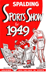
• Spalding Sports Show for 1949: A cross between a sporting goods catalog and a comic book, this is one of the most interesting additions to the Uni Watch library in many a moon. Each page features a gallery of cartoons by the great Willard Mullin (more on him here), sort of Ripley’s Believe It or Not-style, and then concludes with an ad for Spalding equipment toward the bottom of the page. Oddly, the gear being pitched usually has nothing to do with the cartoons on that particular page, but whatever. Can you believe I got this awesome artifact for only $10.50? (Full content available here.)
• 1961 Champion Catalog: No surprises here — the usual assortment of jerseys, hose, more jerseys, and so on. The notable thing about this is that the catalog was keyed to Champion’s Rochester operation, which means I think our resident Rochester sporting goods expert, Terry Proctor, will be weighing in with some thoughts. Also worth noting: another appearance of basketball target stirrups, some rather anorexic-looking illustrations of girls, and a fully intact order blank. (Full content available here.)
• Yarrington Mills swatchbook pages: Speaking of Terry Procter, he recently sent me a bunch of vintage swatch pages from Yarrington Mills, and it’s pretty fascinating stuff. There are stripes, braids, patterns, even sparkle fabrics. Swatches are so damn cool. Thanks, Terry! (Full content available here.)
Raffle Reminder: I’m currently raffling off a free T-shirt from SportsCrack.com. Details here.
Something odd that I just noticed: I was checking something on the Uni Watch Membership Roster yesterday when I noticed something odd: Not a single enrollee has chosen No. 70 for his or her membership card. Granted, 70 isn’t the most hallowed number in sports history, but I figured someone would’ve chosen it by now.
Other numbers that have so far gone unclaimed: 62, 64, 85 and 95. So if you want a unique card and a number all to yourself on the roster listing, you’ve got some options.
And now a quick word from Phil: “All uni trackers, if you’ve been keeping track of your favorite baseball team’s record by uniform, please contact me, if you haven’t already done so, as I’ll be posting the first of the tracking results this weekend. Thanks.”
Uni Watch News Ticker: For those who’ve lost track of the Syracuse lacrosse team’s uni changes this season, Chris Drouin has provided a handy overview: “They started the season with home whites jerseys, white shorts, white gloves and white helmets with their numbers on them. Then they switched to white jerseys, orange shorts and gloves, and orange helmets with numbers on the back. Then, for championship weekend, they stuck with the orange shorts/helmets/gloves, but the helmets had player’s name on the back of it instead of their number.” ”¦ Uni cameo: Kevin Johnson as a Cav (with thanks to Nick Houser, who has a blog devoted to Ohio sports cards). ”¦ Reprinted from yesterday’s comments: Now that’s a bullpen buggy. Note the great usher’s cap, too. ”¦ “I was recently in Belgium and went to the museum where they house the costumes/uniforms for the little statue Mannekin Pis (the famous one that is something of a symbol for the city of Brussels),” writes Kelly Phillips. “I was surprised to see that he has actually donned not only a Montreal Canadiens sweater (a gift from the Canadian prime minister in the 1950s) but even a Toronto Blue Jays jersey in the mid-’80s. He has worn more than 700 outfits over the years, and a number of them have been sports uniforms — mostly European football teams, as well Belgian hockey teams, and even the Latvian ice hockey team when they won the Championships in 2006. The uniforms are incredibly well made and done with meticulous care to appear like the real thing. Which is amusing since the statue is only a little over a foot tall.” Additional info on Kelly’s blog. ”¦ Lots of old-timey baseball photos from Lincoln, Nebraska here, here, and here (with thanks to Bob Andrews). ”¦ Pictorial history of Moroccan volleyball available here (with thanks to Jeremy Brahm). ”¦ Awesome little tidbit buried on this page: “Reliever Seth McClung [of the Brewers] altered his warmup apparel Wednesday, when he wore a long-sleeve shirt with ‘Not Coffey’ printed on the back. McClung was trying to help out the fans who sit behind the bullpen, who have been known to mistake McClung for fellow reliever Tim Coffey” (great spot by Harry Bergmann). ”¦ Don’t step on that logo (big thanks to Brinke Guthrie). ”¦ Stunning news last night out of Chicago, where career low-cuffer Aaron Heilman, of all people, became the latest member of Stirrup Nation. Lots of additional pics here (as first reported by Michael Romero). ”¦ Not uni-related, but an interesting article here about pro sports’ losing-est franchises. The 13 “winners” are presented in this slideshow (thanks, Teebz). … The uniforms of all 64 NCAA baseball tourney teams are described and photo-linked here (nice find by Mike Camello). … The AHL’s Grand Rapids Griffins are looking for a third jersey designer (with thanks to Johnny Griswold). ”¦ The UC Irvine Anteaters use an interesting shortened version of their name on their jerseys (with thanks to Ben Teaford). … Happy Birthday to Kirsten, a day early. Looking forward to tomorrow’s festivities!
[quote]Aaron Heilman, of all people, became the latest member of Stirrup Nation.[/quote]
and yet, he’s wearing them backwards…
/he has brought shame to the nation (although he does get points for trying)
Aptly enough on Spelling Bee Night I noticed something odd about Wally Szczerbiak’s name. Neither “Z” has the gold shadow beneath the wine-colored letter. You can sort of see it in this picture, so it appears that it has been that way for a while.
link
[quote comment=”331632″][quote]Aaron Heilman, of all people, became link[/quote]
and yet, he’s wearing them backwards…
/he has brought shame to the nation (although he does get points for trying)[/quote]
You beat me to it! That was the first thing I noticed. Still, backward stirrups > no stirrups.
BTW, I have a prediction that within 3 years a full 25% of players will abandon the dark side.
[quote comment=”331634″][quote comment=”331632″][quote]Aaron Heilman, of all people, became link[/quote]
and yet, he’s wearing them backwards…
/he has brought shame to the nation (although he does get points for trying)[/quote]
You beat me to it! That was the first thing I noticed. Still, backward stirrups > no stirrups.
BTW, I have a prediction that within 3 years a full 25% of players will abandon the dark side.[/quote]
Holy crap. I didn’t even notice that last night. I even posted a comment about it.
Shame on me.
[quote comment=”331632″][quote]Aaron Heilman, of all people, became link[/quote]
and yet, he’s wearing them backwards…
/he has brought shame to the nation (although he does get points for trying)[/quote]
As Mets fans, I am surprised how lenient you and Paul are being on Heilman.
Interesting note on the Syracuse Lax unis:
They wear the common Nike Lax template however their shorts buck the trend.
link
link
The side insert is normally a contrasting color, for example, white. They go monochrome.
I don’t like.
Many of them also wear elbow pads….made by Nike, which is a new development.
link
Also notice the special Team Exclusive Nike Huarche Trainer 08 cleats that many of them are wearing in silver and orange:
link
link
My own personal preference is the Cuse unis of Mikey Powell’s senior year.
The entire seaon they wore traditional Cuse unis until the Final Four when they busted out the new logo on all orange kits:
link
link
link
The Twins teased some uni/logo changes for the 50th anniversary next season. Yesterday, they installed a logo above the scoreboard at Target Field, and it has a (very) minor change to the logo they currently use that may be an indicator of what’s to come for 2010.
Check out the “s” on the link, and compare it to the one on the scoreboard.
Sorry guys…the three broken links are to pics on this page:
link
For the Twins, on the new logo, the serifs are smaller due to that they are angled as opposed to square ends.
An upgrade, not a complete change. I think that it is a change that most people wouldn’t notice. Except us of course.
there’s just something great about this type of design for the “champion knitwear co., inc.” triangle:
link
really clean and aesthetically pleasing!!!
kinda sorta reminds me of the “p.l. + k.h.” at the bottom of this page:
link
[quote comment=”331640″]there’s just something great about this type of design for the “champion knitwear co., inc.” triangle:
link
really clean and aesthetically pleasing!!!
kinda sorta reminds me of the “p.l. + k.h.” at the bottom of this page:
link
Wipe off your nose, Connelly…and here’s a hint…it’s not honey from a mason jar :)
UC Irvine played Oregon State in the 2007 College World Series, producing a Beavers vs. Eaters matchup:
link
Apologies for A.) my immaturity and B.) my inability to find a shot of them together.
DIY/Hockey question:
I recently purchased an awesome Hawks jersey used in the movie “The Mighty Ducks” (pictures below). The # and NOB are from a character I hadn’t heard of, and I was hoping to have them changed to #9 “Bombay” to match what was shown in the film (since it’s nearly impossible to find an actual one of those). Since I have zero sewing skills I won’t be doing it myself. So does anyone have suggestions on how I should go about finding someone to do this for me? And on getting it to match the old name/number font/material as closely as possible? Thanks guys, love the Uniwatch community.
link
link
[quote comment=”331643″]DIY/Hockey question:
I recently purchased an awesome Hawks jersey used in the movie “The Mighty Ducks” (pictures below). The # and NOB are from a character I hadn’t heard of, and I was hoping to have them changed to #9 “Bombay” to match what was shown in the film (since it’s nearly impossible to find an actual one of those). Since I have zero sewing skills I won’t be doing it myself. So does anyone have suggestions on how I should go about finding someone to do this for me? And on getting it to match the old name/number font/material as closely as possible? Thanks guys, love the Uniwatch community.
link
link
see “Joe H”!!! he does great work!
joe, reading today???
[quote comment=”331643″]DIY/Hockey question:
I recently purchased an awesome Hawks jersey used in the movie “The Mighty Ducks” (pictures below). The # and NOB are from a character I hadn’t heard of, and I was hoping to have them changed to #9 “Bombay” to match what was shown in the film (since it’s nearly impossible to find an actual one of those). Since I have zero sewing skills I won’t be doing it myself. So does anyone have suggestions on how I should go about finding someone to do this for me? And on getting it to match the old name/number font/material as closely as possible? Thanks guys, love the Uniwatch community.
link
link
Cosmo –
Frosty here…DIY’er.. Contact me direct at link – we’ll get you figured out.
Chance – Per your inquiry from yesterday – please do the same. I have no idea how to find you on your blog. Sorry. I can cut and sew though.
[quote comment=”331639″]For the Twins, on the new logo, the serifs are smaller due to that they are angled as opposed to square ends.
An upgrade, not a complete change. I think that it is a change that most people wouldn’t notice. Except us of course.[/quote]
Is it possible that the sign maker messed up?
[quote comment=”331641″][quote comment=”331640″]there’s just something great about this type of design for the “champion knitwear co., inc.” triangle:
link
really clean and aesthetically pleasing!!!
kinda sorta reminds me of the “p.l. + k.h.” at the bottom of this page:
link
Wipe off your nose, Connelly…and here’s a hint…it’s not honey from a mason jar :)[/quote]
haha!!! thanks powers…
Pics of the throwback unis from the Rickwood Classic (Mississippi Braves vs. Birmingham Barons). The teams wore early 80’s throwbacks.
link
A rare appearance for Atlanta’s road gray uniforms last night in Arizona. And the D-backs wore all white.
link
[quote comment=”331646″][quote comment=”331639″]For the Twins, on the new logo, the serifs are smaller due to that they are angled as opposed to square ends.
An upgrade, not a complete change. I think that it is a change that most people wouldn’t notice. Except us of course.[/quote]
Is it possible that the sign maker messed up?[/quote]
That was my first thought when I saw it, I understand sharpening logos but this one was barely changed
Wow, so if Team Stirrvps needs a flammable closer who will break its fans’ hearts, it’s nice to know that we can now count on Aaron Heilmann.
[quote comment=”331648″]Pics of the throwback unis from the Rickwood Classic (Mississippi Braves vs. Birmingham Barons). The teams wore early 80’s throwbacks.
link
I like the look however the font of the Barons doesnt work. And what’s with the adjustable caps…bush league
link
[quote comment=”331643″]DIY/Hockey question:
I recently purchased an awesome Hawks jersey used in the movie “The Mighty Ducks” (pictures below). The # and NOB are from a character I hadn’t heard of, and I was hoping to have them changed to #9 “Bombay” to match what was shown in the film (since it’s nearly impossible to find an actual one of those). Since I have zero sewing skills I won’t be doing it myself. So does anyone have suggestions on how I should go about finding someone to do this for me? And on getting it to match the old name/number font/material as closely as possible? Thanks guys, love the Uniwatch community.
link
link
I suggest asking the folks over on the IceJerseys.com forums. They are VERY knowledgeable when it comes to getting that stuff done.
[quote comment=”331652″][quote comment=”331648″]Pics of the throwback unis from the Rickwood Classic (Mississippi Braves vs. Birmingham Barons). The teams wore early 80’s throwbacks.
link
I like the look however the font of the Barons doesnt work. And what’s with the adjustable caps…bush league
link
It is AA baseball, after all. But, I’m with you, they’ve done MUCH better in previous years with this game.
link
link
link
Regarding UC-Irvine:
Welcome to 2008.
Especially when they played Oregon State. You therefore had a College World Series game with the Eaters playing the Beavers. It was right there on the uniforms.
((Make your own joke here.))
[quote comment=”331652″][quote comment=”331648″]Pics of the throwback unis from the Rickwood Classic (Mississippi Braves vs. Birmingham Barons). The teams wore early 80’s throwbacks.
link
I like the look however the font of the Barons doesnt work. And what’s with the adjustable caps…bush league
link
A shame those caps are adjustable. I think they’re pretty sharp otherwise.
[quote comment=”331649″]A rare appearance for Atlanta’s road gray uniforms last night in Arizona. And the D-backs wore all white.
link
Amazingly the stadium did not implode with the mixing of the uni-world’s version of matter/anti-matter.
[quote comment=”331654″][quote comment=”331652″][quote comment=”331648″]Pics of the throwback unis from the Rickwood Classic (Mississippi Braves vs. Birmingham Barons). The teams wore early 80’s throwbacks.
link
I like the look however the font of the Barons doesnt work. And what’s with the adjustable caps…bush league
link
It is AA baseball, after all. But, I’m with you, they’ve done MUCH better in previous years with this game.
link
link
link
Were minor league teams in 1982 wearing adjustable caps and not fitted caps?
re: Heilman’s stirrups.
I wonder if more players would opt for stirrups if they knew how to wear them properly. The NFL has big ol’ uniform charts in locker rooms. Maybe MLB needs artwork showing how to wear stirrups (higher cut in back, for example), how to blouse pants, etc.
Just thinking out loud, that’s all. There may be guys out there who’d wear them but don’t want to look stupid by asking how it’s done.
–Ricko
[quote comment=”331658″][quote comment=”331654″][quote comment=”331652″][quote comment=”331648″]Pics of the throwback unis from the Rickwood Classic (Mississippi Braves vs. Birmingham Barons). The teams wore early 80’s throwbacks.
link
Quite possibly, yes.
I like the look however the font of the Barons doesnt work. And what’s with the adjustable caps…bush league
link
It is AA baseball, after all. But, I’m with you, they’ve done MUCH better in previous years with this game.
link
link
link
Were minor league teams in 1982 wearing adjustable caps and not fitted caps?[/quote]
oops. “quite possibly, yes” is answer about adjustable caps in minors in ’82.
Why ARE stirrups cut differently on either side?
[quote comment=”331643″]DIY/Hockey question:
I recently purchased an awesome Hawks jersey used in the movie “The Mighty Ducks” (pictures below). The # and NOB are from a character I hadn’t heard of, and I was hoping to have them changed to #9 “Bombay” to match what was shown in the film (since it’s nearly impossible to find an actual one of those). Since I have zero sewing skills I won’t be doing it myself. So does anyone have suggestions on how I should go about finding someone to do this for me? And on getting it to match the old name/number font/material as closely as possible? Thanks guys, love the Uniwatch community.
link
link
I may be in the minority on this, and obviously, Cosmo, do what you want – it’s your jersey. But I don’t think I could bring myself to alter a game- or movie-used anything. In this instance, I think the obscurity even makes it kinda cooler.
[quote comment=”331658″][quote comment=”331654″][quote comment=”331652″][quote comment=”331648″]Pics of the throwback unis from the Rickwood Classic (Mississippi Braves vs. Birmingham Barons). The teams wore early 80’s throwbacks.
link
I like the look however the font of the Barons doesnt work. And what’s with the adjustable caps…bush league
link
It is AA baseball, after all. But, I’m with you, they’ve done MUCH better in previous years with this game.
link
link
link
Were minor league teams in 1982 wearing adjustable caps and not fitted caps?[/quote]
In the third pic, the batter/runner is wearing Huarache 2k5 cleats, which were originally designed as basketball shoes.
I think they look bad with current unis, but with the throwbacks, they are heinous.
I can think of only two MLB ballplayers who wear them well and they are Brian Roberts and Jacoby Ellsbury.
link
link
link
link
BTW…I would assume that Minor leaguers wore fitteds however, I umpired a middle school game in which one team wore meshback caps this past Monday!
link
[quote comment=”331658″][quote comment=”331654″][quote comment=”331652″][quote comment=”331648″]Pics of the throwback unis from the Rickwood Classic (Mississippi Braves vs. Birmingham Barons). The teams wore early 80’s throwbacks.
link
I like the look however the font of the Barons doesnt work. And what’s with the adjustable caps…bush league
link
It is AA baseball, after all. But, I’m with you, they’ve done MUCH better in previous years with this game.
link
link
link
Were minor league teams in 1982 wearing adjustable caps and not fitted caps?[/quote]
Probably not. But I don’t think they were spending money on throwback unis, either. Not exactly a good reason to chintz on the caps, but it’s a reason.
[quote comment=”331665″][quote comment=”331658″][quote comment=”331654″][quote comment=”331652″][quote comment=”331648″]Pics of the throwback unis from the Rickwood Classic (Mississippi Braves vs. Birmingham Barons). The teams wore early 80’s throwbacks.
link
I like the look however the font of the Barons doesnt work. And what’s with the adjustable caps…bush league
link
It is AA baseball, after all. But, I’m with you, they’ve done MUCH better in previous years with this game.
link
link
link
Were minor league teams in 1982 wearing adjustable caps and not fitted caps?[/quote]
Probably not. But I don’t think they were spending money on throwback unis, either. Not exactly a good reason to chintz on the caps, but it’s a reason.[/quote]
“Especially in this economy.” (for those of you that read Bill Simmons)
[quote comment=”331663″][quote comment=”331643″]DIY/Hockey question:
I recently purchased an awesome Hawks jersey used in the movie “The Mighty Ducks” (pictures below). The # and NOB are from a character I hadn’t heard of, and I was hoping to have them changed to #9 “Bombay” to match what was shown in the film (since it’s nearly impossible to find an actual one of those). Since I have zero sewing skills I won’t be doing it myself. So does anyone have suggestions on how I should go about finding someone to do this for me? And on getting it to match the old name/number font/material as closely as possible? Thanks guys, love the Uniwatch community.
link
link
I may be in the minority on this, and obviously, Cosmo, do what you want – it’s your jersey. But I don’t think I could bring myself to alter a game- or movie-used anything. In this instance, I think the obscurity even makes it kinda cooler.[/quote]
Gotta agree with Bernard here. That jersey has a certain flair that you won’t find anywhere else.
In speaking about that, I picked up a Fresno Falcons jersey the other day from their Light The Night promotion to help raise funds to fight against leukemia and other cancers.
link No idea. But I wouldn’t change the jersey. It has its own history.
[quote comment=\”331663\”][quote comment=\”331643\”]DIY/Hockey question:
I recently purchased an awesome Hawks jersey used in the movie \”The Mighty Ducks\” (pictures below). The # and NOB are from a character I hadn\’t heard of, and I was hoping to have them changed to #9 \”Bombay\” to match what was shown in the film (since it\’s nearly impossible to find an actual one of those). Since I have zero sewing skills I won\’t be doing it myself. So does anyone have suggestions on how I should go about finding someone to do this for me? And on getting it to match the old name/number font/material as closely as possible? Thanks guys, love the Uniwatch community.
link
link
I may be in the minority on this, and obviously, Cosmo, do what you want – it\’s your jersey. But I don\’t think I could bring myself to alter a game- or movie-used anything. In this instance, I think the obscurity even makes it kinda cooler.[/quote]
I definitely hear you on that one Bernard. I\’ve gone back and forth recently on whether or not to change it, and decided that I\’m only going to get it changed if it can be pretty close to perfect; otherwise I\’m keeping it the way it is, since I\’d hate to ruin something I like so much.
“…he wore a long-sleeve shirt with ‘Not Coffey’ printed on the back. McClung was trying to help out the fans who sit behind the bullpen, who have been known to mistake McClung for fellow reliever Tim Coffey”
–Mr Coffey is named Todd, not Tim.
I don’t think that the sign maker messed up. That is a lot of money to build those designs.
I think that this is the script for the Twins. That does not mean they won’t change other things on the uniform. Get rid of the pinstripes, add the old Twins patch, etc.
They went with a if it ain’t broke, tighten it a little and grease the wheels.
If they went with a completely different look Twins fans would be very upset. A good safe call by the Twins management.
[quote comment=”331661″]oops. “quite possibly, yes” is answer about adjustable caps in minors in ’82.[/quote]
The AAA teams in the American Association did not. I went to plenty of Denver Bears games that year and am confident that the caps were fitted not just for the home team, but visitors too.
“Other numbers that have so far gone unclaimed: 62, 64, 85 and 95.”……….as well as 70. For what it’s worth, all numbers not divisible by three. Compelling, I tell ya.
As a public service for us hosers, the correct translation of today’s title into Canadian is “A Catalogue of Catalogues”.
Ref: The logo violation in Pittsburgh. In the Army we consistently have unit logos painted on floors of HQ buildings. In my last unit the violation for stepping on it was 29 pushups (for the 29th Infantry Division). Traditions are important.
Fresno Falcons:
Jarrett Konkle
link
[quote comment=”331675″]Fresno Falcons:
Jarrett Konkle
link
I know who he is. LOL
I simply meant his name was slightly obscure, even to the most devoted hockey fan. :o)
[quote comment=”331671″][quote comment=”331661″]oops. “quite possibly, yes” is answer about adjustable caps in minors in ’82.[/quote]
The AAA teams in the American Association did not. I went to plenty of Denver Bears games that year and am confident that the caps were fitted not just for the home team, but visitors too.[/quote]
Phil –
I just sent you my tracking information from my personal and work email. The work email is probably going to work better since it wasn’t sent from my iPhone. Let me know if it works.
thanks
[quote comment=”331677″][quote comment=”331671″][quote comment=”331661″]oops. “quite possibly, yes” is answer about adjustable caps in minors in ’82.[/quote]
The AAA teams in the American Association did not. I went to plenty of Denver Bears games that year and am confident that the caps were fitted not just for the home team, but visitors too.[/quote][/quote]
I’m sure you’re right. I was thinking of AA or lower, well mostly just thinking the early 80s were the tail end of the “cheap hats for spring training and lower minors” era. That’s why I said “possibly” it was the case.
—Ricko
Interesting exhibit (especially for Philly folks): Betsy Ross House is hosting an exhibit on the history of baseball in Philadelphia. If I get a chance to get there, I will post pictures.
[quote comment=”331679″][quote comment=”331677″][quote comment=”331671″][quote comment=”331661″]oops. “quite possibly, yes” is answer about adjustable caps in minors in ’82.[/quote]
The AAA teams in the American Association did not. I went to plenty of Denver Bears games that year and am confident that the caps were fitted not just for the home team, but visitors too.[/quote][/quote]
I’m sure you’re right. I was thinking of AA or lower, well mostly just thinking the early 80s were the tail end of the “cheap hats for spring training and lower minors” era. That’s why I said “possibly” it was the case.
—Ricko[/quote]
Do all AA players wear fitted caps now? I have memories of seeing higlights of link when he was with the Barons, whereas some — but not all — of his teammates had adjustables.
This morning Mike and Mike “banned” someone for a day because he mentioned to them that he has been “charting umpire movements” in MLB, and they were going on and on about how ridiculous they thought this was.
For some reason I started thinking about Uni Watch…
re: UC-Irvine Ant”Eaters”
A couple of years ago they were in the College WS championship against defending champion Oregon State. One can imagine the humor in seeing those UC-Irvine unis vs. OSU’s Beavers unis…
[quote comment=”331682″]This morning Mike and Mike “banned” someone for a day because he mentioned to them that he has been “charting umpire movements” in MLB, and they were going on and on about how ridiculous they thought this was.
For some reason I started thinking about Uni Watch…[/quote]
Whatever happened to those guys that went to the baseball game (I think Toronto) dressed up as umps?
[quote comment=”331682″]This morning Mike and Mike “banned” someone for a day because he mentioned to them that he has been “charting umpire movements” in MLB, and they were going on and on about how ridiculous they thought this was.
For some reason I started thinking about Uni Watch…[/quote]
Good move on their part. anyone’ who’s link of the umpires deserves to be banned.
[quote comment=”331659″]re: Heilman’s stirrups.
I wonder if more players would opt for stirrups if they knew how to wear them properly. The NFL has big ol’ uniform charts in locker rooms. Maybe MLB needs artwork showing how to wear stirrups (higher cut in back, for example), how to blouse pants, etc.
Just thinking out loud, that’s all. There may be guys out there who’d wear them but don’t want to look stupid by asking how it’s done.
–Ricko[/quote]
all heilman needed to do was read this
contained within that article was perhaps the greatest non-Lukasian quote ever uttered on these boards:
[quote] “Fuck this,” he said, heading over to an equipment locker, “I’ll make my own motherfucking stirrups.” [/quote]
other than the “yankees christmas card”, one of my favorite posts ever
[quote comment=”331679″][quote comment=”331677″][quote comment=”331671″][quote comment=”331661″]oops. “quite possibly, yes” is answer about adjustable caps in minors in ’82.[/quote]
The AAA teams in the American Association did not. I went to plenty of Denver Bears games that year and am confident that the caps were fitted not just for the home team, but visitors too.[/quote][/quote]
I’m sure you’re right. I was thinking of AA or lower, well mostly just thinking the early 80s were the tail end of the “cheap hats for spring training and lower minors” era. That’s why I said “possibly” it was the case.
—Ricko[/quote]
Adjustables were alive and well in the Southern League, at least in 1981:
link
New Era for years harped on clubs that adjustable hats were not more expensive than fitted. Remember, an adjustable is a fitted with the back cut out, and much additional sewing done. The cost comes in with the additional inventory needed for individual sizes. In this case, a one-time promotion, all sizes are pretty well known and additional stock wouldn’t be necessary. Judging by some of the previous year’s entries, they didn’t have a problem with getting fitted hats, so I think it’s a pretty safe bet that they were going for the “authenticity”.
It does make me chuckle from time to time how we (me included) are very willing to spend OPM.
In re: Hawks hockey jersey…
I once came into an Edmonton Oilers jersey…not game-used and as far as I could tell not authentic (no fight strap) but professionally named/numbered and a licensed CCM product. The name and number is (Terran) SANDWITH 38. I bought the jersey and when I got home looked up Terran Sandwith; I’d never heard of him. Turns out he had a pretty long minor league career but only a cup of Tim Horton’s coffee as a checking-liner with the Oil in the late ’90s.
So why the hell did he have his name on this jersey and where did it come from…back then they weren’t doing too much custom work, and who would have wanted his jersey in the first place? After thinking about whether to get the name on the back changed, I decided I liked the mystery better and kept it as-is.
The only problem is that I prefer to wear hockey jerseys with “smaller” numbers. Not smaller in size. You see…I’m a pretty skinny guy so when you wear a number like Lindros 88 or Lemieux 66, there’s a lot of weight on the back of the jersey if the numbering’s been done well with the right materials. Something like Orr 4, Coffey 7, Messier 11, those are easier to wear. (Doesn’t stop me from wearing my Lemieux or Cairns #33, but it’s an interesting observation.)
More on UC Irvine’s baseball unis:
They also have an “alternate” home jersey:
link
And during that game they re-named the field (link) after former Chancellor Ralph Cicerone and presented him with the alternate away jersey:
link
He decided to throw the opening pitch without the jersey, though:
link
[quote comment=”331689″]More on UC Irvine’s baseball unis:
They also have an “alternate” home jersey:
link
And during that game they re-named the field (link) after former Chancellor Ralph Cicerone and presented him with the alternate away jersey:
link
He decided to throw the opening pitch without the jersey, though:
link
A long time ago, in a galaxy in California…
UC Irvine students had a cheer:
“Anteaters! Anteaters!
Zot! Zot! Zot!”
The reference was to the “noise” of the greased-lightning tongue of the Anteater in the “B.C.” comic strip.
—Ricko
[quote comment=”331686″][quote comment=”331659″]re: Heilman’s stirrups.
I wonder if more players would opt for stirrups if they knew how to wear them properly. The NFL has big ol’ uniform charts in locker rooms. Maybe MLB needs artwork showing how to wear stirrups (higher cut in back, for example), how to blouse pants, etc.
Just thinking out loud, that’s all. There may be guys out there who’d wear them but don’t want to look stupid by asking how it’s done.
–Ricko[/quote]
all heilman needed to do was link
contained within that article was perhaps the greatest non-Lukasian quote ever uttered on these boards:
[quote] “Fuck this,” he said, heading over to an equipment locker, “I’ll make my own motherfucking stirrups.” [/quote]
other than the “yankees christmas card”, one of my favorite posts ever[/quote]
Bryan also had two classics:
1. Cry Black
2. The appended MLB schedule
Those swatch patterns might be the greatest thing I’ve seen here. They are absolutely gorgeous. I want some. Big time.
[quote comment=”331686″]
other than the “yankees christmas card”, one of my favorite posts ever[/quote]
Christmas card? I’ll show you “Christmas card!”
[quote comment=”331666″][quote comment=”331665″][quote comment=”331658″][quote comment=”331654″][quote comment=”331652″][quote comment=”331648″]Pics of the throwback unis from the Rickwood Classic (Mississippi Braves vs. Birmingham Barons). The teams wore early 80’s throwbacks.
link
I like the look however the font of the Barons doesnt work. And what’s with the adjustable caps…bush league
link
It is AA baseball, after all. But, I’m with you, they’ve done MUCH better in previous years with this game.
link
link
link
Were minor league teams in 1982 wearing adjustable caps and not fitted caps?[/quote]
Probably not. But I don’t think they were spending money on throwback unis, either. Not exactly a good reason to chintz on the caps, but it’s a reason.[/quote]
“Especially in this economy.” (for those of you that read Bill Simmons)[/quote]
The adjustable cap was probably being worn by a roving instructor – they usually just borrow a uni when they’re in town.
So which UC team has the best mascot?
link
link
I’d include UC Santa Barbara, but I don’t think they mean the Steely Dan album.
[quote comment=”331695″][quote comment=”331666″][quote comment=”331665″][quote comment=”331658″][quote comment=”331654″][quote comment=”331652″][quote comment=”331648″]Pics of the throwback unis from the Rickwood Classic (Mississippi Braves vs. Birmingham Barons). The teams wore early 80’s throwbacks.
link
I like the look however the font of the Barons doesnt work. And what’s with the adjustable caps…bush league
link
It is AA baseball, after all. But, I’m with you, they’ve done MUCH better in previous years with this game.
link
link
link
Were minor league teams in 1982 wearing adjustable caps and not fitted caps?[/quote]
Probably not. But I don’t think they were spending money on throwback unis, either. Not exactly a good reason to chintz on the caps, but it’s a reason.[/quote]
“Especially in this economy.” (for those of you that read Bill Simmons)[/quote]
The adjustable cap was probably being worn by a roving instructor – they usually just borrow a uni when they’re in town.[/quote]
#31 is the pitching coach, not a rover.
[quote comment=”331678″]Phil –
I just sent you my tracking information from my personal and work email. The work email is probably going to work better since it wasn’t sent from my iPhone. Let me know if it works.
thanks[/quote]
got it…will be sending you an email shortly … been busy putting together a bunch … you’re next!
thanks
I’m sure you’re right. I was thinking of AA or lower, well mostly just thinking the early 80s were the tail end of the “cheap hats for spring training and lower minors” era. That’s why I said “possibly” it was the case.
I went to a Lynn Pirates (AA) game in 1983 and sat behind the home dugout. I was impressed to see that the fitted stovepipe Pirate cap I was wearing was nicer than the adjustable caps the players had. My recollection is that I saw some Coca-Cola tags on the players’ caps, as though they were leftovers from a giveaway in Pittsburgh.
[quote comment=”331691″][quote comment=”331686″][quote comment=”331659″]re: Heilman’s stirrups.
I wonder if more players would opt for stirrups if they knew how to wear them properly. The NFL has big ol’ uniform charts in locker rooms. Maybe MLB needs artwork showing how to wear stirrups (higher cut in back, for example), how to blouse pants, etc.
Just thinking out loud, that’s all. There may be guys out there who’d wear them but don’t want to look stupid by asking how it’s done.
–Ricko[/quote]
all heilman needed to do was link
contained within that article was perhaps the greatest non-Lukasian quote ever uttered on these boards:
[quote] “Fuck this,” he said, heading over to an equipment locker, “I’ll make my own motherfucking stirrups.” [/quote]
other than the “yankees christmas card”, one of my favorite posts ever[/quote]
Bryan also had two classics:
1. Cry Black
2. The appended MLB schedule[/quote]
1. link
2. link
[quote comment=”331658″][quote comment=”331654″][quote comment=”331652″][quote comment=”331648″]Pics of the throwback unis from the Rickwood Classic (Mississippi Braves vs. Birmingham Barons). The teams wore early 80’s throwbacks.
link
I like the look however the font of the Barons doesnt work. And what’s with the adjustable caps…bush league
link
It is AA baseball, after all. But, I’m with you, they’ve done MUCH better in previous years with this game.
link
link
link
Were minor league teams in 1982 wearing adjustable caps and not fitted caps?[/quote]
I played in the Twins organization from 1989-1994 and never had a fitted hat until I reached AA. The early 90’s seem to be when all the minor league apparel and hat design seemed to take off and fitted hats became the norm. So it is very probable that adjustable hats were worn in 1981.
[quote comment=”331696″]So which UC team has the best mascot?
link
link
I’d include UC Santa Barbara, but I don’t think they mean the Steely Dan album.[/quote]
Made famous by:
link
Douchebaggery …
link
Beware all you “I’m Calling It Shea” people. You could very well be looking at a bunch of officially licensed “We’re Calling It Shea” shirts at the newly named Shea Field at Citi Park.
Speaking of sports related cardigans
link
This was from 1951 when the Golden Bears had been rated as high as #5 in the preseason polls. It was a let down season after 1950 and the team went 9-3.
[quote comment=”331704″]Speaking of sports related cardigans
link
This was from 1951 when the Golden Bears had been rated as high as #5 in the preseason polls. It was a let down season after 1950 and the team went 9-3.[/quote]
That should be 8-2
[quote comment=”331703″]Douchebaggery …
link
Beware all you “I’m Calling It Shea” people. You could very well be looking at a bunch of officially licensed “We’re Calling It Shea” shirts at the newly named Shea Field at Citi Park.[/quote]
I like that the guy got behind his team, but the notion that “We Believe” is a slogan indigenous to that particular GS team is silly. It’s like printing up shirts saying “Let’s Win” and assigning it as an official slogan and expect the rest of the world to pay a royalty when it’s uttered. And if originality is actually an issue, the Royals did “We Believe” shirts in 2004, so when Wang gets his will he give to them?
Love those old Champion football jerseys from the catalog. I miss long-sleeve jerseys, and I really can’t stand the skin-tight almost-sleeveless things that pass for jerseys today. Puttin’ me in a DIY mood now…
Wow. No 85’s taken with the Memberships? I figured all those Rod Tidwell fans someone would have 85 as thier membership #.
[quote comment=”331706″][quote comment=”331703″]Douchebaggery …
link
Beware all you “I’m Calling It Shea” people. You could very well be looking at a bunch of officially licensed “We’re Calling It Shea” shirts at the newly named Shea Field at Citi Park.[/quote]
I like that the guy got behind his team, but the notion that “We Believe” is a slogan indigenous to that particular GS team is silly. It’s like printing up shirts saying “Let’s Win” and assigning it as an official slogan and expect the rest of the world to pay a royalty when it’s uttered. And if originality is actually an issue, the Royals did “We Believe” shirts in 2004, so when Wang gets his will he give to them?[/quote]
I agree with you. However, a modicum of recognition can go a long way with a fan like that. Additionally, to have been told that it was going to happen, then, without explanation, it never materializes … that can be devastating.
The point is, like so many other teams do, a fan will pour himself out for a team, only to have that team disregard him.
link
I might suspend my support, as well.
besty, did you happen to play for the Kenosha Twins?
[quote comment=”331708″]Wow. No 85’s taken with the Memberships? I figured all those Rod Tidwell fans someone would have 85 as thier membership #.[/quote]
Lest we be called Ocho Cinco.
[quote comment=”331709″][quote comment=”331706″][quote comment=”331703″]Douchebaggery …
link
Beware all you “I’m Calling It Shea” people. You could very well be looking at a bunch of officially licensed “We’re Calling It Shea” shirts at the newly named Shea Field at Citi Park.[/quote]
I like that the guy got behind his team, but the notion that “We Believe” is a slogan indigenous to that particular GS team is silly. It’s like printing up shirts saying “Let’s Win” and assigning it as an official slogan and expect the rest of the world to pay a royalty when it’s uttered. And if originality is actually an issue, the Royals did “We Believe” shirts in 2004, so when Wang gets his will he give to them?[/quote]
I agree with you. However, a modicum of recognition can go a long way with a fan like that. Additionally, to have been told that it was going to happen, then, without explanation, it never materializes … that can be devastating.
The point is, like so many other teams do, a fan will pour himself out for a team, only to have that team disregard him.
link
I might suspend my support, as well.[/quote]
Absolutely no question about your point. The guy was unfairly “taken” by several large corporations (imagine that!). But if I had been duped by virtue of not covering my ass, I wouldn’t publicize the fact. The team runs the risks that bad publicity creates but I’ll bet they’re not too worried about it.
Interesting photograph of the San Francisco Seals in 1940(?):
link
Not sure what the story is. I dig the Seal on the caps; it’s hard to find pictures of them wearing those.
I like to be as eco-friendly as the next guy, but this may be taking things a bit too far:
link
I can’t wait to see that green stitching on either a red or black t-shirt…
[quote]The team runs the risks that bad publicity creates but I’ll bet they’re not too worried about it.[/quote]
warriors? worried about bad pub?
[quote comment=”331684″][quote comment=”331682″]This morning Mike and Mike “banned” someone for a day because he mentioned to them that he has been “charting umpire movements” in MLB, and they were going on and on about how ridiculous they thought this was.
For some reason I started thinking about Uni Watch…[/quote]
Whatever happened to those guys that went to the baseball game (I think Toronto) dressed up as umps?[/quote]
“Meanwhile, they’ll be working one of the games when Los Angeles Angels come to town in the first week of June.” link, May 16.
On a completely unrelated note, did you guys hear the Beavers once played the Eaters? CNTRL-F is your friend, people. Use it.
[quote comment=”331714″]I like to be as eco-friendly as the next guy, but this may be taking things a bit too far:
link
I can’t wait to see that green stitching on either a red or black t-shirt…[/quote]
If they really wanted to be eco-conscious and sustainable they would use hemp, which is an exponentially more Earth-friendly crop than cotton, even organic cotton.
Re: “Now that’s a bullpen buggy.”
link
That made me laugh, because it reminds me of a story my dad told me from his baseball days:
Around the same time he was pitching in an amateur league in PA. His buddy worked at a funeral home and drove him to the game in a hearse. They were running late, so the guy told Dad to change in the back. When they got to the park the guy drove onto the field and opened up the back. People saw Dad lying there and thought he was a real stiff. When he shot out of the hearse there was a collective gasp, followed by the umpire telling him, “If you ever pull a stunt like that again I’ll throw your ass out of here!”
And, before anyone else says it; no, this wasn’t during the dead-ball era of baseball…
[quote comment=”331706″]I like that the guy got behind his team, but the notion that “We Believe” is a slogan indigenous to that particular GS team is silly. It’s like printing up shirts saying “Let’s Win” and assigning it as an official slogan and expect the rest of the world to pay a royalty when it’s uttered. And if originality is actually an issue, the Royals did “We Believe” shirts in 2004, so when Wang gets his will he give to them?[/quote]
link
link
linkâ„¢
?
[quote comment=”331713″]Interesting photograph of the San Francisco Seals in 1940(?):
link
Not sure what the story is. I dig the Seal on the caps; it’s hard to find pictures of them wearing those.[/quote]
1938, actually. Here’s the link and link.
I love that uniform. Beautiful stuff.
[quote comment=”331720″]link[/quote]It sure would happen if I had anything to say about it.
“For those of you scoring at home….”
[quote comment=”331713″]Interesting photograph of the San Francisco Seals in 1940(?):
link wonder if that’s Dom in the top right corner?
is there any validity to the claim in this article that Roy Williams is changing numbers??
link
i thought in the NFL they only allow certain positions to wear certain numbers. Roy wore #4 at Texas but not in the NFL
[quote comment=”331724″]is there any validity to the claim in this article that Roy Williams is changing numbers??
link
i thought in the NFL they only allow certain positions to wear certain numbers. Roy wore #4 at Texas but not in the NFL[/quote]
Unless I missed it, I don’t see anywhere in the article where it’s stated that he’s making a change. this is all I see:
The NFL rules about numbers don’t really apply in practices/training camps. I know Ray Lewis has been known to wear #1. The Bears’ players like to switch practice jerseys on occasion. Devin Hester has been seen a few times in Brad Maynard’s #4 (Hester’s college number).
[quote comment=”331662″]Why ARE stirrups cut differently on either side?[/quote]
anyone?
“On a completely unrelated note, did you guys hear the Beavers once played the Eaters? CNTRL-F is your friend, people. Use it.”
They were wearing new Buccaneers unis during the games. Can someone tell me what the green dot on their batting helmet meant?
[quote comment=”331726″][quote comment=”331662″]Why ARE stirrups cut differently on either side?[/quote]
anyone?[/quote]
calves.
[quote comment=”331724″]is there any validity to the claim in this article that Roy Williams is changing numbers??
link
i thought in the NFL they only allow certain positions to wear certain numbers. Roy wore #4 at Texas but not in the NFL[/quote]
I predict no change. Players wear old college numbers routinely in practice, just because they can. I remember seeing a video on SportsCenter of D’Angelo Hall (with the Falcons at this time) in a fight in practice. He was wearing his Va-Tech #4 that day. Not game day #21.
Deion Sanders also occasionally had a #2 jersey for practice.
Look for Roy to be back to his more familiar #11 when the games count.
[quote comment=”331710″]besty, did you happen to play for the Kenosha Twins?[/quote]
Yes I played for Kenosha in 1990 and part of 1991. The coldest winters I ever spent were the two summers in Kenosha.
[quote comment=”331670″]I don’t think that the sign maker messed up. That is a lot of money to build those designs.
I think that this is the script for the Twins. That does not mean they won’t change other things on the uniform. Get rid of the pinstripes, add the old Twins patch, etc.
They went with a if it ain’t broke, tighten it a little and grease the wheels.
If they went with a completely different look Twins fans would be very upset. A good safe call by the Twins management.[/quote]
Speaking of Twins..this ump threw out four guys. FOUR!
link
[quote comment=”331686″][quote comment=”331659″]re: Heilman’s stirrups.
I wonder if more players would opt for stirrups if they knew how to wear them properly. The NFL has big ol’ uniform charts in locker rooms. Maybe MLB needs artwork showing how to wear stirrups (higher cut in back, for example), how to blouse pants, etc.
Just thinking out loud, that’s all. There may be guys out there who’d wear them but don’t want to look stupid by asking how it’s done.
–Ricko[/quote]
all heilman needed to do was link
contained within that article was perhaps the greatest non-Lukasian quote ever uttered on these boards:
[quote] “Fuck this,” he said, heading over to an equipment locker, “I’ll make my own motherfucking stirrups.” [/quote]
other than the “yankees christmas card”, one of my favorite posts ever[/quote]
Ah, the Heilman quote. Classic.
[quote comment=”331728″][quote comment=”331726″][quote comment=”331662″]Why ARE stirrups cut differently on either side?[/quote]
anyone?[/quote]
calves.[/quote]
Start reading link then scroll down. PL chimed in a few comments later and then Ricko elaborated a few comments after that.
[quote comment=”331731″][quote comment=”331670″]I don’t think that the sign maker messed up. That is a lot of money to build those designs.
I think that this is the script for the Twins. That does not mean they won’t change other things on the uniform. Get rid of the pinstripes, add the old Twins patch, etc.
They went with a if it ain’t broke, tighten it a little and grease the wheels.
If they went with a completely different look Twins fans would be very upset. A good safe call by the Twins management.[/quote]
Speaking of Twins..this ump threw out four guys. FOUR!
link
I wonder when was the last time both managers and both starting catchers were ejected from a game. It can’t be something that’s happened very often.
Jeremy Brahm please help!
Will you email me at link?
Thanks,
JD
[quote comment=”331734″][quote comment=”331731″][quote comment=”331670″]I don’t think that the sign maker messed up. That is a lot of money to build those designs.
I think that this is the script for the Twins. That does not mean they won’t change other things on the uniform. Get rid of the pinstripes, add the old Twins patch, etc.
They went with a if it ain’t broke, tighten it a little and grease the wheels.
If they went with a completely different look Twins fans would be very upset. A good safe call by the Twins management.[/quote]
Speaking of Twins..this ump threw out four guys. FOUR!
link
I wonder when was the last time both managers and both starting catchers were ejected from a game. It can’t be something that’s happened very often.[/quote]
I guarantee that Ron Luciano and Earl Weaver were involved.
Okay, is there a rule against Dom DiMaggio references in this blog?
[quote comment=”331737″]Okay, is there a rule against Dom DiMaggio references in this blog?[/quote]Nevermind, either my computer or my eyes are playing tricks on me today.
Did you hear the joke about the murderer?
It killed me.
[quote comment=”331734″][quote comment=”331731″][quote comment=”331670″]I don’t think that the sign maker messed up. That is a lot of money to build those designs.
I think that this is the script for the Twins. That does not mean they won’t change other things on the uniform. Get rid of the pinstripes, add the old Twins patch, etc.
They went with a if it ain’t broke, tighten it a little and grease the wheels.
If they went with a completely different look Twins fans would be very upset. A good safe call by the Twins management.[/quote]
Speaking of Twins..this ump threw out four guys. FOUR!
link
I wonder when was the last time both managers and both starting catchers were ejected from a game. It can’t be something that’s happened very often.[/quote]
That writing is hysterical.
And speaking of Earl Weaver, so is this:
link
[quote comment=”331726″][quote comment=”331662″]Why ARE stirrups cut differently on either side?[/quote]
anyone?[/quote]
Stirrups were originally cut very low, so barley any sanitary sock was showing (they were basically supposed to simulate a solid-color sock.)
The back had to be cut slightly higher to accommodate the back of the shoe, which would typically be higher than the tongue area.
Once they evolved to be worn higher, I really don’t think there’s a good reason for the higher cut in the back – I don’t think it has anything to do with the calves, I think it’s just a holdover from the old days.
All sorts of uni-related awesomeness tonight with the Sox vs. Jays. Jays are wearing the powder blues, Jansenn is sporting royal blue high socks, and the Sox are wearing the ‘socks’ cap with the road grays (which actually doesn’t look too bad, despite my hatred for the road grays).
No ‘Ump Guys’ behind the plate tonight, that would really have capped the whole thing off.
[quote comment=”331730″][quote comment=”331710″]besty, did you happen to play for the Kenosha Twins?[/quote]
Yes I played for Kenosha in 1990 and part of 1991. The coldest winters I ever spent were the two summers in Kenosha.[/quote]
Ah the Kenosha Twins. My pops took my brothers and I around the midwest on a baseball tour around 1991 – Besty, I wonder if you’re signature isn’t on the link in my basement?
Here’s a good old video which I feel is pertinent today. It features Earl Weaver getting tossed and awesome stirrups.
By the way – Earl uses some rough language:
link
The Red Sox and Mets are now tied for most uni combinations worn this season!
[quote comment=”331746″]The Red Sox and Mets are now tied for most uni combinations worn this season![/quote]
Was that combinations or abominations?
[quote comment=”331747″][quote comment=”331746″]The Red Sox and Mets are now tied for most uni combinations worn this season![/quote]
Was that combinations or abominations?[/quote]
Yes, and yes.
[quote comment=”331744″][quote comment=”331730″][quote comment=”331710″]besty, did you happen to play for the Kenosha Twins?[/quote]
Yes I played for Kenosha in 1990 and part of 1991. The coldest winters I ever spent were the two summers in Kenosha.[/quote]
Ah the Kenosha Twins. My pops took my brothers and I around the midwest on a baseball tour around 1991 – Besty, I wonder if you’re signature isn’t on the link in my basement?[/quote]
I don’t see my name there but you do have Brett Roberts who I believe led the nation in scoring at Morehead State as a basketball player before baseball. the only other name I can make out is Tim Moore who I believe only played a year or so longer.
Hey Paul, your april fool’s day gag about the seahawks may actually be true if you watch this video on madden nfl 10
link
link
I loved that 1961 Champion catalog post.
It’s quite interesting, however, that the catalog’s color chart was a listing of available color and not a true chart with swatch images.