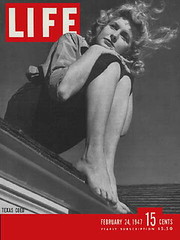
As many of you are already aware, there was a major development in online archiving the other day, as Google announced that they’ll be making Life magazine’s photo archive available on the web. This is kinda like having the key to Ricko’s file cabinet — it’s a bottomless rabbit hole of spectacular imagery.
Having already spent several hours clicking through the pics (which you can access through this portal), I can affirm that the photos — most of which were never published, and many more of which will soon be uploaded — are amazing. To take a simple, random example, look at this. The composition, the angles, the lighting, the expression — it’s a minor masterpiece.
And of course there are tons of great sports photos. I’ve chosen a bunch of them and divided them up into two groups: baseball-related and everything else. And since baseball usually gets top billing around here, let’s turn the tables and start with the non-baseball material for a change.
One logistical note: I’ve linked to smaller versions of the photos, so you can see the captions (which are minimal but usually provide at least the date the photo was shot), but I strongly recommend checking out the larger versions as well, which you can see simply by clicking on the smaller version; in fact, in many cases you’ll have to view the larger versions in order to see some of the details I’m talking about.
Now then (with thanks to the many readers who’ve sent in their faves over the past few days):
• There’s a great sequence of photos that shows these masks being made and worn. Additional pics here, here, and here.
• I’ve frequently run old catalog scans of stripe-adorned basketball shorts, but it’s rare that you see photos of them in action (or, OK, just standing there).
• Interesting uni number placement here. And dig that chenille numbering and lettering!
• Rare to see Muhammad Ali not wearing Everlast trunks.
• There’s a surprising number of photos showing girls playing football (additional shots here, here, here, here, here, and, in a surprisingly racy shot for Life, here).
• Love this shot of SMU’s team plane.
• Always amusing to see football refs wearing button-cuff sleeves.
• The team wearing white in this 1952 shot is Georgia Tech. The other team is Duke, who were doing the monochrome thing way ahead of their time.
• Check out the yard markers here. The line and numerals aren’t chalked over the grass — they were cut down to the dirt and then chalked (or maybe painted).
• Best paper route photo ever.
• Awesome artifact here: a post-game radio script.
• Not sure I’d ever seen a hockey photo with this type of headgear before. Apparently it was common in the college ranks.
• Awesome youth roller hockey photo here, and an even better one here. Honorable mention here.
• I don’t know who this kid was, but he sure was a natural in front of the camera. This must have been one of his teammates — love all the threads dangling of the letters. Mom must have sewn them on in a hurry!
• Now that’s a hockey fight photo.
• Love the handwritten seating sections visible in this shot.
• Great bowling scoreboard here, and some really nice bowling shirt embroidery here and here.
• Softball is almost baseball, but not quite, so we’ll put the softball pics in this entry, beginning with these shirts, which look more like bowling shirts — until you see the uni numbers. And check out the rear-shirt designs here, here, here, and here, plus this zebrafied umpire.
• OK, this is just weird.
• How great is it that Vince Lombardi’s jacket simply said this?
• This is so awesome, on several different levels.
• These kids must have been mascots or junior captains or something like that. Love the fractional uni numbers, but couldn’t they have at least used the same font?
• Must have been a hot day on the gridiron, because the Villanova players were wearing pith helmets!
• Note the plain referee’s shirt here.
• Man, there’s a lot of questionable activity going on in this photo.
• Life must have done a story on basketball ref Jim Enright (no relation, I’m assuming to this Jim Enright), who cut a rather unusual figure in zebra stripes and high-top sneakers. Additional pics here and here.
• Note the differing umpire jacket styles here.
• Sleeved hoops jersey alert! That’s Clemson, essentially wearing T-shirts against a very good-looking NC State team.
• Pure gold here: Roger Staubach with SNOB.
• Here’s a nice one to go out on — thing of beauty.
That’s enough for today. I’ll run the baseball pics in the near future, plus there’s a small group of basketball shots that are presenting such a mystery that I’m planning to give them their own entry, huzzah!
NBA Update: I have a short item about this year’s NBA throwbacks appearing today on Page 2.
Uni Watch News Ticker: I’m a little behind on NHL unveilings, so here are your alts for the Senators (ugh), Kings (doesn’t home plate belong in baseball?), Stars, and Flyers (here’s the rear view). ”¦ If you go here, look in the “Multimedia” listing in the right-hand rail, and scroll down to “Michigan’s Throwback Jersey,” you’ll find a nice little video clip on the Michigan hockey team’s new retro threads (thanks to Michael Davis). ”¦ Magnificent-looking 1920s basketball uniform catalog available here, and you’ve gotta like this sweater. ”¦ Latest Gene Upshaw memorial: Kyle Orton’s cap (courtesy of Paul Mazzarella). ”¦ At the risk of offending some of you, family stickers sound like precisely the kind of hellish suburban trope I live in the city to avoid. Or at least that’s what I thought until Brett Crane sent me this. ”¦ This very short home movie clip shot at the L.A. Coliseum in 1954 concludes with a shot of this poster. Don’t let the solid-yellow uni make you overlook the white-for-night ball (very nice find by Paul Wiederecht). ”¦ “My alma mater, Ohio, celebrated the 40th anniversary of their last MAC championship with 1968 throwback helmets last Saturday against Bowling Green,” writes Tim Burke. Wow — those are my-t-fine, no? ”¦ Nicole Haase stumbled across this great archival Wisconsin hockey photo — nice. ”¦ Wednesday’s comments featured some discussion of Oregon’s mallard helmet, with several readers suggesting that the duck-ish effect would be more pronounced if the helmet was paired with a yellow facemask, to match the mallard’s bill. Jeremy Brahm points out that the Fukuoka Daiei Hawks used a beak/bill treatment (along with the rest of the hawk’s head, natch) on their batting helmets from 1989-92. ”¦ Spectacular article here about the signage and typography in the New York City subway system — high recommended reading (big thanks to Bill Sodeman). ”¦ According to this item (sent my way by Dan Thaler), three Dallas players were fined for sock-related uni violations in last Sunday’s Cowboys/’Skins game. One of them was Kevin Burnett (No. 57), who was apparently flagged for wearing high whites. Another was Tony Romo, who you can see here and here — did they really fine him five grand for having a sliver of exposed kneecap, or was it because he appears to have had a small logo of some sort on his right sock? ”¦ Some great 1958 Colts/Giants footage (from the regular season, not the championship game) here. ”¦ Mizzou is supposedly planning to wear gold against KU (with thanks to Chris Mycoskie). ”¦ The Cowboys will be wearing throwbacks against the Niners this weekend. They will not be wearing throwbacks on Thanksgiving — just their regular home whites. ”¦ My ESPN colleague Eric Neel has a great new article about the 1958 Buffalo football team (which declined a bowl invitation rather than play without their two black players), and it includes some nice old Buffalo football cover designs. ”¦ Laurence Brussels says he recalls a 1970s SI article that mentioned that the Tampa Bay Bucs originally wanted their color scheme to be light green and orange. Anyone know more about this? ”¦ “Not sure how many teams across the country do this but Under Armour provides South Carolina with practice jerseys in every opposing team’s color for the scout squad in practice,” writes Beau Franklin. “Gamecocks are off this week, preparing for upstate rival Clemson, so the scout squad is wearing orange.” ”¦ The Twins will wear 1982 throwbacks for Saturday home games next year (with thanks to Hugh Gitlin). ”¦ Color-vs.-color last night, as Tulsa played Oklahoma State (thanks, Phil). ”¦ Trey Phillips notes that Ball State players are wearing an “86” decal — what’s that about? ”¦ Speaking of Ball State, Central Michigan wore gold jerseys while playing against them the other night, and it didn’t look as bad as I’d expected. ”¦ Jonathon Binet found some unsual shots of Mike Mussina: as a collegiate, as a minor leaguer, not wearing his usual No. 35, and running the bases. Interestingly, he’s wearing a left-handed batting helmet in that last shot, which I initially thought must have been an equipment snafu, but it turns out he batted lefty. ”¦ Upside-down “8” alert: Dice-K, from his Fenway debut (good spot by Steve Michaels, who also sent along this). ”¦ Mike Regan reports that the Kitchener Rangers had special jerseys and trading cards for Remembrance Day (a nicer treatment than last year’s, I’d say). “This ‘Valour’ jersey is based on the jersey that armed forces personnel wore in Europe during and after WWII,” he writes. “The three stripes that replicate the stripes on the ribbon of the Medal of Military Valour, which is awarded to members of the Canadian Forces (or allied forces serving in conjunction with Canadian Forces) for ‘an act of valour or devotion to duty in the presence of the enemy.'” ”¦ There are just too many uni-related things going on in this photo for my poor little brain to process. ”¦ Spent yesterday afternoon eating oysters and drinking beer with R&B DJ extraordinaire Mr. Finewine out in Sheepshead Bay, where I was surprised to see one of these signs on the kitchen wall.
Check out this eBay find… Does anyone really believe this is Tony Romo’s letterman’s jacket from Eastern Illinois? link
Darn! thought for sure i’d get my first ticker credit for the cowboys throwbacks news. Must have been one of the many :-)
I noticed Romo’s kneecaps poking out during the game sunday night and that was my first thought. But then i thought how can they really fine him if it is during the course of the game?
Also the Kings link doesn’t seem to work, and Family is mispelled in the Family Stickers blurb.
Funny, everybody who has gold in their unis is wearing gold jerseys at least once these days.
And nobody mocks them for it.
Five plus years ago, Joe Tiller at Purdue switched the home jerseys to gold (on the advice of the demon Nike) and they were mocked by CBS and ESPN incessantly.
Ga Tech, UCF, CMU, Wake, et al. Particularly the ridiculous UCF goldies with white numerals? Been done … can’t even see ’em in the sunlight.
What’s the deal? Are they so commonplace it’s acceptable these days? Followers :)
Let’s hope the Twins do the throwbacks to 1982 right and wear elastic waistbands. I’m also hoping they don’t do the “cool thing” and opt to wear their road powder blues as the turn-back-the-clock uniform.
Ball State’s “86” decal is for their receiver, Dante Love, who had a career-ending neck injury earlier in the year in a game at IU.
The “86” on Ball State’s helmet is for the receiver who messed up his spine from a hit in the game against Indiana, They carted him off the field and everything and Ball State came back and just waxed IU in the second half!!
Boomer Esiason opened the radio broadcast of last night’s Bengals by stating, “I can now say that these are worst uniforms I have ever seen.”
When I got home and watched , I agree that they are in the top 10.
Paul, most of those Icethetics links are getting 404s.
Also, the Stars link.
Never mind. I see that the pics have been Flickrized.
The Tampa Bay Bucs initially did consider green & orange for their uniform colors, but it was decided they were too close to the Uni of Miami (FL) colours. They decided to honor the major colleges in the state and went with orange (for Miami & Florida) and red (for Florida State).
[quote comment=”301166″]Let’s hope the Twins do the throwbacks to 1982 right and wear elastic waistbands. I’m also hoping they don’t do the “cool thing” and opt to wear their road powder blues as the turn-back-the-clock uniform.[/quote]
Nope, and nope.
As for the handwritten seating sections you mentioned in that hockey photo; I’m thinking they had numbered the sections of boards so when they put them together everything lined up correctly. This was the case when we used to put up our outdoor rink back home anyways.
Also check out the 2 different Cubs logos in that picture:
Note the differing umpire jacket styles here.
That Staubach picture is just fantastic. Georgeous uni matchup in that game. What I wouldn’t give for a jersey like that Navy one, and I am not even a jersey collector.
Looks like I’m not doing squat today but look at Life magazine photos. Thanks Paul! In this photo, the Giants are wearing different pants.
link
Watched the DET / EDM hockey game last night and EDM was wearing their throwbacks. This is the first chance I’ve had to see them in action besides pictures. It was wonderful. Love the colors the jerseys used to be.
How can you not like these:
link
link
link
link
[quote comment=”301164″]Darn! thought for sure i’d get my first ticker credit for the cowboys throwbacks news. Must have been one of the many :-)
I noticed Romo’s kneecaps poking out during the game sunday night and that was my first thought. But then i thought how can they really fine him if it is during the course of the game?
Also the Kings link doesn’t seem to work, and Family is mispelled in the Family Stickers blurb.[/quote]
The logo on his socks appears to be the top of his shoe’s “tongue”
Paul — I think the other team in those Georgia Tech pics is Duke. The other photos in the sequence are labeled “Georgia Tech vs. Duke”, and they look like the same uniforms.
I think I just found my new favorite hockey photo…
link
The jersey, the pads, the mask, the look in his eyes…. beautiful.
Anthony Spencer wears # 93, and was fined, not Andre Gurode
[quote comment=”301179″]
The logo on his socks appears to be the top of his shoe’s “tongue”[/quote]
Maybe it’s the thing link.
What’s the best part of this uniform? The ‘O’ in the middle of AGGIES, the raised lettering, the striped trim, or the number on the shorts? Also, the player is wearing some sort of ring on his left hand, although it doesn’t really look like a wedding ring.
link
[quote comment=”301183″][quote comment=”301179″]
The logo on his socks appears to be the top of his shoe’s “tongue”[/quote]
Maybe it’s the thing link.[/quote]
Yes, that’s the possible logo I was referring to.
The #93 Cowboy is Anthony Spencer not Andre Gurode. Gurode is the Cowboys center and wears 65.
Paul,
In that first picture, the woman is wearing an E&H cap. Was there any indication what the E&H stood for? I would like to think she was an alum of Emory & Henry College, my alma mater, but I can’t find the pic in the Life archives to confirm or deny it.
Hey Paul, the arena in the shot that you admired the hand written section numbers is Matthews Arena, then known as Boston Arena, which opened in 1910. It was the original home to the Bruins, Celtics, New England Whalers, Northeastern University, Boston University, Harvard, MIT, Tufts, Wentworth, and Boston College Hockey Programs. The shot has BU in Red and it looks like the team in white is Northeastern. BU moved out in 1971 into Walter Brown Arena, BC moved out in 1963 to McHugh Forum, and Northeastern took sole posesion in 1979, and renamed it Matthews Arena, where they still play today.
[quote comment=”301185″][quote comment=”301183″][quote comment=”301179″]
The logo on his socks appears to be the top of his shoe’s “tongue”[/quote]
Maybe it’s the thing link.[/quote]
Yes, that’s the possible logo I was referring to.[/quote]
My bad, I guess I win the Captain Obvious Award today…
[quote comment=”301176″]That Staubach picture is just fantastic. Georgeous uni matchup in that game. What I wouldn’t give for a jersey like that Navy one, and I am not even a jersey collector.[/quote]
Any idea what the sleeve patch is on Staubach’s jersey?
Third piece in the ticker talks about a “weater” – Paul – your S is missing!!
On that last link in the ticker, why is crab cakes in quotes?
“Here, have some ‘crab cakes.'” Umm … pass?
I thought I would spend time away from the computer, then….. the signage article….the Life photo archive.
The real world will have to wait a little longer.
[quote] The team wearing white in link is Georgia Tech. Not sure who the other team is, but they were doing the monochrome thing way ahead of their time.[/quote]
That looks to me to be a photo from the same game that was referenced in the previous bullet point about the link, no?
The monochrome team is identified as Duke in that photo.
Picture of Jackie Robinson in a uniform that not too many have seen I am sure…
link
Why the hell do they care so much about what socks a player wears? I mean, I can understand the logo issues, but who gives a damn how high they wear them or what color they are or whatever.
Way to take any individuality off of the field. Look at the old ’60s and ’70s players and they all did different things. Off all of the issues that the NFL could focus on…why socks?
/boggle
[quote comment=”301166″]Let’s hope the Twins do the throwbacks to 1982 right and wear elastic waistbands. I’m also hoping they don’t do the “cool thing” and opt to wear their road powder blues as the turn-back-the-clock uniform.[/quote]
The helmet that Joe Mauer wears behind the plate still won’t be paired with the correct uniform, right?
link
Here’s Rod Carew wearing the same helmet in 1978:
link
But I think the ’82 Twins wore red batting helmets with blue brims (this is Kirby Puckett in 1984):
link
If they wear the powder blue road unis, then they keep the current blue hat and dark shoes. If they wear the home unis, then it’s a red hat and red shoes, according to the uniform database:
link
Guess they couldn’t tell the image was flipped.
link
[quote comment=”301190″][quote comment=”301176″]That Staubach picture is just fantastic. Georgeous uni matchup in that game. What I wouldn’t give for a jersey like that Navy one, and I am not even a jersey collector.[/quote]
Any idea what the sleeve patch is on Staubach’s jersey?[/quote]
Are you talking about Bill the Goat?
link
Michigan assistant coahces were wearing adidas pins on their jsckets. no screen grab will try and get one tonight.
Gee Paul, what else can you get at that clam bar?
In an NFL Network countdown of the 10 ugliest uniforms, they showed a drawing which looked straight out of the World Football League. No screen grab (yet). No green in the photo that I remember.
nice error on the first Mussina card pic. It says #20, but you can clearly see he’s wearing #25.
Todays’ entry is by far my new favorite.
Based on material alone, this will be returned to many times over.
A few Christmases ago, I bought my wife a great book of William Steichens’ photography and much of this resembles those pics.
I use this word alot on this site, but crisp is the best adjective I can use to describe the clothing and overall aura of pics like these:
link
link
link
link
[quote comment=”301197″][quote comment=”301166″]Let’s hope the Twins do the throwbacks to 1982 right and wear elastic waistbands. I’m also hoping they don’t do the “cool thing” and opt to wear their road powder blues as the turn-back-the-clock uniform.[/quote]
The helmet that Joe Mauer wears behind the plate still won’t be paired with the correct uniform, right?
link
Here’s Rod Carew wearing the same helmet in 1978:
link
But I think the ’82 Twins wore red batting helmets with blue brims (this is Kirby Puckett in 1984):
link
If they wear the powder blue road unis, then they keep the current blue hat and dark shoes. If they wear the home unis, then it’s a red hat and red shoes, according to the uniform database:
link
Database has that wrong. Twins never wore red shoes in the Metrodome. Tri-color helmets were worn during the seasons when they wore red hats at home and navy on the road (with the powder blues), so that helmets would “sorta match” both hats. When they went to the red softcaps both home and road, they changed the batting helmets to red with navy visor. Pretty sure that was when the red shoes went away, too, and was the last outdoor season, or possibly second-to-last.
—Ricko
The pic of the Fukuoka Daiei Hawks helmets totally made my day, awesome. Batting helmet gold standard! I hadn’t had a chance to look around the life site yet, but I can tell it’ll take up at least a couple hours of my day, what a good Friday.
Ricko is “The Man.”
[quote comment=”301195″]Picture of Jackie Robinson in a uniform that not too many have seen I am sure…
link
Great find.
We haven’t seen that uniform because it’s not accurate – that’s for the filming of The Jackie Robinson Story, and they obviously didn’t bother too much with the details.
link what the Montreal Royals were wearing in those days. Note the link.
Just bring back the Twins’ stirrups with the logo:
link
It’s hard to find images of those 82 home Twins uniforms in the Metrodome. Most images I find are the powder blue road unis.
Here’s a pic of Kirby as a rookie in the dome, but you can’t see what color his shoes are.
link
He has dark cleats in this 84 pic from spring training, but it’s hard to say if he’s wearing white or blue pants.
link
Check out this Life shot of Villanova players wearing pith helmets on the bench in a game against Texas A&M:
link
Are they trying to keep cool?
In some contemporary sports news:
Both Duke and Southern Illinois have gone the SOD route.
link
link
link
OK, since I’m not getting a damn thing done at work today, I had to do a little investigative work.
Not surprisingly, a lot of the captions are ambiguous or downright wrong on those LIFE images. The link says “Hoosier basketball player Arley Andrews (31) going up for the lay-up during the high school game while the ref is looking on.”
Two things: 1) that is clearly an NCAA game between Indiana and Kansas State. 2) Arley Andrews played for Indiana State, not IU. Also, he didn’t graduate high school until 1954. His twin brother Harley went to Lousiville, so it can’t be him, either.
I’m 99% certain that the player in the photo is Dick Farley, who did wear #31 for the Hoosiers in 1953. You can clearly see the 3 and a little bit of the 1 link. The 1 is a little bit easier to see link (Farley’s hunched down between coach Branch McCracken and the player wearing #25, identified in the caption as Burke Scott).
I guess the caption mixup was due to the similarities between Arley and Farley.
here’s an 82 fleer card pic of a pullover-style twins home uni with dark cleats
link
check out the snap-back adjustable cap on this guy
link
82 donruss card of a guy wearing the mauer helmet
link
however, another 82 donruss card of a guy wearing the red helmet
link
[quote comment=”301210″]It’s hard to find images of those 82 home Twins uniforms in the Metrodome. Most images I find are the powder blue road unis.
Here’s a pic of Kirby as a rookie in the dome, but you can’t see what color his shoes are.
link
He has dark cleats in this 84 pic from spring training, but it’s hard to say if he’s wearing white or blue pants.
link
I can check when I get home, but the last red shoes may have been as far back as 1979. I do know they were gone by the 1981 home opener at old Met Stadium because I went to it, seeing as it was the last home opener outdoors and I hadn’t been to one in years…and I also remember Ken Landreaux had his black shoes spatted up with white tape.
I have the first home opener in the Metrodome on videotape, too. Have watched parts of it several times. Against Seattle. Twins in red hats, black shoes.
—Ricko
[quote comment=”301192″]On that last link in the ticker, why is crab cakes in quotes?
“Here, have some ‘crab cakes.'” Umm … pass?[/quote]
funny blog on this phenomenon
link
OK, one more and then I’m done…
Could the reason that the umps are wearing link be that the photo was taken during the 1945 World Series and one ump was from the AL and the other from the NL?
[quote comment=”301163″]Check out this eBay find… Does anyone really believe this is Tony Romo’s letterman’s jacket from Eastern Illinois? link
some sleuthing revealed a woman named Tiffany Kamykowski who has a username “tsarcelli” on this page, which matches the ebay seller
link
Googling Tiffany Kamykowski reveals two items which link her to Illinois
a Reunion.com page lists her as 29 years old from Illinois (Tony is 28):
link
And a photo caption of a Tiffany Kamykowski describing her as a bartender in Chicago
link
I love sleeved boys’ basketball jerseys, as Clemson was wearing. Sleeves need to make a comeback. But I am also very partial to unusual illegal numbers. I’m just wondering how in the world NC State decided upon unis numbers in the 70s and 80s.
Re.:Philadelphia Flyers throwbacks
The reason why the nameplates on the Flyers’
jerseys were white with black letters was for the
requirements of network television. In the early
1970s-which these Flyers’throwbacks are based on-
NHL teams were not required to put the names on the back of their jerseys. A few teams,including the Flyers and the Rangers,did have the names on the back of their home white jerseys but that was more the exception than the rule. NBC which had the network television rights during that period,broadcast Sunday afternoon games after the NFL season. To better identify the players to the American audience,the network wanted the teams to put the names on the jerseys for their broadcasts. Therefore,teams either had
different sets of jerseys for their NBC appearances and for their regular games.
Appearently,the Flyers’nameplate was probably
a rush job that they came up with on short notice.
I remember that they only wore those nameplates
during the 1974 and 1975 seasons. In later seasons,they would just used white letters for their names.
I am interested to hear more about this story.
[quote comment=”301217″]OK, one more and then I’m done…
Could the reason that the umps are wearing link be that the photo was taken during the 1945 World Series and one ump was from the AL and the other from the NL?[/quote]
Probably not, since they’re playing the Cardinals. That’s two NL teams.
link
I’m not sure if this has been posted in any of the comments recently but George Mason has a new .
There is a contest to name the new one.
He replaces this scary
Those link reminded me of link, shown shaking hands with “Ace” Bailey. Shore had ended Bailey’s career (and nearly his life) by hitting Bailey from behind… Bailey suffered a fractured skull when his head hit the ice. Shore was also injured when he was knocked to the ice in retaliation, and began wearing a helmet (such as it was) thereafter.
link kept link his link to the very link of his career. link owe “Jake the Snake” a debt of gratitude for their continued health!
Sorry I had no idea how to do the tags for the last post…George Mason has a new mascot (in the first link) and the 2nd link is the old one.
Another College Basketball find:
Add Princeton to the short list of schools using Nikes’ “Colorado” template.
Colorado:
link
Princeton:
link
While I was on the Princeton site perusing hoops pics, I found some more pics of Princetons’ stellar football unis, which are my favoirte in the NCAA.
Orange Alternate Top with Black Pants:
link
White Top with White Pants:
link
Black Top with White Pants:
link
Black Top with Black Pants:
link
link
White Top with Black Pants:
link
It seems that their white and orange jerseys have additional piping and the side panel treatment but the black jersey is kept simple, without the extra adornments.
Does anyone know why?
Is that Rangers jersey from Remembrance Day last year, or the Memorial Cup? There is a Mem Cup patch on their shoulders, although they hosted last year so it could’ve been there all season. However, the beards and mohawk lead me to believe it would be the Memorial Cup. Not that it makes a huge difference.
[quote comment=”301221″][quote comment=”301217″]OK, one more and then I’m done…
Could the reason that the umps are wearing link be that the photo was taken during the 1945 World Series and one ump was from the AL and the other from the NL?[/quote]
Probably not, since they’re playing the Cardinals. That’s two NL teams.
link
yeah, I wasn’t really sure if those pics in the “related images” section were actually from the same game or if they’re just related because they’re pictures taken in Wrigley Field in 1945.
Anyway, I ran across link during my search for ’45 Series images.
Worst picture in the history of Life?
link
Anybody watch the 2K Sports Classic last night and notice the “pop up” State Farm sticker on the floor? From above the sticker/logo looks distorted, but from the main TV camera perspective, it appears to be standing upright on top of the court. Sorry, no screen grab.
Paul, I am all for getting LIFE to include their print ads from their magazines. That would be absolutely amazing, but on the same note may end my note taking on every single LIFE print ad. (Long story why I am doing that, so I won’t go into it) But it would be amazing nevertheless. Is there a way we can start a petition on that?
[quote comment=”301228″]Worst picture in the history of Life?
link
Life is only the chronicler of events. You can’t blame them for the subjects they cover.
It was a dark, dark day in American history.
Holy crap, this is in my neighborhood, like within a 2 square mile area. I’m considering finding the location for a side by side, 59 years later.
link
Notes from a Michigan Uniwatch fan:
The Central Michigan football jerseys were terrible! Don’t wear them again!
The Red Wings/Oilers game last night was very attractive to the eye. The Oilers blue/orange color combination was one of my favorite of the 80’s and 90’s, along with the Kings black/silver set. Please Edmonton go back to the old school colors!
for some reason i can’t link anything, and dont remember my html. But check out the front page of my newspaper this morning:
link
question for everyone I meant to ask earlier in the week–
I noticed Terrell Owens was wearing a visor shield against the Redskins last Sunday, but I can’t really remember him wearing one before. Anyone know why he was wearing one? Has he worn one before?
link
[quote comment=”301232″]Holy crap, this is in my neighborhood, like within a 2 square mile area. I’m considering finding the location for a side by side, 59 years later.
link
No shit? I grew up on Paris Ave. and was born at Swedish-American.
[quote comment=”301227″][quote comment=”301221″][quote comment=”301217″]OK, one more and then I’m done…
Could the reason that the umps are wearing link be that the photo was taken during the 1945 World Series and one ump was from the AL and the other from the NL?[/quote]
Probably not, since they’re playing the Cardinals. That’s two NL teams.
link
yeah, I wasn’t really sure if those pics in the “related images” section were actually from the same game or if they’re just related because they’re pictures taken in Wrigley Field in 1945.
Anyway, I ran across link during my search for ’45 Series images.[/quote]
I was thinking that the difference in jackets was a direct effect of the difference between base and plate umpires.
The plate umpires’ jacket would have needed to be more loose, to accommodate a chest protector
However, back then didn’t plate umpires use the handheld protective shield?
Good bowling pics!
In the bowling pic with the guy holding his nose, there’s a guy sitting over by the window-A FOUL JUDGE. They actually had to pay a guy to yell-OVER THE LINE SMOKEY! MARK IT ZERO.
[quote comment=”301218″][quote comment=”301163″]Check out this eBay find… Does anyone really believe this is Tony Romo’s letterman’s jacket from Eastern Illinois? link
some sleuthing revealed a woman named Tiffany Kamykowski who has a username “tsarcelli” on this page, which matches the ebay seller
link
Googling Tiffany Kamykowski reveals two items which link her to Illinois
a Reunion.com page lists her as 29 years old from Illinois (Tony is 28):
link
And a photo caption of a Tiffany Kamykowski describing her as a bartender in Chicago
link
That detective work is up there with me calling equipment managers!
[quote comment=”301228″]Worst picture in the history of Life?
link
I’m gonna go with this one (NOT WORK SAFE!)
link
[quote comment=”301238″]They actually had to pay a guy to yell-OVER THE LINE SMOKEY! MARK IT ZERO.[/quote]
Comment of the day.
As alluded to before, I am hoping that the Twins players who “Get it®” will wear the proper hosiery with the throwbacks.
On another note (or call it gripe), each time I see something that features the new Vikings font, I cringe a little. Was on eBay after looking at the Tony Romo jacket and searched for some classic Vikings items and found this:
link
I love that old Vikings font…and the new one that can be seen Chris Creamer’s site is just so blah…
Sorry, rant/gripe over…carry on. Paul, thanks again for posting this Life info…great way to get through the rest of the day.
[quote comment=”301226″]Is that Rangers jersey from Remembrance Day last year, or the Memorial Cup? There is a Mem Cup patch on their shoulders, although they hosted last year so it could’ve been there all season. However, the beards and mohawk lead me to believe it would be the Memorial Cup. Not that it makes a huge difference.[/quote]
That’s absolutely correct, Priest. Those are the throwback jerseys worn for the Memorial Cup.
The town of Kitchener was originally called Berlin due to the number of German immigrants that settled there between 1870 and 1913. However, when the First World War began, the city’s population sought to change the name in order to separate themselves from the countries that opposed Canada. In 1916, Berlin changed its name to Kitchener after Boer War hero Field Marshal Horatio Herbert Kitchener. Kitchener is still a big military city in Canada, and the jerseys were to honour the men and women who had served so patriotically in the armed forces throughout the ages. The poppy was for those buried at Flanders Field.
Their link, worn last season.
All of the current Mike Mussina HOF debates have meant a lot of pictures have been running of him (see today’s ticker) and through this I have been able to find soomething I have been looking for forever!
In 1996 the 5’s on O’s jerseys were accidentally made using an upside down and backward 2 pattern. It drove me nuts because this was done by Russell and there was nothing we could do to fix it.
link
Correct style
link
Check out this photo of former Oakland A’s owner, Charlie Finley …
link
He’s wearing a Chicago Shamrocks hat. I looked up the Shamrocks and they were a hockey team. However, the logo on his hat is a football.
What is that all about?
Wouldn’t be surprised a lot of color-on-color games from Oklahoma State this year. New coach Travis Ford seems pretty intent on having the team wear orange at home, and since that’s a color distinct from every other team we host this year (minus Texas), then I’d expect the trend will continue on through conference play.
Re: Check out the yard markers here
Did anyone get a look at the refs outfit in this picture?
I could swear those are sailor outfits….
Thanks Paul!
[quote comment=”301241″][quote comment=”301238″]They actually had to pay a guy to yell-OVER THE LINE SMOKEY! MARK IT ZERO.[/quote]
Comment of the day.[/quote]
Forgive me, for I know nothing of bowling thus I didn’t see that shadowy figure in the background, but that is HYSTERICAL.
As for the Bowling scoreboard: I can only imagine the bitching, complaining, and treasure trove of excuses that would be heard if an employee today was asked to set up and maintain this:
link
BTW, these photogenic kids turned out to be none other than:
Young 1:
link
Young 2:
link
link
I hate to ruin everyone’s day, but the Sharks just unveiled their black jersey.
link
And, SHOCKER, they go with the laced collar. I’m sorry guys. No really, I am.
BTW…for all of you UW movie buffs.
I bit the bullet and rented “Bull Durham”, “Slap Shot” and “Fargo” from the library.
Now all I need to do is lengthen the day to 34 hours and I might find a chance to watch them.
[quote comment=”301236″][quote comment=”301232″]Holy crap, this is in my neighborhood, like within a 2 square mile area. I’m considering finding the location for a side by side, 59 years later.
link
No shit? I grew up on Paris Ave. and was born at Swedish-American.[/quote]
I live on Minnesota Dr. and was also born at Swedes. But for insurance reasons had to have my daughter delivered at Memorial, that’s right, I had to drive past a hospital to get to the hospital.
[quote comment=”301245″]Check out this photo of former Oakland A’s owner, Charlie Finley …
link
He’s wearing a Chicago Shamrocks hat. I looked up the Shamrocks and they were a hockey team. However, the logo on his hat is a football.
What is that all about?[/quote]
Go here…
link
and check out the Vintage Football Jerseys.
[quote comment=”301252″][quote comment=”301245″]Check out this photo of former Oakland A’s owner, Charlie Finley …
link
He’s wearing a Chicago Shamrocks hat. I looked up the Shamrocks and they were a hockey team. However, the logo on his hat is a football.
What is that all about?[/quote]
Go here…
link
and check out the Vintage Football Jerseys.[/quote]
They had Boston Shamrock jerseys. No mention of Chicago Shamrocks. Nor did the team description mention a move to Chicago.
[quote comment=”301253″][quote comment=”301252″][quote comment=”301245″]Check out this photo of former Oakland A’s owner, Charlie Finley …
link
He’s wearing a Chicago Shamrocks hat. I looked up the Shamrocks and they were a hockey team. However, the logo on his hat is a football.
What is that all about?[/quote]
Go here…
link
and check out the Vintage Football Jerseys.[/quote]
They had Boston Shamrock jerseys. No mention of Chicago Shamrocks. Nor did the team description mention a move to Chicago.[/quote]
Opps, (premature sendification) meant to include maybe the Chicago version is some sort of harkback from a latter day semi-pro league team.
[quote comment=”301245″]Check out this photo of former Oakland A’s owner, Charlie Finley …
link
He’s wearing a Chicago Shamrocks hat. I looked up the Shamrocks and they were a hockey team. However, the logo on his hat is a football.
What is that all about?[/quote]
There was also a Chicago Shamrocks football team back in the ’30s. I have an Ebbets Field Flannels repro of one of their jerseys:
link
[quote comment=”301253″][quote comment=”301252″][quote comment=”301245″]Check out this photo of former Oakland A’s owner, Charlie Finley …
link
He’s wearing a Chicago Shamrocks hat. I looked up the Shamrocks and they were a hockey team. However, the logo on his hat is a football.
What is that all about?[/quote]
Go here…
link
and check out the Vintage Football Jerseys.[/quote]
They had Boston Shamrock jerseys. No mention of Chicago Shamrocks. Nor did the team description mention a move to Chicago.[/quote]
There is record of a Chicago Shamrocks football team here …
link
However, it’s from 1932. That hat and logo is definately not from the 30’s.
Mysterious.
[quote comment=”301256″][quote comment=”301253″][quote comment=”301252″][quote comment=”301245″]Check out this photo of former Oakland A’s owner, Charlie Finley …
link
He’s wearing a Chicago Shamrocks hat. I looked up the Shamrocks and they were a hockey team. However, the logo on his hat is a football.
What is that all about?[/quote]
Go here…
link
and check out the Vintage Football Jerseys.[/quote]
They had Boston Shamrock jerseys. No mention of Chicago Shamrocks. Nor did the team description mention a move to Chicago.[/quote]
There is record of a Chicago Shamrocks football team here …
link
However, it’s from 1932. That hat and logo is definately not from the 30’s.
Mysterious.[/quote]
I found a possible clue on wikipedia.
“In March of 1987, Finley proposed a new football league. The league would merge with the Canadian Football League, and be renamed the North American Football League. The American cities would be made up of those that lost out on the United States Football League folding. The idea never got past the planning stages.”
I don’t think that handwriting is for the seating sections. I think it is to reference where the boards go when they take them down and then set them back up. Otherwise those sections are tiny (like 2 or 3 seats across).
[quote comment=”301215″][quote comment=”301210″]It’s hard to find images of those 82 home Twins uniforms in the Metrodome. Most images I find are the powder blue road unis.
Here’s a pic of Kirby as a rookie in the dome, but you can’t see what color his shoes are.
link
He has dark cleats in this 84 pic from spring training, but it’s hard to say if he’s wearing white or blue pants.
link
I can check when I get home, but the last red shoes may have been as far back as 1979. I do know they were gone by the 1981 home opener at old Met Stadium because I went to it, seeing as it was the last home opener outdoors and I hadn’t been to one in years…and I also remember Ken Landreaux had his black shoes spatted up with white tape.
I have the first home opener in the Metrodome on videotape, too. Have watched parts of it several times. Against Seattle. Twins in red hats, black shoes.
—Ricko[/quote]
In “The Bronx Zoo” Sparky Lyle tells a story about Billy Martin protesting a game or something because they were playing the Twins and their pitcher had on red cleats while everyone else was wearing black, thus he was out of uniform. That book chronicled the ’78 season.
speaking of georgia tech…some folks were….they’ve really gone south with their football uniforms this year. just an awful template and the gold looks weird. they had classic uniforms a few years back, and when they busted out the white helmets on a thurs. night ESPN game vs. virginia, those looked phenomenal. now, here’s my gripe – why do they never where navy blue jerseys in basketball or football? i miss the days of kenny anderson, with those sweet unis….and i can’t even remember the last time they wore blue jerseys in football, but i know they used to. i don’t agree with this move at all. bring back the blue.
[quote comment=”301257″][quote comment=”301256″][quote comment=”301253″][quote comment=”301252″][quote comment=”301245″]Check out this photo of former Oakland A’s owner, Charlie Finley …
link
He’s wearing a Chicago Shamrocks hat. I looked up the Shamrocks and they were a hockey team. However, the logo on his hat is a football.
What is that all about?[/quote]
Go here…
link
and check out the Vintage Football Jerseys.[/quote]
They had Boston Shamrock jerseys. No mention of Chicago Shamrocks. Nor did the team description mention a move to Chicago.[/quote]
There is record of a Chicago Shamrocks football team here …
link
However, it’s from 1932. That hat and logo is definately not from the 30’s.
Mysterious.[/quote]
I found a possible clue on wikipedia.
“In March of 1987, Finley proposed a new football league. The league would merge with the Canadian Football League, and be renamed the North American Football League. The American cities would be made up of those that lost out on the United States Football League folding. The idea never got past the planning stages.”[/quote]
According to this archive …
link
… he was planning to own the Chicago franchise.
My guess is that he had a logo drawn up and a hat made.
Idn’t that nice.
I found a possible clue on wikipedia.
“In March of 1987, Finley proposed a new football league. The league would merge with the Canadian Football League, and be renamed the North American Football League. The American cities would be made up of those that lost out on the United States Football League folding. The idea never got past the planning stages.”
Good job. Cuz that logo did have the thrown-together look of something like that…and it’s kelly and gold, a Finley fixation.
Remember when the bought ABA Memphis Tams? Changed colors from red, white and blue to kelly and gold. Tams had all-white, all-kelly and all-gold sets and interchanged them like crazy. Good luck finding photos, though. Don’t think the papers cared enough to send photographers to the games, LOL.
[quote comment=”301196″]Why the hell do they care so much about what socks a player wears? I mean, I can understand the logo issues, but who gives a damn how high they wear them or what color they are or whatever.
Way to take any individuality off of the field. Look at the old ’60s and ’70s players and they all did different things. Off all of the issues that the NFL could focus on…why socks?
/boggle[/quote]
exactly
[quote comment=”301263″][quote comment=”301196″]Why the hell do they care so much about what socks a player wears? I mean, I can understand the logo issues, but who gives a damn how high they wear them or what color they are or whatever.
Way to take any individuality off of the field. Look at the old ’60s and ’70s players and they all did different things. Off all of the issues that the NFL could focus on…why socks?
/boggle[/quote]
exactly[/quote]
Sometimes players on the same team wore different COLOR shoes! Say, some in black, some i white, maybe a couple in red (49ers, for ex.). And players would even wear different BRANDS! I mean you’d see, like, adidas, puma and riddell on the SAME TEAM! It was HORRIBLE!
“Dogs and cats, living together!”
—Peter Venkman
Yet another example of Boston using the upside down 8. I am a local Boston guy and i just wanted to add that it happens all the time around here. Almost all of the gas stations(gas is in the 1.80’s-1.90’s) use the 8’s upside down around here. i never noticed it until i started to hear about it on UW.
I had no idea the mets ever had an “M” logo..
link
link
Would love to see them wear a throwback of that jersey..
[quote comment=”301260″]speaking of georgia tech…some folks were….they’ve really gone south with their football uniforms this year. just an awful template and the gold looks weird. they had classic uniforms a few years back, and when they busted out the white helmets on a thurs. night ESPN game vs. virginia, those looked phenomenal. now, here’s my gripe – why do they never where navy blue jerseys in basketball or football? i miss the days of kenny anderson, with those sweet unis….and i can’t even remember the last time they wore blue jerseys in football, but i know they used to. i don’t agree with this move at all. bring back the blue.[/quote]
If memory serves, Tech won the National Championship in 1991 under Bobby Ross.
link
I don’t think so.
William Bell was the tailback and Marco Coleman and Coleman Rudolph were their outstanding defensive lineman.
link
link
link
link
Kenny Anderson. Brian Oliver, and Dennis Scott were excellent together playing for Bobby Cremins.
I was first beginning to watch basketball when they were in college, so my memories of them are quite vivid.
link
The three of them always wore great Nike shoes like the Air Flight 89:
link
Air Bound:
link
Mystery: What, or who is the mourning band commemorating in this pic?
link
[quote comment=”301263″][quote comment=”301196″]Why the hell do they care so much about what socks a player wears? I mean, I can understand the logo issues, but who gives a damn how high they wear them or what color they are or whatever.
Way to take any individuality off of the field. Look at the old ’60s and ’70s players and they all did different things. Off all of the issues that the NFL could focus on…why socks?
/boggle[/quote]
exactly[/quote]
I’m confused. We often criticize players like Clinton Portis and his teammates for their sock shenanigans. After reading this post, as well as Phils’ reply, it seems as if this is what is wanted.
Or is it that you are you protesting the league and their strict management of this individuality?
[quote comment=”301268″][quote comment=”301263″][quote comment=”301196″]Why the hell do they care so much about what socks a player wears? I mean, I can understand the logo issues, but who gives a damn how high they wear them or what color they are or whatever.
Way to take any individuality off of the field. Look at the old ’60s and ’70s players and they all did different things. Off all of the issues that the NFL could focus on…why socks?
/boggle[/quote]
exactly[/quote]
I’m confused. We often criticize players like Clinton Portis and his teammates for their sock shenanigans. After reading this post, as well as Phils’ reply, it seems as if this is what is wanted.
Or is it that you are you protesting the league and their strict management of this individuality?[/quote]
Mostly because when the NFL fines people for sock infringements, it generally makes them look like douchebags.
The NFL does go way too far though.
link
I went to that Google portal, and searched football in the 1940’s. It can’t be in the 1940s though, because it’s color with NOB.
Still, I really like these Bears NOBs, and if Chicago ever did throwbacks, I’d nominate these to be the uniforms thrown back to. They’re brilliant.
[quote comment=”301268″][quote comment=”301263″][quote comment=”301196″]Why the hell do they care so much about what socks a player wears? I mean, I can understand the logo issues, but who gives a damn how high they wear them or what color they are or whatever.
Way to take any individuality off of the field. Look at the old ’60s and ’70s players and they all did different things. Off all of the issues that the NFL could focus on…why socks?
/boggle[/quote]
exactly[/quote]
I’m confused. We often criticize players like Clinton Portis and his teammates for their sock shenanigans. After reading this post, as well as Phils’ reply, it seems as if this is what is wanted.
Or is it that you are you protesting the league and their strict management of this individuality?[/quote]
no…i WANT the sock police…it’s a team game…not 11 “i”s
/didn’t even like broadway joe sporting the white shoes way back when
//but, im prolly in the minority here
///GOML
[quote comment=”301237″]I was thinking that the difference in jackets was a direct effect of the difference between base and plate umpires.
The plate umpires’ jacket would have needed to be more loose, to accommodate a chest protector
However, back then didn’t plate umpires use the handheld protective shield?[/quote]
I actually had the exact same line of reasoning on this at first. On second thought, it does make sense that the home ump would wear a different jacket. External chest protector or not, he’d want one that was better for crouching behind the catcher.
that’s a great price for Crab Cakes. of course, they likely were not made with Old Bay (aka MD style) and thus, automatically inferior. :>
Check out link picture of Michigan/Ohio State.
Look at how dark the blue is, and how the helmet’s stripes are actually GOLD, not yellow.
Also, I dig the facemask-free helmets and the numbers on Michigan’s uniforms.
Check out the socks for both teams, and also look at Michigan’s jersey. Maybe they should go back to having that stripe on their regular jersey.
[quote comment=”301269″][quote comment=”301268″][quote comment=”301263″][quote comment=”301196″]Why the hell do they care so much about what socks a player wears? I mean, I can understand the logo issues, but who gives a damn how high they wear them or what color they are or whatever.
Way to take any individuality off of the field. Look at the old ’60s and ’70s players and they all did different things. Off all of the issues that the NFL could focus on…why socks?
/boggle[/quote]
exactly[/quote]
I’m confused. We often criticize players like Clinton Portis and his teammates for their sock shenanigans. After reading this post, as well as Phils’ reply, it seems as if this is what is wanted.
Or is it that you are you protesting the league and their strict management of this individuality?[/quote]
Mostly because when the NFL fines people for sock infringements, it generally makes them look like douchebags.
The NFL does go way too far though.[/quote]
Exactly. I mean…they are socks. I could understand if they were trying to alter the team logo or change the helmet / jersey or something…..but socks?
It just seems pretty petty, to me. Everyone always loves in on here when someone adds stripes or some such thing to their socks. Why can’t they wear socks up / down / sideway / who cares, I guess?
Is there any actual relevant reason for these strict sock regulations, or is it just unabashed douche-baggery?
[quote comment=”301270″]link
I went to that Google portal, and searched football in the 1940’s. It can’t be in the 1940s though, because it’s color with NOB.
Still, I really like these Bears NOBs, and if Chicago ever did throwbacks, I’d nominate these to be the uniforms thrown back to. They’re brilliant.[/quote]
That’s definitely 1970 — first year for NOBs and last year for Wrigley Field.
But what am I missing here? What is it you like so much better about that style than what they’re link? The width of the letters?
[quote comment=”301276″][quote comment=”301270″]link
I went to that Google portal, and searched football in the 1940’s. It can’t be in the 1940s though, because it’s color with NOB.
Still, I really like these Bears NOBs, and if Chicago ever did throwbacks, I’d nominate these to be the uniforms thrown back to. They’re brilliant.[/quote]
That’s definitely 1970 — first year for NOBs and last year for Wrigley Field.
But what am I missing here? What is it you like so much better about that style than what they’re link? The width of the letters?[/quote]
Width, white C on helmet, and the white/gray facemask (I can’t tell, don’t remember offhand).
thanks for the productivity killer there Paul, but this makes up for yesterday’s snow day … in the day of personalized eye-black stickers, how awesome is link?
[quote comment=”301277″]
Width, white C on helmet, and the white/gray facemask (I can’t tell, don’t remember offhand).[/quote]
Ah, I thought you were talking specifically about the nameplates.
A jersey with actual sleeves a nice touch, too.
[quote comment=”301279″][quote comment=”301277″]
Width, white C on helmet, and the white/gray facemask (I can’t tell, don’t remember offhand).[/quote]
Ah, I thought you were talking specifically about the nameplates.
A jersey with actual sleeves a nice touch, too.[/quote]
I really think they should move the TV numbers to the shoulders so we can still see the stripes.
Don’t think Halas wanted to be memorialized by having his initials in someone’s armpit.
[quote comment=”301275″][quote comment=”301269″][quote comment=”301268″][quote comment=”301263″][quote comment=”301196″]Why the hell do they care so much about what socks a player wears? I mean, I can understand the logo issues, but who gives a damn how high they wear them or what color they are or whatever.
Way to take any individuality off of the field. Look at the old ’60s and ’70s players and they all did different things. Off all of the issues that the NFL could focus on…why socks?
/boggle[/quote]
exactly[/quote]
I’m confused. We often criticize players like Clinton Portis and his teammates for their sock shenanigans. After reading this post, as well as Phils’ reply, it seems as if this is what is wanted.
Or is it that you are you protesting the league and their strict management of this individuality?[/quote]
Mostly because when the NFL fines people for sock infringements, it generally makes them look like douchebags.
The NFL does go way too far though.[/quote]
Exactly. I mean…they are socks. I could understand if they were trying to alter the team logo or change the helmet / jersey or something…..but socks?
It just seems pretty petty, to me. Everyone always loves in on here when someone adds stripes or some such thing to their socks. Why can’t they wear socks up / down / sideway / who cares, I guess?
Is there any actual relevant reason for these strict sock regulations, or is it just unabashed douche-baggery?[/quote]
I’m sorry, but wanting a uniform to look uniform isn’t an example of “douche-baggery”. I’d argue the exact opposite is true. I like sock stripes as much as the next guy, but filling your leg with them is about the biggest look-at-me, douchebag move a player can make(uni-wise) and still be allowed to take the field. It’s a team game, dammit.
are there 3 different 66es in this picture or just 2 (i can’t tell if the sleeve numbers match the back)?
[quote comment=”301251″][quote comment=”301236″][quote comment=”301232″]Holy crap, this is in my neighborhood, like within a 2 square mile area. I’m considering finding the location for a side by side, 59 years later.
link
No shit? I grew up on Paris Ave. and was born at Swedish-American.[/quote]
I live on Minnesota Dr. and was also born at Swedes. But for insurance reasons had to have my daughter delivered at Memorial, that’s right, I had to drive past a hospital to get to the hospital.[/quote]
Small world, huh?
I went back and found an old post of yours talking about the ERABs–both my Mom and Dad went to East.
And if “ERABs” is a bad nickname, how about the Freeport Pretzels–Preston Pearson’s ala mater?!
link
[quote comment=”301282″]are there 3 different 66es in this picture or just 2 (i can’t tell if the sleeve numbers match the back)?[/quote]
bad link, try link
[quote comment=”301280″][quote comment=”301279″][quote comment=”301277″]
Width, white C on helmet, and the white/gray facemask (I can’t tell, don’t remember offhand).[/quote]
Ah, I thought you were talking specifically about the nameplates.
A jersey with actual sleeves a nice touch, too.[/quote]
I really think they should move the TV numbers to the shoulders so we can still see the stripes.
Don’t think Halas wanted to be memorialized by having his initials in someone’s armpit.[/quote]
I’ve thought about that. Only problem is that you’ll probably just end up with something like link anyway, so I say keep ’em where they are.
last picture, as i have to actually do work, but check link, my how innovation has changed the game, eh?
[quote]I’m sorry, but wanting a uniform to look uniform isn’t an example of “douche-baggery”. I’d argue the exact opposite is true. I like sock stripes as much as the next guy, but filling your leg with them is about the biggest look-at-me, douchebag move a player can make(uni-wise) and still be allowed to take the field. It’s a team game, dammit.[/quote]
THANK YOU duck…you and i agree on something? (actually, i think we always agreed on this)…
i’ve said this before and i’ll say it again, uniforms should be…well..uniform…i hate the pajama pant look in baseball but i’d rather 9 guys all wear that than have a bunch of short pant, long pant, stirruped, non-stirruped, flat brim, curved brim, baggy shirt, tight shirt mismatched misfits
[quote comment=”301282″]are there 3 different 66es in this picture or just 2 (i can’t tell if the sleeve numbers match the back)?[/quote]
Looks to me like the big 66 and TV numbers are the same.
But on that link, are there players wearing different colored masks? Most look grey, but the player facing the camera over the runner’s back, seems to be wearing a white facemask.
While looking at some West Virginia pictures in the Life archive, I came across this beautiful photo….
link
After reading the caption, I was just wondering why Ford wouldn’t have been allowed back in the game. Anybody have any ideas?
Georgia Tech wore the navy unis last in the ACC Championship game against Wake Forest two years ago. I agree that they look good, but navy is NOT one of our primary colors. Navy is, and always has been, a trim color and us switching to navy unis would be like any other team switching to black…completely stupid. We do have a navy uni in the new set, but it has not been brought out yet this year.
Anyone see the UCLA-Michigan game last night? Great game, and even more beautiful. Yeah, Michigan’s got the basketball equivalent of the Reebox on the back, but considering the way most other teams look these days, this was just plain nice to see.
link
link
link
[quote comment=”301246″]Wouldn’t be surprised a lot of color-on-color games from Oklahoma State this year. New coach Travis Ford seems pretty intent on having the team wear orange at home, and since that’s a color distinct from every other team we host this year (minus Texas), then I’d expect the trend will continue on through conference play.[/quote]
Why would Ford want the team wearing orange at home?
[quote comment=”301275″][quote comment=”301269″][quote comment=”301268″][quote comment=”301263″][quote comment=”301196″]Why the hell do they care so much about what socks a player wears? I mean, I can understand the logo issues, but who gives a damn how high they wear them or what color they are or whatever.
Way to take any individuality off of the field. Look at the old ’60s and ’70s players and they all did different things. Off all of the issues that the NFL could focus on…why socks?
/boggle[/quote]
exactly[/quote]
I’m confused. We often criticize players like Clinton Portis and his teammates for their sock shenanigans. After reading this post, as well as Phils’ reply, it seems as if this is what is wanted.
Or is it that you are you protesting the league and their strict management of this individuality?[/quote]
Mostly because when the NFL fines people for sock infringements, it generally makes them look like douchebags.
The NFL does go way too far though.[/quote]
Exactly. I mean…they are socks. I could understand if they were trying to alter the team logo or change the helmet / jersey or something…..but socks?
It just seems pretty petty, to me. Everyone always loves in on here when someone adds stripes or some such thing to their socks. Why can’t they wear socks up / down / sideway / who cares, I guess?
Is there any actual relevant reason for these strict sock regulations, or is it just unabashed douche-baggery?[/quote]
Using this site as my source, I have often read that it is Reebok, the uniform provider, that forces the NFL to be so strict with their uniform policing.
If the players don’t wear the vectors’ swag correctly, fans won’t buy it!
Wow! Not uni related, but wow nonetheless.
link
That’s West Virginia in one photo. Love that dinner bucket!!
In regard to the Tampa Bay Buccaneers original colours – what I read (albeit 30 yrs ago in Sports Illustrated), was their original choice was light green and orange. That this choice was rejected by NFL properties, for being too similar to the Dolphins. As to what exactly light greeen the Buccaneers were thinking of, that’s what I’ve always wondered about, after all light green is not exactly a common choice for a team colour.
The only example I can think of is the NY Liberty. The Dolphins are obviously close to light green with their choice of aqua , which hopefully does not disappear – with their rumoured uniform change for next season.
[quote comment=”301287″][quote]I’m sorry, but wanting a uniform to look uniform isn’t an example of “douche-baggery”. I’d argue the exact opposite is true. I like sock stripes as much as the next guy, but filling your leg with them is about the biggest look-at-me, douchebag move a player can make(uni-wise) and still be allowed to take the field. It’s a team game, dammit.[/quote]
THANK YOU duck…you and i agree on something? (actually, i think we always agreed on this)…
i’ve said this before and i’ll say it again, uniforms should be…well..uniform…i hate the pajama pant look in baseball but i’d rather 9 guys all wear that than have a bunch of short pant, long pant, stirruped, non-stirruped, flat brim, curved brim, baggy shirt, tight shirt mismatched misfits[/quote]
Sorta, I should have specified that I’m a hypocrite and I adore cuffed pants high socks in baseball, and I actually have convinced myself that those are the “normal” guys within uniform boundaries, and the pajama pants guys are the d-bags. BTW, when did douchebag become the only available slang term for pricks/a-holes/jerkoffs/girlfriend’s ex’s etc? I always liked it myself, but now it seems overdone. I’m going back to my old standby, ass-jacket. It’s so good, It doesn’t need to make sense.
[quote comment=”301291″]Anyone see the UCLA-Michigan game last night? Great game, and even more beautiful. Yeah, Michigan’s got the basketball equivalent of the Reebox on the back, but considering the way most other teams look these days, this was just plain nice to see.
link
link
link[/quote]
Those pics definitely DO NOT warm my heart.
UCLAs’ uniforms are classic however their white socks with black shoes is one of my biggest uniform pet peeves.
Michigan on the other hand really saddens me. I mentioned this past weekend that the Fab Five and their uniforms were my first uni obsession.
Their defection to Adidas, in combination with that of Kansas has truly broken my heart.
[quote]If the players don’t wear the vectors’ swag correctly, fans won’t buy it![/quote]
are a lot of people buying official nfl socks? is this really a hot item?
[quote comment=”301296″][quote comment=”301287″][quote]I’m sorry, but wanting a uniform to look uniform isn’t an example of “douche-baggery”. I’d argue the exact opposite is true. I like sock stripes as much as the next guy, but filling your leg with them is about the biggest look-at-me, douchebag move a player can make(uni-wise) and still be allowed to take the field. It’s a team game, dammit.[/quote]
THANK YOU duck…you and i agree on something? (actually, i think we always agreed on this)…
i’ve said this before and i’ll say it again, uniforms should be…well..uniform…i hate the pajama pant look in baseball but i’d rather 9 guys all wear that than have a bunch of short pant, long pant, stirruped, non-stirruped, flat brim, curved brim, baggy shirt, tight shirt mismatched misfits[/quote]
Sorta, I should have specified that I’m a hypocrite and I adore cuffed pants high socks in baseball, and I actually have convinced myself that those are the “normal” guys within uniform boundaries, and the pajama pants guys are the d-bags. BTW, when did douchebag become the only available slang term for pricks/a-holes/jerkoffs/girlfriend’s ex’s etc? I always liked it myself, but now it seems overdone. I’m going back to my old standby, ass-jacket. It’s so good, It doesn’t need to make sense.[/quote]
I’ve always liked “assclown” personally.
Virginia Tech is going with an interesting uniform combination tomorrow night against Duke…
Orange tops, maroon pants… Check out ESPNU at 5:30EST to see for yourself
Speaking of ESPNU and VT, the VT men’s basketball team is wearing their maroon away jerseys right now against Xavier… they look… interesting…
[quote comment=”301274″]Check out link picture of Michigan/Ohio State.
Look at how dark the blue is, and how the helmet’s stripes are actually GOLD, not yellow.
Also, I dig the facemask-free helmets and the numbers on Michigan’s uniforms.
Check out the socks for both teams, and also look at Michigan’s jersey. Maybe they should go back to having that stripe on their regular jersey.[/quote]
While we’re on the subject of uniform, uh, uniformity, check out the Michigan-TOSU picture.
Only #66 and the center are wearing the striped socks.
Based on the quarterback, it seems that the front section of the helmet wing is missing.
Again, look at #66 and compare his number font to that of the running back.
“Awesome youth roller hockey photo here, and an even better one here. Honorable mention here.”
Not 100% certain, but the honorable mention photo appears to be Columbus Circle, with Broadway receding to the north directly behind the monument.
[quote comment=”301298″][quote]If the players don’t wear the vectors’ swag correctly, fans won’t buy it![/quote]
are a lot of people buying official nfl socks? is this really a hot item?[/quote]
I would love to jump ugly and staunchly defend my comment.
But I have to agree…I can’t imagine many fans buying a complete set, as opposed to a team buying in bulk.
Oh, just saw the “related photos” to the right of the image, the youth roller hockey is definitely Columbus Circle.
[quote comment=”301266″]I had no idea the mets ever had an “M” logo..
link
link
Would love to see them wear a throwback of that jersey..[/quote]
I’d prefer, if they MUST have an alternate, go to the interlocking “NY” and a blue jersey…like they had back in the early 80s for a time.
[quote comment=”301266″]I had no idea the mets ever had an “M” logo..
link
link
Would love to see them wear a throwback of that jersey..[/quote]
That would be the minor league Mets. Not sure what city the played in. Anyone?
As a recent grad of Ball State I’ll put a little bit of history to the “86” on the Cards’ helmets. 4 Years ago when I was a freshman as BSU and the cards won only ONE GAME that year, Dante Love wasn’t just a receiver on the team, he WAS the team, between being the only receiver we had (Ridgeway was gone by this point) and his kick returns he was about the only bright spot in our horrid team. As BSU slowly got better he got better and was always there for a clutch catch or kick return. This year (his senior year and last year) was his ultimate curtain call. Before he went down he lead the nation in yards, caught everything, was Nate Davis’s go-to guy, and was putting the stamp on a great college career and was looking forward to playing on sundays.
When he went down at IU we didn’t just lose our number one receiver. We lost the heart and soul of our receiving corps, we lost an unapologetic leader who remembers the olden days of Ball State being number one on ESPN’s “Bottom ten” list.
That small 86 is a very minuscule memorial to a player, leader, and overall GREAT kid (as a student I interacted with him…he’s just a massive goofball). This dream season for us is just a little more tainted with his absence.
I am sorry this is so long, and I am sure very few of you care about the essay I just wrote…but simply saying “It’s for Dante Love” doesn’t suit the memorial justice.
I read that U Buffalo article during the Uni Watch off day. Saw this photo
link
Note the old-timers posing in the modern locker room, along with #81’s altered nameplate.
[quote comment=”301270″]link
I went to that Google portal, and searched football in the 1940’s. It can’t be in the 1940s though, because it’s color with NOB.
Still, I really like these Bears NOBs, and if Chicago ever did throwbacks, I’d nominate these to be the uniforms thrown back to. They’re brilliant.[/quote]
Photo is mid-to-late 60’s Shows Lions’ Lem Barney being tackled. Going by the white facemask and its style, the guy behind Barney about to tackle him is Gayle Sayers. #48 is a running back named Ron Smith. So it’s either after an INT or a fumble recovery.
Is that what you’re trying to figure out?
—Ricko
link comment=”301266″]I had no idea the mets ever had an “M” logo..
link
link
Would love to see them wear a throwback of that jersey..[/quote]
Like this, or something to this effect. Doesn’t have to be gray filling, though.
VFeFrenzy,
I’m also an Emory alum (’07). I do believe that is our alma mater depicted. I know that back in the late ’40s/early ’50s all pledges had to wear beanies, so that would seem consistent with her choice of headgear. Also, looking at the photo, I’m pretty sure the classroom she is in is on the first floor of Byars, with the window facing Carriger. It was quite a shock for me to open that photo up just now as well.
[quote comment=”301305″][quote comment=”301266″]I had no idea the mets ever had an “M” logo..
link
link
Would love to see them wear a throwback of that jersey..[/quote]
I’d prefer, if they MUST have an alternate, go to the interlocking “NY” and a blue jersey…like they had back in the early 80s for a time.
[/quote]
i don’t think that “M” hat is the parent club…i think it’s one of their minor league affiliates…but i could be wrong
the second pic shows an away jersey with a patch…1964-5 world’s fair patch? i can’t make it out…but that would narrow down the year
according to UMDB, “1965: Worlds Fair patch remains on left sleeve of home jersey and right sleeve of road jersey for second and final season.” so…that would make the pic from 1965 and prolly one of those minor league affiliates
Reading Paul’s NBA throwback story, I got to thinkin’ – could the MN Timberwolves use the MPLS Lakers throwback, or is that logo/wordmark now ownned by LA?
[quote comment=”301290″]Georgia Tech wore the navy unis last in the ACC Championship game against Wake Forest two years ago. I agree that they look good, but navy is NOT one of our primary colors. Navy is, and always has been, a trim color and us switching to navy unis would be like any other team switching to black…completely stupid. We do have a navy uni in the new set, but it has not been brought out yet this year.[/quote]
Here ya’ go:
link
VFeFrenzy (Part Deux),
I played around with the URL tags a little. The pics are all from September 1951 and the photographer was George Silk. I also found a pic where a girl is wearing a clear ‘Emory & Henry’ jacket. I highly suggest looking through the gallery. Here’s something to get your appetite whet that you might recognize:
link
[quote comment=”301213″]OK, since I’m not getting a damn thing done at work today, I had to do a little investigative work.
Not surprisingly, a lot of the captions are ambiguous or downright wrong on those LIFE images. The link says “Hoosier basketball player Arley Andrews (31) going up for the lay-up during the high school game while the ref is looking on.”
Two things: 1) that is clearly an NCAA game between Indiana and Kansas State. 2) Arley Andrews played for Indiana State, not IU. Also, he didn’t graduate high school until 1954. His twin brother Harley went to Lousiville, so it can’t be him, either.
I’m 99% certain that the player in the photo is Dick Farley, who did wear #31 for the Hoosiers in 1953. You can clearly see the 3 and a little bit of the 1 link. The 1 is a little bit easier to see link (Farley’s hunched down between coach Branch McCracken and the player wearing #25, identified in the caption as Burke Scott).
I guess the caption mixup was due to the similarities between Arley and Farley.[/quote]
The location of the photo is also mislabeled as “Sunman, IN” — while it is quite clearly the Old Fieldhouse in the middle of campus in Bloomington.
If the Hoops Gods smile, one day when the now well dated Assembly Hall is torn down and replaced the Old Fieldhouse will be brought back into use as a temporary home for the Hoosiers.
[quote comment=”301314″][quote comment=”301290″]Georgia Tech wore the navy unis last in the ACC Championship game against Wake Forest two years ago. I agree that they look good, but navy is NOT one of our primary colors. Navy is, and always has been, a trim color and us switching to navy unis would be like any other team switching to black…completely stupid. We do have a navy uni in the new set, but it has not been brought out yet this year.[/quote]
Here ya’ go:
link
I found something even better.
Here is an entire album from the 2006 ACC Championship.
link
Check out this 50/50 helmet:
link
[quote comment=”301312″][quote comment=”301305″][quote comment=”301266″]I had no idea the mets ever had an “M” logo..
link
link
Would love to see them wear a throwback of that jersey..[/quote]
I’d prefer, if they MUST have an alternate, go to the interlocking “NY” and a blue jersey…like they had back in the early 80s for a time.
[/quote]
i don’t think that “M” hat is the parent club…i think it’s one of link…but i could be wrong
the second pic shows an away jersey with a patch…1964-5 world’s fair patch? i can’t make it out…but that would narrow down the year
according to UMDB, “1965: Worlds Fair patch remains on left sleeve of home jersey and right sleeve of road jersey for second and final season.” so…that would make the pic from 1965 and prolly one of those minor league affiliates[/quote]
After review it appears that the uni in question is the Marion (Va.) Mets. The story the pics came from are about the manager Birdie Tebbetts of the Marion Mets.
[quote comment=”301266″]I had no idea the mets ever had an “M” logo..
link
link
Would love to see them wear a throwback of that jersey..[/quote]
Never seen that before. Farm club?
[quote comment=”301318″][quote comment=”301312″][quote comment=”301305″][quote comment=”301266″]I had no idea the mets ever had an “M” logo..
link
link
Would love to see them wear a throwback of that jersey..[/quote]
I’d prefer, if they MUST have an alternate, go to the interlocking “NY” and a blue jersey…like they had back in the early 80s for a time.
[/quote]
i don’t think that “M” hat is the parent club…i think it’s one of link…but i could be wrong
the second pic shows an away jersey with a patch…1964-5 world’s fair patch? i can’t make it out…but that would narrow down the year
according to UMDB, “1965: Worlds Fair patch remains on left sleeve of home jersey and right sleeve of road jersey for second and final season.” so…that would make the pic from 1965 and prolly one of those minor league affiliates[/quote]
After review it appears that the uni in question is the Marion (Va.) Mets. The story the pics came from are about the manager Birdie Tebbetts of the Marion Mets.[/quote]
Ah, makes sense.
Still, pretty cool.
A question, because I don’t remember.
NOB for football was an innovation of the AFL. The leagues “merged” in principle for the ’66 season (which led to first “Super Bowl”), but didn’t realign and begin playing each other until 1970. I do remember that mandatory NOB was a result of the merger. AFL teams already were unanimous in their use…
But when did it kick in for NFL teams? Must have been ’70 if Bears didn’t have them til then, right?
—Ricko
[quote comment=”301275″][quote comment=”301269″][quote comment=”301268″][quote comment=”301263″][quote comment=”301196″]Why the hell do they care so much about what socks a player wears? I mean, I can understand the logo issues, but who gives a damn how high they wear them or what color they are or whatever.
Way to take any individuality off of the field. Look at the old ’60s and ’70s players and they all did different things. Off all of the issues that the NFL could focus on…why socks?
/boggle[/quote]
exactly[/quote]
I’m confused. We often criticize players like Clinton Portis and his teammates for their sock shenanigans. After reading this post, as well as Phils’ reply, it seems as if this is what is wanted.
Or is it that you are you protesting the league and their strict management of this individuality?[/quote]
Mostly because when the NFL fines people for sock infringements, it generally makes them look like douchebags.
The NFL does go way too far though.[/quote]
Exactly. I mean…they are socks. I could understand if they were trying to alter the team logo or change the helmet / jersey or something…..but socks?
It just seems pretty petty, to me. Everyone always loves in on here when someone adds stripes or some such thing to their socks. Why can’t they wear socks up / down / sideway / who cares, I guess?
Is there any actual relevant reason for these strict sock regulations, or is it just unabashed douche-baggery?[/quote]
The only douche-baggery I see comes from the infants who mess around with their socks in a plea for attention.
Guess it’s all in your perspective.
[quote comment=”301307″]
I am sorry this is so long, and I am sure very few of you care about the essay I just wrote…but simply saying “It’s for Dante Love” doesn’t suit the memorial justice.[/quote]
Tyler, have you read any of our comments today?
Finding the backstories to all of these incredible pictures has created amost 160 posts today.
Yours is no different.
[quote comment=”301321″]A question, because I don’t remember.
NOB for football was an innovation of the AFL. The leagues “merged” in principle for the ’66 season (which led to first “Super Bowl”), but didn’t realign and begin playing each other until 1970. I do remember that mandatory NOB was a result of the merger. AFL teams already were unanimous in their use…
But when did it kick in for NFL teams? Must have been ’70 if Bears didn’t have them til then, right?
—Ricko[/quote]
You’re right – it was instituted League-wide for the 1970 season.
[quote comment=”301287″][quote]I’m sorry, but wanting a uniform to look uniform isn’t an example of “douche-baggery”. I’d argue the exact opposite is true. I like sock stripes as much as the next guy, but filling your leg with them is about the biggest look-at-me, douchebag move a player can make(uni-wise) and still be allowed to take the field. It’s a team game, dammit.[/quote]
THANK YOU duck…you and i agree on something? (actually, i think we always agreed on this)…
i’ve said this before and i’ll say it again, uniforms should be…well..uniform…i hate the pajama pant look in baseball but i’d rather 9 guys all wear that than have a bunch of short pant, long pant, stirruped, non-stirruped, flat brim, curved brim, baggy shirt, tight shirt mismatched misfits[/quote]
I see your point, but to me this just seems like a way to make a better looking product for sales and rights and all that crap that kinda ruins the game. Again, just my opinion.
I understand that most people think the pros these days do everything for “look at me” value, but a little sock frivolity is different than pulling a sharpie out.
I don’t know, I just remember players with all sorts of differences in their uniforms on the same team growing up. Different, but the same.
It worked out okay. No one ever had any serious reprecussions from silly sock action.
Maybe it’s the concept of fining someone for socks that bothers me, in the end.
[quote comment=”301204″]Todays’ entry is by far my new favorite.
Based on material alone, this will be returned to many times over.
A few Christmases ago, I bought my wife a great book of William Steichens’ photography and much of this resembles those pics.
I use this word alot on this site, but crisp is the best adjective I can use to describe the clothing and overall aura of pics like these:
link
link
link
link
Crisp is very appropriate when describing some of those photos. They’re just fantastic!
[quote comment=”301323″][quote comment=”301307″]
I am sorry this is so long, and I am sure very few of you care about the essay I just wrote…but simply saying “It’s for Dante Love” doesn’t suit the memorial justice.[/quote]
Tyler, have you read any of our comments today?
Finding the backstories to all of these incredible pictures has created amost 160 posts today.
Yours is no different.[/quote]
I disagree. Yours is better.
those Zephyr jerseys the Wizards will be wearing are sweet as hell!!!
Re: The Bucs in green and orange, gotta love the SI Vault. link:
The (Seattle team’s name) list was reduced to seven names–Cascades, Evergreens, Mariners, Olympics, Pioneers, Sockeyes and Seahawks–and Seahawks was judged to be most suitable and to have the most graphic potential. The team colors also had to be approved by NFL Creative Services (Tampa’s first choice, orange and pale green, was discarded for being too similar to the Dolphins’ colors). Seattle settled on silver, blue and green, the last two representing the waters and the forests that surround Seattle. And Creative Services came up with a wonderfully fierce Seahawk logo.
[quote comment=”301238″]Good bowling pics!
In the bowling pic with the guy holding his nose, there’s a guy sitting over by the window-A FOUL JUDGE. They actually had to pay a guy to yell-OVER THE LINE SMOKEY! MARK IT ZERO.[/quote]
No, Scott, those bowling pics are phenomenal!!
link
link
I cannot express how great I think those are. Just magnificent.
re: High socks, low socks:
It strikes me that the NBA and MLB seem to survive giving players a little latitude “from the knees down.” Based, I suppose, on what guys feel comfortable wearing. I dunno, maybe a guy feels faster with more white showing…or thinks he looks taller…who the hell knows.
Just sayin’ it isn’t really logical that football–both NFL and NCAA–make such big deal out of it when it seems to matter so little in the other two major sports.
I find it more annoying that Ohio State has two number 2’s and a lot of that goes to high school kids saying, “I’ll play for you, but I gotta have my number 2″…so the NCAA kinda changes a longstanding policy (whether it was a rule or not, you just never saw such at thing…at least not in the 50+ years I’ve been watching football).
Also, virtually all the NFL uni rules go back to the late 70s, long before Reebok or any other merchandiser had the clout they do today. No slit sleeves, white socks a certain height, tape on shoes must be same color as shoes…all that is late 70s’, early 80’s. I remember Fred Biletnikoff had it in his contract that the Raiders paid the fines for all his uniform violations.
—Ricko
[quote comment=”301328″][quote comment=”301323″][quote comment=”301307″]
I am sorry this is so long, and I am sure very few of you care about the essay I just wrote…but simply saying “It’s for Dante Love” doesn’t suit the memorial justice.[/quote]
Tyler, have you read any of our comments today?
Finding the backstories to all of these incredible pictures has created amost 160 posts today.
Yours is no different.[/quote]
I disagree. Yours is better.[/quote]
Laren…I don’t see where you were going with that, but maybe my point was misunderstood.
I was complimenting Tylers’ post.
VFeFrenzy (Part Three),
After I looked through all those photos, I realized they confirmed something I learned my junior year. I was doing an oral history project on the Tangerine Bowl teams and Tammy Farnsworth told me that LIFE came to campus to do a story on the team, but that it was never published. Fifty-seven years later we’ve got the photos!
[quote comment=”301322″][quote comment=”301275″][quote comment=”301269″][quote comment=”301268″][quote comment=”301263″][quote comment=”301196″]Why the hell do they care so much about what socks a player wears? I mean, I can understand the logo issues, but who gives a damn how high they wear them or what color they are or whatever.
Way to take any individuality off of the field. Look at the old ’60s and ’70s players and they all did different things. Off all of the issues that the NFL could focus on…why socks?
/boggle[/quote]
exactly[/quote]
I’m confused. We often criticize players like Clinton Portis and his teammates for their sock shenanigans. After reading this post, as well as Phils’ reply, it seems as if this is what is wanted.
Or is it that you are you protesting the league and their strict management of this individuality?[/quote]
Mostly because when the NFL fines people for sock infringements, it generally makes them look like douchebags.
The NFL does go way too far though.[/quote]
Exactly. I mean…they are socks. I could understand if they were trying to alter the team logo or change the helmet / jersey or something…..but socks?
It just seems pretty petty, to me. Everyone always loves in on here when someone adds stripes or some such thing to their socks. Why can’t they wear socks up / down / sideway / who cares, I guess?
Is there any actual relevant reason for these strict sock regulations, or is it just unabashed douche-baggery?[/quote]
The only douche-baggery I see comes from the infants who mess around with their socks in a plea for attention.
Guess it’s all in your perspective.[/quote]
Yes, I guess it is.
Still seems to me like a way for the No Fun League to make their product look better for next years Madden game.
[quote comment=”301336″]VFeFrenzy (Part Three),
After I looked through all those photos, I realized they confirmed something I learned my junior year. I was doing an oral history project on the Tangerine Bowl teams and Tammy Farnsworth told me that LIFE came to campus to do a story on the team, but that it was never published. Fifty-seven years later we’ve got the photos![/quote]
[quote comment=”301337″][quote comment=”301322″][quote comment=”301275″]Is there any actual relevant reason for these strict sock regulations, or is it just unabashed douche-baggery?[/quote]
The only douche-baggery I see comes from the infants who mess around with their socks in a plea for attention.
Guess it’s all in your perspective.[/quote]
Yes, I guess it is.
Still seems to me like a way for the No Fun League to make their product look better for next years Madden game.[/quote]
?
I don’t follow.
More great bowling shirts…
link
link
link
That’s a good lookin’ team!!
link
Whaddaya know….an Automatic Pin Boy!!
link
5 Times National Match Games Champion, Marion Ladewig. One of the best women bowlers ever…
link
Just beautiful….
link
[quote comment=”301260″]speaking of georgia tech…some folks were….they’ve really gone south with their football uniforms this year. just an awful template and the gold looks weird. they had classic uniforms a few years back, and when they busted out the white helmets on a thurs. night ESPN game vs. virginia, those looked phenomenal. now, here’s my gripe – why do they never where navy blue jerseys in basketball or football? i miss the days of kenny anderson, with those sweet unis….and i can’t even remember the last time they wore blue jerseys in football, but i know they used to. i don’t agree with this move at all. bring back the blue.[/quote]
I think GA Tech’s uniforms are awesome. I like that yellowish gold, you don’t see that color very often.
[quote comment=”301307″]As a recent grad of Ball State I’ll put a little bit of history to the “86” on the Cards’ helmets. 4 Years ago when I was a freshman as BSU and the cards won only ONE GAME that year, Dante Love wasn’t just a receiver on the team, he WAS the team, between being the only receiver we had (Ridgeway was gone by this point) and his kick returns he was about the only bright spot in our horrid team. As BSU slowly got better he got better and was always there for a clutch catch or kick return. This year (his senior year and last year) was his ultimate curtain call. Before he went down he lead the nation in yards, caught everything, was Nate Davis’s go-to guy, and was putting the stamp on a great college career and was looking forward to playing on sundays.
When he went down at IU we didn’t just lose our number one receiver. We lost the heart and soul of our receiving corps, we lost an unapologetic leader who remembers the olden days of Ball State being number one on ESPN’s “Bottom ten” list.
That small 86 is a very minuscule memorial to a player, leader, and overall GREAT kid (as a student I interacted with him…he’s just a massive goofball). This dream season for us is just a little more tainted with his absence.
I am sorry this is so long, and I am sure very few of you care about the essay I just wrote…but simply saying “It’s for Dante Love” doesn’t suit the memorial justice.[/quote]
Yeah but that essay probably wouldn’t fit on a helmet.
Thank you both to Mpowers and to Lauren
Count the apology at the end as ignorance to the people who write on this board…oops
FYI (lol) Fred Biletnikoff’s uniform violations included (but were not necessarily limited to)…
Slit neck on jersey, cut off sleeves, slit sleeves, stickum on inside of taped forearms, (you could USE it, you just weren’t supposed to WEAR it), no thigh pads, no knee pads, pants legs slit behind knees, pants rolled up above knees exposing knees, white socks too high, stickum supply gobbed on ankles of white socks (see above), white tape on black shoes.
—Ricko
Ottawa Sens third jerseys look like they are straight out of NASCAR! Plug ugly!
[quote comment=”301309″][quote comment=”301270″]link
I went to that Google portal, and searched football in the 1940’s. It can’t be in the 1940s though, because it’s color with NOB.
Still, I really like these Bears NOBs, and if Chicago ever did throwbacks, I’d nominate these to be the uniforms thrown back to. They’re brilliant.[/quote]
Photo is mid-to-late 60’s Shows Lions’ Lem Barney being tackled. Going by the white facemask and its style, the guy behind Barney about to tackle him is Gayle Sayers. #48 is a running back named Ron Smith. So it’s either after an INT or a fumble recovery.
Is that what you’re trying to figure out?
—Ricko[/quote]
Bob Hyland (#50 in the picture) was a Bear only in 1970. He was a center but also played on special teams (as did Sayers). Barney might be running back a kick.
Not that it matters I guess.
[quote comment=”301345″]FYI (lol) Fred Biletnikoff’s uniform violations included (but were not necessarily limited to)…
Slit neck on jersey, cut off sleeves, slit sleeves, stickum on inside of taped forearms, (you could USE it, you just weren’t supposed to WEAR it), no thigh pads, no knee pads, pants legs slit behind knees, pants rolled up above knees exposing knees, white socks too high, stickum supply gobbed on ankles of white socks (see above), white tape on black shoes.
—Ricko[/quote]
so, he was a douchebag then?
[quote comment=”301347″][quote comment=”301309″][quote comment=”301270″]link
I went to that Google portal, and searched football in the 1940’s. It can’t be in the 1940s though, because it’s color with NOB.
Still, I really like these Bears NOBs, and if Chicago ever did throwbacks, I’d nominate these to be the uniforms thrown back to. They’re brilliant.[/quote]
Photo is mid-to-late 60’s Shows Lions’ Lem Barney being tackled. Going by the white facemask and its style, the guy behind Barney about to tackle him is Gayle Sayers. #48 is a running back named Ron Smith. So it’s either after an INT or a fumble recovery.
Is that what you’re trying to figure out?
—Ricko[/quote]
Bob Hyland (#50 in the picture) was a Bear only in 1970. He was a center but also played on special teams (as did Sayers). Barney might be running back a kick.
Not that it matters I guess.[/quote]
Wondered if Sayers was on special teams. So, yeah, entirely possible.
[quote comment=”301340″][quote comment=”301337″][quote comment=”301322″][quote comment=”301275″]Is there any actual relevant reason for these strict sock regulations, or is it just unabashed douche-baggery?[/quote]
The only douche-baggery I see comes from the infants who mess around with their socks in a plea for attention.
Guess it’s all in your perspective.[/quote]
Yes, I guess it is.
Still seems to me like a way for the No Fun League to make their product look better for next years Madden game.[/quote]
?
I don’t follow.[/quote]
I just think they are more concerned about selling stuff and controlling the players and these “violations” are just a way to do that. Meh….color me jaded.
See, the thing is that Ricko points out a guy that did crazy stuff and it is looked at as a rebelious guy from the good ol’days and it gave players character. Now…most of them could be interchanged with another player on the same team and you would have a hard time noticing.
Like you said, it is a matter of perspective, and mine is different than yours.
[quote comment=”301348″][quote comment=”301345″]FYI (lol) Fred Biletnikoff’s uniform violations included (but were not necessarily limited to)…
Slit neck on jersey, cut off sleeves, slit sleeves, stickum on inside of taped forearms, (you could USE it, you just weren’t supposed to WEAR it), no thigh pads, no knee pads, pants legs slit behind knees, pants rolled up above knees exposing knees, white socks too high, stickum supply gobbed on ankles of white socks (see above), white tape on black shoes.
—Ricko[/quote]
so, he was a douchebag then?[/quote]
According to the stance you and Duck took, it sounds like you think so. Or was he being and individual that didn’t give a damn about the rules?
I guess it just seems like what was “bad-ass” behaviour back then is looked at as “showboating” now.
Wearing high white socks is a long, long way from pulling out a Sharpie.
[quote comment=”301348″][quote comment=”301345″]FYI (lol) Fred Biletnikoff’s uniform violations included (but were not necessarily limited to)…
Slit neck on jersey, cut off sleeves, slit sleeves, stickum on inside of taped forearms, (you could USE it, you just weren’t supposed to WEAR it), no thigh pads, no knee pads, pants legs slit behind knees, pants rolled up above knees exposing knees, white socks too high, stickum supply gobbed on ankles of white socks (see above), white tape on black shoes.
—Ricko[/quote]
so, he was a douchebag then?[/quote]
I suppose, but he was a Hall of Fame douchebag. And he sure was fun to watch. Of course, those Raider teams were unique ones all the way around. Stabler, Matuzak, Alzado…yikes.
But think what a pain it would have been for the Madden game people to make his figure look like that. Much easier to keep everyone looking more alike, which was, I think, the point of someone’s earlier post.
Extra note on Biletnikoff. Google image search his wife sometime. Name’s Angela, I believe. Lordy.
[quote comment=”301352″]Extra note on Biletnikoff. Google image search his wife sometime.[/quote]
im all over that like brown on rice
[quote comment=”301351″][quote comment=”301348″][quote comment=”301345″]FYI (lol) Fred Biletnikoff’s uniform violations included (but were not necessarily limited to)…
Slit neck on jersey, cut off sleeves, slit sleeves, stickum on inside of taped forearms, (you could USE it, you just weren’t supposed to WEAR it), no thigh pads, no knee pads, pants legs slit behind knees, pants rolled up above knees exposing knees, white socks too high, stickum supply gobbed on ankles of white socks (see above), white tape on black shoes.
—Ricko[/quote]
so, he was a douchebag then?[/quote]
According to the stance you and Duck took, it sounds like you think so. Or was he being and individual that didn’t give a damn about the rules?
I guess it just seems like what was “bad-ass” behaviour back then is looked at as “showboating” now.
Wearing high white socks is a long, long way from pulling out a Sharpie.[/quote]
Let’s just say there’s a huge difference—HUGE difference—between being a character and being an egomaniac.
They most definitely are NOT the same thing.
Not always, anyway.
[quote comment=”301352″]
Extra note on Biletnikoff. Google image search his wife sometime. Name’s Angela, I believe. Lordy.[/quote]
Wowsers….those are some world class fun bags. Awfully pretty gal, to boot.
:)
Rams to wear ’99 throwbacks in ’09.
link
[quote comment=”301351″][quote comment=”301348″][quote comment=”301345″]FYI (lol) Fred Biletnikoff’s uniform violations included (but were not necessarily limited to)…
Slit neck on jersey, cut off sleeves, slit sleeves, stickum on inside of taped forearms, (you could USE it, you just weren’t supposed to WEAR it), no thigh pads, no knee pads, pants legs slit behind knees, pants rolled up above knees exposing knees, white socks too high, stickum supply gobbed on ankles of white socks (see above), white tape on black shoes.
—Ricko[/quote]
so, he was a douchebag then?[/quote]
According to the stance you and Duck took, it sounds like you think so. Or was he being and individual that didn’t give a damn about the rules?
I guess it just seems like what was “bad-ass” behaviour back then is looked at as “showboating” now.
Wearing high white socks is a long, long way from pulling out a Sharpie.[/quote]
Basically, yes I do, although I prefer ass-jacket. I see uniforms as being a large part of your teams identity. So by hacking the thing up and trying to look different than the other guys on the team, although it might not be the thought process they use, it makes it like you want to be singled out. No I in team, blah balah blah. But yes, bascially I hate it. High or low whites don’t bother me as much becasue it’s such a slight variation, but no whites, all whites, or extra stripes drive me nuts. It’s called a uniform for a reason, if you want to single yourself out from the crowd, then make a fricken play. Am I cherrypicking certain things that piss me off whilst overlooking others, absolutly, but its Friday afternoon, and baby, I don’t give a damn.
[quote comment=\”301357\”]Rams to wear \’99 throwbacks in \’09.
link
That isn\’t a very far ways to \”throwback\”.
It\’d be nice to see some old school LA Rams uniforms.
[quote comment=”301334″][quote comment=”301328″][quote comment=”301323″][quote comment=”301307″]
I am sorry this is so long, and I am sure very few of you care about the essay I just wrote…but simply saying “It’s for Dante Love” doesn’t suit the memorial justice.[/quote]
Tyler, have you read any of our comments today?
Finding the backstories to all of these incredible pictures has created amost 160 posts today.
Yours is no different.[/quote]
I disagree. Yours is better.[/quote]
Laren…I don’t see where you were going with that, but maybe my point was misunderstood.
I was complimenting Tylers’ post.[/quote]
Oh, no, I got your point and was not criticizing you, Matt. Simply adding my kudos to Tyler. I loved his post and wanted to emphasize that I found it more valuable than some of our standard “why is Philly’s nameplate white” explanations (although those stories are the reason I read here every day and occasionally add a comment). It was full of the helpful and personal detail that makes good writing work.
[quote comment=”301344″]Thank you both to Mpowers and to Lauren
Count the apology at the end as ignorance to the people who write on this board…oops[/quote]
Laren…short for MacLaren…happens all the time.
I am going to rehash what someone mentioned before and politely ask everyone to put the term D——B– to bed.
We’re much more creative than we’re making ourselves out to be.
[quote]I guess it just seems like what was “bad-ass” behaviour back then is looked at as “showboating” now.[/quote]
lest you misinterpret, i and TAFKA duckstyle (although i won’t speak for him) aren’t necessarily hating the player…but the way the player treats the uniform…and that’s important, to me anyway
it’s an honor and a privilege to be able to wear a professional uniform, one i’m sure everyone on here would kill to have…i just don’t like the way players disrespect the laundry today…or yesterday
*biletnikoff and others of his time are special cases since while i don’t agree with altering the uni for ‘look at me’ purposes, i believe he was doing it to cheat…this falls into an entirely different class of
douchebaggeryass-jacketeryass-clownity“improvisation”…now, if manny becomes a met, i’ll jump on the ‘it’s manny being
a douchebagmanny’ bandwagon, because he can flat out rake…BUT it doesn’t mean he’s not disrespecting the uniform…it’s like “he may be an ass-jacket, but he’s OUR ass-jacket”I think you have to have been around to watch them play. Plus, everything, truly, is related to its time frame, too, and always needs to be judged to a great extent in that context.
Generally, Duck, I agree with you, and I cherrypick the hell out of things that annoy me. But, it WAS kinda fun to be able to quickly pick out players you enjoyed without seeing their numbers.
“Who caught that???”
“Cliff Branch. Gotta be; he’s the one who wears white shoes AND white kneehighs.”
Was just a different time, that’s all.
[quote comment=”301365″]I think you have to have been around to watch them play. Plus, everything, truly, is related to its time frame, too, and always needs to be judged to a great extent in that context.
Generally, Duck, I agree with you, and I cherrypick the hell out of things that annoy me. But, it WAS kinda fun to be able to quickly pick out players you enjoyed without seeing their numbers.
“Who caught that???”
“Cliff Branch. Gotta be; he’s the one who wears white shoes AND white kneehighs.”
Was just a different time, that’s all.[/quote]
Agreed.
[quote comment=”301365″]I think you have to have been around to watch them play. Plus, everything, truly, is related to its time frame, too, and always needs to be judged to a great extent in that context.
Generally, Duck, I agree with you, and I cherrypick the hell out of things that annoy me. But, it WAS kinda fun to be able to quickly pick out players you enjoyed without seeing their numbers.
“Who caught that???”
“Cliff Branch. Gotta be; he’s the one who wears white shoes AND white kneehighs.”
Was just a different time, that’s all.[/quote]
I bow to you, Ricko, and your ability to concisely put the point I was trying to make into straightforward and easily understandable terms. You, Sir, are the man. :)
link
totally appropriate display of the Oregon logo. Despite what anyone may think.
[quote comment=”301368″]http://sportsillustrated.cnn.com/multimedia/photo_gallery/0811/campus.cheer.oregon.amanda/content.1.html
totally appropriate display of the Oregon logo. Despite what anyone may think.[/quote]
i prefer when they have a big O on their chests
Thank you, Phil?
To veer OT for a moment, I was checking my other favorite site, and I came across a few pics of VaTechs’ new SOD unis in action against Fairfield, in Puerto Rico.
The look is completed by an interesting pair of team exclusive Nike Hyperdunks.
link
link
Notice that Fairfield is wearing Nikes’ old Michigan State template.
Rhode Island, against Duke in their new white SOD uni, is wearing the original Greg Oden era TOSU “Horns” template, as well.
Also notice the team exclsuive Nike Kobe 3’s that the Blue Devil is wearing.
link
link
link
More Template recycling:
Maryland vs. Youngstown State
link
1. Maryland looks GREAT.
2. YSU is wearing the old Texas template.
3. YSU, another Ohio school, like TOSU, is wearing the Lebron James Air Zoom Soldier 2.
Unlike TOSU, whose unis are made under the LBJ logo, theirs are made by Nike.
HistoricFootballPosters.com
As a current University at Buffalo student I beg you to reproduce this artwork
link
I’m not sure how you will do it but hook it up
Hey, Matt…
Want a look at those pre-adidas (made by whom I know not) three-stripe cleats in NFL?
Go to the LIFE site and search “Buddy Dial”. It’s from Dial’s second year with Steelers (whatever that was)…cuz I remember the photo and have been looking for it, and because Dial wore 83 his first year in Pittsburgh.
—Ricko
Okay, without looking at any references, how many of these guys can you identify?
link
[quote comment=”301373″]Hey, Matt…
Want a look at those pre-adidas (made by whom I know not) three-stripe cleats in NFL?
Go to the LIFE site and search “Buddy Dial”. It’s from Dial’s second year with Steelers (whatever that was)…cuz I remember the photo and have been looking for it, and because Dial wore 83 his first year in Pittsburgh.
—Ricko[/quote]
Do you mean these:
link
Oh, and BTW…I took your challenge and was only able to name 5 of the QBs
1. Bart Starr
2. Bobby Layne
3. Don Meredith
4. Y.A. Tittle
5. Johnny U.
Not bad for someone born in ’77.
[quote comment=”301375″][quote comment=”301373″]Hey, Matt…
Want a look at those pre-adidas (made by whom I know not) three-stripe cleats in NFL?
Go to the LIFE site and search “Buddy Dial”. It’s from Dial’s second year with Steelers (whatever that was)…cuz I remember the photo and have been looking for it, and because Dial wore 83 his first year in Pittsburgh.
—Ricko[/quote]
Do you mean these:
link
Oh, and BTW…I took your challenge and was only able to name 5 of the QBs
1. Bart Starr
2. Bobby Layne
3. Don Meredith
4. Y.A. Tittle
5. Johnny U.
Not bad for someone born in ’77.[/quote]
Yup, those are the shoes.
bo & woody
think anyone will fondly look back on tressel & richrod some day?
I immediately went to “Soccer” in the Life archives. Most people don’t realize that Pele was backup goalkeeper for Brasil during most of the 1960s.
link
True fact.
Oh, and Brasil’s warmups of the late-50s to mid-60s were the best ever:
link
[quote comment=”301370″]Thank you, Phil?
To veer OT for a moment, I was checking my other favorite site, and I came across a few pics of VaTechs’ new SOD unis in action against Fairfield, in Puerto Rico.
The look is completed by an interesting pair of team exclusive Nike Hyperdunks.
link
link
Notice that Fairfield is wearing Nikes’ old Michigan State template.
Rhode Island, against Duke in their new white SOD uni, is wearing the original Greg Oden era TOSU “Horns” template, as well.
Also notice the team exclsuive Nike Kobe 3’s that the Blue Devil is wearing.
link
link
link
VaTech in maroon unis:
link
Miami, against Southern Miss, wearing interesting kicks:
link
Mizzou, surprisingly hasn’t boarded the SOD train yet:
link
Okl. State in the previously mentioned orange home unis:
link
link
Iowa Template:
Iowa:
link
Cornell:
link
Penn:
link
Richmond:
link
[quote comment=”301377″]link
[/quote]
Speaking of B & Woody, I was watching the 1974 Ohio State-Michigan game on the Big 1(1)0 Network this evening.
One OSU player, #91, had, in addition to the standard buckeye leaves, had a huge round decal on one side of his helmet. It was a larger buckeye leaf with the word “BUCKS” arched underneath in red (it appeared). I’ve not seen this decal on the helmet hut, or helmet project sites. Anybody know anything?
[quote comment=”301380″][quote comment=”301377″]link
[/quote]
Speaking of B & Woody, I was watching the 1974 Ohio State-Michigan game on the Big 1(1)0 Network this evening.
One OSU player, #91, had, in addition to the standard buckeye leaves, had a huge round decal on one side of his helmet. It was a larger buckeye leaf with the word “BUCKS” arched underneath in red (it appeared). I’ve not seen this decal on the helmet hut, or helmet project sites. Anybody know anything?[/quote]
according to this incredible reference, #91 in 1974 was james cope…unfortunately a google image search yields no pics :(
The white face mask in the Bears photo is mask that was worn by alot of Bears. Gale Sayers for one. They were mainly Wilson brand-other companies made them as well. And I believe George Halas had a deal with Wilson of some sort.
link
link
From Helmet Hut-
This classic “Wilson” helmet proudly reflects those infamous “monsters of the midway” during their 1963 championship season. The dark navy or midnight blue shell, which matched their jerseys, was often incorrectly confused as black in color. Please notice the correct period “Schutt” face mask bolted directly to the shell. The direct bolt-on style was later replaced by flexible mounting clips that absorbed force better which reduced neck injuries and allowed the mask to be removed quicker if necessary. The Bears, unlike the rest of the league, used “Wilson” rather “Riddell” helmets as their founder and long time owner / coach George “Papa Bear” Halas had personal business ties with the Wilson Sporting Goods Co. which was headquartered in Chicago
Duke vs. Michigan on ESPN2. Look at the State Farm logo on the court it looks 3-D. annoying I can’t stop looking at it.
[quote comment=”301229″]Anybody watch the 2K Sports Classic last night and notice the “pop up” State Farm sticker on the floor? From above the sticker/logo looks distorted, but from the main TV camera perspective, it appears to be standing upright on top of the court. Sorry, no screen grab.[/quote]
From it’s orientation relative to the camera, I assumed that it was a digital ad, like the first down yellow line. Apparently it’s not. The fact that they are on the court but oriented toward the camera, IMO, is kinda cool, yet very stupid. It would annoy me even more if I were in the arena. Do they think that we’re not smart enough to read “State Farm” at the perspective angle if it were straight and flat on the floor?
On the other hand, we’ve not mentioned the company 3 times, so maybe it was an effective advertisement.
If Oregon wore yellow face masks on the helmets all you guys would say is “how ugly they are” and “wow Oregon’s done it again”. Just like in the first article you guys did on the Oregon unis
you said “If you look again at this photo, you’ll see that Oregon’s new pants and jerseys come in green, yellow, white, and black, but the helmets only come in green, yellow, and white. Why isn’t there a black helmet?” But now when Oregon does get black helmets you say “Douchebag Update: As the nation waits with breathless anticipation to see if college football’s favorite comic book publishes a new issue this Saturday, it now turns out that they’ll probably have a new helmet.” No matter what Oregon does Uni Watch will criticise it.
[quote]No matter what Oregon does Uni Watch will criticise it.[/quote]
point?
[quote comment=”301383″]Duke vs. Michigan on ESPN2. Look at the State Farm logo on the court it looks 3-D. annoying I can’t stop looking at it.[/quote]
I’d watch the game, if it was this Duke-Michigan matchup:
link
[quote comment=”301384″][quote comment=”301229″]Anybody watch the 2K Sports Classic last night and notice the “pop up” State Farm sticker on the floor? From above the sticker/logo looks distorted, but from the main TV camera perspective, it appears to be standing upright on top of the court. Sorry, no screen grab.[/quote]
From it’s orientation relative to the camera, I assumed that it was a digital ad, like the first down yellow line. Apparently it’s not. The fact that they are on the court but oriented toward the camera, IMO, is kinda cool, yet very stupid. It would annoy me even more if I were in the arena. Do they think that we’re not smart enough to read “State Farm” at the perspective angle if it were straight and flat on the floor?
On the other hand, we’ve not mentioned the company 3 times, so maybe it was an effective advertisement.[/quote]
Can’t take your eyes off that Unnamed Insurance Company (no more free publicity from me…) logo? Check link out.
[quote comment=”301165″]Funny, everybody who has gold in their unis is wearing gold jerseys at least once these days.
And nobody mocks them for it.
Five plus years ago, Joe Tiller at Purdue switched the home jerseys to gold (on the advice of the demon Nike) and they were mocked by CBS and ESPN incessantly.
Ga Tech, UCF, CMU, Wake, et al. Particularly the ridiculous UCF goldies with white numerals? Been done … can’t even see ’em in the sunlight.
What’s the deal? Are they so commonplace it’s acceptable these days? Followers :)[/quote]
UAB doesn’t have a gold.
[quote comment=”301379″][quote comment=”301370″]Thank you, Phil?
To veer OT for a moment, I was checking my other favorite site, and I came across a few pics of VaTechs’ new SOD unis in action against Fairfield, in Puerto Rico.
The look is completed by an interesting pair of team exclusive Nike Hyperdunks.
link
link
Notice that Fairfield is wearing Nikes’ old Michigan State template.
Rhode Island, against Duke in their new white SOD uni, is wearing the original Greg Oden era TOSU “Horns” template, as well.
Also notice the team exclsuive Nike Kobe 3’s that the Blue Devil is wearing.
link
link
link
VaTech in maroon unis:
link
Miami, against Southern Miss, wearing interesting kicks:
link
Mizzou, surprisingly hasn’t boarded the SOD train yet:
link
Okl. State in the previously mentioned orange home unis:
link
link
Iowa Template:
Iowa:
link
Cornell:
link
Penn:
link
Richmond:
link
Add Saint Louis to the collection:
link
Kentucky, with an SEC patch, and the Memorial band for Bill Keightley(sp)The Wildcat:
link
Georgia, with the same SEC patch, in a atrange place:
link
[quote comment=”301388″][quote comment=”301384″][quote comment=”301229″]Anybody watch the 2K Sports Classic last night and notice the “pop up” State Farm sticker on the floor? From above the sticker/logo looks distorted, but from the main TV camera perspective, it appears to be standing upright on top of the court. Sorry, no screen grab.[/quote]
From it’s orientation relative to the camera, I assumed that it was a digital ad, like the first down yellow line. Apparently it’s not. The fact that they are on the court but oriented toward the camera, IMO, is kinda cool, yet very stupid. It would annoy me even more if I were in the arena. Do they think that we’re not smart enough to read “State Farm” at the perspective angle if it were straight and flat on the floor?
On the other hand, we’ve not mentioned the company 3 times, so maybe it was an effective advertisement.[/quote]
Can’t take your eyes off that Unnamed Insurance Company (no more free publicity from me…) logo? Check link out.[/quote]
Laren, when I’m teaching 1 point and 2 point perspective drawing, I always reference the artist in the first hit.
His work blows my kids minds!
I show them some of his sidewalk using the MM projector and they are hooked!
A’ight, UW…I’m done.
I’m going to sit down with a few Newcastles and watch “Bull Durham” for the first time.
I’ll talk to y’all tomorrow.
[quote comment=”301388″][quote comment=”301384″][quote comment=”301229″]Anybody watch the 2K Sports Classic last night and notice the “pop up” State Farm sticker on the floor? From above the sticker/logo looks distorted, but from the main TV camera perspective, it appears to be standing upright on top of the court. Sorry, no screen grab.[/quote]
From it’s orientation relative to the camera, I assumed that it was a digital ad, like the first down yellow line. Apparently it’s not. The fact that they are on the court but oriented toward the camera, IMO, is kinda cool, yet very stupid. It would annoy me even more if I were in the arena. Do they think that we’re not smart enough to read “State Farm” at the perspective angle if it were straight and flat on the floor?
On the other hand, we’ve not mentioned the company 3 times, so maybe it was an effective advertisement.[/quote]
Can’t take your eyes off that Unnamed Insurance Company (no more free publicity from me…) logo? Check link out.[/quote]
I’ve seen those before–just mind boggling. If you have never seen 3D sidewalk art, check those out. HIGHLY RECOMMENDED.
[quote comment=”301392″]A’ight, UW…I’m done.
I’m going to sit down with a few Newcastles and watch “Bull Durham” for the first time.
I’ll talk to y’all tomorrow.[/quote]
we play winston-salem…batting practice at 11:30
[quote comment=”301301″][quote comment=”301274″]Check out link picture of Michigan/Ohio State.
Look at how dark the blue is, and how the helmet’s stripes are actually GOLD, not yellow.
Also, I dig the facemask-free helmets and the numbers on Michigan’s uniforms.
Check out the socks for both teams, and also look at Michigan’s jersey. Maybe they should go back to having that stripe on their regular jersey.[/quote]
While we’re on the subject of uniform, uh, uniformity, check out the Michigan-TOSU picture.
Only #66 and the center are wearing the striped socks.
Based on the quarterback, it seems that the front section of the helmet wing is missing.
Again, look at #66 and compare his number font to that of the running back.[/quote]
I’m not convinced that is a Michigan-Ohio State game. The weather and dress of the crowd seems to indicate a warmer than typical date than the traditional late November weekend. Also, the cheerleader in the background has a “P” on her sweater.
Something kinda cool about this photo…
link
Pretty sure that’s Gene Autry in the background.
link
Video history of the Sharkies unis. I wish traffic to SJ wasn’t so bad. And I wish the tix weren’t so expensive.
As I suspected, the game is not tOSU vs. Michigan, but tOSU v. Purdue.
Here’s a photo from 1954 of Charles Baer, the Purdue QB wearing the same uni with the three helmet stripes without the wings:
link
The “pajama pants” look, 1952…
link
Patch on Staubach is “Bill the Goat” in the charging mode with a navy blue blanket
I don’t know about the quotes, but if it’s the same Randazzo family I used to be employed by, there might be some mob hits in the crab cakes.
[quote comment=”301399″]The “pajama pants” look, 1952…
link
Thought I’d better check. #22 is OF Tom Wright. Most games he ever played in one season in MLB was in that year…89 (29 with Browns, then 60 with White Sox). Doesn’t seem likely he wore his pants that way during games…but who knows.
—Ricko
[quote comment=”301402″][quote comment=”301399″]The “pajama pants” look, 1952…
link
Thought I’d better check. #22 is OF Tom Wright. Most games he ever played in one season in MLB was in that year…89 (29 with Browns, then 60 with White Sox). Doesn’t seem likely he wore his pants that way during games…but who knows.
—Ricko[/quote]
Oops, I’m wrong. Tom Wright wasn’t Afro-American. Neither was J.W. (Jay) Porter, the ohter player listed as wearing #22 for Browns in ’52.
HOWEVER, in 1951, it was Satchel Paige. And, since that’s a spring training photo (the ’52 unis were sans orange and had script lettering), we can assume that’s Paige, I guess.
Watching the Blues-Ducks game on FSN Midwest. Blues debuted their third jersey tonite. They kinda look like the Wild’s main jerseys – lace-up, with a circle logo. Only instead they’re blue (duh) and have the arch in the circle with the Blue Note. Classy, if you ask me. Can’t find any pics, though…
My bad, i just found one:
link
[quote comment=”301403″][quote comment=”301402″][quote comment=”301399″]The “pajama pants” look, 1952…
link
Thought I’d better check. #22 is OF Tom Wright. Most games he ever played in one season in MLB was in that year…89 (29 with Browns, then 60 with White Sox). Doesn’t seem likely he wore his pants that way during games…but who knows.
—Ricko[/quote]
Oops, I’m wrong. Tom Wright wasn’t Afro-American. Neither was J.W. (Jay) Porter, the ohter player listed as wearing #22 for Browns in ’52.
HOWEVER, in 1951, it was Satchel Paige. And, since that’s a spring training photo (the ’52 unis were sans orange and had script lettering), we can assume that’s Paige, I guess.[/quote]
Final note: Paige changed to #29 for ’52 and ’53, his last seasons in the majors until his single game appearance with the Kansas City A’s ’65. Sorry about taking so many posts to get it straight.
[quote comment=”301398″]As I suspected, the game is not tOSU vs. Michigan, but tOSU v. Purdue.
Here’s a photo from 1954 of Charles Baer, the Purdue QB wearing the same uni with the three helmet stripes without the wings:
link
Helmet Hut claims the 3-stripe design was used from ’49-’54, with the following helmet losing the two side stripes.
A quick look on the web tells us that Purdue only played tOSU in the last three of those years. Only the ’54 game was at Purdue, matching the photo date and consistent with Purdue in home whites.
[quote comment=”301374″]Okay, without looking at any references, how many of these guys can you identify?
link
Powers puts me to shame. I only got 4: Wade, Starr, Unitas and Tarkenton.
[quote comment=”301408″][quote comment=”301374″]Okay, without looking at any references, how many of these guys can you identify?
link
Powers puts me to shame. I only got 4: Wade, Starr, Unitas and Tarkenton.[/quote]
i might have gotten one or two more if it was in color, but i only got 5…
starr, johnny u, tark, dandy don and tittle
To Boomer Esiason and the guy who thinks that the Bengals road uniforms are among the worst of all time… you are out of your collective minds. The Bengals road uniforms with the orange socks (granite they dont wear their orange socks with the black pants anymore) were in the top 5 current NFL uni’s. The black socks with black pants does kinda suck but that par for the course in the current NFL (Ravens, Jags, Saints, etc.) They’re a little much… but they’re the Bengals; come on they’re pretty cool. The orange plate around the names on the back is a sweet touch I believe. At least theyre trying to be different and fun… you have to respect that, they could be dull and boring like the Texans… but no one would ever complain about that.
[quote comment=”301274″]Check out link picture of Michigan/Ohio State.
Look at how dark the blue is, and how the helmet’s stripes are actually GOLD, not yellow.
Also, I dig the facemask-free helmets and the numbers on Michigan’s uniforms.
Check out the socks for both teams, and also look at Michigan’s jersey. Maybe they should go back to having that stripe on their regular jersey.[/quote]
There is no way that is Michigan. Purdue maybe?
[quote comment=”301289″]While looking at some West Virginia pictures in the Life archive, I came across this beautiful photo….
link
After reading the caption, I was just wondering why Ford wouldn’t have been allowed back in the game. Anybody have any ideas?[/quote]
SUBSTITUTIONS:
1876–Fifteen players to a team and few if any substitutions.
1882–Replacements for disqualified or injured players.
1897–Substitutes may enter game at any time at discretion of captains.
1922–Players withdrawn during the first half may not return until the second half. Players withdrawn during the second half may not return to the game.
1941–Players may substitute at any time but may not be withdrawn or the outgoing player returned until at least one play has intervened. “Platoon” football was made possible. This is one of the affects of WW I and WWII – the military’s influence on the game and personnel.
1948–Unlimited substitution on change of team possession.
1953–Two-platoon abolished and players allowed to enter game only once in each quarter
1954-64–Changes each year toward more liberalized substitution and platoon football.
1965–Platoon football returns. Unlimited substitutions between periods and after a score.
1974–Substitutes must be in for one play and replaced players out for one play.
1993–Players who are bleeding or whose uniforms are saturated with blood must come out of the game until their return has been approved by medical personnel.
Victor C. Winnek
NCAA Football Official & Rules Historian
Western Collegiate Football Officials Association
(From AllExperts.com)
No idea what team this is, but it looks like someone in the dugout has a star logo on his chest. But, nice to see that the White Sox weren’t the only baseball team ever to wear shorts!
link
[quote comment=”301456″]No idea what team this is, but it looks like someone in the dugout has a star logo on his chest. But, nice to see that the White Sox weren’t the only baseball team ever to wear shorts!
link
They have related ones too!
link
link
link
link
link
link
That’s just a FEW! This archive is sweet.
[quote comment=”301458″][quote comment=”301456″]No idea what team this is, but it looks like someone in the dugout has a star logo on his chest. But, nice to see that the White Sox weren’t the only baseball team ever to wear shorts!
link
They have related ones too!
link
link
link
link
link
link
That’s just a FEW! This archive is sweet.[/quote]
Sorry…. But I had to include just one more… Possibly the best of the group.
link
[quote comment=”301290″]Georgia Tech wore the navy unis last in the ACC Championship game against Wake Forest two years ago. I agree that they look good, but navy is NOT one of our primary colors. Navy is, and always has been, a trim color and us switching to navy unis would be like any other team switching to black…completely stupid. We do have a navy uni in the new set, but it has not been brought out yet this year.[/quote]
i disagree that it would be “completely stupid” – i checked out some of the pics that MPowers provided and that jogged my memory about the game vs. wake in the ACC championship. they looked really sharp there. navy is naturally one of your school colors, and it looks good with the gold – see notre dame, navy, numerous other schools – it’s not like a florida state or usc going with a black alternate, which looks more forced. i just feel like white and gold are too close together to differentiate home and away. mixing in navy every now and then looks awesome. when i watch a team play georgia tech at home in basketball, i want to see a dark color as the away team. to me, it’s like they can go navy, but choose not to, and now that you’ve said navy isn’t really a primary color, i understand, though disagree with the choice.
Ever looked at the history of the black armband tribute? Check out these black armbands from the Life photos on the civil war.
link
The “86” on the Ball State helmets is in tribute to WR Dante Love, who was seriously injured earlier in the season against Indiana.