Hi there. Las Vegas was fun (more on that in a minute), but it’s good to be back on terra Brooklyna. Got back to Uni Watch HQ at about 9pm. The good news is that since my body was still on Pacific Time, I was able to stay up and watch most of the Mets/Dodgers game; the bad news is that the Mets/Dodgers game wasn’t worth watching, at least if you happen to be a Mets fan.
Anyway: The NBA Draft begins tonight. That has led to a bunch of questions from various readers, so let’s shift into Q&A mode:
Will the NBA and Nike unveil their new uniforms at the draft?Ӭ
As far as I know, no.
So when the draftees pose for photos while holding up jerseys, they’ll be using the old Adidas jerseys?
ӬӬPresumably, yes.
But I thought Nike is taking over for Adidas next season.
Yes. But next season isn’t here yet. My understanding (and I’m phrasing it that way because I haven’t 100% confirmed it, but I’ve heard it from more than one source so I’m about 98% sure that it’s true) is that Adidas is outfitting the NBA Summer League, which runs through mid-July. In other words, Adidas’s contract isn’t quite finished yet.
So when will the Nike unveiling take place?
”¨”¨It’s not clear. Several different NBA teams have said that their new unis would be revealed “later this summer,” but I haven’t heard anything more specific than that. And believe me, I’ve tried to find out, because my secret fear (or is it actually my secret hope? )is that I’ll make plans for a summer vacation and then find out that I’ll be away on the unveiling date. So I’ve made a lot of inquiries, but nobody’s talking.
The NHL held their unveiling prior to their draft. Why can’t the NBA do that too?
”¨”¨As I just explained, Adidas’s contract isn’t actually finished yet.
Then the NBA should move the draft to a later date, so it takes place after the Nike contract kicks in.Ӭ
Maybe. Or maybe a bunch of staged photo ops featuring overgrown children posing with corporate executives isn’t the most important thing about the draft. Or maybe the staged photo ops will work just fine with the current jerseys instead of the Nike jerseys.
———
The draft, incidentally, will be held at the Nets’ arena, just down the road from Uni Watch HQ. But I have other plans for tonight, so apologies in advance if I miss any uni-related moments.
Meanwhile, a few thoughts regarding Las Vegas:
• The heat topped out at 117 º on Tuesday, tying the city’s all-time record high (and shattering my own record high). Naturally, I stayed indoors as much as possible. But I took seven cab and Lyft rides and inevitably ended up talking about the heat with most of the drivers, all of whom said, more or less, “Yeah, it’s hot, but my car can handle it, and it’s fine as long as the air-conditioning holds out.” One guy added that he has to buy new windshield wipers pretty frequently, because the rubber dry-rots in the Vegas heat.
• My one extended period of being outdoors came on Tuesday morning, when I took a one-hour tour of the Neon Museum, which was pretty excellent. I’ll share some photos with you soon. (The temperature at the time was “only” 95 º. The tour guide, who wore one of those safari caps with the flap on the back to protect his neck from the sun, insisted that we all bring a bottle of water, and they also offered us umbrellas. I declined the umbrella and had no problem with the conditions, although a few of my fellow guests peeled off and retreated to the museum lobby midway through the tour.)
• I didn’t gamble at all — in part because I had a busy itinerary and never really had any down time, in part because gambling by myself has never seemed like much fun (I’d rather be doing it with a friend or girlfriend). Also: Over the years I’ve found that I prefer gambling in non-Vegas settings — in Reno, say, or at Indian casinos, or at small-town “Las Vegas Night” events, or in Canada. There’s something interesting about how those places try to mimic Vegas, which for some reason I find more interesting and endearing than Vegas itself.
• I’ve been watching the new season of Twin Peaks, much of which takes place in Las Vegas (mostly in residential and office settings, not on the strip), and I was surprised by how much I found myself thinking about that during my time there. I asked a few locals how they felt about the show’s portrayal of their city, but none of them had watched it. Usually I’m the one who hasn’t watched the TV show that other people are talking about, so it was weird to be on the other end of that equation.
• I only had one free night to make my own dinner plans, and I had really wanted to eat at Chicago Joe’s, which is basically this little house. About the most un-Vegas-y setting imaginable, right? That seemed like it’d be fun and interesting. Unfortunately, they were closed on Mondays. Dang. Maybe next time.

More NHL stuff: As everyone continues to process all the information that was presented at Tuesday night’s NHL/Adidas unveiling, here are a few follow-ups:
• On my plane ride home yesterday, I wrote an ESPN piece with five major takeaways from the unveiling. It’s up now on ESPN.
• Golden Knights owner Bill Foley has been telling people that the team will wear gold gloves, rather than the white ones that were shown at the unveiling. A few people at the event told me that the team actually went back and forth on the glove color in the days leading up to the unveiling. They also said that gold gloves were difficult to manufacture and might not be possible, which seems odd, but I’m not in the glove making business (yet), so what do I know. For now, I’d say we should all treat the team’s glove color as “to be determined.”
• Speaking of the Knights, after they chose goalie Marc-André Fleury in yesterday’s expansion draft, the NHL posted a short video of Fleury wearing a Knights jersey. The weird thing is that the jersey includes the NHL centennial patch, which teams wore last season:
Fresh threads for Fleury. #VegasDraft pic.twitter.com/LoKHdpbsQu
— NHL (@NHL) June 22, 2017
That patch, wasn’t included on any of the jerseys shown at Tuesday night’s unveiling, but all NHL teams began wearing it midway through last season, as soon as the calendar turned to 2017, so it wouldn’t be surprising to see them keep using it through Dec. 31. I’ve asked the league and Adidas about that and will let you know once I hear back from them.
• Random factoid: One of the most interesting bits of information that emerged from my interviews with Adidas and NHL people came when I was talking with NHL exec Brian Jennings. I mentioned how the NHL logo at the base of the jersey collar was being changed from an embroidered patch to a Chromaflex chip. He said that when he saw the first prototype with the chip, he ran his fingers against the chip’s edges and decided they were too sharp, because a player could get cut if an opposing player grabbed his jersey and pushed it up into his face. So the logo chip had to be retooled with smoother edges. What a great bit of uni minutiae!
Naming Wrongs update: Scott Turner and I have been working on the next round of Naming Wrongs shirts, and I’m happy to report that four new sets of designs are now available for ordering. Let’s go one at a time:
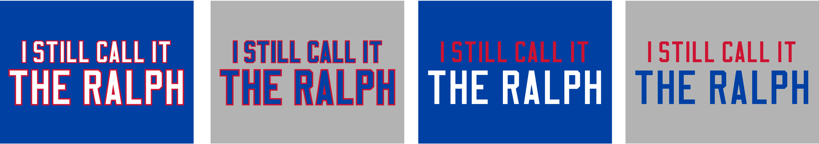
1. The Ralph. Got lots of requests for this one. (Also got requests for Rich Stadium, but we can’t do that one because that’s a corporate name — sorry.) We’re offering four different versions, although I’m assuming the first two will be the most popular (for all of these images, you can click to enlarge):
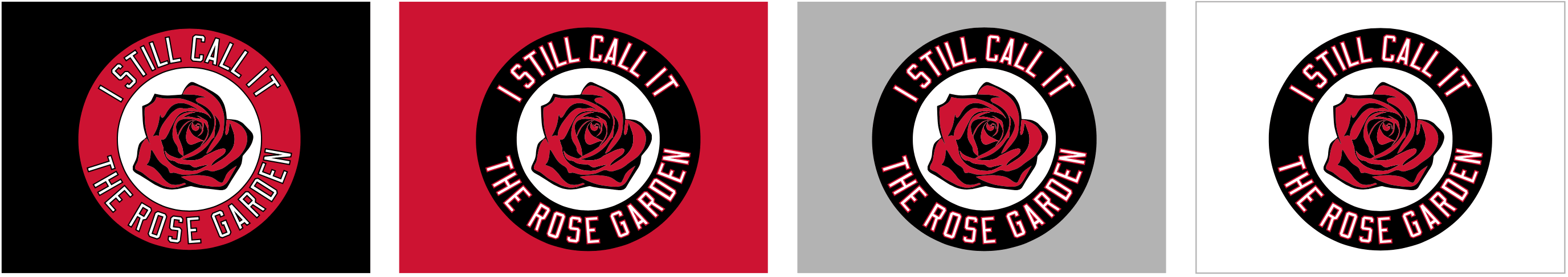
2. The Rose Garden. Another no-brainer. We decided that this one called for something more than just typography (although we may add a straightforward typographic version if people ask for it):
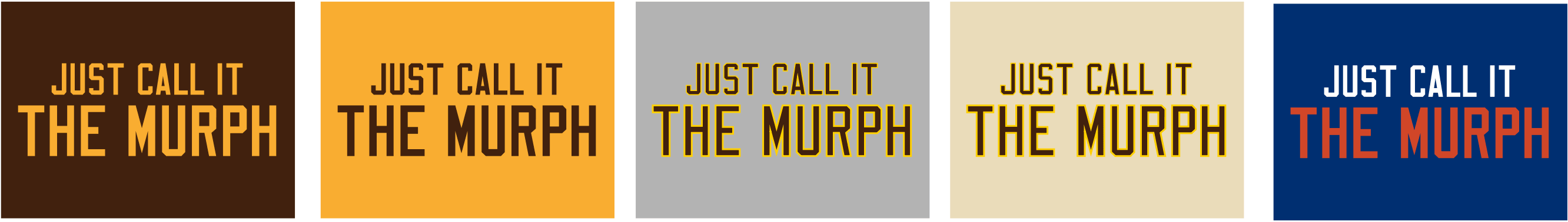
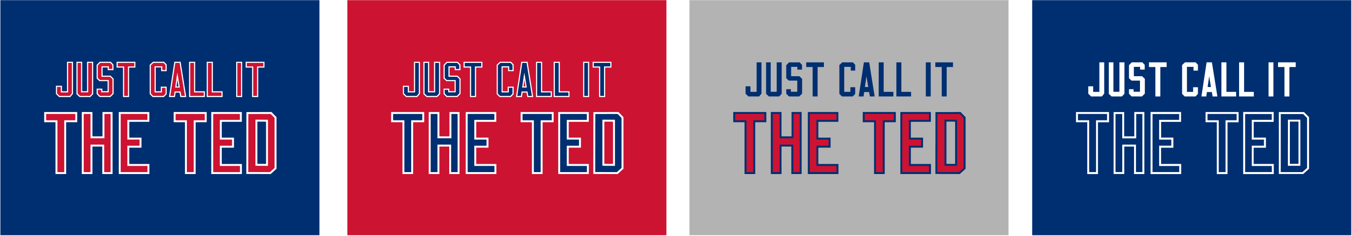
3. The Murph. This was an interesting one, because Qualcomm’s naming rights deal just expired last week, and there’s some question regarding what the stadium’s new name will be. So we’re introducing a new phrase: Instead of “I Still Call It” or “I’m Calling It,” this one will have “Just Call It”:
4. The Ted. I received quite a few requests from Braves fans who wanted a shirt for Turner Field. “I Still Call it” obviously doesn’t work here, and “I’m Calling It” didn’t feel right to me either, because the new ballpark is off in the suburbs and has no connection to the Ted. So we once again went with “Just Call It.” I’ll be interested to hear how that works for everyone.
All of these designs are now available in the Naming Wrongs shop, and are also cross-listed in the Uni Watch shop (where card-carrying Uni Watch members can get 15% off; if you don’t already have the discount code, get in touch and I’ll hook you up). My thanks to everyone who submitted suggestions and ideas. We’ll have more designs soon.
Seasonal suggestion: Independence Day is fast approaching, which means we’ll be seeing lots of stars and stripes uniforms throughout the uni-verse (including in MLB, where they plan to have players wear flag-based unis for four consecutive days).
With that in mind, I humbly suggest that you consider the Uni Watch stars/stripes T-shirt for your holiday needs. It has a handsome flag-themed script on the front, and the back design allows you to tell the world what you think of “patriotic” uniforms.
The shirt is available here. My thanks, as always, for your consideration.
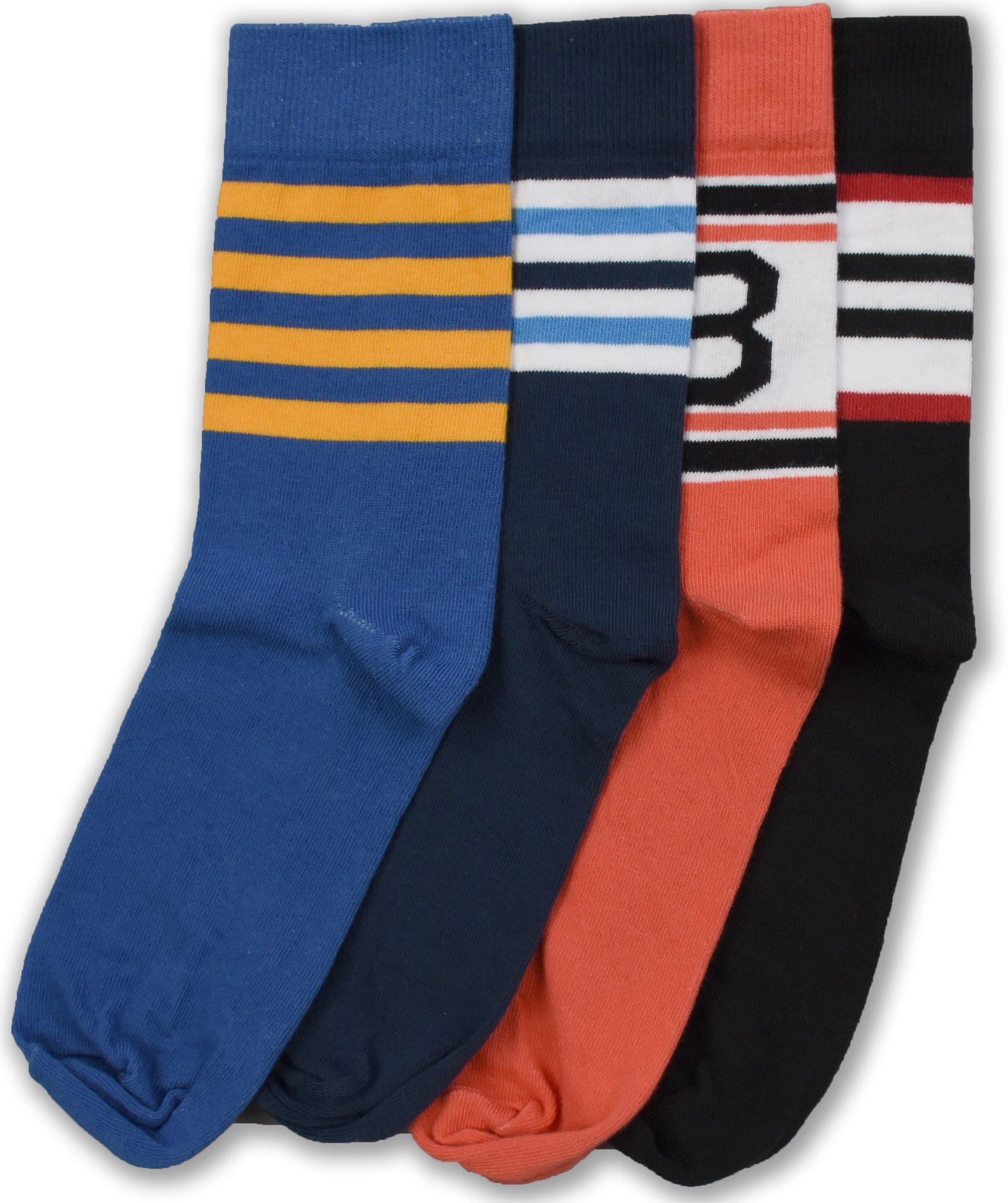
StripeRite reminder: In case you missed it yesterday, I’m extremely happy to announce that the latest batch of StripeRite socks (shown at right; click to enlarge) is now available from American Trench. I really like these designs, and I hope you will too. Supplies are limited, so move fast if you want to get in on these.
And remember, most of the designs from the first and second StripeRite batches are still available as well.
Sorry about all the sales pitches today. Just one of those things where several projects came to fruition at the same time. My thanks, yet again, for your consideration.
The Ticker
By Mike Chamernik

Baseball News: An opera about Negro League legend Josh Gibson, named The Summer King, recently ran at the Pittsburgh Opera. Though the story is a tragedy (Gibson suffered a brain tumor and died of a stroke at only 35), the production included lots of great old uniforms (from Ted Arnold). … The Mariners’ Kyle Seager wore light blue batting gloves on Tuesday night. They were probably left over from Father’s Day weekend — or, as @SpoonT12 points out, maybe they were UNC gloves, because Seager is a former Tar Heel. … Cory Fisher picked up some Michigan State stirrups from the university surplus store. … The Diamondbacks gave away team-themed car sun shades earlier this season, and they came in handy yesterday, as temps in Phoenix reached 115 º (from @ASU_Uniformity). … Royals C Salvador Perez hit a grand slam while using Tigers 1B Miguel Cabrera’s bat, which was left behind in KC when the Tigers were in town (from Jason Pratt). … Speaking of the Royals, why do some players wear their sunglasses backwards on their caps? In the Royals’ case, it’s because their minor leaguers are taught never to cover their cap logos.

NFL News: The Broncos used to share Mile High Stadium with the Triple-A Denver Bears baseball club. For the Broncos’ 1978 opener, they kept the dirt infield, but put artificial turf over the pitcher’s rubber. That comes from this video clip (from Bill Kellick). … Pope Francis tried on a helmet and was given a personalized Papa Francisco jersey yesterday when Jerry Jones, Ronnie Lott, and the Pro Football Hall of Fame delegation made a visit to the Vatican (from Alex and Mary Lynn Delfino). … An October 1975 edition of the Philadelphia Daily News contains a full page on NFL uniforms. The piece includes a story on how Vince Lombardi, through force of personality, changed the Redskins’ colors when he took over as coach in 1969 (from @SportsPaperInfo). … Based on metrics including attendance and amounts of social media buzz, a sports analytics professor ranked the popularity of NFL teams (from Douglas Ford). … Former Vikings coach Bud Grant required his teams to wear black shoes. That clip also includes a humorous bit with a Vikings player describing black Converse high-tops as “America’s shoe.”
College Football News: Illinois is getting rid of their center helmet stripe. Here’s last year’s helmet for comparison (from Craig Choate). … Arizona will have new uniforms next season (from Phil). … Ball State updated its helmet design (from Adam Maxwell, via Phil). … New argyle gloves for UNC (from James Gilbert). … Toledo announced a new apparel deal with Nike (from Ryan Hercik). … New orange uniforms for Sam Houston State (from Chris Mycoskie). … Remember when Tennessee wore “Smokey Grey” alternates in 2013? The Vols planned on wearing a new version for 2014, but outcry from fans pushed them to scrap the look. The never-worn 2014 unis were sent to a youth football team in Israel (from Mark Smith). … Check out the amazing jersey design worn by the officials in the 1970 Rose Bowl (from Jerry Wolper).

Hockey News: The Red Wings revealed a logo for their inaugural season at Little Ceasar’s Arena. No word yet on whether it’ll be worn as a jersey patch. Lots of fans on social media immediately pointed out that the swirl at the center of the design looks like the Hurricanes’ primary logo. … The Blackhawks’ Marian Hossa will indeed miss the 2017-18 season, and possibly beyond, due to a skin disorder exacerbated by his equipment. Hockey players have long suffered from mysterious rashes and skin outbreaks due to their pads and jerseys: The plague was known as the gunk back in the late 1970s and early 1980s. In 1988, the Oilers discovered that the formaldehyde used to prevent mildew and maintain the color of the equipment was to blame. … The Penguins will raise their Stanley Cup banner at their home opener on Oct. 4 against the Blues. … In the wake of the NHL uni unveilings, one observer picked winners and losers based on the teams’ redesigns and tweaks. … The NHL draft is tomorrow, and here are the the draft caps (from Nick Lineback). … The Sabres’ lace collar looks like a fish skeleton (from Ross Taylor). … The Columbus Burn, a proposed SPHL team, revealed their logo. Having a “Burn” logo in blue reminds me of those color text brain teasers. … An NHL jersey change you may have missed: The Blues’ numbers have changed from yellow to white (from Dave Singleton).

NBA News: The Pacers’ Lance Stephenson swung a deal with teammate Kevin Seraphin to obtain No. 1. Stephenson, who rejoined Indiana late last season, wore the digit during his first stint with the team. …The Lakers’ Kareem Abdul-Jabbar stopped by the Alamo before Game 4 of the 1983 Western Conference Finals against the Spurs in San Antonio. He even signed the guest book (from Jeremy Kendrick). … No photos, but the last two paragraphs of this article indicate that a New York Nets player wore a Miami Floridians practice jersey during a 1969 ABA game after Nets management misplaced his normal uniform (from Jerry Wolper). … Pro wrestler Kassius Ohno likes to wear NBA-inspired ring gear. … The Clippers have come up with a logo variation that’s even worse than their regular logo.

Soccer News: Here are the pre-match training top and the match tee for the U.S. Men’s team for this summer’s Gold Cup (from Conrad Burry). … New home kit for Arsenal (from an unnamed reader). … New home and away kits for Chelsea and Tottenham have leaked (from Charles George). … The NWSL will honor Tony DiCicco with a moment of silence and armbands at this weekend’s games. DiCicco, who died of cancer on Monday, was the USWNT coach in 1999, when they won the World Cup. … Manchester United’s new home kit has leaked (from Charles George). … New away kit for Inter (from Tim Kraus).

Grab Bag: Here are the liveries for this weekend’s IndyCar race, the Kohler Grand Prix Road America (from Tim Dunn). … A scathing inspector general’s report indicates that the Pentagon wasted $28 million on the wrong type of camo for uniforms for the Afghan army. Officials opted for a proprietary forest pattern, even though Afghanistan is mostly desert. You can read the full report here (from Trevor Williams and Hugh C. McBride). … This might be the most unlikely connection in the history of connections: Bob Saget and some of his fans think he looks like the Cholula hot sauce mascot. … Rather than “borrow” a pro team’s logo, Weiss High School in Austin, Texas, designed its own new logo. Here’s the final result (from Clint Loerwald). … A Tennessee sports fan has created a mash-up logo honoring the Titans, Grizzlies, and Predators. Scroll down through the responses to see similar designs for other cities.
I think they are keeping the Centennial patch through the end of the calendar year. It still looks incredibly stupid on the sleeves of almost every team, often overlapping striping in awkward ways. They should have made it supercede any team anniversary patches and go not he chest opposite the C/A.
I watched a good part of the NHL Awards/Vegas Expansion draft, a bit of an odd hybrid. The event was held at the T-Mobile centre in Vegas. A few selected players actually came on stage; the biggest applause was near the end when they introduced Marc-Andre Fleury. The introduced players wore the Vegas Golden Knight jersey. I will say, while as a rule, I’m not partial to grey, the jersey looks really quite good live, under the arena’s bright lights. I am thinking maybe it’s because in this era of “overkill” in terms of 3rd jerseys, special event jerseys, etc., uniform followers think they’ve seen everything, well…… this is an uniform that we haven’t seen anything quite like it before (re: color combination), it looks fresh and it doesn’t suck.
As to the success of the franchise…..well? Any person willing to pay $500M for a sun-belt franchise has to have a question mark on his head to begin with. Last night spectacle did nothing to dispel that, it looked like George McPhee (Vegas GM) was cringing/embarrassed whenever the owner Bill Foley spoke — not a good sign.
The Golden Knights players ay the draft has the Centennial patch on their jerseys when they appeared on stage.
The Centennial patch will be worn for the calendar year of 2017
link
In the late 1970s Bobby Clarke suffered from “the gunk” and would douse himself with DMSO (dimethyl sulfoxide) as a remedy. One side effect of DMSO is the pungent, garlic-like, odor it gives off from the skin or breath for a few days after use.
“An opera about Negro League legend Josh Gibson, named The Summer King, is running at the Pittsburgh Opera.”
The last performance was May 7.
link
Thanks. Will adjust text.
“for uniforms the Afghan army”
Missing a preposition, presumably “… for the Afghan army.”
Fixed.
The Military’s (ours) never ending follies with uniforming the men and women who serve should be a metaphor for things are done in our DoD, and this process is in desperate need of overhaul, or keelhauled depending on your branch of service.
Ever hear of a uni pattern called MultiCam? In 2012, after years of testing, Army uniform officials recommended that MultiCam should replace the existing pixilated design as the official camouflage pattern the service issues to all soldiers.
Made by Crye Precision LLC of Brooklyn, N.Y.,  (another uni historic moment for Brooklyn) MultiCam is the pattern that outperformed the service’s Universal Camouflage Pattern, or UCP, to become the Army’s pattern for soldiers deploying to Afghanistan. UCP was nonetheless adopted (I’m shocked, shocked I tells ya!) in 2004, but came under congressional scrutiny when soldiers complained about its poor performance in Afghanistan. The only way you could be camouflaged wearing UCP unis was to hide in a gravel pit.
I won’t even mention the Navy’s experiment with blue cammies at sea, it’s a Monty Python sketch in it’s boobery.
But there is Good News coming.
Congress has set a September 30, 2017 deadline for the department to be prepared to undergo an audit. The Army accounting problems raise doubts about whether it can meet the deadline — a black mark for Defense, as every other federal agency undergoes an audit annually.
The Defense Department’s Inspector General, in a June 2016 report, said the Army made $2.8 trillion (yeah, that’s a T as in TRILLION, were talking Beyonce money here!) in wrongful adjustments to accounting entries in one quarter alone in 2015, and $6.5 trillion for the year. Yet the Army lacked receipts and invoices to support those numbers or link.
Turns out James Madison may have been on to something in Federalist 41 when he warned about the fiscal and bureaucratic dangers of maintaining a large standing army! But a useful check against the nigh-ubiquitous civilian embrace of camouflage as a symbol of tribute to military service. Given the DoD’s sordid history with camo – especially the absurd, Kardashian-like stylistic competition between the services on the point – a camo ballcap or jersey would seem more a tribute to government waste, fraud, and abuse than to the troops themselves.
Well said Mr. Rogers.
One of the reasons the Army chose UCP over Multicam in the first place was because Multicam is proprietary to Crye, and the printing fees were considered to be prohibitive. UCP is currently being phased out in favor of Operational Camouflage Pattern (OCP), which is a pattern very closely related to Multicam, but is owned by the Army itself.
Or as the Army likes to call it… link
If you remember, back in 1990/91, our Army deployed to the desert in the first gulf war in Forest Camo. Uniforms, MOP suits, vehicles, etc.
Good news about the Golden Knights likely not wearing white gloves. Still, mostly gold gloves with that uniform combination will still look a bit odd.
Generally, the predominant colour of hockey gloves matches the colour of the pants. The Knights would be better suited to having mostly black gloves trimmed in gold and steel grey.
In addition, I was surprised to see they went with the grey helmet – but I absolutely love it!
Generally, the predominant colour of hockey gloves matches the colour of the pants.
I never made that connection. Great point!
Rich Stadium may have been a corporate name, but it was still the original name of the stadium, so I feel like “I Still Call It The Ralph” is not appropriate. If you are going to offer it, I would think that “I’m Calling It The Ralph” seems more appropriate since you are not using an original name.
In fact, in general, I think the “I’m Calling It” language is generally better than “Just Call It” because it reflects a personal choice, not a directive to those around you. “Just Call It” works for San Diego for these five minutes before they get another corporate advertisement, but once it is renamed “I’m Calling It” works better.
Rich Stadium may have been a corporate name, but it was still the original name of the stadium, so I feel like “I Still Call It The Ralph” is not appropriate.
Our stated goal has never been to honor the original name. The idea is to honor a previous non-corporate name. And lots of Bills fans have told me that they *do* still call it the Ralph, so that works just fine.
“In fact, in general, I think the “I’m Calling It” language is generally better than “Just Call It” because it reflects a personal choice, not a directive to those around you.”
You are correct
Yeah, I’ve thought about that. I confess that I’m a bit conflicted about it. We’ll see how people respond to “Just Call It.”
Careful. Nike’s lawyers might get their panties all bunched up over that one.
I expected the Red Wings’ Little Caesar’s patch to be shaped like a pizza slice.
The wrestler referenced in the grab bag is Kassius Ohno, not just Kassius as listed.
Thanks. Fixed.
He’ll always be Chris Hero to me.
The Braves’ old stadium was called Turner Field, not Ted Turner Field.
Duly noted. Text now adjusted.
FYI, on Tuesday Bob Kraft and the Pro Football Hall of Fame delegation were in Israel and they gave Prime Minister Netanyahu a helmet and football. link
Those are definitely not UNC gloves being worn by Kyle Seager because the gloves are UA and not Nike. UNC baseball wears Nike.
Just wondering Paul: Now that the original T-shirt club version of the stars and stripes shirt has come and gone, have you reconsidered a version without “Pandering” on the back? While I agree with the general sentiment, it’s the type of shirt that I wouldn’t want to explain to people over and over if I wore it for a July 4th celebration. If there was no name on back or even something like “Murica”, I’d get behind it.
Thanks in advance for hearing me out!
I agree with you.
The shirt’s current design is exactly the design I want it to have. If you’re worried about having to explain it to someone, then I guess it isn’t the right shirt for you — which is fine.
I could remove or change the “Pandering” NOB, but that would defeat the whole point of the shirt and change the message that I want it to have. Why would I want to do that?
We went through all of this two years ago, and none of the issues have changed. Look here: link
I can understand both sides of this. I understand what Paul is doing, and I understand why it might cause discomfort. Still, if you want straight up flag imagery, there are certainly plenty of things you can spend your hard earned money on. The only thing I’m disappointed in is the wording of the blurb: “tell the world what you think of ‘patriotic’ uniforms.” Not everyone is going to think that way.
The only thing I’m disappointed in is the wording of the blurb: “tell the world what you think of ‘patriotic’ uniforms.” Not everyone is going to think that way.
As opposed to all those other sales listings that are worded in ways that every single person DOES agree with? Come on, Jon — you’re smarter than that.
Maybe it’s unfair, but I hold Uni Watch to a higher standard than I would, say, MLB’s online shop. One of them is a pure money grab, the other is not. You make it very clear that you’re making a larger point, and if someone disagrees, then maybe it’s not for them. I can’t imagine a money grab outfit ever saying something like that. So, to compare it to every other sales pitch rings a little hollow to me. It just seems off putting in my opinion.
I don’t know that it comes down to simply wanting to purchase flag imagery. If I wanted an ugly shirt with a flag, I’d go to Walmart and spend $8 on a seasonal design with eagles and stuff.
Like others who read Uni Watch, I appreciate good design and I think it’s a solid looking shirt. I also like knowing that the money spent is going to a writer that I respect. I just would prefer a different NOB. And if that’s the case, maybe it isn’t the shirt for me. That’s cool. At the end of the day, it’s Paul’s shirt and message.
Thanks for the reply, Paul. As you mentioned, it’s been two years since the original shirt was created (and I remember the debate when it was released), so I wasn’t sure if you had changed your stance at all. While I’d love to purchase a slightly modified version of this shirt, I also respect that you’re standing by your convictions.
Thanks, Scotty. Appreciated.
That Philly Daily News piece on uniforms had such a condescending tone, didn’t it? It was basically saying that teams are wasting time bothering with uniforms and should just concentrate on winning. The inevitable link to fashion designers also makes it look insignificant and “girly,” at least by ’70s nomenclature. Even now, the anti-uni people make the same linkage when they get deeper into the woods of uni minutiae than they’d like.
One tidbit I thought was interesting was that the Giants were already planning their 1976 helmet logo in 1975. So the “disco NY” was always supposed to be a one-year thing?
It was basically saying that teams are wasting time bothering with uniforms and should just concentrate on winning.
I hate this sort of false dichotomy. For the most part, the folks in a team’s corporate offices involved with uniform design are not people who would otherwise be out on the field playing the game, nor traveling the country scouting young talent ahead of the draft. And given that uniforms have become part of a merchandising revenue stream for teams, one could make a solid case that quality uniform and logo design actually helps a team win by providing more resources with which to improve the quality of play on the field.
The one exception would be if senior decisionmakers devote undue attention to uniforms and other such issues. During the Orioles’ recent decade-plus of on-field suckitude, Peter Angelos spent a significant amount of his time each day and his attention on trivial aesthetic issues like the color of the warning-track dirt and the length of the infield grass. Camden Yards’ then-head groundskeeper told a DC SABR convention a decade ago that almost every day, Angelos would walk out onto the field in the morning and measure the grass with a ruler, and if it was longer than some arbitrary mark on his ruler, he’d order her to cut the grass. Granted, somebody needs to measure the grass every day and cut it at the appropriate time, but that’s the sort of thing you hire someone with a masters degree in agronomy to do for you as your head groundskeeper, and then you trust them to see to it. If the CEO of the organization is spending time every day overseeing details he should delegate to others, then that does take away from his ability to do the management tasks that would improve the team’s on-field performance.
OKAY. The Rose Garden Naming Wrongs tee is something i’d go for. nice work!
I don’t follow basketball. Like, at all. So, until today, I had no idea that there had been an arena named after me. How dare they give it a corporate name! I might have to get me one of those shirts. ;)
Jon, it had never even occurred to me that your surname must resonate in all sorts of ways. Is it weird when everyone talks about the Rose Bowl? (What happens when you go bowling?)
I guess Pete Rose dealt with the same thing, eh?
I always joke about the Rose Bowl, and the Tournament of Roses parade. I’ve been bowling exactly once in my adult life, and there was alcohol involved, so my memory is sketchy. Just be glad I don’t have a son. I’d name him Lazarus for sure. ;)
And I’m pretty sure Pete’s issues are very different from mine. ;)
The Diamondbacks sunshade giveaway was on the 22nd of April.
Hmmm, that wasn’t clear from the tweet. Will adjust text.
Proofreading:
“why do some players wearing their sunglasses backwards on their caps”
– wear
Are they “Indian casinos” or Native American casinos? ;)
Re: Artificial turf over pitcher’s rubber at Mile High —
That little swatch of turf over what was left of the mound is quite peculiar. First, how the heck did they keep that swatch from sliding around? I presume they tacked it down into the dirt with something, but I still wouldn’t think it would be very stable. Second, from the countless times I saw football games at the old stadium in San Diego while the infield dirt was still uncovered, it was clearly obvious (as it is in this picture from Mile High), that the mound was always, essentially, removed. That is, it was FLAT. I heard a couple different possible explanations for how this was done — (1) the mound was on a platform that was “sunk” (for lack of a better word) into the ground (so that there was no noticeable edging to it) and it could be moved away when needed and/or (2) they would level it out and rebuild it when needed.
My point is that the little turf swatch we see in that Mile High picture is not covering the rubber because the mound has been flattened, which would have also removed the rubber from its position on the now-removed mound.
Anyone have any thoughts on that?
I does seem pointless to have that swatch of artificial turf over what appears to be a flattened mound, even for safety purposes.
In fact, it seems like players wearing cleats for natural grass would risk injury while suddenly planting their foot on the small piece of artificial turf.
Paul,
Ordering for the Uni Watch stars & stripes t-shirts reads that they will arrive in 9-12 business days, which makes it really tight for arriving by July 4th. I would love to wear it for the holiday. Your thoughts on whether it will arrive in time?
I agree it will be tight. I wish I had thought to say, “Hey, buy this shirt!” a few days ago, or last week. Didn’t even occur to me until yesterday.
I have no special “pull” with Teespring, and no crystal ball. Sorry. You can do rush shipping, but of course that’s more expensive. If you don’t want to risk it, I understand. (But hey, even if the shirt doesn’t arrive in time, it’ll still be good for next year!)
My favorite thing about the article on uniform changes is the reference to Ma Bell. My father worked for AT&T for his entire career and I grew up with a lot of old phone company stuff in our house, including a working phone booth in our basement. I haven’t heard “Ma Bell” in ages.
Did it cost you a dime to use the phone booth?
That Philadelphia Daily News article misses the two best parts of the Lombardi uniform story: first, that Vince was color blind, and second, that the jersey salesman was his brother-in-law.
Today’s ESPN column is up:
link
I was pretty shaken up after the Rbk Edge shook up the league. Now only the Sens and the Caps have those weird patchy odd ball designs. The state of NHL uniform design is in good shape.
Well I see my alma mater Ball State is still using the “robo-bird” logo which may have been cool in the late 80’s but seems dated now. Black helmets? Really? Ugh!
I love the Rose Garden shirt. My first inclination was to request a standard text version, fearing that the message would get lost in the design, but after looking at it more (and after seeing the size of the graphic on the shirt) I think I will be fine with the one you’ve created. Nice work.
Thanks, Casey. We’ll likely add a type version as well, but I really like the current one.
Are those timers on the product pages hard and fast, or once they expire will the shirts still be available? I want to make sure I order on time.
Teespring has a rolling 3-day window. At the end of the three days, they print and ship the orders that have been received up to that point, and then a new window starts. All of these will be available indefinitely.
That’s what I thought. Thanks for clarifying.
Paul (or anyone else), can you explain the chromaflex issue a little more? What exactly are they made of that the pointy edges would actually cut the players? Are we talking like really pointy sharp edges on the corners of laminated card? This seems really strange to me. A perfect reason to go with traditional patches.
I was wondering the same thing. Is it the same stuff they use for patches on MLB caps? I can’t imagine that stuff cutting anyone, but I guess it’s better to be safe than sorry.
Chromaflex patches are little plastic chips. They’re flexible (hence the name), but they do have edges. The NHL logo has lots of places where the curves meet at a point (like the “crown” at the top), so those pointy edges could have been problematic. But they came up with a way to soften the edges.
I’ve been out of the naming wrongs loop, so if this is redundant, sorry- The Key Arena in Seattle, home to the former Seattle Sonics (the current OKC Plunder) is easier to spell and more place specific than the Coliseum, which it had been since the World’s Fair in ’62. But Key Bank’s naming deal lapsed in 2011, and the city doesn’t want to bear the cost of changing out to the old name and has had no success in finding a replacement. Expect to hear more about this once the baseball park gets a new name.
link
BTW, does any city have a more consistent theme for their temples of sport than Seattle? The Key, The Safe, and The Clink all within the city city limits. Only the football stadium is assured continuity into the next decade, so this too shall pass.
Something interesting to me with respect to the story about Lombardi changing the Redskins’ colors is that this means that the Redskins 1969 helmet shell may have only been used for one year, unless they saved to use with new decals in 1972. Although the decals on the 1968 and 1969 Redskins’ helmets appear to be the same, the color of the helmet shell appears to have been changed in 1969 to match the new “redder” jersey. Here is a picture of Sonny Jurgensen in the “browner” pre-1969 jersey and helmet:
link
And here’s a picture of Sonny Jurgensen from 1969:
link
The new design for the logo described in the article, was not implemented until 1970, the year Lombardi died, when the Redskins switch to a yellow helmet:
link
I believe the uniform colors, striping, etc. in 1970 were the same, or nearly the same as in 1969.
I don’t see the Cholula/Saget similarity.
Then again, I have trouble understanding how Bob Saget’s comedy landed him a role as Danny Tanner’s character.
Philips Arena
…I still call it…
Ted’s Messiah Complex
The Little Caesar’s Arena patch will NOT be worn on game uniforms. How do I know? Because it’s a corporate name, which would make it uniform advertising, which the NHL done not allow. Look at recent openings in any of the major sports; if it’s a corporate name, either the team had no patch, or they wore a patch that simply said “Inaugural Season” but didn’t say what was being inaugurated, as the Mets did when they opened Citi Field.
Also, the link for Inter in the soccer section seems to be wrong (I get an ad, but no story or photo).
Incorrect. The Devils’ Prudential Center patch featured the Prudential name and logo:
link
I stand corrected. I wonder if there are limits on it…I’d think that teams would abuse this as stealth ad patches. Sorry for the wrong information, but that IS the rule in MLB at least.
Shouldn’t the res version of “Just Call It The Ted” have the top line in white?
Dammit, *RED version