
By Phil Hecken with Shannon Shark
A couple weeks ago, news began spreading that the New York Islanders, whose lease with Barclays may terminate (either by the Islanders or by Barclays — both of whom have opt-outs) sooner than expected, the City of Hartford made a pitch to host the team’s games (at least on an interim basis), should the team find itself homeless in the future. Sadly, the Islanders haven’t so much resembled a professional hockey team over the past several decades, between sucking, having hustlers “own” the team, and a aging arena eventually deemed unfit for play. The team packed its bags and moved from the once proud (and home to the Four Time Consecutive Stanley Cup Winners) Nassau Coliseum a couple years ago, joining the Brooklyn Nets in Barclays. That hasn’t worked out all that well either: amazingly, when Barclays was designed and built, no one thought to make the place fit for hockey.
Anyway.
I tweeted something about the Islanders and Hartford, and my buddy, Mets Police head honcho Shannon Shark and I began to have a little back-and-forth about the Islanders, a possible move to Hartford, and … if they were to move, what kind of uni changes might the team make. Very quickly, the conversation turned to…

…the “Fisherman.”
For those of you who are millennials (kidding), that’s one of those really bad jerseys introduced in the 1990s (1995 to be exact) that was so awful, it was hated almost from the get-go. It’s actually gained “cult” status in some circles, and I love it in the “it’s-so-bad-it’s-good” kind of way. In fact, it’s actually the basis for my Uni Watch Membership Card:

The jersey itself is awful — the colors, the “waves,” the asymmetrical numbers and non-aligned nameplate. So hated was it from the introduction that fans almost immediately called for a “return” to the classic Islander jersey, with the even more classic orange and blue “island” logo, complete with NY (and the “Y” forming a hockey stick). The team at first balked, but eventually relented, swapping out the “Fisherman” logo for the classic NY logo midway through the second season:

They’d keep that for another year and a half, eventually returning to the more classic logo and colors.
As a HUGE Islander fan growing up (and not only did I grow up literally 10 minutes from the Coliseum, I went to dozens of games during their Stanley Cup years), I was one of those clamoring for the return of the classic logo and colors. But I realized, with time, that maybe the team was onto something — the awful jersey did produce two very good logos — the “fisherman” logo itself, and the secondary “lighthouse” logo (which depicts the Montauk Point light). The problem was, the team jettisoned their classic (associated with four Stanley Cup wins) logo and put the new logos on one of the worst sweaters ever to grace NHL ice. Predictably, almost everyone hated them.
Back to Shannon — we started discussing the fisherman at length, and could it be possibly “reused” — but in classic Islander colors — should the team move to Hartford? In the course of our discussions, Shannon actually mentioned he owns a “fisherman” jersey. I said, “Ok, we gotta put something together for Uni Watch” and one thing led to another. I’ll now turn this portion of the post over to Shannon, with this thoughts on the jersey:
The Potential of the Fisherman
By Shannon Shark
Phil, I’m here to defend the potential of the fisherman. Not the actual fisherman, but the potential of it.
Before we go further, I am a traditionalist. The New York Islanders should play on Long Island, and wear what they wore when they were born (we can argue about minor tweaks, but blue and orange with the crest that has Long island on it.)
That being said, the fisherman was not as bad as some other things we have seen in sports (the 49ers black, the Islanders black).
I bought this jersey in 2015 off eBay when the Islanders brought the fisherman back for a warmup jerseys.

I would have bought a new one if they had made them available for sale (they might have auctioned them, but I just wanted to go to NHL.com and hit click). I’m a fan of what I call uni-corns — the one-off uncommon jerseys. I have several in my closet (several New York Giants throwbacks that the SF’s did, a Rays fauxback, several Cubs throwbacks from their Wrigley 100 celebration season, and of course Mets everything) that we should cover some weekend. Anyway, since I couldn’t easily get this uni-corn, I solved my craving by going on eBay and grabbing this replica.
As a goof it is fun to wear. As a good looking piece of attire, it is not. However, the fisherman has potential. Where it went wrong was the color swap and the wavy lines. It looked like a jersey that was trying way too hard to be 90’s cool.
Let’s break down the individual pieces. Let’s look at just the fisherman without the distractions of the colors and the waves.

It’s kind of a cool idea. The fisherman looks tough (the actual Gorton’s fisherman that it was compared too isn’t as rugged). It’s nautical which works with Long Island. The stick in his hand looks right. You aren’t scoring on this guy.
There’s probably a way to keep the traditional Islanders word font, but the I and the S do give nice balance.

Now let’s look at the lighthouse:
It’s nice. Probably would have made a nice chest crest.
COLORS: What if we did the fisherman on the traditional Islanders colors? Well, that looks even worse.
What if we did the fisherman in the Hartford Whalers colors? That could be interesting, especially if the Islanders spend some temporary time there before someone figures out a new permanent home. Do they have lighthouses in Hartford? Maybe the lighthouse on a crest in Whalers colors.
THIRD JERSEY POTENTIAL: My first choice is no third jerseys. If we must have one, yeah let’s do the fisherman. Someone with better photoshop skills can help us out here and mock up what it might look like in either traditional Islanders colors or in Whalers colors if that happens.
Islanders, just go home to Nassau and dress properly. Otherwise we need someone to mock up the Quebec City Insulaires (they have lighthouses) or do the fisherman in KC Royals blue.
Thanks, Shannon. I agree — the fisherman and the lighthouse BOTH have potential. Now, my photoshop (or really “GIMP”) skills have disappeared since I switched to a Mac back in 2011 — and I never really picked them back when I returned to using a PC a few years later. But my MS Paint skills aren’t too shabby. Let’s see how the fisherman or the lighthouse would look on a traditional Islanders jersey:

OK — not too shabby. How about the lighthouse?

We appear to be cooking with gas here.
Now, neither of these is as classic as the original Islanders’ NY logo — but (especially if the team were to move to Hartford) either could probably used there, especially since a logo with the outline of Long Island probably won’t work for an inland city in another state. True, there aren’t any lighthouses in Hartford (nor is Connecticut the State an island), but barring a name change, this could certainly work.
It just goes to show you that a bad jersey can still contain a good (serviceable anyway) logo. And a decent logo on a good looking jersey works quite well.
I’m with Shannon on this point though: the Islanders should play on Long Island and wear what they were born in. But it’s kind of fun to speculate on the “what might have been” or “what could still be” as long as the team’s future home is in flux. Maybe the fisherman can’t be saved, but let’s hope the once proud franchise can have a good, permanent home on Long Island in the foreseeable future.
One last thought: this exercise was interesting an another way — and might be worth exploring more fully in the future — what OTHER logos (on any team in any sport) are no longer being used that might be resurrected on a “better” jersey in the future? Have there been any “good” logos that simply jettisoned merely because they were part of an overall overhaul that was lousy? There have got to be some out there, right?
Let’s hear your thoughts in the comments down below.
.
Pens & Flyers Stadium Series
Last night, at Heinz Field (home of the Pittsburgh Steelers), the Pittsburgh Penguins and Philadelphia Flyers hooked up on an outdoor game. We’d already seen both teams’ uniforms (special ones, of course, for this game) revealed, so that wasn’t a surprise — but I did watch most of the game and it was actually quite good looking.
Because a football (or baseball) field is obviously much larger than a hockey rink, teams will do different things in the area surrounding the rink to “fill in” the empty space. I loved how the Penguins created a sort of visual “Clemente Bridge” EDIT: Per the comments, it’s meant to honor the Fort Pitt and Fort Duquesne Bridges:
In the Battle of PA…
West side = best side.
Let's Go Pens! pic.twitter.com/QXK1hhQqBf
— Pittsburgh Penguins (@penguins) February 25, 2017
The great outdoors. pic.twitter.com/GkkMbas6jI
— Pittsburgh Penguins (@penguins) February 26, 2017
The Penguins wore gold sweaters, socks and helmets, and black pants. The numbers were done in “Steelers” number font with a similar, kind-of military NOB font.
Ready for the 3rd period. Game back on. LET'S GO PENS! pic.twitter.com/pEEX9jbfvl
— Pittsburgh Penguins (@penguins) February 26, 2017
They had the SS patch on the right shoulder and a “keystone” City of Champions patch (featuring four “Stargell” stars — for their four Stanley Cups) on the left shoulder:
The @Penguins win the Battle of Pennsylvania, 4-2! #StadiumSeries pic.twitter.com/bLZSGj8Zo9
— NHL on NBC (@NHLonNBCSports) February 26, 2017
The Flyers went with all black uniforms, with orange nameplates and black numbers outlined in white. I thought they looked good, but I will admit it was difficult to make out the numbers on long shots. They might have done better to make the numbers solid white (or even orange outlined in white):
#StadiumSeries coming up next…
📺 @nbc
📻 @933wmmr
🿠https://t.co/6YFTCsoMZa pic.twitter.com/DYn1glqYIt— Philadelphia Flyers (@NHLFlyers) February 26, 2017
It was easier to read the Flyers’ giant TV numbers (since they were mostly on the orange arm stripe). Both teams, of course (and is the tradition of the stadium games) had huge TV’s:
#Flyers fall to the Penguins, 4-2. #PHIvsPIT
Next game: Tuesday vs. COL, 7pm. pic.twitter.com/APY7TFMibP
— Philadelphia Flyers (@NHLFlyers) February 26, 2017
Tweeter The Goal Net noticed the Flyers’ helmet manufacturer’s logos were orange:
@PhilHecken @UniWatch – the manufacturer's logos on #Flyers helmets tonight are orange. I don't think ever seen colored ones before #🥅 pic.twitter.com/VeRiQxcCXu
— TheGoalNet (@TheGoalNet45) February 26, 2017
Good shot here from Funhouse of the (standard) varsity jacket worn by the Penguins coaches:
@PhilHecken Good-lookin' game at Heinz Field. And you can go ahead and buy me that coat. pic.twitter.com/XLxv20F7Jr
— Funhouse (@SportsFunhouse) February 26, 2017
All in all, a fun game (maybe not so much for Flyers’ fans) to watch, with good contrast, and decent lighting and conditions. I always enjoy these outdoor games.
Hey man, nice shot! pic.twitter.com/CizpSSXxWk
— Pittsburgh Penguins (@penguins) February 26, 2017
.

Shout Out To Gotham
Uni Watch reader and friend, Mark Healey, started a project back in 2005, with the goal of bringing “true independent coverage” to New York baseball: Gotham Baseball.
Over the years, GB has been and is many things; a print magazine, a popular website and message board, a podcast, and a multi-platform product with a digital magazine and podcast component. But really, it’s a celebration of New York Baseball. The “past, present and future of the New York game”, as their tagline goes.
Mark explains, “We had our fans from the get-go, as Amazon.com tabbed us as one of the Top 10 New Magazines of 2005 (and the only sports magazine on the list), We published as a print-omly product from 2005-2008, and to out great pride and joy, the entire run was selected and is now part of the permanent archive at the National Baseball Hall of Fame and Museum’s A. Bartlett Giamatti Research Center in Cooperstown, NY. Over the years, projects have come and gone, but Gotham Baseball is still here.”
Mark’s current publishers at The Wave newspaper have agreed to give Gotham Baseball a home in print; a weekly column in The Wave newspaper, and he’s in the process of re-designing GothamBaseball.com and bringing back the Gotham Baseball LIVE podcast.
If you don’t already (and I’m guessing not a lot of you do), why don’t you check it out and give Gotham Baseball a few more followers: on Facebook, on Twitter and on Instagram.
OK? OK!
.
T-shirt reminder: Paul here. In case you missed it this past week, our latest T-shirt, designed by the great Todd Radom, is now available. Check it out (click to enlarge):
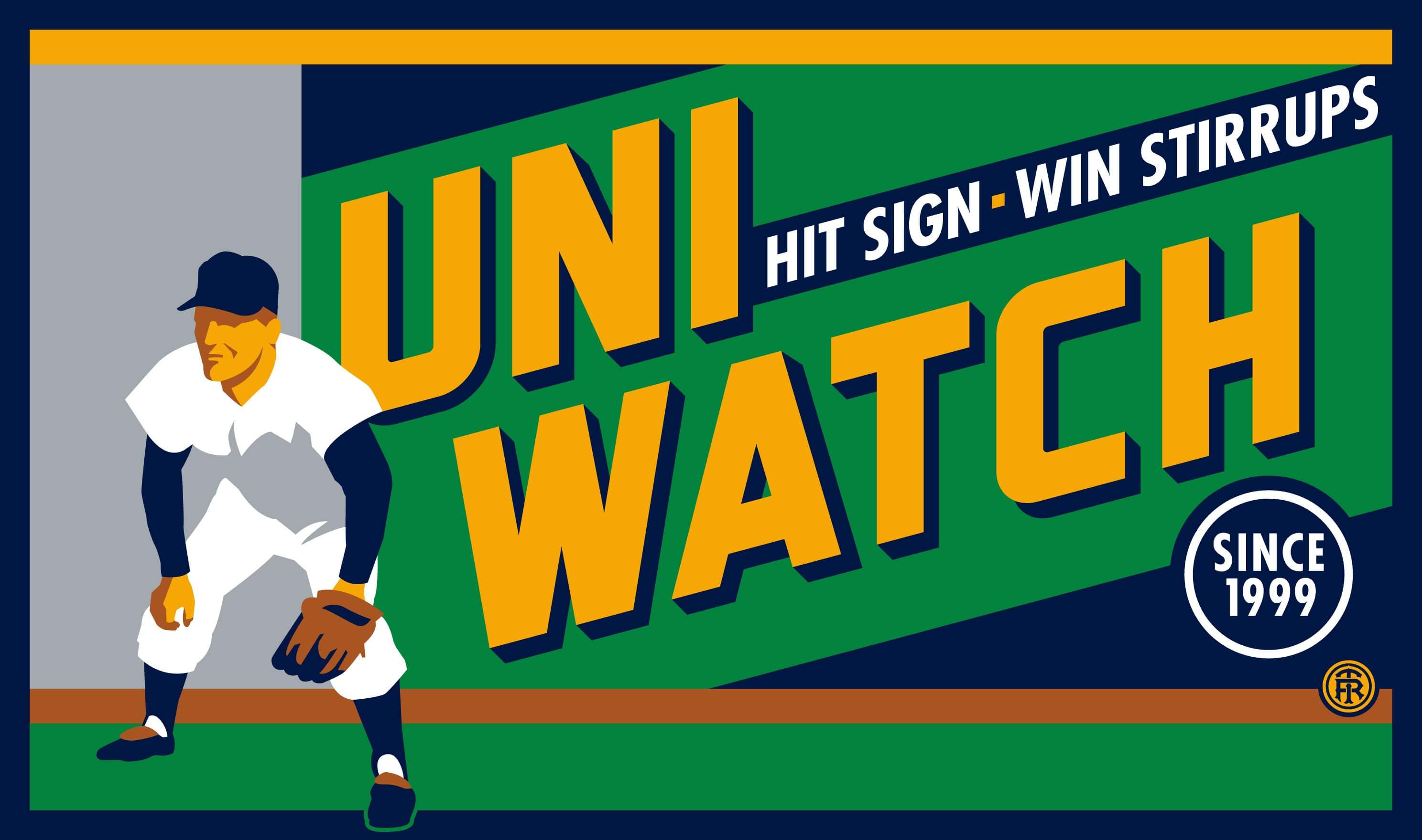
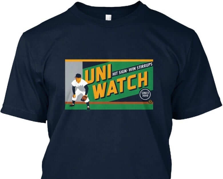
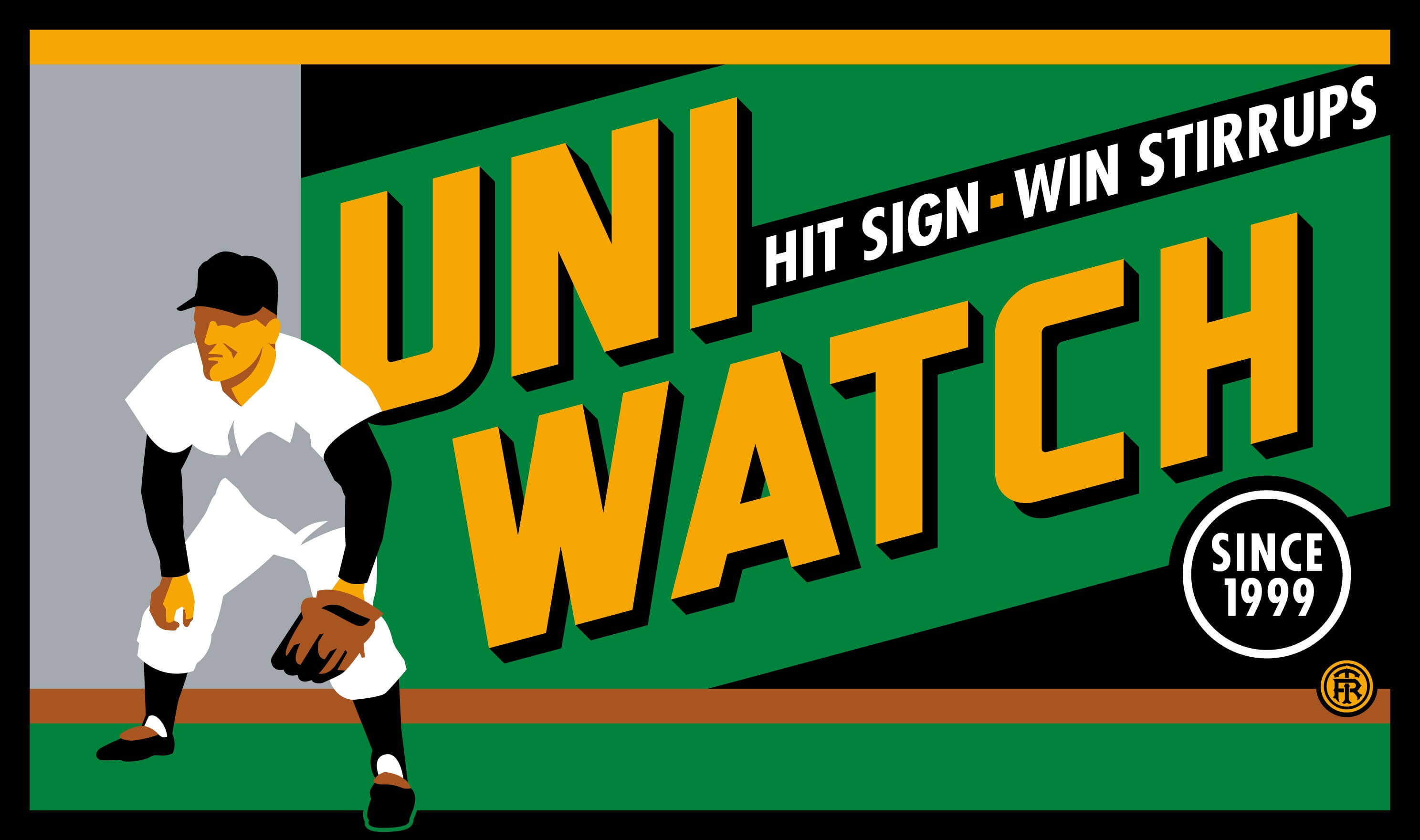
The design takes inspiration from the old Abe Stark sign at Ebbets Field, which read, “Hit Sign, Win Suit.” Please note that we’re using the shirt fabric color to fill in the dark portions of the design — the outfielder’s cap, sleeves, stirrups, and shoes, and the dark parts of the sign behind him. We think it looks best on Teespring’s dark navy shirt, which is the version shown above. But you can also order the shirt in black (yes, go ahead and make all your BFBS jokes), in which case the design will look like this:
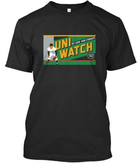
There’s also an American Apparel short-sleeved version and a long-sleeved version, both of which come in a slightly lighter shade of navy. You’ll be able to see all of this on the ordering page. Just make sure you choose the shirt and color you like best.
The shirt is available here through next Friday, March 3. My thanks, as always, for your consideration.
.

In Case You Missed It…
Earlier this week (Thursday, in fact), Paul released his latest ESPN column, “What have we learned so far from the NBA uniform ads?,” which (as the name implies), looks at five things we’ve learned so far from the NBA’s uniform ad program.
If you haven’t had a chance to check it out, here ya go. Definitely worth the read if you haven’t already.
.
Uni Watch News Ticker
By Phil

Baseball News: The Alma College “Scots” have some interesting uniforms: their uni numbers and letters have a plaid pattern (via Paul, from Alma Scots Baseball). … Ron Santo’s birthday was yesterday, and Bruce Menard posted one of the best photos I’ve ever seen of him from a Spring Training game. Love the palm trees and windbreaker under jersey. … The Tampa Bay Rays broke out their new ST caps yesterday (from Drew Gentry). … Dear God I hope this isn’t a new trend: UMich baseball pants have stripes that only partially go down the leg (from TJ Hudge). Didn’t we learn anything about truncated stripes from the D-Bax, who already jettisoned that look? … For the first time yesterday, Eastern Michigan broke out the pinstripes (from EMU Baseball). … Think this year’s MLB “St. Paddy’s Day” caps are going to be bland and boring? If these are correct for the National League and the American League (from Ed Kendrick), then the answer is “yes.” What ever happened to creative, team-specific SPD caps? It’s not like they’ll look any worse with regular ST jerseys. Let’s hope these are just “for sale” and not necessarily what teams will wear on March 17. … Here’s a great shot of the Los Angeles Angels (of Anaheim) of Los Angeles first ever spring training (from Bruce Menard). … Looks like the home plate umpire was wearing a Postseason patch in yesterday’s Mets/Nats spring training game (good spot by [insert name]. … Will the Baltimore Orioles have an all black helmet option this year (notice, those are both double flappers however). Still, good spot by Cory Forsyth. … The New Era ad in the Mets dugout shows the “defunct” spring training cap (from Will Goldman). … Not sure how official this hoodie for Long Beach State Baseball is, but I like it (from Finding Nostalgia). … “Oof that @NewEraCap logo on @MLB caps has to go,” says Eric Trager, who asks, almost rhetorically, “Why does a company with a product monopoly need that placement?” … Probably (like the Yankees) just a ‘first ST game thing,” but the Cubs wore their white pins and regular season (no “AZ patch”) caps yesterday (from Jake Smith). … Here’s a pretty good look at the “detail” on the numbers of the Spring Training jerseys (from Missouri Locker Room). … Here’s a really nice vintage Dodgers “8 Pennants” pin (from Dave).

![]()
NFL/College Football News: CROSSOVER ALERT (also posted in hockey): Steelers equipment Manager Pat Noone and Penguins equipment manager Dana Heinze created a special Steelers/Pens hybrid helmet for the Stadium Series (from Mike Slavonic). … How would a USC baseball logo look on a USC helmet? No, not that USC — the Gamecocks. … “regarding your recent post about a team from Wales with an Auburn logo, many British teams reuse American team logos,” says Andy Reed. “There is a Leicester based team (home of socccer champions) which is inspired by the Texas Longhorns.” … The Detroit Lions won’t unveil their new uniform set for a couple months, but that doesn’t mean there aren’t some new concepts out there. Most of these suck, but the Lions would do well to do something similar to this the great Brandon Moore has come up with. … Dan Pfeifer tweeted, “Even pylons are doing everything possible to avoid concussions nowadays,” and his linked story showed a helmet atop a pylon. But the linked story, “Arizona signee My-King Johnson will be the first active openly gay scholarship player in FBS history,” is interesting too: not because Johnson is openly gay, but it’s news because he’s the first openly gay player in FBS history. … Holy crap — check out Richard Sherman’s jersey swap collection (from Keyvon). … “At the Pittsburgh airport” (there is a Franco Harris mannequin commemorating the “Immaculate Reception”), says Wayne Jones. “It kills me that the TV numbers are the wrong font on Franco’s Steelers jersey.” Here’s a still of that jersey in action. … “Came across an interesting photo of Raiders defensive lineman Charles Philyaw from the ’70s showing him with a headband that appears to attach to his sunglasses,” says Bill Kellick. … Ohio State will certainly wear alternate uniforms this fall, but what will they look like? A few options (from Andrew Lind).

Hockey News: CROSSOVER ALERT (also posted in football): Steelers equipment Manager Pat Noone and Penguins equipment manager Dana Heinze created a special Steelers/Pens hybrid helmet for the Stadium Series (from Mike Slavonic). … Not quite a crossover alert, but Kris Letang’s new candy bar has the Pittsburgh Pirates 1990s road wordmark on a Pittsburgh Penguins sweater (from Derek Reynolds). … Yesterday, the Johnstown Tomahawks wore Johnstown “Chiefs” (from Slap Shot) sweaters (via Alan Saunders). This must be a thing now, as the Milwaukee Admirals did the same thing about a week ago (from Keïth”). … This is cool: Look at how the Buffalo Sabres crest changed slightly over the years (from TheEichelTower). … Was Brooks Laich wearing #23 sweater but #22 on helmet? (from Tyler Stern).

NBA News: Anthony Morrow won’t wear ex-Bull Derrick Rose’s No. 1 after backlash (from Kelby Phillips). According to this article, “Anthony Morrow says he wants to change his jersey number after receiving angry tweets from fans. … This is the second time this season a new Bulls player has dealt with anger from fans, via social media, for trying to wear Rose’s old number.” … Did the Wizards inadvertently reveal a uni advertiser? Conrad Burry found this picture of the Wiz’ mascot featuring an ad for “Clean Well,” and notes it could be an ad patch, but also cautions the company is not local. … Here’s the Saturday roundup from Zach Loesl: Color-on-color between Cleveland and Chicago; Color-on-color between Atlanta and Orlando; Color-on-color between Charlotte and Sacramento; Color-on-gray between Minnesota and Houston; and, Brooklyn wearing white on the road.

College Hoops News: Yesterday, the University of North Carolina Tar Heels wore white on the road at Pitt (from Ben Trachtman). According to a retweet from James Gilbert, Pitt requested to wear retro blue uniforms on Sr. Day.” … Jimmer Vilk thought it was a great matchup, other than his “I LOVE BIG NUMBERS” hangup. … Yesterday’s ticker included this shot of possible new UCLA and Cal unis (unconfirmed at this time — they may just be placeholders). Timothy Phillips writes, “Here are some screen shots out of the upcoming season UA catalogue. Both Cal and UCLA are only featured once in the same jersey that ran in Saturday’s ticker but it appears they will become an UA school in the future. The UCLA jersey is known as the Retro, not sure if they will stick with a classic look or be forced to don some of the atrocious unis like they had under adidas.” … ISU and Baylor went color vs. color yesterday (from Sedge). … The Rhode Island Rams had a “unique” look yesterday — almost looks like part of their Rams logo is on the waistband (from Clint Richardson). … Yesterday, Boston College had the numbers of their three seniors on the court: #2, Connar Tava; #5, Garland Owens; and #15, Mo Jeffers (from Andrew Cosentino). … Kansas had some 1950’s “inspired” throwbacks last night (from Bill Stevens). Here’s some pics. … Nevada and UNLV went color vs. color last night (from Bill Nutt). … Tweeter Brandon saw this photo and asks, “Possible new Nebraska red uni to the right of the stage. A companion to their white script jersey?”

Grab Bag: There was a good story on the history of the sports bra on Only A Game on NPR yesterday, points out Joe Makowiec, entitled “From The ‘Jockbra’ To Brandi Chastain: The History Of The Sports Bra.” … “If you are interested in stories about banners for non-athletes. I’m spending my Saturday afternoon at a concert,” says Mike Styczen. … “The sports/talk radio station where I work at in Eau Claire, WI, just got a new logo,” says Lukas Hoffland.
.
And that’s it for today. Thanks to Shannon Shark for all his contributions to the “Fisherman” article — give him a Follow on Twitter; and don’t forget to give Gotham a follow on your preferred form of social media. I’ll be back next weekend, but until then…
Follow me on Twitter @PhilHecken.
Peace.
“At first I thought Vancouver’s jerseys had polka dots on them. When I zoomed in I said to myself, “Ah, polka *triangles*”¦”
If they’re supposed to signify raindrops, why not just use raindrops?”
— Jimmer Vilk
.
Or they could just be the Whalers.
That’d be hilarious. At least the Isles have glory days they can look back on.
It’s fun to entertain the idea for Uniwatch sake, but it’s a move that probably would never happen. Leave the NYC area for the Insurance Capital with a commissioner who won’t move Arizona? No. One could argue about Atlanta moving to Winnipeg, but come on Atlanta was a disaster that made the Yotes look like the Leafs in popularity. The worst case scenario, have them share MSG or the Rock with either NYR or the Devils until a new arena is built around Queens/western Nassau with league and taxpayer money. Bettman wouldn’t have a team leave NY for a part of New England that already saw a team leave. That kind of move could turn his tenure from being popular with the owners into the seeds of a “suit rebellion” against him.
The fact that Hartford ever ended up with a major league team was a fluke (no pun intended) and won’t happen again.
True that, the Whalers were a fluke. If they were still in Boston at the time of the merger, they would have had to move out of NE most likely before joining the NHL. But let’s not forget the Islanders are a WHA fluke themselves. I think a TEMPORARY move to Hartford would be a win-win for everyone. We can see how the fans in Hartford draw (hello Hurricanes) & the Isles get a place to lay their helmets for a few years. Look at it this way…if they went to Quebec instead, they probably wouldn’t ever be back.
It’s worth mentioning Hartford has more money than any metro area in the US without a major sports franchise.
Nah being from ct, if it was any kind of permanent move it would be the Whalers. The islanders have really no following in ct other than a few who root for the soundTigers.
Hell, I’m a Sound Tigers fan in Bridgeport, and even I don’t follow the Isles.
I really like both the Fisherman and Lighthouse logo and the way they look on the mock ups.
I’m don’t watch a lot of hockey because it’s not readily available in the U.K. And so my opinions are not as strong but I feel that as the chest logo is so dominant that other aspects of the jersey should be more subtle. For me that’s where the original jersey missed and why the Leafs jersey will always appeal to me.
I’ve always hated logos where the team name wordmark is in the logo. If your logo doesn’t explain your team, either the logo stinks or the name does.
Oregon St. unis look so much better since they ditched the word mark, so does Boise St. when they do so.
The fisherman is a terrific logo, but it’s a terrible front-of-jersey crest. The fisherman himself, no text, would be fine, as would the lighthouse alternate. If the fisherman-and-text logo must go on a jersey, stick it on the shoulder.
As much as I love the Whalers logos and uniforms, Islanders is just such a great name that I hope that whatever happens to the team, they wind up somewhere the name still works. Providence, for example, or anywhere on Long Island. (Sadly, Key West, Honolulu, and Avalon not realistic homes for an NHL team.)
Phil,
Thanks for the nice write-up about the Pens/Flyers game. I think it did look good, and despite a few tweaks I’d make, I really liked the Pens “Pittsburgh Gold” unis.
One small correction for you: The bridge design on the field is meant to honor the Fort Pitt and Fort Duquesne Bridges, not the Clemente Bridge. The Fort Pitt is the iconic bridge you travel across when coming into the city from the airport: link and the Ft. Duquesne is the one that takes you from the “Golden Triangle” over to the stadium. link
The Clemente Bridge is one of “Three Sisters” bridges on the Allegheny, renamed after famous figures in Pittsburgh history: Roberto Clemente, Andy Warhol (the bridge takes you right to his museum), and environmentalist Rachel Carson. link
Thanks, Phil!
Thanks John. Text now edited to reflect this! Appreciate the info!!!
No, if you zoom in on Laich’s helmet, you can clearly see that it’s a 23.
1. Your link has a pic of the Pens’ coaching jackets, not the Flyers.
2. Alma College letters/numbers have a PLAID pattern, not plain.
Ugh. Yes, plaid. Now fixed. Flyers jacket link removed.
I’ve said it before, and I’ll say it again. The fisherman should be known as “Angry Stan Fischler”.
LOL, I came here to say that to.
Also, people love to rag on Nassau Coliseum, but it was so much better a place to watch hockey than pretty much any new arena. I can only imagine how bad Barclay’s was, having been there in the upper level for a concert and feeling like I needed a telescope to see the show.
*too
Barclay’s sight lines in the lower bowl are horrible as well. The rake is so shallow that if the person in front of you move forward an inch, you can’t see anything in front of you.
Jimmer Vilk thought it was a great matchup, other than his “I LOVE BIG NUMBERS” hangup.
I love normal sized numbers. Unfortunately over the years uniform suppliers (especially the minimalist Swooshkateers) have made them progressively smaller to the point that normal looks big.
OK, I also love big numbers. Every NHL team should adopt those Stadium Series TV numbers
both goalies in last night’s game had black pads. I always disliked that. I also thought it was against some rule since it affects players’ visibility of the puck on rebounds
Nope, no rule at all. White pads (mostly with, but sometimes without, splashes of team color) are popular because some goalies think they blend in with the ice and boards so shooters don’t get the contrast and see where NOT to shoot. Black pads have the advantage of matching the puck, so maybe you’ll get a quick whistle and a bail out from a scrum at the crease with a loose puck. So on that logic, other colors like Fleury’s old yellow gold or Carey Price’s ancient red Vaughns are simply not popular because they offer none of the above advantages.
“….he’s in the process of re-designing GothamBaseball.com and BRINING back the Gotham Baseball LIVE podcast.”
Should be BRINGING
Unless he plans on saturating the yankees and mets in salt water….which would be AOK with this non-gothamite!
Cheers and keep up the great sunday coverage, Phil!
Isn’t Nassau Coliseum just completing a renovation? Seems to me that the Coliseum then would make the best temporary home for the Islanders compared to Hartford. You guys from the area likely have a better idea about this than me.
Hopefully, they can get the arena at Belmont Park in Elmont done. As a longtime hockey fan, would not want to see the death of the Islanders because an arena deal could not get completed.
Believe they took out a number of seats which left capacity below what the NHL wants for a team.
The renovated Coliseum will only seat 12,000, which is not big enough under NHL rules.
A) It would be temporary.
B) They are not drawing even 12,000 fans a game right now.
I thought that I read somewhere that they could temporarily expand it to 15,000 seats, which would be about the same of Winnipeg.
Had to google it, here’s an article that says 13,000 with the potential to expand to 15,000 with temporary seating.
link
That is a great picture of Ron Santo. I love how the outfield fence was literally a wooden fence.
Interesting question, Phil. Let’s rescue a baby that was thrown out with the bath water.
My vote comes from the crazy teal and purple 90’s. Remember these Detroit Pistons?
link
I like the word mark. Check out the exhaust pipes! The horse for horsepower is clever too but borderline superfluous. So cut the horse, make the word mark compatible with a red white and blue jersey, and I think we’d have something good going!
As for another observation that the Flyers’ helmet manufacturer logos are orange on a black helmet, let me offer the fact that when CCM had its traditional blocks logo, it stayed red white and blue for teams in those colors, but went mono white so as not to clash with other colors.
link
That’s the Fort Duquesne Bridge (or, less likely, its larger sister the Fort Pitt Bridge), not the Clemente Bridge. It’s the one next to Heinz Field.
40th anniversary of Slapshot is why there’s so many jerseys.
The Capitals old Capitol building logo could definitely be repurposed in red, white, and blue. As a lifelong Caps fan it was a shock when they changed in 95, but in a nutshell the black, blue, and bronze set was pretty decent. I’m still praying for the Islanders/Oilers/Flyers-type transition back to the original uniforms instead of just throwbacks. I think the Sabres early 2000’s logo could work in blue and yellow, along with a number of Canucks logos, and the Ducks were smart enough to bring back the Mighty Duck even if it’s not in purple and teal.
Good call, except I’m personally all about the eagle as was on the whites and blues. The Capitol logo never did it for me as the primary logo.
“COLORS: What if we did the fisherman on the traditional Islanders colors? Well, that looks even worse”
This link redirects to the Gorman fishsticks box (the previous link) instead of the image you were trying to link
Uniform changes are inevitably linked with performance, so it’s not surprising the fisherman era has been criticized. I had no problem with the logo or design, but what the Isles need to do is put both logos on the next uniform(assuming they don’t move to another state). The traditional logo would be the primary, with the fisherman the secondary.
For fun, a friend an I made custom jerseys back during the last islanders template. I tweaked the lighthouse logo and the fisherman wordmark and put it on that year’s template. Looks like this.
link
He has a blue one
That doesn’t suck. And I’m not try to damn with faint praise. You’d think highly paid design consultants could have done at least that well.
Cool Gamecocks baseball logo/football helmet mashup, but for the sake of simplicity, shrink it down or move it back so it’s not under the facemask hardware
I always liked the Browns “CB” logo. Obviously doesn’t belong in the helmet, but it’s a shame the logo itself was cast aside.
“…no one thought to make the place fit for hockey.”
Correction on this: the ironic part in all of this Barclays Center madness is that the original plans actually called for the ability to fit an NHL sized rink.
link
“With the recent release of renderings of the Barclays Center and this week’s discussion of the “Brooklyn Islanders”, we thought we’d get nostalgic and take a look at what the interior of the arena would have looked like if the Nets had been able to stick with the original Frank Gehry design. The arena would have been 850,000 square feet in size rather than 675,000, the final number.
“It’s nowhere near as tight a bowl obviously, but there would have been no problem fitting an NHL team in the Gehry design. The problem was that the arena had become so expensive that investors thought it best to downsize so they could have an easier time getting the financing.
“Let’s not forget how tight things were back in late 2009. There was a December 31 deadline to get financing with federal guarantees, which were absolutely critical to the arena completion. Dan Goldstein boasted there was no way Ratner could reach that deadline and hearings were delayed. The arena’s first post-Gehry design, unveiled in June, was being hammered by architecture critics. Prokhorov announced he was buying the team and part of the arena on September 23…but only as long as that deadline was met. The State Court of Appeals hearing on eminent domain took place October 14 and the decision came down on November 24. Bonds were authorized the same day as the decision. The bonds barely got investment grade ratings a week later on December 1, then were finally sold on December 15, leading to Prokhorov and Bruce Ratner finalizing their deal the next day. The master closing on the remaining Atlantic Yards properties took place December 23, only eight days before the deadline. If any of those things hadn’t happened or had been delayed, who knows where the Nets would be. And throughout this period, the Nets were setting a record for consecutive losses at the beginning of the season.
“Losing an opportunity to host the Islanders is not such a high price to pay…if indeed that is the case.”
I always thought the Fisherman could work as an alternate, given it’s almost cult status and now an historical footnote that’s unmistakably Islanders lore!
Another thing, if the Isles went to Hartford could they still be the New York Islanders given its proximity to Long Island, or would they try something like New England Islanders which would get the goat of every NY loving sports fan, or just rebrand and the Hartford Islanders or Whalers?
I feel like the fisherman logo looks like it could very easily be a product of the much maligned Brandiose. It’s just an angry guy with heavy outlines. The lighthouse logo isn’t bad, and could definitely be reworked to look pretty good as an alternate logo.
“Not sure how official this hoodie for Long Beach State Baseball is…”
I’d say pretty official. From the Long Beach State Official Store website:
link
link
I don’t know. A lot of negative connotations with the fisherman logo, with all those kids he killed in that Jennifer Love-Hewitt movie.
JUST get rid of the waves on the sweater its self and it’d be great. Your example in the article is perfect. Especially if it replaces any BLACK unis in the NYI rotation with are terrible for the most part.
I saw a banner at the Barclays Center honoring Jay-Z for the eight concerts that sold out in the arena’s opening engagement.
The link to the Garth Brooks banner raising has an embedded video that also shows his wife, Trisha Yearwood, receiving a large bouquet of flowers. If Yearwood was being honored, would they have given flowers to her husband??
She’s opening for him so I guess technically she can claim having sold out 9 concerts in a row as well. Maybe the bouquet was her 2nd place award?
As I’be pontificated often in Uni Warch comments, I’m an Islanders fan with strange tastes (I like the 2011 alternate jerseys better than any other third they’ve ever had for example) sonit should probably come as no surprise that I have a soft-spot for the fisherman jerseys. Now, they have NOTHING on the Isles real colors/crest, but personally I would love to see the fisherman or lighthouse brought back as the third jersey in 2018-19, though personally I would prefer the waves and teal color scheme. As far as the arena thing, I must admit my bias. On a personal level, I have loved the Isles in Brooklyn as I’ve been to more games in the last two seasons than I’d been to in the rest of my life combined. (I fell in love with the team during my time at Stony Brook from 2006-2011, but post-graduation and not owning a car I was barely able to get out to the coliseum) That said, the team belongs on LI and I hope something can be worked out in that regard.
The Brewers have brought it back a bit, but I always liked the Barrelman logo:
link
Not as good as the MB glove – arguably one of the best logos around. But given the team’s nickname, the singing of “Roll Out The Barrel” at games, etc. it’s great.
One Improvement on the old islander logos on the new uniform would be to render the logos in current Islanders colors get rid of the teal, dark navy blue Etc I think that would look even better.
Editing note: “hustler’s” –> “hustlers”
Saved? Saved?!? The fisherman logo may have had potential _if_ the Islanders were an expansion team (as opposed to one that won four straight Stanley Cups in the early 1980s). But that potential died as soon as Rangers fans started chanting, “WE WANT FISH STICKS! WE WANT FISH STICKS!”
I notice there are no halos on the crowns of the caps in the LA Angels spring training photo. Must have gone with simpler caps in the spring (like the 1969 Seattle Pilots – no “scrambled eggs” on the bill during ST) before breaking out the fancy stuff for the regular season.
I noticed that too. I always thought that was one of the greatest hats.
Apart from the uniforms, the other interesting feature is the black raised tarpaulin behind the players. What is it there for?
Sometimes… a bad logo is a bad logo and no amount of time is going to improve its appeal. Leave the Fish Sticks in the read view mirror of bad hockey design, forever.
The Islanders should go to Rhode Island! That’s a winning preposition for everyone.
That makes sense.
And using the old logo, “RI” could replace the “NY” and the “R” could form the hockey stick.
The fisherman’s sneer makes the whole thing look a little too much like a Brandiose design for my liking.
You’ve got an apostrophe catastrophe here:
having hustler’s “own” the team
I dislike the Fisherman and Lighthouse logos; the Islanders always look best in the original design, just my opinion,
But, the Whalers’ logo/Unis have always been one of my favorites in all sports. It was great going to Binghamton, NY, with my dad when I was a kid because the AHL’s Whalers played there and the unis were nearly identical save for the “B” and “H.”
It would be great if Hartford had an NHL team again, but not at the expense of Long Island. The Isles belong in Nassau Coliseum, no question.
In the meantime, here’s to hoping that one day soon we’ll see a “Return of The Whale.”
The Whale came and went already. In the AHL anyway.
The fisherman logo was the worst in professional sports! Nothing even comes close. The wavy uniform was ok, not great, but ok. You mock the Isles black uniform (I don’t know which of the two you’re referring to), but those are both so far superior to the fisherman. That logo should be burned off the Internet, never to be seen again.
The Hartford Islanders would not make any sense.
But the Hartford Inlanders would.
And here I was looking for an “SS” logo on the Penguin’s jersey thinking that would be a pretty bold move…took me a second to realize the SS stood Stadium Series in this instance
I will go to my grave insisting that the Angry Fisherman is a work of genius, and the most unfairly maligned logo in sports history.
I love that guy.