Ever since the NBA announced that Nike would be taking over from Adidas as the league’s uniform outfitter in the fall of 2017, one of the recurring questions on people’s minds has been, “Will Nike do anything about the sleeves?”
We may now have an answer. Yesterday’s Wall Street Journal included an article about the league’s plan to stop selling lower-priced replica jerseys at brick-and-mortar shops next season (which, as you can imagine, doesn’t matter to me one little bit), and buried within that article was the following tidbit:
Nike, meanwhile, is expected to present its initial NBA jersey designs to retailers beginning this week. The company said it doesn’t plan to produce sleeved jerseys, a style debuted by Adidas in 2013 that received mixed reviews from players and fans.
The full article is here, but it’s behind a paywall, so I’ve uploaded the text for you here. (After a good back-and-forth in today’s comments, I’ve disabled that link. The link to the original article may still work for you, however — the paywall appears to be inconsistent. Give it a try.)
I saw a few people on Twitter yesterday trying to parse the Journal’s wording (“They don’t plan to do sleeves, but that doesn’t mean they won’t do sleeves”), but come on — the clear implication there is that the sleeved jerseys are on the way out.
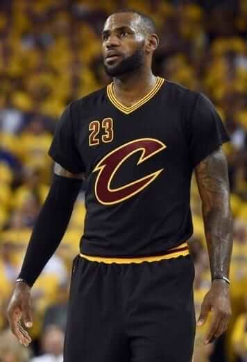
If so, that will be a major shift. By my count, at least 19 of the 30 NBA teams currently have a sleeved jersey. That includes the Jazz, who introduced a sleeved alternate just this season. Will they really scrap it after only one year? Sleeves are required on “pride” jerseys, and the Cavs rode their sleeved black alternates all the way to the way to the NBA title last season (reportedly at LeBron James’s request).
Then again, the league will be introducing lots of uniform changes next season: Maker’s marks and advertising patches are already a certainty, new tailoring and fabrics haven’t been announced but are a given, and I’ve heard through the grapevine that several teams will have fairly bold redesigns. So why not scrap the sleeves too while they’re at it? After all, even at the college level, the sleeves were always an Adidas thing, not a Nike thing.
I’m sure most fans will be happy, or at least not heartbroken, to see the sleeves go. Me too, for the most part. But I think the real letdown with the sleeves is that they never used them to their full potential. No patches, no stripes, no patterns, no nothin’. What a waste.
Meanwhile, if any of you retailers out there have feedback on the new Nike designs you’ll be seeing this week, you know where to find me.
Collector’s Corner
By Brinke Guthrie
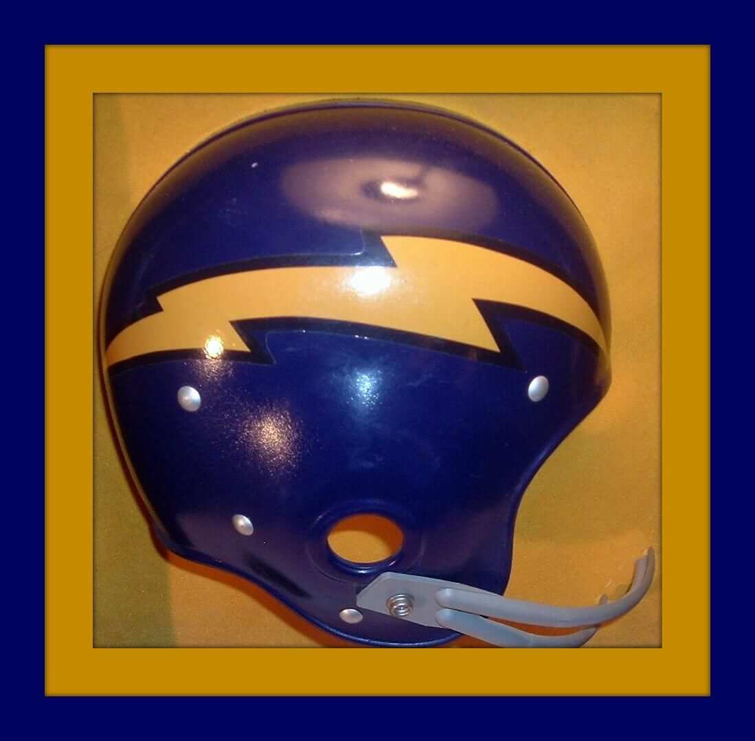
If you think that “L.A. Chargers” logo was bad, how about this this San Diego Chargers helmet plaque. How did this one get approved with that lightning bold so far off the mark? At first I thought it was for the Air Force Academy, ya know? Maybe the Chargers’ll go to this look for their move up the coast? Eh, not likely.
Now for the rest of this week’s picks:
• Two more for the Super Chargers — this retro stripe cap really takes ya back. And the helmet on this Dr. Pepper/Taco Bell promo glass points left — a real rarity.
• Great artwork on this album called 25 Action Years for the NBA. Narrated by none other than The Voice, Chris Schenkel.
• Get your 1970s Milwaukee Brewers/McDonalds promo ball right here!
• This Kansas City Chiefs jersey is supposedly from the 1970s (No. 86 Buck Buchanan,) but that heat-pressed on NFL shield looks newer than that, and I don’t recall seeing heat-pressed league logos back then.
• This is a truly great NFL poster from the 1960s. Black Saints helmet, too! The seller took a terrible photo of it, but take a peek anyway. This is how it was done.
• Nice helmet depictions on these 1980s Tasco NFL binoculars.
• The facemask on this 1970s Vikings helmet plaque is ridin’ just a little bit too low, am I right? So is this one for the Brownies.
• How about this 1983 Cleveland Browns media guide. Terrific look to those outfits, no? Makes you think of Ozzie Newsome and Brian Sipe. That Sipe look is one classic uniform, especially compared to what they wear now.
• Tombstone Pizza of Medford, Wis., wants to make you a “Packer Backer” with this bumper sticker.
• Ah, look at the great font on this 1970s Seattle Mariners pennant.
Raffle reminder: I’m currently raffling off a $100 discount code for use at IceJerseys. Full details here.
Design contest reminder: I’m currently accepting entries for a “Redesign the Chargers” contest. Full details here.
The Ticker
By Mike Chamernik

Baseball News: The Cubs visited the White House yesterday. The team gave President Obama a jersey with a World Series Champions sleeve patch, which they will likely wear on the field this season. The Cubs also gave the president a road jersey that didn’t have the usual front number. The idea there is that Obama is a White Sox fan, so the Cubbies wanted to give him a jersey that simply said, “Chicago” and nothing else (from (Brandon Smith and Andy Garms). … Former Cubs CF Dexter Fowler had a pair of Jordans made up for Obama (from Sean Jankowski). … New jerseys for Nevada. They use the blue-and-yellow color scheme of the state flag (from @PackFundraising). … The Fresno Grizzlies will reveal their Tacos uniforms this morning. … Comedian Howie Mandel wore a Expos-themed shirt on an episode of Just For Laughs (from @mike3783). … The Frontier League unveiled a 25th-anniversary logo (from Josh Handler). … Supermodel Emily Ratajkowski has a painting of a Manny Ramirez card in her apartment.

Pro and College Football News: As Josh Berger notes, the four Super Bowl semifinalists — the Packers, Falcons, Steelers, and Pats — are all Flywire-free. First time that’s happened since Nike took over as the NFL’s outfitter in 2012. Also, the Packers and Falcons are still wearing the old Reebok tailoring and fabric, making the NFC very old-school this time around (well, if 2011 counts as “old”). … This Bucs hat on Amazon has an AFC patch on it. Brian Ashbaugh checked to see if that was for real and indeed it was. Little-known fact: Tampa Bay was in the AFC West for its inaugural, winless season in 1976. … In 1973, Packers LB Tom MacLeod had some serious spacing on his NOB (from Bill Kellick). … Jim Brown and Joe Namath played a game of football with B.A. Baracus and the gang in a 1986 episode of The A-Team, entitled “Quarterback Sneak.” The uniforms were modeled after the USFL’s L.A. Express (from Gene Sanny). … Back in the 1990s, USC had odd captaincy patches. Instead of wearing a “C,” the captains wore little patches that said, “captain” (from Matt Shevin).

Hockey News: Contrary to what SportsLogos.net reported last week, the Devils are not getting new uniforms next season. Key quote: “[T]he logo will remain the same, the black-and-red color scheme will remain the same. The Devils’ primary identity jerseys are not being redesigned” (from Stan Capp). … DC Comics artist Jason Fabok is one of us. He created designs for a few fictional NHL teams (from Gus Ponce). … John Muir has a few notes about a recent St. Lawrence women’s hockey game. Kennedy Marchment wore a “LAH” emblem in place of a captaincy patch for an unknown reason, and goalie Grace Harrison has the St. Lawrence crest on her pads (the SLU men’s goalie does the same). “Really, why don’t all college goalies do something like this?” John asks. … Are the Penguins the only team that has different colored sleeve numbers, back numbers, and helmet numbers? (From Patrick Thomas.) … Speaking of the Pens and uni numbers, 87 was the theme of last night’s win over the Caps. … In 1981, almost two years after he retired, Bobby Hull attempted an comeback with the Rangers that lasted five exhibition games. “For decades I have been searching for a photo of Hull in a Ranger uni, and finally came across this,” says Bob Gassel.

NBA News: Players across the league wore these warm-up shirts for MLK Day yesterday. … There were also special socks (from Zachary Loesl). … Steph Curry honored Barack Obama by wearing red, white, and blue sneakers and teammate Draymond Green wore “Sideline Racism” shoes last night (from Zachary Loesl). … Jazz and Suns went navy-vs.-gray yesterday (from Trent Knaphus). … A graphic designer named Lammert Wijnsma created a few Greek-themed personal logos for Giannis Antetokounmpo. You may recognize his work, because he previously made logos for other young NBA players. … The Celtics’ Isaiah Thomas said he would want to change from No. 4 to No. 11, but he doesn’t want to make all his fans buy a new jersey. Current Blazer and former Boston teammate Evan Turner had a back-and-forth with Thomas about Turner’s former number. … Hungry? You will be after seeing the big, distracting ad for a milkshake that the Pacers have on their backboard post (Zach Loesl again).

College & High School Hoops News: Big East teams wore MLK patches yesterday. The addition made Marquette’s jersey particularly busy (from @joeymisdemeanor and Michael Brighton). … UNC coach Roy Williams was awarded a No. 800 jersey for his milestone victory last night (from James Gilbert). … A Kentucky high school team had to wear inside-out jerseys to avoid a black-vs.-black matchup last night. The refs were still able to decipher the jersey numbers (from Michael Kinney). … A high school game in the Bay Area last night was white vs. some sort of gold-creme color (from Ethan Kassel).

Soccer News: New black-and-white logo for Juventus. Here’s how the mark has evolved over the club’s history (from several readers). … Mikey Traynor picked his five favorite uniforms from this year’s African Cup of Nations. The internet really has it all, doesn’t it? I really like Senegal’s shirt.

Grab Bag: A New York Times writer explored the difference between the Adidas and Nike flagship stores in Manhattan (from Tommy Turner). … A Reddit post called this the world’s worst golf ball. … Team North America squared off against Team Europe in the Continental Cup this past weekend. Some Team North America curlers wore combined USA and Canadian flag patches (from Wade Heidt). … I don’t know anything about the film series, but here’s a uniform-related Star Wars joke (from Esteban Colinalarga).
Remember, Tampa Bay started as an AFC team in 1976 and Seattle was in the NFC. They switched for 1977.
Of course, the Bucs were never in the AFC while using the skull/flag logo, since they started using that in 1997.
Had to look it up. Didn’t remember them being in our division – AFC West. In that first year they played everyone in the AFC once plus the Seahawks.
…and, by some miracle, did not beat the Jets.
(The Jets have 4 times in their history been a one-win team’s only win; only one other franchise has been that even twice).
Plus, the Jets were the losers in the expansion Panther’s first-ever win.
The Penguins seem to be the only team to have three different colors for their three number locations.
Colorado, Columbus, Winnipeg, and Arizona have contrast sleeve/back numbers on their road whites but the helmet numbers match one of the two colors. Edmonton’s orange has contrast back and top shoulder.
Philadelphia has contrast numbers on both home and away, but again, the helmet numbers match one of the two number locations.
Minnesota has the same color numbers on the sleeve and back of their reds, but the numbers are trimmed differently. Tan trimmed green on the red back and green helmet, but tan trimmed red on the green sleeve.
The Penguins having white helmet numbers seems to be an artifact of the previous uniform design, where the numbers on the black jerseys were actually white. I just find it strange that they just haven’t changed those number stickers yet.
Gold helmets would be a nice touch, the way they were between 1984 and 1988.
Missed the Detroit whites having contrast sleeve/back with back-matching helmet numbers.
Everyone else seems to match all three number colors on both home and road sets.
Simple theory: If a team incorporates contrast shoulder or sleeve segmentation, expect the sleeve numbers to contrast the ones on the back of the jersey.
Jim Brown and Joe Namath on the A-Team: Everyone in the photos has a red outline around their numbers, except for Namath and Mr. T. Please resist any “pity the fool” jokes in the comments.
Funny how the sleeves say “LA” but the helmets have “TA”.
If memory serves, the intentional similarity allowed them to incorporate USFL game footage into the episode.
I remember the same.
Also I think the long-view footage showed a near-empty stadium (big surprise for the LA Express in the Coliseum), and that fact was written into the show, something about playing in East Berlin and keeping the fans away.
The opposition footage was of the NJ Generals, and the red and gold did nicely for “What would the East Germans or Soviets wear for a football game?”
I think they did the same thing on HBO’s “1st & Ten.”
And some of the helmets and jerseys have red trim, others don’t.
D’oh! Already mentioned…..
I pity the fool who tries to tell people not to make any “I pity the fool” jokes in a comment section
I love it when a post comes together.
Mr. T has mismatched socks.
Per request above, no “pity the fool” jokes.
Mr. T’s Shoes – In his biography Mr. T (St. Martin’s Press, 1984), the black actor with the Mandinkan style hair cut told the story of his worn-out footwear.
“My beat-up, run-over, taped-up raggedy and old combat boots used to belong to my father before they were handed down to me. I wear my father’s boots with pride because they help me not to forget where I come from and they tell me that I have to finished his journey. Now the reason I wear mismatched socks is because there are a lot of poor children who don’t have a pair of matched socks, and people laugh at them. So I wear mismatched socks so people can laugh at me, instead of poor kids. Plus I am making a fashion statement: just wear what you got and be thankful.
In the NHL section, the link “fictional NHL teams” actually shows his concepts for two non-fictional OHL teams. The other link (the “created designs” text) has the actual fictional teams.
Regarding the Steak ‘n’ Shake ad on the Pacers’ post, that’s an M&Ms milkshake, not a sundae.
And you learn something everyday: looking up who else has worn #11 for the Celtics, apparently the first person to do so was Chuck Connors. Never knew he played in the NBA!
Still not fixed.
Proofreading:
“The idea there is thta Obama…”
Fixed.
Not cool to upload something that’s behind a paywall.
A) It was available for free yesterday, when it was first posted.
B) That would be why Paul copied the text and reposted it himself.
Yeah, but it’s not free now. It would be like taking a shirt from one of Paul’s sponsors that was free for a day, copying it, and handing out prints the next day.
I know. Given that my industry is going down the toilet precisely because some idiot decided 20 years ago that we should give away the content for free, I wrestled with this one. I have now become Part of the Problem. (Well, I was already Part of the Problem because I give away content for free here on Uni Watch, but now I’m an Even Bigger Part of the Problem.)
It’s not something I do often, but in this case I wanted you people to be able to see the article, and I think those of you who don’t already subscribe to the WSJ are unlikely to do so for their sports coverage, so it felt like a bit of a wash. But you’re still right to call me out for it.
I feel the best way would have been to excerpt that one relevant part of the story and linked back to the original, warning that it’s behind a paywall. Maybe a couple readers actually subscribe, which would help the WSJ after its recent cuts. (I don’t like the WSJ’s editorial perspective, but I also don’t like seeing journalists lose jobs.)
After all, you’re a journalist that likes to get paid for his work. How would you like it if somebody took your work for no money?
I do appreciate your response, BTW.
How would you like it if somebody took your work for no money?
Thousands of people do take my work for no money right here on this site every single day, because I allow them to do it. You’re doing it right now. As I already noted, that is Part of the Problem.
But again, your point is well taken.
Just like to throw my two cents in.
The fact that the piece was initially offered for free permits you to post it as you please imo. However if it was behind a paywall the entire time it would be unethical to post it.
Joe,
The WSJ had been mirroring the entire print industrys financial face plant for years before it was picked up by the Morlocks.. I mean the Murdochs. They have, at least since last summer been utilizing the “bendier paywall” model, in which they offer “FREE” select articles and expanded link sharing on “social media” and the like to generate subscriptions with modest success.
Too soon to tell if this method will achieve their goal of tripling online readers in the coming years. I assume you know this and that your issues about reprinting content have more to do with journalists slipping onto the endangered species list than with the WSJ’s attempts at attracting new readers. In that respect I totally agree with you… at this particular time in our shared history – we DESPERATELY need journalists – the good kind I mean, not the “Harpy McHottie’s” in the noisy news machine, but ones with integrity, passion, (bullet proof would be nice too) and erring on the side of truthiness.
You know, those guys. In case you have not been reading, things are gonna get real interesting here in Dee Cee.
link
I dunno, Paul, since there is advertising on this site we are only getting your content for free in the exact same way television and radio have been providing content for free for many decades.
We are compensating you indirectly by viewing the ads.
Except TV and radio have *always* given away their content for free.
Journalism, as a model going back centuries, has generally been something that people pay for. It’s only in the past 20 years that it has become something people expect to get for free. And that is why the industry is in a death spiral.
And that in turn is why I am rethinking this website’s content model. More on that soon.
We’ve devoted enough time to this non-uni topic. Let’s please move on. Thanks.
With apologies to Dan Fogleberg…
Be who you must
That’s a part of the plan
Await your arrival
With simple survival
And one day we’ll all understand
The late John Matuszak, who made his biggest mark in the NFL with the Raiders, is No. 59 in that A-Team photo.
link
It looks like the “LA” is on the shoulder, but the helmet reads “TA”
#14 looks like Alan Autry (a.k.a. Capt. Bubba Skinner from the TV series “In The Heat Of The Night”). He went by the name Carlos Brown when he was drafted by the Packers in 1975
Something doesn’t sit with me right about saying the “Packers are still wearing the old Reebok tailoring.” Reebok didn’t come up with that basic body template (excluding any sleeve variations over the years), but rather inherited it from Starter. Starter inherited it from Sand Knit as best I can tell. And I think they started that body style in the late 80’s.
link
Ones before then had a full mesh or durene shoulder (unlike the current dazzle material), so I didn’t count that.
link
link
So, we should in fact say that the Packers are still wearing the “Sand Knit cut.”
The Chargers helmet plaque that Brinke featured instantly reminded me of a Chargers mini helmet I got out of a gum ball machine in the 1970s. It also had a straight lightning bolt, which I hated. Here’s a photo of one (next top a Browns “CB” helmet): link
I distinctly remember being in 6th grade and saying WHAT is that straight looking bolt doing on there?? There was a local drugstore chain in Dallas that always had a nice display/selection of these in the school supplies dept- i always made a beeline to that part of the store. They had the standard NFL Properties school supplies too- binder, spiral notebook, etc.
Those vintage San Diego trucker caps have the braid between the bill and the crown. I always used to tear that off once the hat was in my possession.
You mentioned the left-facing Charger helmet was rare in print. I had a group of USFL pennants all of which had right-facing helmets, except for the Invaders, which would have resulted in a left hand clutching the thunderbolt; something a superstitious person might try to avoid.
The Mariners’ font is the very period-appropriate Serif Gothic. Looks great, but apparently it was a bear squishing all those letters onto a jersey, judging by the endless tweaks on Seattle uniforms throughout the ’70s.
I’ve always thought the Ivory Coast logo is the best in all of soccer. I love how retro looking it is and the colors are great. Plus, who doesn’t love elephants?
The golf ball link made me laugh out loud. Thanks for the chuckle.
The golf ball link is from Imgur, not Reddit. I’m not sure if you’re aware that the 2 sites aren’t related since you’ve made this error before.
Imgur is the image host for Reddit (or that’s how I understand it). They’re hand-in-hand.
When I find a pic from a random Reddit user, I like to link directly to the image, and bypass Reddit itself. People unfamiliar with Reddit may find the site’s page layout and comment system confusing (I know I did back in the day).
Here’s the Reddit post for the camo ball: link
Imgur was created by a Redditor, because Reddit’s image hosting was a mess. Imgur would not exist without Reddit and it’s safe to say that 99% of images on Imgur are posted to Reddit.
If Nike really is getting rid of the sleeves on NBA jerseys that might actually be a decent trade-off for the ads that will soon appear on them.
To me, the sleeved jerseys always just looked like the team forgot to take off their warm-up shirts.
From the New Jersey Devils article:
“It’s likely that the form-fitting look Reebok introduced, which necessitated some subtle changes, will be replaced by the more free-flowing sweater look NHL fans were once used to.”
What a strange speculative statement? Is there any basis for it?
There are plenty of reasons to hate the Reebok Edge system (repeated design elements, curved hem, temporary influx of poor uni designs), but the one good thing that came of it is that player again wear tight jerseys/smaller shoulder pads again like they did in every decade except the 90s and early 00s. The “free-flowing sweater” look is only good for big fat dudes who wear jerseys in public.
Anything at this point is speculation, but it may just be that the replica jerseys that will be produced by Fanatics will be closer to the old CCM 550 line than the current Reebok Premier shirts.
Regarding that A-Team episode, I remembered that the other QB (not Joe Namath) had two different numbers on his jersey. Turns out I remembered right; look at the third photo. There’s Namath, Jim Brown, John Matuszak, Mr. T, and an actor wearing a jersey with #14 on the front and #12 on the shoulders.
(IMDb doesn’t mention the goof, nor the actor’s name.)
That is Alan Autry (Bubba from “In The Heat Of The Night”). He was a 1975 draft pick of the Packers (he went by Carlos Brown at that time) and started 3 games at QB for them in 1976. I also noticed the TV numbers on his right shoulder were different.
I remember that A Team episode well, Namath and Mr T look like they are wearing Auburn knockoffs. Don’t forget the episode of the Six Million Dollar Man where they play a football game and Csonka is Larry Bronco. My favorite Rockford Files episode is The No Cut Contract where Rob Reiner plays a cocky minor league QB King Sturtevant, it reminded me of someone I know.
An amazing week in Dee Cee continues for Uniwatcher in the Universe.
as we observe the peaceful transition of power and this.
link
I was watching the Jazz Suns game last night and noticed on the Suns’ grey alternate there was a small patch on the sleeve. So, at least one team is getting a little extra use out of the sleeve (not that I condone the use of sleeves on basketball jerseys).
Is there a requirement that pride jerseys have sleeves? Is that some kind of ancient mandate that is sacrosanct and cannot be changed? The NBA can make or alter any rule in the rule book. So if Nike says no sleeves, and they’re paying a billion dollars for the privilege, I would guess the NBA is going to change the rule or ignore it altogether.
1) That is the current rule.
2) But yes, obviously the rule can be changed.
3) Nike doesn’t get to decide this unilaterally, just as Adidas didn’t get to decide to unilaterally introduce sleeves either. In both cases, this is the kind of thing that the outfitter pursues (or doesn’t, as the case might be) in consultation with the league and the teams. So when the WSJ article says “Nike isn’t planning to produce sleeves,” that’s the result of a series of decisions by multiple parties, not a single decision by Nike.
While I have no idea if it’s intentional or not, this is my favorite picture from the Cubs’ visit yesterday.
link
By coincidence, that photo of Bobby Hull in a Rangers uni co-stars a former teammate of his when they were with the WHA Winnipeg Jets.
The Manny Ramirez card/paining in the supermodel’s apartment is by Jonas Wood.
Click on the “sports card” link in this article.
link
…also here.
link
I guess I’m OK with the Devils not making any drastic changes to their identity, but I’ve always thought their current uniforms were a bit stale and generic, and I was kind of excited at the prospect of them finally being mothballed. I’d love to see them come up with something new and fresh in a red-&-green motif, but I guess that won’t be happening. Maybe a 3rd jersey down the road?
Just came across this tweet in the sidebar of latest news on ESPN.com, from senior writer Arash Markazi:
link
“I was told the Chargers will never use this logo again. It will go down as the shortest-lived logo in sports history.”
Over a day late to the party, I see. As to shortest-lived, is that true?
One last time: IT WAS ONLY A PROMOTIONAL/MARKETING LOGO. It was never going to appear on uniforms or in any major role. It was just gonna be on billboards, stadium signage, etc. Comparing it to other “short-lived” logos (like the 49ers’ 1991 helmet fiasco) is apples and oranges.
On items from last few days.
– Chargers LA avatar did not even have a registered trademark.
– The QB sneak end zone at Lambeau Field said Dallas in 1967 Ice Bowl.
– Cowboys played home game v. Browns in 1967, Washington had played there the previous week. You could clearly see remnants of Washington team name under Browns in Cotton Bowl end zone (also had ‘CB’ logo’.
Highlights here: link
Just catching up on my UW reading. I live in Medford, WI, so it was very cool to see a reference to Tombstone Pizza. My dad was one of their first employees when they started selling frozen pizzas from a tavern (Tombstone Tap – named as such because it was located across the road from a cemetery). I remember those bumper stickers, too.