
For many of today’s photos, you can click to enlarge
There were four throwback games around Major League Baseball yesterday — part of Turn Back the Clock Day, which MLB says will be a new annual tradition (although it remains unclear why they did so little to publicize the new tradition and partially buried it by running two of the four throwback games in the afternoon, where they got much less exposure). Here’s a game-by-game rundown:
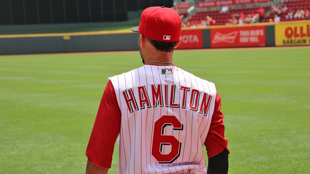
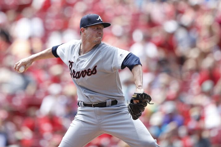
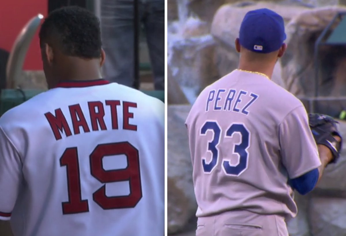
Braves vs. Reds. This was a weird one, because the Reds wore early-2000s unis (as a tribute to Junior Griffey’s upcoming Hall of Fame induction) while the Braves threw back to the road uniforms they wore from 1969-71, creating the odd spectacle of two opposing teams turning back to the clock to different eras. Obviously, the Braves couldn’t have matched the Reds with an early-2000s look, because Atlanta’s uniforms haven’t really changed since then, but it was still weird to see the mismatched looks. We’ve seen plenty of games with only one team throwing back, of course, but how often have we seen two teams wearing throwbacks from separate time frames? It happened fairly often during the NFL’s 1994 throwback-o-rama, because those throwbacks were drawn from different points in the teams’ respective histories, but I can’t recall seeing this happen in an MLB game. Anyone..?
I watched a fair amount of this game, and it was very easy on the eyes. A few notes:
• Both teams looked good, although the plain Braves script, with no tomahawk and no front number, looked a bit plain:
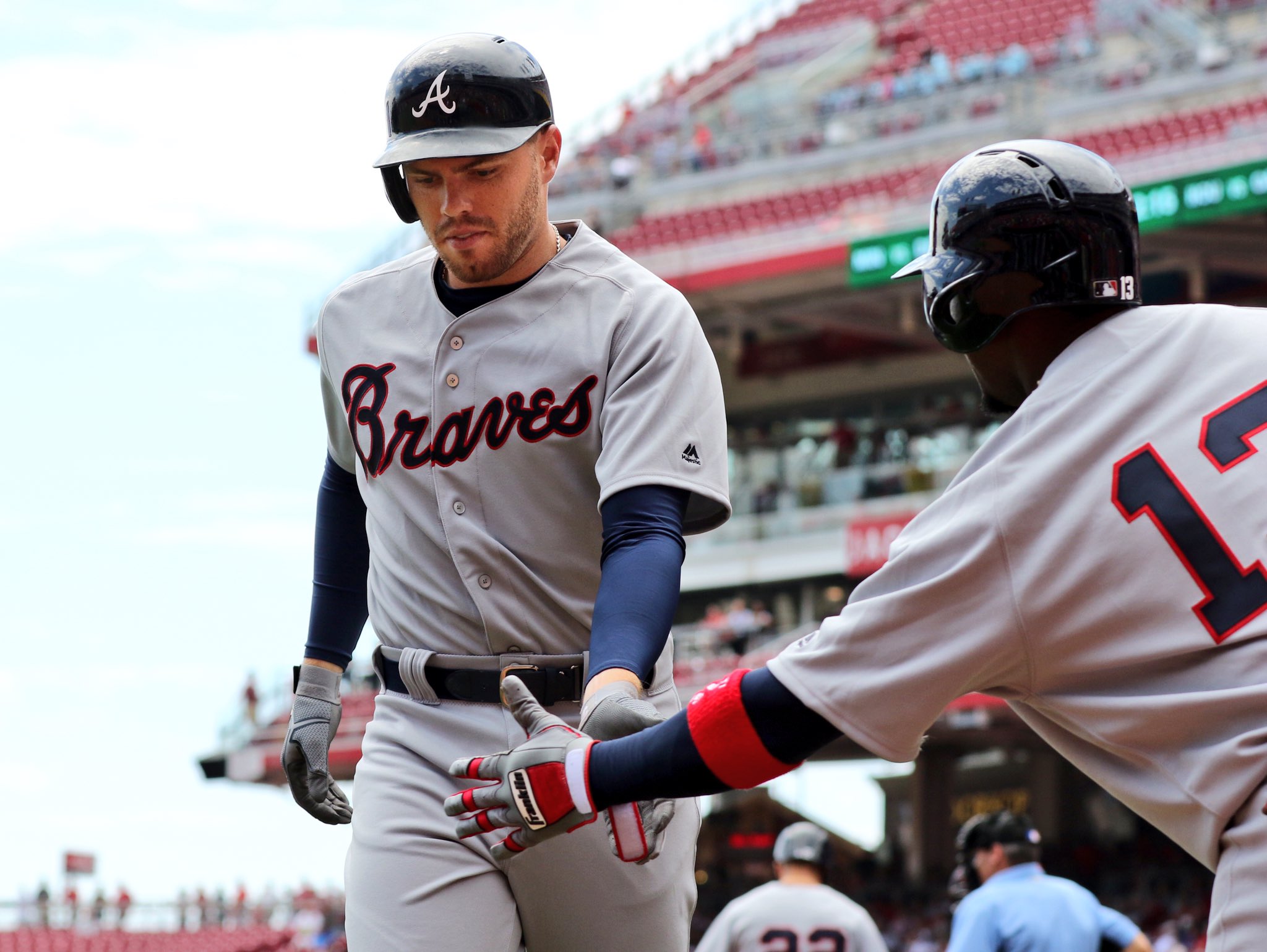
• I don’t get too worked up about logo creep in throwback games. I mean, I wish it didn’t happen, but I understand why it does. So it was an unexpected bonus to see that the Braves didn’t have the MLB logo on the back of their jerseys (as you can see in the previous photo shown above), but the logo did appear on the Reds’ jerseys — period-appropriate in both instances:
• Back in the day, this Braves uniform included the Indian head sleeve patch. That was conspicuously absent yesterday:
Want to see more? Game photos are available here.
———
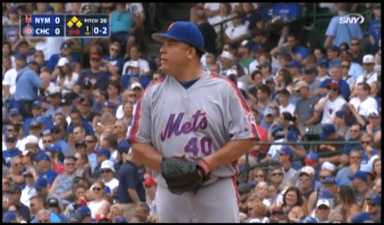
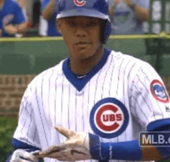
Mets vs. Cubs. Both teams wore 1980s uniforms (which in the Mets’ case was the road grey version of the Sunday throwback they’ve been wearing at home this season). No mismatched-era issues here, as these two unis faced each other many times back in the day and even shared space on a 1984 Sports Illustrated cover.
I watched most of this game as well, and it wasn’t so hot. Notes:
• As many, many fans immediately noticed, he Mets’ chest script was consistently riding too low:
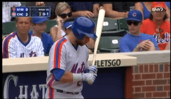
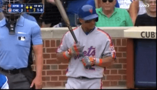
Not sure what that was all about, but it looked miserable.
• Since I mentioned the MLB logo’s presence in the previous game, I’m gonna keep doing it. Oddly, the Cubs wore it yesterday but the Mets didn’t:”¨”¨

• The Cubs’ chest logo included the circle-R trademark logo back in the 1980s (per Henderson, it was added in 1979), but it wasn’t there yesterday:
• For the third time this season, Mets first baseman James Loney went with orange sannies. Whatever you think of that look, he really shouldn’t be freestyling in a throwback game, and Cubs broadcaster Len Kasper called him out for it:
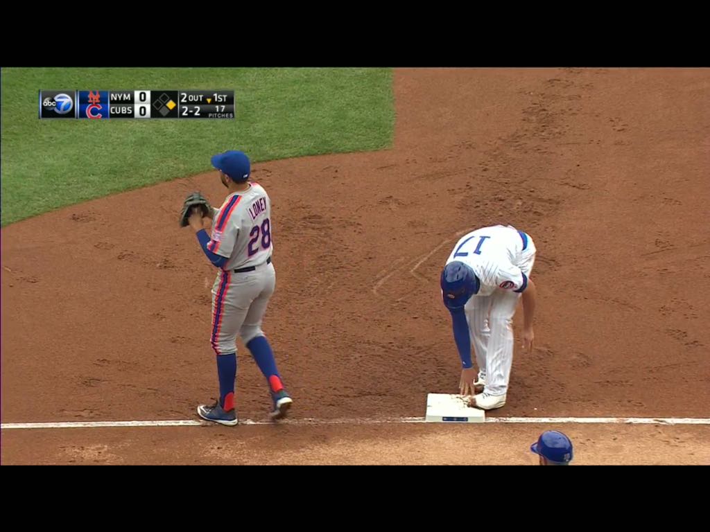
@PhilHecken @UniWatch Loney catches some crap for not being true to the '86 #Mets uniform. pic.twitter.com/WvxxUWN5vN
— Funhouse (@RNs_Funhouse) July 20, 2016
• The Cubs didn’t look terrible (do they ever?), but oy — that waistband:

You can see lots of additional game photos here.
———
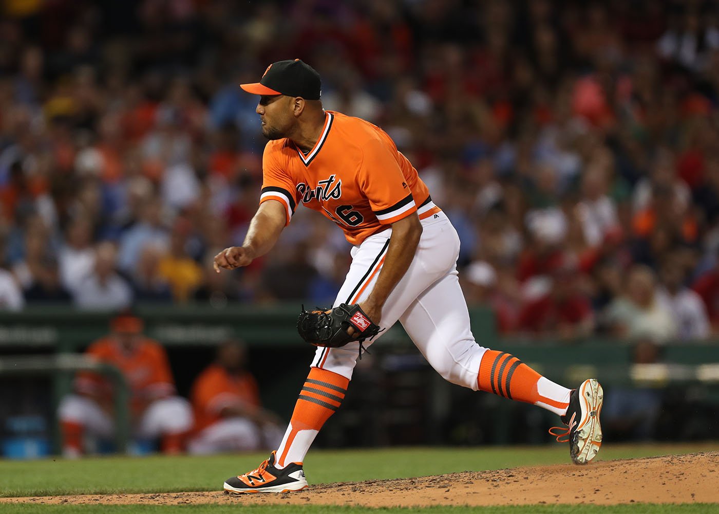
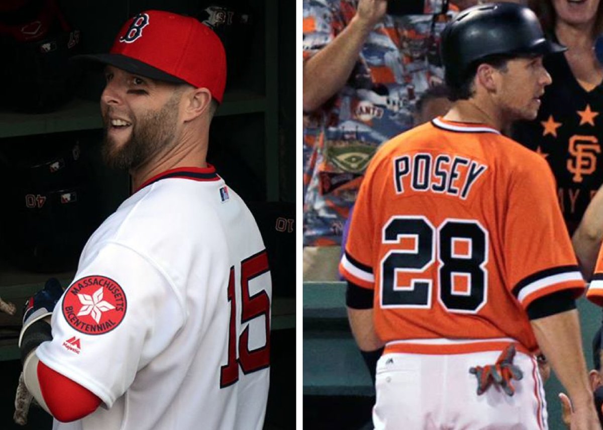
Giants vs. Red Sox. The Red Sox wore 1975 home whites, complete with the Massachusetts bicentennial patch, and the Giants wore their late-1970s orange road jerseys. These two uniforms never appeared in the same season (at least not with the Sox wearing that sleeve patch), but at least they’re from the same era. And for the most part, this was a good-looking game.
Notes:
• The good news is that all of the Giants went high-cuffed; the bad news is that they all wore two-in-ones, which are clearly the lowest form of baseball hosiery. And in a very strange development, the two-in-ones didn’t even simulate the Giants’ real late-’70s hose, which consisted of black stirrups over orange sannies. Instead, they simulated orange stirrups with three black stripes and white sannies — something the Giants have never worn. Welcome to the brave new world of baseball socks, where you can just make things up as you go.

• Most of the Red Sox went with pajama pants, although a few went high-cuffed with period-inappropriate solid-red socks and left fielder Brock Holt wore the proper throwback striping. At first I thought he was wearing striped socks, but a closer look reveals that he may have been wearing stirrups over red sannies, as seen in this video:
@PhilHecken @UniWatch Giants at Red Sox, throwbacks. pic.twitter.com/0fBi8eQ1yD
— Funhouse (@RNs_Funhouse) July 20, 2016
• Just like in the Mets/Cubs game, there was an inconsistency regarding the MLB logo. The Red Sox wore it but the Giants didn’t:
You can see a bunch of game photos here.
———
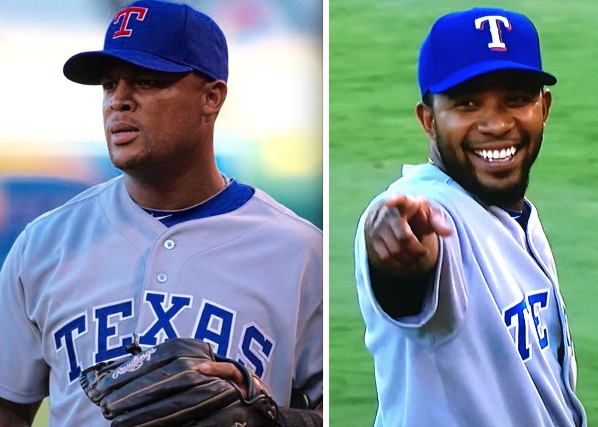
Rangers vs. Angels. The Angels wore their late-1970s home whites, which they also wore last just a few days ago (and which Phil covered in detail last Saturday), while the Rangers wore their 1986 road greys. If you can overlook the Angels’ number/NOB font issues (see Phil’s Saturday post for details), these two uniforms overlapped a bit in the late 1980s, so they’re more or less from the same era.
Not a bad-looking game. I like the Rangers so much better in blue than in red — wish they’d stick to that.
Notes:
• Rangers shortstop Elvis Andrus wore the team’s current cap, instead of the throwback cap. Here’s a comparison with Andrian Beltre on the left and Andrus on the right:
• The logo decal on Johnny Giavotella’s batting helmet switched from a regular to throwback during the game:
@UniWatch Giavotella wearing the latest Angels batting helmet logo in the 3rd, then the throwback logo in the 6th pic.twitter.com/NLQ1sZRSrA
— Alex Calinsky (@AlexCalinsky) July 21, 2016
• The MLB logo did not appear on the back of either team’s jersey:
Game photos are available here.
All in all: a fun day around the league. If this really is going to be an annual thing, here’s hoping it’s a little better coordinated next time around.
Here are some additional shots from the four games:
(My thanks to all contributors, including Jonathon Binet, Brinke Guthrie, Chris Howell, Matthew Lohr, @RNs_Funhouse, @RoyDaddy13, Shannon Shark, and of course Phil.)
Timberwolves-redesign contest reminder: In case you missed it earlier this week, I’m running an ESPN contest to redesign the Timberwolves. Details here.

Raffle results, and today’s new raffle: The winner of the Braves cap is Matthew Wilcott. Congrats to him, and thanks to all who entered.
Our next ’47 cap up for raffle is this Padres cap, which has a fabric adjusta-strap in the back:
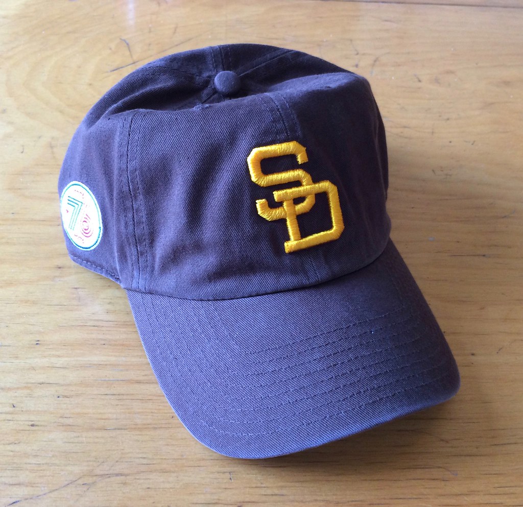
Trust me, it’s brown. Here’s a closer look at the logo on the side (against a different background). There’s a ’47 maker’s mark on the other side.
To enter, send an email with your name and shipping address to this address (not to the usual Uni Watch email address, please) by 8pm Eastern TODAY. One entry per person. I’ll announce the winner tomorrow, and I’ll also announce tomorrow’s raffle cap, and then we’ll keep repeating that process for each remaining weekday this month. If you win one of the raffles, please be nice enough to step aside and stop entering the remaining ones. Thanks.

Click to enlarge
21 locks, waiting to be found: Like a lot of people (or so I assume), I have a drawer where I keep keys ”” my spare car keys, keys to my mom’s apartment, keys to my upstairs neighbor’s apartment, house keys for the friend who I cat-sit for, and so on.
The drawer has become a bit of a mess, sort of like the drawer where Redd Foxx kept all his eyeglasses on Sanford and Son, so last night I decided to go through it and organize it. To my surprise, I found that most of the keys ”” a total of 21, by my count ”” are completely unfamiliar to me and I have no idea what they’re for. Some are grouped together in twos and threes, others are by themselves. Two are connected to a yellow plastic thingie, which seems particularly odd because I’m not a yellow plastic thingie kind of guy. How the hell did I ever acquire that?
I’m pretty certain two of the keys are for the house I grew up in (which my parents sold 12 years ago), but I no longer recall which two. As for the rest, I must have considered them important or useful at some point ”” they wouldn’t have ended up in the drawer otherwise ”” but now I don’t even recognize them.
I can’t decide whether I should recycle them, make some sort of art out of them, or just put them back in the drawer. Hmmmm.
The Ticker
By Paul

’Skins Watch (a day early this week): Cleveland hometowner/booster Drew Carey thinks it’s time to move on from Wahoo (from our own Alex Hider). … Longtime ’Skins superfan and unofficial team mascot Chief Zee, who routinely wore a faux Indian headdress and carried a toy tomahawk at games, has died. … North Dakota state highway signs, which since 1923 have featured an outline of the Sioux luminary Red Tomahawk, are being changed to a design based on the shape of the state (from @GKG_77).

Baseball News: Buried toward the end of this item is the news that the South Bend Cubs will wear Star Wars jerseys on Saturday. … Remember that Asian heritage jersey hoax from a while back? The guy behind that is now selling T-shirts of the designs. … Lots of upcoming uni-related moves by the Mariners in connection with Junior Griffey’s number retirement. They’ll wear 1989 throwbacks with this patch on Aug. 5 and will switch to this patch on Aug. 6. And on Aug. 7 they’ll give away a replica of the throwback (from Brad Iverson-Long and @notoriouscs). … Former Bulls center Brad Miller threw out the first pitch at Wrigley yesterday. He wore argyle Cubs shorts, a style popularized by Bill Murray (thanks, Mike). … OF Julio Borbón, who hadn’t played in the bigs since 2013, was called up by the Orioles earlier this week. One difference from his previous MLB stints: He will now have an accent on his NOB (from Andrew Cosentino). … While looking for something else, I came across this shot of Pedro Martinez from 1993. Man, the Dodgers’ front jersey numbers were huge! … In the 2000 MLB All-Star Game, Reds SS Barry Larkin wore a blank batting helmet. The shell looks more navy than black — maybe an Indians helmet..?

NFL News: Judging by this rundown, it appears that the Texans will wear white at home for their season opener against the Bears on Sept. 11, mono-blue against the Chargers on Nov. 27, and their red alts against the Jags on Dec. 18, along with the usual run of Pinktober and G.I. Joevember slop (from Kenny Saidah). … This is a 2013 item, so we may have seen it before, but I have no memory of it and, in any case, once more won’t hurt: Someone has put together a very entertaining “hidden history” of what the Panthers might have looked like if they had existed in 1955 (from Scott Moody). … Steven Marks was recently at the Children’s Museum of Art here in NYC and saw this quilt-y thing made of of football jerseys. Further info on the artist here.
College Football News: New BFBS alts for Brown (from Joel Mathwig). … Michigan’s new uniforms will be unveiled on Aug. 2, and will apparently feature a slightly different shade of yellow. Further info here (from Chris Russell and Anthony Giaccone). … GFGS + Tulane’s “Angry Wave” = this new helmet. … Coastal Carolina is switching to Under Armour. … New cleats for UNC (from James Gilbert). … Miami (Ohio) now has the state of Ohio above the nameplate (from Camden Henry). … Notre Dame will unveil its latest Shamrock Series uniform tonight (thanks, Phil).

Hockey News: New uniforms for the ECHL’s Missouri Mavericks. … New Rangers acquisition Mika Zibanejad will wear No. 93. Never seen a number unveiled quite like that before (from @_ynnhoJ). … 15th-anniversary logo for the Saginaw Spirit.

Basketball News: The Suns will play two games in Mexico City this season. Seems like a safe bet that they’ll wear “Los Suns” jerseys, or some other Spanish-language design, for those games (from Jeffrey Seals). … Great interview with designer Tom O’Grady about the Suns’ 1990s sunburst uni design (thanks, Phil). … Good article on the renovations to NC State’s arena (from J. Huckel).

Soccer News: New away kit for Burnley (from Josh Hinton). … “Roy Radics, a friend who was a massive Tottenham Hotspur fan and also the lead singer of a Brooklyn-based ska band called the Rudie Crew, passed away this March at the much too young age of 51,” says Terence Kearns. “As a tribute to his love of Spurs and life, I had this Tottenham third shirt from last season printed. It’s the only Spurs shirt I’ll wear this season.” … Here’s an interview with the author of a book about soccer jerseys (from Mark Coale). … Here’s a slideshow featuring the kits for this year’s teams in the second flight of German soccer (from Anthony Zydzyk). … I don’t generally get too excited about sports footwear, but this article about the engineering that went into Nike’s soccer cleats for the Olympics is seriously interesting. Recommended (from Tim Cross).

Grab Bag: Bit of a kerfuffle in Oregon, where a county sheriff running for re-election has prompted some controversy by appearing at campaign events in uniform. … The airport at Terre Haute, Ind., is getting a new name, which of course is being described as a “rebranding.” Sigh. … There’s a new museum exhibit on men’s fashion in Virginia (from Tommy Turner). … If your ultimate Frisbee team is called moontower, then this is a pretty cool jersey design.
– The Cubs didn’t look terrible (do they ever?) – Yes, every time they wear the terrible blue alternate pajama tops which seems like more times than not…
The Cubs’ sansabelt was possibly the homliest object ever associated with baseball, so naturally the Brewers copied it in 1978.
And the Cubs look pretty terrible just about every time they go on the road. The concept is good (gray, plain, blue letters, red numbers), but the “Chicago” typeface is dreadful. It might hold up fine if there were other elements on the uniform, but the wide tracking on a jersey with no piping doesn’t just look plain; it looks painfully awkward. It adds up to one of the most unnecessarily bad uniform around.
As noted in this link, the fix for the Cubs is link. Alternatively, some good concepts from the Creamer boards come up on a Google image search.
Proofreading: “creating the odd spectacle of a two opposing teams”
Fixed.
So, depending on the Carolina Panthers faux-back timeline (and whenever they switched to the silver helmet), it is possible that they AND the Bears would have black helmets with a white “C” on the side–and that Bears would have “copied” the Panthers.
Um….but the Bears never wore black….
From the Bears website:
“In 1935 the Bears introduced an orange jersey with black arm stripes and black helmet … ”
Granted, they did go to dark/navy in the 50’s.
Interesting – considering Papa Bear was so insistent on Illini colors…..Did they actually wear it? At work – can’t really check other sites (this one is not blocked!)
I think everything on that timeline should be pushed ahead 10 years.
There would be no helmet logo in the 50s.
There would be a thick, single-color logo in the 60s. That detailed panther does look good on the pennant, just like the ram head, the colt with football, the prospector shooting pistols, the bobblehead cowboy on a horse, the steelworker punting on a beam, the full eagle carrying a ball in its talons and the quarterback towering over Yankee Stadium logos would. But the helmet would be simple.
The C-P 10 year logo screams 70s (think of the disco NY Giants)
Lastly, if the Panthers did exist in 1955, they would definitely be named after a city. Charlotte Panthers.
No offense North Dakota, but your state shape isn’t SO interesting that it necessarily warrants being featured on your road signs.
jmo
My thought exactly, (not-so-)-Dumb Guy. Replacing something memorable and reflective of your state’s heritage and current population with . . . a rectangle?
The state highway signs read to me more as tribute or commemoration than like exploitation. Interesting state highway shapes and imagery is one of the cool manifestations of American federalism. State shapes (such as in Ohio) are fine, but only if your state has a distinctive shape. North Dakota does not. Keep the Indian head!
Here’s a nice graphic of current state highway signs:
link
Utah for the win, and Minnesota has the best use of color, but North Dakota’s current design is easily #2 or #3 in the nation.
Plus, even if there was something wrong with the native sillouette, they’re all on secondary roads in North Dakota. It’s not like lots of people see them!
I *love* state highway sign designs — something I’ve been fascinated by for decades. I’ve long been disappointed by my home state’s design, which is such a snooze.
But about this:
State shapes (such as in Ohio) are fine, but only if your state has a distinctive shape. North Dakota does not.
I think that’s unfair. ND’s shape may not seem distinctive to you (or to me, frankly), but I suspect it resonates strongly with its residents, who likely perceive nuances in the shape that escape the rest of us. There’s no reason they shouldn’t be able to feel a sense of pride and identification with their state’s shape, just as the residents of Ohio (or any other state) do.
I’m not saying this is a good reason to replace the Indian head with the state shape. I’m simply saying that the particular shape of the state is neither here nor there in terms of this discussion.
I didn’t say North Dakotans shouldn’t take pride in or identify with their state’s shape. What I said was that North Dakota’s shape is not particularly distinctive. Which is simply a true fact. You speak of “nuance,” but rendering it on a road sign necessarily requires simplifying the shape – that is, reducing any nuance. Which will render North Dakota’s outline indistinguishable from Kansas’ outline. Plus, South Dakota, which has a shape marginally more distinctive than North Dakota, already uses its state outline on state highway signs, so North Dakota’s state highway markers will be doubly less distinctive than they are today. What’s more, look at how South Dakota has to distorts its state shape to make the numbers legible: North Dakota will have to do the same, or it will keep the state’s correct proportions but shrink or distort the numbers to be less legible to motorists. The former choice contradicts any potential local identification or pride with the nuances of the state’s shape; the latter choice is the definition of bad design.
Does the state of the shape matter to the discussion? The ability of motorists to quickly identify three bits of information from a distance at speed is a critical part of highway sign design: (1) The number of the highway; (2) The status of the road as a state, not a federal or county, road; (3) The name of the state. While it’s true that a reasonably large state like North Dakota has plenty of interior highway where nobody can be in any doubt as to what state they’re in – Did you cross the Red River of the North heading west? Less than five hours ago? Still North Dakota! – the Peace Garden State also has lengthy borders with three states and two provinces, and anywhere near those borders the identity of its roads matters to motorists trying to navigate. The Indian-head shape of North Dakota’s state highway markers is something you don’t forget if you’ve seen it once; motorists can easily tell that a given marker on a “next exit” sign refers to a North Dakota road, not a South Dakota or Minnesota or Montana highway.
The ability of motorists to quickly identify three bits of information from a distance at speed is a critical part of highway sign design: (1) The number of the highway; (2) The status of the road as a state, not a federal or county, road; (3) The name of the state.
Demonstrably untrue. There are many, many states (including my own) whose highway route signs give no indication of which state they’re from.
Quick, which one of these is New York, which one is New Jersey, and which one is Delaware:
link
Paul — New York has a nice state road sign. I love the badge. I wish more states could spruce theirs up. So many states just have a white box with black numbers inside. New York’s badge and Pennsylvania’s keystone are great.
Totally with you on Pennsylvania’s keystone — it’s the Keystone State, after all!
But New York is not the Shield State, or the Badge State, or whatever. Our signs are characterless — there’s nothing New York-y about them. The county route signs used throughout the state are actually better, because they’re rendered in the state colors. But the state signs are so blah.
Paul, you’re confusing existence with quality. There are 51 states for the purposes of highway markings. Simple math tells us that the designs of 25 of them will be below average. Just because New York has a highway marker, it does not follow that New York’s road marker is therefore an example of perfection.
But in fact New York’s state highway marker does communicate the identity of its state reasonably well. A highway marker need not include the letters of the name of the state to communicate the name of the state. In fact, given the size, distance, and speed of approach involved, lettering that spells out the name of the state is probably the worst way to communicate that information. The shape of the white shield is distinctive from all of New York’s neighbors, so anyone who has driven in or near New York once can be expected to recognize New York state highway markers as belonging to New York. Good design! Could be better, but it works.
The few states that still follow the old federal recommendation that state highway markers consist of numbers in a white circle in a black square, those states are examples of the worst highway sign “design.” Square quotes, because in fact those states did not design anything at all. It’s impossible to know whether a give road marker is in New Jersey or Delaware, for example, or Kentucky or Mississippi. (Or West Virginia or Montana.)
Interesting the NH is still using the “Old Man in the Mountain” silhouette some 13 years after its collapse.
I guess it’s still iconic enough to stick around for a while.
They talked about changing the sign design in the wake of the Old Man’s disappearance but ultimately decided to stick with it.
North Dakota is throwing away the baby with the bathwater. Can someone please define the difference between benign/abusive use of symbols, and maybe spare our Indian friends more of this disingenuous behavior?
I’m thinking that Barry Larkin helmet is most likely a Braves helmet, seeing how the game was played in Atlanta.
The Padres cap looks blue. And it was a blue dress with black stripes.
No, no, no, no, NO! Not that damn dress meme again!
Paul, are you taking the photos of those ’47 hats? You’re gonna break the Internet!
It is a fun idea to have a few baseball teams wear throwbacks on the same night. Do have minor complaints. Teams should do the throwback proper.
Are MLB teams not swimming in money? Could the Red Sox and Angels not get a set of batting helmets that matched the throwback hats?
The Giants orange socks with the stripes are not throwback. Mets should not have players wear orange sannies when wearing throwbacks. The Braves and Rangers throwbacks are pretty plain uniforms. I do not imagine fans are excited to see these uniforms.
It is an idea that has potential for some great future games. I would love to see a future throwback game when Baltimore visits St. Louis. They could do a St. Louis Browns at St. Louis Cardinals with teams wearing uniforms from the 1940s. Next time Washington is at Toronto, it would be great to see the Expos at Blue Jays in uniforms from the 1980s.
Let me add that throwback uni’s with current sizing/fabric cuts look horrible. Back in the day, beltless uniform pants didn’t look as bad as they do when they’re faux-backed, and they weren’t designed to be pajama pants. Sleeve lengths weren’t as long back then, and neck lines didn’t droop.
Are MLB teams not swimming in money?
Money isn’t so much the issue. Lots of folks, including the ones in charge of this stuff, just aren’t as detail oriented as the average UW reader and are fine with “close enough.”
Could the Red Sox and Angels not get a set of batting helmets that matched the throwback hats?
THAT bugged me. Watching Mike Trout bat while wearing McAuliffe numbers and a red helmet, I was having a Carlton Fisk flashback. The Angels looked like the Sawx, and vice versa.
That being said, I’ll take a botched throwback over no throwback at all. Sometimes it leads to some great looks, like the Pirates’ black matte helmets with the ’79 throwbacks. So wrong, but it looks so good.
And I agree with you about the Orioles and Nats. Bring back the Browns! And the Expos! At least for a game or two.
The Braves and Rangers throwbacks are pretty plain uniforms. I do not imagine fans are excited to see these uniforms.
Plain? Maybe. But I love seeing that Rangers uniform. It’s the one I grew up with.
Those Rangers gray uniforms are better than what they normally wear. Hardly plain.
Not saying that it is a bad uniform. Good colour scheme. It is the Rangers uniform I watched while growing up in my younger years. Brings back memories on Nolan Ryan striking out people and kicking Robin Ventura’s butt.
Why is Brown wearing black? I know the school name has nothing to do with the color, but still seems – well, dumb to me.
And didn’t the whole BFBS thing play out a few years back? I thought we were on to grey and neon now?
Brown wearing black is like Bowling Green not wearing any green. It’s just wrong.
Black for Black’s Sake alts for Brown. Say that three times fast!
Has anyone got a handy copy of Monty Python’s Big Red Book?
i hope Phoenix plays with a plain “Soles” chestmark when in Mexico. I really hate teams using “los” although it is fairly common to hear it when talking about american teams (especially in the NFL or teams without a clear translation like Lakers, Knicks, Timberwolves and Raptors)
The Knicks wouldn’t use “Los” anyway. They’d just use “Nueva York”.
But they do have a jersey that reads “Knicks” right? Nueva York would be OK, in Mexico, nobody says New York when referring to the city.
Phoenix translates into Fénix in Spanish, but I highly doubt a jersey would have that.
This is tricky territory. If folks in Mexico call New York, “New York”, than who exactly is calling it “Nueva York”? It would be like calling the big cities in California “St. Francis”, “St. James”, and “The Angels”. On the other hand, folks commonly refer to the fourth-largest city in Germany as “Cologne”, a French word.
I said the contrary, nobody calls it New York, everybody says Nueva York.
Just to clarify
(mimes shooting self in head with pistol)
Have to subscribe to a Newspaper website across the country just to view a local politics article? No thanks.
Glad I saw the logo thing for the Spirit when I did!
You mentioned that the “circle R” trademark was not present on the Cubs’ 1984 throwbacks. What’s even more bizarre to me is that looking at this Twitter post from Majestic, the Cubs crest was layered twill yesterday: link
Why would Majestic use layered twill instead of the normal embroidered crest that they use today and that they used in the 1980s?
That is seriously weird. And yes, I just double-checked, and the logo was definitely embroidered in the 1980s. Great catch!
Pretty disappointing on Majestic’s part.
Yes. And the bizarre thing is the Cubs have been using this incorrect logo/crest on every single one of their special event jerseys the last few years – Mother’s Day, Father’s Day, Memorial Day, July 4th, etc. Why? It’s also somewhat smaller than their regular logo which is pretty strange. Just looks terribly off.
Plus the pinstripes are too thin…they used to have the thicker, zig-zag pattern to them like on this early 90’s Rawlings one: link
They were also closer together back then. I have a game-used Cubs jersey from 1991, so it’s button-down but still has the ’80s zigzag pinstripes and single-layer numbers like the team used yesterday. I think the Yankees still do their pinstripes in that older style, don’t they?
typo “Brooklyn aka band” = “ska band”?
Yes, thanks. Now fixed.
The Giants also should’ve had vertical arched NOBs on their throwbacks. A small detail to all but the obsessed but Majestic consistently gets this wrong (every Phillies throwback from the ’70s through late ’80s, every time).
LOVE the Griffey patches the Mariners came up with. Bravo.
Do not encourage the embarrassingly garish sub-section of graphic/apparel design called “ultimate jerseys.”
Naming the Frisbee sport, “ultimate”, is a case of hubris on par with calling jello with marshmallows in it, “ambrosia”. Where’s a bolt of lightning when you need it?
Ultimate Frisbee is a perfectly fine name for the sport. It’s like playing frisbee, but taken in all ways to its ultimate extreme. But dropping the Frisbee to just Ultimate? Even though I understand the intellectual property necessity of doing so – Ultimate strikes me as the worst name for a sport ever. Disc Rugby? Dugby? Field Platter? Basically anything that’s even remotely descriptive would be better.
Ultimate Disc would be the preferred default.
But the best, by far, would be Flatball.
Flatball? You mean Hockey?
Flatball? You mean Hockey?
No, that’s puckball. And of course field hockey should be known as ballpuckball, because instead of a puck it is played with a ballpuckball ball.
I thought NIke owned the rights to the pantone color used for Michigan’s classic Maize, and that’s why it was tweaked when Adidas took over. This Amarillo talk is nonsense.
I’ll just take it like Nike’s “Volt” color, and consider it their marketing speak. Students and fans will just continue to call it “maize”.
…and opposing fans will call it corn
You also can’t own the rights to a specific PANTONE® color. The simple fact that it is a PANTONE® color means that it’s owned by PANTONE, Inc.
You can claim “ownership” of a specific color within a specific industry if your association with that color, in that industry, is deemed to be strong enough that a court might recognize it, but you can’t simply submit a specific color to the USPTO and register a trademark for it like you can a logo. There are rare instances where companies have had custom colors created for them, like Tiffany Blue, for example, but it’s rare.
No sportswear company can tell another one that they can’t use a specific color. If adidas had used the closest PANTONE® color to Michigan’s previous yellow, they could have done so. Michigan approved a different color for adidas to use. Simple as that.
link
As a Cubs fan, here is who (and what) I think of when I see these TBTC unis:
link
(well, the part after the ad, of course)
#8
The Laughing Brave is scarier than Pennywise the Clown.
Coastal Carolina’s primary color is teal, but UA said they wouldn’t be able to produce teal jerseys for the 2016 season. The black jerseys are supposedly a one year placeholder until UA can create a teal jersey. UA stated that teal is a hard color to reproduce on the fabric they use.
Hmmmm — similar to Nike’s problems with green.
Matching a client’s well-established colors would seem to be among a vendor’s most basic responsibilities, no? And failing to do so would seem to be the very definition of amateur hour.
Agreed. To me, it’s the most basic requirement.
That Tulane helmet is clearly the worst photoshop ever.
Wow… a lot of Twitter folk are responding badly to that Zibanejad number reveal, with so many of them complaining about how they should still have Yandle.
Meanwhile, I’m just sitting here looking at that .GIF and thinking how woefully small those numbers are.
I’m generally in favor of a league-wide TBTC day, but boy did some of those jerseys look cheap and thrown together, particularly the Mets. Maybe it was the non-contrasting color, or the odd sizing of the word mark, but it honestly looked like something you’d buy at Target.
Non-contrasting COLLAR, that is (dammit).
I wouldn’t favor its return to regular use, but if the Braves were going to wear the ’69 uniforms, I wish they’d bit the bullet and used the sleeve patch from that year. Whatever one’s opinion about Indian symbols & names, I’d like to think that even the most leery would consider this a qualitatively different case from using them on present-day uniforms, or gratuitously pasting them on stuff.
If Cleveland were going to wear throwbacks from a season where Wahoo’s cap depiction was even more unfortunate than it is now … well, you could debate the wisdom of doing so in the first place. But if they were GOING to, then bowdlerizing it doesn’t seem like a solution that’s better than the problem.
The nicest thing about the Braves’ uniforms was no name on the back. That was a big plus even for the pullovers of the Cubs and the Red Sox. Uniforms look so dignified that way. The link would have been much better without the names, also.
I agree that players should not be freestyling on the sock design, any more than they can do with caps. But I don’t agree that there is anything wrong with two-in-ones. Two-in-ones look like stirrups, so they are fine with me. I’d be very happy if more players wore them. Also, they cannot be worn backwards.
I couldn’t agree with you more.
For one day they should have given Colon #50 to wear….. Just One Day….. that would have been a real throwback, right Mets fans?
Perhaps the Dominican Republic will someday be annexed as the 54th state (PR, Guam, and DC will get in first), so he could wear that and still maintain a great 1986 tradition.
I love those angels jerseys….. where have you gone Brian Downing?
The best Angels uniforms always used blue and red.
The S.F. Giants throwback jerseys vs. Red Sox, also used name plates. They haven’t used plates on their jerseys for several years now.
Yes, Majestic is pretty good about using nameplates when they’re period-appropriate on throwbacks. The Giants did use nameplates on those orange jerseys back in the late ’70s (although they also used vertically arched lettering, which Majestic didn’t bother with).
Majestic has also used period-appropriate nameplating for the Mets’ throwbacks this season. This is a fairly simple detail to get right, and they do tend to get it right.
Yup. It seems like Majestic’s effort is half-arsed. Either use the nameplate with vertically arched letters, or don’t use the plate at all, like on their current road jerseys.
Surprised to see nothing on here about the Giants wearing white pants as the road team. I even heard the announcers on ESPN say something about it, during the game.
link
Yeah, there was a TBTC game between the Giants and A’s about ten years ago where San Francisco got that detail wrong. IIRC, Oakland wore green over white; the Giants wore orange over grey.
There was also a TBTC game in 1999 at Candlestick where A’s wore green over grey and Giants wore the orange jerseys over their 90’s belted pants, not the sansabelts that went with the pullovers in late 70s/early 80s.
Having a bad day with my “facts”.
Interesting noting no Indian head patch on the Braves throwback jersey juxtaposed with the weekly Redskins report.
I apologize if this question has been asked before, which I’m sure it has, but why is it so hard for Majestic (or whomever) to make period-accurate throwbacks?
I’m a Phillies fan. Whenever they bring out throwbacks to a specific era without the proper vertically arched NOB, it drives me bonkers. It’s lazy and not accurate.
I’m somewhat willing to let pajama pants slide, because of the comfort that a player may be used to, but what about everything else?
Majestic has pretty much given up on trying to do vertically arched NOBs, sadly.
I get the impression vertical-arched lettering is the equivalent of the Gordian Fricking Knot as far as baseball’s (and basketball’s, while we’re at it) tailors are concerned. Maybe it has to do with the peril of late call-ups and last-minute trades, but it doesn’t seem to bother makers of the Red Wings’ and Rangers’ sweaters.
I love Mitchell and Ness, but they botched up this new Piazza jersey…no glacier twill… link
No NOB’s looks much better. The Cubs should drop the NOB full time, and even ditch the red outline around the numbers.
The Reds just look right in vests. They need to being them back, even if only as an alternative. I would choose the mid-90s uni though.
No NOB’s looks much better. The Cubs should drop the NOB full time, and even ditch the red outline around the numbers.
Seconded!
I don’t mind the red borders all that much, but the single-layer blue goes really well with the blue belt and blue sleeve hems.
Yesterday’s uniform should be made into the regular Cubs home uniform or at least an alternate. That would make its small-ish Cubs logo and MLB logo on the collar forgivable because they would be part of a new uniform rather than mistakes in recreating something from 20-30 years ago.
I mentioned this last time Loney wore those…they are not traditional sannies, but some kind of thicker orange socks with a lot of texture on them that he improvised into sannies. I’d love to know more about what those socks are, where he got them and do the other Mets have access in the clubhouse to them.
I mentioned this last time Loney wore those…
And I responded the same way I’ll respond now: As far as I’m concerned, any undersocks worn beneath stirrups are sannies.
Duly noted, but that was not what my post above was about. You call them sannies and I will agree to do the same. As a Met fan with a heavy interest in all uni related aspects, I have even greater interest in what the story behind them is and was trying to spark a conversation if anyone was interested. So far nobody seems interested in engaging in a deeper analysis.
They appear to be just, you know, orange socks. Don’t you think?
100% agree. Anything under the stirrup is a Sanny. Now get off my lawn.
I’m normally not a fan of fan-made uni-tweaks and redesigns (and professional redesigns haven’t been all that great lately either), but I totally dig that faux-retro Carolina Panthers look. The NFL jersey quilt is cool too.
I like the Giants and Braves TBTC jerseys as well.
Every time I read about Terre Haute I think of this classic Onion article:
link
Anyone notice that ALL the throwbacks were from not cool-base model jerseys? The ones they are selling on MLB shop don’t have the “diaper” bottom either.
Considering the 86 mets one is in the coolbase style, is this majestic’s way of conceding that the diaper back was bad for buisness? since they love selling their merch so much.
Having spent a few miserable years in Terre Haute one semester long ago, the best “rebranding” concept for that town involves a hurricane, flood, earthquake and lots of barbed-wire/keep-out-signs.
It looks like the article about the sheriff is behind a paywall
I’d wear that SD cap if it were blue.
I had a brain fart yesterday and forgot about my all-time favorite Milwaukee Brewers cap. So the list is:
1) Turn-Ahead-the-Clock Beer Barrel Man
2) Yellow block M on blue
3) White Motre Bame M
4) White Miller M
5) Ball-in-Glove on yellow
6) Ball-in-Glove on blue
7) Blue block M on yellow
8) Gold Motre Bame M
9) Gold Motre Bame BM
One-off and other-team-throwback caps really don’t belong, but that TATC Beer-Barrel Man cap is simply the greatest thing the Brewers have ever worn on their heads, so it has to go on the list. (Whereas the similar “Youniform” Beer-Barrel Man cap was merely really, really good, so it doesn’t make the list.) That TATC Milwaukee cap has been my cap-collecting white whale since long before I started actively rooting for the Brew Crew.
Fans of teams that have a history of cap logo churn, I’d be interested to read your all-time cap rankings.
The Barry Larkin blank batting helmet must’ve been a Braves since the 2000 Midsummer Classic took place at Turner Field.
Looks like the Univ. of Wisconsin’s football jerseys from their new sportswear vendor have been released. Kinda strange it’s coming from the bookstore having them on sale instead of a fashion show.
link
Is the football team borrowing the men’s hoops team’s number font?
Under Armour did some sort of event where they displayed the new Wisconsin and Yale uniforms, along with Notre Dame’s Shamrock Series uniform.