
For most people, the initials “CIA” refer to, you know, the CIA — the Central Intelligence Agency in Washington. But for those of us of a more gastronomic bent, “CIA” refers to the Culinary Institute of America, whose main campus is in the Hudson Valley town of Hyde Park, about two hours north of Manhattan.
The CIA describes itself, probably accurately, as “The World’s Premier Culinary College.” Until yesterday, however, it never occurred to me that the CIA has something most other colleges also have: a basketball team.
I learned that from this fascinating article about the team, which is called the Steels — a reference to the sharpening steels that chefs use to keep their knives in good working order:
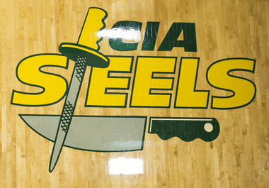
The Steels’ uniforms are pretty pedestrian. On the plus side, though, no maker’s marks, at least that I can see. Also of note: The team appears to be coed, at least judging by the team portrait (click to enlarge):


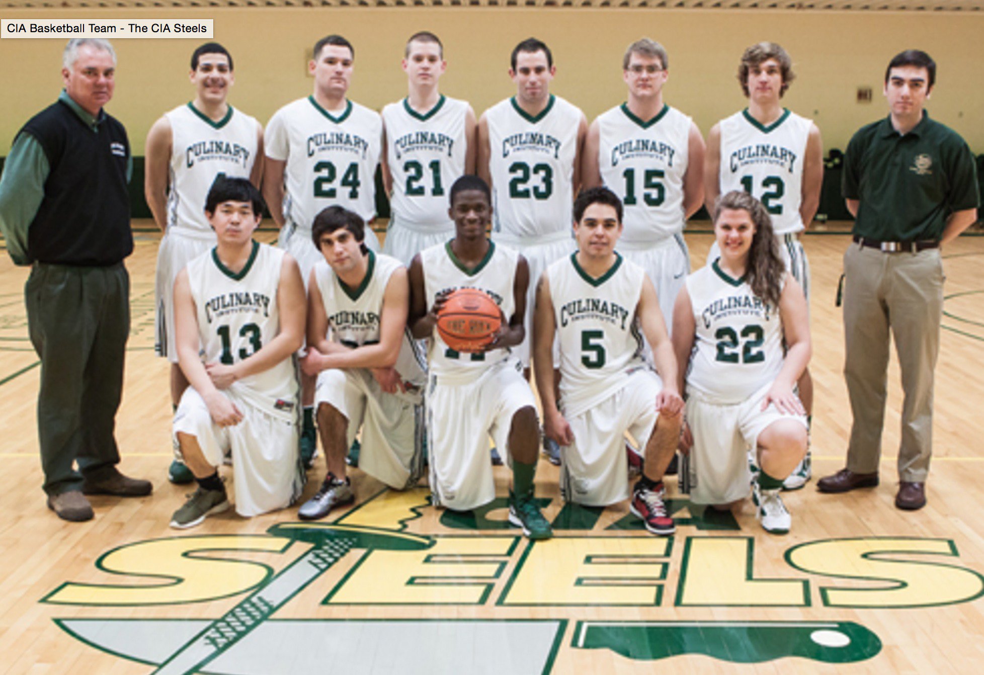
The basketball team is part of what the article describes as “one of the country’s most unlikely athletic departments.” In addition to the hoops squad, the CIA also has soccer, cross country, tennis, and volleyball teams. Naturally, I approve of the color scheme:


The CIA is not part of the NCAA. Its teams compete in The Hudson Valley Intercollegiate Athletic Conference, a 10-school conference that’s part of the United States Collegiate Athletic Association (formerly the endearingly named National Little College Association).
Finally, here’s a great little bonus factoid: The “Pedestrian Crossing” signs on the CIA campus show the standard design of silhouetted figure — wearing a chef’s toque (click to enlarge):

And now you can all make your various jokes about how they must have a great pregame meal spread, how the head coach’s assistant is probably called a sous coach, and so on. Go on, knock yourselves out.
(My thanks to John Fitzgerald for the Steels team portrait.)
Fun with AP Style: Associated Press assistant sports editor Oskar Garcia fielded questions on Twitter yesterday concerning various vexing issues of sports-related style and usage. Among the most interesting revelations: Schools that can be referred by their initials on first reference are BYU, UCLA, LSU, UTEP, UNLV, SMU, and TCU. Schools that should be spelled out on first reference but can be called by their initials on second reference include UCF, USF, USC, FIU, FAU, UTSA, ULM. (I’m surprised UNC didn’t make either list.)
Also: When referring to runs batted in, plural, it’s “RBIs” (not “RBI”). And in football, it’s “fourth-and-7” — spelled out for the down, numeral for the distance. Yes, that seems confusing. Style rules are like that sometimes.
(Thanks to Ed Bauza for letting me know about this one.)
Holiday T-shirt reminder: In case you missed it yesterday, we’ve launched three new designs that are not technically part of the Uni Watch T-Shirt Club (no sleeve patch, no month designation) but are very much in keeping with the spirit of the project. Take a look (click to enlarge):
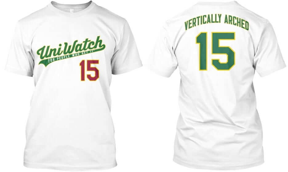
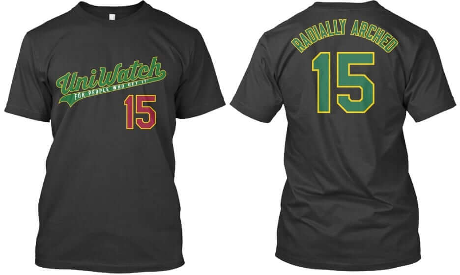
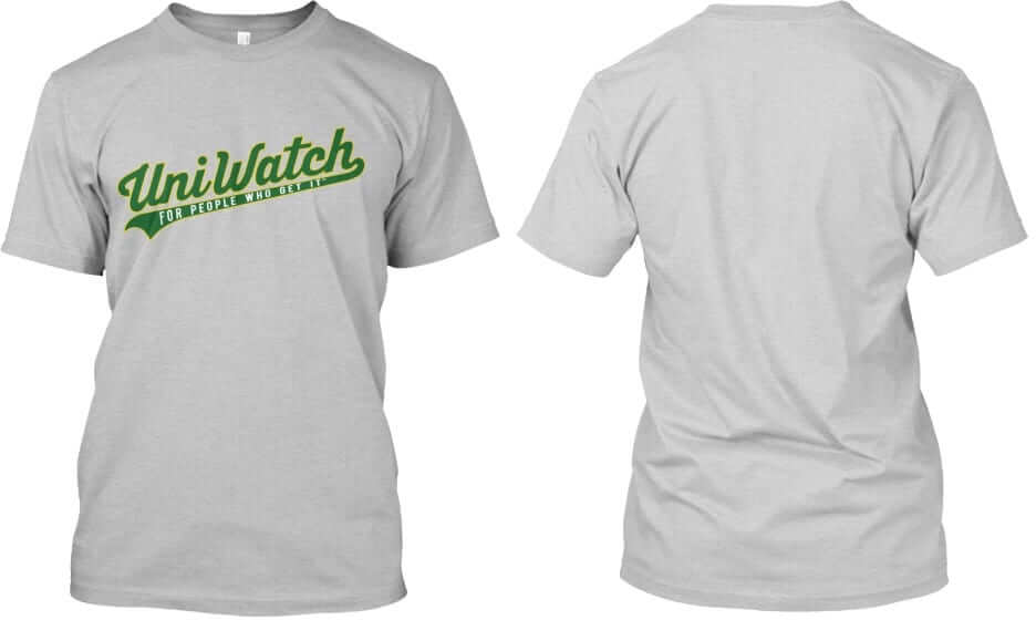
Each of these three designs — “Vertically Arched,” “Radially Arched,” and the plain script with nothing on the back — is available in all three colors shown (white, black and grey). In addition, each design and color is available in three formats: short-sleeved tee, long-sleeved tee, and sweatshirt. Plus the plain script design is also available as a hoodie with pockets. So if you tally up the three designs times the three colors times the three formats plus the hoodie option, you get 30 possible combinations. I absolutely do not recommend that you try to collect ’em all, but maybe you’ll like one or two of them.
These shirts are available here. They’ll be offered for three weeks — up until Dec. 9 — which means they’ll deliver in time for Christmas.
Meanwhile: If you ordered all 12 of the T-Shirt Club designs and qualify for the year-end prize (which, in case you missed it earlier, will be an embroidered patch featuring this design), please prove that you’ve collected ’em all by either (a) taking a photo of all 12 shirts or (b) taking screen shots of your 12 order-confirmation emails from Teespring and putting the 12 shots into a folder. Then email the photo or the folder to TshirtClubProof@gmail.com (please note that this is a new address — do not send your proof to the regular Uni Watch email address), and be sure to include your mailing address so I know where to mail the patches once they’re ready to go.
Key Ring Stories reminder: In case you missed it a few days ago, I’m accepting photos and stories for a new project about the things that people keep on their key rings. This should be a really fun project for everyone — full details here.
I don’t usually do this, but I think yesterday’s Uni Watch post was really, really good. Also lots of fun. Many readers seemed to agree. If you missed it, I urge you to check it out here.

Mike’s Question of the Week
By Mike Chamernik
Last week Paul had that entry about the Blue Jackets’ gameday posters, and that got me thinking: Have you ever collected and displayed sports posters? If so, what are some of your favorites from over the years?
Though I didn’t own any, the Costacos Brothers made some iconic posters in the 1980s and ’90s. I currently hang this Mitchell & Ness NBA throwbacks mini-poster at my desk at work.
How about you? Post your answers in today’s comments.
The Ticker
By Mike Chamernik

Baseball News: New logos and uniforms for the Syracuse Chiefs. And here are the new hats (from @akanefive and Matt Bowman). … The Harrisburg Senators are bringing back their Uncle Slam alternate cap (from Joseph Matlock). … The Yankees’ Phil Rizzuto used to keep bubble gum on his cap’s squatcho/ee. A hat that he wore during the 1952 World Series at the Yankee Stadium museum still has a wad on it (from Jeff Jacobs).

Pro and College Football News: Virginia Tech will wear white pants to honor the 1987 team, which was the first year for retiring coach Frank Beamer. … Washington will wear white-over-white against Oregon State. … Yesterday we had a mention of an Illinois fan dressed as Red Grange. Here’s more information on that (from Kevin Olivett). … Fenway Park’s scoreboard is set for Saturday’s Irish/BC game. … The package design on this Michigan uniform costume will surely hurt sales (from Josh Sandin). … Timothy Harendt sends in two old ticket stubs from Hardin-Simmons, a small private school in Texas. The top photo is from a 1959 game against Auburn, which Timothy says was the first time Aubie appeared on the game program. The bottom pic is from a 1951 game against Arizona. ”¦ When Bills players make local charity appearances, they wear NNOB jerseys. What’s up with that? … Jags safety Sergio Brown likes his Color Rash uni, which he’ll wear in tonight’s gold-vs.-blue game against the Titans (from Phil).

Hockey News: Yesterday, Paul wrote that the NHL will have four teams for the All-Star Game this year. Even considering that, the league will only use two uniform designs. Not sure how that’s going to work. … Edmonton International Airport has a great Oilers display at its baggage carousel. … Star Wars jerseys for the Milwaukee Admirals. … And, Star Wars jerseys for the Vancouver Giants (from Ryan Houdayer). … And again, Star Wars helmets for the Omaha Lancers (from Oliver Pérez). … The Toledo Walleye will wear jerseys for 8-Bit Night this Saturday. ”¦ The 1912 Glasgow Black Foxes had some seriously cool sweaters (from Will Scheibler).

Basketball News: Magic players wear their Twitter handles as NOBs on their warm-up/bench tops. Do all teams do this? … This page shows every Milwaukee Bucks team photo. … Bucks F Jabari Parker shaved his afro. … Wofford wore sleeved jerseys against UNC last night (from Craig Kirkpatrick). … Gonzaga and Northern Arizona went turquoise-vs.-yellow last night. The turquoise was Gonzaga’s N7 uniform (from David Tobias). ”¦ Western Kentucky wore their new red unis for the first time last night (from Josh Claywell).

Soccer News: Here’s a look at the NASL’s Team America, a club from the early 1980s that wore red-and-white horizontally striped jerseys (from Benjamin Brown and Phil). … Paris Saint-Germain will wear jerseys with “Je Suis Paris” embroidered on them (from Phil). … A self-financed Italian football team is named after the 1998 Coen brothers film The Big Lebowski. The club also uses the Dude’s face as a logo (thanks, Saurel Jean). … Unusual palm tree-themed jersey for the Central Coast Mariners (from Terry Mark).

Grab Bag: A Canadian skier will have a vicious panda bear painted on his helmet for the World Cup downhill races. The design was created by a 10-year-old, and the helmet will be auctioned off after the event to raise money for pediatric liver research (from Phil). … Sports teams aren’t the only ones who wear flag-based designs: A Muslim woman appearing on Fox News yesterday wore a stars/stripes hijab (from A.J. Frey). … Harvard’s Arnold Arboretum is holding a Lilic-themed T-shirt design contest (from Brian Mazmanian). … New logo for the town of Waukee, Iowa. ”¦ Louisiana Tech signed a five-year deal with Adidas. The school’s various teams previously all had separate deals with different manufacturers. … Darren Read has saved all of his ticket stubs over the past 35 years or so and has created framed montages out of them. I really enjoy all the Expos tickets.
if I remember the story correctly, when my dad was a Yale undergrad, the Culinary Institute of America was in New Haven. The students often wore varsity jackets with the schools initials on them which sounds like a Paul would love to findin a thrift store.I
The tagging around the Jackets poster link in the Question of the Week is broken.
QoTW
I used to have a tennis poster in my room as a high school kid, but I guess it was more of a print. It was mostly yellow and it said “TENNIS IN NYC” on it with a silhouette of I think Andy Roddick on it. Loved that poster and have tried a couple times to find it again with no luck.
As a kid I had a one-of-a-kind NFL poster map of the US, with cool drawings of several players grouped around each NFL city. I loved that poster and would stare at it for hours. Of course the poster is long gone now. I’ve searched eBay and have never seen one like it. Sure would like to get my hands on one – does this poster ring a bell with anyone?
Re: “RBIs”
SportsCenter went through a period where the anchors would use “RBI” for multiple runs batted in (they may still, I don’t know). It was like nails on a chalkboard for me after hearing “… had 3 RBIs last night …” my entire life. Guidance from the AP on using “RBIs” is most welcome.
I never thought about RBI or RBIs being proper as plural, one way or another. RBIs seems appropriate on surface, but it’s, of course, not “Run Batted Ins”. Perhaps it should be RsBI.
The American Outlaws and ESPN teamed up to do USMNT posters as bar giveaways during the World Cup last year. Not gameday specific, but they’re pretty cool looking.
The Magic only did that Twitter thing because of “Social Media Night.” Interestingly, Mario Hezonja has no Twitter and instead had the Orlando Magic one.
Shouldn’t BC be the second team listed on the Fenway scoreboard?
Shamrock Series is always a home game for ND, regardless of location.
Yes, that’s bullshit. Imagine, an aspect of college football that’s bullshit — shocker!
Interesting. Silly me for thinking Boston College would be the home team in a game played in Boston.
For an extra lump sum of cash – the Terriers would dress in pink… no wait, that was last month.
One more reason to root against ND!
Crowd/”homefield advantage” aside, is there any real advantage to being the home team or away team in basketball, football and hockey? Especially when played in a neutral environment?
Home team gets the last line change in hockey, right?
Home team in the NFL gets choice of wearing color or white (Color Rash games notwithstanding).
Could a not-at-home “home” team designation in hockey cause the first and third periods to have benches nearest their opposing goals, rather than the second period? That could actually affect pace of play and scoring, though for both teams equally. Or are goal assignments based purely on bench location, not home/away designation?
Yes, home team in hockey gets last change so it can react to the road team’s personnel. Included in that, the road team has to declare its starting lineup first and the home team can react to the road team’s starters. This is why John Tortorella only goes apeshit over opening faceoff line brawls when he’s on the road.
Also, the home team’s center puts his stick down last for faceoffs, unless it’s in the defensive zone due to a penalty, like icing. Good centers use this information to plan their own faceoff strategies.
arrScott: The first and third periods give teams “the short change,” and the second period (and overtime if needed) yields “the long change.” Practically, that “advantage” is only because home locker rooms are cushy, and the home locker room is connected by an easement to the “home bench.”
Most NHL rinks these days have the tunnels to the dressing rooms behind both the home and visiting teams.
Is that new Mike? When OT first came in they did the “long change” for OT and they quickly killed it because the goalies were destroying the creases at the end of the 3rd period just prior to the switch.
Mike, thanks. I had thought that teams got the long change in 1st and 3rd. But since I was like the one boy my age in Minnesota who didn’t play hockey – or skate at all – that’s the sort of detail I tend to flub as a spectator.
Styczen:
link
Here’s the quoted relevant part, [my interjections in brackets]
6. At the end of regulation [which was the third period, so short change], the entire ice surface will be shoveled and the goalies will change ends [so long change on OT]. There will be no further ice surface maintenance during the balance of overtime period. Following the overtime period and before the shootout, the ice surface will be shoveled again, and the goalies will change ends [so back to the short change on the shootout, but the Zamboni driver clocks out after preparing for the third period].
Please… “period of the long change”… you’re making me hear Doc Emerick in my head…. Talk about nails on a chalkboard. I can wait ’til April.
If I’m not mistaken, ND gives up a home game to play in a stadium near the visitor. To expand their brand I think
It’s not necessarily near the visitor; Notre Dame has played Washington State and will play Army (next year) in San Antonio.
The initial impetus, I think, was NBC’s desire for prime-time games. With the new contract, there are three on-campus games every two seasons. Last year, the game was Michigan; this year, Texas and USC were at night. By playing the game off-campus, NBC is happy (the game is in prime time) and Notre Dame has one less night game on campus (without the hoopla and inconvenience that a residential campus endures).
They then make the game an event, by setting up academic events (this year, ND and BC law students will conduct a mock trial of the Boston Massacre; the School of Architechtute will do a presentation on Boston as an example of the sustainable city of the future), community service projects, and the like.
The Magic only wore those shirts last night for social media night >> link
QotW
The Sports Illustrated posters with the white border and basic black font were virtually mandatory for any kid’s bedroom wall in the early 80’s. I had the Dave Winfield Yankees one, hanging over my bed for years until he got traded. I still have it folded up somewhere I think. The simplicity of those was excellent- they just looked classy, not loud and gaudy.
Scottish football club facing action over team badge. Apparently they broke heraldic law.
link
Wait, there’s a law in Scotland prohibiting teams from wearing the country’s flag? I’m moving.
As a UNC (graduate) student I was surprised, too, but I was reminded by my wife, a Colorado native, that at least in Colorado (and perhaps Wyoming) UNC refers to the University of Northern Colorado. For example, billboards in Colorado refer to their university as UNC: link
My wife is a UNC Chapel Hill graduate – although she refers to the Heels now as “The Cheeters”. Two decades of institutional fraud will do that, even to Carolina blue bloods. She also mentions that the Tar Heels will get through it and hopefully be better for it all. Optimism is one of her strong suits.
She also reminds me that UNC actually refers to the University of North Carolina – 17 universities, one system, whatever that means. Chapel Hill is the most popular because of it’s Ballin’ tradition, some might say women’s soccer and the Mount Rushmore of student fraud. Certainly should be an NCAA trophy for that – Suck on that Duke!
Paul,
Sniglets themselves have a very interesting story that involve Douglas Adams, the creator of “Hitchhiker’s Guide to the Galaxy”. (Which I first heard as a radio play on public radio when it was broadcast along side the radio play adaptation of ‘Star Wars’.) See “The Meaning of Liff”.
Not everyone is happy with new words, so if I ever hear a complaint about a made-up word, I usually say ‘all words are made-up words’.
That Italian Dude logo seems (ahem) borrowed from the folks over at LebowskiFest. link
QOTW: There was a terrific Great Goalies poster available in the ’70s that had photos of all of the goalies of the era on it. Both me and my brother had one in our rooms. Masks, pads, jerseys, all of the cool stuff.
RBI and RBIs are both wrong. It should be RsBI. RBIs is the worst answer of the three.
By all means, you go ahead and use “RsBI.” Let us know how that works out.
I do use RsBI, but mostly to annoy my friends. It seems to work pretty well in that regard.
Aside from being silly, that is also incorrect. Acronyms and initialisms are words unto themselves, grammatically. Every grammar style guide I’ve ever encountered – Oxford, Chicago, AP, and so on – agrees on this point, and it’s how people have actually used acronyms and initialisms since they entered everyday English in a big way during the Industrial Revolution. So it’s Attorneys General but AGs; Runs Batted In but RBIs, and Memoranda of Understanding but MOUs.
Also, acronyms and initialisms take the appropriate a/an article regardless of whether the first word being abbreviated would take the other article. So it’s a Solid Rocket Booster but an SBM.
Why is RBI wrong? The “R” represents both run (singular) and runs (plural). I agree that RBIs is incorrect.
By that silly logic, it should be ‘RsBedI’
Pilight is exactly correct and this principle must be applied immediately to any and all acronyms and initialisms.
Car makers must notify us of fuel efficiency by advertising the “MsPG” and advise proper tire inflation using “PsSI.”
College students interested in training for a military commission must be referred to as “ROsTC” members.
The association of international governments must be known as the “UNs.”
None of your examples switch between singular and plural, so those constructions aren’t appropriate. Having RBI mean both a single run batted in and multiple runs batted in could be confusing.
It’s only complicated because you’re trying to make it so. If a run batted in is known as an RBI, then doing that 3 times means you have 3 RBIs. It’s really that simple. The only possible reason to write it as RsBI is if you’re trying to distinguish between one runner scoring on one hit and multiple runners scoring on one hit, and there’s simply no reason to do that over the course of an entire season.
QOTW
I have a 2012-2013 Notre Dame men’s hockey senior night posted, a 2015 FC Schalke 04 fankalendar, and numerous ticket stubs on the walls of my bedroom in addition to none sports related posters.
The discovery of the CIAs basketball team reminds me of when the nation discovered the Art Institute had a baseball team …
link
The use of “squatcho/ee” in the Baseball section gives me an idea: Spell it “squatchoe.” Most will pronounce the last syllable “oh;” Dutch speakers will pronounce it “oo;” and contrarians can declare the “o” to be silent and pronounce it “ee.”
All this debate over “squatcho” and “squatchee.” Go ahead, have at it. Meanwhile, I’ll just sit here in my little corner of the world and call it what I’ve always called it for the first 57 years of my life, “button.”
See ya later.
I think there’s someone on your lawn.
in my youth, i never heard it referred to as anything but a “ball-finder”. i like both squatcho and squatchee, and i grew up in the land of Kruk and Kuip, so i am fond of most of their -isms, but “ball-finder” was the term i always knew.
Garcia’s second class of colleges probably has a lot to do with the many schools that share the same initials. (If someone alludes to “USC” around here, he probably DOESN’T mean the one in California.)
Two terrific Uni Watch leads in a row. I’m a thousand times more interested in the unis and logos of small schools, especially schools you sort of wouldn’t think of as having organized athletics, than any big school’s latest one-off football uniform. The Steels are also a terrific proof case for high schools everywhere: The worst student-designed team logos are better than the best pro ripoff logos. Not that the Steels athletic logo is bad; it’s a perfectly serviceable design. Nothing special, but nicely whimsical where it counts. But because it’s clearly designed by and for the school, it’s better than any potential ripoff or pro-inspired logo would be.
QOTW: Most of my sports-themed decor was done by me. If you recall Paul’s feature on my baseball drawings two years ago, it was of a similar tenor. I’d recently discovered Magic Markers and professional sports, so I’d make 8 1/2 x 11 posters of unpopular teams with garish uniforms (my favorites). My bedroom also had little circular cutouts of NFL helmets I’d colored in when I was fourteen. When I was college-aged, I favored USFL pennants and also had a WFL poster like the one featured on Collector’s Corner not long ago. When it came to sports, I was/am a contrarian.
QotW
I had quite a few posters on the wall as a kid. Some highlights:
Grandmama: link
The Black-n-Blues Brothers: link
This was my favorite:
link
Never been a big poster guy but was at a Chicago Blackhawks game the year after they won the first of their recent Cups. Local radio station was doing pregame show and available for the taking were nice simple posters of the Stanley Cup. My all time favorite Stan Mikita was a guest of the show and was available for autographs. Grabbed a poster, got Stan to sign it, later had it professionally framed and now have a great keepsake hanging in the den.
The iconic poster of my youth was Cory Snyder GUNSMOKE!
link‘.jpg
I still have it to this day.
QotW
Ones I had
— George Gervin (“Iceman”)
link
–Earl Campbell
link
Posters? I had the full set of NHL Western Division art posters ordered from the back of a Wheaties box. Even though I live in NY I loved the expansion teams of the West, especially my California Golden Seals! I have photos of me and my friends in my bedroom with the posters on the wall in the background. Here are examples of two of the posters, they have been discussed before here on UW:
link
link
-Jet
Akin to the shirts that say, “I’m calling it Shea”, we need t-shirts that say, “I’m calling it squatcho” and “I’m calling it squatchee”…
-Jet
+1000
I also had this Gilles Meloche poster, which I probably ordered through the Hockey News. I also have a picture of me in my room with this in the background…
link
-Jet
QOTW:
My parents got the Washington Post (morning paper) not the Washington Star (evening paper), but our neighbor gave me some of these “posters” that came in the Star during the ‘Skins Super Bowl year of 1972.
link
So you were Team Shirley Povitch over Team Mo Siegel, huh?
Sad Day: link
I was a kid. I probably only cared about which paper had which comics on Sunday!
I think the Post was more conservative, so my Dad got that one.
I never collected sports posters, but I had a couple on my wall as a kid. This link was always my favorite, and I kept it up long after they changed the uniforms and logo.
My sons each have a link on the walls of their bedrooms.
The CIA (Central Intelligence Agency) is in Langley VA, not Washington.
QOTW: I was a big Will Clark fan growing up, and I had a few posters of him on my wall. One was the old-school Starline with the orange border and his name in a simple black block font outlined in white. Another was a kind of metallic one that said “SHEER WILL” at the top with three color photos of Will mid-swing over a background closeup photo of Will’s eyes. I know those a both rolled up in a tube in my basement.
There was a “G Force” one with Matt Williams and Kevin Mitchell, the Costacos “WILLPOWER” one that I hated because the photo had no energy or power to it at all, and one that said “Thriller” (in Mistral!) that I didn’t like because it looked like the photo was taken after a swing and miss.
I also displayed covers of Beckett Baseball Card Monthly on a corkboard in my room, probably 1987-1989 or 90.
Sports posters included a Bills OJ Simpson (somewhere there is a picture of me posing with a football and a football-shattered nose in front of it) and one of those Leroy Neiman Olympic posters (’76).
I live about 10 minutes from the CIA and had no idea they had any athletics teams. Their campus is right down the road from Marist, whose Red Foxes are a little bit more celebrated.
Does Disney get a cut when these teams sell their Star Wars merchandise? Do these teams need Disney’s permission? Just wondering is all.
I’m not surprised at all. Being a cleveland native, Cleveland state is referred to as “CSU” but those are also the initials for Charleston Southern, Colorado State, and Columbus State (community college)
Columbus State is CSCC, who’s ever called it CSU?
CSU is also California State University – [insert city]. There’s a lot of other smaller, or lesser known, or less “important” school abbreviations out there for many of the same school initials.
Just a thought: since the CIA uniforms are a bit… flavorless… how about a quick and easy design competition? you could call it “spice up the CIA” or “sharpening the steels”. keep it simple: you must maintain the nickname “steels”, you must use some form of yellow and green, and you may design unis for any or all of the aforementioned sports: basketball, soccer, volleyball, cross-country, or tennis, as well as redesign the logo if you wish.
Can we invent an intermural club ice hockey team? They actually have steels! That, and I have an idea for them.
QOTW: I collected many sports posters during my college years. I had a great poster of Manon Rhéaume as well as a Costacos Don Majkowski. Later had a faux movie poster of Brett Favre (Favre And Away). Those come immediately to mind.
For anyone who has an answer:
The bottom of Sergio Browns gold jersey (of the jags) seems to be cut and bungeed. Any ideas on how and why this is done. I’m curious.
Thanks
QOTW: I own the Wayne Gretzky link poster, and have for years. It doesn’t hang anymore because the thing on the cardboard back (which you use to drape over a nail and keep it on the wall) fell off and I never replaced it.
Jet has posted Sportsgraphics posters of the North Stars and Seals. I won the Habs version through a Paul Lukas annual “Thank You Readers” Xmas time raffle. Once I get a real place of my own that isn’t a dorm room, I’ll be hanging it.
From that picture with the Ped X-ing signs, those signs are technically not up to the Federal Highway Administration’s standards per its Manual on Uniform Traffic Control Devices. If one of my old bosses saw it, he’d have a fit.
Should clarify, the ped X-ing sign and STOP sign both have issues.
Probably the only reasons those modifications are OK is a confluence of (a) the changes are pretty darn minor (it would be different if the stop sign were a white circle with black lettering–I still see a red octagon), (b) I’m assuming the Culinary Institute is private property, in the same sense that Hofstra is, and (c) everybody knows that these private roads are designed to keep cars as slow as possible, because it’s a university campus.
Related, the fun “pedestrian with a chef hat” modification reminds of a photo that I posted on Facebook and specifically brought to PL’s attention. I once studied for three weeks on the campus of the University of Curaçao. You know the cartoon people that show the men’s room from the women’s room? Well, they both had mortar boards on their heads, because it’s a school!
Actually, no, they’re not “OK.” FHWA would call them out on it. I’m not saying FHWA is right, just stating that it is not up to the code that defines traffic control devices on public and private property.
The reasoning is so that everything is uniform and you don’t have weird colored signs and whatnot. Also, they’re engineers so they lack a sense of humor.
Isn’t it a question of access? If the the campus is gated then the roads are not subject to the same regs. Don’t know if the CIA restricts traffic to that extent.
A small new masterplanned community near Orlando uses the stop signs with the black border outside the white border. Seems that is becoming more common.
On that note, how come some similar campus-like places I’ve seen speed limit signs stating “13 MPH” or something absurd. Are 15/20/25 reserved for public roads?
I know Ole Miss has a campus speed limit of 18 MPH – an homage to the uniform number of Archie Manning.
One Minor issue, that’s a honing steel, not a “sharpening steel.”
link
Here’s an AP piece compiling name changes of college mascots, buildings, and mottoes, due to “pressure from students.”
link
Power to the people, I guess, huh?
So… when do we get to vote on who to replace Washington & Jefferson with on Mount Rushmore? I’m thinking JFK and Bill Clinton.
Newsflash to these protesting students, EVERY DAMN THING in our country’s history can be somehow connected to racism and slavery and other things which we now consider wrong. Use it as an educational tool, don’t just erase it.
Professor Farnsworth: “I don’t want to live in this world anymore.”
I’ve been on that wavelength for over 20 years!
Polk and Arthur for Rushmore!
. . . and John Adams in place of Roosevelt.
QOTW:
I had a Costacos Dodgers “Triple Threat” poster featuring Darryl Strawberry, Eric Davis, and Brett Butler in my room in high school. Hometown heroes Straw and Davis ended up being complete busts with the early 1990s Dodgers.
link
Slightly disappointed WVU didn’t make the second list.
I had a poster in the late 70’s from Nike. It had a photo of every shoe they manufactured that year, probably for dealers to use. This back in the waffle trainer days, but the featured shoe I remember most was the Nike Disco. It was sequin-y silver with metallic red swooshes. Just ridiculous…but the poster was awesome.
I remember my older brother having this awesome poster on his door:
link
I also remember the moment I first heard of Hall and Oates and thinking, “Oh cool, just like the hockey players!”
I’m surprised UCONN and UMASS aren’t on the list of schools that can be abbreviated. Both state schools and both clear which school one is writing about.
I had this on my wall as part of my reverence to those 90s Bulls teams:link
I had this poster of Sergei Fedorov playing for the Soviet National Junior Team. Loved the uniform more than anything else about it.
link
This Rangers poster has been in my family since the 1970s. I had no idea it was a big deal ’til Uni-watch kept making notes of this style popping up on ebay:
link
Yet another rare nugget from today’s lede: the soccer player wears #1, but is not a goalkeeper!
Can we discuss UND’s new nickname? Or are we strictly sticking to ticker stuff, today?
You can bring it up if you like. But it’ll be in part of tomorrow’s ’Skins Watch.
Fair enough. Maybe tomorrow I won’t feel as bitterly as now; but my earliest impression is UND’s weak sauce is the result of committee dumbing-down at its worst. Entries in Rich Hall’s Sniglets books would have yielded 25 better offerings.
That’s disrespect to Mr. Hall. It would have been more than 25!
QOTW: In 2001, my alma mater Rochester Institute of Technology (RIT, probably one of those schools that has to be spelled out before it’s abbreviated in an article!!!) hosted the Division III Frozen Four (We lost to Plattsburgh in the finals, dammit!!!). I was able to get my hands on one of the promotional posters (about 11×17) that was hanging in one of the buildings on campus, and made it the centerpiece of a larger collage commemorating the event. Along with the poster, I added ticket stubs, a program cover, pictures I had taken, and the front page of the student newspaper from that week to a 25×36(ish) poster frame. It hung in my apartment up until I got married, at which time it was deemed unsuitable for hanging (the same fate most pieces of sports memorabilia meet when a man gets married), and is now in storage in my basement.
Watched the UNC – Wofford basketball game last night and play-by-play guy Wes Durham got excited midway through the second half when the UNC lineup briefly included players wearing uniform numbers 0, 1, 2, 3, and 4, saying “that almost never happens.” And – when Marcus Paige (No. 5) returns shortly from his hand injury – they will probably have players wearing 1-5 inclusive on the court.
QOTW:
I actually have two sports posters in my office.
1984 poster of Cal Ripken with a hibachi in front of his locker
link
1984 Dodgers Salute to Hall of Famers (Drysdale and Reese) poster
link
The Cleveland Institute of Art is also referred to as the CIA.
And so is Coney Island Avenue (a major thoroughfare that runs thru Brooklyn).
I’m sure lots of things are.
Colorado Institute of Art
I missed yesterday’s awesome post, Paul. Great job!
For the record, I prefer “squatchee,” and think “squatcho” sounds more like a made-up word. Ironic, I know.
It’s too bad Louisiana Tech is switching to adidas. I think Nike does shoulder stripes perfectly, and La Tech looked great with Nike. All about the money, I guess
Strangely, until today, I had never heard of the United States Collegiate Athletic Association. As a HS counselor, I host many colleges in our region (Greater Cincinnati/Northern Kentucky and beyond) who come to recruit potential students. Today’s visit to my school was from the University of Cincinnati-Clermont College, who also belong to the USCAA. Two encounters in one day. . .
My dad had a Carling O’Keefe 1974 Team Canada poster like this:
link
I have one of the Molson Ice Greg Harrison mask posters hanging to the right of where I am currently sitting. Looks like this:
link
A bit off topic on the acronym front.
Did anyone else first read U.S. Mint in their head when they saw USMNT. Have a similar problem when reading copse (as in trees) in a book; I first see corpse no matter how clear the context.
Nice URL, Paul.
I suspect I’m in the vast minority, but I actually think of the current attire the Jax Jaguars wear, this is the best looking one, which is not saying much admittedly.
I sort of like it as well… But the helmet ruins it. If they out the new logo on the old helmet it would’ve looked much better.
The sweat boxes on the Jags’ gold jerseys looks really bad. I mean it looks bad on all Nike jerseys but the gold really accentuates it.
A team named the Admirals didn’t use Admiral Ackbar for their Star Wars jersey. What a disappointment.
It looks like there are no “leftovers” in the CIA uniform dept. either … I see the one girl wearing 22 in the team photo, and a guy wearing 22 in the overhead shot.
In that collection of Team America soccer photos, check out the NOB on link, which goes from capitals (VAN) to small capitals (der) and back to capitals (BECK). I don’t think I’ve ever seen a prefix do that.