
Click to enlarge
Bizarre scene yesterday in Tampa, as Giants defensive lineman Jason Pierre-Paul made his first game appearance since losing one of his fingers and part of another during a July 4th fireworks accident. He had been expected to wear a custom glove — and hey, maybe he did, but it was hard to tell under the padded wrap he wore on his hand, which looked like a cross between an oven mitt and a boxing glove. Here are a few more shots (click to enlarge):


If they had to wrap his hand like that, I guess it must still be healing, which I hadn’t realized. I’d be curious to know more about this, since the wrap obviously compromised his ability to grab or grip anything with that hand.
Aside from that, it was a very quiet day around the league, at least from a uni-centric perspective. A few notes:
• After kicking a field goal, Giants kicker Josh Brown changed his footwear, switching from a field goal shoe to a kickoff shoe. He probably does this routinely, but I’d never been aware of it before.
• I caught a few Bills highlights and thought, “Damn, they look so good.” Too bad they’ll be wearing mono-red bodysuits later this week for the Color Rash game.
• It’s been a while since we’ve mentioned Nike’s sweatbox problem (maybe because we’ve been focusing on Nike color-matching problem, Nike’s custom-font problem, and all the rest of Nike’s problems), but it bears repeating: The sweatbox looks like shit. I hate to trot out so shopworn a cliché as “If we can put a man on the moon”¦,” but it does seem made for situations like this one.
• More G.I. Joke nonsense, including spatting tape, waistband towels, captaincy patches, coaches’ caps and headsets, and so on. Many teams also wore military logo helmet decals. You can see the Jets and Jags wearing them here.
• The Panthers took things a step further by wearing the initials of fallen soldiers. Nice gesture, bad civics: Memorial Day is May; the holiday coming up this Wednesday is Veterans Day.
• At one point NBC ran a graphic showing showing two Eagles players — one in the Nikelace-ized jersey and one in the older style.
• This is funny: At the Barclays Center, where the Islanders had a home game yesterday, the scoreboard helpfully showed the day’s NFL scores. The thing is, when showing the Jags/Jets score, they used the logo for the Winnipeg Jets. And when they showed the Packers/Panthers score, they used the logo for the Florida Panthers. Not sure if this was intentional (“Hey, we’re an NHL arena now, we’ll push the NHL agenda whenever possible!”) or a mistake, but it’s amusing either way. Now we just have to wait until baseball season and see if they use the New York Rangers logo when showing the score of a Texas Rangers game.
(My thanks to James Paterson, Brooks Simpson, Alex Sinclair, Ben Whitehead, and Phil for their contributions.)
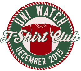
T-Shirt Club update: As you may recall, on Friday I showed you a preview of how the Uni Watch T-Shirt Club’s December design was shaping up. In case you missed it on Saturday, we posted an updated version showing how the design had evolved a bit further. Here’s another look at that graphic (click to enlarge):
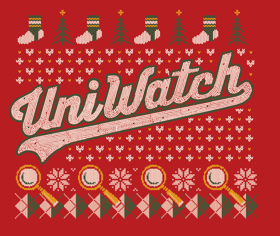
Pretty good, right? If we can finalize the last details of the design today, the shirt will launch tomorrow. Otherwise it’ll launch either on Wednesday or else next week. Stay tuned.
Meanwhile, I have several other Club-related announcements to make:
1. As a result of all the problems with the November tequila sunrise shirts, the entire run is going to be reprinted. If you were told by Teespring’s customer service people that a replacement shirt wasn’t possible, forget that — it’s possible, and it’s happening. Everyone will get a new shirt. If you were sent the wrong size, you’ll get the right one. If you weren’t happy with your shirt’s print quality, you’ll get a new one. And if you loved your shirt and had no complaints, well, now you’ll have two of them. Congrats!
If you requested and received a refund, I’m pretty sure you’ll still get a new shirt anyway (I’m trying to confirm that). If you were thinking of asking for a refund but hadn’t yet done so, please wait and let’s see how the new print run turns out. If you’re still not satisfied with the replacement shirt, you’ll still be able to request a refund.
To everyone who’s had a complaint: Please accept my apologies. I know how frustrating it is to order something you’re excited about and then have it turn out to be a letdown. As the creative force behind this project, I’ve shared in both the excitement and the letdown — it’s a drag. We’re doing our best to make it right. Thanks for your patience.
2. We’re going to offer some additional Uni Watch shirts for the holidays. Strictly speaking, these will not be part of the T-Shirt Club — there will be no sleeve patches, and you won’t have to buy any of these to qualify for the “Collect ’Em All” bonus prize. Still, these shirts will be very much in keeping with the spirit of the Club, and I think you’ll like them. More details later this week, I hope.
3. Many of you have asked if the 2015 T-Shirt Club shirts, all of which have been limited-edition, would be offered for sale again. After thinking about it, I’ve decided to go ahead and make all of the 2015 designs available, but with some provisos: (a) The 2015 designs will not be revived until 2016, probably around February or so. Only the people who bought the designs this year will get to enjoy them this year. (b) When the 2015 designs are revived, they will not have the T-Shirt Club sleeve patch. Only the people who bought the shirts the first time around will get to wear the patches. (c) The revived versions of the designs will not count toward the “Collect ’Em All” bonus prize. The only way to earn that prize is to have ordered all 12 of the 2015 designs when they were first offered.
4. Speaking of the prize, it’s finally time to announce what it is. Everyone who’s ordered all 12 shirts (and who can prove it, either by sending a photo of the 12 shirts or by sending copies of “Your order has been received” emails from Teespring) will receive an embroidered patch with this design:
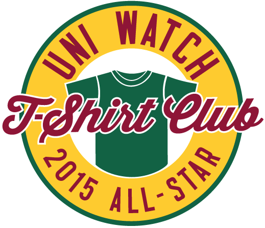
After having a representation of a patch on each shirt, I thought it would be cool to have a real patch as the bonus prize. The patch will be four inches across, just like the Uni Watch anniversary patches that I was selling last year. This patch will not be available for sale — the only way to get it is to purchase all 12 of this year’s designs.
5. Finally, many of you have asked if the T-Shirt Club will continue in 2016. Answer: Probably, but not necessarily in the same format we used this year. I’m fairly certain we’ll have some new shirt designs, but I’m not sure we’ll come up with a new one every month, or on any specific schedule. Right now, I have several ideas that are still in flux. More details soon.
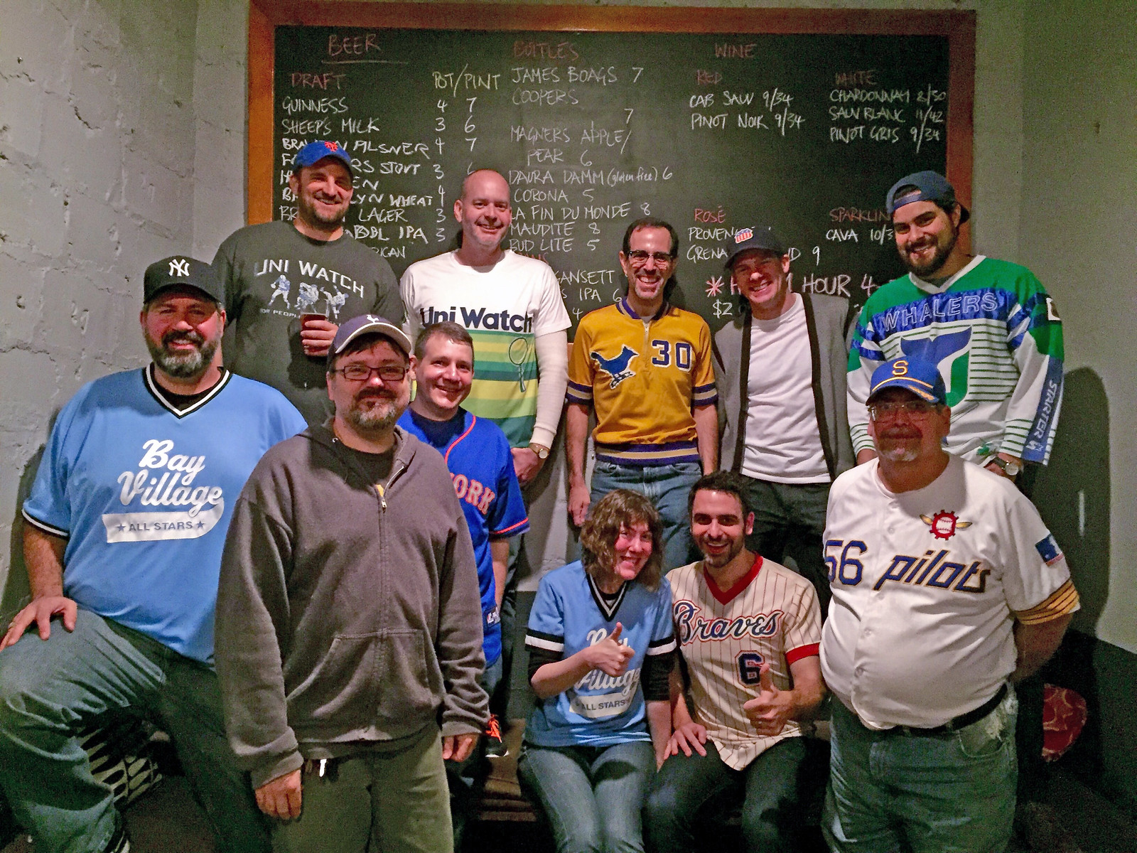
Photo by Mary Bakija; click to enlarge
Uni Watch party report: Big thanks to everyone who showed up for Saturday’s Uni Watch gathering in Brooklyn, some of whom are shown above. From left to right in the front row: Keith Goggin, Doug Kalemba, Marc Rivlin, Heather McCabe, Marty Buccafusco, and Lou Sherwood. And in the top row: Brad Eckensberger, own own Phil Hecken, yours truly, Ben Fortney (a longtime Ticker contributor who I was happy to meet for the first time), and Chris Giorgio.
As you can see in the group photo, there were lots of excellent jerseys on hand, and I took some (really shitty) photos of a few of them. Let’s start with Phil, who was wearing the new tequila sunrise T-shirt (for all of these, you can click to enlarge):
Keith Goggin was wearing an adult-sized reproduction of his old youth league jerseys. He brought along the original, which Heather McCabe modeled for this before/after shot:
Brad Eckensberger wore the old Uni Watch “charter member” T-shirt — always a favorite of mine (although I’d never wear it myself because, you know, the band should never wear its own shirt):
(Brad, incidentally, brought along a book that looks like it will force us to rewrite a key chapter in uniform history. More on that soon.)
And here I am with longtime Uni Watch reader/pal/neighbor Marty Buccafusco. I wore my vintage Delphos St. John’s basketball warm-up top (more on that here), and Marty wore a 1970s Braves jersey and posed with his son, Gus (who wore a Georgia Bulldogs jersey), and his mom, Regina Buccafusco — three generations of uni watchers!

Several other people attended but weren’t on hand for the group photo. My thanks to one and all, and doubleplusthanks to Morgan (sorry, can’t recall your last name) for all the nice things you said about my work — meant a lot, really.
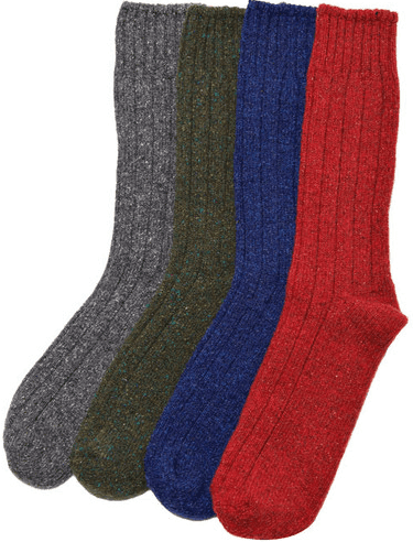
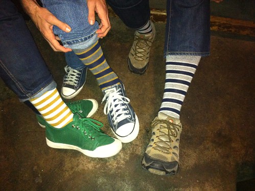
Sock discount: Longtime Uni Watch advertiser American Trench is offering a special deal: Order any of the wool/silk boot socks on this page and get 15% off by using the code WOOLSILK at checkout. I now wear American Trench socks almost every day, and I can honestly say they’re among the best, most comfortable socks I’ve ever owned. I get lots of compliments on the colors and stripes, too. Best of all, American Trench honcho Jacob Hurwitz is a great guy — I’m proud to have him and his product line represented on Uni Watch.
As an aside, it turned out that three people at Saturday’s Uni Watch party here in Brooklyn were wearing American Trench striped socks, so I’m not the only one who likes this product line. From left, that’s Marty Buccafusco, myself, and Brad Eckensberger:
Membership update: A few new designs have been added to the membership card gallery (including Zak Jester’s card, shown at right, which is based on an MLB umpire’s sleeve number). I’m sending the current batch of cards to the printer today, so new and recent enrollees should have their cards by the end of this week.
As always, you can sign up for your own custom-designed card here, you can see all the cards we’ve designed so far here, and you can see how we produce the cards here. My continued thanks to everyone who’s signed up.
The Ticker

Baseball News: The Giants have a pitching prospect who throws 100 mph and wears stirrups (from Chris Flinn). ”¦ Good catch by Ferdinand Cesarano, who spotted Yankees C Thurman Munson wearing the wrong number font — standard block instead of varsity — in this 1976 shot. ”¦ Uni designer/historian and longtime Uni Watch pal Todd Radom has created a really nice poster to commemorate the Royals’ championship. It’s part of a series of travel posters he’s designed.

NFL News: According to the mighty Gridiron Uniform Database, the Broncos wore a patch promoting Colorado’s upcoming centennial celebration on Dec. 14, 1975. I’m not sure I’d ever seen that patch on a jersey until Tyler Maun sent me this shot. That jersey is part of a series of uniform displays at SFO airport, part of the build-up to the Stupor Bowl next February. ”¦ Speaking of airport displays: If you’ve ever been to the Pittsburgh airport, you know that there’s a status of Franco Harris making the Immaculate Reception. Someone recently gave that statue a new accessory. ”¦ Here’s an absolutely spectacular article about the history of NFL injury carts. Wish I’d come up with this one myself. Highly, highly recommended reading (from Kurt Esposito).
College Football News: New BFBS jersey for Marshall (from C Dubya). ”¦ Check out this 1970s Pitt photo. No. 44, Elliott Walker, is wearing a tearaway jersey with plain white numerals — no gold outlining. No. 33, Tony Dorsett, has a tearaway jersey that includes the gold outlining but has no sleeve stripes (also: hip pads!). The quarterback, Matt Cavanaugh, has a standard jersey. “At least the pants and helmets are consistent!,” says Jeff Flynn.

Hockey News: This is pretty awesome: A 1907 team called the Sakatoon Bankers, which was sponsored by a local bank, wore a dollar sign crest (great find by Will Scheibler, who refers to this photo as “the money shot”).

College and High School Hoops News: Oh baby, look at this spectacular 1940s girls’ basketball warm-up top. Great Harv-Al label, too (big thanks to my pal Robin Edgerton). ”¦ Everyone knows about Indiana’s candy-striped warm-up pants, but Tennessee used to wear something very similar, which I didn’t realize until Scott Gleason Blue clued me in. ”¦ Man, there’s a lot going on in this 1981 Tulsa shot — the carnival font, the Zubaz-style side panels, the green shoulder band (anyone know what that was for?). Good stuff (from Paul Dillon).

Soccer News: We’ve seen this type of thing before, but it’s still funny: Seattle Sounders keeper Stephen Frei’s team crest fell off of his jersey last night, revealing “Team Crest Here” wording (from Tim Stoops).

Grab Bag: Citi Field hosted its first cricket match on Saturday, and the uniforms were color on color (from David Dyte). ”¦ “The linespeople at Sunday’s Ivy Rugby Conference women’s final used Colorado state flags to signal the referee (who’s wearing yellow in this photo),” says Tris Wykes. “I asked why and he said he travels with his own flags and he’s a Colorado native, hence the design.” ”¦ Oh baby, check out the 1938 Packard Motor Company bowling team (from our old pal Vince Grzegorek).
Paul, you might have liked the way the Bills looked in that shot, but the ghost of Elmer Layden couldn’t have been too pleased at the separation between socks and pants.
Hearty agreement on American Trench socks.
That’s inte about Tennessee wearing “candy stripe” warmup a like IU considering every school that has anything checkerboard in their stadium, uniform or anything they (Tennessee fans) claim everyone is copying them, even though checkerboard endzones were so common back then and still a lot of schools have it.
A lot of college teams wore the candy striped warm-up pants back in the 1970s; I’m sure it was a standard item in the Medalist/Sand Knit catalog (or whomever was supplying these uniforms back then). Besides IU and Tennessee I also remember Kentucky having them from probably 1973-1977. Really a lot of schools whose “colors” were one color plus white used them.
IU is about the only school that kept using them after say 1978 or so, so it’s become identified with them.
My high school wore them in the late 70s-early 80s. But, as Walter correctly notes, they have become identified with IU over the years (similar to how McAuliffe fonts are now thought of as a “Red Sox brand”), and is now moving into other IU sports.
Widely-used motifs that fall into disuse can be claimed as the intellectual property of teams that stick with them, don’t you think?
In the CFB section I can’t find the 1970s Pitt photo.
Fixed. Here’s the link, so you don’t have to scroll back up to the Ticker:
link
Paul, not to nit pick, but that should read “Delphos St John” not “Delphis St. John”. This small Catholic high school is located in Delphos, OH in the NW part of the state. They’re actually a member of what a lot of folks consider the best small school athletic conference in the country: the Midwest Athletic Conference.
Not nitpicking at all. Never apologize for pointing out a typo — I want the text to be accurate and clean, and I appreciate everyone’s help in making it that way.
MAC Pride! Unfortunately, my school is probably the only one in the MAC to not win a single State Championship…
Can’t find a photo (and was too lazy to pause the TV), but I think Panthers coach Ron Rivera had a Lieutenant’s bar on the front of his cap yesterday.
Not sure what that was all about.
He’s described as “the son of a U.S. Army officer” on his Panthers bio page. Could be a nod to his father, then.
Bellichick wasnt wearing a hoodie yesterday. Nonetheless, he still cut off the sleeves of his jacket
Proofreading: “there will be no sleeve patchs”
“is wearing a tearaway jersey plain white numerals”
“We’ve this type of thing before”
Thanks, Jerry. All fixed.
Here’s an absolutely spectacular article about the history of NFL injury carts. Which I’d come up with this one myself.
Wish
Jason Pierre-Paul’s name is missing from the first sentence.
Argh! Fixed.
I believe the green shoulder band/ribbon was in honor of the murdered kids in Atlanta in 1981. Maybe this was a tournament game at the Omni?
Paul, regarding the NFL injury carts – should the sentence “Which I’d come up with this one myself.” read instead “Wish I’d…”?
Yes, thanks. Now fixed.
Sloppy today. Sorry about that.
Typo #2 – Saskatoon not Sakatoon.
Whats the deal with the white SUV parked behind the left goal (TV view) at Barclay Center? If that was a hologram for TV it fooled the heck out of me. Reminded me of the cars parked along the high walls at Three Rivers Stadium.
link
Boy howdy does context matter. Sharing the field with the Giants in all-white makes the Buccaneers looks pretty good. Not as in, the Giants look so ugly that the Buccaneers look good by comparison. The Giants actually look fine in all-white, which I say as someone who basically hates mono-white and New York sports teams. But having the good-looking Giants in all-white on the field gives some much-needed visual balance to the Bucs’ garish unis. Not so much a game featuring two good-looking teams, but a game where complementary uniforms make each look a little better than they look on their own.
(Trying to think of other examples of this. Say, if Royals-Mets in 2015 was a World Series with two well-uni’d teams, then maybe Diamondbacks-Yankees in 2001 was a World Series in which contrast made each team look a little better than they look on their own. Which may only make sense to me, since I don’t think the Yankees unis are all that awesome.)
If only Tampa Bay could persuade every opponent to dress in mono-white, they’d be an OK-looking football team.
“Sharing the field with the Giants in all-white makes the Buccaneers looks pretty good.”
~~~
By all-white, you mean blue helmet, white jersey and light gray britches, yes?
D’oh, you’re right. Very light gray pants. Too light, really, but it provides nice contrast for the Buccaneers’ too-dark gray.
Anthracite: The teal of the 2010’s.
Except teal is an actual color, while “anthracite” is a marketing campaign.
Except teal is an actual color, while “anthracite” is a
marketing campaignlump of coal.Fixed. ;)
In that awesome link, is there any significance to the two guys with diagonal sashes across their sweaters? The one in the front row is wearing pads, so did the team’s goalies wear special sweaters? Was distinctive unis for goalies ever a thing in hockey? Or is this just a typical ad hoc figment of unis back in the day?
In the Franco bit: “a status of Franco Harris”
If I’m not mistaken – and I’m pretty sure I’m not – that statue of Franco Harris is in the entrance to the Pittsburgh Sports Hall of Fame located on the second floor of the Senator John Heinz History Center. A significant distance from the airport. Unless there are two of those statues, I’ve seen that statue, have a picture of it and have never been to the Pittsburgh airport. But I’ve been the to Heinz Center – a fabulous museum, and I’m not from Pittsburgh.
There are two statues near the escalators at Pittsburgh International. One is George Washington, who first put a fort at the confluence of the three rivers, and the other is Franco reaching down to make the Immaculate Reception.
About five years ago, my wife and I were on the train taking passengers from the security area to the terminals at the Pittsburgh Airport. Lo and behold, I noticed that the real-life Franco Harris was standing a few feet away from us. Immediately, I started to wonder if he would take the escalator closest to his statue, or if he’d acknowledge it at all? In the end, he played it cool, walking right past it. Has to be tough…you know you’d want to look at it, right? Probably better to just be cool and pretend like it’s not a big deal.
Thanks. Good to know. I’m glad I put the caveat in there about two statues. Kind of like having two Rocky statues though, isn’t it?
In the Uni Watch get together section, it Mrogan or Morgan?
Fixed.
– At one point NBC ran a graphic showing showing two Eagles players – one in the Nikelace-ized jersey and one in the older style.
Also, when they put the defensive line intro “mugshots” up during the first quarter, Brandon Graham # 55 was wearing a #54 practice jersey with odd shoulder numbers (not “official” Eagles font) and also odd because the Eagles do not have shoulder numbers on their practice jerseys. All the other players were wearing un-numbered “blanks” for their mugshots.
A day late on this, but the jerseys Eagles promo shots not only looked like either practice jerseys or old template, but they appeared to be a sickly olive color. Maybe it was just the lighting (probably not) but it looked hideous.
[jerseys in the]
I am surprised the NFL didn’t waive the one helmet for the season rule for the color rash games.
Seems like a missed opportunity for them to make even more money.
Seems like a missed opportunity for them to make even more money.
How? Helmets are not heavily merchandised.
But you can print one on a shirt!
Sorry, late to the party was on the road most of the day yesterday.
I do not support the color rash idiocy, but there are many opportunities to market the helmets – helmet lamps, phones, shirts, kids accessories, etc.
I am kind of shocked that the merchandise wing of the NFL hasn’t come to that conclusion.
This was mentioned by someone in the comments on Friday but it appears that the bottom of the socks for both the Jets and Bills Color Rash uniforms are no longer white.
This is a potentially massive shift in NFL aesthetics. If it were to be applied to all uniforms it would have a huge effect on the overall look. Right now the white bottoms are the primary reason for the leotard look. White bottoms also play a factor into the color of cleats because that’s the color that contacts the shoe. It effects the look of spatting as well (especially for white cleated teams)
If the NFL also now begins allowing colored cleats to become the official base color, that also radically changes the overall look.
Doesn’t seem so radical to me, given how many NFL players disregard the official sock protocol.
A lot of skilled players do disregard it, but rarely for linemen and even among skill positions you can usually see some white.
Imagine how different the Chiefs would look at home if the lower legs, for the entire team, were entirely red (cleats included) except for the stripes. The best example I know of the effect is when the Lions would do Thanksgiving throwbacks (which need to come back). Seeing the whole team in solid socks at the NFL level is a really different experience.
link
The Steelers bumble bee throwbacks also have the same effect.
link
“This is a potentially massive shift in NFL aesthetics. If it were to be applied to all uniforms it would have a huge effect on the overall look.”
~~~
Agreed, and I’m not sure why the NFL didn’t do this sooner. Players no longer wear stirrups (which necessitated the crew socks) and it seems to be one more relic that could certainly go.
Except for say PSU or USC (and even they jazz it up sometimes), the colleges have largely abandoned the low white look too (sometimes positively, sometimes to their detriment).
There is no good reason the NFL needs to keep the low whites, which looks especially ridiculous on teams who insist on going full leotard, and teams who wear dark pants/dark undersocks and black cleats. I hate the leotard look, but if you’re going to do it, then get rid of the low whites.
Maybe ONE good thing will come from the color rash — the edict that teams must wear white crews all the time.
There is no “edict that teams must wear white crews,” at least not in the sense that they have to wear a separate white crew sock over a colored sock.
The rule, which relatively few players currently follow, is that you must wear a one-piece sock that’s white from the ankle to mid-shin and team color or team pattern (i.e., stripes) from mid-shin to below the knee. An example of a sock that follows this rule is here:
link
Of course, NFL hosiery is now a mish-mash of socks, tights/leggings, calf tubes (i.e., leg warmers), spatting tape, and, yes, white crew socks. It’s unclear how much of this is about function and how much is about fashion. Either way, the rule is widely ignored and should probably be rewritten.
“…you must wear a one-piece sock that’s white from the ankle to mid-shin and team color or team pattern (i.e., stripes) from mid-shin to below the knee.”
~~~
Fair enough, but I think we’re just arguing over semantics here anyway. The fact is that from the cleat to somewhere up the shin/knee, white must appear. Whether or not that’s because of crew socks, while not irrelevant, isn’t the point. The point is that ya gotta show white from the cleat to some point on the leg. We’re talking about eliminating the white part of the equation (which is spelled out in the rule you cite).
And this is one “old school” requirement I’d totally support eliminating, since aesthetically teams look like shit below the pants these days.
Right now the only teams that get to wear a solid color from the knee to the toe are the Bears, Chiefs, and Pats (and the Jets this year for their “white out”) on the road. All teams have white, striped socks and white cleats which really creates a different look.
Another rule that has to go is the ban against solid white socks. How many leotard looks could be eliminated if you allowed all white socks like they do in college.
“the only teams that get to wear a solid color from the knee to the toe are the Bears, Chiefs, and Pats (and the Jets this year for their “white out”) on the road.”
~~~
Solid color, yes: see Chiefs, Bears, Patriots (kinda fudging it there) and Jets. But that’s created by a “solid sock” and tights or leg warmers or something else above that sock going under the pants. None of those teams JUST have the single (striped) sock by itself.
Also, not that I want the “college look” (bare calves) in the NFL, but it wouldn’t kill the NFL to allow it for teams who have one sock from shoe to shin. The leggings and tights (as opposed to the old school of a stirrup covered by a low white) just doesn’t work sometimes.
I think the tights as substitute for the very top of the sock is here to stay. In fact I think the Bills road look is based on this exact concept-a white striped sock worn over blue tights. Some players do wear socks that run from ankle to knee but not too many. I’m ok if the tights actually match the socks and create that solid look. I don’t like it when the colors are off (e.g. the Bears can’t seem the color of the tights to the navy socks)
The jersey Thurman Munson is wearing is most likely a leftover from the 1975 season. They wore Rawlings jerseys that one season and they were block font instead of varsity.
I found this video on how they converted Citi Field for cricket interesting: link
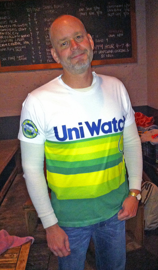
really like the latest UW T-shirt. best of the bunch IMO.
I think the NFL honoring our military for a few weeks a year with stickers and towels is a small price to pay. I love the work you do and read your blog every day but I wish you would go a bit easier on the uniform nods to the military. We can’t honor them enough for all they do. People take the military for granted these days. It’s true there are bad people in the armed forces but it’s a crazy and hateful world out there and and our military is the thing that protects us from that.
People take the military for granted these days.
Really? I strongly disagree. And it’s absurd to think that sports fans take the military for granted, since nearly every game features some combination of a military jet fly-by, a military color guard, or camouflage uniforms.
I have nothing against the military. But I’m very opposed to a relentless campaign of political messaging that singles out one sector of our society over and over and over and over again, to the near-exclusion of all other sectors. There are plenty of ways to support the military — and support other aspects of a well-rounded society — without presenting such a lopsided point of view.
Wish I could have made the gathering – looks like it was fun. Next year….
Whoops, sorry. Didn’t mean to attach the comment to this thread.
We can’t honor them enough for all they do.
What do they do exactly? Hey, I believe in a good defense, and I think the people who serve need to be treated with respect throughout their service and beyond, but I think the deification of military service is a tad overblown and attribute things like “protecting our freedoms” to things that are guaranteed under the Constitution, a political process, and never really threatened to have been taken away.
“I think the NFL honoring our military for a few weeks a year with stickers and towels is a small price to pay.”
~~~
Depends upon your definition of small price.
Of course, now that they’ve gotten bad pub for this bullshit, they’re going to “refund the money” so now it’s all good and we can just carry on like we do every November.
Nothing to see here…move along.
People take the military for granted these days.
In all seriousness, I invite anyone who believes this sentence to go and find a veteran of the U.S. military who served between 1975 and 1990 and say it to his face.
“Take the military for granted” is one of the deepest traditions of our republic. It’s only in the last couple of decades that Americans have thrown off centuries of traditional indifference to engage in obsequious public displays of military idolatry. I mean, read General George Washington’s letters, both to Congress and to his private contacts: He couldn’t get public respect and resources for the Army while it was actively fighting for American independence. Veterans of the Revolution received almost no public regard, and often faced personal ruin, after the war. (Many of them ruined by George Washington’s post-war financial scheming, so: Irony!) We only have veterans organizations like the American Legion because American culture’s traditional indifference to veterans and the military runs so deep, and has for centuries.
“I mean, read General George Washington’s letters, both to Congress and to his private contacts”
~~~
I’ll get right on that.
Twelve bucks in paperback.
link
And surprisingly good reading, for a guy nobody expects to be much of a writer.
I’m inclined to think of all patriotic displays that are not spontaneous as being disingenuous.
I thought the tequila sunrise shirt was awesome, it fits perfectly. I hope the reprint isn’t costing you anything because I genuinely don’t need another one.
Glad you like your shirt, Mike.
Thanks for your concern, really, but the reprint will not cost me anything — Teespring will take the hit. Enjoy your second shirt!
One odd thing I’ve noticed while looking up the Panthers-Packers game (in an attempt to find a pic of Ron Rivera’s hat mentioned above – no success so far), is the odd treatment of Carolina’s shoulder loops. I don’t know if this is something that’s been discussed here before (though it wouldn’t surprise me if it has come up in the past).
For a few players, notably Cam Ward and Joe Webb, link, giving a rather old-school look that we never seem to see from any modern version of UCLA stripes. Yet, for the rest of the team, link, they look so stretched that link. It just makes me wonder why it is that way.
Carolina’s one of the few teams that’s stuck with the old template since Nike took over. I would figure that if they did switch to the Elite 51 template, the shoulder loops would end up being the same type of panels as on the Colts’ and Jets’ unis.
Perhaps because quarterbacks (and kickers) often wear looser fitting jerseys than their teammates there is enough room to complete the loop.
Don’t really know what to think about the Barclays Center team logos. I would have thought they’d have access to a league-wide graphics package.
Then again, they’re still using the link as of last week, so maybe they just don’t care that much.
I see your point Paul and I can appreciate it. The G.I. Joke comment just rubbed me the wrong way a bit so I felt I’d offer up a bit of an opposing view. I’d love to see support for emergency responders, teachers, caseworkers, farmers, and garbage disposal workers but then the uniforms wouldn’t really be uniform at that point. It’s a difficult conundrum to appease everyone I suppose. All that said, keep up the good work Mr Lukas and sorry for venting lol.
Do we really need to be appreciating all these professions, really? I work in a much maligned sector, definitely not thanked and if it were up to some, I’d be out on the street, but I earn a fair wage. That’s all the thanks I need. As long as people are fairly compensated, they’re happy. A patch on a sports team isn’t going to change how I feel about my line of work. And while educators are both underappreciated and underpaid, a special uniform or appreciation night isn’t going to change anything, unless it’s used as a rallying cry for reform.
I have a thought for the 2016 t-shirt club: Different sports, different style shirts, throwbacks, etc. For example, on of my favorite purchases of 2015 is link. While it’s sort of a shirsey, a crew neck sweatshirt is probably pretty close to the actual jerseys worn in the 1920s. Something in this vein as part of the
t-shirt club would be cool.That’s nice, I agree.
Complete agreement. As for schedule, what about instead of monthly, on a more occasional basis connected with major events on the sporting calendar? The starts of seasons, or historical anniversaries, and whatnot?
Heck, if Teespring can manage to get the rainbow-guts t-shirt right the second time around, maybe they could do a Steelers “Batman”-style sweatshirt in UW colors. I’d wear that!
I’d love to see the reaction to the “Motorsport T” complete with patches of all of Uni Watch’s sponsors.
I really like the T-shirts, my only problem is that, being in Mexico, shipping becomes a large pricing component. Now that 2015’s shirts will be available, I can buy a couple I liked and save on the shipping. Thanks for that Paul
…because, you know, the band should never wear its own shirt…
Maybe that’s true for average bands with average shirts. But if you’re in a legendary band with dozens, nay, hundreds of amazing shirts to wear? link.
link
It would be cool if for a DIY someone compiled a quilt from many of these uniwatch shirts!
I’d be happy with the service decals on the back of the helmets, maybe the camo ribbon and no more. Same with the pinktober stuff.
Shorter versions of cricket are always colour v colour. Test cricket is white v white. link