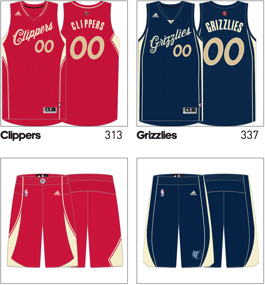
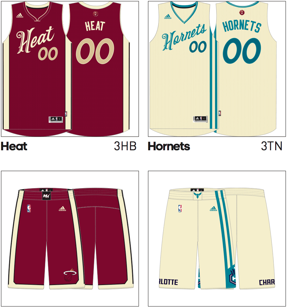
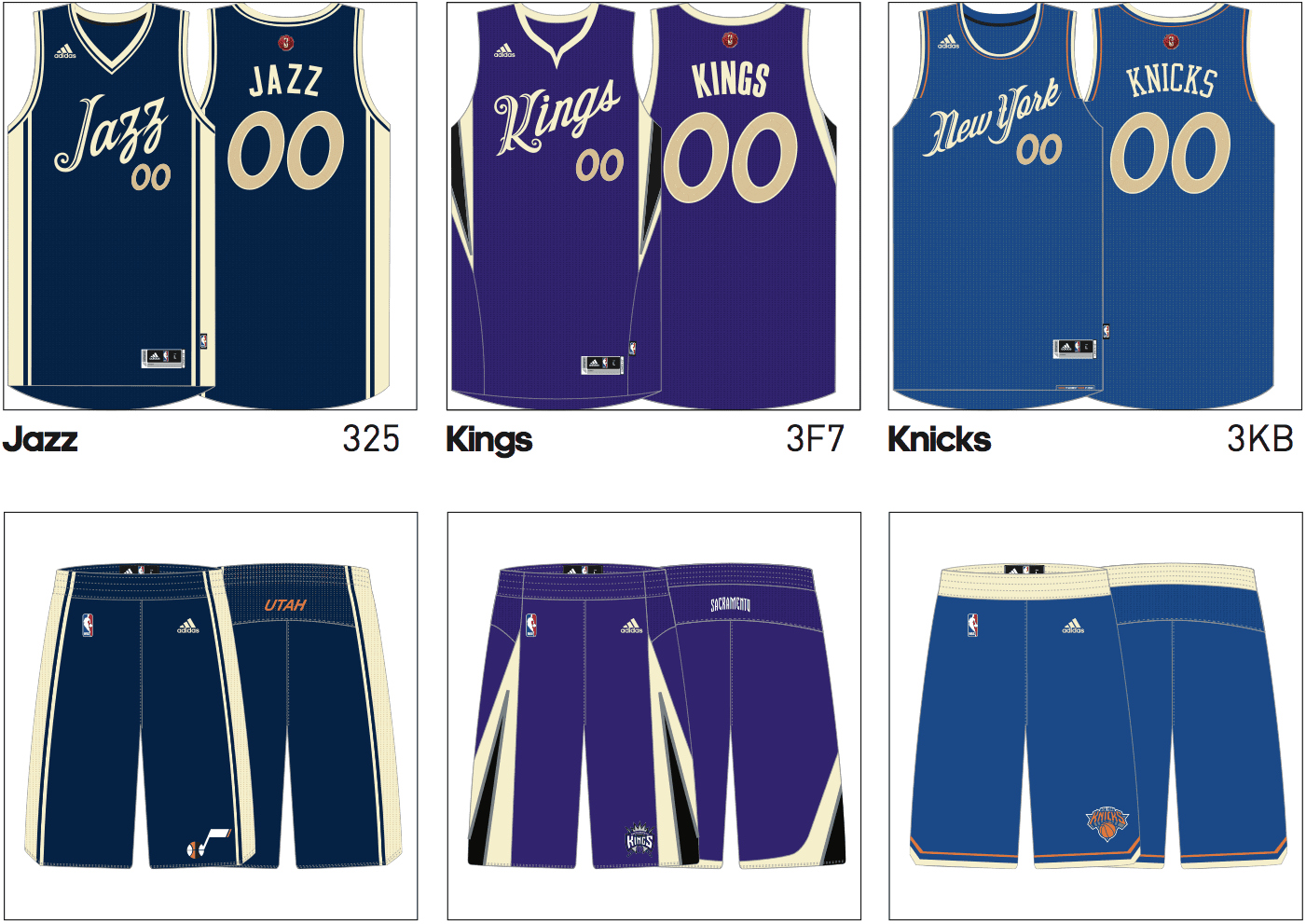
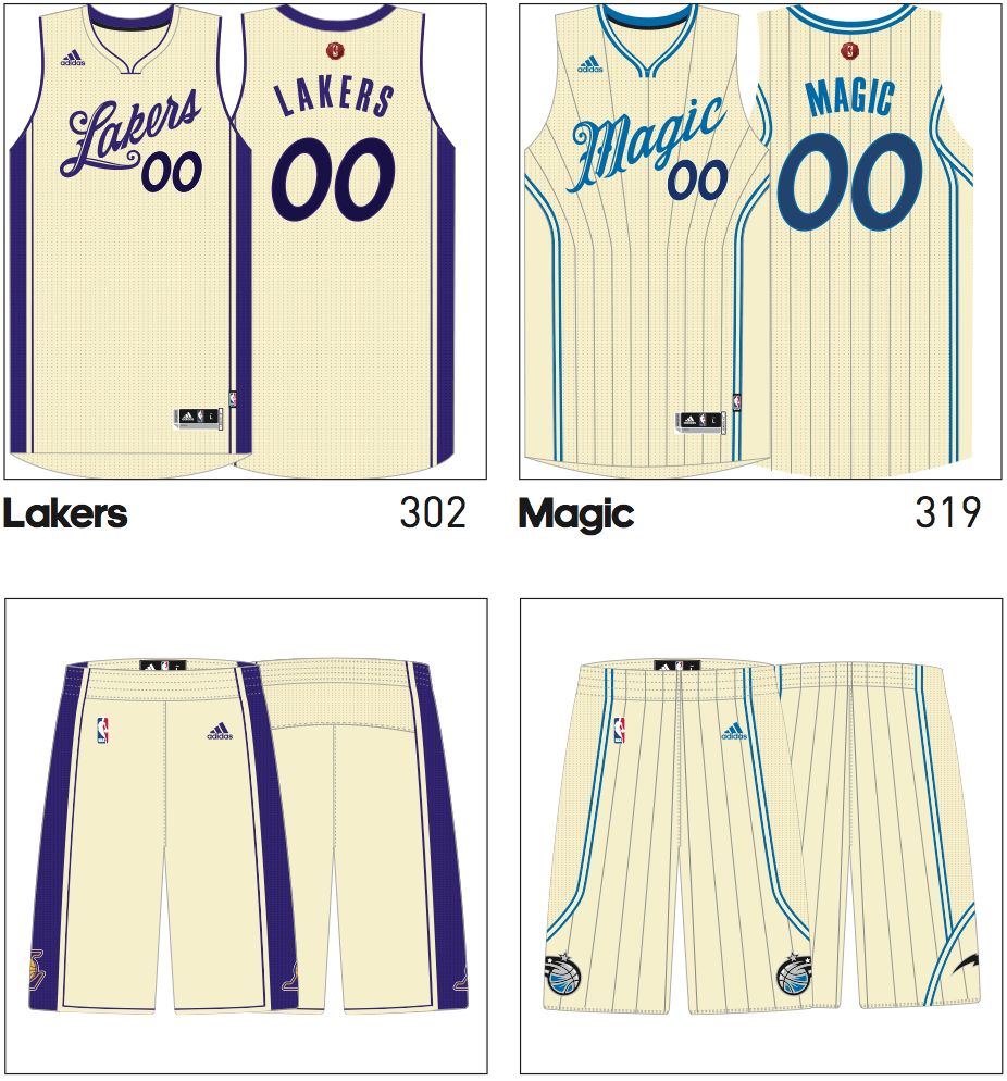
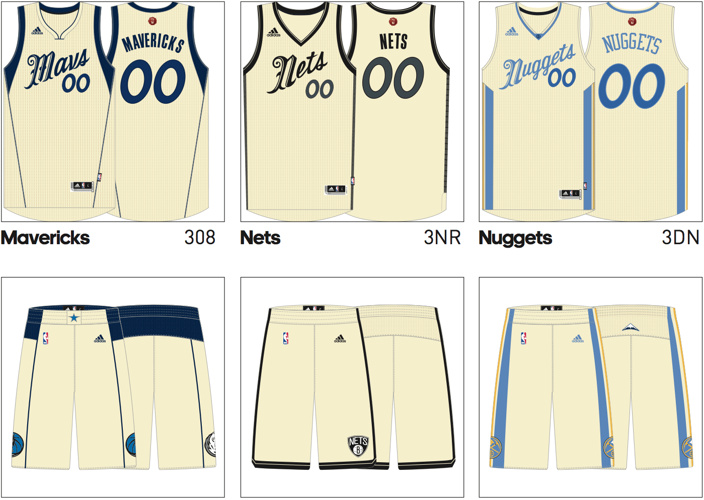
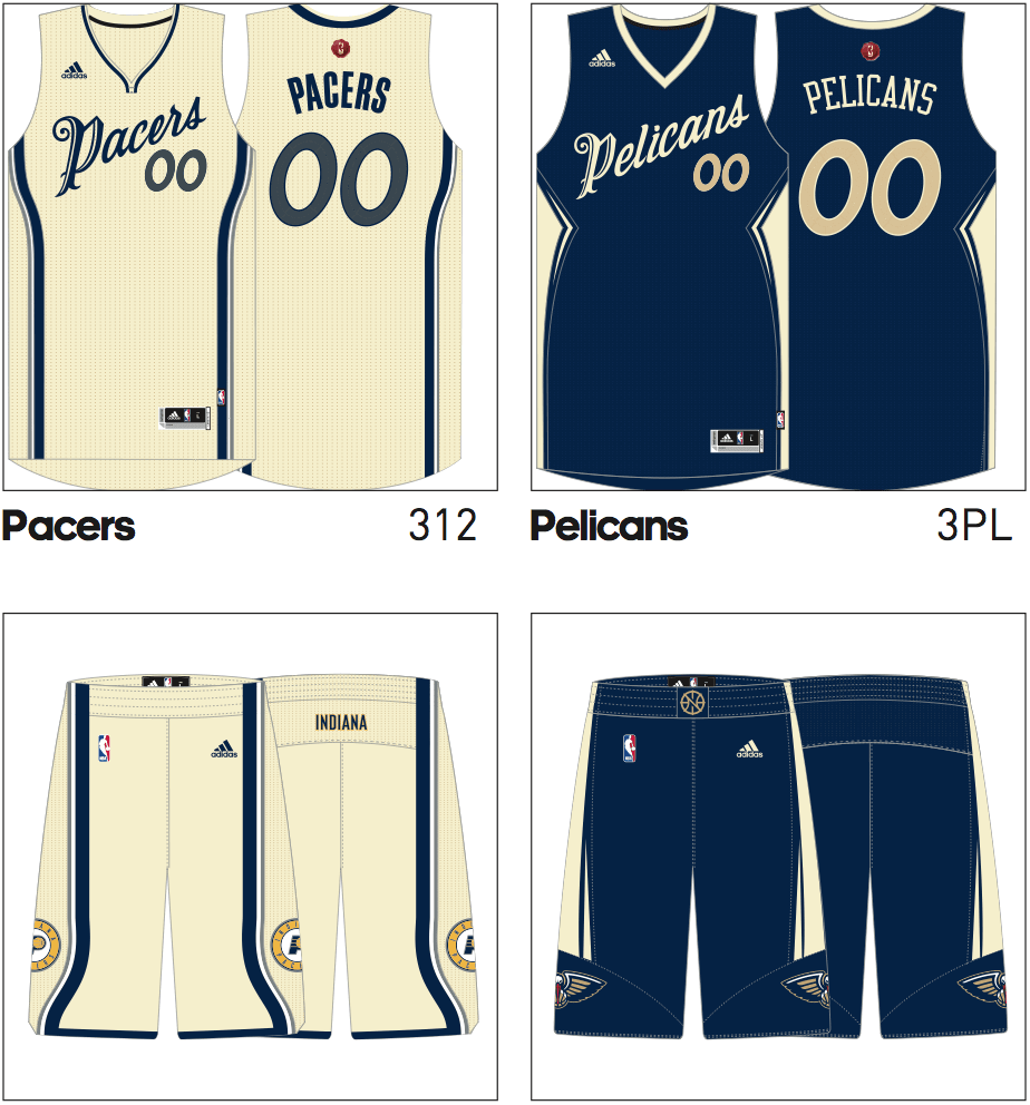
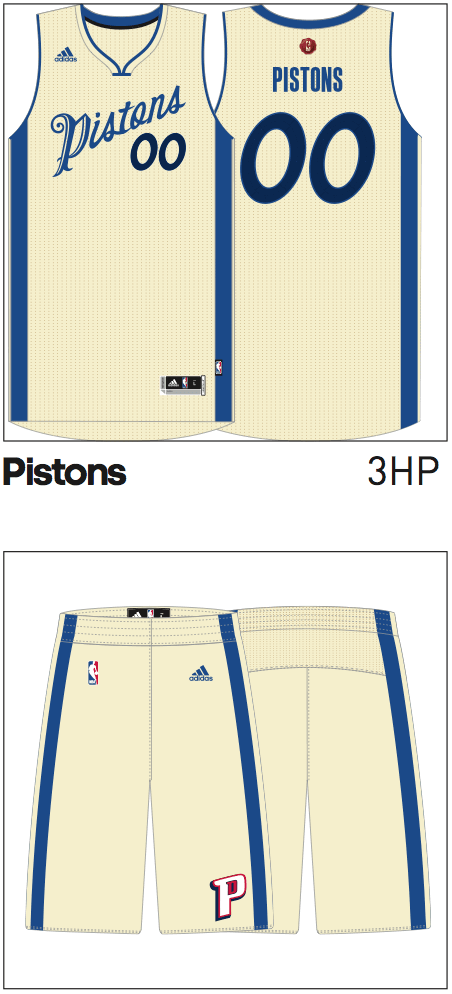
Christmas is more than seven months away, but you’re going to get a little taste of it today, because I’m bringing you another exclusive: this year’s NBA Christmas uniforms, which I recently obtained from an industry source.
I’m happy to report that most of the designs are quite nice. In fact, many teams’ Christmas uniforms are better than their normal uni designs. Let’s take a look (click to enlarge):
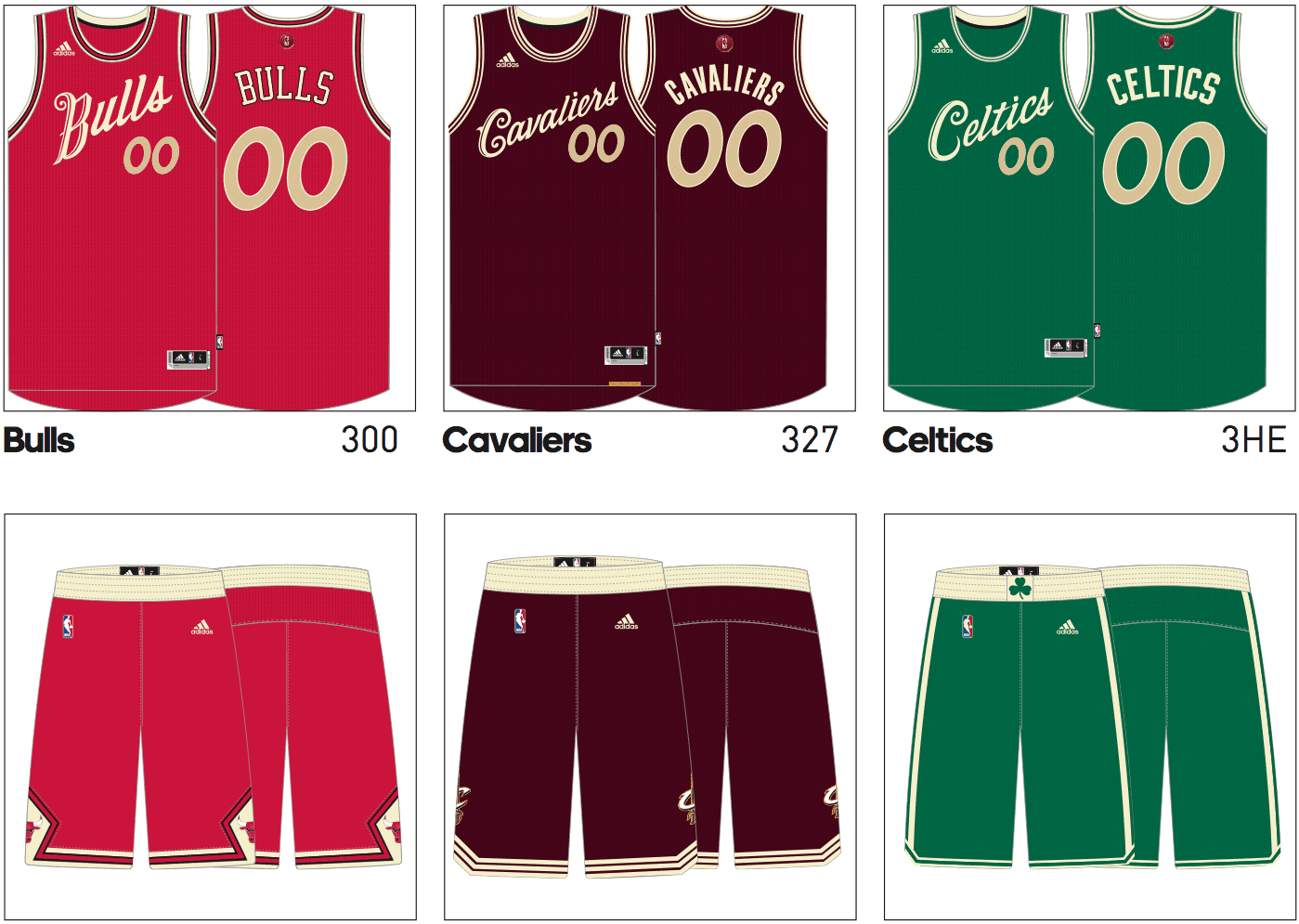
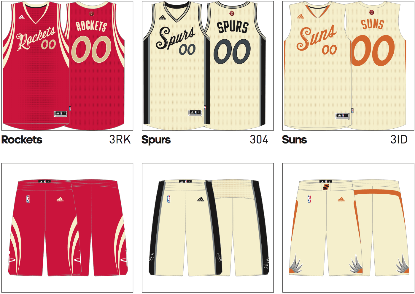
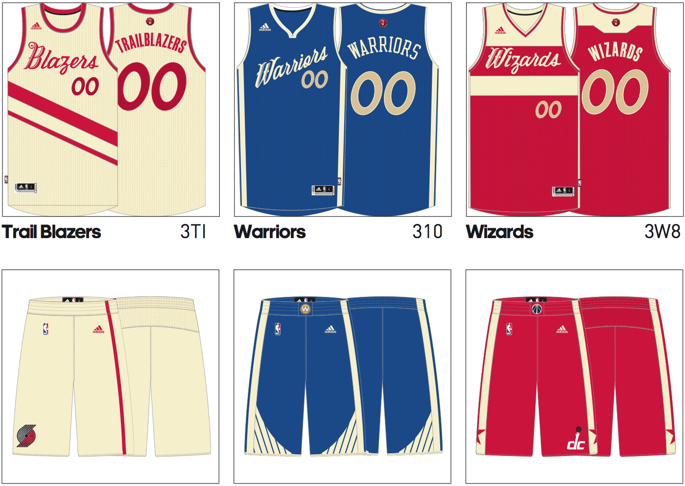
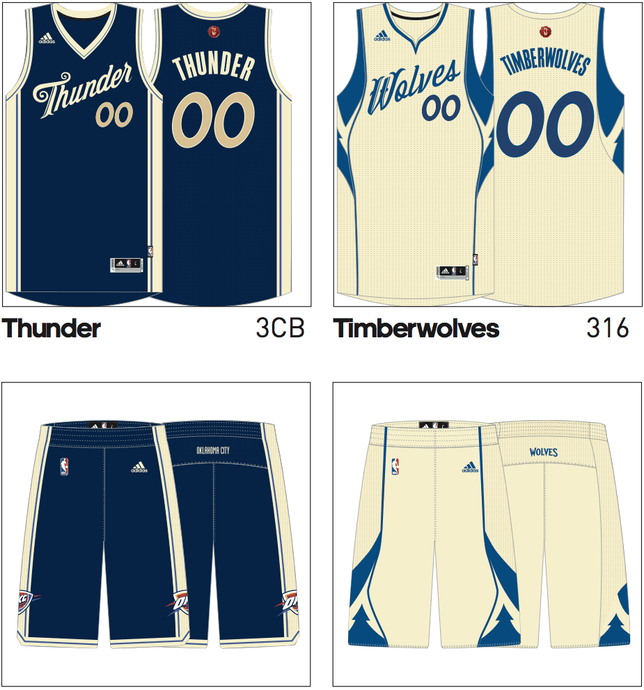
Okay, that’s a lot to digest, so let’s go one item at a time:
1. No sleeves! No nickNOBs! In short, no gimmicks. Refreshing.
2. Remember, we don’t yet know which teams will be playing on Dec. 25, or even how many games there will be on that date, because the NBA hasn’t yet released the 2015-16 schedule. (For reference, last year there were five games on Christmas.) So we won’t be seeing all of these designs on the court, but the designs were developed months ago, so they did one for every team, just in case.
3. The script chest insignia are meant to evoke the feel of the fancy script on a Christmas card. I think most of them are pretty nice on their own, although the repeated template waters down the visual effect a bit. I’m not sure why they chose to have the scripts running uphill with the uni numbers offset to one side, but I like it — reminds me of the Cavs’ uniforms from the first LeBron era.
4. The heavy use of cream, instead of white, is meant to evoke a feeling of parchment. Strictly speaking, it’s not cream — it’s greige. I initially thought that this was a nonsense term cooked up by the Adidas marketing department — a contraction of grey and beige — but it turns out it’s a real term for fabric that’s neither dyed nor bleached. The plan is for the NBA to feature this as a sustainability storyline — “Hey, no dyes!” That’s ridiculous, of course: If you really want to promote sustainability, just wear your regular uniforms on Christmas instead of creating a set of disposable one-day designs.
But whatever — marketing nonsense notwithstanding, this color looks great. And some of the resulting color combos are super-tasty, like the Suns’ cream and orange, the Nets’ cream and black, and the Wizards’ cream, red, and gold.
5. It’s hard to see on the mock-ups, but the NBA logo above the NOB will be shown in a splotch of sealing wax, which is meant to evoke the feel of an old-fashioned Christmas card:
6. There will supposedly be “glazed sugar ornamental shiny surfaces” on the fabric and trim. I have no idea what that’s going to entail, but let’s beat the rush and start making fun of it now.
7. The mock-ups don’t provide a very good sense of the number font, because they used double-zero for all of the jerseys. Here’s a view of two more numerals — it’s not much, but it’s all I have:
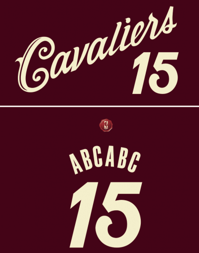
8. I like how they worked certain teams’ visual signatures into the jerseys, like the Blazers’ diagonal stripe and the Wizards’ two-tone design. Wish they’d found some excuse to skip the Kings’ garish pointed side panels, though.
9. As some of you may have figured out by now, four teams are missing. I’m not showing the Bucks’ or Sixers’ designs, because that would provide hints as to what those teams’ new regular season uniforms look like, and I’ve made promises not to reveal anything regarding those two teams. I haven’t made any similar promises regarding the Raptors, but I’m not going to show their Christmas uni either, just to preserve a bit of mystery.
That leaves the Hawks. They have a new regular season uni in the pipeline as well, and I haven’t seen or heard any details about it. But if their Christmas design is any indication, the standard uni is gonna give us plenty to talk about:
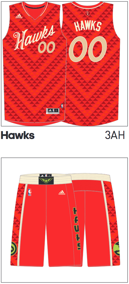
I don’t know what to make of that pattern on the jersey and the sides of the shorts, but it sure looks, uh, interesting. As for the lime green trim on the shorts, that used to be a Hawks color. Perhaps it’s going to be again..? On the other hand, lime green doesn’t appear on any of the other Hawks merch shown in this catalog, so who knows. (And speaking of other merch in the catalog, the Clippers merch all shows that new “LAC” logo that I first reported on last month.)
Overall: Very, very nice — well done, people. And to all a good night.
Ben lives! The 76ers’ awesome Ben Franklin logo, which surfaced last summer but then was sort of orphaned, is now an official part of the team’s new logo set. The Sixers have also made a few other logo tweaks, all of which are small but positive (although Chris Creamer has a slightly more cynical — and entertaining — assessment). New uniforms will follow on June 18.
My only problem with Ben is that I’m so used to cartoon characters having four fingers that his five-fingered hand looks a little weird to me. How’s that for visual indoctrination?
At least one observer doesn’t share my enthusiasm for Ben: ESPN commentator Stephen A. Smith. You can get his take on things in this video clip.
Meanwhile, several readers quickly noted that the adjustment to the basketball in the Sixers’ primary and partial primary logos matches a concept that longtime Uni Watch reader/contributor Conrad Burry executed several years ago. Hmmmmm.
T-Shirt Club Update: The Uni Watch T-Shirt Club’s design for June will launch next Tuesday, May 19, and will be available through the following Tuesday, May 26. (Normally the shirts are available for sale from Tuesday through the following Monday, but extending the availability of this design by one day because of Memorial Day.)
This month’s design is black for black’s sake (aka the one design that The Jeff might actually order; click to enlarge):
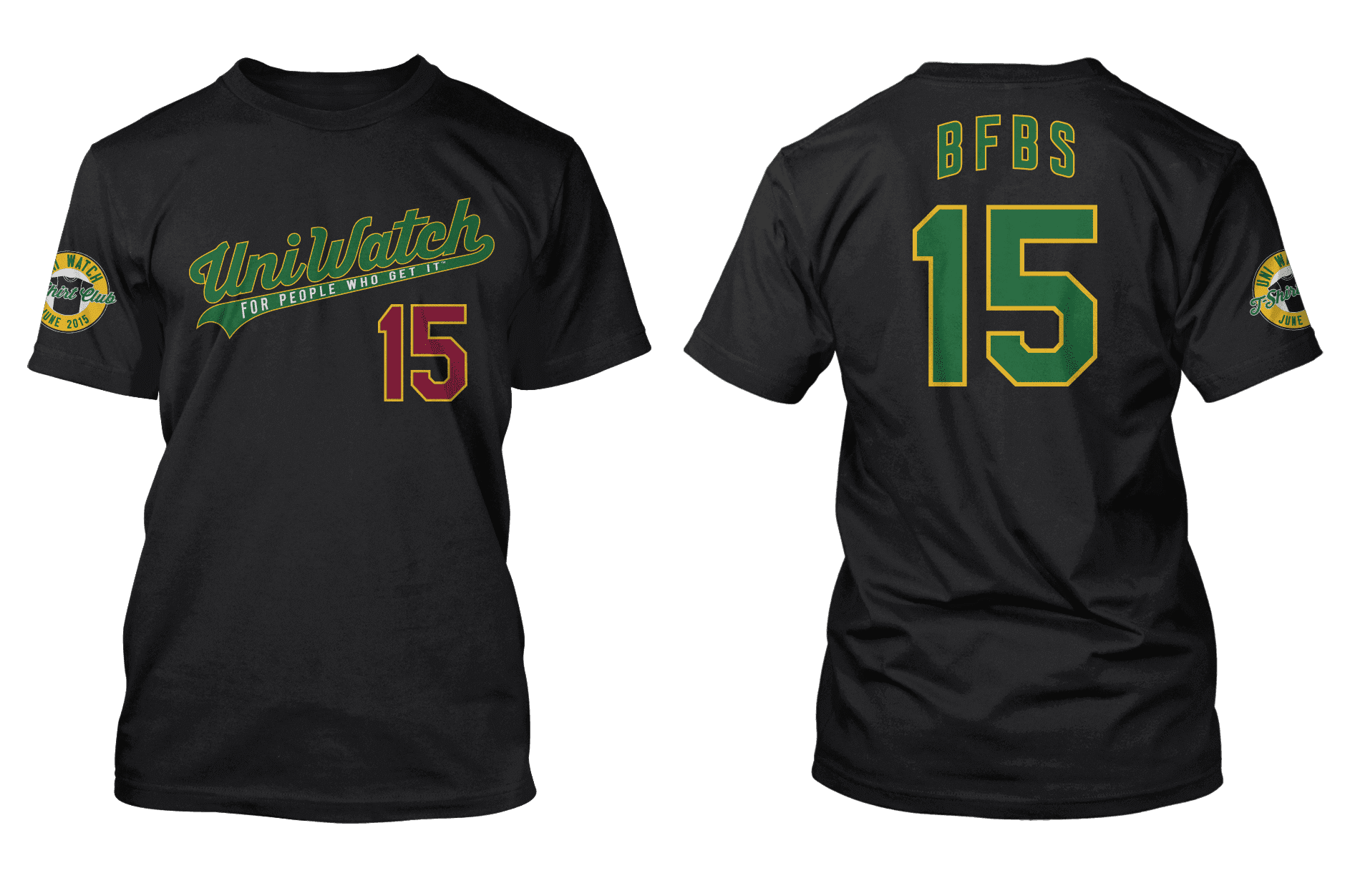
Not much to say about this design — it’s pretty basic and straightforward. It’s worth noting, though, that my Teespring designer, Bryan Molloy, came up with a more minimalist BFBS design. I think it’s a really fun concept, but it doesn’t feel right for the T-Shirt Club. (No, we won’t be producing that one, so please don’t ask. Thanks.)
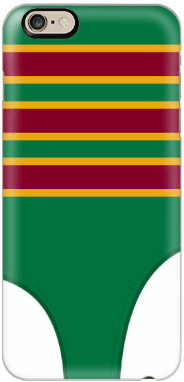
Smart phone case now available: Matt Beahan, the winner of our recent cell phone case design contest, worked with me to make a few adjustments to his stirrup-based concept. As you can see at right, there’s now a clearer distinction between the front and back stirrup openings, and I also had him add some stitching marks along curved edges of the openings.
With those changes made, the phone case is now available for ordering. A few notes:
• The case is available for more than two dozen different phone models. Use the pop-up menu on the ordering page to choose your phone. I did my best to position the artwork so in a way that works for all of the different models but, as you’ll see, the design “fits” slightly differently onto each model’s case.
• The price is $19, no matter which model you choose. Domestic shipping is $5; overseas shipping varies.
• The case will be available for three weeks — from now through June 3.
• If you order a case, you should receive it somewhere in the June 10-17 range (that’s in time for Father’s Day, for what it’s worth).
• As you’ll see, the campaign has a goal of 250 sales, but don’t worry about that. As long as we sell at least 10 (which I’m sure we will we’ve already done), the cases will definitely be produced and shipped.
I think that’s it. If you have any additional questions or concerns, let me know. Thanks.
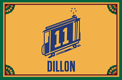
Membership update: Three designs have been added to the membership card gallery (including Owen Dillon’s awesome Golden State throwback treatment, shown at right). The printed and laminated versions of these cards will be processed when we fill up the current batch, which should be soon because next Monday is Purple Amnesty Day, which always results in a mini-flood of orders.
As always, you can order your own custom-designed card here, you can see all the cards we’ve made so far (more than 1600 of them!) here, and you can see how we produce the cards here.

Baseball News: One day after debuting their “Baltimore” home jerseys, the Orioles went back to their regular home jerseys for last night’s game against the Blue Jays. ”¦ Ebbets Field Flannels recently ran a photo contest and longtime Uni Watch reader/pal Marty Buccafusco won himself some free stuff by submitting this photo of himself and his son Gus. Congrats! … A fan at Wrigley Field wiped a cap on her butt and then tossed it onto the field — twice! — during Monday night’s Mets/Cubs game (thanks, Mike). ”¦ Here’s your chance to vote for the best minor league logo (from J. Daniel). ”¦ Rehabbing Yankees P Ivan Nova, who normally wears No. 47, was wearing No. 81 in an extended spring training game yesterday (from Steve King). ”¦ Logo-emblazoned stirrups yesterday for UMass. … I’ve long been a fan of the Tigers’ “Swinging Kitten” mascot. Turns out there’s also a sliding kitten, and they’re bringing him out for this T-shirt, which will be given away on June 16 as part of the team’s Children’s Health Night promotion. There are several other versions of the kitten, as you can see on the cover of the 1980 Tigers media guide. I’d love to see these designs get back into circulation. … New cap for the Iowa Cubs (from Zach James). … Louisville’s uniforms could probably use a re-think.

NFL News: Always fun to see an old photo of the Jags’ original prototype jersey (from Leo Strawn Jr.). ”¦ Here are the new uni numbers for the Titans’ rookies. One of those rookies, RB David Cobb, is a big Eddie George fan but will not wear No. 27 (from Eric Wright). ”¦ Speaking of the Titans, they’re redesignating their navy jersey as their primary this year, so it’s surprising to see that players participating in the team’s recent Titans Caravan events were wearing the Columbia blue jerseys (Eric Wright again). ”¦ Raiders draftee Amari Cooper has apparently changed uni numbers already, from 19 to 89 (from Brian Molinet). … New uni numbers for the 49ers’ rookies (thanks, Phil). ”¦ A fan at last night’s Mets/Cubs ballgame was wearing a Bengals-themed motorcycle helmet. When I tweeted that photo last night, everyone said, “The helmet is nothing — look at the jacket!” Okay, then: Look at the jacket (from Eric Wright). ”¦ Two uni-related notes buried within this Deflategate story: “Four men wearing Patriots jerseys were arrested during a sit-in at the NFL offices promoted by the Boston website Barstool Sports” and “Since the suspension was announced, sales of [Tom] Brady’s jersey have doubled, according to online retailer Fanatics.com.”

College Football News: Here’s a bunch of reimagined SEC helmet concepts (from Bryan Council). ”¦ Someone at Notre Dame PhotoShopped an Under Armour logo onto former Irish LB Kendall Moore. Moore only wore Adidas for Notre Dame (from Dirty McGirty). ”¦ New uniforms for Samford.

Hockey News: A reading of the tea leaves suggests that the Avalanche might be changing their jerseys (thanks, Phil). ”¦ Love the big patch on this British Columbia jersey. Pretty big “A,” too (from Jim Wooley).

NBA News: As of this morning, the new Clippers logo — the one I first reported on last month, although it hasn’t been officially acknowledged or released — was appearing on the front page of the NBA’s online shop. It’s not clear if this was a mistake, a concession to reality, or a tease, but it’s worth noting that the new logo has not yet appeared on the shop’s mobile site.

Soccer News: The Red Bulls have been giving out great posters at each match this season. As you can see, the most recent one is a breakdown of the team’s kit (from Andrew Muccigrosso). … Here’s a look at how the MLS’s rebrand is going. ”¦ Inter’s new jerseys have leaked (thanks, Phil). ”¦ In Ghana, they apparently refer to NOBs as being “embossed” on the jerseys. ”¦ New away kit for Olympique Lionnais. ”¦ New kit for Liverpool, too.

Grab Bag: Big controversy in Connecticut over a high school’s prom dress code. ”¦ Mumbai’s firefighters need better uniforms. ”¦ Shame on the North Carolina Dept. of Transportation, which is selling corporate advertising on its trucks and drivers’ uniforms. Unacceptable. ”¦ Yesterday’s announcement of Verizon’s acquisition of AOL, and the immediate increase in the latter’s stock price, prompted Huffington Post report Ariel Edwards-Levy to create a clever combined logo. … The St. Joseph’s golf team uses driver covers with a very cool mascot logo. “He’s even wearing golf shoes!” says Pat Costello. “If only the ‘TM’ wasn’t there.” ”¦ Stephen Krupin notes that Washington, DC’s sports facilities have some outdated logos: “The aisles at the Verizon Center have logos on the sides of the seats, alternating rows between the Caps and Wizards. The only problem is they still haven’t replaced the outdated Caps logo last worn in 2007, and they still use the old Wizards logos in colors last worn in 2011. And the Nats’ scoreboard is still topped with the Todd Radom-designed ‘Nationals’ wordmark, which the Nats shelved in 2010.” ”¦ Corporate sponsorships aren’t just annoying — they also don’t work (from @holycalamity). ”¦ An Ohio high school is changing its logo after getting a cease-and-desist from the U. of Arizona.
“Speaking of the Titans, they’re redsignating their navy jersey as their primary this year…”
*redesignating
Thanks. Fixed.
The number font on the NBA Xmasers looks sorta meh in #00, so thanks for including the #15, where it promises to be much better (to my eyes).
The CFL draft was yesterday. If one liked that chart from earlier this month, it’s a great way to see a lot of Canadian university football uniforms being worn live.
Again, the soccer ticker is flooded with reposts. Liverpools kit launch shindig was over a month ago, we saw leaks months before that
Titans’ rookie numbers links to Jacksonvile uni pic.
Fixed.
Cleaning up a bit:
“this photo this photo” in the Marty Buccafusco item
The tagging seems to be messed up a bit for the original Jags jersey.
There’s no period after “NBA’s online shop” in the Clippers item.
Fixed.
jags design and titans uninumbers are ran together
Fixed.
Paul,
As you said in #2, we don’t know which teams are playing. But, unless there are away versions for all teams, isn’t it possible that the jerseys will drive the schedule? You can’t have greige vs. greige, right?
A reasonable point.
Greige… but at least they didn’t say it was eggnog to try and continue a theme, right?
Will it be Team Name on Back or player’s names?
Player, I’m assuming. It’s common to use team NOBs in mock-ups.
Surprised they didn’t go with a script NOB. If the jerseys are like Christmas cards, you’d sign your name, not print it.
Very nice look. overall.
Cavs, ditch your blue alt and make these your new alt.
Kings and Wizards, scrap your everyday unis and keep these,
Conrad Burry twitter link not working
Working fine for me.
Yeah, the link is definitely not working. Twitter tells me the page doesn’t exist.
I pulled my tweets on the subject; I thought better of dragging Conrad’s name into tweets where I @ the CEO and call the org’s process lazy (also felt bad about that; he’s a seemingly good dude who happily interacts with fans on Twitter). Conrad said it wasn’t a big deal but I didn’t want to make things awkward for him. (I’m probably overthinking it, I dunno).
For the record, I like the tweaked primaries but yesterday it was hard to look at them and see anything but his concept stuck inside a Philadelphia Union roundel. (The latter part later had me ruminating on 20th-century intra-city name/logo convergence, and whether this was akin to a latter-day Yankees/Knicks/football Giants sharing similar interlocking NYs, or any other such examples).
Why is the Celtics’ “C” in a different font than the Cavs’ and the Clippers’? Other than that it appears that the font is uniform across teams.
Wonder why the Knicks have their city name when everyone else has team name
As far as I know, the only time the Knicks have ever worn their team name on the front, to my knowledge, is on the c.1979-83 jerseys with the funky font and the team name below the numbers (and then, only on the home whites). Otherwise, they’ve always worn “NEW YORK”.
Technically, New Orleans doesn’t use “Pelicans” on their home or away uniforms, even if they wear their red alts quite a bit.
The Knicks have “New York” on their standard jerseys.
For a Christmas day jersey, they should have some fun with it and be the St. Knicks.
Dammit, I can’t find the “like” button…
Shut it down. COTD.
Genius.
*looks at the “greige” basketball jerseys*
*screams internally*
When then unis are finally unveiled, will you show the Bucks, 76ers, and Raptors Christmas unis on here?
Yeah, probably.
I’m not “asking”, but I guarantee I know a few Uni Watchers that would buy that minimalist BFBS! That thing just screams “Jason Bernard”, and the rest of us Buccos fans as well.
Love the BFBS you went with though!
Not all Buccos fans are BFBS fans. That concept doesn’t raise my Jolly Roger.
Aye-aye, matey. Put me down for a bumblebee-stripe revival.
1) As a rule, I’m against the Christmas jersey phenomenon. However, for the first time the Christmas template is actually… good! And not stupid! If they’re going to create one-offs, they should at least look good, and these fit the bill. I love how they used the greige color/script/number template but kept a distinctive element from each team’s unis. Much better than picking a template and slapping a team logo on it.
2) You said not to ask, so I’m not asking. But I don’t like the BFBS t-shirt club design, and there’s like a 65% chance I’d order the minimalist alt design if that were chosen instead. $.02, &c.
Wow, these are refreshing. Most of these are excellent.
But as a Hawks fan, this is terrifying. Everyone–and I mean literally everyone single person–in Atlanta loves the throwback logo, and most everyone is hoping to see them incorporate more elements from the Dominique Wilkins era (bring back yellow for trim, clean up the striping a little, etc.).
But then I remembered an excerpt from an excellent Kevin Arnovitz piece on ESPN:
“Over beer and homemade bagel bites, they weighed in on everything from potential smartphone Hawks apps to mockups of new team uniforms that look like a cross between something a Marvel superhero would wear and the Oregon football unis (which the research said millennials are nuts about, even if your dad thinks they’re hideous).”
link
The Hawks new marketing folks have been doing an incredible job in the wake of the racial email fallout, but I assure you there is no millennial faction of the fanbase that is clamoring for Spiderman outfits.
I would love the Hawks to go back to red and yellow. The Heat are more of a red and black team, with only a little touch of yellow trim, and although the Rockets have a third that’s an homage to their old red-and-yellow days, their major colors are red and silver. Their current red-and-blue scheme just doesn’t impress me.
As for the lime green. attempting to incorporate it with red is a HUGE mistake. Unless they’re bringing back the 1970-72 unis as Hardwood Classics, they shouldn’t even be touching lime green.
I should point out that I meant to say “The Hawks’ current red-and-blue…” there.
My guess is Atlanta is pulling out all the stops with their new identity. I would bet that the pattern on the unis will become their “signatute” pattern much like the BK Nets have adopted herringbone and use it on not only the uniforms but the floor as well. The neon green could work well, it hits the millennials while also a throwback to their previous looks. That said I don’t see how the red and neon green fit together at all. I like the idea that their making some risky moves because they have to have the most boring, bland look in all of sports. The transition from a signature color scheme like red and yellow to generic blue and red was such a forgettable failure.
I’m good with them pulling out all the stops, as long as they go either blue/neon green or red/yellow. Red/neon green would be *OK*. No more blue/red, please.
The Tennessee alt helmet mockup is turrible. The gradient checkerboard – no.
I really like the hint of old green in the Hawks unis – those greens are one of my favorite NBA uniforms.
That new Hawks logo at the waistband is interesting. Zoom in, and it looks like a flame is part of it; suggesting the city seal of a Phoenix.
Compliments to the design team for a clever concept (Christmas cards) and solid execution.
Also looking closely, the negative space with the flame creates the top of an “A” and the bottom of the flame is a basketball.
I LOVE Brian Malloy’s BFBS design.
I’d have ordered it, for what it’s worth! Great job, Brian!
I don’t see any gold championship patches on the back of the collar. Does this mean they’re gone next year on all jerseys?
Last year’s Xmas jerseys didn’t have the gold tab either:
link
Paul- I think the NBA Christmas jersey concept should be renamed… The NBA Salutes the Minnesota Wild Alternate Jersey Lettering. I mean Jesus Christ, can those NBA fonts look anymore like the wild Merry Christmas card lettering?
link
I’m surprised all the Universe has yet to weigh in on the obvious.
I mean, they’re both going for the same thing so they’re going to look similar (though there’s the uphill script too).
And to answer your question, yes, they could look more similar – check the ‘M’ on the Mavs jersey.
Well, of course they’re not going to use the identical Minnesota WILD script font? I mean come on… after all NBA stands for Nothing But Attorneys.
Even though I’m not an NBA fan nor a fan of their ever too-meshy jerseys (and I guess would technically be a Pistons fan if I had to choose), I’d love to see the Spurs’ black version of the Christmas one off. Could be amazing, and tempting.
I do really like the minimalist design for the t-shirt club shirt. What I like the most is the tighter kerning compared to the regular shirt.
You mean the kerning on “BFBS”? I specifically asked Bryan to make the kerning looser/wider/etc., because it’s only four letters and I wanted it to have a bit more “wingspan.”
Yes. The kerning on the “BFBS” on the minimalist one is better IMO. I understand the need for spacing since its only four letters, but its just different to see the kerning be so wide compared to most name/nameplates we see.
Huh. I’ll take that feedback into consideration. Not saying I’ll definitely change it, but I’ll think about it. Anyone else want to chime in on this?
I think both versions look fine, but the wider spacing does sorta have a bit of a 70’s feel to it. Nameplate lettering seems to be a bit more standardized (and kinda lazy) today than it used to be. You don’t really see anyone trying to space out a short name today. Heck, you really don’t even see properly arched names with each letter being unique anymore. Everyone just places the lettering in an arched path, rather than actually arching the letters themselves.
So, to sum up The Jeff’s opinion: vertical arching is proper arching; radial arching is rubbish.
+1 to The Jeff.
link
HOHOHOHOLY CRAP… The NBA celebrates…
The Minnesota WILD!!!
Disagreeing with Stephen A. Smith is, more often than not, a sign that you’re a thoughtful, decent person.
I don’t *love* the Hawks uni design, but I do like that they’re willing to be bold with it. Much better than the bland redesign NOLA came out with.
Agreed.
Speaking of the Pelicans, the alt’s side striping makes it look a bit like a WNBA jersey. Pacers, too.
Can Adidas do anything without using a template? Also the “winter white” or whatever they want to call that color just makes the jerseys look dirty. It doesn’t work on hockey jerseys and it doesn’t work here either.
And for the record, while my favorite color (and about 95% of my wardrobe) is black, it doesn’t mean that I support the idea of every team wearing BFBS. Fan jerseys/shirts/hats/etc are fine. Actually wearing them on the field? Usually bad.
And for the record, while my favorite color (and about 95% of my wardrobe) is black, it doesn’t mean that I support the idea of every team wearing BFBS.
I know. Was just giving you shit (plus I think you actually said at one point that the BFBS t-shirt was the only one you’d be interested in).
Our tastes differ widely, but I respect the consistency of your positions and the way you defend them. Keep it up.
Bravo, Owen Dillon.
Can’t even post the Raptors jerseys?Why do you hate Canada so much?
So, guess that means the Raptors aren’t playing Christmas Day?
So I guess that means you didn’t read the text?
RTFA.
No raptors or bucks uniforms huh!? That’s messed up!!!
It’s amazing how many people just look at the pictures but can’t be bothered to read the text.
Or maybe it’s not so amazing…
This is BS. The NBA is moving to Nike for game jersey’s beginning with the 15/16 season. The pics show Adidas. I don’t buy this rumor.
No, the NBA is moving to another supplier (which may or may not be Nike) with the 2017-18 season.
So much good stuff today:
1. Love the Christmas jerseys.
2. Never saw the prototype Jags jersey. Love it!
3. BFBS tee makes more sense than the minimalist one, as it still has the rest of the Uni Watch colours, which is what most BFBS jersey have. But the minimalist one does look good in a Pirates kind of way.
4. Thanks for posting that BC hockey jersey, never saw it before. I’m still amazed that as late as 1979 teams still had lace collars and old school fabrics.
This was the Jaguars’ prototype white jersey, with teal pants:
link
My memory is fuzzy on this, and I can’t find a photograph, but I believe that the dark jersey was paired with silver pants.
Clippers new logo looks like nba playoffs logo to me. Same swooshes and colors.
Even when I like a design like these xmas day games, it feels tainted if it’s part of a league-wide template.
Pro sports teams’ appearance should have local flavor like a real neighborhood bar, not an Applebees where they slap a few photos of the local high school football team, and give you the same stuff as the town next door.
^
This
These NBA uniforms are fake, sorry to report it.
Nice to have an expert around to set me straight.
If Guest5555 says it, it must be true.
I’m not sure I believe the story that Brady jersey sales are up. Their figures seem a little inflated.
Not sure if I remember this correctly but I thought Vick and Kobe’s jersey sales went up after they got in trouble too? Something to do with being associated with a badass or whatever.
Let me take those numbers to the bathroom for a moment and I’m sure they will be to your liking
I presume the Adidas logos won’t be on the actual jerseys?
I’d have to think so.
link had the Adidas logo too.
RE: the Sliding Kitten. If they really wanted safety, he should be shown with both hands/paws up… not dragging his right hand behind. Unsafe sliding technique.
I sent a pic of IDOT’s (Illinois) trucks with the State Farm logo all over them a couple of months ago under the heading “Corporate Douchebaggery”….What really pisses me off is that the signs on the roadside used to have the *999 number on them to alert drivers about how to get assistance. The freaking number has been covered up by a State Farm logo.
I’ve called IDOT and they have ignored my bitching…..
Ha! My very first thought upon seeing the Ben Franklin Sixers logo was “he should have four fingers.” I shoulda known you’d be on top of that, Paul!
Griegh? Is it pronounced “grey-zh” or “gree-zh” or even just “grey?” I dunno… teams’ll probably end up creating GFGS jerseys somewhere down the road.
Wiki says it’s a homophone of “gray”/”grey.”
You mean to tell me they’re opting for something visually appealing? That’s so, un-NBA-like.
In terms of corporate sponsorships not working, don’t forget the National Guard’s sponsorship with Dale Earnhardt Jr.
$26.5 million spent and not one person signed up because of that sponsorship.
link
I was quite surprised to see a Z10 case offering… then discouraged to see nothing for Z30 owners. I know that’s out of your control Paul, but it was still a little disappointing to see. So, so close.
I hope the Celtics and Bulls play each other on Christmas. Red and green, very Christmas-y!
I don’t know if Paul or anybody else has ever researched this, but the Atlanta Hawks have got to be close to setting a record for the most uniform redesigns for a major-league team over the last quarter century.
By my count, this next design will be the sixth total overhaul in the past 25 years. Has anybody done it more often?
It seems like the 76ers might be in the running, not sure.
You can check on Sportslogos.net.
If you change the criterion, the link compared to the Hawks’ five going on six (I’m not counting minor changes like adding a wordmark on the butt or changing to the Pacman logo) over the same period.
Considering the amounts of money involved, it surprises me how many teams fail at Branding 101.
Good call on the Cavs. It looks like the Sixers are about to go with uniform #6 in the past few decades as well.
The Ballin’ Ben logo reminds me of disheveled Dick Cheney!
Nah.
Way too friendly and energetic to be Dick Cheney.
“I’ve long been a fan of the Tigers’ “Swinging Kitten” mascot.”
Looks more like the “Crack Smoking Kitten” to me ;)
Another cartoon Tiger to add:
link
Bummer. I was really hoping the case would be available for my phone, but I suppose I shouldn’t be surprised given that my phone, while a new-ish HTC, isn’t exactly everywhere most of those other models are.
I guess I’m the grinch who stole Christmas, but these unis are absolutely…STUPID!!
It’s obviously just another marketing ploy by the folks in the Ivory Tower in NYC to separate basketball fans from their money. Most of these designs have ZERO relationship, whatsoever, to the uniforms worn by NBA teams in the past. I guarantee that the Mavs have NEVER worn a uniform that looks remotely like the one shown in this article!
For the life of me, I don’t know why anyone would want to wear a uniform that looks like everyone else, much less like a Christmas card!! YUK!! Come Christmas Day, I guess I’ll just have to watch a bowl game or reruns of “Leave It to Beaver!”
Good point that Ben should have 4 fingers. Also, shouldn’t he be wearing Ben Franklin glasses?
Interesting web-site
link
I’m a little nervous. I’m glad you didn’t show the 76ers because I don’t want anything spoiled, but I would like to think based on the logos that there’s no way that Christmas mockup could spoil anything new, that it would it just be an alternate based on color scheme. Now I’m going to have to worry if something drastic is coming our way
So, does this mean the Clippers will not be getting new uniforms next year?
So I know you said the Clippers new logo was on all the merch. I noticed that the Christmas jersey does not look like the designs you posted last month. They look like an evolution of the current design that they are going to ruin with a crappy logo and word mark I’ve got my fingers crossed that they come out much better than the leaks. I have little hope after seeing the logo on the NBA Store. Give me some hope…
So why the anti-raptor love? Where’s their jersey?
Thanks for sharing such a nice idea, article is nice, thats why i have read it entirely
I am very pleased that the Nets’ jersey says “Nets”!
GOOOOOOOOOOOOOOOOOOOOOOOOOOOOOOOOOOOOOOOOOOOOOOOOOO HAAAAAAAAAAAAAAAAAAAAAAAAAAAAAAAAAAAAAAAAAAAAAAAAAAAAAAAAAAAAAAAAAAAAAAAAAAAAAAAAAAAAAAAAAAAAAAAAWKS!!!!!!!!!!!!!!!!!!!!!!!
Did anyone notice the disgusting length of the shorts? Are they afraid the players knees are going to get cold? Bring back the 5-6″ inseams like all shorts in America should be. Sky’s Out Thighs Out! Tired of seeing grown men wearing caprees!