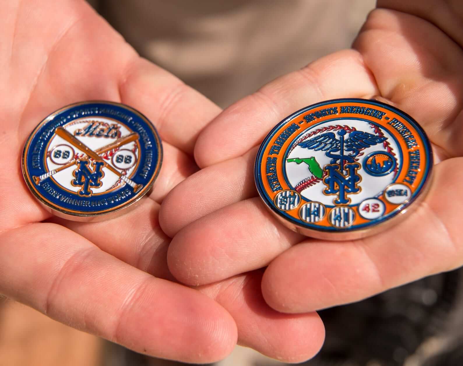
Photo by Brett Carlsen for The New York Times; click to enlarge
So here’s a new one. If a Mets player suffers a major injury — not a sprained ankle or a sore hammy, but something that keeps the player on the shelf for months and requires significant rehab time at the team’s training facility down at Port St. Luice, Fla. — and if the player also dedicates himself to his rehab program, the rehab staff will award him one of these “rehab coins” when he’s ready to play ball again.
The coins have apparently been given out for several years now, but I didn’t know about them until they were featured yesterday in this very interesting article, which explains that the coins were the brainchild of Mets minor league rehabilitation coordinator Dave Pearson:
Pearson got the idea for the coin a few years ago after he noticed that players in the Mets’ strength and conditioning program were getting new T-shirts every year. He wanted something for the rehab program. But, he figured, “Nobody wants to wear a shirt that says ”˜rehab.’”
Then he remembered a gift he had received, before he worked with the Mets, from a patient who had served in the military. As a sign of thanks, the man had given him a challenge coin, a special token that signified the unit to which he belonged. Peterson thought the idea might work with the Mets.
A nice idea. But does a millionaire athlete really need a coin as a motivational tool? And do the players actually care about the coins once they receive them? Apparently not:
Jenrry Mejia said he keeps his Mets coin at home in the Dominican Republic; it might be in a drawer somewhere, he thinks. Steven Matz, who has also had Tommy John surgery and has an outside chance to make the Mets this season, said he kept his coin in the center console of his truck. He said the sun might have melted it a bit. Juan Lagares forgot that he had ever received one.
“I might use it as a golf-ball marker,” Harvey said, examining his coin. He was being serious, sort of.
Since we’re talking about the Mets here, it’s easy to make jokes: “The players probably have to pay for the coins” or “Wilpon’s planning to pay his players’ salaries in those coins.” But there’s no need for that, because the coins come with their own built-in Metsian self-mockery:
[After coming up with the idea, Pearson] sketched out a design for a coin that represented the Mets’ rehab program. The result was a mash of Mets history, medical references and, of course, a motto. Pearson searched Google and found “Perfer et obdura; dolor hic tibi proderit olim,” which is Latin for, “Be patient and tough; this pain will be useful.”
But on the coin, “Perfer” is misspelled as “Prefer.”
Sigh.
So about that Browns news: Okay, so by now you know that yesterday’s Browns logo release was no big deal. I summarized my reactions yesterday in this ESPN piece, but here are some additional thoughts:
• Several people have noted that the new shade of orange seems closer to the Bengals’ shade. That could be part of an effort on Nike’s part to consolidate fabric dye lots. (There was some chatter about this yesterday on Reddit, although we know by now how reliable that is.)
• As I mentioned in my ESPN piece, you can get a sense of what the brown facemask will look like on the field by looking at Bowling Green photos. One additional visual point is that the brown mask kind of blends in with the skin tone of African American players, who currently comprise about 68% of the league’s players.
• Speaking of the facemask: Several news news stories yesterday, including the one written by ESPN’s Browns beat reporter, Jeremy Fowler, mentioned that the Browns had previously worn brown facemasks in 1952-62. That was news to me, so I asked Jeremy where he got that info. He said it came from Browns spokesperson Rob McBurnett, so I contacted Rob and asked if he had any photographic substantiation of the team wearing brown masks back in the day. He responded with this shot from a 1962 Browns/Cowboys game (click to enlarge):
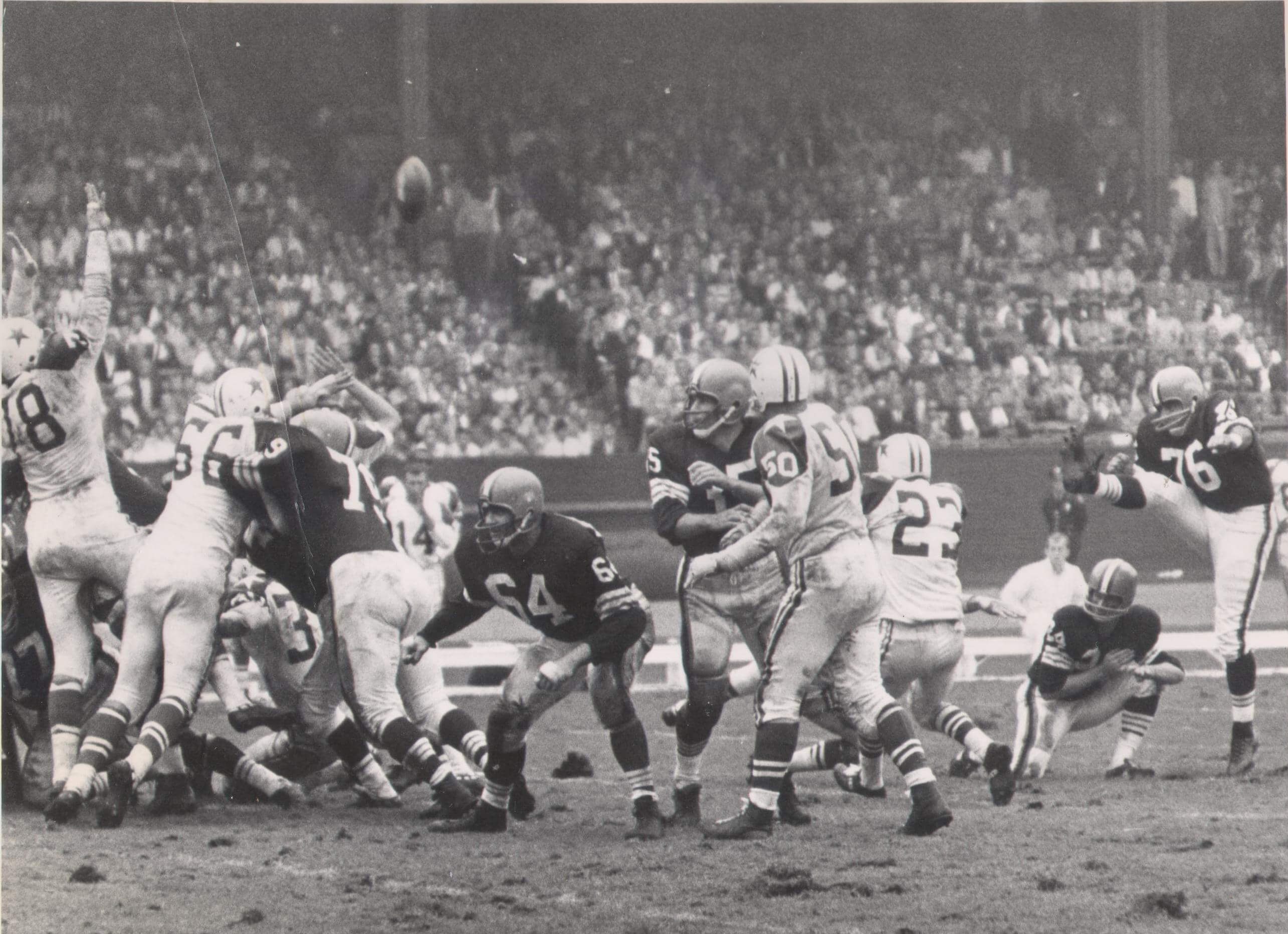
As you can see, two of the linemen do indeed have brown facemasks. So there you go.
• Several people have asked me why they’re using such an old-fashioned helmet illustration for the new logo. One reason, I’m sure, is because they don’t actually want the illustration to be all that illustrative. When I asked team president Alec Scheiner if the center striping would be getting wider, he declined to answer the question and said we’d all find out when the new uniforms are released in April. So the helmet illustration was probably deliberately inconclusive-looking.

• I really, really like the new Dawg Pound logo. No offense to Todd Radom, who designed the previous version (or to his bulldog Casey, on whom that logo was based), but this new design is really fun. Yeah, he has the requisite furrowed brow and a snarl, but he’s also sort of smiling — he looks more mischievous than ferocious, and I can totally envision him switching into slobbering, tail-wagging mode. Scheiner wouldn’t say whether this logo will appear on the uniforms as a sleeve patch or hip graphic, and I doubt they’ll go that route, but I’m holding out a small hope for it. (As an aside, kudos to the several conspiracy theorists who think the dawg’s mouth is a subliminal Nike swoosh. With the pooch’s mouth and the Broncos’ logo’s nostril serving as our starting points, maybe we can assemble an entire creature out of swooshes.)
• As for the uniforms, they’ll be unveiled on the evening of April 14. Scheiner says they’ll be more “radical” than the logo changes, which isn’t saying much but still sounds like cause for concern.
• Phil and Todd Radom both discussed the Browns logos on this Cleveland radio show last night.
• Finally, lots of people spotted this on the Browns’ website yesterday and got all excited, thinking it was a leak of the new jersey. As I kept explaining to these people, that’s cornerback Joe Haden’s Pro Bowl jersey.

Baseball News: The Pawtucket Red Sox are moving, probably to Providence, which unfortunately means that one of the great team nicknames — “PawSox” — will no longer apply. Dang (from John Kimmerlein). … Pretty nice new uniforms for Navy, along with matte batting helmets. … . … Whoa, check out this early-1980s Phoenix Giants uni — yabba-dabba-do! (Nice find by Drake Gilliand.) ”¦ Robbie Cano has switched to Franklin batting gloves.

NFL News: This is funny: What if the Browns were in charge of redesigning every NFL team’s logo? … More NFL helmet concepts, most of them pretty dreadful. … Seahawks RB Marshawn Lynch is trying to trademark the phrase “I’m just here so I won’t get fined.” … ” I guess the Chargers’ logo can now mean be used to represent electrochemisty,” says Lydia Kisley. “That’s from the lab of Phil Baran at Scripps Research Institute, which is in San Diego. I found it on his website, in publication 138. I only saw it on the website, not in the publication it’s linked to. Guessing one of the graduate students is a Chargers fan.”

College Football News: Baylor has hopped on all of the standard uniform trends in recent years — BFBS, chrome helmets, matte helmets, custom typefaces, etc. The only thing they haven’t done is GFGS — until now.

Hockey News: The Kings wore their gold throwbacks last night. ”¦ The space between Red Wings D Alexey Marchenko’s NOB and his uni number appears to be larger than on his teammates’ jerseys (good spot by Jim Thorburn). ”¦ Habs headgear! That’s Christian Thomas wearing the full cage and Jarred Tinordi with the full shield (big thanks to Matt Larsen). ”¦ Also from Matt: Blues goalie Jake Allen is Canadian but has an American flag on his backplate.

NBA News: The Suns will unveil their new sleeved alt jersey at 2pm Eastern today. … Kevin Garnett, back in Minnesota, is wearing his old uni number. ”¦ The Cavs will wear navy alternates tomorrow night (thanks, Phil).

College Hoops News: Color vs. color last night in Maryland, as the Terps wore gold unis at home against Wisconsin. That prompted this look at Maryland’s top games wearing gold. ”¦ Tonight Virginia Tech will be doing a giveaway of an argyle T-shirt based on Buzz Williams’s sweater (from Andrew Cosentino). … More color vs. color: Missouri and Florida going black-vs.-orange last night (thanks, Phil).

Soccer News: MLS will hold its annual Jersey Week promotion during the first week of March. ”¦ Here’s a look at the evovlution of the New England Revolution’s uniforms.

Grab Bag: Some old Tour de France jerseys have been repurposed as blankets. ”¦ A new cycling kit manufacturer is offering limited-edition designs. ”¦ Speaking of cycling, here’s the story of how lace-up cycling shoes made a (slight) return to popularity after a crash by American hopeful Taylor Phinney at the 2012 Giro d’Italia (from Sean Clancy). ”¦ New lacrosse helmets for Oregon. ”¦ The Australian cricket team is going to be testing a new helmet design. ”¦ Jersey-sponsorship snafu for the Aussie rules football team West Perth Falcons.
The university of Florida basketball jersey is the road version of the new white hyper elite jersey they are wearing on Saturday. link
The stripe on the new Browns helmet logo is bigger than the one on the previous logo. I am assuming that means it will look more like Ohio States alternative with the oversize stripes… which are dumb.
I guess Browns fans can save a lot of money by just using a brown Sharpie on the facemask of their current gear (t-shirts, etc.)to get the 2015 look.
It also means we’re probably going to see the gray mask still occasionally used by various media outlets for the next few seasons. Heck, we still see the wrong Seahawks logo pop up, and that was actually a noticeable color change.
When does the pic on the COTD change? I can’t recall.
When someone reminds me. Thanks for doing so!
It’s not baseball season yet. How about a hoops picture of someone grabbing a rebound?
Or a glove save by a goalie?
Much as I love that Pirates pic, how about an update to Steven Souza’s famous catch to complete Jordan Zimmermann’s Sept 28 no-hitter last fall? Probably the most famous and photogenic catch in recent MLB history.
In the air: link
Caught: link
And next fall, will there be a one-handed Giants catch?
Because he’s not showing any stirrup.
Good point! But the Marlin in the bullpen behind him is showing plenty of stirrup.
I would offer this as an option as well
Game 3 ALCS:link
I’m gonna start buying canned foods for when they release the new Browns uniforms. The riots might shut down the city. Can’t wait to read what the gunmetal grey represents about the city. Maybe the guns in the riots?
“I gotta get the bread and milk!”
You forgot the toilet paper…which I snagged and now you won’t have a square to spare.
It’s not “gunmetal gray,” it’s “Shipyard Steel” to represent the industrial backbone of the city of Cleveland. It pays homage to the hard working men and women who helped build the Great Lakes region, one shipload at a time. It’s also .372956% lighter.
This comment needs a like button. Well done.
Hey, don’t forget that the brighter orange is meant to signify the flames of the Cuyahoga River on fire.
I don’t buy this gunmetal grey stuff. If they really were going to make grey an official team color, why remove it entirely from the helmet, the teams main brand and the only place it currently existed in the uniform?
The Mets token also uses the Staff of Caduceus (two snakes) and not the Staff of Asclepius (Aesculapius) (one snake). They are not the same (link). According to this article (link) there’s a split between professional and commercial organizations.
Here’s the EMS logo e.g. link
The Browns claim brown facemasks since 1952. Were there even ANY facemasks in 1952? I thought one of the first worn was a plastic guard Otto Graham wore to protect his busted face in 1953. Then again, it is the Browns putting out this info. They don’t do much right anyway.
That sounds about right. Facemasks didn’t really become standard issue until the mid 50’s, and then the color was dictated by the manufacturer, with gray being the most common. Cleveland apparently had a small number of players with brown masks (of course it’s a black & white photo so those could just be darker gray) but then it’s likely there were a couple players with those masks on every team.
link
Yes, those “cow catcher” style masks pointed out on the linemen in the picture were all brown at first, no matter what team used them. Facemasks were truly a piece of equipment back then, and whatever color coating the mask manufacturer used on its masks was what you got. Note that most of the other masks in the photo are gray. Personally, I wouldn’t describe a team as “wearing brown masks” when only a few players who used a specific brand of mask wore the color.
The brown colored face masks were the norm for Schutt in the 1950’s era until they switched to grey in the 1960’s.
link
PrahSox?
BTW, the link on the limited-edition cycle gear is taking me to the Revolution Uni history.
The Mets challenge coin is a strong argument against MLB’s GI Joe fetish. Servicemembers, and civilians who give a shit about the military, take challenge coins seriously. Even challenge coins issued by non-military sources like agencies and nonprofits. I know people who display challenge coins more prominently in their offices than photos of themselves with presidents.
Yep. I still carry my 2 most prized coins in my pocket every day.
I was thinking something along the same lines. The idea behind a challenge coin is that there’s a great deal of pride and honor one can rightfully claim by having been a part of the organization issuing it — so much so that one is within their rights to challenge whether or not a member was really a part.
For the military, it makes every ounce of sense and it’s a very cool tradition. There’s a high school football team here in Wisconsin that does something similar, and the guys carry the coin with them the rest of their lives.
Going through rehab? Seems like just a task you do to get back to doing a job. It’s not really a point of pride or something others would challenge.
Kinda silly if you ask me.
“… The Kings wore their gold throwbacks last night. …”
Love ’em.
Seconded.
What I don’t like about the Browns new dog logo is that it’s primarily negative space. I can only envision that on the walls behind the end zones. I can’t see any other decent place to put that dog logo. Sure, it could go on a polo shirt, or something. But there are no lines to connect the pieces of the dog and close the design in.
Sure, the Oriole bird is missing that one line on the chin, but that’s only one small line. This is the dog’s entire head.
” I can only envision that on the walls behind the end zones. I can’t see any other decent place to put that dog logo.”
~~~
Todd said that’s where he thinks the logo will go (walls behind the end zones) during last evening’s radio show. I tend to agree there probably aren’t many other places it could go. Hopefully nowhere near the unis.
It just doesn’t look refined to me. For the most part the top is fine. The negative space thing I like, the only issue is there is no way for this logo to appear on brown as intended. Limitations like that can be acceptable if the logo is compelling enough and this one is nearly there.
The mouth needs some work and it has nothing to do with the swoosh. It may be correct physically to how a bulldog would growl, but it just looks weird. The style looks different than the rest of the logo too. It honestly looks like it was intended to not have a mouth and a different designer added it last minute.
I can’t judge the designer here too harshly as I’ve been in these situations before where something gets forced on you and you have to make the best of a bad situation.
Semi-related, I just looked at the Browns Creative twitter and these were NFL designed, which to me it seems like their style. So the Nike conspiracy theory’s are unfounded.
Yes. The lack of refinement, though, is troublingly consistent when comparing this mark to other recent projects done by the NFL’s in-house creative dept: Carolina, Jacksonville, Tampa Bay, Miami…
They desperately need a deft hand in there to build marks, because these are lacking.
I felt the same way, so I mocked this version up
link
Thats 1000X better than the shit they put out.
I think the reason Paul likes it so much is because it’s reminiscent of the goofy mascots of days gone by (Nuggets, Bucks, Padres, etc.), but personally I think the design falls short and prefer the old dawg.
Kansas State wore grey uniforms at home against Kansas Monday night, wouldn’t that qualify as color vs color? link
Yup.
First thing I think of when I see the Dawg Pouns logo is: “The mouth is shaped like a swoosh.” Fuck Nike.
I bet Nike loves it when people see any sort of distorted checkmark shape and just assume it’s a swoosh.
Sometimes a mouth is just a mouth.
It never occurred to me the Dawg’s mouth was a swoosh. I think sometimes people see what they want to see.
Lee
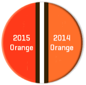
Am I the only person here who thinks that the switch from 2014 Orange to 2015 Orange is a lamentable development? Not merely for the Bengalsification factor, but because orange qua orange is a fine color and way underemployed. Yes, the new reddish-orange is more “dramatic.” Big flaming deal.
I prefer the new orange, as a color. Always thought the old orange was washed out and drab. Yet I agree with you. [old man voice] When I was a kid [/old man voice] it seems like there was more variety between teams in terms of hues of color worn. Used to be you could see the difference between the red the baseball Cardinals and the Reds wore, for example. Even moreso with blues. Now, thanks to league-wide supplier contracts and economics of scale, there’s pretty much one version of any given color league-wide in any given league. So every red is the same, every orange is the same, and you get at most three choices of blue. I’d much prefer variety, even if I personally don’t much like some of the color choices, to standardization.
I guess we’re just lucky the Saints and Packers still get to wear different colors of “gold.”
It’s kind of ironic isn’t it. Considering how uniforms have become big business, you would think there would be more incentive to come up with something new in colors, instead of being dumb-downed. I guess it can be argued the other way, nonetheless frustrating.
I was hoping the Browns would adopt an even more reddish orange, with a matte finish. My own view, nothing about Cleveland should be flashy.
Used to be, teams wore distinctive colors with a wide variety of marginally different hues but one of a small handful of number fonts. Today, teams wear one of a small handful of colors but distinctive number fonts with a wide variety of marginally different details.
It’s not just orange, it’s “Passionfruit Orange” to capture the passion that runs deep through Cleveland. The shade is a reddish orange to represent to blood of the Cleveland fan, because being a member of the Dawg Pound runs in the blood of Northern Ohioans. It also makes the players .28756493673% faster.
How about “Jolly Olly Orange” to express their eternal optimism? It’s .999756% sweeter!
“Jolly Olly Orange”
Thank you for making my day.
“Am I the only person here who thinks that the switch from 2014 Orange to 2015 Orange is a lamentable development?”
~~~
Yes.
I’m gonna disagree with Phil here and agree with Connie. I like the old shade a lot better in terms of how it fits for the Browns’ identity. New orange is too bright for them.
Agreed. I like the Browns’ 2014 orange better. It was distinctive. The old orange was immediately recognizable as the Browns’ orange. The new orange is so similar to the Bengals’ orange as to be indistinguishable. Not good for the Browns or the Bengals.
I found this version hidden in the Browns site too… did they publicize this one?
link
Every NFL team has two versions of their Helmet logo, 3/4 view and side profile.
The Pawtucket Red Sox are moving, probably to Providence, which unfortunately means that one of the great team nicknames – “PawSox” – will no longer apply.
Pfft. Two ways around that. 1) rebrand as the Providence PawSox, 2) Pull a Wellington Mara or a Clint Murchihson.*
*TPIC for #2. So stand down, Phil…
Actually, if they are moving, I’d be real surprised if they keep the Red Sox name. Minor league teams have been trending away from the parent clubs’ nicknames for decades. So if no one else has suggested, I’m seriously saying go with the Providence PawSox. It harkens back to their roots, plus it has that alliteration thing going on that most people enjoy for some reason.
They could just keep the Pawtucket name. I mean, I think Pawtucket is a lot closer to Providence than Santa Clara is to San Francisco.
Providence is bigger, though, so I’m sure there’s no way they’re going to allow that.
Hmmm, just thought of another one. They could be the Rhode Island Red Sox. Put a pair of red stirrups on some chicken feet.
Brilliant! Especially since the Rhode Island Red is a breed of chicken and the state symbol.
Since, as Mr. Vilk mentioned, minor league teams have been going away from carrying the big league corresponding name, why not make them the Red Cocks? A red stockinged rooster being the logo, of course.
Per my brother back in RI, the talk is that it is going to be the Rhode Island RedSox. But a lot can happen between now and when they actually move the few miles (literally) from McCoy to the proposed new site. And as nice as “Rhode Island” might look across the front of away grays, to my mind it can’t beat “Pawtucket” in the same context.
It’s going to be the Rhode Island Red Sox.
Eagerly awaiting the sound of the crowd chanting “Gallus gallus domesticus!”
Interesting part of the new Navy uni’s is that with the UA faux button down they no longer have to split the lettering to account for the flap. Looks like a 1 piece “A”
Ah, excellent point!
Here’s what Joe’s talking about:
link
That looks weird.
I really dislike MLS’ policy of only allowing a club to keep a jersey for a maximum of 2 seasons just so they can have a jersey week and market new overpriced jerseys for people to buy. It’s impossible to have a classic jersey with tradition and history when the league forces the clubs to change them so often in the name of making a few more dollars.
Feel fortunate its even 2 years. That used to be what the EPL did, but now every team gets new designs every year.
Ugh.
Lee
The “gigantic helmet logo” concept just doesn’t work for the majority of teams because it requires a very narrow field of circumstance for it to be effective.
The logos that can work have to be ones that rely greatly on negative space because the helmet needs some uniformity of color otherwise everything jut becomes a blur or different shades. In short, the helmet color must be critical to the logo color. Its why big logos for Boisie State and Missouri work and those for the Buccaneers and most of the fan concepts do not.
By just blowing up the same logo, these designs just stuff the space without integrating the logo into the helmet. There’s no room to breath and no negative space to give definition.
NFL teams already use big helmet designs but most have been around so long we hardly notice. The Vikings, Eagles, Rams, Chargers, Bengals all use helmet designs which are over size but they’re so seamlessly incorporated and rely so well on the helmet itself to be part of the design we never notice.
If any teams could really pull off the oversize look it would probably be the Texans whose logo has the shape to fit the space well and uses enough negative space so that it would not overpower the overall look of the helmet.
I know purple is a bad word around here, but those Kings throwbacks are sweet!
On the Detroit feed of the game last night, they said that the name of the color is actually “Forum Blue” because the owner of the Kings at the time hated the word “purple”. He was also the owner of the LA Lakers at the time, so he wanted the two teams to have matching colors.
That would be Jack Kent Cooke, and yes he was the one who coined the “Forum Blue” name for the color. He bought the Lakers in ’65 and built the Forum for both the Kings and Lakers in ’67. That’s when the Lakers switched to their current colors.
Kings actually switched colors in 1988, with the arrival of Wayne Gretzky.
Right. Hence the throwbacks last night. … But the Lakers went to their current Forum Blue/Purple & Gold back in ’67.
Chick Hearn (Legendary Lakers Broadcaster) called it “Forum Blue”
I agree with JKC as Forum Blue sounds regal while purple seems kinda lame: )
Does that mean Uni Watch will accept Forum Blue as a color for membership colors on the non exemption days of the year (364)?
The lack of serifs on the Browns wordmarks definitely shows their toughness as well. Leave all that fancypants stuff to the Bengals.
For some reason, that just made me think of this: link
Maybe that’s what the Browns need for a secondary logo… a beer bottle flying through the air.
The one thing that sticks out in the font is curving on the top and bottom of the S, but the middle is mitred. I can see doing the inside of the C, D and O square but the outside edge round, but I’m already cringing at how bad the 2, 5, 6 and 9 will look.
Just checked the P in DAWG POUND. My LCD is acting up…
OCD
Eh, I guess I can see how they might irritate someone’s CDO, but I think they’ll still look decent enough. Better than the stupid crap the Vikings & Bucs have, anyway.
The flag on Jake Allen’s mask looks to be half American flag, half Canadian flag. Duel citizenship maybe?
I don’t think he has dual citizenship or anything, but yeah, that’s definitely a split US/Canada flag on the mask, as shown link.
Though, amusingly, the US flag is missing the bottom red stripe. It also appears to be significantly short on stars in the canton.
Kings should permanently go back to the gold and “Forum Blue” (as that purple was so elegantly described by Chick Hearn) and get rid of the BFBS gang colors they currently wear.
The flag on Jake Allen’s mask is half USA and half Canada.
Excuse me for not being able to follow the logic, but exactly how does changing the the tint of orange match the passion of the fans and city? I just am at a loss.
The bad thing about those helmet concepts is doing three or four good ones and having someone say “do all the teams” and you’re stuck with these.
I like the attempt on the Bears: logo in front, something on sides. The claw marks may be too similar to the Bengals’ stripes, but it’s a great idea.
Best one by far is the Pittsburgh helmet: all yellow with a little wear on it. I would like this once a year with the yellow-on-black jerseys.
I’d definitely use one of those coins as a ball mark on the golf course. Not the Mets, of course, but definitely a good ball marker.
That CotD brings back memories of a collection I kept from about 1972-1979.
Suns new alternate is out:
link
Because when I think of the f*@%ing Sun, I think of the color gray. Good job Phoenix.
I’m sure the color is listed as orange, but it looks more like copper to me. And since I liked, nay LOVED, the ASU copper/anthracite unis, I like the new Suns colors. Sleeves are bad and gray is overplayed, but it goes well enough together.
wow those are baaaaaaaaad.
So, so grim.
Even though Paul dismissed that new set of NFL helmets as “pretty dreadful”, I thought a lot of them were cool and actually as a whole they were a better set than the ones we saw here a few days back.
Am I the only one? A number of them were quite creative. The Texans especially would be an upgrade, and the Raiders one was badass. The Packers concept actually displayed a sense of humor, which obviously is a no-no in the NFL, but still…these designs deserved better than “dreadful”.
Lost in all of the hoopla about the Browns logos yesterday is the fact that the Elf will remain as a secondary logo, according to Alex Scheiner Browns President. Good news!
Glad to hear that I assumed Elfie was being shelved!
How is that forgettable clip art helmet “logo” the primary and the Elf secondary?
What am I missing here?
Just a wild guess but I would not be surprised to see the Elf on the chest or sleeves of the new jerseys.
The snafu over the West Perth reminds me when the Bathurst 1000 touring car race in Australia was broadcast by Channel 7. In the early 1980’s, Kevin Bartlett drove a Chevrolet Camaro sponsored by Channel 9, with the number reflecting the Channel 9 corporate logo:
link
Channel 7 did not spit the dummy like they are threatening to do with the Falcons, and let the car compete. They were miffed though, when the car had a spectacular roll-over in the 1982 race, which gave Channel 9 lots of free publicity!
QOTD, though not really an answer to the question as much as a comment on something Mike discussed: Only BP homer I ever got, I caught on the fly. Bleachers in Miller Park, first weekend of the 2002 season. Arizona Diamondbacks BP. I was 19. Was wearing my glove.
When it came off the bat, I thought to myself, “You know, that could be coming right at me.” Relative to my field of vision, it didn’t look like the ball was moving to the left or right one bit. It’s like it went straight up, and straight down. I didn’t have to move my feet one bit. I put up my mitt because I thought it might come in my direction and I followed it all the way into my glove at waist level. Didn’t feel a thing; hit me right in the pocket. It was as if it had been thrown to me.
I saw it go in, but I almost didn’t believe it was in there until I opened up my mitt and saw it. The smattering of fans that was also in attendance gave me a small round of applause as I held up the ball for them to see.
One of those moments that means nothing in the grand scheme, but, to me, was pretty darn cool.
Only foul ball I ever caught was on the fly, too. Protip: Take your glove to the game.