
Click to enlarge
There are certain things with which I feel a very strong sense of identification — things that, when I see or hear them, activate a little center of recognition or even ownership in my brain. One of those things, unsurprisingly, is my name (which I happen to share with an old Hollywood actor). Another is my birthday. And then there are my initials, which happen to be featured on the uniforms shown above.
That’s the 1911 Portage Lake team from Houghton, Michigan, which was part of the International Hockey League. From a strictly aesthetic standpoint, I’m not nuts about the design — the letters are too wide and feel too clunky. Still, even with questionable typography, doesn’t “PL” look great on a jersey? Okay, so it probably doesn’t look like anything special to you. But it sure does to me.
Of course, if your name is, say, Nick Yarborough or Steve Farrell, then you’re used to seeing your initials on a uniform all the time. For most of us, though, it’s not such a common experience. For those of you who’ve seen your initials on a uni, whether frequently or infrequently, how do you feel about it?
(Big thanks to my pal Jay Sherman-Godfrey for letting me know about this one.)
Click to enlarge
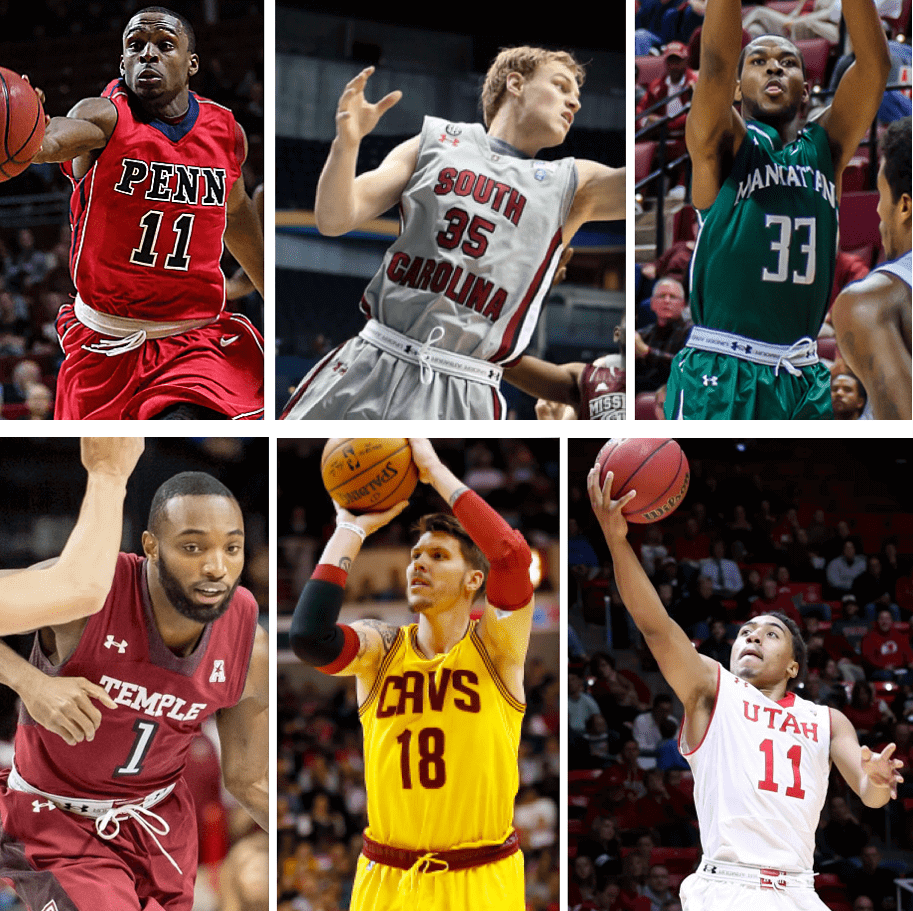
Roll your own: If you’ve been following the pro and college basketball sections of the Ticker in recent weeks, you know I’ve been tracking the increasing trend of players rolling down the waistband on their shorts. Today I have a new ESPN column that takes a closer look at this phenomenon, including interviews with some of the players shown above. Check it out here.

Regime change? In the wake of Arizona State switching from Nike to Adidas and Miami also pondering a move away from Nike, someone posted the following comment yesterday afternoon: “Do you think there’s a chance Adidas gets the NFL contract in 2017?”
Leaving aside the fact that this is a largely meaningless and unanswerable question, it raises a point that I had frankly forgotten about, namely that Nike’s current contract with the NFL is only a five-year deal — and we’re about to finish the third of those five years. In other words, it’s possible that we’re now closer to the end of the current NFL/Nike era than we are to the beginning. Man, doesn’t it seem like they just got started? (By contrast, Reebok’s NFL deal — the one that the current Nike deal replaced — was for 10 years.)
If I had to guess, I’d say Nike will get to re-up unless they have another embarrassment like the Eagles green fiasco. But even if Adidas or Under Armour land the NFL contract, or if Reebok makes a comeback, would it matter? I doubt it. If you don’t count tailoring gimmicks like the Nikelace, the neck roll, and the sweatbox, 27 of the 32 NFL teams are currently wearing the same uniforms they were wearing at the end of the Reebok deal. (The five exceptions are the Dolphins, Vikes, Jags, Seahawks, and Bucs.) Yeah, another team or two will get new unis in 2015, but whatever — what we’ve seen during the course of the Nike contract is a modest pace of change, which is pretty much the way things have always been in the NFL (and, just for the record, is what I predicted all along would be the case under the Nike deal). I see no reason to expect anything different no matter who the outfitter is, especially if the league sticks to its current uniform protocols of allowing only one alternate/throwback uni that can be worn only twice per year, only one helmet shell, etc.
In short: Changing suppliers can have a big effect on a college program. But in the NFL? Despite all the fuss, it really doesn’t matter that much.
Raffle reminder: The annual Uni Watch year-end raffle is now underway. Get the full scoop here.
NFL Superhero Project
By Thomas Correia
Today marks is the final matchup for the NFL Superhero Project. I hope all of you football and comic book fans have enjoyed these past 15 weeks as much as I have. Here are the heroes I’ve chosen for tonight’s game between the Titans and Jaguars (click to enlarge):
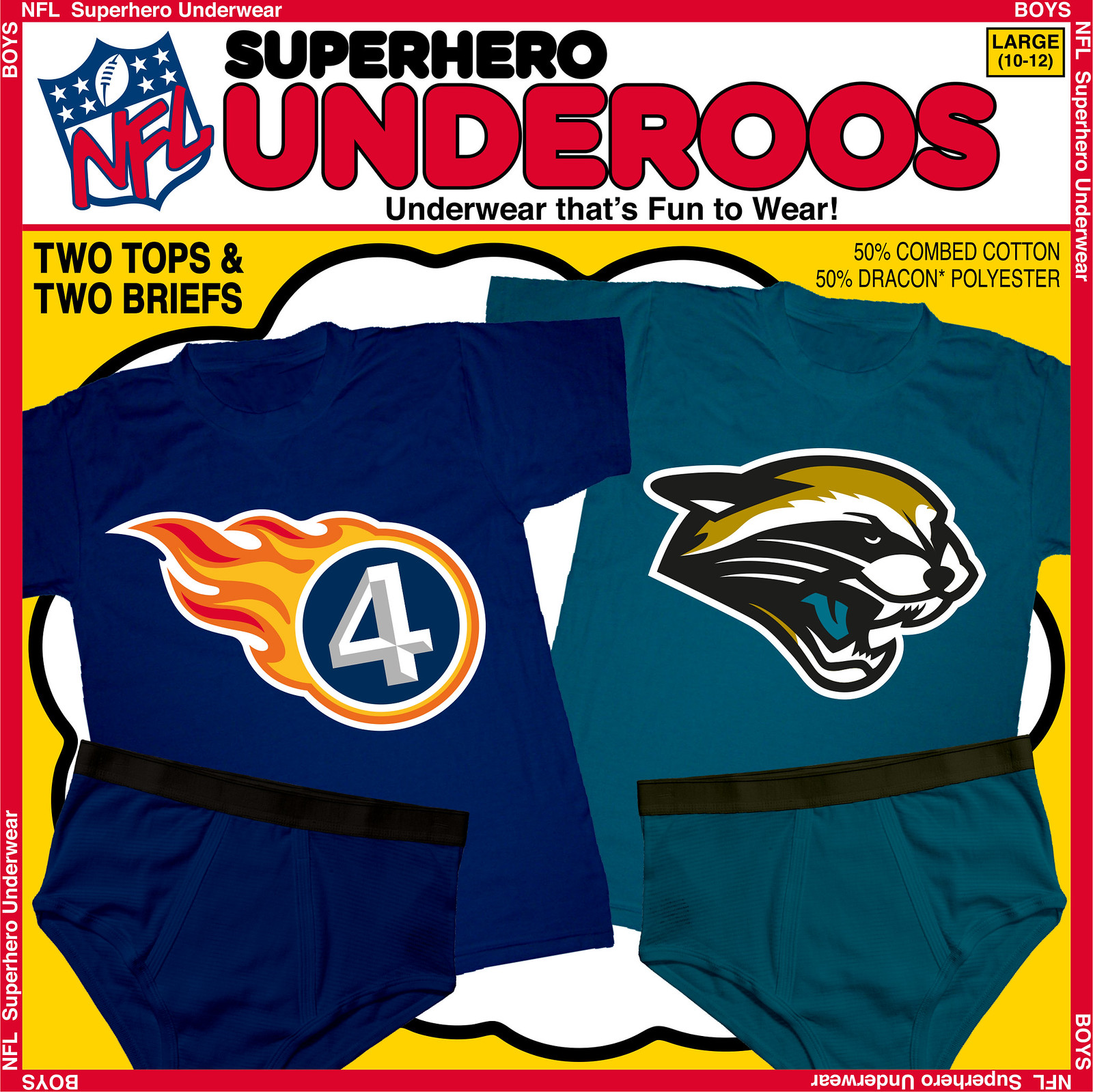
Since the flame is a key part of the Titans’ logo, I wanted to find a hero with fire ability. The top fire-related hero is of course the Human Torch of Marvel’s Fantastic Four, who are known for their blue uniforms and their “4” chest logo, which here replaces the “T” in Tennessee’s team logo.
As for Jacksonville, it took some work to morph the team’s jaguar-head logo into Rocket Raccoon of Marvel’s Guardians of the Galaxy. Since Rocket starred in one of the most popular films of this past summer, this logo is particularly timely. If I had done this project last year, only true die-hard comic fans would have been familiar with Rocket.
As I now sign off from this project, I want to thank Paul and all the Uni Watch readers and commenters. It’s been an extremely positive experience for me, and I’ll be showing my appreciation next Wednesday — Christmas Eve Day — when I’ll be providing a poster of all 32 superhero logos. See you then!

Mike’s Question of the Week
By Mike Chamernik
As you probably know, Uni Watch has always been a fan of MLB reliever Josh Outman. I’ve always liked Rip Hamilton for his mask, Vlad Guerrero for his glovelessness and Chris Osgood for his plain goalie mask. I’ve always wished I was buff enough to wear a headband for an armband like Ben Wallace.
What about you — whose uniform stylings have you always liked? Are there any quirks that you find endearing? Have you ever copied any players’ styles when you played sports? Post your answers in today’s comments.
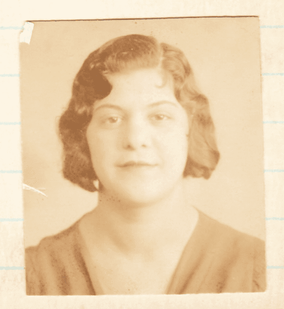
PermaRec update: The latest Manhattan Trade School student whose file I’m examining on Permanent Record is the girl shown at right, who didn’t tell the whole truth about why she turned down a job. Get the full scoop here.
Uni Watch News Ticker
By Mike Chamernik

Baseball News: When the Havana Sugar Kings moved to Jersey City in 1960, some awesome temporary uniforms were created (from Phil). … This story about former Twins great Tony Oliva’s reaction to President Obama’s initiative to normalize relations with Cuba includes a photo of Oliva wearing a Twins Hall of Fame blazer. … Cards manager Mike Matheny will wear No. 26 next year and Trevor Rosenthal will switch from 26 to 44 (from Brinke). ”¦ Up until now, the best view we had of A’s outfielder Billy Conigliaro’s “Billy C” nickNOB was from this baseball card, but Ferdinand Cesarano was watching Game Five of the 1973 World Series and got this great rear-view shot of Conigliaro on deck. While he was at it, he also got a shot of the New York City 75th-anniversary patch on the Mets’ dugout jackets.

NFL News: From a commenter named Mike in yesterday’s comments: “The 49ers are running out of numbers! In the last 2 days they have signed a practice squad defensive back and a running back to their active roster. However, they don’t have any numbers available to them. With the number of players on the roster, injury lists, practice squad and with their retired numbers, the only numbers available are 3, 5, 6, 19, 65 and 82.” … The Packers don’t wear captaincy patches during the regular season but always add them for the playoffs. Yesterday they announced who’ll be wearing them this time around. … Jeff Ash’s English friend bought this horrendous Aaron Rodgers jersey from NFL Shop Europe. … The OklahomIraqis fantasy football league is letting readers rank its teams’ logos, colors and uniforms (from Justin Cliburn). … Marc Swanson sends in some cool old NFL programs he’s come across, along with two Cleveland Browns helmets from the team’s stadium.

College Football News: The coach who brought the Nike Pro Combat uniform stuff to the high school level is retiring (from Chris Bisbee). … Here is a look at the Cotton Bowl patches and the Poinsettia Bowl patches (from Phil). … And, here are the Military Bowl patches on Virginia Tech jerseys (from Andrew Cosentino). … North Carolina State will wear slogan-laden cleats for its bowl game (from Phil). … Colorado State will wear all white with this helmet for the Las Vegas Bowl (from Phil). ”¦ Yesterday’s Ticker mentioned that Marshall will be wearing a memorial decal for Chad Pennington’s father. Now it turns out that they may also add one for university president Dr. Stephen Kopp, who died yesterday (from Coleman Mullins).

Hockey News: The Capitals wore rally helmets during their 20-round shootout Tuesday night (from Phil). … A Fansided writer listed five NHL uniform changes he’d implement. … The Bakersfield Condors will wear Lord of the Rings jerseys on Dec. 27 (from Jonathan Daniel).

Soccer News: New crest for the League of Ireland’s Bray Wanderers. It celebrates the club’s 30th anniversary of acceptance into the league (from Patrick Fleming). … New training top for Barça in 2015-16 (from Phil). … Chelsea goalkeeper Petr Cech, who has worn padded headgear for years, says his helmet saved teammate Kurt Zouma from greater injury after the two of them had a head-on collision Tuesday night.

Basketball News: The Kings retired Peja Stojakovic’s No. 16 the other night. … Rich guy Warren Buffet went to a Cavs game the other night and wore an old replica jersey. … The Bulls hosted a bowling outing and the players and guests wore Bulls bowling shirts. … The Raptors went with purple throwbacks last night (from Phil). … The 2016 Final Four logo has been released. ”¦ A 1949 women’s team from Chicago, called the Texas Cowgirls, posed for a team portrait while holding toy guns (from Michael Clary).

Grab Bag: Rihanna is the new creative director of Puma. I picture her sitting at a desk in a corner office with a “Hang in There” poster behind her as she designs a more efficient drawstring bag (from Jon Solomonson). … “You know how sports championship rings are often really big and gaudy?” asks Sean Clancy. “The ring that pro cycling team BMC received for being world champions in the team time trial is the opposite of that.” … Here’s a collection of food-shaped erasers.

QOTD… no doubt it’s the link. I never had his long, skinny legs but I tried to find the longest set I could find and pulled them up as high as they would go during my softball playing days.
Agreed. Pants to mid-calf, back stirrup touching bottom of pant. I had my mom cut my little league stirrups at the bottom, sew in a piece of elastic so I could stretch the ‘rups to obtain that look.
The Fansided article was pretty much spot-on with the NHL unis that need to change. Too bad the site has some of the most intrusive, annoying ads.
Thankfully, Uni Watch isn’t bad at all with ads these days… except for the “From the Web” clickbait crap, especially the sidebar that pushes COTD so far down.
I haven’t seen this done anywhere yet, but if it was, I apologize. I mentioned it really late in the Monday comments, too late for anyone to read it.
When the Browns go all brown, should the costume be referred to as The “uniturd” look? Or is that too obvious/immature?
It’s a little immature, but I like it and think it accurately describes the look. With some good striping, those pants would look good and break up the turd appearance. Right now their legs all look like Mr. Hankey from South Park.
I thought of Mr. Hankey too when looking at their mono-browns. Just replace the orange helmets with Santa hats, and the look is complete!
Ha, I didn’t even think of that. Which is odd as I have been meaning to watch the first Mr. Hankey episode.
“Mr. Hankey” for the win!
i call the pants that.. really needs a stripe
I’m really reluctant to do so, if only because I’m tired of the puerile “pee pee poo poo” comments when we talk about the Padres’ proper color scheme.
I call them taco’s ever since Steve Garvey said he went from wearing an American flag to wearing a taco.
ALL NFL monochrome uniforms have got to go. And so does Roger Goodell.
Apropos of the comment about people with NY and SF having lots of “personalized” apparel options…I got a laugh from the Scott Pilgrim graphic novels and film – Scott Pilgrim wears a Smashing Pumpkins logo t-shirt in both.
link
ed
“… When the Havana Sugar Kings moved to Jersey City in 1960, some awesome temporary uniforms were created (from Phil). … ”
Very cool. The Sugar Kings were a truly storied franchise. Yesterday’s news about US-Cuban diplo relations might — I hope — prompt a UW edition on Cuban baseball unis through the ages. The Ebbets Field guys have done a great service by keeping alive some of those incredible Cuban League insignia.
To answer PL’s question, as a kid I used to like to watch freight trains pass by, and the distinctive CN of the Canadian National cars made me happy.
ConNie DC,
I too like the distinctive CN of Canadian National, and their followers in logotopia
like here:
link
and here:
link
CN’s not bad, but for me, link was the best.
Of course, it doesn’t have the initial significance…
Really, there isn’t anything that would apply to me in that area. I mean, RS or RDS, the only two things I can even think of are 80s animation studio Ruby-Spears and the French-Canadian counterpart of TSN. Neither are particularly significant to me personally.
Man, train livery. True that you can’t beat the Chessie cat. But I’ve always had a soft spot for my the K-T line, for which my great-grandpa worked:
link
An early example of FedEx-style corporate adoption of a popular nickname. The M-K-T name gave rise to the nickname K-T Line, or “Katy Line,” which the company eventually adopted.
The railroad my grandfather worked for had a fairly ho-hum logo, but man were their trains beautiful:
link
Well that was odd:
link
Not quite uni-related but the RT version of the Dodge brand of cars like the Charger etc always makes me want one.
U.L. Washington, for his toothpick.
My initials are ITH. I remember as a kid going to cheesy souvenir shops where virtually everything was available with an initial on it, and I could NEVER find and “I”. There are probably more now, with the preponderance of Isabellas and such. But imagine my glee when I first spotted one of those three-letter decals (you know, that idea that we stole from European countries?) for ITHACA!!! I implored an Ithaca native to purchase one for me when she next went home, and finally, at age 53, I have something real with my initials on it!
NFL Ticker quote doesn’t specify what team it is referring to.
“In the last 2 days they have signed a practice squad defensive back and a running back to their active roster. However, they don’t have any numbers available to them. With the number of players on the roster, injury lists, practice squad and with their retired numbers, the only numbers available are 3, 5, 6, 19, 65 and 82.”
49ers, IIRC
Correct. Text now updated.
Now that the 49ers have released all around good guy and true gentleman Ray McDonald, #91 is now available too.
Do you think we’ll ever see a three-digit number?
In theory the league could allow 0, 00, and 01-09, for a total of 11 new numbers without going to triple digits.
The clunky typography is my favorite thing about those PL sweaters. Pretty much the only thing I like about them at all.
When I was a very young child, my family’s doctor told me that the paper towel dispenser in his exam room was just for me, since “Scott” was stepped into its stainless steel sides. I guess I’m lucky, because I like the shapes of my initials, so uniforms and caps with prominent S or R shapes are often aesthetically pleasing to me aside from the familiarity of seeing one’s own initials. Some letters, like I and F, often just don’t look as good on a uniforms. They’re kind of tough to use really well as standalone shapes.
I was reading that linked story in the Phoenix newspaper yesterday about the Arizona State switch to Adidas for athletic apparel. The story listed the ten richest NCAA apparel contracts. I was surprised over a couple of things in that list. Only two Nike schools were listed, Florida State 6th and LSU 10th. My surprises were that only two Nike schools made the top 10, and neither was either Oregon or Texas. Any thoughts.
At a book show, I found an old trainspotting guide for the London, Midland and Scottish Railway and many of the engines had LMS as part of their livery. (They also used a red and gold that is something like the maroon and gold of the U of M.)
QotW: Does Cruyff’s two stripe uniform count?
The initials thingee is one reason why I own several California Angels interlocking CA caps. Not only did I see my first Major League game in 1969 at Anaheim my initials are CA.
Great work on the Rocket Raccoon logo!
Thanks Gunny.
QOTD
I was never an Allen Iverson fan, but I did have an affinity for the compression sleeve he had to wear because of his shoulder injury. My little homage to that look was to by a double-wristband and hike it up to my right bicep.
I’ve always been partial to soccer goalkeepers wearing caps. I did so throughout my career, not only to attempt to control my flowing mane, but also as a callback to history. Before goalkeepers were required to wear contrasting jerseys to identify them to the referee, the Laws called for the goalkeeper to wear a cap for the same purpose. Goalkeepers always looked super-cool in their caps, including a variety of stylings, both period-appropriate and “revolutionary”. I decided to adopt the look and am tickled any time I see a goalkeeper do the same, even if it is just for a one-off to battle a low sun.
QOTD: As a kid (around 1970) I read about how Pete Maravich wore his socks while at LSU. For the net couple of years, everytime I shot baskets on our driveway my socks were pushed all the way down.
QOTD: some of my baseball teammates and i would roll our sleeve up one cuff a la Bo Jackson! Back when we had arms that were weren’t afraid to show off lol….. although nothing compared to BoJack himself!!!
Basketball shorts are too damn baggy!
It might have been a clumsy stopgap, but that link is beautifully intricate.
Paul, despite its demotion from “planet” to “floating rock,” how does the astronomic symbol for Pluto work for you? It was originally a tribute to the Lowell Observatory’s namesake Percival Lowell. link The original astrological symbol for Pluto is very similar to those for Mercury and Venus.
I toured the Lowell Observatory in 1997 and enjoyed the story of Pluto and its symbol. I don’t quite love the symbol, though. I’ll take those Portage Lake jerseys instead!
The observatory is two hours north of me and it’s a must-see, especially on a summer night when they let people look through the telescopes. Just jaw-dropping.
All the guys who were MLB players during the 1970s..the snug uniforms and high stirrups was a great look. Frank Robinson always stuck out with the cool ribbon stirrup..when I was a kid I always wondered how he made them. The 1971 Pirates..first non flannels..perfect and simple. The type face on the leisure suit uniforms of the 1976 Padres. Sleeves on NFL jerseys..always looked so much better than they do now. Tom Landry’s hat..I hate the Cowboys with every fiber of my being but..how can you hate that?
My bad..WHITE SOX..too much coffee!
QOTD: Growing up, I remember loving the way Michael Jordan wore his shorts. For the time they were super baggy but today they look like just the right blend. Everyone I know also tried to imitate the armband high on the arm. Combine that with the black shoes the Bulls wore specifically for the playoffs and you get a terrific look.
Jordan’s black kneepad, folded over just slightly showing the red underside, was also emulated on our local playgrounds. link
If the A’s were still in Kansas City, not only would my initials be represented, but the team could actually be referred to by just stating the letters: the KC A’s.
I live in the Houghton, MI area (home of the world’s first professional hockey team, The Portage Lakes Hockey Club). There of course are historic images of the various teams all over town. The first logo, seen here:
link
is fantastic in my opinion. What’s interesting is that there is a current Portage Lakers junior hockey team (not related) that doesn’t use any of those old logos that I’ve seen. I’m not sure who has the rights but someone needs to get them and start selling those things.
The winged ‘Pl’ is outta sight.
Paul, you could combine two of today’s segments and make the 05-06 winged logo your next tattoo, superhero style across your chest.
That’s actually the logo that appears in the print edition of today’s NYT; the one above is from the on-line edition.
Funny you should mention initials on uniforms…I saw someone with this hat yesterday and commented to myself that it would be cool if I were a Padres fan.
link
Regarding the NFL question, if Adidas did come in, would they use the Adidas brand, or simply use the Reebok brand again? Adidas is Reebok’s parent company after all.
I imagine they’d continue to utilize the Reebok brand as their “exercise” or “fitness” brand. The Reebok brand is somewhat phasing out of the sports scene.
I thought that was the goal when the rebrand happened.
I was gonna say, Reebok is becoming a women’s fitness brand. There’s been talk for some time that Adidas would be taking over the NHL contracts simply by absorbing Reebok’s contract.
QOTW: Growing up a ‘Skins fan I found it interesting the placement of Joe Theismann’s and Joe Washington’s facemasks. Theismann’s was attached farther back on the helmet (essentially making it closer to his face. Washington did the opposite–it was attached farther front and protruded outward more than normal.
Pic below from Helmet Hut.
Theismann
link
Washington
link
It never received as much publicity as Theismann’s one-bar facemask, but I always found it interesting that Jim Plunkett link well into the mid-’80s. At that time, just about every other player in the league had already switched to more complex facemask styles that included a bar that spanned the top front brim of the helmet. Outside of a few kicking specialists, Plunkett was the last player – and definitely the last quarterback – I remember to wear that style of facemask.
I sort of recall Mark Duper (WR-Miami NFL team) wearing a 2-bar his entire career, and he played into the 1990’s.
Good call on Duper! He was wearing the two-bar facemask at least link (based on the link). Maybe he was the last non-kicker to wear it in game.
QOTD: I wasn’t imitating anyone specifically, but throughout the mid-90s I always went high cuffed with my stirrups pulled down to the ankle, link style. Now that I think about it, link might have been the original inspiration for that. I was diggin the “retro” look a decade before I ever played a game of vintage base ball.
As for initials, I always love a good “B” but finding a good BF combination is tough. Constantly on the lookout for a nice “interlocking BF” combination, very rarely find one. Creating one that’s wholly my own is on the long-form todo list. I will admit that I purchased link for it’s awesome color combo, the gold crown, and of course the “B”.
My initials are RBS. I’m not a huge jersey collector/wearer but I do like the Royal Bank of Scotland logo on the Scotland rugby jumpers.
I’ve also been called Bryan my whole life, even though my first name is Robert, and my close family calls me “B,” so I find myself picking up Browns, Bears, or Bruins gear with the single “B” logo. I draw the line at Red Sox caps. I just can’t go that far.
My dad’s middle name is Gibson, and he thinks it’s a riot to collect Gibson guitar stuff even though he’s never strummed a chord in his life.
Today’s ESPN column is up:
link
Band rolling has been something that women have been doing with athletic shorts & pants since at least the 90s. I can remember just about every girl on our high school volleyball team doing it.
However, I gotta say it looks like a new phenomenon with men.
I remember back in the 1980s high school girls who rolled their waistbands to make their Catholic school-regulation skirts a little shorter.
Nothing new under the sun.
I was actually going to include a graf about the Catholic schoolgirl skirt-rolling thing, but I decided to leave it out. Now I’m second-guessing myself!
I can confirm this happened as recently as ten years ago when I was in high school.
Plus, yoga pants are designed to be rolled at the waist.
And I kinda get why some players would keep doing it even if UA shortened the hems, since the rolling would give a snugger fit.
Some soccer players have been rolling their shorts going back to the 90s too. Frank Lampard is the probably the most prominent that I’ve noticed – link
Insert “fat frank” reference here
QOTW: I used to love Kurt Rambis’ link. Back in my teens, I took advantage of a “buy one pair of glasses, get the second one free” deal at my optometrist’s office to get a very similar set of thick black-rimmed glasses specifically to wear when playing basketball. I was the spitting image of Rambis (minus the ‘stache, the mullet, and about six inches in height).
Did a quick image search for W S and hockey and came across this Australian team (Western Suburbs):
link
Not sure if I changed to a Jofa helmets in goal partially because of Irbe, but a big fan of his and of unusual helmets in general for hockey that many might find ugly and outdated – Northland, Jofa, etc.
One of the older players I play hockey with wears an old Spalding helmet that has the hat size ( 7 1/8) imprinted on the back ; our goalie still wears 70s equipment including the old 70s style fibreglass masks.
It’s too bad Winston-Salem, NC doesn’t have an NHL team.
Another waistband roller link
My favorite uni quirks were Horace Grant’s goggles, because as a kid I had to wear them playing basketball, and it was comforting seeing a pro wear them too. Also, even though it was only during BP and warm ups, The Kid wearing his hat backward. I still wear my hats backward because of watching him as a kid growing up in the Seattle area.
Ditto, I was the nerdy guy who wore glasses (and later, prescription racketball goggles) under my goalie mask. As a result, I loved Eric Dickerson and Horace Grant.
Anyone with my initials “TC” can look at a pro baseball team that wouldn’t immediately come to mind . . . Minnesota Twins.
Even as a Boston fan, I always loved the “Twin City” cap!
QOTW:
I’m one of many, many kids who grew up in the 90s and copied the Fab Five black socks look.
I started popping my collar after link, then I realized it just made me look like a dick.
I copied the link for a bit, but that too got old quickly.
I also spent the early 00s wearing Bjorn Borg wristbands.
I can certainly understand your wanting to get one of those “PL” jerseys! I bought a Rochester Red Wings “FC” hat. The “FC” on their hat is meant to stand for “Flower City”.
link
Of course, I have also taken the next step in hatwear:
link
Hi Paul. I see my initials, “TB” all the time on the Tampa Bay Rays’ hats, etc. I don’t know that it makes me feel one way or another, but when I first saw a Rays hat with the initials, I considered buying one simply for that fact. Then I thought, “that’s pretty stupid; I’m not a Rays fan!” I guess I wouldn’t want to explain why I wear the cap once admitting I wasn’t a fan.
I wonder if the next step in the waistband-rolling trend is for the manufacturers to invert any logos they might have on there.
My initials are BJ, think I’ll ever see that on a jersey?
NFL back judges wear “BJ” on their uniforms. It always brings a little smile when
I notice it.
I never realized an article of sports clothing bearing my initials was missing from my life until I saw Team Russia’s amazing curling unis at the Olympics in Sochi. Now I can’t get ’em outta my mind!
link.jpg
I was just watching for the uniforms, HONEST!
Dangit.
link
link
Thanks, pally!
Those were actually for sale from the supplier, if you dug deep enough into the obscure European corners of the internet during commercial breaks during the curling coverage.
“…I’d say Nike will get to re-up unless they have another embarrassment like the Eagles green fiasco.”
Does the ongoing Jets green mismatch count as a fiasco? I would say so.
Paul, the Catch of the Day is pure brilliance. So awesome!
Lee
Ditto. Not sure how long that has been up, but I love those photos. “Hey, get a pic of me in my bathing suit… no wait, let me stand by the TV first!” I particularly love the little kid giving the bird and the one with the dude that resembles a young Jimi Hendrix going to prom!
I can totally see how taking a picture with your TV was a thing back then… after all, I bet for many of them, it was either their first TV ever, or the first one they bought with their own money, etc…
Now we all buy TVs every couple years, and they are certainly no longer any sort of novelty.
I like the old man in the rocker waiting for that baby to warm up, and the woman in her full wedding gown pointing at the TV, as if telling her older sister “check this shit out Marge, score!”.
[/active imagination]
Lee
My initials are typically all over the place and seen. British Petroleum took care of that for me. I’ve never gotten any gear with the logo on it though, just always liked seeing MY gas stations around the country.
In Canada, I’d probably associate BP more with the ubiquitous pizza restaurant chain Boston Pizza.
link
I’d go with that as well!
Initials on a uni:
I’m no fan of the Montreal NHL team, but their logo has always been appealing to me. And I even like the colors.
The PL jerseys are cool but the arena behind them is fantastic!
That was the first thing that struck my in the photo. What a great place to play or watch.
A good example of why hockey venues were always referred to as “Barns.”
Loved the Jersey City photo of the Sugar Kings. In the late 1950’s in NYC area I used to watch winter league games from Cuba on the tube. One time in 1959 I was watching and you could hear gunshots. That was the last game that was broadcasted from there.
I must admit that I always took notice of any recreational basketball backboard that was fabricated by DP.
I wondered about the 5 year Nike contract from the beginning… How far into the 5 years can they wait to pull the plug and sign with another supplier? Is it year 3? Year 4? Does the actual team gear supply even remotely sync with the retail supply, or does the retail supply need way more lead time? I’m sure the ink wasn’t even wet on the Nike contract when the process began; more curious as to what the deadline is.
If Adidas did obtain the NFL contract (wishful thinking) I’d love it if they did so under the Mitchell & Ness label. From a team gear supply AND a retail standpoint, they would destroy Nike head to head (it is apples & oranges currently, of course; different focuses).
I can’t imagine Jerry Jones is happy that his sleeve stripes look faded and amateur. Jeffrey Lurie’s opinion? Finding out what each owner REALLY thinks of Nike would be my Sony leak.
How far into the 5 years can they wait to pull the plug and sign with another supplier?
The current Nike deal was announced toward the end of 2010 — in other words, toward the end of the next-to-last year of the then-current Reebok deal. Reebok essentially had lame-duck status throughout 2011.
If they were to stick to that schedule, we would expect to hear an announcement of the next deal (whether it’s an extension for Nike or a new contract with a new company) by the fall of 2015.
Thanks for the update, I appreciate it!
QOTW:
In hockey, I have always liked the no-visor, no earguard look.
When I turned 18, everyone took their youth full-cage off as a right of passage. I followed suit, and after 12 years I’ve showed up to work the next day with black eyes, stitches, and an acute case of hyphema.
I admit I’m probably stupid, stubborn, and I’m taking an unnecessary health risks, but the only reason refuse to wear the visor is that I just love that classic open face helmet aesthetic.
I always tried to do the high stirrups ala Gary Templeton Cards ss. Just a strip, would cut up the sides to make em cool. Back then it was dorky n ol fashioned to wear em low.. Looking back on it that was a ugly look!!
Another is my birthday. And then there are my initials
I’m with you there, Paul. I feel a little sense of ownership as well. I don’t like having to share my birthday with Pol Pot and Bill Laimbeer, and every time I hear someone talk about the JV team at a high school basketball game I think to myself “Hey, that’s my team!”
@thomas
you really should submit these designs to a place like teefury.com or shirtpunch.com
i’d buy the hell out of that Rocket Raccoon shirt
Thanks Tony
I’ll look into it, but I am concerned about any licensing issues with NFL/Marvel/DC . . . I actually created an alternate version of the Rocket logo using the Jags shield logo (see image) but replacing the “JAGS” with “GOTG”.
link
if you look at the shirts that they’ve sold on there, i think you can get away with it.
Yeah, chances are you’d just fly under the radar with everything else. I bet it’d be popular, it’s a great design!
Cool. I’ll take a serious look and hope for the best.
QoTW:
Uniform stylings I’ve always liked: Bill Romanowski.
Quirks I find endearing: Dave Marcis’ racing wing-tips.
Athlete’s look I copied: I was a lousy pole vaulter for my high school track team, and I tried wearing glasses (with ‘croakies’) for a while to channel Billy Olson; doing so brought no improvement and made me even less appealing to girls than I already was.
i’ll wear the Twins “TC” hat every now and then, but since i’m a Tribe fan i got lucky when they introduced the block C logo
Paul, one of the more famous teams in Japanese high school baseball is P.L. Gakuen. link, though neither is for sale as far as I can tell.
QOTW:
I used to wear my Pirates pillbox cap underneath my replica Pirates helmet (just as Willie Stargell did) when I played ball with my cousins. And I copied Pops’ batting stance as well.
Kinda liked Slick Watts’ slightly askew headband when he played for the Sonics. When I wore one, though, it would be straight across my head.
I share my initials with link which is kind of cool. But even cooler, my son’s initials are MLB, a kind of happy accident.
My initials on a jersey:
link
My initials are hard to come by, until somebody calls a team the West Virginia Hurricanes. But I like the pretzel “W” of the Nationals. I have a replica Senators’ hat from the ’60s.
If an urban brand like Under Armour ever got the NFL uniform contract I would be out.
Hopefully Nike or adidas gets it!
What the fuck does “urban brand” mean, and how is UA more of an “urban brand” than Nike??
Also: You would “be out”? Really, you’d stop watching the NFL?
Okaaaaaay.
I’ve never been one who has ever said “I want the Jacksonville Jaguars to leave that city”. Well now it’s different.
Jags in the middle of the field for tonight’s game! ? Horseshit. Either you put your full name or the NFL shield IMO.
It would be like the Giants painting G-Men, or the Bears with da Bears or Seattle with just Hawks.
It would be like the Giants painting G-Men, or the Bears with da Bears or Seattle with just Hawks.
Poor comparison, Jags wear “Jags” on their jersey patch and on their nose bumper. Those other teams don’t wear those slang terms on their uniforms.
Super duper late QotW (I was traveling yesterday), I miss when hockey goalie masks were consistent. Patrick Roy had one Montreal mask and one Colorado mask. Now, some goalies have two designs a year! I like consistency, even if a changing mask helps out Uni Watch sleuthing by giving date parameters. (No issues with changing goalie equipment from year to year.)
Styles: I rolled up my jersey sleeves to copy JS Giguere’s style. Better range of motion.
On A Football Life last night they showed a TV Guide cover of Smith and McCardell wearing what appears to be a prototype Jags jersey with a number style that was never worn. This photo was taken right before they switched to the curved number font, so it makes sense that they would have prototypes around. Have you seen it before?
link
Late QOTW: Will Clark wore flip-up sunglasses well into the 90’s, even as other players had moved to Oakleys or Gargoyles for their sartorial sun protection.
I’d buy the same kind: flat, clunky black ones with straight earstems, held on by black elastic around the back of my head, and little tabs at the bottom outside of each lens so you had something to touch when you were flipping the shades up or down without getting the lenses dirty. I put white athletic tape on the inside of the nose bridge for padding, just like Will, and that helped me get into the mindset that I wanted to have as a player.
I still have a pair in my gear bag, and they get more of a reaction from teammates or other players than going high-cuffed with stirrups.
link
Black socks/ black shoes a la second-threepeat Bulls or the Fab 5. Amazingly difficult to get black sports socks in the UK in ’95 – I can still remember going to all the sports stores I knew and taking a few days to find them. Everywhere now.
What’s largely forgotten in all of this NFL uniform supplier discussion, is that the vast majority of all uniforms are made in a Berlin WI factory and have been for the past 50 years.