[Today we have a guest entry from B. David Zarley, who’s going to fill us in on some of his favorite uniforms in the rapidly expanding world of roller derby.]
By B. David Zarley
This exceedingly superficial rundown will focus on the all-star uniforms for the top three D1 teams operating under the aegis of the Women’s Flat Track Derby Association, as well as a few of my personal favorites.
A few notes: Every team has a light uni and a dark uni; the skaters with the stars on their helmets are known as jammers, and they are the only ones capable of scoring points; the striped helmets are worn by the pivots, who are the only skaters who can be passed the star. Each skater has her own derby name, so I’ve included my favorite name for each team.
Okay, here we go:
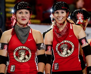
• Gotham Girls Roller Derby: The indomitable Gotham Girls are the three-time defending champs of the flat track, and their simple black/white/red color scheme assures that the focus is on the skaters. Gotham’s dark uniforms are predominantly black, while the team’s light look trades out the onyx for a strong red. A notable uni quirk: Jammer Bonnie Thunders, a former synchronized figure skater, wears a small lightening bolt on her right hip.
Best derby name: Derby names are about the only aspect of the sport that the Gotham Girls don’t dominate, with Puss n’ Glutes being about the best of the bunch. (Photos by Sean Hale)
• Texas Rollergirls: The Texecutioners’ light kit has a white top with a broad red band featuring the stylized “Texas” wordmark. Swap the white for black to go dark.
Best derby name: On a team with numerous strong contenders, best name on Texas has to go to jammer Olivia Shootin’ John. (Photos by Danforth Johnson)
• B.ay A.rea D.erby Girls: Based in Oakland, the Golden Girls may be the most aesthetically pleasing team on the track. Resplendent in black and gold, their dark uniforms have three stars across the chest framed by gold lettering, while the light uni changes the tops to white. Topping both iterations is a shimmering golden helmet. Bay Area pivot Demanda Riot adds ghostly face paint and black bars to the proceedings for a touch of menace.
Best derby name: Best name goes to belle RIGHT hooks, for her combination of the esoteric and literary with the obvious and pugnacious. (Dark and Demanda photos by Danforth Johnson)
• Windy City Rollers: Chicago’s team lifts its colors and design motif from the city flag — all-white for light uni and silver and black for the dark. As you can see in those photos, this team’s necklines have a bit more plunge than most, and their jammer’s star is six-pointed — another reference to the Chicago flag.
Best derby name: Can’t go wrong with Jackie Daniels. (Photos by Gil Leora and Danforth Johnson)
• Philly Roller Girls: The Liberty Belles share a similar color scheme with Windy City. The most notable aspect of their look is that they skate in skirts, which, when combined with the high-belting effect of their blue stripes, gives their uniforms a unique, quasi-vintage dress look.
Best derby name: The delightfully vulgar Heavy Flo. (Photo by Danforth Johnson)
• Montreal Roller Derby: Montreal’s New Skids on the Block are instantly recognizable in their incandescent greens. The light top is a screaming neon, and the dark is black with electric accents. Pink zebra-striped tights complete the look, which is either avant grade punk and an embrace of Montreal’s inherent hepness or an attempt to get rods and cones to careen into one another (just like the derby action on the oval!).
Best derby name: The brazen Mange Moi El Cul, which loosely translates to “eat my ass.” (Photos by Sean Murphy)
• London Rollergirls: London Brawling’s black and pink look revolves around a prodigious Union Jack. The black-on-black version is the more appealing of the two, as the Jack really seems to pop when they go dark.
Best derby name: Hell Vetica Black, the type wonk’s preferred skater. (Dark photo by Danfroth Johnson, pink by Cat Meaney)
This is an almost criminally incomplete assessment of roller derby’s aesthetic charms — there are over 200 other all-star teams not even touched upon here, and that’s not counting the individual leagues’ house teams. If you’re curious to learn more, check out the local league in your area.
———
Paul here — thanks for that rundown, David. I remember when NYC’s Gotham Girls team wore T-shirts with DIY graphics, so it’s interesting to see that some of the teams have Nike or Adidas logo creep. Really shows how far roller derby has come.
ESPN reminder: In case you missed it yesterday, my latest ESPN column features the results of our “Redesign the Cavs!” challenge. Enjoy.

’Skins Watch: A music festival has told bands not to wear Native American headdresses onstage. ”¦ A “Caucasians” T-shirt, which mocks the Cleveland Indians, has become a big seller on Indian reservations in Canada (thanks, Phil). ”¦ Probable presidential candidate Hilary Clinton thinks the ’Skins should change their name. ”¦ Some Indian tribes have declined to accept “bribe money” from Dan Snyder’s foundation, but a tribe in Montana has gladly accepted Snyder’s money to build a new playground. … The ’Skins would like you to believe that there’s a grass-roots campaign to support the team’s name, but some good investigative work by Slate has revealed that it’s actually an Astroturfing campaign by a corporate cirisis-management firm. In any case, the National Congress of American Indians says the pro-’Skins site has omitted a bunch of inconvenient facts.

Baseball News: The Tigers will wear “Tigres” jerseys tomorrow, as part of the team’s annual salute to the contributions of Latino ballplayers. ”¦ The Royals and Indians will wear 1974 throwbacks on Aug. 30. One major inaccuracy there: The Indians never paired the red top with gray pants (thanks, Phil). ”¦ Wait, check that — Joshua Lombay just sent me a photo of Gaylord Perry wearing red over gray in the 1974 All-Star Game. So there’s some precedent for that look after all. … Here’s a fun 1950s cartoon with some humorous uni-related suggestions for the national pastime (big thanks to Bruce Menard). … Todd Radom found this very odd photo of former Reds pitcher Jim Brosnan — what happened to his pinstripes? Baseball Hall of Fame curator Tom Shieber showed the photo to Reds Museum curator Chris Eckes, who had this to say: “We have handled a number of jerseys that feature a different material on the sides of the jersey. … [The side panel] is made of a different material from the balance of the jersey. I’m not sure what it is exactly, but it’s a stretchable material that I always assumed was there to give the jersey a bit more flexibility at what could be points of stress when swinging or throwing.” Todd then pointed out that Chris’s 1956 date made sense given what the Reds were up to that year. ”¦ On Wednesday Mets radio broadcaster Howie Rose said longtime beat writer Marty Noble had told him a story, as follows: Noble said Tom Seaver and Lou Brock had been reminiscing at the recent Hall of Fame inductions at Cooperstown, and they had specifically discussed a game in which Seaver had hit Brock in the earflap with a pitch — and it happened to be the first game Brock had ever worn an earflap. This all sounded fishy to me, because I couldn’t recall Brock ever wearing a flap — I thought he had always gone flapless. But then I did some photo research and found this. Never seen Brock with a flap before! ”¦ Twins prospect Kennys Vargas has a tattoo of the MLB logo combined with the Puerto Rican flag (thanks, Phil). ”¦ The Myrtle Beach Pelicans will wear pink uniforms this weekend (thanks, Phil). … Yesterady’s trade that moved Yoenis Céspedes from Oakland to Boston creates a bit of a promotional problem for the A’s (thanks, Brinke). … Keith Olbermann wore the El Paso Chihuahuas’ “Bark in the Park” jersey on the air two nights ago (Phil again). … Rocker Jack White wore a Detroit Stars Negro Leagues jersey when throwing out the first pitch for the Tigers the other night. ”¦ If you wear a jersey, remember to wear a blank shirt underneath it (from Matt Larsen). ”¦ No photo, but Josh Harrison of the Pirates was apparently wearing the wrong cap last night (thanks, Phil). ”¦ Speaking of the Pirates, here’s something I hadn’t been aware of: Tony Peña wore Stargell Stars on the brim of his catching helmet (from Jerry Wolper). … The New Girl was shopping at Trader Joe’s and picked up this bag of high-end Cracker Jack. Super-delicious, and fun packaging, right down to the home plate-shaped UPC code.

NFL News: There’s an upcoming documentary on the four black players who broke the pro football color barrier. Judging by the trailer, it will have some excellent uniforms. ”¦ The NFL is putting electronic trackers in players’ shoulder pads to come up with new statistical metrics. … The Bucs’ new pants, with their truncated stripes, look brutal (from Phil). ”¦ As you know, the Vikings’ uni numbers have those asinine serifs for numerals in the tens column but not in the ones column. So players with single-digit numbers don’t have the serifs — except for the team’s mascot (good observation by Joshua, who didn’t give his last name).

College Football News: Good article on Georgia Tech’s 2014 uniforms. … New matte black helmet for Northern Illinois (thanks, Phil). … Also from Phil: Here’s a look at Louisville’s Opening Night helmets. … New tailoring template — but basically the same jersey design — for Ohio State (from Ryan Robey). … New alternate uniform for Air Force.

Basketball News: What took them so long: The NBA is adding its Twitter handle the game ball. … Pitt will be playing some exhibition games this month in the Bahamas. Here are the home and road unis they’ll be wearing (from Chris Weber). … New uniforms for VCU.

Soccer News: A pair of third kits have leaked Manchester City’s and FC Barcelona’s. … A California painting company is using Arsenal’s name and crest (from Chris Cruz).

Grab Bag: Some friends and I recently played a round of late-night badminton with an LED-equipped shuttlecock, as you can just barely see in this crummy video that I shot. ”¦ Here’s an infographic listing the four occasions in Gaelic football history when a team has worn three different jerseys in the course of one season (from Graham Clayton). ”¦ “Got an email from Pitt with this logo in the signature,” says Sebastian Smelko. “Never saw it previously.” ”¦ This is pretty awesome: a look at the origins of common UI symbols. Highly recommended (big thanks, Brinke). ”¦ Here’s a soda display based on the U. of Illinois logo (thanks, Brinke).

Another thing about the upcoming K.C./Cleveland “1974” game is the length of Majestic’s baseball pants, why can’t they produce mid-calf pants? I am not a fan of this “high cuffed” knickers style garbage. To me, it looks just as bad as pants that are long and baggy. Give me some middle ground.
Here’s an article from my TV market, specifically from the [i]Sarasota Herald-Tribune[/i] about the Venice (Fla.) High School mascot and nickname being put under scrutiny. ‘Skins watch material, huh?
link
“… Today we have a guest entry from B. David Zarley…”
And it’s fabulous.
1,000% agree. Brilliant stuff.
Thirded. Well done!
“tens column” “ones column”
Flashback Friday!
Haven’t heard those terms in 40+ years!
Those Tigres jerseys are sharp. I’m actually surprised we haven’t seen a version of that as some sort of Sunday home alternate.
The Bucs helmet logos look brutaller (?).
The entire Buccaneers package just doesn’t even make sense anymore.
Those logos, those numbers, those colors, that design… how on earth did anyone sign off on that?
Lee
The NFC south keeps looking worse with each passing year. The creamsickles were a very good set. The first Bucs overhaul was a good one. This is pathetic. Not very long ago the Saints looked great with the rich shade of gold, now it’s more like a badly laundered set of old white pants. The Falcons ruined a great look with the current worst-in-professional-sports clown suits. I dread what the Panthers will do next in the race to the bottom.
would it kill the Indians to get striped socks/ stirrups for the game?
It’s not up to the Indians, actually. Home team supplies both uni sets for a throwback game.
Would it kill the Royals to get the Indians striped socks/ stirrups for the game?
Unless you can it ’em at Walmart, no.
For what it’s worth, Lou Brock did get hit by Seaver at least once, on September 8, 1974. Of course, I have no idea if it was in the head or if he wore a flap,though.
link
Here’s a shot of Brock in a road uniform wearing a flapped helmet:
link
Wasn’t ’75 the only season St. Louis wore the ‘swinging bird’ decal?
Here’s my favorite Roller Derby jersey…the 1970’s NY Chiefs.
link
Oh, man — that’s tremendous!
I daresay you’re wrong:
link
OMG, you could spend days exploring the roller derby rabbit hole.
link
Thanks for this…and the whole Roller Derby feature….in the 60’s, I loved the unis of the “Bay Area Bombers” …as well as others on the televised series…the striping as i recall, reminded me of softball tops….
This is the look I remember…the immortal Joanie Weston
link
Who remembers when they added the figure-eight track and the alligator pit?
link
All of the original Roller Derby uniforms were made by SandKnit. I’ll bet that the folks at Ripon Athletic still have the patterns.
Note to Paul- In Canada they refer to the reservation as a “reserve,” as in the Six Nations Reserve in Brantford, ON, Wayne Gretzky’s hometown.
Ah, memories! Dick Lane doing the play-by-play for the L.A. T-Birds back in the day.
Ah, this one isn’t so bad.
link
I’m looking at that link and the NOB sure does look off balance. It’s like they initially wrote “PERRY” right on top of the number 36, and then decided to add the “G.” to the left of that, without realigning everything.
Yeah, we’ve noted that before. Perry’s brother Jim was also on that Cleveland team, and they appear to have added the initial as an afterthought.
David Zarley, This line, “The brazen Mange Moi El Cul, which loosely translates to “eat my ass.”” made me laugh out loud. Good work out of you.
Look at L’Ville’s opening night helmets. Wow
By the Matrix is that shot of Lou Brock not completely gorgeous?
As much as I enjoy the Cardinals in button downs and belts, those double knit era pull overs were some of the best ever.
How many teams are out there that managed to look equally amazing in both v-knecks and button downs? Pirates probably and maybe the Reds.
California from ’75-’92 had great uniforms.
YMMV
Any team with lettering across the front looks better in pullovers.
Yep. I really don’t understand why they ever went away. Pullovers just make sense. As concerned as teams are today with “branding”, why on Earth would anyone want to wear a jersey where the team’s logo is split apart and can look weird with extra letter fragments or improper spacing?
Softball tops for baseball teams never look good.
Can somebody define precisely what is meant by “softball tops”? My current understanding is that it’s more than just a coloured top, but rather a coloured top thrown on with the usual white/grey pants i.e. like a softball team who have coloured tops but aren’t going to make their players go out and buy matching pants. What annoys me most about coloured alternates currently is that they’re just done so lazily: take the primary, dye it blue/black/red, wear with regular pants (nobody buys the pants so why give a crap about how they look) – voila!
The Zipper is a style I’d like to see come back.
I think lots of it has to do with sale of jerseys to fans. Fatsos like me (that is to say those who are at least minimally considerate of others) wouldn’t wear a pullover in public, but a button down works.
That Brosnan photo couldn’t be 1956 — they didn’t wear that uniform combo with the pins and white hat until 1958, and Brosnan wasn’t a Red until the middle of 1959.
Regardless of the exact timing, it’s interesting to find out that disruption of uniform patterns by special fabric panels is not strictly a modern thing.
Don’t think the Brock photo is spring training — the caption says it’s at Busch, and the background sure looks like Busch, with the incline of the ramp visible above the seating area.
You know, I don’t know why I thought that was a spring training shot. Never mind. Text now adjusted.
Probably because for some reason the photos.com sidebar says “Date created: March 31, 1975.” (Also, the caption beneath the photo says both 1975 and 1979 — confusing!)
Reader Eric Wright has found another Indian wearing red over gray in the 1974 ASG: Geroge Hendrick.
link
Even better, it’s George “Pajama Pants Trendsetter” Hendrick showin’ a decent amount of stirrup!
“there is little debate amid the rolling high-plains grasslands of north central Montana, where members of the business council of the Chippewa Cree Tribe say the name is fine with them.
“I have no problem with the name,” tribal chairman Rick Morsette”
–So much for the term being so obviously/universally disparaging and insulting.
“The foundation provided 300 iPads split between two local schools and gave schoolchildren trips to Washington D.C. White said a foundation-paid walking path near the reservation’s Wellness Center is in the planning stages. Council members have a wish list that includes a sawmill and more playgrounds.
This week, for the 50th annual Rocky Boy Powwow and Celebration, the foundation is sponsoring a youth rodeo school, a 3-on-3 basketball jamboree, an Ultimate Warriors competition and an Indian National Finals Rodeo tour event hosted by the Chippewa Cree Rodeo Association.” – – – “We know bribe money when we see it,” tribal member Kenrick Escalanti said.”
–So, people say if you’re going to ‘appropriate’ cultural imagery, you should reach out to the tribes and partner with them on activities that benefit them. When the Redskins actually do those things, they’re accused of bribery?
I have one question for you: do you really, truly believe that Daniel Snyder would have created the Original Americans Foundation if the growing fervor to change the Redskins’ team name was not there?
I’d love to take a look at all the photos David links to but alas:
Per company security policy you have been denied access to the website:
link
Reason:
Not allowed to browse this Malicious URL.
Reason:
Not allowed to browse this Malicious URL.
Anyone else having a similiar problem?
Try them now.
nope. for some reason, all the “bdavidzarley.com” links are being flagged as malicious.
No big deal. I’ll look at them when I get home or on my phone later on or something. I really should get some work done now.
Three of the bdavidzarley.com links — all from the Gotham Girls section — have been changed and should work with no problem now.
Damn it, Nebraska.
link
Well, I’ll be listening to that game on the radio…
And it gets worse…
link
In response to James’ link – everything wrong with Adidas and its role in football in one picture – the lead pic with the damn hand gesture perfectly framing their damn logo.
In response to Sean’s link – link.
The video might not be the best. But the LED shuttlecock is awesome. I need one of those. They would be very popular at campgrounds everywhere I imagine.
Gotham recently added logo helmet decals–you can see them pretty well in the “dark units” photo there. Just on one side, a la the Steelers. They also have helmet merit decals–black stars so a spectator won’t be able to see them. I haven’t been around the team in a while (former official) but I believe you get one star for every championship the team wins while you’re on the team.
Did anyone else noticed a sleeve stripe inconsistancy on Georgia Tech’s uni’s in that photo? Look at the top, center guy in comparison to the others…
It could be worse. Just see the GT-VT game from last year, where the throwback uniforms in this year’s poster were used: link
It should be noted that Georgia Tech’s recent posters have featured uniforms from the previous year, which is possibly because (speculating here) the new uniforms were meant to be a surprise, or because the posters had to be ready before the uniforms. Case in point…
2013: link
2012: link
2011: link
2010: link
I sure like that Caucasians T-shirt.
New uniforms for VCU
Woof. It’s the exact same downgrade that Dayton got from the Swooshketeers. Both teams looked just fine last year. Stop fixing things that aren’t broke!
Agreed on Bay Area having the best unis in the sport. I think Hell Vetica Black should be docked points ((or at least a point size or two)) for not wearing jersey number 95 ((I’ve inquired; she had her number, KT0, before her name. Said out loud — “Kay Tee Oh” — it’s her name. But still.))
Gotham are 4-time champs, actually.
right down to the home plate-shaped UPC code.
Mexico’s Tecate beer also has some fun with their upc codes, link Ever since I’ve noticed, I’ve wondered why more packaging doesn’t do this.
Duane Reade, a drugstore in NYC, started doing link with their store brand a couple years ago.
Their barcode is link, shaped like a local landmark.
I’m assuming that those function. If so, that’s fantastic. Kudos to whichever designer came up with the idea.
Philly Wears the skirts because they’re the Liberty Belles! The skirts have lightening bolts/cracks up the front and the high waistline so that they resemble the Liberty Bell. It’s not just a cute vintage-y look.
Anybody remember those wild stripey English rugby jerseys that were announced last September but were never used in a match? Well, they’ve finally made it onto the pitch at the Women’s Rugby World Cup: link
Also, the US team, as former tournament winners, get to wear a special sleeve patch of the tournament trophy: link
ECHL’s Indy Fuel unveil their uniforms:
link
Did adidas model the new Nebraska helmet after an anarchy flag? link
Can someone explain to me why modern roller derby skaters are so averse to using their real names? It’s almost like they’re ashamed of what they’re doing.
Two reason for not using their real names: first, there’s a tradition of it, taken to extremes, from the olden days of derby. Second, creepers.
Team USA hoops jerseys announced today. They’ve got a little of the bomb pop in them.
link
I think that I like the winged USA.
I saw that ohio state will be wearing the Mach speed uniform. Just wanted to add that Alabama will also be wearing the Mach speed template as well. I saw pictures yesterday of a photo shoot the team was having. I’d like to see closer pictures if somebody can get a better look at them.
In the Twins-White Sox game, the Twins are wearing red BP jerseys. I’m watching the White Sox telecast and I missed the beginning, so not sure if any reason why was given.
The Twins are wearing their red road BP jerseys for tonight’s game in Chicago. Have they done this before? On the Good or Stupid Scaleâ„¢, these are definitely Stupid.
not uni-related but a fact stated from Bob Costas “Yankees and Red Sox have not made a trade between each other since 1997” The teams recently made a trade a few days ago.
Why the hell is Boston wearing their red softball shirts vs NY. There needs to be a MLB rule “wearing practice t-shirts vs divisional rivals is prohibited”
Seen at tonight’s Sporting Kansas City – Philadelphia Union game – SKC’s goalie, Andy Gruenebaum, is missing the crest on his jersey, with the text “TEAM CREST HERE” in its stead. No pictures, unfortunately.
This longtime Mad Rollin Dolls ticket holder (home of great skater names like Gouda Riddance – Wisconsin, after all – and Knockingjay) LOVES that someone brought all this derby goodness to UW’s attention.
1. To correct Aaron P, there are some skaters who use their real names.
2. To correct Mr. Zarley, The Face and The Franchise AKA Suzy Hotrod and Bonnie Thunders of GGRD.