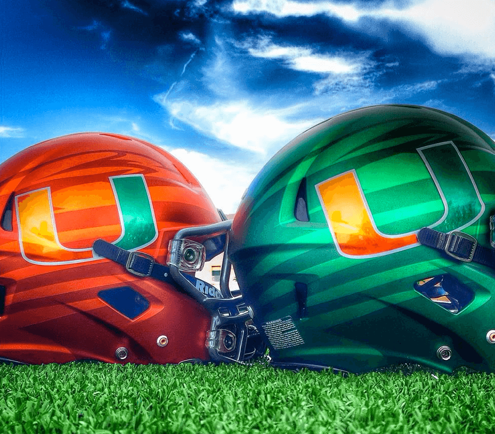
Click to enlarge
Miami unveiled their new football uniforms back in April. Yesterday they provided a close-up look at their new helmets. I love them — orange and green is such an underrated combination. More, please! (On the other hand, the new gray jersey ain’t so hot.)
Meanwhile: New ESPN column today — the results of the Cavs-redesign contest. Enjoy.

Mike’s Question of the Week
By Mike Chamernik
Suppose you’re an NBA free agent and every team is offering you the maximum contract — four years, $88 million (ignore salary cap restrictions). Which team would you sign with? My roommate said he would choose the Bulls, because they’re the hometown team and they’re a favorite in the East; I said the Mavericks, because they have excellent facilities and amenities, and I want to be involved in whatever Mark Cuban is doing.
What about you? Would the uniforms factor into your decision? What other things would you consider?
As always, post your responses in the comments.
Tick-Tock: Today’s Ticker was compiled and written by Mike Chamernik.

Baseball News: Here’s a fantastic photo gallery of the last game at Yankee Stadium before its mid-’70s renovation (thanks, Chris Rocco). … Chris also found photos of the Yankees’ Thurman Munson and Sparky Lyle posing with a tiger. … The Rays are giving away Joe Maddon wine glasses on Friday (from Jonathan Daniel). … Did the Cubs misspell “Wrigley Field” in their on-field painted logo? Or is it an illusion? … Justin Masterson, who’s a high-cuffer, was traded from Cleveland to St. Louis yesterday. To honor him, Indians players all went high-cuffed during yesterday’s afternoon game (from Samuel Selker). … Mike Davie found an Expos road jersey on eBay that has the team name, rather than the city name, on the front. According to Dressed to the Nines, the Expos never wore this on the field. So what could this be? Could be a prototype, a spring training jersey, a minor league affiliate’s uni. Most likely it’s some sort of fashion jersey or unlicensed knockoff.

NFL News: Since the Raiders are rumored to be considering a move to San Antonio, we are reminded that the Raiders proposed to build a stadium Irwindale, California, in 1987 (from Jonathan Daniel). … Falcons LB Paul Worrilow was named the team’s defensive signal caller and will wear the green dot on his helmet this year. … The Steelers will retire Joe Greene’s No. 75 in November. … A 49ers fan is traveling the country wearing a suit covered with the team’s logos (from Brinke). … The St. Louis Red Cross tweeted a photo of Chris Long in a camo Rams uni (from Andrew Maynard). … Meanwhile, the Dolphins shop is selling a Ryan Tannehill jersey with camo numbers and NOB, and the product description says “Official product worn on-field by NFL players and coaches.” Might Miami wear this in a game this year?

College Football News: Maryland is planning to unveil a new uniform for this season (from Phil). … Photos of a white TCU helmet have been circulating. “I have a friend who is a team manager and he said that the new helmet is indeed legit,” says Patrick Homa. … Great display of the Cougars’ helmet history in the football operations building at Washington State (from Greg Farrar). … Kentucky has a bunch of uniform combinations this year (from Phil). … Colorado has a “125 Years” logo (from Phil). … Tulane will unveil its new uniforms at 9am ET today (from Chris Mycoskie).

Hockey News: A reader named Thom sends in this exchange and question: “There was a debate between Phillies announcers during Wednesday afternoon’s game about the whether it is a hockey ‘jersey’ or ‘sweater.’ Canadian-born Matt Stairs said he never heard it called a ‘sweater’. But then they texted the Flyers TV guy Jim Jackson and he said it was either.” … An Edmonton illustrator created logos for all of Saskatchewan’s ghost towns. The logo for Canuck has crossed hockey sticks (from Will Scheibler).

Grab Bag: New basketball court design for Dayton (from Patrick O’Neill). ”¦ New kit for the Harlequins, an English rugby team (from Josh Jacobs). … Greater Western Sydney Australian Rules player Heath Shaw, who’s returning from a serious head injury, wore a cricket helmet at his press conference yesterday (from Graham Clayton). … Nashville’s Hillsboro High School’s football team has gray uniforms with gold numbers, gold and neon green accents and a bright yellow helmet with a silver decal (from Trés Lawless). ”¦ Here’s a video interview with Everton’s kit man. “He’s like an English Joe Skiba,” says Tim E. O’Brien. … The new Fall Experimental Football League has revealed its first franchise name and logo (thanks, Phil.

I believe that new “gray” (anthracite *cough*) jersey is being referred to as “Smoke”
eff Nike
Jeez, Nike’s jumping on the legalization bandwagon too?
If I got max money in the NBA, I would go to Pop and the Spurs for the chance to win. As for aesthetics, I wouldn’t put them above a solid coach and organization.
You need to be willing to take much less than max money to go to the Spurs.
The scenario is 4 years $88M any team.
“… An Edmonton illustrator created logos for all of Saskatchewan’s ghost towns…”
Wonderful!
I love projects like this.
I’m lame…is there a link somewhere to get an up close look at those?
Count me as one who’s interested in the Tulane unveiling. That change to a brighter green accent on the helmet/logo is GREAT. I love their colors.
Uniform hints seemed a bit underwhelming, as they’ve always had some understated but very attractive unis. Love the new helmets, though.
Here ya go.
7 different combos, including BFBS (or is that Anthracite for Anthracite’s Sake — can’t really tell)
40 year-plus Tulane Football fan and season ticket holder. These uniforms are very underwhelming and perhaps the very worst in my memory. Helmets are over-detailed while the jerseys are for the most part Alabama-type plain. Almost ZERO use of the Sky Blue that with Olive Green make Tulane’s colors and uniforms (usually) unique and good looking. My take on this set of football uniforms – I can’t wait for the next update ….
Also, particular disdain for ALL teams that have helmet Logos on one side, Numerals on the other. MAKE UP YOUR FRIGGIN MINDS. Have one or the other, or, use different themes on different helmets. DECIDE ALREADY!
“Also, particular disdain for ALL teams that have helmet Logos on one side, Numerals on the other. MAKE UP YOUR FRIGGIN MINDS. Have one or the other, or, use different themes on different helmets. DECIDE ALREADY!”
Agreed. I am not a fan of the logo-on-one-side, numberal-on-the-other trend, and I hate that Nike seems to trot it out as part of its redesigns for all of its teams lately. I particularly dislike it for Tulane. The Green Wave has a decent-looking logo, and using a number on one side of the helmet instead of that logo makes the helmet less visually interesting, not more.
The FXFL commish should really look up the definition of the words “unique” and “original.”
link
That’s the first thing I thought of, too. But hey, there aren’t so many teams out there with “Mammoth” or “Mammoths” in their name that it feels overused.
And at least the Omaha franchise didn’t go with “Channel Cats.” I HATE HATE HATE when teams use “Cats,” or “Dogs” following some non sequitur word as their nickname. It’s the most overused, outdated, and unimaginative naming trope in sports. I’m looking at you, Sacramento River Cats and Charleston RiverDogs! You and all your feline and canine friends!
Non sequitur word?
link
Call them the Channel Catfish, then, not the “Channel Cats.” I guarantee the logo would have looked like a feline, not a fish.
I like orange and green too but those helmets are awful. They’re cheap and gimmicky looking, like most of the other multiple combo stuff these teams half-assedly trot out. Teams should stick to one helmet. Miami’s normal white one is perfect.
I respectfully disagree. To me they look like candy. Emblematic of the giddiness and glamor of South Beach.
Yeah, that makes total sense for a football team that plays about 20 miles away from there.
I can’t tell if that was sarcasm or if you were agreeing with him. 20 miles really isn’t very far, you know.
I think the green helmet looks great paired with the white jersey and green pants as seen at the top of this article
link
Seconded. Their colors are some of the best in sports.
And… almost an hour later, I realize I screwed up. This should be under ScottyM’s post about Tulane.
I would probably go for either Philly (where I live now) or Cleveland (where I grew up), but I would give a lot of weight to amenities/organizational strength (Cuban ranks well here). However, if I was a college recruit with the option to go anywhere, aesthetics would play a larger role, because some many colleges (Oregon especially) get increased press solely because of their uniforms.
Honestly, if I got max money (ignoring salary cap stuff like the question asked) I would go to a team that another play plays on that would compliment my style (or mine to his). Like if i am a big PF, I might want to play with pass first smart PG. Or if I am a PG, I might want to play with a scoring threat SG or SF.
I do not factor in uniforms or location. Except maybe Cleveland, Milwaukee, Toronto, Detroit (I leave out Minneapolis since I am from here and would be close to family LOL, otherwise I would suspect it would make the list). Well, maybe LeBron could entice me to come to Cleveland….
Today’s ESPN column is up:
link
“Appealingly snappy.” Love it!
While there’s a lot of excellent work in the submission gallery, I was really looking forward to viewing a hand-drawn ‘2-for-1’ redesign by Tom Birbaum, but that was not to be :(
I was seriously bummed by Tom’s absence from this project. Tom, why have you forsaken us?!
Ditto – first thing I did was scroll through all of the designs looking for Tom’s. A lot of very professional-looking designs this time around.
Also a disturbing lack of mascots this time around. On the plus side most people seem to like the wine and yellow colours.
The contest entries are amazing! The team’s proclivity to rebrand every six years or so frees the entrants to fly a real freak flag.
There’s more than just Ryan Tannehill’s jersey being sold under the “Salute to Service” moniker. Looks like a fashion jersey to me. They all have the same stenciled camo numbers.
link
You are correct, Mike. These fashion jerseys were released last year.
Absolutely right they are old, as the attached link referrs to the jersey as a Steve Johnson Buffalo Bills jersey, but he was dealt to San Francisco for a 2015 draft pick.
O MAN! Those Yankee Stadium last-game pics are superb. I listened to the last two innings of that game in the parking lot of a Pathmark in Clark, NJ while my mom was shopping.
I agree. Wonderful stuff. Thanks to the contributor and the guy whose Dad took them.
I grew up going to the old Stadium with my father. The seats were green and so was the facade but the vibe was exactly as it was in these shots. So many great memories for me.
Yes, I hate the Yankees with every fiber of my being, but these photos were awesome.
Mike’s question: Minnesota, I’m from Mexico but I’ve always loved that team.
Flip Saunders loves you, Omar.
hahaha, I bet I’m the only mexican who likes them
Those 1973 Yankee Stadium pics are a treasure trove!!!
I really like the Cavs skyline jerseys. I also think the obvious hometown connection would make it a great option for other teams looking for an alternate/pride uniform.
Totally agree. I think it would be an upgrade to the Motor City and Rip City unis.
I feel sorry for the Kentucky football player that had to stand on boxes so he could be the same height as his teammates in that behind-the-scenes photo.
QOTW: I would choose the Lakers. They’re my hometown team (well, one of them anyway), and they’re the team I’ve rooted for my whole life (even through the dark days: Benoit Benjamin, Sedale Threatt, Xavier Henry, Jodie Meeks. *shudder*). It’s also one of those unis, as an NBA player, I would want to don. That being said, the current organizational issues may give me a slight pause. I suspect playing at home would trump that, however.
I would also choose the Lakers, only because I love the purple and yellow colours. And I would petition for the return of the drop-shadow numbers.
Good stuff so far, people. My roommate and I talked about this for like 45 minutes yesterday, so I needed to know what you guys thought.
In my second life I’d love to come back as a free agent in a pro sports league. Like Carmelo Anthony this summer – four teams flew him out, wined and dined him, mocked up pictures of him in Bulls and Rockets unis and photoshopped a Larry O’Brien Trophy in his hands… and then he went back to New York, no hard feelings.
Looking at submission 4 for the Cavs redesign, the “Quicken Loans Cavs” design, i.e. one brand on top of another. Is it that long before we start seeing other products branded with other non-related brands? What’s stopping us from seeing Quicken Loans branded Cheerios?
That Expos jersey looks like a franken-jersey mix of the Indians racing stripe:
link
And the Expos BP wordmark:
link
Remember the Cincinnati Reds’ jersey that was circulating on this site a few years ago? It had black sleeves and an extruded shadow on the wordmark. Didn’t we come to the conclusion it was a prototype? The Expos’ uniform reminds me of it; it has the same degree of detail. The racing stripe seems an effort to continue a detail from the 1989 uniform. It would have lined up with the pants stripe the Expos adopted in 1990.
I know it has its fans, but that Expos’ script looks hastily-rendered. It would have benefited from the three-color treatment the Braves’ wordmark had in the 1970s.
Or it’s another team called the Expos.
Not likely — the jock tag has the link.
I have a couple of Russell jerseys from the mid-90s, (94/95/96), they have the same tags. Those aren’t fashion jerseys, don’t think this one is either.
I’m voting for prototype.
QOTW:
The romantic in me likes to think I’d choose the Charlotte Hornets, because I grew up rooting for them and the organization seems to have gotten things together recently, but I’d probably find myself frustrated.
Organizationally, both the Suns and the Mavs seem to offer good player environments with smart front offices.
But then, I don’t know if I could refuse the allure of the big city with Brooklyn (not the Knicks – they practice way out in Westchester County – the Nets are building a facility on the East River waterfront) or Washington.
I also love the Yankee Stadium pics. I went to a Yankee game this month with two friends, close to my age, but they never saw the original pre-1976 stadium. I feel lucky that I watched games there.
Here is a good article about that stadium’s most distinctive feature…the original copper façade that was destroyed as scrap. (BTW some piece of software automatically added the funny loop under the c in façade…it wasn’t me. That’s cool)
link
That diacritical mark under the “C” (“ç”) is a cédille (in French — since façade is a French word), but it’s used in many other languages as well.
TMYK.
QOTW: I’d play for the Spurs. Texas – no income tax, 8th lowest state & local tax paid per-capita. Plus, I’m just guessing here, but I think San Antonio would probalby have the best Tex-Mex food scene of the three Texas teams. Plus-plus, I’d have ample opportunity to finally check out the basement at the Alamo.
That no state income tax is a factor, for sure. San Antonio seems like a cool city, great fan support too. Anyone would be thrilled to go there. Except Charles Barkley.
Ummm…bernard. I’m afraid link
(Good Pee-Wee Herman reference, BTW.)
I love Miami’s color combo too. Up there with Auburn imo
It’s interesting Miami didn’t change the color scheme on the “U” logo on the helmets. I would of thought they’d substitute the dominate helmet color with white on each specific helmet.
I saw a blue Auburn helmet and they have the reverse color logo on it (Orange and white AU)
Hockey jerseys were called sweaters because in the old days they were literally that (it gets cold in those old rinks). The terms are still used interchangeably. I’m surprised that a Canadian never heard the term, though. That’s okay; I’ve been following/playing/researching hockey since Bobby Orr was young, and I never heard hockey pants called “breezers”. I hear it’s a regional thing.
I’m Canadian and I’ve never heard a player call it a sweater. I’m familiar with the term obviously from the most famous hockey story of all time (The Hockey Sweater by Roch Carrier) but I’ve never heard it used in everyday life.
I’d never heard of breezers until I came to Uni-Watch. Always pants.
Maybe its a regional thing.
I’m with you, Mike. Sweater is rarely used any longer here in Canada. “Chandail” in French is correct, but there are other words used there too.
As for pants-vs-breezers, the distinction is what you’re wearing. Breezers are the nylon sheath worn over the pants. The pants are still the pants. For example, players bring their own equipment to the all-star games, but they are given breezers to wear over their pants.
I think it’s a traditionalist thing. The old-timers like to call it a sweater. Most of the sub-40 crowd call it a jersey. I prefer to call it a jersey, but I think the two terms are perfectly interchangeable. Pittsburgh media people LOVE to call it a sweater, especially Dave Molinari of the Post-Gazette used to actually edit his copy like (sweater) if it may have been referred to as a jersey in a quote. Stan Savran is another who always refers to it as a sweater. Paul Steigerwald would always call it a sweater as well, but in more recent years he calls it a jersey. Pierre McGuire always refers to it as a sweater, while Doc Emrick normally calls it a jersey.
But what riles me up is when some folks consider it sacrilege when others call it a jersey. I’ve seen it here.
I love that story!
link
I think a better question might be which team would you pick if you were only offered the league minimum salary. I wouldn’t even begin to know how to spend 88 million. I mean, I could buy everything I want and still have 87 million left.
But you figure you’d pay about half of it (give or take a few points based on state tax rate), so you’re likely starting with about $44 million.
Then you’d likely want to live in a nice neighborhood or building, not so much to be fancy but for security and privacy, so let’s say you drop about $4 million on housing (and that doesn’t get into property tax and condo/HOA fees).
And you have to think about the support staff – publicist/manager, personal assistant to manage your property while you travel, the agent who got you the $88-million contract.
Once you’ve accounted for everything and paid into your 401(k), you’re probably looking at less than $20 million, and what the hell can you do with that pittance?
Interesting wrinkle, I like it. Say you’re a bench player, maybe a tenth or eleventh man. One-year, minimum deal ($507 K, which I’d still kill for right now) where are you going?
It would be tough to pick anyone other than the Spurs, right? Maybe Cleveland or Chicago, maybe the Thunder or Clippers. But I’d go to San Antonio.
Because then, I’d be a contributor and look great in that system, and it would help me with my next contract!
You’d spend more than a million dollars just managing that 88 million.
Trust me, if you had 88 million dollars, you’d spend more than a million of it.
Lee
You need a posse too.
I’m always playing this sort of question game love it.
I would pick Golden State. Pretty good winter weather, plus you got Giants, A’s, Sharks and 49ers nearby.
QOTW 1: I’d definitely pick the Lakers as they are my home town team and despite the white unis, lack of drop shadows, etc. Unis may have some minor impact on my decision, but since unis change far more easily than do locations (especially for a team like the Lakers that isn’t moving anywhere any time soon), the location would trump everything else.
Based on current jerseys, I would head to Golden State. If they can get the arena deal done in San Francisco, even better.
QOTW 2 (league minimum): On a one-year deal at the league minimum, I’d have to pick the Spurs for an instant chance to win with an organization that seems to do everything right.
QOTW: Sonics
+1
;_;
If I could even play basketball, which I can’t, I wouldn’t even care that much about the money so long as I could play for my beloved Lakers. Their jerseys are beautiful, with exception of the pointless black, sleeved jersey. And has anyone ever brought up the theory that sleeved NBA jerseys are most likely targeted at white NBA fans who feel there is a stigma associated with the more traditional jerseys?
I like the new Harlequins rugby kits. The streaky/fade on the bottom of the away kit is sort of ridiculous, but the diamond pattern on the front of the away kit is a cool interpretation of the club’s badge.
link
I’d have to go to some historic team. I’m from Pennsylvania and wouldn’t mind being a Sixer. But I’ve been thinking about the Milwaukee Bucks lately. I want to be the next Lew Alcindor.
QOTW: Excluding hometown team Suns (because it’s more fun this way), I would pick the Clippers. To live and die in LA
With Ballmer now in as owner and Blake and CP3 in their primes, the Clips are finally a better free agent destination than the Lakers. And it’s not even close.
Very true. I based my pick mostly on the city in which you would live during the year. That’s LA – and I can’t stand the Lakers, never have, never will, and never could hypothetically… so Clippers it is.
qotw: I would go to Portland because I like the way the sun hits buildings late in the afternoon. But I would insist that the team go back to its original logo.
QOTW: The Denver Nuggets. I love Colorado. I love the team name. And I love several of their link. I might make my signing conditional on bringing the original Alex English-era rainbow striped jerseys back into the uniform rotation.
I could definitely see a future sports team in that state calling themselves the Colorado or Denver Weed. The logo would be obvious, along with the color scheme.
Those rainbow skyline Nuggets jerseys are a thing of beauty!
As a Canadian, I would definitely pick a warm weather city! Even as a regular schlub, I’d like to take my talents to South Beach lol. Clearly the family man Lebron got bored of that life!
Other factors include what lifestyle you desire off the court, or after basketball. If you want to remain in the public eye, you’d want to make friends in LA to transition careers. If you have a different, specific business goal, the city may or may not be relevant to your selection (for example, you might invest in NASCAR if you’re in Charlotte).
The one good thing about Toronto’s sports culture is how some players are comfortably staying in town during the season in a condo near the dome/ACC, and go elsewhere in the offseason. This became popular going back to the Blue Jays in the 90’s, when the condos popped up around the same time as the dome. If it wasn’t accommodating, we wouldn’t get any superstars, so I assume there are ways to make the players comfortable. Plus, there is the island airport right downtown.
Not all pro athletes are big city dwellers, either. Lots of them like a Texas ranch lifestyle, etc.
I would seriously consider Philly (I have visited a few times). I love Philly. So many former players from each sport return after playing elsewhere, or retain ties to the city. It says a lot to me, especially since I love the city like they do. I can’t really describe it; just a great atmosphere, and great people.
If we’re talking uniforms, it would have to be the Showtime era Lakers (not today’s Lakers).
QOTW: Cleveland, since it’s the closest to Pittsburgh.
With that said, since Paul will probably abandon us after posting tomorrow’s entry, enjoy your month-long vacation!
Are you sure about that? You’d have to deal with all of those icky Browns fans if you go to Cleveland. Wouldn’t you rather stay in your own state and go to Philly instead?
Philly fans < Cleveland fans
And that's a scathing indictment of Philly fans.
Then again…
link
Yankee Stadium:
I remember the monuments were on the field of play…looks like the flagpole was on the field right behind the monuments…but what was that object on the field to the right of the monuments (seen best in pic 78)? Looks like a speaker tower. Don’t remember that on field of play. Why would they put that there?
Here’s a clip of the monuments coming into play on a fly ball:
link
And something I didn’t realize – that as recently as the late ’60s spectators could exit Yankee Stadium via the outfield:
link
Taken from this blog post, which also has some way cool photos from that era:
link
Same contract for any team? Spurs would probably be my first choice. Great system and personnel, and fantastic uniforms.
Yes, the uniforms would be a factor. Phoenix is also on my list thanks to their recent upgrade.
And I like Jell-o, so Utah is in my top five. I like snow and underdogs, so the Raptors are as well. I suppose the Cavs would round out my list.
Any places y’all *wouldn’t* play? Mine would be Detroit and Boston.
I would not wear the old Barney the Dinosaur uniforms though. If the Raptors throwback, I’m on the DNP list that day. Let’s just replace them with Dallas or Houston to be safe.
Sacramento is down on my list. Great fans, but horrible uniforms and a directionless front office. Haven’t heard great things about the city, either.
Kansas City Kings would have been at the top of my list. Those unis were the best.
You’re right about the fans. They deserve to keep the Kings. They also deserve better than the Kings.
Actually, I don’t mind the current uniform. If I were ranking the NBA, I’d put them square in the middle.
Great post with the Yankee Stadium pics. I’ve never seen red foul poles before. Actually when I first saw them I thought it was something to do with the camera. Was that standard back then or was it just something the Yankees did?
I think different teams paint the poles differently…the Mets in the early 70s had white poles. They painted them orange at one point in the 80s. When Yankee Stadium re-opened in 1976, they had yellow poles. Red is a unique color though.
I guess foul poles should be a light color so umpires can see them better…but the baseball is white, so they probably shouldn’t be white. Bright yellow or orange make ssnse.
Oh yes! Someone referenced the Stepien era in the Cavs contest.
link
It was the worst of times, it was the best of times. I myself had fond memories of those years, so I’d wear that.
QOTW:
I’d go with the Dallas Mavericks because, honestly, who wouldn’t want to play for Mark Cuban and with Dirk Nowitzki? Cuban takes care of his players and Dirk is one of the best in the leauge. I’d go there to try and win one more title to send The Big German out a winner.
Not only is Cuban a really bright guy, but Chandler Parsons signed his Mavs offer sheet in a night club with him!
Here are tons of action shots of Miami players in different uniform combos. I really hope The U doesn’t rock orange helmets with green jerseys in an actual game. link
link Wonder what will happen with these shirts now. And are there any other promotions that got messed up by the trade deadline?
The Dodgers have an upcoming Matt Kemp figurine day but they’ll be able to keep it since Kemp stayed put.
At first I thought it was a smaller font, but I kept looking to realize that the Ts on TCU’s white and purple helmets are a different font, which is especially noticeable on the bottom serif / part of the T.
link
It’s unfortunate that Kentucky has so many options that look so bad. As expected, the only unis that look good include some combo of the white and blue jerseys and pants.
As for the QOTD, I’d first have to think about the coach, schemes, players already on the team + how long they could potentially be there, and ownership. Secondarily, I’d think about the city and what it has to offer + what other pro sports teams are there, which would show something about how good or bad the fan base might be. In the end, the top options would be the Clippers, Mavs and Thunder.
Aside: any idea what % of players live in the same city where they play?
ays
The Rays/Tigers trade opened up #14 for David Price.
Regarding the Raiders moving to San Antonio. I’ve only known the Raiders as the Oakland Raiders. Los Angeles Raiders were never around when I started following the NFL. LA Raiders and Oakland Raiders just sounds right. There is no cowboy raider in my mind. But hey if the facts in the article provided by the ticker are true then a cowboy can damn well be a Raider.
This is my preference – Build a new stadium in Oakland dammit! Do you really want to lose an NFL goldmine! Sheesh