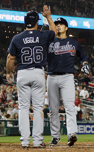
As you know, many MLB teams let the starting pitcher choose the jersey for each game. That includes the Braves, at least for their road games. (Their jersey choices for home games are scripted — whites on weekdays, creams on weekends, red flag-descrations on five designated dates.)
That has prompted reader Robert Kittle to do a bit of numerical analysis:
After tossing out two road games from last season that featured non-conventional jerseys (throwbacks in one case, camo lettering in the other), I looked at the remaining 79 road games and found that the Braves wore the navy jerseys in 33 of them, or 42% of the time.
When breaking it down by pitcher, I discovered that Tim Hudson and Kris Medlen were the only pitchers who clearly favored the gray jersey over the blues. Medlen never wore the blue jersey, and Hudson wore it only once out of 11 road starts.
With Hudson now in San Francisco and Medlen out for the year, use of the gray jersey will likely decline this season. This is already showing up in the numbers: Leaving out Jackie Robinson Day (because I don’t think the pitcher got to choose the jersey for that game), they’ve already worn blue five times out of seven games. It’s also worth noting that newly acquired starter Ervin Santana chose navy for his one road start, so he may be a blue partisan. Looks like we’re going to see a significant spike in blue this year.
I’m hoping this isn’t the case, because the Braves’ classic grays are such a great uniform, but it’s beginning to look like they won’t be seen much this season.
Good stuff, Robert — thanks for crunching the numbers.
This brings up something worth discussing: I’ve always felt a little uneasy about having the starting pitcher choose the jersey. For one thing, it carries an element of letting the inmates run the asylum, which I don’t care for. But hey, if you’re going to go that route, shouldn’t every inmate get an equal shot at it? I realize the starting pitcher is arguably the most important player on the team each day, but he’s not the only player. And most of the time he doesn’t even finish the game! Why shouldn’t a relief pitcher get to pick the jersey once in a while? Or the shortstop? Or the back-up catcher? (And yes, we all know there’s an easy solution: Just have one home jersey and one road jersey, like the Yankees do. But that’s not the reality most teams live in.)
Personally, I’d rather have the equipment manager make the decision and leave it at that. But if you’re going to bring players into the equation, I think they should all get a crack at it. What do you folks think?
Update: One of today’s first comments was a link to this 2013 article about uniform selection, which includes the following:
Just because pitchers have the option of choosing doesn’t mean they spend a lot of time thinking about it. Braves pitcher Tim Hudson says he always chooses the gray jersey on the road because he’s a traditionalist. Occasionally, if he’s lost a game or two in gray, he’ll switch to blue, but it’s not something he thinks about a lot.
“Our game is hard enough as it is,” Hudson said. “If a guy thinks too much about what they’re going to wear, then they’re probably in the wrong business.”
Unmasking the Commenters: I recently invited the site’s commenters to tell us a bit more about themselves and give us a peek at what they look like, just because I thought it would be fun to pull back the internet’s curtain of anonymity. I’ll keep showcasing you folks as long as you keep sending in your photos and quick bios.
Today we’re spotlighting Anthony Nuccio, who submitted a photo of himself with a famous sports guy (click to enlarge):
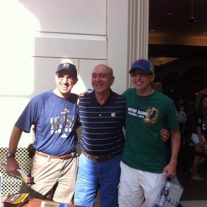
That’s me on Dick Vitale’s left, and my father is on his right. I’m a junior at North Central College in Naperville, Illinois, where I major in religious studies and minor in writing. When I’m not in school, I spend the other three months of the year in Lake Zurich, Illinois.
I was born and raised as a Bears, Blackhawks, Bulls, and Cubs fan. My father instilled in me a great love for Notre Dame athletics, and we were finally able to go to South Bend for Notre Dame’s home opener against Temple this past season. I’ve played a wide variety of sports in my lifetime, including soccer, hockey, cross country, and track and field. Some of my non-athletic interests include collecting baseball cards and patches, reading, and being outdoors. I am also a second-generation Eagle Scout.
Thanks, Anthony, and thanks for your contributions to the site — you help make Uni Watch a better place!
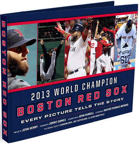
Yo, Red Sox fans: In case you missed it earlier this week, Uni Watch readers are being offered a special deal on 2013 World Champion Boston Red Sox: Every Picture Tells a Story, a gorgeously produced coffee table-style book (not an e-book) that chronicles the 2013 Bosox season. It features over 200 photos (some of which you can see here), along with essays by team owner John Henry, outfielder Jonny Gomes, manager John Farrell, Boston broadcaster Joe Castiglione, former mayor Thomas Menino, journalists Gordon Edes and Leigh Montville, and more.
The book lists for $40, and Amazon has it for $27.33. But if you go here and use the checkout code RSX131, you can get it for $24.95 — definitely the lowest price you’re gonna find. You know what to do.

’Skins Watch: A new study indicates that teams using Native American mascots and imagery are paying a financial price, to the tune of a few million dollars per year. Additional info from the study itself is available here. ”¦ Students at a New Hamshire high school are trying to change the school’s “Red Raiders” mascot (from Tom Mulgrew). ”¦ Portland-area readers may want to check out this panel discussion on Native American mascots that’s taking place at Reed College next Thursday (from David Landesberg).

Baseball News: The Marlins will wear Miami Sun Sox throwbacks on June 8. Further details on the Sun Sox here (thanks, Phil). ”¦ Cardinals 2B Kolten Wong changed things up by going high-cuffed with stirrups last night, but the real news, as several readers reported, was that he wore gray sannies! Never seen that before. On the one hand, it’s nice that the gray matches his gray road uni and the gray trim on his cleats. But it still doesn’t feel right — white would be better. Interesting move, though. ”¦ For the first game of Wednesday’s Cubs/Yanks doubleheader, the Cubbies wore their alternate gray pants with their blue jersey. “Cubs TV announcer Len Kasper mentioned that this was the first time the Cubs have worn this combination,” says Michael Schweda. ”¦ Brennan Boesch, called up by the Angels in time for Wednesday’s game, is wearing No. 00. He wore 26 with the Tigers. I’ll try to find out what’s up with the double zeroes (from Brett Crane). ”¦ Here’s some home movie footage from a 1967 Mets/Phils game at Shea that shows glimpses of the green outfield wall that was used for the first month or so of that season (from Chris Rocco). ”¦ For a while now I’ve been responding to the camouflage jersey phenomenon by saying, “Not all soldiers are heroes, not all heroes are soldiers.” The second part of that line has now been addressed by the Lehigh Valley IronPigs and Pawtucket Red Sox, who’ll be wearing police- and firefighter-themed jerseys on April 26. Nice idea, although the jerseys “feel more like a disaster than a tribute,” as Ben Wideman puts it. ”¦ In 1994, the Giants wore radially arched NOBs. But Bobby Bonds, who was the team’s first base coach at the time, was wearing a ’93 jersey with vertically arched lettering. “Seems to have been an issue all season,” says David Shank. ”¦ Pirates pitcher Wandy Rodriguez has been going double-flapped (from Johnny Bruno). ”¦ During yesterday’s CSN/MLBN broadcast of the Braves/Phils game, they still had some Braves players listed as wearing No. 42 (screen shots by Tom Marshall). ”¦ It had previously been reported that the Red Sox will wearing the white “Boston” jerseys for the Patriots Day game next Monday morning. They’ve now issued a press release describing this move as “inaugurating a new tradition,” which means the white “Boston” jersey will become an annual thing for the Patriots Day game. ”¦ When the Orioles and Rays did the all-42 thing on Wednesday (delayed a day due to a rainout), the stadium announcer and scoreboard operator got a bit confused during a late-inning substitution. ”¦ Yesterday’s Ticker included a link to the D-backs’ Federal League throwbacks, which they’ll be wearing on April 23 against the Cubs. Turns out that a few of the uni elements in that photo were wrong, so the team has issued a corrected version (note the different cap, belt, and sock colors), along with a mock-up showing the front and rear views. I asked team designer Brian Gundell about the D-Backs sleeve patch, and he responded, “The Cubs wanted to re-create the exact match-up that took place on April 23, 1914, between Kansas City and Chicago of the Federal League. We happened to be their opponent that day, and we agreed to participate, but we also requested that our logo be present, since there’s no direct connection between us and the old KC team.” Brian’s a good guy, but man — that sleeve patch is such a mistake. The veritable turd in the punchbowl. ”¦ Oh, I also asked Brian if the D-Backs would be wearing throwback batting helmets. Response: “We’re pretty sure the batting helmets will be blank navy. The Cubs are providing a set of helmets that will be used for each of the teams that participate in their throwback games.” ”¦ Wes Reichart notes that low-crown MLB 5950s are now available on MLB.com. He says this is the first time these caps have been available to consumers — is that really true? ”¦ I just scored this totally boss vintage jersey. More photos/details after I receive it from the seller. ”¦ It’s very sutble, but it’s true: Yankees pitcher Dellin Betances was wearing an upside-down “8” last night (genius spot by Brian Cheung).

NFL News: Reader Ryan Becerra was watching footage from a Bears/Cardinals game from Oct. 29, 1972, and noticed that the Bears’ players were wearing two different jersey designs — some with the classic rounded numerals and some with block numerals.

College Football News: The Washington Huskies will release new uniforms today. ”¦ Remember those “flame” helmets that Arizona State wore against Notre Dame last year? They’ll be wearing them again in 2014. ”¦ Louisville has extended its deal with Adidas. Key quote: “Included in the contract, per U of L’s news release, are five football jersey choices, allowing dozens of combinations when combined with helmets.” Further info here (thanks, Phil).

Hockey News: New uni set for the Butte Cobras of the WHL (thanks, Phil). ”¦ The NHL is promoting the postseason by installing a FanFest exhibit outside of Madison Square Garden. “They have a great display from the Hall of Fame, including Wayne Gretzky’s baby skates,” says Alan Kreit, who took these photos.

NBA News: Lots to like in this old NBA photo, including a Bucks-branded ice bag, Pistons socks, and first names on the Pistons’ warm-up jackets (from John Romero).

Grab Bag: A West Virginia midget football league is suing Riddell over the company’s concussion-related claims. ”¦ There are 29 professional sports teams in Chicago, and David Ridderhoff has ranked all of them. ”¦ In a related item, here’s a video interview with the guy who runs the Chicago Sports Museum (from Marc-Louis Paprzyca). ”¦ New logo for the Minnesota Lottery. ”¦ A 15-year-old in Illinois has been making custom-painted sneakers in team-themed designs. Further info here (from Luke Resnick). ”¦ Here’s something you don’t often see: a blue shamrock logo. That’s NASCAR driver Cole Whitt (from Tom Mulgrew). ”¦ “Covered a high school softball game last night, and both teams wore all-black unis,” says Josh Claywell. “Only differences were cleat color, number font/color, the splash of white on the sides of one team’s jersey, and a stripe on that team’s pants. Drove me nuts, but none of the fans seemed to give a shit.” ”¦ Notre Dame lacrosse will be wearing a “Shamrock Series” uniform this weekend (from Jared Buccola). ”¦ Didn’t realize until now — but am not really surprised — that there’s a blog devoted to Craig Sager’s suits (from Warren Junium).
You can buy low-crown 5950 MLB caps from minorleagues.com and have been for a while. Cheaper at minorleagues.com.
Great cap source. Back in the 1990s, low-crown caps were regularly available for the Twins at the big merch store a block north of the Metrodome (Dome Plus?) and for the Cubs at that place across Addison from Wrigley.
I got impatient waiting for the to restock the Orioles cap with the white panel so I got it off eBay. Not sure it is lowcrown, so going through the motions of showering in it, sticking it in the microwave, etc. That’s what I get for straying from 47 Brand caps.
Low crown caps are also sold on neweracap.com. They have been on there for years. link
’47 brand hats are the best out there. I stopped dealing with the high crown 5950 from New Era and solely buy these when I need/want a new lid.
I would love to buy hats online, but New Era’s sizing system is about as consistent as Angel Hernandez’s strike zone.
That’s for sure! In any given size they range from yarmulka to full over the ears.
Thats a problem with ‘fitted’ caps in general. The umpire caps that ASA sells us suffer from the same problem. A lot of the makers of plain caps have gone to flex caps, which have stretchy backs, and have a couple of size ranges. These are much better buying remotely.
I too have experienced inconsistencies in New Era’s 5950 fittings and have found that I’m actually a tweener. To solve the problem, I bought a hat stretcher and just buy the smaller size I usually fall between. Sometimes they fit fine, other times I stretch them. More often than not, the upsize is too big and there is no good way to shrink them.
Maybe Kolten Wong’s gray sanis are his tribute to David Letterman.
Agree that it seems weird for the starting pitcher to get to choose the jersey each day, but I guess it’s in line with teams going to extreme lengths to make him as comfortable as possible, like how some guys demand no one on the team talk to them during the day their starting.
For the record, I would strongly dislike it if every MLB team had one home and one road jersey, and I dislike the few that do now. I like variety, especially over the course of a 162-game season.
Geez, isn’t the game enough to give you enjoyment? I don’t understand why fans today demand to have a “variety” of jerseys, caps and uniform styles for their teams. If a team wears the same home and road uniform 81 times apiece somehow their fans are going to be bored or something?
Well said. I use this argument all the time on weird-uni-loving youngsters.
Is the game enough to give me an enjoyment? Yes.
Does that mean it’s not possible for other things (the kind of uniforms I enjoy, for instance)to give me additional enjoyment? No.
I didn’t get “demand” from Danya’s comment. I certainly don’t “demand” that my teams have alternate jerseys (and I’d be fine if they had none), but I do like how their alts look.
I think it is cool that the teams have different uniforms. Now If every team with white hats get color hat would be great. Only SMU, Texas, the old Pat the Patriot, and creamsickle hats worn by Tampa Bay should be the only white hats allowed.
I purchased low crown Mets and Dodgers hats a year after the switch from wool from Marshall’s .
found this article the other day when researching something else, but it’s about uniform selection. link
The final paragraphs complement today’s post perfectly.
“Just because pitchers have the option of choosing doesn’t mean they spend a lot of time thinking about it. Braves pitcher Tim Hudson says he always chooses the gray jersey on the road because he’s a traditionalist. Occasionally, if he’s lost a game or two in gray, he’ll switch to blue, but it’s not something he thinks about a lot.
Our game is hard enough as it is,” Hudson said. “If a guy thinks too much about what they’re going to wear, then they’re probably in the wrong business.”
That’s awesome — I’m going to add it to today’s text!
agree! Good find.
More teams should choose their uniforms the way the Oakland A’s used to do it.
link
That’s an awfully good argument for not entrusting players with much of ANY decisions about what they’re going to wear–socks & stirrups most definitely included.
Exactly. Players are going to be superstitious*, so the more you can reduce the variables the better it will be for them. Take the uniform out of the equation and let the players worry about pregame meals or not touching foul lines or whatever.
*Baseball in particular breeds superstition, since it’s a sport where peak performance still mostly results in failure, and where from moment to moment chance is experienced as playing a greater marginal role in results than skill. Even Richard Dawkins would be praying to Jobu of you put him on a baseball team.
I am curious to know how many players are “traditionalists,” but not just in the sense of uniforms, and have studied/love the history of the game, enjoy playing in old parks like Wrigley/Fenway even with small locker rooms and other quirks, etc. I am guessing very few.
Did the Braves ditch their red antebellum-era rifle club jerseys? If so it would be of almost equal goodwill as ditching NocaHoma.
We know 26 isn’t available with the Angels because they retired it for Gene Autry. Still, 00 is an unusual choice…
I didn’t know Gene Autry wore 26 with the Angels. Oh, wait, it’s one of those idiotic “symbolic” number retirements.
I hate the PItcher deciding the jersey. I’m a Cubs fan and when I went to see them at Wrigley a few times, i wanted to see the traditional pinstripe jerseys, but i always seemed to draw Zambarano as the starter, and he always chose the blue jersey.
Re: Bobby/Barry Bonds
No, the difference is not between vertically and radially arched NOB’s. Both NOB’s are vertically arched. Bobby Bonds has full block letters. Barry Bonds has plain block letters.
I’ve never heard the difference between serif and sans-serif block letters being described as “full block” and “plain block” before.
“You went full block, man. Never go full block.”
People in the trade have all sorts of lingo for their tools. Loitering in a sports store taught me the lettering on the front of the Red Sox’ (and grey Mets’) jerseys is called “fancy block”.
Actually it’s called link.
Then you’re the person to ask, Graf Zeppelin- What’s the font on the Pirates’ jersey called?
Tiffany is similar, but definitely NOT the same as the Red Sox wordmarks.
The Red Sox font is called Tuscan…don’t know of the Pirate font has a name.
I noticed that too.
That can’t be a 1993 jersey that Bobby Bonds is wearing in 1994, as the Giants changed the front wordmark on their jerseys in 1994, and it would have been noticed if Bobby wore the old one.
I also can’t find any examples other than Bobby Bonds of that serifed font on Giants uniforms from either the 1983-1993 home uniform design nor the 1994-1999 design. (Both uniforms seem to have the same number and NOB fonts–only the front changed in 1994.)
You nailed it Mark!
Honestly, letting the pitcher choose the uniform is one of the stupidest things in all of sports – and one of the main reasons I really don’t watch baseball much anymore.
really? You have a really low threshold if that is what is keeping you from watching baseball.
It’s Brennan Boesch by the way, not Brendan
Thanks. Will fix.
re: pitcher deciding the jersey
I’m guessing the starting pitcher is sort of like the captain for the game? And it’s like how Arsenal wears all short sleeves or all long sleeves based on what the captain wears?
I get that that’s the logic, but even accepting that, then usually the starting catcher, not the pitcher, should be making the choice. Except that on many teams, the day-to-day on-field leader among the players – what “captain” means in sports – is the guy at short, or third, or right field. Rarely is the guy on the mound actually taking care of the team. He’s got more important things to focus on, such as the insanely difficult task of throwing a tiny ball as hard as he can into a tiny box while avoiding a wooden stick.
Well, yeah, it’s not exactly logical, but baseball culture’s always laid out a red carpet for starting pitchers. You hear about how they get mad because the other players weren’t taking their amphetamines on the days they pitched.
And I also get it – the starting pitcher has the most influence over the result of any player on the team, and he only really gets to be on the team one out of five days.
I suspect superstition plays a bigger role in many pitchers’ jersey selections than Hudson’s comments would lead one to believe (or perhaps he would like the reader to believe). If Wade Boggs felt compelled to eat chicken before every game, it wouldn’t be the least bit surprising for a starting pitcher to base the jersey selection for his upcoming start based on how well or poorly he’d pitched in a particular jersey. It’s also something I doubt he’d want to confess to publicly.
I have bought the low crown caps through the actual New Era site. I hate the new material they make the caps out of now. You used to be able to buy an on field cap and with the magic of soaking them in water and letting it dry on your head, you could get those crowns to shrink down. I used to take a shower with my hat on and wet the hat down on my head then just wear it all day. The new hats don’t shrink so low crown is where it’s at.
One soccer thing that I didn’t think was worth sending in as a ticker item – MLS awarded an expansion franchise to Atlanta, and the team won’t start play until 2017 but here’s a link:
As of yet, the team has no name and no color scheme, although Blank said he expected to have some red, some black and some gold — the original colors of the Falcons.
I started thinking if this was also going to inform the color scheme for the Falcons if they decide to Nike-fy their current look.
Well, they’ve worn their current look since 2004 (or 2003, if you count the black as the primary) so they’re past the 10-year mark for major uniform change. The new stadium is opening in 2017, and the sister MLS franchise is launching that year as well.
Maybe I’m adding 2 and 2 to get 200, but if I had to place a bet, I’m thinking a new look for the Falcons in 2017 with the same colors as the soccer team red, black and gold.
Well, that’s the first time I’ve ever heard the Falcons original colors actually described as red, black & gold. They had 2 little insignificant stripes on their helmets, that’s it. It was about as much of a team color as red & blue are Steelers colors because they just happen to be on the logo.
Sure, but that’s one more reason I think gold might become part of the Falcons’ color scheme if they’re going out of the way to mention it.
And I don’t think the Steelers comparison works – the gold was far from incidental. It was a very conscious addition to appease Georgia Tech fans who thought the Falcons looked too much like the Dawgs.
To be fair, the 2013 Falcons did a pretty decent job of looking more like Gt on their own. Wait…you’re talking about uniforms.
Expect the MLS team to be named the Phoenix, its the most appropriate name for a sports team based in Atlanta. The color scheme described matches it, and its about damn time that a major team in a city that rose from the aashes went by the name Phoenix (that’s what the Thrashers should have been called, especially given the previous hockey team’s name was the Flames).
I think its safe to say the Falcons will have new uniforms by the time they move into the new place. The only real question is whether or not they will make the switch to correspond with the new home, or if they will switch before. I’d love to see them dump silver in favor of gold, and go with a modernized throwback look (Red Helmets, gold stripes, black jerseys with red jerseys as alts).
That sure will be confusing when Phoenix gets a team though.
I think you mean IF Phoenix gets a team, right now they aren’t one of the cities speculated/targeted for expansion.
So I don’t think Atlanta should be worrying about a hypothetical scenario in which a city (that isn’t presently being considered or talked about for an expansion) is awarded a MLS Franchise.
RE: ’72 Cards/Bears….
The Bears jerseys may be mismatched (and it’s only slightly noticable in those pre-HD screen grabs), but DAMN that is a good looking game!!
Sleeve stripes anyone?? Clean Cards’ jerseys!! Beautiful!!
That was a good looking matchup. The early 1970s was the transition point between the old durene jerseys and the woven mesh material that I think Sand-Knit was developing. From say 1968-1972 some teams wound up with two different jerseys – the old style heavy woven material for “cold weather” with woven-in stripes and tackle-twill numbers sewn on and a mesh-style for “warm weather” with screened on stripes and numbers. Some teams wound up with plain jerseys with no stripes for their mesh jerseys, some with other differences.
The Bears were one where the white mesh jersey not only had screened-on numbers whomever was supplying them (I’m assuming Wilson since Halas had a deal with them) just used a plain block number. I’ve also seen photos of the Bears in this era with stripeless navy jerseys that do have their traditional rounded numbers – I’m assuming those were their navy mesh jerseys and they decided to use sewn-on numbers instead of plain printed on numbers like they did with the white jerseys.
Re: the Bears having different types of jersey numbers on Oct 29 1972. Here’s a theory from someone with who has spent a rather amazing amount of time studying Chicago Bears History. It seems like in the early 70s the Bears had two different uni-phases each season. In the pre-season and the first couple weeks of regular season, the Bears white jerseys would have navy blue block numbers, rather than the rounded numbers outlined in orange. The pre/early season dark jerseys would have the rounded orange outlined numbers, but would not any sleeve stripes. Early/preseason jerseys usually had simple block letters for the name plates, rather than letters outlined in orange. Seems that on Oct 29 1972 some of the plainer early season jerseys got mixed in with more detailed the later season uniforms.
I cannot recall ever hearing a reason for why the Bears had these jersey alternations early on. However, George Halas did own a sports uniform company–“White Bear Uniforms” I believe. I’ve seen old game programs from the mid-1950s that had advertisement for them. My guess is that either a) white Bear didn’t have the same silk screening capabilities necessary for the new fabrics John mentioned, or b)Halas still used White Bear to supply the Bears uniforms in the early 70s, and didn’t mind saving time by issuing the Bears less elaborate pre-season uniforms and putting more time/effort into customers White Bear could actually lose. Through at least the late 80s, the Bears practice jerseys always had the un-outlined block numbers, so the idea isn’t too farfetched. Finally, I thought for a second that maybe the block-numbered players were guys who had been cut and brought back to the team last minute to fill out the roster following injuries. However, its clear from the photos that the block numbered players include QB Bobby Douglass (#10) center Rich Coady (#52) and tight end Earl Thomas (#82). However, all three of those players had been with the Bears all of 1971 and 1972. Douglass and Coady were both starters in both ’71 and ’72, while Thomas started most (if not all) of ’72.
Oct 10 29 1972 was week 7 of the NFL season, and the Bears’ third road game. According to Grid Iron Uniform Database, the Bears had just debuted the outlined/striped navy jerseys the week before. Their next road game would feature the orange outlined/rounded numerals on white jerseys. My guess is that the Bears equipment staff (or White Bear if it still existed) fell short of getting all players fancier jerseys ready by the time the team had to pack up for St. Louis, and thus compromised by featuring a handful of the plainer jerseys. Its actually rather unsurprising, the Abe Gibron led bears of that era were pretty notorious for general bumbling and disorganization.
I’ll bet a similarly intricate story surrounds the Dolphins’ mismatched uniforms during the perfect season.
Online retailer leaks photo of new Browns uniforms!
link
Kidding, but it’s from this mini-store of team-themed golf outfits from GolfKnickers.com:
link
Which, if nothing else, is a great follow-up to Mike’s QotW yesterday. Browsing through the outfits, you can find almost every possible color combination, but without the sentimentally distracting details of actual team uniforms and logos. Do I like a particular color combo because that’s what my favorite team wears, or do I really like the color combo as a color combo? The Golf Knickers outfits are a good test of that question.
The combination of classical golf style (knickers and hat) with sports team colors reminds me of the late Payne Stewart.
New uni set for the Butte Cobras
(cue Beavis/Butthed voice) “Heh, heh, Butt Cobras.”
Beat me to it. I should grow up.
2nd time in a week an item in the blog is a repeat or a screw up of an item posted in the blog in the recent past. That Huskie video of players reacting to the new uniforms is actually from the April 1 joke reveal by the coach Peterson that your blog posted on April 2nd or so. That’s why the video clip ‘annoyingly’ doesn’t show the uniforms. C’mon man!
Thanks. Will fix.
In my defense, the video I linked to today (which I’ve now removed from the Ticker) is dated April 17:
link
Yeah, it’s a different video. This was the April Fools Joke. link
I was wondering what this was all about. I distinctly remembered the April Fool’s joke video showing the two kids in the fake uniforms up on stage and there being no big video montage up on the screen.
This certainly explains why I remembered it differently — because it was a DIFFERENT FUCKING VIDEO.
Good work, Tom.
Man, I miss those Pistons warmups. link.
Seconded.
Thirded. In fact, I miss the days when every team had unique designs for their warmups and shooting shirts, rather than this awful Adidas template shit that’s so prevalent these days.
And regarding the team name on socks (TNOS?) – that was something most NBA teams did between ’88-91. One of the first items of team merchandise I ever had was a pair of Hornets socks…
Bring these back too:
link
Dang, beat me to it… in all likelihood, they were personalized for them by the same place that did the name on back for the Wings, East Side Sporting Goods.
Years ago when I visited their store (which was on Schoenherr Road just north of 11 Mile/I-696 at the time), they had a bunch of older jerseys on the wall, including (if I recall correctly) at least one of the “mythical” Pistons “silver” jerseys from the early 1980s.
They were also the ones who made the giant jerseys for the Spirit of Detroit statue. The Wings jersey was being stored in one of the backrooms when I was there.
Does anyone know exactly how much lower the 5950 low crown is? And is the bill smaller as well? I can’t wear a current 5950 at all because the crown and giant bill dwarf my head! It’s terrible…never had that issue when they were the older Sports Specialties versions in the early 90’s.
I want to know that there will be a noticeable difference before I shell out the money.
Joe, I can tell ya the low crown caps have a considerably lower profile…when I wear a regular 5950 on my giant melon it looks like I’m wearing a backwards fireman’s hat, but the low crown looks more or less normal. The bill looks to be about the same, about 2.75 inches from the center stitched line to the front of the bill.
The sizing is inconsistent, though…I usually buy 7 1/2, and the low crown one is a smidge tighter on my head than the regular 5950.
That minor leagues.com site is the real deal, though…well worth ordering thru them and saving 25%!
Why shouldn’t a relief pitcher get to pick the jersey once in a while? Or the shortstop? Or the back-up catcher?
You never played baseball growing up, did you?
I did, actually. But when I played, teams only had one or, at most, two jerseys.
I agree with Paul on this, and I also played ball growing up. But (A) I never played on a team with more than one jersey, and (B) I never played on a team whose coaches would put up with that kind of mollycoddling of an individual player. If a player really is so uncomfortable with the color of his shirt that he can’t perform at his peak, then he’s a head case who needs coaching or treatment, not special privileges to change the color of his whole team’s shirts.
If we were talking about the cut of a jersey – sleeves or no sleeves, say, or sizing, or whatever – then I’d have some sympathy. If the equipment is getting in the way, then that’s an issue. But as with, say, cleats, that’s an issue to be addressed for the player in question. Make a custom jersey that doesn’t pinch or restrict the shoulder or whatever.
You just wanted to say “mollycoddling”!
A true curmudgeon does not need to create an elaborate setup to say “mollydoddling.” Also, hey pitchers whining about your shirt colors, get off my lawn!
LOLLIGAGGERS!
Ragamuffins!
Stop talking balderdash, you scallywags!
Stop talking balderdash, you scallywags!
This must be the comment of the day tomorrow.
I am glad no one called anyone a Ninnyhammer. That may have lead to fisticuffs, you rapscallions!
Wandy Rodriguez goes double flapped because he is actually a switch hitter.. Quite rare for a pitcher.
Not doubting you, but per Baseball Reference he bats righty, throws lefty.
link
Which is even goofier than switch-hitting because it results in his throwing arm being the one exposed to incoming pitches. Maybe he’s begun switch-hitting to guard against that?
On the mlb.com Pirates website, Wandy Rodriguez is listed as batting S (switch), not right. So Brad Susany’s statement is correct. As for pitchers that expose their throwing arm while batting, Tim Linceum is a notable one as he throws RH and bats LH.
No link for the David Landesberg story in Skins watch.
Thanks — fixed. Here’s the proper link:
link
For comparison purposes: how the “8” should look on a Yankees road jersey: link
It’s extremely subtle but the lower portion of the 8 is slightly longer than that of the top.
In case anyone was wondering, it’s because if you put it in the center, it will actually appear to be a bit lower than center. It’s just one of those illusions that trick our brains.
Tromp l’oeil:)
Don Cherry thinks Craig Sager’s suits are too conservative.
I’ll be honest… I first raed that as ‘butt’cobras…
Sounds like something dudes discussing their preferences in women might say. “Jim is a real butt cobra, while I’m more of a leg lizard!”
Off topic but uni-related, I picked the Blues to go the distance and now I’m almost regretting it because now if they prevail looking at their rainbow sweaters for the next month is torture.
Reebok ruined a very nice traditional looking team.
“Reebok ruined a very nice traditional looking team”
That could be a standing head…
I don’t like letting the starting pitcher dictate the jersey choice, but I like the idea of putting it to a team vote even less. After all, if player-majority rule dictated everything uni-related, we’d never see stirrups (or even socks) ever again.
Had a good laugh at the comment from the Diamondbacks official talking about “no direct connection” between Arizona and the KC Federal League team the Diamondbacks will be dressed as in the upcoming game.
That’s a really odd way of stating the obvious, there’s not even a remote connection between Arizona and the Federal League. I can’t imagine even a casual Diamondbacks fan thinking there is a link between the two.
Isn’t the Diamondbacks patch on a Kansas City team’s jersey virtually guaranteeing that nobody anywhere will buy that jersey?
1) Who says that jersey will even be for sale? It has a point collar, which I suspect means it would be difficult for Majestic to mass-produce.
2) Even if it is available at retail, why does its saleability matter to us one little bit?
But given the generally fair assumption that much of what pro leagues do with their unis is driven by the intent to sell merchandise, saleability is relevant. If a team makes a uniform with elements that seem likely not to be saleable, that may be an important indication that merchandising did not, in that case, drive the design. It’s a potentially useful data point when considering a uni design.
But given the generally fair assumption that much of what pro leagues do with their unis is driven by the intent to sell merchandise…
You have to tailor the broad assumption to the specific circumstance. I’m not sure the jersey for the road team in a throwback game has ever been made available for sale. Often the home throwback isn’t available either.
I have a 1971 Washington Senators road jersey from a throwback game the Rangers put on when the Nats first came to Arlington. It was sold for years subsequently by both the Rangers and the Nats in their team stores and online. (And no, I didn’t pay retail, so it’s not a $200 shirt.)
I’m not sure the jersey for the road team in a throwback game has ever been made available for sale. Often the home throwback isn’t available either.
It’s more common in recent seasons to sell road throwbacks – the 1912 Yankee jerseys from Fenway’s anniversary comes to mind. The Brewers also sold blue 1982 road jerseys when they played a TBTC game in St. Louis in 2011.
Right now on baseball’s online shop you can still buy the link from their trip to Miller Park last year, as well as the link worn in Philly last season.
The 1946 Brewers/Twins matchup added two road jerseys to the shop (although the actual road team wore link).
Not saying all road jerseys are offered for sale, but enough are that I’m surprised that wasn’t a concern.
2) Because some of your readers ARE interested in buying jerseys manufactured in the 21st century?
Agreed. Rare occasion where I disagree with Paul, though, regarding his comment in the article. I think you had to have something with the Diamondbacks branding on that uniform someplace.
Otherwise, the message you’re sending is, “Hey, we’ll let opposing teams have their way with us, including deciding what we’re going to wear, what city we’re going to represent and whether or not we get to show our colors because we have no history of our own.” Even for a single game, I don’t think that’s a message any organization wants to send.
The patch is small, subtle, and classy. It shows that the Diamondbacks respect the occasion and will play along, but are still the Diamondbacks and are still out to beat the Cubs, not roll over to EVERY one of their whims, at the end of the day (and they’re the Cubs, so odds are good).
Looking at the link, I’m even more confused about Majestic’s logo situation.
New logo in the lower-right corner, but old one on the sleeve?
1970 Baltimore Colts were another team that wore mesh ss and durene ls. Both were made by Sand-Knit. I have a Dan Sullivan durene.
In the Mets 1986 Championship season, Goodman and Sons made their jerseys, and many (all?) of the 8’s that season link
Uni Watch would have had a field day if it was in existence that year.
The Butte Cobras are a member of the Western States Hockey League, the WSHL. Not the Canadian-based, but with a few American teams, WHL.
i thought it was interesting that during the jackie robinson games all players still had their real batting helmet numbers. domonic brown still wore his #9 armband
I like those Custom Kicks, but man she is asking to get nailed by the pro leagues. She’s selling their logos, and that is a no no.
The 1936 Green Bay Packers [via @packers] Read more: link
link
Very cool. I love link – ripe for a throwback.
Cool MLB logo variants: 1964 Guy’s Potato Chips Baseball Pins. via John Thorn @thorn_john – pic.twitter.com/Utj8CyKFxJ
Note the Cleveland Indians logo being used here. I’ve never seen this before.
I went to the Chicago Sports Museum last weekend. I thought it was pretty cool! You can try on Refrigerator Perry’s Super Bowl ring.
What body part did the ring finally fit on?
How can you rank 29 uniforms on a website, but only have pictures of 7 of them?
It’s also a memory test. Like “Concentration,” but geekier.
I know a lot of other examples have already been cited (downside from posting from the west coast is that you’re always late to the party, even at 0830), but I worked at a Lids for a bit in college and as I recall we to always had a couple of low-profile caps in stock for some of the bigger-selling teams (e.g. Red Sox, NYY, etc.).
RE: Kolten Wong
I wonder if they gray sani look would work better for a team that wears solid color stirrups? It seems like the white stripes on the Card’s stirrups make it a particularly poor choice to pair with a gray sani, no?
Anyone else find it odd to see the word “Pigs” on a police-themed jersey?
link
Olbermann did on his show last night.
This is link. It’s a four-leaf clover.
Shamrocks have, by definition, three leaves.
I really like that new Minnesota Lottery logo!
That should be the Wild’s crest, rather than that “clever,” busy, picture within a picture thing they have.
Aw, the Wild can keep their crest. But if Minnesota ever gets an MLS franchise, that should be the crest. A shame that the lottery came up with that first!
Minnesota United FC pretty much already nails the Loon on a soccer badge link
Here’s hoping they get the big promotion to MLS franchise.
The numerals on those new Husky jerseys remind of Visa’s old logo. link
Hey Anthony…
I went to North Central, too! Communications (Broadcast) and English.
That’s awesome, Shep!
Paul,
Tried a riff off your frozen steak blow torch recipe last night. Was awesome! Froze three tri tip “strips” for about 24 hrs – probably about 8 – 10 oz each. Got a cast iron pan screaming hot. Seared both sides off (About 1 min each side). Put into oven for 60 minutes at 200 degrees on middle rack. Absolute perfection.
Okay, I know what I’m doing this weekend.
Nice. Still more fun with the blowtorch, I say, but your method sounds good too!
The Braves’ navy alt looks pretty bad imo. If you have to wear a softball top, it should have sleeve piping and/or a head spoon. Same with both of Boston’s and last year’s Oakland green.
My sense of traditionalism is skewed obviously if I say that I see no problem with the navy jerseys, but I’ll be honest, I am slightly disappointed that road grays are starting to be de-emphasized. Still, a little color isn’t the worst thing in the world, is it?
Why does the “Unmasking the Commenters” icon show a face being removed to show a silhouette? Shouldn’t it be of a mask being removed to show a face?
Mets/Philles 67 – Looks like both teams scoring a bunch of runs, and a fairly large DH crowd must – be this game:
link
Is Retrosheet the most useful baseball resource?
Think you are right…Cardwell used to swing his arms back like that during his delivery.
I liked the new white UW helmets until I saw this. I don’t care who you are, though, this is funny:
link
If it didn’t mess with the decal application I’d be fine with that look, but its hard to see that design as a plus if it makes it look like the decals were hastily applied, then torn off and re-applied about 20 times until they just gave up and decided to just go with a bubbly decal.
Wouldn’t the easiest solution to the conundrum of the Diamondbacks wearing KC Fed uniforms been to schedule a team from Kansas City to play the Cubs? There was only 100 years to get it worked out after all.