
Time for another round of awesome wire photos. The first one in this batch is from Michael Clary, the next five are from me, and the rest are from Bruce Menard. Ready? Here we go:
• The Hoover vacuum company was apparently trying to draw a comparison between its product and the groundball-Hoovering skills of Pirates infielders Gene Alley and Bill Mazeroski.
• Man, I really miss vertically arched NOBs. Sigh.
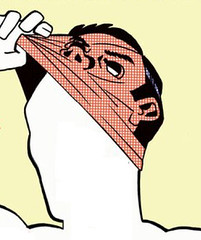
• Holy moly, here’s a version of the Braves’ Indian head logo that I’ve never seen before.
• This is odd: Why would the 1938 Cubs’ pants have had an asymmetrical belt loop arrangement?
• Kinda striking to see an umpire wearing a necktie and no jacket.
• Here’s a great Sox in shorts photo that I don’t think we’ve seen before. Also, note Chisox owner Bill Veeck’s pegleg peeking out from his trousers.
• In 1923, the New York baseball Giants briefly had a player named Moses Solomon, who was dubbed “the Rabbi of Swat.” His religion is played up in this caption. Also, note the overlapping “A” and the Pedro porthole!
• Our friends at No Mas sell a T-shirt emblazoned with “Keep the Dodgers in Brooklyn.” It’s based on this photo.
• Gabby Street’s little boy sure looked adoarable as a batboy in the 1930 World Series.
• Look at the amazing basketball uniform worn by the Washington Palace Five of the ABL in 1926. Interesting to see such an early use of a V-neck collar.
• Check out the “Golden Jubilee” patch on Willie Mays’s 1951 Minneapolis Millers jersey. Was that for the team? The league?
• Speaking of patches, here’s a good look at the flag-based shield patch that the Tigers wore in 1946. This patch, which replaced the Hale America “Health” patch that was worn in 1942, was worn by most MLB teams for the balance of World War II.
• The caption of this photo doesn’t quite explain why Joe D. had “Electricians” on his back.
• So much to like in this shot of Pepper Martin looking over the latest Rawlings gloves. Love the cigar-brandishing sales rep! Also, note Martin’s white cap, which appears to have a logo patch instead of a direct-sewn logo. Presumably just a spring training cap.
• What’s going on here? That’s the great Grover Cleveland Alexander giving pitching advice to a women’s baseball team in 1928. Interesting caps and uniforms — and heels!
Unmasking the Commenters: I recently invited the site’s commenters to tell us a bit more about themselves and give us a peek at what they look like, just because I thought it would be fun to pull back the internet’s curtain of anonymity. I’ll keep showcasing you folks as long as you keep sending in your photos and quick bios.
Today’s commenter is boxcarvibe, who’s become a frequent presence in the comments over the past two years or so (click to enlarge):
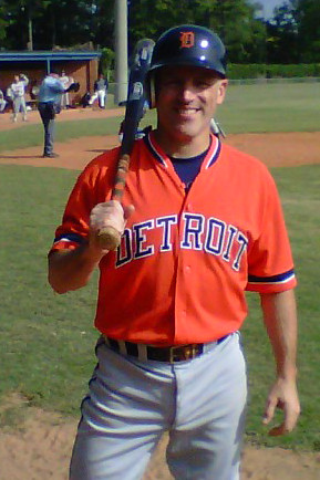
Real Name: Steve Vibert. Hobby: railroading. Combine those two things and you get my stage name, boxcarvibe. By day, I’m a marketer, designer, and left-brain change agent. I get to travel the country to do what I do. By night and weekends, I’m a husband, dad, and Atlanta-area adult league baseball player. I’m a rabid jersey collector, with a focus on the Detroit Tigers and their minor league affiliates. When given the rare chance, I’ll suit up to play baseball in authentic Tigers garb, such as Travis Fryman’s orange BP jersey and authentic Detroit road grey pants (shown above). A work colleague turned me on to Uni Watch two years ago, and I have lurked or contributed ever since. I’m in awe of the uni knowledge posted here every day, especially the uniform concepts and the talent on display. Amazing stuff!
Thanks for sharing, Steve, and also for your comments ”” you help make Uni Watch a better place.
Do you want to be featured in “Unmasking the Commenters”? If so, send me a photo and a quick paragraph about yourself. You don’t have to reveal your real name, and the photo doesn’t have to show your face, but you must include a photo to be considered. Send everything
this-a-way.
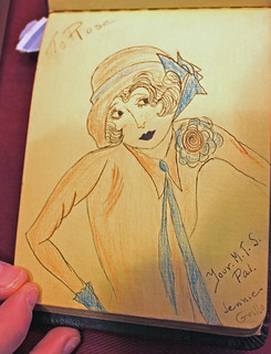
PermaRec update: A random note and self-portrait written in a 1927 autograph book (shown at right) has led to a connection with my collection of old report cards from the Manhattan Trade School for Girls. I’ve written two separate entries about this, the first of which is up now on the Permanent Record blog.
Troll update: I’ve alo added a short new entry on My Pet Troll, about the recent spike in troll-related academic research.

’Skins Watch: Good story on how the community in Saskatoon has responded to the school board’s decision to change a local school’s “Redmen” team name (thanks, Phil). … Meanwhile, another Canadian school, this time in Calgary, is also abandoning the “Redmen” name. Slowly but surely, people (from Brendon Chrus).

Baseball News: This is pretty great: Someone has started a blog devoted to Mets baseball cards that he wishes had existed. If you’re a Mets fan of a certain age, you’ll totally get it. Further info here, and big thanks to Shannon from the Mets Police for tipping me wise. ”¦ Clint Glaze spotted a Padres shirt with a Giants sleeve logo at a local shop. ”¦ Interesting logo arrangement on this Kellogg’s NutriGrain Bars package. “Typically there is some pattern (e.g., alphabetically by city/nickname, by leagues/divisions, etc.) but I don’t see any rhyme or reason as to how these logos are ordered,” says Jeff Sak (who also notes that the Indians are represented by the “C,” not by Wahoo). ”¦ Notice anything odd about Johnny Pesky’s 1946 Red Sox A.L. championship watch fob and money clip? The logo shown on them is actually an old White Sox logo (from Bruce Menard, who also spotted this Bosox flocked batting helmet). ”¦ Brian Jud was watching the Cheer episode where Sam Malone is goaded into showing up at Yankee Stadium to pitch against his old nemesis and former Yankee Dutch Kincaid for one at-bat on Dutch Kincaid Day. “This supposedly occurs during a Yankees home game against the Red Sox,” says Brian, “but Sam and the rest of the Sox are wearing the Red Sox’s home whites. I wonder what the Yankees were wearing for this game.” ”¦ Terence Kearns came across a pretty cool T-shirt that makes use of assorted letters from various MLB team logos. ”¦ Paul Caputo has written about the stories behind the team names for the Lake Elsinore Storm, the Albuquerque Isotopes, and the Inland Empire 66ers. ”¦ This pregame report for yesterday’s Giants/Dodgers Cactus League game included the following: “Pablo Sandoval, batting fifth in today’s lineup behind Buster Posey, forgot his uniform. So he’s had to borrow a minor leaguer’s and is wearing No. 97 today. Someone in the press box quipped that they had to find the fattest minor leaguer to lend his uniform, but that’s not true. Slimmed-down Sandoval, who truly is as fit as advertised, could fit into an average-size uniform.” Then there were two updates. The first one: “Panda’s jersey arrived in the nick of time, so he’s back to his regular No. 48.” The second one: “[Giants beat writer] Andy Baggarly is the hero. He drove Sandoval’s jersey out from Scottsdale. He bypassed the horrible traffic backup with some tricky driving and would have used the Panda jersey as his official explanation if pulled over. But no need.” ”¦ The Fresno Grizzlies will be wearing Teenage Mutant Ninja Turtle jerseys at some point this season (from Jared Buccola). ”¦ Here’s more about that mysterious Auburn throwback mix-up.

NFL News: You know that great “NFL Timeline” commercial that shows the evolution of the game? David Firestone recently scored one of the vintage-style jerseys used in that commercial and has written about it.

College Football News: Adidas is selling T-shirts for the Battle at Bristol. “I figured Adidas was probably selling them so early because by the time this game rolls around Tennessee will have already switched its provider to Nike,” says Charley Collier. “Sneaky Adidas.” ”¦ Someone on eBay is selling what is claimed to be a game-used 1961 Navy “Beat Army” jersey.

Soccer News: Manchester United is reportedly set to ink a $1 billion deal — that’s “billion” with a “b” — with Nike (thanks, Phil). ”¦ Here’s a site devoted to MLS jersey history. “The owner of the site is also the owner of all of the game-worn jerseys in the photos,” says Leo Strawn Jr. “It’s not complete, but it’s quite an extensive collection, and an interesting way of putting together a historical database for uni enthusiasts!”

NBA News: Lebron James was supposed to wear his mask, which has been protecting his broken nose, for at least another week, but he’s decided to say the hell with that.. ”¦ The Lakers did the “Los” thing yesterday. ”¦ Jerry Wolper bought a program at a recent Trail Blazers game and found a spread explaining the stories behind the players’ uni number choices.

College Hoops News: It’s one thing to wear No. 0, but that big goose egg looks even starker when worn on a NNOB jersey. That’s Miles Jackson-Cartwright of Penn. ”¦ Was Roy Williams wearing a Jumpman lapel pin at the UNC/Duke game? “Either that or St Jude’s,” says Amanda Punium. ”¦ Rex Henry has made a uni-based bracket to track the ACC tournament. “After each day of competition I will be updating the jersey colors and numbers with the scores of the games,” he says.

Grab Bag: “A sure sign of spring up north: the announcement of the annual all-hockey hair team,” says Mike Menner. … The Winter Paralympic Games opened in Sochi, and the Slovakian wheelchair curling team has some great sweaters and flag-based wheel covers. “And just in case anyone is wondering, the Norwegian Paralympians don’t share the same taste in pants as their countrymen in the Olympics,” says James Vetter. … Whatever you’re doing or seeing tonight, I hope (but doubt) it’s half as awesome as what I’ll be seeing. Can’t wait!
“Can’t wait!”
So cool!
I hope it’s unnecessarily complex and roundabout, but full of whimsy and features a mouse running in a wheel.
Rube Goldberg was a genius! Here’s a one of his cartoons, which captures the NFL fan’s in-stadium experience perfectly (but without any Nike logos): link
awesome, Jimbo!
-Jet
The Braves jerseys were so much better with the vertically arched names. Another team that could use that treatment are the Angels. Their current NOB is too clunky and barely arches.
I don’t like vertically-arched player names because of the lack of uniformity: a given letter has a different shape depending on where it falls in the name and on the name’s length. If you have to have NOB (which you don’t; but that’s another issue), then the letters in those names should be standard — every A should look like every other A.
Vertical arching in itself is aesthetically pleasing; it’s just fine in a team’s wordmark because all players are wearing the same mark. But in player names, vertally arched lettering is chaotic. The Braves’ uniforms look better without it.
Dead on. Vertical arching is bad typography. For a mainly decorative application, like a team logo, it’s just fine. But for an application where legibility is of prime importance, vertical arching is objectively inferior to radial arcing. Letters, as letters, are just shapes. Alter the shape of the letter, and you necessarily make the letter more difficult to read. Our brains are good at rotating images to find patters; they’re less good at axially distorting images to find patterns.
Vertical arching of NOB is a case where “it looks pretty” is an insufficient excuse for objectively bad design.
The link uses a slightly-exaggerated vertical arch in its wordmark. The symmetry between the two Es is quite nice. Makes me think that palindromes probably are the best looking words to be set that way.
Paul,
I didn’t even realize that No Mas made a version of the “Keep The Dodgers In Brooklyn” shirt when I sent you that pic. That’s great!
Also, in the 1951 Willie Mays pic, that Golden Jubilee patch is for the half century mark of minor league baseball (even though the minors had been around longer than 50 years). Here’s a clip from the St. Petersburg Times 1/1/1951: link
Thanks for running all the pics!
~Bruce
Beat me to it, I’ll just add link.
link
No points for recognizing who is hold it or what city he was in when this photo was taken.
I’m pretty sure the “Golden Jubilee” patch celebrated the anniversary of Organized Baseball, and was worn by all pro teams. And “Electricians” most likely was a military team: Joe D was probably assigned to some unit that did electrical maintenance or something.
There are adult baseball leagues? Looks like I need to dig to see if there are any in the DC area.
Cool stuff, boxcarvibe
There ARE adult baseball leagues! National website is link. Our motto: “Don’t go soft…play Hardball!”
..ahem…
Oh, wow! Thanks! I also ended up finding some blog with links to several different leagues.
Honestly, I haven’t played since little league. And I’m in my late 30s now. It’d be nice to try to give it a go again.
I played in a Northern Virginia wood bat adult league for a couple of seasons in my late 20s. It’s what motivated me to look for, and then not finding one, found, a vintage base ball league. The level of play was astoundingly high. I washed out of organized baseball at the start of high school; the guys in the league were mostly guys who played through college and didn’t quite make the leap to the pros (and in a few cases, guys who washed out of the pros below AAA). And in addition to being seriously good, most of the guys took the game very seriously. I just wasn’t good enough, or serious enough, to stick around long, but even mostly riding the pine it was fun just to be suited up with such good baseball being played.
Here in Japan we have them too; it’s a pretty big deal and many companies have teams.
I should send Paul a picture of me playing on my team. We have wide, far-apart pinstripes that I don’t think are used much in the US.
I noticed the Dutch Kincaid Day snafu years ago when it first aired, and again more recently when I re-watched Cheers from start to finish on Netflix. [The series seems not the least bit dated; still funny after all these years. Great stage comedy.]
I always wondered about that; I expect the producers either didn’t really care or simply thought Ted Danson looked better in the home whites.
Likely, they didn’t care about the solid red stirrups either.
What about the link?
The Red Sox had red, white, and blue striped stirrups at the time this episode was made.
I wish they’d go back to them.
Not according to Cris Creamer’s site (supra) or link.
The episode aired in March 1991, so it was probably filmed between the 1990 and ’91 seasons, based on the 1990 uniform. Most of the pics from that year that I’ve seen show only the sides of the stirrups, not the top so it’s hard to tell.
The best pic I’ve found is link, from the 1990 postseason. At first glance it looks like these are solid red but if you look carefully there appears to be a white stripe just below Joe Morgan’s pant cuff.
The way Danson is wearing the stirrup in that picture, compared the the Morgan pic, it looks like maybe the stripes should be visible (if they’re there), but then again maybe not.
Maybe the Cheers costume department never saw the stripes on the stirrups, since the manager and all the players wore their pant cuffs over them, so they either just assumed the stirrups were solid red or that no one would know the difference.
Once again, the Red Sox had red, white, and blue striped stirrups at the time this episode was made.
Except for a short time in 1974, when they wore the red panel hats (and red sleeves), until the current ownership, the Red Sox had red, white, and blue striped stirrups.
The new ownership (I heard it was because Mr. Henry likes the color red, but doubt the story), changed the sleeve color from blue to red (also not shown in Dressed to the Nines), and the stirrup/sock color to solid red.
Oh, I believe you. I saw a couple of other pics where you can sort of make out a sliver of a white stripe at the top of the stirrup-sock right at the pant cuff. I’m sure the stripes were there, and that no one actually wore the socks and pants so the stripes were visible. I was just thinking that the Cheers costume department might have missed it for that reason, assuming they gave it any thought at all.
Yes, I bet you’re right. I miss the blue sleeves and striped stirrups, worn perfectly by Fisk in Game 6.
I’m remembering back a few years to the mid-2000’s when the Yankees and the Devil Rays played a regular season series in Japan; the Yankees were technically the away team, but because lots of Japanese (and Matsui) fans wanted to see the iconic pinstripes.
Point being, on “Cheers,” I feel like it’s less they didn’t care, and more they just wanted the iconic home whites regardless.
*but because lots of Japanese (and Matsui) fans wanted to see the iconic pinstripes, they wore their home whites.
Yea, that’s probably right. Indeed it would have been fine if they’d only had Danson appear in the home whites, since Sam’s appearance was just for a pre-game exhibition, but IIRC they showed some other Sox players coming in and out of the dugout also wearing the home whites.
Maybe they just figured no one would care; after all, there was no Internet back then for people to race to and complain! :)
Also, yes, the show’s fantastic! I’m too young to have watched it during its first run, but I’ve been binging over the past couple months.
Almost everything about it dates extremely well, except for some of the social issues that they kind of had to address in a roundabout way.
Is that Hoover vacuum some sort of promo model, or were those things really that big back then? That thing wouldn’t fit in my living room.
Considering that upright vacuum cleaners are usually in the area of 4″ tall when the handle is completely upright, and Alley and Mazeroski were just shy of 6″, I’d say that was an oversized promotional unit.
Jeez, I woulda sworn that the vacuum and baseballs were superimposed over the photo of Alley & Maz. The outfield grass looks darker between Alley and the Hoover, and if you look at the scoreboard between the handle and the extension cord, it seems too distorted. Also, if you had a giant vacuum cleaner between two ballplayers, would they look so serious?
Pirate broadcaster Bob Prince used to say “and there’s another Hoover to Maz” for ground balls and refer to easy flies as “number 10 can of golden bantam” as in “can of corn”Wonder if there were fees for that!
Lots of sites reported it, but this one has a decent picture. The T-Shirts Wichita State received for winning the MVC Conference Tournament show WSU’s logo on the front, but Indiana State as the winner on the bracket that was on the back of the shirt.
link
Bruce’s comment hadn’t appeared in my browser before I posted mine. He’s right: the Golden Jubilee thing was a minor league commemoration.
In particular, the 50th season of the American Association (founded 1902).
I don’t see what happens in another country (particularly a far left bastion of stupidity like canada) really effects the Washington REDSKINS. Whose name will always remain REDSKINS despite the kicking, screaming, and whining from a minority liberal elite (which has pretty much petered out by now) and various other black agitators in washington.
“Far left bastion of stupidity like Canada”
That’s a joke, right?
I think a Rob Ford gif is ironic-appropriate here.
Apparently, “skins4life” doesn’t actually know very much about Canadian culture and politics. If he did, he’d know that Saskatoon, Saskatchewan, where the school with mascot in question is located, is actually in the heart of Western Canada, the country’s bastion of conservatism.
link
Also home of what was, briefly, the best-named political party in the history of Anglo-Saxon government. It was called the …
Canadian Reform Alliance Party.
Also home to Preston Manning and Stockwell Day. Both names Dickens would have invented if he wrote a novel about Western Canadian conservative politics.
So…you think it’s black people who are offended by the REDskins name?
Comprehension fail.
If they were an “elite,” then they’d be achieving their goal of imposing their will on everyone else and the Redskins would be changing their name. If it’s true that the name won’t change, then opponents are not an “elite” in this context.
Words have meanings!
“Black agitators,” really? Sounds like a quote from some 1960’s KKK member about Dr. Martin Luther King, Jr.
I’d love to hear what you think about that new vocal group, the Beatles, and their long hair.
If it smells like a troll…
Lee
link
link
Slowly but surely some of the best mascots will be vanished due to the PC police…. Only mascots of white people will be seen… Vikings, Romans, Spartans, Celtics, Steelers….
White people? Steelers? Ahem: link
Also, I can hear the grandfather of every Greek-American I knew as a kid laughing ruefully at the suggestion that Spartans are “white people.”
link Yellow people?
As a Steeler fan and native Pittsburgher, I want to start a campaign to get rid of Mr. McBeam. Not on the grounds that he offends any one race, but because he is offensive to the human condition in general and gives Steeler fans, ages 12 and under and ages 67 and older, horrible nightmares.
It’s a well know fact in Pittsburgh that if you chug a can of Iron City in a dark room, then spin three times while chanting his name, he will appear behind you holding his steel beam in a menacing manner….no, not that steel beam….yeah, that one. This thing needs to go.
Because, you know, regional self-identity based on ancestral origins is the same thing as using someone else’s identity to present yourself as vicious.
“Only mascots of white people will be seen…”
And why exactly is that a bad thing?
White people have done a lot for this country, you know? If only the PC Police didn’t keep us from having a White History Month!
February is Black History Month. March is Women’s History Month. Which means that April-January are all White Men’s History Month. As a white man, I cherish our annual 10 months of heritage celebration. White guys rule! Not in the sense that we’re awesome, but in the sense that we literally make the rules and run the place.
I knew someone who was on the IHS(Indian Health Service) work softball team… Guess what they wore as uniforms?
Cleveland Indians t-shirts with the Chief Wahoo logo
After seeing the University of Tennessee wearing the high pants, striped stirrups look, my 10 year old wants some striped socks or stirrups to wear for his travel team. (I could not be more proud.)
Can someone recommend a website where I can buy socks, hopefully without a high minimum order? Thanks in advance.
Contact Robert Marshall: rpmarshallart at gmail
He’ll fix you up right proper.
I’m not 100% sure he’s still doing it, but Comrade Robert Marshall is your go-to guy for stirrups (a contact link is in there).
Hopefully, he’ll gear up with some ruppage for the spring.
Thanks, Paul and Phil. I knew you could point me in the right direction.
This is the same kid who saw Vanderbilt’s red, white, and blue jerseys a couple of years ago and asked me why they were wearing Ole Miss colors instead of their school colors. I have a young uni watcher on my hands.
Breaking soccer news – NYCFC (the city’s new MLS club) just released two logo designs link.
The site is crashing under traffic right now, but here are the two designs: link
Wow, so it’s basically the same logo (the interlocking NYC), but the fans get to choose if it’s on a shield or a roundel. Whoopee.
If only the Cosmos were entering MLS…
Basically, you’re choosing between a police badge and a subway token. For an NYC club, I think you have to go with the subway token.
Cosmos have a nice identity, but I prefer less NASL fetishization in MLS, not more.
“I prefer less NASL fetishization in MLS, not more.”
Oh, come on! How can you not get behind link?
Okay, you win. All uniforms need fringes.
Now, I like the Whitecaps, Timbers, Sounders and Earthquake, all names taken from old NASL teams. But there were always Cosmos boosters who were arguing, “PEOPLE WILL TAKE MLS SERIOUSLY WHEN THEY SIGN THE BEST PLAYERS AND 80,000 PEOPLE WILL PACK THE MEADOWLANDS,” when in actuality, MLS is arguably the most successful startup league outside of the Big 4.
If it’s a choice between NASL fetishization and English Premier League fetishization (it is Man City: America branch after all) I don’t think there’s any contest as to which is the more loathsome, downright detestable evil. I’ve said it before and I’ll say it again, the path to US soccer being taken seriously is building itself up from within and drawing on its own culture to do so. The most obvious way to be taken seriously though is to resist your league being made into European football’s bitch.
The funny thing is that the Cosmos are already a fairly successful global brand. You very rarely see any actual MLS team merchandise here in Ireland, but in the past few months I’ve seen two separate people sporting Cosmos clothing and I know at least one other person who owns a Cosmos jersey.
I know we’ve had this discussion in the past (and I’ve enjoyed them!), but soccer around the world has always had a touch of Anglophile to it.
My issue with the Cosmos is tow-folds:
* The few years of Pele/Chinaglia Cosmos are a symbol of NASL’s excesses – unsustainable spending, financed in later years by even more unsustainable expansion fees. And while we can’t blame the Cosmos entirely for the league’s downfall, their shortsightedness more than enabled it.
* It didn’t help that the Cosmos were/are kept alive by a series of shady people who don’t have the game’s best interests at heart.
And I’m not sure if you can really call what MLS is going for “English Premier League fetishization”. For one thing, there’s real atmosphere at places like Portland and Seattle (and I dare you to find an equivalent of tailgates at RFK at the prawn sandwich outlets of the Premier League), and the league exists for itself, not to prop up its richest members.
but soccer around the world has always had a touch of Anglophile to it.
I don’t know if I would agree with that really. You look at South American soccer culture and it’s virtually unrecognizable to anything in England. At the World Cup in South Africa the vuvuzela was just the tip of a culture that had been quite alien to most. Even just in continental Europe, while there are some commonalities with England I would put that more so down to general European values. Also, Italians, Spanish, Germans and French would all hardly be happy with being described as in any way indebted to English football. If there were anything I would say about soccer it’s that, unlike sports like rugby or more recently attempts by the NFL to spread American football globally, the sport has managed to spread because it doesn’t carry any cultural baggage with it hence allowing it to fit chameleonesque into whatever milieu it finds itself.
I’m not at all well enough educated on the Cosmos situation to comment – I actually hadn’t realized they even still had a team playing matches until fairly recently – but I can’t see how importing the financial culture of Man City and the Yankees into the MLS is doing anything to avoid similar excesses. Besides, how shitty is it for New York soccer fans that the choice they’ll have is between an energy drink and the Soccer Yankees?
As for your last paragraph, I agree completely. MLS is a fantastic league at present and I’ve experienced first hand the atmosphere at a Sounders home game (actually saw them play the Timbers last August so I also got to see the amazing traveling support from Portland). On the other hand, embracing the presence of a Premier League side (the worst modern example from a league which was originally set up by a coup of the richest English clubs and one media tycoon to ensure that they all got a nice profit out of the game and which has since only grown more excessive every year with prawn sandwiches coming out its arse) in MLS seems anathema to that.
Holy moly, here’s a version of the Braves’ Indian head logo that I’ve never seen before.
And one I hope never to see again! Wow, that’s horrifying!
It had nice teeth though! (this is a joke people)
As a kid I had my favorite team (Mets), but when the visiting team comes to town as nattily-attired as Gene Alley and Bill Mazeroski in that Hoover pic…how can you not become a fan of every team in baseball? Those vests… those “P” caps… those stirrups…perfection!
-Jet
Yup, was expressing my love for that set on the board over the weekend.
I agree with Mike D. below as well, Reds and Bucs look great, should own the look permanently. When vests were the “in” thing in the 90s, link and link tried – still classy but somehow neither looked quite right.
Yeah, I think what makes the Pirates vests work is the pinstripe around the sleeves and neck – a subtle touch but it helps frame the shape… whereas Seattle with the headspoon looks like their regular jersey with the sleeves cut off. It also helped that both Pitt and Cincy wore multi-striped stirrups with their vests — can you imagine those players running around in pajama pants?!
-Jet
Also noticed that Cinncy had striping around the sleeve holes of their vests too. This is what prevents it from looking like a regular jersey with the sleeves cut off.
-Jet
Here’s a picture of the ’62 Reds in their vests with the striping around the sleeve holes. You’re right, it is a good look.
link
The Cubs aren’t usually remembered as being a vest team, but they were for a while in the ’30s and ’40s and I think they’d do well going back to that look again. I’d lvoe to see a non-pinstriped white vest as a regular home alternate with maybe the powder-blue vest as the road alternate.
I agree. The Pirates and Reds are teams who look right in vests.
Amusing uni-related SportsCenter commercial featuring Henrik Lundqvist in full goalie gear:
link
link
No write-up on ESPN for this?
Pretty sure I saw the commercial on this very site back in November or December.
Paul did a write-up here on this site back in November, when the commercial first came out.
link
(Thanks to Rob Holecko for providing easy access to the link when in the comments section last week when this same question came up then.)
Paul, almost all pro-quality flannel baseball pants had the asymmetrical belt loop arrangement. Before elastic belts with the leather tabs all belts were made entirely of leather. Not being adjustable the extra loop helped keep a long belt in place.
Thanks for the explainer, Terry!
Paul, nothing here specifically about the Electricians on Joe D’s uniform but it would have been in wartime when he was stationed at Santa Ana California or in Hawaii with the 7th AAF. The link is a treasure trove of baseball during the war years too. Enjoy!
link
Here is the roster for an Army-Navy baseball exhibition, played at Furlong Field, which was in the civilian housing area of Pearl Harbor, in October 1944:
link
And here’s a photo of Furlong Field, in all its glory:
link
You’ll notice on the roster that DiMaggio wore #4 while playing for the 7th Army Air Force Team, not his normal #5. The wire service photo also shows Joe D wearing #4.
It appears that the catcher is also wearing a name on the back of his jersey, and it sort of looks like it also says “Electricians”. Look closely: the catcher’s sleeve piping, name on back, cap color and hosiery appear to be identical to what DiMaggio’s wearing.
The caption mentions the Medical Fund of the Southern California Baseball Association. This is the most interesting part: the SCBA was a collection of semi-pro clubs. From what I can tell, the level of competition was quite high. Articles in the 23 August 1942 San Bernadino Sun reference teams called the San Bernadino Comets, the San Bernadino Cardinals and the Coltor Cementers, a new team in the association”features some of the strongest baseball talent in the county.”
The interesting thing is that it appears to be an integrated league, at least more integrated than most other leagues of the era. The Coltor team was managed by Cesar Perea, and included Morrie Encinas, Bobby Tafoya, and Joe Castenon — it appears to be a Latino club, playing against mostly Anglo competition.
The history of integration predates the World War 2 era. According to a book called “Jim Crow At Play”, Bud Fowler, “a colored man and a first-class ball tosser” managed one of the San Bernadino clubs back in 1888 and 1889. Another book, “Crossing Lines, Crossing Cultures” notes that other (very successful) clubs in the SCBA in the 1920s and 30s were Los Angeles Nippon, a team comprised of Japanese-Americans, and the Chinese American Lowa, also known as the Los Angeles Chinese, who were feared for their speed and baserunning prowess.
The war seemed to have ended that multiculturalism. On December 7, 1941, the Los Angles Nippons played the Paramount Studios team. When the game ended, with Paramount winning 6-3, FBI agents descended on the field and, according to the Hollywood Reporter, “rounded up the Jap contingent.”
My guess is that by 1944, most of the teams were sponsored by companies working in the war effort. This game was probably a fundraiser for workers who’d been injured on the job, or former workers who’d been wounded in battle. Hence, the “Electricians” on the back.
It’s an interesting story.
Good stuff CortM!
Not only is Sam Malone wearing a Red Sox home uniform in Yankee Stadium, but it’s a uniform he never would have worn during his 72-78 “career” with the Sox. In 72 the Sox’ button-down jerseys did not have headspooning, and in 73 they switched to pullovers. The button downs (with headspooning) came back in 79. Plus his stirrups lack the blue and white stripes.
UT has been associated with addidas forever. atleast since 1997.
Roy Williams did indeed have a Jumpman pin:
link
Celtics st pats day uni revealed on boston globe. Going with sleeves
link
New to me, don’t recall seeing here yet
Paul, almost all pro-quality flannel baseball pants had the asymmetrical belt loop arrangement. Before elastic belts with the leather tabs all belts were made entirely of leather. Not being adjustable the extra loop helped keep a long belt in place.
Who doesn’t know this?
RE: the jacket less ump –
Both leagues – when umpiring was strictly a league matter – were very slow in letting their umps take off the jackets, no matter hot it got. The American League, with Joe Cronin as league president was especially slow in doing so. It was only after Cronin retired, and Lee McPhail became the league president in 1974, is when they finally let the AL umps both take the jackets off when it was warm, AND *gasp* take off the ties. McPhail was also possibly responsible for the red coats the AL umps wore from the mid-70s to the mid-80s.
Arena League’s LA Kiss. Shitty uniforms. I don’t need to say any more.
Love the idea of “fantasy” baseball cards