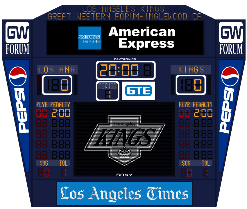
Like many of you, I’ve always had a certain fascination with scoreboards. So I was pretty jazzed when Reader Cory Gibson-Bath recent tipped me wise to a new site devoted to illustrations of NHL scoreboards, past and present. I wanted to know more, so I got in touch with the site’s creator, CanuckFanatic92 (he prefers not to give out his real name). Here’s the transcript of an email interview I conducted with him:
Uni Watch: How old are you, where do you live, and what do you do for a living?
CanuckFanatic92: I’m 21 and I live on Vancouver Island, which is in British Columbia, and I am trying to search for a job.
UW: Have you always been interested in scoreboards?
CF92: Yes, ever since I saw the old scoreboard at Pacific Coliseum during highlights of the 1994 Stanley Cup on TV many years ago. It just intrigued me how the technology has come such a long way since that time.
UW: How did you get the idea of creating a website devoted to scoreboard imagery?
CF92: A friend convinced me to create the site after I showed him some of my renderings of scoreboards. He was like, “You gotta put these on a website!” And I was like, “Yeah, you’re right, they’re no use to anybody if they rot on my hard drive.”
UW: I know you’ve contributed to the Frozen Faceoff site. Was that site an inspiration for your site?
CF92: Frozen Faceoff has inspired me to get the work out there, but I’ve been quietly making these textures since approximately 2008. I haven’t shown them publicly until last month, however.
The original plan for these was to get them “modded” into the NHL series made by EA. Unfortunately, due to the way the 3-D model files were made, one could only modify the existing shape of the model, not add onto it.
UW: Your site only shows hockey scoreboards. Do you care about other sports, and do you plan to show their scoreboards on your site at some point down the road?
CF92: At some point there is going to be that person who will request scoreboards from MLB or the NBA, and I realize I’ll have to direct my attention to these scoreboards in the future. In short, I am open to the idea. Lately, I’ve also been thinking of putting up team banners, like retired numbers and championships.
UW: Do you have any specific goals for the site? Like, do you want to document every single NHL scoreboard ever, or something along those lines?
CF92: To be honest, documenting every single NHL scoreboard was one of my goals, but photographs of the old analog clocks are pretty hard to come by. So that goal has, so far, been an uphill battle.
UW: What do you base your illustrations on? Like, do you have a lot of old scoreboard photos, or what?
CF92: I base my illustrations on the best shot I can find of the target scoreboard. Usually the best angle is a head-on shot of it. My photograph cache probably has around 300 photos, and dozens of screencaps from videos.
Another factor I have to take into account is scale. I go mad if I don’t have the scale exactly right, especially with the new scoreboards, which sometimes don’t have their dimensions listed.
UW: What software do you use to create the illustrations, and how long does a typical illustration take to create?
CF92: Photoshop, obviously. Without it I’d be stuck using MS Paint. An “average” scoreboard can take up to a week. My personal best on a single illustration is two hours and 15 minutes.
Recently, for the dot-matrix display illustrations, I’ve been using Paint Shop Pro 3 (a program from 1993!) to enlarge the designs to fit onto the scoreboard texture, and it enlarges them in a way the image doesn’t lose its “blockiness.”
UW: Has this project taught you anything about scoreboards that you didn’t already know?
CF92: It’s taught me how the design of scoreboards went from supplementing the game experience to being eye candy in the blink of an eye. Scoreboards have gotten noticeably uglier as the years have gone by. They went from four-sided technological marvels to gargantuan, oversized television screens within a decade.
UW: Any other things you’re particularly interested in besides scoreboards? Any other websites besides this one?
CF92: I’m also interested in hockey uniforms, and especially the NHL ice surfaces like what Frozen Faceoff does. Also, I’m a lover of old fire trucks.
UW: Anything to add?
CF92: I know the “Clapping Hands” (like the one from Maple Leaf Gardens) will end up in my request jar at some point. I’ll get it drawn up and animated someday!
Accursed color reminder: Tomorrow is Purple Amnesty Day — the one day of the year when you can order a purple-inclusive Uni Watch membership card. The 24-hour window will run from midnight to midnight (Eastern time). I’m bracing for the onslaught. Do your worst!
Uni Watch News Ticker: Interesting article on how athletic shoes can increase the risk of injury. ”¦ There’s a debate going on, or at least a discussion, regarding whether any ’Skins player should ever wear Sean Taylor’s number (from Tommy the CPA). ”¦ Check out Lou Holtz’s hat, circa 1988. When did that lower-right serif disappear from the logo? (From Jerry Kulig.) … New kit for Norwich City (from Justin Hale). … Now that Cooperstown High School has changed the name of its teams from Redskins to Hawkeyes, the Oneida Nation has donated $10,000 to help cover the cost of new uniforms (from Stephen King). … Flag-desecration uniforms for Wichita State baseball, to support the Wounded Warrior Project (thanks, Phil). … New away kit for Stoke City (from George Chilvers). … Shame on the state legislature of South Carolina, which will now allow ads on school buses (from William Lyon). … Check this out: a model of Yankee Stadium made from 75,000 matchsticks (thanks, Brinke). … Gaelic football will soon start using electronic Hawk-Eye technology to help judge scoring plays. “Seems like this could be a perfect fit for MLB and the NFL as well,” says Micahel Clary. … “I was in the Toledo Mud Hens Swamp Shop the other day and they had these nifty uniform guides on the wall,” says Jacob Kubuske. “For some reason there wasn’t one for the road unis.” Too bad about the pants. ”¦ The Chiefs’ practice jerseys have an ad patch for the University of Kansas Hospital, and Ryan Stone isn’t happy about it: “The Chiefs are a Missouri team playing in a stadium funded in part by Missouri taxes. There is a deep rivalry between Missouri and the leech state to our west. Why would this franchise choose to polarize a majority of its fan base with these ridiculous patches?”
Battle of the Uniforms: Voting for Round Three will remain open until 9am Eastern today. The fourth round — essentially the two league championship series — will be up and running by noon-ish.
The Lou Holtz picture is probably from 1988. In 78 he was the Arkansas coach.
The date is probably around ’88 as you said but the serif is there? Am I missing something? The top left serif and bottom right serif on the “N” come off the diagonal.
link
I think he’s talking about the bottom right serif which is currently not on their ND mark. The logo here is just an older logo.
The ‘missing’ serif has bugged me, but I think the ‘N’ with the serif is the exception. Here’s the only Knute pic (link)I found with an ‘ND’.
Simple answer for Ryan Stone, $
Mr.Stone is an example of why people living in Kansas (like myself) don’t like people from Missouri. They whine a lot.
I should expand that as well…I’m a native Minnesotan and feel the same way about the cheeseheads. :)
There’s a kind of hush
All over the world
Tonight…
I think that Lou Holtz photo is from 1987, not 1978. In ’78, he was coaching Arkansas.
Looks like Jim beat me to it.
Typo on my part. Now fixed.
Just don’t make a similar mistake when you post this week’s PowerBall numbers!
As a Mizzou student from Kansas City, I have to agree with Ryan. I know KC has always been more of a kU town just because it’s closer, but why should Missouri taxpayers be represented by such an unfortunate state? Much like the kU license plates that were shot down in Missouri, these patches have no place east of the border.
Granted, I’m a little biased and just hate kansas…but I know money runs the world
“… … The Chiefs’ practice jerseys have an ad patch for the University of Kansas Hospital, and Ryan Stone isn’t happy about it: “The Chiefs are a Missouri team playing in a stadium funded in part by Missouri taxes. There is a deep rivalry between Missouri and the leech state to our west. Why would this franchise choose to polarize a majority of its fan base with these ridiculous patches?”…”
I do love this stuff. Is there anything better than state vs state rivalries? Wisconsin -Minnesota is also very good. I don’t just mean Ole Miss vs Crimson Tide school-based rivalries, I mean the whole phenom of a person in State X loathing everything about contiguous State Y. It’s great, and we could use some more of it here in rootless DC. Although an immigrant here, I’m quick to trash Virginia and its glorification of the great Confederates. Easy state to hate.
Back to KS/MO. Well, there is the interesting fact that the UK Med Ctr is in Kansas City KS and that from the KU parking lot you can throw a rock into Missouri. But OK. There’s also the fact that when Mr Hunt brought the Texans from Dallas, he was big on establishing a regional identity for the team. See old Chiefs logo in which they feature an Indian warrior chief superimposed on map of many nearby states.
But really, the essential point to keep in mind is that Kansas is much better than Mizzou. Well, it used to be. C’mon: first US territory to prohibit slavery by democratic ballot; Lawrence was founded by, and informed by, self-righteous New England abolitionists who did a lot of reading; William Allen White was America’s greatest editor and journalist who didn’t live in a big city; Dwight Eisenhower was a superb general and an underestimated President; and there’s a great statue of the “Madonna of the Plains” in Council Bluffs. Missourians are Quantrill’s Raiders and Jesse James. Now you have to like Harry Truman and Mark Twain and the KC jazz scene of the 1920s and 1930s. And you have to admit that Kansas these days has taken a sad turn toward Creationism, nativism and cultural defensiveness. But I still go there a lot. The hell with Missouri.
Also, culturally, rural Missouri isn’t too unlike Kansas (or, Kansas is basically Missouri without the cities). That Thomas Frank book could easily be retitled “What’s the Matter with Kansas *and* parts of Missouri?” if it wasn’t so clunky.
“…and there’s a great statue of the “Madonna of the Plains” in Council Bluffs.”
Dang! You have me convinced! Kansas > Missouri. But I’m pretty sure the “Madonna of the Plains” is in Council Grove. Council Bluffs, Iowa, does have the Ruth Anne Dodge Memorial (aka link), though, which is link and visually pretty cool in its own right.
Yes, I can attest that you can throw a rock from KUMC to Missouri, the hospital is quite literally connected to Missouri by State Line Rd.
As for the sponsorship, I don’t get the consternation. KC is a big metro area, anyone from that area remember seeing oneKC billboards? I certainly never saw the Chiefs as the Missouri team, they are the metro area’s team.
Anyway, KUMC is (currently) the premier hospital in the region (yes, I think they’ve surpassed St. Luke’s in recent years) so it makes sense for them to be well connected to the sports teams.
It’s Council Grove (not Council Bluffs). I was just through there last Saturday and saw it with my own eyes!
Connie,
Great, stay the hell out of Missouri. Leaves more room for those of us living in 2013.
Are you seriously suggesting that a sports team shouldn’t be sponsored by a local business?
Who cares if it’s “local” or not, why is it even appropriate for a freakin HOSPITAL to sponsor a multi-million dollar sports franchise? Shouldn’t that maybe be the other way around?
Because hospitals are businesses that need to promote themselves?
What’s so wrong with a hospital getting its name out there? Medical equipment and healthcare are not cheap by anyones standards and sponsoring a part of a major sports team helps bring in people. Also The Chiefs are the midwest’s team Mr. Stone, not Missouri’s, and Kansas is the leech state? Have you looked at your state lately?
Their name is all over everything because they’re the hospital for the Chiefs. Our medical staff is filled by them. It’s not just a sponsor, it’s a partnership. This Mizzura rage to a hospital is just kind of sad. As an Iowan I have enjoyed this Mizzura-Kansas state rivalry, but being mad because the state on the right side of the Civil War, and on the conference alignment shake-ups, happens to have a quality hospital partnered with the Chiefs over whatever Mizzou could offer up is just grasping at straws to be upset about something.
It’s a university hospital. I know a lot of healthcare providers are big business but it seems a heck of lot more civic orientated than a hedge fund or a fast food chain.
It’s also just 7 miles away from Arrowhead which is closer than the distance between Wrigley Field and Comiskey Park. If a patch on practice jersey sponsored by a local hospital which services local residents polarizes the majority of the fan base I think its time to rethink your priorities.
“Leech state”? “Unfortunate state to the west”? Odd, I’ve never witnessed KU Med turn away any patients wearing black and gold.
And trust me, not all KU fans/alumni like being associated with the Chiefs either.
Rock Chalk.
Good to see the ESPN uni voting is so skewed. Virginia somehow has 9,000+ votes in for the O’s/Tigers matchup and less than 1,500 for the any of the other matchups, while the state of Michigan is right around 2,000 for each matchup. Kinda getting ridiculous.
Yeah, I noticed that when the O’s killed the Astros in the opening round.
I am a big Redskins fan. But living in FL we don’t/didn’t get a lot of ‘Skins news. Not being a big college football guy I had no idea that Sean Taylor was such a good player. I had heard of his arrests and such in the past. When he was shot, I chalked it up to another “athlete with bad acquaintances” scenario. I guess the guy had turned his life around and was doing good (and well).
I had no idea he was so beloved in DC. So much so that they are thinking of “retiring” his number (officially or unofficially).
Only Baugh’s 33 is officially retired.
In my experience in DC, Taylor was eagerly liked as a player. He became beloved when he was murdered. You didn’t see Taylor- or 21-themed Redskins license plates before the crime; afterwards, in Virginia anyway, it seemed like half the cars with Redskins plates suddenly had variations on RIP 21.
At least one car in my neighborhood has lately switched from Taylor-themed Skins plates to RG3-themed plates.
Taylor was really beginning to come into his own as a player at the time of his murder. Unfortunately he was one of those players that had such possibilities of becoming great but his life was taken beforehand. I do remember him originally wearing 36. It was nice though to see someone else wear 21 over Deion Sanders since before him it belonged to a fan favorite Terry Allen.
Truthfully I don’t think it should be officially retired although I don’t mind the team just not circulating it.
If Washington ever brings in a player that wants to wear it, maybe he can make a donation to whichever charity the Taylor family has set up, similar to the gestures we see nowadays where if a player on an existing team has a number a new player wants.
I lived in the DC area for most of my life and have always been a Redskins fan, but have been living in LA for quite a while and missed Taylor’s entire career. I honestly never thought that much of him because he played during some of the team’s worst years. I guess he was a lot better than I give him credit for.
That said, there’s no way that his number should be honored in a way that the numbers of Sonny Jurgensen, Art Monk, Darrell Green, Chris Hanburger, John Riggins, etc have not. I can see the team unofficially retiring # 21, but I wouldn’t have a problem with another player eventually wearing the number.
Although it looks like their run is about to end, I’m glad to see the Buccos among the Elite 8 in the Battle of the Uniforms. Deservedly so, in my completely biased opinion.
Can’t wait to submit my purple Northwestern Wildcats membership card order tomorrow…
Great job, CanuckFanatic92! Always room for another in the Hockey Wing here at Uni Watch! :o)
Seconded. The website is excellent.
Now if only he wasn’t a Canucks fan.. ;)
Hey Paul,
It looks like (at least on my screen) the entry today starts in the middle of a sentence. Below the scoreboard picture, the wording starts “a certian fascination with scoreboards”.
Nice job with the Uni-Bracket! As I biased Tigers fan, I was always a little put off when everyone always mentioned the Yankees as the penultimate “Classic” look. The Tigers are just as classic, even more so. I know Jim C. did the American Leauge seedings, but your NL seedings were spot on in my opinion.
Weird. Start of the entry looks fine to me.
Entry looks fine for me too
Penultimate?
Paul – Do you know if Boston’s “Hanging Sox” hat is still listed as officially part of their uniform in the MLB Style Guide?
Does anyone know if they have worn the hats since the first season they were introduced (2009 I believe)?
Thanks
Yes, it is still shown in the Style Guide.
I think they were worn for a few games in 2010, but not since.
I’m pretty sure they lost almost every single game they played in those ugly-ass things, anyway.
When did that lower-right serif disappear from the logo?
I’m not sure I’d put it that way. Notre Dame didn’t quite have a unified style guide as to the ND Monogram looked back then — caps looked different from polo shirts, which looked different from jackets, which looked different from print media. The logo might even differ between cap manufacturers.
When did tenths of a second start appearing on hockey and basketball scoreboards? I haven’t seen any from before the ’88 Olympics (disclaimer: before my time), but today’s featured site has them on the Met Center scoreboard last used in ’84.
Were there really 10ths-of-a-second displays in the early to mid-’80s?
link
Here’s a shot of the Met Center board circa 1974. They appear to be in place here.
No, I don’t think they were there in 1974. Why would they be? There was no need for them until…the early 90s? I think that’s when tenths of a second were added to hockey, but I’m not certain.
link
I’m not saying they are DEFINITIVELY but it appears they’re viable here
My guess would be that the tenths place on the clock was used for other sports/events at the Met Center but probably not for hockey.
Indoor track meets?
For what it’s worth, later in the video Cory posted, the clock ticks inside of a minute:
link
That Yankee Stadium matchstick model: Greater than Higgins’ matchstick Bridge on the River Kwai model?
link
Discuss.
This takes the sports/matchstick thing the opposite direction.
link
The “Dominion” scoreboard used at Maple Leaf Gardens from 1968-82 was hand-built on-site by legendary MLG public address announcer Paul Morris and Paul Wood. Morris was the PA announcer at the Gardens from 1961-99. He is the gold standard for announcers. He was the only announcer that I have ever heard that did not sound like a carnival barker on steroids. His clear, crisp voice with its perfect enunciation and calm demeanor is unmatched by anyone out there today. And he wasn’t a professional “voice talent” from radio or TV. Amazin’!
Paul Morris literally grew up at Maple Leaf Gardens. His Dad Doug was the building’s superintendent from the day it opened in 1931. Paul began working there as a gofer in his teens and rose to the position of head electrician and sound man. He and his Dad installed the Mighty Wurlitzer organ in the Gardens when it was purchased from the demolished Odeon Theater in TO.
Think of it. A DIY scoreboard for a major arena. Unheard of today. Go Leafs Go!
Great story, Terry — thanks, as always, for sharing your knowledge with us!
“He was the only announcer that I have ever heard that did not sound like a carnival barker on steroids.”
Really? The only one? Ever?
Harvey Wittenberg, Bob Sheppard, Jim Riebandt, et cetera, et cetera all sounded like carnival barkers on steroids to you?
Indeed.
Not quite of this style, but Claude Mouton at the old Forum was another great one. I can still recall him booming out Mario Lemieux’s name on that final goal of the third 6-5 game of the Canada Cup.
Plus…wringing out every syllable at Parc Jarry of… John BOCC-A-BELL-A
Mia culpa. But I’m not a Yankee fan. LOL. Who couldn’t respect Bob Sheppard?
I don’t parlez vou Francais. LOL
Terry’s stories are great. If you grew up in Western New York, they’re invaluable.
My grandfather worked in the Wurlitzer plant, which was in North Tonawanda. I grew up watching Dick Irvin, Jr. and Howie Meeker announce Hockey Night in Canada, which seemed to always be live from the historic Forum in Montreal or Toronto’s Maple Leaf Gardens.
Lots of memories…
I’ve been a Leaf fan since 1958 when they along with the Habs were the parent teams of the Rochester Americans. CBS used to have an NHL game from Madison Square Garden on Saturday afternoons. Neither Toronto or Montreal ever played in those contests.
But I would take my Zenith transistor radio to the bathroom where I took my Saturday night bath for church on Sunday and listen to the Leafs on CKFH 1430, Foster Hewitt’s station in Toronto as he described the action for Imperial Oil. To an 11-year-old kid MLG seemed like a palace. When I first visited there in the early 1970s Foster’s classic broadcast gondola had been literally wrecked for scrap by that GD Harold Ballard the old SOB.
“Last minute of play in this period.”
Re: the Lou Holtz ND serif…it is immortalized forever on his statue:
link
…and the cover of his book:
link
looks like it was just an embroidery oddity from the company that made his coaching apparel
here it is on his hat and jacket:
link
here are 2 shots of it along with a non-serif logo on a player’s jersey sleeve : link
link
Check the first players shot: Holtz in a Reebok polo, with the player in a Champion jersey. Adidas would never, ever, EVER let that happen in 2013 at a blue blood program like ND.
What did he mean by “clapping hands”?
The 1982-1999 scoreboard at Maple Leaf Gardens was the first one at the Gardens with a video board, which was a super low-res colour board. Not good enough for real video, plus whenever there was a penalty they had to use it to display the penalties.
One of the most common videos they put up was of two hands that looked like Mickey Mouse hands (with the gloves) clapping. It was usually synched to the organ playing the three bars to the “charge” song.
This is what the scoreboard actually looked like.
link
Sounds similar to some of the simple animation they used to have on the link
I love the scoreboard site. Thanks for the interview, and kudos to CanuckFanatic92.
Looks my beloved university is trying to create a unique brand with their new football uniforms next season, and man did they eff it up. If you are trying to be unique, why copy the Bengals. Rumor has it the helmets will have tiger stripes as well. link
The Option 1 blue jersey, I don’t hate. It would have to be paired with the white or gray pants, but it’s not awful. Everything else… kill it with fire. I really like Memphis’s color scheme, but it ain’t working on most of those (especially the black jerseys/pants, yuck).
The monochrome black aside, I don’t think those are too bad at all. The absence of a color-contrast side panel is a HUGE victory, and makes these vastly superior to the Bungles. Tiger stripes are cool, there’s no reason not to utilize them as a design element.
Full disclosure: I’m a guy who likes the Bungles’ helmets.
What are the helmets like?
I don’t dig either choice, but Option A isn’t terrible. If you’re going to go black, I say you should go all-black, but the blue/blue combo looks way too much like pajamas.
Blue/gray is classy, though, and I don’t mind the tiger stripes – it’s a not a bad way of incorporating the mascot into the unis.
The Tigers have been taking giant leaps backward in both football and basketball for a while now.
I still love these, even though they look just like the Lions/Cowboys – such a solid look…
link
Don’t forget the OTHER importance of May 17. It’s Carlos May Day.
Does anyone have a link to a good picture of Carlos May wearing his “MAY 17” jersey?
looks like baseball got around to fixing the league logos
link
Didn’t even know they had “simplified” logos for the leagues.
I don’t know if this has been covered in the tickets, but holy crap, Arsenal signed a $230 million deal with Puma:
link
It’s going to be weird seeing Arsenal shirts without the swoosh.
I’m a little worried about this. At least there was only one swoosh on the shirt. When Spurs had Puma, the mark showed up 3 times on the shirt! Add that to their logo on the shirt, plus shorts and socks and they had 8 animals plastered all over the kit.
…and speaking of England; love that Norwich kit. Stoke, not so much.
I thought at one time I ran across a site that had pictures of the old analog hockey scoreboards/clocks. A quick google search finds nothing. Anyone know of a site like that?
As an Active Duty Sailor, I enjoy most of the camo and flag uniforms. But I understand your feelings towards most of them. The fact that Wichita State is doing this to raise money for The Wounded Warrior Project should keep them off of your “Flag-desecration” lists. If it is a team just doing it to make more money for their school or themselves, then I don’t like it. But if they are putting money towards the USO, MWR, Wounded Warrior Project or anything of that nature, then they deserve some props. Plus these aren’t way over the top and actually look good, unlike a lot of the other teams that do this.
doing it for a charitable cause is all well and good, but why should they violate the flag code in the process?
Why can’t they wear link?
Crap. Bad link.
… link …
What was this from? It looks like those guys in uniform were actually Active Duty. I know the Padres do stuff like that all the time. Every Sunday they have a group of Marine Recruits at the game and honor them. But the Padres having been doing the camo thing for many years. And no, I’m not a Padres fan, just been stationed in San Diego for a long time.
I’m not entirely sure when that photo was taken, but it’s a shot of the Great Lakes Naval Station’s baseball team.
Paul’s written about this in the past. Instead of honoring the military by slapping together some generic camo or “flag desecration” designs, why not wear uniforms based on those actually worn by military personnel in the past?
I think I remember Paul’s blog on that. That would be cool to do as well. The camo thing has been overdone and most of it done poorly. I just don’t understand why he hates it so much if it’s going to a good cause. I know it’s all become a business but some teams still do it right. I like that the Padres use the actual pattern that the Marines use for theirs but seeing that San Diego is much more of a Navy town (over twice as many Sailors stationed here than Marines), I’d like to see the Navy pattern used.
I just don’t understand why he hates it so much if it’s going to a good cause.
I never said I hated it. I just called it a flag-desecration jersey, which is what it is — it’s desecrating the flag, violating the Flag Code, etc.
I’m always in favor of good causes. But it would be nice if they could be paired up with good execution instead of lazy pandering.
I hate them (camo, flag desecration, etc.) because they’re ugly.
link. Somebody somewhere please wear something like that in conjunction with a Wounded Warrior Project, USO, et al. fundraiser.
Craig, first off, thank you for your service. I think a lot of Americans have no idea how central the Navy and naval personnel have become to the conduct of our military operations overseas. Your whole service is a bit unfairly underappreciated at the moment. I’ve a friend who’s a sailor who’s spent much of the last six years on provincial reconstruction teams in Afghanistan – a landlocked country! So wherever you are in the world, thank you to you and your US Navy colleagues.
In Paul’s defense, it doesn’t matter how much money anyone is raising for the Wounded Warrior Project. Putting a flag on an athletic uniform is flag desecration. That’s been a part of American flag etiquette since the 1800s. Their heart is in the right place, but they’re still basically burning Old Glory to show their patriotism. Just leave the flag itself off the uniform, adopt whatever non-flag-shaped patch they want, and they’d be golden.
Or put it another way: Remember all the times you went to a ballgame and the color guard took the flag down off the pole, wrapped it around themselves, and then slide across home plate or the goal line until it was filthy and torn while you sang “The Star Spangled Banner”? Yeah, me neither, because that’s not how we show our respect for the flag. It wouldn’t be cool if the honor guard did it, and it’s not cool if an athlete does it.
The next “Battle of the Uniforms” round is up:
link
I also wrote a sidebar piece:
link
And there’s video:
link
So… the Orioles fans are cheating, and the rest of the people that read your column are those who like traditional uniforms.
As for your rules on colored baseball jerseys, I’m ok with number 1.
Option 1 is definitely the lesser evil of the 2. I think my issue is that we are trying to create a unique and new brand for our school and all we did was add our colors to the Bengals template.
I love our school colors of blue/gray. Outside of a few blue monochrome games over the years, we have had a long tradition of blue tops and gray pants at home.
I haven’t seen a photo of the helmets, but have heard they are similar to the Bengals.
Pflava, I would love to see at least a throwback game with those jerseys if they can’t be our regulars.
Finding out the players really like the new uni’s, which seems like where we are headed with all this.
I recognized that Great Western Forum scoreboard right off the bat, I attended many Laker games in that building.
So I’ve been working on a mock history of baseball, based on a string in yesterday’s comments.
There were two leagues that had been granted “open” classification, the PCL and the Mexican League. Westward expansion ruined any plans they had to become coequal with the AL & NL. Imagine that Stan Musial had accepted a $100,000 a year offer from the Mexico City Diablo Rojos, and gone south. Dozens of other stars, lured by big bucks follow. The PCL, seeing an opportunity, merges with the top 2 or 3 Mexican teams, to create a 10 team major league. Chaos ensues.
For example:
In 1969, desperate to break into the burgeoning California market, the American League grants an expansion franchise to the Disney Corporation, set in Anaheim. Disney names the team The Love Bugs, to tie in with their Herbie movie series. Eventually the name is shortened to Bugs, then, in 1990, a group led by Billy Crystal (fresh off his success in those dude ranch movies) buys out Disney, and rebrands the team the Orange County Cowboys. In 2002, the team is sold again, this time to a Latino media mogul, who rechristens the club Los Vaqueros de Los Angeles.
Hey, it could have happened…
Paul, if I’m mot mistaken, not only does Jamaal’s practice jersey have an Ad endorsement on it, but it doesn’t appear to be branded–at all. Note the missing jock tag, NFL Equipment shield, and what appears to be missing Swoosh.
I know u hate purple and injun names. Since u hate camo unis too, why even post pics of those monstrosities? I don’t click on them since they are so trashy.
I use to work for the top provider of scoreboards in the country, great job by the way, got to travel to stadiums and arenas across the country and went to a lot of events. Really enjoyed the scoreboard write up and site.
Well, I did my worst… :)
link
We’re a group of volunteers and opening a brand new scheme in our community. Your web site provided us with valuable information to paintings on. You have performed an impressive activity and our whole community will probably be grateful to you.