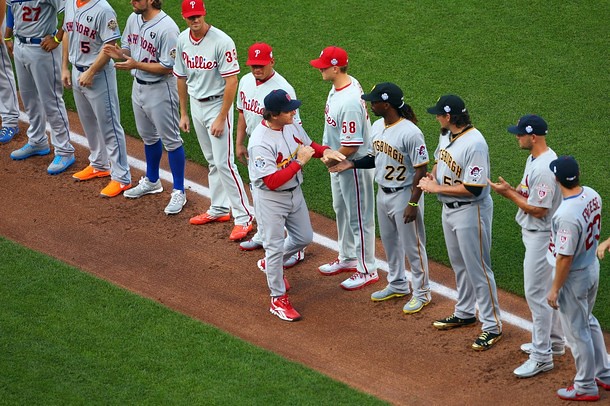
Not the most uni-notable All-Star Game last night. No helmet mix-ups, no major snafus, just a parade of specialized footwear. I missed the first half of the game, so I make no claims as to the following lists being complete or perfect, but here’s some of what was going on:
• The stars on the back of the jerseys and caps — which had been worn during the week leading up to the ASG last season, but not this season — reappeared last night.
• Because of the All-Star Game patch on the right sleeve, the Mets’ representatives moved their Gary Carter memorial patches to the upper left chest. This marks the third different placement of that patch this season: right sleeve, upper left chest, and upper right chest (back on June 3). What a mess. They’ll have a chance to put it in yet another spot if they make it to the World Series (unlikely but not impossible), since the WS patch will present the same problem. It’s enough to make me hope they don’t make it.
• As expected, several players wore white shoes, including Robinson Cano, Josh Hamilton, Joe Nathan, Felix Hernandez, Mike Napoli, Curtis Granderson, and Adam Jones.
• Lots of National Leaguers wore gray shoes, including Rafael Furcal, Ryan Braun, Dan Uggla, Matt Holliday, Craig Kimbrel, Michael Bourn, Joey Votto, R.A. Dickey, Stephen Strasburg, Jose Altuve, Andrew McCutchen, and Carlos Ruiz.
• Other shoe colors included blue for Jose Bautista, red for Wade Miley, orange for Pablo Sandoval (here’s a closer look), orange for Melky Cabrera, orange for David Wright, gold for Bryce Harper, red for Mike Trout, red for Aroldis Chapman, light blue for Starlin Castro, orange for Matt Wieters, lots of gold trim for Joel Hanrahan, red for Yu Darvish, and let’s not forget red for Tony LaRussa.
• Fernando Rodney had an odd NOB on his BP jersey. Turns out that’s the first name of his father, who died back in 2002. (And as you can also see, Rodney had gold shoes and was using a comically oversized glove to shag flies.)
• Another point regarding Rodney: Reader Caldwell Bailey notes that Rodney had only one star on the back of his cap.
• George Brett threw out the first pitch and wasn’t wearing socks with his loafers.
• Finally, from the department of You’ve Got to Be Fucking Kidding Me, there’s this.
I’m sure there’s tons of stuff I missed, so feel free to post additional observations in the comments.
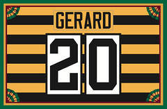
Membership update: A new batch of membership cards designs has been added to our card gallery (including Joseph C. Gerard’s Steelers throwback treatment, shown at right). The printed/laminated versions of this latest batch should mail out by the end of this week.
As always, you can sign up to get your own custom-designed card — and can also order stickers based on your card design — here.
Uni Wach News Ticker: When Prince Fielder won the Home Run Derby on Monday night, someone on the TV crew forgot that he’s no longer on the Brewers (from John Okray). … When the Wild recently introduced free agent signees Zach Parise and Ryan Suter, they both wore the team’s alternate jersey. “I’m not sure if this represents a shift from the green being the alternate to primary jersey, or if it’s just an attempt to try to sell more jerseys,” says Joe Exner. … Interesting article about using Kevlar to protect athletes (from Jim Atherton). … Matt Blinco was listening to a radio interview with Blue Jays slugger Jose Bautista. “He mentioned he would be in some type of competition with David Ortiz to benefit some youth groups, and the loser’s punishment would be to quote ‘wear pants up for a few days,'” says Matt. … Here’s what the American Olympians will be wearing for the opening and closing ceremonies (thanks, Brinke). … Kayce Harris reports that his high school alma mater — Arapahoe High in Metro Denver — has a special with the Arapaho tribe in Wyoming: “A man from the tribe redesigned the school’s Warrior mascot, the tribe dedicated the gymnasium and named it after Chief Anthony Sitting Eagle, and they frequently visit the campus in addition to being present at all graduation ceremonies. Further details and a picture of the logo can be found here. Even as a teenager I was impressed by how special this relationship was.” … The Islanders will be playing a preseason game here in Brooklyn, an event so momentous that it has its own logo (from John Muir). … In a related item, Brooklyn’s arena sponsor continues to be shining beacon of pride. ”¦ New uniforms for the University of Arkansas-Monticello (from Justin Bates). … Latest reason to love Hamilton Nolan. … Here are the Canadian Olympic track and field uniforms (from Walter Ford). ”¦ Here’s a closer look at Southern Miss’s throwback helmet (from Lucas Ehrbar). ”¦ Excellent article about how Michael Jordan teamed up with Nike. Spoiler alert: Nike was not his first choice (from Tim E. O’Brien). ”¦ A diner in Philadelphia called Olympic Gyros — a name that the diner has had since 1984 — has received a cease-and-desist letter from the USOC. Key quote: “[T]he organization emphasized the need to ‘protect the rights of companies who financially support the U.S. Olympic Team,’ such as McDonald’s and Coca-Cola.” Total fucking douchebags (from Bernie Langer). ”¦ Ever wonder what’d happen if a baseball could be thrown at the speed of light? Okay, so you probably didn’t wonder, but here’s the rather entertaining answer anyway.
The O’s brought their road helmets for the game…strange
Images in this slideshow – link
That’s one of the first things I noticed too. They wore the home caps, though.
The catcher wore the road helmet too, which is weird because he usually wears the home helmet on the road.
He did have the “home” helmet on behind the plate, which is a bit misleading itself. If you look closely you will see that the bird logo on the helmet is actually the recreated 60’s version of the bird and not the 2012 version…he’s re-using the same helmet from 2011.
link
Oh, my bad. I never got a close look at it but thought it was the roadie.
At least the O’s, and all the teams, wore either white or grey. I prefer a splash of color, but with all the teams having color jerseys nowadays, the All-Star Game has to put some limits on uniforms, I guess.
link
Thankfully, NOT all teams have softball, er, color jerseys. The Tigers, Yankees, Dodgers, Phillies and Cardinals still have the decency to wear white at home and gray on the road.
Great uniforms all. But I still love the Orioles’ orange, the A’s green and gold, the Mets’ royal blue, and a few others.
It would had been nice to see MLB use the ASG to further showcase how teams are supposed to look on top of the white & grays with proper hosiery instead of even more lax rules with ugly shoes, stars & cap patches. Make them look top notch for one game at least.
link should be next year’s “baseball season COTD” image.
+1
Not an ASG observation, but a question: Does anyone know what Josh Hamilton had written on his eye black??
It looked like a Bible verse. Not sure which one.
The O’s players wore home hats, but road helmets:
link
link
It’s Andrew McCutchen, by the way. I’m amazed at how many people *still* spell his name wrong.
Thanks. Now fixed.
it is strange that “Aroldis” can be spelled correctly but not “McCutchen”. Paul has been reading SI too much, which has made that mistake more than once. Oh, and the truly correct spelling is “MVP Andrew McCutchen”.:)
Well said, sir. You get a Zoltan salute for that.
link
Good to see a multi-Pirate all star game; havent seen one since the early 1990s.
Paul Konerko wore black shoes with gold cleats. Think they were Nike but I couldn’t tell for sure.
2nd…why was LaRussa the NL manager? Has a retired manager ever managed an all star game before? Has a retired player ever played in the game?
To my knowledge no manager has ever played in an All Star Game
Washington Senators shortstop and manager Joe Cronin was the starting SS in the first ASG (1933) – and managed the Senators to their last AL pennant in the same year.
i see what you did there.I
John McGraw had done it at the 1st all star game…
Four managers counting LaRussa managed in the ASG after they quit managing.
John McGraw (retired), Tony LaRussa (retired), Danny Murtagh (resigned), and Bob Lemon (fired).
And Dick Williams and Dusty Baker both managed All-Star Games after leaving their pennant-winning teams from the previous year.
LaRussa was manager since he was in the World Series last year. I think they asked him to come out of “retirement” to manage again. Besides, who would they have chosen otherwise? Would’ve been a giant CF. Do you choose Francona, who replaced LaRussa, or Roenicke, who managed the Brewers who lost in the NLCS to the Cards?
Francona? Mike Matheny is the Cardinals current manager. Francona is on ESPN.
I think it was a total class move to not only have tlr manage, but to have Dave Duncan as pitching coach.
Re: Barclays Center will there be a “I’m calling it O’Malley’s Pleasure Dome” t-shirt for it?
Two Olympics related comments… First, why in God’s name do those in charge of designing America’s Opening Ceremonies uniform INSIST on wearing those stupid hats? Are berets supposed to be American? Because I have lived in the USA and NEVER once seen an American wearing a beret… they should be the ones receiving a cease and disist from the USOC, who’s with me? Second, in regards to the Olympic Gyro, what an awful story, however since they have been using the word Olympic (and I do not believe the USOC owns the word Olympic, espiecially since it can be considered a proper noun descrbing something of Mt. Olympus) for so long, I hope they fight the good fight and continue to use that name! Total overreach on the part of corporate sposorship.
From June 2001 through June 2011, a black beret was standard headwear in the US Army. The Green Berets, of course, continue to wear berets.
Not saying that I like the Olympic unis, but let’s be accurate.
The beret used to be distinctive and a source of unit pride in those units that tradsitionally wore them. But it lost its’ distinctiveness when they were issued to everybody.
When I think of American civilians in berets, these 2 come to mind:
link
link
Exhibit A: link
Exhibit B: link
I agree with ya tho… berets look goofy as hell unless you’ve earned one (e.g.: Green Berets or Army Rangers) and in that case, it’s the most badass hat on the planet. But they don’t belong on athletes. For God’s sake, they look like they’re on their way to Prep School.
Thanks to both of you for clarifying my mistake in excluding military berets, but you are correct in that those are and should be earned. My point is more that the uniforms of the ceremonise should reflect current or traditional culture in the represented country and that berets do not exactly personify American pop culture. I guess the big question is, is their a headgear requirement at all? It will be interesting to see if any of the athletes choose to remove the berets during the ceremonies.
The athletes sign a code of conduct which includes provisions to wear the full uniform, with sponsor logos unobscured, during the opening/closing ceremonies, and if they win a medal (they don’t want a repeat of 1992, when members of the Dream Team who were contracted to Nike or Converse cleverly hid the Reebok logos on their suits with American flags).
BTW, what was unveiled yesterday is not the Closing Ceremony uniforms. Those will be all white, and feature “newsboy” hats:
link
Agree with everybody so far who hates those berets. May I add, though, that the oversized Polo logo is downright shameful. Take away the beret and the polo-player-with-pony and it’s an OK design.
“… Because I have lived in the USA and NEVER once seen an American wearing a beret…” Hey, Joe, other than the military berets you haven’t noticed in airports and bus stations, the civvies models are daily viewing (but not in summer) in New York, Boston, SF, and maybe even LA and Chicago. Wearers include old lefties, Europhiles, ripped African-American men in T-shirts, and most of the Catholic high school bands that march in St Patrick’s Day parades. Even me sometimes.
Thanks for clarification, DJ, regarding newsboy caps for the closing ceremonies. I actually like ’em. But the Lauren logo, oy gevalt.
“… Because I have lived in the USA and NEVER once seen an American wearing a beret…” Hey, Joe, other than the military berets you haven’t noticed in airports and bus stations, the civvies models are daily viewing (but not in summer) in New York
Was it only yesterday that we were talking about Brooklyn, hipsters and goatees-that-are-really-VanDykes?
One hundred men
We’ll test today
But only three
Win the raspberry beret
There ya go.
Let’s call it the “Razzberet”.
I’m going to assume that your raspberry comment is not intended to insult paratroopers, who earn the maroon beret.
The Army has three earned berets: green for SF, tan (formerly black) for Rangers, and maroon for the Airborne.
Legs have been issued black berets since 2001, when General Shinseki watched a change of command ceremony at Ft Bragg and was impressed with how squared-away the troops looked.
Unfortunately, Legs don’t look squared-away in berets. They just look rumpled.
Can’t insult something one has never heard of.
It was merely an attempt to combine The Ballad of the Green Berets with a crappy Prince song.
Consider it free association.
Will we see “I’m Calling It Olympic Gyros” t-shirts at the Reading Terminal?
Some of the later articles said the uniforms were “inspired” by what the US team wore at the 1948 London Olympics. If so, that’s a nice idea. But I rather doubt they wore berets back then.
But recall the 2002 and 2006 Salt Lake and Torino teams, who were outfitted by Roots, and who wore berets. They flew off the shelves — everyone liked them, everyone wanted them. Ralph Lauren is probably hoping for the same reaction.
Had J. Peterman outfitted the US Olympians in ’96, these would have been a hit:
link
Those Roots berets, at least the 2002 Salt Lake ones, were actually good looking. They sat high and kind of popped up, almost like a toque. The 2012 Polo berets sit low and flop over more like a French or military beret. And they’re decorated to resemble a military beret, whereas the 2002 version was much more whimsical and looked like something you’d wear on the ski slopes, not something you’d wear to boot camp.
It would seem the USA Olympic outfit for the 1948 London games did not involve berets – although the rest of the outfit for 2012 invokes 1948 to some degree,
link
The copyright bullshit the IOC is pulling is really making me want to hate the Olympics.
/Olympic Gyros won’t fucking hurt McDonald’s and Coca-Cola’s sales, you fucking douchebags
No it won’t. Do the smart thing — take necessary action to protect your trademark, then sign a licensing agreement with the restaurant for, say, a dollar a year. Then to celebrate, go to the restaurant and spend that dollar, and a few more, on a nice Greek lunch or dinner. You get your trademark protection and plenty of goodwill.
I won’t hold my breath waiting for that story to run on the ticker. Too many trademark/copyright lawyers are idiots who are too narrowly-focused on the technicalities of intellectual property law to notice when they’re stepping into a P.R. nightmare (and I saw that as a lawyer myself).
I’m a lawyer, too. And it might not be the USOC’s complete call as to how zealously to enforce the trademarks.
I may be the only one, but I really liked the gray shoes, especially when worn with the high cuffs like Dickey and Strasburg. I’d much rather see spikes match a team color (or pants color in this case), instead of seeing so many navy-based teams wearing black cleats.
I feel the same way about gloves now- give me Bautista’s blue glove, or even the catchers’ mitts from the Derby over the traditional brown or black.
I like the grey shoes. If I had my druthers, I’d say black shoes across the board, but what’re ya gonna do? The kids these days like the colorful kicks. Not saying colored shoes are bad… I like red on the Cards, for example, but for some reason I really hate blue shoes and gloves.
Never been a fan of the colorful glove. Brown or black. But that’s just me.
“Never been a fan of the colorful glove. Brown or black.”
Whoops… wrote that poorly. Meant to say I’m only down with brown or black gloves. No colors. Please.
Matt Wieters and Adam Jones wore the road batting helmet during his at-bats despite being on the home team.
link
Nevermind, looks like somebody already got to it.
Two things…
George Brett probably crapped his pants again and didn’t have back-up socks.
Now, I don’t know a lot about the stars on the back of the jersey thing, so cut me some slack on this one. Would it be cool if the players wore on their jersey as many stars as they’ve had ASG appearances? Or would the jerseys take on the look of a football helmet with merit stickers? For more than two, they could be arranged in a link rather than have them running down one arm or something stupid like that.
I don’t think 14 gold stars on Derek Jeter’s uniform next year will look good. Plus, where would you put them?
Epaulettes? I dunno… maybe it could be a cluster with a number in the center to represent x2 once you get past 5? You get into crazy territory when you get to 11, so who knows. Or just have one star with a number in the center. Just puttin’ it out there.
Easy – in a row, 2 stars high & 7 stars wide, where a NOB would go.
And with the Yanks, they don’t do NOB so that would be even wilder!
Around the hem of the sleeve, between any sleeve-edge piping and whatever patch the team wears. Plenty of horizontal room to go well into the double-digits. Bonus for Jeter, who has neither
piping nor patch, so the stars would fit nicely, and could even stack in two rows.
Oh for fuck’s sake, how about this: The players wear their regular uniforms and go out and play a baseball game, the end.
Too much visual noise already (cap patches, the technicolor shoes, etc.)….
^^^that
Wha? No! link
Personally, I’d prefer gold stars to the giant All Star patch on sleeve and cap. But it really needs to be one or the other. So if the patch, then no stars. If stars, then no patch. Symbolically, the patch and the stars are redundant, so including both is braggardly overkill.
Anyway, serious question: What about Stargell stars? Are those “too much visual noise”, or do we accept them as awesome just because they happened when we were children? If Stargell stars are OK, then why not stars for All Stars?
Because if they didn’t do it in 1954, they shouldn’t do it now either!
/or something
Stargell Stars? spontaneous, home-grown, etc.
Selig Stars? The complete opposite.
Would it be cool if the players wore on their jersey as many stars as they’ve had ASG appearances?
Like the NBA does? No. No it wouldn’t.
Anyone else get the feeling that every time George Brett was shown, it looked like he was about to punch someone? Even when he was smiling, he looked intense.
I don’t know if it was a screw-up by the Cardinals equipment manager or what, but Freese and Holliday had on Royals-blue undershirts instead of either red or navy. Duncan, Furcal and TLR seemed to look like normal, so not sure what that was about.
They were probably wearing Nike-branded All Star Game 2012 undershirts, which were royal blue.
The Cardinals’ equipment manager * doesn’t * screw up. These had to be, as random reader indicated, All-Star undershirts, as royal blue is not one of the Cardinals’ colors.
link
and now we know the real reason the Red Sox didn’t sign Aroldis.
R.A. Dickey looks so out of place in the header pic since all the others look like total shit in their pajamas.
C’mon, Brett, sockless loafers are only aceptable while wearing shorts.
Or in the ’80s, right?
Yes, or on the set of Weekend at Bernie’s.
Seems like the Arkansas-Monticello piece isn’t in the right place in the ticker, since it’s between the Islanders Brooklyn logo piece and the piece related to the venue for that game.
Right. Now fixed.
I don’t have a pic… but Matt Cain’s cap logo seemed really high last night. Idk if that’s how the Giants hats normally are but it sure looked odd to me.
I agree, especially when compared to his teammates. Ref: link
Once again, the ugliest jerseys make the best membership cards.
I am surprised Harper went with gold shoes. I have no real reason to my objection, just struck me as an odd color choice. Gold isn’t a Nats color. When I think of gold shoes, I think of speeders like Michael Johnson. Though I also think of L.C. Greenwood. Just looked odd on the rookie.
Gold was until recently a Nats color. But yeah, those shoes seemed out of place. Especially for a player whose memorable contributions to his All Star team consist of a base running mistake, dropping a can of corn in the outfield, and striking out on three pitches. That was not a gold-shoe performance. Someone needs to ask Congress to lower the drinking age to 19 and raise the gold-shoe age to 21.
That’s a clown reply, bro.
He said he did it as a Vegas thing.
But they were nowhere near Vegas. That explanation makes no sense. What does Vegas have to do with baseball or the ASG? Ask Pete Rose, Vegas and baseball don’t mix. Vegas? Oh wait! I just remembered he is 19. It makes sense now. That is a perfectly reasonable response from a 19 year old.
Bryce is from Vegas, so that must be the reference.
Thanks. I personally don’t like the Steelers throwbacks, but since there were plenty of existing membership cards based on their classic design, I decided to give the throwback a shot and be different.
BTW Paul, good work on the design. Card hasn’t come in yet but it looks great.
Regarding blue-shod Bautista and red-shod LaRussa: blue and red spikes are the standard attire for the Blue Jays and Cardinals, respectively.
link
link
This may have been the best all-around uni All Star Game in my lifetime.* There really aren’t any bad unis at the moment. I’d say maybe Marlins & D-Backs looked least good, and they’re C-minus unis at worst. If anything, the Orioles were the big disappointment; the white panel caps look OK on a field full of Orioles at Camden Yards, but when it’s just Jones on the field with a bunch of other AL players, it made him look like the lone minor-leaguer on a big-league team.
Also, the ASG patch caused less clash with the unis than is typical, thanks to blue being so common on MLB unis.
*Socks and shoes notwithstanding. There were a lot of clown shoes, bro.
“There were a lot of clown shoes, bro.”
Well played sir. Well played.
the white panel caps look OK on a field full of Orioles at Camden Yards, but when it’s just Jones on the field with a bunch of other AL players, it made him look like the lone minor-leaguer on a big-league team.
I had the exact same reaction.
“I’d say maybe Marlins & D-Backs looked least good, and they’re C-minus unis at worst.”
I thought the Marlins had no representative this year.
Maybe I missed it, but did the injured Giancarlo Stanton suit up and get introduced?
I do wish the Fish would wear the road gray tops more often:
link
I think you’re right. I recall sort of mentally comparing unis as they showed shots of players gathered in the dugouts, where you can really compare and contrast, but I can’t actually recall seeing a Marlins uni. Guess I was judging it in absentia!
Also, Joel Hanrahan’s kicks looked sharp. I say the nicest of the bunch.
Haven’t been able to locate a picture yet, but I think Adam Jones had something on the 1 on the back of his jersey.
Am I the only one that enjoys the All-Star game simply because there are no softball tops? Home whites, road grays. Yeah, I’m a traditionalist.
Now, if only there had been some socks showing. Would it be so hard for MLB to mandate that for ONE game? Don’t answer that, I already know the answer.
Right, it’s a game that’s guaranteed to look good because the traditional home whites and road grays are worn. Thankfully baseball never activated its plan to have special jerseys worn by players in the game, since what would have been produced would be similar to the batting practice shirts, I’m sure.
I’m actually surprised that there hasn’t been a push to wear “All-Star uniforms” in baseball. Especially now that the two sides are playing for home-field advantage. It always seems like something that’s inevitable, especially with the continued marketing push of the BP jerseys. Every other sports league does it, right? Not that I want to see it, I could just see them using that justification.
A few years back, MLB floated the idea of having the teams wear the ASG BP jerseys in the actual game. The reaction was overwhelmingly negative, and they dropped the idea a week or so before the game.
The jerseys were marketed as “All-Star Game Jerseys”, and the description on MLBShop said they were the game jerseys. It all quietly went away after the negative press.
100% agreed. Even my wife, a non-uni junkie made a comment about how good the game looked. Leave the alternate tops to the merchandising. This isn’t the NCAA trying to recruit kids with flash and bling.
As for the shoes, I’m not a fan. In fact what I loved SOOOO much about the pics from the Giant’s/A’s pics from the other day was the shoes. The ones I saw were all-black, seemingly without makers’ marks. Would they look good with all of today’s uniform sets and pajama pants? No. But if I could find a pair, I would buy them.
I’m sorry, but link looks really fucking link. Thanks for wearing high cuffs, guys, but c’mon.
Do you have the same response when an A’s player goes high-cuffed?
Yes.
I give the A’s points for doing their own thing, but yes.
said this last night, but it bears repeating
all of us who love lower leg stylings but who PREFER stirrups — that’s a classic example of why white shoes will never work with just dark socks — you need the white sani to pick up the color of the white shoe and provide a nice color balance
did a piece last year with the rickster that examines when white shoes were hot and looked good
if players insist on going with light colored kicks (light gray, white), they better be rupping or they look like shite — i’d almost rather see a pajamist than a high-cuffer when they pull that shit
I vote for green shoes.
I’m with Marty.
The A’s had green cleats in ’67 when they first went to the white shoes. Were supposed to be for “muddy days.” Wore them a few times, and even in black and white photos you can tell they aren’t black.
But I have yet to see a color photo. Not tons of color shot back then. Weren’t too many outlets for color shots.
And, of course, they wore forest shoes on the road in….’83, was it?
Kevlar padding has the law of unintended consequences written all over it. Most athletes feel indestructible with the equipment they currently use. A number of them take extra liberties on opposing players because the current equipment standards. Now introduce a product which would make them ‘bullet-proof’?
That Jordan-Nike excerpt article is fascinating, especially this sentence:
“At first Jordan hated the red-and-black shoe. “I’ll look like a clown,” he said. But he relented and wore them, after which the NBA ruled them illegal for some bizarre reason, fining Jordan $5,000 per game, a sum that Nike paid with a secret smile.”
The NBA clamped down on the original Jordans? That’s news to me. I wonder what their issue was with the sneaks?
Probably because they didn’t conform to what the rest of the team was wearing – primarily white shoes, with the only contrast coming from the maker’s mark (e.g. the swoosh, the star-chevron combo, or the three stripes).
link
5:10 Letterman asks him why.
When I was a kid, I had that Wilson red & black “Michael Jordan Air Attack” basketball that letterman is holding at the end of the clip. Yeah buddy.
I had always heard it had something to do with the Nike “Air” that was featured in them. However I have no idea if this was the reason or not.
Lots of dark sock with light-colored shoes looks like Chuckie Margolis Who Lives in the Basement.
Or an old guy raking his lawn.
Or that famous athlete, Sheldon Cooper…
link
You will notice the 1st base coach at the :38 second mark of the video, just above the All Star Fox logo, is wearing a helmet that does not have a team logo on it.
link
That’s Mets manager Terry Collins. Must have forgotten to bring a helmet and I bet they gave him a Royals helmet and peeled off the logo.
The Olympic Cafe, a Greek restaurant on River Street in Savannah, went threw a similar issue before the 1996 Olympics. They changed their name to the Olympia Cafe (which is still there). While the signs have now changed, for the time I was living in the area the letters on the sign in front of the restaurant were in all caps, except for the capital C in OLYMPIC, which, with the addition of one small vertical line, got turned into something approximating a small a.
Still wouldn’t be allowed in the UK unless the company name was registered before 1995!
link
Para 4.8 refers.
The Olympic Cafe, Cafe Olympic etc have all been ordered to change their names, a cake shop making “Olympic rings” has been banned, etc etc.
What happened to the amateur Olympic ideal? :(
it died along with the idea of sport as something for just rich toffs to do to pass the time
Actually, I now despair.
Para 4.6.3 – see the illustration. Sheesh!!
I noticed that Mike Napoli was wearing plain black catcher’s gear. Doesn’t he normally wear blue with red trim?
No, he’s been wearing BFBS for about a month now (including a black helmet!). Says he likes the look.
He is a dirtbag, after all.
He should go play for the White Sox if he wants to pull that shit! (bah, only hitting .228 & Dunn’s .208 – All Stars my ass).
Game is a total joke.
Batting average is a stupid statistic for a player like Dunn.
His ops is .859 and his slugging % is .502, his batting average doesn’t matter when he’s getting on base that much and jacking that many home runs.
Strikeouts don’t matter with him, neither does his his batting average. You need Dunn to have a high OPS, lots of walks and lots of HRs.
He’s doing all of that and that’s why the Sox are in first.
You know what’s another great statistic? Strikeouts. Dunn has 134 of them & on pace for about 270. Don’t tell me Dunn is some kind of finesse hitter because he’s not – he is a softball meathead hitter that’s this generation’s Rob Deer & Dave Kingman. Plenty of other guys can hit HRs, walk with a high OPS while batting well above their weight. Only two people ever conveyed Dunn: Mike Rizzo & Kenny Williams.
Now stop bothering me, TimE.
I have some credible sources on my side:
“Adam’s job is not to hit for average. It’s to hit homers, drive in runs, walk, be a presence. If you look at that from that perspective, he’s definitely an All-Star.”
You know who said that?
Paul Konerko. [mic drop]
I thought that it was every batters job to hit for average.
I don’t know why Nolan allows Napoli to wear a black helmet with a Rangers cap logo on it. Black isn’t one of the team colors (drop-shadows don’t count as team colors). The black chest guard, mask, shinguards, whatever — I don’t mind them being black. But the black helmet is horrible. Pick red or blue for the brain bucket, Nap.
Here is Napoli last night…
link
Here is Napoli on May 10, 2012
link
I know it’s catchers gear but if I was him, I would feel embarrassed if I was on the field not wearing the same colors as the team. Some creative license allowed but that’s just taking it too far.
Ummm…isn’t generic catching gear (or in his case gear that would go with any of Rangers’ combinations) actually sort of a throwback mentality?
link
How is that uniform with the rest of the team, tho?
It’s one thing if the equipment doesn’t exist, it’s another thing in this day & age to do that.
Point is, with the Rangers unis he could have a red set, a royal set and maybe a gray set. A backup to “match” for each could mean, potentially, six sets of gear.
Seems a tad excessive, doesn’t it?
Maybe he just wants to wear the same set every day, a set he’s comfortable in (catching is tough, let’s not forget). And maybe cut it down to one set and a backup, with everything interchangeable. For a catcher, not an unreasonable mindset.
So he picked black. Fine. Matches the shoes they wear every day.
There are a lot of players we can beat up for a lot of things. This just doesn’t seem to be one of them.
Well, yeah, he could have just picked royal.
That’s true.
Or red, or blue/red or red/blue. What if he picked a forest green or orange? Black is not a neutral color & is a primary color of other teams & it’s not like “oh black is all they had at the store”. I think it’s a look at me, I’m doing my own thing! kind of move.
Like if I was a catcher on the Padres, as much as I love the brown & Athletic Gold chevron cap design, I wouldn’t wear it with my gear because it doesn’t match the team’s scheme.
As I said, black does match the shoes they wear every day. The Rangers (not him) have sort of defined black as “generic” or “everyday”…for their purposes, in their world. If it weren’t so, they’d being red or royal cleats.
Yeah, because he could have chosen red or royal for his gear, there might be some “look at me” in this. But at least he doesn’t wear a helmet custom-painted so it looks like the gas tank on a Kawasaki.
Didn’t Thurman Munson used to wear an orangey-brown chest protector. Didn’t really match the Yankees color scheme, but it was his trademark.
Munson wore an orange chest protector, with orange and navy shin guards.
and here you go… link
Google is a wonderous thing
Kevlar may be bullet-proof, but it can also be cut-resistant as well. A number of hockey players wear Kevlar leggings under their hockey socks to protect against the possibility of being cut by an opponent’s skate.
Don’t know if this was mentioned in the comments yesterday but I noticed the stars on the back of the ASG jerseys had a colored border corresponding to whatever the primary color is of the player’s team.
I think Cain had black bordered stars on his jersey but I think someone else had blue bordered stars and another had red bordered stars.
Yes, the team-colored borders were used for the jersey stars (but not the cap stars) last year as well.
So Paul hopes his favorite team doesn’t make it to the world series because they’ll have to move a patch?
Yep, it’s time for a reality check.
See: “bait, rising to”
So that link is geographically wrong. The Islanders play east of BK, therefore no need to travel across any bridge (as the logo insinuates.) Sure, you could say they’re coming from Manhattan, but there’s no need to do that since LIRR has a terminal at Atlantic Ave already.
Just sayin…
What I heard a few months ago and thought was odd is that there is absolutely no mention of their opponent, which happens to be a team that plays closer to the barclays center (11 mi.) than the islanders do (20 mi.)
True enough (although like any LIRR stop, you might have to change trains at Jamaica), but I think the point is that when you say the word “Brooklyn”, the next word anyone thinks of is “bridge”. After “bridge”, then everyone thinks of “Home of UniWatch HQ” .. .
I have no problem with them using the Brooklyn Bridge, which if a bit easy is still the most obvious identifier of the borough.
But he’s right – the sense I got from the speed lines in that logo is that the Islanders are traveling over the bridge, which is just silly.
The bridge is over
The bridge is over
bada ba ba
bye bye
oops
If the beat stop rockin, the Bridge will keep rockin…
Depending on the mood I’m in, when you say the word “Brooklyn”, I think “Decker.”
Mmmm, Brooklyn Decker.
Glad to see common sense used in the Denver-Arapahoe High School situation. Being of Osage Indian decent, my father grew up on a reservation, and having visited the reservation many times, the topic of removing native related mascots is ridiculous. I have followed this blog for a few years now and really like it a lot. The only thing I have always disagreed with Paul is the changing of Native mascots. I have always supported using these names. With our population decreasing more and more, using our likeness is a positive way in remembering us. The white trash in me says that native names are bad ass and remind us all of how we fought for our people and lands until our last acre of land was taken away. The Osage in me thanks these teams for honoring us and has never once be offended by any mascots, not even the RedSkins.
To my mind, native nicknames is largely a matter of intellectual property. If the tribe agrees to license its name, then go for it.
Ugh. “the issue of native nicknames is” or “native nicknames are“.
Can’t get those guys to agree on anything.
If it really is just intellectual property, then Redskins or Indians are in the clear. They’re not specific tribal names nor are they contemporary imagery – it’s an image from history dating back at least 200 years. Remember Thanksgiving and the whole Pilgrims & Indians thing? – That’s almost 400 years. The descendents of the people who were known then as “Redskins” or “Indians” don’t own that image – it belongs to everyone, as does every other past cultural image that’s managed to survive to the modern day. Patriots doesn’t represent the modern military, Cowboys doesn’t represent modern cattle ranchers, Pirates doesn’t represent gun-toting Somalians or free MP3 downloaders, and Indians doesn’t represent any Native American people living today.
In short, Indians & Redskins are meant to invoke things like warpaint, scalping, tomahawks and spears. If you actually think of those things in reference to modern Native Americans… you should probably stop.
Perfect example of how to “get it right.”
“Because of the All-Star Game patch on the right sleeve, the Mets’ representatives moved their Gary Carter memorial patches to the upper left chest…the WS patch will present the same problem. It’s enough to make me hope they don’t make it.”
You say you’re a Mets fan!?! This is an completely embarrassing statement.
Someone didn’t take his irony vitamins this morning.
Although… it’s been said
Many times, many ways…
link
I just had to note that the Padres’ Darrel Akerfelds memorial patch was moved to the same location as the Carter one on Huston Street’s jersey. And yes, it looked just as wack as the Mets’ did.
That last item in the ticker was fantastic; the theorized calamity created by the near-light speed fastball was so understated. And the payoff at the very end…hilarious.
Who are the catchers in the Home Run Derby? Are they just bullpen catchers for the home team? Or maybe coaches? I don’t think they are regular players…
The reason I ask this, is because I noticed one of the catchers wearing a royal blue chest protector, and also a royal blue catcher’s mitt. I doubt you’d ever see a catcher in a game use a glove that is the same color as his pads & chest protector because the target of the glove wouldn’t stand out to the pitcher. It was just an odd look that I’d never seen before.
Jeff Pearlman and other guests of Esquire got their Uni Watch on:
link
Regarding Mets caps:
“It’s a status symbol. You have fashion sense, you exude New York bona fides, and, most importantly, you are asserting yourself as a 99-percenter. You are not a Yankees fan. You know how to wear a cap with integrity.”
Amen.
As I’ve explained to the non-baseball inclined “Nobody where’s a Mets cap because it’s stylish.”
Disappointing analysis from Esquire. Orange and blue “clash”? No, they complement. Should have asked Nick Sullivan instead.
I hate the Mets. I’ve hated them since 1986, when they beat the Astros in Game 6 of the NLCS, the game that went on for about 247 innings. Hate Shea. Hate New Shea. Hate Mookie. Hate ’em all.
But man, do they look good. Forget the Dodgers, and the Red Sox, and the Yanks: there is nothing more beautiful than those white home uniforms, with the royal blue pinstripes and the orange trim. And the way the “Y” on the cap ever so slightly curls around the “N”, all soft curves and summertime — it’s the most perfect cap insignia ever.
For at least 30 years, the Mets have done their best to mess up perfection: thick sleeve trim, ugly side panels, and of course, black. Even with all of that, they couldn’t kill the essential beauty of blue and orange.
So I guess I disagree. If it were stylishness alone, I’d wear a Mets cap every day of my life. But it’s not, so I can’t. Because I hate the Mets.
^
Exactly what Cort said!
Is it too late to edit my grammar? “…nobody WEARS…”
Sheesh.
Speaking of Olympic douchebaggery …. think of all of the Olympic sponsors like Mickey D, Coca-Cola, Acer, and the millions of dollars spent on the Olympic brand. Then think of the 44 billion dollars that the British government has spent.
Why are so many Olympic athletes in poverty?
Thankfully, the USA dodged a huge financial bullet when Chicago lost out to host the 2016 games.
As for the athletes being “poor”, if ‘going for the gold’ takes up enough of their time where they can’t hold a job, that’s their choice and their problem, which is not mine(or my tax $)to solve.
“It’s enough to make me hope they don’t make it.”
Ummm….really? NOT a Met fan.
Yup, it’s true. I hate the Mets. Always have. You’ve finally figured it out! [hangs head in shame]
Time to retire that black jersey of yours.
Who’s replacing them as your new favorite?
Duh: I’ve been a closeted Yankees fan all along.
I’d have thought Brooklyn Cyclones. :>
Let the truth set you free!
Regarding the stars on the caps…..and their return.
They were on the caps of those playing in the celebrity softball game. Saw them on Bo Jackson, Rollie fingers, the guy from GLEE.
Yeah, yeah, yeah…you’re a Met fan. But why tempt fate by saying something like THAT?!
Schizoid preview: Mets at Nats next Thursday night. I’ll be there, but I’ll be torn. I mean, I still love the Mets, and blue-and-orange is such a fine look, but the Nats and the curly W are excellent, and I think I’m duty-bound to root for SOME team or other in my new town, and it can’t be the Aboriginals or the Wizards (such a dorky name!), so go, Nats, I guess.
I don’t mean to discourage anyone from rooting for the Nats – welcome aboard! – but you could always go with Caps and/or United to satisfy your cheer-local quota and keep rooting for the Mets.
Me, I’m a lucky chickenshit when it comes to the Nats. I root for the Nats and the Twins, and when they meet in interleague I refuse to take sides. Whoever needs the win more, root for good games, pull for whichever of them is trying to avoid the sweep, yadda yadda. Thankfully, the Twins are the only team in baseball not to play in DC since the Nats returned, so I’m lucky that my chickenshit approach to having it both ways hasn’t been put to the test by having to actually attend the game in person.
“I hope the [insert team] lose every single game they were their [insert color] softball tops because it looks like total shit.”
Doesn’t mean it’s actually going to happen. It’s just fun to say it.
Well fuck. I meant “wear”.
link
Gotta get a few things off my chest….
The piping along the shoulders really, really bothers me.
“The State of Hockey”: I don’t get it. Is it an advertisement? A plea for attention?
Xcel Energy. Why is that corporate entity part of the news conference? How is that business associated with the signing of these two men? Yeah, I get that they paid for the naming rights to the arena but did they also pay to sponsor a press conference?
I don’t think the Wild (a terrible team name) logo is clever. It looks ridiculous.
And finally: What is with the plastic water bottles and why are they front and center in this picture? Hasn’t that fad come and gone? That @#$%& doesn’t decompose and very few are recycled. Get those men a glass and fill it with tap water.
Okay. I’m done.
Everything about this post is perfect.
Comment of the week.
This made me laugh. Nicely done, Jim.
I briefly worked in event management and logistics, and it basically boils down to this: Do you want to be in charge of distributing a bunch of cups or glasses to everyone in the conference room and trying to fill them all up in the water fountain all the way down the hall, hoping no one accidentally drops one and it shatters all over the floor, or do you want to just put out a bunch of bottled water on a table and call it a day?
Elgato, I appreciate your perspective.
Before plastic water bottles became ubiquitous people drank from water fountains then went about their business. If thirst struck again, the person would go to the fountain and get another drink. There was no expectation that one’s thirst would be serviced or anticipated. If someone was immobile, someone else found a glass and filled it up and brought it to the person…”Here you go, ma’am.” “Thank you, son.”
Where water is deemed necessary, a pitcher of water could be placed at a table. Paricipants could pour and drink from a glass at their leisure. At the end of the event, someone’s job would include collecting and washing the glasses for re-use at the next event.
Covenience has its merits, but at what expense?
Plus, doesn’t that State of Hockey logo use Impact?
Exactly!
Also baseball mass = .145 kg so
the relativistic kinetic energy of that ball =
mc^2*( (1 / sq.root.(1 – v^2 / c^2)) – 1) = 16.6 million gigajoules of energy, which is roughly the annual energy consumption on Mongolia. As a fun consequence of relativity during its flight the ball would advance through time 2.3 times faster than stationary observers.
*slower
Wait, 16.6 million gigajoules? Wouldn’t that be something like 15 times as much energy as was released in the Tsar Bomba explosion? Which would make the lowly baseball the most dangerous weapon of mass destruction in human history.
Ahhh. I miss Professor Irwin Corey.
No the tsar bomba explosion was estimated at 50 megatons of TNT which would be about 209 million gigajoules, which is about 6 months worth of all Norwegian energy consumption. That’s reassuring….
High cuffs with grey shoes is a bad look. R.A. Dickey looked like an 11 year old, circa 1974, playing in his PF Flyers. You can’t be in and out with the traditional stuff: high cuffs require black shoes.
The US Olympic team looks like Liechtensteinian customs officials.
Anyone else notice that David Wright had his eyebrows freshly waxed for the mid-summer classic? Jeez, David…
Best part of the ASG: no Miami Marlins jerseys in sight. How’s that higher payroll working out Captain Tacky? Hope 4th place feels nice.
And that is too bad because this is nice look:
link
Could use some matching front numbering though.
Miami is still well ahead of the Phils :(
how on earth is that a nice look? the front and back don’t even look like they are the same jersey.
Buster Posey also wore gray cleats, but he usually does so on the road.
No picture is even necessary, but the biggest uniform mishap of the entire night hasn’t been mentioned here yet… Fernando Rodney and his hat has got to be one of the most busch league looks ever to grace a major league diamond. I know that’s “his look”, but c’mon… No it’s not!!!
i don’t care much about ASG foot shenanigans, it’s all just marketing BS at this point, kind of takes the fun out of it. but i will take day-glo orange and gold any day to the white on AL grey on NL link look. heck at least the oddball colours didn’t blend into the pants, and that’s something, as little of a something as it is. from the photos shown here only adam jones pulled off white or grey. disagree? next time you go out match up you shirt , pant, and footwear colours and see how big of a dork you feel like, someone might ask you why you left the house without a helmet. apples and oranges? maybe, but the white and grey still looked worse then any gaudy colour.
forgot about granderson.
listen, i am not saying the white shoes did anything for either of these guys, they looked stupid too and should be wearing black shoes, but it is the ASG and everyone is having some fun because they can. but they looked a thousand times better then anyone in footies. all the shoes are stupid, all the shoes looked bad, arguing for or against any of them is beyond foolish and like arguing which fastfood chain makes the most edible “meat”. but if we are going to say anything, i don’t see how anyone can honestly think that the footie look is “good”.
Well, the dark socks with white shoes IS a sort of cliche.
In August I’m playing “old guy watering his lawn” in a short film by a local filmmaker. I asked the wardrobe person what to wear. She said, “Plaid shorts, black kneehighs and white shoes.”
So…there ya go.
fine, it’s horrid, but it still looks slightly better then footie jam-jams. but they both looked worse the day-glo and gold. either way it is all pointless. it is for fun in a for fun game. the question is do any of the odd combos look good? and no, none of the white or grey combos looked good if any team wants to go in that direction. i am guessing bright orange and gold are not on any teams hmmmm list.
Every one of us has our own involuntary reactions and associations over which we really have no control. We also can’t change such reactions in anyone else.
For me, I see white trousers and and white shoes and my mind instantly finds an athletic reference…
“Oh, okay, like cricket.”
I see dark socka and white shoes I go right to…
“Mr. Fineberg raking his lawn in Boca Raton.”
Or maybe, “Looks like Mickey Mouse.”
maybe if all the cleats were not above the ankle, and every panel wasn’t a different colour i could get more excited one way or another on any of this shoe BS.
but don’t explain to me about involuntary reactions like i was some sort of child rick, you make me want to pull out my hair in frustration, and i mean the short ones.
personally, i would rather look like any crazy ol get off my lawn old man then an overgrown child in footies, but maybe that’s just me. i care more about what we could see that would make my eyes bleed which is road teams opting for grey or home teams opting for white in a footie jam-jam look then what we won’t see which is individual choice that isn’t worth getting worked up over in a one and done celebration.
again the bottom line is everyone pretty much looked like crap who tried to get funky, and arguing about who looked like the bigger pile of shit is worthless. but who cares it’s an all star game celebrating the individual, and if the individual wants to look like crap at the time he is being honoured, that’s their choice, maybe they all liked their boots. let’s just be thankful it is over.
i need to go to work, later.
No, no, no, wasn’t “explaining” anything. Was just making a statement so you’d know I wasn’t disagreeing, rather that first reactions, which are personal and genuine, really aren’t points to argue.
And then said what mine are.
When I looked your your link to footie jammies my reaction was, “Not what I think of, but I sure as hell can understsnd how someone WOULD.”
Did anyone else thing Granderson looked ridiculous with the white shoes and high cuffs?
Yes. And Adam Jones, too (among others).
Scroll up a bit. There are a few comments.
The Olympics is making me hate the Olympics. WHY would I want to support douchebags?
Ah Harry Shearer likes to say: “The Olympics — it’s a movement! And we all need one — every day!”
2 things
1. In regards to reasons as to why players go high cuffed (if they have a reason)….During the game last night, it was mentioned that Curtis Granderson goes high cuffed to honor players from the Negro leagues
Do any other players that go High Cuffed give a reason for doing so?
2. In regards to players with Zero or Double Zero numbers…an episode of Seinfeld was on last night where George tried to get the nickname “T-Bone” but was given the nickname “Koko the monkey” by his boss, Kreuger. Kreuger then gave him a replica softball jersey with the name Koko on the back and the number “OO” which stood for “oo” as in “oo oo, aa aa” (the commonly used sound that a monkey makes)
Michael Vick is launching his own clothing line (for humans):
link
Will the colors of the collection’s palette reflect the uniforms he’s worn over the years: Falcons Red, Eagles Green, DOC Orange?
Jake Peavy had his name misspelled on his jersey and had to get another one.
link
A couple of guys from the cards and other non blue colored teams wore blue nike undershirts, I assume the ones they got for the batting practice jerseys. Looked weird.
I noticed the All Star Game logo on Andrew McCutchen’s compression sleeve.
I thought it was pretty crappy of Ron Washington to play every single one of his players (except Darvish who was the final vote winner) even playng Andrus at 3B, but he couldn’t get Adam Dunn an at bat in the ninth. Serves him right that Harrison got slammed, he shpuldn’t have even been on the team.
I find it hilarious, actually. I think the Final Man vote is a complete farce that wastes thousands of manhours all for some cheap marketing stunt & the man Darvish beat ended up going to the ASG anyway. Would have never seen this 20 years ago.
You wanted to see Dunn strikeout? Really?
As reported here in Chicago, Adam Dunn was supposed to replace Billy Butler as DH, but asked Ron Washington to keep Butler in the game for the home fans.
Very surprised you didn’t point out the corporate douchebaggery (sp?) of the Ralph Lauren logo on the Olympic blazers.
Does anyone know what is up with USA baseballs two alternates that have shown upon the Wikipedia page for the men’s national team? Straight up Yankee look alike. Is this a joke on Joe Torre? Or is it for real?
Looks like the alts were added to the image on April 15, 2012:
link
I don’t see any photos of these alts at the USA Baseball site or in Flickr galleries of Team USA game photos from the last year or two. Absence of evidence doesn’t prove the negative, of course.
In reply to Thomas re USA national team’s Wikipedia entry with Yankees-like alts.
Hey Paul, figured I’d drop some more corporate douchebaggery!
link
Spotted on eBay: yet another reminder of why NOBs on baseball jerseys are wrong (despite the fact that oduble-barreled surnames are awesome):
link
Paul- You need to check this site out- Meatopia.org. Sounds like it’s right up your alley.
Meatopia started out as my friend Josh’s annual meat-o-rama birthday party. It has now ballooned into a much larger (and much more crowded, more expensive, more annoying) event. I no longer bother with it.
Ian Kinsler wearing Prince Fielder’s pants:
link
It doesn’t surprise me that Michael Jordan’s first choice wasn’t Nike, check out the Adidas posters in his UNC dorm room. (I have no idea what’s up with the umbrella, towel, and headphones):
link
Though he is wearing a pair of Nike’s.
im guessing he’s not doing a gene kelly medley
Probably singing along to Purple Rain.
Just because. John Kruk eating ribs in slow motion as the theme from Chariots of Fire plays in the background:
link
What uniform did Bob Lemon wear when he managed the All-Star game after the Yanks fired him?