If the endless see-sawing of the opinion polls is any indication, Republican voters just can’t make up their minds regarding who they want as their party’s standard-bearer next year. With the Iowa caucuses now just a few days away, it’s time to assess the one variable that GOP voters obviously haven’t considered yet: Who is the most uni-reputable candidate of the bunch?
Here’s a breakdown, with the candidates listed alphabetically:
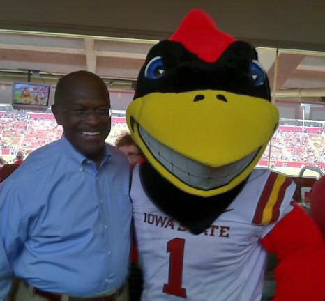
Michele Bachmann: If there are any photos of Bachmann in uniform floating around out there, I haven’t found them yet. Check that, reader Dennis Couvillion just provided me with this shot of Bachmann wearing a custom-made Iowa/Iowa State hybrid jersey:

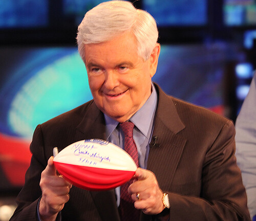
Herman Cain: Okay, so he isn’t a candidate anymore, plus I haven’t found any photos of him in uniform. But this shot is too good not to include:
Newt Gingrich: Gingrich’s pictorial history appears to be uni-barren. In fact, the only vaguely sports-related photo of him I could find was this one:
(As I’ve mentioned previously, Gingrich still raises some interesting aesthetic issues, because he’s the fattest serious presidential candidate in several generations. Is America ready to vote for a fat man? Then again, about one-third of Americans are now fat, so why not?)
Jon Huntsman: Another no-show in the uni department, although it’s worth noting that he once tried to compare Mitt Romney to an old, beat-up baseball mitt, a metaphor that prompted some amusingly nit-picky backlash about the difference between a mitt and a glove.
Ron Paul: You’d think a libertarian would be opposed to uniforms, right? But it turns out that The GOP’s professional irritant has a rich uniform history, beginning with this photo:
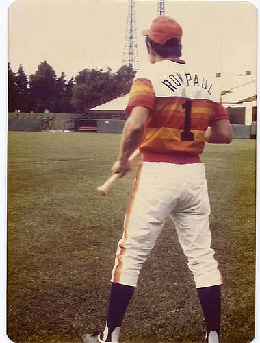
So much data there to process! The perfectly bloused pants are a definite plus, but they reveal bogus two-in-one faux stirrups. Similarly, major points for a grown man being willing to don the tequila sunrise uni, but the number font is wrong. Then there’s the FNOB (always interesting to see, although I doubt it was necessary in this case) and the adjusta-strap cap (boo!). Quite the bumper crop of uni-formities!
There are additional shots of Paul in uniform in this slideshow:
Rick Perry: You’d think a big, strapping Texan like Perry would have played a lot of sports over the years (plus he was an Eagle Scout). But the only photo of him in uniform that I’ve been able to find is this one, from his days at Texas A&M:
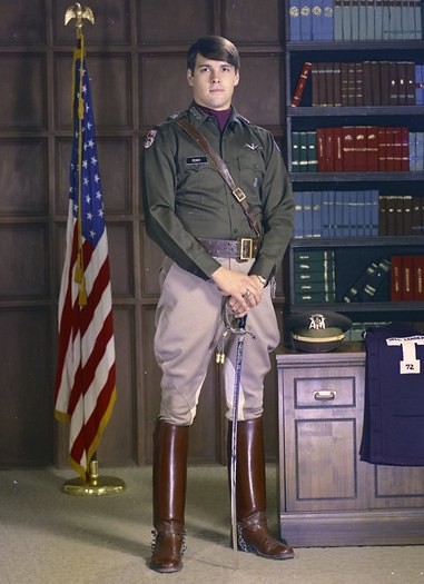
Unfortunately, almost everyone who’s seen that photo has immediately thought, “Hey, that looks just like Niedermeyer from Animal House.”
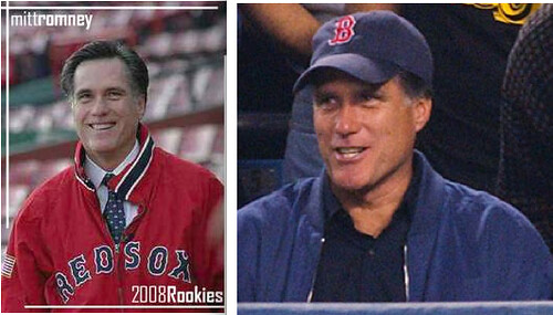
Mitt Romney: Romney was Governor of Massachusetts, so there are a few shots of him in Red Sox gear:
But the real prize is this shot of a six-year-old Romney in a (Little League?) baseball uniform:
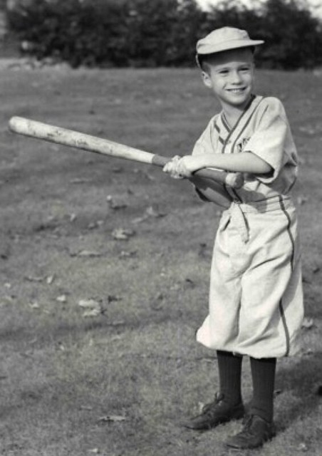
That’s pretty great — the super-baggy pants, the loose belt flap, the ill-fitting cap, the bat that’s obviously way to big and heavy for him, the joy emanating from his face despite it all. There’s more emotion and humanity in that photo than he’s shown in his entire campaign. And hey, are those dress shoes? Adorable.
Rick Santorum: Santorum participated in one of those old-timey base ball games a few months ago in Iowa (click to enlarge):
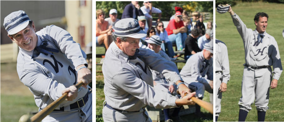
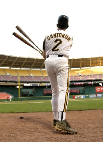
Looks like he could’ve used some blousing lessons from Ron Paul. Speaking of which, just like Paul, Santorum has suited up for the annual Congressional baseball game. This shot is from 2005:
All in all, not the most uni-inspiring slate of candidates. Unfortunately, the party’s most uni-savvy presidential aspirant was the first one to drop out of the race: Tim Pawlenty, who plays hockey and has left a huge digital trail of photos for our consideration:
Hmmm, can we get the candidates to show up for one more debate in full uniform? They can just shut up and stand there for our appraisal, which most folks would probably consider to be an improvement on several levels.
As you’re probably aware by now, Nikegon’s Rose Bowl uniform was unveiled yesterday. One the plus side: The new non-tapered number font is a big upgrade; the TV numbers are a good addition; and I suppose we should be thankful they went with SNOB instead of just putting “Nike” on the back. On the down side: I hate the new helmet (wings on the shoulder make sense, but wings on a helmet don’t [unless you’re going for a Nordic theme, which they obviously aren’t]); the two-tone facemask sucks; the new shoulder wing pattern looks like an oil slick. Jury’s still out on the color-shifting numerals (could actually be cool, but let’s wait and see).
Eh, whatever. I’ve been saying all along that Nikegon’s basically using a superhero comic book aesthetic here, and now each Ducks game is like the new issue of that comic book. So it all kind of makes sense, but it’d be a lot stronger if Nike hired John Buscema Gene Colan Will Eisner Jack Kirby to do the visuals. Okay, those guys are all dead, but Steve Ditko’s still alive — someone slip his phone number to Phil Knight, pronto.
As the year winds down, a few December offers are also about to expire. To wit:
• From now through the end of the year — i.e., for the next few days — if you order two sheets of stickers based on your membership card design (that costs $26; ordering instrux are here), you’ll also get a free sheet of Uni Watch logo stickers (a mix of all three colors).
• Speaking of the circular Uni Watch logo stickers, the end of the year will also bring an end to the deal I’ve been offering: You can get three stickers (one of each color) by sending a self-addressed stamped envelope to Paul Lukas, 671 DeGraw St., Brooklyn, NY 11217. If you want to enclose a coupla bucks or a barter offering, that’d be nice, although it isn’t required.
Research query: Tim Robinson makes some really cool NBA infographics. The other day he sent me the following note:
I’m currently trying to assemble a larger chart of the history of the NBA All-Star Game. The most ambitious aspect I want to include is the designs for all jerseys worn. I’ve tracked down a lot of the old ones, but I’m having trouble finding sufficiently detailed photos for 1985 West, 1976, 1974 East, 1973 East, 1971 East, and most stuff before 1970 (only black-and-white photos seem to be available).
I’m shocked at how hard this has been. The NBA’s site isn’t helpful at all, and Getty Images has been disappointing for anything earlier than the mid-1980s. Grey Flannel auctions show some pretty old ones, but finding both teams for each year is difficult.
Tim’s note is just the latest example of how poorly documented the NBA’s visual history is. Even the league itself is in the dark regarding much of this stuff. Unfortunately, I don’t have anything materials or leads to help Tim with his NBA All-Star search, but here’s some advice to him (and to anyone else trying to research NBA history):
• In addition to Getty Images, other wire photo resources include Corbis, US Presswire, and the Associated Press. The SI cover vault can sometimes be useful, and there’s a gallery of old NBA uni designs at Dick’s Courtroom. Each of these has its own strengths and weaknesses, depending on what you’re looking for, but all are worth a look.
• In addition to Grey Flannel, other auction sites worth investigating include Lelands, Legendary Auctions, Robert Edward Auctions, and probably a few more I’m forgetting. They tend to archive their listings for at least a few years but not indefinitely, so the sooner you start hunting, the better.
• Don’t forget about eBay. Photos, programs, even uniforms can show up there. Worth investigating.
If anyone has additional tips for NBA research, let’s hear ’em. And if you have anything that can help Tim with his NBA All-Star research, feel free to contact him directly. Thanks.
Uni Watch News Ticker: The Giants were hoping to wear white at home against the Cowboys this Sunday, but the league put the kibosh on that. … The Yankees and Red Sox will apparently be wearing 1912 throwbacks to celebrate Fenway Park’s centennial on April 20. … Condolences to Blake Pass, whose grandfather passed away on Christmas Day. “He played on the Piedmont College (Demorest, Georgia) basketball team in the early 1940s,” says Blake. “He’s #11 in that photo. He used to brag about the perfect season his team had when he played for them — they didn’t win a game! He also told numerous tales about the gym, which was at one time a barn. He said that there was nothing between the boards to keep the wind out. And how about that coach with the cardigan and the pipe!” … “After seeing a few Chrysler commercials and watching the Lions again make the playoffs, I felt the need to do something with my feelings of Detroit pride,” says Caleb Borchers. “I decided to do a sports-themed version of the Detroit flag, using stars, fleur de lis, and stripes to represent the Tigers’ four World Series, the Pistons’ three titles, and the Wings’ 11 Cups.” … Michael Orr has whipped up a rundown of all the Euro 2012 kits that have been released/leaked so far. “I’ve also created the @KitNerd Twitter account to accompany the #KitNerd hashtag I’ve been using for a few months,” he says. “I had a gathering a few months ago where everyone came wearing their favorite soccer kit, not unlike your Uni Watch gatherings. Planning another one here in Portland for January 6.” … The Knicks have removed the black from their logo and Madison Square Garden has just undergone a renovation, so you’d figure the center court logo would be updated, right? Wrong. Inexplicable, especially since they did update the logo under the scoreboard. In addition, the league has added its Twitter handle to the backboard support, and the Celtics have added their to the sidecourt (all this from MJ Kurs-Lasky). … “The Tokyo-Hakone Ekiden is a two-day relay race covering 217.9 kilometers,” says Jeremy Brahm. “Sapporo Beer, a sponsor of the race, has released a special beer with the color of each of the 20 participating universities on the can.” Hmmm, beer and universities — what could go wrong? … The Rangers have been wearing a “94” helmet decal in memory of Derek Boogaard, but Marian Gaborik has an additional decal for Pavol Demitra (good catch by Ryan Dowgin). … Here are Ilya Bryzgalov’s pads for the Winter Classic (from Enrico Campitelli Jr.). … Rich Friedman follows a Miami Hurricanes football newsgroup and says someone just posted this. No idea if it’s legit, though. … If you’re a Chiefs fan, you’ll want to check out this neon sign. … Tons of cool Sabres memorabilia showcased here (big thanks to Tim Tryjankowski). ”¦ While looking for something else, I stumbled across this absolutely sensational NFL Properties ad from 1974 — which originally in Women’s Day, of all places! Sensational stuff. ”¦ Also very nice: a 1932 ad from Spalding, extolling their role as the outfitter of the U.S. Olympic track team. ”¦ Baseball Hall of Fame curator Tom Shieber was doing a bit of research when he came upon the earliest reference to undervisor colors he’d ever seen. It was in the Baltimore Sun of August 5, 1872, which contained the following passage: “The Peabody [Base Ball Club] appeared in their new uniform — white hats, covered under the brim with dark green to shade the eye; white shirts, with the name Peabody in red across the chest, white pants and red stockings.” So green undervisors date back nearly 140 years! ”¦ If you choose to believe conspiracy theories, here’s a good one: Dwight Howard’s new team will ultimately be determined by Adidas. ”¦ Jeff Brand was watching last night’s Blues/Wings pregame and noticed that Evgeny Grachev didn’t have a front helmet number. “Interesting, because Adam Cracknell, who was just called up for Monday night’s game, has a front number, while Grachev was called up last week before Christmas.” ”¦ Check this out: a Kellogg’s poster showing the evolution of the baseball uniform. I’ve never seen this item before. Anyone else..? ”¦ Wanna see something amazing? Check out these incredibly unattractive 1979 Iowa Oaks uniforms. “Could that be the ugliest ever worn on a minor league baseball field?” asks MJ Viquez, not unreasonably. ”¦ And here’s a great video segment showing Michigan’s equipment crew setting up the team’s practice gear at the Superdome (courtesy of Aaron Rich):
Are we sure that the Oregon unis are truly school NOB? I was thinking that OREGON was placed there just for effect, as to show what a player name will look like on the jersey.
I think you are right. They did the same thing for Navy’s Pro Combat uniforms. “NAVY” was put on the model but they had their names on them for the game.
link
link
Fixed link.
Maybe this one will work… link
For those who read this entry within the first 15 mins. of it being posted, I just added a photo of Michele Bachmann in uniform.
Bachmann calls Romney a flip-flopper after wearing that Iowa/State harlequin jersey? The gall!
I had been watching the GOP race mainly to see if, like both parties in 2008, the quality of each campaign’s logo would correlate with its electoral success. But maybe the uni-angle is more interesting. Tough call between Santorum and Paul on that score, though that childhood photo of Romney is pretty awesome.
That thing is an atrocity! Frankenjerseys shouldn’t be done, but if you feel you have to, stick to the simple straight-down-the-middle approach. Going patchwork just makes it look far worse.
I actually kind of prefer the way Bachmann’s jersey is done. It’s such a ridiculous concept anyway; being all formal and split-down-the-middle about it just feels like taking it way too seriously. The full-on harlequin approach of mixing it all up, element by element, seems a lot more whimsical.
Dear Michele: Don’t pander. It embarrasses all of us.
-Walter
I think Bachmann’s too crazy to run the country. But that jersey is just wrong on so many levels. I just don’t see the damn point of hybrid jerseys. Pandering is stupid.
The Herman Cain pic has an amusing Heckle & Jeckle quality to it.
Please note super creepy looking guy behind Bachmann. Thanks.
Far less creepy than Bachmann, if you ask me.
Usually the “super creepy looking guy” behind her is her husband, Marcus.
I haven’t been able to find pictures of it, but when she was running for re-election here in the 6th district (a.k.a. “Bachmannistan”), she was campaigning in a replica Joe Mauer Twins jersey. If memory serves, she’s also campaigned in a Randy Moss jersey, but, again, can’t find pics of that.
link
link
link
link
Dang! You’re good!
great piece today!
of course, back in his salad days, perry was a three striper
now…he tends to take his fashion cues from the movies
Am I the only one who gets the willies (and not in a good way) from Perry’s knee-high boots? Is it vaguely “SS officer”-esque?
Those are riding boots (and riding pants, or jodhpurs). Must be a horse around there somewhere.
My dad swears the Patton-esque uniforms are Texas A&M ROTC issue. Every Aggie has one.
I’ll bet he’s wearing a thong under those super riding pants…
Yes, that’s a Texas A&M Corps of Cadets uniform.
you want to talk about
panderingflip-flops???an aggie doing a hook ’em????
isn’t that like, death-penalty worthy in some counties in texas?
Boots are only worn by Seniors.
“Senior boots” are a major status symbol in Aggieland. Chicks dig ’em.
When you link… you willlink
Nowhere near as cute as Fluttershy, but still link =)
Not exactly uniform related, but I stumbled across this a couple hours ago… figured the 3 people in the Hockey Wing might find it amusing: link
Don sure loves to do that with his hands…
Nice to see he kept it sedate for the holidays.
Here’s Huntsman in uniform:
link
From this sideshow of kid pix of the candidates:
link
Surely there’s a photo of Romney in either Michigan or US Olympic gear. I’ll see what I can dig up on that score.
Same slideshow, young Mitt caddying for his dad:
link
The Gingrich photo in that slideshow is priceless, but non-uni-related, and not even a photo of him as a kid, but it still must be seen to be believed.
Agreed. It almost looks Photoshopped, or like they slapped a wig and false sideburns on him. Stick a joint in his hand and he’s ready to run the local chapter of SDS!
Newt: When I grow up, I want to be Isaac Asimov!
Romney wouldn’t be in US Olympic gear; if anything, he’d be wearing the uniform of a volunteer for the 2002 Salt Lake Winter Olympics (think purplish blue parka with white, orange, and yellow trim).
OK, so as far as I can tell, Romney was just as disciplined in never wearing branded apparel as head of the Salt Lake Olympics committee as he is as candidate for president. But here are some great shots of his father, Governor George Romney of Michigan, at the Tigers’ 1963 home opener (taken by the father of this blogger:
link
Here’s the elder Romney with Tigers player and future U.S. Senator Jim Bunning:
link
George and Lenore Romney in the stands:
link
And here’s the pièce de résistance, the elder Romney and Detroit Mayor Jerome Cavanagh, in apparently fitted flannel Tigers caps:
link
From elsewhere, here’s young Mitt, not in uniform but fully suited on bike during his missionary year in France:
link
In that video clip of the Iowa Oaks, the team is wearing white jerseys over powder blue pants. It appears their opponent is also wearing white jerseys, but with white pants. Any idea why both teams would be wearing white?
I think it’s possible that in this game, Iowa misplaced the matching tops (presumably to go grey on grey).
But those aren’t as ugly as the 1980 Tuscon Toros or the 1981 Tacoma Tigers or Lynn Sailors.
No photos, but Tim Pawlenty and I skated in the same inline marathons in Duluth and St. Paul in the mid-’00s. He’s a former hockey player, so he finished way ahead of me.
Seeing the name Huntsman makes me want to link.
Notice the Woman’s Day ad has the teams listed in alpha order by city. (I told you that was my *thing*).
So tell me if I’m being some young bastard that doesn’t know anything, but aren’t they ALMOST in alphabetical order by city…except for Miami? What’s up with that? Were they the Broward County Dolphins or something?
You’re right… Miami is completely out of place.
ACK!! Dumb Guy FAIL!
Also, it must likely have been from before September 1974… Houston, Buffalo and Philadelphia have 1973 helmets. (And I see no black outline on the green wing on the white Philly helmet – although it’s hard to tell.)
There was never a black outline on the wing. It’s been rather thoroughly debunked over at the Gridiron Uniform Database site.
/There’s also the Chargers white (but numberless) helmet dating it to pre-74.
I know. That’s my site. I was being sarcastic.
The Giants actually asked the league if they could change and wear white and were denied?
Because that tweet looks like a fan asked them if they could wear white, and the Giants are just replying that jersey designations have to be submitted to the NFL before the start of the season.
god forbid the cowboys ever not wear white
It’s not a reply post, so who knows? Though, knowing they had the last game of the season hosting Dallas, they should’ve planned for it ahead of time.
Of course, if I’d been in charge in Pittsburgh, and had gotten wind of the Browns’ decision to wear white at home all year, I’d have scheduled the game against them at Heinz to be a white-at-home game instead of a throwback game, just to force the Browns into their *gasp* brown unis once.
It’s freaking hilarious that the NFL has such a lockdown on this process (home/road uni designations), yet let players run rampant with their leggings with no more than a slap on the wrist, only threatening the offenders they deem to be exceptionally egregious with a time-out in the corner.
I tend to agree with Rob’s interpretation. There’s no evidence in that Tweet that the Giants made a formal request. Besides, they knew the rules already.
The kids in the NFL Properties ad look like Adam Rich and his little brother- straight out of central casting!
Ron Paul’s numeral looks legit; the Astros dropped the number-in-a-circle motif after one season, but retained the font. I don’t think Houston went to the white-outlined Wilson numerals until 1977.
-Walter
I thought for that one season, the numbers were navy trimmed in orange (which may or may not be what Paul has on his shirt). Then they went to the navy trimmed in white.
Here’s the font, juxtaposed with Paul’s jersey:
link
Looks like I owe Paul an apology — the font is at least very close. I knew the numerals in that set had little flourishes but didn’t realize the 1 was so plain-looking, so I mistakenly thought Paul was wearing a generic 1. Mea culpa!
“Looks like I owe Paul an apology…”
~~~
man, if i had a nickel for every time i’ve said that…
Philadelphia Eagles. Rice Owls (in days of yore). Seattle Pilots. Actual pilots. All have one thing in common: Nordic theme.
Yeah, I don’t get Paul’s complaint there either. The choice of mirrored silver on ultra glossy black is dumb, but the wings themselves are fine.
I guess pilots (Seattle and otherwise) have laurels and not wings. Nonetheless, helmet wings are hardly unprecedented. It certainly seems like overkill to have wings on both the helmet and the shouldes, but the helmet wings probably have more historical precedent than the shoulder ones.
Those weren’t wings on the Seattle Pilots caps/helmets, they were “scrambled eggs,” the decorations used on the cap of an officer.
Correct. The only place wings appeared on the Pilots unis was on the pilot wheel logo on the jerseys.
Is America ready to vote for a fat man? Then again, about one-third of Americans are now fat, so why not? New Jersey obviously is ready.
Nice shout-out today to the alma mater of link
They weren’t even officers’ scrambled eggs, either. An officer’s peaked cap (in the Navy, at least) uses oak leaf clusters to form the scrambled eggs, whereas the Pilots used something closer to a stalk of wheat:
link
link
Nicely foreshadowing the relo to become the Brewers. Here’s real scrambled eggs in action (bonus inclusion of the USS Halsey’s bull mascot):
link
Montreal Alouettes had winged helmets for a time, too.
link
I couldn’t make out any detail at all on those Oregon pics. Every pic is so damn dark, there is no lighting. OK Nike, I get it, the kids wearing these unis are supposed to be mysterious warriors or whatever, now flick the fucking light switch on so I can see what they look like.
You don’t get it – the uniform really IS that dark. It absorbs light, like a black hole or Disaster Area’s stunt ship.
A late friend of mine said The God Machine used to play louder than Disaster Area. The talk was Swervedriver played at about that volume, too.
-Walter
Why do they do that whenever they release these type of unis?
Too bad Oregon does not use a better looking shade of green.
Uh maybe emerald green. Seems like they use that dark odd looking green instead.
With all due respect, I’d say the late 70s-early 80s Appleton Foxes (now the Wisconsin Timber Rattlers) had the worst minor league unis – they were a White Sox farm club at the time and were forced to wear hand-me-down editions of Bill Veeck’s infamous collared unis. link
I thought we already had a winner in the worst minor league uniform when someone posted photos of the multi-colored Tucson Toros from the 1970s or early 1980s.
With all due respect to Iowa and Appleton, late ’70’s Tucson takes the cake.
LaRussa looks like a guy that hangs out in a bar smoking cigarettes all day in that video.
Hey UW!!!!!!!!!!
I have to admit that even I am getting a bit tired of Oregons’ uniform changes.
BTW…I was checking out the upcoming seasons’ lacrosse gear and I found that UNC is going with the old Joe Forte/Julius Peppers/Ronald Curry era basketball look. Check it out:
New:
link
Old:
link
And another note…here’s a pic of Peppers wearing the Air Jordan XI at UNC, which is the shoe that caused such a ruckus last week…No I wasn’t involved…this time.
link
That was a good look, but decisively untraditional. I wish some teams had stuck with it.
-Walter
I actually liked when Michigan and UNC wore them.
UNC:
link
Michigan featuring Jamal Crawford in Flightposite 1 TB:
link
Although, besides the Fab Five look, this might be my all-time fave UM look featuring Dommanic Ingerson in the Air Signature Player:
link
It requires an insignia identifiable at a glance. Nothing fussy, like a buckeye or a gamecock.
Man, if Matt’s tired of the changes, it really is time to pick a look and stick with it, huh?
Vilk never misses a beat!
My first post in more than a month, and there Jimmy is to send me back under my rock!
I have been one of the proponents of anything Nike-gon, however their shananigans are becoming trite!
how’s that thesaurus app i got you workin out?
BTW, here is the shorts that will go along with the NC jersey:
link
That is the new template that Duke, Hopkins and Cornell are also wearing this coming year:
Cornell:
link
Hopkins:
link
Duke:
link
Not sure if this was ever mentioned, but has anyone noticed that Steve Mason is not wearing the same goalie pads as was noted in the preseason UniWatch article?
In there, they mention Mason wearing this design:
link
And he had that very design on with the whites on a game Deb 18th:
link
However, they took a road trip to face the Blackhawks and check out the pads he’s sporting now:
link
I know where Ditko’s office is, but I heard he can be a bit um grumpy shall we say? I will have to take a pass on sending a note to him regarding Oregon.
As long as Nike (and every other uni company) stays away from Rob Liefeld and Pat (“Michiyamenotehi Funana”) Lee, we should be fine.
Very excited about the news of Red Sox/Yankees in 1912 throwbacks. Hopefully MLB goes with someone other than majestic and please, oh Lord, have the players show some sock out there!
I suppose the Pittsburg State Gorillas are the most likely to wear a patch…
link
Paul,
Re Ron Paul and his “adjusta-strap cap (boo!)”
There is a new retro movement, popular among young people, that makes these caps hip…they are now called “snapbacks”. We purists don’t have to like them, but you will hear more and more about them. It is at least easier to say. The NBA is marketing them as well:
link
I don’t think Paul was being entirely serious there. Fitted caps were pretty rare for civilians back then; even some minor-league teams were using adjustable caps at the time.
Always been an adjusta-strap fan, so I’m enjoying my brief moment of being cool.
To be really cool though, you should call them “snapbacks.”
Well, some of mine are Velcro-adjusted, so I was painting with a wider brush.
Hmm, based on the sound Velcro makes, can you call those “cracklebacks”?
Is velcro ever cool? I must admit I own a couple of cracklebacks.
Velcro is *always* cool.
Snapbacks, cracklebacks…where are the popbacks?
“Velcro is *always* cool.”
link
“I’m enjoying my brief moment of being cool.”
~~~
in the show they woulda ripped you
And after seeing that NBA ad, I want one of these:
link
I used to have that Kellogg’s uniform history poster. I believe it was from 1993, as the last two uniforms shown were the first for the Rockies and Marlins. They made two other posters in the same series: one of uniform histories, and another of World Series programs. Now I’m curious if they’re still somewhere in my parents’ house…
As for the Ducks new Rose Bowl unis… surprised more folks haven’t made the Batman analogy. The Duck Knight Rises. link
NPR Morning Edition’s ‘Sweetness & Light’ commentary by Frank Deford–calling for an end to fighting in the NHL–contains some old-time uni-related vignettes, including references to stirrups and b-ball short-shorts: link
Carmine Infantino
Jerry Ordway, maybe?
John Byrne?
In other words, there are lots of classic comic book artist still alive.
I own one of the other Kellogg’s posters. It’s an evolution of MLB Caps. The Marlins Teal cap is the last one. It even includes a NY Mets Pillbox cap.
I also own both of the Kellogg’s posters. They are both the history of uniforms and MLB caps (as rightly stated). They were in lieu of the 1993 MLB expansion. I think that they are were one of the best cereal box giveaways (redeemable w/upc’s) ever!
I am disappointed the Giants will not be wearing white this sunday night… It would be the perfect time to resurrect the 1980’s tradition of making the cowboys wear blue at Giants stadium.. I believe the last time they did so was in the 1986 season… If they can’t wear white maybe the road pants are an option! They are 3-0 in those pants in Dallas the past 3 games played there!
I’m not sure, but I believe I remember reading that at the beginning of the season the Cowboys were expected to wear white all season, and then the week before the Patriot/Cowboy game the Pats asked the Cowboys to wear blue and the Cowboys agreed… Is this the case?? If so, what’s stopping the Giants?
In other Football Giants uni news, I don’t think its been addressed, but many of the Giants d-backs have been wearing thin strings from the sides/back of their pants/belt lines. They have been either grey or red…and almost look like what hangs from Hasidic Jews clothing…I’m not sure what they actually accomplish though.
The Cowboys were not likely to attempt to wear white all season, since they’ve worn their blue 1960s-inspired double-star alternates at least once since 2004 (usually on Thanksgiving; I don’t know offhand if there have been any additional games).
Dallas did avoid wearing their regular blue unis last year, though (they did wear the alts, avoiding an all-white season).
RE: The Red Sox/Yankees throwbacks.
I believe the Sawx are going to have multiple throwbacks, one for each decade. I’ll try to dig up an article. It was posted on a White Sox message board months ago. (And I believe verified by the White Sox marketing director, who is very communicative to fans via email.)
Apparently the White Sox will be wearing their 1982 throwbacks because of the Fisk connection.
Any reason my posts replying to this are being eaten? I found a site confirming my original post.
Do the new Oregon ‘Rose Bowl’ uniforms come with boots?
Based on the amount of s*** shoveled on the Nike website describing the uniform – oh, pardon me – “uniform system”, hip-waders should be included!
Ugh. Ms. B’s jersey effort further fails by missing Iowa State’s design entirely. White border? Sleeve stripes? I think not. Just check out the pic of Cy with Mr. C right below for the correct jersey.
Also, will Paul himself be reporting on the Pinstripe Bowl uni scene up in the Bronx this week when my Cyclones hit town? Bummed I can’t make it to NYC for that game and a stop by the UniWatch world headquarters to say hello.
I got to say, I like Paul in the retrostros jersey.
He looks like he has a pretty good swing.
I think it’s been definitely proven that that Hurricanes set of pictures is fake. It’s quite amateur in its presentation and any university worth their salt wouldn’t put something like that on Photobucket.
For a brief moment in time, Michigan representative Thad McCotter was running for President. He has some uniform history himself.
link
Better Oregon Helmet photos! Sweet Jesus
link
link
sweet! … jesus
YIKES
John Belushi said it best…
link
They just showed video of it on one of Madison’s local news telecasts. It definitely has like a mirror/ door knob effect.
Toledo have given their helmet decal a stars-and-stripes treatment for the military bowl that basically renders it unrecognisable. Navy going with the S&S decal that’s been seen before.
I know I was trying to figure out what it was.
link
navy looks different…
Probably because it’s Air Force?
Yeah, I know…I knew it was a service academy and that’s about it. It’s been a long year and my brain is toast.
Oklahoma has small white stars on the back of their helmets which to my knowledge has never been done before. I’m hoping it’s just for their practice helmets.
link
The Toronto Raptors court design has an interesting look, the “Raptors” at the ends of the court look 3D.
Yeah that’s interesting. And there is an interesting new (yet old) court design for the Portland Trailblazers. Their key no longer has markings for the college regulations. Just a simple, large width key for NBA use. I believe that configuration hasn’t been used since The Forum in Los Angeles in the 1970’s.
New Blazers floor: link
Old Lakers’ Forum floor: link
I should have noticed that the Raptors key is also that way.
Northern Illinois University played in the California Bowl in 1983. They put up a flickr set from that time. link
As you can see in this picture, they had “1983 MAC Champions” on their sleeve along with a “California Bowl III” patch. link
What’s so special about the Chiefs neon sign? Looks pretty standard to me. Auction price is low, but if you notice the shipping, it turns out not to be a deal at all. Just seems like kind of a mediocre thing to put on your normally outstanding site. I’m a Chiefs fan by the way.
Maybe you bump into NFL logo neon signs all the time (in which case, mazel tov), but I don’t. So I thought it was noteworthy. Your mileage may vary.
I thought University of Miami was doing away with the green jerseys and pants …