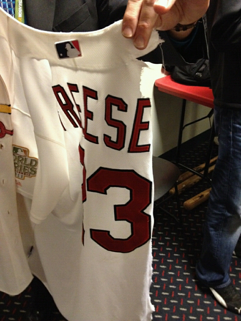
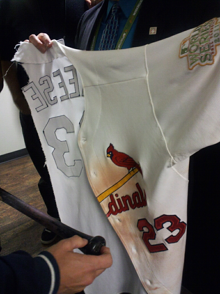
The photo you see above (which, like all the photos in today’s entry, you can click to access a larger version) is what was left of David Freese’s jersey after his game-winning home run last night. It ended up that way after a bizarre celebration rite that was like nothing I’ve ever seen before.
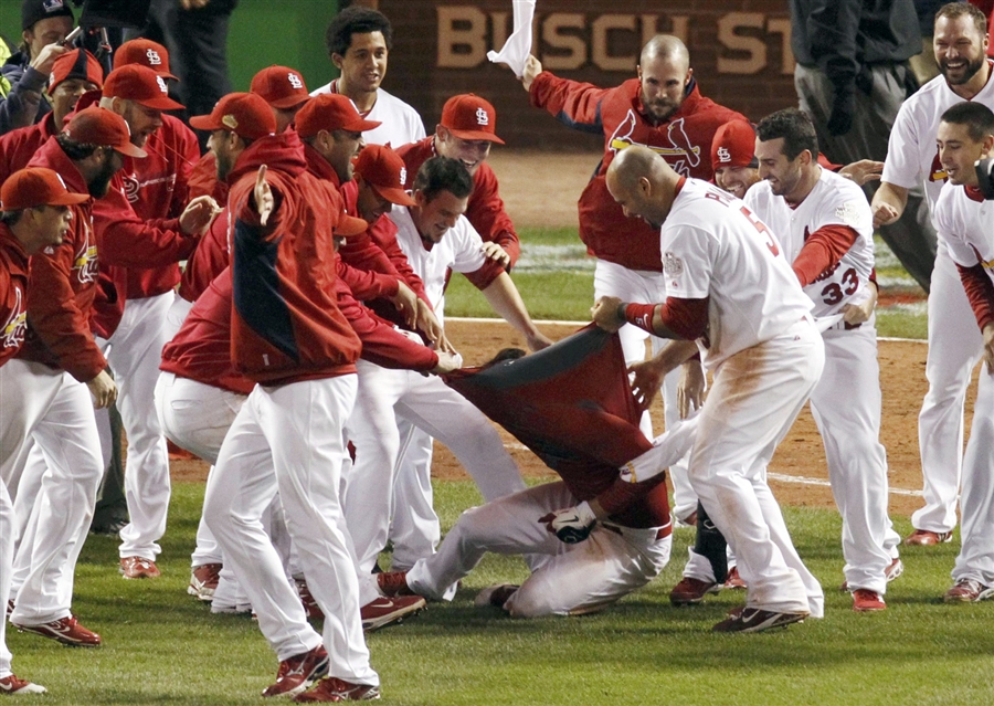
As Freese circled the bases, the Cardinals did what every team now does when someone hits a walk-off homer: They spilled out of the dugout and waited to mob him at home plate. But after he touched the dish, something odd happened. Somebody emerged from the scrum with a two-handed grip on Freese’s (apparently very stretchy) jersey:
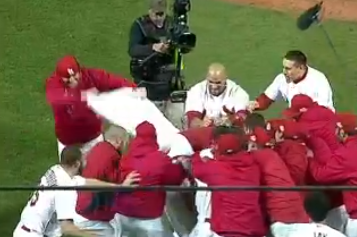
From there it got seriously weird, as more and more players tried to grab a piece of Freese’s uni:
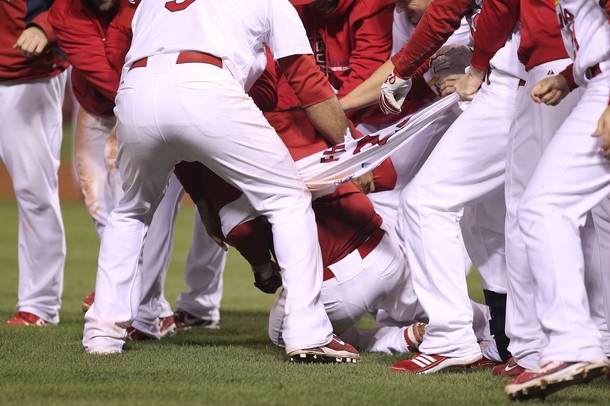

When they’d finished ripping the jersey off of Freese, they started in on his undershirt:
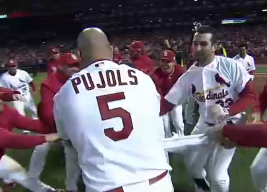
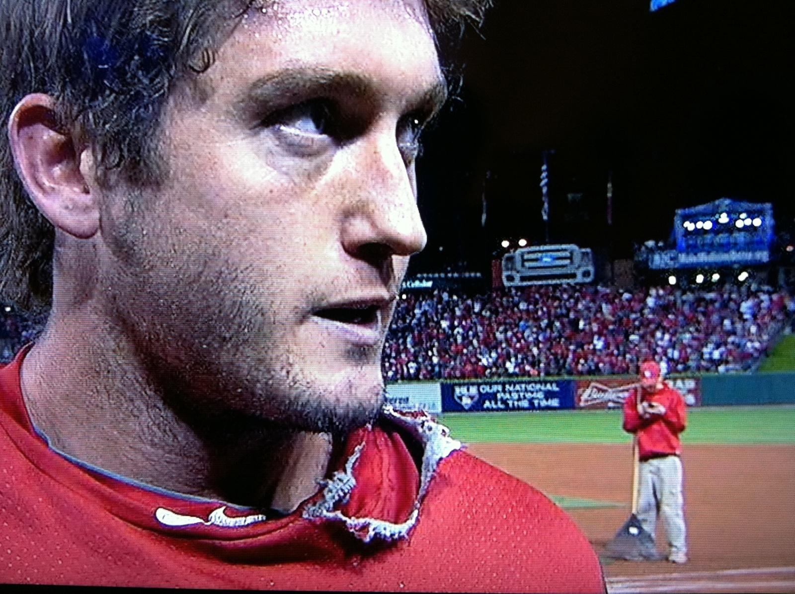
When it was over, Freese looked like a homeless man during his postgame interview (the groundskeeper kid texting in the background is a nice touch):
So here’s what I’m wondering: Given the relentless monkey see, monkey do culture we now see in sports, will every walk-off homer now result in one of these jersey-stripping rituals? Hope not — the last thing we need is another predictable, preprogrammed ritual that cheapens the original, spontaneous event on which it was based — but it seems inevitable, no?
Meanwhile, I hear Freese’s jersey will is headed for Cooperstown. Tom Shieber, if you’re reading this, are there any other torn jerseys in the Hall’s collection?

Update, 10am: Didn’t realize until just now that the Cards have a bit of recent history with this jersey-shredding thing. It started with Nick Punto tearing dress shirts (not jerseys) off of his teammates, which led his teammates to tear his jersey off of him after he hit a game-winning homer back on Sept. 10. So this is, basically, a Cardinals thing. And that’s fine — their team, their celebration, their ritual.
Uni Watch News Ticker: New mask for Ray Emery (from Eric Lovejoy). … The Rangers all wore pink chinstraps for last night’s home opener. … What’s even worse than pink where it doesn’t belong? Purple where it doesn’t belong. “Gotta say, I love the number/name font,” says Ryan Connelly, although I don’t share his enthusiasm. … I think we’ve seen this before, but just in case: Here’s a page chronicling the history of Nebraska football uniforms (from Gil Neumann). … Tons of great striped hose on display on this page showcasing Japanese high school baseball prospects (big thanks to Andy Ingram). … The Royal Mint has begun making the medals for the 2012 Olympics and has unveiled the 2012 Paralympic medals (from Tom Mulgrew). … In a related item, did you know that the 2012 Olympics will feature women’s boxing? It true — and they may be wearing skirts (thanks, Brinke). … The new Gonjasufi EP has a Swinging Friar motif. … Hmmm — new black jersey for Purdue, or is that just a fashion jersey? (From Andrew A. Weintraut.) … We’ve all seen high schools that poach NCAA logos or helmet designs. But the Tara High School Trojans in Louisiana have taken things a few steps further by poaching USC’s entire uniform (from Ben Melancon). … Even by the usual pink standards, the uni being worn this Sunday by the Hershey Bears is a bit much (from Mario Carr). … Good spot by Neil Vendetti, who writes: “While messing around in Google Maps, I stumbled upon a pool in Palisades, New York, with a giant Cubs logo painted in it. I researched in a bit but could find no mention of it anywhere. The coordinates are 41.016237, -73.904795.” … Latest camouflage nonsense comes from Minnesota-Duluth hockey. They’ll wear that on Veterans Day. Meanwhile, there are new mask designs for Minnesota-Duluth goalies Kenny Reiter and Aaron Crandall (from Eric Lichtenberg). … Great work by Brian Gundell who’s been doing a Pac-12 uni tracker. Here’s his work for Week 1, 2, 3, 4, 5, 6, 7, and 8. … Illustrator Mickey Duzyj has just created a bunch of absolutely killer 1986 Mets posters for No Mas. … Still more BFBS news: “When West Virginia got the sweatback unis, we lost our black jerseys,” writes Chris Cocuzza. “Judging by what I found at our book exchange today, they’re back. Our old non-sweatback black unis had navy numbers, so at least the black was accompanied by our old gold and blue. Now it seems it’s just yellow, white, and black.” … Major upgrade for Louisiana Tech basketball. In addition to the design change, they had previously been NNOB. … For reasons not worth explaining here, I’ve been listening to the first three Blondie albums quite a bit this week. I’d forgotten how great they were. … Jeff Ash’s latest vintage Packers slideshow is from Picture Day, 1967. … This is pretty cool: an aerial shot of a Giants Stadium end zone being changed from one team’s logo to the other’s (big thanks to Alan Borock). … Some — but not all — of Louisville’s basketball players are wearing those striped socks that we first saw in the team portrait the other day. “I couldn’t be happier,” says David Merrill. ”¦ JrNOB — at least on a practice jersey — for Jerry Rice Jr. (from Matt Shevin). ”¦ A Walmart ad that aired during last night’s Cards/Rangers game showed USFL footage — Gamblers vs. Bandits (excellent catch by Eric Stangel). ”¦ Oh great, Evander Kane was wearing pink skate laces last night (from Sean Maguire). ”¦ Bit of a kerfuffle over some old Olympic hockey jerseys (from Joe Exner).
Paul, I am a daily reader of your website and love the work you do, but I have to say on this one – lighten up! The jersey tear WAS a spontaneous moment. I think it will actually look rather cool in the Hall all torn up, if they include a blurb or picture of why it was torn. This was a natural, organic celebration of a guy coming up huge in a huge game, and his teammates coming together to honor him, in their weird, 21st century, LaRussa probably hated it-way.
This was a natural, organic celebration of a guy coming up huge in a huge game, and his teammates coming together to honor him, in their weird, 21st century, LaRussa probably hated it-way.
And when did I say anything to the contrary? I think it’s fine. But if it becomes a monkey see, monkey do thing, I think THAT will suck.
OK, so, I just got home from said game about 6 1/2 hours ago (I’m a Cub fan and still barely sleep), but my interpretation of today’s entry tells me that Paul thought that last night’s tearing WAS cool and unique – he’s just worried that it’s an event that’s waiting to be re-done, and that at THAT point it won’t be genuine. I can’t say I disagree with the idea.
i really, REALLY hope the try to repair the jersey and use it for game 7!!! would give off a GREAT haloween-zombie-frankenstein-feel!!!
Didn’t the same thing happen to Chris Carpenter after his 3-hitter to clinch the Philly series?
yes, that’s what i was going to say
The Jays did this on every walk off win this season (10?) But for the Jays, the goal was to get the jersey over the guys head. I don’t think it was to tear it into pieces, tho.
Die hard Cubs fan Bill Murray lives in Palisades. I’m leaning toward this as being his over the top, absurd palace with logo creep pool.
link
I am really disappointed to learn that. Bill Murray’s house in Zombieland was definitely not in New York.
…and it’s only a mile from Rockland Country Club where he’s a member.
I’m way digging the Japanese baseball uniforms, especially the widely-spaced pinstripes. It never fails to amaze me how the tiniest tweaks to baseball tradition can look epochal when you see them in the flesh.
My own company team here in Japan has wide pinstripes (but no stripes on our socks). I thought they’d look stupid, but I was surprised how good they turned out. And the quality is such that while the jerseys are mesh, there are no mesh holes where the dark think pinstripes are, so it looks OK whether your T-shirt underneath is light or dark.
I know a lot of players wear shin guards on their front leg, but I don’t recall ever seeing a metatarsal guard like the one link is wearing.
I was pleasantly surprised when I followed that link. Given the garish costumes some of the NPB teams wear, I was expecting the worst. But the majority of those Japanese high school unis looked really nice.
I love the self-description of the blogger responsible for showcasing those cool unis:
“… A baseball blog written by a girl who just moved back to the US after several years in Japan. Probably likely to continue being about Japanese amateur baseball and bashing the Yomiuri Giants, but who knows what the future holds…”
Every single NY Ranger wore a pink chinstrap for the home opener last night…
At least NHL teams are only doing one home game each (if all teams are indeed doing it).
Thanks. I meant to check on that but was so busy with the Freese story that I forgot. I’ll update the Ticker now.
Why is it that the Rangers’ home opener was last night? The season’s already 3 weeks old. The Blackhawks have already played 5 home games.
I believe they were renovating MSG forcing the Blue Shirts on the road to start the year.
This is the only Debbie Harry in uniform pic i could find.
Been frequenting Blondie recently too- especially ‘Autoamerican,’ and the songs “T Birds’ and also “Do The Dark.” Saw them once late 70s @ The Palace in Cincinnati- absolutely bonkers loud. Clem Burke, great drummer. Have a great live version of “Maria” if you want it, Paul.
[img]http://2.bp.blogspot.com/_7HTO3jP-_lk/SlD-XIFL8jI/AAAAAAAADe8/1G0hR1TD3T0/s400/deborah-harry-muppets.png/[img]
link
Bulletin board code doesn’t work (you have to use HTML), and I don’t think images are allowed to be direct-posted.
Technodummy> Think you mean this:
[img]http://2.bp.blogspot.com/_7HTO3jP-_lk/SlD-XIFL8jI/AAAAAAAADe8/1G0hR1TD3T0/s400/deborah-harry-muppets.png[/img]
Yeah, that’s Bill Murray’s house.
Paul, I gotta say that the purple practice/warmup jerseys aren’t that big a deal to me, because a) they’re practice/warmup jerseys and not gamers, and b) it’s for a good cause (Hockey Fights Cancer).
Something else I’ve been saying pretty much all month:
The NHL cares about fighting all forms of cancer. All the NFL seems to care about is boobies.
I think those jerseys look great. Then again, my alma mater’s colors are purple and gold, so I’m used to purple and ok with it.
I don’t care much for hockey, but I’d wear one of those Pens sweaters.
Something else I’ve been saying pretty much all month:
The NHL cares about fighting all forms of cancer. All the NFL seems to care about is boobies.
This I agree with totally. It’s a bit galling to watch the NFL uglify itself in showing concern for something devoted exclusively to the opposite sex. When female athletes start wearing light blue all over the place to bring attention to prostate cancer, then maybe I can get behind all the breast cancer stuff. For now, I say the NHL is the most egalitarian.
Yeah. Cause if your wife/mother/sister/friend dies of breast cancer, it has nothing to do with you.
Agreed. They should only concern themselves with manly forms of cancer, since they’re men and men are all that matter.
Cancer is cancer. It sucks, period. It shouldn’t matter if it’s your mother and breast cancer, your father and prostate cancer or your brother and lung cancer. The NHL’s approach of fighting ALL cancer is far superior to the NFL focusing on just breast cancer.
its not devoted exclusively to women, men can have breast cancer and I doubt they refuse to support them. It just happens that the vast majority of those with breast cancer are women.
But I definitely agree purple should be something we see sports teams wearing more when doing these awareness things as that’s the color for cancer awareness (the color used by Relay For Life which is sponsored by the American Cancer Society). A lot of awareness has been raised for breast cancer, and while its important to stay ever-vigilant in that fight there are plenty of other cancers that are less-known and potentially more deadly. If a team is going to raise awareness about cancer they should consider addressing more than just the one.
Is the endzone photo from the old Giants Stadium or the new Snoopy Field?
That’s the new stadium… In the old stadium, the tunnels were directly behind goalposts… (Hence the legend of Parcells having a toadie open or close the doors at the end of the tunnel depending on who was kicking into that end zone…)
so no Jimmy Hoffa, or did they move him to the new stadium too? ;)
Hoffa couldn’t afford the PSLs for the new place.
Ah well – perhaps not
1. The name and number on the Penguins’ purple warmup jerseys look like something out of Wilkes-Barre.
2. I got to the game after warmups, but the alts that the Pens wore didn’t do much for me.
3. The 2012 NHL Draft will be in Pittsburgh. link‘s a logo.
Creamer already has link.
Yuk.
Gonna be an interesting weekend to be in Pittsburgh, if you know what I mean and I think you do
If I do, not as interesting as the following Sunday.
PAUL:
A few years ago I recall reading an article regarding the origin/evolution of numbers on football jerseys. The article stated that originally, numbers were stenciled/painted onto the jerseys and eventually they were made from felt or twill.
The screened on numbers of the 70’s and 80’s seems a return to the past in a sense if this stencil assertion is in fact true.
Can you post the article I am talking about (or am I delusional)?
Thanks,
BirdsforBrains
I have NO problem with all World Series games in which the home team scores in the 8th, 9th, 10th, and 11th inning – where the 11th inning score is a walk-off home run – ending with the last batter crossing the plate having his jersey ripped to shreds by his teammates at home plate.
It’s always been that way, and it always should be.
Phil, I think you have a winner for tomorrow.
The Pens practice jerseys (even though purple) were for a good cause. They are being auctioned off to support the NHL’s Hockey Fights Cancer campaign.
That’s actually the University of Minnesota – Duluth (which would explain the bulldogs). Because we all know the University of Minnesota are the Golden Gophers (as well as Wisconsin’s punching bag)
Gotcha. Now fixed.
Just want to point out that those ugly camo jerseys can’t be claimed by the University of Minnesota (Thank God!) Those belong to the JV Team up the road, University of Minnesota, Duluth. I’m a veteran, and while I appreciate the nod for supporting Veterans Day, I’m totally against any camo jerseys… ever. There’s just nothing visually appealing about camo anything. Just offer up free tickets for vets and their families for the night. Much better way to show your appreciation. Keep up the good work, Paul!
Now fixed.
For me, it boils down to this: If you’re a young adult with the physical fitness to play varsity sports and the intellectual gifts to succeed in college, and you want to wear your country’s uniform, link. If you are a fit, smart young person who has chosen not to serve your country in wartime, that’s fine too; but having made that choice, do not then play soldier dress-up.
Not really the players’ choice is it?
No, it’s the AD’s choice, but. First, who is the AD trying to impress with these gimmick unis? Players, and potential recruits. If there’s one thing the alumni are not sitting around wishing for at any school anywhere in the nation, it’s “Gee, I sure wish my alm mater would screw around with our uniforms.” Second, the fundamental justification for having sports in schools is and has always been the notion that sportsmanship and competition builds character and makes better citizens. If it’s really true that we now find ourselves with a generation of student-athletes who believe that the only appropriate response to a dictate from their leader is unthinking obedience, then it’s probably time to disband all school athletics at every level. The athletes absolutely do have a choice. They can choose to let their coaches and ADs know of their objections. They can choose not to wear the camo uniforms.
Or, and this is my real point, they can choose to take their great physical and intellectual gifts down to their local armed forces recruiter or ROTC office and make the commitment that earns a person the right to wear his country’s uniform.
UMD=JV? Two words: National Champions.
That would make the Yellow Nocturnal Rodents at UM-TC “Mites” level of hockey.
Oh, and how’s that Big Ten football season working out for the Goofers…we won a championship in that as well… probably could beat the Nocturnal Rodents in football, too, especially considering who the Rodents have lost to.
Seriously, though, back to Unis. Terrible idea for the camo jerseys, probably the idea of a UM-TC grad.
Some more on the camo jerseys. They are warm-up jerseys. The team will wear them before the game, autograph them, and then they will be auctioned off at the game. The money will go to a local hockey camp for kids of military families.
This is a partnership with a MN based group Defending the Blue Line that helps military families play/enjoy hockey.
RE: SYRACUSE LETTERMAN JACKETS ..
Regarding the question posed on the site yesterday, The actual Letterman jackets and game jerseys worn by the cast of “The Express” were being sold on EBAY for quite some time. No screen grabs, but I am sure there may be a few still online or on EBAY …. There were a multidude of the beng sold and many of the jerseys are still up … Also, check out the website “BPH” or “Ball Park Heroes” … He gets sports movie worn stuff often ….
Thanks Nick – I’ll have to do some shopping.
I did acquire a movie-worn WVU jersey from “discount_sports_apparel” on ebay awhile back, he tends to have stuff from “The Express” and some other movies too.
That’s actually a pretty decent-looking sweatback for Purdue… and, at least it’s not black-on-black numerals link.
I actually like that the school name on front evokes the shape of the cowcatcher from link.
The black on black numbers are cool. They worked for the Spurs back in the day and they’d work just fine now if NCAA didn’t have rules against them.
The sweatbacks are just a bad idea for in-game uniforms. Put that stuff on fan jerseys. It’s cool there, but those details are just lost in actual game play.
I agree with Rob S, and never really noticed the cowcatcher shape of the school name on the front. The sweatback looks better on a black jersey, IMO.
I’d lean towards those jerseys being legit. They match the jerseys revealed earlier in the month in gold, and I’m not sure if Purdue has ever been totally without a black jersey.
Actually, now that I think about it, they might have been without a black jersey towards the end of the Brian Cardinal era. I’m sure somebody more knowledgeable than me will correct me.
Jerseys are legit.
You can see the matching shorts here: link
Love the black. White and gold were very close to being sweet if they would have outlined “Purdue” on the front. Looks cheap and terrible without an outline.
the only way for those jerseys to look good is for the outline (color/color) numbers
/can’t believe i’m agreeing with THE on anything these days
Can’t believe I’m approving of anything worn by Purdue or its fans, but that jersey does look pretty good (from the front).
To clarify my earlier comment, strictly speaking as far as sweatbacks go (thus excluding all non-sweatbacks from comparison), in my opinion, it’s not that bad.
I still think the whole sweatback concept in general is lame, though.
As to whether the “tear your teammate’s jersey off” becomes monkey-see, monkey-do, my only question is when are the next beach volleyball championships?
Regarding the photos of Tara High School Trojans, their opponent pictured is Woodlawn H
Regarding the photos of Tara (Baton Rouge, LA) High School Trojans, their opponent pictured is Woodlawn High School from Shreveport, LA. Woodlaw has produced former NFL quarterbacks, Terry Bradshaw and Joe Ferguson.
Pierre,
Actually, that’s the Woodlawn High Panthers of Baton Rouge. :)
That’s right, skirts. The AIBA has introduced a trial alternate uniform, asking female boxers to wear skirts because it will make the women easier to distinguish from the men, as if the completely different bodies wasn’t enough. Poland adopted the uniform, calling the uniforms more “elegant” and “womanly.”
… yes, because nothing says “elegant” and “womanly” like two people beating the blood and snot out of each other. Plus, I can’t recall any single male boxer ever wearing a sports bra in the ring…
I can think of a few that might have needed a sports bra. Butterbean comes to mind . . .
But yeah, it’s a stupid rule and I hope they realize it or at least make it so that the fighters may wear skirts instead of requiring them.
Did anyone click on the linked article about the girl in Detroit playing offensive line? Interesting story.
I happened to think of Eric Esch after writing that as well…
I used to have Toughman Contest for the Genesis. It amused me to no end that I could play as Coolio and beat Butterbean into the ground…
Missed that before. Of course, I’d say that the writer of that article overstated the Lions’ position – 5-2 does not a contender make, not when the franchise has a history of late-season collapses, although it is an optimistic start.
Moving past that little bit, though… definitely a nice story.
Roadgeek moment, though – the article refers to “Six Mile”, which I found a little odd, because east of Five Points Street (which serves as part of the border between Detroit and Redford Township), Six Mile is signed as, and almost exclusively referred to as, McNichols Road.
The first thing I thought when I saw those purple Pens jerseys was link.
Didn’t the Cardinals also tear Chris Carpenter’s jersey off after his complete-game shutout in Game 5 of the NLDS?
Nice work by Brian Gundell. I’m glad the templates I made are finally being used for some good, as intended. Only thing I see is that some of the numeral styles are slightly off. Otherwise very accurate and thorough.
Anyone else remember that comment Ricko made some time ago about players being ridiculously cut, with a slightly-more-than-pissed-off attitude?
I only mention this because seeing T.O. working out this past week (alas, with link) made me realize: “These guys are fucking jacked”. Given how workouts, physical demands, and the ever-changing landscape in football culture have changed a lot in the better part of 150-200 years of (American) football’s existence, I was wondering what football players would look like 20-40 years from now.
It also made me think about how football players like to wear their uniform as tight as possible. Of course, they wear borderline bodysuits (looking at you, Adidas) to make themselves as impossible to grab as possible (duh), but there might also be a Romanticism-related factor to that, like “Yeah, ladies. Check out these lean-ass 26′ pythons spilling out of my jersey. All pumped up and ready to bust Jay Cutler in his pretty Vandy-ass face, just for you ;)”
Why not just cut to the chase already, and use link as a uniform?
Back to sleep I go, but discuss.
The very first entry on this here site discussed referred, if rather briefly, to this very issue — and I even linked to a photo of Terrell Owens:
link
Why not use that as a uniform? Most obvious reason: Offensive Linemen.
Do you mind if I co-opt your phrase “pretty Vandy-ass face”? ‘Cause I know a few people to whom I could apply it. Thanks.
link, perhaps?
Oh no, no professional athletes. ;-)
Paul,
This is actually something the Cardinals have been doing in the latter part of the season after walk-off and other big wins. Nick Punto started it(and in turn has been nicknamed “The Shredder”) sometime in August, I believe.
Really? Fascinating. More details, please!
Ah, here we go. Apparently started on September 10th, in response to Punto tearing shirts (not jerseys) off of his teammates:
link
I’m adding this info as a follow-up to today’s main entry.
So, wait, a ballplayer fancies himself as link
Well, aside from the always losing thing, who wouldn’t want to be a badass ninja with claws and the awesome voice of Uncle Phil?
Indeed. Shredder was definitely among the coolest of the “bad guy” characters of that era.
Two upsides to the Japanese approach to the Beautiful Game: great fundementals…and NO PAJAMA PANTS.
Raise your hand if, like me, you watched the walkoff celebration and immediately wondered what Paul’s take would be on it…
I can’t, because I was listening on the radio and didn’t actually see it.
those are pictures of Japanese college prospects…
While the Cards have done the jersey ripping already this season (Nick Punto a few weeks ago), this is NOT a precedent for the Cardinals in the Worlds Series!! In 1942, rookie third baseman Whitey Kurowski hit the home run that put the Cards up for good. In the clubhouse afterwords, his teammates ripped the seat out of his pants, then tore that into pieces that each of them kept as a souvenir. Freese got off easy compared to Kurowski..but there’s always tonight’s celebration!
(FYI-this story is sourced to the Cleveland Plain Dealer, October 6, 1942…but it was in most papers around the country).
Link?
This is the article in the St. Petersburg Times from Google Archive:
link
Awesome. Thank you!
Wow! They even jostled Kennesaw Mountain Landis around a bit, how cool is that?!
“For reasons not worth explaining here, I’ve been listening to the first three Blondie albums quite a bit this week…”
Oh, I think they’re worth explaining. And I’m sure I’m not alone.
C’mon, you can’t just leave something like that sitting on the table.
Eh… “found them in the attic” and/or “lost a bet” aren’t particularly interesting reasons.
;)
On Sunday I glanced at the clock and it was 11:59. As you may know, “11:59” happens to be the title of a very good song on Parallel Lines. As I noted the time, that song began playing itself in my head, at which point I realized I hadn’t listened to my early Blondie albums in a long time. So I pulled them out.
Hey, you asked.
OK, yeah, that may have made for an unwieldy ticker entry but thanks for sharing.
And that’s totally the kind of thing I would do.
…and the script “Blondie” insignia can be repurposed into a nifty “Baltimore” title.
A local band here once did a tribute to Blondie. As a white rapper pushing forty, they asked me to come up and perform during Rapture. You know the part. Let me tell ya… it wasn’t easy.
Did I just get a whole lot cooler in everyone’s book?
Blondie embodied a remarkable synthesis of punk, pop, and rock; played catchy but sparky melodies with cool chops; wrote smart, original lyrics; featured a cute chick lead singer who dynamited the stereotype of cute chick lead singers; was very very NYC downtown but reached kids around the world; and were equally popular with men and women and boys and girls; and I still like them and her a lot.
I agree completely – it sadly seems to be the evolution of things is from a cool, spontaneous moment to a moment that gets packaged, sold, sponsored, planned and regulated.
Before we know it, it’ll be the Banana Republic Walk-Off Home Plate Celebration brought to you by Banana Republic. Planned in advance, and with rules about when and where it can happen.
I think the clothes-ripping thing is already a trend in MLB.
Here is a picture of BJ Upton ripping off Sam Fuld’s belt earlier this season.
link
The Rays did this a few times this season that I recall and it appeared to be an effort to get the guy’s pants off, although I dont think anybody ever succeeded. And when talking to some friends they said they had seen other teams do something similar, but I do not recall which teams.
Wow! A nebraska uniform history…yawn. Who’s next? Penn State?
Just shamelessly throwing shade, aren’t you?
link
Penn State
Not a pictorial history but covers it well.
It’s only tangentially uni-related, and I have no idea and don’t care what the politics of this candidate are, but this link is freakin’ awesome. Features Brian Wilson wearing a campaign t-shirt that mimics the famous link but with the candidate’s geeky glasses and Iowa farmer stache. Brilliant, in a pop-culture-eats-itself kind of way.
I think that’s the first MC Hammer ripoff I’ve heard in at least 5 years, if not longer. So, I guess he gets a point for that too.
I don’t believe I’ve ever seen someone make a campaign ad that’s basically a YouTube Poop video. And that managed not to look stupid while doing it too. Nicely done.
Did anyone else notice the ad on the right side of the last link in the ticker (Bit of a kerfuffle over some old Olympic hockey jerseys)? The photo is reversed / mirrored so the NOB and numbers are backwards. Threw me for a trip…made it hard to read the interesting article.
What browser are you using? I don’t have any ads on either side of the ticker.
Right now, I have an ad for NCAA-themed computer keyboards after the ticker, though.
Everyone sees different ads based on your ISP location, what you’ve clicked on before (if anything), etc.
Yeah, I get that. That’s why I see ads for the Chicago Wolves on occasion and the guy in the NyQuil ad I see is wearing a Bears hat.
But I was wondering if different browsers rendered the page differently because on Firefox and IE, there’s just blank space to the left and right of the ticker.
I was getting an ad for tailgatefan.com using Chrome.
Let me clarify….the ad on the sidebar after you follow the link not on this site.
Oh, gotcha. Yeah, now I see what you mean.
Eagles confirm no black jerseys this season
link
“Midnight green” needs to go away. They should go back to the more vibrant green they used to wear…
Kelly Green. and I concur… The midnight green was cool for awhile (it fit in with the BFBS trend without using much black), but now it’s time to revert to the kelly and white.
Guy who grabbed Freeses homer last night got to meet him and brought along a friend. The friend had a link
And I hope it curses the Cardinals ala Buckner’s Cubs batting glove in ’86.
The O’s are going back to a cartoon bird!!!
link
Awesome!
Although I like the current bird, I like the cartoon bird slightly better.
BUT…
According to a source, the logo won’t replicate the birds from the 1970 and 1983 caps, but it will be a variation of the two, taking certain qualities of both to create the new cartoon image.
Please tell me they aren’t going to make it look angry, too. I can handle a variation of the two, but if it isn’t smiling, then just forget it. I’ll hold off on my huzzahs until I actually see it.
And no teeth.
What, you’re saying link isn’t acceptable?
That bird looks like he’s about to murder somebody… but, hey, I’m sure Comrade Marshall approves of the hosiery!
That bird looks like Comrade Marshall…
I was thinking of Louisville when I said “no teeth.” They might make the Top 5 sometimes, but until they take the teeth out of the Cardinal logo, I can’t justify putting them at #1.
But yeah, to answer your question, that logo would not be acceptable to me. Never saw it before, and I could do without ever seeing it again.
Yeah, the Louisville bird is fugly with that toothy scowl. Illinois State isn’t much better, showing slightly less teeth for their Redbirds logo…
But, I guess they gotta find a way to stay distinct from the NFL and MLB teams, right?
Looking at some of the other O’s logos up on SportsLogos.net, and came across link…
Sadly, the dueling bats (between the circled bird and Not-The-Killer) was not the first thing that I noticed. Probably should’ve just used the years (i.e. World Series 63·69·70).
I meant 66·69·70… *bonk*
Murder somebody, or trip and plant his beak into the ground, the way he’s walking…
Oops, this was supposed to under my own post, I must’ve hit the reply on Movi’s 2:09 post instead of the 2:15.
Don’t be surprised if they go the angry route. Angry Birds swag is really selling these days.
I can see it now: “Angry Birds Park at Camden Yards”
link
I am headed to Baltimore for a work event at Camden Yards tomorrow night. I am taking a tour of the stadium in the morning. I will keep an eye out for the new gear and report back on Monday.
to go with their cartoon franchise. As an Oriole fan of over 50 years I don’t care what the uni is. It’s lipstick on a pig. Fix the franchise.
assuming the below website is accurate, that is in fact bill murray’s house.
link
Where’s the pond?
Gotta share this, it’s too good (IMO) to sit in Paul’s inbox until Monday’s ticker:
link, link courtesy of the link.
Regarding Tara HS (Baton Rouge, LA)’s “poaching” of USC’s football uniforms: I see the point about a HS using a logo/style that isn’t their own, but I don’t see USC complaining. Lutcher HS (between BR and New Orleans) has long mimicked LSU’s colors and helmet design, yet LSU is gracious enough not to mind. Can’t say the same for St. Amant HS’s Gators (right outside BR)and its use of the script “Gators”. The University of Florida had a rightful legal claim and told STA to cease and desist. Rightful, yes, but petty on Florida’s part. It’s free publicity for the college, in my view… imitation is the sincerest form of flattery.
Bradley, the reason I sent in those pics of Tara High is because it is pretty much an exact replication of USC’s unis, helmets and all. My former school Thibodaux High and Lutcher and I believe Independence High also use designs similar to LSU, the only difference is they alter the helmet decal to reflect the initials of the school (THS, LHS) In Tara’s case, it is USC to the T (NNOB, and exact helmet logo) I haven’t seen another team, at least in Louisiana that mimics a college or pro team that closely.
Have we talked about the Orioles changes yet?
link
Scroll up just a *tiny* bit…
This is pretty cool: an aerial shot of a Giants Stadium end zone being changed from one team’s logo to the other’s
link
J! E! N! T! S! Jents! Jents! Jents!
At least I don’t think they should keep it that way…but that is cool.
“I love the NY Jents. They don’t win many games, but at least they are the classiest team in the NFL.”
Love those paintings @ No Mas, but if you’ve got Straw, you’ve got Doc, and you’ve got Iron Mike why not link
Such a classic.
I was going to say that the numbers on the Packers unis in the 67 slideshow were looking to be all the same this time around, but then I saw the pic of Dave Dunaway and Jay Bachman with the extra-serifed variants (both were rookies).
Brand new uniforms for the Radford University men’s basketball team were unveiled today:
link
They added blue (a traditional school color) to the extremely boring older versions:
link
No photos of the new white uni’s yet.
So we’ve got the O’s changing, the Jays, the Marlins…
Any other uni changes been announced for next year?
San Diego, at least according to Bill Center, the San Diego Union-Tribune Padre beat writer:
Comment From marcus marcus : ]
any news on how the uniforms will look next year? (colors, logos)
Thursday October 27, 2011 1:33 marcus
1:33 Bill Center: There will be new uniforms, but the Padres are keeping the design and colors under wraps.
Found at:
link
Ref: Bandits vs. Gamblers at WalMart
I work at Best Buy and one of the videos that is used in the store to demonstrate how “sports” looks on the flat-screens is a USFL Tampa Bay Bandits game from Tampa Stadium.
I bet I have seen that video about 100 times this week.
Now that President Obama has finally fulfilled at least one of his campaign promises by bringing home the soldiers from the Middle East by Christmas…
My question is in what direction are all of these camo-wearing teams going to go next with out the “support the troops” band wagon to jump on?
Isn’t there still gonna be troops in Afghanistan; I thought the pull-out was just going to be in Iraq.
Regardless, I feel like there will be more cancer/disease awareness (Lupus anyone?) to replace all of the camo.
why does Paul love the socks louisville is waering if he hates adidas, nike, and other athletic brands??? the socks are obviously just three stripes for adidas!!!
PS my cousin went to tara high
He probably likes the stripes.
I think we had a discussion on that. Paul liked triple stripes before it was known as Adidas.
oh,ok
It is good to hear that the Orioles are dropping the “ornithologically correct” version of the bird on the cap. I always liked the cartoon bird.
The broadcasters just said that the field that TCU and BYU are playing on right now is not the field that the Cowboys play on, but rather the “college” field. So does Cowboys Stadium have two fields that roll out with a flick of the switch? Like U of PHX Stadium with the grass field that rolls outdoors when not in use?
Watching SJ Sharks at Red Wings tonight…Andrew Desjardins of San Jose is wearing 69. He’s only the second player in NHL history to do so.
Really? I thought there would have been more immature players, especially if they got drafted young.
Wow, great work by Brian Gundell on the pac 12 uni tracker. They put my renderings on the duck tracker to shame.
Brian, if you’re reading this, which I doubt since I’m so late, how did you get the carbon pattern onto the helmets, wings, and numbers?
#TeamBirdsOnBat is now #TeamTrophyWithFlagsOverHead.