Greetings from northwestern Ohio, where the temperature is in witch’s teat territory. I was working pretty much all day and all night yesterday (doing a video shoot at the Wilson factory where they make the footballs that’ll be used in the Super Bowl — more on that later), so today’s Monday Morning Uni Watch rundown will be extremely abbreviated. Basically, Big Ben had some nameplate issues, James Farrior had a minor paint-chip explosion, and the Bears had their usual cold-weather decal problems. And probably a few other things, but that’s all I had time to compile.
I did have time, however, to whip up a little something about an incident you might have missed from Saturday night, when one of the strangest jerseys in NBA history appeared in Washington.
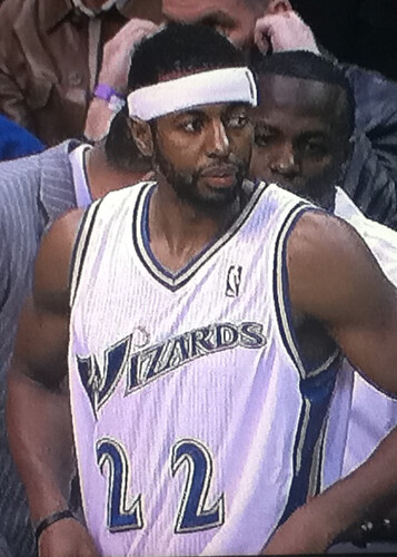
Here’s the backstory: With the Wizards depleted in the back court due to injuries, the team called up guard Mustafa Shakur from the D-League and signed him to a 10-day contract. But they must have done a serious rush job on his jersey, because his uni number — which should have been flush-left, like all the other Wizards’ numbers — was mispositioned and oddly spaced.
Things got even weirder on the back of Shakur’s jersey, which looked like it was lettered up at K-Mart (although the low NOB had the odd effect of making Shakur easy to identify even when he had a towel slung over his shoulder).
Quite a few readers e-mailed me on Saturday night while this game was in progress. But none of them could top Marcus Hall, who was actually at the game and took a bunch of photos of Shakur:
Nice job by Marcus. My thanks also to readers Jonathan Hayward, Jamie Tallman, Logan Light, Marcus Harrington, Jay Anderson, and K.C. Kless for their contributions.

Collector’s Corner, by Brinke Guthrie
Since Paul’s on the road today, we decided to give Collector’s Corner a rare Monday showcase. Here we go:
• Of course I love anything NFL from the ’70s, including this Dolphins thermo mug. The seller has several other teams for sale as well.
• Here’s a 1970s NY Giants ski cap with that terrific “Official Licensed Product” tag. Remember that? [Good call on that tag, which I’d forgotten about. Terrific indeed! ”” PL]
• I like this New York Rangers satin jacket straight from Madison Square Garden.
• Looks like Roger was about to heave a long one. No doubt winning another game with :10 left on the clock. The listing says “poster” but it’s just 11″ x 17″.
• How about this awesome-looking 1940s Montreal Canadiens coloring book, eh? [Find of the week. ”” PL]
• Packers fans, here’s a terrific set of 1970 Volpe prints. [Note that Carroll Dale, at lower right, is shown wearing white pants. ”” PL]
• Going way back, here’s an early-1900s baseball punch-out game.
• Finally, this one is absolutely for PL. Not even going to describe it. Just click here. [Speechless. ”” PL]
Seen something on eBay that you think would make good Collector’s Corner fodder? Send your submissions here.
Good food for a good cause: All you NYC-area folks, listen up: Reader Dave Rakowski is throwing a classic north Jersey beefsteak on Feb. 19, to benefit the Police Unity Tour (a 300-mile bicycle ride from New Jersey to Washington, D.C., to raise awareness for police officers killed in the line of duty). “I rode the Tour last year and was able to raise the required $1,700 through friends, family, and co-workers,” says Dave. “This year, four of my fellow police officers in Kearny have joined me and together we must raise $8,500. That’s where the beefsteak comes in.”
There will be lots of raffle prizes, including autographed footballs from the Jets and Giants. And the food will be provided by Nightingale’s, which I can personally vouch for as the oldest and best of the New Jersey beefsteak caterers. (They’re featured prominently in this story I wrote a few winters back.)
I’m going to try to attend this one (need to re-shuffle a few things on my calendar first). If you’ve never been to a beefsteak and have been curious to check out the scene, this event is the real deal, and you’ll be helping out a fell Uni Watch reader.
Uni Watch News Ticker: Here’s the latest round of design options that Nike is whipping up for Oklahoma State (with thanks to Justin Mitchell). ”¦ Tons of old Browns photos, many of them very cool, here (thanks, Vince). ”¦ While looking for something else, I came across this shot of Joe Rudi in solid green. ”¦ No photo, but Brian Rowland says Michal Rozsival of the Coyotes, whose uni number is 32, was wearing 23 on the right sleeve of his white road jersey last Thursday. Phoenix’s next road game is this Wednesday — something to watch for. ”¦ Lots of cool retro/throwback soccer shirts available here (as noted by Evan Sadler). ”¦ As many of you have probably heard by now, Stan Lee of Marvel Comics (who’s, like, 1000 years old but apparently has no interest in retiring) is working with the NHL on something called the Guardian Project, which involves creating lame-ass superheroes for each NHL team or some such. Whatever, wake me when it’s over. ”¦ When President Obama signed the bill providing health benefits for 9/11 responders, he was doing it while wearing the swoosh — ugh (as noted by Ben Marciniak). ”¦ I tried to make contact with Kevin Kierst, the Mets’ new equipment manager. Left two voicemails for him and then got a call from Mets PR guru Jay Horwitz, informing me that Kevin would prefer to “keep a low profile,” since he’s brand-new on the job and all. Disappointing. ”¦ Here’s something from six weeks ago that I don’t think we’ve covered until now: Seventh graf of this piece indicates that the Mariners will be wearing a memorial patch this season for broadcaster Dave Niehaus (good catch by Aaron Maisel). ”¦ Twenty-five top-selling NFL jerseys from the past year are shown in this slideshow (with thanks to Michael Koch). ”¦ Coupla awesome finds from the Ricko Files: Art Howe with a facemask rig in 1980, and Gary Redus wearing one of the Reds’ white spring training helmets. ”¦ Latest college hoops team to go BFBS: Stanford. “Looks fairly hideous,” says Ken Clampett. ”¦ Check out this absolutely bizarre chinstrap hook-up. That’s David Overstreet, playing for the Montreal Alouettes in 1981 (major find by Bill Kellick). ”¦ Here’s the Sparky Anderson memorial patch that the Tigers will be wearing this season (plus they’re retiring his number). As you may recall, the Reds will also have a patch for Anderson, which will look like this (with thanks to Jeff Cohen). ”¦ Lots of cool old minor league hockey uniforms showcased in this video clip (with thanks to Ken Manyin). ”¦ Tris Wykes notes that Union College goalie Kate Gallagher has a saying on her backplate, along with the area codes for her school (315) and her hometown of Minneapolis (612). ”¦ New lacrosse gear for Hofstra and new gloves for Johns Hopkins (with thanks to Jeff Brunelle. ”¦ David Caruso got a pair of Keds with a tennis racquet pattern on the sole. ”¦ Typo alert! That’s Shane Southwell of Kansas State on Saturday (good catch by Cody Canafax). ”¦ John Vittas attended the Rangers’ annual FanFest on Saturday and saw a guy wearing this jersey. Clever concept, although the numbers and letters seem to be on individual panels (sort of like each one has its own nameplate), plus I’m sure some of you will be howling because he tucked in the jersey. ”¦ I think we might have covered this before, but just in case: Maryland goalie Matt Mitchell’s pads are patterned after the Maryland state flag (big thanks to Jim Dankiewicz). ”¦ Baltimore Mayor Stephanie Rawlings-Blake wore a Steelers jersey as part of a bet based on the Steelers/Ravens playoff game. ”¦ The Cavs wore their CavFanatic uniforms on Saturday night. ”¦ Louisiana Tech’s Lady Techsters wore sleeved throwbacks on Saturday (with thanks to Tom Morris). ”¦ Here’s an absolutely sensational story about how Ottis Anderson was wearing practice pants, not game pants, in Super Bowl XXV (great find by Mark Vermylen). ”¦ Dave Robb has come up with something truly sensational: high school yearbook photos of Keith Hernandez playing football and basketball! Turns out Dave’s wife went to high school with Keith back in the day. I have a hunch those images may find their way onto a SNY broadcast this season. ”¦ Iowa hoops added a Sharm Schuerman memorial patch yesterday (as noted by Tom O’Connor). ”¦ New soccer kits for Kawasaki Frontale (with thanks to Jeremy Brahm). ”¦ Much better weather this year for the U.S. Pond Hockey championships. Jeff Barack attended and took some great photos, which you can see here and here. ”¦ This isn’t quite the same as cross-dressing, but it’s close: A’s outfielder Joe Rudi inspecting what I assume was a Seals skate (very nice find by Roger Faso). ”¦ The Vancouver Giants had a road game against the Kamloops Blazers on Saturday night but forgot to pack their jerseys. They played the game wearing Kamloops practice jerseys, as seen in these video highlights (with thanks to Brian Thompson) … A Chinese sports brand is trying to break into the U.S. market (thanks, Brinke) … Also from Brinke: Bears fans burn Cutler jerseys after disappointing loss … “Wanted to share this cake my fiancée made for a customer of her small business yesterday,” says Kevin Wright. “It pained us both, as we’re both Packers fans, but after the victory Sunday, it was all OK in the end.” … Special thanks to Phil for several of the entries in today’s Ticker. As for me, I’ll be moseying my way back to Columbus this afternoon (have to stop in Waldo so I can check out the renowned bologna sandwich at the G+R Tavern) and then flying home. See you tomorrow.
Instant flashback to grade school………
link
My brother used to have the Raiders version….
I had the Denver Broncos version, that was more red than orange and blue.
Reds and Tigers memorial patch look very similar to me :)
Oops. Thanks. Now fixed.
Think I like the Reds’ memorial patch better because it is simpler.
The Tigers’ patch is more complicated, but hardly overly so. So in this case, I’d go with the Tigers’ less generic look.
I actually liked the idea of the Reds and Tigers using the same patch.
“Tris Wykes notes that Union College goalie Kate Gallagher has a saying on her backplate, along with the area codes for her school (315) and her hometown of Minneapolis (612)”
Union College is in Schenectady, NY and the area code is 518…so not sure what the 315 is for. The 315 area code is for western NY (near Lake Ontario)
Co-sign – Maybe she wished she went to Syracuse?
Check out the tabs on the visor of the Packers #36 Nick Collins from the NFC Championship Game.
link
It looks like they have that old school Packers logo of a football player running infront of a football. How cool is that? I think #24 Jarret Bush has the same visor as well. HAs anyone else noticed this?
They have had those visor tabs at least all year, but I don’t know about years past. The also have that logo on their locker room nameplates on the road only. Now, looking through other photos, on their equipment cases, the Packers have the interlocking “GB” on top of the case.
link
link
Those retro Reebok Packers varsity jackets are just tremendous. The Pack sure does respect their history. Stillers, too. The retro throwback logo touches are great. Course, winning lots of SB trophies helps.
Varsity jackets? What’d I miss?
plus I’m sure some of you will be howling because he tucked in the link
Seriously? I hope not.
Anyway, jersey snafus like Shakur’s numbers and NOB are kind of sad. I mean, sure, it’s not like he got called up to an actual NBA team or anything, but a cup of coffee with the Wizards might be as close as the guy will ever come to the big time, and the team gives him a jersey that makes him look like he’s acting out one of those old Sesame Street “link” skits. Hey, fans, can you guess which one of these players doesn’t really belong here? Poor guy.
I remember noticing that Ottis Anderson’s pants looked like they were about to fall off during Super Bowl XXV, never knew they were practice pants.
Isn’t the all-green leprechaun Ray Fosse, not Rudi? I’m viewing on a cell phone so it’s hard to tell.
Looks like Fosse to me.
definitely Fosse, not Rudi
Big Ben’s nameplate:
Hey Paul, to me it looks like the nameplate was never even sewn down–just heat pressed to the jersey.
Your thoughts?
So weird. I just moved from Ohio to Brooklyn, and I have to go to a blog ran by a Brooklynite to see an image of my hometown back in Ohio.
Too confusing for a Monday morning.
Paul, what is with the dig on K-Mart? We don’t make our own clothes, we sell the same things you find at any other discount retailer, and show me a example of when you have seen a poorly made jersey at a store.
what is with the dig on K-Mart?
~~~
“we sell the same things you find at any other discount retailer”
~~~
i think you may have answered your own question
To be fair, I’m pretty sure K-Mart would’ve done a better job on that jersey.
to be even more fair…matt powers would have done a better job on that jersey
i think the dig was at “discount merchandise” and k-mart, wal-mart, et. al. are just examples … i don’t think he was singling them out, per se
just like when you get a cut you put a band aid on it, not a fabric bandage…you buy a cutrate jersey, you buy it at k-mart, not a big-box, discount retailer
das all
I’d like to apologize to K-Mart, witch’s teats, Michal Rozsival’s sleeve number, and everyone/everything else I viciously slandered in today’s entry.
I’m not sure what game Brian R. was watching last night because Rozsival sure link on both sleeves.
/just sayin’
Say what you will about K-Mart, but link.
Crap. ROAD jersey = white. I think all this schooling over the last few weeks has made me retarded. Or just made it worse. LOL
Sorry kids. Was watching some older NHL games the other night and marveling at the home teams in white.
I’m back on the hunt for a picture.
Ok, found some redemption, and Brian is indeed right!
You can see #23 clearly on Rozsival’s right sleeve in link.
And here is link with his #23 sleeve.
It even has the Coyotes web people slightly confused. link on their website, but the man wearing #23 is not Oliver Ekman-Larsson. That’s Rozsival once again.
link, the real #23 on the Coyotes.
I’ll just go back to being mildly retarded now. :o)
With the Steelers and Packers in the Super Bowl, we have a rare matchup, uni-wise: athletic gold pants vs. athletic gold pants. That’s only happened one time before in the big game: Steelers vs. Rams in Super Bowl XIV back in 1980.
I didn’t remember the 1980 game, but I said the same thing.
Where else could 120 self-respecting guys show up in yellow pants and not be ridiculed?
Here’s a look at that one:
link
I normally don’t have a problem with gray facemasks, but I’ll side with The Jeff on this: that matchup would have been perfect if the Rams’ facemasks were blue.
That’s the one where the Rams’ quarterback Thomas Jarrett was almost killed on the field, right? ;)
Nice!
Anyone else catch how “Ottis” Anderson is never called “OJ Anderson” after that incident in California…?
Also, almost no one—customers or servers—abbreviate Orange Juice by its initials anymore, either.
That was solidly in the vernacular before the murders.
And no way anyone thesedays would introduce a new product called “Yo-J” which, of course, happened before it all went down.
—Ricko
Oh, servers will write down, but rarely say it aloud
Kinda like Voldemort, I guess.
—Ricko
That’s why I hate NOB’s. Shakur looks like he dragging the number. It should be much higher, which would seem like he is carrying the number on his shoulders. NOB’s should be eliminated.
I vote nay; that is probably one problem highlighted by NOB’s out of all professional sports that use NOB’s. Also, I love buying a jersey with my favorite players name on the back, not just a number that would most likely be used by another (sometimes not as good) player later.
I agree with eliminating the NOB. Especially if teams are putting logos on the backs as well. Way too cluttered, and the numbers have gotten way too small. NOBs are fine on the warmups, but during the game I want to see a big, easy-to-distinguish number on the jersey.
Major disagreement. NNOB’s look cheap as heck.
They do tend to look cheap, because the numbers are too small and there’s a glaring empty space where the NOB should be. If they were to eliminate NOBs (they shouldn’t), they’d also have to make the numbers larger. It wouldn’t look as bad then.
Thanks for the beefsteak plug Paul. Can’t wait to see the SB XLV footballs with the GB Packers on it. Go Pack Go!!!
I really think the Keith Hernandez photos are worthy of not only a colorization but a moustachization also. Any takers?
Nice.
Kind of a Winnipeg Blue Bombers look to Hernandez’ high school football uni in that first photo (in black and white, anyway).
Simple can be a good thing. Not saying EVERYONE should adhere to that philosophy, how boring would that be.
—Ricko
I really like those photos from former Browns lineman Jerry Sherk’s Facebook page. They are as good as Jerry Reuss’
photos. Love to see a future interview with Mr Sherk on this site.
Re.: Joe Rudi with Seals skate.
That is definitely Joe Rudi. It looks like the photo was
from 1970 when Ray Fosse was still with the Indians.
Indeed, it is Rudi.
We were reffering to the “Joe Rudi in solid green” pic. That looks like Fosse.
Too much Rudi in one ticker can be confusing. ;)
Anyone else notice Ben wearing 2 different shoes?
link
He has a lingering foot injury, so I’m sure the ‘other’ shoe served a medical purpose.
roethlisberger’s been doing that for a while…
if you scroll down in the boxing day ticker (in the item after the bolded “Greg Riffenburgh”) … you’ll see he’s been wearing different combos depending on the field surface
Left two voicemails for him and then got a call from Mets PR guru Jay Horwitz, informing me that Kevin would prefer to “keep a low profile,” since he’s brand-new on the job and all. Disappointing.
Considering what happened to the previous guy, I think this low-profile thing is a good idea. At least for awhile.
Low profile is one thing…witness protection is another.
Any idea when the Packers will announce which jersey they will wear for the big game? The NFC is home this year, meaning they choose… Should be interesting to see if they continue with the “Road Warrior” motif, or go with the classic Green and Gold.
Even better; the Packers use the blue throwbacks and the Steelers wear their Batman uni’s.
That’s just crazy. You can play it that way in Madden if you want, but even I wouldn’t go that far. (mainly because I really don’t like the blue throwbacks, I’d rather put one team in mono-yellow)
Agreed.
Opinion of throwbacks aside, probably a good idea if every year the Super Bowl is about this season, and this season alone. Whichever team wins, it will be the 2010 version of that team. “Cannonball” Butler and Don Shy won’t be in the Steeler backfield this time around.
No need to hark back to other memorable moments. If the event itself isn’t a memorable moment all its own, then something is seriously wrong.
—Ricko
I think we all saw enough of the “faux-leather” helmets.
I’d be all in favor. Heck, the players have the blues in their closets, so why not?
Green Bay Packers: Green over Gold
Pittsburgh Steelers: White over Gold
this
The Guardian illustrations do not include a St. Louis Blues figure. I was disappointed by this. Any reason why not? Did Stan Lee just forget about us Blues fans?
Because depressing people with music isn’t a very good super power?
The NHL and the Guardian Project are unveiling one per day up to the All-Star Game on January 30. It has not yet been revealed from what I’ve seen.
Correct. They set it up where people could vote in head to head matchups, and the team with more votes was revealed sooner. Unfortunately, that means my favorite Panthers are right here at the end with those Blues.
fail
When you come right down to it, being the Bears quarterback has got to be one of the least attractive jobs in pro sports, doesn’t it.
I seems to remember Cutler taking a serious shit-kicking early in the year, and him coming right back.
But last night he’s suddenly a wuss and we see video of his jersey being burned in the street.
Right, like he was responsible for the Bears being behind while the echo of the Anthem singer still was bouncing around inside Soldier Field.
I’m not a Cutler apologist, just that the total tonnage of what so called “knowledgeable” fans don’t really know about football is amazing.
Sometimes it isn’t that your players or your coaches screwed up. The other guys just were better today, and they beat you.
—Ricko
That being said, visually speaking the Bears-Packers game sure was a classic NFL post-season look, wasn’t it.
If only it had started snowing.
—Ricko
I believe a lot of the instant-Cutler bashing yesterday comes from the fact that he is acknowledged to be a rather unpleasant person. It’s easy to jump on anything he does as he’s already given you ammo with his general sour disposition.
But I wouldn’t want him in SF even though we need a QB. Too polarizing a figure.
Someone more like the universally loved Jim McMahon, huh. ;)
Tellin’ ya, there’s a Navy Hole that swallows (or twists up and spits out sideways) Chicago Bears quarterbacks.
If Tom Brady had been drafted by the Bears he’d be David Garrard’s backup now.
I think the only guy it wouldn’t have screwed up would have been Ryan Leaf.
—Ricko
And maybe Jamarcus Russell.
San Fran, and everyone else in the league are probably going to make a run for Caleb Hanie after his performance yesterday. He’ll be the NFL’s hot qb prospect for 2011, like Kevin Kolb was the season before.
On the + side, he does date Kristin Cavalleri.
i predict a spring breakdown
The Bears fans I’ve spoken with today were citing other complaints about him appearing to fake injuries to excuse poor play or get out of practice. I can’t say myself, since I don’t follow the team, but it sounds like his reputation in Chicago is of someone who will avoid responsibility for his shortcomings and who looks for reasons to avoid work.
Interesting. I do follow the team and I’ve never heard anything like that.
No screen shot but did anyone else notice Clay Matthews helmet decal was half missing during yesterdays game, I guess it isn’t just the Bears who have issues during the cold weather.
Yep, I mentioned it in last nights comments. But I have no screenshot either.
Anyone else notice the “6” patch on the Guardians for the Blackhawks, Bruins, Canadiens, and Maple Leafs? Why no “6” patch for the Red Wings Guardian? and we’ll have to wait and see on the NY Rangers…
Anybody else think the Red Wings Guardian looks more like a Transformers character than a comic book superhero?
Ditto the Blackhawk (does it transform into a helicopter?) and Blue Jacket (a double-barreled tank?)
Purdue did a series like the guardian project, but for individual football players over a 2-4 year period.
It was used in promotions and the “fire-up” video before the games.
link
Oh, I remember that! Well, mostly I just remember the Orton one, because I think it got used when they pushed him for the Heisman.
ESPN had Super Bowl XLV footballs on the set last night. Chris Berman even mentioned that they were the official Super Bowl balls and as the show went to commercial a camera zoomed in on them to clearly show where the Packers and Steelers team names were stamped into the leather.
I thought all the balls were made last night. What gives?
How many balls did they actually show with Packers/Steelers clearly printed on them?
I wouldn’t be surprised if they’d pre-made a ball for each possible matchup just for TV, then they run off the full batch after the games.
Pretty much guarantee there were prototypes in the possible combinations provided in advance for studio use. Don’t have to be perfect, or be the real deal. Just have to LOOK like the real deal.
It’s theater. In two weeks, it’s football.
—Ricko
Exactly. They showed us those protos at the factory. They all had the word “Sample” stamped on the side in fine print.
At the airport now, headed home soon,
Paul
At the airport, which means you should’ve tried the bologna sandwich. I can’t say I’ve had that one, but as a fan of fried bologna, I’m kind of on the edge of my seat waiting for the review.
It was good. Not life-altering, but solidly good. I’d happily order it again if I found myself in Waldo, Ohio (which seems unlikely, but ya never know).
Also quite good: the slice of black raspberry pie I had for dessert.
You do realize that at a funeral the dead guy’s suit has no back to it, right?
I mean, they don’t put his arms through the sleeves n’ all.
—Ricko
There were just two. One ball showed the Super Bowl logo facing out and the other had the team names facing out.
Probably props, you’re right. But it seems like an awful lot of trouble to send these to ESPN for 5 seconds of airtime and so Berman can say they have the game balls.
berman could have been full of shit, too
wouldn’t be the first time
I did a phone interview with Berman once before the 89 Super Bowl with the Bengals..and he gave me my own nickname.
“Brinke(‘s) Robbery.”
Congratulations?
On Countdown before the Packers/Bears game they had four balls with all possible matchups shown on camera.
Revelation:
Sometimes they cut the movie trailers before the final edit it done on the movie.
Uh-huh, really, they do.
And the John Wooden obits were put together before he died, too.
I know, I know, hard to believe, but that’s show biz.
And news.
–Ricko
You’re in Ada?! I went to college in Ada. Lots of good local food in the town. I was a broadcasting major and did a piece at Wilson. The people are awesome!
Did ya notice the color-on-color uni illustration on that 1900’s baseball punch-out card game???
link
-Jet
No softball uniforms in sight, though.
That 1940’s hockey coloring book… wow.
Comparing it to the 70’s hockey coloring set I had, it’s kinda disappointing in how the player poses are nearly identical – no “action” poses, just a skater or goalie standing in pretty much the same pose. And with the background of most of the pictures being indistinct, all you could really color was the player and the title panel.
But it’s still wicked cool…
-Jet
From yesterday’s thread: in case no one’s noted it, Matt’s photo of Walter Johnson for colorization dates from 1912-15. Those were the only seasons in which the Nats wore the navy caps with the white band around the base of the crown and the edge of the bill.
Not sure who the opponents are in that Griffith Stadium phot were but I’m guessing the Browns. I’ll try to do some sleuthing on point.
Oops, “Griffith Stadium photo.” Sorry.
I didn’t realize just how much Joe Rudi I could handle in one day, so here’s some more…
link
link
link
link
Joe Rudi. Ah, 1972. Riverfront Stadium. Game 2. I’m at the Series in the left field stands. Denis Menke takes one deep, but of course I can’t see if it’s out or not, but it looked like a homer, so I had to look at the crowd reaction to see if it was.
It wasn’t.
The painting is also incorrect as the distance measurements painted on the outfield wall at Riverfront Stadium were on the lower part of the fence as seen here:
link
Any word on if K-State will debut new gray hyper elites tonight vs. Baylor?
new gray sweatbacks on full display
duuuuuuude. that nhl guardians project? what a total wreck. behold this abomination:
link
‘controls wintery weathery patterns and […get this…] oil manipulation.’
classic.
Agreed. Comic book superhero mascots seems like a great idea but the implementation is a bit lacking, if not completely lazy. As a Hurricanes fan, I’d say having that lovechild of Storm and Storm Shadow as a mascot would beat the crap out of having the skating pig. Even better would be just having Storm as a mascot.
And since I’ve already brought up a G.I. Joe character, I didn’t know Cobra Commander was a Montreal Canadians fan.
Two notes:
In the excellent Jerry Sherk Browns pictures, great one in the eighth row down of the Matthews brothers taken after a game in Cleveland in 1984, as evidenced by the Oilers 25th anniversary patch on the jersey worn by Bruce Matthews.
West Virginia wore its dark road uniforms at home yesterday against South Florida clad in gold.
link
Those WVU BFBS uni’s need to be burned faster than those Chicago fans burned Cutler’s jersey. Wear the damn school colors, Old Gold and BLUE.
+++++ WALLPAPER BACKGROUND REQUEST +++++++
Can someone take this image:
link
And place it smack in the center of a black blackground, 1440×900?
Or this one:
link
On a matching orange background. need to get ready for the season, yknow.
Tampa Bay Lightning postpones news conference unveiling new uniforms due to the deaths of two St. Petersburg Police officers and the shooting of a U.S. Marshall.
link
Prayers for the officers.
And maybe the BEAT LA can be enlarged, -but not distorted?
In tennis news, Ekaterina Makarova was forced to change shirts because her sponsor logo was too big for the shirt front. It was acceptable on the sleeve though.
link
Tennis player forced to change her dress…
link
…because of logo creep.
Um, yeah. Forgot to hit F5 before posting…
that’s one of those Grand Slam patch deals.
Sparky “home.”
Something nice about that.
link
—Ricko
It’s a nice patch. Clear, simple, classic.
not that i’m complaining, because i agree that that is a nice patch but…
do any teams simply do a black memorial armband anymore? is that no longer de rigueur? seems that every memorial these days has to be somewhat *unique*
Agreed. To a certain extent, memorials have become the latest “Look at me!” (or at us) uni element.
I don’t think anyone uses black armbands anymore except the Yankees (for non-iconic figures like Ralph Houk and Cory Lidle, that is — the icons get patches).
Not a fan of the black armband. Does it eliminate to possibility of an ugly, over the top memorial patch? Sure does. Does it mean more to have a unique gesture for whoever is being remembered? Probably.
Also, Detroit probably wanted to make a special emphasis on #11 because of them retiring it.
link
“Top 10 smokeless tobacco commercials” by the website BroBible. Obviously, these are pretty old, and there are a number of them that include athletes, Carlton Fisk, Earl Campbell. Kind of a trip to see them when nowadays all you hear about/see is the anti-tobacco commercials.
NEW CANADA NATIONAL TEAM SOCCER KITS Switch from Adidas to Umbro.
link
Yikes. That kit looks like something you’d order for your high school team out of a catalogue…
I may be in the minority, but I actually like Canada’s new kit. Saying “f**k you” to Adidas is the first step towards recovery. Look at France.
The only thing that I would change about the shirt is that I would make the Crest more legible (sp?), because the current shirt’s Crest kinds gets lost on the Chevron. But other than that, Canada is solid on the uni design.
And as long as were talking about France, I know they made the HUGE upgrade to Nike not too long ago, but the shirt that they featured at the unveiling (sp?) was basically an all-blue polo shirt. So can anyone explain THIS?
link
kinda*
Question:
Are the Green Bay yellow pant, the exact shade of yellow as the Pittsburgh Steelers pants. Green Bay’s seems slightly more yellow – where the Steelers seem slightly deeper – slightly more orangy/yellow – I could easily be wrong here.
according to our friends over at colorwerx:
green bay
pittsburgh
i had thought donovan did those on pms values, but i guess not…i think the golds are the same, however
Thanks, looking at this picture – they do look more or less the same
link
K-State coming out in gray uniforms.
Out of Mike McCarthy’s mouth – link
Contrast between State’s gray and Baylor’s green ain’t that great.
pads to change away & alts
link
tmw (tues) i think
So I was scrolling through the top 25 jersey sellers for the NFL and I can honestly say there were a few total surprises to me. Polamalu at number 1, Tebow at 3, Vick at 6, DeSean Jackson at 9, “Boogie Man” Sanchez at 10, the fact that Peyton Hillis, Wes Welker, and Jason Witten were even on the list. Only 3 defenders Ray Lewis, Clay Matthews and Polamalu. Is there no love for Ed Reed, Revis Island, Patrick Willis, James Harrison, DeMarcus Ware, Peppers or Urlacher. Kind of crazy for that to be the top 25.
Sleeved Lady Techsters gamer that passed through my hands a while back:
link
A possible theory on Vancouver “forgetting to pack their jerseys” for the game against Kamloops- don’t CHL teams play half the season wearing one colour at home and another on the road, and then switch for the second half of the season? Maybe Vancouver just brought the wrong set of jerseys…