Relatively uni-unventful day in the NFL yesterday, but here are a few items of note:
• Just like last week, Eli Manning was wearing an old-style (i.e., non-super-stretchy) jersey. But instead of his NFL Equipment shield being stitched onto a little red triangle of fabric, as used to be the case for the Giants’ pre-stretchy blue jerseys, Manning’s jersey had a blue triangle instead. I hope to get the full scoop from Joe Skiba shortly.
• Two things you don’t often see: the Bears in throwbacks and the Vikes in purple pants.
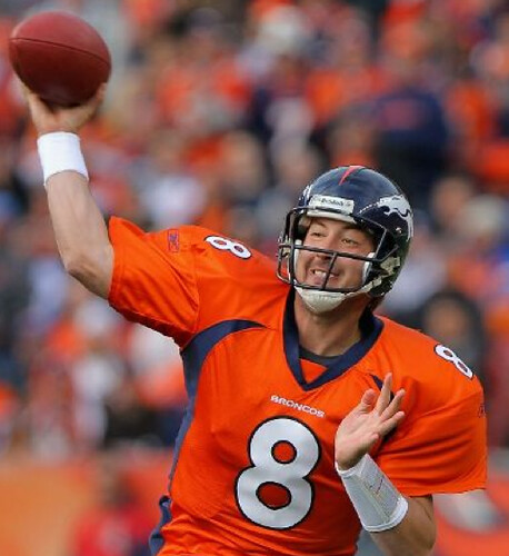
• Kyle Orton’s NFL Equipment shield was missing. Also: No photo, but reader David Marucheau says Orton had his sideline hat tucked in the back of his pants on the final kneel-down play of that game. If anyone DVR’d the game, let’s see a screen shot.
• Joe Haden was wearing some seriously high whites — and they would’ve been even higher if he’d pulled them all the way up.
• NBC apparently didn’t get the memo about the new conference logos.
• Turning our attention to Saturday’s college action, Northwestern saluted outgoing equipment manager Bill Jarvis by wearing “Jarv” on their nose bumpers.
• Texas Tech wore red pants, I believe for the first time.
• And Miles Burress of San Diego State lost one of his helmet decals on Saturday.
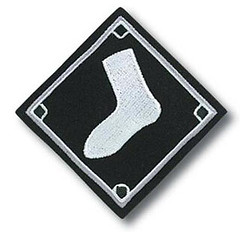
Sox appeal: Lots of unhappy campers in Chicago, where word leaked on Friday that the White Sox are replacing their road uniform’s excellent diamond-shaped sleeve patch with the “Sox” insignia. Chisox message boards have been abuzz with negative reaction to the switcheroo and several fans e-mailed the team to complain. That apparently got the attention of Sox marketing VP Brooks Boyer, who sent several bloggers and fans the following note (which was forwarded to me by reader Scott Schaaf):
Guys,
I want to thank you all for your notes about the road uniforms. Although none of you are happy with the decision, I do appreciate the feedback, good or bad. ”¦
We have talked quite a bit about the road greys for a few years after getting input from our players, staff and even some fans. The most alarming thing I received from a fan was the stat showing how little we are wearing our road greys in favor of the black uniforms. That is something we plan to correct going forward.
After looking at the road greys, we determined that the uniform should contain our main logo, our brand, and have decided to replace the flying sock with the White Sox primary S-O-X logo. This was one of several possible options.
I know this is not a popular decision with you guys and I am sorry to disappoint. In the event any or all of you are at SoxFest, please find me if you would like to discuss further.
Again, I truly appreciate the feedback. Sorry this email response was not what you wanted to hear.
All the best,
Brooks
A few quick thoughts:
1) Boyer’s explanation notwithstanding, it’s hard to fathom what the Sox were thinking here. If there’s one thing I’ve learned over the years, it’s that scripts and related insignia do not look good on sleeves. Plus the diamond-shaped sock patch was one of the better sleeve adornments in the game. This feels like change for change’s sake. Disappointing.
2) Although he didn’t say what fans wanted to hear — and acknowledged as much — I think it’s fairly impressive that Boyer put together a fairly substantive response (on a weekend, no less). And while I saw some message board comments along the lines of “Sure, I’d be happy to talk with him at SoxFest — if I could afford the $250 to go,” that seems a little unfair. I mean, is Boyer supposed to show up at every disgruntled fan’s house for a chat? He’s making himself available to fans in one of the few settings in which they get to mingle with him. I wish every team exec could be this hospitable.
3) Seems like a big fuss over something as inconsequential as a sleeve patch, no? Then again, maybe not.
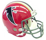
Gold rush: After last Thursday’s Falcons/Ravens game, I got quite a few queries asking about the gold stripes on the Falcons’ helmets. One guy even asked if it was a special gesture for Veterans Day.
As I explained to everyone who asked, the Falcons wore those same gold stripes on their throwbacks last season, and of course they also wore them back in the late ’60s. The story, as I think most of you know, is that the gold stripes were a shout-out to Georgia Tech, because the team had basically chosen Georgia Bulldog colors.
I was a little surprised to get so many questions about this one — I thought most people knew that story by now. I’m always happy when people are curious enough to ask, though.

Star chamber: As you may recall, Robert Marshall offered the stirrup design shown at left back around the Fourth of July. One of the many readers who bought a pair was longtime DIYer David Frost, who recently decided that the design was lacking something — so he added it. Those are white tackle twill stars, which Frosty added to his hose as a patriotic gesture. “I wore them to work on Thursday for Veterans Day and they got a great reaction,” he says.
Now here’s the best part: If you bought a pair of these stirrups, Frosty will add a pair of stars to your set — free of charge. Just pack up your stirrups, include your address and $3 for return shipping, and send it to David Frost, 510 Callalily Ct., Myrtle Beach, SC 29579. Thanks for the super-generous offer, Frosty — I’ll be curious to see how many folks take you up on it.
Quick Candela update: One of the many puzzling and frustrating things about the Candela project is that there’s an official New York City Parks Dept. sign right next to the structures that provides some quick info about them — all of it inaccurate (for details, scroll down to the bottom of this page). This misinformation initially sent us off in several wrong directions with our research, and it’s also contributed to the fog of mystery and confusion about the structures over the years.
When our research turned up conclusive evidence that the sign was wrong, we informed the folks at the Parks Dept., who thanked us and said they’d update the sign. That was about 18 months ago. In retrospect, we probably shouldn’t have expected much from the municipal bureaucracy, but it’s still been really frustrating to see the sign sitting there just a few feet from the structures, trumpeting its inaccuracies month after month.
So yesterday Kirsten and I took matters into our own hands and affixed a waterproof (we hope) patch onto the sign. As you can see, we didn’t quite match the right shade of putty, but at least the text is now accurate. Much better.
Uni Watch News Ticker: Charlie Samuels, who had been suspended by the Mets, has now been fired. ”¦ Ever wonder what a wolverine looks like? Look no further. That’s what Michigan will be wearing for the Big Chill game on Dec. 11. Not quite as good as the design it’s based on, but still very cool. ”¦ Who’s the ballplayer with the Joe Cool shades? That’s none other than Joe Willie Namath in a rare baseball shot. Looks like his team had some very inconsistent jersey typography (great find by Dan Cichalski). ”¦ The Wrigley marquee will be painted purple for the Northwestern game on Saturday. ”¦ New women’s hoops coach at Morehead State has some funny ideas about how to dress (with thanks to Scott Gleeson Blue). ”¦ My college hoops roundup column included a mention of Tulsa’s new uni, but now Kyle Grooms has provided better photos and additional info: “The blue road uniform will be worn with red shoes; white home uni with white/blue shoes. Tulsa will also wear different warm-up tops and shooting shirts that reflect different eras of Tulsa basketball. I believe the plan is one that says ‘Kendall’ (the original name for University of Tulsa was Henry Kendall College), then one reflecting the Nolan Richardson-era teams, and the last representing the Bill Self Elite Eight and Sweet Sixteen teams.” ”¦ Remember that fuss about Clinton Portis wearing a Phillies cap? Shouldn’t happen again (with thanks to Andrew Hoenig). ”¦ As many of you know by now, there’s a interesting detail on the Rangers’ third jersey: All of the team’s retired numbers are shown on the inner rear hem. “I understand that’s only available on the on-ice authentics and the jerseys sold exclusively in the MSG team store — not at retail outlets like Modell’s,” says Terence Kearns. Personally, I think that kind of gimmickry — and also the “Established 1926” on the inner rear collar — is precisely the sort of thing an old-school New York franchise like the Rangers should not be doing. Leave those gewgaws to the amateurs. You’ve got a nice sweater, a decent anniversary patch, and plenty of history — that’s enough. ”¦ Meanwhile, Joe DeAngelis doesn’t like that the Rangers’ new jersey is being paired with the regular everyday pants. “The red on the pants is clearly not the same shade of red used in the new jersey, and the pants’ bright white stripe pattern is overwhelming against the jersey’s off-white details.” He’s right. ”¦ Joe Lombardo watched the Pacquiao/Margarito weigh-in and spotted something odd: “There was a guy in the background wearing a jersey that looked like it was half NFL (white Cowboys, maybe?), half Notre Dame home. It had the NFL crest on the collar and the interlocking ND below it. The number on the front was 88, but the sleeve numbers were 81 (I think) on the white side, and 18 on the Notre Dame side.” Anyone know more? ”¦ New look for the Wisconsin Timber Rattlers. Want to see more? There’s a photo slideshow, a video clip of the unveiling, and this article, which includes the following tidbit: “[T]he Timber Rattlers are part of a select group of minor-league teams ”” roughly 30 out of 160 ”” whose logo and jersey can be purchased by youth baseball teams around the country. ‘Because of that, we see a huge influx in sales,’ said [a team official]. ‘And because of all these Little League teams buying our jerseys, we’re getting royalties on all those jerseys'” (with thanks to Caleb Bentz and John Okray). ”¦ Lots of spectacularly detailed and evocative old baseball portraits on this page (great find by Andy Kanzer). ”¦ Here’s a good article on how the South Carolina football equipment staff gears up for a road game (with thanks to Charles Hall). ”¦ Raleigh McCool spotted something I hadn’t been aware of in Lipscomb’s new hoops uniforms: subscript NOBs! ”¦. We often gripe about how today’s NFL players — esp. receivers and defensive backs — wear their pants too short. But Mike Braam found an old photo of Fred Biletnikoff wearing short pants back in the day. ”¦ I’ve never seen an old satin night-game jersey show up on eBay until now. And scroll down to see the sensational chain-stitched design on the back! Reasonably priced too, for what it is. Alas it’s too small for me — grrrrr — or else I’d already have bought it, but I hope one of you out there will snap it up. If so, let me know once you get your hands on it. ”¦ I don’t know about you, but my sock drawer runneth over thanks to all the stirrups I’ve ordered from Robert Marshall — it’s a serious mess. So I got all excited when I saw this spectacular vintage sock rack on eBay. Wouldn’t a stirrup collection look great in that? Unfortunately, I got outbid. Double-grrrr. ”¦ Speaking of eBay, Jeff Flynn, Jr. found this, which I’d totally bid on if I didn’t already have something very similar. ”¦ Still more eBay goodies: a chevron-striped basketball warm-up; a groovy old Durene jersey in Redskins colors; one of the most interesting all-star jersey designs I’ve ever seen; and a really nice 1960s baseball undershirt, complete with off-center buttons, three-quarter sleeves, and cool Russell Southern tagging. ”¦ Good article about the rebranding at North Dakota (thanks, Brinke). ”¦ Lots of poppies last week in the EPL. ”¦ Steve Johnston was at the U. of Chicago over the weekend and took a coupla snaps of some of their sports heritage displays. ”¦ Someone named “John,” who didn’t give his full name and who managed to contact me without disclosing his own e-mail address, says, “Baylor basketball will be debuting a yellow alternate uniform for Tuesday’s 24-hour hoops marathon. The color scheme looks kinda like the Seattle SuperSonics alternate uniforms before they moved to OKC.” Might be true, might be bogus — either way, let’s hope “John” is a little less cloak-and-dagger next time. ”¦ Injured Patriots player Bret Lockett can’t spell “Patriots” (with thanks to Seth Horowitz). ”¦ Here’s a bizarre one: Eric Feingold was at a Chinese restaurant in Dublin — you know, in Ireland — and was surprised to find the Minnesota Wild’s logo on the cover of the menu. ”¦ Coupla college hoops teams broke out new alternate uniforms yesterday: gold for Purdue and BFBS for South Dakota State (with thanks to Andrew Weintraut and Tom O’Connor, respectively). ”¦ New hoops uniforms for Penn, too (with thanks to Evan Smith). ”¦ Still more college hoops news: New uni number assignments and sneakers for UNC. ”¦ If you go to ESPN Australia, you should see two banner ads featuring Aaron Rodgers wearing a Photoshopped No. 211 jersey. And if the ads aren’t there, you can see them here, because Katie Kopo took some screen shots for us. ”¦ Lots of soccer fuss in Kansas City, where word has leaked that the Kansas City Wizards will be renaming themselves Sporting KC on Wednesday. The new logo leaked last night on a Wizards blog, but a little birdie just sent me a much cleaner version of it.
Teevee news: I appear as a talking head in an NFL Films segment that’s currently airing on the NFL Network. The topic is the “Top 10 Uniforms of All Time,” or something along those lines, and readers who’ve seen it say it’s pretty good and that I don’t make a complete fool of myself (I don’t get the NFL Network myself, so I haven’t seen it, although the producers are sending me a DVD). For those who are interested, there’s one remaining showing of the program, at 1pm Eastern on Tuesday.
Darren Fletcher of Manchester United was forced to go without name and number on Saturday. Explanation and interesting commentary here:
link
Kinda surprised United don’t have a numbered blood jersey. Every other time I’ve seen this happen, the guy ends up wearing 49 or 50 for the rest of the game.
Then again, mehhhhhhhhh, Darren Fletcher. You are so overrated.
Sporting KC? Really?
You know, if US Soccer teams want people in this country to pay attention to them, I really don’t think the European style naming is the best idea.
I guess I could be wrong… but to me that name sounds more like it belongs on the side of a building, not a professional sports team.
I’m inclined to agree with you. While the MLS team in Houston is the “Dynamo,” far too many people refer to them as the “Dynamos,” as if their name were something similar to the more American “Bulldogs” or “Cowboys.” How much ridicule has Real Salt Lake gotten for their name (despite their actual affiliation, however loose, with Real Madrid)?
The European naming convention is interesting, to be sure, but it seems a bit silly in America.
(I say all of this as a BIG soccer fan who enjoys watching the sport coming from either side of the Atlantic.)
I think the thing MLS has been doing right, and why it’s found its niche, is that it has focused on soccer fans. Reaching people put off by Euro-style naming is probably pointless, as those people aren’t really going to be won over by soccer anytime soon.
I wonder how KC area soccer people felt about the Wizards name. I can see dumping a stupid name and landing on a Euro-name (like Dallas) but trading in a name identifiable with the place, even if it is pretty cheeseball, for a generic Euro-name when you’ve been around 15 years seems like a bad idea.
I live in the KC area and support the Wizards, er um Sporting. I don’t think that the club’s supporters ever fully embraced the Wizards name. There has been a lot of talk about rebranding the team and I think the majority of fans supported this. I just don’t think that this new name (Sporting) or the new crest lived up to expectations.
Word is that the Sporting Kansas City name will also be used for a rugby team and womens’ soccer team to expand the brand identity.
I agree with Richard. I think the MLS is past it’s initial growth phase where it copied the format of the Big 4 leagues to try to get fans and make them comfortable. Now it has the die hard fan base and more knowledgable fans that want the league to change to be more like every other league in the world. And that includes getting away from (city/state) (nickname) to some.
And hey, at least they don’t go by the “Wiz” anymore.
It’s one thing to copy the format of European team names – but it is plain idiotic for there to be a team named FC Dallas – when the league uses the term “soccer”.
It would also help build some credibility if the Eastern Conference final wasn’t contested by Denver and San Jose.
Seriously? San Jose is East? Wow… and I thought it was bad when the NFL re-aligned and kept Dallas in the East division.
San Jose is in the Western Conference. They happened to play in the Eastern Conference finals against Colorado (also western) because both teams entered the playoffs as wild cards.
The MLS rules for wild cards is that they take the best teams from the whole league, not just by conference. This year’s playoffs featured 6 teams from the West and two from the East. It just so happened that both Eastern teams were eliminated in the first round.
The solution would be to rename the semi-finals so they are not affiliated with a conference.
In the annals of stupid, Europosing MLS names, “Sporting Kansas City” actually out-does “Real Salt Lake” and all the bloody “FCs” we have.
American Soccer: We Can’t Be Bothered To Wait For Our Own Traditions And History, We’ll Just Steal Yours, Thanks.
this just in…
it’s soccer
nobody cares
They’ll care when the twin NFL and NBA lockouts next year cripple the NCAA.
No we won’t.
No NFL doesn’t mean I start watching soccer. It means I play more Madden or watch the UFL.
this just in..
people do care
Ah, but they do care, Phil, for the comment thread to be this long! Color me pleasantly surprised, because I didn’t expect that much of a response.
Never embraced the Wiz or the Wizards, so the name change is a step up. Not as good as the KC Comets, but a step up.
Now if MLS and the MISL partnered up, KC could share the Comets name with the Missouri franchise.
At least you can’t call the team Toto FC anymore …
why, are they not in kansas anymore?
Actually the Wiz/Wizards played all their home games in Missouri prior to the 2009 season. The 2009 and 2010 seasons were played in Kansas at the KC T-Bones minor-league baseball park, Community America Park.
Their new stadium is located adjacent to the Community America Park, in Kansas.
Since the Royals and Chiefs both play in Missouri, it makes the Wizards the largest professional sporting franchise in the state of Kansas.
As a soccer fan, I’m very put off by it.
We should be embracing what our country does differently while playing the world’s game. The league doesn’t do promotion and relegation. It uses the term “soccer” over “football.” Why can’t MLS franchises be named the way the US and Canada traditionally name sports teams?
I wouldn’t even mind it if they used “AFC.” In countries/ regions where soccer is not clearly the most popular code of football, the term ‘Association’ is supposed to be used.
Look at Hull for example. The rugby league club is known simply as Hull FC, because it is older and more popular in the area than Hull City AFC. On the other end, the Reds use Liverpool FC because no teams in the area compare.
And don’t even get me started with the freakin’ Houston Dynamo; as a native Houstonian, scrapping “1836” for “Dynamo” was ridiculous.
Agreed. Houston 1836 is a great name.
A lot of clubs in Germany seem to go that route. 1860 Munich springs to mind.
I’d like to see promotion and relegation in both soccer and baseball. Sure, my Pirates would never get past AAA, but it might be an incentive for other teams to spend that luxury tax money on players.
And the 1836 name angered the Mexican-American fans, did it not? I’m glad they changed it, because unless it’s a really famous date like 1776, it’s not as good as a name.
It’d be fun to see the chaos ensue if we did promotion/ relegation in the U.S./ Canada. The Toronto Maple Leafs would play a hell of a lot better if they had to fight to stay out of the AHL.
And the name did anger Mexican-American fans. AEG named the team for the year the city was founded – which was also the year Texas became independent of Mexico. Houstonians can’t help the fact that their city was founded during the Texas Revolution. It’s positively ridiculous; no one of British descent protests the New England Patriots or the UMass Minutemen.
Losing an entire empire probably softened the blow…
Solid entry today, Paul. Thanks for your hard work.
A few observations:
– I know they lost, but that white helmet/red pants look works really well for Texas Tech. Hope they keep it.
– With you – and all the Sox fans – all the way on the White Sox complaint.
– Great job tagging the Candela sign.
– Is there a better throwback than the Falcons? The whole look is absolutely gorgeous. Why the club doesn’t revert to that right away is beyond me.
– Yeah, Sporting KC?
probably
but none proves their current unis are so woefully horrid as the falcons does; ok…maybe the bills does too, but it’s not as good a throwback; the vikes’ is up there too
“- Is there a better throwback than the Falcons?”
Chargers (runs and hides)
Seriously, I have to agree. The Arthur Blank Falcons have been such an improvement over the Rankin Smith Falcons everywhere but with the uniforms. Make the throwback the standard, have a red alt home jersey (leave out the gray from the Bartkowski/Andrews era), and eliminate the gold helmet stripes. I think the Tech alumni are over it.
I will testify to Orton having the baseball cap tucked into the back of his pants. I told my wife, look what he did and then sure enough after the kneel down just turned towards the Chiefs bench took off his helmet, grabbed his hat and acted like nothing had happened. As cool as the other side of the pillow. I should have grabbed a screen shot.
Stuart Scott is on Line 1 and says he has a cease and desist order for the term “as cool as the other side of the pillow”……
Unfortunately I didn’t set my DVR 1 minute longer….all I got was to that last kickoff :(
I have absolutely seen this before. Don’t remember the game, tho. But I have seen other QB’s do this, positively.
Can someone please call whoever at the Falcons and tell them to ditch the black helmets for the red one with the gold stripes. That is one of the best looking helmets ever.
That Bears throwback has a much greater visual presence than the regular uniform. The orange details on navy blue really pop in a unique way. Throw a solid orange ‘C’ on the helmet, make the numerals on the front and back of the jersey the same and that’s a winner as a full time uniform.
I agree, it’s a very sharp uniform.
It also seems to me to be perfectly tailored for HDTV – on a standard signal the orange numbers blend into the navy background, but HDTV doesn’t need such contrast.
I am all for that. Solid orange wishbone C..no white trim.
What I think was lost in Boyer’s response was that the So will probably at least be wearing the road grays more often.
BOOOOOOO!!!!
Dude, Halloween was more than two weeks ago. Give it a rest.
That was an annoyed boo, not a spooky boo. I like the black jersey more than the gray one.
…and given the choice of dwelling on Halloween or listening to the X-mas music being played in stores already… I’ll stick with Halloween.
You can always listen to Adam Sandler between the seasons.
link
I wonder if that Chinese restaurant has gotten their cease and desist letter from the Wild yet…
On the MLS Rumors website, a poster sent his rumor that while the “Sporting KC” name is definite (earlier, the site documented how MLS registered the name for website purposes), the logo shown here was not. We’ll just have to wait until Wednesday.
link
The colors will apparently include blue (dark and/or light blue) as the new stadium being built by the Kansas Speedway is full of those shades.
I wouldn’t trust that guy.
Anyone who believes anything spouted by MLS Rumors deserves what he gets.
Hence the name “Rumors.” As I said, I’m waiting until Wednesday.
Miles Burress of San Diego State didn’t lose one of his helmet decals – he started the game without a decal on either side of his helmet.
Here’s a screencap from the first minute of the game that I posted on the Chris Creamer boards:
link
I admire Boyer for his forthcoming response to fans, but it kinda comes off to me as arrogant: “We understand that you, our fans, who pay for tickets and merchandise, really hate this decision that we made. But we’re going to stick with it because we don’t really give a crap about your opinion.”
Rather than catering to fans (the team knows that fans will continue paying money for Sox-branded items including jerseys no matter what), they’re going to do what they damn well please, and Boyer’s letter essentially said as much.
I think he should be applauded for realizing the team doesn’t wear its gray uniforms enough.
Yeah, that’s nice and all, but it doesn’t change the fact that he said, “I know this is not a popular decision with you guys and I am sorry to disappoint” in regards to the flying sock logo. This is all in the name of the Almighty Branding (Boyer’s words: “we determined that the uniform should contain our main logo, our brand….”) and while he acknowledges how unpopular the choice is, makes it clear that they’re not changing their minds in spite of the negative fan response.
Fans are the ones who should matter here, not The Great and Powerful Brand.
Another salient point is that the flying socks are obviously part of the brand, since the fanbase and public at large both identify the logo with the White Sox. Saying that a unique, recognizable, and integral part of your brand isn’t part of that brand is pure fiat. It is arrogant to tell your fans that you know better than them what identifies your brand.
@ jdreyfuss
Early in the year I wrote to Scott Reifert (VP of COM) actually stating that the White Sox haven’t been using the Diamond-Sock logo enough & it should be used more on gear. Cripes I hope he didn’t think I was coming off as sarcastic!
I think it’s a not-so subtle way of saying “hey, we don’t wear our grays enough, but here’s an incentive to buy them now that there’s a change on them *wink wink* “. I don’t know what the numbers are of the homes & black alternate jersey sales, tho I’m sure they outsell the grays around 10-to-20 :1.
And no, I don’t like the patch switch. I never really liked the roads enough to ever want to buy them (unless they were a faux flannel). The 1987-90 roads have been growing on me because of the color scheme, tho that too suffers from being a double-knit poly.
Seems like a time or two per year Brooks is put in a position of having to defend a decision by the Sox business/marketing side that is unpopular with organized fans (as organized as message board people are). He handles it as well as a person can. But over time I think he’s started being identified with defending things people don’t like.
I really think they figured no one would care like when they dumped the sleeveless jerseys, but Sox fans tend to feel strongly about the basic set being pretty much perfect.
Do we really know if the sentiment on message boards etc. represents the full spectrum of fans? If I came only here, I’d think most Mets fans hate the black uniforms, but I don’t know if that is the case in the real world.
As a Mets fan living in Chicago, i’ll answer your point. i hate, hate, hate the black drop shadow on the Mets pinstripe jerseys. don’t much like it on the snow whites, or the snow whites for that matter. still, years ago when the Amazins played the Yanks in the Subway Series, i reached for the mets black “new york” road alt. 90s relic? yes. but i thought they were kind of sharp.
as for the Sox…. they actually have a history with black and white that elevates them from the black-for-black’s sake masses. that said, they should have kept the white sox. if they’re not gonna actually wear sox that are, you know, white, they might as well have an actual white sock someplace on the uni. otherwise they’re just the Chicago Sox.
Count me as a Sox fan who’s not feel the current set is perfect. The 2nd generation set (1991) of the uni IMO was the best: Comiskey Park sleeve patch, lots of black stirrups with white socks, NNOB, correct & flat-embroidered cap logo & MLB-less logo cap. The long pants just defeat the team nickname & black socks are blasphemy, the roads have fat & dated stripes (and are asymmetrical, which I learned here very recently) and the most unique graphic was just removed and the look overall is very bland & boring. Hell even the 2nd generation black alternates were better with a white/gray letters & numbers as opposed to the 1993-current clunky white/black/gray scheme.
Now on a graphics basis (sans alternate set), it’s fine, but the color scheme reeks of the late 1980s/early 90s pop culture & fashion trends of Gretzky L.A. Kings, L.A. Raiders, rap / hip hop videos, Bud “Grandmaster B” Bundy, metal & the beginning of BFBS. It just reeked of a quick cash cow & the opening of a new ballpark we would all quickly resent.
Hey Paul. Just sent you an email with an better pic of the new Siena uni’s and some BFBS Union College Dutchmen Hockey uni’s.
Re: Tom Hodges at Morehead State… wow. And I thought Don Cherry’s suits were loud!
“Portis said his misstep wasn’t intentional. He simply picked out the Phillies cap because it was red, and it went with his red hoodie.”
Isn’t that why New Era makes all those alternate colored hats? So you matchemup like Garanimals.
North Dakota should just make their new logo a layer and change thier name to the “fighting sue.”
A high school in Cleveland used to have the nickname the Fighting Lawyers. I was disappointed when they changed to the Hornets.
i can only imagine how fast someone slapped an injunction on that name
They had the name for a long time. If memory serves, I believe this was John Marshall High School, but I could be wrong (John Marshall of course being a figure of great historical significance when it comes to law and the judiciary system).
Sort of along those same lines, Yuma High School in AZ uses the nickname Criminals
Thirty-two years ago (give or take a few months) a friend who had recently moved to the Mile High from Fargo mentioned the nickname controversy at UND and one spot-on response. An intramural team made up entirely of Sioux called themselves the “Fightin’ Norwegians”.
As a die-hard Vikes fan I have to say, I think the combo the Vikes wore yesterday is the best of an admittedly bad lot when it comes to the new uniforms. Just love the White jersey/purple pants combo. Wish they would go back to this full time:
link
If they ditched the solid purple socks and went with some stripes, they may be onto something. But until then… nope.
Why not just solid white socks, or white on top near the pants and purple down lower on the leg?
Against NFL regs. You have to have white on the bottom. I don’t know if you’re required to have a design on top though.
That’s another rule that seems to serve no real purpose.
How about we just focus on getting the entire team to wear the same style? Who cares if there’s white on the bottom, or gray, or any other color, just make everyone do the same damn thing.
I do think the white on the bottom tends to look better, but should it really be a rule? If a team wanted to go with solid colored sock like those ugly Detroit Lions throwbacks, why shouldn’t they be able to?
Love the new Purdue gold hoops alt.
interestingly, I don’t think Coach Painter likes the gold uniforms. their old set had a gold alternate, but they never wore them while Painter was the coach, and now, in his 6th year as the head coach they wear the gold alts for the first time. Also, they sold replica gold alts last year on campus, so they apparently had the jerseys but never wore them.
I think they should just ditch the WHITE altogether and just wear gold at home and black on the road.
“… have decided to replace the flying sock with the White Sox primary S-O-X logo.”
Ok… is it just me, or is calling it the “flying sock” the dumbest thing you’ve read today? It’s corporate-ese that labels the sock as being in flight when it is, in fact, not. It doesn’t have wings, it doesn’t have little lines coming off it implying motion… it’s just sitting there atop a nice little diamond with bases.
Oh yeah, and I agree with Paul… change for the sake of change despite opposition from the people who pay your bills. Bullshit for the sake of business.
The Sox do have a history with a flying sock logo. He’s not engaged in any sort of corporate speak. They had a logo that was literally a winged white sock, that, to a minor degree, the diamond sock references. What he did is misidentify the diamond-sock as flying. If it were flying, it would have wings like that old logo from the 50s/60s.
Good lord that sounds insane.
true…
but they haven’t used it since like 1970
and it doesnt look like the sock on diamond
well…sure, it’s a sock…but it’s not a flying sock
If anything, it looks as though it might be hovering over the diamond.
Well… it would have had to fly up into the air to be hovering, right?
I’d prefer to just think of it as a *really* large sock instead.
Maybe it’s a sock-shaped kite and someone is standing on the pitcher’s mound holding the string.
maybe it’s a giant magical sock endowed with special anti-gravitational powers?
Now you’re just being silly Phil.
Disgusted by the Sox decision. I love that logo probably even more than the interlocking SOX. And at least the “worst sleeve patch in MLB history” led to this tshirt: link
Yeah Saw the NFL Uni Top 10 the other night and I was amazed that I saw you on there! Pretty cool and awesome
I saw the top 10 uni show on NFL network. You sounded very “authorative” ( not sure if that’s a word, but it’s meant to be a compliment)!
As for the list itself, was a joke…..powder blue, really!! No Packers, Steelers, home jerseys?
Bengals made the list!!!!! They should have played it straight and left out the cheerleaders and pop warner entries…
Maybe someone should inform Boyer that the White Sox uniform has TWO sleeves…
No. The Cubs tried that approach in the early 90s and ended up with some of their link.
Yeah I thought of that too, but it’s redundant, and it’s even worse when a 2nd patch is added to a sleeve:
link
These portraits are amazing. Wow…
link
Also…love the DIY Candela documentation.
Biletnikoff was apparently VERY particular about how he wore his uniform. Not only did he wear his pants above the knee, he cut them in back for extra room, according to this:
link
It’s about 2/3 of the way down. And if you’ve never read the whole series, it’s a great way to kill your productivity for a while.
Argh!! Texas Tech, what are you doing? I hate those white helmets, I hate those red pants! Just glancing across a sports bar at that game, more than one person asked, “Wait, who is that? Maryland?”…and btw, Maryland always looks terrible.
I like the TT look. Far better than the all-black look they had. If they were trying to go all Piratry rebel with that look, they failed. It just looked UA goofy.
Now Maryland, another UA school, it’s an atrocious look by itself. I’m pretty certain the design team that did the Bills’ get-up did the Terps. Starting with the script Terps, nothing on that uniform works singularly or together.
I like the white helmets, but they could keep them or stick with black, as long as they keep the red pants. The RED Raiders should have some more red in them, after all.
I remember them wearing the red pants a few times when Michael Crabtree was there.
link
link
while i think the socks replacing the “flying sock” with the S-O-X insignia is a MAJOR downgrade as well, i want to echo part of paul’s sentiment here and applaud brooks boyer and the organization for even addressing this.
it’s nice to see an organization react seriously to a fan base’s concerns re: uniforms. and sox fans who are complaining about spending the $250 to go to sox fest? at least you HAVE fan festival that you have the option to attend. some teams (my mets for one) don’t even have one.
True. And as Paul pointed out, it’s not as though he can (or should) go door-to-door to speak in private with anyone who isn’t happy about the decision.
And there have got to be SOME people on these messageboards who are going to the convention. Couldn’t they just go in there as “group delegates” to express the feelings of the community as a whole?
As a former KC Wizards season ticket holder, I’m pissed about this. You’re building a fantastic new stadium, but screwing it all up with this BS? THERE’S NOT EVEN A KC IN THE DAMN LOGO. Since day 1 the Wiz have made the mistake of not having a KC logo. EVERY Kansas City team has one, it’s been our identity of every team since Lamar Hunt came up with that genius arrowhead logo.
I guarantee that we’ll still sing all of the old Wizards songs, especially since we won a title under that name.
I agree there should have been a “KC”, where the “sc” looking seahorse thing is, it would have been the perfect spot. It wont be official till Wednesday.
Cardinals Derek Anderson with the “N” wristband. Isn’t that unapproved?
link
That’s a Neumann wristband. And yes, the “N” is supposed to be covered up (as it usually is).
Always loved that ‘Neumann’ logo.
Hello….Neumann.
And Josh Cribbs (or rather the Browns) pays $5,000 every time he wears the converted striped socks as wristwarmers. Players wear unapproved equipment all the time and just pay the fines.
Funny thing is, those are approved equipment if you wear them on the legs, as many players do.
Here’s a closer look at the outfield end zone at Wrigley. link
Ugh. The fake ivy is bad enough, but using it as just a backdrop for the Allstate ads is just completely obnoxious.
and yet, the under armour ad remains uncovered
if someone boots a PAT into one of the buildings across the street, do they get to keep the ball?
I wonder if that UnderArmour sign will stay or if Northwestern/Nike will be able to have it removed.
They can just leave those doors open and say they’re doing it for the safety of the players.
That. Is. Insane. How are they going to rule out of bounds on plays to the back of that endzone? I suppose if a player makes contact with a single leaf of ‘ivy’ that he would have to be ruled out of bounds, since the ivy itself is out of bounds and the wall could be used as an aid to make a catch. Even if he’s able to snag the catch and tap his foot down in bounds, he’s got to be out if he brushes the ivy with his hand, elbow or other extremity.
Maybe they can put a net up to protect the fans from errant balls, and just play that endzone under Arena League rules.
Well, there’s good news for the team defending that endzone: you won’t have to worry about defending receivers on half of that back line, because no one is going to want to hit that wall at speed. Even with the all-state ivy pads in place, that wall so close is going to slow receivers and make them think twice about going after a ball.
Hope no one injures themselves…Remember a few years ago when during a game, possibly a scrimmage/preseason, the guy ran out of bounds, ducked his head, and severly injured his neck off the padding? I can’t remember exactly who it was, when it was, or what level of football it was, but I remember it being all over ESPN.
that would be Gus Frerotte, celebrating a touchdown for the Washington Redskins by headbutting the wall in the corner of the endzone….gave himself a concussion…
Last time I checked the “primary S-O-X” insignia is on the road uniforms…unless they don’t consider the cap part of the uniform.
Guess it could’ve been worse. They could’ve taken “Chicago” off the front.
I agree on Atlanta adopting their retro uni full time (and would also vote yeah for Minnesota and Buffalo to do the same), I aslo wish the Falcons would play outdoors – why on earth do mostly warm weather cities need a dome. I’m not being practical, but the Falcons should go back to Fulton County Collesium (probably demolished)
One more shut-out – the Broncos should go back to orange full time – I can live with the Nike swoosh. They would own the colour orange in the NFL – it’s a team colour that inspires passion – as opposed to dark blue, worn by how many teams ? – has there ever been a “dark blue – out” – in any city, at any level? – Noooooooo!!! – because dark blue is a passion-less colour – it’s the sweater colour if you want to look boring. The Flyers switched back to orange (from black – almost as boring as dark blue) – the Broncos should wake up and do the same – in fact uni-watch readers should start to send alarm clocks to these teams to start to wake them up from this dark uni abyss.
If the 10 Falcons games were the only use of the Georgia Dome, they would have built an outdoor stadium instead. But with a dome, Atlanta has landed two Super Bowls, taken the annual SEC Championship game in football away from Birmingham, turned the Peach Bowl into one of the more attractive non-New Year’s games, hosts the SEC basketball tournament most years, plus NCAA basketball tournament games, concerts, etc.
On principle, I prefer outdoor football, but when the city is footing much of the bill for the stadium, it’s hard to argue against what has the greatest economic impact for the city.
There have been a few questions on the regs of an NFL jersey. If I may, some items from the 2010 NFL Rule Book:
Surnames of players with lettering of a minimum of 2 1/2″ high MUST be worn above the the back of the numerals. Nicknames are not allowed.
Numerals must be worn on the front and back. The numerals MUST be a minimum of 8″ high and 4″ wide (nothing is said about “1’s”). The color(s) must be in sharp contrast with the jersey color.
Smaller numerals SHOULD (NOT must) be worn on the tops of the shoulders of the jersey or on the upper arms of the jersey.
Before July 1 of each season, the home team is required to inform the NFL their choice of their jersey color (white or color) for their home games of the upcoming season and the away team MUST wear the opposite.
For any game (Pre-regular-post season), the two teams MAY wear jerseys in their official colors (non-white). As long as the Commissioner OK’s that the colors sufficiently contrast.
This should help a little.
I think someone needs to inform the teams of this.
I want my color on color, dammit.
How ’bout road grays instead of whites?
Sure, for the Raiders, Lions, Patriots and maybe Eagles.
Or did you forget yesterday’s concepts already?
I remember, but if der Kommissar Goodell thinks there’s not enough contrast, would he if every team had road grays?
so TV numbers are encouraged, but not required
ok but then…
this is an apparent contradiction; if the away team “MUST” wear the “opposite” (color or white) doesn’t that negate the next section?
either they mandate one team wear white or they don’t…which is it?
because it sounds like they can go color vs color as long as “the Commissioner OK’s that the colors sufficiently contrast.”
can we get a ruling from the bench?
I don’t know that opposite = white. Maybe it just means not the same. Could you say this is opposite? link
no — but that’s the NCAA and not the NFL
the NCAA has some rule (not sure exactly what it is, but to paraphrase) the road team must wear white (unless the home team agrees to let them wear color) and if they don’t they get a delay of game and loss of timeout per half (or something like that)
when carroll and neuheisel decided to go color-on-color they agreed to decline the penalty or some such (don’t have time to look up the actual arrangement)
but for the NFL, i am curious — basically, if i’m reading what timmy posted, the NFL is not prohibited from color vs color as long as goodell thinks there is enough contrast
yes?
Whoever was the road team in that game had to lose a timeout each half for violating the rule. So the coach of the other team said he’d just burn a timeout on the first play of each half to square things.
Maybe it’s link and not at the start of each half.
And link.
And I’m almost positive that the rule has since been changed.
I think the July 1 thing is supposed to mean that if they make that designation, then that’s their home jersey and the visiting team must dress appropriately to accommodate or face some kind of punishment by the league.
But on a game-by-game basis, the home team can still switch things up as long as the visiting team agrees to play along.
either they mandate one team wear white or they don’t…which is it?
No contradiction at all. Almost all rules ever written for anything, including the U.S. Constitution, contain such apparent contradictions; the usual rule of interpretation is that the specific trumps the general. So as a general rule, home team chooses white or color by mid-summer and visitors must wear the opposite (if home=color, then white; if home=white, then color). But if the teams involved in a specific game petition the commish for an exception to go color-on-color, the commish can grant the exception provided that he determines adequate color contrast.
Thus there’s no contradiction here.
thanks scott & timmy…
so, basically…you can’t have color vs color…unless the goodell says “you can have color vs color” which probably won’t be happening for any of the current uni schemes…
just a “game that never was” such as the texans (chiefs) vs cowboys (even though BOTH teams had white jerseys in 1960)…
or say, the thanksgiving throwback of 2004 when (i believe) we had bears vs cowboys and lions vs pats, all in colors (and of sufficient contrast)
what i’d like to know is whether any current unis would qualify (because im sure several would) in order to permit the NFL to allow for a color vs color game
~~~~
as a codacil (and thanks again to you both)…is there a specific rule (and im sure there is, but i wanted to know the wording) that mandates all teams will have a white jersey, and if they give a justification for such
thanks, lads
“Before July 1 of each season, the home team is required to inform the NFL their choice of their jersey color (white or color) for their home games of the upcoming season and the away team MUST wear the opposite.”
ok but then…
“For any game (Pre-regular-post season), the two teams MAY wear jerseys in their official colors (non-white). As long as the Commissioner OK’s that the colors sufficiently contrast.“
this is an apparent contradiction; if the away team “MUST” wear the “opposite” (color or white) doesn’t that negate the next section?
either they mandate one team wear white or they don’t…which is it?
because it sounds like they can go color vs color as long as “the Commissioner OK’s that the colors sufficiently contrast.”
can we get a ruling from the bench?
Here’s my take on that…
I think let’s say the Bears will play the Giants next year and it’s the 70th anniversary of them playing each other in the NFL Championship game. It’s in Chicago. The Bears say they’ll wear navy for the game. Which would normally mean the Giants would have to wear white.
BUT, they both agree that the Giants would like to wear red jerseys as part of the “celebration,” b/c that’s what they wore in 1941.
They both petition the league office of the color vs color scheme. Mr. Goddell reviews the request, and says to the Bears, as long as you wear the throwbacks from 2010 with the orange numbers, and have no plans to breakout the orange jerseys as your alternate for 2011, we’ll OK the request.
So I think, the color vs color is a “waiver” or “exemption” to the color vs white mandate as long as the NFL Office OK’s it directly.
Well RS Rogers summed it up better than me, but there ya go, Phil!
The paragraph about the Commish allowing a color-vs-color matchup if he deems the colors to be contrasting used to apply only to post-season games. They must’ve changed that part recently, thus the conflict with the July 1 rule.
LOVE that alternate Rangers Jersey! Would like to see something similar for the Red Wings.
As a native-born Twins fan, I applaud the ChiSox for downgrading their sleeve logos.
But while it’s a definite downgrade, I just don’t see the Sox logo as being unsuited to use as a sleeve logo in the way that, say, the Orioles jersey script was/is. It’s about proportion; the sleeve is a square-to-vertical space. A horizontal patch, like most team-name scripts, won’t work there as a result. “Orioles” became little more than a horizontal orange stripe on the O’s sleeve. But the Sox logo is a vertically proportioned logo; it should fill the sleeve nicely. It’s more akin to putting, say, the Yankees’ Tiffany NY or the Tigers’ Old English D on the sleeve.
Or the “LA” that the Dodgers have on their home whites, right?
Exactly.
How about they slap the diamond sock logo on the home unis?
Another inconsistency with pairing the Rangers’ new jersey with the regular everyday pants is that the blue stripe on the pants does not match the darker blue of the jersey — similar but as not severe as the often documented problem the Cowboys have with their different shades of blue stripes on their pants and helmets vs. their white jerseys.
Re: the replacement of the Sox patch. Why not use link rendered in black and silver in a diamond shape? (From: MLB Game Worn Jerseys of the Double-Knit Era by William F. Henderson.)
Perfect solution. Or add red trim to all the jerseys and use the patch as is.
I’m a White Sox fan, and I can attest to the fact that Brooks Boyer is one of the most responsive, open MLB execs out there. He answers most of his emails directly, and is generally pretty honest. Its refreshing, especially considering he’s the marketing director- a position usually filled by a person who does nothing but spin.
Its a running joke on Sox message boards: “What’s Brook’s email again?” because any time there’s an issue everyone emails him directly.
I don’t like the change either, but Brooks is awesome.
On that note, if you send a typed letter by postal mail to Bud Selig’s office, you stand a pretty good chance of receiving a personal response from him in reply. Eventually. Doesn’t work for email to his office.
Bud can read, then.
Who knew?
Very quick & dirty, but link (the darker gray color is supposed to be silver).
It’s still a downgrade but it’s better than putting just the primary logo on there.
I like that a LOT.
Totally. Nice play on the 1971-75 home sleeve patch.
Here’s Spain’s new kit- their 4th in the last 3 years- complete with creepy, skin-peeling video link
Good work JTH! Here’s some quick copy and paste jobs:
link
link
link
link
2 & 3 have the best visibility, IMO.
Omaha Storm Chasers is the new name for the Omaha Royals.
Paul, you were very good in that NFL network show. You expressed your opinions and thoughts on the subject of uniforms and uniform design very eloquently. Everybody else on that show sounded like an idiot compared to you. Great job. Great website.
Thanks, man. Can’t wait to see it myself.
RE: the 49ers/Falcons program at link. The handwritten note on the prgram reads “Score 49ers 14 Falcons 42”. The program is dated September 29, 1968. The final score of that game was 49ers 28, Falcons 13 (link). In fact, no 49ers/Falcons game ever ended 42-14 (link). What gives?
How bout some credit to San Diego State for wearing full wrap around stripes? And on a Nike jersey, even more impressive.
That’s one of the reasons I gave them a B in our college uni grades, but Phil didn’t find them as impressive.
The Redskins are using the yellow pants once again.
Clearly the only thing that will be good about the Redskins tonight
Indeed.
Hell at this rate, they might burn them at halftime and come out wearing white. Eagles are going to score 70 unless they throw in the 3rd stringers at halftime
holy shit…i just walked in…
are the eagles playing indiana?
If the FCC won’t stop this obscenity from being broadcast they should no longer have any qualms with full-frontal nudity during prime-time
It doesn’t work that way… Sex and foul language get censored, violence is perfectly acceptable. This may be a horrible massacre, but that still falls under the violence category.
Omaha Royals (KC’s AAA affiliate) announced name change to Omaha Storm Chasers and have a new mascot
link
Go O-bolts! Or should that be Roy-bolts as a nod to the past?
For those who care: on ‘The Soup Presents: Smackdowns Part 2’, “Mankini” was shown during the “New Jersey Smackdowns” segment of the show wearing a blue Seattle Mariners cap with the old trident “M”. Can anyone provide a screenshot please?
So the White Sox change one stinking patch on their jersey and it causes a serious uproar? My soccer team is completely going away with this “rebrand” and in its place we are getting an off-putting alienating Euro-wanna-be concept. I guess I always held on to the delusion that soccer could be an American sport (seeing as how pro soccer in the U.S. dates back almost as far as it has in Europe — it was just muscled out of the picture by baseball and football). But apparently our domestic league only wants to appeal to Latin immigrants, European ex-pats, and “citizen of the world” douches. So much for trying to win over some of the NFL crowd. Not with a name like Sporting KC.
It’s a big uproar because it’s a needless change, and it’s one for the worse given the strength of the Diamond-Sock and its 20.01 year history as opposed to the more simple & plain primary logo being used to replace it. Uni Watch obsesses. There’s also a lot of hardcore baseball fans on and around the blog.
Great idea if you write this tomorrow. Thank you sir bye