The Mets’ home opener is tonight — the first nighttime home opener in the team’s history, grumble-grumble — and, like many fans, I’m not happy about the name of their new stadium. The whole taxpayer/bailout angle is annoying, but to me that’s a side issue. The bigger concern, at least from my perspective, is that any corporate stadium sponsor just doesn’t feel right in New York. As I wrote on ESPN back in December:
Up until now, New York teams had avoided the scourge of corporate naming-rights deals. Let other cities have their FedEx Forums, their Qualcomm Stadiums, their Xcel Energy Centers, their
Enron FieldsMinute Maid Parks — we had Madison Square Garden, Yankee Stadium, Giants Stadium, and Shea. No need for that corporate nonsense here. ”¦ [That’s] why I’ll miss the name Shea Stadium, a name that rolled nicely off the tongue ”¦ and was bestowed as an honor for a guy who truly deserved it, with no money changing hands. Imagine that.
For these and other reasons, I’ve done my best to avoid saying or writing the name of the Mets’ new stadium, preferring to call it “the Mets’ new stadium.” (I was gonna go with “that place where I flushed the toilet on my birthday,” but that was too unwieldy.) But local musician/minister/character the Rev. Vince Anderson and No Mas impresario Chris Isenberg have come up with a much better name for the ballpark.
There’s a beautiful simplicity to this, and I’m embarrassed that I didn’t come up with it myself. It was mostly Vince’s idea; you can read more about it here. Yes, the T-shirts will be available for sale (there’s also a blue version; I pretty much forbade Isenberg to include any black), but this project isn’t really about merch. Like so many No Mas initiatives, it’s about thinking a little harder while lobbing a few spitballs at the entrenched corporate powers that have sucked so much of the life out of sports. The shirts are available here, and you can bet I’ll be wearing one to every game I attend this season. I hope some of you will, too.
With all that in mind, here’s some video footage from the first game ever played at Shea. Enjoy.
More No Mas-ish News: Chris Isenberg isn’t just a T-shirt mogul. Among his many excellent projects is a series of live interviews with notable New York sports figures. These events, which take place at the Nike shop at 21 Mercer St. in Manhattan, are conducted in front of small, invitation-only audiences. I attended the recent installment featuring Amani Toomer, and it was very impressive.
The next such event is tomorrow at 8:30pm, when Isenberg will be interviewing David Wright. Unfortunately, I won’t be able to attend (I have a very special errand to run in the Bronx; more on that later), but Isenberg has graciously offered to make a handful of seats available to Uni Watch readers. If you want to attend, stop what you’re doing and send a quick note here right now (leave “Uni Watch” as the subject line) with your name and whether you’ll want to bring a guest. Isenberg — who says he plans to wear an “I’m Calling It Shea” T-shirt while conducting the interview — will randomly select a few names at the end of the day and I’ll announce them tomorrow.
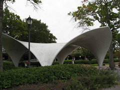
And speaking of Shea, here’s a major announcement: Last September, Kirsten and I attended a Mets/Cubs game — my last game at Shea, as it turned out — and also spent some time admiring the pair of wonderful fiberglass structures located just north of the stadium. At the time, we thought they had been used as bus shelters during the 1964 World’s Fair, because that’s what it says on a sign at the site (see item #13).
Kirsten and I sort of developed a crush on the structures that day — so cool, yet so obscure and underappreciated — so we decided to investigate their backstory. We thought maybe we’d write an article or make some sort of display model that we could put in a gallery (Kirsten’s an architect, so she knows how to do that kinda thing), just a little something to give these overlooked structures some well-deserved attention. We figured the whole thing would take us about six weeks.
Nearly seven months and innumerable hours of research later, we’re now in the home stretch of a project that has expanded to become a museum exhibit. It’s been quite an odyssey, because information on the structures has been much harder to come by than we expected, and much of what’s publicly available has turned out to be inaccurate (they weren’t bus shelters after all, for example).
Anyway: Our exhibit is called The Candela Structures: A New York City History Mystery, and it’ll be running at the City Reliquary in Brooklyn from May 16th (there’s an opening reception that evening) through at least June 28th. I’ll have more details as the date draws nearer, but for now let’s just say I’m really excited and really exhausted — that’s the sort of project it’s been.
Brother, can you spare 37 bucks for an upper deck seat?: Page 2 is running a big package today on how the economic meltdown is affecting fans, teams, scalpers, vendors, jillionaire athletes, and so on. My contribution is an interview with Pirates team prexy Frank Coonelly and marketing exec Lou DiPaoli, who had some interesting things to say about the challenges of selling tickets for a bad team in a bad economy. It’s available here.
Raffle Reminder: Today’s the last day to enter the SoccerPro.com raffle. Details here.
Uni Watch News Ticker: Scott Mason found lots of good photos in this book. Check them out here. ”¦ “The entire Toledo Mudhens team is wearing stirrups,” reports Nile Smith. “And all of the Indianapolis Indians were high-cuffed, but no stirrups. There are also two McCutchens on the team this year, but Andrew (the good one) has a big gap between his first initial and last name.” ”¦ Lee Stokes is another reader who created an imaginary football league and came up with his own team names, logos, and uniforms. Here’s a bunch of artwork from his North American Football League, “a dice-based football league I played from about 1982-2000. The NAFL was 90% done before computers (or at least before I had consistent access), so all games, stats, records, etc. were hand-printed, and helmets and uniforms were hand-drawn and colored in.” ”¦ This item from Friday’s Ticker prompted Dave Cousineau send along this shot of himself, circa 1985. “Those were our unis for the Par-Troy West (Parsippany-Troy Hills, NJ) Little League team (senior league, frosh yr. of high school),” he says. ”¦ Several people have commented on this photo — note how the “S” is folded out of sight. ”¦ I’m late on this, but quite a few readers noted that the Mets logo patch was missing from Mike Pelfrey’s left sleeve last Wednesday. ”¦ Josh Hamilton was wearing an Elmer Fudd cap on Friday (with thanks to Alan Borock). ”¦ Now here‘s an odd jersey. “I found it at a local yard sale recently and have no idea of what the context of it might be,” says Craig Bates. ”¦ The Wizards are scrapping their gold alts (with thanks to Matthew Windsor). ”¦ Interesting logo-anti-creep item here. Read the item description (with thanks to Colin). ”¦ A New York photographer is collecting images of logos that include the World Trade Center towers. Details here (with hanks to Sam McCullough). ”¦ Mario Fontana notes that Jed Lowrie, who wears No. 12, marks his batting gloves with roman numerals. ”¦ Speaking of batting gloves, Mike Meech notes that Ryan Howard’s gloves are customized with his jumpman-esque personal logo. ”¦ Contrary to what I wrote last Thursday, the 1961 Steelers were not the first NFL team to have a cheerleading squad. As several readers informed me, that distinction belongs to the Colts, as seen in this 1958 shot. ”¦ Now I’ve seen everything: sportswear-branded yamulkes. ”¦ David Sonny notes that one of the Cubs’ base coach helmets has a seriously off-center logo. ”¦ As our resident sporting goods scholar, Terry Proctor comes off as a combination of wise old Yoda and street-savvy retailer. But it turns out he was a nerd making uniform doodles in junior high, just like everyone else. “I found these drawings in a loose-leaf notebook that I used from 1959-65,” he says. “It was in a box of junk that my late mother saved and was stored in the attic of my childhood home. It just got forgotten over the years when I moved.” Great stuff. ”¦ Scott Davis says the Red Sox navy alts will be worn for all Friday road games. Is this the first time a team has designated a jersey for a certain day of the week on the road? ”¦ In a related item, lots of folks are upset about the Red Sox wearing blue socks on the road, so someone on the Chris Creamer board did a bit of Photoshopping. As several people have said, the navy version is a more chromatically consistent, but the red version just feels better for the Red Sox. … Patrick Karraker notes an oddity in Steve Sullivan’s NOB: The lettering is italic, except for the V. ”¦ Nice to see the Yanks and Mets doing business with such reputable firms. ”¦ Kristopher Hunt thinks the Red Sox’s new alt cap would look better if the logo was outlined in white, like on the sleeve here. I think he’s right. ”¦ Nomar’s played for three teams whose color schemes include red — the Bosox, Cubs, and Dodgers. And he appears to be using batting gloves from one of those stops in his career (good spot by Harrison Bobbins). ”¦ If you watch this 1966 NFL footage, you’ll see a Cowboys practice with three different helmets and what appears to be an old Pro Bowl helmet (with thanks to Paul Wiederecht). ”¦ Also from Paul: During the 1988 NLCS, Kirk Gibson had a sleeve-borne shout-out to teammate Jay Howell, who was suspended for the series. ”¦ New football uniforms supposedly in the pipeline at University of New Mexico. “I don’t think there will be great changes, but I am told that the numbering font will be changed to fit the font used in all signage, lettering, and numbering throughout the department,” says John C. Barnes. ”¦ Asdrubal Cabrera of the Indians broke his belt while sliding on Saturday. Ed Hahn got us some screen shots. ”¦ Wanna see something bizarre? Check out the last few sentence of this story (with thanks to Chris Flinn). ”¦ Reprinted from Saturday’s comments: Baby it’s cold outside. ”¦ This photo from UGA’s spring game shows all three of the team’s jerseys at once (nice find by Michael Hardman). ”¦ Cubs catcher Koyie Hill was hit on the toe by a pitch on Friday, so on Saturday his cleat had been cut open to reduce the pressure on the sensitive spot (big thanks to Paul Mazzarella). ”¦ Paul Williams and Winky Wright both wore blue trunks on Saturday night. ”¦ Looks like the Twins may have new uniforms next season (with thanks to Jeff Barak). ”¦ Nice to see Tiger Woods whoring himself out to Nike even more than usual (with thanks to Greg Riffenburgh). ”¦ Wes Epple saw this awesome poster at a Pittsburgh-area gas station last weekend. ”¦ Bobby Cox was wearing the Braves’ regular cap yesterday, instead of the Sunday alternate cap. Mike Rich says this happened last year, too. ”¦ Chris Murphy took lots of photos of the changes to Kaufman Stadium in KC. Check out his reportage here. ”¦ Reprinted from yesterday’s comments: Chief Wahoo — Indiana non-grata? ”¦ Tough to see, but the A’s debuted their black socks with their black jerseys yesterday (thanks, Phil). ”¦ Speaking of A’s hosiery, in case you missed it in Sunday’s post, it turns out Corey Wimberly isn’t the only one with excellent taste in stirrups. That’s pitcher Josh Outman, and I’m penciling him in right now for the A.L. Cy Young award. ”¦ No photo, but Dustin Kline says umpire Jim Joyce was wearing a Wilson mask supported by a Nike strap in yesterday’s O’s/Rays game. ”¦ Interesting Japanese baseball note from Jeremy Brahm, who notes that players sometimes had their names on their helmet brims back in the 1970s.
RE: The odd A’s Jersey: Couldn’t you do just do some investigating by the manufacturer’s tag?
“i’m calling it shea”
absolutely. fucking. perfect.
So, I guess this book will not be on the shelves of the Lukas Library:
link
link
Re: Possible uniform change for the Twins.
It makes me feel old, but I remember so vividly being excited when they changed to their current look in 1987. Buttons and belts? Woo-hoo, sweet progress in the ongoing battle against pullover and sansabelts.
Their look over the past 20+ years has been a good one. It is too bad that they now see a need to change it. Now that alts are so common, why can’t they just mix in new alts as they see fit, but leave the standard uniform the same?
I still refuse to call Progressive Field anything other than “the Jake” although calling “the Prog” woulde have some cool Rush and/or King Crimson conotations.
“Scott Davis says the Red Sox navy alts will be worn for all Friday road games. Is this the first time a team has designated a jersey for a certain day of the week on the road?”
No, it’s not the first time. The Astros introduced black “Houston” alternate jerseys in 2000 for use for Sunday road games. Those switched to the current red versions around 2002 and were still only worn on Sundays until two or three years ago when the owner decided he wanted to see them all the time.
And the Blue Jays may have actually done it before then with their “TORONTO” blue alternates, circa 1996 or ’97.
[quote comment=”322970″]Re: Possible uniform change for the Twins.
It makes me feel old, but I remember so vividly being excited when they changed to their current look in 1987. Buttons and belts? Woo-hoo, sweet progress in the ongoing battle against pullover and sansabelts.
Their look over the past 20+ years has been a good one. It is too bad that they now see a need to change it. Now that alts are so common, why can’t they just mix in new alts as they see fit, but leave the standard uniform the same?[/quote]
I agree. I like the current uniforms with the subtle undelining of “win” (Win Twins!). Also, I know I’m in the minority, but I like pinstripes on gray. Looks good to me.
Three different Cubs pant/sock styles at once (solid sanitary, long pants, and stirrups):
link
To call Citi Field “Shea” would be to disgrace the Shea name. Citi does not deserve the honor to be called Shea, and I would never want there to be any confusion for future generations that Citi resembles anything that Shea used to be.
Having moved away from California in 2003, I have no idea what they call the park where the SF Giants play. The place has had 3 names (Pacific Bell, SBC, AT&T) in 9+ seasons of operation. Wonder how long the Citi name will be on this new park.
[quote comment=”322972″]“Scott Davis says the Red Sox navy alts will be worn for all Friday road games. Is this the first time a team has designated a jersey for a certain day of the week on the road?”
No, it’s not the first time. The Astros introduced black “Houston” alternate jerseys in 2000 for use for Sunday road games. Those switched to the current red versions around 2002 and were still only worn on Sundays until two or three years ago when the owner decided he wanted to see them all the time.
And the Blue Jays may have actually done it before then with their “TORONTO” blue alternates, circa 1996 or ’97.[/quote]
The ’72 A’s (Bando, Reggie and them) wore their first doubleknit (sansabelts, pullovers, et al ) white jerseys only on Sundays (at home, of course, being white jerseys). I don’t know that the policy held up forever, but they did that for at least the first season or two of that set.
—Ricko
i cant speak to the accuracy of this, but a commenter on a pitt blog that i read indicated that pitt will be switching its contract from adidas to nike, so the teams will be outfitted by nike. again, i cannot speak to the accuracy of the claim, but pitt may be goin to the swoosh, which will be sweet as long as they are at least somewhat conservative with our football unis. the comment said to expect a news conference about it on tuesday.
[quote comment=”322974″]Three different Cubs pant/sock styles at once (solid sanitary, long pants, and stirrups):
link
Wearing pants that high is great.
For football.
Or if you’re The Scarlet Pimpernel.
—Ricko
RE: The odd-looking A’s jersey.
It looks like a Tampa Bay Rowdies soccer jersey with those sleeves. I’m guessing this A’s team could have played The Beautiful Game?
RE: The blue Ultra-Stripe Astros uniform and their bretheren
Majestic/Sand Knit made a number of generic Ultra-Stripe uniforms in the 1980s, with blacks, purples, greens, yellows, reds, and oranges along with a special red, white, and blue which was used by South Alabama and by Louisiana Tech.
You could order your own custom striping pattern (I guess, if you ordered a team set plus the butterfly-collar coaching shirts); I have one with a number of different shades of maroon that is accented with a gold stripe as well as one with different shades of gray accented with one purple stripe.
[quote]Patrick Karraker notes an oddity in Steve Sullivan’s NOB: The lettering is italic, except for the V.
link
Looks like the V just got applied backwards.
I like the current set of Twins unis, too. I even like the road pins. From what Cuddyer was saying in the article, it sounds like the players want change for the sake of change. He also seems to dislike pins a little, especially on the greys. I wonder if players generally don’t like the way pins look with today’s baggy uniform stylings. I personally think pins and piping make the pajama style look even worse.
Advertising and sports (especially baseball) have been intertwined for a long long time. Green Bay Packers, Wrigley Field, outfield ads: link
Yes, it has gotten out of hand recently with the stadium names, but you can do a lot worse than Citi Field. Except for the major public relations bailout issue, it’s a clean, simple name and works well.
Not to be Captain Obvious, but could the mystery A’s jersey be that of an usher or vendor?
If you watch link, you’ll
see a Cowboys practice with three different helmets and what appears to be an old Pro Bowl helmethear link.link… not uni-related exactly, but goes along with today’s theme.
[quote]Nice to see Tiger Woods whoring himself out to Nike even more than usual (with thanks to Greg Riffenburgh)
link
[/quote]
It’s not really any more than usual. He usually has a logo for a specific piece of his equipment in that space. It’s just a new line of equipment, so it’s a new logo.
link
[quote comment=”322983″]Advertising and sports (especially baseball) have been intertwined for a long long time. Green Bay Packers, Wrigley Field, outfield ads: link
Yes, it has gotten out of hand recently with the stadium names, but you can do a lot worse than Citi Field. Except for the major public relations bailout issue, it’s a clean, simple name and works well.[/quote]
Being an Angels and Lakers fan for all my life, I always thought that Edison International Field and Great Western Forum always sounded good in spite of that fact that they were corporate names. I’m glad Arte Moreno changed the name to Angels Stadium (for the time being). Great Western Forum was certainly less jarring to hear that Staples Center, anyway.
[quote comment=”322974″]Three different Cubs pant/sock styles at once (solid sanitary, long pants, and stirrups):
link
Soriano’s pants are still too tight, but they appear to not be as bad as in the past.
Someone give Reed Johnson a raise.
[quote comment=”322984″]Not to be Captain Obvious, but could the mystery A’s jersey be that of an usher or vendor?[/quote]
No, Captain.
The Royals mascot is not wearing a crown. His head is crown shaped! Why? It looks like a deformity.
[quote comment=”322988″][quote comment=”322983″]Advertising and sports (especially baseball) have been intertwined for a long long time. Green Bay Packers, Wrigley Field, outfield ads: link
Yes, it has gotten out of hand recently with the stadium names, but you can do a lot worse than Citi Field. Except for the major public relations bailout issue, it’s a clean, simple name and works well.[/quote]
Being an Angels and Lakers fan for all my life, I always thought that Edison International Field and Great Western Forum always sounded good in spite of that fact that they were corporate names. I’m glad Arte Moreno changed the name to Angels Stadium (for the time being). Great Western Forum was certainly less jarring to hear that Staples Center, anyway.[/quote]
I always thought Edison International Field sounded like an airport.
Paul – in regards to the umpire wearing a Wilson mask with a Nike strap it may have really been a Nike mask with Wilson pads. Wilson is the official catchers gear sponsor for MLB (and by default umpire’s plate gear as well)…Nike makes a titanium alloy mask that is much lighter then any other mask on the market. I didnt see the mask you are referring to but if the bars were silver it likely was the Nike mask with pads changed out so he didnt get crap from the league.
Will be off the grid for most of the day but if you need me you know how to get a hold of me…btw, have your jacket, just havent had a chance to send it off your way yet.
KW
[quote comment=”322992″][quote comment=”322988″][quote comment=”322983″]Advertising and sports (especially baseball) have been intertwined for a long long time. Green Bay Packers, Wrigley Field, outfield ads: link
Yes, it has gotten out of hand recently with the stadium names, but you can do a lot worse than Citi Field. Except for the major public relations bailout issue, it’s a clean, simple name and works well.[/quote]
Being an Angels and Lakers fan for all my life, I always thought that Edison International Field and Great Western Forum always sounded good in spite of that fact that they were corporate names. I’m glad Arte Moreno changed the name to Angels Stadium (for the time being). Great Western Forum was certainly less jarring to hear that Staples Center, anyway.[/quote]
I always thought Edison International Field sounded like an airport.[/quote]
And the best thing about the Forum when it was called “Great Western Forum” was that everybody just called it “the Forum”.
Is it not possible that the Notre Dame Nikes are named after the Greek goddess of victory?
If the Orioles, White Sox, Indians, Twins, A’s, Mariners or Rays choose to wear their dark-colored, navy blue/ black jerseys on a Friday, won’t Boston be forced to wear the gray jerseys instead? Sort of hard to always dictate your attire on the road (sort of like in 2007 when the Diamondbacks wore black jerseys at home in the NLCS to force the Rockies out of their “good luck” black jerseys).
[quote comment=”322971″]I still refuse to call Progressive Field anything other than “the Jake” although calling “the Prog” woulde have some cool Rush and/or King Crimson conotations.[/quote]
I think there’s a difference between sticking with a stadium’s original name and giving a new stadium a name it never had. No one is ever going to say Capital Centre instead of the Verizon Center. It might be different for places built in the parking lots of the old stadium though. I guess you argue it’s really just a makeover.
as a Royal fan from the ’75-’85 heydays, is is correct to call the New Kauffman Stadium “The Nookie”?
RE: Navy Socks for the Red Sox. Team President Larry Lucchino is notoriously accessible, even once giving out his email on the radio so that fans could reach him.
That said, I have already sent him an email (llucchino@redsox.com) pleading for red “sox” on the road. I encourage anyone else who is bothered by the navy hose to do the same…
I, too, long for the days of non-corporate sponsored stadiums. Just like I long for the days of non-ad uni watch blogs.
Ah, such is life.
[quote comment=”322967″]”i’m calling it shea”
absolutely. fucking. perfect.[/quote]
Sure is.
Although I still might go with “Debbits Field” from time to time. :D
Re phasing out Chief Wahoo:
I don’t want to get into the whole Wahoo debate, but from a design standpoint I think the problem with phasing him out is the only other primary logo the Indians have- -the script I- -blows. Visually I think it looks like crap, and ideologically I’ve never liked logos based on the first initial of the nickname. If they’re introducing new logos, as the article says, I hope they can eventually hit on a good one.
[quote comment=”322973″][quote comment=”322970″]Re: Possible uniform change for the Twins.
It makes me feel old, but I remember so vividly being excited when they changed to their current look in 1987. Buttons and belts? Woo-hoo, sweet progress in the ongoing battle against pullover and sansabelts.
Their look over the past 20+ years has been a good one. It is too bad that they now see a need to change it. Now that alts are so common, why can’t they just mix in new alts as they see fit, but leave the standard uniform the same?[/quote]
I agree. I like the current uniforms with the subtle undelining of “win” (Win Twins!). Also, I know I’m in the minority, but I like pinstripes on gray. Looks good to me.[/quote]
I’m in the minority with you then. I love the current Twins unis, except the Blue alts which are some of the worst alts in the league.
I like the grey pinstripes too. The only thing I would change is use the red hats as the full time home hats, and the blue TC hats as the fulltime road hats, dumping the M logo hats. Howwever, if they are going to make a change, the Killebrew era pinstripes would be great as well.
Keep the pins!!!!
Given the location (Flushing Meadows), shouldn’t the Mets’ new home really be called by a name that rhymes with Citi? See if you can guess!
[quote comment=”323002″]Re phasing out Chief Wahoo:
I don’t want to get into the whole Wahoo debate, but from a design standpoint I think the problem with phasing him out is the only other primary logo the Indians have- -the script I- -blows. Visually I think it looks like crap, and ideologically I’ve never liked logos based on the first initial of the nickname. If they’re introducing new logos, as the article says, I hope they can eventually hit on a good one.[/quote]
Seconded, all around.
[quote comment=”323003″][quote comment=”322973″][quote comment=”322970″]Re: Possible uniform change for the Twins.
It makes me feel old, but I remember so vividly being excited when they changed to their current look in 1987. Buttons and belts? Woo-hoo, sweet progress in the ongoing battle against pullover and sansabelts.
Their look over the past 20+ years has been a good one. It is too bad that they now see a need to change it. Now that alts are so common, why can’t they just mix in new alts as they see fit, but leave the standard uniform the same?[/quote]
I agree. I like the current uniforms with the subtle undelining of “win” (Win Twins!). Also, I know I’m in the minority, but I like pinstripes on gray. Looks good to me.[/quote]
I’m in the minority with you then. I love the current Twins unis, except the Blue alts which are some of the worst alts in the league.
I like the grey pinstripes too. The only thing I would change is use the red hats as the full time home hats, and the blue TC hats as the fulltime road hats, dumping the M logo hats. Howwever, if they are going to make a change, the Killebrew era pinstripes would be great as well.
Keep the pins!!!![/quote]
I agree wholeheartedly regarding the Twins caps. The “M” on the hat is the only part of the current uniform that I never liked. The “TC” should have never been abandoned.
I don’t suppose No Mas is going to come out with a line of shirts that say “I’m calling it Metrodome” for us Twins fans? Wouldn’t really work here I guess. Target Field it is :)
[quote comment=”323002″]Re phasing out Chief Wahoo:
I don’t want to get into the whole Wahoo debate, but from a design standpoint I think the problem with phasing him out is the only other primary logo the Indians have- -the script I- -blows. Visually I think it looks like crap, and ideologically I’ve never liked logos based on the first initial of the nickname. If they’re introducing new logos, as the article says, I hope they can eventually hit on a good one.[/quote]
I just want to know if the state of Indiana has anything to do with this story, or if that reference/link is merely an attempt to squeeze in a little Latin on this semi-literate blog. :-)
[quote comment=”323005″][quote comment=”323002″]Re phasing out Chief Wahoo:
I don’t want to get into the whole Wahoo debate, but from a design standpoint I think the problem with phasing him out is the only other primary logo the Indians have- -the script I- -blows.[/quote]
Yes, and the “C” that they had on their caps in the Joe Charbenaux (?) days was no bargain either.
As a graduate of the University of Illinois I can say that there’s very little that you can do with the letter I that will make it distinctive. :-(
[quote comment=”322977″][quote comment=”322972″]“Scott Davis says the Red Sox navy alts will be worn for all Friday road games. Is this the first time a team has designated a jersey for a certain day of the week on the road?”
No, it’s not the first time. The Astros introduced black “Houston” alternate jerseys in 2000 for use for Sunday road games. Those switched to the current red versions around 2002 and were still only worn on Sundays until two or three years ago when the owner decided he wanted to see them all the time.
And the Blue Jays may have actually done it before then with their “TORONTO” blue alternates, circa 1996 or ’97.[/quote]
The ’72 A’s (Bando, Reggie and them) wore their first doubleknit (sansabelts, pullovers, et al ) white jerseys only on Sundays (at home, of course, being white jerseys). I don’t know that the policy held up forever, but they did that for at least the first season or two of that set.
—Ricko[/quote]
So did they wear gold and green for the rest of the home games?
[quote comment=”323006″][quote comment=”323003″][quote comment=”322973″][quote comment=”322970″]Re: Possible uniform change for the Twins.
It makes me feel old, but I remember so vividly being excited when they changed to their current look in 1987. Buttons and belts? Woo-hoo, sweet progress in the ongoing battle against pullover and sansabelts.
Their look over the past 20+ years has been a good one. It is too bad that they now see a need to change it. Now that alts are so common, why can’t they just mix in new alts as they see fit, but leave the standard uniform the same?[/quote]
I agree. I like the current uniforms with the subtle undelining of “win” (Win Twins!). Also, I know I’m in the minority, but I like pinstripes on gray. Looks good to me.[/quote]
I’m in the minority with you then. I love the current Twins unis, except the Blue alts which are some of the worst alts in the league.
I like the grey pinstripes too. The only thing I would change is use the red hats as the full time home hats, and the blue TC hats as the fulltime road hats, dumping the M logo hats. Howwever, if they are going to make a change, the Killebrew era pinstripes would be great as well.
Keep the pins!!!![/quote]
I agree wholeheartedly regarding the Twins caps. The “M” on the hat is the only part of the current uniform that I never liked. The “TC” should have never been abandoned.[/quote]
Agreed. Although my Big Yuck is the vests. To me, that’s a style. You’re a vest team or you’re not. Same with pins. You don’t wear them sometimes. They’re either your style or they’re not.
Not saying that’s a rule or something, just that that’s the way it was for a long, long time, so it’s what I got used (one of those those “when I was a kid” things; we all know how that is).
I hope the Twins don’t change. No real reason to. Awww, the poor players are bored. Tell that to the Yankees. Here’s a better idea: Make that uni the uni of another W-S team.
(That being the said, don’t dislike the look of the new throwbacks at all. Far better looking than the originals, actually, and as a “fauxbacks” go, kinda fun. My only bitch was talking about “honoring” that lousy ’82 team. Remembering, sure. Honoring? Um…no.)
—Ricko
Paul — you have said you don’t like the Red Sox red jerseys, and I think you mentioned the Braves’ red jersyes too. Is it that they are red, or is there some other reason?
[quote comment=”322995″]Is it not possible that the Notre Dame Nikes are named after the Greek goddess of victory?[/quote]
Well, that would certainly be an interesting mix of cultures and religions. :-)
[quote comment=”323004″]Given the location (Flushing Meadows), shouldn’t the Mets’ new home really be called by a name that rhymes with Citi? See if you can guess![/quote]
Pretty?
I went to the Baseball Hall of Fame this weekend – took some pics for you all to enjoy :-) (Including the satin Braves jersey)
Baseball Hall of Fame pics
Re: UGA jerseys
Every time I see the black jerseys, I love the red even more. The black looked good when it first debuted (although I was and am still against them on the principle that UGA’s jerseys are somewhat classic). However, each subsequent time they’ve been worn, they’ve looked worse and worse. I dunno. I guess the initial aesthetic appeal has worn off.
I guess I just don’t like them. The only bit of good they do is make the black in the pant stripe pop.
[quote comment=”322987″][quote]Nice to see Tiger Woods whoring himself out to Nike even more than usual (with thanks to Greg Riffenburgh)
link
[/quote]
It’s not really any more than usual. He usually has a logo for a specific piece of his equipment in that space. It’s just a new line of equipment, so it’s a new logo.
link
Agreed. However, it was odd seeing some other players with Tigers Vr line on their hat as well!
Paul Casey
link
I know there were a few more but I didn’t have time to search anywhere but the Master’s homepage!
I understand that golfers will use the same clubs, but being that they are Eldrick’s line I would have assumed only he would have been able to use them for the Masters!
and just for hat sake check this out:
She has been to the Masters once or twice I’d say!
In regards to the blue Astros unis, my high school team, I graduated in 1986, wore a version of this same uniform. Our shool colors however were brown and gold. The sanitaries that we wore were gold accompanied with brown stirrups. Which we wore CORRECTLY.
I have been looking for a color shot to send in but all I have are black and white from the newspaper and our yearbook but the colors get lost in the shades of gray.
Whoops
Sorry, my html skills aren’t up to par!
-no pun intended.
Throw this up there with the guy from Boston College…Almost
By the way, Tiger isnt “whoring himself out to Nike more than usual.” He has, at least for the last at least three years, worn the ‘one’ logo (for the ball) and ‘SQ’ logo (for the fairway woods and drivers) on his hat. Now, the ‘SQ’ logo has been changed to the ‘Vr’ (victory red) logo, the logo of a line of irons that he helped design himself. So, in reality, he is “whoring himself out” less to Nike.
This practice is also common for all sponsored golfers. Those sponsored by Ping have G10 on the sides of their caps (see Masters winner Angel Cabrera) and those sponsored by Titleist have the Footjoy ‘FJ’ logo on the sides of their caps (as the Acushnet company that owns Titleist also owns Footjoy). Golfers make their money by these sponsorships, so if Tiger is “whoring himself out” then he’s doing it as a part of a sport that is full of whores. Golfers, in reality, make a very small percentage of their money on tournament winnings. They need the sponsorships to make golf a viable career option for themselves. This was not a case of Nike taking a practice too far, it was a case of a practice being noticed here simply because of a blind hatred of Nike.
link
Hmmm…that road jersey (with white lettering worn only in ’69 and ’70) looks awfully powder blue compared to the gray unis in all the other photos.
;)
—Ricko
Video footage of the first game played at Shea was interesting. I could not help but notice how the crowd was so well dressed. Perhaps if everyone dressed up for games overall behavior would improve.
[quote comment=”323022″]http://picasaweb.google.com/marcusdavidhall/BaseballHallOfFame#5324025509799004386
Hmmm…that road jersey (with white lettering worn only in ’69 and ’70) looks awfully powder blue compared to the gray unis in all the other photos.
;)
—Ricko[/quote]
A gray jersey from 1969.
link
I know i’ll get the answer quickly, but was there any reason for the black stripe on the vest??
The Twins could just tweak the Twins script on the home unis to be a little more like their throwbacks and get rid of (or improve) the M and they’d be fine.
[quote comment=”323017″]
and just for hat sake check this out:
She has been to the Masters once or twice I’d say![/quote]
I get a real cute message from the Masters that basically says “we’ve already pulled down this picture.” :-)
[quote comment=”323022″]http://picasaweb.google.com/marcusdavidhall/BaseballHallOfFame#5324025509799004386
Hmmm…that road jersey (with white lettering worn only in ’69 and ’70) looks awfully powder blue compared to the gray unis in all the other photos.
;)
—Ricko[/quote]
well…maybe it’s not from 69-70?
prolly the 1968 model
the 69-70 version was gray but had the distinction of having blue sanitaries — but the away uni was gray and not blue
Has anyone mentioned the Nike logo being on the stripe of the BC jersey during the college championship game? Not a location/choice I’ve seen very often.
(I’m talking about the “yoke” area between the shoulder blades…)
[quote comment=”323028″][quote comment=”323022″]http://picasaweb.google.com/marcusdavidhall/BaseballHallOfFame#5324025509799004386
Hmmm…that road jersey (with white lettering worn only in ’69 and ’70) looks awfully powder blue compared to the gray unis in all the other photos.
;)
—Ricko[/quote]
well…maybe it’s not from 69-70?
prolly the 1968 model
the 69-70 version was gray but had the distinction of having blue sanitaries — but the away uni was gray and not blue[/quote]
whoops…i didn’t see the blue outline around the white lettering in my quick rush to judgment
that’s not from 1968
hmmm….it does look kinda powdery blue
[quote comment=”323028″][quote comment=”323022″]http://picasaweb.google.com/marcusdavidhall/BaseballHallOfFame#5324025509799004386
Hmmm…that road jersey (with white lettering worn only in ’69 and ’70) looks awfully powder blue compared to the gray unis in all the other photos.
;)
—Ricko[/quote]
well…maybe it’s link?
prolly link
the 69-70 version was gray but had the distinction of having link — but the away uni was gray and not blue[/quote]
Lettering on the ’68 (and season prior to that) was navy with white edge on a powder road uni, not other way around. That white with navy border stuff was ’69 and ’70 only.
Okay, everyone who actually SAW those road unis in person in 1969 (and who went to the game specifically TO see those road unis) raise your hand. Not like I’d forget it, I was home on leave from the Army and seized the opportunity to head out to Met Stadium and check out those new White Sox roads with their weird white stirrups and royal sanis (there’d been a color photo of Bill Melton in SI in the homes earlier that’d I seen during basic training).
;)
—Ricko
[quote comment=”323012″]Paul — you have said you don’t like the Red Sox red jerseys, and I think you mentioned the Braves’ red jersyes too. Is it that they are red, or is there some other reason?[/quote]
I’m generally not a fan of solid-color alt jerseys. But I *especially* don’t like solid-RED jersey.
Not sure if it’s been mentioned on here, but in the Reds/Pirates game on Saturday, Joey Votto tore his pants while attempting to slide into home. His knee hit the catcher’s spikes and tore a large hole in his pants. Here’s link of the slide, but you can’t see the tear very well. I couldn’t find any good images.
He came out later wearing different pants.
[quote comment=”322975″]To call Citi Field “Shea” would be to disgrace the Shea name. Citi does not deserve the honor to be called Shea, and I would never want there to be any confusion for future generations that Citi resembles anything that Shea used to be.[/quote]
Considering Shea looked like dogshit and a pretty all-around boring and bland stadium and Citi Field is actually quite a nice looking stadium, don’t you think it would be complimentory to the Shea name to keep using it? In fact, calling CF Shea would be insulting to CF, because why would you want that beautiful new stadium to be associated with that run down dump?
“I’m Calling It Shea” shirts now available:
link
Royal version shown on this page:
link
Sorry, Phil, was writing while you were writing.
Yeah, if you grab the two photos and pop them up on screen side by side, the White jersey is quite a different color from the Giants road.
[quote comment=”323030″][quote comment=”323028″][quote comment=”323022″]http://picasaweb.google.com/marcusdavidhall/BaseballHallOfFame#5324025509799004386
Hmmm…that road jersey (with white lettering worn only in ’69 and ’70) looks awfully powder blue compared to the gray unis in all the other photos.
;)
—Ricko[/quote]
well…maybe it’s link?
prolly link
the 69-70 version was gray but had the distinction of having link — but the away uni was gray and not blue[/quote]
whoops…i didn’t see the blue outline around the white lettering in my quick rush to judgment
that’s not from 1968
hmmm….it does look kinda powdery blue[/quote]
aparicio – 1970
[quote comment=”323036″]Sorry, Phil, was writing while you were writing.
Yeah, if you grab the two photos and pop them up on screen side by side, the White jersey is quite a different color from the Giants road.[/quote]
White SOX jersey.
[quote comment=”323037″][quote comment=”323030″][quote comment=”323028″][quote comment=”323022″]http://picasaweb.google.com/marcusdavidhall/BaseballHallOfFame#5324025509799004386
Hmmm…that road jersey (with white lettering worn only in ’69 and ’70) looks awfully powder blue compared to the gray unis in all the other photos.
;)
—Ricko[/quote]
well…maybe it’s link?
prolly link
the 69-70 version was gray but had the distinction of having link — but the away uni was gray and not blue[/quote]
whoops…i didn’t see the blue outline around the white lettering in my quick rush to judgment
that’s not from 1968
hmmm….it does look kinda powdery blue[/quote]
aparicio – 1970[/quote]
Thanks, Marcus. Was wondering about that.
[quote comment=”323032″][quote comment=”323012″]Paul — you have said you don’t like the Red Sox red jerseys, and I think you mentioned the Braves’ red jersyes too. Is it that they are red, or is there some other reason?[/quote]
I’m generally not a fan of solid-color alt jerseys. But I *especially* don’t like solid-RED jersey.[/quote]
I don’t so much mind the bright red-ness of the jersey, what makes these hideous to me is that they’re using the dark blue for the numbers. It creates a mess thats just difficult to make out from a distance. If they were to go with white numbers and typeface, it would be better, but they don’t.
And its not only in baseball, you see this screwup in football as well. Virginia Tech with the orange crap is a perfect example. I hate those unis, not because they’re orange, but because the fact that maroon is the secondary. Maroon should be the trim and white should be the secondary.
“Baltimore” road uniforms make their debut tonight!
[quote comment=”323036″]Sorry, Phil, was writing while you were writing.
Yeah, if you grab the two photos and pop them up on screen side by side, the White jersey is quite a different color from the Giants road.[/quote]
nah…mea culpa on me…
wasn’t trying to correct ya…but if ya look at the pic i posted, that’s obviously the 1969 version (note the MLB patch on left sleeve), whereas the
[quote]aparicio – 1970[/quote]
version marcus posted (thanks for the clarification!) — definitely appears to be more blue than gray
is it POSSIBLE the 69’s were gray and the 70’s were blue??? but different for the two years???
even okkonen finds a different shade (albeit in gray) for the two seasons…
A little difficult to see on photo 38, but Michigan’s QB had red numbers on his jersey. Anyone seen that before?
link
[quote comment=”323005″][quote comment=”323002″]Re phasing out Chief Wahoo:
I don’t want to get into the whole Wahoo debate, but from a design standpoint I think the problem with phasing him out is the only other primary logo the Indians have- -the script I- -blows. Visually I think it looks like crap, and ideologically I’ve never liked logos based on the first initial of the nickname. If they’re introducing new logos, as the article says, I hope they can eventually hit on a good one.[/quote]
Seconded, all around.[/quote]
Agreed. I hate the “I” and am not a fan of Wahoo, either.
Did anyone read the comments on the PD link? Folks really get worked up about this issue. The team is almost damned if they do, damned if they don’t. Is Wahoo offensive? IMO, yes. But can’t we just phase out the logo because it’s clunky, stale, ugly, and representative of decades of losing?
Here’s a better picture of the red numbers
link
Paul, the stadium’s name is CITI FIELD.
That’s it. You can call it MickeyMouseLand if you want, but it won’t change anything. Companies pay for this and you have to respect it. You didn’t pay for naming rights, so STFU you dumb hayseed.
[quote comment=”322981″][quote]Patrick Karraker notes an oddity in Steve Sullivan’s NOB: The lettering is italic, except for the V.
link
Looks like the V just got applied backwards.[/quote]
Could be, but it almost looks like the V is a compilation of other letter pieces. Why the Preds’ equip mgr would either make the mistake of sewing it backwards or not have any V’s left is beyond me…that’s the kind of things you see in low level minors.
Just still lots of confusion on that. The 1970 SI baseball preview issue has a White Sox hat (in a montage of all MLB hats) that is clearly navy, and not a ’68 or earlier hat because the logo is different.
In 1970 I saw them play the Twins first on TV and later in person, and the teams’ hats (even in b&w; you can tell easily tell navy from royal) were the same color. Only thing I can think of is that White Sox for some reason changed from royal with powder to navy with gray during the season. I can only go by what I saw late in 1970 at Met Stadium: Twins in pins, ChiSox in gray, both teams in Navy hats, which was clearly a difference from the previous year.
—Ricko
—Ricko
[quote comment=”323032″][quote comment=”323012″]Paul — you have said you don’t like the Red Sox red jerseys, and I think you mentioned the Braves’ red jersyes too. Is it that they are red, or is there some other reason?[/quote]
I’m generally not a fan of solid-color alt jerseys. But I *especially* don’t like solid-RED jersey.[/quote]
Fair enough. They are loud. But red is the team’s color (or at least I thought it was until this year’s changes). At least they’re not black.
I prefer navy blue, but the red is a good change of pace. They just need red socks!
I guess I don’t have to ask whether you even like the red jerseys of your favorite NFL team, the Giants, LOL. (I do, but then again I like a third jersey, especially if done right like with the Giants’ classic uniforms.)
[quote comment=”323039″][quote comment=”323037″][quote comment=”323030″][quote comment=”323028″][quote comment=”323022″]http://picasaweb.google.com/marcusdavidhall/BaseballHallOfFame#5324025509799004386
Hmmm…that road jersey (with white lettering worn only in ’69 and ’70) looks awfully powder blue compared to the gray unis in all the other photos.
;)
—Ricko[/quote]
well…maybe it’s link?
prolly link
the 69-70 version was gray but had the distinction of having link — but the away uni was gray and not blue[/quote]
whoops…i didn’t see the blue outline around the white lettering in my quick rush to judgment
that’s not from 1968
hmmm….it does look kinda powdery blue[/quote]
aparicio – 1970[/quote]
Thanks, Marcus. Was wondering about that.[/quote]
no prob – I tell you, i was like a kid in a candy store Sunday!! It was definitely worth the 11 hours in the car (5 1/2 hour drive from baltimore)
[quote comment=”323046″]Paul, the stadium’s name is CITI FIELD.
That’s it. You can call it MickeyMouseLand if you want, but it won’t change anything. Companies pay for this and you have to respect it. You didn’t pay for naming rights, so STFU you dumb hayseed.[/quote]
Actually, companies pay for this and therefore I *dis*respect it. I can call the ballpark whatever I like. Just like I can call you FuckFace if I like. Which I do.
[quote comment=”323046″]Paul, the stadium’s name is CITI FIELD.
That’s it. You can call it MickeyMouseLand if you want, but it won’t change anything. Companies pay for this and you have to respect it. You didn’t pay for naming rights, so STFU you dumb hayseed.[/quote]
Oh boy, here we go. This gonna be fun.
[quote comment=”323046″]Paul, the stadium’s name is CITI FIELD.
That’s it. You can call it MickeyMouseLand if you want, but it won’t change anything. Companies pay for this and you have to respect it. You didn’t pay for naming rights, so STFU you dumb hayseed. [/quote]
In 2 days all legal citizens of the United States, except those granted extensions, will have paid for the naming rights of that stadium…
just sayin..
My interview with the Pirates execs is now up and running:
link
When there was talk of the renovation of my beloved Lambeau Field including a naming-rights sale, it hit me: “They can’t make me call it that.” I see no reason for such resistance to not be applied to new stadia.
Meanwhile, there are more trolls coming through here the past few days …
[quote comment=”322998″]as a Royal fan from the ’75-’85 heydays, is is correct to call the New Kauffman Stadium “The Nookie”?[/quote]
That’s what HE said.
[quote comment=”323023″]Video footage of the first game played at Shea was interesting. I could not help but notice how the crowd was so well dressed. Perhaps if everyone dressed up for games overall behavior would improve.[/quote]
Doubtful. Folks at the end of the 19th century dressed up for games, and their behavior was frequently such that would shock the conscience of today’s average fan . . . except perhaps those in New York and Philly.
[quote comment=”323049″][quote comment=”323032″][quote comment=”323012″]Paul — you have said you don’t like the Red Sox red jerseys, and I think you mentioned the Braves’ red jersyes too. Is it that they are red, or is there some other reason?[/quote]
I’m generally not a fan of solid-color alt jerseys. But I *especially* don’t like solid-RED jersey.[/quote]
Fair enough. They are loud. But red is the team’s color (or at least I thought it was until this year’s changes). At least they’re not black.
I prefer navy blue, but the red is a good change of pace. They just need red socks!
I guess I don’t have to ask whether you even like the red jerseys of your favorite NFL team, the Giants, LOL. (I do, but then again I like a third jersey, especially if done right like with the Giants’ classic uniforms.)[/quote]
Coupla things:
1) The Giants aren’t my favorite NFL team. The 49ers are (and they wear a lot of red, obviously).
2) No, I don’t like the Giants’ red jerseys, but that’s because I think they don’t make sense within the Jints’ color scheme. I’m not opposed to red football jerseys per se. Same goes for basketball and hockey. But I really don’t think it works on the baseball diamond.
[quote comment=”323048″]Just still lots of confusion on that. The 1970 SI baseball preview issue has a White Sox hat (in a montage of all MLB hats) that is clearly navy, and not a ’68 or earlier hat because the logo is different.
In 1970 I saw them play the Twins first on TV and later in person, and the teams’ hats (even in b&w; you can tell easily tell navy from royal) were the same color. Only thing I can think of is that White Sox for some reason changed from royal with powder to navy with gray during the season. I can only go by what I saw late in 1970 at Met Stadium: Twins in pins, ChiSox in gray, both teams in Navy hats, which was clearly a difference from the previous year.
—Ricko
—Ricko[/quote]
sorry for the shitty paint job…
but i did my best to compare 69 & 70 side by side
granted, one’s in the sun and one’s behind a case with a flash…but they definitely appear different shades, with the 70 decidedly more bluish
(i think the horsey is brown tho)
[quote comment=”323055″]When there was talk of the renovation of my beloved Lambeau Field including a naming-rights sale, it hit me: “They can’t make me call it that.” I see no reason for such resistance to not be applied to new stadia.
[/quote]
Man, we dodged a bullet there. Fortunately for us, the Packers were the leading opponent of selling naming rights to Lambeau Field.
It cracks me up that the Glorious Founder was called a hayseed. I could at least understand a rude type throwing out a “pompous condescending commie socialist new york hipster doofus,” but hayseed? I don’t get it. I’m a hayseed, and the Glorious Founder ain’t no hayseed.
[quote comment=”323021″]By the way, Tiger isnt “whoring himself out to Nike more than usual.” He has, at least for the last at least three years, worn the ‘one’ logo (for the ball) and ‘SQ’ logo (for the fairway woods and drivers) on his hat. Now, the ‘SQ’ logo has been changed to the ‘Vr’ (victory red) logo, the logo of a line of irons that he helped design himself. So, in reality, he is “whoring himself out” less to Nike.
This practice is also common for all sponsored golfers. Those sponsored by Ping have G10 on the sides of their caps (see Masters winner Angel Cabrera) and those sponsored by Titleist have the Footjoy ‘FJ’ logo on the sides of their caps (as the Acushnet company that owns Titleist also owns Footjoy). Golfers make their money by these sponsorships, so if Tiger is “whoring himself out” then he’s doing it as a part of a sport that is full of whores. Golfers, in reality, make a very small percentage of their money on tournament winnings. They need the sponsorships to make golf a viable career option for themselves. This was not a case of Nike taking a practice too far, it was a case of a practice being noticed here simply because of a blind hatred of Nike.[/quote]
Yup, no question, Tiger and Nike would both go broke without each other. No greed whatsoever, just smart bizness. Which no doubt explains the main character and copious logo creep in this commercial:
link
[quote comment=”323059″][quote comment=”323048″]Just still lots of confusion on that. The 1970 SI baseball preview issue has a White Sox hat (in a montage of all MLB hats) that is clearly navy, and not a ’68 or earlier hat because the logo is different.
In 1970 I saw them play the Twins first on TV and later in person, and the teams’ hats (even in b&w; you can tell easily tell navy from royal) were the same color. Only thing I can think of is that White Sox for some reason changed from royal with powder to navy with gray during the season. I can only go by what I saw late in 1970 at Met Stadium: Twins in pins, ChiSox in gray, both teams in Navy hats, which was clearly a difference from the previous year.
—Ricko
—Ricko[/quote]
sorry for the shitty paint job…
but i did my best to link side by side
granted, one’s in the sun and one’s behind a case with a flash…but they definitely appear different shades, with the 70 decidedly more bluish
(i think the horsey is brown tho)[/quote]
Can you put Marcus’ photos of the ’70 ChiSox and ’69 Giants side by side? Same era, similar lighting. Certainly appear to be different colors (powder and gray). Remember now, the powder of that era was far, far less intense than the powder of the doubleknit era, so don’t expect it to be the same color blue as the Dick Allen White Sox era. Not even close. Far more muted and subtle than the bright doubleknits.
—Ricko
P.S. I remember reading somewhere (back then) that the first horsey was unrecognizable on the orange helmet, that it “looked like a big ink blot.” Had it been brown I don’t think an ink blot would have been the first thing to come to mind. LOL
[quote comment=”323048″]Only thing I can think of is that White Sox for some reason changed from royal with powder to navy with gray during the season.
—Ricko[/quote]And that would have been quite unusual, no?
Weird even today; but in the late 1960’s that type of thing would have been way out of normal.
from today’s “Ask Vic” on jaguars.com:
Kevin from St. Augustine, FL
Why is it that in every discussion I see about the new uniforms everyone is bashing teal? I think people need to realize that teal is the Jags’ color; it’s what makes the Jaguars the Jaguars. We are the only team in the league that uses a color like that. I believe Mr. Weaver is doing the right thing by trying to clean up the uniforms and give us more of an identity. Jags fans need to remember: all day, all night, all teal.
Vic: Teal is a funny kind of color. It’s an eye-shadow kind of color and, frankly, I think NFL Properties goofed in branding two teams that came into the league together so similarly. Carolina and Jacksonville each got an eye-shadow and black color scheme and each got a cat as a mascot. All these years later, however, it is what it is. Yes, the Jaguars’ main color is teal and, yes, the Jaguars are identified as such. What the Jaguars are going to do when they present their uniform changes is make it clear what their uniform colors are and what you can expect the team to wear at home and away without fail. That goes directly to tradition and I think everyone knows how much I value tradition.
[quote comment=”323061″]Glorious Founder[/quote]
Can I be Glorious Pinto? Or Glorious Boone?
Oh wait, you said “Founder”. Never mind.
also from jaguars.com:
Greg from Jacksonville
Do you believe the uniform is that significant in defining a team’s image and, if so, do you have any suggestions/wish list for uniform changes for the Jaguars?
Vic: Yes, I think a sustainable uniform design is significant in defining a team’s image because the players have to be changed but the uniforms can stay the same. They’re the constant. Bart Starr and Brett Favre are linked by the uniform they wore. My suggestion would be to avoid state-of-the-art fashion and seek a more classic look because the uniform design has to be sustainable. If you get too wild with it, it’s inevitable that more changes will be made. Pick and stick.
[quote comment=”323055″]When there was talk of the renovation of my beloved Lambeau Field including a naming-rights sale, it hit me: “They can’t make me call it that.” I see no reason for such resistance to not be applied to new stadia.[/quote]Hey, how much rent do you charge the Packers??
:-)
Seriously, the city/county owns Lambeau, don’t they? JMHO but they’d run into a lot of voter resistance if they tried anything-maybe if they got a Wisconsin company to agree to make it “XYZ stadium at Lambeau Field” they’d get away with it; but not much more than that. I know there was a lot of resistance when they remodeled Soldier Field. They didn’t even disclose the names of any company who had thought of bidding on naming rights.
Glad to see there’s some others around here who don’t hew to the corporate line.
[quote comment=”323064″][quote comment=”323048″]Only thing I can think of is that White Sox for some reason changed from royal with powder to navy with gray during the season.
—Ricko[/quote]And that would have been quite unusual, no?
Weird even today; but in the late 1960’s that type of thing would have been way out of normal.[/quote]
Actually more common then than now. Timmy B gave us a long list of NFL team who made midseason changes in that era, and baseball team often did similar things.
I may also have been a quality control thing with the dye lots. And maybe the 70 blues I saw were a little off. All I ask is, check out the 1970 SI baseball preview cover with Jerry Koosman. That White Sox hat just ain’t royal, but its the hat logo style they had adopted for the first time in ’69 (on a royal hat).
All I know is I went to checkout the White Sox road unis at the Met in ’70 and there were decidedly different from those I’d seen the year before.
And Okkonen, if you’ll notice, shows them Navy BOTH in ’69 and ’70…with gray unis. And the White Sox themselves did a throwback game with gray unis, white lettering edged in navy, with navy hats and sleeves.
As mysterious as the early ’80s A’s if you ask me.
—Ricko
If a team has a history of great success (Yankees, Cardinals, Pack, etc.), I can see the pick and stick. If a team has a history of suckitude (IE the creamsicle Bucs), a change can do wonders.
An interesting conundrum is a team like the Minnesota Vikings. Lot’s of success at getting close and generally having above average teams, but no history of winning the big ones. I guess a change was good for getting the Broncos over the hump!
[quote comment=”323063″]Can you put Marcus’ photos of the ’70 ChiSox and ’69 Giants side by side? Same era, similar lighting. Certainly appear to be different colors (powder and gray). Remember now, the powder of that era was far, far less intense than the powder of the doubleknit era, so don’t expect it to be the same color blue as the Dick Allen White Sox era. Not even close. Far more muted and subtle than the bright doubleknits.[/quote]
here ya go
what’s the verdict, sir rick?
[quote comment=”323069″]Actually more common then than now. Timmy B gave us a long list of NFL team who made midseason changes in that era, and baseball team often did similar things.
—Ricko[/quote]
Thanks for that. I’ll be on the lookout for more links, etc.
The only reason I would say it was much less common in ye olden dayes is that there was virtually no emphasis on marketing, etc. back then.
[quote comment=”323053″]
In 2 days all legal citizens of the United States, except those granted extensions, will have paid for the naming rights of that stadium…
[/quote]
You can get an extension on FILING, but no extension on PAYING.
Speaking of that Steelers poster, here are some good link from when the “Steelers Footballers” came to my school.
Interesting intersection of the real world and (whatever you want to call this blog): Paul posts “Pirate economics” on a day when the Maersk Alabama situation is making headlines.
[quote comment=”323068″][quote comment=”323055″]When there was talk of the renovation of my beloved Lambeau Field including a naming-rights sale, it hit me: “They can’t make me call it that.” I see no reason for such resistance to not be applied to new stadia.[/quote]Hey, how much rent do you charge the Packers??
:-)
Seriously, the city/county owns Lambeau, don’t they? JMHO but they’d run into a lot of voter resistance if they tried anything-maybe if they got a Wisconsin company to agree to make it “XYZ stadium at Lambeau Field” they’d get away with it; but not much more than that. I know there was a lot of resistance when they remodeled Soldier Field. They didn’t even disclose the names of any company who had thought of bidding on naming rights.
Glad to see there’s some others around here who don’t hew to the corporate line.[/quote]
Candlestick Park (1960—1995, 2008-present)
3Com Park at Candlestick Point (1995—January 2002)
San Francisco Stadium at Candlestick Point (2002—September 2004)
Monster Park (2004—2008)
I doubt that any fan has ever called it anything but Candlestick Park or The ‘Stick. You can’t make people use the silly corporate name.
[quote comment=”323066″][quote comment=”323061″]Glorious Founder[/quote]
Can I be Glorious Pinto? Or Glorious Boone?
Oh wait, you said “Founder”. Never mind.[/quote]
Can I claim Glorious Bluto?
[quote comment=”323068″][quote comment=”323055″]When there was talk of the renovation of my beloved Lambeau Field including a naming-rights sale, it hit me: “They can’t make me call it that.” I see no reason for such resistance to not be applied to new stadia.[/quote]Hey, how much rent do you charge the Packers??
:-)
Seriously, the city/county owns Lambeau, don’t they? JMHO but they’d run into a lot of voter resistance if they tried anything-maybe if they got a Wisconsin company to agree to make it “XYZ stadium at Lambeau Field” they’d get away with it; but not much more than that.[/quote]
On the contrary – it was the Brown County voters who insisted on exploring the possibility of selling naming rights (in a separate vote after approving the recent renovations), above the objections of the team.
[quote comment=”323072″][quote comment=”323069″]Actually more common then than now. Timmy B gave us a long list of NFL team who made midseason changes in that era, and baseball team often did similar things.
—Ricko[/quote]
Thanks for that. I’ll be on the lookout for more links, etc.
The only reason I would say it was much less common in ye olden dayes is that there was virtually no emphasis on marketing, etc. back then.[/quote]
Less emphasis on branding and consistently, too. Didn’t matter if something changed. Merchandise sales back then were zip. WAY different world. Hell, even in the late ’70s you couldn’t find meshback replica hats of anyone but the Twins hereabouts (well, maybe a team or two from booths at Met Stadium). I went to California to see my kids and was delighted to score A’s, Giants, Dodgers and Angels adjustable meshbacks. Went I got back was actually cool to have out of town hats, because no one did. Had to mail order ’em from ads in back of Baseball Digest or something (that’s for those of us who remember mail order).
—Ricko
[quote comment=”323071″][quote comment=”323063″]Can you put Marcus’ photos of the ’70 ChiSox and ’69 Giants side by side? Same era, similar lighting. Certainly appear to be different colors (powder and gray). Remember now, the powder of that era was far, far less intense than the powder of the doubleknit era, so don’t expect it to be the same color blue as the Dick Allen White Sox era. Not even close. Far more muted and subtle than the bright doubleknits.[/quote]
link
what’s the verdict, sir rick?[/quote]
definitely powder blue lite vs gray
[quote comment=”323051″][quote comment=”323046″]Paul, the stadium’s name is CITI FIELD.
That’s it. You can call it MickeyMouseLand if you want, but it won’t change anything. Companies pay for this and you have to respect it. You didn’t pay for naming rights, so STFU you dumb hayseed.[/quote]
Actually, companies pay for this and therefore I *dis*respect it. I can call the ballpark whatever I like. Just like I can call you FuckFace if I like. Which I do.[/quote]
Now, now you two, play nice…wait, i don’t have any authority here!!!!
some observations on today’s post while I have a free moment:
Does anyone else think the logo on that Steelers Footballers poster looks like Zippy the Pinhead?
I never thought I’d see UW and Rev. Vince combine forces, sort of. I’m a big fan of his, Jay Bakker’s and the whole idea of what they’re doing at Revolution Church. I’ve listened to sermons online and knew Vince was a big baseball and mets fan but still…neat to see them mentioned so prominently in a UW post. Cool stuff.
Paul, I sure hope you never put out a “call for help” for that exhibit on the ’64 World’s Fair. If you did, I’m terribly sorry. My father and uncle went to that and took tons of home movies that were later transferred to videotape in the 80s.
Jon, what Pitt blog did you hear that from regarding switch to Nike? Just curious because I check out like 4 or 5 pretty regularly (although not so much the comments so I could have missed it.). Look, I really don’t care one way or the other between Adidas and Nike for my beloved Panthers, but bring that script back and those folks in Oregon would be my friggin’ heroes!!!
I FINALLY found a way to make watching golf exciting: rooting against Tiger and Phil on the last day of a tourney. After Easter dinner, my brother-in-law, nephew and I headed down to his man cave and in between the Pirates, the hockey on NBC and the absolute ass-whipping the Cavs put on the C’s, we flipped to CBS to try and jinx TigerPhil. We had a blast. I was calling Phil “Chill Chokelson” and when Tiger hit that tree….my wife and sister-in-law, upstairs, thought we were watching hockey cause it was so loud!
Happy Easter Monday everyone. Back to the grind.
Paul, Phil, link
/WFC’d
If I had to guess I’d say that the link is a roller derby jersey. But that’s just a guess.
A friend at work is calling it “The Shea After.” I prefer to think of it as City Field, but that doesn’t work as well when you’re speaking it.
But someone should get on a T-shirt for link.
[quote comment=”323080″][quote comment=”323071″][quote comment=”323063″]Can you put Marcus’ photos of the ’70 ChiSox and ’69 Giants side by side? Same era, similar lighting. Certainly appear to be different colors (powder and gray). Remember now, the powder of that era was far, far less intense than the powder of the doubleknit era, so don’t expect it to be the same color blue as the Dick Allen White Sox era. Not even close. Far more muted and subtle than the bright doubleknits.[/quote]
link
what’s the verdict, sir rick?[/quote]
definitely powder blue lite vs gray[/quote]
I’ll let you folks here decide. Everyone thinks I’ve been hallucinating all this anyway. LOL
—Ricko
[quote comment=”323015″]I went to the Baseball Hall of Fame this weekend – took some pics for you all to enjoy :-) (Including the satin Braves jersey)
Baseball Hall of Fame pics[/quote]
Out of curiosity, what was the context of the Sam Perlozzo jersey? I know he’s no hall of famer.
[quote comment=”323087″][quote comment=”323080″][quote comment=”323071″][quote comment=”323063″]Can you put Marcus’ photos of the ’70 ChiSox and ’69 Giants side by side? Same era, similar lighting. Certainly appear to be different colors (powder and gray). Remember now, the powder of that era was far, far less intense than the powder of the doubleknit era, so don’t expect it to be the same color blue as the Dick Allen White Sox era. Not even close. Far more muted and subtle than the bright doubleknits.[/quote]
link
what’s the verdict, sir rick?[/quote]
definitely powder blue lite vs gray[/quote]
I’ll let you folks here decide. Everyone thinks I’ve been hallucinating all this anyway. LOL
—Ricko[/quote]
Check out link and scroll down about halfway. There’s a row of 3 pictures of flannel road jerseys: link, link and link. It appears to me that the flannel is the same color on all three. (There’s also a link on the page — pretty obvious what color that one is.)
It’s easiest to compare the colors if you obscure the top part of the jerseys so that all the logos/wordmarks/numbers aren’t showing and you just look at the flannel material itself.
My thought is
1) that the jersey is gray, but the blue outlines on the white letters/numbers give it the illusion of a bluish appearance.
–OR–
2) They actually are a bit blue, but they started life as a light gray that turned blue as the result of being washed along with the blue socks and undershirts.
[quote comment=”323010″][quote comment=”322977″][quote comment=”322972″]“Scott Davis says the Red Sox navy alts will be worn for all Friday road games. Is this the first time a team has designated a jersey for a certain day of the week on the road?”
No, it’s not the first time. The Astros introduced black “Houston” alternate jerseys in 2000 for use for Sunday road games. Those switched to the current red versions around 2002 and were still only worn on Sundays until two or three years ago when the owner decided he wanted to see them all the time.
And the Blue Jays may have actually done it before then with their “TORONTO” blue alternates, circa 1996 or ’97.[/quote]
The ’72 A’s (Bando, Reggie and them) wore their first doubleknit (sansabelts, pullovers, et al ) white jerseys only on Sundays (at home, of course, being white jerseys). I don’t know that the policy held up forever, but they did that for at least the first season or two of that set.
—Ricko[/quote]
The Diamondbacks currently wear their red jerseys on the road for every Tuesday game. They also wear them at home on Sundays, plus the black jerseys at home on Saturdays.
[quote comment=”322967″]”i’m calling it shea”
absolutely. fucking. perfect.[/quote]
I’ve lived through a few new stadiums (Memorial Stadium to Oriole Park at Camden Yards in Baltimore, and Astrodome to Enron Field/Minute Maid Park and Reliant Stadium in Houston). Sure – you can call it Shea all you want, and I realize and respect that the name has significant meaning to you.
On the other hand, why not just go generic and call it the ballpark? I don’t think many people call Minute Maid Park or Reliant Stadium the Astrodome (to be fair, the ‘Dome is still standing); nor would fans in Baltimore call Oriole Park (or M&T Bank Stadium) Memorial Stadium.
Again, call it whatever you want – or just say, “I’m going to see the Mets.”
[quote comment=”323089″]Check out link and scroll down about halfway. There’s a row of 3 pictures of flannel road jerseys: link, link and link. It appears to me that the flannel is the same color on all three. (There’s also a link on the page — pretty obvious what color that one is.)
It’s easiest to compare the colors if you obscure the top part of the jerseys so that all the logos/wordmarks/numbers aren’t showing and you just look at the flannel material itself.
My thought is
1) that the jersey is gray, but the blue outlines on the white letters/numbers give it the illusion of a bluish appearance.
–OR–
2) They actually are a bit blue, but they started life as a light gray that turned blue as the result of being washed along with the blue socks and undershirts.[/quote]
thanks JTH…
quick and dirty side by sides of the three jerseys (not cropped or anything — just straight side by sides)
tough call on whether or not it’s “blue”
[quote comment=”323089″][quote comment=”323087″][quote comment=”323080″][quote comment=”323071″][quote comment=”323063″]Can you put Marcus’ photos of the ’70 ChiSox and ’69 Giants side by side? Same era, similar lighting. Certainly appear to be different colors (powder and gray). Remember now, the powder of that era was far, far less intense than the powder of the doubleknit era, so don’t expect it to be the same color blue as the Dick Allen White Sox era. Not even close. Far more muted and subtle than the bright doubleknits.[/quote]
link
what’s the verdict, sir rick?[/quote]
definitely powder blue lite vs gray[/quote]
I’ll let you folks here decide. Everyone thinks I’ve been hallucinating all this anyway. LOL
—Ricko[/quote]
Check out link and scroll down about halfway. There’s a row of 3 pictures of flannel road jerseys: link, link and link. It appears to me that the flannel is the same color on all three. (There’s also a link on the page — pretty obvious what color that one is.)
It’s easiest to compare the colors if you obscure the top part of the jerseys so that all the logos/wordmarks/numbers aren’t showing and you just look at the flannel material itself.
My thought is
1) that the jersey is gray, but the blue outlines on the white letters/numbers give it the illusion of a bluish appearance.
–OR–
2) They actually are a bit blue, but they started life as a light gray that turned blue as the result of being washed along with the blue socks and undershirts.[/quote]
And the ’71 is a doubleknit…showing what I said about the difference in intensity of the color. Powder blues prior to that were, as you said, only slighty more than “a bit” blue.
The best way to compare those three jerseys is to “Keyhole” a spot on the upper chest so that you’re looking at the fabric in the same direct light. On these three, looks like right chest is best; there’s some “flash” on the left chest of Twins). When you do it that way, there’s definitely a blue cast to the White Sox jersey. Not much, but it’s there, esp compared to the Indians jersey, about which there can be no doubt…it’s gray.
Even Marcus, who saw the jerseys in person, says the White Sox jersey is a light powder blue.
—Ricko
RE: “Baltimore” road uniforms make their debut tonight!
And they will be playing against the Rangers in their home “away” Texas jerseys.
Way to go man. If every Met fan calls it Shea there is nothing they can do about it. My sister lives in San Francisco and its still Candlestick, no matter how many times they sell the name on that one. Besides if the Wilpons are so damn smart then where is all the money they gave Bernie Madoff, oops!
[quote comment=”323094″]RE: “Baltimore” road uniforms make their debut tonight!
And they will be playing against the Rangers in their home “away” Texas jerseys.[/quote]
…and I’m gonna guess that the red Ranger hats will reappear.
[quote comment=”323093″]
And the ’71 is a doubleknit…showing what I said about the difference in intensity of the color. Powder blues prior to that were, as you said, only slighty more than “a bit” blue.[/quote]
You 100% sure that ′71 jersey is a doubleknit?
If so, it does a link.
[quote comment=\”323082\”]Paul, Phil, I hate to rain on your parade, but…
/WFC\’d[/quote]
HAHAHAHAHA the chest majestic logo to add insult to injury
Just as a general point. Starting in, I believe, ’64 the White Sox had gone to powder blue roads. It a big deal, and was a Bill Veeck trademark there for a while. That’s why when I saw what appeared to be gray in ’70 I was surprised they’d abandoned it.
Now, if I was just seeing it wrong and they stayed powder through ’70 and the red cap era, they in fact didn’t abandon it until the Navy pants and collars (which were a sort of Bicentennial/throwback thing when they debuted in ’76).
And that does seem logical. It being Veeck and all.
—Ricko
Re: Corporate naming of stadiums. Here in Philly, I have noticed for a few years now that during the sports segment reports of our local news radio station, the reporters don’t say the corporate name of the stadium. Rather, they refer to them as “the ballpark” or “the center”. I’m assuming this is a conscious effort by the station to deny free advertising to the companies whose names adorn the stadiums. Can anyone confirm this? Does this happen in other cities as well?
The North Face yamulke, for the sporting young man who wishes to express his subservience to G-d while looking like the kind of douchebag who would show up to a party with a water bottle and bore everyone with his endless stories from that morning’s hike.
[quote comment=”323101″]The North Face yamulke, for the sporting young man who wishes to express his subservience to G-d while looking like the kind of douchebag who would show up to a party with a water bottle and bore everyone with his endless stories from that morning’s hike.[/quote]
Did J. Peterman write that? LOL
[quote comment=”323097″][quote comment=”323093″]
And the ’71 is a doubleknit…showing what I said about the difference in intensity of the color. Powder blues prior to that were, as you said, only slighty more than “a bit” blue.[/quote]
You 100% sure that ′71 jersey is a doubleknit?
If so, it does a link.[/quote]
I’ve sent Paul photos from the ’71 SI opening week story about all the new-fangled “duds” with no belts, colored cleats, etc., that talked a lot about the new red “White Sox.”
To clarify, and we speed right past this sometimes when making general observations, baseball didn’t go directly from flannel to doubleknit. Some teams did, I suppose, but the latter half of the ’60s also was the polyester-blend period…and the first red hat White Sox unis may well have been that stuff. Either way, the point is that powder blue got a helluva lot more intense in ’71 (same year adidas jumped heavily in baseball, btw). It was like, Yikes!–that’s sure bluer than powder blue used to be.
All I can say is, if you saw all unfold in person, you know what I’m talking about.
—Ricko
Hey, how much rent do you charge the Packers??
:-)
Seriously, the city/county owns Lambeau, don’t they?
Heh-heh. Well-played, anotherguy. *tips metaphorical cap*
Yes, Lambeau is owned by the city and Brown County. And because the stock-holding fans, rather than an individual or a small consortium, “own” the team (as much as a nonprofit corporation can be owned by anybody), you’re right, there would be stiff resistance to selling the naming rights.
They seem to have found a compromise a la what the Browns did in selling naming rights to the gates at their stadium. Fans enter the stadium through the “Lambeau Field Atrium” … which has a sign flanked by two red Miller logos. I know the presence of those logos doesn’t offend me in the least.
But that is what we’re talking about, isn’t it? A feeling of ownership that has nothing to do with who legally owns the team, or to whom those people sold naming rights.
Along the lines of what David pointed out, I rarely hear people say “I’m going to Miller Park.” I hear “I’m going to the Brewers’ game,” or “I’ve got Brewers tickets for Sunday.”
[quote comment=”323092″]
tough call on whether or not it’s “blue”[/quote]
Nah, just a little down today, it was a rough weekend. It’ll bounce back and be its usual cheerful self tomorrow. Just needs a little time.
[quote comment=”323105″][quote comment=”323092″]
tough call on whether or not it’s “blue”[/quote]
Nah, just a little down today, it was a rough weekend. It’ll bounce back and be its usual cheerful self tomorrow. Just needs a little time.[/quote]
Aww…Rainy Days and Mondays. Hang in there.
[quote comment=”323100″]Re: Corporate naming of stadiums. Here in Philly, I have noticed for a few years now that during the sports segment reports of our local news radio station, the reporters don’t say the corporate name of the stadium. Rather, they refer to them as “the ballpark” or “the center”. I’m assuming this is a conscious effort by the station to deny free advertising to the companies whose names adorn the stadiums. Can anyone confirm this? Does this happen in other cities as well?[/quote]
I’m assuming its just easier to say that way. I mean, you could either say ‘Citizens Bank Park’ every time you refer to the stadium, or you could just say ‘ballpark’. I highly doubt there is a conscious decision to slight Citizens Bank or Wachovia because of this.
I’ve also heard people refer to the stadiums as ‘The Wach’, ‘The Bank’, and ‘The Linc’. Once again, its just easier to say.
OMG. I must have one, NOW. Paul, you’ve outdone yourself.
I’m going to weigh in on this new Mets stadium name business. I tried to keep calling U.S. Cellular Field “New Comiskey Park”, but I felt like I sounded out of touch, senile, misinformed and clueless. Of course, every generation of Sox fans calls the stadium whatever they want to no matter what. Now I just call it “The Cell” and not think twice about it. At least we got a nice renovation out of the deal. Nobody seems to really care anymore about the name; we’re used to it.
[quote comment=”323104″]They seem to have found a compromise a la what the Browns did in selling naming rights to the gates at their stadium. Fans enter the stadium through the “Lambeau Field Atrium” … which has a sign flanked by two red Miller logos. I know the presence of those logos doesn’t offend me in the least.
But that is what we’re talking about, isn’t it? A feeling of ownership that has nothing to do with who legally owns the team, or to whom those people sold naming rights.
Along the lines of what David pointed out, I rarely hear people say “I’m going to Miller Park.” I hear “I’m going to the Brewers’ game,” or “I’ve got Brewers tickets for Sunday.”[/quote]
That “gate” option is used a lot: Lambeau is one of the places where it’s perfect. A lot of resistance to a name change in Green Bay, but (at least before the remodel with the triangular atrium building) no particular landmarks. You can’t have statues, etc. and try to name gates. People meet “at the Jordan statue” for the Bulls/Bears game.
And the Pack was smart to go with Miller. The Bud Light Atrium wouldn’t fly with the GB fans. Bud would have a lot of incentive to try and gain a foothold, but they probably also realize it wouldn’t be cost-effective.Miller: I’d say the most common use for a stadium name is for the uncommon usage: hockey at Wrigley or a concert at Soldier Field. Everyone else knows where you’re going when you say you’ve got Sox tickets or Hawks tickets (or even Wolves tickets).
BTW, I used to work with someone who would say (in the normal course of conversation) “my beloved Des Moines”. Needless to say, he didn’t work in Chicago for very long before moving back to Iowa.
Please forgive me for this huge post, but I really need the help of the Uni Watch Faithful on this.
I have a rather awkward request. First some background information. I hail from a small college town called Stevens Point, WI. In 1969, in order to raise money for the local college radio station WWSP, the radio station came up with a trivia contest as a fundraiser. People in Stevens Point just call this event “Trivia”, and is also the World’s Largest Trivia Contest. There usually about 600-700 teams that play worldwide. There is always a theme every year for Trivia. This yeah it is “Trivia 40: Here’s Lookin’ At You Kid”, as a reference of Casablanca. Many times the theme has to deal with a famous actor who has recently passed away, or something relevant like in 1991 it was “Attack of the palindrome”. Teams can consist of as many players as the team wants. The contest is always sometime in April, and starts at 6pm on a Friday, and concludes at Midnight that following Sunday for 54 straight hours of Trivia. The format is simple. Eight questions per hour, and a few designated “speed rounds with twelve questions per hour. The DJ asks the trivia question, repeats it, plays a song (always oldies and classic rock) repeats the question again, plays another song, and then closes the question. So usually you have about 7 minutes to answer each question. Each team is given a “team ID” when they register. The team has to call a specific number that they are given to the WWSP phone bank, say their ID number, and give their guess for the question. You are not told if you are right or wrong. You have to wait for the question to be closed. If your team thinks that the answer given by the radio station is wrong, and the answer you found was correct, you must have two sources (none can be from the internet) and if you prove your case you will get the points. If a questions gets messed up, or read wrong, or there are multiple correct answers, or no team gets the question correct, then the question is worth zero points. Trivia has become known worldwide, and was even mentioned on Jay Leno a few years ago, a movie documentary was made called “Trivia Town”, it was the answer to a question on Jeopardy a few years ago, and Ken Jennings even mentioned it in his book. He was in Stevens Point a few years ago doing research. Here is an example of a question from a few years ago just for fun:
“Question 6 of hour 54: What is the first and last name of the professional baseball player whose signature is on the baseball bat used by Wendy Torrence in striking her husband Jack?”
That is all the DJ gives you. Your team has to figure out those characters, find out what movie or tv show is is from (this one is obviously from the 1980 movie THE SHINING) and either pop in the DVD and find out, or have the note already typed down in your database. The answer, if you didn’t know is Carl Yastrzemski. The scoring is parimutuel. All teams that respond correctly are given an equal share of the 2000 points that a question is worth, with a minimum of 5 points and a maximum of 500 points. The “Yaz” question was worth a measly 10 points because most people answered correctly.
My Trivia team is called “Festivus For the Rest of Us” and are comprised of my high school and college friends. We are all between the ages of 22-26. We take notes on everything throughout the year. Movies, TV shows, magazines, cartoons, commercials, print ads… anything is game for Trivia questions. I started this team with another friend of mine in 2001. We had always played Trivia just with some friends and never took it too seriously. It seemed impossible to answer most of the questions, and like most people in the contest, we used it as an excuse for a party or just to hang out for three days. Now, Trivia has become more like a reunion. There are some people that I only see during this one weekend every year. Last year, my team finished in 8th place. We were the youngest team since 1980 to make it into the top 10. (The radio station hands out trophies at an awards ceremony at 1am for the top 10 teams). My Trivia team is a close knit family, and we are all obsessed with this obsession that is Trivia. I take notes on something every single day. It is a huge part of my life.
Now… finally to my request. Aside from the normal 8 questions per hour. There are other ways to get points. There are “running questions”. The Running Questions are given at specific locations in Stevens Point at 7:00 A.M. both Saturday and Sunday mornings. Teams are asked to gather information within “running” distance of the meeting sight. It is basically a scavenger hunt. There are music snippets. The music questions are snippets of 8 songs. There are three music questions, and each of the snippets is equivalent to one question. These are very hard because the songs are about 3 seconds each, and kind of can run together. The final way to get point is through recognition of pictures from a booklet you get at registration called the New Trivia Times. There are 24 pictures with various sports figures, actors, musicians, products and advertisements. Being a young team, this visual trivia always gives us a bitch of a time. This is where I hope some of you can help. Teams are not allowed to post these images on the internet in a forum or anything like that… but they can e-mail, send out, or have as many people as they want look at the images. These images come out today at the first day of registration. The actual contest starts this Friday at 6PM and the New Trivia Times pictures are asked throughout the contest. If you are interested in taking a look at these pictures please contact me at:
jokray @ gleneringolf . com
I would think that people like Ricko, who is actually old enough to actually know the people in the images, (I kid cause I love) would know a lot of these pictures. If anyone could help me out I would really appreciate it. My team would really appreciate it. Trivia is very important to me, and this would mean so much if you could help me out. If you want to know more about Trivia, here is their home page:
link
Victory Red..It’s called branding…Nobody does it better then Nike..I find it hilarious that this site has no problem whoring itself with such shitty ads from rip off artist companies… Be true to your words..If you are going to bash “logo Creep” better stop selling memberships and shoving advertising down our throats.
[quote comment=”323109″]Of course, every generation of Sox fans calls the stadium whatever they want to no matter what.[/quote]Sure, “Comiskey” will slowly but surely die out: but OTOH I’ve yet to have someone ask “where??” when I say I’m going to Comiskey or at Comiskey.
Phil, if you have a minute, fire me an email.
TSN has a little photo gallery of some of the link in history.
Some are decent. Others are well-known on this blog.
[quote comment=”323112″]Victory Red..It’s called branding…Nobody does it better then Nike..I find it hilarious that this site has no problem whoring itself with such shitty ads from rip off artist companies… Be true to your words..If you are going to bash “logo Creep” better stop selling memberships and shoving advertising down our throats.[/quote]
Membership has its privileges… which you clearly know nothing about.
Riddle me this, “icedaddy”: how does a membership have anything to do with logo creep?
[quote comment=”323111″]Please forgive me for this huge post, but I really need the help of the Uni Watch Faithful on this.
I have a rather awkward request. First some background information. I hail from a small college town called Stevens Point, WI. In 1969, in order to raise money for the local college radio station WWSP, the radio station came up with a trivia contest as a fundraiser. People in Stevens Point just call this event “Trivia”, and is also the World’s Largest Trivia Contest. There usually about 600-700 teams that play worldwide. There is always a theme every year for Trivia. This yeah it is “Trivia 40: Here’s Lookin’ At You Kid”, as a reference of Casablanca. Many times the theme has to deal with a famous actor who has recently passed away, or something relevant like in 1991 it was “Attack of the palindrome”. Teams can consist of as many players as the team wants. The contest is always sometime in April, and starts at 6pm on a Friday, and concludes at Midnight that following Sunday for 54 straight hours of Trivia. The format is simple. Eight questions per hour, and a few designated “speed rounds with twelve questions per hour. The DJ asks the trivia question, repeats it, plays a song (always oldies and classic rock) repeats the question again, plays another song, and then closes the question. So usually you have about 7 minutes to answer each question. Each team is given a “team ID” when they register. The team has to call a specific number that they are given to the WWSP phone bank, say their ID number, and give their guess for the question. You are not told if you are right or wrong. You have to wait for the question to be closed. If your team thinks that the answer given by the radio station is wrong, and the answer you found was correct, you must have two sources (none can be from the internet) and if you prove your case you will get the points. If a questions gets messed up, or read wrong, or there are multiple correct answers, or no team gets the question correct, then the question is worth zero points. Trivia has become known worldwide, and was even mentioned on Jay Leno a few years ago, a movie documentary was made called “Trivia Town”, it was the answer to a question on Jeopardy a few years ago, and Ken Jennings even mentioned it in his book. He was in Stevens Point a few years ago doing research. Here is an example of a question from a few years ago just for fun:
“Question 6 of hour 54: What is the first and last name of the professional baseball player whose signature is on the baseball bat used by Wendy Torrence in striking her husband Jack?”
That is all the DJ gives you. Your team has to figure out those characters, find out what movie or tv show is is from (this one is obviously from the 1980 movie THE SHINING) and either pop in the DVD and find out, or have the note already typed down in your database. The answer, if you didn’t know is Carl Yastrzemski. The scoring is parimutuel. All teams that respond correctly are given an equal share of the 2000 points that a question is worth, with a minimum of 5 points and a maximum of 500 points. The “Yaz” question was worth a measly 10 points because most people answered correctly.
My Trivia team is called “Festivus For the Rest of Us” and are comprised of my high school and college friends. We are all between the ages of 22-26. We take notes on everything throughout the year. Movies, TV shows, magazines, cartoons, commercials, print ads… anything is game for Trivia questions. I started this team with another friend of mine in 2001. We had always played Trivia just with some friends and never took it too seriously. It seemed impossible to answer most of the questions, and like most people in the contest, we used it as an excuse for a party or just to hang out for three days. Now, Trivia has become more like a reunion. There are some people that I only see during this one weekend every year. Last year, my team finished in 8th place. We were the youngest team since 1980 to make it into the top 10. (The radio station hands out trophies at an awards ceremony at 1am for the top 10 teams). My Trivia team is a close knit family, and we are all obsessed with this obsession that is Trivia. I take notes on something every single day. It is a huge part of my life.
Now… finally to my request. Aside from the normal 8 questions per hour. There are other ways to get points. There are “running questions”. The Running Questions are given at specific locations in Stevens Point at 7:00 A.M. both Saturday and Sunday mornings. Teams are asked to gather information within “running” distance of the meeting sight. It is basically a scavenger hunt. There are music snippets. The music questions are snippets of 8 songs. There are three music questions, and each of the snippets is equivalent to one question. These are very hard because the songs are about 3 seconds each, and kind of can run together. The final way to get point is through recognition of pictures from a booklet you get at registration called the New Trivia Times. There are 24 pictures with various sports figures, actors, musicians, products and advertisements. Being a young team, this visual trivia always gives us a bitch of a time. This is where I hope some of you can help. Teams are not allowed to post these images on the internet in a forum or anything like that… but they can e-mail, send out, or have as many people as they want look at the images. These images come out today at the first day of registration. The actual contest starts this Friday at 6PM and the New Trivia Times pictures are asked throughout the contest. If you are interested in taking a look at these pictures please contact me at:
jokray @ gleneringolf . com
I would think that people like Ricko, who is actually old enough to actually know the people in the images, (I kid cause I love) would know a lot of these pictures. If anyone could help me out I would really appreciate it. My team would really appreciate it. Trivia is very important to me, and this would mean so much if you could help me out. If you want to know more about Trivia, here is their home page:
link
I’ll bet $100 that the answer to the first question is “Robert Redford.”
[quote comment=”323112″]Victory Red..It’s called branding…Nobody does it better then Nike..I find it hilarious that this site has no problem whoring itself with such shitty ads from rip off artist companies… Be true to your words..If you are going to bash “logo Creep” better stop selling memberships and shoving advertising down our throats.[/quote]
*grabs popcorn for the 2nd installment of ‘dipshit dumbass tries to attack Paul without doing his homework’*
This oughtta be fun!
[quote comment=”323094″]RE: “Baltimore” road uniforms make their debut tonight!
And they will be playing against the Rangers in their home “away” Texas jerseys.[/quote]
Who, coincidentally left DC and moved to Texas in ’72, the last year “Baltimore” was on the jersey.
someone else besides the Nats and Rangers are sporting the “curly W.” that’s western kentucky’s baseball team (hilltoppers).
link
From the “Shea Opening Day” newsreel and re: the presentation of a horseshoe floral arrangement to Casey Stengel:
What happened to the horseshoe as a universal “lucky charm” especially among the major team sports, and did it hit its zenith in the mid-20th Century? I can seem to remember myriad shots of horseshoes in locker rooms, but this may amount to one as my memory can be a bit exaggerated.
Thanks to any light shedders.
One other thing on the scheduled use of alternate jerseys on the road: since switching to the red/black look in 2007, the Diamondbacks have worn the black jersey for every Saturday home game, and the red jersey every Tuesday, regardless of whether they’re on the road or at home.
So, that counts, right?
[quote comment=”323100″]Re: Corporate naming of stadiums. Here in Philly, I have noticed for a few years now that during the sports segment reports of our local news radio station, the reporters don’t say the corporate name of the stadium. Rather, they refer to them as “the ballpark” or “the center”. I’m assuming this is a conscious effort by the station to deny free advertising to the companies whose names adorn the stadiums. Can anyone confirm this? Does this happen in other cities as well?[/quote]
Sometimes the basketball arena in downtown DC is just called The Phone Booth.
[quote comment=”323121″]One other thing on the scheduled use of alternate jerseys on the road: since switching to the red/black look in 2007, the Diamondbacks have worn the black jersey for every Saturday home game, and the red jersey every Tuesday, regardless of whether they’re on the road or at home.
So, that counts, right?[/quote]
I remember that that was the plan at first, but then it went by the wayside in the middle of the summer. Apparently, players REALLY want Cool-Base tops when it’s hot outside (except Curtis Granderson, who once blogged he has a Cool-Base top in his locker, but he doesn’t like it, so he wears the double-knit every day). But this was just before Majestic figured out how to make gray Cool-Base tops, so maybe the D-Backs are back on schedule.
As of right now: If you buy an “I’m Calling It Shea” shirt, you can get a 10% discount by using the discount code “uniwatch” (with apologies to those of you who’ve already placed your orders).
Not Uni-related, but I just heard on Philly radio that hall of fame announcer Harry Kalas dies this morning. In the broadcast booth.
From all us Philly fans, RIP.
Regarding corporate naming rights of stadia: I’ve always hated this, but I guess it’s a way of life.
At least in Pittsburgh you have three companies with local ties (PNC, Heinz and Mellon) on the marquee.
You still get folks who refer to Mellon Arena as the “Civic Arena” but that’s forgivable because it changed names but is the same venue.
No one called PNC or Heinz “Three Rivers”.
Wasn’t there a media outlet in Denver that refused to use Invesco and instead just called the stadium Mile High?
I’m in agreement with saying “the ballpark” over calling a new stadium the old name, but that’s just me.
[quote comment=”323112″]Victory Red..It’s called branding…Nobody does it better then Nike..I find it hilarious that this site has no problem whoring itself with such shitty ads from rip off artist companies… Be true to your words..If you are going to bash “logo Creep” better stop selling memberships and shoving advertising down our throats.[/quote]
Ah, the “It’s called branding” retort. So insightful, so informative.
There are a few jillion good responses to this. Instead of wasting everyone’s time with them, I’ll simply link to the appropriate manifesto:
link
[quote comment=”323088″][quote comment=”323015″]I went to the Baseball Hall of Fame this weekend – took some pics for you all to enjoy :-) (Including the satin Braves jersey)
Baseball Hall of Fame pics[/quote]
Out of curiosity, what was the context of the Sam Perlozzo jersey? I know he’s no hall of famer.[/quote]
each team had a locker with various artifacts from the team history – the pic was because of the Elrod Hendricks number 44
I’ll bet $100 that the answer to the first question is “Robert Redford.”
The question of course being: Whom was Ricko often mistaken for in the late 1920s?
(eyeroll)
—Ricko
[quote comment=”323116″][quote comment=”323111″]Please forgive me for this huge post, but I really need the help of the Uni Watch Faithful on this.
I have a rather awkward request. First some background information. I hail from a small college town called Stevens Point, WI. In 1969, in order to raise money for the local college radio station WWSP, the radio station came up with a trivia contest as a fundraiser. People in Stevens Point just call this event “Trivia”, and is also the World’s Largest Trivia Contest. There usually about 600-700 teams that play worldwide. There is always a theme every year for Trivia. This yeah it is “Trivia 40: Here’s Lookin’ At You Kid”, as a reference of Casablanca. Many times the theme has to deal with a famous actor who has recently passed away, or something relevant like in 1991 it was “Attack of the palindrome”. Teams can consist of as many players as the team wants. The contest is always sometime in April, and starts at 6pm on a Friday, and concludes at Midnight that following Sunday for 54 straight hours of Trivia. The format is simple. Eight questions per hour, and a few designated “speed rounds with twelve questions per hour. The DJ asks the trivia question, repeats it, plays a song (always oldies and classic rock) repeats the question again, plays another song, and then closes the question. So usually you have about 7 minutes to answer each question. Each team is given a “team ID” when they register. The team has to call a specific number that they are given to the WWSP phone bank, say their ID number, and give their guess for the question. You are not told if you are right or wrong. You have to wait for the question to be closed. If your team thinks that the answer given by the radio station is wrong, and the answer you found was correct, you must have two sources (none can be from the internet) and if you prove your case you will get the points. If a questions gets messed up, or read wrong, or there are multiple correct answers, or no team gets the question correct, then the question is worth zero points. Trivia has become known worldwide, and was even mentioned on Jay Leno a few years ago, a movie documentary was made called “Trivia Town”, it was the answer to a question on Jeopardy a few years ago, and Ken Jennings even mentioned it in his book. He was in Stevens Point a few years ago doing research. Here is an example of a question from a few years ago just for fun:
“Question 6 of hour 54: What is the first and last name of the professional baseball player whose signature is on the baseball bat used by Wendy Torrence in striking her husband Jack?”
That is all the DJ gives you. Your team has to figure out those characters, find out what movie or tv show is is from (this one is obviously from the 1980 movie THE SHINING) and either pop in the DVD and find out, or have the note already typed down in your database. The answer, if you didn’t know is Carl Yastrzemski. The scoring is parimutuel. All teams that respond correctly are given an equal share of the 2000 points that a question is worth, with a minimum of 5 points and a maximum of 500 points. The “Yaz” question was worth a measly 10 points because most people answered correctly.
My Trivia team is called “Festivus For the Rest of Us” and are comprised of my high school and college friends. We are all between the ages of 22-26. We take notes on everything throughout the year. Movies, TV shows, magazines, cartoons, commercials, print ads… anything is game for Trivia questions. I started this team with another friend of mine in 2001. We had always played Trivia just with some friends and never took it too seriously. It seemed impossible to answer most of the questions, and like most people in the contest, we used it as an excuse for a party or just to hang out for three days. Now, Trivia has become more like a reunion. There are some people that I only see during this one weekend every year. Last year, my team finished in 8th place. We were the youngest team since 1980 to make it into the top 10. (The radio station hands out trophies at an awards ceremony at 1am for the top 10 teams). My Trivia team is a close knit family, and we are all obsessed with this obsession that is Trivia. I take notes on something every single day. It is a huge part of my life.
Now… finally to my request. Aside from the normal 8 questions per hour. There are other ways to get points. There are “running questions”. The Running Questions are given at specific locations in Stevens Point at 7:00 A.M. both Saturday and Sunday mornings. Teams are asked to gather information within “running” distance of the meeting sight. It is basically a scavenger hunt. There are music snippets. The music questions are snippets of 8 songs. There are three music questions, and each of the snippets is equivalent to one question. These are very hard because the songs are about 3 seconds each, and kind of can run together. The final way to get point is through recognition of pictures from a booklet you get at registration called the New Trivia Times. There are 24 pictures with various sports figures, actors, musicians, products and advertisements. Being a young team, this visual trivia always gives us a bitch of a time. This is where I hope some of you can help. Teams are not allowed to post these images on the internet in a forum or anything like that… but they can e-mail, send out, or have as many people as they want look at the images. These images come out today at the first day of registration. The actual contest starts this Friday at 6PM and the New Trivia Times pictures are asked throughout the contest. If you are interested in taking a look at these pictures please contact me at:
jokray @ gleneringolf . com
I would think that people like Ricko, who is actually old enough to actually know the people in the images, (I kid cause I love) would know a lot of these pictures. If anyone could help me out I would really appreciate it. My team would really appreciate it. Trivia is very important to me, and this would mean so much if you could help me out. If you want to know more about Trivia, here is their home page:
link
I’ll bet $100 that the answer to the first question is “Robert Redford.”[/quote]
A fellow “Pointer” Mike? How do you know about Trivia? More importantly, do you know why the answer to the first question every year is Robert Redford?
Paul, I sent Chris Isenberg an email and got an auto-response thanking me for RSVPing and telling me what time to show up. I assume that that is the message meant for regular RSVPs and that I shouldn’t make any concrete plans unless I am one of the chosen few tomorrow, right?
… Kristopher Hunt thinks the Red Sox’s new alt cap would look better if the logo was outlined in which, like on the sleeve here.
Uh…outlined in white, perhaps?
[quote comment=”323130″]do you know why the answer to the first question every year is Robert Redford?[/quote]
robert redford had been appointed sewer commissioner of provo, utah, in 1976…doesn’t everyone know that?
[quote comment=”323100″]Re: Corporate naming of stadiums. Here in Philly, I have noticed for a few years now that during the sports segment reports of our local news radio station, the reporters don’t say the corporate name of the stadium. Rather, they refer to them as “the ballpark” or “the center”. I’m assuming this is a conscious effort by the station to deny free advertising to the companies whose names adorn the stadiums. Can anyone confirm this? Does this happen in other cities as well?[/quote]
Happens in Calgary too – the Dome or the Saddledome. I don’t think I’ve ever heard “Pengrowth” in front, or the prior name “Canadian Airlines”. Maybe the name would have stuck better if it weren’t the third name for the facility.
[quote comment=”323132″]… Kristopher Hunt thinks the Red Sox’s new alt cap would look better if the logo was outlined in which, like on the sleeve here.
Uh…outlined in white, perhaps?[/quote]
Yes. Thanks. Now fixed.
And while I’m here, my summary of the Blue Jays 2009 uniform combinations is now linked to my username. We’re only 7 games in so theres not much so far, but as the season goes on I can see starting to break down home-away, by starting pitcher, etc
The last time I coded html was for my AOL homepage in 1996 so please excuse the amateur presentation.
[quote comment=”323131″]Paul, I sent Chris Isenberg an email and got an auto-response thanking me for RSVPing and telling me what time to show up. I assume that that is the message meant for regular RSVPs and that I shouldn’t make any concrete plans unless I am one of the chosen few tomorrow, right?[/quote]
Right — I think. Checking with Chris now. Will advise.
[quote comment=”323125″]Not Uni-related, but I just heard on Philly radio that hall of fame announcer Harry Kalas dies this morning. In the broadcast booth.
From all us Philly fans, RIP.[/quote]
God bless his soul.
At least he got to announce the Phils winning it all last year
[quote comment=”323124″]As of right now: If you buy an “I’m Calling It Shea” shirt, you can get a 10% discount by using the discount code “uniwatch” (with apologies to those of you who’ve already placed your orders).[/quote]
Paul,
Is this at the expense of the 10% going to charity or will that still happen?
[quote comment=”323139″][quote comment=”323125″]Not Uni-related, but I just heard on Philly radio that hall of fame announcer Harry Kalas dies this morning. In the broadcast booth.
From all us Philly fans, RIP.[/quote]
God bless his soul.
At least he got to announce the Phils winning it all last year[/quote]
Ditto
link
[quote comment=”323117″][quote comment=”323112″]Victory Red..It’s called branding…Nobody does it better then Nike..I find it hilarious that this site has no problem whoring itself with such shitty ads from rip off artist companies… Be true to your words..If you are going to bash “logo Creep” better stop selling memberships and shoving advertising down our throats.[/quote]
*grabs popcorn for the 2nd installment of ‘dipshit dumbass tries to attack Paul without doing his homework’*
This oughtta be fun![/quote]
Nice rebuttal..glad to see you censored my last comebacks.Thin skinned and gutless..You play will the bull you get the horns.
So much for being anti-establishment.
Bunch of pussies..
Nearly no one (a few idiot radio folks being the principal exception) uses the corporate name for the Broncos’ new stadium. It’s either New Mile Hi or, more often, just Mile Hi.
Coors Field is routinely referred to by its name, but the name isn’t too long and most of us who’ve been here for more than a couple weeks have met at least one member of the family. Pete and Marilyn are often seen at games. Some folks act cute and call the ballpark “The Keg”, but now there’s an overrated steakhouse down the street from the ballpark by that name, so that can cause confusion.
Pepsi Center is usually called by its name. Even though it replaced Big Mac, it’s far enough away and so much nicer that no one ever tried to call it “New Mac” or some such. Some act cute and call it “The Can”, which can cause its own form of confusion.
Have yet to hear a nickname for the Rapids’ homefield that’s repeatable in polite company. The sponsor is Dick’s Sporting Goods.
Per the argument over the naming of stadiums, I have to agree with a commentary Scott Simon of NPR made a couple weeks ago. “Putting a name on a building may have been a sign of ego, but it also implied a commitment to a community; something that would last more than a generation or two,” he said. “Now, buildings that are considered monuments put their names up for lease.”
The entire commentary is here link
Have Pac Bell go through so many incarnations in such a short time underscores the impermanance of our society. Sears Tower always will be Sears Tower. Candlestick is the Stick. Quick, who is the corporate sponsor this year for the Oakland Coliseum.
Simon’s right.
[quote comment=”323125″]Not Uni-related, but I just heard on Philly radio that hall of fame announcer Harry Kalas dies this morning. In the broadcast booth.
From all us Philly fans, RIP.[/quote]
not just philly fans…ALL fans
/another sad day for baseball (been a bad year for baseball)
[quote comment=”323145″]
/another sad day for baseball[/quote]
Football, too. Whoever gets the NFL films gig has some mighty big shoes to fill.
[quote comment=”323134″][quote comment=”323130″]do you know why the answer to the first question every year is Robert Redford?[/quote]
robert redford had been appointed sewer commissioner of provo, utah, in 1976…doesn’t everyone know that?[/quote]
Wow! Did you do your homework already Phil?
Here is a link to some other facts, and the story about the “Robert Redford” question.
link
Paul –
Your piece/preview on upcoming exhibit of the Shea sculptures reminded me of a very similar structure behind my old dorm (Mason Hall) and next to a shuttle stop on the campus of the University of Vermont that we all referred to as the “flying diaper”.
Not sure of its UVM history, and couldn’t turn up any pictures via the Google, but its too similar to not at least be based on the same design.
R.I.P., Harry Kalas. Great voice, great announcer. I can hear his call of Schmidt’s 500th as I type this.
But … he hasn’t done NFL Films narration for several years. I’m an NFL Films junkie, and I can’t remember the last time I heard his voice on a new production. I enjoyed his work there, too.
Moment of silence in D.C. for Kalas. Class.
[quote comment=”323145″][quote comment=”323125″]Not Uni-related, but I just heard on Philly radio that hall of fame announcer Harry Kalas dies this morning. In the broadcast booth.
From all us Philly fans, RIP.[/quote]
not just philly fans…ALL fans
/another sad day for baseball (been a bad year for baseball)[/quote]
Personal favorite quote from last year’s world series game in FL:
“They can put those STUPID towels away NOOOOOWWWWW!”
Favorite “tweaking” of a corporate name was when the First Union Center in Philadelphia became known as “the FU Center,” which works well with Philadelph fan’s image/gimmick.
[quote comment=”323131″]Paul, I sent Chris Isenberg an email and got an auto-response thanking me for RSVPing and telling me what time to show up. I assume that that is the message meant for regular RSVPs and that I shouldn’t make any concrete plans unless I am one of the chosen few tomorrow, right?[/quote]
This just in from Isenberg:
“as of now we’ve had 6 uniwatch peeps and they are all in. If we get crazy booked later, we’ll have to cut it off but first 6 are in regardless with their plus-ones.”
So there you go.
[quote comment=”323140″][quote comment=”323124″]As of right now: If you buy an “I’m Calling It Shea” shirt, you can get a 10% discount by using the discount code “uniwatch” (with apologies to those of you who’ve already placed your orders).[/quote]
Paul,
Is this at the expense of the 10% going to charity or will that still happen?[/quote]
The charity thing will happen regardless.
[quote comment=”323152″]“Favorite ‘tweaking’ of a corporate name was when the First Union Center in Philadelphia became known as ‘the FU Center'”…[/quote]
Or as I once dubbed it, the “Stone Cold Steve Austin” FU Center when WrestleMania XV was held there a decade ago.
(RIP Harry Kalas; uni patch starting Wednesday.)
[quote comment=”323062″][quote comment=”323021″]By the way, Tiger isnt “whoring himself out to Nike more than usual.” He has, at least for the last at least three years, worn the ‘one’ logo (for the ball) and ‘SQ’ logo (for the fairway woods and drivers) on his hat. Now, the ‘SQ’ logo has been changed to the ‘Vr’ (victory red) logo, the logo of a line of irons that he helped design himself. So, in reality, he is “whoring himself out” less to Nike.
This practice is also common for all sponsored golfers. Those sponsored by Ping have G10 on the sides of their caps (see Masters winner Angel Cabrera) and those sponsored by Titleist have the Footjoy ‘FJ’ logo on the sides of their caps (as the Acushnet company that owns Titleist also owns Footjoy). Golfers make their money by these sponsorships, so if Tiger is “whoring himself out” then he’s doing it as a part of a sport that is full of whores. Golfers, in reality, make a very small percentage of their money on tournament winnings. They need the sponsorships to make golf a viable career option for themselves. This was not a case of Nike taking a practice too far, it was a case of a practice being noticed here simply because of a blind hatred of Nike.[/quote]
Yup, no question, Tiger and Nike would both go broke without each other. No greed whatsoever, just smart bizness. Which no doubt explains the main character and copious logo creep in this commercial:
link
Gee, Tiger playing pinball with the trees, where have I seen that?
Oh, and about Mr. Icedaddy (who’s continuing to post comments without realizing that they’re all being blocked): Another pussy hiding behind a phony name AND a phony e-mail address.
I really wish we had a higher caliber of cranks on this site. There’s a difference between an asshole I can respect and just a straight-up asshole.
I think Harry was around long enough and good enough to deserve at least a one game memorial sleeve patch.
Possibly black background with the text:
OUTTTAAAAA HEEEEERRRE!
C’mon–that’s not a terrible pun.
[quote comment=”323146″][quote comment=”323145″]
/another sad day for baseball[/quote]
Football, too. Whoever gets the NFL films gig has some mighty big shoes to fill.[/quote]
And Puppy Bowl.
Anybody remember the link that Paul posted a while back to a picture of the USA divided by baseball alleigances?
[quote comment=”323149″]R.I.P., Harry Kalas. Great voice, great announcer. I can hear his call of Schmidt’s 500th as I type this.
But … he hasn’t done NFL Films narration for several years. I’m an NFL Films junkie, and I can’t remember the last time I heard his voice on a new production. I enjoyed his work there, too.[/quote]
Actually, there is a fellow currently doing the Game of the Week show named Scott Graham that sounds a lot like Harry. He was a Phillies guy too for several years (probably with the idea of being the heir) but they cut him loose.
Whoever the new pbp guy in Oakland is, he is a Bill King sound-alike and of course the new guy at the Yankee Stadium PA is not coincidentally sound like Bob Sheppard.
“All uniformed personnel asked to wear No. 42 on Wednesday” 4/15!
Did I really miss this story somewhere?
link
Bill King
He has some great Raiders radio calls that have turned up on highlight films:
“Madden’s on the field! He wants to know if it’s real! They say ‘Yes, get your big butt out of here!’ He does!”
the rest of the US > NYC. Sorry to break it to ya.
You think I was happy going from the Astrodome to Enron Field? (which I still call it, cause it makes fun of corporate irresponsibility)
This shit is unfortunately a fact of life nowadays, and with the payroll the Mets have I’d say it’s a necessity. Look on the bright side, at least you aren’t the CITI Mets like you would be in Japan.
[quote comment=”323162″]”All uniformed personnel asked to wear No. 42 on Wednesday” 4/15!
Did I really miss this story somewhere?
link
Enough is enough with this stuff. The overkill has rendered disingenuous many of the activities done to remember Robinson.
[quote comment=”323120″]From the “Shea Opening Day” newsreel and re: the presentation of a horseshoe floral arrangement to Casey Stengel:
What happened to the horseshoe as a universal “lucky charm” especially among the major team sports, and did it hit its zenith in the mid-20th Century?[/quote]
I haven’t seen one of those in a while.
Also, has any retiring player recieved a car as a gift “from the fans” since the 1960’s? Another byegone tradition.
I like the play at the plate late in the first-ever-game-at-Shea video. The catcher has discarded his mask. :-) Today, that catcher would hae his mask on: and have MUCH better padding.
[quote comment=”323163″]Bill King
He has some great Raiders radio calls that have turned up on highlight films:
“Madden’s on the field! He wants to know if it’s real! They say ‘Yes, get your big butt out of here!’ He does!”[/quote]
“Ho-ly Toledo!” and “Old man Willie, he’s going all the way””
I don’t know if the new guy does all Phil’s stitch but he does the “Touch-down R-r-r-r-raiders” like Phil.
Yeah, I think it’s no coincidence that King was one of the first home-team announcers to have his calls incorporated into the team highlight films.
“George Blanda has just been elected king of the world!”
I made it to Yankee Stadium for a game in ’98, and one of the many highlights was hearing Bob Sheppard announce the batters.
[quote comment=”323149″]R.I.P., Harry Kalas. Great voice, great announcer. I can hear his call of Schmidt’s 500th as I type this.
But … he hasn’t done NFL Films narration for several years. I’m an NFL Films junkie, and I can’t remember the last time I heard his voice on a new production. I enjoyed his work there, too.[/quote]
My favorite Harry alliteration was from the ’87 Skins highlight films when describing the RFK fans being so loud, the Lions could not call signals.
“Despite protests from the Detroit sideline, the DC diehards dealt their decibels in defining doses”
[quote comment=”323165″][quote comment=”323162″]”All uniformed personnel asked to wear No. 42 on Wednesday” 4/15!
Did I really miss this story somewhere?
link
Enough is enough with this stuff. The overkill has rendered disingenuous many of the activities done to remember Robinson.[/quote]
I agree – I just can’t remember anytime ALL players wore the same number!
I thought these last 3 of the last 4 paragraphs from MLB.COM were pretty funny:
“The idea of “un-retiring” Robinson’s number for a day belongs to Ken Griffey Jr., who is back with the Mariners this season…He didn’t know what he was starting.
“It’s just my way of giving that man his due respect,” Griffey said at the time. “I just called Bud and asked him if I could do it…It was about me wearing it on that day, and only that day.”
Selig enjoyed the feel of it so much he now wants to blanket big league fields with all those No. 42s dancing across America.”
[quote comment=”323165″][quote comment=”323162″]”All uniformed personnel asked to wear No. 42 on Wednesday” 4/15!
Did I really miss this story somewhere?
link
Enough is enough with this stuff. The overkill has rendered disingenuous many of the activities done to remember Robinson.[/quote]
I don’t love it, but I’m OK with it. Frankly, I prefer it to the endless series of stories we had to deal with in recent years as 4/15 drew near: “Joe Shmoe is going to wear 42.”… “And so is John Doe,”… “This just in, the entire Dodgers team will wear 42.” … It was this incredibly drawn-out drip-drip-drip. Now it’s done in one feel swoop — simple, straightforward, done. Is it overkill? Yes. But for every rookie who’ll be wearing 42 (and seeing this spectacle) for the first time, it’s a good thing.
I hate to bring up a glaring contradiction to your hatred of ads as I enjoy your site and respect your opinion, but…
You have advertisements on your site, and probably for the same reason the Mets sold their naming rights… To cover costs.
And yes I know it’s not No Mas presents UniWatch, but what happens when the price of domain names skyrockets?
Lions to unveil new unis a week from today, idk if that date’s been posted before, if not there ya go.
i still wish they’d bring back those blue pants from the 90’s….
[quote comment=”323172″]I hate to bring up a glaring contradiction to your hatred of ads as I enjoy your site and respect your opinion, but…
You have advertisements on your site, and probably for the same reason the Mets sold their naming rights… To cover costs.
And yes I know it’s not No Mas presents UniWatch, but what happens when the price of domain names skyrockets?[/quote]
For the umpteenth time: I’m not against ads. If you knew anything about my work (which you clearly don’t), you’d know that I’ve spent a good portion of my career celebrating advertising design.
But there are some places where advertising doesn’t belong. A stadium name is one of them.
Since you clearly didn’t read the manifesto I linked to back in post #159, here it is again. I think you’ll find it enlightening:
link
[quote comment=”323135″] Happens in Calgary too – the Dome or the Saddledome. I don’t think I’ve ever heard “Pengrowth” in front, or the prior name “Canadian Airlines”. Maybe the name would have stuck better if it weren’t the third name for the facility.[/quote]
Another part of that may be the idea of a local iconic landmark. Long after the dome in Indy was renamed we were making plans to go to the Hoosierdome. It wasn’t as if we were making some anti-corporate statement: it was simply the quickest and easist way to talk about the dome in the state of Indiana. IMHO, saying “the RCA Dome” would have caused more confusion than anything else.
Just a comment (somewhat) related to Page 2’s feature today… The Blue Jays “Messin’ with Recession” promotion, which feature $5 tickets for the top deck and some 2nd deck seats, is actually a 150% INCREASE over last years price for similar games (early season Tuesdays). And, they aren’t serving liquor at half of the games, due to a liquor licence violation. Now there are other factors at play here (they had problems with drunkenness and fights during the $2 games last year) but I still can’t see how you can more than double your prices and have the balls to call the promotion “Messin’ with Recession”
[quote comment=”323172″]I hate to bring up a glaring contradiction to your hatred of ads as I enjoy your site and respect your opinion, but…
You have advertisements on your site, and probably for the same reason the Mets sold their naming rights… To cover costs.
And yes I know it’s not No Mas presents UniWatch, but what happens when the price of domain names skyrockets?[/quote]
Is there a shortage on domain names? Is the Internet running out of “joe-blow.com” sites?
Please. Spare me the overwhelming dose of BS. The Internet domain pricing is really affecting GoDaddy’s services at $1.99. I’m pretty sure they’re losing hand-over-fist in money at that price, right?
Paul doesn’t own a mansion because of the ads, whereas the Mets can play in a billion-dollar stadium and run a payroll that is more than the GDP of most second-world countries year in and year out because they sold out their stadium rights to the highest bidder.
It’s not like Paul put a sign on the front lawn that said “I’ll whore my site out to the highest bidder” either. He has teamed up with respectable, community-based, small business people who are simply offering a product. And Paul works to give us deals and discounts from those vendors, as well as offering us free shwag in raffles that – I’ll guess – you enter whole-heartedly so you can win something.
When was the last time CitiBank said, “Hey, Max, we got your season tickets for you. No worries”? Have they ever knocked 10% off a gameday ticket? Not likely.
When you get a gift horse, stop complaining about the dental work.
[quote comment=”323172″]I hate to bring up a glaring contradiction to your hatred of ads as I enjoy your site and respect your opinion, but…
You have advertisements on your site, and probably for the same reason the Mets sold their naming rights… To cover costs.
And yes I know it’s not No Mas presents UniWatch, but what happens when the price of domain names skyrockets?[/quote]
Yeah, Paul has banners (as all ballparks have billboards) but the day this site becomes “No Mas’ Uni Watch”, I’m outta here.
[quote comment=”323174″]
But there are some places where advertising doesn’t belong. A stadium name is one of them.
[/quote]
The limit of my advertising knowledge is one or two college courses in marketing: but a well-remembered message from that academic background is that your advertising can create ill-will as easily at can create positive impressions.
And many years in business has taught me that its very, very, VERY easy to waste advertising dollars on projects where it’s not cost-effective to spend good money.
Something tells me that most of these corporate names fall into one or both of the the above catagories.
I just noticed that one of the catagories here is “broadcaster’s uni banter”. The radio description of the uniforms worn each day by the White Sox is sponsored (by a local sports memorbilia store). Is this common around MLB???
(BTW, the Cubs do NOT do this AFAIK.)
[quote comment=”323002″]Re phasing out Chief Wahoo:
I don’t want to get into the whole Wahoo debate, but from a design standpoint I think the problem with phasing him out is the only other primary logo the Indians have- -the script I- -blows. Visually I think it looks like crap, and ideologically I’ve never liked logos based on the first initial of the nickname. If they’re introducing new logos, as the article says, I hope they can eventually hit on a good one.[/quote]
I would like to see the Tribe go with the block C caps they use on weekend games, as their everyday cap.
So let me get this straight…
An Angels player who makes his first start of his rookie season gets killed and the game the next night is cancelled.
Harry Kalas, already enshrined in the Hall of Fame, dies and the Phillies are playing an hour later? Not only that, but they’re actually using the Phils announcers for the MLB.com feed?
Wow… just wow…
[quote comment=”323160″]Anybody remember the link that Paul posted a while back to a picture of the USA divided by baseball alleigances?[/quote]
here-
link
dunno if we covered this, but bobby cox never wears the alternate stuff…he sticks with the classic blue/red cap…i think he even wears it on the road instead of the solid blue, not sure though.
[quote comment=”323182″]So let me get this straight…
An Angels player who makes his first start of his rookie season gets killed and the game the next night is cancelled.
Harry Kalas, already enshrined in the Hall of Fame, dies and the Phillies are playing an hour later? Not only that, but they’re actually using the Phils announcers for the MLB.com feed?
Wow… just wow…[/quote]
It’s pretty rude to presume you know better than the respective organizations on how they choose to deal with their grief.
Wow stirrup match-up at Wrigley right now: Rockies’ Ubaldo Jiménez versus Cubs’ Reed Johnson. The result: stirrup pitcher beans stirrup batter.
Thanks Werthj, but I found the one that isn’t cut off.
link
[quote comment=”323160″]Anybody remember the link that Paul posted a while back to a picture of the USA divided by baseball alleigances?[/quote]
i’ve uploaded it for ya here:
link
for the most part i think its pretty accurate although i have a friend from pensacola, fl who says northern florida isnt really the marlins, but the braves if anything
link
damn thing is from Nike though
no so much Uni related, at least not yet.
link
Gatorade is replaying a high school football rivalry game that happened in 1993!
lemme try that again:
link
i know imageshack sucks but hopefully it will hold up
[quote comment=”323190″]no so much Uni related, at least not yet.
link
Gatorade is replaying a high school football rivalry game that happened in 1993![/quote]
Will they be sponsoring Taft-Bakersfield ’72 III?
link
[quote comment=”323043″]A little difficult to see on photo 38, but Michigan’s QB had red numbers on his jersey. Anyone seen that before?
link
That’s Tate Forcier, aka The Michigan QB Hope for the Future. He’s an early enrollee, and as of right now, basically a stick figure. With all of the spread running plays Rich Rod runs, they are trying not to get him injured in spring practice. Red numbers was probably a substitute for a red no-contact jersey. I guess they didn’t want a scarlet jersey among the maize and blue at the spring game?
Logo creep on a news story…
link
[quote comment=”323149″]R.I.P., Harry Kalas. Great voice, great announcer. I can hear his call of Schmidt’s 500th as I type this.
But … he hasn’t done NFL Films narration for several years. I’m an NFL Films junkie, and I can’t remember the last time I heard his voice on a new production. I enjoyed his work there, too.[/quote]
Really? I guess I haven’t seen much NFL Films stuff in a while.
OK, so whoever gets the Westwood One NFL Sunday Afternoon Doubleheaders gig has some mighty big shoes to fill.
okay, third times a charm. this should work:
United Countries of Baseball:
link
[quote comment=”323194″]Logo creep on a news story…
link
Ahhh dammit… its not there anymore…
The header had a big ol Verizon logo… wish I had screenshotted it because it was perfect…
[quote comment=”323197″][quote comment=”323194″]Logo creep on a news story…
link
Ahhh dammit… its not there anymore…
The header had a big ol Verizon logo… wish I had screenshotted it because it was perfect…[/quote]
Actually the dad’s reaction was really perfect.
I think the Iceman goeth….
Stuby… you should have a rather large e-mail from me in your inbox. Those Trivia pictures are in.
Anyone else right off the bat want to take a loot at them? Teebz? Ricko? LarryB? Just let me know, and give me your e-mail.
jokray @ gleneringolf .com
Paul, sorry if your bandwidth has been a little maxxed out this afternoon. I’ve been hitting ‘Refresh’ more often today than in the past for the offhand chance of reading one of Iceman’s posts before it gets deleted.
The pathetic immature nature of these posts have me rolling. Its sad to think someone with a brain can post such nonsense
Back to nicknames for corporate stadia…
Even though the Ravens are a popular team in Baltimore (so attendance is usually very high), I love calling M&T Bank Stadium “MT Bank Stadium”. You can imagine the nickname for it when it was sponsored by PSI Net.
When Oriole Park at Camden Yards opened up, I thought that it was extremely stupid to have such a long-winded name for it, but at least they’ve never resorted to corporate branding on the stadium.
[quote comment=”323202″]Stuby… you should have a rather large e-mail from me in your inbox. Those Trivia pictures are in.
Anyone else right off the bat want to take a loot at them? Teebz? Ricko? LarryB? Just let me know, and give me your e-mail.
jokray @ gleneringolf .com[/quote]
Alright, I’ll get right on it.
[quote comment=”323128″][quote comment=”323088″][quote comment=”323015″]I went to the Baseball Hall of Fame this weekend – took some pics for you all to enjoy :-) (Including the satin Braves jersey)
Baseball Hall of Fame pics[/quote]
Out of curiosity, what was the context of the Sam Perlozzo jersey? I know he’s no hall of famer.[/quote]
each team had a locker with various artifacts from the team history – the pic was because of the Elrod Hendricks number 44[/quote]
Nice that Ellie gets some love in the hall. One of the nicest, hardest working guys to ever be part of the game
Something kinda interesting has happened with the Cedar Rapids Kernels. Their normal home unis have kelly green numbers outlined in navy blue.
Apparently, a few numbers (3 leaps to mind, worn by Tyson Auer) have either been destroyed by overuse or “gone missing.” So, the team has taken authentic jerseys out of the gift shop to replace them. Problem is, the gift shop jerseys were ordered after the original jerseys made their debut in 2007. They are blue numbers outlined in green. So, a replica is now a game-used authentic.
Man, I hope this guy never retires:
link
[quote comment=”323208″]Man, I hope this guy never retires:
link
isn’t he the one guy in baseball that’s older than you?
[quote comment=”323202″]Stuby… you should have a rather large e-mail from me in your inbox. Those Trivia pictures are in.
Anyone else right off the bat want to take a loot at them? Teebz? Ricko? LarryB? Just let me know, and give me your e-mail.
jokray @ gleneringolf .com[/quote]
Just emailed you, Mr. O. :o)
[quote comment=”323209″][quote comment=”323208″]Man, I hope this guy never retires:
link
isn’t he the one guy in baseball that’s older than you?[/quote]
Pretty sure he’s matching his jersey number with his age. LOL
[quote comment=”323209″][quote comment=”323208″]Man, I hope this guy never retires:
link
isn’t he the one guy in baseball that’s older than you?[/quote]
Your’re a riot, Alice!
My friend who plays baseball at UConn posted a picture of him from one of his games today. I think I know why hes been hitting so many home runs. link
Mark Fidrych died today, too.
[quote comment=”323190″]no so much Uni related, at least not yet.
link
Gatorade is replaying a high school football rivalry game that happened in 1993![/quote]
A good firned of mine that i played HS football with emailed me this story and asked me if that would be something I would be interested in doing.
HA! Maybe flag football but man, I couldn’t see strapping on the pads. First, I’d be worried about getting embarrassed again (as we lost our big rivlary game my junior and senior year). Second, no matter what happens, it’s not gonna change what happend in the first place, in the game that really matter.
But, on the other hand, using it to get back into playing shape would be fun. Still wouldn’t want to play though.
Count me in as one how hates naming rights for stadiums. What was wrong with Forbes Field, Crosley field, and so on. And as a kid I too went to the 1964 Worlds Fair. I saw KEK’s family took home movies of that. I have such nice memories of that Worlds Fair.
[quote comment=”323213″]My friend who plays baseball at UConn posted a picture of him from one of his games today. I think I know why hes been hitting so many home runs. link
the swoosh on his ass?
Only a Breaking News alert at this point.
link
Great drawings by Terry Proctor.
I especially liked this one
link
[quote comment=”323210″][quote comment=”323202″]Stuby… you should have a rather large e-mail from me in your inbox. Those Trivia pictures are in.
Anyone else right off the bat want to take a loot at them? Teebz? Ricko? LarryB? Just let me know, and give me your e-mail.
jokray @ gleneringolf .com[/quote]
Just emailed you, Mr. O. :o)[/quote]
Thanks buddy! You should have them in your e-mail.
[quote comment=”323217″][quote comment=”323213″]My friend who plays baseball at UConn posted a picture of him from one of his games today. I think I know why hes been hitting so many home runs. link
the swoosh on his ass?[/quote]
A little further down.
There are an awful lot of swooshes on the Uconn players though
Up until now, New York teams had avoided the scourge of corporate naming-rights deals. Let other cities have their FedEx Forums, their Qualcomm Stadiums, their Xcel Energy Centers, their Enron Fields Minute Maid Parks – we had Madison Square Garden, Yankee Stadium, Giants Stadium, and Shea. No need for that corporate nonsense here. …
How long has it been since the arena across the parking lot from Giants Stadium has been “Brendan Byrne Arena”? And what’s the Felt Forum at MSG called these days?
FWIW, I despise the sale of naming rights as much as anyone, but to whatever extent New York’s escaped it so far, it probably has more to do with venues being their own brands than principle on the Yankees’ or MSG’s part.
time lapse of the playoff logo being paited on the ice rink at the link.
[quote comment=”323223″]time lapse of the playoff logo being paited on the ice rink at the link.[/quote]That’s a nine-year time lapse for Hawks fans.
Bad news always comes in threes…
RIP link, link, and link
[quote comment=”323225″]Bad news always comes in threes…
RIP link, link, and link[/quote]
And don’t ask why I typed Sid Fidrych… I know its Mark…
apologies
Lee Stokes and the dice football league was cool too.
An older cousin of mine told me he invented dice baseball. 2 was HR, 3 double, 4 single and so on.
I had my own dice leagues and recently found most of the scores except when I was first starting it.
I made up names like the Griffins, Cheetahs, Blue Bombers etc. But never made up unis for them.
johnny O just saw about the trivia. I am ok on some trivia. maybe depnding on how trivial it may be. I would not have known the Robert Redford thing.
[quote comment=”323225″]Bad news always comes in threes…
RIP link, link, and link[/quote]
Wow, I thought you were goint to mention Marilyn Chambers!
[quote comment=”323225″]Bad news always comes in threes…
RIP link, link, and link[/quote]
dag – sad day in sports today
[quote comment=”323074″]Speaking of that Steelers poster, here are some good link from when the “Steelers Footballers” came to my school.[/quote]
Just noted this post. Is this the Nick who is a college football 1930’s uni buff?
If so or if not I am not far from Ellwood City. In Ohio though. I used to live in Zelienople and Butler for a bit years ago. and have been to EC a few times.
[quote comment=”323206″][quote comment=”323128″][quote comment=”323088″][quote comment=”323015″]I went to the Baseball Hall of Fame this weekend – took some pics for you all to enjoy :-) (Including the satin Braves jersey)
Baseball Hall of Fame pics[/quote]
Out of curiosity, what was the context of the Sam Perlozzo jersey? I know he’s no hall of famer.[/quote]
each team had a locker with various artifacts from the team history – the pic was because of the Elrod Hendricks number 44[/quote]
Nice that Ellie gets some love in the hall. One of the nicest, hardest working guys to ever be part of the game[/quote]
not gonna lie, kinda teared up a little when I saw it – he really was one of the “good guys” of the game
mets wearing snow whites with black & blue caps and black shirts/socks
and a hugh jass pizza patch on the sleeve
…lost a bet to PL (was hoping against hope they’d remove the dominos logo and go with the cap patch on the sleeve — no such luck)
/honestly, im disgusted
//not surprised in the least, however…just disgusted
[quote comment=”323061″]It cracks me up that the Glorious Founder was called a hayseed. I could at least understand a rude type throwing out a “pompous condescending commie socialist new york hipster doofus,” but hayseed? I don’t get it. I’m a hayseed, and the Glorious Founder ain’t no hayseed.[/quote]
Seinfeld reference!
[quote comment=”323202″]Stuby… you should have a rather large e-mail from me in your inbox. Those Trivia pictures are in.
Anyone else right off the bat want to take a loot at them? Teebz? Ricko? LarryB? Just let me know, and give me your e-mail.
jokray @ gleneringolf .com[/quote]
For whatever reason I can not get that email to work?
[quote comment=”323235″][quote comment=”323202″]Stuby… you should have a rather large e-mail from me in your inbox. Those Trivia pictures are in.
Anyone else right off the bat want to take a loot at them? Teebz? Ricko? LarryB? Just let me know, and give me your e-mail.
jokray @ gleneringolf .com[/quote]
For whatever reason I can not get that email to work?[/quote]
try this
if you put spaces in there, it won’t work — johnny only did that so you’d know how to type it in your addy bar
[quote comment=”323233″]mets wearing snow whites with black & blue caps and black shirts/socks
and a hugh jass pizza patch on the sleeve
…lost a bet to PL (was hoping against hope they’d remove the dominos logo and go with the cap patch on the sleeve — no such luck)
/honestly, im disgusted[/quote]
WTF?!!!!
Let’s say that the elder Wilpon is a closet Dodger fan (I know…it’s a stretch).
DON’T THE DODGER’S WEAR FREAKING BLUE?!!!!!
C’mon…this sucks.
[quote]//not surprised in the least, however…just disgusted[/quote]
[quote comment=”323233″]mets wearing snow whites with black & blue caps and black shirts/socks
and a hugh jass pizza patch on the sleeve
…lost a bet to PL (was hoping against hope they’d remove the dominos logo and go with the cap patch on the sleeve — no such luck)
/honestly, im disgusted
//not surprised in the least, however…just disgusted[/quote]
WTF?!!!!
Let’s say that the elder Wilpon is a closet Dodger fan (I know…it’s a stretch).
DON’T THE DODGER’S WEAR FREAKING BLUE?!!!!!
C’mon…this sucks.
[quote comment=”323015″]I went to the Baseball Hall of Fame this weekend – took some pics for you all to enjoy :-) (Including the satin Braves jersey)
Baseball Hall of Fame pics[/quote]
Great pictures. Just today I saw on MLB network had Cathedrals of the Game about Cooperstown. I taped it to watch later. I have never been there.
at least the franchise didn’t bounce the first pitch
*wipes brow*
[quote comment=”323236″][quote comment=”323235″][quote comment=”323202″]Stuby… you should have a rather large e-mail from me in your inbox. Those Trivia pictures are in.
Anyone else right off the bat want to take a loot at them? Teebz? Ricko? LarryB? Just let me know, and give me your e-mail.
jokray @ gleneringolf .com[/quote]
For whatever reason I can not get that email to work?[/quote]
link
if you put spaces in there, it won’t work — johnny only did that so you’d know how to type it in your addy bar[/quote]
DUH ya that was the simple solution.
And I just looked at the Braves satin jersey. There was something about satin being used in the 1930’s for football pants and some jerseys.
Bring back the satin? How about throwback game using satin?
Holy shit, that patch is huge.
That didn’t take long.
Ricko, and LarryB, you should have an e-mail from me in your inbox. I really appreciate this guys. I love Uni Watch!
I accidentally didn’t send the pics on the first attempt, but you should have them in the second one. Let me know for sure.
[quote comment=”323242″]Holy shit, that patch is huge.[/quote]
They probably thought they should be subtle, understated. I’m sure their thinking was not to mess up the idea of having such a patch by being, y’know, gaudy.
—Ricko
There are two words that DON’T come to mind when my eyes are forced to gaze at that patch: ‘Classy’ and ‘Baseball’
I never thought I’d say this, but if it meant getting rid of the patch I’d rather they just go sleeveless. Dear lord.
[quote comment=”323229″][quote comment=”323225″]Bad news always comes in threes…
RIP link, link, and link[/quote]
Wow, I thought you were goint to mention Marilyn Chambers![/quote]
I’ve gotta agree: Marilyn Chambers is big news!
[quote comment=”323246″]There are two words that DON’T come to mind when my eyes are forced to gaze at that patch: ‘Classy’ and ‘Baseball’
I never thought I’d say this, but if it meant getting rid of the patch I’d rather they just go sleeveless. Dear lord.[/quote]
You know that you’re organization is doing something wrong (uni-wise) when my wife (who can’t understand the time I spend here) says “you have to tell everyone on uniwatch how much this patch sucks”.
That is why I love her.
[quote comment=”323229″][quote comment=”323225″]Bad news always comes in threes…
RIP link, link, and link[/quote]
Wow, I thought you were goint to mention Marilyn Chambers![/quote]
Whoops!
Wow, I thought you were going to mention Marilyn Chambers!
Better
Sad day indeed. Back in the day before satellite radio you could pick up the Phillies games on AM all the time here in Pittsburgh. Used to listen to Harry all the time. Where have all the great announcers gone! Man when Scully decides to hang them up, who’ll be left. That could be a discussion unto iteself. Old time broadcasters and there colorful “uniforms”.
To tie in Mark Fidrych, as a kid, I hated that other pitchers used to dig a canyon infront of the rubber. I couldn’t pitch from a wideup without catching a spike so I’d get down on my knees and mound up the dirt with my hands to fill in the hole with dirt. I earned the nickname Fidrych for a time due to those antics.
At the World Deaf Hockey Championships tonight, I don’t have my camera, but I’m waiting on another guy who is taking pictures.
Canada is wearing black-and-red, and looks a helluva lot like the Hurricanes’ alternate jersey… much to my disgust.
This game against Slovakia is going to be hard enough to watch, and now Canada has to make it worse. :o(
Baltimore on the roadies lookin mighty nice!!!!
Looks like the Twins will be wearing the Navy softball shirts again tonight. That’s 5 home games without the standard pinstripes.
If the Twins do change jerseys for next year, couldn’t they wear the ’87 version of the current home jerseys as their Saturday throwbacks? I think it’s time for a change to the standard jerseys. And if you’re going to do throwbacks, throwback to a favorable time in your history – not the losingest season in your history.
Chiming in late in the day to say that Lee Stokes’ work on the NAFL unis and helmets is pure awesome.
just tuned in to the Mets game and oh my is that pizza patch awful! way too big! geez oh man!
I know the Mets are on and I was watching some of that. Now I have the Cavs Pacers on. And for any Michigan fans here the Big Ten Network is showing the 1969 Ohio State Michigan game.
Yuck
R.I.P. Harry Kalas. A great voice, and a good friend.
Texas Rangers (i think that’s the state they play in, but i’m not too sure) are wearing their red caps with their whites
Oh, and maybe the O`s sleeve patch would look better if it were this one instead of the one Nick is sporting
Wrong sleeve patch on Brian Roberts. Should have the “Orioles” patch instead of “Baltimore.”
link
[quote comment=”323258″]Wrong sleeve patch on Brian Roberts. Should have the “Orioles” patch instead of “Baltimore.”
link
wow – nice pick up!
but it’s overshadowed by texas having the wrong everything on
Mets fans are really glad that cat that ran on the field wasn’t black. Whoah nelly that would have been bad. Here are some pics I grabbed:
link
link
link
And just for fun… I took a video of it:
link
[quote comment=”323259″][quote comment=”323258″]Wrong sleeve patch on Brian Roberts. Should have the “Orioles” patch instead of “Baltimore.”
link
wow – nice pick up!
but it’s overshadowed by texas having the wrong everything on[/quote]
Those Texas uniforms do look awful with the red hats and undershirts. Then you got the catcher wearing a blue helmet and gear.
[quote comment=”323238″][quote comment=”323233″]mets wearing snow whites with black & blue caps and black shirts/socks
and a hugh jass pizza patch on the sleeve
…lost a bet to PL (was hoping against hope they’d remove the dominos logo and go with the cap patch on the sleeve — no such luck)
/honestly, im disgusted
//not surprised in the least, however…just disgusted[/quote]
WTF?!!!!
Let’s say that the elder Wilpon is a closet Dodger fan (I know…it’s a stretch).
DON’T THE DODGER’S WEAR FREAKING BLUE?!!!!!
C’mon…this sucks.[/quote]
I am THIS FREAKING CLOSE to renouncing and disowning this accursed, hopelessly clueless and STUPID franchise once and for all. Between the stupid black caps and trim, the stupid lying about the “home” uniform in the MLB style guide, the stupid insistence on being the only MLB team that wears its road cap at home, the stupid Domino’s Pizza patch, the stupid wearing of 2 different patches for the new stadium, the stupid trades and signings, not to mention the horrendous, pathetic, atrocious, disgusting ways they find to lose ballgames year after year, I’ve had about all I can take.
This franchise is STUPID, STUPID, STUPID.
[quote comment=”323262″][quote comment=”323238″][quote comment=”323233″]mets wearing snow whites with black & blue caps and black shirts/socks
and a hugh jass pizza patch on the sleeve
…lost a bet to PL (was hoping against hope they’d remove the dominos logo and go with the cap patch on the sleeve — no such luck)
/honestly, im disgusted
//not surprised in the least, however…just disgusted[/quote]
WTF?!!!!
Let’s say that the elder Wilpon is a closet Dodger fan (I know…it’s a stretch).
DON’T THE DODGER’S WEAR FREAKING BLUE?!!!!!
C’mon…this sucks.[/quote]
I am THIS FREAKING CLOSE to renouncing and disowning this accursed, hopelessly clueless and STUPID franchise once and for all. Between the stupid black caps and trim, the stupid lying about the “home” uniform in the MLB style guide, the stupid insistence on being the only MLB team that wears its road cap at home, the stupid Domino’s Pizza patch, the stupid wearing of 2 different patches for the new stadium, the stupid trades and signings, not to mention the horrendous, pathetic, atrocious, disgusting ways they find to lose ballgames year after year, I’ve had about all I can take.
This franchise is STUPID, STUPID, STUPID.[/quote]
link
Brian Roberts sleeve patch now fixed.
link
Just noticed that Adrian Gonzalez of the Padres is wearing an Elmer Fudd, albeit in the ‘flaps up’ configuration.
link
y’know
and tis a small consolation…but the fathers with two sleeve patches (neither particularly tiny), softball jerseys and whateverthefuckcolor those pants are…
actually look worse
when we look back on the footage of the “first ever game at
citinew shea…the place the mets play” in 45 years…it will not be with the same nostalgia as we watched the footage of the opening of shea — it will be like, “grampa, WTF?”[quote comment=”323055″]When there was talk of the renovation of my beloved Lambeau Field including a naming-rights sale, it hit me: “They can’t make me call it that.” I see no reason for such resistance to not be applied to new stadia.
Meanwhile, there are more trolls coming through here the past few days …[/quote]
I don’t even live in Chicago and I still call US Cellular Field on the South Side “Comiskey” and so do a lot of folks in WI and IL.
The important thing to remember about all this naming stuff is that ultimately we call sports facilities what we want to call them. Camden Yards is (was?) “Oriole Park at Camden Yards” but who calls it that? Who calls it “Invesco Field at Mile High”? Even names like “The Jake” or “The Bob” are shorthand that no one intended originally but just kind of came about naturally. What will most people end up calling the Mets’ new stadium? We’ll have to wait and see.
jj putz is wearing that old nike compression shirt with the two color sleeves…weren’t those banned in like 2006?
[quote comment=”323266″]link[/quote]
I know that’s the way it is in the Style Guide, but has that ever been the actual rule in practice?
They wear the black caps at home all the time, and have even been known to wear the beautiful blue caps on the road (though a lot less frequently).
[quote comment=”323260″]Mets fans are really glad that cat that ran on the field wasn’t black. Whoah nelly that would have been bad. Here are some pics I grabbed:
link
link
link
And just for fun… I took a video of it:
link
In the second picture the guy in the Mets cap is Governor Paterson.
[quote]In the second picture the guy in the Mets cap is Governor Paterson.[/quote]
i see
The governor is legally blind, and he’s got a front row seat.
[quote comment=”323273″][quote]In the second picture the guy in the Mets cap is Governor Paterson.[/quote]
i see[/quote]
and even HE got the right hat on
[quote comment=”323270″]jj putz is wearing that link…weren’t those banned in like 2006?[/quote]
For pitchers, yes! The chicken pox “distract” hitters. Nice find!/How did that leave the locker room?
[quote comment=”323081″][quote comment=”323051″][quote comment=”323046″]Paul, the stadium’s name is CITI FIELD.
That’s it. You can call it MickeyMouseLand if you want, but it won’t change anything. Companies pay for this and you have to respect it. You didn’t pay for naming rights, so STFU you dumb hayseed.[/quote]
Actually, companies pay for this and therefore I *dis*respect it. I can call the ballpark whatever I like. Just like I can call you FuckFace if I like. Which I do.[/quote]
Now, now you two, play nice…wait, i don’t have any authority here!!!!
some observations on today’s post while I have a free moment:
Does anyone else think the logo on that Steelers Footballers poster looks like Zippy the Pinhead?
I never thought I’d see UW and Rev. Vince combine forces, sort of. I’m a big fan of his, Jay Bakker’s and the whole idea of what they’re doing at Revolution Church. I’ve listened to sermons online and knew Vince was a big baseball and mets fan but still…neat to see them mentioned so prominently in a UW post. Cool stuff.
Paul, I sure hope you never put out a “call for help” for that exhibit on the ’64 World’s Fair. If you did, I’m terribly sorry. My father and uncle went to that and took tons of home movies that were later transferred to videotape in the 80s.
Jon, what Pitt blog did you hear that from regarding switch to Nike? Just curious because I check out like 4 or 5 pretty regularly (although not so much the comments so I could have missed it.). Look, I really don’t care one way or the other between Adidas and Nike for my beloved Panthers, but bring that script back and those folks in Oregon would be my friggin’ heroes!!!
I FINALLY found a way to make watching golf exciting: rooting against Tiger and Phil on the last day of a tourney. After Easter dinner, my brother-in-law, nephew and I headed down to his man cave and in between the Pirates, the hockey on NBC and the absolute ass-whipping the Cavs put on the C’s, we flipped to CBS to try and jinx TigerPhil. We had a blast. I was calling Phil “Chill Chokelson” and when Tiger hit that tree….my wife and sister-in-law, upstairs, thought we were watching hockey cause it was so loud!
Happy Easter Monday everyone. Back to the grind.[/quote]
hey kek, got it from the comments on the spring game on pittblather.com. theyre usually pretty good, but you never know with people making the comments. someone said that there was a leak that tomorrow they will announce all sports are switching to nikes. i dont know how much credence to put in it, but id love to see it happen. the only reason i really even consider it is that at the blue-gold game, the “gold” team wore white, when we have perfectly good gold jerseys. found that odd.
[quote comment=”323174″][quote comment=”323172″]I hate to bring up a glaring contradiction to your hatred of ads as I enjoy your site and respect your opinion, but…
You have advertisements on your site, and probably for the same reason the Mets sold their naming rights… To cover costs.
And yes I know it’s not No Mas presents UniWatch, but what happens when the price of domain names skyrockets?[/quote]
For the umpteenth time: I’m not against ads. If you knew anything about my work (which you clearly don’t), you’d know that I’ve spent a good portion of my career celebrating advertising design.
But there are some places where advertising doesn’t belong. A stadium name is one of them.
Since you clearly didn’t read the manifesto I linked to back in post #159, here it is again. I think you’ll find it enlightening:
link
Did read it. I also read your blog regularly. I wouldn’t say you celebrate advertisement design, you critique them.
“No need for that corporate nonsense here.”
Ummmm have you been to Times Square? If anywhere was proper it would be NYC. Welcome to the reality the rest of us enjoy, bullshit companies adorning the homes of your favorite teams. This is not an attack, It’s reality.
If the Mets were determined to have corporate sponsorship for the new stadium, I thought they should have done it in a way that honored the city’s history and past stadia (as the architecture is meant to do anyway). The solution, then, is simple: Get Ralph Lauren to provide the sponsorship and name the field The Polo Grounds.
Relax mets fans. You have something going for you tonight. As in that a position player in Nick Swisher isn’t your best pitcher.
On the bright side, he does have a 0.0 ERA for the rest of his career. And a major league strikeout.
Well, unless he comes out for the 9th.
[quote comment=”323281″]Well, unless he comes out for the 9th.[/quote]
Actually, NVM, I’m stupid.
As the Mets were being introduced on the SNY pre-game, my wife asked why I was booing Charlie Samuels.
Despite the attachment I have to the pins because that’s what I grew up watching the likes of Doc & Darryl wear, I like the snow whites, find it a nice departure from the other New York team, and have no problem with them if that is the direction the team wants to go. Just quit calling it the damn “alternate” uni when NOT wearing it is the exception. Same goes for the black & blue caps. I much prefer the blue, but the 2-tone looks OK, and if you want to deck the team in them, fine. Just don’t call them the freakin’ “road” caps when you wear them almost as often at home.
The team needs to either quit this stupidity or just man up and say they’ve changed the unis and be done with it.
P.S. I wouldn’t have been surprised (and frankly probably would’ve been more agreeable to it) if they’d just gone with the black tops and matching lids instead of the not-alts and not-road cap.
[quote comment=”323279″]If the Mets were determined to have corporate sponsorship for the new stadium, I thought they should have done it in a way that honored the city’s history and past stadia (as the architecture is meant to do anyway). The solution, then, is simple: Get Ralph Lauren to provide the sponsorship and name the field The Polo Grounds.[/quote]
Funny you mention that. The San Francisco owners gave Ralph Lauren that offer for Whatever-Candlestick Park, with the same logic. RL declined.
[quote comment=”323283″]As the Mets were being introduced on the SNY pre-game, my wife asked why I was booing Charlie Samuels.
Despite the attachment I have to the pins because that’s what I grew up watching the likes of Doc & Darryl wear, I like the snow whites, find it a nice departure from the other New York team, and have no problem with them if that is the direction the team wants to go. Just quit calling it the damn “alternate” uni when NOT wearing it is the exception. Same goes for the black & blue caps. I much prefer the blue, but the 2-tone looks OK, and if you want to deck the team in them, fine. Just don’t call them the freakin’ “road” caps when you wear them almost as often at home.
The team needs to either quit this stupidity or just man up and say they’ve changed the unis and be done with it.
P.S. I wouldn’t have been surprised (and frankly probably would’ve been more agreeable to it) if they’d just gone with the black tops and matching lids instead of the not-alts and not-road cap.[/quote]
That’s exactly what I’ve been saying. Why do they have to flat-out LIE about their uniforms year after year for over a decade? As hideous as it is, if they want the wear the two-tone-cap-over-plain-white-jersey in practically every home game, then MAKE THAT THE HOME UNIFORM. That has essentially been the team’s standard home uniform since NINETEEN-NINETY-FREAKIN’-EIGHT.
Remember that the blue cap was still the official road cap as well until 2001, even though the black/blue cap was the ONLY cap worn with the grey uniform in 1998, 1999 and 2000.
The most frustrating thing about this, and I think Paul has said it best repeatedly, is that they’re the only franchise that doesn’t Get Itâ„¢; the freakin’ Mets get this wrong while EVERY OTHER TEAM in MLB, and every other sport for that matter, gets it right. And they get it wrong for absolutely NO REASON; it’s just maddeningly and petrifyingly S-T-U-P-I-D.
“Funny you mention that. The San Francisco owners gave Ralph Lauren that offer for Whatever-Candlestick Park, with the same logic. RL declined.”
I never heard about the Giants trying to arrange that. Thanks.
is it just me or was paul shown on espn right before they showed seaver and piazza walking out. paul were you there?
[quote comment=”323278″][quote comment=”323174″][quote comment=”323172″]I hate to bring up a glaring contradiction to your hatred of ads as I enjoy your site and respect your opinion, but…
You have advertisements on your site, and probably for the same reason the Mets sold their naming rights… To cover costs.
And yes I know it’s not No Mas presents UniWatch, but what happens when the price of domain names skyrockets?[/quote]
For the umpteenth time: I’m not against ads. If you knew anything about my work (which you clearly don’t), you’d know that I’ve spent a good portion of my career celebrating advertising design.
But there are some places where advertising doesn’t belong. A stadium name is one of them.
Since you clearly didn’t read the manifesto I linked to back in post #159, here it is again. I think you’ll find it enlightening:
link
Did read it. I also read your blog regularly. I wouldn’t say you celebrate advertisement design, you critique them.
“No need for that corporate nonsense here.”
Ummmm have you been to Times Square? If anywhere was proper it would be NYC. Welcome to the reality the rest of us enjoy, bullshit companies adorning the homes of your favorite teams. This is not an attack, It’s reality.[/quote]
Dude, did you read ANYTHING in that other post? Yes, Uni Watch is often anti-advertising — because, for the jillionth time, there are some places where ads don’t belong. So much of my work HERE, on THIS SITE, is anti-ad. But that’s not my whole life or career.
Times Square is what it is. And until now, New York stadium names have been what they are (i.e., non-corporatized). Apples and oranges. You keep finding these “comparisons” that have nothing to do with each other. And that’s not an attack — it’s reality.
[quote comment=”323287″]is it just me or was paul shown on espn right before they showed seaver and piazza walking out. paul were you there?[/quote]
I assume you’re referring to this guy:
link
Another reader sent me that screen grab several hours ago. No, it’s not me, and I wasn’t at the game.
Kirsten: “That doesn’t look ANYTHING like you.”
[quote comment=”323260″]Mets fans are really glad that cat that ran on the field wasn’t black. Whoah nelly that would have been bad. Here are some pics I grabbed:
link
link
link
And just for fun… I took a video of it:
link
Was the kitty brought over? I’m semi-serious here.
[quote comment=”323289″][quote comment=”323287″]is it just me or was paul shown on espn right before they showed seaver and piazza walking out. paul were you there?[/quote]
I assume you’re referring to this guy:
link
Another reader sent me that screen grab several hours ago. No, it’s not me, and I wasn’t at the game.
Kirsten: “That doesn’t look ANYTHING like you.”[/quote]
Now for the analysis: the non-Mr Lukas pictured does sport similar facial hair to Paul’s, but the pictured non-Mr Lukas is sporting a button-down Mets jersey and an Under Armour jacket–both examples of polyester, the fabric Mr Lukas loathes.
Plus, that seat probably costs MUCH more money than Mr Lukas would ever consider surrendering for a ticket at “Willets Point Park.” (Corporate name obviously deleted.)
{tongue out of cheek>
[quote comment=”323289″]I assume you’re referring to this guy:
link
UA jacket, phillies (?) cap, cheesy shades, crackberry, replica jersey with black drop shadow?
are you sure that wasn’t you?
[quote comment=”323289″][quote comment=”323287″]is it just me or was paul shown on espn right before they showed seaver and piazza walking out. paul were you there?[/quote]
I assume you’re referring to this guy:
link
Another reader sent me that screen grab several hours ago. No, it’s not me, and I wasn’t at the game.
Kirsten: “That doesn’t look ANYTHING like you.”[/quote]
Hey look, it’s some guy with a beard at a Mets game! I bet it’s Paul Lukas! Ha.
I am not a from NY, so my opinion does not count for much, but I was surprised that the Mets opened their new digs with the snow whites. I would have bet the farm they would open with the traditional pinstripes with the blue caps. It seems to me that the Mets ownership have no sense of tradition, or else they would not have black jerseys or pizza patches.
[quote comment=”323292″][quote comment=”323289″]I assume you’re referring to this guy:
link
UA jacket, phillies (?) cap, cheesy shades, crackberry, replica jersey with black drop shadow?
are you sure that wasn’t you?[/quote]
Think that’s a Mr Met cap, on Not-Mr Lukas.
[quote comment=”323295″][quote comment=”323292″][quote comment=”323289″]I assume you’re referring to this guy:
link
UA jacket, phillies (?) cap, cheesy shades, crackberry, replica jersey with black drop shadow?
are you sure that wasn’t you?[/quote]
Think that’s a Mr Met cap, on Not-Mr Lukas.[/quote]
ah yes…michael…good catch
that might be the ONLY accoutrement mr. lukas would sport out of that combo
Have been on here less than a year…but this is the first time I’ve seen the comment count over the 300 mark. Just curious as to what the all-time comment count record might be for a single day’s posting? Mr. Icedaddy’s repeated comments that were never allowed to post notwithstanding… ha ha…
[quote comment=”323297″]Have been on here less than a year…but this is the first time I’ve seen the comment count over the 300 mark. Just curious as to what the all-time comment count record might be for a single day’s posting? Mr. Icedaddy’s repeated comments that were never allowed to post notwithstanding… ha ha…[/quote]
i think this was it
“we’re the goddam yankees…”
/brilliant, brilliant post
[quote comment=”323298″][quote comment=”323297″]Have been on here less than a year…but this is the first time I’ve seen the comment count over the 300 mark. Just curious as to what the all-time comment count record might be for a single day’s posting? Mr. Icedaddy’s repeated comments that were never allowed to post notwithstanding… ha ha…[/quote]
link
“we’re the goddam yankees…”
/brilliant, brilliant post[/quote]
Thanks, Phil…and you’re right: brilliant post.
Did anyone watch the post game interview on ESPN with David Wright. I don’t know if it was the camera angle or what, but the bill of his cap looked HUGE. I don’t think I’ve ever seen one jut out in front of someone that far.
Like I said it might have been the camera, but if not…can players customize their hats like that?
[quote comment=”323300″]Did anyone watch the post game interview on ESPN with David Wright. I don’t know if it was the camera angle or what, but the bill of his cap looked HUGE. I don’t think I’ve ever seen one jut out in front of someone that far.
Like I said it might have been the camera, but if not…can players customize their hats like that?[/quote]
Have no mental image (or picture or recollection) of what you’re talking about, but yes, some customization is allowed. Orel Hershiser always insisted on black underbills when everybody else had standard gary under their wool 5950’s.
do you think no mas would do up a shirt that says “i’m calling it busch” for a cardinals fan?
My NFL Films junkiedom does not extend to “Inside the NFL,” obviously. This is from the Associated Press report on Harry Kalas’ death:
Joining NFL Films as a narrator in 1975, he did the voiceover for “Inside the NFL” from 1977 through 2008.
I think the A’s jersey is made by Speedline. I have some of their goods-very high quality. Powers quality. Everything I have made by them is a school, so I’d bet on that. Probably not a pro jersey…
-an asshole you can respect
Love the shirt. I think I’ll call it Shea and when the Mets are losing I’ll call it sheetyfield.
Wow – as someone who participates in two fake football and one fake baseball league (for more info and unis: link ) and briefly had a solo league based on drawings I did as a kid, great stuff on the Lee Stokes NAFL link. I’m pretty sure I threw out my old drawings in a cleaning fit a few years ago, and I’ve regretted it since.