I don’t think I’ve ever devoted a lead entry to the subject of a vintage garment I’ve acquired, but I’m going to do that today, because I scored something very, very special over the weekend.
First, a bit of background: Although I don’t often talk about it, I’m a semi-serious bowler. Got my own ball, my own shoes (left-footed, natch). Never been part of a league, but I’ve always bowled on a fairly regular basis (back when I had a normal office job, I’d go pin-bashing at least once a week on my lunch hour), and I maintain a pretty consistent 170 average. My high game is 231, and I crack 200 just often enough to make me think I don’t suck.
As you might expect, I hate computerized auto-scoring, and I’ll go out of my way to avoid it. Seven years ago I discovered the Perfect Bowling Venue: a tavern in Paterson, New Jersey, that has a back room with four beautiful early-’60s lanes. Manual scoring, $2.50/game, cheap beer, excellent gravy-cheese fries — heaven. The fact that the place is called Paul’s Bar & Bowling is a nice bonus, like I was fated to bowl there (unfortunately, I have no photos).
Paul’s is about a 75-minute drive from my house, which may seem like a long schlep just to go bowling, but it’s also just 10 minutes from the storied Rutt’s Hut, home of New Jersey’s (and hence the world’s) finest deep-fried hot dogs, so I usually just combine the two stops into a full day of north-Jersey fun. I try to make this trip about once a month.
I have my share of cool bowling shirts, which I enjoy, but until a few days ago I’d never owned a bowling jacket. So you can imagine how jazzed I was this past Saturday when I found this in a Brooklyn vintage shop. Ain’t it a beauty? The chest emblem is gorgeous, but the real prize is the back — is that totally hot or what? Nice label to boot. Fits me just right, too.
Now here’s the kicker: When I got home after purchasing this magnificent speciment, I googled Berles Carton, the company whose name is on the back. Turns out it was a box factory in Paterson, New Jersey — the same town where I go bowling. How completely perfect is that?!
And in a bit of bonus vintage uni news, this softball uniform showed up in the mail yesterday. Looks my-t-fine on Collateral Gammage, with or without the shorts.
And as long as we’re talking vintage, I also scored this wool/mohair sweater, which isn’t really uni-related, but the stripes are sorta zebra-ish, no?
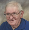
And now a word from someone who actually knows about this stuff: Yesterday’s post regarding vintage uni-related items up for auction prompted a reply from longtime sporting goods maven Terry Proctor (that’s him at left), who had a few thoughts to share:
About that May & Halas tag, Papa Bear actually ran a team-supply sporting goods store in Chicago. They sold uniforms by Wilson and King-O’Shea, a Wilson subsidiary. The Bears used Wilson or K-OS uniforms right up until the NFL decided to go with a single manufacturer. At one time Halas had his office at the store — in this book, Lamar Hunt mentions that he (Hunt) visited Chicago for a meeting with Halas “at his sporting goods store.”
On Jerry Rhome’s helmet: The facemask is made out of magnesium and was dipped in gray vinyl. The mask manufacturers of the day went by Henry Ford’s credo: “Any color as long as it’s gray.” And that MacGregor helmet was actually a clear plastic shell with the color applied to the INSIDE of the shell. Also note the little nylon plastic fasteners peeking out at the front and the jaw pad area. They also are on the back but aren’t visible in the photos. The front, rear, and jaw pads all were applied with these fasteners. We had a special tool to remove/replace them. The padding at the crown of the helmet was permanently riveted to the shell. All pads were covered with real leather.
This style of helmet could also have your team decals and striping applied inside the shell, but the turnaround time was very long so we didn’t mess with it that often. The idea was good but never panned out.
Another gimmick from that era was the “Swivler” football cleat — the front cleats were built into a pod that actually “swiveled” when you turned your foot. It was supposed to reduce the number of knee injuries. Fundamentally a good idea, but mud and grass got into the mechanism and prevented it from working properly. After an initial curious interest in the product, coaches and teams returned to things that they were familiar with.
Big thanks to Terry for sharing his expertise. I’ll have a Uni Watch Profiles interview with him in the near future.
Research Project: I’m busy attending an investigative reporting workshop today, but here’s something I could use a little help with: I’d like to know how many pinstripes were on Cecil Fielder’s jersey when he played for the Yankees (I’m sure most of you can guess where this one is going). Forget about the sleeves — I just want to know how many pinstripes were on his torso (front and back), sort of like counting lines of longitude on a globe. So start googling photos of Fielder, get out those magnifying glasses, and let me know what you find.
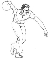
Uni Watch News Ticker: Looks like Daniel Gibson was wearing kinesio tape the other night. Is that an NBA first? (With thanks to Brendon Yarian.) ”¦ Here’s an all-time classic: a pair of Lou Gehrig pants patched on the inside with sugar bags (great find by Jared Wheeler). ”¦ I think we’ve previously included Jose Lind on the list of players who’ve worn pins on their caps, but here are some particularly good views of it. Plus Lind also engaged in a bit of underbill adornment, although I can’t make out what he wrote there (all this courtesy of Andy Chalifour). ”¦ Can someone please explain why the Xcel Energy Center’s online seating chart has two giant swooshes on it? (As spotted by David House.) ”¦ While we’re at it, can someone explain why the Xcel Energy Center has such a pathetically embarrassing name? ”¦ The scourge of purple neckties continues (with thanks to Chris Shockey). ”¦ UNO wore special military appreciation jerseys last weekend (with thanks to Dan Owen). ”¦ Looks like Ken MacAfee, who wore No. 81, was wearing a No. 3 jacket (good spot by Mike Engle). ”¦ This season’s Stanley Cup logo will look like this. ”¦ Color-vs.-color alert: Illinois/Chicago State last night. … The Red Sox will unveil their new road jersey, alternate jersey, alternate cap (which you’ve already seen), and primary logo today at 6pm. … Bonus points to anyone who recognizes the drawing at the top of today’s entry and the role it played in one of my pre-Uni Watch projects. … I’ll be off the grid today, so Phil will be minding the store, plus he’ll have tomorrow’s entry. It would be swell if y’all could keep the comments section from turning into a Star Wars convention. Thanks.
Shit! The Stanley Cup Logo won’t load for me!
Can someone link it differently? I must see it!
I’m presuming this is old news, but these Nike Transformer cross-over thingies… well, they’re not good
link
I love this year’s cup logo!! Nice and clean!!
The vintage clothes hunting trips must be interesting. Back in college, my buddies and I would make periodic trips to Goodwill and similar stores to find used clothes that were cool enough wear on campus. It was sort of an anti-preppy thing.
Paul, are your trips to true vintage clothing stores or places like Goodwill? Alas, at Generic Midwestern University Town, vintage clothing stores were few and far between, leaving us with the daunting task of sifting through the chaff at Goodwill.
[quote]I’ll be off the grid today, so Phil will be minding the store, plus he’ll have tomorrow’s entry. It would be swell if y’all could keep the comments section from turning into a Star Wars convention. Thanks.[/quote]
Isn’t that like the fox running the henhouse? The inmates running the asylum? The, uh…
Johns… running the bordello?
Where is the source of the Stanley Cup Logo? The page won’t load for me and i can’t find it on the web anywhere
Picking up my bonus points – the drawing at the top is tied to “Beer Frame”, the fantastic zine of copious consumption.
Does Illinois even have a white unform? Here’s a gallery of them going orange-on-black against Georgia last weekend…
link
link.
Any better?
[quote comment=”304833″]link.
Any better?[/quote]
Yes! Thanks!!
[quote comment=”304833″]link.
Any better?[/quote]
Just out of curiosity, how come it’s the NBA Finals but the Stanley Cup Final (singular)?
Now that I’ve thought about it, neither sounds right.
Regarding the number of pinstripes on a jersey, I think they’re spaced exactly one inch apart — I have a game used Cubs jersey (2006) and this is how far apart they are.
It looks like pinstripes were a little closer together back when jerseys were made by Rawlings and Russell, but now I’m wondering if that isn’t just an optical illusion created by the fact that the pinstripes used to be thin zigzags and not pure straight lines.
[quote comment=”304832″]Does Illinois even have a white unform? Here’s a gallery of them going orange-on-black against Georgia last weekend…
link
link.
[quote comment=”304837″][quote comment=”304832″]Does Illinois even have a white unform? Here’s a gallery of them going orange-on-black against Georgia last weekend…
link
link.[/quote]
Thanks, JTH. Those are nice – they should wear those all the time at home.
While we’re at it, can someone explain why the Xcel Energy Center has such a pathetically embarrassing name?
Obviously because the Xcel Energy company outbid Land-o-Lakes or Medtronic or Best Buy or any other local company for the naming rights. (not sure if any of the names I mentioned even bid on the rights).
I think the swwoshes are a half assed attempt at the link
[quote comment=”304839″]While we’re at it, can someone explain why the Xcel Energy Center has such a pathetically embarrassing name?
Obviously because the Xcel Energy company outbid Land-o-Lakes or Medtronic or Best Buy or any other local company for the naming rights. (not sure if any of the names I mentioned even bid on the rights).[/quote]
Xcel Engery used to be Northern States Power. Not sure “Northern States Power Center” would be much better. Ah, who knows. Most of those corporate names sound like crap anyway.
We should nominate the worst. I always hated “Network Affliates” or whatever it was for Oakland’s stadium. And “monster” for Candlestick is no better.
Keep waiting for “Go Daddy Field”. Sheesh.
—Ricko
Jose Lind, it should also be noted, was among of the first to go with ankle length pants.
[quote comment=”304841″][quote comment=”304839″]While we’re at it, can someone explain why the Xcel Energy Center has such a pathetically embarrassing name?
Obviously because the Xcel Energy company outbid Land-o-Lakes or Medtronic or Best Buy or any other local company for the naming rights. (not sure if any of the names I mentioned even bid on the rights).[/quote]
Xcel Engery used to be Northern States Power. Not sure “Northern States Power Center” would be much better. Ah, who knows. Most of those corporate names sound like crap anyway.
We should nominate the worst. I always hated “Network Affliates” or whatever it was for Oakland’s stadium. And “monster” for Candlestick is no better.
Keep waiting for “Go Daddy Field”. Sheesh.
—Ricko[/quote]
Worst:
Jobing.com Arena (PHX coyotes)
Horrible name
Love the bowling talk!! Right down my alley!! badda-bum, ching! Thank you! I’ll be here all week!
While bowling my league a few weeks ago, we were talking about how the game’s changed and one of the things we lamented about was not keeping score anymore. I miss the telescores and grease pencils.
The place in Jersey sounds really quite cool. Paul, you sir are making this particular bowler very jealous with your kegling related excursions.
**Starts to plan trip to the Holler House**
[quote comment=”304844″]Love the bowling talk!! Right down my alley!! badda-bum, ching! Thank you! I’ll be here all week!
While bowling my league a few weeks ago, we were talking about how the game’s changed and one of the things we lamented about was not keeping score anymore. I miss the telescores and grease pencils.
The place in Jersey sounds really quite cool. Paul, you sir are making this particular bowler very jealous with your kegling related excursions.
**Starts to plan trip to the Holler House**[/quote]
Saw a fun litle book at Barnes & Noble yesterday. Title is something like “Bowling in All 50 States.”
Maybe when Paul gets uber rich it can be the “Uni Watch Holler House”. Corporate naming, how big league would THAT be. (rolls yes)
Notice how I cleverly weave themes together?
Busy day at work for me. Shooting some TV spots. Have fun, everyone. Don’t screw around with the substitute teacher. No switching seats and stuff.
—Ricko
[quote comment=”304843″][quote comment=”304841″][quote comment=”304839″]While we’re at it, can someone explain why the Xcel Energy Center has such a pathetically embarrassing name?
Obviously because the Xcel Energy company outbid Land-o-Lakes or Medtronic or Best Buy or any other local company for the naming rights. (not sure if any of the names I mentioned even bid on the rights).[/quote]
Xcel Engery used to be Northern States Power. Not sure “Northern States Power Center” would be much better. Ah, who knows. Most of those corporate names sound like crap anyway.
We should nominate the worst. I always hated “Network Affliates” or whatever it was for Oakland’s stadium. And “monster” for Candlestick is no better.
Keep waiting for “Go Daddy Field”. Sheesh.
—Ricko[/quote]
Worst:
Jobing.com Arena (PHX coyotes)
Horrible name[/quote]
It’s the worst when a stadium has had a perfectly good name for a long time, then sells out; Candlestick -> 3Com, Riverfront -> Cinergy.
BTW Ricko, the Oakland Coliseum became Network Associates Coliseum (I think its McAfee now). Tom Tolbert on KNBR took to calling it “The Net Ass”.
And right across the street from Jobing.com Arena is University of Phoenix Stadium. Dumb.
thought this might be in the ticker today, but since it’s not…a little jail house fun…
“las vegas wranglers to host gov. rod blagojevich prison uniform night”
outstanding
[quote comment=”304845″][quote comment=”304844″]Love the bowling talk!! Right down my alley!! badda-bum, ching! Thank you! I’ll be here all week!
While bowling my league a few weeks ago, we were talking about how the game’s changed and one of the things we lamented about was not keeping score anymore. I miss the telescores and grease pencils.
The place in Jersey sounds really quite cool. Paul, you sir are making this particular bowler very jealous with your kegling related excursions.
**Starts to plan trip to the Holler House**[/quote]
Saw a fun litle book at Barnes & Noble yesterday. Title is something like “Bowling in All 50 States.”
Maybe when Paul gets uber rich it can be the “Uni Watch Holler House”. Corporate naming, how big league would THAT be. (rolls yes)
Notice how I cleverly weave themes together?
Busy day at work for me. Shooting some TV spots. Have fun, everyone. Don’t screw around with the substitute teacher. No switching seats and stuff.
—Ricko[/quote]
We’ll behave, Mr. Ricko. We promise.
I think this, link , is the book you were referring to. That was actually on my list to Santa.
Paul:
“Gravy cheese fries” = poutine.
At least during hockey season, you should use the French-Canadian terminology, non?
[quote comment=”304850″]Another gimmick from that era was the “Swivler” football cleat – the front cleats were built into a pod that actually “swiveled” when you turned your foot. It was supposed to reduce the number of knee injuries. Fundamentally a good idea, but mud and grass got into the mechanism and prevented it from working properly. After an initial curious interest in the product, coaches and teams returned to things that they were familiar with.
Lotto recently came out with a similar concept in their “Twist’n go technology”. Not sure if it works any better.[/quote]
Sorry, should have been more informative. Lotto has soccer boots with a similar gimmick. link
[quote comment=”304847″]thought this might be in the ticker today, but since it’s not…link…
“las vegas wranglers to host gov. rod blagojevich prison uniform night”
outstanding[/quote]
G-Rod?
[quote comment=”304847″]thought this might be in the ticker today, but since it’s not…link…
“las vegas wranglers to host gov. rod blagojevich prison uniform night”
outstanding[/quote]
Nice. But it should really be George Ryan prison uniform night, since he’s actually in prison right now.
[quote comment=”304829″][quote]I’ll be off the grid today, so Phil will be minding the store, plus he’ll have tomorrow’s entry. It would be swell if y’all could keep the comments section from turning into a Star Wars convention. Thanks.[/quote]
Isn’t that like the fox running the henhouse? The inmates running the asylum? The, uh…
Johns… running the bordello?[/quote]
As long as I get my 20%……..
Italics gone?
[quote comment=”304833″]link.
Any better?[/quote]
Nice
I still prefer the logo from 2006 and 2007… Don’t see why they needed to change from that
Yeah, Beer Frame…I was looking thru a few of my old issues just the other day.
Lotto makes a soccer boot with a twisting stud. Not exactly an entire stud plate, but an interesting concept…
link
[quote comment=”304842″]Jose Lind, it should also be noted, was among of the first to go with ankle length pants.[/quote]
Ricko,
Do you mean ankle length pants, or no pants at all? (Scroll down to the off-field problems section)
[quote comment=”304860″][quote comment=”304842″]Jose Lind, it should also be noted, was among of the first to go with ankle length pants.[/quote]
Ricko,
Do you mean ankle length pants, or no pants at all? (Scroll down to the off-field problems section)[/quote]
Shoot, link didn’t work, try this: link
[quote comment=”304835]
Just out of curiosity, how come it’s the NBA Finals but the Stanley Cup Final (singular)?
Now that I’ve thought about it, neither sounds right.[/quote]
Something to do with the fact that the logo may need to be done in French, perhaps? Especially if Montreal makes the final, there would be a Coupe Stanley/LNH version of the logo done.
I don’t care how unrational it is, I’m pulling for Colt McCoy to win the Heisman because he’s the only one of the 3 finalists not to wear the ugly-ass Revolution helmet.
“Alden speaks for itself”
You listening Nike? Reebok?
[quote comment=”304843″][quote comment=”304841″][quote comment=”304839″]While we’re at it, can someone explain why the Xcel Energy Center has such a pathetically embarrassing name?
Obviously because the Xcel Energy company outbid Land-o-Lakes or Medtronic or Best Buy or any other local company for the naming rights. (not sure if any of the names I mentioned even bid on the rights).[/quote]
Xcel Engery used to be Northern States Power. Not sure “Northern States Power Center” would be much better. Ah, who knows. Most of those corporate names sound like crap anyway.
We should nominate the worst. I always hated “Network Affliates” or whatever it was for Oakland’s stadium. And “monster” for Candlestick is no better.
Keep waiting for “Go Daddy Field”. Sheesh.
—Ricko[/quote]
Worst:
Jobing.com Arena (PHX coyotes)
Horrible name[/quote]
Not to wave the corporate banner, but there are some corporate sponsored arena/stadium names that work.
Great American Ballpark in Cincy is a good name.
And of course you have the ultimate symbol of corporate greed that actually translates into a pretty good stadium name…
…Yankee Stadium.
[quote comment=”304843″][quote comment=”304841″][quote comment=”304839″]While we’re at it, can someone explain why the Xcel Energy Center has such a pathetically embarrassing name?
Obviously because the Xcel Energy company outbid Land-o-Lakes or Medtronic or Best Buy or any other local company for the naming rights. (not sure if any of the names I mentioned even bid on the rights).[/quote]
Xcel Engery used to be Northern States Power. Not sure “Northern States Power Center” would be much better. Ah, who knows. Most of those corporate names sound like crap anyway.
We should nominate the worst. I always hated “Network Affliates” or whatever it was for Oakland’s stadium. And “monster” for Candlestick is no better.
Keep waiting for “Go Daddy Field”. Sheesh.
—Ricko[/quote]
Worst:
Jobing.com Arena (PHX coyotes)
Horrible name[/quote]
Nothing beats University of Phoenix Stadium
I’m still waiting for Mr. Skin Field
Riddell, Inc. has filed a lawsuit against Schutt Sports, Inc, claiming Schutt has infringed on three different patents arising from Riddell’s helmet and faceguard technologies.
The three-count federal court complaint identifies three Schutt helmet models that infringe upon Riddell’s patented technologies for football helmets and faceguards. Infringing products are identified as Schutt helmets marketed under the “DNA,” “ION,” and “AIR XP” product names.
The Riddell patents protect key technological features of helmets and faceguards that offer wearers greater injury protection, performance and personal comfort. The suit alleges that despite Riddell’s patent protection, Schutt has used Riddell’s technology without permission.
“Riddell’s pioneering products offer unique innovations that protect our athletes,” said Dan Arment, President of Riddell, Inc. “We are committed to developing the best sports equipment for our customers and we will protect our research and development legacy against any company trying to use Riddell technology in their products.”
The lawsuit asks a federal jury to prevent further patent infringement and to award damages.
I was working as a GIS consultant for Northern States Power (now Xcel Energy) when the Wild were granted a franchise and they NSP was looking to win naming rights. I kept telling the people I was working with to pay extra to get the team naming rights as well and call them the “Minnesota Fighting Power Lines.” I even drew a half-a$$ed logo with a mean looking power pole and a few people wrote a fight song.
I think what this all proves is that in the winter in Minnesota, you can get a little loopy.
About the Xcel Energy name…it could have been worse, a few years before they were looking to merge with Wisconsin Electric and would have created a company called “Primergy.” I still have friends who work for Xcel who are looking for the stationery for that in a vault somewhere. LOL.
[quote comment=”304846″][quote comment=”304843″][quote comment=”304841″][quote comment=”304839″]While we’re at it, can someone explain why the Xcel Energy Center has such a pathetically embarrassing name?
Obviously because the Xcel Energy company outbid Land-o-Lakes or Medtronic or Best Buy or any other local company for the naming rights. (not sure if any of the names I mentioned even bid on the rights).[/quote]
Xcel Engery used to be Northern States Power. Not sure “Northern States Power Center” would be much better. Ah, who knows. Most of those corporate names sound like crap anyway.
We should nominate the worst. I always hated “Network Affliates” or whatever it was for Oakland’s stadium. And “monster” for Candlestick is no better.
Keep waiting for “Go Daddy Field”. Sheesh.
—Ricko[/quote]
Worst:
Jobing.com Arena (PHX coyotes)
Horrible name[/quote]
It’s the worst when a stadium has had a perfectly good name for a long time, then sells out; Candlestick -> 3Com, Riverfront -> Cinergy.
BTW Ricko, the Oakland Coliseum became Network Associates Coliseum (I think its McAfee now). Tom Tolbert on KNBR took to calling it “The Net Ass”.
And right across the street from Jobing.com Arena is University of Phoenix Stadium. Dumb.[/quote]
Our local ball club, AAA Iowa Cubs, went from Sec Taylor Stadium (named after an old Des Moines Register sports writer, I believe) was changed in the recent years to Principal Park. :/
Most of us still call it Sec Taylor, and the really funny thing is that most of the news casters do, as well. :D
It’s just a matter of time before Mississippi State switches to these jerseys.
link
They also have camo baseball, softball, basketball, and HS Football jerseys.
What’s wrong with the Xcel Energy Center as a name? It flows much better than many other names
I’m pretty sure Kendrick Perkins had kenesio tape on his shoulder during the NBA Finals
[quote]Riddell, Inc. has filed a lawsuit against Schutt Sports, Inc, claiming Schutt has infringed on three different patents arising from Riddell’s helmet and faceguard technologies.[/quote]
that sound you just heard?
powers’ brain exploding (again)
link
It just sounds way better than:
link
Great place to see a game, though. And that review is so spot on….we Des Moines-ians loves us some free T-shirts. The best is the “hotdog” gun that usually results in someone taking the internal “load” of hotdog and bun square in the face. :D :D
[quote comment=”304871″]What’s wrong with the Xcel Energy Center as a name? It flows much better than many other names[/quote]
If you have to ask, you’ll never understand.
I love the fact that it’s the Great American Ballpark. It’s probably the most perfect name for a baseball stadium.
Another name that would be perfect: John Deere Field
[quote comment=”304846″][quote comment=”304843″][quote comment=”304841″][quote comment=”304839″]While we’re at it, can someone explain why the Xcel Energy Center has such a pathetically embarrassing name?
Obviously because the Xcel Energy company outbid Land-o-Lakes or Medtronic or Best Buy or any other local company for the naming rights. (not sure if any of the names I mentioned even bid on the rights).[/quote]
Xcel Engery used to be Northern States Power. Not sure “Northern States Power Center” would be much better. Ah, who knows. Most of those corporate names sound like crap anyway.
We should nominate the worst. I always hated “Network Affliates” or whatever it was for Oakland’s stadium. And “monster” for Candlestick is no better.
Keep waiting for “Go Daddy Field”. Sheesh.
—Ricko[/quote]
Worst:
Jobing.com Arena (PHX coyotes)
Horrible name[/quote]
It’s the worst when a stadium has had a perfectly good name for a long time, then sells out; Candlestick -> 3Com, Riverfront -> Cinergy.
BTW Ricko, the Oakland Coliseum became Network Associates Coliseum (I think its McAfee now). Tom Tolbert on KNBR took to calling it “The Net Ass”.
And right across the street from Jobing.com Arena is University of Phoenix Stadium. Dumb.[/quote]
I’ll agree with the Riverfront->Cinergy, as a local it bugged the crap out of me. Now we have Great American Ballpark which I think is one of the best sports venue names out there. I completely forget that the it’s still a banner for Great American Insurance Co.
The swooshes on the Xcel Energy Center map are apparently the logo or marking of the company that produced the drawing. The same markings appear on the seating charts for many buildings:
United Center
link
Giants Stadium
link
Seems strange that several different ticket broker sites would use a seating chart with some other company’s logo. Or that the company would bother to put a logo on what looks like a rather basic seating chart that one could find anywhere.
[quote comment=”304835″][quote comment=”304833″]link.
Any better?[/quote]
Just out of curiosity, how come it’s the NBA Finals but the Stanley Cup Final (singular)?
Now that I’ve thought about it, neither sounds right.[/quote]
[pedant ON] It’s a question of grammar; the NBA Finals refers to the games (plural), while the Stanley Cup Final refers to the series (singular). [pedant OFF]
As far as corporate naming rights go, I remain amused that the Lords of Baseball wouldn’t allow Gussie Busch to re-name Sportsman’s Park in St. Louis “Budweiser Stadium” when the brewery bought the Cardinals in the 1950’s. Since then, there have been link link link in St. Louis, all featuring teams with link link link…
[quote comment=”304852″]
G-Rod?[/quote]
Yeah. WTF’s with that?
Everyone knows his name is Blago.
Any other Red Sox fans out there a little worried about tonight? I mean, I like the two-socks logo better by itself than on the circular baseball logo, but really only on merch. On the field, I really prefer the classic look they’ve had. Although this ownership group has done a good job of respecting the history of the ball club while moving forward (i.e. Fenway improvements). Maybe the alt will be a cream-colored (a la the Reds) with the two-socks over the left breast… that would look nice.
Thoughts?
link
Hehehe….sorry, but this always makes me laugh. Just imagine a mostly disintegrated hotdog and foil wrapper launching into the crowd and the frivolity that ensues. :)
Is this something that most parks have? I have seen a lot of T-shirt launchers (which we have also, in the shape of a bat) but not many hot dog launcher sightings.
[quote comment=”304869″][quote comment=”304846″][quote comment=”304843″][quote comment=”304841″][quote comment=”304839″]While we’re at it, can someone explain why the Xcel Energy Center has such a pathetically embarrassing name?
Obviously because the Xcel Energy company outbid Land-o-Lakes or Medtronic or Best Buy or any other local company for the naming rights. (not sure if any of the names I mentioned even bid on the rights).[/quote]
Xcel Engery used to be Northern States Power. Not sure “Northern States Power Center” would be much better. Ah, who knows. Most of those corporate names sound like crap anyway.
We should nominate the worst. I always hated “Network Affliates” or whatever it was for Oakland’s stadium. And “monster” for Candlestick is no better.
Keep waiting for “Go Daddy Field”. Sheesh.
—Ricko[/quote]
Worst:
Jobing.com Arena (PHX coyotes)
Horrible name[/quote]
It’s the worst when a stadium has had a perfectly good name for a long time, then sells out; Candlestick -> 3Com, Riverfront -> Cinergy.
BTW Ricko, the Oakland Coliseum became Network Associates Coliseum (I think its McAfee now). Tom Tolbert on KNBR took to calling it “The Net Ass”.
And right across the street from Jobing.com Arena is University of Phoenix Stadium. Dumb.[/quote]
Our local ball club, AAA Iowa Cubs, went from Sec Taylor Stadium (named after an old Des Moines Register sports writer, I believe) was changed in the recent years to Principal Park. :/
Most of us still call it Sec Taylor, and the really funny thing is that most of the news casters do, as well. :D[/quote]
Sec Taylor still applies because the official name is “Sec Taylor Field at Principal Park” …. until Principal goes under anyway….
I can only hope by “new road jersey” the Sox mean link.
Why do we have to change something so perfect?
[quote comment=”304849″]Paul:
“Gravy cheese fries” = poutine.
At least during hockey season, you should use the French-Canadian terminology, non?[/quote]
Awwww, so that’s what poutine is. A guy I worked with a few years back used to ask for it whenever we went to a restaurant at lunch, and then laugh to himself when they looked confused. I assumed it was some kind of asphinctersayswhat type of joke that I didn’t care to enough to ask about.
[quote comment=”304881″]Any other Red Sox fans out there a little worried about tonight? I mean, I like the two-socks logo better by itself than on the circular baseball logo, but really only on merch. On the field, I really prefer the classic look they’ve had. Although this ownership group has done a good job of respecting the history of the ball club while moving forward (i.e. Fenway improvements). Maybe the alt will be a cream-colored (a la the Reds) with the two-socks over the left breast… that would look nice.
Thoughts?[/quote]
nope
Am I alone in thinking that “Great American Ballpark” sounds totally bush league?
It reminds me of a Six Flags attraction or something.
[quote comment=”304886″][quote comment=”304881″]Any other Red Sox fans out there a little worried about tonight? I mean, I like the two-socks logo better by itself than on the circular baseball logo, but really only on merch. On the field, I really prefer the classic look they’ve had. Although this ownership group has done a good job of respecting the history of the ball club while moving forward (i.e. Fenway improvements). Maybe the alt will be a cream-colored (a la the Reds) with the two-socks over the left breast… that would look nice.
Thoughts?[/quote]
nope[/quote]
The only Sox alt I could see working would be navy with “Red Sox” across the chest, like the BP jerseys they wore in the 90s. I had one of those when I was little.
Whatever they end up doing, it’ll hopefully be better than the current red. I can’t stand that one, especially with the navy cap.
The XCEL swooshes are NOT a poor attempt at replicating the Xcel Energy logo. That’s what I thought at first, too…
After a little searching, they’re apparently the watermark for TicketTransaction’s Intellimap. I’ve been able to spot it on other seating charts for different venues. Don’t blame the area, blame the ticket broker’s map. :)
[quote comment=”304888″][quote comment=”304886″][quote comment=”304881″]Any other Red Sox fans out there a little worried about tonight? I mean, I like the two-socks logo better by itself than on the circular baseball logo, but really only on merch. On the field, I really prefer the classic look they’ve had. Although this ownership group has done a good job of respecting the history of the ball club while moving forward (i.e. Fenway improvements). Maybe the alt will be a cream-colored (a la the Reds) with the two-socks over the left breast… that would look nice.
Thoughts?[/quote]
nope[/quote]
The only Sox alt I could see working would be navy with “Red Sox” across the chest, like the BP jerseys they wore in the 90s. I had one of those when I was little.
Whatever they end up doing, it’ll hopefully be better than the current red. I can’t stand that one, especially with the navy cap.[/quote]
They had a navy “fashion jersey” like that on the web site for a while, and I thought it looked pretty sharp; for sure better than the red alts.
[quote comment=”304838″][quote comment=”304837″][quote comment=”304832″]Does Illinois even have a white unform? Here’s a gallery of them going orange-on-black against Georgia last weekend…
link
link.[/quote]
Thanks, JTH. Those are nice – they should wear those all the time at home.[/quote]
That’ll never happen, Illini fans are obsessed with orange, I’m sure they’d rather the team wore orange for every game. Hence the happy switch from blue football jerseys to orange(90% of the time anyway). As it is, it seems like the whites only come out during tournaments or when they go up against a team in red(excluding the fiasco against Wisconsin a few years ago). I’m surprised they wore white at home against Hawaii. And that damn zigzag pattern that I’m sure there’s a name for, but can’t place it, I hate it with the fire of a thousand suns.
[quote comment=”304881″]Any other Red Sox fans out there a little worried about tonight? I mean, I like the two-socks logo better by itself than on the circular baseball logo, but really only on merch. On the field, I really prefer the classic look they’ve had. Although this ownership group has done a good job of respecting the history of the ball club while moving forward (i.e. Fenway improvements). Maybe the alt will be a cream-colored (a la the Reds) with the two-socks over the left breast… that would look nice.
Thoughts?[/quote]
Ok, just checked the Reds shop, and I’m wrong about them having a cream-colored jersey… but I could have sworn I saw one on this site sometime in the past couple of years, definitely in one of Paul’s season updates. Maybe I’m going crazy….
[quote comment=”304883″]
Keep waiting for “Go Daddy Field”. Sheesh.[/quote]
According to link, the new arena in Pittsburgh will be named the Consol Energy Center/Arena.
While I’m not thrilled about the name, I’ve already seen one site dubbing the new arena as “The Power Plant”.
[quote comment=”304892″][quote comment=”304881″]Any other Red Sox fans out there a little worried about tonight? I mean, I like the two-socks logo better by itself than on the circular baseball logo, but really only on merch. On the field, I really prefer the classic look they’ve had. Although this ownership group has done a good job of respecting the history of the ball club while moving forward (i.e. Fenway improvements). Maybe the alt will be a cream-colored (a la the Reds) with the two-socks over the left breast… that would look nice.
Thoughts?[/quote]
Ok, just checked the Reds shop, and I’m wrong about them having a cream-colored jersey… but I could have sworn I saw one on this site sometime in the past couple of years, definitely in one of Paul’s season updates. Maybe I’m going crazy….[/quote]
Were you thinking of link?
[quote comment=”304892″][quote comment=”304881″]Any other Red Sox fans out there a little worried about tonight? I mean, I like the two-socks logo better by itself than on the circular baseball logo, but really only on merch. On the field, I really prefer the classic look they’ve had. Although this ownership group has done a good job of respecting the history of the ball club while moving forward (i.e. Fenway improvements). Maybe the alt will be a cream-colored (a la the Reds) with the two-socks over the left breast… that would look nice.
Thoughts?[/quote]
Ok, just checked the Reds shop, and I’m wrong about them having a cream-colored jersey… but I could have sworn I saw one on this site sometime in the past couple of years, definitely in one of Paul’s season updates. Maybe I’m going crazy….[/quote]
didn’t mean to imply you’re wrong about the reds (possible creams)…just saying the sox alt won’t be
It’ll always be “The Jake” for me, I still think renaming Jacobs Field would have gone over far better had they called it Jacobs Field at Progressive Ballpark or something. I still think of “The Q” as Gund Arena, but I have to give Dan Gilbert credit, he owns the team, renamed the arena after his company and he’s pumped a ton of money into the team/venue to make it one of the best places to watch a basketball game.
[quote comment=”304891″][quote comment=”304838″][quote comment=”304837″][quote comment=”304832″]Does Illinois even have a white unform? Here’s a gallery of them going orange-on-black against Georgia last weekend…
link
link.[/quote]
Thanks, JTH. Those are nice – they should wear those all the time at home.[/quote]
That’ll never happen, Illini fans are obsessed with orange, I’m sure they’d rather the team wore orange for every game. Hence the happy switch from blue football jerseys to orange(90% of the time anyway). As it is, it seems like the whites only come out during tournaments or when they go up against a team in red(excluding the fiasco against Wisconsin a few years ago). I’m surprised they wore white at home against Hawaii. And that damn zigzag pattern that I’m sure there’s a name for, but can’t place it, I hate it with the fire of a thousand suns.[/quote]
It would be nice if they could at least have the visiting teams wear white then.
[quote comment=”304894″][quote comment=”304892″][quote comment=”304881″]Any other Red Sox fans out there a little worried about tonight? I mean, I like the two-socks logo better by itself than on the circular baseball logo, but really only on merch. On the field, I really prefer the classic look they’ve had. Although this ownership group has done a good job of respecting the history of the ball club while moving forward (i.e. Fenway improvements). Maybe the alt will be a cream-colored (a la the Reds) with the two-socks over the left breast… that would look nice.
Thoughts?[/quote]
Ok, just checked the Reds shop, and I’m wrong about them having a cream-colored jersey… but I could have sworn I saw one on this site sometime in the past couple of years, definitely in one of Paul’s season updates. Maybe I’m going crazy….[/quote]
Were you thinking of link?[/quote]
Very possibly… but I thought the Reds had something similar, too. Maybe I’m just thinking of the redesigned homes w/o cream coloring.
[quote comment=”304862″][quote comment=”304835]
Just out of curiosity, how come it’s the NBA Finals but the Stanley Cup Final (singular)?
Now that I’ve thought about it, neither sounds right.[/quote]
Something to do with the fact that the logo may need to be done in French, perhaps? Especially if Montreal makes the final, there would be a Coupe Stanley/LNH version of the logo done.[/quote]
In years past, all you had to do was make the conference final in order to get the logo on the ice…
With that said, they make a French version of that logo every year, regardless of who makes the Final. The hologram I have saved from the 2006 ST Champs gear I have for the Canes fluctuates between the English and French versions of the logo.
[quote comment=”304895″][quote comment=”304892″][quote comment=”304881″]Any other Red Sox fans out there a little worried about tonight? I mean, I like the two-socks logo better by itself than on the circular baseball logo, but really only on merch. On the field, I really prefer the classic look they’ve had. Although this ownership group has done a good job of respecting the history of the ball club while moving forward (i.e. Fenway improvements). Maybe the alt will be a cream-colored (a la the Reds) with the two-socks over the left breast… that would look nice.
Thoughts?[/quote]
Ok, just checked the Reds shop, and I’m wrong about them having a cream-colored jersey… but I could have sworn I saw one on this site sometime in the past couple of years, definitely in one of Paul’s season updates. Maybe I’m going crazy….[/quote]
didn’t mean to imply you’re wrong about the reds (possible creams)…just saying the sox alt won’t be[/quote]
Ah, I didn’t take it either way… I just thought you were saying my idea sucked!
[quote comment=”304893″][quote comment=”304883″]
Keep waiting for “Go Daddy Field”. Sheesh.[/quote]
According to link, the new arena in Pittsburgh will be named the Consol Energy Center/Arena.
While I’m not thrilled about the name, I’ve already seen one site dubbing the new arena as “The Power Plant”.[/quote]
I know for me, naming rights on stadium/ballparks etc are annoying to say the least. But I agree that some are definitely worse than others. I don’t mind the United Center at all, mostly because United is a normal sounding stadium name, if I didn’t know any better(ok I’d have to be pretty dumb, but go with me on this) I might not realize it was sponsored at all. When I was little, Wrigley field was just the opposite for me. Until I learned Wrigley owned the team I always assumed it was Wrigley’s gum sponsored in some way. And US Cellular field pisses me off to no end, “The Cell”, what a joke. I’m not one to try and pretend it’s still called Comiskey though, mostly because Comsikey was an asshole so why would I stick up for that name. I usually just avoid calling the park by any name, I prefer just saying on the South Side, or something to that effect. Rant over.
[quote]Ah, I didn’t take it either way… I just thought you were saying my idea sucked![/quote]
nope…im just saying that after you see what they will be releasing this evening, i can tell you it won’t be cream (although, you may wish it were)
Was looking at one of the sox blogs and I think they are bringing back solid navy lettering, but the tiffany font. also 2 sox logo patch by itself on sleeve. I think it was royal rooters. The diagram looked like one of the spec sheets mlb does. I like the 2 sox alt cap, preety sharp
link
What I think I was thinking of. This is from Paul’s 2007 preview column, and in that light, it looks cream-colored-ish.
I am a little scared about the tweaks on the RED SOX road jerjeys. I hope they are subtle. Also the socks on the hat appear to be a little small. Does anyone have any leaks besides the hat?
[quote comment=”304903″]Was looking at one of the sox blogs and I think they are bringing back solid navy lettering, but the tiffany font. also 2 sox logo patch by itself on sleeve. I think it was royal rooters. The diagram looked like one of the spec sheets mlb does. I like the 2 sox alt cap, preety sharp[/quote]
Link, please??
LI Phil, is the jersey nasty?
[quote comment=”304902″][quote]Ah, I didn’t take it either way… I just thought you were saying my idea sucked![/quote]
nope…im just saying that after you see what they will be releasing this evening, i can tell you it won’t be cream (although, you may wish it were)[/quote]
That bad, huh? Say it ain’t so……
[quote comment=”304897″][quote comment=”304891″][quote comment=”304838″][quote comment=”304837″][quote comment=”304832″]Does Illinois even have a white unform? Here’s a gallery of them going orange-on-black against Georgia last weekend…
link
link.[/quote]
Thanks, JTH. Those are nice – they should wear those all the time at home.[/quote]
That’ll never happen, Illini fans are obsessed with orange, I’m sure they’d rather the team wore orange for every game. Hence the happy switch from blue football jerseys to orange(90% of the time anyway). As it is, it seems like the whites only come out during tournaments or when they go up against a team in red(excluding the fiasco against Wisconsin a few years ago). I’m surprised they wore white at home against Hawaii. And that damn zigzag pattern that I’m sure there’s a name for, but can’t place it, I hate it with the fire of a thousand suns.[/quote]
It would be nice if they could at least have the visiting teams wear white then.[/quote]
Maybe. I kind of enjoy the contrast of color vs. color in basketball, but only when the colors actually do contrast, no red v orange etc. White basketball jerseys always look kind of dirty and off-white to me. I also dig CvC(color vs. color) in soccer, but that’s where my love ends, I have a staunch record of hypocrisy to uphold.
[quote comment=”304901″][quote comment=”304893″][quote comment=”304883″]
Keep waiting for “Go Daddy Field”. Sheesh.[/quote]
According to link, the new arena in Pittsburgh will be named the Consol Energy Center/Arena.
While I’m not thrilled about the name, I’ve already seen one site dubbing the new arena as “The Power Plant”.[/quote]
I know for me, naming rights on stadium/ballparks etc are annoying to say the least. But I agree that some are definitely worse than others. I don’t mind the United Center at all, mostly because United is a normal sounding stadium name, if I didn’t know any better(ok I’d have to be pretty dumb, but go with me on this) I might not realize it was sponsored at all. When I was little, Wrigley field was just the opposite for me. Until I learned Wrigley owned the team I always assumed it was Wrigley’s gum sponsored in some way. And US Cellular field pisses me off to no end, “The Cell”, what a joke. I’m not one to try and pretend it’s still called Comiskey though, mostly because Comsikey was an asshole so why would I stick up for that name. I usually just avoid calling the park by any name, I prefer just saying on the South Side, or something to that effect. Rant over.[/quote]
Most people I know simply refer to it as Sox Park. Rolls off the tongue much easier than the incredibly unwieldy US Cellular Field.
[quote comment=”304825″]I’m presuming this is old news, but these Nike Transformer cross-over thingies… well, they’re not good
link
They are from the not too recent past, about two summers ago when the film came out.
Nike often releases their their retro shoes in theme-based packs.
For example, last year before school started, they had a “Back to School Pack”:
Crayola Box Vandals:
link
Marble Notebook Dunks:
link
Elmer’s Glue Air Max 90’s:
link
[quote comment=”304896″]It’ll always be “The Jake” for me, I still think renaming Jacobs Field would have gone over far better had they called it Jacobs Field at Progressive Ballpark or something. I still think of “The Q” as Gund Arena, but I have to give Dan Gilbert credit, he owns the team, renamed the arena after his company and he’s pumped a ton of money into the team/venue to make it one of the best places to watch a basketball game.[/quote]
I agree with “The Jake” although “Gund Arena” never really did anything for me and I’ve come to appreciate “The Q.” At least we have Cleveland Browns Stadium (even with the named gates) but nothing beats (ambiance included) Cleveland Lakefront Municipal Stadium.
Hey!!
I know we discussed this the other day, but I actually got a response from Reebok this morning about why Canadians are excluded from the logo contest:
Dear Peter,
Thank you for your question. The Reebok Lost Logo Challenge is a watch & win promotion, which was created in conjunction with NBC and the NHL. Through its design, the promotion relies heavily on NBC to prompt viewer participation and provide pertinent contest announcements. Since the NBC broadcast of the NHL Winter Classic is only available to U.S. viewers, it would be disservice to open it up to TV viewers outside of the U.S. who would not hear the pertinent broadcast announcements for this contest.
Regards,
Reebok Corporate Communications
hope this helps!
[quote comment=”304902″][quote]Ah, I didn’t take it either way… I just thought you were saying my idea sucked![/quote]
nope…im just saying that after you see what they will be releasing this evening, i can tell you it won’t be cream (although, you may wish it were)[/quote]
Is it that bad? =/
[quote comment=”304907″]LI Phil, is the jersey nasty?[/quote]
i cannot say (other than to say i’ve seen it)…paul swore me to secrecy…
[quote]That bad, huh? Say it ain’t so…… [/quote]
bad is all a matter of opinion…im sure there’ll be plenty of commentary on it tomorrow
(sorry for being cryptic…im sure six o’clock can’t roll around fast enough for you guys)
[quote comment=”304915″]
(sorry for being cryptic…im sure six o’clock can’t roll around fast enough for you guys)[/quote]
Don’t do this to me, Phil! I won’t be able to see it until tomorrow (unless NESN shows it on SportsDesk).
Sabathia’s new uniform:
link
[quote comment=”304912″][quote comment=”304896″]It’ll always be “The Jake” for me, I still think renaming Jacobs Field would have gone over far better had they called it Jacobs Field at Progressive Ballpark or something. I still think of “The Q” as Gund Arena, but I have to give Dan Gilbert credit, he owns the team, renamed the arena after his company and he’s pumped a ton of money into the team/venue to make it one of the best places to watch a basketball game.[/quote]
I agree with “The Jake” although “Gund Arena” never really did anything for me and I’ve come to appreciate “The Q.” At least we have Cleveland Browns Stadium (even with the named gates) but nothing beats (ambiance included) Cleveland Lakefront Municipal Stadium.[/quote]
Agreed, add the Richfield Coliseum to the list of well named venues in Cleveland. Its not that Gund Arena does anything for me, I just still have to stop myself from saying “The Gund.” However, I seldom stop myself from saying “The Jake”
[quote comment=”304915″][quote comment=”304907″]LI Phil, is the jersey nasty?[/quote]
i cannot say (other than to say i’ve seen it)…paul swore me to secrecy…
[quote]That bad, huh? Say it ain’t so…… [/quote]
bad is all a matter of opinion…im sure there’ll be plenty of commentary on it tomorrow
(sorry for being cryptic…im sure six o’clock can’t roll around fast enough for you guys)[/quote]
Ok ok, you’re sworn to secrecy and that’s cool… but how did you and Paul get the chance to see it?
[quote comment=”304911″]
Marble Notebook Dunks:
link
[/quote]
…and the link
Paul – do you ever sometimes wish you were born in an earlier era? It fits your taste in wardrobe, hobbies, uni-style preference, and pretty much your whole lifestyle.
[quote comment=”304863″]I don’t care how unrational it is, I’m pulling for Colt McCoy to win the Heisman because he’s the only one of the 3 finalists not to wear the ugly-ass Revolution helmet.[/quote]
It’s still a VSR-4, which I loathe!
[quote comment=”304922″][quote comment=”304863″]I don’t care how unrational it is, I’m pulling for Colt McCoy to win the Heisman because he’s the only one of the 3 finalists not to wear the ugly-ass Revolution helmet.[/quote]
It’s still a VSR-4, which I loathe![/quote]
BTW, Stuby…that’s how I determine who to root for.
I have NEVER rooted for Texas, TOSU, VaTech or Wisconsin.
I take that back. AJ Hawks’ senior year at TOSU, I rooted for them in their first game…against Texas and Mr. Wonderlic(Vince Young).
Xcel Energy’s logo resembles two swooshes link as seen here but the two on the seating chart are way to close to Nike for some reason.
Rob, it’s over at redsoxnation
[quote comment=”304840″]I think the swwoshes are a half assed attempt at the link
[/quote]
I think the bigger question is not why there are swooshes on the seating chart, but why is Paul looking for tickets to Celtic Women? There are on PBS like 19 times a week. Also, does this mean he’s coming back to Minny?
[quote comment=”304913″]Hey!!
I know we discussed this the other day, but I actually got a response from Reebok this morning about why Canadians are excluded from the logo contest:
Dear Peter,
Thank you for your question. The Reebok Lost Logo Challenge is a watch & win promotion, which was created in conjunction with NBC and the NHL. Through its design, the promotion relies heavily on NBC to prompt viewer participation and provide pertinent contest announcements. Since the NBC broadcast of the NHL Winter Classic is only available to U.S. viewers, it would be disservice to open it up to TV viewers outside of the U.S. who would not hear the pertinent broadcast announcements for this contest.
Regards,
Reebok Corporate Communications
hope this helps![/quote]
Great, that means watching the Winter Classic on NBC will be like watching the World Series on TBS. Instead of Frank TV, I’m going to hear nothing but Reebok!
[quote comment=”304883″][quote comment=”304869″][quote comment=”304846″][quote comment=”304843″][quote comment=”304841″][quote comment=”304839″]While we’re at it, can someone explain why the Xcel Energy Center has such a pathetically embarrassing name?
Obviously because the Xcel Energy company outbid Land-o-Lakes or Medtronic or Best Buy or any other local company for the naming rights. (not sure if any of the names I mentioned even bid on the rights).[/quote]
Xcel Engery used to be Northern States Power. Not sure “Northern States Power Center” would be much better. Ah, who knows. Most of those corporate names sound like crap anyway.
We should nominate the worst. I always hated “Network Affliates” or whatever it was for Oakland’s stadium. And “monster” for Candlestick is no better.
Keep waiting for “Go Daddy Field”. Sheesh.
—Ricko[/quote]
Worst:
Jobing.com Arena (PHX coyotes)
Horrible name[/quote]
It’s the worst when a stadium has had a perfectly good name for a long time, then sells out; Candlestick -> 3Com, Riverfront -> Cinergy.
BTW Ricko, the Oakland Coliseum became Network Associates Coliseum (I think its McAfee now). Tom Tolbert on KNBR took to calling it “The Net Ass”.
And right across the street from Jobing.com Arena is University of Phoenix Stadium. Dumb.[/quote]
Our local ball club, AAA Iowa Cubs, went from Sec Taylor Stadium (named after an old Des Moines Register sports writer, I believe) was changed in the recent years to Principal Park. :/
Most of us still call it Sec Taylor, and the really funny thing is that most of the news casters do, as well. :D[/quote]
Sec Taylor still applies because the official name is “Sec Taylor Field at Principal Park” …. until Principal goes under anyway….[/quote]
Hmm, not according to their website and to the name on the front of the stadium. It would be nice if that were the case, though.
[quote comment=”304860″][quote comment=”304842″]Jose Lind, it should also be noted, was among of the first to go with ankle length pants.[/quote]
Ricko,
Do you mean ankle length pants, or no pants at all? (Scroll down to the off-field problems section)[/quote]
I always thought that people like Joe Carter and Eric Davis started that awful trend.
Carter, beware this pic is NSFPF(Not Suitable for Phillies Fans):
link
Davis:
link
Wow, I did find it listed that way on one site. I wish they would use that more….Principal Park makes my skin crawl.
I miss the old chain-link upper deck from back in the Iowa Oaks days. :)
[quote comment=”304846″][quote comment=”304843″][quote comment=”304841″][quote comment=”304839″]While we’re at it, can someone explain why the Xcel Energy Center has such a pathetically embarrassing name?
Obviously because the Xcel Energy company outbid Land-o-Lakes or Medtronic or Best Buy or any other local company for the naming rights. (not sure if any of the names I mentioned even bid on the rights).[/quote]
Xcel Engery used to be Northern States Power. Not sure “Northern States Power Center” would be much better. Ah, who knows. Most of those corporate names sound like crap anyway.
We should nominate the worst. I always hated “Network Affliates” or whatever it was for Oakland’s stadium. And “monster” for Candlestick is no better.
Keep waiting for “Go Daddy Field”. Sheesh.
—Ricko[/quote]
Worst:
Jobing.com Arena (PHX coyotes)
Horrible name[/quote]
It’s the worst when a stadium has had a perfectly good name for a long time, then sells out; Candlestick -> 3Com, Riverfront -> Cinergy.
BTW Ricko, the Oakland Coliseum became Network Associates Coliseum (I think its McAfee now). Tom Tolbert on KNBR took to calling it “The Net Ass”.
And right across the street from Jobing.com Arena is University of Phoenix Stadium. Dumb.[/quote]
Actually, the A’s ballpark is now known as the Oakland Alameda County Coliseum. McAfee’s naming rights just expired, so it has reverted back to it’s original name (for now).
And it’s easy to pick any corporate named stadium as one of the worst, but how about the best? I’ve always loved Cincinnati’s Palace of the Fans.
[quote]Ok ok, you’re sworn to secrecy and that’s cool… but how did you and Paul get the chance to see it?[/quote]
it’s paul’s job to know
[quote comment=”304913″]Hey!!
I know we discussed this the other day, but I actually got a response from Reebok this morning about why Canadians are excluded from the logo contest:
Dear Peter,
Thank you for your question. The Reebok Lost Logo Challenge is a watch & win promotion, which was created in conjunction with NBC and the NHL. Through its design, the promotion relies heavily on NBC to prompt viewer participation and provide pertinent contest announcements. Since the NBC broadcast of the NHL Winter Classic is only available to U.S. viewers, it would be disservice to open it up to TV viewers outside of the U.S. who would not hear the pertinent broadcast announcements for this contest.
Regards,
Reebok Corporate Communications
hope this helps![/quote]
Unless NBC suddenly became Versus, I have no problem getting NBC in Canada. In fact, every major satellite and cable network in Canada carries NBC. Every. Single. One.
… meaning everyone in Canada with some sort of cable/satellite connection gets NBC.
Oh nice! the Stanley Cup logo is SAH-REET!
Here’s the email for Reebok:
link
Teebz: Maybe you can let them know that!
*note: it took me 3 days of waiting to get that response
[quote comment=”304935″]Here’s the email for Reebok:
link
Teebz: Maybe you can let them know that!
*note: it took me 3 days of waiting to get that response[/quote]
I’m emailing the guy from Reebok that spoke to me about the EDGE jerseys. I want a better answer than that. :o)
NEW RED SOX ROAD JERSEY.
I found this floating around…Not sure if it’s accurate.
link
[quote comment=”304930″]Wow, I did find it listed that way on one site. I wish they would use that more….Principal Park makes my skin crawl.
I miss the old chain-link upper deck from back in the Iowa Oaks days. :)[/quote]
Check the last line here:
link
[quote comment=”304917″]Sabathia’s new uniform:
link
HAH! Hilarious!
I don’t like the Yankyucks, I hope they will make him look crisp than a bumrag like he was as an Indian and Brewer.
[quote comment=”304938″]NEW RED SOX ROAD JERSEY.
I found this floating around…Not sure if it’s accurate.
link
I wouldn’t mind if that was the new road jersey, but it seems a little photoshopped…. I dunno, just my gut feeling
What’s up guys! I’m back commenting after a few days away. Busy with the new house/move, and all the stuff that comes with it. And I was out of town for a long weekend…. Anyway…
Regarding the bowling discussion, I was staying on Cape Ann (the cape north of Boston) at my sister’s place in Rockport. I was keeping her busy with the usual (seafood, small shops, microbrews, Celtics-Blazers game..sat near a guy in an Arvedis Sabonis jersey)… and we decided to go bowling. The reason being, the definition of “bowling” is far different up there. When you say “bowling” in New England, they think this:
link
As a guy who has done my fair share of “real” bowling, it was a frustrating yet fun experience. A few weird things:
-The ball fits in the palm of your hand
-10 frames, but you get 3 rolls per frame
-You can get a spare on the 2nd roll, but not the 3rd
-You play 2 frames in a row, then switch to the next guy
-The pins don’t get cleaned up during a frame/in between rolls…only after a frame is done
-Pins definitely do not bounce off each other as easily as in normal bowling.
-Scores are generally far lower
T
he place basically looked like a scene from “Honey I shrunk the bowling alley”. Alas, they had hard cider and I was with my sister…so it was a good time.
Anyone else experience New England’s version of bowling?
[quote comment=”304839″]And it’s easy to pick any corporate named stadium as one of the worst, but how about the best? I’ve always loved Cincinnati’s Palace of the Fans.[/quote]
I’ll disagree on only one part. Palace of the Fans is a great dedication to the people who help keep it open, but it’s sounds a little too much like a novelty. I much prefer Palace of the Fans’ successor, Crosley Field.
I have….in CT…Duck Pin I THInk they called it….out by Southington, CT…I had a great time!
[quote comment=”304942″]What’s up guys! I’m back commenting after a few days away. Busy with the new house/move, and all the stuff that comes with it. And I was out of town for a long weekend…. Anyway…
Regarding the bowling discussion, I was staying on Cape Ann (the cape north of Boston) at my sister’s place in Rockport. I was keeping her busy with the usual (seafood, small shops, microbrews, Celtics-Blazers game..sat near a guy in an Arvedis Sabonis jersey)… and we decided to go bowling. The reason being, the definition of “bowling” is far different up there. When you say “bowling” in New England, they think this:
link
As a guy who has done my fair share of “real” bowling, it was a frustrating yet fun experience. A few weird things:
-The ball fits in the palm of your hand
-10 frames, but you get 3 rolls per frame
-You can get a spare on the 2nd roll, but not the 3rd
-You play 2 frames in a row, then switch to the next guy
-The pins don’t get cleaned up during a frame/in between rolls…only after a frame is done
-Pins definitely do not bounce off each other as easily as in normal bowling.
-Scores are generally far lower
T
he place basically looked like a scene from “Honey I shrunk the bowling alley”. Alas, they had hard cider and I was with my sister…so it was a good time.
Anyone else experience New England’s version of bowling?[/quote]
I used to bowl candlepin. Have a crapload of trophys from youth leagues and whatnot. If the bus went out towards the candlepin lanes in town, I would probably still do it.
By the way guys, I’ve also seen link floating around as the new Sox road jersey. Not too bad!
[quote comment=”304942″]What’s up guys! I’m back commenting after a few days away. Busy with the new house/move, and all the stuff that comes with it. And I was out of town for a long weekend…. Anyway…
Regarding the bowling discussion, I was staying on Cape Ann (the cape north of Boston) at my sister’s place in Rockport. I was keeping her busy with the usual (seafood, small shops, microbrews, Celtics-Blazers game..sat near a guy in an Arvedis Sabonis jersey)… and we decided to go bowling. The reason being, the definition of “bowling” is far different up there. When you say “bowling” in New England, they think this:
link
As a guy who has done my fair share of “real” bowling, it was a frustrating yet fun experience. A few weird things:
-The ball fits in the palm of your hand
-10 frames, but you get 3 rolls per frame
-You can get a spare on the 2nd roll, but not the 3rd
-You play 2 frames in a row, then switch to the next guy
-The pins don’t get cleaned up during a frame/in between rolls…only after a frame is done
-Pins definitely do not bounce off each other as easily as in normal bowling.
-Scores are generally far lower
T
he place basically looked like a scene from “Honey I shrunk the bowling alley”. Alas, they had hard cider and I was with my sister…so it was a good time.
Anyone else experience New England’s version of bowling?[/quote]
One of my favorite SNL Skits called “What’s the Best Way?”:
Stanley Sperrow: Hello, welcome to What’s the Best Way, the only game show by New Englanders, for New Englanders. Ok folks, ready to play?…..
Stanley Sperrow: Oh yeah. Ok, lets meet our contestants. First, Tony Vallencourt. You’re an electrical contractor, you enjoy that?
Tony Vallencourt: Oh yeah, pissah.
Stanley Sperrow: And what do you do in your free time?
Tony Vallencourt: I snow plow the K-Mart plaza parking lot and, uh,candlepin bowling.
Stanley Sperrow: Alright, Katie McGregor. You work at a wicker shop?
Katie McGregor: Aya, I’m part (paht) owner.
Stanley Sperrow: And what do you do in your free time?
Katie McGregor: I like to make pottery, and I like to candlepin bowl.
Stanley Sperrow: Ah – and Wayne Dunbar, you’re retired?
Wayne Dunbar: Aya.
Stanley Sperrow: And in your free time?
Wayne Dunbar: (slowly) Oh, you know, go out on the porch – look out at the stars – and candlepin bowling.
[quote comment=”304929″][quote comment=”304860″][quote comment=”304842″]Jose Lind, it should also be noted, was among of the first to go with ankle length pants.[/quote]
Ricko,
Do you mean ankle length pants, or no pants at all? (Scroll down to the off-field problems section)[/quote]
I always thought that people like Joe Carter and Eric Davis started that awful trend.
Carter, beware this pic is NSFPF(Not Suitable for Phillies Fans):
link
Davis:
link
Realize I’m splitting hairs, but those guys started it, sorta, as their pants came almost to the top of their hightops (which makes the pants, still, technically above the ankle). I was thinking of the first guys I noticed who wore them all the way down to their lowcut cleats, or longer…Jose Offerman, Jose Lind and there was another Pirate and another Royal, both of whom started it while teammates with Lind, that I can’t recall with looking at the rosters. Not saying they were the first, just the first I noticed whose socks were completely covered…while wearing lowcuts.
Make sense?
—Ricko
(okay, back to work)
[quote comment=”304941″][quote comment=”304938″]NEW RED SOX ROAD JERSEY.
I found this floating around…Not sure if it’s accurate.
link
I wouldn’t mind if that was the new road jersey, but it seems a little photoshopped…. I dunno, just my gut feeling[/quote]
That’s a concept from the Chris creamer boards, made by somebody who now wished he had watermarked it.
[quote comment=”304945″][quote comment=”304942″]What’s up guys! I’m back commenting after a few days away. Busy with the new house/move, and all the stuff that comes with it. And I was out of town for a long weekend…. Anyway…
Regarding the bowling discussion, I was staying on Cape Ann (the cape north of Boston) at my sister’s place in Rockport. I was keeping her busy with the usual (seafood, small shops, microbrews, Celtics-Blazers game..sat near a guy in an Arvedis Sabonis jersey)… and we decided to go bowling. The reason being, the definition of “bowling” is far different up there. When you say “bowling” in New England, they think this:
link
As a guy who has done my fair share of “real” bowling, it was a frustrating yet fun experience. A few weird things:
-The ball fits in the palm of your hand
-10 frames, but you get 3 rolls per frame
-You can get a spare on the 2nd roll, but not the 3rd
-You play 2 frames in a row, then switch to the next guy
-The pins don’t get cleaned up during a frame/in between rolls…only after a frame is done
-Pins definitely do not bounce off each other as easily as in normal bowling.
-Scores are generally far lower
T
he place basically looked like a scene from “Honey I shrunk the bowling alley”. Alas, they had hard cider and I was with my sister…so it was a good time.
Anyone else experience New England’s version of bowling?[/quote]
I used to bowl candlepin. Have a crapload of trophys from youth leagues and whatnot. If the bus went out towards the candlepin lanes in town, I would probably still do it.[/quote]
I have definitely bowled candlepin in NH and here in the Land of Pleasant Living we still have a few Duckpin lanes.
link
[quote comment=”304946″]By the way guys, I’ve also seen link floating around as the new Sox road jersey. Not too bad![/quote]
That would look my-t-fine, but….
“The Red Sox will unveil their new road jersey, alternate jersey, alternate cap (which you’ve already seen), and primary logo”
Wouldn’t “primary logo” mean that the B on the cap will be something different?
With Cameron possibly joining the Yanks, could they be the next to ‘Untuck’?
And if ‘The Boss’ was still around, would he allow it?
Just asking…..
[quote comment=”304921″]Paul – do you ever sometimes wish you were born in an earlier era? It fits your taste in wardrobe, hobbies, uni-style preference, and pretty much your whole lifestyle.[/quote]
I feel like if Paul had lived in the early-mid 20th century, from when most of his favorite clothes and designs come, he would want like vintage 19th century clothing. Maybe he would be a civil war uniform buff of something.
[quote]Wouldn’t “primary logo” mean that the B on the cap will be something different?[/quote]
the current primary logo is this…that is what is changing
[quote comment=”304954″][quote]Wouldn’t “primary logo” mean that the B on the cap will be something different?[/quote]
the current primary logo is link…that is what is changing[/quote]
Ahhhhhhhhhhhhhhhhhhhhhhhhhh, I see. I thought that meant primary uniform logo, which I would say is the “B”. Thanks for clearing that up.
Rob, I want to say that’s it. That is what I was refering to. I think it looks great.
[quote comment=”304948″][quote comment=”304929″][quote comment=”304860″][quote comment=”304842″]Jose Lind, it should also be noted, was among of the first to go with ankle length pants.[/quote]
Ricko,
Do you mean ankle length pants, or no pants at all? (Scroll down to the off-field problems section)[/quote]
I always thought that people like Joe Carter and Eric Davis started that awful trend.
Carter, beware this pic is NSFPF(Not Suitable for Phillies Fans):
link
Davis:
link
Realize I’m splitting hairs, but those guys started it, sorta, as their pants came almost to the top of their hightops (which makes the pants, still, technically above the ankle). I was thinking of the first guys I noticed who wore them all the way down to their lowcut cleats, or longer…Jose Offerman, Jose Lind and there was another Pirate and another Royal, both of whom started it while teammates with Lind, that I can’t recall with looking at the rosters. Not saying they were the first, just the first I noticed whose socks were completely covered…while wearing lowcuts.
Make sense?
—Ricko
(okay, back to work)[/quote]
“Do or Do Not, There is no Try”
As far as wearing their pants IN their cleats, Vlad does it now:
link
That looks like it came straight out of mlb properties. I was at the Nats new uni unveiling and they were passing those style sheets to the media that was present
[quote comment=”304938″]NEW RED SOX ROAD JERSEY.
I found this floating around…Not sure if it’s accurate.
link
That’s not real…Paul linked it the other day that it wasn’t real
[quote comment=”304956″]Rob, I want to say that’s it. That is what I was refering to. I think it looks great.[/quote]
Yeah, I think the navy-on-gray is a great look, and the sleeve patch adds some color. If this is the new road jersey, I’d be a happy camper.
[quote comment=”304843″][quote comment=”304841″][quote comment=”304839″]While we’re at it, can someone explain why the Xcel Energy Center has such a pathetically embarrassing name?
Obviously because the Xcel Energy company outbid Land-o-Lakes or Medtronic or Best Buy or any other local company for the naming rights. (not sure if any of the names I mentioned even bid on the rights).[/quote]
Xcel Engery used to be Northern States Power. Not sure “Northern States Power Center” would be much better. Ah, who knows. Most of those corporate names sound like crap anyway.
We should nominate the worst. I always hated “Network Affliates” or whatever it was for Oakland’s stadium. And “monster” for Candlestick is no better.
Keep waiting for “Go Daddy Field”. Sheesh.
—Ricko[/quote]
Worst:
Jobing.com Arena (PHX coyotes)
Horrible name[/quote]
while we’re in arizona.. how about University of Phoenix Stadium.. wouldn’t be too bad, except.. university of phoenix is an online school with no sports teams.. it’s just an advertisement..
[quote comment=”304893″][quote comment=”304883″]
Keep waiting for “Go Daddy Field”. Sheesh.[/quote]
According to link, the new arena in Pittsburgh will be named the Consol Energy Center/Arena.
While I’m not thrilled about the name, I’ve already seen one site dubbing the new arena as “The Power Plant”.[/quote]
“The Mines” would be more appropriate.
Mining is a dying industry in the region. I’m surprised Consol has the deep pockets to pull this off.
[quote comment=”304835″][quote comment=”304833″]link.
Any better?[/quote]
Just out of curiosity, how come it’s the NBA Finals but the Stanley Cup Final (singular)?
Now that I’ve thought about it, neither sounds right.[/quote]
because the NBA is stupid. The final is made up of 7 games (max) but the final is the single set of games. There is one final set of games. they have their plural wrong.
[quote comment=”304876″]I love the fact that it’s the Great American Ballpark. It’s probably the most perfect name for a baseball stadium.
Another name that would be perfect: John Deere Field[/quote]
I liked it until I realized to was a corporate name. At first I thought it was just a good name and not a sell out.
The MacAfee jacket he has on #3 with an 81 jersey-capes and things like that are numbered more or less for keeping track not nec. for uniform number. We kept ours in canvas bags and handed them out as needed or laid them on the bench as the O or D came off on change of possession. So he probably grabbed the first one he came to.
Paul, knowing your love for corporate logos, you may fing this interesting…
link
[quote comment=”304966″]Paul, knowing your love for corporate logos, you may fing this interesting…
link
this one is GREAT!
Make sure you check out the full length article/ Nike ad on ESPN.com today. The most blatant ad I have ever seen disguised as a column. Complete with colors, features, and release date. Pathetic.
[quote comment=”304839″]
while we’re in arizona.. how about University of Phoenix Stadium.. wouldn’t be too bad, except.. university of phoenix is an online school with no sports teams.. it’s just an advertisement..[/quote]
I’ve been a part of the University of Phoenix sports program for some time. We’ve held the national title in Free Cell for the past 3 years; talk about a dynasty!
Eat your heart out Powers:
Kobe’s low-top shoe:
link
[quote comment=”304846″][quote comment=”304843″][quote comment=”304841″][quote comment=”304839″]While we’re at it, can someone explain why the Xcel Energy Center has such a pathetically embarrassing name?
Obviously because the Xcel Energy company outbid Land-o-Lakes or Medtronic or Best Buy or any other local company for the naming rights. (not sure if any of the names I mentioned even bid on the rights).[/quote]
Xcel Engery used to be Northern States Power. Not sure “Northern States Power Center” would be much better. Ah, who knows. Most of those corporate names sound like crap anyway.
We should nominate the worst. I always hated “Network Affliates” or whatever it was for Oakland’s stadium. And “monster” for Candlestick is no better.
Keep waiting for “Go Daddy Field”. Sheesh.
—Ricko[/quote]
Worst:
Jobing.com Arena (PHX coyotes)
Horrible name[/quote]
It’s the worst when a stadium has had a perfectly good name for a long time, then sells out; Candlestick -> 3Com, Riverfront -> Cinergy.
BTW Ricko, the Oakland Coliseum became Network Associates Coliseum (I think its McAfee now). Tom Tolbert on KNBR took to calling it “The Net Ass”.
And right across the street from Jobing.com Arena is University of Phoenix Stadium. Dumb.[/quote]
Story goes that one of the early bidders for the naming rights to University of Phoenix Stadium was Pink Taco mexican restaurants. Pink Taco Stadium would have been perhaps the best name ever.
[quote comment=”304964″][quote comment=”304876″]I love the fact that it’s the Great American Ballpark. It’s probably the most perfect name for a baseball stadium.
Another name that would be perfect: John Deere Field[/quote]
I liked it until I realized to was a corporate name. At first I thought it was just a good name and not a sell out.[/quote]
But the thing about it is, there are no blatantly obvious coporate logos around the stdium…i mean their logo is there:
link
but not like some of these:
link
link
link
I think it would be cool if the Sox unveiled a purple alt with a diagonal orange lightning bolt stripe and camo numbers (with FNOB) on back. Who’s with me?
[quote comment=”304921″]Paul – do you ever sometimes wish you were born in an earlier era? It fits your taste in wardrobe, hobbies, uni-style preference, and pretty much your whole lifestyle.[/quote]
It would be fair to say that I am a midcenturyist. But that doesn’t mean I wish I’d been born earlier — the best time to be alive is always right now.
— Paul, checking in on a quick lunch break
rippers at River View East in Elmwood Park >> rippers at Rutt’s
/one local man’s experienced yet humble opinion
How cool is this!
link
Niles North is my alma mater.
Brian, just say no to crack.
[quote comment=”304923″][quote comment=”304922″][quote comment=”304863″]I don’t care how unrational it is, I’m pulling for Colt McCoy to win the Heisman because he’s the only one of the 3 finalists not to wear the ugly-ass Revolution helmet.[/quote]
It’s still a VSR-4, which I loathe![/quote]
BTW, Stuby…that’s how I determine who to root for.
I have NEVER rooted for Texas, TOSU, VaTech or Wisconsin.
I take that back. AJ Hawks’ senior year at TOSU, I rooted for them in their first game…against Texas and Mr. Wonderlic(Vince Young).[/quote]
I get bummed out when the Niners draft a guy that wears a Revolution, because they’re just that ugly. I think they did a good job with the Revo Speed, though.
Pink Taco Stadium would have been perhaps the best name ever.[/quote]
I don’t think that would have gone over too well with Joe Buck saying “the Cardinals are in the Red Zone here @ Pink Taco Stadium”
Right decision not to name it that
[quote comment=”304972″][quote comment=”304964″][quote comment=”304876″]I love the fact that it’s the Great American Ballpark. It’s probably the most perfect name for a baseball stadium.
Another name that would be perfect: John Deere Field[/quote]
I liked it until I realized to was a corporate name. At first I thought it was just a good name and not a sell out.[/quote]
But the thing about it is, there are no blatantly obvious coporate logos around the stdium…i mean their logo is there:
link
but not like some of these:
link
link
link
No corporate logos in Great American Insurance Ballpark?
link?
Terry Proctor is a great guy. I have the pleasure of dealing with him here at the local newspaper. One of the few guy’s that can list off game info from over 50 years from the top of his head and you don’t have to question it cause its right. I look forward to seeing his interview on this site.
[quote comment=”304970″]Eat your heart out Powers:
Kobe’s low-top shoe:
link
Nice grab,
The have been on NT for about three months now.
If the site wasn’t BLOCKED here at work, I’d perhaps, provide a link to a great thread devoted to them.
BTW, I find them to be quite underwhelming.
The only shoe of his that I have remotely liked were and are his current Hyperdunks.
link
link
[quote comment=”304972″][quote comment=”304964″][quote comment=”304876″]I love the fact that it’s the Great American Ballpark. It’s probably the most perfect name for a baseball stadium.
Another name that would be perfect: John Deere Field[/quote]
I liked it until I realized to was a corporate name. At first I thought it was just a good name and not a sell out.[/quote]
But the thing about it is, there are no blatantly obvious coporate logos around the stdium…i mean their logo is there:
link
but not like some of these:
link
link
link
Their logo is also displayed on top of the outfield scoreboard. I think I understand what you mean though. Their name accompanied with that little red doodle, or whatever it is, is somehow not as offensive as a giant Tropicana orange. I wonder if that is due to the simplicity of the logo, or the fact that it is not a consumer product like orange juice or cell phones, and therefore we don’t see it on TV/billboards all the time.
[quote comment=”304978″][quote comment=”304923″][quote comment=”304922″][quote comment=”304863″]I don’t care how unrational it is, I’m pulling for Colt McCoy to win the Heisman because he’s the only one of the 3 finalists not to wear the ugly-ass Revolution helmet.[/quote]
It’s still a VSR-4, which I loathe![/quote]
BTW, Stuby…that’s how I determine who to root for.
I have NEVER rooted for Texas, TOSU, VaTech or Wisconsin.
I take that back. AJ Hawks’ senior year at TOSU, I rooted for them in their first game…against Texas and Mr. Wonderlic(Vince Young).[/quote]
I get bummed out when the Niners draft a guy that wears a Revolution, because they’re just that ugly. I think they did a good job with the Revo Speed, though.[/quote]
I agree. The Speed is the first helmet by Riddell that I would consider wearing.
Kobe out to change basketball… link.
[quote]The have been on NT for about three months now.
If the site wasn’t BLOCKED here at work, I’d perhaps, provide a link to a great thread devoted to them.[/quote]
you could, you know, always do that at home
[quote comment=”304985″]Kobe out to change basketball… link.[/quote]
Yeah, that’s been on NT for, oh nevermind…
[quote comment=”304980″][quote comment=”304972″][quote comment=”304964″][quote comment=”304876″]I love the fact that it’s the Great American Ballpark. It’s probably the most perfect name for a baseball stadium.
Another name that would be perfect: John Deere Field[/quote]
I liked it until I realized to was a corporate name. At first I thought it was just a good name and not a sell out.[/quote]
But the thing about it is, there are no blatantly obvious coporate logos around the stdium…i mean their logo is there:
link
but not like some of these:
link
link
link
No corporate logos in Great American Insurance Ballpark?
link?[/quote]
Before you get all bent out of shape, I said blatanly obvious. Tell me how that is obvious? It’s only text, with an eagle. Would you rather have that or a train filled with citrus?
[quote comment=”304986″][quote]The have been on NT for about three months now.
If the site wasn’t BLOCKED here at work, I’d perhaps, provide a link to a great thread devoted to them.[/quote]
you could, you know, always do that at home[/quote]
True, however I have not had a moment’s rest at home lately, gearing up for the holidays, shopping, etc.
This week, we had insulation blown into our exterior walls and they left about 100 two inch diameter holes in all of my second floor rooms.
Vinyl spackle, primer, and paint have been my life for the past few days.
BTW, I read that Kobe article/ad and this struck me as a coincidence:
Matt Powell, a senior analyst for Sports One Source, a market research firm, said basketball shoes, once a $5 billion-a-year industry, have shrunk to about $2.5 billion a year.
Hmm, alias, maybe!
[quote comment=”304983″][quote comment=”304972″][quote comment=”304964″][quote comment=”304876″]I love the fact that it’s the Great American Ballpark. It’s probably the most perfect name for a baseball stadium.
Another name that would be perfect: John Deere Field[/quote]
I liked it until I realized to was a corporate name. At first I thought it was just a good name and not a sell out.[/quote]
But the thing about it is, there are no blatantly obvious coporate logos around the stdium…i mean their logo is there:
link
but not like some of these:
link
link
link
Their logo is also displayed on top of the outfield scoreboard. I think I understand what you mean though. Their name accompanied with that little red doodle, or whatever it is, is somehow not as offensive as a giant Tropicana orange. I wonder if that is due to the simplicity of the logo, or the fact that it is not a consumer product like orange juice or cell phones, and therefore we don’t see it on TV/billboards all the time.[/quote]
You are correct sir. The name along with the history (or what used to be) of the baseball season (America’s pasttime) beginning with the Reds day just works for me
[quote comment=”304989″]This week, we had insulation blown into our exterior walls and they left about 100 two inch diameter holes in all of my second floor rooms.
Vinyl spackle, primer, and paint have been my life for the past few days.
[/quote]
Hope Santa is bringing you a new roof too, Matt. (Judging by those pictures you posted of the Purple Powers Palace a few weeks (months?) back…)
;)
Now please excuse me while I sob as I calculate the final tab of my newly-redone kitchen…
[quote comment=”304991″][quote comment=”304989″]This week, we had insulation blown into our exterior walls and they left about 100 two inch diameter holes in all of my second floor rooms.
Vinyl spackle, primer, and paint have been my life for the past few days.
[/quote]
Hope Santa is bringing you a new roof too, Matt. (Judging by those pictures you posted of the Purple Powers Palace a few weeks (months?) back…)
;)
Now please excuse me while I sob as I calculate the final tab of my newly-redone kitchen…[/quote]
heh…note the only rim on which powers can dunk ;)
Great pull, Phil…
Okay, this is probably a stupid question, but who is Collateral Gammage? Is it Paul’s girlfriend, or what? How did she get that name?
Oops, I totally didn’t mean to refer to her as “it”. Sorry, Ms. Gammage.
[quote comment=”304992″][quote comment=”304991″][quote comment=”304989″]This week, we had insulation blown into our exterior walls and they left about 100 two inch diameter holes in all of my second floor rooms.
Vinyl spackle, primer, and paint have been my life for the past few days.
[/quote]
Hope Santa is bringing you a new roof too, Matt. (Judging by those pictures you posted of the Purple Powers Palace a few weeks (months?) back…)
;)
Now please excuse me while I sob as I calculate the final tab of my newly-redone kitchen…[/quote]
link…note the only rim on which powers can dunk ;)[/quote]
Based on indisputable visual evidence, that also might be the only place his wife should ever again let him get anywhere near being “in the paint”.
[quote comment=”304832″]Does Illinois even have a white unform? Here’s a gallery of them going orange-on-black against Georgia last weekend…
link
Illinois does have a white uni set- they are required to wear it when they play at home against teams wearing red, like Wisconsin
[quote comment=”304991″][quote comment=”304989″]This week, we had insulation blown into our exterior walls and they left about 100 two inch diameter holes in all of my second floor rooms.
Vinyl spackle, primer, and paint have been my life for the past few days.
[/quote]
Hope Santa is bringing you a new roof too, Matt. (Judging by those pictures you posted of the Purple Powers Palace a few weeks (months?) back…)
;)
Now please excuse me while I sob as I calculate the final tab of my newly-redone kitchen…[/quote]
Baby steps, Al.
But yes, a ridge vent and completely new roof are on the docket this spring.
“Bonus points to anyone who recognizes the drawing at the top of today’s entry and the role it played in one of my pre-Uni Watch projects.”
You were making sketches of the unis from the National Bowling League (1961-62)?
Now there’s a great question: What DID the Fresno Bombers and Omaha Packers wear, anyway? Or the Detroit Thunderbirds? How ’bout the New York Gladiators?
(I call help with Fort Worth Panthers and Twin Cities Skippers. Went to the Skippers’ home opener, Fall of ’61…Bob Strampe and Earl Anthony hosting the hated Panthers, led by…Carmen Salvino, was it?).
—Ricko
(Jesus, I AM old. LOL)
[quote comment=”304994″]Okay, this is probably a stupid question, but who is Collateral Gammage? Is it Paul’s girlfriend, or what? How did she get that name?[/quote]
Collateral Gammage (so nicknamed because she’s tall and leggy) = Milesofsparks = Kirsten = my galpal.
If you don’t know what gams are, I’m afraid I can’t help you.
— Paul, checking in during a short refreshment break
[quote comment=”304996″][quote comment=”304992″][quote comment=”304991″][quote comment=”304989″]This week, we had insulation blown into our exterior walls and they left about 100 two inch diameter holes in all of my second floor rooms.
Vinyl spackle, primer, and paint have been my life for the past few days.
[/quote]
Hope Santa is bringing you a new roof too, Matt. (Judging by those pictures you posted of the Purple Powers Palace a few weeks (months?) back…)
;)
Now please excuse me while I sob as I calculate the final tab of my newly-redone kitchen…[/quote]
link…note the only rim on which powers can dunk ;)[/quote]
Based on indisputable visual evidence, that also might be the only place his wife should ever again let him get anywhere near being “in the paint”.[/quote]
Very nice, Mr. Pearson.
To be totally honest, as if it wasn’t painfully obvious, I disagree with the anti-purple initiative.
I am a big fan of these uniforms:
Clemson:
link
LSU:
link
link
Williams:
link
Albany:
link
This is what I get for sleeping in.
1. As far as the new Red Sox logo is concerned, I heard an updated version of link may be coming back. Judging by the way link is worded, maybe that is what we’re looking for. Or someone at mlb.com has piss-poor grammar.
2. I love the fact that the last NFL team to play in a college stadium full-time decided to sell the naming rights of their new stadium to an online university. People that don’t know better (all 3 of them) probably think the stadium actually belongs to the University of Phoenix.
3. I haven’t missed candlepin bowling since they allowed beer to be sold at bowling alleys in Mass. I always sent the ball down someone else’s lane.
[quote comment=”304992″][quote comment=”304991″][quote comment=”304989″]This week, we had insulation blown into our exterior walls and they left about 100 two inch diameter holes in all of my second floor rooms.
Vinyl spackle, primer, and paint have been my life for the past few days.
[/quote]
Hope Santa is bringing you a new roof too, Matt. (Judging by those pictures you posted of the Purple Powers Palace a few weeks (months?) back…)
;)
Now please excuse me while I sob as I calculate the final tab of my newly-redone kitchen…[/quote]
link…note the only rim on which powers can dunk ;)[/quote]
My kitchen:
link
[quote comment=”305001″][quote comment=”304996″][quote comment=”304992″][quote comment=”304991″][quote comment=”304989″]This week, we had insulation blown into our exterior walls and they left about 100 two inch diameter holes in all of my second floor rooms.
Vinyl spackle, primer, and paint have been my life for the past few days.
[/quote]
Hope Santa is bringing you a new roof too, Matt. (Judging by those pictures you posted of the Purple Powers Palace a few weeks (months?) back…)
;)
Now please excuse me while I sob as I calculate the final tab of my newly-redone kitchen…[/quote]
link…note the only rim on which powers can dunk ;)[/quote]
Based on indisputable visual evidence, that also might be the only place his wife should ever again let him get anywhere near being “in the paint”.[/quote]
Very nice, Mr. Pearson.
To be totally honest, as if it wasn’t painfully obvious, I disagree with the anti-purple initiative.
I am a big fan of these uniforms:
Clemson:
link
LSU:
link
link
Williams:
link
Albany:
link
Just joshin’, Matt. I’m not one of the anti-purple crowd.
[quote comment=”305000″][quote comment=”304994″]Okay, this is probably a stupid question, but who is Collateral Gammage? Is it Paul’s girlfriend, or what? How did she get that name?[/quote]
Collateral Gammage (so nicknamed because she’s tall and leggy) = Milesofsparks = Kirsten = my galpal.
If you don’t know what gams are, I’m afraid I can’t help you.
— Paul, checking in during a short refreshment break[/quote]
A herd of whales, right?
Link didn’t work..my “kitchen”
link
Their was an odd uniform situation in the Champions League yesterday.
link
Lyon was hosting Bayern Munich, which should have meant Lyon in their first-choice white and Bayern in their all-black change strip.
However, Lyon decided to wear THEIR change, a truly horrid day-glow yellow affair (it looks greener in the picture than on TV). It is safe to say that selling replica shirts was a consideration.
Bayern could have opted to wear their Champions League kit, an all-white affair, since it would constrast sufficiently. But they didn’t as you see.
The result was both teams playing in their second choice kits. Ahh, the things companies will do for money.
BTW, the four stars above the crest on the Bayern CL shirt are arched, supporting those who say the 1-over-3 arrangement on their league “home” shirt is about keeping all the stars on the red striping.
[quote comment=”305003″][quote comment=”304992″][quote comment=”304991″][quote comment=”304989″]This week, we had insulation blown into our exterior walls and they left about 100 two inch diameter holes in all of my second floor rooms.
Vinyl spackle, primer, and paint have been my life for the past few days.
[/quote]
Hope Santa is bringing you a new roof too, Matt. (Judging by those pictures you posted of the Purple Powers Palace a few weeks (months?) back…)
;)
Now please excuse me while I sob as I calculate the final tab of my newly-redone kitchen…[/quote]
link…note the only rim on which powers can dunk ;)[/quote]
My kitchen:
link
Is this one of those optical illusions where if you pay close attention, a kitchen will appear?
One thing that I loved about being a metro-Detroit resident was that our sports facilities were very non-corporate. As recent as 1999, we had:
Pontiac Silverdome (Pontiac the city, not the car)
Tiger Stadium
Palace of Auburn Hills
Joe Louis Arena
Pine Knob Amphitheater
Now we only have the Palace and the Joe (for now). The Tigers moved to Comerica Park, the Lions to Ford Field, and Pine Knob was renamed..get this…DTE Energy Music Theater.
Lame-o
i’m actually stoked that the red sox are shaking things up a bit.
and to be honest, those red alt uniforms were just awful, in my opnion…
i’m hoping they go back to a more blue look w/ the away gear, and if they use their BOSTON in a sock logo like they did against the braves back in the day, i’d be even more stoked.
[quote comment=”305006″]Link didn’t work..my “kitchen”
link
Matt, you definitely out-kicked your coverage
[quote comment=”305011″][quote comment=”305006″]Link didn’t work..my “kitchen”
link
Matt, you definitely out-kicked your coverage[/quote]
She is fascinated with my knowledge of athletic footwear and protective headwear for American football.
The new red sox road jersey was on mlbshop.com for a short while the other night. It is plain grey (no striping or anything) and Has RED SOX in navy in the current font with no outline. It looks awesome. If you like classics, you will like this.
[quote comment=”305006″]Link didn’t work..my “kitchen”
link
Wowwee—I need to get me a kitchen remodel.
:D
[quote comment=”305012″][quote comment=”305011″][quote comment=”305006″]Link didn’t work..my “kitchen”
link
Matt, you definitely out-kicked your coverage[/quote]
She is fascinated with my knowledge of athletic footwear and protective headwear for American football.[/quote]
She thinks you are a big dork doesn’t she?
[quote comment=”305011″][quote comment=”305006″]Link didn’t work..my “kitchen”
link
Matt, you definitely out-kicked your coverage[/quote]
I like what you’ve done with the kitchen. Where can one find that fixture on the right side of the picture?
Phil,
Is it safe to assume that this is the new Red Sox jersey?
link
GTG Toronto
[quote comment=”305018″]GTG Toronto[/quote]
no…its “FTH GLG”
[quote comment=”305006″]Link didn’t work..my “kitchen”
link
I got the same countertop. Swear to God.
And by “countertop,” I really do mean “countertop.”
(Biting my tongue before making a comment about the hardwood floors which someone will undoubtedly misconstrue as a comment about Mrs. Powerrs…)
[quote comment=\”305016\”][quote comment=\”305011\”][quote comment=\”305006\”]Link didn\’t work..my \”kitchen\”
link
Matt, you definitely out-kicked your coverage[/quote]
I like what you\’ve done with the kitchen. Where can one find that fixture on the right side of the picture?[/quote]
Doesn’t anyone else think this was just a shameless plug to show off his hot wife/gf?
when r the red sox jerseys being unveiled
[quote comment=”305021″][quote comment=\”305016\”][quote comment=\”305011\”][quote comment=\”305006\”]Link didn\’t work..my \”kitchen\”
link
Matt, you definitely out-kicked your coverage[/quote]
I like what you\’ve done with the kitchen. Where can one find that fixture on the right side of the picture?[/quote]
Doesn’t anyone else think this was just a shameless plug to show off his hot wife/gf?[/quote]
It may be, but is anybody complaining? No. I thank him for redoing his kitchen.
this is continuing yesterdays discussion of the dunguard facemask. from helmethut.com:
“Before Bradshaw’s NFL switch to the Rawlings line of head protectors, he wore the Riddell TK2 suspension helmet. The face mask of choice through his college and early days with the Steelers was the Dungard DG105 two bar. This light weight face mask sat high on the helmet and added much more protection to the nose area.”
link
[quote comment=”305023″][quote comment=”305021″]Doesn’t anyone else think this was just a shameless plug to show off his hot wife/gf?[/quote]
It may be, but is anybody complaining? No. I thank him for redoing his kitchen.[/quote]
I’m geniunely interested in seeing who Matt will be showcasing in the pictures of his new roof…
[quote comment=”305021″][quote comment=\”305016\”][quote comment=\”305011\”][quote comment=\”305006\”]Link didn\’t work..my \”kitchen\”
link
Matt, you definitely out-kicked your coverage[/quote]
I like what you\’ve done with the kitchen. Where can one find that fixture on the right side of the picture?[/quote]
Doesn’t anyone else think this was just a shameless plug to show off his hot wife/gf?[/quote]
Yes.
To Mike and Chris.
Anyway, back to unis.
I’ve always considered the Red Sox to be a fairly traditional and conservative organization.
If they are willing to change, who else might?
Or is it a ploy to steal the Yankees’ CC Thunder?
[quote comment=”305022″]when r the red sox jerseys being unveiled[/quote]
i believe 6:00 pm tonight is the witching hour
Maybe Yankees should go to solid navy pants.
I mean, y’know, since alternates evidently are a must in order to be considered as having great, updated uniforms.
Besides, they’d be…slimming.
—Ricko
[quote comment=”305028″]Maybe Yankees should go to solid navy pants.
I mean, y’know, since alternates evidently are a must in order to be considered as having great, updated uniforms.
Besides, they’d be…slimming.
—Ricko[/quote]
Unless you’re CC.
[quote comment=”305028″]Maybe Yankees should go to solid navy pants.
I mean, y’know, since alternates evidently are a must in order to be considered as having great, updated uniforms.
Besides, they’d be…slimming.
—Ricko[/quote]
Any truth to the rumor that Sabathia is the surprising co-star in ‘The Day The Earth Stood Still’?
you know, for role of ‘giant orb that invades NYC and creates havoc and destruction for all mankind’
[quote]Doesn’t anyone else think this was just a shameless plug to show off his hot wife/gf?[/quote]
and whom amongst us wouldnt want to give matt’s wife a shameless plug?
A little help for a friend:
“My brother has asked for a particular image of Roberto Clemente that he can hang in his office… He vaguely describes it as Clemente at bat and the image is from behind so you can see the 21…The version I have in my mind is shot from the upperdeck behind homeplate with clemente swinging for the fences… However, I am slowly beginning to believe I made this image up, as link is all that I can find…
“Would you all recall the image I’m talking about? Would you have any suggestions for other places to acquire baseball paraphenalia that I could check?”
If you have any thoughts post them here or contact me directly (LarenR[at]mac[dot]com). Thanks.
[quote comment=”305032″]A little help for a friend:
“My brother has asked for a particular image of Roberto Clemente that he can hang in his office… He vaguely describes it as Clemente at bat and the image is from behind so you can see the 21…The version I have in my mind is shot from the upperdeck behind homeplate with clemente swinging for the fences… However, I am slowly beginning to believe I made this image up, as link is all that I can find…
“Would you all recall the image I’m talking about? Would you have any suggestions for other places to acquire baseball paraphenalia that I could check?”
If you have any thoughts post them here or contact me directly (LarenR[at]mac[dot]com). Thanks.[/quote]
To be clear, she is looking for an art-quality print to be framed, not just a web image. Thanks again.
[quote comment=”305021″][quote comment=\”305016\”][quote comment=\”305011\”][quote comment=\”305006\”]Link didn\’t work..my \”kitchen\”
link
Matt, you definitely out-kicked your coverage[/quote]
I like what you\’ve done with the kitchen. Where can one find that fixture on the right side of the picture?[/quote]
Doesn’t anyone else think this was just a shameless plug to show off his hot wife/gf?[/quote]
Guy has a great-looking wife and he’s proud of her.
We should find fault with that?
[quote comment=”305034″][quote comment=”305021″][quote comment=\”305016\”][quote comment=\”305011\”][quote comment=\”305006\”]Link didn\’t work..my \”kitchen\”
link
Matt, you definitely out-kicked your coverage[/quote]
I like what you\’ve done with the kitchen. Where can one find that fixture on the right side of the picture?[/quote]
Doesn’t anyone else think this was just a shameless plug to show off his hot wife/gf?[/quote]
Guy has a great-looking wife and he’s proud of her.
We should find fault with that?[/quote]
UW’ers
Don’t fret…I was having a little fun with Al.
The guy mentioned my roof and his kitchen, so I posted one of those “look at her uniform” type pics which just happened to be in my kitchen.
It was all in good fun. Let’s not make an issue out of it or else I might end up in Phil’s shackles, where I am sure NOONE will EVER want to be.
Just think, in little over an hour, the Sox will unveil their new gear.
I think these are the new red sox uniforms.
link
[quote comment=”305036″]I think these are the new red sox uniforms.
link
Nice grab!
I hope those are what we’ve been looking for.
I am loving the gray road jersey. It instantly reminded me of Freddie Lynn and Jim Rice.
[quote comment=”305036″]I think these are the new red sox uniforms.
link
Throw a two-socks sleeve patch on that bad boy and it’s dynamite!
Confirmation:
link
[quote comment=”305036″]I think these are the new red sox uniforms.
link
Are we gonna see a return to blue sleeves, too? God I hope so.
[quote comment=”305039″]Confirmation:
link
chance, i think that link is farked
[quote comment=”305041″][quote comment=”305039″]Confirmation:
link
chance, i think that link is farked[/quote]
Probably crahsing from all the traffic. It had links to the jerseys and cap on the MLB.com shop.
[quote comment=”305042″][quote comment=”305041″]
chance, i think that link is farked[/quote]
Probably crahsing from all the traffic.[/quote]
hence farked
If that’s the real deal 2 thumbs up! Nice work! Your thoughts LI Phil?
[quote comment=”304962″][quote comment=”304893″][quote comment=”304883″]
Keep waiting for “Go Daddy Field”. Sheesh.[/quote]
According to link, the new arena in Pittsburgh will be named the Consol Energy Center/Arena.
While I’m not thrilled about the name, I’ve already seen one site dubbing the new arena as “The Power Plant”.[/quote]
“The Mines” would be more appropriate.
Mining is a dying industry in the region. I’m surprised Consol has the deep pockets to pull this off.[/quote]
Yeah, somehow Consol has a shit-ton of money. The advertise heavily during Penguins games and have billboards all over Pittsburgh.
New Red Sox jerseys and logos at NESN.com: link
[quote comment=”305043″][quote comment=”305042″][quote comment=”305041″]
chance, i think that link is farked[/quote]
Probably crahsing from all the traffic.[/quote]
hence link[/quote]
Curse my 20th-century vocabulary!
[quote comment=”305046″]New Red Sox jerseys and logos at NESN.com: link
link
New “hanging socks” logo.
So, what’s the consensus, better hung than before?
[quote comment=”305046″]New Red Sox jerseys and logos at NESN.com: link
Direct link: link
wow. i like all of the mock-ups better than the real thing.
too plain. should have kept the current font. throw the patch on the shoulder. that siad, i LOVE the blue jersey.
Interesting –
“The Sox will now have four uniform options — home, away and alternates for both. The lettering on all uniforms and logos will have the appearance of hand-cut felt, meant to look for more traditional.”
Wonder what that means?
[quote comment=”305051″]wow. i like all of the mock-ups better than the real thing.
[/quote]
The mock-ups have the first “S” broken up across the hem, while the actual jerseys have the word “BOSTON” off-center so it doesn’t.
Still HATE that stupid figure MLB uses for its template.
For example…what color are sleeves with new road jersey?
With Navy alt jersey?
What color are Varitek’s socks gonna be with that either the gray or navy jersey? I mean is team issue still all red? Would have been great to have the old tri-colors, at least with the Navy alts.
And let’s even START on the shoes on that guy.
—Ricko
[quote comment=”305051″]wow. i like all of the mock-ups better than the real thing.
too plain. should have kept the current font. throw the patch on the shoulder. that siad, i LOVE the blue jersey.[/quote]
I’d have to go the other way. I like all the uniforms except the blue, it reminds me too much of the Braves’ blue jersey last year (ie too much blue if that makes sense). The others are all plain, but ok.
I do like how the hat looks with the blue jersey though. That seems pretty modern but classy.
[quote comment=”305046″]New Red Sox jerseys and logos at NESN.com: link
Not as bad as I was expecting; like the \”Yaz\” era unis, but with the Red Sox font. Bring back the navy undershirts (on the road anyway) and the navy-white-stripe topped red stirrups, and we\’d be getting somewhere.
I hate the hanging-sox hat, and the blue alt-road jersey, but hopefully they won\’t wear them too much…
As for the logo changes, why bother?
[quote comment=”305052″]Interesting –
“The Sox will now have four uniform options — home, away and alternates for both. The lettering on all uniforms and logos will have the appearance of hand-cut felt, meant to look for more traditional.”
Wonder what that means?[/quote]
I was just about to comment on that! What are the current letters made of? Also I like the “shirts off out backs game” the organization is playing where fans can win the new road shirts by specifically complimenting them around town.
[quote comment=”305053″][quote comment=”305051″]wow. i like all of the mock-ups better than the real thing.
[/quote]
The mock-ups have the first “S” broken up across the hem, while the actual jerseys have the word “BOSTON” off-center so it doesn’t.[/quote]
The mock-ups are likely wrong; the old traditional “BOSTON” road jersey has it off-center…
[quote comment=”305057″][quote comment=”305052″]Interesting –
“The Sox will now have four uniform options — home, away and alternates for both. The lettering on all uniforms and logos will have the appearance of hand-cut felt, meant to look for more traditional.”
Wonder what that means?[/quote]
I was just about to comment on that! What are the current letters made of? Also I like the “shirts off out backs game” the organization is playing where fans can win the new road shirts by specifically complimenting them around town.[/quote]
I believe the current letters are tackle-twill.
yeah, like anyone will run into these guys just wandering around town; they’ll just give them to some muckety-muck they run into at the boardroom, or their little silver-spoon kid, like they do with everything…
[quote comment=”305059″][quote comment=”305057″][quote comment=”305052″]Interesting –
“The Sox will now have four uniform options — home, away and alternates for both. The lettering on all uniforms and logos will have the appearance of hand-cut felt, meant to look for more traditional.”
Wonder what that means?[/quote]
I was just about to comment on that! What are the current letters made of? Also I like the “shirts off out backs game” the organization is playing where fans can win the new road shirts by specifically complimenting them around town.[/quote]
I believe the current letters are tackle-twill.
yeah, like anyone will run into these guys just wandering around town; they’ll just give them to some muckety-muck they run into at the boardroom, or their little silver-spoon kid, like they do with everything…[/quote]
I hear ya…. Idea sounds good in concept, but usually gets totally bogged down in execution. However, if I lived in Boston I would waste a whole day looking for those things!
Annnnnd approx 23 min after the unveiling, they are available for sale!! You know where to go..(sarcasm)
Looks like the circle logo just changed the font of BOSTON. link, link. That and the stitching ditched the blue lines. Interesting to see the alternate hat’s for both the red and blue jerseys, but the blue hat with red everything else still drives me nuts!
Nice update, Boston! I’d give it an A+ if it weren’t for the hanging socks cap. Looks more like a Christmas cap. Love the update on the logo, that’s exactly what I would had done. The old navy letters seemed out of place. And I’d say the road alternate jersey is superior to the home alternate. Love that plain road grey jersey!
the font used in the “new” secondary logo is what is seen on the “hall of fame” shirts available at the baseball hall of fame website. I want to say the font was used in the 40’s or 50’s. It’s taller and skinnier.
I’m dying to know what the Red Sox did w/ the back of the away jerseys, both primary and alternate. Are there still NOB’s?
I really love the Boston “tweaks”. They showed how a team can update their look without going all rec-league softball. I’ve never liked the red alts and I was hoping they were going to replace those but I like what I see otherwise. I don’t mind the hanging sox cap although I’ve never understood the need for an alternate hat ($$$). At the end of the day, they didn’t “mess up” their iconic look.
Be advised that this opinion comes from seeing life through Yankee-colored glasses.
The new road jersey? Blech! Would have looked much nicer with either white or red trim around the wordmark. It’s too bland as is. I will admit to a fondness for the red caps with blue brims, though. I was hoping for the return of those.
For what its worth, RedSox.com has pictures of the new look on their main page…
here’s the new gear: link
I like the new gray and blue jerseys… do not like the new hat
According to another site, when seen on TV at the unveiling, the new road jerseys do indeed have the Sox logo on the sleeves. No grab yet.
Will they still wear red stirrups/sani’s with the new road grays?
The changes for the Sox…
Primary logo = hanging socks
Secondary logo = circle logo (slightly altered)
Tertiary logo = B
New hanging socks hat for the alternate unis
New navy blue alternate away uni
Away uni changed to navy font, no backing, no piping
One thing of note… mlb shop is selling cool-base and non-cool-base authentic versions of the new unis
looks like there might be a shift away from that style
I’m sure the article about new Red Sox jerseys has been posted and this may have also been addressed, but this part intrigued me:
“The alternate road uniform will be a combination of white pants and blue jersey with “BOSTON” in red lettering across the chest.”
Is this even allowed? I don’t know the MLB’s official rules on white at home and gray on the road, but so many other teams have worn colored jerseys on the road and I can’t remember any wearing white pants with them away. Hopefully, Paul does some investigative reporting on this.
Here you go guys. Very in depth look at the new Red Sox unis and some close up photos. Notice the change to the red home alternate too. No more piping.
link
[quote comment=”305073″]I’m sure the article about new Red Sox jerseys has been posted and this may have also been addressed, but this part intrigued me:
“The alternate road uniform will be a combination of white pants and blue jersey with “BOSTON” in red lettering across the chest.”
Is this even allowed? I don’t know the MLB’s official rules on white at home and gray on the road, but so many other teams have worn colored jerseys on the road and I can’t remember any wearing white pants with them away. Hopefully, Paul does some investigative reporting on this.[/quote]
I think that was a misprint because the picture showed the blue jersey matched with grey pants.
I really like the new looks of the away and blue alternae but don’t like the demotion of the primary logo since ’79. I really liked it:
link
[quote comment=”305044″]If that’s the real deal 2 thumbs up! Nice work! Your thoughts LI Phil?[/quote]
it KILLED me to know about this for the past few days, but i promised paul i wouldn’t say a word
i’ll have more on this new look tomorrow
[quote comment=”305073″]I’m sure the article about new Red Sox jerseys has been posted and this may have also been addressed, but this part intrigued me:
“The alternate road uniform will be a combination of white pants and blue jersey with “BOSTON” in red lettering across the chest.”
Is this even allowed? I don’t know the MLB’s official rules on white at home and gray on the road, but so many other teams have worn colored jerseys on the road and I can’t remember any wearing white pants with them away. Hopefully, Paul does some investigative reporting on this.[/quote]
If the Astros could get away with just one Tequila Sunrise uniform, I don’t see why a team couldn’t wear white pants with a color jersey on the road.
If you look at the nesn slideshow, it shows the blue jersey being worn with gray pants, not white.
[quote comment=”305077″]I don’t know the MLB’s official rules on white at home and gray on the road, but so many other teams have worn colored jerseys on the road and I can’t remember any wearing white pants with them away. Hopefully, Paul does some investigative reporting on this.[/quote]
this is a great question…a quick search yielded the following from our friends at wiki:
The official rules state that:
The league office might require that each team have a single uniform for all games or requires that each team have a single, white home uniform and a single, non-white away uniform. With the elimination of the separate American League and National League administrations, it is unknown what the effectiveness of this rule now is.
will need to do some more research on this, but it doesn’t appear the sawks can’t wear white pants on the road
[quote comment=”305074″]Here you go guys. Very in depth look at the new Red Sox unis and some close up photos. Notice the change to the red home alternate too. No more piping.
link
Too bad, really. The Red Sox were one of the last teams left that always wore gray on the road. I’ll give an A to the regular gray jersey, an F to the new alt, which shows no creativity whatsoever.
As a lifelong Bosox follower, I find these changes disappointing. As a designer, they are underwhelming. Using the tiffany font for the away grays is already an update/revision of the 80’s style, so why not also outline the letters in white to mirror the lettering on home whites? Why one and not the other? Or better yet, why not go to the pre WW2 B, thereby losing the white outline on the hat, and eliminate outlining on both the home and away jersey? That’d be the truly classic look. And lastly, why make a new alternate logo hat when the 76-79 red crown/blue B is still popular and would make a great alternate? Why, Bosox, why?
Oh well. Guess they needed a new revenue stream to combat Yankee Stadium v.2.
New sox unis and logo are ok, in a do no harm way. Would have liked to see three things:
– consistent piping usage (including a thin double piping around the sleeve
– return to the old stirrups (white and blue stripes)
– an updated hanging sox logo that incorporates a stronger graphic design quality (think Celtics shamrock logo).
we should look at these designs and think ‘a modern classic’, not ‘ho hum’
Seems a tad unlikely that a team would carry white pants along on the road just to wear with one particular jersey every few games. Must more sensible, logistically speaking, to let the pants be interchangeable. But, never know.
Is there still red piping on the road pants?
(Another reason that figure they use is so bad for its intended purpose).
—Ricko
AHH!! I was watching SportsCenter, and, and…they were showing clips of Adam Dunn last year…and…I completely forgot those Reds camo jerseys existed and they scared the shit out of me.
[quote comment=”304999″]”Bonus points to anyone who recognizes the drawing at the top of today’s entry and the role it played in one of my pre-Uni Watch projects.”
You were making sketches of the unis from the National Bowling League (1961-62)?
Now there’s a great question: What DID the Fresno Bombers and Omaha Packers wear, anyway? Or the Detroit Thunderbirds? How ’bout the New York Gladiators?
(I call help with Fort Worth Panthers and Twin Cities Skippers. Went to the Skippers’ home opener, Fall of ’61…Bob Strampe and Earl Anthony hosting the hated Panthers, led by…Carmen Salvino, was it?).
—Ricko
(Jesus, I AM old. LOL)[/quote]
Ricko, you actually went to an NBL match and got to see Strampe, Salvino & Anthony??!!? In their prime?!!? I’m so unbelievably jealous! How simply cool is that???
If you’ve got info, pics, etc. associated with the NBL, or any other bowling for that matter, I’d LOVE to see some, if you’d be so kind.
My 2c – I like the new hats. The red in the socks looks like chain-stitched, whicn I think would make the hat unique among MLB hats. (my apologies if chain-stitched is the wrong word, hopefully if it is someone else will know the right word for the textured stitching it uses).
I know they say the blue alts are for road games, but I’m sure they’ll wear them for home games as well, to “give the home fans a chance to see them” too.
first of all, love the new sox set…great look that should have never left.
secondly, there are hints that clemson might go with purple tops and orange pants next season…dabo likes the purple, i’ve heard tell.
now all we need is for south carolina to bring back the garnet helmet, black jersey and garnet pants and my beloved uniforms will be back…except for the pat patriot
[quote comment=”305086″]
I know they say the blue alts are for road games, but I’m sure they’ll wear them for home games as well, to “give the home fans a chance to see them” too.[/quote]
I don’t know about that. The NESN article was talking about how they have been designating red as the home color and blue as the away color recently. With blue jackets and BP gear, red at home. This is of making that distinction more apparent.
[quote comment=”304889″]The XCEL swooshes are NOT a poor attempt at replicating the Xcel Energy logo.
That’s what I thought at first, too…
After a little searching, they’re apparently the watermark for TicketTransaction’s Intellimap.
I’ve been able to spot it on other seating charts for different venues.
Don’t blame the area, blame the ticket broker’s map. :)[/quote]
…nice job. That was bugging me. The potentials of a bad link, link, etc. logo were too much to bear.
Speaking of great lanes, the next time Paul and the rest of the UW gang make it to Minnesota, they should meet at the link in St. Paul. Maybe Ricko could have an artwork showing and tell everyone stories of yesteryear until they run out of link.
Since I’ve been pestering everyone all day, I’ll throw my hat in the ring:
Love them! I kinda miss the piping, just to break it up a little more, but they look great. Just thinking about these beauts with some white sanitaries and blue stirrups while on the road…. whoo, chills.
I love the two-socks/hanging-sox logo, and always have… looks good on that hat.
I think Mark Teixeira will look nice in the new duds………………………………
link
Kinda what I was thinking of, except without the third year coming out of the forehead, natch.
[quote comment=”305085″][quote comment=”304999″]”Bonus points to anyone who recognizes the drawing at the top of today’s entry and the role it played in one of my pre-Uni Watch projects.”
You were making sketches of the unis from the National Bowling League (1961-62)?
Now there’s a great question: What DID the Fresno Bombers and Omaha Packers wear, anyway? Or the Detroit Thunderbirds? How ’bout the New York Gladiators?
(I call help with Fort Worth Panthers and Twin Cities Skippers. Went to the Skippers’ home opener, Fall of ’61…Bob Strampe and Earl Anthony hosting the hated Panthers, led by…Carmen Salvino, was it?).
—Ricko
(Jesus, I AM old. LOL)[/quote]
Ricko, you actually went to an NBL match and got to see Strampe, Salvino & Anthony??!!? In their prime?!!? I’m so unbelievably jealous! How simply cool is that???
If you’ve got info, pics, etc. associated with the NBL, or any other bowling for that matter, I’d LOVE to see some, if you’d be so kind.[/quote]
Yup, went to first-ever Skippers match. Was a sophmore in high school. thought it was great. Too bad the league couldn’t work things out with the PBA. And get a TV contract. It was a fun concept.
The Minneapolis Convention Center, built expressly for the Skippers, had two levels of theatre-style seating behind the bowlers. Yup, a balcony. Don’t remember if was six lanes or four. Whichever it was, the two outside lanes were like a “bullpen” for warmups (substitution, in some form, was allowed). Had a huge, I mean HUGE, electric scoreboard on the wall at far end of building behind and above the pinspotters. Building actually was narrower and lower at that end. Lights were dimmed a bit in spectator area. Definitely an arena feeling.
Adjacent to Met Stadium site, the structure sat vacant for many years. In 1974, we looked at it as a possible site for Buckskins’ World Team Tennis matches. My partner and I actually were given the keys and walked around inside with flashlights (elecricity was off, of course). Rubble everywhere, but that giant scoreboard was still there, looming a couple stories above us.
Later it was rennnovated as the Carlton Celebrity Room, hosting Vegas-stye dinner shows. I recall seeing Seals & Crofts, Lorretta Lynn, the Oak Ridge Boys and Tom Jones there.
Now a Chevy’s Restaurant sits on the site, right across Killebrew Drive at 24th Avenue South, across from Mall of America.
Had the program from that opening match, but it’s long gone, sad to say.
I CAN tell you the Panthers wore all black with a large, ornate “Hong Kong”-style embroidered panther head in white on the back of their shirts. Had a bit of red in it. “Fort Worth Panthers” was chain-stictched in white around it. Bowlers’ last names where chain-stitched in white above left front shirt pocket.
Skippers wore light blue (was just a bit toward teal, as I recall) slacks and white shirts. Shirts had light blue “epulets” from collar to shoulder seam, as well as light blue flaps on shirt pockets. Navy blue collars. Navy blue “TWIN CITIES SKIPPERS” in three-inch sans serif tackle twill letters on back; navy last name chain-stitched above left shirt pocket. May have been a navy border (1″ or so) at sleeve ends. Both teams wore white (cream) shoes.
Have just one clipping here somewhere. A preseason story from SPORT Magazine, I believe. Was just thinking I should scan it and e-mail to Paul.
Wish I knew more about other teams’ colors. I think San Antonio Cavaliers wore red pants and white shirts with gold and red trim. Fresno Bombers may have been royal and orange. Beyond that, don’t know much. Someday would really like to dedicate time to researching it all. One of the really great obscure Uni projects to tackle.
—Ricko
Saints wearing the gold pants. Their white jerseys gold pants one of the best looks in football.
I love the cap…so much so that I will probably order a 7 1/4 tonight.
I too would have liked to see some piping on the gray jersey.
Here is the link to that Kobe IV thread:
link
Utah’s kicker Louis Sakoda was wearing an Under Armour pin on his lapel at the college football awards ceremony. I wanted to puke a little bit when I saw it…
So, Are the Reds Sox going back to Navy Undershirts and Socks on the road?
Since the theme now is RED at home and NAVY on the road.
Why did the Sox feel the need to introduce a ghastly alternate hat, when after trying the alternate hat experience in 1998, which failed miserably, one would think that they would not want to attempt it again. On another similar note, since the Henry group took over in 2003, the uniforms have gone down hill, due to their removal of the navy at home, the striped stirrups, and the “improvements” to Fenway. I miss classic Fenway, the one that Yaz played in.
I have an article on the NBL somewhere. I’ll try to dig it up.
I will second scotty j, ricko, YOU HAVE BEEN TO AN NBL MATCH? Any details and drawings would be greatly appreciated! And what was the venue?
Sorry, you posted as I was writing.
RIVETING BOWLING PROSE RICKO!
scroll up a bit, Scott.
[quote comment=”305094″]I love the cap…so much so that I will probably order a 7 1/4 tonight.
I too would have liked to see some piping on the gray jersey.
Here is the link to that Kobe IV thread:
link
nice to see they use flywire like the hyperdunk
Flyers wearing white sweaters at home tonight? I wasn’t aware that the NHL teams had that option…
[quote comment=”305101″][quote comment=”305094″]I love the cap…so much so that I will probably order a 7 1/4 tonight.
I too would have liked to see some piping on the gray jersey.
Here is the link to that Kobe IV thread:
link
nice to see they use flywire like the hyperdunk[/quote]
My guess is that all of their new high end shoes will feature fly-wire.
[quote comment=”305103″][quote comment=”305101″][quote comment=”305094″]I love the cap…so much so that I will probably order a 7 1/4 tonight.
I too would have liked to see some piping on the gray jersey.
Here is the link to that Kobe IV thread:
link
nice to see they use flywire like the hyperdunk[/quote]
My guess is that all of their new high end shoes will feature fly-wire.[/quote]
Kobe IV All-Stars:
link
link
link
[quote comment=”305104″][quote comment=”305103″][quote comment=”305101″][quote comment=”305094″]I love the cap…so much so that I will probably order a 7 1/4 tonight.
I too would have liked to see some piping on the gray jersey.
Here is the link to that Kobe IV thread:
link
nice to see they use flywire like the hyperdunk[/quote]
My guess is that all of their new high end shoes will feature fly-wire.[/quote]
Kobe IV All-Stars:
link
link
link
And there’s more…
The Christmas Day Kobe IV’s:
link
Kobe just unveiled the Christmas Day Nike Zoom Kobe IV. At this point a release date for the Christmas Day Nike Zoom Kobe IV is not available.
However, the Nike Zoom Kobe IV will be available on NIKEiD on Christmas day, and moving forward, in an amount of 24 pairs per day.
Went to Nike store at Mall of America Tuesday. Not at all as large as I expected, especially after seeing the three or four story San Francisco NIKE TOWN a few years ago.
Entryway cool. Huge video images floor-to-ceiling along a long, curved wall. Nothing cleated, though. Focus on exercise and basketball. Big emphasis on “create your own”, even in teeshirts (which is kinda cool). And ,oh, lordy, the color combinations of shoes they have on display!
—Ricko
watching the st. joseph’s/villanova game on espn2. i dunno why. some guy on nova changed jerseys midgame (and number… 00 to 44) because of blood. i must say i really like the villanova jerseys.
[quote comment=”305074″]Here you go guys. Very in depth look at the new Red Sox unis and some close up photos. Notice the change to the red home alternate too. No more piping.
link
Thanks for posting the link. The new road unis could have been much worse. The “Boston” wordmark looks a little insubstantial without the outlining, though… gotta think that this will look a little strange on the heftier players, like Ortiz. Good thing they didn’t sign CC, huh?
I for one, can’t stand the Red Sox. Some of the members of their nation annoy the S*** outta me. Worse than Yankee fans….
but I love the new alternate jerseys and cap. The hanging sox Cap is magnificent! I just wish they’d add some patches to the sleeves.
I’m underwhelmed overall by the Sox’s makeover. A few thoughts from a lifelong Sox fan:
1. I’m ecstatic that they didn’t touch the regular home unis.
2. The new alt hat BLOWS. I don’t mind the team making the hanging sox the primary logo, but do something a bit more creative like using the 1908 single sock logo w/ “Boston” on it.
3. The new road unis are okay. No better, no worse. I kind of like when they got away from just plain blue, but this is cool. Almost wish they used the old block lettering, though. And, red piping is desperately needed.
4. Dump both alts and start anew. Do a throwback style jersey like Philly did.
All in all, I’m not really phased one way or the other. You had to think they were go to have multiple colored alts. I just find them boring and I don’t like colored alts in general.
Ecstatic they kept the homes, and wish they had done a bit more w/ the roads.
AND DUMP THE F’ING HANGING SOX HAT!!!
[quote comment=”305110″]4. Dump both alts and start anew. Do a throwback style jersey like Philly did.[/quote]
The ’36 roads would have been a great alt jersey.
New Red Sox road jerseys- pretty bland, esp. the alt.’s. Should have gone with “BO STON”.
[quote comment=”305104″][quote comment=”305103″][quote comment=”305101″][quote comment=”305094″]I love the cap…so much so that I will probably order a 7 1/4 tonight.
I too would have liked to see some piping on the gray jersey.
Here is the link to that Kobe IV thread:
link
nice to see they use flywire like the hyperdunk[/quote]
My guess is that all of their new high end shoes will feature fly-wire.[/quote]
Kobe IV All-Stars:
link
link
link
what if kobe doesnt make the all star game
The new Sox hats seem out of place to me because I can’t get used to the idea of working socks on one’s head. It reminds me of the old joke, “if your feet smell and your nose runs, then you’re built upside down.” I agree with the previous poster who thought bringing back the red caps with the blue bills would make a great alternate.
link
[quote comment=”305102″]Flyers wearing white sweaters at home tonight? I wasn’t aware that the NHL teams had that option…[/quote]
Yup, they changed it to the discretion of the team last year. You just have to let the other team know in advance.
And as a Hurricanes fan, I have some issues with that game. Never mention it again upon pain of… Well, not death. I can’t do that through the Internet.
[quote comment=”305114″]The new Sox hats seem out of place to me because I can’t get used to the idea of wearing one socks on one’s head. It reminds me of the old joke, “if your feet smell and your nose runs, then you’re built upside down.” I agree with the previous poster who thought bringing back the red caps with the blue bills would make a great alternate.
link
[quote]what if kobe doesnt make the all star game[/quote]
and our post of the day comes in at 11:14, EST
well done
So, on the CC boards, one person said this about the new Red Sawx uniforms:
“Jehovah tap dancing”!
Major, major downgrade IMHO.
[quote comment=”305118″]So, on the CC boards, one person said this about the new Red Sawx uniforms:
“Jehovah tap dancing”!
Major, major downgrade IMHO.[/quote]
imo guess it wasn’t you
btw, welcome back, james
/congrats on the WS…tell cole that johan will have a response for his left ear next spring
I didn’t see any info about the NOB and number fonts for the new Red Sox road unis, but here’s a link showing both fonts as the same as those on the 2007 road unis.
See halfway down the page, here:
link
Anybody notice the old NFL logo on Mike Carey’s shirt pocket? Sorry no cap.
Craven’s back! Craven’s back!
And those Red Sox alternate hats are just perfect.
So…Christmassy.
Think they come with one of those boxed sets of Life Savers from Walgreens?
About the Xcel Enrgy Center swooshes. The seating chart pictured is for the Minnesota State High School Hockey Finals. The tournament (which, BTW, the late Herb Brooks played in as a high school student, and said was a bigger thrill to win than the 1980 Olympics) is sponsored by Nike. Hence, their logo is everywhere. This tournament is the single biggest event in Minnesota each year, in terms of both logistics and media coverage. Nike knew what type of investment they were making when the got their Nike/Bauer line as the main sponsor of this non-professional tourney. Here is an article link – link
OK
The reason I remember this is because we advertised in the Van Port in August of 2005…
EXCELLENT NBL COVERAGE AHEAD:
So,
This article is written by my good friend Ed Piel, member of the bowling writers, and 80+ years old. Page 11 is his article (page 12, triangle bowl advert).
link
ENJOY
On closer inspection (check out the pictures at the MLB Shop), I think the roads are pretty nice looking, and the blue alts look much better up close. But, the question that’s bugging me is, “what color are the stirrups?” None of the pictures show the stirrups (even the ones on NESN, that have the “Dressed to the Nines”-esque mockups). Anyone know? Paul?
I have nothing to say. I just want to post comment #300.
How many MLB teams now DON’T wear alts on the road? With the O’s and Red Sox now having dark road jerseys available, are the Tigers and Yankees the last tradition-bound teams in the AL? Seems the NL has more, with the Reds, Dodgers, Phillies, Pirates, Cardinals and Giants sticking with traditional gray for all games.
[quote comment=”305124″]OK
The reason I remember this is because we advertised in the Van Port in August of 2005…
EXCELLENT NBL COVERAGE AHEAD:
So,
This article is written by my good friend Ed Piel, member of the bowling writers, and 80+ years old. Page 11 is his article (page 12, triangle bowl advert).
link
ENJOY[/quote]
Thanks for posting that link, Scott. I actually stumbled onto that newsletter last night while Googling the NBL.
Oh, by the way, I’m very jealous of you as well. You’re actually living my dream….being a proprietor. Nothing would please me more than having my own center. Count yourself lucky…
trackback: link
“Amazing tag, cribbed from Uniwatch, my new favorite blog. “About that May & Halas tag, Papa Bear actually ran a team-supply sporting goods store in Chicago. They sold uniforms by…”