True confession: When they gave me a jersey to wear for throwing out the first pitch in Camden last Thursday (details of which, in case you missed them, are here), I initially got the buttons misaligned while buttoning the jersey. Fortunately, the clubbie who’d given me the jersey quickly pointed out my mistake, and then he even reached in and fixed the buttons for me.
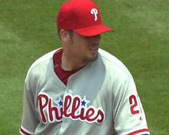
Too bad none of Adam Eaton’s teammates did that for him during yesterday’s Phillies/Braves game. Eaton started the game fine, working with his top button open during the 1st and 2nd innings — no problem there. But he must have changed jerseys or gone to the bathroom or something like that during the top of the 3rd, because he came out for the bottom of the inning with his top button stuck into his second buttonhole, which looked dorky-and-a-half. Even worse, his button mismanagement continued into the 4th, 5th, and 6th innings (a span that also included plate appearances in the 4th and 6th, after which he was mercifully removed from the game.
That game featured a few other oddities. Mike Rich notes that Bobby Cox was wearing the wrong cap. And here’s something I’ve never seen before: Jeff Francoeur had a lock of hair sticking out through one of his Cool Flo helmet vents. Maybe that kinda evened things out in the game’s dork-o-rama sweepstakes.
Uni Watch News Ticker: This new book is nothing special, but it does have a uni-related title. ”¦ The Orioles added a memorial armband yesterday for Jim McKay, who got his broadcasting start in Baltimore. ”¦ Was James Worthy wearing mismatched uni elements in this photo, or was it just the lighting, or sweat, or what? (With thanks to Matt Fitzgerald.) ”¦ Scott Player is going to have to change his single-bar facemask (with thanks to Jeff Israel, who also pointed out Croatia’s checkboard-patterned socks). ”¦ Bobby Cox isn’t the only one with cap problems: Luis Ayala wore the wrong cap on Saturday (with thanks to Kevin Reiss). ”¦ You’ve probably seen the famous Dolphins/Jets “fake spike” play at some point. What you might not have noticed is that every player on the field was wearing the NFL’s 75th-anniversary patch — except for Dan Marino. See for yourself here (great catch by Frank Fleming). ”¦ Interesting note from Thomas Foote, who writes: “Basketball-reference.com recently added a uniform number feature that purports to list every player who ever wore every number in any season. Additionally, on the top of each player’s personal page, there’s a bunch of boxes — one for each uni number worn during the player’s career, styled in the team’s colors. Check out Chucky Brown’s page: 14 teams, 2 uni numbers. Sharp contrast with Tony Massenburg, who wore seven different numbers with 14 teams. On thing I found in my quick personal perusal is that three NBA players have worn 03, and one each have worn 07 and 09. All these players played for the Rochester Royals in the 1950s. Intrigued, I searched for pictures of the Royals from that era and found this. The 07 seems to be Paul Noel, the only player ever listed as having worn that number.” ”¦ USA Rugby has a new kit — look here and here (with thanks to Joe Alvernaz). ”¦ “Talking to A’s equipment manager Steve Vucinich before the season, he said that the A’s would be wearing the home whites and new black alternates at home and the road grays and the green alternates on the road,” says Brandon Davis. “But they wore green at home on Wednesday, as part of their Go Green promotion, promoting the environment and encouraging fans to wear green. Starting pitcher Justin Duchscherer wanted to wear the blacks, but the team wouldn’t let him choose that day. Also, note that when the A’s do wear the new black jerseys, they pair it with the gold-brimmed home batting helmet (and even switch to black socks), but the old black jerseys from previous seasons had been worn at home with the solid-green road batting helmet. ”¦ “I was watching America’s Ballroom Challenge and noticed the winners of the American Rhythm section — Jose Decamps and Johanna Zacharewicz — actually had sponsorships on their costumes!” writes Karen Hibbitt (who adds that she’s “embarrassed” to have been watching the show). “The sponsorship patch is subtle and small, but you can definitely see it on his arm.” ”¦ Biggest jockey ever. ”¦ Speaking of jockeys, the Belmont jocks were once again wearing the Eight Belles memorial patch on their boots. No Hooters logo for Big Brown after all, though — that sponsorship ended up getting nixed by the powers that be. ”¦ What happens to the uniforms used in movies? In the case of the film Cobb, they end up on eBay (nice find by Jonathan Martin) . ”¦ And speaking of eBay, here’s a real prize. ”¦ The NOB on Mark Grudzielanek’s powder blue jersey looks even more extended than usual (with thanks to Matt Shevin). ”¦ The Padres, who frequently wear camouflage uniforms, turned the tables the other day by having a Naval officer wear a Padres uniform to catch the first pitch, which was thrown by his son. Details here (with thanks to Matt Eichwedel). ”¦ Awesome score by Jeff Barak, who found this amazing 1915 photo of Washington Senators manager Clark Griffith. Dig that overcoat!! ”¦ Jeff also pointed me toward a thread that included this shot of the 1932 Alabama/George Washington game. Note the interesting ref’s uniform. ”¦ The St. Paul Saints celebrated Prince’s birthday by wearing purple jerseys with symbols instead of numbers on their backs, and Minna H. provided a bunch of screen grabs (additional images here and here). “SuperFan, who does a push-up for each run the Saints score, was wearing a purple headband, purple wristbands, and purple-striped tube socks,” says Minna. “Also there was an interesting discussion about how the opposing pitcher couldn’t keep his jersey tucked in.” ”¦ Note to designers: There’s a new font out there called Metroscript, which, as you can see, is being touted as sports-appropriate. ”¦ Good treatment of French Open aesthetics here (with thanks to Brinke Guthrie). … Susan Freeman‘s father attended the Dallas Stars warehouse sale and came away with some nameplate (here’s a closer view), pucks, and sticks. … I’ll be doing another reading at KGB next month. The date will be July 22nd, the theme will be “Design and Sports,” and I believe one of the other readers will be the very wonderful Michael Beirut, who’s a partner at Pentagram and has done some identity/logo work for the Jets. Further details as the date draws nearer.
Re. James Worthy’s uniform, those Lakers unis were notorious for their differing shades between the jerseys & shorts… Looks bad, but I love it. There’s no way that’d happen in today’s over-corporate NBA.
I always thought it was some kind of quirk of the photographs caused by the lighting.
You know – I know it looked bad, but if Eaton keeps pitching well, he can dress as badly as he wants (especially after last year).
I doubt I’m the only one wishing the Basketball Reference site had used the correct font for each of those uni numbers.
Re: James Worthy. For some reason, in Sports Illustrateds from the 1980s, purple uniforms often appeared mismatched. I think it was the lighting. Kansas State had the same apparent mismatch (see SIs from March 1981 during NCAAs with Rolando Blackmon).
David Eckstein often has little tufts of hair poking out his batting helmet. His habit of constantly smacking himself on the head in the on-deck circle probably contributes to that.
Is Eaton’s jersey mis-buttoned, or is the flap on his right side tucked in on that side? The jersey crest doesn’t look like it’s misaligned like it would be if the shirt was buttoned incorrectly.
Anyone catch the piece of gum on Mets 2nd baseman Luis Castillo’s batting helmet last Thursday night? (The announcers figured it was a joke from “My pocket schedule said 4:05 PM” Ramon Castro) I was was away, so I didn’t get a chance to mention it on here, but I also didn’t see anything about it when I skimmed the last few posts……
Re.:NFL 75th Anniversary Patch.
I remember that Troy Aikman got in trouble
with the league over the placement of the patch early in the 1994 season. While everybody else had
the patch near the left shoulder,Aikman had the patch near his right shoulder. I think that his explanation was that the patch impeded his head movement during his throwing motion or his overall
vision as he looked downfield.
Question for the group, is anyone in the Balt/DC area? I’m going to be at Camden Yards for the Pirates/O’s game Friday night and I’ve been forwarded email regarding it being a turn back the clock night for the O’s. Does anyone know if the Pirates are going to participate as well? I was going to sport my pillbox cap anyway but it sure would be cool to be in uniform somewhat.
That ’79 series was an all-time favorite of mine as far as unis. I prefer the old bird logo and liked those orange jerseys, only when worn with the white pants. And I’m biased, but I loved the mix and match styling of the Pirates in the late 70s and early 80s.
In fact, I’ve put the finishing touches on some screen shots I’ve compiled from my favorite Christmas gift this past holiday season: The full game DVD collection of the ’79 series. I’ll put together some captions/comments and forward the link to Paul sometime this week.
Not that the O’s needed another reason to honor Jim McKay, but he was also part of the current ownership group.
It’s neat that the symbols on the saints uniform are the sifted versions of their numbers on the keyboard.
Francoeur had a lock of hair sticking out through one of his Cool Flo helmet vents.
In the NHL, Manny Legace always had hair sticking out of his goalie mask. I always laughed cause it looked like a 10 year old playing.
link
You can see it in a couple of pics in the STL section.
Speaking of mismatched uniforms, I swear in the photo collage of the Boston/LA series history in Sports Illustrated, I can see a Celtics player with “Boston” on his jersey, while his teammate has “Celtics”.
Watching the Celtics game last night I noticed there was a change in the court from game one, in game one that the majority of the halfcourt line was camouflaged in the ridiculous trophy as seen here: link but last night the line had been colored back in white and extended through the trophy as you can kind of see here, can’t really find a better picture: link, can anyoen fidn a better pciture? I know my links arent gonna work so paste them into your browser
i stand corrected the links worked
(The Padres, who frequently wear camouflage uniforms, turned the tables the other day by having a Naval officer wear a Padres uniform to catch the first pitch, which was thrown by his son.)
Okay, Padres, you beat my Mets 4 straight, but that was pretty cool.
Susan Freeman’s father attended the Dallas Stars warehouse sale and came away with some nameplate
link
———-
Looks like the white plates are on air-knit material and the black ones are on tackle twill…which leads me think they are for replica jerseys. The gamers would be on air-knit like the white ones.
I HATE the “National Inquirer” style of internet reporting. Latest example that bugs me: Keep reading how Big Brown was the big favorite but “finished dead last.” Well, yeah, he did, but it isn’t like the horse ran the entire race full out and everyone beat him. For one reason or another, he withdrew.
Not taking Big Brown’s “side” or anything just get annoyed by the sorry, half-assed state of journalism–and the shitty quality of reporters–in cyberspace (not talking about anyone here, just some people who work at legitmate web sites, but are hardly legitimate journalists).
It’s the “EXCLUSIVE INSIDE: Actual Photo of President Shaking Hands with Alien!” kinda thing…and the story shows the prez meeting a Croatian immigrant from Croatia (possibly in his Purina jersey…there, I made this uni-relevant, LOL).
Just slipshod and cheap. My j-school professors would chew their asses for such nonsense.
Well, as Bob Schiffer once said, “The Internet is the nation’s water cooler.” I guess most times that’s about as seriously as we can, or should, take it.
Eaton’s buttons were not misaligned. His top button was undone and tucked under, giving the appearance that he was off one button. You can see the tiny fold of his collar up toward the right side of his shoulder.
The two pieces of “Phillies” would not have lined up if he was truly off one button.
oops, forget to delete “from Croatia”.
“A Croatian immigrant from Croatia”? Well, I should HOPE so.
Something else I noticed from the Braves-Phils game (besides the funny button, and Francoeur’s rooster tail hair) was that Glen Hubbard, Atlanta’s First-Base coach was apparently still wearing his Memorial Day helmet. He had an link on the left side, and there was some sort of ribbon on the right side near the back (can’t find a shot of that). Was wondering if it was left-over from Mother’s day, maybe, or perhaps, an early blue ribbon for Father’s day?
~E~
[quote comment=”274603″]I HATE the “National Inquirer” style of internet reporting. Latest example that bugs me: Keep reading how Big Brown was the big favorite but “finished dead last.” Well, yeah, he did, but it isn’t like the horse ran the entire race full out and everyone beat him. For one reason or another, he withdrew.[/quote]
my crow was excellent saturday night, btw…roasted and with some cornslaw on the side
unless kent desmoreaux knows something and he’s not letting on, this has been the biggest disappointment since the maginot lines…glad i wasn’t anywhere near elmont on sattiday…i’d have lost a pretty penny
Looks like those symbol jerseys were done by hitting shift and typing the player’s number. Hence, #@ is 32.
NATIONAL UNIS —
Glad to see that distinctive Croatian checkerboard. Appalled by the new kits of the US rugby side. Distressed that Uni Watch does not treat national uniforms with the same insane particularity that if affords, say, striping on baseball stirrups. Don’t mistake my meaning: it is a good thing to obsess about baseball hose. But surely in this Olympic year, and in this Euro Cup year, we might expect more regular and more intensive coverage of the duds worn by the representatives of nation states.
With love but in high dudgeon, from your hopelessly loyal but chronically malcontent acolyte, et cetera.
[quote comment=”274603″]I HATE the “National Inquirer” style of internet reporting. Latest example that bugs me: Keep reading how Big Brown was the big favorite but “finished dead last.” Well, yeah, he did, but it isn’t like the horse ran the entire race full out and everyone beat him. For one reason or another, he withdrew.
Not taking Big Brown’s “side” or anything just get annoyed by the sorry, half-assed state of journalism–and the shitty quality of reporters–in cyberspace (not talking about anyone here, just some people who work at legitmate web sites, but are hardly legitimate journalists).
It’s the “EXCLUSIVE INSIDE: Actual Photo of President Shaking Hands with Alien!” kinda thing…and the story shows the prez meeting a Croatian immigrant from Croatia (possibly in his Purina jersey…there, I made this uni-relevant, LOL).
Just slipshod and cheap. My j-school professors would chew their asses for such nonsense.
Well, as Bob Schiffer once said, “The Internet is the nation’s water cooler.” I guess most times that’s about as seriously as we can, or should, take it.[/quote]
I don’t know, isn’t that a bit much. Last place is last place and I would argue that the way horses were passing Big Brown at the turn of the stretch that he would have finished last anyway. I think the overall point is that he was a huge favorite and turned out a very disappointing performance.
Without citing any specific examples, it’s hard to make your point about “National Inquirer” style of internet reporting. The horse wasn’t withdrawn, that would be a scratch, it was pulled up by the jockey and eased down the stretch.
I’m kicking myself for not heading out and placing the bet I would have, because I would have profited $157.50. D’oh.
Won’t ever claim to know a lot about horse racing, but when you’ve covered enough events you kinda get a “feel” for things. Big Brown seemed like — and probably still is — more than enough horse to have won. But as they came out of the first turn, I remember thinking, “Something’s wrong.” Never will ever be able to put my finger on it or claim any special insight…was just a gut sensation that something was off, that it was never going to be the race that maybe it should have been.
Some of you must know what I’m talking about. You watch enough sports and you start to pick up…I dunno, the rhythm of things…or something.
My point is, if Jeff Gordon’s car breaks down 100 yards after the start and he, techically, finishes last, as I reporter if I make a big deal out of “Jeff Gordon finishes dead last” it’s a misleading and incomplete telling of the tale.
Accurate, I suppose. But it isn’t the real story. And I should be a better reporter than that.
[quote comment=”274611″]Some of you must know what I’m talking about. You watch enough sports and you start to pick up…I dunno, the rhythm of things…or something.[/quote]
totally agreed…i’ve seen every belmont since the late seventies, and several of them in person, and you could easily tell something wasn’t right, even from the start…once BB got up in (i forgot the name…won’t watch any replays) xxxx’s butt, i thought he may have been kicked…this is a horse that’s hardly ever tasted dirt, much less been in that position…kent did a nice job of breaking him off the rail, but you just knew something was amiss…thankfully it waddn’t my stake…
won’t belabor this anymore, but i totally agree with ya ricko…destiny dealt BB a losing hand and it was pretty apparent from the start…and not the 3/4 pole like the touts claimed
[quote comment=”274593″]Re.:NFL 75th Anniversary Patch.
I remember that Troy Aikman got in trouble
with the league over the placement of the patch early in the 1994 season. While everybody else had
the patch near the left shoulder,Aikman had the patch near his right shoulder. I think that his explanation was that the patch impeded his head movement during his throwing motion or his overall
vision as he looked downfield.[/quote]
NFL Photo Library doesn’t turn up much from early 1994.
But here, Aikman has the patch on the correct side, but it’s much lower than most players wore it:
link
This shot from the preseason shows it in the correct place and position:
link
Hard to see in this one from November, but it’s not on the left/his right side:
link
So it must be on the correct side (his left).
Celtic FC has a new kit, apparently for their Scottich Premier League win. If you like yellow (and really, who doesn’t want to look like a canary?) then it’s for you. The socks are probably the most amazing part.
link
link
Any other Michigan fans remember this, and why it ended up not happening? Did Charles Woodson’s Heisman run just cause Desmond’s number retiring to go by the wayside? I don’t remember Michigan ever making an announcement like that, and it certainly never came up again.
I have no problem with how the media portrayed the race. It is hard enough to get interest into horse racing as is, and a dead-on favorite technically finishing last is the best possible scenario other than a triple crown winner.
Ricko, I don’t know if you are still in school or not (The J-school comment) but in my years of experience I have found the way it works in school and the way it works in real life are often two completely different things. Just the way it works.
Better story title = more interest = more $$$
[quote comment=”274617″]
Better story title = more interest = more $$$[/quote]
Eggggs-actly.
..and J-school was a lonnnnnnnnnnnnnnnnng time ago. LOL
Take a close look at Eaton’s right shoulder in the link. It looks more like the flap is tucked under his shirt. If the buttons were off, wouldn’t the jersey either billow out or have the PHILLIES wordmark be out of line?
I don’t think he buttoned the jersey wrong at all.
[quote comment=”274602″]Susan Freeman’s father attended the Dallas Stars warehouse sale and came away with some nameplate
link
———-
Looks like the white plates are on air-knit material and the black ones are on tackle twill…which leads me think they are for replica jerseys. The gamers would be on air-knit like the white ones.[/quote]
I was wondering about that. Some are tackle twill and some are knit. I am not positive I don’t have replica jerseys with both types, though. Another shot of the nameplate is link.
[quote comment=”274612″]My point is, if Jeff Gordon’s car breaks down 100 yards after the start and he, techically, finishes last, as I reporter if I make a big deal out of “Jeff Gordon finishes dead last” it’s a misleading and incomplete telling of the tale.
Accurate, I suppose. But it isn’t the real story. And I should be a better reporter than that.[/quote]
That’s not really correct, first, comparing horse racing to auto racing is apples and oranges for too many reasons to state here.
Furthermore, you have to look at the stage. If your scenario with Gordon happens in a May race, you probably wouldn’t see that headline.
However, if it’s the final race of the season with a championship on the line and he needs to finish 15th or better and the same thing happens, you better believe it would be headline worthy.
Case in point, this was a horse going for a triple crown, a feat that hasn’t been accomplished since 1978. We’re not talking about a low level claiming or maiden race.
I just think you’re understating the story with this criticism. There was PLENTY of critical remarks to go around with the coverage of the Belmont (not going to the winner for what seemed like five minutes, the understated, almost disappointed sounding call from Tom Durkin, Caton Bredar’s horseback coverage which was far inferior to NBC’s Donna Brothers, etc)
That Metroscript font might work for wordmarks (I guess), but it’d look like total gibberish on a uniform or on the field.
Don’t wanna belabor this. And not going to. Just saying that–figuratively speaking–the headline, to be accurate, is not…
BIG BROWN FINISHES LAST
(that suggests all the other horses outran him).
Better would be…
BIG BROWN PULLS UP, FINISHES LAST
(that gives reader a more complete picture and indicates there’s more to the story)
That’s really all I meant. Lousy reportage for the sake of a sensational newspeg…which we agreed is about $$$.
[quote comment=”274624″]Don’t wanna belabor this. And not going to. Just saying that–figuratively speaking–the headline, to be accurate, is not…
BIG BROWN FINISHES LAST
(that suggests all the other horses outran him).
Better would be…
BIG BROWN PULLS UP, FINISHES LAST
(that gives reader a more complete picture and indicates there’s more to the story)
That’s really all I meant. Lousy reportage for the sake of a sensational newspeg…which we agreed is about $$$.[/quote]
I am probably going to get flogged for this and told to just stop reading but…this is why Uniwatch is going to sh*t. I have read the site since 2006 and the comments used to be great. Now I have to slog through stupid bickering about nothing every morning to get to the comments that matter and are interesting. It is just annoying and frustrating.
There, I said my peace, now bash away.
Okay, back on point…
Anyone else notice Texas A&M’s white jerseys yesterday in the NCAA baseball playoffs? Maroon inserts all over the place. Some of the inserts on jerseys I actually kinda like, but those were just…goofy.
Although if I’m entitled to my opinion (which I assume I still am), as much as I love uni-watching, I’m not particularly entranced by trying to determine whether Adam Eaton knows how to button a jersey. People just screw up sometimes.
Now, if u wanna talk about the droopy-sanitaried RiverSharks, that’s a least…baffling.
[quote comment=”274624″]Don’t wanna belabor this. And not going to. Just saying that–figuratively speaking–the headline, to be accurate, is not…
BIG BROWN FINISHES LAST
(that suggests all the other horses outran him).
Better would be…
BIG BROWN PULLS UP, FINISHES LAST
(that gives reader a more complete picture and indicates there’s more to the story)
That’s really all I meant. Lousy reportage for the sake of a sensational newspeg…which we agreed is about $$$.[/quote]
Fair enough… but don’t you feel that any story worth it’s salt is going to explain to the reader what went on in the race and the horse was pulled up. I don’t think a headline should have to tell the entire story.
Also, your second headline isn’t really accurate either…. Big Brown didn’t pull up, Kent Desormeaux the jockey pulled him up. Horses don’t tend to pull themselves up.
My point isn’t to argue semantics, I just think that you can only say so much in a headline. The fact of the matter is Big Brown was a huge favorite, turned out a dud of a performance with huge stakes on the line. And like I said in one of my previous posts, I think had Desormeaux not eased him up, he would have come in last anyway.
Sorry Chad G., for making you slog through this.
About the Alabama – GW picture:
Does it look like #38 for GW is wearing stirrups? I know some football teams used stirrups, but unlike baseball players, they usually wore some kind of white athletic sock that covered the stirrup area.
whatever.
I don’t have a picture of it, but Cincinnati’s Adam Dunn has had hair sticking out his helmet vents no fewer than ten times this season. I don’t have a photo, but I’ll try to capture the screen next time I see it.
[quote comment=”274609″]NATIONAL UNIS —
Glad to see that distinctive Croatian checkerboard. Appalled by the new kits of the US rugby side. Distressed that Uni Watch does not treat national uniforms with the same insane particularity that if affords, say, striping on baseball stirrups. Don’t mistake my meaning: it is a good thing to obsess about baseball hose. But surely in this Olympic year, and in this Euro Cup year, we might expect more regular and more intensive coverage of the duds worn by the representatives of nation states.
With love but in high dudgeon, from your hopelessly loyal but chronically malcontent acolyte, et cetera.[/quote]
as paul has said numerous times he doesn’t know much about soccer so therefore doesn’t report on it. he has put links to sites that show national team uniforms. but i feel your pain.
new Arsenal kit for next year link
with the socks: link
apparently they are making a new away kit and the white shirt will become the alternate next year.
Paul thought you would like this…….
link
[quote comment=”274589″]Re: James Worthy. For some reason, in Sports Illustrateds from the 1980s, purple uniforms often appeared mismatched. I think it was the lighting. Kansas State had the same apparent mismatch (see SIs from March 1981 during NCAAs with Rolando Blackmon).[/quote]
Kansas State actually wore two-tone uniforms in that era.
[quote comment=”274632″][quote comment=”274609″]NATIONAL UNIS —
Glad to see that distinctive Croatian checkerboard. Appalled by the new kits of the US rugby side. Distressed that Uni Watch does not treat national uniforms with the same insane particularity that if affords, say, striping on baseball stirrups. Don’t mistake my meaning: it is a good thing to obsess about baseball hose. But surely in this Olympic year, and in this Euro Cup year, we might expect more regular and more intensive coverage of the duds worn by the representatives of nation states.
With love but in high dudgeon, from your hopelessly loyal but chronically malcontent acolyte, et cetera.[/quote]
as paul has said numerous times he doesn’t know much about soccer so therefore doesn’t report on it. he has put links to sites that show national team uniforms. but i feel your pain.[/quote]
I know I’m normally quick to take a side oppposite of Paul, I do have to defend him on this one. During last World Cup he had an absolutely outstanding article: link
Granted, he was helped out by a UW reader but still, it was VERY thorough.
There’s only so much he can cover. It’s baseball season, stirrups get a lot of play. Would I like to see more stories on hockey or a EURO 2008 breakdown and less reports of what he’s wearing to his softball game? Sure, but this is for the most part a blog based on the big sports in America.
[quote comment=”274625″][quote comment=”274624″]Don’t wanna belabor this. And not going to. Just saying that–figuratively speaking–the headline, to be accurate, is not…
BIG BROWN FINISHES LAST
(that suggests all the other horses outran him).
Better would be…
BIG BROWN PULLS UP, FINISHES LAST
(that gives reader a more complete picture and indicates there’s more to the story)
That’s really all I meant. Lousy reportage for the sake of a sensational newspeg…which we agreed is about $$$.[/quote]
I am probably going to get flogged for this and told to just stop reading but…this is why Uniwatch is going to sh*t. I have read the site since 2006 and the comments used to be great. Now I have to slog through stupid bickering about nothing every morning to get to the comments that matter and are interesting. It is just annoying and frustrating.
There, I said my peace, now bash away.[/quote]
I am also a long time reader and I have been thinking the same thing for a while now. Didn’t speak up also in fear of getting bashed, so thank Chad! But I am backing you up because in case you get bashed, at least you have someone to get bashed with.
Kek– i completely agree with you. i wasn’t trying to take a shot at him. i loved that WC article, but i was just saying he doesn’t talk about it all that often, and i understand that. he’s a big baseball fan, so he sure as hell should report on two of his biggest loves, baseball and uniform aesthetics, after all its his site.
Speaking of soccer, how come the Argentines (white/light blue striped jersey) didn’t wear an alternate road kit when playing the US (white jersey)? From the high up TV shot, you couldn’t tell the teams apart.
I know I’ve seen them wear an all dark blue kit in the past, so they do exist.
Can anyone find a pic of the blazer being worn by French football manager Raymond Domenech? France is playing Romania today (tonight :P) in the Euro championships. It looks like the kind of thing Paul would absolutely love.
[quote comment=”274626″]Okay, back on point…
Anyone else notice Texas A&M’s white jerseys yesterday in the NCAA baseball playoffs? Maroon inserts all over the place. Some of the inserts on jerseys I actually kinda like, but those were just…goofy.[/quote]
I tried (mightily) to link to a picture of those when the I noticed those jerseys last week. Just ugly. I’ve seen some classy unis on A&M in the past. Those took a wrong turn. And did you notice the spacing on the front of the Rice jerseys made it look like “R ice”. I like their colors and Old English font but that just bugs me.
did anyone notice the numbers on kobe’s jersey during the basketball game last night? it looked almost as if the numbers were stained. i clicked around and didnt see any other players with the issue. here is a pretty good picture i found of the numbers (sorry, i dont know how to make it a link):
link
[quote comment=”274634″]Paul thought you would like this…….
link
That’s a great photo. Assuming someone actually scores…
[quote comment=”274643″][quote comment=”274634″]Paul thought you would like this…….
link
That’s a great photo. Assuming someone actually scores…[/quote]
i also love the fact that its not because you might get a card for it.
[/bold][quote comment=”274639″]Speaking of soccer, how come the Argentines (white/light blue striped jersey) didn’t wear an alternate road kit when playing the US (white jersey)? From the high up TV shot, you couldn’t tell the teams apart.
I know I’ve seen them wear an all dark blue kit in the past, so they do exist.[/quote]
According to the NY Times, Argentina refused to.
link
[quote comment=”274643″][quote comment=”274634″]Paul thought you would like this…….
link
That’s a great photo. Assuming someone actually scores…[/quote]
not uni related, but a question i just gotta ask…
why is it that, as a lackluster footy fan, i find a nil-nil game but with many close scoring chances fairly boring…but im a HUGE fan of a crisply played pitcher’s duel?
im guessing that it’s because i understand the nuances and subtleties inherent in baseball, so i don’t find it at all boring…yet soccer, i am certain, presents many of the same nuances and quirks, yet, because (while i certainly KNOW the sport having played it for like 8 years as a kid) i perhaps don’t understand it like i do beisbol, and as such find it very difficult to get into…i’d like to, and i will watch a game if it’s “on”, but i don’t seek it out nor follow it
anyone else feel (a) the same way or (b) love a 0-0 footy match but find a 1-0 baseball game boring?
[quote comment=”274642″]did anyone notice the numbers on kobe’s jersey during the basketball game last night? it looked almost as if the numbers were stained. i clicked around and didnt see any other players with the issue. here is a pretty good picture i found of the numbers (sorry, i dont know how to make it a link):
link
Not sure, but I think that’s the heat-press adhesive staining thru the numbers.
Joe Hilseberg, can you comment on this?
[quote comment=”274642″]did anyone notice the numbers on kobe’s jersey during the basketball game last night? it looked almost as if the numbers were stained. i clicked around and didnt see any other players with the issue. here is a pretty good picture i found of the numbers (sorry, i dont know how to make it a link):
link
Looks like glue…. maybe the white is glued to the yellow. Can that really be – not stitched???
[quote comment=”274647″][quote comment=”274642″]did anyone notice the numbers on kobe’s jersey during the basketball game last night? it looked almost as if the numbers were stained. i clicked around and didnt see any other players with the issue. here is a pretty good picture i found of the numbers (sorry, i dont know how to make it a link):
link
Not sure, but I think that’s the heat-press adhesive staining thru the numbers.
Joe Hilseberg, can you comment on this?[/quote]
From what I can gather it looks like the Lakers use the “kiss cut” technique on the jersey numbers. This means that the white layer is pressed directly onto the purple of the jersey. Their jersey is made out of one of those new age wicking materials, so it would stand to reason that the marks on the numbers are just good old fashioned sweat. Tackle twill is just a plain old material that is not water/sweat proof…it will stain if it gets overly saturated.
[quote comment=”274649″][quote comment=”274647″][quote comment=”274642″]did anyone notice the numbers on kobe’s jersey during the basketball game last night? it looked almost as if the numbers were stained. i clicked around and didnt see any other players with the issue. here is a pretty good picture i found of the numbers (sorry, i dont know how to make it a link):
link
Not sure, but I think that’s the heat-press adhesive staining thru the numbers.
Joe Hilseberg, can you comment on this?[/quote]
From what I can gather it looks like the Lakers use the “kiss cut” technique on the jersey numbers. This means that the white layer is pressed directly onto the purple of the jersey. Their jersey is made out of one of those new age wicking materials, so it would stand to reason that the marks on the numbers are just good old fashioned sweat. Tackle twill is just a plain old material that is not water/sweat proof…it will stain if it gets overly saturated.[/quote]
link
yes…it is kiss cut
[quote comment=”274646″]
not uni related, but a question i just gotta ask…
why is it that, as a lackluster footy fan, i find a nil-nil game but with many close scoring chances fairly boring…but im a HUGE fan of a crisply played pitcher’s duel?
im guessing that it’s because i understand the nuances and subtleties inherent in baseball, so i don’t find it at all boring…yet soccer, i am certain, presents many of the same nuances and quirks, yet, because (while i certainly KNOW the sport having played it for like 8 years as a kid) i perhaps don’t understand it like i do beisbol, and as such find it very difficult to get into…i’d like to, and i will watch a game if it’s “on”, but i don’t seek it out nor follow it
anyone else feel (a) the same way or (b) love a 0-0 footy match but find a 1-0 baseball game boring?[/quote]
I think that it’s because it seems very few possessions actually result in a halfway decent scoring chance. It’s like watching 90 minutes of the Neutral Zone Trap.
[quote comment=”274651″][quote comment=”274646″]
not uni related, but a question i just gotta ask…
why is it that, as a lackluster footy fan, i find a nil-nil game but with many close scoring chances fairly boring…but im a HUGE fan of a crisply played pitcher’s duel?
im guessing that it’s because i understand the nuances and subtleties inherent in baseball, so i don’t find it at all boring…yet soccer, i am certain, presents many of the same nuances and quirks, yet, because (while i certainly KNOW the sport having played it for like 8 years as a kid) i perhaps don’t understand it like i do beisbol, and as such find it very difficult to get into…i’d like to, and i will watch a game if it’s “on”, but i don’t seek it out nor follow it
anyone else feel (a) the same way or (b) love a 0-0 footy match but find a 1-0 baseball game boring?[/quote]
I think that it’s because it seems very few possessions actually result in a halfway decent scoring chance. It’s like watching 90 minutes of the Neutral Zone Trap.[/quote]
I can relate this to hockey because I am not a baseball fan. With hockey as long as there are scoring chances I find a 1-0 hockey game exciting while other people who may be average fans find them extremely boring. As stated before, I think, as a hockey freak, I understand the little plays and small happanings of hockey to apreicate it while an average fan is just looking for goals.
[quote comment=”274646″][quote comment=”274643″][quote comment=”274634″]Paul thought you would like this…….
link
That’s a great photo. Assuming someone actually scores…[/quote]
not uni related, but a question i just gotta ask…
why is it that, as a lackluster footy fan, i find a nil-nil game but with many close scoring chances fairly boring…but im a HUGE fan of a crisply played pitcher’s duel?
im guessing that it’s because i understand the nuances and subtleties inherent in baseball, so i don’t find it at all boring…yet soccer, i am certain, presents many of the same nuances and quirks, yet, because (while i certainly KNOW the sport having played it for like 8 years as a kid) i perhaps don’t understand it like i do beisbol, and as such find it very difficult to get into…i’d like to, and i will watch a game if it’s “on”, but i don’t seek it out nor follow it
anyone else feel (a) the same way or (b) love a 0-0 footy match but find a 1-0 baseball game boring?[/quote]
As a pretty decent soccer fan I’d say it’s a mixed bag. It’s all about quality of play, same as in baseball. You might like a 1-0 game that truly was a pitchers duel and had a few great defensive plays. But you’d hate a 1-0 game where there was 13 runners left on base, etc. With soccer as long as there are some good runs, decent scoring chances and goalkeeping to go along with that, a 0-0 game can be great fun. In soccer it’s not the scoring that gets your blood pumping, it’s the tease build ups by the other team and the goal saving tackles that make it great, sometimes. Other times it’s fun to watch your team man-handle another team 5-0. I for one, missed the game last night because I was stuck in traffic, but I’m told it was full of suspense, and a great result against the best team in the world.
[quote comment=”274645″][/bold][quote comment=”274639″]Speaking of soccer, how come the Argentines (white/light blue striped jersey) didn’t wear an alternate road kit when playing the US (white jersey)? From the high up TV shot, you couldn’t tell the teams apart.
I know I’ve seen them wear an all dark blue kit in the past, so they do exist.[/quote]
According to the NY Times, Argentina refused to.
link
Ridiculous, had I got to watch the game, it would have been online and it would have been next to impossible to tell the sides apart. I guess being the #1 team in the world brings with it some cocky attitudes. Hopefully this article is wrong, and they only brought their white/blue shirts by mistake. They did wear their white road shorts, I don’t know why they’d wear their alternate shorts, but refuse to wear their alternate jersey.
I can’t tell you how frustrating it was trying to get good shots of the symbols on the back of the St. Paul Saint jerseys. I took over fifty shots and sent Paul a dozen or so.
I am embarrassed to admit it took me three or so innings to realize that the symbols corresponded with the players’ numbers, but when I sorta figured it out, I verified it by looking at each player’s number as he was up to bat.
It was a fun game to watch, even more so because there was cotton flying all around so it looked like snow.
Also, I didn’t get a screen grab, but #18 on the link didn’t have his NOB like the rest of his team. I love link logo, link. The announcers also discussed the base coaches having to wear batting helmets rule. Apparently, The Independent League doesn’t mandate it, but the St. Paul Saints have signs in both clubhouses requiring base coaches to wear helmets. Thus far, no opposing team has done so, but at least the Saints have covered their butts.
P.S. I agree that I find myself more reluctant to read through the comments these days than I did when the blog first started because there seems to be more outside chatter, more bickering, and more meanness in general. I am guilty of the first two (at least) myself and will try to stay on point (to a certain extent) in the future.
Can’t find any good pics, but Joba Chamberlain had all sorts of tags coming out of his jersey on Sunday. To pitch good, he’s gotta look good!
Yahoo Sports has a blog entry about the coolest football helmets. link
I think it’s interesting how what passes as good these days wasn’t necessarily good when it was “in” originally. Meaning, I never liked the old Bucs logo until I see it now. Same with alot of other teams… Brewers, Blue Jays (not that I particularly like the uni, but love the bird logo), even some of the old Padres gear. Never used to be a fan, but I love me some retro. Think this generation of parents’ kids will some day be rockin’ the retro Marlins teal hats?
[quote comment=”274658″]Yahoo Sports has a blog entry about the coolest football helmets. link
The main picture in the yahoo list of football helmets is very interesting because of the news concerning Scott Player.
The NFL is disallowing his one bar facemask because it is only attached on either side using one screw.
This facemask uses two! I’m sure the NFL and their stance wouldn’t change but it would at least be interesting!
[quote comment=”274655″]The announcers also discussed the base coaches having to wear batting helmets rule. Apparently, The Independent League doesn’t mandate it, but the St. Paul Saints have signs in both clubhouses requiring base coaches to wear helmets. Thus far, no opposing team has done so, but at least the Saints have covered their butts.[/quote]
When you say “the Independent League,” you mean the American Association? The Atlantic League, Can-Am League, Continental League, Frontier League, Golden League and Northern League presumably all set their own rules independently of each other, and from what I can tell so far the Atlantic League IS requiring helmets for the coaches, while the Can-Am League is not.
[quote comment=”274655″]I can’t tell you how frustrating it was trying to get good shots of the symbols on the back of the St. Paul Saint jerseys. I took over fifty shots and sent Paul a dozen or so.
I am embarrassed to admit it took me three or so innings to realize that the symbols corresponded with the players’ numbers, but when I sorta figured it out, I verified it by looking at each player’s number as he was up to bat.
It was a fun game to watch, even more so because there was cotton flying all around so it looked like snow.
Also, I didn’t get a screen grab, but #18 on the link didn’t have his NOB like the rest of his team. I love link logo, link. The announcers also discussed the base coaches having to wear batting helmets rule. Apparently, The Independent League doesn’t mandate it, but the St. Paul Saints have signs in both clubhouses requiring base coaches to wear helmets. Thus far, no opposing team has done so, but at least the Saints have covered their butts.[/quote]
Minna, Thank you for those great pics. I was just playing around in MS Word, trying to figure out what each of the pictured numbers truly were!
Very clever on the part of the Saints.
As for the frustration of many UW readers over the path of the blog:
I am probably one of the more guilty parties concerning off-topic commentary and dialogue, however my ways will be ammended! Sorry to all!
[quote comment=”274658″]Yahoo Sports has a blog entry about the coolest football helmets. link
Just goes to show that everyone has different tastes. I agree with most of the list, but, I don’t think I would’ve put the old Tampa Bay helmet at number 2. Pitssburgh, Green Bay, Indianapolis, San Diego … yeah, good choices in my opinion.
[quote]I was just playing around in MS Word, trying to figure out what each of the pictured numbers truly were[/quote]
or you could just look at the keyboard of your computer…you know..where the numbers are above the “QWERTY”
[quote comment=”274659″]Think this generation of parents’ kids will some day be rockin’ the retro Marlins teal hats?[/quote]
For sure I will! I still have my (too small) original Marlins road hat (teal with black brim). I liked them better than the all teal, but think the black is an improvement over both.
Pictures of Charlie Hough in teal and black. With high stirrups!
link
link
link
Was reading Ron Darling’s “Ask The Booth” on sny.tv and here was a great q & a – Darling definitely “Gets it” TM
Based on everything that you have seen in baseball, how has the game changed or evolved since you began playing and watching?
– Bill in Monticello, N.Y.
Whoa, Bill, what a can of worms! 1986 … tight uniforms, skinny players, quicker games, bigger strike zone, Game of the Week on Saturday … a much simpler time to play the game. 2008 … baggy uniforms, much stronger athletes, Questec, Game of the World every night and BLOGGERS and YOUTUBE … much more complicated time to be an athlete.
[quote comment=”274591″]Is Eaton’s jersey mis-buttoned, or is the flap on his right side tucked in on that side? The jersey crest doesn’t look like it’s misaligned like it would be if the shirt was buttoned incorrectly.[/quote]
That’s what I thought, too. Just looks like it got tucked under. The alignment of the “Phillies” looks OK to me.
[quote comment=”274665″][quote comment=”274659″]Think this generation of parents’ kids will some day be rockin’ the retro Marlins teal hats?[/quote]
For sure I will! I still have my (too small) original Marlins road hat (teal with black brim). I liked them better than the all teal, but think the black is an improvement over both.
Pictures of Charlie Hough in teal and black. With high stirrups!
link
link
link
I was at the first ever Marlins road game at SF in ’93. I remember seeing those teal/black hats for the first time and thinking ‘God those are hideous’. Now, eh, not so bad.
That game also featured the Grateful Dead singing the anthem a capella and Bonds home debut as a Giant.
[quote comment=”274668″][quote comment=”274665″][quote comment=”274659″]Think this generation of parents’ kids will some day be rockin’ the retro Marlins teal hats?[/quote]
For sure I will! I still have my (too small) original Marlins road hat (teal with black brim). I liked them better than the all teal, but think the black is an improvement over both.
Pictures of Charlie Hough in teal and black. With high stirrups!
link
link
link
I was at the first ever Marlins road game at SF in ’93. I remember seeing those teal/black hats for the first time and thinking ‘God those are hideous’. Now, eh, not so bad.
That game also featured the Grateful Dead singing the anthem a capella and Bonds home debut as a Giant.[/quote]
Teal makes me angry…….. grrrrr
Cool slide show of Hasek’s career. LOVE the second pic. One of my favorite Unis.
link
[quote comment=”274658″]Yahoo Sports has a blog entry about the coolest football helmets. link
Can’t believe no one noticed that the Steelers logo on that helmet is on the wrong side. It should be on the right.
[quote comment=”274671″][quote comment=”274658″]Yahoo Sports has a blog entry about the coolest football helmets. link
Can’t believe no one noticed that the Steelers logo on that helmet is on the wrong side. It should be on the right.[/quote]
Close tags?
My bad…
[quote comment=”274659″]I think it’s interesting how what passes as good these days wasn’t necessarily good when it was “in” originally. Meaning, I never liked the old Bucs logo until I see it now. Same with alot of other teams… Brewers, Blue Jays (not that I particularly like the uni, but love the bird logo), even some of the old Padres gear. Never used to be a fan, but I love me some retro. Think this generation of parents’ kids will some day be rockin’ the retro Marlins teal hats?[/quote]
i say that’s a qualified yes…qualified because im OCD and possibly insane…see…i love me the classic unis, no question, but there were a few garish beauties with which i fell in love way back when (and one today…more on that in a sec) that i will still indubitably love 20 years hence…
examples: the link (but not every year — 1976-1979 were the best…and the link, but only 1972-73, and the 1978 alt…)
but…i never liked the equally loud all orange o’s unis (paul recently had a column on them), or the indian or phillie all-color alts of the early 70s…although i do prefer those as an alt (top and bottom matching) to the current softball top/white or gray pant craze we’re in now…blech…and i still like some of the unis of yore which were ALL solid color other than white or gray (early road link come to mind)
and that current uni i love…link…
but ONLY the color…i hate the accent color, the shoulder treatments and the font…but DAMN do i love that tennis ball treatment…
yeah…im insane
I’m watching Euro2008, Netherlands vs. Italy.
The Italian coaches are wearing matching blazers with a club emblem stitched on – I thought that custom was reserved for the NFL official ceremonies and/or monday night football announcers.
[quote comment=”274670″]Cool slide show of Hasek’s career. LOVE the second pic. One of my favorite Unis.
link
First, let me say I have not been reading ALL the dailies… Having said that, I find it amazing that both Hasek AND Osgood wear plain masks. I know there has to be a story why…
[quote comment=”274665″][quote comment=”274659″]Think this generation of parents’ kids will some day be rockin’ the retro Marlins teal hats?[/quote]
For sure I will! I still have my (too small) original Marlins road hat (teal with black brim). I liked them better than the all teal, but think the black is an improvement over both.
Pictures of Charlie Hough in teal and black. With high stirrups!
link
link
link
I bought a fitted teal Marlins hat about 5 years ago because it was on deep discount (5 dollars). I rarely wear it but it’s still fun to have, for the whole “so hideous it’s cool” factor.
I started really paying attention to unis in 1955, during the baseball season. Back then, only one team wore Red hats (Phillies), and just two wore Royal (Cubs and Dodgers). Everyone else, including the entire American League, wore Navy or Black. With their flashy red visors, tne Braves and Cardinals were pretty damn far out there.
All of which meant the advent of new colors, and increased use of color, in the 60s and 70s was kinda fun. I liked the first A’s kelly and gold rigs, just because they were different. Oh, things definitely went overboard in MLB, but now with the increasing use of black alternates, or black as team colors, the pendulum does seem to be swinging a little bit back toward the, relatively speaking, overall somber look.
That’s my way of saying I kinda miss the Marlins’ Teal hats. Not that I espcially liked them, but a new and different color is nice once in awhile when you’re watching a game.
[quote comment=”274636″][quote comment=”274632″][quote comment=”274609″]NATIONAL UNIS —
Glad to see that distinctive Croatian checkerboard. Appalled by the new kits of the US rugby side. Distressed that Uni Watch does not treat national uniforms with the same insane particularity that if affords, say, striping on baseball stirrups. Don’t mistake my meaning: it is a good thing to obsess about baseball hose. But surely in this Olympic year, and in this Euro Cup year, we might expect more regular and more intensive coverage of the duds worn by the representatives of nation states.
With love but in high dudgeon, from your hopelessly loyal but chronically malcontent acolyte, et cetera.[/quote]
as paul has said numerous times he doesn’t know much about soccer so therefore doesn’t report on it. he has put links to sites that show national team uniforms. but i feel your pain.[/quote]
I know I’m normally quick to take a side oppposite of Paul, I do have to defend him on this one. During last World Cup he had an absolutely outstanding article: link
Granted, he was helped out by a UW reader but still, it was VERY thorough.
There’s only so much he can cover. It’s baseball season, stirrups get a lot of play. Would I like to see more stories on hockey or a EURO 2008 breakdown and less reports of what he’s wearing to his softball game? Sure, but this is for the most part a blog based on the big sports in America.[/quote]
I’m sorry if I didn’t convey adequately my love of Paul and this site. It’s great! Including the softball auto-musings. And I’m also sorry if I seemed to be a big non-American sports fan, or even much of a soccer guy. No. What I like — and what I can’t get enough of — is the particular genre of national team uniforms. Soccer World Cup, Euro Cup, Argentina vs USA in the Meadowlands, I’m interested in them all, but less as a soccer guy than as a nationalism fetishist. What I really really hope that Paul covers are the zillion Olympic uniforms.
It’s fairly well known in Atl that Bobby Cox is no fan of the alternate caps with the tomahawk on them. I don’t think he really likes the alternate jerseys, either.
It’s quite possible he wore the wrong one intentionally.
ok…
remember the brouhaha over the obama shirts? how MLB took mr. levin to task, etc…
lemme ask the lawyers out there…i stumbled upon link…interestingly while searching, of all things, “colorado rockie uniform photos”…but that’s not what piqued my interest…what did was the following contained in the webpage:
the united states supreme court gives me the right to sell these…items according to the “first sale doctrine”
(interestingly enough, i couldn’t block/copy the quote to reproduce here…so i had to retype it)
would THAT and the rest of what is posted on that page have any impact upon mr. levin’s ability to hawk his wares? i am not a lawyer, so i don’t know if it even RELATES to what he was doing, but i was wondering if perhaps he doesn’t have some kind of legal standing against mlb…
i honestly don’t know, nor do i know if his product even falls into the same category as the scrub caps being offered for sale
i just found it interesting
perhaps one of the lawyers who reads this board can comment
thanks!
[quote comment=”274679″]
I’m sorry if I didn’t convey adequately my love of Paul and this site. It’s great! Including the softball auto-musings. And I’m also sorry if I seemed to be a big non-American sports fan, or even much of a soccer guy. No. What I like — and what I can’t get enough of — is the particular genre of national team uniforms. Soccer World Cup, Euro Cup, Argentina vs USA in the Meadowlands, I’m interested in them all, but less as a soccer guy than as a nationalism fetishist. What I really really hope that Paul covers are the zillion Olympic uniforms.[/quote]
I am a soccer idiot and for the most part ignore the club uniforms because I still can’t get over the uni sponsorships. However, national soccer unis are great – the lack of a sponsor just one reason. I recall that Paul’s ESPN column from the 2006 World Cup contained extensive research from a co-writer. I’d like to see a Euro Cup article, but not sure if it’s in the works.
[quote comment=”274682″][quote comment=”274679″]
I’m sorry if I didn’t convey adequately my love of Paul and this site. It’s great! Including the softball auto-musings. And I’m also sorry if I seemed to be a big non-American sports fan, or even much of a soccer guy. No. What I like — and what I can’t get enough of — is the particular genre of national team uniforms. Soccer World Cup, Euro Cup, Argentina vs USA in the Meadowlands, I’m interested in them all, but less as a soccer guy than as a nationalism fetishist. What I really really hope that Paul covers are the zillion Olympic uniforms.[/quote]
I am a soccer idiot and for the most part ignore the club uniforms because I still can’t get over the uni sponsorships. However, national soccer unis are great – the lack of a sponsor just one reason. I recall that Paul’s ESPN column from the 2006 World Cup contained extensive research from a co-writer. I’d like to see a Euro Cup article, but not sure if it’s in the works.[/quote]
Sorry for reiterating what was already posted…like Minna I don’t read every word as much as I used to
[quote comment=”274591″]Is Eaton’s jersey mis-buttoned, or is the flap on his right side tucked in on that side? The jersey crest doesn’t look like it’s misaligned like it would be if the shirt was buttoned incorrectly.[/quote]
Mike’s right. You whiffed on this one, man. The collar on the button side of Eaton’s jersey is just tucked under (like Hanley Ramirez does with both sides of his collar), although Eaton’s is probably unintentional.
One thing you are right about: It does look dorky.
yeah…um…with regard to that link thingy…and the MLB…and mr. levin
prolly should have done some research first…looks like it has nothing to do with what he was doing
still…interesting late afternoon reading tho
“First sale doctrine” seems like it would more apply to, say, an artist who painted a portrait of, I dunno, Michael Jordon in his Bulls uniform with a Bulls logo in background. The artist could sell the original without permission or paying rights to Jordan, the Bulls or the NBA. But, if he made copies and sold them, that would be a different story.
That even close?
Oops, didn’t realize that was a link to wikipedia re: first sale doctrine.
Wow, I’m gonna have to read that more carefully cuz can’t see the connection to scrub hats.
[quote comment=”274654″][quote comment=”274645″][/bold][quote comment=”274639″]Speaking of soccer, how come the Argentines (white/light blue striped jersey) didn’t wear an alternate road kit when playing the US (white jersey)? From the high up TV shot, you couldn’t tell the teams apart.
I know I’ve seen them wear an all dark blue kit in the past, so they do exist.[/quote]
According to the NY Times, Argentina refused to.
link
Ridiculous, had I got to watch the game, it would have been online and it would have been next to impossible to tell the sides apart. I guess being the #1 team in the world brings with it some cocky attitudes. Hopefully this article is wrong, and they only brought their white/blue shirts by mistake. They did wear their white road shorts, I don’t know why they’d wear their alternate shorts, but refuse to wear their alternate jersey.[/quote]
It wouldn’t have made a difference if you were on your computer, the game was not in High Definition. I have an 42″ HD plasma and couldn’t tell the teams apart…it was total shit! I found myself focusing on the players socks (Arg. wore dark). I couldn’t focus on the shorts because almost all the US players think it is cool to wear your shirt untucked. I gave up at half time which stinks because from what I read the second half was great.
On another note, I cringed when I turned on the Belmont Stakes and saw Big Brown’s trainer wearing his Trump casino hat, his stable hands wearing Trump Casino shirts and Big Browns lead horse rider wearing a UPS jacket (apart from the other riders)…top that with him “Guaranteeing” win and I knew Big Brown was doomed.
[quote comment=”274643″]
That’s a great photo. Assuming someone actually scores…[/quote]
Oh, God, that’s so funny!
Soccer is low scoring! WOW! I never made the connection.
RE: James Worthy’s uniform. If I recall correctly, his jersey was stolen while they were in Boston, and that was a spare generic jersey that had been brought with the team.
Am I the only one who thought link was shot with a funhouse lens? The ump looks huge, the runner on second looks like he’s four feet tall, and it makes me wobbly in the knees.
Whoa!
Let’s try this photo.
Looks askew to me.
link
Question for the group: does anyone know if there is an absolute protocol for displaying a Trojan or Spartan logo in a two-dimensial state? I understand that the face will always be pointing toward the mask on a helmet but that reflects more of a three-dimensial state.
I’m working on a project for a friend of mine and he is thinking there is a certain way the face, nose and eyes should point when depicted on a hat, shirts, etc. I have seen both, but more times than not it’s with the face pointing right.
Nationals are wearing green caps tonight. Something about the launch of a TV network that is all green.
Giants/Nats game just underway and the Nats are wearing green caps (sorry, no pics yet). SF broadcast reports that they were scheduled to be worn against St. Louis last week as a promo to mark the debut of the new Discovery network, “Planet Green,” but the game got rained out, so the caps are back tonight.
Anyone notice in the Indians-Tigers ESPN telecast that miguel cabrera has what looks like Rawling logo creep on his high socks?
link link becoming the fourth* major leaguer to do so
*legitimately, that is
[quote comment=”274681″]ok…
remember the brouhaha over the obama shirts? how MLB took mr. levin to task, etc…
lemme ask the lawyers out there…i stumbled upon link…interestingly while searching, of all things, “colorado rockie uniform photos”…but that’s not what piqued my interest…what did was the following contained in the webpage:
the united states supreme court gives me the right to sell these…items according to the “first sale doctrine”
(interestingly enough, i couldn’t block/copy the quote to reproduce here…so i had to retype it)
would THAT and the rest of what is posted on that page have any impact upon mr. levin’s ability to hawk his wares? i am not a lawyer, so i don’t know if it even RELATES to what he was doing, but i was wondering if perhaps he doesn’t have some kind of legal standing against mlb…
i honestly don’t know, nor do i know if his product even falls into the same category as the scrub caps being offered for sale
i just found it interesting
perhaps one of the lawyers who reads this board can comment
thanks![/quote]
I think it refers to the fabric- the royalties were paid for the fabric I suppose, that being the first sale. Therefore MLB (or whoever) could not charge royalties or copyright protection again.
link
Photos of Nats green coming up, y’all.
GIANTS NETWORK:
CAN I GET A CU OF THE NATS???
thx.
There ya go.
link
[quote comment=”274676″][quote comment=”274670″]Cool slide show of Hasek’s career. LOVE the second pic. One of my favorite Unis.
link
First, let me say I have not been reading ALL the dailies… Having said that, I find it amazing that both Hasek AND Osgood wear plain masks. I know there has to be a story why…[/quote]
Hasek does not wear a regular mask like Osgood does. Hasek’s is a hybrid. Osgood’s cage actually can still flip open. Hasek’s is part of his helmet.
They look similar, but they are completely different in terms of the way they are made.
[quote comment=”274701″]link[/quote]
A-DAMN IT, A-PHIL! Stop doing that Santino Marella impersonation…
[quote comment=”274705″][quote comment=”274676″][quote comment=”274670″]Cool slide show of Hasek’s career. LOVE the second pic. One of my favorite Unis.
link
First, let me say I have not been reading ALL the dailies… Having said that, I find it amazing that both Hasek AND Osgood wear plain masks. I know there has to be a story why…[/quote]
Hasek does not wear a regular mask like Osgood does. Hasek’s is a hybrid. Osgood’s cage actually can still flip open. Hasek’s is part of his helmet.
They look similar, but they are completely different in terms of the way they are made.[/quote]
Well for 11 of his 17 nhl seasons he wore the same lunky cooper helmet osgood did, just a different cage. He looked the way a europeon goalie should.
[quote comment=”274650″][quote comment=”274649″][quote comment=”274647″][quote comment=”274642″]did anyone notice the numbers on kobe’s jersey during the basketball game last night? it looked almost as if the numbers were stained. i clicked around and didnt see any other players with the issue. here is a pretty good picture i found of the numbers (sorry, i dont know how to make it a link):
link
Not sure, but I think that’s the heat-press adhesive staining thru the numbers.
Joe Hilseberg, can you comment on this?[/quote]
From what I can gather it looks like the Lakers use the “kiss cut” technique on the jersey numbers. This means that the white layer is pressed directly onto the purple of the jersey. Their jersey is made out of one of those new age wicking materials, so it would stand to reason that the marks on the numbers are just good old fashioned sweat. Tackle twill is just a plain old material that is not water/sweat proof…it will stain if it gets overly saturated.[/quote]
link
yes…it is kiss cut[/quote]
I commented on this last night after the game, but it was kind of late… here are some other pics of Kobe:
link
link
[quote comment=”274705″][quote comment=”274676″][quote comment=”274670″]Cool slide show of Hasek’s career. LOVE the second pic. One of my favorite Unis.
link
First, let me say I have not been reading ALL the dailies… Having said that, I find it amazing that both Hasek AND Osgood wear plain masks. I know there has to be a story why…[/quote]
Hasek does not wear a regular mask like Osgood does. Hasek’s is a hybrid. Osgood’s cage actually can still flip open. Hasek’s is part of his helmet.
They look similar, but they are completely different in terms of the way they are made.[/quote]
Are you sure? i’m pretty sure both cages are just screwed on with 2 screws. Both can flip open. The only difference is hasek has some weird modern helmet, osgood still has the classic cooper helmet and cats-eye cage.
[quote comment=”274676″][quote comment=”274670″]Cool slide show of Hasek’s career. LOVE the second pic. One of my favorite Unis.
link
First, let me say I have not been reading ALL the dailies… Having said that, I find it amazing that both Hasek AND Osgood wear plain masks. I know there has to be a story why…[/quote]
No story, they are just veteran goalies who like the style of mask that was more common in the 1980’s. It’s purely coincidental.
Speaking of Santino, the WWE could be in deep shiznit with FIGC (the Italian Soccer Federation) for ripping off the FIGC insignia and adopting it as a T-shirt with Santino’s name on it.
What’s the Italian wording for “possible lawsuit”?
I’ve never seen a sadder photo in my life.
link
[quote comment=”274712″]I’ve never seen a sadder photo in my life.
link
Oops … Meant this one:
link
[quote comment=”274713″][quote comment=”274712″]I’ve never seen a sadder photo in my life.
link
Oops … Meant this one:
link
Dammit, Yahoo!
It’s picture 11 in that slide show.
[quote comment=”274709″][quote comment=”274705″][quote comment=”274676″][quote comment=”274670″]Cool slide show of Hasek’s career. LOVE the second pic. One of my favorite Unis.
link
First, let me say I have not been reading ALL the dailies… Having said that, I find it amazing that both Hasek AND Osgood wear plain masks. I know there has to be a story why…[/quote]
Hasek does not wear a regular mask like Osgood does. Hasek’s is a hybrid. Osgood’s cage actually can still flip open. Hasek’s is part of his helmet.
They look similar, but they are completely different in terms of the way they are made.[/quote]
Are you sure? i’m pretty sure both cages are just screwed on with 2 screws. Both can flip open. The only difference is hasek has some weird modern helmet, osgood still has the classic cooper helmet and cats-eye cage.[/quote]
Absolutely sure. Hasek’s mask and helmet are made by the Warwick Mask Company. The helmet is of one piece fibreglass, and provides a considerable amount of safety compared to Osgood’s helmet, and even more safety than current helmets on goalies. The cage on Hasek’s mask is designed to push away from the face for ease of putting it on his head, but not to come open.
Osgood’s mask is the same style that was designed and worn by Vladimir Tretiak. Called a “cat’s eye” mask, the cage is designed to open up. However, due to the design of the helmet, it was abandoned by the majority of goaltenders due to the helmet’s inability to deflect the full-force of slapshots. Concussions are more common in this type of helmet.
Osgood continues to wear the old-style mask because he says he can see better out of it. Hasek is more old-school, and continues to wear what he honed his trade in.
[quote comment=”274714″][quote comment=”274713″][quote comment=”274712″]I’ve never seen a sadder photo in my life.
link
Oops … Meant this one:
link
Dammit, Yahoo!
It’s picture 11 in that slide show.[/quote]
link
that’s just sad man
I have searched through hundreds of Hasek photos. I can’t find one where the cage is 90-degrees to the helmet.
I’ve seen Osgood’s up, but I’ve never seen Hasek’s up. I’m not saying I’m right, by the way. Just going off all that I’ve seen.
If anyone has an image of Hasek’s cage up, I’d almost pay for that image. ;o)
However, the helmet’s are certainly very different… of that much I am sure.
Regarding Jeff Francoeur’s lock of hair…the team I play for uses those cool flo helmets and that happens quite often, actually….Yet another reason to hate those things.
[quote comment=”274699″]link link becoming the fourth* major leaguer to do so
*legitimately, that is[/quote]
Yeah, those last 116 by that Ruth guy can’t really be considered legitimate, since he never had to face Satchel Paige or any other players trapped in the Negro Leagues.
Minnesota Vikings cornerback Marcus McCauley is apparently switching from #31 to #21. I’m a big Vikes fan but I wasn’t aware until I saw this video: link
He gives his explanation starting around 2:08
For the Prince baseball players, it seems that the symbols are from the numbers on a keyboard. I think that those are the numbers shifted.
EG: 23=@#