
New ESPN column today — the long-awaited prototypes installment. Here’s the link.
The prototypes column probably wouldn’t have been possible without the help of Bill Henderson, who’s just published a new edition of his MLB Game Worn Jerseys of the Double Knit Era (formerly known as The Double Knit Era Collector’s Reference). By any name, it’s an utterly essential reference, every bit as necessary a presence on your shelf as Marc Okkonen’s Baseball Uniforms of the 20th Century. Think of it this way: If you care enough about uniforms to read Uni Watch, you’ll totally love this reference guide.
Unlike the Okkonen tome, Henderson’s opus is available on a CD-R or as a downloadable file, not as a printed book. And it doesn’t cover the pre-1970 era. But within its stated area of coverage, it’s absolutely encyclopedic. For each MLB team, there’s list of basic rules of thumb, a chronological chart of basic styles, and then lots and lots of photos showing the progression of each team’s jersey over the past three-plus decades, with plenty of attention paid to sleeve patches, throwbacks, prototypes, BP jerseys, oddities, and the occasional bit of storytelling.
There’s also info on fabrics, undershirts, tagging, typography, and a lot more. The whole thing is over 1200 “pages” (it’s basically a massive PDF file), with over 30,000 photos. And new for this edition, Bill has added info showing what each team’s last set of flannels looked like, so we can see the transition from flannel to double-knit, along with lots of other new material.
I find myself referring to Bill’s research almost every day. Okay, so I probably have more use for it in my daily workday than you do, but you get the idea. Uni Watch’s highest rating.
In addition, Bill is generously offering a discount to Uni Watch readers. If you go to his web site, click on “Purchase,” and scroll down to the bottom of the ordering page, you’ll see a “If you received a special offer…” prompt. Click on it, and then enter the username “special” and the password “bonds” (all lowercase in both instances). This will qualify you for a price of $29.99 — five bucks off the usual price. And worth every penny.
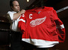
NHL News: Two more NHL teams have unveiled their new uniforms. Let’s start with Detroit, where Reebok’s new tailoring template has forced the Red Wings to move their “C” and “A” designations to the other side of the jersey (full details here). But as Craig Barker points out, putting the designatory letters on that side is nothing new for the Red Wings. I know we’ve covered this before, but I forget the details, so can someone please provide a quick recap of the side-to-side migrations of Detroit’s “C” and “A”?
The bigger problem, it seems to me, is that rounded hemline, which hasn’t looked so bad on most other teams but is really accentuated — and not in a good way — by the Wings’ design.
Meanwhile, if you want a good laugh, take a look at this photo and then check out the headline on this article. I think I’ll let both the uniform (additional views here and here) and the journalism speak for themselves.
Uni Watch News Ticker: Really nice slideshow here, showcasing the flannel uniforms recently worn by a Russian baseball team traveling through the U.S. And although he’d be too humble to say anything, it just so happens that the Ruskies’ duds were designed by none other than our own Scott M.X. Turner. … Underbrim history may have been made last night, as Vince explains: “Last night, Indians vs. Tigers, featured perhaps the first pitching matchup ever to feature both pitchers still wearing their holograms on the underbrim of their hats. Fausto, of course, has a long documented history of this, but the kid the Tigers called up from AA for the game, Jair Jurrjens, had his hologram on also.” … Good survey of recent Cardinals throwbacks here (with thanks to Elena Elms). … Andy R. reports that his sister Kiirsta has just become a Charger Girl (aka a San Diego Chargers cheerleader), which must make Mama R. very proud. “Did you know about their Halloween tradition?” asks Andy. “For the game closest to Halloween, each girl chooses her own costume/uniform. This year, it’s the on the 28th, against the Texans. I found out, though, that they may not be the only team that does it. Also, sadly, I found out that they’re not as interested in being creative and/or different as they are in simply ‘looking hot.'” I may never recover from that stunning bit of news.
In the first Charger/Halloween picture, the cheerleader on the left is wearing the Swiss flag, not the Red cross symbol.
link
Please don’t tell me that the numbers on the front of the Islanders uniforms will actually be on different sides for home and road. They really wouldn’t do that… would they???
[quote comment=”132999″]In the first Charger/Halloween picture, the cheerleader on the left is wearing the Swiss flag, not the Red cross symbol.[/quote]
She didn’t want to be sued by Johnson & Johnson.
My updated edition of Bill Henderson’s “MLB Game Worn Jerseys of the Double Knit Era” arrived in the mail yesterday, making it one of the most exciting days of the year. My wife thought that I was nuts as I did a victory dance around the kitchen after opening the envelope.
“[. . .]and the swashbuckling vintage-inspired ties at the collar, which are a “throwback to our origins in 1972,” says Chris Botta, Islander’s vice president of communications. Team numbers, traditionally placed only on the back, have been added to the front of the jerseys as well, which may make favorite-player spotting easier,[. . .]”
A few points from these two half sentences:
1. I didn’t know hockey players could swashbuckle.
2. A throwback to the origins? Maybe if the rest of it didn’t look like juxtaposed crap.
3. On the front numbers, unless you have ice seats directly behind the net, you will see the back of a player as he skates down the ice.
That was the worst piece of journalism I’ve read in a while.
Maybe it’s because I’m still half-asleep, but I dig those Islanders sweaters–especially the white one.
[quote comment=”133006″]Maybe it’s because I’m still half-asleep, but I dig those Islanders sweaters–especially the white one.[/quote]
[sarcasim] Everybody is entitled to their own opinions even if they are bad opinions [sarcasim]
The Old Time Baseball Game was played yesterday in Cambridge MA. The big feature is the old time unis. Link is to the pic gallery.
[quote comment=”133001″]http://cdn.nhl.com/islanders/images/upload/2007/08/jersey_1_article.jpg
Please don’t tell me that the numbers on the front of the Islanders uniforms will actually be on different sides for home and road. They really wouldn’t do that… would they???[/quote]
Thats the first thing i noticed too, did they do it just for the sake of having the picture read 07 08 or are they actually going to do that, because that would be absolutely ridiculous. Talking about the red wings switching sides with their Cs and As this year, the Islanders would be switching every few games
I’m one of the few remaining Islander fans (True Blue since ’72), but these uni’s are HORRENDOUS! Ehat the hell were they thinking? The Fish Sticks jersey was better that this thing. At least it had some character. This is just a mess! And until they get close to winning Cup #5, they should delete those 4 stripes. Argh!
Has Teebz already placed an order for the new Islanders jersey?
I’m one of the few remaining Islander fans (True Blue since ‘72), but these uni’s are HORRENDOUS! Ehat the hell were they thinking? The Fish Sticks jersey was better that this thing. At least it had some character. This is just a mess! And until they get close to winning Cup #5, they should delete those 4 stripes. Argh!
i’m with ya, john. i was a resident of section 111 for 10 years and this jersey makes me want to vom a little bit. if you really want a good laugh, go to the team’s website (newyorkislanders.com) and look at the reebok brand praise on all five of the news tabs. ughhhhh. to be fair to the isles, some tweaks and a toned down approach may have worked, but this really doesn’t
I don’t know if it has been done before, but I think there should definitely be an article focusing on current NFL Cheerleaders uniforms. Or maybe a ranking perhaps? I know one thing for sure… the Packers would be real far down on the list. The Pack don’t have cheerleaders per say. Since 1988 the Cheerleaders from St. Norbert College (my alma mater) and UW-Green Bay swap every other week on the sidelines of home games. The outfits they do have are pretty basic, and definitely old school.
Also, sadly, I found out that they’re not as interested in being creative and/or different as they are in simply ‘looking hot.’â€Â
link
I think I will have to subscribe to NHL Radio next year……
The is a link of the islanders new uniform
am i seeing this right? no arm numbers on the isles sweater?
No sir i don’t like it.
The New NHL….”Welcome to Crappy Jersey Central”
oh nevermind, i just saw ken’s picture
i still don’t like them
There are link on the islanders jerseys
haha never mind you already noticed it
Well if that second jersey shot (of the guy going surfing in his Isles jersey?) is correct then the “opposite side numbers” thing was just a stunt to read “07-08”. Thank God.
[quote comment=”133019″]I think I will have to subscribe to NHL Radio next year……[/quote]
Just subscribe to XM Satallite Radio. 170 channels of listening pleasure for around $10-14/month. I have it and it is the greatest thing in the world All MLB, NHL, ACC, Big East, Big Ten, Pac-10, SEC, PGA Tour events… and I think Indy Car is thrown in there as well.
And putting my two cents into the new Islanders jersey… I know I am in the minority, but I actually kind of like them. They are different… sure maybe in a bad way, but I personally like teams who go against the grain a little. I am not an Islanders fan, nor do I know a lot about their uni history. Could some die hard fans go into detail and explain why they don’t like them so much? I would just like to hear their opinions.
Another hockey sweater with way too much flair. Again, alot of these jerseys are the sartorial equivalent of Minute Maid Park in Houston – a bunch of random crap thrown together for no particular reason.
Is there anywhere where one can find one of those Team Russia throwbacks? I really, really want one. It’s not often you see a really great Team Russia jersey for something that isn’t a CCCP throwback…
[quote comment=”133020″]The is a link of the islanders new uniform[/quote]
At least with this view we miss the logo creep
link
[quote comment=”133003″]My updated edition of Bill Henderson’s “MLB Game Worn Jerseys of the Double Knit Era” arrived in the mail yesterday, making it one of the most exciting days of the year. My wife thought that I was nuts as I did a victory dance around the kitchen after opening the envelope.[/quote]
I am eagerly awaiting mine!!! I can’t wait!
As a Ranger fan, I am happy to say, “HA HA!” (in Nelson from the Simpsons voice)
I’m in complete agreement with some of these postings. The fisherman jersey for the Isles is by far a better design than the new crap that these guys came up with. This is proof of the crap that the Isles have become over the years ever since Milbury took over.
[quote comment=”132999″]In the first Charger/Halloween picture, the cheerleader on the left is wearing the Swiss flag, not the Red cross symbol.[/quote]
I’ve never heard of a cheerleader being neutral but anyway here’s a pic of the Vikings cheerleaders last Halloween
The Islanders have finally link. After 30 years of following this team (with waning interest in the last 5), I am officially out!!! How the hell could this orginization not have learned their lesson?!!! They tried a link once and the fans (except for Teebz) spoke out and said “Why change a link?”. So, they do the right thing and link(albeit with some minor tweaks). Now they go and create a monstrosity that, except for the logo, rivals the link and the link and the worst unis in Hockey…not the NHL, but all of freakin’ hockey.
Now to top it all off, my link, that I read every day apparently had a major link in their headquaters; because link are the only way you can explain link.
link!!! Goodbye NHL!!!
link!!!
[quote comment=”133033″][quote comment=”133020″]The is a link of the islanders new uniform[/quote]
At least with this view we miss the logo creep
link
Is it me or are those numbers huge?
Could some die hard fans go into detail and explain why they don’t like them so much? I would just like to hear their opinions.
It looks like they took a bunch of scraps and threw them together. It is a uniform of “pieces” that do not mesh into a coherent whole.
On a historical note, the Islanders booted a chance to go back to the color blue they wore in their glory days.
Oh, well. As a Ranger fan this will just give me another topic to goof on the Islanders all year.
Paul or Vince, could you restore my post please? Thanks.
A quick improvement on the Isles jerseys would be to take the number off the front (it’s just terrible) and to remove the piping in the shoulder area and to have the collar be the main color of the jersey.
[quote comment=”133035″]As a Ranger fan, I am happy to say, “HA HA!” (in Nelson from the Simpsons voice)[/quote]
As a Devils fan, I have to say the Rangers have the second best uniforms in the area. Which must be comforting because they also have the second best team.
wow! the link is live…
earliest ive ever seen it on pg 2!
i was just going to mention that
I hate to say it, but link is just plain wrong.
Looking at those Brewers uniforms, he has drawn some incorrect inferences based on jersey tagging. In the early 1970s the Brewers, like many clubs, recycled jerseys from year to year. The jerseys with blue and gold piping on the neck and sleeves were actually from 1971, even though many still bear the original “1970” tagging.
Shame, because I love this resource. But that has to be corrected.
[quote comment=”133039″][quote comment=”133033″][quote comment=”133020″]The is a link of the islanders new uniform[/quote]
At least with this view we miss the logo creep
link
Is it me or are those numbers huge?[/quote]
I thought the same, but maybe the short name and the way he is sitting is adding to the effect
[quote comment=”133046″]wow! the link is live…
earliest ive ever seen it on pg 2![/quote]
Holy crap, check out that prototype 76ers logo. That thing is sweet, although more suited to like a high school team. The 76 in the sword? Awesome!
Carry over from yesterday and the stars on Texas uniforms:
Dallas Stars: yes, a big one.
Dallas Cowboys: uh, yeah.
Dallas Mavericks: back of jersey, above the name
Texas Rangers: Texas state flag patch on sleeve and on logo
FC Dallas: crest on jersey
Houston Astros: jersey and hat.
Houston Texans: helmet
Houston Rockets: No
Houston Comets: in the logo
Houston Dynamo: crest on jersey
San Antonio Spurs: only if you count the ‘spur’ itself as a star.
San Antonio SilverStars: about a hundred of them
So there you have it. It makes so much sense when you break it down scientifically. Texans LOVE their stars.
I’m sure there are also many minor league teams in Texas that also sport a star either on either their logo or jersey.
OK my curiosity is now satisfied.
As some of you have apparently discovered already, today’s ESPN column link.
links to the entire uni unveiling for the iron pigs
link
I have always divided my NHL loyalties between the Islanders and the Blackhawks. These new uniforms have now made me a one-team man.
LET’S GO BLACKHAWKS! (assuming they don’t desecrate their uniforms too)
[quote comment=”133068″]I have always divided my NHL loyalties between the Islanders and the Blackhawks. These new uniforms have now made me a one-team man.
LET’S GO BLACKHAWKS! (assuming they don’t desecrate their uniforms too)[/quote]
I’m pretty sure they desecrated them pretty thoroughly with their play the last few years.
The Wings jersey looks about as good as it can under the new design, and still one of the best in the league, but I know that the collar and white crescent at the bottom are going to bother me. The link pictures make it look like the bottom stripe is even, as always. I’ll wait until their on the ice, I guess.
RE: Stars on Texas uniforms: Isn’t it ironic that the Rockets, one team that could legitimately put stars on it uniform, are the only team that doesn’t have stars?
I’m pretty sure they desecrated them pretty thoroughly with their play the last few years.
CJ, Good point…I can’t argue with that. Argh, I am just so devastated by these monstrosities the Islanders unveiled….Didn’t they learn their lesson in 1995????
[quote comment=”133070″][quote comment=”133068″]I have always divided my NHL loyalties between the Islanders and the Blackhawks. These new uniforms have now made me a one-team man.
LET’S GO BLACKHAWKS! (assuming they don’t desecrate their uniforms too)[/quote]
I’m pretty sure they desecrated them pretty thoroughly with their play the last few years.[/quote]
Agreed. As a (former) Chicagoan, I’d much prefer if they DIDN’T wear the uniform that once went to the playoffs 28 years straight.
Awesome ESPN article.
I can now go back to work.
The Islanders really whiffed on a opportunity blend traditional and contemporary stylistic elements. The blue-and-orange color scheme is such a good combination that I don’t think it would have taken much to devise a great-looking jersey. The color blocking is just so sad — just awful.
On the Russian baseball uniforms, I think they look fantastic as I’m a big fan of the heathered gray look. Are those unis really flannel or just made to look that way? In any event, I wish some MLB team would adopt a textured gray look over the flat gray all have now. I think it would instantly upgrade most teams’ road unis without changing any other stylistic elements.
One last thing: I saw a couple references to IU’s “Hep” patch in comments on Wednesday and wanted to chime in that I think the football players did very well in coming up with a classy looking memorial to their dearly departed coach. It’s been hard to spot a photo on the helmet decal but I found one blurry glimpse on the IU Web site, link. It looks to me like it’s a round white decal on the back of the crimson helmet with the words “Don’t Quit” arched in the top half of the decal and the number “13” in the middle, all in crimson. The “13” is a reference to IU’s mission/mantra to “play 13” — 12 regular season games and a bowl game.
[quote comment=”133005″]1. I didn’t know hockey players could swashbuckle.
[/quote]
Only if they’re the old link. No word if they played with parrots on their shoulders.
[quote comment=”133040″]Could some die hard fans go into detail and explain why they don’t like them so much? I would just like to hear their opinions.
It looks like they took a bunch of scraps and threw them together. It is a uniform of “pieces” that do not mesh into a coherent whole.
[/quote]
Agreed – the panels may work well as a form/fit/function aspect, but do teams really need to accentuate them with different color piping and/or panels? Witness the Bruins new sweater – at least they had the good sense to make the shoulder portion look retro and integrate it seamlessly into the overall design, unlike what my beloved Isles have done.
I am sad that my Reds prototype didn’t make the cut. Alas.
link
[quote comment=”133076″][quote comment=”133005″]1. I didn’t know hockey players could swashbuckle.
[/quote]
Only if they’re the old link. No word if they played with parrots on their shoulders.[/quote]
Avast! Have ye seen the new pirate movie that was jsut released? It’s rated “ARRRRRRRRRRRRRRRRRR”
[quote comment=”133073″][quote comment=”133070″]I’m pretty sure they desecrated them pretty thoroughly with their play the last few years.[/quote]
Agreed. As a (former) Chicagoan, I’d much prefer if they DIDN’T wear the uniform that once went to the playoffs 28 years straight.[/quote]
The responses to my last comment show exactly how bad it has gotten in Chicago.
However, it’s ain’t exactly greener here in Philly. Years of close but not quite and last year’s team that lost the ability to form coherent sentences.
Hopefully, the Flyers won’t botch their uniforms. I can’t wait to be there and either throw things or sigh in relief.
link guy looks like he’s bent over grabbing his ankles with a Canadian flag sticking out of his arse
more coaches should be like this…
link
first, earn your helmet logo sticker,
next earn your name on your jersey (if the college uses names).
my favorite part of the Islanders article is:
Head coach Ted Nolan believes the new look “bodes well” for the season. “When you look good and feel good you work better and play better.”
or the fashion designer calling the neckline a little kids shirt with the laces.
but my own opinion about them? i like the white better than the blue, doesn’t mean i like them but… and so far the original 6 have remained classy
[quote comment=”133086″]link guy looks like he’s bent over grabbing his ankles with a Canadian flag sticking out of his arse[/quote]
My God, man. You have a sick mind. You have to really be looking for something like that to find it.
I did not read yesterday’s comments, so I don’t know if it was posted. Yesterday it was announced that New Mexico State’s football team will wear pink socks for their Sept 29th game.
link
[quote comment=”133030″][quote comment=”133019″]I think I will have to subscribe to NHL Radio next year……[/quote]
Just subscribe to XM Satallite Radio. 170 channels of listening pleasure for around $10-14/month. I have it and it is the greatest thing in the world All MLB, NHL, ACC, Big East, Big Ten, Pac-10, SEC, PGA Tour events… and I think Indy Car is thrown in there as well.
And putting my two cents into the new Islanders jersey… I know I am in the minority, but I actually kind of like them. They are different… sure maybe in a bad way, but I personally like teams who go against the grain a little. I am not an Islanders fan, nor do I know a lot about their uni history. Could some die hard fans go into detail and explain why they don’t like them so much? I would just like to hear their opinions.[/quote]
As long as it doesn’t look like a basketball warm-up, I am a fan! It actually kind of looks like a hockey jersey…
link
I guess I am link challlenged. Here is a link to the article.
[quote comment=”133014″]Has Teebz already placed an order for the new Islanders jersey?[/quote]
Hell no. I hate the Islanders. I only love the Fisherman jersey. :o)
[quote comment=”133060″]Carry over from yesterday and the stars on Texas uniforms:
Dallas Stars: yes, a big one.
Dallas Cowboys: uh, yeah.
Dallas Mavericks: back of jersey, above the name
Texas Rangers: Texas state flag patch on sleeve and on logo
FC Dallas: crest on jersey
Houston Astros: jersey and hat.
Houston Texans: helmet
Houston Rockets: No
Houston Comets: in the logo
Houston Dynamo: crest on jersey
San Antonio Spurs: only if you count the ‘spur’ itself as a star.
San Antonio SilverStars: about a hundred of them
So there you have it. It makes so much sense when you break it down scientifically. Texans LOVE their stars.
I’m sure there are also many minor league teams in Texas that also sport a star either on either their logo or jersey.
OK my curiosity is now satisfied.[/quote]
Texas is the link
[quote comment=”133095″][quote comment=”133060″]Carry over from yesterday and the stars on Texas uniforms:
Dallas Stars: yes, a big one.
Dallas Cowboys: uh, yeah.
Dallas Mavericks: back of jersey, above the name
Texas Rangers: Texas state flag patch on sleeve and on logo
FC Dallas: crest on jersey
Houston Astros: jersey and hat.
Houston Texans: helmet
Houston Rockets: No
Houston Comets: in the logo
Houston Dynamo: crest on jersey
San Antonio Spurs: only if you count the ‘spur’ itself as a star.
San Antonio SilverStars: about a hundred of them
So there you have it. It makes so much sense when you break it down scientifically. Texans LOVE their stars.
I’m sure there are also many minor league teams in Texas that also sport a star either on either their logo or jersey.
OK my curiosity is now satisfied.[/quote]
Texas is the link[/quote]
No kidding. Really?
I think the Isles jerseys are terrible. And whoever wrote that article for the paper up there is smoking the dank. The one shining ray of cool is the orange lace on the blue jersey. I’ve never seen that before, I think the contrast looks pretty neat.
[quote comment=”133071″]The Wings jersey looks about as good as it can under the new design, and still one of the best in the league, but I know that the collar and white crescent at the bottom are going to bother me. The link pictures make it look like the bottom stripe is even, as always. I’ll wait until their on the ice, I guess.
[/quote]
The on-ice and replica uniforms are made differently. The replicas will be like last season’s jerseys, while the official on-ice ones will be form-fitting and have the curved hems.
[quote comment=”133071″]
RE: Stars on Texas uniforms: Isn’t it ironic that the Rockets, one team that could legitimately put stars on it uniform, are the only team that doesn’t have stars?[/quote]
Not at all… because a stupid Hollywood movie type designed the stupid logo and hasn’t a clue! That link won’t even fly, it would spin around in a loop.
I’ve been behind the Isles since the late 70’s…looks as if I’m in the minority here…the sleeves may take a little getting used to, but I don’t mind the way the new jersey’s look. Just have to get past those sleeves somehow…
[quote comment=”133081″][quote comment=”133073″][quote comment=”133070″]I’m pretty sure they desecrated them pretty thoroughly with their play the last few years.[/quote]
Agreed. As a (former) Chicagoan, I’d much prefer if they DIDN’T wear the uniform that once went to the playoffs 28 years straight.[/quote]
The responses to my last comment show exactly how bad it has gotten in Chicago.
However, it’s ain’t exactly greener here in Philly. Years of close but not quite and last year’s team that lost the ability to form coherent sentences.
Hopefully, the Flyers won’t botch their uniforms. I can’t wait to be there and either throw things or sigh in relief.[/quote]
at least you had close but not quite. The Hawks can’t even claim close.
[quote comment=”133030″][quote comment=”133019″]I think I will have to subscribe to NHL Radio next year……[/quote]
Just subscribe to XM Satallite Radio. 170 channels of listening pleasure for around $10-14/month. I have it and it is the greatest thing in the world All MLB, NHL, ACC, Big East, Big Ten, Pac-10, SEC, PGA Tour events… and I think Indy Car is thrown in there as well.
[/quote]
I was just pointing out that at least on the radio I won’t have to watch these uniforms in action. Just a total disregard to the history of the game.
[quote comment=”133089″][quote comment=”133086″]link guy looks like he’s bent over grabbing his ankles with a Canadian flag sticking out of his arse[/quote]
My God, man. You have a sick mind. You have to really be looking for something like that to find it.[/quote]
what the hll is that ottawa logo supposed to be?
I only know this because I work for the Flaming Thumbtacks, I’m a Bills fan that still holds a grudge (lateral my ass), but the Titan’s cheerleaders have worn link the last two years at least. Not only have they done Halloween, but link as well. Uni Watch vets will realize that these links are from ESPN. PL maybe you should talk to Easterbrook when it comes time to do a piece on NFL cheerleaders.
what the hll is that ottawa logo supposed to be?
The Peace Tower, located on Parliament Hill, IIRC.
I like the idea of the SF Giants using the orange lettering, but it would probably look alot better on home whites, like back in the 70s.
I am probably in the minority among Giants fans, but I can’t stand the cream colored home unis. I know, I know, they harken back to the NY days, but they probably looked alot better when they were made of wool.
Hot shit, I made the ESPN column!!! Wow, thanks for posting my freak jersey pics Paul!
matt
[quote comment=”133102″]I’ve been behind the Isles since the late 70’s…looks as if I’m in the minority here…the sleeves may take a little getting used to, but I don’t mind the way the new jersey’s look. Just have to get past those sleeves somehow…[/quote]
I’m with you . . .I don’t mind the overall treatment. The sleeves bother me and the number on the front chest has got to go!!! (Note to Buffaslugs). But other than that it’s okay.
I like the lace-up collar and the piping on the shoulder isn’t terrible. On a totally arbitrary scale, I’ll give it a 75 out of 100.
I am probably in the minority among Giants fans, but I can’t stand the cream colored home unis. I know, I know, they harken back to the NY days, but they probably looked alot better when they were made of wool.
Giants owner Peter Magowan said that he wanted the uniforms to look like they did in 1958, when the Giants arrived in San Francisco (of course, with modern tailoring and fabric). Hence, the cream-colored home uniforms.
[quote comment=”133114″][quote comment=”133102″]I’ve been behind the Isles since the late 70’s…looks as if I’m in the minority here…the sleeves may take a little getting used to, but I don’t mind the way the new jersey’s look. Just have to get past those sleeves somehow…[/quote]
I’m with you . . .I don’t mind the overall treatment. The sleeves bother me and the number on the front chest has got to go!!! (Note to Buffaslugs). But other than that it’s okay.
I like the lace-up collar and the piping on the shoulder isn’t terrible. On a totally arbitrary scale, I’ll give it a 75 out of 100.[/quote]
I think the lace up looks good, but not when its uselessly placed on the new jerseys. Since the drop neck is filled in having the lace there is stupid. If they didnt have the NHL logo and fabric there it would be excellent.
[quote comment=”133110″]what the hll is that ottawa logo supposed to be?
The Peace Tower, located on Parliament Hill, IIRC.[/quote]
This is Canada’s equivalent to the Capitol Dome in Washington.
[quote comment=”133094″][quote comment=”133014″]Has Teebz already placed an order for the new Islanders jersey?[/quote]
Hell no. I hate the Islanders. I only love the Fisherman jersey. :o)[/quote]
I just figured that the new one might be sufficiently ugly for you to bite. I did not realize that your passion for arguably unattractive Islanders jerseys was limited to the fisherman.
[quote comment=”133115″]I am probably in the minority among Giants fans, but I can’t stand the cream colored home unis. I know, I know, they harken back to the NY days, but they probably looked alot better when they were made of wool.
Giants owner Peter Magowan said that he wanted the uniforms to look like they did in 1958, when the Giants arrived in San Francisco (of course, with modern tailoring and fabric). Hence, the cream-colored home uniforms.[/quote]
And by modern tailoring, he means link? Magowan should worry a little more about quality control.
Question about Paul’s Page 2 Column:
What’s with the PetroCanada patch on the sleeve of the 20th anniversary Expos jersey? Did this become a gas station giveaway?
link
[quote comment=”133105″][quote comment=”133030″][quote comment=”133019″]I think I will have to subscribe to NHL Radio next year……[/quote]
Just subscribe to XM Satallite Radio. 170 channels of listening pleasure for around $10-14/month. I have it and it is the greatest thing in the world All MLB, NHL, ACC, Big East, Big Ten, Pac-10, SEC, PGA Tour events… and I think Indy Car is thrown in there as well.
[/quote]
I was just pointing out that at least on the radio I won’t have to watch these uniforms in action. Just a total disregard to the history of the game.[/quote]
I gotcha… good call
PL,
any link to your interview from the other day for those who missed it?
From the Chicago Suntimes:
“New Cubs left-hander Carmen Pignatiello — a Chicago-area native, no less — finally got a nameplate on his clubhouse locker stall on his second day on the job. His name was spelled ‘Tignaitello.'”
Oops!
The number on the front chest of NHL jerseys is a trend that is not only expanding but here to stay. From the Isles website “In order to keep pace with the new times, the Islanders followed in the footsteps of the extremely popular Buffalo Sabres jerseys by including the players’ numbers on the front of the jersey. The Islanders, along with four other teams, feature numbers on the front, with more likely to follow in the coming years”
[quote comment=”133129″]From the Chicago Suntimes:
“New Cubs left-hander Carmen Pignatiello — a Chicago-area native, no less — finally got a nameplate on his clubhouse locker stall on his second day on the job. His name was spelled ‘Tignaitello.'”
Oops![/quote]
lemme guess
berman will be calling him carmen pignatiello “on the donkey”
excellent ESPN column today Paul.
the pics of the Tampa Bay Bucs rejected helmets show some drawings of jersey mock-ups. wow. now those are some ugly jerseys. we should all thank the uni-gods they never saw the light of day.
[quote comment=”133131″]The number on the front chest of NHL jerseys is a trend that is not only expanding but here to stay. From the Isles website “In order to keep pace with the new times, the Islanders followed in the footsteps of the extremely popular Buffalo Sabres jerseys by including the players’ numbers on the front of the jersey. The Islanders, along with four other teams, feature numbers on the front, with more likely to follow in the coming years”[/quote]
Trends are not always a positive thing . . .I think the whole number on the front of the jersey thing fails Paul’s “Is it good or is it stupid” test.
Numbers on the back – good; Numbers on the sleeve or shoulder – good (easier to read on TV). Numbers on the front, upper chest – stupid (when a player is in a link, the number is difficult, AT BEST, to even read!)
[quote comment=”133119″][quote comment=”133094″][quote comment=”133014″]Has Teebz already placed an order for the new Islanders jersey?[/quote]
Hell no. I hate the Islanders. I only love the Fisherman jersey. :o)[/quote]
I just figured that the new one might be sufficiently ugly for you to bite. I did not realize that your passion for arguably unattractive Islanders jerseys was limited to the fisherman.[/quote]
The new jersey is horrific. It’s a visual crime. It doesn’t even have the same caché.
I like the Fisherman jersey because it’s unique and has great appeal when it’s completely customized. It’s also huge for conversation starters when I walk into a bar or lounge to watch a game.
[quote comment=”133133″]excellent ESPN column today Paul.
the pics of the Tampa Bay Bucs rejected helmets show some drawings of jersey mock-ups. wow. now those are some ugly jerseys. we should all thank the uni-gods they never saw the light of day.[/quote]
What’s the link? Can’t find it…
Since just about everyone is focusing in on the negatives of the isles jersey(albeit there are quite a few) I’d just like to focus on 1 positve. Unlike the last 2 unvielings it does not look as if they will be going to a BBQ which i have to say is a relief
Oh my god, the link is so sweet!
[quote comment=”133141″]Oh my god, the link is so sweet![/quote]
That black and gold makes a really nice looking uni, kinda Saints-ish.
[quote comment=”133079″]I am sad that my Reds prototype didn’t make the cut. Alas.
link
I talked to several people (collectors, mostly) about that design, and the consensus was that it was probably not a true Reds prototype, but rather a stock item that had been modified to look Reds-ish. So I didn’t include it in the column. Sorry.
[quote comment=”133140″]Since just about everyone is focusing in on the negatives of the isles jersey(albeit there are quite a few) I’d just like to focus on 1 positve. Unlike the last 2 unvielings it does not look as if they will be going to a BBQ which i have to say is a relief[/quote]
That’s the only thing that could have made them worse.
Or half-elbow stripes. I hate those too.
[quote comment=”133011″][quote comment=”133001″]http://cdn.nhl.com/islanders/images/upload/2007/08/jersey_1_article.jpg
Please don’t tell me that the numbers on the front of the Islanders uniforms will actually be on different sides for home and road. They really wouldn’t do that… would they???[/quote]
Thats the first thing i noticed too, did they do it just for the sake of having the picture read 07 08 or are they actually going to do that, because that would be absolutely ridiculous. Talking about the red wings switching sides with their Cs and As this year, the Islanders would be switching every few games[/quote]
In the picture above of the two unis on hangars, the number is on the left side on the blue one, but in link, the number is on the right. WTF?
[quote comment=”133127″]PL,
any link to your interview from the other day for those who missed it?[/quote]
Not sure which interview you mean, but there’s about 10 minutes of me chatting about hockey uniforms in the August 8th link link.
[quote comment=”133149″][quote comment=”133011″][quote comment=”133001″]http://cdn.nhl.com/islanders/images/upload/2007/08/jersey_1_article.jpg
Please don’t tell me that the numbers on the front of the Islanders uniforms will actually be on different sides for home and road. They really wouldn’t do that… would they???[/quote]
Thats the first thing i noticed too, did they do it just for the sake of having the picture read 07 08 or are they actually going to do that, because that would be absolutely ridiculous. Talking about the red wings switching sides with their Cs and As this year, the Islanders would be switching every few games[/quote]
In the picture above of the two unis on hangars, the number is on the left side on the blue one, but in link, the number is on the right. WTF?[/quote]
The jerseys on hangers was done for the photo only. The numbers will appear on both jerseys on the right side during the season.
[quote comment=”133150″][quote comment=”133127″]PL,
any link to your interview from the other day for those who missed it?[/quote]
Not sure which interview you mean, but there’s about 10 minutes of me chatting about hockey uniforms in the August 8th link link.[/quote]
didnt you say there was an interview to be broadcast at 1pm the other day? a baseball site?
[quote comment=”133076″][quote comment=”133005″]1. I didn’t know hockey players could swashbuckle.
[/quote]
Only if they’re the old link. No word if they played with parrots on their shoulders.[/quote]
don’t forget… link one could make an argument for link also.
[quote comment=”133107″][quote comment=”133089″][quote comment=”133086″]link guy looks like he’s bent over grabbing his ankles with a Canadian flag sticking out of his arse[/quote]
My God, man. You have a sick mind. You have to really be looking for something like that to find it.[/quote]
what the hll is that ottawa logo supposed to be?[/quote]
It’s a cyclops.
They’re very popular in canada.
Teebz, I’ve always liked the Fisherman jersey too.
[quote comment=”133155″][quote comment=”133150″][quote comment=”133127″]PL,
any link to your interview from the other day for those who missed it?[/quote]
Not sure which interview you mean, but there’s about 10 minutes of me chatting about hockey uniforms in the August 8th link link.[/quote]
didnt you say there was an interview to be broadcast at 1pm the other day? a baseball site?[/quote]
Oh right, that. It was on the Midday Show at baseballchannel.tv. I’m too busy right now to find the exact link, but poke around on their site and you’ll probably find it.
I contacted the Phillies yesterday on trying to make a switch in uniforms in either getting a totally different design or getting an alternate jersey. Because for being a Phillies fan for as long as I have seeing them wear the same thing constantly gets pretty annoying. But after contacting them they sent me a email back which stated, Mr. Fetko,
In terms of an alternate uniform, you most likely will hear some information about 2008 after our season has concluded.
Thanks,
The Phillies * One Citizens Bank Way * Philadelphia PA 19148
So I say look for something different for next season.
[quote comment=”133164″]I contacted the Phillies yesterday on trying to make a switch in uniforms in either getting a totally different design or getting an alternate jersey. Because for being a Phillies fan for as long as I have seeing them wear the same thing constantly gets pretty annoying. But after contacting them they sent me a email back which stated, Mr. Fetko,
In terms of an alternate uniform, you most likely will hear some information about 2008 after our season has concluded.
Thanks,
The Phillies * One Citizens Bank Way * Philadelphia PA 19148
So I say look for something different for next season.[/quote]
I’m betting they’ll jump on the red alternate jersey bandwagon. On behalf of Astro’s fans everywhere, welcome.
[quote comment=”133158″][quote comment=”133107″][quote comment=”133089″][quote comment=”133086″]link guy looks like he’s bent over grabbing his ankles with a Canadian flag sticking out of his arse[/quote]
My God, man. You have a sick mind. You have to really be looking for something like that to find it.[/quote]
what the hll is that ottawa logo supposed to be?[/quote]
It’s a cyclops.
They’re very popular in canada.[/quote]
That logo made me think of Terence & Phillip from South Park for some reason. Blame Canada!
Those Isles unis would not be so bad, if they removed the piping from the shoulders, and the numbers from the front. Would be sort of a orange & navy Red Wings look, except for those horrible angled elbow stripes.
BTW, New Canucks unis look to be leaked from EA, according to Team1040 in Vancouver:
link
link
Only thing is that they look like the “template” that was out there way back, so take it with a grain of salt.
[quote comment=”133166″][quote comment=”133164″]I contacted the Phillies yesterday on trying to make a switch in uniforms in either getting a totally different design or getting an alternate jersey. Because for being a Phillies fan for as long as I have seeing them wear the same thing constantly gets pretty annoying. But after contacting them they sent me a email back which stated, Mr. Fetko,
In terms of an alternate uniform, you most likely will hear some information about 2008 after our season has concluded.
Thanks,
The Phillies * One Citizens Bank Way * Philadelphia PA 19148
So I say look for something different for next season.[/quote]
I’m betting they’ll jump on the red alternate jersey bandwagon. On behalf of Astro’s fans everywhere, welcome.[/quote]
As a Pirates fan I too welcome you to our own private Hell.
And by modern tailoring, he means this? Magowan should worry a little more about quality control.
No, less baggy cuts. A couple of this year’s throwbacks not only had the old colors and lettering, but were very baggy in the shirts and pants.
If a player wants to look sloppy and wear his pants down to below the soles of his shoes, it shouldn’t necessarily be put at management’s doorstep. Have a league-wide uniform policy similar to the NBA, and enforce it.
A couple of things from Paul’s column:
Giants: In 1994, the Giants changed their road jersey design from a simple “SF” logo
That was a mistake by the Giants. They should go back to the “SF” jersey logo. It was simple, classy, and different.
Seahawks: When the Hawks unveiled their new helmet logo in 2002, they presented two versions of the helmet and let their fans vote on which one would be the keeper. The blue version was the overwhelming winner
In that case, the Seahawks have soon pretty idiotic fans. The Seahawks went from having one of the best uniforms/helmets to one of the worst.
Angels: The origins of this prototype design, from the team’s Disney-owned era…
The Disney-era Angels uniforms really grew on me. I initially despised them, especially since they came immediately after the absolutely perfect “CA” caps and uniforms of the early-mid 1990s.
Just my two cents…
I dug that Phillies prototype in Paul’s column.
As far as changing their uniforms, I’m for it. I long for the return of the blue roads and the fat ‘P’. Is their some rule against the powder blue road uniforms?
Anyway, I’d like to see them shed the pinstripes as well, and maybe get a uniform that has the logo instead of the team name on it. The Philadelphian in me longs to steal the the elephant from the A’s and recreate link
Last Friday we discussed whether or not Penn State’s jerseys have a small PSU logo on them. While I still believe that they did at one point, I recieved my “game worn” jersey in the mail today and I can confirm that they do not anymore.
[sarcasim] Everybody is entitled to their own opinions even if they are bad opinions [sarcasim]
Apparently everyone is entitled to spell sarcasm wrong when mocking someone else.
[quote comment=”133086″]link guy looks like he’s bent over grabbing his ankles with a Canadian flag sticking out of his arse[/quote]
I have to admit it, once he said I see it too…
And why is all that stuff on the Buc’s prototypes locked out? Cant see it here…any other links to it please?
[quote comment=”133169″]Those Isles unis would not be so bad, if they removed the piping from the shoulders, and the numbers from the front. Would be sort of a orange & navy Red Wings look, except for those horrible angled elbow stripes.
BTW, New Canucks unis look to be leaked from EA, according to Team1040 in Vancouver:
link
link
Only thing is that they look like the “template” that was out there way back, so take it with a grain of salt.[/quote]
That’s supposed to be a fan-based mockup from what I’ve heard.
A couple of days back when talking about hidden logos I am not sure it anyone mentioned link
Anyway, the The entire logo is an M (Montreal) the red portion is an e(Expos) and blue portion is a b(baseball). Altogether it is Montreal Expos Baseball.
Here’s an link from MIT about testing done there on hockey uniforms.
In the article it says the overall drag difference from old to new was 5%, and the thermal profile reduced by 10%.
Now, I’m all for moving forward and improving performance, but at what cost?
Here’s the problem I’ve got with the direction some of the uniform suppliers are taking…..to sell marginally better products, they have to sell a huge load of bunk along with them.
Reebok has gone on and on and on about how much better the new hockey uniform will perform. I don’t call making 100% uglier jerseys to reduce the drag by 5% a great improvement.
Same thing goes for Nike, New Era, etc. They tout all of these HUGE improvements which actually turn out to be quite minor, and they turn away from fan opinion,tradition and style.
Progress indeed.
[quote comment=”133186″]A couple of days back when talking about hidden logos I am not sure it anyone mentioned link
Anyway, the The entire logo is an M (Montreal) the red portion is an e(Expos) and blue portion is a b(baseball). Altogether it is Montreal Expos Baseball.[/quote]
Also forms C and D for Club du Baseball Montreal.
[quote comment=”133177″]I dug that Phillies prototype in Paul’s column.
As far as changing their uniforms, I’m for it. I long for the return of the blue roads and the fat ‘P’. Is their some rule against the powder blue road uniforms?
Anyway, I’d like to see them shed the pinstripes as well, and maybe get a uniform that has the logo instead of the team name on it. The Philadelphian in me longs to steal the the elephant from the A’s and recreate link[/quote]
I too are for the phillies losing the pinstripes and putting a “P” logo on it. It for me is boring as hell watching them wear the same uniform time and time again. N i swear to god if they give us a uniform like the pirates red, sry, but i dont know how i could watch their games without shooting myself
nice interview…
that host was brutal though…
he gave me a headache…
how many times did he need to interrupt you or speak over you with his stupid jokes
link to here
link
then choose the Paul Lucas link… (they couldnt get that right either…
[quote comment=”133190″][quote comment=”133177″]I dug that Phillies prototype in Paul’s column.
As far as changing their uniforms, I’m for it. I long for the return of the blue roads and the fat ‘P’. Is their some rule against the powder blue road uniforms?
Anyway, I’d like to see them shed the pinstripes as well, and maybe get a uniform that has the logo instead of the team name on it. The Philadelphian in me longs to steal the the elephant from the A’s and recreate link[/quote]
I too are for the phillies losing the pinstripes and putting a “P” logo on it. It for me is boring as hell watching them wear the same uniform time and time again. N i swear to god if they give us a uniform like the pirates red, sry, but i dont know how i could watch their games without shooting myself[/quote]
I was at the bar with my Phillie-loving friend and the Pirates were on with their hideous red vests. We were talking about how the Philthies wear classic unis with no crazy alternates. Unfortunately this sounds like they’re about to go the way of the Burgh. Of course, they’ll still finish behind the Braves every year so its cool. ;)
[quote comment=”133187″]Reebok has gone on and on and on about how much better the new hockey uniform will perform. I don’t call making 100% uglier jerseys to reduce the drag by 5% a great improvement.
Same thing goes for Nike, New Era, etc. They tout all of these HUGE improvements which actually turn out to be quite minor, and they turn away from fan opinion,tradition and style.
Progress indeed.[/quote]
I’m probably in the minority here, but I think almost any minor improvement that helps the quality of play is probably a good improvement. True, sometimes teams or manufacturers use new inovations as an excuse to make major design changes that are sometimes bad, but that’s a separate issue. Uniforms have always been evolving, seems to silly to stop just because of tradition.
[quote comment=”133145″][quote comment=”133079″]I am sad that my Reds prototype didn’t make the cut. Alas.
link
I talked to several people (collectors, mostly) about that design, and the consensus was that it was probably not a true Reds prototype, but rather a stock item that had been modified to look Reds-ish. So I didn’t include it in the column. Sorry.[/quote]
That’s very interesting. I wonder what the reasoning would be for doing such a thing.
I love those all-graphite Toronto outfits! It’s too bad the league refused them; they would have looked really distinctive. The idea that they would have been “too hot” (it’s not thatmuch darker than regular gray) seems like an flimsy excuse.
Also, in this link, I think Dressed to the Nines has the number font wrong. The “1” didn’t have a base on it.
“Helps the quality of play” is a rather arbitrary statement.
To discard traditions for some ill-defined and uncertain benefit seems silly to me.
“I love that it’s more fitted. Skinny is definitely a menswear trend and very hot. Hated, hated, hated the tie on the neckline,” said Nina Garcia, Elle Magazine’s fashion director and the very vocal and sometimes tough judge on Bravo hit show, “Project Runway.” “I don’t really get it unless there’s some functional reason for it. It looks like a little boy’s shirt. I love the numbers on the front and some of the color blocking. Other than that I think they should have left it alone. It’s overly designed and too busy.”
ok, let’s get this straight right here and now, fashion designers have no freaking clue about sports apparel. they’ve tried, it doesn’t work. that’s how we got the blue, black and bronze of the caps. so all of the fashion designers, sit down and shut up.
lace-up collars are the stirrups of hockey. nobody else does laceup collars. there might be a few throughout history, but none are around today that i know of.
skinny? numbers on the front? F#%& YOU!
that said, i don’t think the isles jersey is all that bad. granted, it’s worse than what they had. personally, i’m reminded of link, and actually the isles jerseys are a little bit less busy. The shoulder outline is interesting, and doesn’t seem to be all that crazy. And they acutally have hemline stripes that aren’t pencil-sized!!! think of how bad it could’ve been! all things considered, this is one of the better jerseys we’ve seen so far.
[quote comment=”133196″][quote comment=”133145″][quote comment=”133079″]I am sad that my Reds prototype didn’t make the cut. Alas.
link
I talked to several people (collectors, mostly) about that design, and the consensus was that it was probably not a true Reds prototype, but rather a stock item that had been modified to look Reds-ish. So I didn’t include it in the column. Sorry.[/quote]
That’s very interesting. I wonder what the reasoning would be for doing such a thing.[/quote]
Maybe an amateur team? The “1” looks a bit off here too.
[quote comment=”133161″]Teebz, I’ve always liked the Fisherman jersey too.[/quote]
Sweet! The more, the merrier! Glad to have you aboard, ScottyJ! :o)
I had hoped for a linkwith the new stadium.
I’m sure the 2008 alt jersey will be something unique… like their stadium that ISN’T like every other new stadium.
Paul or Vince, could you rescue a post for me? it was eaten by the spam filter
Red Wings jersey is fine. And the Islanders jersey? just don’t know. It looks ugly, but their logo still rocks. A little too much orange. If any of the players are getting hooked by another player it’s gonna separate all of the material that was sewn together. Looks like they found some material on the floor and sewd on the scraps. Front number is horseshit. I don’t like it. What a letdown, from one of the best to probably the worst..so far.
[quote comment=”133196″][quote comment=”133145″][quote comment=”133079″]I am sad that my Reds prototype didn’t make the cut. Alas.
link
I talked to several people (collectors, mostly) about that design, and the consensus was that it was probably not a true Reds prototype, but rather a stock item that had been modified to look Reds-ish. So I didn’t include it in the column. Sorry.[/quote]
That’s very interesting. I wonder what the reasoning would be for doing such a thing.[/quote]
Itlooks like a Reds jersey, but you can bootleg it without getting sued.
I have posted, link, the new Senators logos that were found on the Canadian Intellectual Property Office website. Minor tweaks to both the side profile and alternate logos.
All in all, I like the Senators’ updates more than I liked the Sharks’ updates.
… I didn’t think the Islanders jersey was THAT bad. It’s busy, yes, but in my opinion, I don’t think it crosses into “bad” territory.
i often refer back to this site…
link
[quote comment=”133187″]Here’s an link from MIT about testing done there on hockey uniforms.
In the article it says the overall drag difference from old to new was 5%, and the thermal profile reduced by 10%.
Now, I’m all for moving forward and improving performance, but at what cost?
Here’s the problem I’ve got with the direction some of the uniform suppliers are taking…..to sell marginally better products, they have to sell a huge load of bunk along with them.
Reebok has gone on and on and on about how much better the new hockey uniform will perform. I don’t call making 100% uglier jerseys to reduce the drag by 5% a great improvement.
Same thing goes for Nike, New Era, etc. They tout all of these HUGE improvements which actually turn out to be quite minor, and they turn away from fan opinion,tradition and style.
Progress indeed.[/quote]
[sarcasm] As a hockey player I am so happy MIT has studied the problems with the hold hockey sweaters. I can’t tell you how many times I had to be taken out of a game becasue my sweater was slowing me down or over heating me. Thank goodness those few percentage points will save them game and keep many a hockey players from beeing rushed to the ER with fatigue and other injuries due to the old sweaters. [sarcasm]
Overall interesting read though.
[quote comment=”133214″]i often refer back to this site…
link
Wow, the 1948 unis even make Mitch Williams look somewhat respectable.
[quote comment=”133199″]”I love that it’s more fitted. Skinny is definitely a menswear trend and very hot. Hated, hated, hated the tie on the neckline,” said Nina Garcia, Elle Magazine’s fashion director and the very vocal and sometimes tough judge on Bravo hit show, “Project Runway.” “I don’t really get it unless there’s some functional reason for it”. [/quote]
Like the fashion industry is big on link… wtf?
[quote comment=”133219″][quote comment=”133199″]”I love that it’s more fitted. Skinny is definitely a menswear trend and very hot. Hated, hated, hated the tie on the neckline,” said Nina Garcia, Elle Magazine’s fashion director and the very vocal and sometimes tough judge on Bravo hit show, “Project Runway.” “I don’t really get it unless there’s some functional reason for it”. [/quote]
Like the fashion industry is big on link… wtf?[/quote]
I can assume that Nina Garcia has never played hockey, let alone worn a jersey over pads. Her ignorance has to be bliss for her to say something as ridiculous as that.
Great ESPN article, Paul. I love several of those prototypes, starting with the Saints’ black helmet. LOVE it. Also, the Blues, the silver on the Red Sox unis (but the gold shows up better), and the jag-u-ar stretching on the helmet.
P.S. Any Brits out there? I will be visiting London and Cambridge (mostly Cambridge), and I want to know what I should see. I am not the typical tourist (in other words, I don’t give a rat’s ass about Buckingham Palace), so if you’re out there, give me some hidden gems.
[quote comment=”133223″]Great ESPN article, Paul. I love several of those prototypes, starting with the Saints’ black helmet. LOVE it. Also, the Blues, the silver on the Red Sox unis (but the gold shows up better), and the jag-u-ar stretching on the helmet.
P.S. Any Brits out there? I will be visiting London and Cambridge (mostly Cambridge), and I want to know what I should see. I am not the typical tourist (in other words, I don’t give a rat’s ass about Buckingham Palace), so if you’re out there, give me some hidden gems.[/quote]
Check out a footy game, Minna! There’s nothing like it! :o)
[quote comment=”133224″][quote comment=”133223″]Great ESPN article, Paul. I love several of those prototypes, starting with the Saints’ black helmet. LOVE it. Also, the Blues, the silver on the Red Sox unis (but the gold shows up better), and the jag-u-ar stretching on the helmet.
P.S. Any Brits out there? I will be visiting London and Cambridge (mostly Cambridge), and I want to know what I should see. I am not the typical tourist (in other words, I don’t give a rat’s ass about Buckingham Palace), so if you’re out there, give me some hidden gems.[/quote]
Check out a footy game, Minna! There’s nothing like it! :o)[/quote]
Man, I want to. Which team should I root for?
*Ducks as she starts a futbol war*
Oh, and Teebz, I kinda like the nauseating fisherman, too.
[quote comment=”133226″]Oh, and Teebz, I kinda like the nauseating fisherman, too.[/quote]
Me too. I actualy bought one of those jerseys (note I didn’t call it a sweater as that’s an insult to sweaters) and wore it as my practice jersey in high school as I was a goalie.
[quote comment=”133226″]Oh, and Teebz, I kinda like the nauseating fisherman, too.[/quote]
The ‘nauseating fisherman’ is a site for eyes compared to what BARF, er RBK did to their new and improved RBK-barf jerseys. I actually feel anger towards the jersey, is that normal??
[quote comment=”133231″][quote comment=”133226″]Oh, and Teebz, I kinda like the nauseating fisherman, too.[/quote]
The ‘nauseating fisherman’ is a site for eyes compared to what BARF, er RBK did to their new and improved RBK-barf jerseys. I actually feel anger towards the jersey, is that normal??[/quote]
It’s all right, Broker75, we
[quote comment=”133220″][quote comment=”133219″][quote comment=”133199″]”I love that it’s more fitted. Skinny is definitely a menswear trend and very hot. Hated, hated, hated the tie on the neckline,” said Nina Garcia, Elle Magazine’s fashion director and the very vocal and sometimes tough judge on Bravo hit show, “Project Runway.” “I don’t really get it unless there’s some functional reason for it”. [/quote]
Like the fashion industry is big on link… wtf?[/quote]
I can assume that Nina Garcia has never played hockey, let alone worn a jersey over pads. Her ignorance has to be bliss for her to say something as ridiculous as that.[/quote]
i said it once and i’ll say it again.
Lace-Up Collars are the Stirrups of Hockey
sure their function isn’t mandatory anymore, sure there are other ways of doing it. but if you had to pick one thing on a hockey jersey that no other sport does (if there’s a sport that does it, it either went away long ago, or i don’t know about it). it’s definitely THE old-time hockey thing, and i hope more teams adopt it
I don’t know why everyone hates the Isles’ new sweaters (or “shirts” as one enlightened journalist likes to call them) so much. I think they’re very classy. They remind me of the sweaters the Penguins wore during their Cup years.
The only thing I’m not crazy about is the blue shoulder outline on the aways.
[quote comment=”133231″][quote comment=”133226″]Oh, and Teebz, I kinda like the nauseating fisherman, too.[/quote]
The ‘nauseating fisherman’ is a site for eyes compared to what BARF, er RBK did to their new and improved RBK-barf jerseys. I actually feel anger towards the jersey, is that normal??[/quote]
It’s all right, Broker75, we’ll hold you.
todd k., you are correct that the host on mlb.com is an idiont. Too bad because Paul was his usual erudite self. Paul, you have a really sexy voice. Just thought I’d throw it out there.
[quote comment=”133235″]I don’t know why everyone hates the Isles’ new sweaters (or “shirts” as one enlightened journalist likes to call them) so much. I think they’re very classy. They remind me of the sweaters the Penguins wore during their Cup years.
The only thing I’m not crazy about is the blue shoulder outline on the aways.[/quote]
Wow…I hadn’t noticed the similarities in the sleeve striping to the old Pens. It is close. I definitely don’t think they’re as bad as everyone is saying…I’d still drop them into the bottom 1/3 of the league…but not worse than the Panthers!
[quote comment=”133236″][quote comment=”133231″][quote comment=”133226″]Oh, and Teebz, I kinda like the nauseating fisherman, too.[/quote]
The ‘nauseating fisherman’ is a site for eyes compared to what BARF, er RBK did to their new and improved RBK-barf jerseys. I actually feel anger towards the jersey, is that normal??[/quote]
It’s all right, Broker75, we’ll hold you.
todd k., you are correct that the host on mlb.com is an idiont. Too bad because Paul was his usual erudite self. Paul, you have a really sexy voice. Just thought I’d throw it out there.[/quote]
Is that a pass at Paul Minna? :)
[quote comment=”133238″][quote comment=”133236″][quote comment=”133231″][quote comment=”133226″]Oh, and Teebz, I kinda like the nauseating fisherman, too.[/quote]
The ‘nauseating fisherman’ is a site for eyes compared to what BARF, er RBK did to their new and improved RBK-barf jerseys. I actually feel anger towards the jersey, is that normal??[/quote]
It’s all right, Broker75, we’ll hold you.
todd k., you are correct that the host on mlb.com is an idiont. Too bad because Paul was his usual erudite self. Paul, you have a really sexy voice. Just thought I’d throw it out there.[/quote]
Is that a pass at Paul Minna? :)[/quote]
That’s for me to know….
How many people here have a fisherman’s jersey/sweater? I don’t, but now I’m curious.
[quote comment=”133237″][quote comment=”133235″]I don’t know why everyone hates the Isles’ new sweaters (or “shirts” as one enlightened journalist likes to call them) so much. I think they’re very classy. They remind me of the sweaters the Penguins wore during their Cup years.
The only thing I’m not crazy about is the blue shoulder outline on the aways.[/quote]
Wow…I hadn’t noticed the similarities in the sleeve striping to the old Pens. It is close. I definitely don’t think they’re as bad as everyone is saying…I’d still drop them into the bottom 1/3 of the league…but not worse than the Panthers![/quote]
Um, maybe it’s my eye for a good jersey design (Penguins) versus one I hate (new Isles), but link are far different than link.
[quote comment=”133240″][quote comment=”133237″][quote comment=”133235″]I don’t know why everyone hates the Isles’ new sweaters (or “shirts” as one enlightened journalist likes to call them) so much. I think they’re very classy. They remind me of the sweaters the Penguins wore during their Cup years.
The only thing I’m not crazy about is the blue shoulder outline on the aways.[/quote]
Wow…I hadn’t noticed the similarities in the sleeve striping to the old Pens. It is close. I definitely don’t think they’re as bad as everyone is saying…I’d still drop them into the bottom 1/3 of the league…but not worse than the Panthers![/quote]
Um, maybe it’s my eye for a good jersey design (Penguins) versus one I hate (new Isles), but link are far different than link.[/quote]
Right…definitely not identical…but similar. Ask this…if it didn’t have the front chest numbers…would people be turning out in droves to “burn the witch!” (she turned me into a newt once….I got better).
[quote comment=”133240″][quote comment=”133237″][quote comment=”133235″]I don’t know why everyone hates the Isles’ new sweaters (or “shirts” as one enlightened journalist likes to call them) so much. I think they’re very classy. They remind me of the sweaters the Penguins wore during their Cup years.
The only thing I’m not crazy about is the blue shoulder outline on the aways.[/quote]
Wow…I hadn’t noticed the similarities in the sleeve striping to the old Pens. It is close. I definitely don’t think they’re as bad as everyone is saying…I’d still drop them into the bottom 1/3 of the league…but not worse than the Panthers![/quote]
Um, maybe it’s my eye for a good jersey design (Penguins) versus one I hate (new Isles), but link are far different than link.[/quote]
Teebz, your pic of Lemieux made me think of something. Where are teams that have the front jersey number going to place a Stanley Cup patch? I don’t see anywhere on the new Isles jersey where it could go.
[quote comment=”133225″][quote comment=”133224″][quote comment=”133223″]Great ESPN article, Paul. I love several of those prototypes, starting with the Saints’ black helmet. LOVE it. Also, the Blues, the silver on the Red Sox unis (but the gold shows up better), and the jag-u-ar stretching on the helmet.
P.S. Any Brits out there? I will be visiting London and Cambridge (mostly Cambridge), and I want to know what I should see. I am not the typical tourist (in other words, I don’t give a rat’s ass about Buckingham Palace), so if you’re out there, give me some hidden gems.[/quote]
Check out a footy game, Minna! There’s nothing like it! :o)[/quote]
Man, I want to. Which team should I root for?
*Ducks as she starts a futbol war*[/quote]
There is no war. There are three Americans at Fulham. You root for Fulham.
0=)
[quote comment=”133243″][quote comment=”133240″][quote comment=”133237″][quote comment=”133235″]I don’t know why everyone hates the Isles’ new sweaters (or “shirts” as one enlightened journalist likes to call them) so much. I think they’re very classy. They remind me of the sweaters the Penguins wore during their Cup years.
The only thing I’m not crazy about is the blue shoulder outline on the aways.[/quote]
Wow…I hadn’t noticed the similarities in the sleeve striping to the old Pens. It is close. I definitely don’t think they’re as bad as everyone is saying…I’d still drop them into the bottom 1/3 of the league…but not worse than the Panthers![/quote]
Um, maybe it’s my eye for a good jersey design (Penguins) versus one I hate (new Isles), but link are far different than link.[/quote]
Right…definitely not identical…but similar. Ask this…if it didn’t have the front chest numbers…would people be turning out in droves to “burn the witch!” (she turned me into a newt once….I got better).[/quote]
I would. Compare link to link and link. Which is best?
Why mess with something that looked so good before the new template was introduced? Is Reebok calling the shots here as to the way the jerseys look, or are the individual teams?
[quote comment=”133243″][quote comment=”133240″][quote comment=”133237″][quote comment=”133235″]I don’t know why everyone hates the Isles’ new sweaters (or “shirts” as one enlightened journalist likes to call them) so much. I think they’re very classy. They remind me of the sweaters the Penguins wore during their Cup years.
The only thing I’m not crazy about is the blue shoulder outline on the aways.[/quote]
Wow…I hadn’t noticed the similarities in the sleeve striping to the old Pens. It is close. I definitely don’t think they’re as bad as everyone is saying…I’d still drop them into the bottom 1/3 of the league…but not worse than the Panthers![/quote]
Um, maybe it’s my eye for a good jersey design (Penguins) versus one I hate (new Isles), but link are far different than link.[/quote]
Right…definitely not identical…but similar. Ask this…if it didn’t have the front chest numbers…would people be turning out in droves to “burn the witch!” (she turned me into a newt once….I got better).[/quote]
Without front numbers = good. And the breakup of orange from the elbow to shoulder is hilariously stupid. A full extension of the dark blue for the sleeves would be better, the bottom of the sleeve looks ok as is, it’s the bicep section thats pissing me off, then I’d be almost happy.
Thanks, Anthony V.! Since you are a lawyer, I trust you….
Any dissenters out there?
[quote comment=”133226″]Oh, and Teebz, I kinda like the nauseating fisherman, too.[/quote]
Conspiracy theorists abound!! TEEBZ designed the new Islander monstrocity to gain favor for his “so awful it’s awesome” fisherman’s (I’ll assume “KASPARAITIS”) jersey!
[quote comment=”133251″][quote comment=”133226″]Oh, and Teebz, I kinda like the nauseating fisherman, too.[/quote]
Conspiracy theorists abound!! TEEBZ designed the new Islander monstrocity to gain favor for his “so awful it’s awesome” fisherman’s (I’ll assume “KASPARAITIS”) jersey![/quote]
Banker B! Good to see ya. I like your theory about Teebz being behind the new Islander jersey (which, in all fairness, I neither love nor hate). Got any proof?
Minna H.,
“How many people here have a fisherman’s jersey/sweater? I don’t, but now I’m curious.”
I have one (It was a gift)…I also have the jersey with the fisherman pattern (but without the fisherman, which I happened to think was a pretty snazzy looking sweater.
How damn great is it to have Minna back on the site? (And not just because she likes my voice, although that’s a nice bonus.)
I’m off to Coney Island, where, among other things, I’ll be watching tonight’s Brooklyn Cyclones game. Everyone play nice while I’m gone.
[quote comment=”133246″][quote comment=”133240″][quote comment=”133237″][quote comment=”133235″]I don’t know why everyone hates the Isles’ new sweaters (or “shirts” as one enlightened journalist likes to call them) so much. I think they’re very classy. They remind me of the sweaters the Penguins wore during their Cup years.
The only thing I’m not crazy about is the blue shoulder outline on the aways.[/quote]
Wow…I hadn’t noticed the similarities in the sleeve striping to the old Pens. It is close. I definitely don’t think they’re as bad as everyone is saying…I’d still drop them into the bottom 1/3 of the league…but not worse than the Panthers![/quote]
Um, maybe it’s my eye for a good jersey design (Penguins) versus one I hate (new Isles), but link are far different than link.[/quote]
Teebz, your pic of Lemieux made me think of something. Where are teams that have the front jersey number going to place a Stanley Cup patch? I don’t see anywhere on the new Isles jersey where it could go.[/quote]
shoulder, like link or link
link might be screwed though…it’s alright, they’ll never need to put that patch onlink!link
[quote comment=”133098″]I think the Isles jerseys are terrible. And whoever wrote that article for the paper up there is smoking the dank. The one shining ray of cool is the orange lace on the blue jersey. I’ve never seen that before, I think the contrast looks pretty neat.[/quote]
That article was written by someone who never appears in the sports section of Newsday. I get it and read it every day, and I don’t remember ever seeing by-line featuring her name. So, they must have outsourced it to some fashion moron.
I definitely think the Isles-reaction in the beginning of the comments is way overboard. It’s not very good, but it’s not exactly worse than the Fisherman. Teebz has it right when he says that the Fisherman had some pizazz, but it had that spunk because it was comically awful. This is not comically awful. It’s just kind of tedious and showy. The blue piping around the shoulder yoke? Awful. The multi-colored sleeves? Terribly unfortunate. And what is the deal with that white strip beneath the elbow? I liked the numbers on the front for the Sabres, and I still like it. I also like the numbers on the sleeves. If you take out the piping, change the yoke to blue, and get right of the orange in the sleeves, you’re in good shape.
[quote comment=”133239″]How many people here have a fisherman’s jersey/sweater? I don’t, but now I’m curious.[/quote]
Not only do I have one… but mine says Fichaud on the back. I think I was 12 or 13, and he was just coming up for the first time. Way more exciting than Tommy Soderstrom. Greatest uni decision of my life. It makes me smile every time I see it.
Has anyone ever seen link I wonder if the Titans are the only team who does this or what…I’ve never seen it done before.
BT
[quote comment=”133257″]How damn great is it to have Minna back on the site? (And not just because she likes my voice, although that’s a nice bonus.)
I’m off to Coney Island, where, among other things, I’ll be watching tonight’s Brooklyn Cyclones game. Everyone play nice while I’m gone.[/quote]
I’ve seen the commercials Paul, the Cyclones ARE Brooklyn! Have fun!
[quote comment=”133251″][quote comment=”133226″]Oh, and Teebz, I kinda like the nauseating fisherman, too.[/quote]
Conspiracy theorists abound!! TEEBZ designed the new Islander monstrocity to gain favor for his “so awful it’s awesome” fisherman’s (I’ll assume “KASPARAITIS”) jersey![/quote]
I actually like this conspiracy idea. Perhaps I can revive the Fisherman? And Kasparaitis was the only player there for the longest time that I could like.
Todd Bertuzzi? He was/is terrible.
Travis Green? He has never been good.
Mathieu Schneider? At that stage of his career, no.
Trevor Linden? Not on your life.
Kirk Muller? Wayyyy past his prime.
Paul, none of the Tampa Bay Bucs pics are working on the ESPN.com article. Is anyone else having an issue opening them? I didn’t see any comments from anyone else……
[quote comment=”133260″]Has anyone ever seen link I wonder if the Titans are the only team who does this or what…I’ve never seen it done before.
BT[/quote]
Kerry Rhodes of the Jets does it. link.
I’m not sure why this interests me enough to mention it, but there’s a guy on the radio in New York whose first name is Brandon—he calls himself BT also.
[quote comment=”133257″]How damn great is it to have Minna back on the site? (And not just because she likes my voice, although that’s a nice bonus.)
I’m off to Coney Island, where, among other things, I’ll be watching tonight’s Brooklyn Cyclones game. Everyone play nice while I’m gone.[/quote]
say hi to doug heffernan for me…
Let’s see what link and the link will do.
[quote comment=”133257″]How damn great is it to have Minna back on the site? (And not just because she likes my voice, although that’s a nice bonus.)[/quote]
You never know what you’ve got until it’s gone. And having Minna back is like the first ray of sunlight breaking over the dark horizon in the morning – peaceful and refreshing. :o)
Flattery has to get me somewhere.
[quote comment=”133264″]Paul, none of the Tampa Bay Bucs pics are working on the ESPN.com article.
Is anyone else having an issue opening them?
I didn’t see any comments from anyone else……[/quote]
I did….but that’s because of the Internet blocker I have here at work. If anyone can see the pics and wouldn’t mind putting them on another site, I would GREATLY appreciate it.
[quote comment=”133170″][quote comment=”133166″][quote comment=”133164″]I contacted the Phillies yesterday on trying to make a switch in uniforms in either getting a totally different design or getting an alternate jersey. Because for being a Phillies fan for as long as I have seeing them wear the same thing constantly gets pretty annoying. But after contacting them they sent me a email back which stated, Mr. Fetko,
In terms of an alternate uniform, you most likely will hear some information about 2008 after our season has concluded.
Thanks,
The Phillies * One Citizens Bank Way * Philadelphia PA 19148
So I say look for something different for next season.[/quote]
I’m betting they’ll jump on the red alternate jersey bandwagon. On behalf of Astro’s fans everywhere, welcome.[/quote]
As a Pirates fan I too welcome you to our own private Hell.[/quote]
The difference is that red is the Phillies primary color and has been for the better part of 125 years. Their BP jerseys were red for a number of years. I hope the Phillies don’t make any stupid changes. I like how they’ve got a “modern classic” look. The only change I wouldn’t mind is a “Philadelphia” jersey.
[quote comment=”133266″][quote comment=”133260″]Has anyone ever seen link I wonder if the Titans are the only team who does this or what…I’ve never seen it done before.
BT[/quote]
Kerry Rhodes of the Jets does it. link.
I’m not sure why this interests me enough to mention it, but there’s a guy on the radio in New York whose first name is Brandon—he calls himself BT also.[/quote]
I can’t find a good pic of it, but I remember Ed McCaffrey of the Broncos used to do this. He used to wear his shoulder pad, cleats, etc. as small as possible to cut down on weight and perform better. He cut an ‘x’ at the toes of his shoes to let his big toe poke through.
I realize there’s not a lot of soccer fans here but has anyone been reading about the proposed MLS franchise in St. Louis? They’ve now put up a website with their proposed stadium and pretty crappy looking team crest. A teams crest/shield is meant to be official and regal looking, this saint on a horse thing looks ridiculous. Not to mention the lame fleur-de-lis that’s way out of place on the bottom. link
I would love to see Jose Offerman try to charge the mound on link. I don’t think Jose would have been walking to the police car after that.
A teams crest/shield is meant to be official and regal looking, this saint on a horse thing looks ridiculous
It’s the statue of Saint Louis that is located in downtown St. Louis.
[quote comment=”133288″]A teams crest/shield is meant to be official and regal looking, this saint on a horse thing looks ridiculous
It’s the statue of Saint Louis that is located in downtown St. Louis.[/quote]
I don’t think the crest looks that bad but ‘St. Louis Soccer United’? Are you kidding me?
[quote comment=”133288″]A teams crest/shield is meant to be official and regal looking, this saint on a horse thing looks ridiculous
It’s the statue of Saint Louis that is located in downtown St. Louis.[/quote]
Yeah, I wouldn’t think that to be a proposed team crest.
One thing that did stand out was that apparently St. Louis has long been known as the “Soccer Capital of America”. Who knew?
[quote comment=”133223″]Great ESPN article, Paul. I love several of those prototypes, starting with the Saints’ black helmet. LOVE it. Also, the Blues, the silver on the Red Sox unis (but the gold shows up better), and the jag-u-ar stretching on the helmet.
P.S. Any Brits out there? I will be visiting London and Cambridge (mostly Cambridge), and I want to know what I should see. I am not the typical tourist (in other words, I don’t give a rat’s ass about Buckingham Palace), so if you’re out there, give me some hidden gems.[/quote]
I’m not a Brit, but just spent two weeks there visiting my girlfriend’s family. Did some tourist things (British Library, National Gallery, Tate Modern), but my favorite was Charles Darwin’s house in the village of Downe, Kent. It’s been maintained pretty much as it was when he lived in it, and I got a real charge out of standing in the very room and seeing the very desk and chair where he wrote The Origin of Species. Another favorite was the display room in the British Library with everything from the Magna Carta to Shakespeare’s First Folio to Jane Austen’s journals to Beatles’ lyrics scrawled on backs of envelopes by John and Paul.
[quote comment=”133290″][quote comment=”133288″]A teams crest/shield is meant to be official and regal looking, this saint on a horse thing looks ridiculous
It’s the statue of Saint Louis that is located in downtown St. Louis.[/quote]
Yeah, I wouldn’t think that to be a proposed team crest.
One thing that did stand out was that apparently St. Louis has long been known as the “Soccer Capital of America”. Who knew?[/quote]
Yeah, it’s always been huge there — lots of tight-knit European immigrant communities/neighborhoods. SLU used to be a college power too, I think. I think the crest is okay — it’s based on a statue of St. Louis (King Louis IX) that’s in front of the art museum, in Forest Park. So how could it be more “regal looking” than to be an actual king? Also, the fleur-de-lis is the symbol of the city and appears on the city flag, so that’s appropriate.
[quote comment=”133176″]A couple of things from Paul’s column:
Seahawks: When the Hawks unveiled their new helmet logo in 2002, they presented two versions of the helmet and let their fans vote on which one would be the keeper. The blue version was the overwhelming winner
In that case, the Seahawks have soon pretty idiotic fans. The Seahawks went from having one of the best uniforms/helmets to one of the worst.
Just my two cents…[/quote]
I voted for the silver helmet!
A couple of things from Paul’s column:
Seahawks: When the Hawks unveiled their new helmet logo in 2002, they presented two versions of the helmet and let their fans vote on which one would be the keeper. The blue version was the overwhelming winner
Actually, if I remember right, the Seahawks were going to go with a road and home helmet (much like the WSU Cougars) but the NFL said no. That’s what I remember reading somewhere so the vote took place. I don’t have a source, though.
[quote comment=”133113″]Hot shit, I made the ESPN column!!! Wow, thanks for posting my freak jersey pics Paul!
matt[/quote]
Me too.
Astros early 90’s prototype jersey is AWESOME! how did this not get picked up?
I feel like the Islanders jersey is so close to great yet so very, very far. Ignoring the crappy quality of my editing, isn’t link much better than link? All they had to do is take out that awful piping at the top, and not make the sleeves so orange. It literally took me 3 minutes to do that.
[quote comment=”133266″][quote comment=”133260″]Has anyone ever seen link I wonder if the Titans are the only team who does this or what…I’ve never seen it done before.
BT[/quote]
Kerry Rhodes of the Jets does it. link.
I’m not sure why this interests me enough to mention it, but there’s a guy on the radio in New York whose first name is Brandon—he calls himself BT also.[/quote]
I live in Nashville, but it’s interesting to hear there’s another (of a goldzillion) BT.
BT
[quote comment=”133189″][quote comment=”133186″]A couple of days back when talking about hidden logos I am not sure it anyone mentioned link
Anyway, the The entire logo is an M (Montreal) the red portion is an e(Expos) and blue portion is a b(baseball). Altogether it is Montreal Expos Baseball.[/quote]
Also forms C and D for Club du Baseball Montreal.[/quote]
Isn’t it an e, d and b for Equipe du Baseball Montreal?
There ain’t no “c” in that logo anywhere from what I can see, and you can make up a lot of stuff from that logo :)
[quote comment=”133293″][quote comment=”133290″][quote comment=”133288″]A teams crest/shield is meant to be official and regal looking, this saint on a horse thing looks ridiculous
It’s the statue of Saint Louis that is located in downtown St. Louis.[/quote]
Yeah, I wouldn’t think that to be a proposed team crest.
One thing that did stand out was that apparently St. Louis has long been known as the “Soccer Capital of America”. Who knew?[/quote]
Yeah, it’s always been huge there — lots of tight-knit European immigrant communities/neighborhoods. SLU used to be a college power too, I think. I think the crest is okay — it’s based on a statue of St. Louis (King Louis IX) that’s in front of the art museum, in Forest Park. So how could it be more “regal looking” than to be an actual king? Also, the fleur-de-lis is the symbol of the city and appears on the city flag, so that’s appropriate.[/quote]
The crest could look great if it didn’t have quite so many colors. The statute and the lily both fit.
. . . .although I’ve long thought that St. Louis should have some team called the Archers.
link dumb question, why are the bills using throwback helmets in training?
and i agree, the St. Louis Archers would be SWEET!
[quote comment=”133239″]
How many people here have a fisherman’s jersey/sweater? I don’t, but now I’m curious.[/quote]
[Raises Hand] Road. No name and number.. I was going to get Kenny Jonsson, but I was young and had no money for it. Anyone know of somewhere that would still do it? (keeping in mind the crazy numbers).
regarding nhl radio…the last few seasons it was available from nhl.com for FREE. hoping it’s still that way this season. and the audio quality is pretty good.
[quote comment=”133324″][quote comment=”133189″][quote comment=”133186″]A couple of days back when talking about hidden logos I am not sure it anyone mentioned link
Anyway, the The entire logo is an M (Montreal) the red portion is an e(Expos) and blue portion is a b(baseball). Altogether it is Montreal Expos Baseball.[/quote]
Also forms C and D for Club du Baseball Montreal.[/quote]
Isn’t it an e, d and b for Equipe du Baseball Montreal?
There ain’t no “c” in that logo anywhere from what I can see, and you can make up a lot of stuff from that logo :)[/quote]
Some say the E D B is also for Elizabeth D. Bronfman, daughter of the team owner Charles Bronfman, he of the booze [Seagram’s] fortune.
I kind of like the new Islanders sweaters.
The Brewers did something interesting today to try and help their slump they have going on…
” The Brewers have tried dabbling in the trade market, shuffling their lineup — anything to shake them out of their recent slump.
They tried something new before Thursday’s game, with almost every player and coach submitting to a buzz cut administered by Kevin Mench, J.J. Hardy and Claudio Vargas in the home clubhouse.
About six or seven players had shaved their heads on Wednesday, but most of the players resisted the new team haircut until Matt Wise and Corey Hart, two of the players with the longest locks, agreed to it.
“You always try to find stuff to get you going,” Hart said.
Part of their reluctance could be attributed to their wives’ disapproval. Hart’s wife, Kristina, grudgingly let him cut his hair, but not before protesting that “you have such pretty hair.”
Wise’ wife, Amy, was a little more forceful in her disapproval, sending him a text message expressing her skepticism.
At least Hart wasn’t going home with a mullet. The hairdressers at first chopped off the locks on top of his head but left a wave of hair flowing down the back of his neck. Hart paraded through the clubhouse for a few minutes with that look, to his teammates’ delight.
“That’s going to get us some wins!” Bill Hall yelled triumphantly.
Some members of the team nonetheless refused to cave in to the pressure, including hitting coach Jim Skaalen.
“Give me a week, and my hair will all fall out and I’ll look like that anyway,” Skallen said.”
Has anyone else noticed that in the Braves-Giants game currently in progress that Jeff Francoeur’s name is misspelled on the back of his jersey? Somebody needs to get a screen grab of this. It’s spelled FRANCOUER, which is how sports writers sometimes misspell it.
That “Philadelphia” road jersey looks great. I wish they would have gone with that. And the possibility of them getting an alternate both excites and scares me. On one hand I’d be happy to see another jersey in their set, but on the other, I would hope not to see something like the Angels did with the all red.
[quote comment=”133164″]I contacted the Phillies yesterday on trying to make a switch in uniforms in either getting a totally different design or getting an alternate jersey. Because for being a Phillies fan for as long as I have seeing them wear the same thing constantly gets pretty annoying. But after contacting them they sent me a email back which stated, Mr. Fetko,
In terms of an alternate uniform, you most likely will hear some information about 2008 after our season has concluded.
Thanks,
The Phillies * One Citizens Bank Way * Philadelphia PA 19148
So I say look for something different for next season.[/quote]
As a White Sox fan, I understand your pain. I am quite bored with the same look and color scheme since ’91. Even the black alternate hasn’t gone through any real changes since like ’93. I need some color in my life.
I have a feeling that Johnny O (POST #85) must work for XM Radio.
[quote comment=”133349″]Has anyone else noticed that in the Braves-Giants game currently in progress that Jeff Francoeur’s name is misspelled on the back of his jersey? Somebody needs to get a screen grab of this. It’s spelled FRANCOUER, which is how sports writers sometimes misspell it.[/quote]
Okay, he must have changed jerseys, because it’s spelled right now. Either that or I’m losing my mind…
Teebz, you mention on your site that the wings moved teh C/A to avoid teh seams. Look at the pic though it goes right over the right seam now.
Coyotes and Sharks new jerseys leaked. . .kinda:
link
Looks like the yotes removed the horizontal striping. And, if thats SJ’s new jersey, I like.
link
And you can kinda see Edmonton’s new jersey in the bottom pic.
^^^^^^
And you can kinda see Vancouvers also, the back at least.
Here’s a blow-up look of Edmonton’s new jersey (lotta white): link
Ted Ginn: still in the kicker facemask tonight, but no shield at all. Weird.
I remember when Trent Dilfer wanted to wear Terry Bradshaw’s old narrow 2-bar Dungard classic and the league quashed the idea because it wasn’t enough protection. Players are always trying to cheat masks for visibility, but this is the first pro instance I’ve seen where a position player has been allowed to wear a kicker mask.
If they didnt mess with the angle and just changed the colors and removed the baseball on linkthis, itd be sweet.
link
[quote comment=”133356″]I have a feeling that Johnny O (POST #85) must work for XM Radio.[/quote]
No dice Scott. I am but a humble golf pro from Wisconsin. I have had XM Radio for over a year now. When I used to be a sales rep for Titleist I traveled a lot, and it was the only way I could listen to Brewers games in Chi Town, Michigan, or Minnesota. It is just simply a great product that everyone should try. And with a merger of Sirius Radio.. it should be even better
I can get the link to work, but its the old browns logo with the state of St. Louis and the baseball on it.
I clicked on the Henderson “typography” link in today’s post and discovered that my “official” Braves John Smoltz road jersey, purchased by my Dad from the Braves clubhouse store, is using the wrong number typography. Sewn on numbers, red over navy, and certainly close to the real thing, but not quite right. #$%&!
[quote comment=”133286″]I would love to see Jose Offerman try to charge the mound on link. I don’t think Jose would have been walking to the police car after that.[/quote]
Offerman was an awful-fielding SS. I remember someone said, “how to you spell Offerman?” “One O, 2 ff’s, and 43 E’s.”
Anyone notice that the Chiefs were wearing AFL logo patches on their jerseys tonight? I don’t remember ever seeing that before.
[quote comment=”133257″]How damn great is it to have Minna back on the site? (And not just because she likes my voice, although that’s a nice bonus.)
I’m off to Coney Island, where, among other things, I’ll be watching tonight’s Brooklyn Cyclones game. Everyone play nice while I’m gone.[/quote]
Ah, Paul, I blush at your enthusiastic welcome back. However, it is because you are a host par excellence that I always read your site (even when I do not post). As long as you keep bringing it strong, I will be faithful.
Teebz, you are the cream in my coffee (or would be, if I weren’t lactose-intolerant) and my Dorito connection (hook me up!). I had to laugh, though, because I am certainly not peaceful–though I may be refreshing. Yes, flattery will get you something–depending on what you want.
Perry, thanks for the suggestions. Libraries and museums are favorites of mine, so on the list they go.
I have decided that I will root for the team that has the best uniforms, probably black. That’s how I choose my secondary teams.
Finally, I saw Ed Hochuli reffing for the first time (Vikes game). It is always good to see his guns back in action.
[quote comment=”133381″]Anyone notice that the Chiefs were wearing AFL logo patches on their jerseys tonight? I don’t remember ever seeing that before.[/quote]
It’s the memorial patch for Lamar Hunt.
Just a random tidbit, but after looking at a video today I realized link wears real stirrups
P.S. Sorry if it was already mentioned…
[quote comment=”133338″][quote comment=”133239″]
How many people here have a fisherman’s jersey/sweater? I don’t, but now I’m curious.[/quote]
[Raises Hand] Road. No name and number.. I was going to get Kenny Jonsson, but I was young and had no money for it. Anyone know of somewhere that would still do it? (keeping in mind the crazy numbers).[/quote]
River City Sports will do it, but be prepared for a ridiculous cost. The last time I called them, the cost of the customizing was nearly the same price as a brand-new jersey.
[quote comment=”133372″]Here’s a blow-up look of Edmonton’s new jersey (lotta white): link
Ugh. I’m desperately hoping the piping is just for placement to help the developers.
But there’s not much hope, is there?
On the topic of logo prototypes, I remember seeing a Buffalo Bills prototype logo a few years back. I vaguely remember a charging buffalo making a red and blue ‘B’. Anyone else seen this?
[quote comment=”133176″]
The Disney-era Angels uniforms really grew on me. I initially despised them, especially since they came immediately after the absolutely perfect “CA” caps and uniforms of the early-mid 1990s.
Just my two cents…[/quote]
I often defend the old A-wing uniforms to other Halo fans, as I thought they were kinda cool. Those mid 90’s interlocking CA uniforms were and are my all-time favorite for the Angels, though.
link
full pic of that oilers vs canucks nhl08 game. canucks jerseys look pretty good if that’s real
[quote comment=”133321″]I feel like the Islanders jersey is so close to great yet so very, very far. Ignoring the crappy quality of my editing, isn’t link much better than link? All they had to do is take out that awful piping at the top, and not make the sleeves so orange. It literally took me 3 minutes to do that.[/quote]
The coloring in that top panel on the arms and ditching the piping only gets us halfway. They also would need to:
#1 – link.
#2 – restore the link
In fact, All you have to do, is show Reebok that Bossy picture, and say “make THAT, only without the stripe on the pants.”
I do like the string collar. While “unnecessary, it is a traditional, throwback look and makes the NHL logo seem less obtrusive.
as an Islanders fan, I should be more pissed about the jerseys. But pretty much every decision since trading Glen Healy has been a disaster, so I’m kinda numb to it. If they can trade Roberto Luongo for Oleg Kvasha, fashion sense never had a shot in hell of making our roster.
[quote comment=”133060″]Carry over from yesterday and the stars on Texas uniforms:
So there you have it. It makes so much sense when you break it down scientifically. Texans LOVE their stars.
I’m sure there are also many minor league teams in Texas that also sport a star either on either their logo or jersey.
OK my curiosity is now satisfied.[/quote]
as far as minor league team logos go:
Round Rock Express: Stars in team logo(sharp looking unis too,actually.. link)
Corpus Christi Hooks: Star in logo
San Antonio Missions: Star in logo
Midland Rockhounds: no star that I could find.
Frisco RoughRiders: Texas flag sleeve patch
Coastal Bend Aviators: no stars
El Paso Diablos: star in logo
continued unnecessary study of texas minor league teams…
Ft Worth Cats..no star present
Bay Area Toros: no star, but they do feature the ubiqutious bull_or steer, or longhorn..etc)
Lewisville Lizards: no star present
Tarrant County Blue Thunder: no star
Amarillo Dillas(which is a horrifically bad name): No star
Edinburgh Coyotes: Star(very small)in team logo
Laredo Broncos and Rio Grande Valley White Wings: no stars
[quote comment=”133354″][quote comment=”133164″]Because for being a Phillies fan for as long as I have seeing them wear the same thing constantly gets pretty annoying.[/quote]
As a White Sox fan, I understand your pain. I am quite bored with the same look and color scheme since ’91. Even the black alternate hasn’t gone through any real changes since like ’93. I need some color in my life.[/quote]
Nah, I’d have to say the current White Sox uniform is one of the best they’ve ever had, far better than anything in the preceeding few decades. The White Sox have never really stuck with the same uniform for a long time, it’s nice to see them keeping one (and I can’t see it changing, especially after winning a world series in it). One thing that might be nice is wearing the 50’s home jersey as an alternate, it looked great when they did it as a throwback in 2005 – not TOO different, but you get some color.
The new Isles jerseys look like cheap fake versions of their traditionals ones that somebody’s mom would buy them at sears in sixth grade.
[quote comment=”133247″][quote comment=”133225″][quote comment=”133224″][quote comment=”133223″]Great ESPN article, Paul. I love several of those prototypes, starting with the Saints’ black helmet. LOVE it. Also, the Blues, the silver on the Red Sox unis (but the gold shows up better), and the jag-u-ar stretching on the helmet.
P.S. Any Brits out there? I will be visiting London and Cambridge (mostly Cambridge), and I want to know what I should see. I am not the typical tourist (in other words, I don’t give a rat’s ass about Buckingham Palace), so if you’re out there, give me some hidden gems.[/quote]
Check out a footy game, Minna! There’s nothing like it! :o)[/quote]
Man, I want to. Which team should I root for?
*Ducks as she starts a futbol war*[/quote]
There is no war. There are three Americans at Fulham. You root for Fulham.
0=)[/quote]
I’m a Spurs supporter (they’re up in N17, down the proverbial block from the red-and-white scum), but Craven Cottage is very cool, and you should be sure to try to see a (Fulham) match there. I always support my American boys (but f****** Tim Howard styming my Spurs for Everton).
But seriously, Spurs, Fulham, Chelsea, Arsenal, West Ham (premiership), Charlton, Watford (sort of), Queens Park Rangers and Crystal Palace (championship) are all London teams in the top two tiers, so be sure to see what you can. Spurs and Arsenal tickets can be very expensive and very hard to come by, but try anyway. Chelsea’s Stamford Bridge is a library, Fulham’s Craven Cottage is like Wrigley, and Spurs’ White Hart Lane has, if I do say so myself, the best fans going.
Enjoy your trip, and COME ON YOU SPURS!
[quote comment=”133387″]Just a random tidbit, but after looking at a video today I realized link wears real stirrups[/quote]
…..and they are awesome!!! I’ve always dug the yellow sanis and green stirrups look.
In the middle of this picture of quarter machine football helmets from the 60’s and 70’s, one is of the Cleveland Browns with the “CB” helmet decal.
[quote comment=”133037″][quote comment=”132999″]In the first Charger/Halloween picture, the cheerleader on the left is wearing the Swiss flag, not the Red cross symbol.[/quote]
I’ve never heard of a cheerleader being neutral but anyway here’s a pic of the Vikings cheerleaders last link
First, where can I get one of Scott M.X. Turner’s Russian Baseball Hats? The winged version was awesome.
Second, I believe that link is a much more realistic picture of the Vikings’ cheerleaders.
[quote comment=”133708″]
First, where can I get one of Scott M.X. Turner’s Russian Baseball Hats? The winged version was awesome.
[/quote]
I really want one of the jerseys… really, really want one of the jerseys.
great column on the Protos. one other note on the Seahawks’ never-worn silver helmets… they had originally planned to wear both versions, with the loser of the fan vote being an alternate, but the No Fun League nixed it. they let Miami wear construction-crew tops but the Hawks can’t run out a silver helmet? psshaw.
It seems like, just off the top of my head, the NHL is letting the traditional teams keep it somewhat sedate (NYR, Boston, Detroit) while other teams are being encouraged to be a little more progressive (garish IMO).
The Isles jersey just has way too much going on.
I actually saw them at the Islanders team store and in person are not as hideous.
Still way too busy.
It might be more tolerable if they nix the numbers on the front.
link
Slight jersey tweaks for Pitt football this year.