



I was reading something about the Yankees the other day, and the writer referred to the team’s “interlocking ‘NY’ logo.” There’s nothing remarkable about that phrase, of course — I’ve used it plenty of times myself in my own writing.
But are the two letters in the Yankees’ logo (or, more specifically, the Yankees’ multiple logos) really interlocking? No, they’re not. They don’t intertwine or wrap around each other — they’re just overlaid, and it’s not even clear which letter is on top.
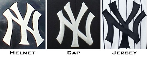
By way of contrast, let’s look at the Twins’ logo:
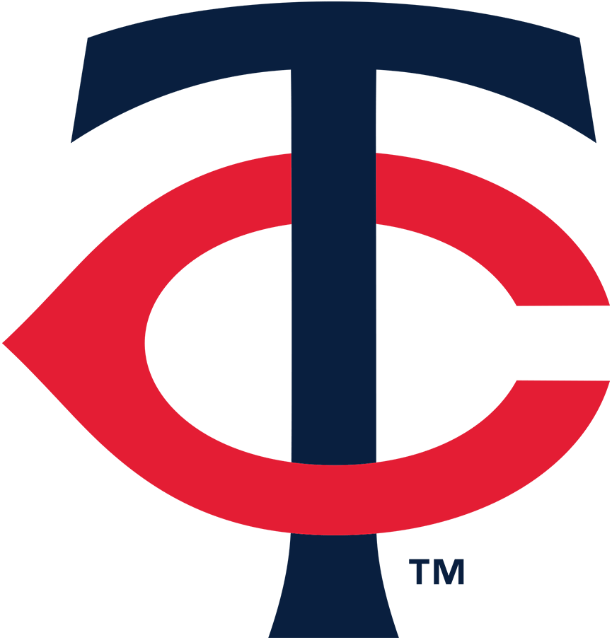
Those two letters can accurately be described as interlocking. The vertical stroke of the “T” passes in front of the top arm of the “C” but behind the back arm. It’s not a particularly complex design, but it’s nonetheless a genuine example of interlocking letters, while the Yankees’ logo is not.
Here’s a simple way to think about it: For a true interlocking design, if you pick up one of the letters — either one — you end up picking up the entire logo. If a logo fails that test, it’s not interlocking.
Let’s look at some other current and historical MLB team logos and see if they qualify as truly interlocking: