


As you’ve probably heard by now, the NFL finally gave in to reality this week and scrapped the Pro Bowl. That’s understandable — ratings were down, player participation had tanked, and the game had been reduced to 7-on-7 flag football — but it’s still a bummer from a Uni Watch perspective, because the Pro Bowl was our most reliable source for entertainingly awful football uniforms. It got to the point where I looked forward to seeing if they could top themselves each year in the “So bad it’s good” sweepstakes. More often than not, they did not disappoint.
But while the NFL may be able to kill off the Pro Bowl, they can never kill our memories. With that in mind, here’s a fond look back at the 10 worst — or at least most comical — designs in Pro Bowl uniform history, going from somewhat amusingly bad to full-on hilariously bad1, beginning with…
10. The Rear View (2009-10)
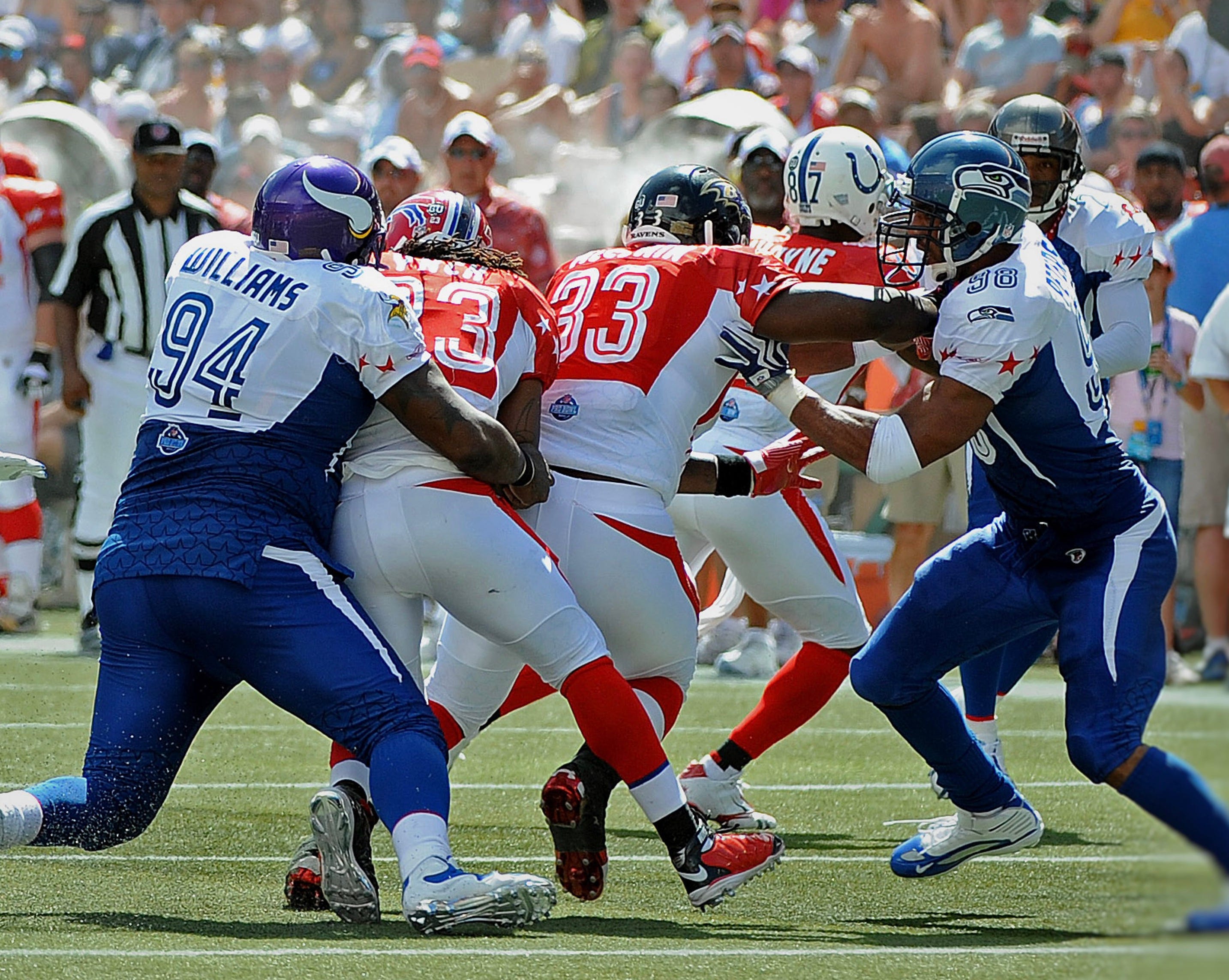
Too be fair, these uniforms weren’t so bad when viewed from the front. But oy, that back view. The weird contrasting fabric panels, the Pro Bowl logo patch under the uni numbers, the spikes wrapping around the players’ butt cheeks — it was all too much. If you squint, you can also see that the jerseys had a sublimated star pattern, although it’s hard to make out. But don’t worry — a bit later on we’ll be seeing some sublimated stars that are much easier to discern!
9. The Fadeaway Gradient (2001-02)
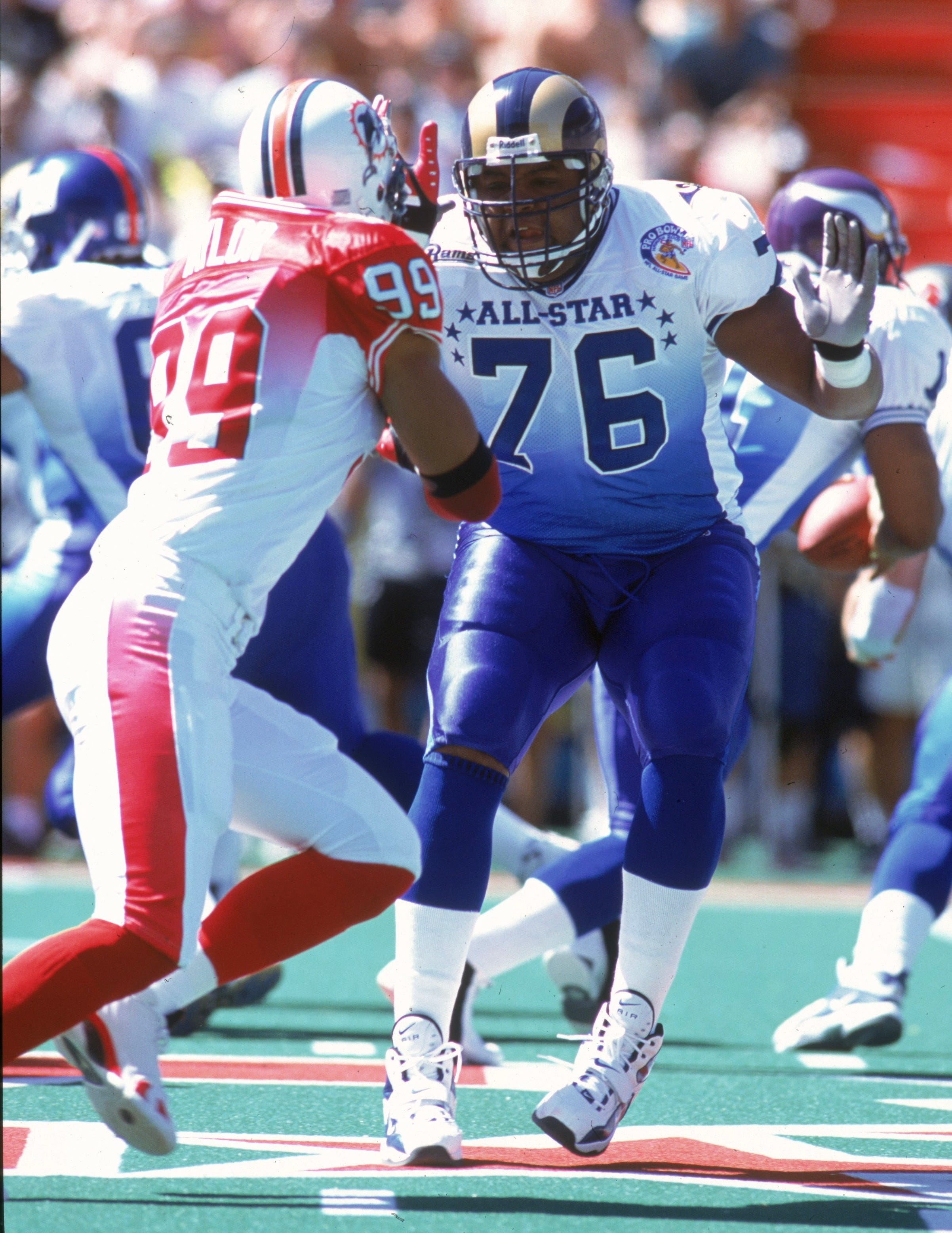
Pretty tame by Pro Bowl standards, but it was still pretty weird to see a gradient design on the gridiron, especially in 2001. The Falcons wouldn’t follow with the NFL’s first non-Pro Bowl gradient uniform until 2020.