
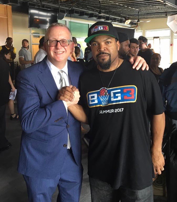
Last Friday I had an ESPN column about how uniform designer Todd Radom collaborated with Ice Cube to create the uniforms for the new BIG3 basketball league. That piece was the product of two interviews that I conducted — a short one with Cube (he’s a busy guy), most of which ended up in the story, and a fairly long one with Todd (that’s him at right; photo by his daughter, Hannah Radom), much of which ended up on the cutting room floor.
It seemed like a waste to lose all the good info Todd had provided, so today I’m going to run a transcript of the interview sections that I didn’t end up quoting in the ESPN piece. I smoothed over a few transitions, but nothing drastic. Here we go:
How did you get involved with BIG3?
I was approached by somebody at the Firm back in, I would say, mid-September. They wanted me to get involved with the league’s primary logo, so that’s where it started — they found me.
How were they steered toward you?
You know, I think they found me on the internet. It was one of those wonderful stories where you google “sports design” and there I am. That’s my understanding.
And how did that balloon into doing all the team logos and uniforms?
As Ice Cube and I moved our way through the primary logo, we just clicked to an extent that it made sense to continue this relationship, so they commissioned me to do the whole deal.
Had the team names already been selected at that time, or did you have a role in that process?
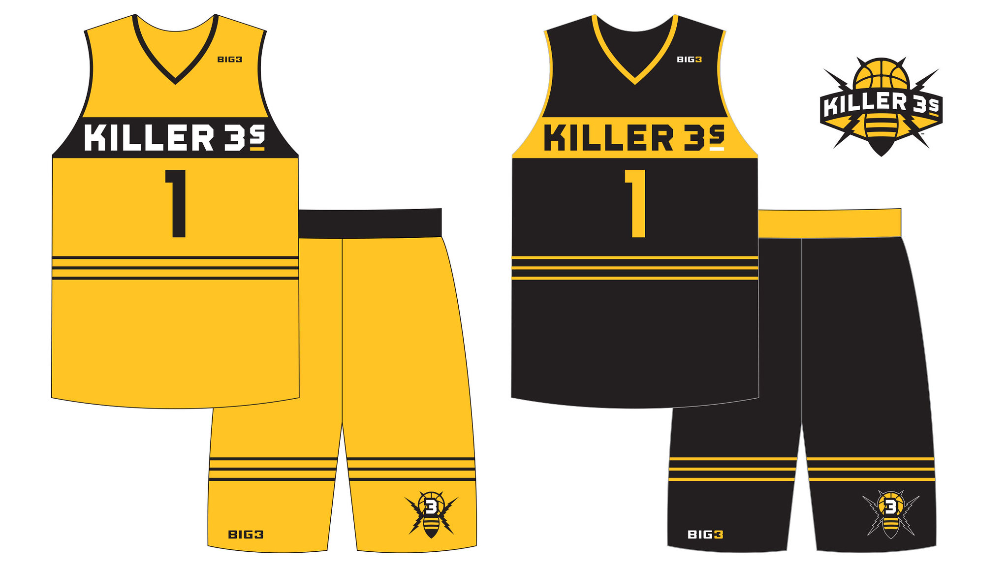
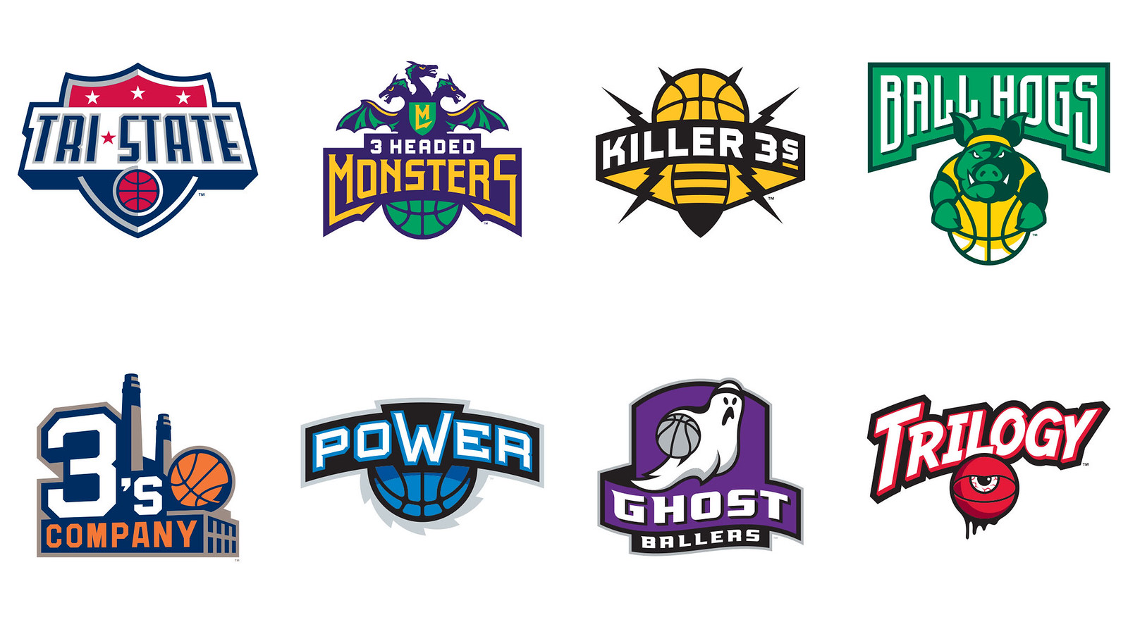
I did not have a role in that. They already had a list of names, and Cube would basically feed them to me: “Alright, let’s start with 3-Headed Monsters,” then “Let’s do the Killer 3s.” And that’s how it went.
One important thing to mention here — and this was made pretty clear to me at the beginning of the process — is that this is a legitimate league. It’s not a vanity project. These are professional athletes here. It needed to look legit, professional, first-class. It had to have some gravitas, some staying power. No gimmicks. That really informed everything that we did.
Killer 3s was one of the first ones we did, and it was pretty apparent what it should look like and what the color scheme would be. So I put together sketches and sent them to Cube, and he would chew on it for sometimes an hour, sometimes a day. And he shared some of these things with some of the players, with the rest of his group, but it was mostly just the two of us doing this and it made for a very tight collaboration. And a big part of that is that everyone understood that we had a very limited amount of time to put this together, so the whole thing had to move at a pretty good pace, and it did.
Did you consult with any of the players?
I did not. I know Cube shared many of the designs with some of the players, because I would get a text from him saying, “I showed this to this guy and he loved it!” Lots of very positive feedback, and you know that’s very empowering.
I’ve always maintained that basketball uniforms present more of a design challenge than other sports, because you don’t have as much space to work with. There’s no headwear, no sleeves, no long pants, and you’re required to have uniform numbers on the front and back, which eats up a lot of your prime real estate. Is it trickier than designing for, say, baseball?
It’s definitely trickier, because everything’s more compressed. And also, when you think about it, this is a half-court league, so everything is going to be compressed even further. I should also say that I designed the court for this league, which was interesting. But anyway, you want some vibrancy and some personality, but on the other hand this is a very crowded space and the uniforms have to sort of conform in some way to that visual culture. So there were definitely some very different dynamics involved.
How did you arrive at some of the design choices you made for the various teams?
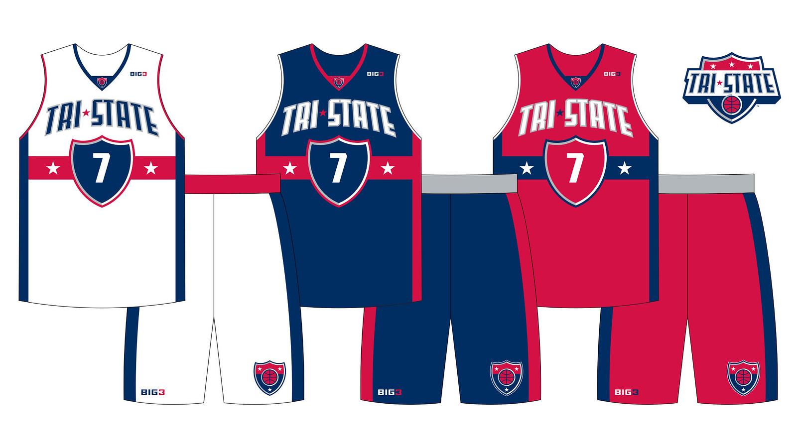
Take a team like Tri-State. What is that? It’s not going to lend itself to easy depiction of imagery. So I thought about Interstate highways and the shield-shaped Interstate signs, and I thought about the old shield logo used by the New Jersey Americans, who later became the Nets. And then, what do you know, Dr. J is named the coach of Tri-State! So sometimes these things work out.
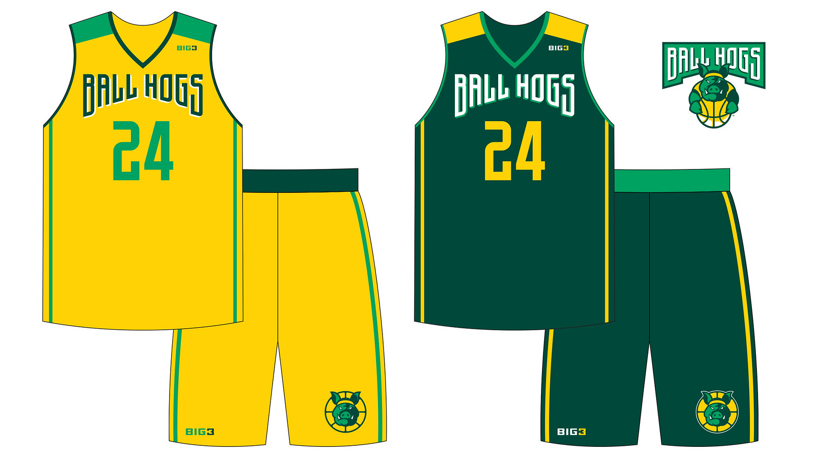
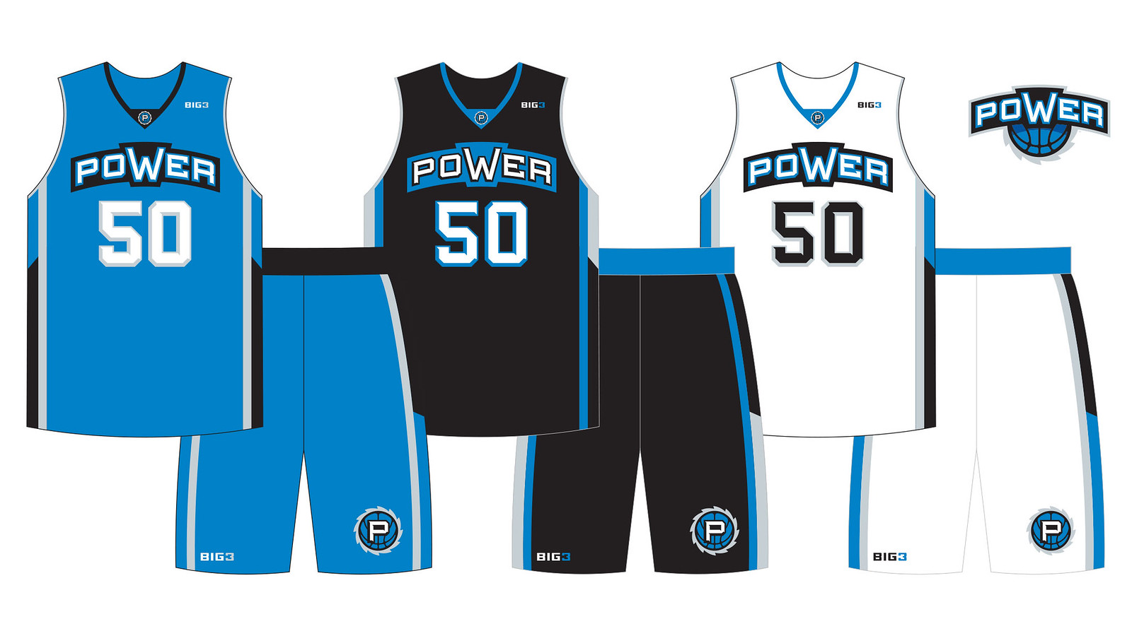
Then there’s a team like Ball Hogs — it pretty much has to be a hog that’s not letting go of a basketball, and he should have a headband. Power is a tough one — it’s a very short word. What do you do with it? So it just had to look powerful.
How long did it take to do the eight team identities?
We started on the team logos in earnest right around the first of the year and they were wrapped up by the end of March. It was a lot of work, I will say, but it was such a good collaboration with Cube. My intent all along was really to have a visual program that was robust, because there needed to be some licensing involved, I was thinking about how is this going to look on TV, and so on. So if you start with a primary logo, then there are secondary logos and there are team wordmarks and lettering. And if you lay down that foundation, then you can pivot to uniforms pretty seamlessly, so it all combines for this large suite of assets that all work together.
Out of the eight teams, five of them don’t have a white uniform, so most of these games will be color vs. color. How did you decide which teams would get a white uniform and which ones wouldn’t?
Cube! He literally has a grid where he’s got this figured out. So, week one in Brooklyn, these will be the matchups — seriously. And you know, there is no instance in this league where you’re going to have black versus black, or anything like that. We thought about this, and I know he thought about it quite a bit. So yeah, every game is going to be contrast-y enough so that no one’s going to get confused.
Why do some of the teams have alternate uniforms or third uniforms, and others don’t?
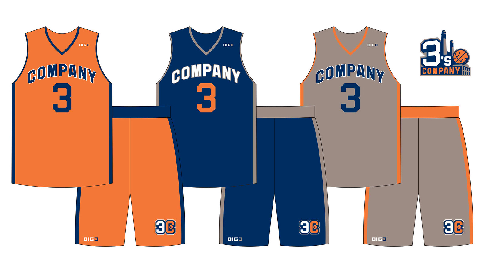
Another Cube thing! Toward the end of the process — just a few weeks ago, in fact — Cube got in touch and asked if we could add a couple of third jerseys for a few teams. Because we did go back and forth with a team like 3’s Company, for example, we knew we wanted one of the uniforms to be gray, but then we kinda vacillated between having navy or orange for the other uniform, so why not have both? So for those teams with the alternate uniforms, that was all driven by Cube. And they all work.
I see that you followed the NBA protocol of including a basketball in each of the team logos. Was that your choice, or were you told to do that?
Totally my choice. And it was really because this is a total start-up. There’s no history to these teams, no memories. Memories will be made and history will be made on the court, but up until then there’s got to be some easy vernacular to kinda circle back to, to make it apparent what these teams are in a pretty overt way. It’s also smart from a trademark perspective: If this is an identity for a basketball team, you can differentiate yourselves in the marketplace — that’s part of what we have to consider throughout, how the mark can be protected. So that was part of it.
The NBA has experimented with sleeves over the past few years. Was there any discussion of using sleeves for BIG3?
Never. It never came up. Like I said before, we want to look legit, and
I didn’t want to get gimmicky at all in any way. And sleeves on a basketball uniform are, let’s face it, a gimmick. We may have seen the last of them now that the NBA season is over. We wanted a clean look where these team identities are allowed to breathe, so fans can become familiar with them.
Who’s manufacturing the uniforms?
OT Sports, down in North Carolina. They do a lot of minor league baseball uniforms, the D-League, stuff like that. They definitely know how to outfit a basketball league. The jersey colors and graphics will be sublimated, with the numbers and player names stitched on in twill. They’re making the shooting shirts, too — I designed those as well, which presented an opportunity to showcase the secondary logos.

Teams throughout the sports world tend to get new uniform makeovers on a pretty fast cycle these days. How long do you think it’ll be before these teams get new designs?
For a new league, you have to get your brand established, get these teams into the public consciousness, so you don’t want to make changes too quickly. Three years — that sounds reasonable. And I think the uniforms we’ve created are pretty versatile. You can swap out colors and retain the core look.
Did you design anything else besides the team logos, uniforms, and shooting shirts?
The uniforms included custom number fonts that I created for each team. I also did the referees’ uniforms, and I designed the court itself, which is actually a half-court.
How collaborative was your work with Ice Cube?
This was a very tight collaboration with him, it really was. The number of emails, texts, and phone calls was probably close 1,000. But it was always informed by this real love for logos and uniforms, seriously. I really think it’s one of the best collaborations of my creative career. Each and every day, despite these very pressing deadlines, it was just joyous, and I’m kind of sad that that the bulk of it is over because it was such a great challenge. It’s been an incredibly fun process.
———
So that’s the interview. BIG3 debuted yesterday here in Brooklyn. I had other plans for the day, so I didn’t attend the games, but Todd was on hand to see his uniforms in action. You can see lots of game photos here. Of particular note: Several players wore nickNOBs. Allen Iverson, for example, had “The Answer”; Jason Williams had “White Chocolate”; and Brian Scalabrine had “W. Mamba” (apparently short for “White Mamba,” a play on Kobe Bryant’s “Black Mamba”).
Click to enlarge

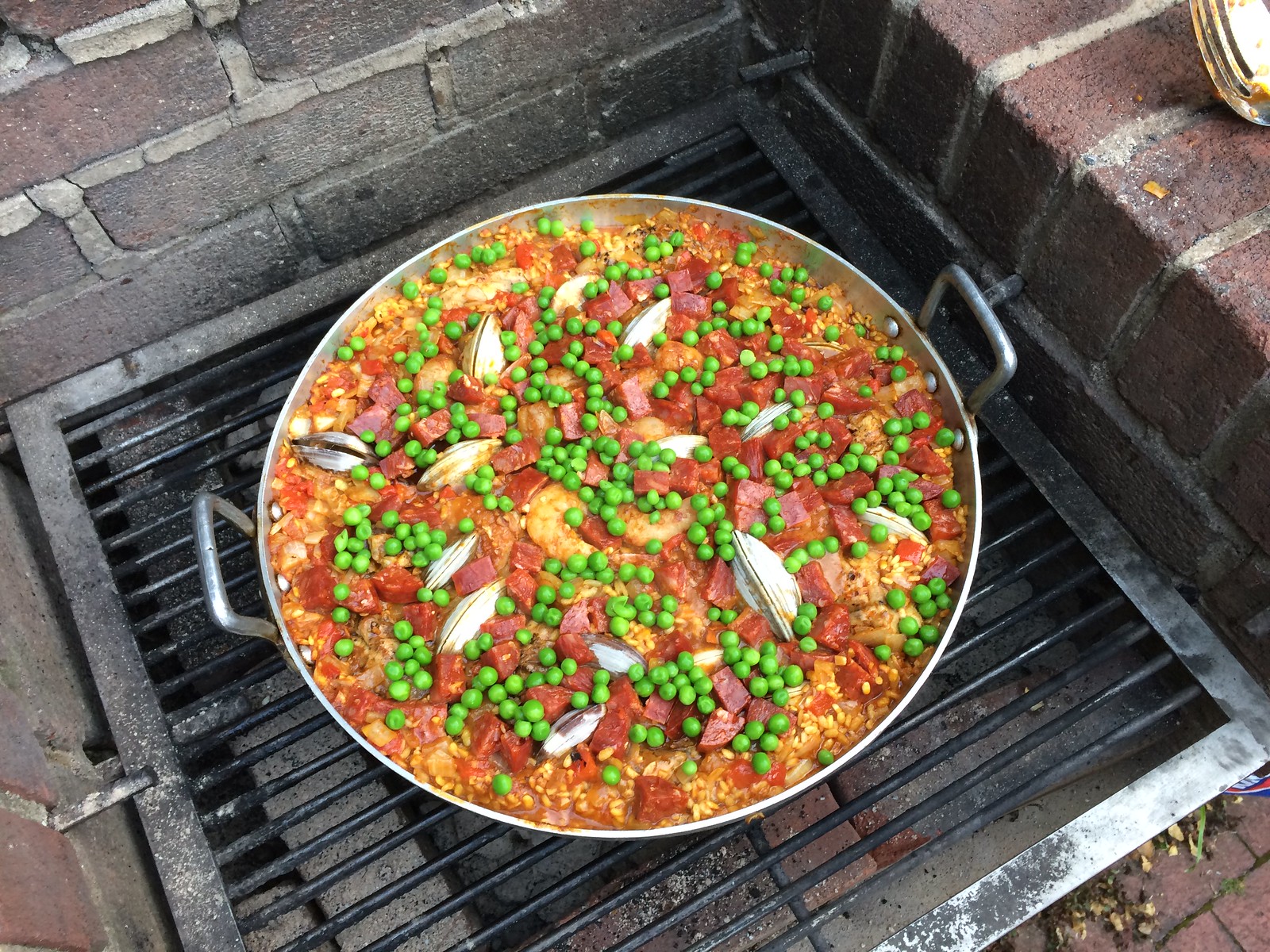
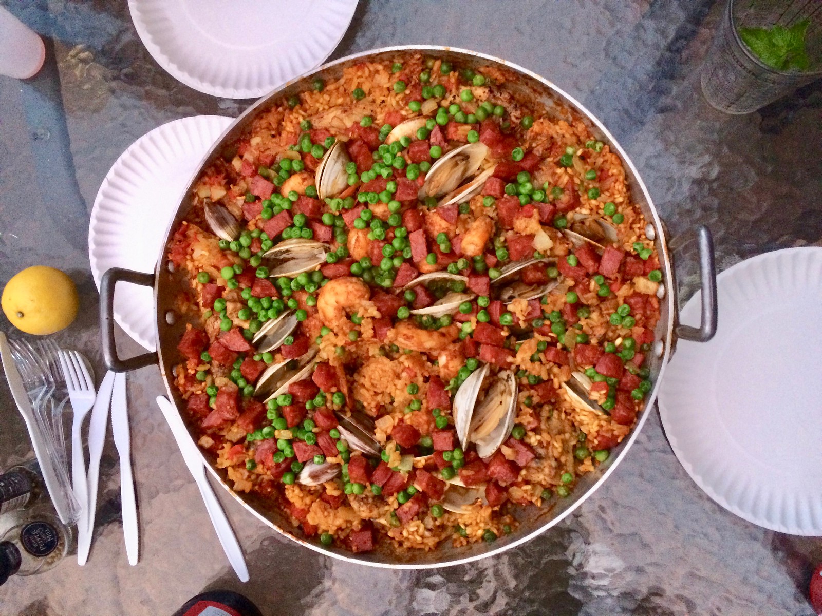
Culinary Corner: A year ago, almost to the day, I had a Culinary Corner installment about how the Tugboat Captain and I made paella on the grill, complete with shrimps, clams, chorizo, and chicken. Two nights ago we did it again. Turned out about the same as last time, which is to say it was really good, but next time I think we’ll skip the chicken, which doesn’t seem to add much to the dish, and replace it with more seafood.
In short: This is still a very worthwhile preparation. You can see a good instructional video by going here and clicking on the “Watch Every Step” link in the lower-right corner of the header photo. Here’s how Saturday’s version turned out:

Click to enlarge
Naming Wrongs reminder: In case you missed it last week, all of the designs shown above have been added to the Naming Wrongs T-shirt project. You can read more about them here, and you can order them in the Naming Wrongs shop. (They’re also cross-listed in the Uni Watch shop, where card-carrying Uni Watch members can get 15% off. If you don’t already have the discount code, get in touch and I’ll hook you up.) I’ve also been updating our Naming Wrongs FAQ page.
Click to enlarge
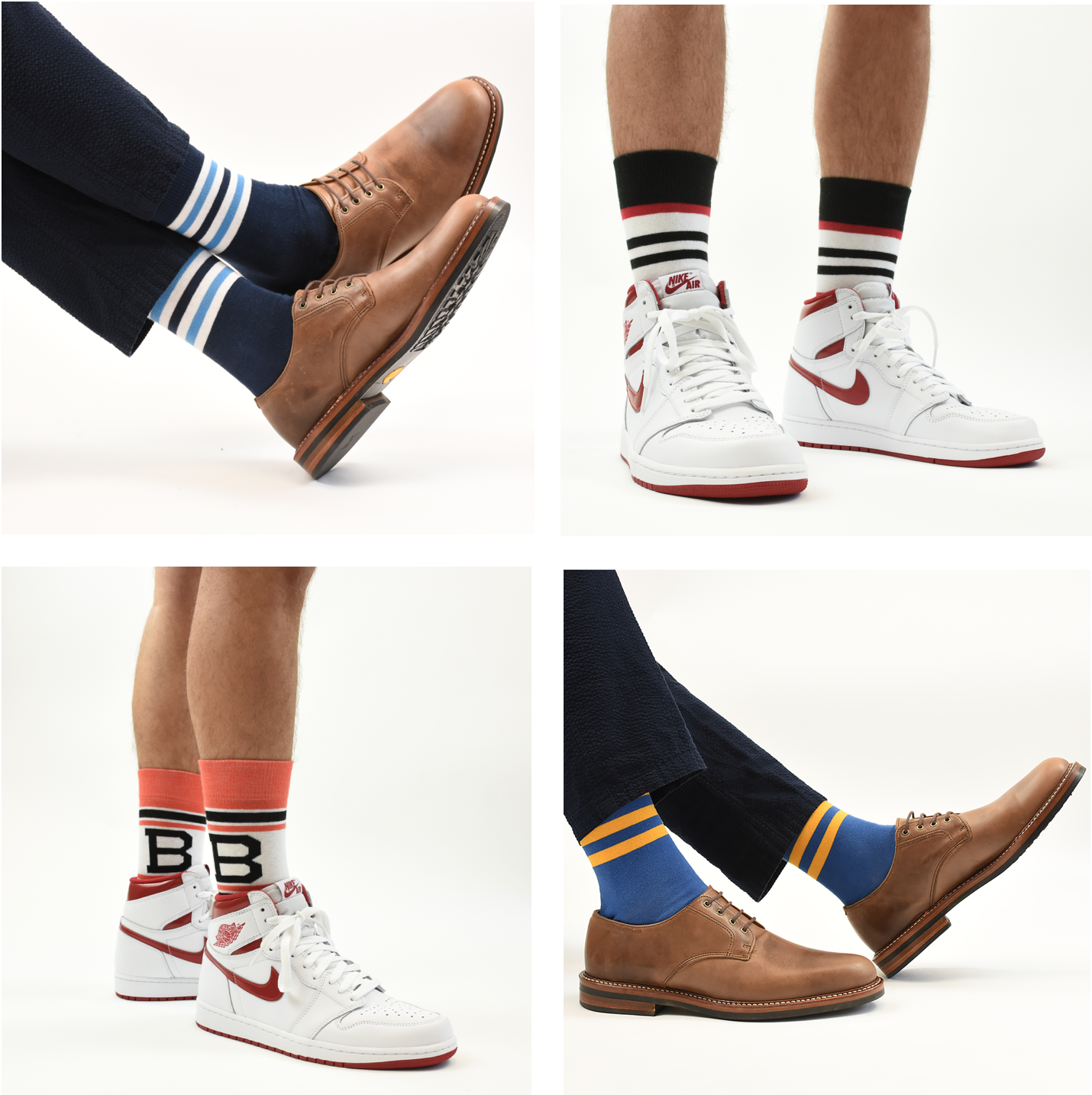
StripeRite reminder: In case you missed it last week, four new StripeRite sock designs are now available for ordering. And as shown in the pics above, they’re plenty versatile.
In addition, most of the designs from the first and second StripeRite sets are still available.
My thanks, as always, for your consideration.
The Ticker
By Alex Hider

Baseball News: Astros’ 2B Jose Altuve appears in this 5-Hour Energy commercial. There are no Astros logos on his jersey or cap — but the New Era logo still appears on Altuve’s cap (from Jimmy Lonetti). … Dodgers’ closer Kenley Jansen doesn’t get to hit much (he’s only had six at bats in his eight-year career), but the team apparently has a batting helmet on hand for him (from Max Wagner). … Looks like some teams are reusing their spring training jerseys for Dominican Summer League practices and games (from Zac Ipson). … Ian spotted a fan wearing a Johnny Manziel Padres jersey at Petco Park the other day. The Padres did draft him in the 28th round of the 2014 MLB draft. … The Kingsport Mets of the Appalachian League wore “Kingsport Spirit” jerseys for yesterday’s game to celebrate the city’s 100th anniversary (from Daniel Patrick Owens). … The Salt Lake Bees will wear Salt Lake Trappers throwbacks on Monday for ’80s Night (from Mike). … The AA Trenton Thunder have used bat dogs instead of bat boys since 2000. On Monday they’ll wear “bat dog” uniforms featuring one of those pups, Derby (from Bobby). … We may have seen this before, but worth sharing again: Casey Stengel wearing a cap with Yankees, Mets and Pirates logos ””and another pic of Stengel wearing a logo-filled jersey (from Greg Niforos). … New uniforms for the Japanese national baseball team. … Pitchers Jorge De La Rose and Rubby De La Rosa are both on the Diamondbacks’ roster, but they use inconsistent NOB typography (from Josh M). … Latest one-day MiLB makeover: The Peoria Chiefs will become the Peoria Distillers on Thursday. … Jerry Kulig was traveling at the Milwaukee airport and spotted a truck with the Brewers’ old ball-in-glove “‘mb” logo.

NFL News: This mirror at a bar in Amherst Junction, Wis., shows the evolution of the Packers’ helmet through the years (from Michael Bialas). … Shane Hartline found this framed print of NFL QBs at a flea market. Note the FNOB and the stock block number font.
College Football News: According to this pennant, the Utah Uthes ”” not Utes ”” were the champions of the 2009 Sugar Bowl (from Daniel Malan). … An Ohio State fan in Sunbury, Ohio, owns a Smart Car and gave it the full Buckeye treatment (from Jason Hillyer).

Hockey News: Strange number placement for Canada during the Inline Hockey World Championship (from Wafflebored). They weren’t the only ones to sport garish jerseys. Check out more photos from the tournament here (from Charles Eldridge). … Kenny Kaplan was watching this video about NHL expansion and spotted some uni-notable moments. At the 16:00 mark, there’s a quick view of the Flyers and Kings playing color vs. color. And at 20:18, there’s a blurry glimpse of the Seals wearing a jersey that isn’t shown in any of the standard uniform databases. Anyone know more?

NBA News: Raptors G DeMar DeRozan talked with Sports Illustrated about why he loves wearing Kobe Bryant signature sneakers (from Brinke). … This is what it would look like if the Nuggets’ rainbow alts had different colorways (from Timbo Slice).

Soccer News: FC Lokomotiv Moscow, a soccer team in Russia, is letting season ticket holders take home their seats as the team prepares to renovate its stadium (from James Gilbert). … Trevor Williams reports that FootyHeadlines.com recently came out with an app for their website. “It is a better experience than their website, as I can apply a filter just for kit news,” he says. “Of course, the app is still full of ads and blurry pictures, as FootyHeadlines’ main goal is to break news first instead of having a clean format.”

Grab Bag: NASCAR driver Danica Patrick wore a camera mounted on the visor of her helmet during a race at Sonoma Raceway yesterday (from David Firestone). … Speaking of David Firestone, he interviewed Funny Car driver Alexis DeJoria about her racing suit over on his blog. … What was the highest car number in NASCAR history? No. 999, worn by Wilbur Rakestraw during the late 1950s (from Graham Clayton).
Saw a story about Tim Tebow’s minor-league promotion this morning with a thumbnail image of Tebow in a Columbia Fireflies batting helmet but a jersey that resembles a 1935 Homestead Grays jersey. Unfortunately, it was a Huff Post story, so the image only appeared as a thumbnail on the main page, with an embedded video on the actual story page. Anyone know what’s up with the Fireflies doing a Grays or Grays-esque throwback?
Columbia and Charleston played a game where both teams wore throwback negro league uniforms.
link.
Thanks!
“it’s one of the best collaboration of my creative career.”
“Seals wearing a jersey” Link gets me a “Page not found.” (I think we’ve seen that design as an early prototype.)
Both fixed.
To paraphrase Penguins announcer Mike Lange, “I’ve seen that Seal before!”
Those Seals jerseys came up last year, in link. They used leftovers from the WHL San Francisco Seals during their first preseason. The North Stars are also wearing their early prototypes in that footage.
Ah, yes. Thanks for the reminder!
The Seals in 1966-67 were known as the California Seals, as the then WHL franchise had relocated from the Cow Palace in Daly City to the new Colosseum Arena (now known as Oracle Arena) in Oakland. The WHL Seals’ owners (who were awarded the NHL franchise, in the first of many many errors to befell the franchise) changed the name because Oakland was not felt by the NHL to be “major league,” even though the AFL’s Raiders literally played within a two minute walk from the arena, as well as to appeal to East Bay fans.
The uniforms in this video are the same style the Seals wore during their tenure in the WHL.
For better photos, see link
“Coliseum;” the Colosseum is in Rome.
Damm autocorrect…
The link for the ESPN article from last week is broken; it has the URL for today’s article in front of it.
Coding error. Should be fixed now.
“… replace it with more seafood.” Always a good plan.
I usually don’t venture beyond red meat and poultry on a grill, but dammit the paella is next. And by next, I mean as soon as I get a paella pan, it’s on.
Paella valenciana(the original) has zero seafood in it. Chicken, rabbit & snails. Protein is a vehicle to transmit other flavors.
If you can’t find bomba rice, Italian arborio can work in a pinch.
Arborio is what we used.
Curious use of the word “KILLER” (with black uni, no less) in one of the B3 team names, in light of the controversy over the Washington BULLETS…
-Jet
What controversy? Abe Pollin changed it after Israeli Prime Minister Yitzhak Rabin was assassinated. Owner made a choice for his team. I don’t remember any groundswell of rage at the arena gates to change the name à la Redskins or Indians.
You’re right, there was no public outcry so controversy was the wrong word to use, but “In November 1995, owner Abe Pollin announced he was changing the team’s nickname because Bullets had acquired violent overtones that had made him increasingly uncomfortable over the years, particularly given the high homicide and crime rate in the early 1990s in Washington, D.C…” I’m merely questioning why “Killers” doesn’t also have “violent overtones.”
-Jet
“Killer” not “Killers”. I realize it is “killer B’s” a takeoff on “killer bees”, but still…
-Jet
Let’s face it though, an awful lot of sports team nicknames feature terms that could be considered “violent”, not to mention the penchant for aggressive, fearsome-looking logos.
Posted this the other day, so it might have been missed, but the top line in the “Just Call It The Ted” red shirt needs to be solid white.
We considered that, but we prefer it the way it is.
Noticed that in the Big 3 illustration of the court design, the athlete attempting the dunk is using his left hand on the court, but on the video board, he’s dunking right handed.
“Strange number placement for Canada during the Inline Hockey World Championship”. Also strange that the IIHF (the International ICE HOCKEY Federation, not the International INLINE HOCKEY Federation) is staging a world championship in a non-ice hockey competition).
“Shrimps” = typo?
Nope — intentional. Always like to include the “s.”
Shrimp are just, you know, shrimp. But shrimps sound more festive, more fun, just more. The “s” sort of carries an implied exclamation point that makes the whole thing sound like a party. At least to me.
Your site, your style! Rock on. I think I’m going to attempt the paella for my upcoming 4th BBQ.
Those Nuggets unis don’t look bad at all.
Really like the white with different shades of blue. No offense to Paul but I would buy that jersey.
Jerry Kulig was traveling at the Milwaukee airport and spotted a truck link.
I wonder if that’s left over from the promotion where AirTran link. They both use the modern/inaccurate glove logo.
I like that you use “here we go” instead of “here goes”. That one always makes me cringe.
“Here goes” seems like something you say when you’re about to try or attempt something.
“Here we go” is more of a “We’re starting now” line.
Even though USA Today described the Big 3 as something for people who loved late 90/2000s basketball, this late 70s/80s fan is looking forward to it (assuming I can see it online). At least the visuals are appealing. Kudos to Todd and Ice on the design!
The Times has an article on 8 reasons why the Big 3 could succeed and 6 reasons why it could fail.
link
One of the six reasons: “It’s hard to root for a logo.” They don’t know us uni watchers very well, do they?
Todd’s comin’ straight outta Compton.
Welcome to Visor Cam, NASCAR. Indycar has been doing this IN RACES since the Indy 500. Here’s an example from the Texas race a couple weeks back.
link
Would be great to have Danica wear this in a real race; then we’d be guaranteed to see what it looks like to wreck a racecar from the driver’s point of view.
Malware report on Uni Watch: Since about June 9, I’ve been having a malware problem on Safari on my iPad, which I’ve been able to trace to uni-watch.com. When I go to uni-watch.com in Safari on my pad, as soon as the page finishes loading, I get involuntarily redirected to an ingmatic.com “gift card giveaway” page, which looks like a scam or a phishing attempt, and the ingmatic.com page overrides browser settings to prevent using the “back” button to get back to uni-watch.com. Renders Uni Watch unusable for me on my iPad, and worse, once infected, Safari starts doing it on most web pages. I’ve found that wiping my Safari’s history and cache in Settings clears the problem, and through experimentation I’ve determined that it’s visiting uni-watch.com that causes the malware to re-infect my pad.
Thanks for the heads-up, Scott. I’ll alert my webmaster.
+1
I seem to get these popups every time I try to do a first click on the webpage after it loads. Happens in Chrome, whatever Microsoft calls its browser these days, and on any Android Browser (tablet or phone).
I’ve gotten this a couple times recently as well.
I’ve been suffering from this since before June.
It’s a “legit” league and not a “vanity project”… and yet they decided on childish names for half the teams?
At least they didn’t put city names on the teams given that the whole league is a road show. In the PBA the teams have city names, e.g. Portland Lumberjacks, Dallas Strikers, even though the whole league operates out of a bowling center in Oregon.
From a few days ago:
If Connecticut had a demonym that wasn’t awkward and terrible, I would definitely use it.
What’s wrong with Connecticutian? It rhymes with “electrocution”, for Christ’s sake. That’s way better than “New Yorker”!
It doesn’t surprise me the Flyers had color-on-color matchups back in the day. Of all teams in the league, they have the most even distribution of white to color. Which is to say, the road uniforms are easy to confuse with the home uniforms.
Color-on-color in hockey usually occurred in a pre-season game, I don’t think there are too many regular-season examples. Since the Flyers were the only team in orange and the league was predominantly blue back then, they would clash with the fewest amount of teams, perhaps only the Redwings would have caused problems.
Incidentally, the first year of the WHA featured 3 teams out of 12 with orange as their primary dark color!
-Jet
The Kings wore yellow as homes back in the day, with purple as away.
Re Big3–there seems to be a subliminal Wu Tang theme going on (Killer 3s, Ghost Ballers, Power), that contributes to the 90s vibe.
Who came up with team names?