So here’s an odd situation: Back in February the Penguins revealed an anniversary logo that they’ll begin wearing next season (shown at right; click to enlarge). When I wrote about that logo at the time, I mentioned the following:
Speaking of the Penguins, reader Zane Heiple notes that their patch shows three Stanley Cups [for the titles they won in 1991, 1992, and 2009], which could cause problems if they win the Cup this year. Do they have a four-Cup version of the logo set aside, just in case?
At the time, the Pens had a record of 27-26, so a run at the Cup seemed unlikely and Zane’s question appeared to be moot. Frankly, I had forgotten all about this until yesterday, when reader Christopher Taylor pointed out that the Pens are now one win away from another Cup and could close it out as soon as tomorrow night.
That raises several questions:
• If Pittsburgh wins the series, will the team revise the logo? I suspect they will, and that they already have a four-Cup version at the ready, just as Zane suggested when he first raised this issue back in February.
• Is there any merchandise or team items (stationery, e.g.) that had already been produced with the three-Cup logo? If so, what will happen to that stuff? Yes, I know, it’ll be sent to Africa along with the “Stanley Cup Champion San Jose Sharks” T-shirts, ha-ha-ha. But no, really, what will happen to those Penguins items with the three-Cup logo? Will they become highly prized collectors’ items?
• Has this type of thing ever happened before, where a logo had to be redesigned because of a team winning another title?
• Wouldn’t it have been easier if the Pens and the other Second Six teams had waited until the off-season to reveal their anniversary marks, instead of trotting them out so early? (Yes, I know, they timed the release to coincide with the anniversary of when their franchises were granted, but it was still really early by anniversary logo standards.)
• Have I completely jinxed the Penguins by writing about this?

Screen shot by David Sperino; click to enlarge
“Come on, Blue ”” with black stripes!”: We’ve all seen MLB umpires wearing long-sleeved windbreakers, long-sleeved pullovers, and long-sleeved blazers. Until now, though, I don’t think I’d ever seen one wearing a long-sleeved polo shirt. That’s Mike Everitt working the plate in last night’s Giants/Bosox game.
Although I hadn’t seen the long-sleeved polo before, some quick photo research reveals that umps have been wearing it here and there throughout the season. Here’s Dale Scott on May 21:
And here are C.B. Bucknor (April 12) and Mike Estabrook (May 19) wearing the black version:
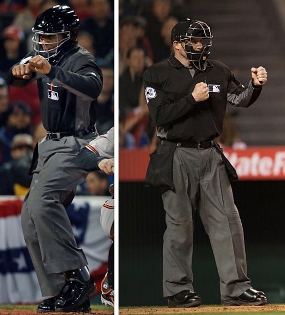
The long sleeves wouldn’t be so bad, of course, if not for their brutal-looking side-turned-sleeve panels.
Remember when the ump was, by definition, the best-dressed guy in the ballpark? In less than 50 years they’ve gone from business suits and neckties to some weird hybrid of casual Friday and athleticwear.
The Ticker
By Paul

Baseball News: Check out this sensational page outlining all the new uniform details for the 1970 Phillies — including the outfits for the usherettes, turnstile clerks, and groundskeepers. Jared Wheeler found that in the Phils’ 1970 yearbook. Tremendous stuff. … Here’s a question I’ve often pondered: Why exactly should baseball players have to wear caps? (From David Arnott.) … Good story about how White Sox closer David Robertson prefers to go high-cuffed. … If you mixed MLB mascot bobbleheads with a Japanese anime sensibility, you might end up with something like these. Additional examples here. … The Johnson City Cardinals will become the Johnson City Wagon Wheels on July 9 (from Marcus Brooks). … Bob Owchinko pitched for the Indians in 1980 and the A’s in 1981 and ’82. But for some reason his 1981 Donruss card lists him as a Pirates player in an Indians uniform (good one from Hugh McBride). … Speaking of baseball cards, check out the amazing jacket worn by Pirates P Grant jackson here. … The Orioles gave away this umbrella last night (from Andrew Cosentino). … The Pirates will be wearing Penguins jerseys while traveling to Colorado tomorrow. … “I apologize for the blurry screengrab, but a Reds promo spot on Fox Sports Ohio showed a player — No. 50 — with his NOB completely blurred out,” says Chad McNeal. “The Reds don’t currently have a No. 50 on the roster, but I assume this is from 2014 and that it’s Neftali Soto. I have no idea why they would blur his name, though — Brayan Peña’s NOB is clearly visible and he’s no longer a Red either.” … Wedding band alert! That’s Angels P David Huff, who was apparently wearing his wedding ring — on his pitching hand! — during last night’s game against the Yankees (good spot by @Arlington10, via Phil). … Good article about the process of renaming the Binghamton Mets for next season.

Pro Football News: The CFL appears to have a quarterback who wears double-zero. … The latest installment of Jim Harbaugh’s Jersey Tourâ„¢ featuring a Julio Jones Falcons jersey. … Wanna see some seriously large NOB lettering? Look here.
College Football News: Tulane has a new helmet with an anthropomorphized wave logo. Naturally, I love it (from Vicious Sid). … New gloves for UNC (from James Gilbert). … Florida is telling fans which colors to wear for the Gators’ first three games (from @DavidDoop).

Hockey News: New primary logo, with other new identity elements to follow shortly, for the Columbus Cottonmouths (from Kevin Mills). … Members of Metallica wore Sharks jerseys while performing the national anthem prior to Monday night’s game. … The latest NHL video game from EA Sports will include ECHL teams. … Buried within this article about the Greenville Swamp Rabbits extending their affiliation agreement with the New York Rangers is the following: “The Swamp Rabbits will continue to celebrate their relationship with New York with third jerseys modeled after the Rangers uniforms. This will mark the fifth straight year the Swamp Rabbits will don the highly popular alternate uniforms.”

NBA News: The NBA has come out with a series of LGBT pride T-shirts featuring rainbow-patterned team logos (thanks, Mike). … For the 2011 slam dunk contest, Blake Griffin wanted to jump over a convertible, but he was told that the car had to be a Kia Optima, because Kia was an official NBA sponsor advertiser. Douchebags (from Martin Hick). … Fun caricatures of NBA players and their signature sneakers (from Andrew Rader). … Steph Curry chews on his mouthguard on 85% of this free throws (Mike again).

Soccer News: Here 10 soccer kits to look out for (thanks, Phil). …mV-Varen Nagasaki of the J-2 League has an alternate kit to mark the anniversary of the atomic bomb attack on Nagasaki. … Adidas misspelled Colombia as “Columbia” in an ad campaign (from @bryant_rf). … Cambridge United is looking for a new person to wear a mascot costume (from The Boot Room). … An ESPN art director discussed what the network has planned for Euro 2016 (from Nate Morrow). … New away kit for West Ham United (Yellow Away Kit). … New away kit for Bayern Munich.

Grab Bag: Here’s a debate on the current state of office attire and dress codes. … Here are Ireland’s Olympics outfits (from Colm Heaney). … The United States Navy is developing an Iron Man-style augmented-reality diver’s helmet. … “Indy 500 Champion, Alexander Rossi looks to have lost his sponsorship from NAPA auto parts and is back in a solid black car without a primary sponsor — again,” says Tim Dunn. … New police uniforms for Princess Anne, Maryland. … New rugby jersey for Ireland (from James G). … The political cartoon shows what Democratic presidential candidates Bernie Sanders and Hillary Clinton might look like in basketball uniforms. … Oregon’s latest over-the-top uniform is for the track and field team. New shoes, too (from Steve Wagner and Patrick Gallagher, respectively). … A new law in New Hampshire allows graduating high school seniors to wear military uniforms at their graduation ceremonies, instead of the standard cap/gown, if they have completed basic training. … New logo for the city Meridian, Mississippi. … Big controversy in the curling world over a new generation of technologically advanced brooms.
Proofreading: “Pirates P Grant jackson” (The jacket is just the Pirates’ late ’70s design.)
As far as the Penguins’ anniversary logo goes, I haven’t noticed any available merchandise.
“Will they become highly prized collectors’ items?” How prized do any of these phantom items become?
“Have I completely jinxed the Penguins by writing about this?” We’ll know who to blame.
As far as the Penguins’ anniversary logo goes, I haven’t noticed any available merchandise.
Right, because the current season hasn’t ended yet. What I meant was whether any merch with the three-Cup logo had already been produced, even if it hasn’t shown up yet on shelves/websites/etc.
Paul, don’t think that Streatham Rovers (the eviction company shirt sponsor) is real, buddy….
Right you are. Now deleted.
College football:
Was that first item supposed to be about the new UNC football gloves with argyle pattern?
link
Fixed. Try it now.
I don’t think hockey plays again until tomorrow.
Crap — that’s what I meant to write. The whole today/tomorrow/next day thing sometimes gets mixed up when I’m writing things ahead of time!
To be perfectly honest, I would not have known myself if I hadn’t checked the schedule just before reading the column this morning because I couldn’t remember.
Looks like Bob Owchinko was traded to the Pirates after the 1980 season and then traded to Oakland by Pittsburgh at the end of spring training in 1981.
link
Copy/Pasted for the lazy (emphasis mine):
December 9, 1980: Traded by the Cleveland Indians with Gary Alexander, Victor Cruz and Rafael Vasquez to the Pittsburgh Pirates for Bert Blyleven and Manny Sanguillen.
April 6, 1981: Traded by the Pittsburgh Pirates to the Oakland Athletics for a player to be named later and cash. The Oakland Athletics sent Ernie Camacho (April 10, 1981) to the Pittsburgh Pirates to complete the trade.
For reference, opening day was April 9, 1981 for the Pirates, so he was traded before their first game.
Ah, that explains things a bit – thanks for the update!
The Owchinko card anomaly happened with some regularity back in the day. It was always a result of a trade that happened after the pictures were taken but before the card went to press. The other interesting element of cards in the ’50’s and mostly in the ’60’s were the ones that showed players without a hat. This usually befell marginal players since there was no guarantee as to where they’d be playing in the upcoming season.
Game 5 of the Stanley Cup Finals is tomorrow the 9th.
Proofreading, third item grab bag
Devleoping
Fixed.
I expect they have the 3-cup merch made and boxed with two shipping stickers ready to go:
SHIP TO PITTSBURGH
SHIP TO HAITI
I also expect they have 4-cup merch being made as we speak with two shipping stickers:
SHIP TO PITTSBURGH
SHIP TO HAITI
Yeah, you probably have jinxed the Pens now, Paul. Good one. >:O
In all seriousness, I was thinking the same thing when the logo was announced. Then I figured that they probably did have a 4-cup version locked and loaded just in case.
The Twitter link about the Pirates in Pens jerseys isn’t working. Seems to be the reference portion of the URL; by removing the ? and everything past it, it works normally:
link
Fixed.
RE: Slobbification of Baseball – now that they’re wearing those polos, what would the umps wear on Casual Fridays?
It’s reached the point of slobbification no return. Seriously, at this point, I’d rather see them dress down a bit. Dress slacks look like shit with anything other than a jacket and tie, in my opinion.
Tulane’s alternate helmet looks almost identical to my High School’s logo. link
Pretty sure Tulane has had that logo floating around for many years (just not on their helmets). So I think your high school likely poached it from Tulane, not the other way around.
Yeah, the Tulane logo is an old one. I remember seeing it on local Baton Rouge TV sportscasts as a kid in the ’70s.
link
link
Alexander Rossi’s NAPA sponsorship was originally a deal only for the Indy 500. When he won the 500 NAPA extended it for the dual races in Detroit.
Seems to me Andretti/Herta/Curb/Agajanian should have no problem getting sponsorship for the young, American Indy 500 champion…right?
Is Pittsburg the only city where all their major sports franchises wear the same colors? St Louis used to have both baseball and football teams with same name and colors (football Cardinals used to have navy as a secondary color, but now it’s black), but the Blues obviously have different colors.
The Big Red did not have navy. The striping was red and black. The black on the unis matched the black outlining on the helmet logo.
Here’s HOF’er Dan Dierdorf:
link
I believe you are right. I was mistaken since the Cards had blue stripes for a long time while in Arizona. One reference was until around 2004. Don’t know if they started in Arizona with this, but they had it for a long time. Might have only been on the white jerseys. The blue was actually more royal. Never made sense to me, and was glad when they changed to black.
Just read that the blue was added in 1996 when they changed their name from Phoenix to Arizona, and added the state flag to the sleeve. The blue was to match the state flag, and they had this until 2004 when they changed to new uniforms with black.
Another reason for the Washington Professional Football Franchise to make a name change — if they pick a name like the Americans, they could change colors to red white and blue
That would put them in step with the city’s baseball, basketball, and hockey franchise colors
As it is, we have the same number of same-color teams as Pittsburgh has, but that football team is an outlier
That would put them in step with the city’s baseball, basketball, and hockey franchise colors
And with Budweiser, now known as America!
America, owned by a Belgian-Brazilian conglomerate.
No no no no no! Whatever their name is or may be in the future, the burgundy and gold has to stay. It’s such a great look.
link
The striped socks really put it over the top.
It is not all the teams, but New York has a healthy dose of blue and orange:
Mets
Knicks
Islanders
Seattle has a good dose of blue and green:
Seahawks
Mariners
Sounders
Thunderbirds
The umpires have been wearing long-sleeved polos for a few years now, usually confined to the home plate umpire (if it’s a cool day, and he doesn’t want to wear the blazer).
Interesting! I totally missed that (maybe because they only added the contrast-colored panels this year, which really highlights the sleeves’ presence).
Balloon Chest Protectors anyone?
Ah, the old days…
2 things
1) love the Phillies 1970 new uniforms picture, interesting to see they were thinking of the front numbers being low, glad they didnt go with that and with it at the same height of the logi.
2) why can’t you just say nba advertiser? Why have sponser crossed out? Its not clever, I get corporate greed outrages you, but that just seems childish, then again I never liked you doing the cross out word and putting what you prefer, if you prefer nba advertisers, just say it like that, you don’t do it when you do colorrash for colorrush.
Then again if it was my blog I would just call nba advertisers, whores, so what do I know.
I believe it is the NBA that is the whore in this construction. The advertisers are the johns.
True, very good point!
Perhaps the advertisers are pimps and the fans are johns. After all, they’re the ones who always end up paying.
NBA is always the pimp.
Advertisers are the Johns since their buying a space on the NBA’s jerseys.
The retailers are the whores since they get a little piece of the sales but have to give most of their money back to the NBA.
*they’re not their
Here’s the explanation for the Bob Owchinko card:
December 9, 1980: Traded by the Cleveland Indians with Gary Alexander, Victor Cruz and Rafael Vasquez to the Pittsburgh Pirates for Bert Blyleven and Manny Sanguillen.
Since the trade happened in the 1980 offseason, no pictures were taken of him in a Pirates uni, so Donruss just changed the team name to reflect the trade. Before he could suit up and play for the Pirates, this happened:
April 6, 1981: Traded by the Pittsburgh Pirates to the Oakland Athletics for a player to be named later and cash. The Oakland Athletics sent Ernie Camacho (April 10, 1981) to the Pittsburgh Pirates to complete the trade.
Oddly enough, he did eventually play for the Pirates in 1983.
Thanks!
Just looked at the CFL master roster — link — there are no players listed at all wearing either 0 or 00. There are a number of players listed without uniform numbers though.
Looking at the individual team web sites, Edmonton has a defensive back listed wearing 02, Calgary and Hamilton each has a DB wearing 0, Saskatchewan has a DL wearing 0, and Loserpeg and Montreal each has a WR wearing 0. No current 00s to be found in the entire league.
As someone who has worked a bit in Canadian sports this seemed interesting to me so I poked around a bit to confirm a suspicion about what this might be.
The 00 in the picture is Lukas McConnell. He isn’t a CFL QB, but rather the starting QB for the University of Waterloo Warriors. He was in camp with the Hamilton Tiger Cats as part of the CFL-CIS Development Program (CIS is the Canadian equivalent of the NCAA). It’s a program that brings Canadian University quarterbacks into CFL training camps to learn and improve.
As for why 00, that I don’t have any reasoning for, he wears 7 for his university team.
For a short time last season, Montreal had a running back wearing 0 AND a quarterback wearing 00.
0 and 00 are both still legal to wear in the CFL, though one usually sees 0 on defensive backs. J.T. O’Sullivan wore 0 the year he was with Saskatchewan as a third-string QB (remember when he was briefly a starter in the NFL?).
The other numbering quirk in the CFL is that offensive linemen only have numbers 50-69 to use as numbers in the 70s are available to eligible receivers (and it was once much more common to see receivers wearing 70s than 80s).
Football Canada actually amended that numbering rule a few years ago. 50-79 are now ineligible with 49-49 becoming eligible in line with the US numbering system.
40-49* … Sorry meant to include that 40-69 was the old rule for ineligible numbers.
Oh, sure, I know they’re legal, there just aren’t any 00s listed on the official rosters at the moment and just the 0s and 02 I found.
By rule, baseball players don’t have to wear caps. The rules only say that “All players…shall wear uniforms identical in color, trim, and style.” I would interpret that as meaning that if one player wears a cap, they all must, but there’s nothing specific about it. NCAA rules are similar.
NCAA women’s softball specifies that a cap is an “accessory” (i.e. not part of the uniform) and says that visors and caps may be mixed but all must be the same predominant color. Since it’s not part of the uniform I would presume that wearing one is optional, but I don’t know for certain.
My playing days are long over, but even for everyday life I personally like caps for sun-shading and even, when I’m at a game, floodlight-shading. So I assume players do too.
Quick check on ebay shows you can buy the Penguins Anniversary patch (as a sticker) along with a Stanley Cup Final patch.
link
Is anything on ebay legitimate anymore? Those could well be bootleg items. There’s no kind of trademark statement for the sticker like there is on the card for the patch.
Thanks for the shout out, Paul. Certainly not a problem I mind the Penguins facing. Reddit user thenixhex311 created a quick fix logo that’s a simple solution here: link
Weird – at first glance on that one, the black negative spaces stood out to me more than the gray Cup spaces. I was wondering why there were upside-down beehives.
Perhaps this has been covered in the past, but are umps required to wear pleated pants? They’re not wearing pleats in 2016 by choice, right?
I dunno. If I’m gonna squat 300+ times in an evening, I think I’d opt for pleats.
In soccer, teams usually reflect their championships with stars above or around their crest. This poses problems when teams win championships, as their next season’s jersey has usually already been produced.
Example:
Monterrey’s title in 2010 caused the 4th star to be placed on top od the 3 current stars.
link
Afterwards, the stars were realigned:
link
It also creates the conflict that the official badge does not match the one worn on the jersey.
Paul’s picky pigmentation policy provokes passionate, purple partisan people… but I’m not one of them.
The bit about MLB having to wear caps made me think of cricket. I’m no expert on cricket, but have watched a bit. Obviously the batsmen and the wicket keeper are going to wear protective gear. After them, there’s baseball caps, traditional floppy cricket hats, large brimmed hats and no hat at all. Bowlers will sometimes take their hats off to bowl. Basically, there’s no uniformity in headgear.
Changing a logo because of a subsequent championship? I can think of a couple of examples, but neither quite like what the Penguins might have. Alabama football changes the number on its helmet to match the number of championships it has won. Also, Brazil soccer has its World Cup stars in the badge. But I understand the difference. Pittsburgh might have to change a special patch so that it’s not out of date upon arrival, whereas the other two aren’t cases of an advance release of a new logo–those are spots where a new logo will change if and when another championship is won.
Last couple days, the pop-behind ads have been loud videos. Rather startling and not very much liked. Any way to regulate that?
Seems like it would be against the rules to wear a wedding band on the pitching hand. Makes scuffing the ball too easy.
It’s even against the rules to wear it on the glove hand. But a handful of pitchers do it anyway.
I like that the article on the Wagon Wheel jerseys repeats the songs geographical error in attempting to correct it.
“But he’s a-heading west from the Cumberland gap
To Johnson City, Tennessee
Those lyrics have become ingrained in the culture in Johnson City, in part because of the geographic impossibility of doing so. To get to Johnson City from the Cumberland Gap, a person would have to travel west, not east.”
You travel east from Cumberland Gap to Johnson City.
With all the teams getting into Turn Back the Clock games with retro unis why can’t the umpires join in the fun? Imagine seeing umpires call a game in the red jackets and ties from the 1970’s or something from the 1930’s or 1940’s.
I’ve been advocating for this for many years. Would be soooooo much better if the umps threw back as well.
I think part of the problem is that (a) the home team is responsible for all the throwback attire, and teams may not feel like spending the extra $$$ that would be required, and, especially, (b) umpiring crews for a given series are not assigned very far in advance, so there’d be no way to know who’d be working the game and which sizes of attire to order for them.
I don’t want to see the old balloon style chest protectors return.
I do. Umpiring youth games with them in the 70s was a blast.
Caps – believe it or not – ARE safety equipment. The front brim WILL deflect a ball – it happened at the LLWS once not long ago. We remind fielders and pitchers all the time to turn the caps around.
Today’s headline was obviously written by Peter Percival’s Pet Pig Porky (who loves pie)
Nice Monkees reference!
I dont think the logo thing is a big deal, My friend is a pens fan and said that its embarrassing, but, honestly, Its so hard to win a cup, I see why the was presumption, Theyve had the #1 player this whole time and havent touched it in almost 10 years
2009 wasn’t ten years ago, and I don’t know what is embarrassing about having to change a logo. Three Cups is already an impressive total, and the fourth would equal the output of the New York Rangers, a franchise which had a roughly 40 year head start.
The Red Wings have the same potential issue, with their Final Season at the Joe patch having four stars for four Cups. Though I suppose they can’t win a fifth now before the end of next season, though they had a chance to when they made the logo.
The Italian National Football Team has to change their new logo shortly /after/ it debuted in 2006, after they won the World Cup, because the championship stars were incorporated into the badge itself (rather than placed above, which is most common).
Furthermore, each of the three stars was placed in a band of the tricolour, so there was some publicity at the time about having to revise the logo straight away as it was so clearly designed for three. Many wanted the return to the classic badge with stars placed above, but it was revised to add another star in the white band.
Here’s the 3-star version from 2006: link
And current:
link