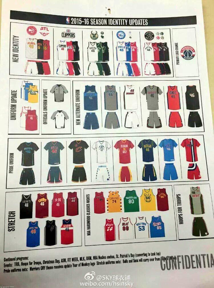
Click to enlarge
Major NBA development late last night, as a someone on Reddit posted what appears to be a sheet outlining all of the NBA uniform changes for next season (see above). It includes a lot of things we already knew but a whole lot more that we hadn’t yet seen. It quickly spread via all the usual channels.
Before we get into the details, let me get some quick disclaimers out of the way: I do not know who posted the sheet on Reddit and have not yet independently confirmed that the sheet is legitimate, so everything in it should be treated as provisional for now. It’s worth noting, however, that the sheet includes accurate depictions of a bunch of previously released designs. That makes me inclined to believe that the unreleased designs on the sheet are probably accurate as well. Also, the format and design of the sheet itself, including the “Confidential” stamp on the bottom, are all consistent with internal NBA documents of this sort, which further leads me to believe that it’s probably legit. Not definitely, but probably.
The big problem, obviously, is that the image is low-res and out of focus. I’m no wiz when it comes to Photoshop, but I’ve done my best to enlarge and brighten the mock-ups of the new designs.
The sheet is formatted into four horizontal rows. Let’s go one row at a time, working from left to right within each one, shall we?
Row 1
• First up is the new Hawks identity. Nothing new there.
• Next is the new Clippers identity, which includes a glimpse of the black alternate uniform, which hasn’t yet been officially released:
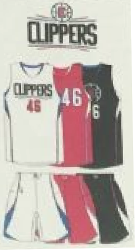
This appears to confirm the earlier leak of this design.
• Next comes the new Bucks identity, which includes a glimpse of the black alternate uniform:

As you can see, it appears to show a buck’s head with the uniform number positioned between the top of the antlers.
• Next comes the new Sixers set, which came out last month. Nothing new there.
• Then we have the long-awaited Raptors set:
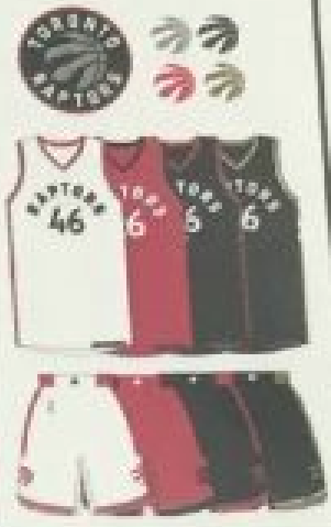
No purple, thankfully. Of the two alternates, one is presumably the rumored “Drake alternate.”
• At the end of the row is the updated Wizards primary logo, which we already knew about.
Row 2
• First come the tweaks to the Nuggets’ uniforms (shown at last month’s NBA draft) and tighter tailoring on the Rockets’ jerseys (already leaked a while ago). Nothing new there.
• Next up is a surprise — new jerseys for the referees:
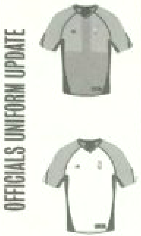
Why the white jersey? Presumably because we’re seeing more grey-vs.-grey games, and they want the officials to stand out more from the players. We had already seen a few games in which the refs tried to solve this problem by wearing the older jerseys with the dark sleeves, but now they appear to be trying a different solution.
• Next is a series of alternate uniforms (click to enlarge):
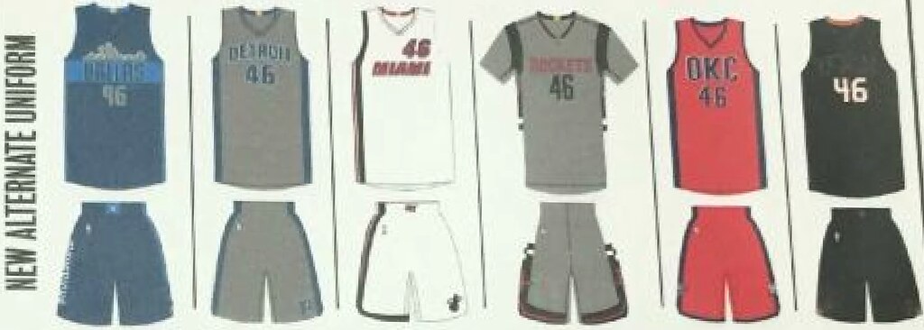
From left to right: The first design is the Mavericks’ fan-designed alternate, which we already knew about. Then comes a GFGS Pistons design with blue lettering; a new Heat design; Rockets GFGS with sleeves (boy does that one look dreadful); Thunder “OKC”; and, uh, what is that last one? I’m not sure. I’ve played around with the image a bit and think the chest lettering says “Utah,” but other people are saying this is a Suns design.
Row 3
This row shows eight new “pride” uniforms, all with sleeved jerseys. Here are the first four of them (click to enlarge):
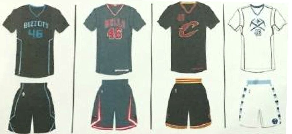
First is Charlotte’s “Buzz City” design, which was released last month. Then we have what looks like a GFGS Bulls design; a Cavs design that looks a bit like the 2014 Xmas jerseys, except they put the uni number on the upper chest instead of on the sleeve; and a Nuggets design that actually looks like fun.
Here are the next four (click to enlarge):
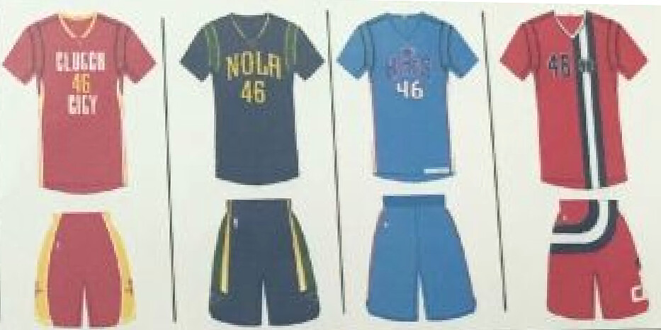
We begin with a “Clutch City” design for the Rockets; then a NOLA design for the Pelicans; then an absolutely brutal purple-on-blue uni for the Kings; and, in the most confounding development of the entire sheet, a Wizards design that hearkens back to the franchise’s old Baltimore Bullets days. Why would you ever create a sleeved version of that uniform? Bizarre.
Row 3
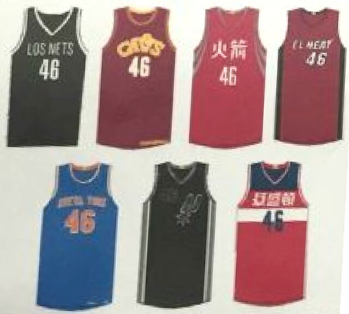
• First are the “Stretch” jerseys. We’ve seen this term before in an earlier leak, and it wasn’t clear what it meant. Judging by these designs, however, it appears to refer to foreign-language or cross-cultural designs (although someone in the comments just said it refers to an alternate jersey worn with the team’s existing road shorts — hmmmm):
• Next we have this season’s throwback designs, including the Pacers’ just-released Hoosiers-inspired uni. Odd to see that listed as a throwback, because Pacers exec Todd Taylor repeatedly referred to it as a Pride uniform when I interviewed him the other day, but whatever. In any case, all of these except the Pacers design had already surfaced a while back in an earlier Adidas catalog leak, so nothing new there.
• Finally, we knew from an earlier leak that the Heat would have some sort of military tribute uniform, but we didn’t know what it would look like — until now:
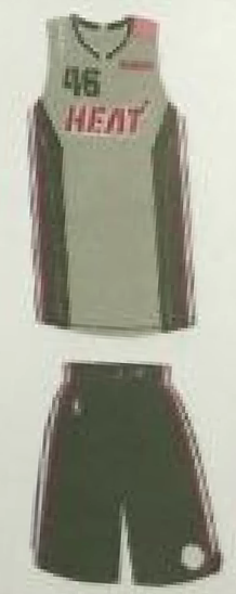
I’ll just say, “At least it isn’t camouflage” and leave it at that.
The final item of note is this text running along the bottom of the sheet (click to enlarge):

No more sleeves on St. Paddy’s Day, whoop-whoop!
Did I miss or misinterpret anything? Quite possibly. I didn’t become aware of the sheet’s existence until about midnight, when I was about to go to bed, and then I stayed up until about 2:30am writing this entry, so I was (and am) a bit punchy. Feel free to fill in any gaps that I might have left.
(Big thanks to Mike Chamernik, who was the first to let me know of the sheet’s existence.)
Membership update One card — just one! — has been added to the membership card gallery (that’s Jonathan Flaugher’s shown at right, which is based on Ohio University’s “Battle of the Bricks” jersey). Why only one? Because membership sign-ups have slowed to a crawl lately.
If you want to help jump-start things, you can order your own custom-designed membership card here, you can see all the cards we’ve designed so far here, and you can see how we make the cards here.

Baseball News: “On July 31, the Cards are giving away a Lou Brock bobblehead that commemorates the Brock-for-Broglio trade,” says Jim Santel. “The figurine depicts Brock trading in his Cubs pinstripes for the birds on the bat, and his Cubs hat rests by his feet. I wonder if a bobblehead has ever featured two teams’ unis at once?” ”¦ If you buy an overpriced polyester shirt featuring the name/number of a player who gets traded at the deadline, Majestic will give you a 50% discount on the next overpriced polyester shirt you buy. Wow, what a deal! This is the part where I remind you that a much better solution would be to avoid buying overpriced polyester shirts to begin with. ”¦ Steve Salayda was watching Game Four of the 1993 World Series and heard broadcasters Tim McCarver and Sean McDonough discussing high- vs. low-cuffed pants styles. ”¦ Egg-themed jerseys last night for the Toledo Mud Hens. ”¦ Star Wars jerseys on Saturday — such an original idea! — for the West Virginia Black Bears (from Jason Moore). ”¦ Three Astros players wore stirrups last night. ”¦ Yesterday was a “Wayback Wednesday” for the Padres, which means they wore their 1980s throwbacks. In addition, they went with retro-style game notes and scoreboard graphics.

NFL News: A sailboat that won a recent race in Michigan had the Lions’ logo on the side of the hull, plus the crew wore Lions T-shirts (from Mike). ”¦ “The other day there was an ad on the side of my Facebook page for Dolphins merch,” says Tyler Cochran. “It had the throwback ’66 logo (which I love), so I clicked on it. It took me to a page of the throwback merch from Nike, all labeled ‘Miami Dolphins Alt.’ They had all the usual stuff (jacket, personal logos for NFL stars (from Jamie Burditt).

College Football News: Miami now has a “hype video” for its new uniforms (thanks, Phil). ”¦ Also from Phil: Texas will not have alternate unis this year. ”¦ The Citadel will wear a memorial decal for the Charleston massacre victims this season (from Harrison Wallace). ”¦ Some Big 12 players talked about alternate uniforms. ”¦ With Penn State reverting to NNOB this season, a player had the team’s longtime equipment manager personally remove the nameplate from his jersey (from Mike McLaughlin). ”¦ Countless layers of paint recently slid off of Tennessee’s Painted Rock, leaving the rock as a largely blank slate. According to this story, at least one Vol sees a uni-related subtext: “‘It’s a God-given way to say we are starting over,’ [UT Freshman Jonathan] Mays said. ‘We are about to do something big. We switched from Adidas to Nike and everyone is excited about that and now we literally have a new slate to start off on for The Rock'” (from Patrick Lasseter).

NBA News: The Hawks are partnering with the Fulton County parks department to install a new basketball court surface at a local park. ”¦ With all the chatter about the Clippers new uniforms, I think this might be our first look at the rear view (from Sandy Dover). ”¦ Yesterday’s entry about the Pacers and their Hoosiers-inspired alternate uniforms prompted Kary Klismet to note that Milan, Indiana — the town whose high school formed the basis for the film — has a museum devoted to the school’s 1954 state title team, including a large collection of uniforms worn in the movie. ”¦ This is pretty funny: A local TV newscast began a report by using the wrong 76ers logo and then used the correct one just a few seconds later (good spot by Michael Paolucci). ”¦ Jazz beat writer Andy Larsen says the team has logo changes in the works. Additional info here, here, and here (thanks, Mike).

College Hoops News: Kudos to Conrad Burry, who gained access to an Adidas catalog and found a bunch of retro-styled alternates, with a heavy emphasis on cream tones — look here, here, here, and here. Not sure if those are throwbacks or fauxbacks, but a lot of them look pretty good (the retro logo on the Louisville shorts is particularly nice, and I love Nebraska design). Condrad says the catalog lists them under the heading “HWCN,” which presumably stands for “Hard Wood Classic Nights,” or something along those lines.

Soccer News: New shorts sponsor advertiser for Wigan, and they’re putting the ad logo in the tramp stamp spot (from George Chilvers). ”¦ New jerseys for Malaga (from Christian Machowski). ”¦ New kit for AFC Bournemouth (from @espitt). ”¦ New away kit for Monaco (from Tim Cross).

Grab Bag: Here’s a poll where you can vote on your favorite Buffalo Sabres uniform from the team’s history (thanks, Phil).The latest installment of the great design podcast 99 Percent Invisible is about the history and impact of the AIDS awareness ribbon (from @holycalamity). ”¦ Excellent story on the Tour de France’s chalkboard lady (from Sean Clancy). ”¦ Also from Sean: There’s a new set of trading cards featuring female cyclists. ”¦ Speaking of cycling, here’s a visual timeline of interesting bike helmet designs. ”¦ The city of Reno may be getting a new logo. ”¦ A new, supposedly more comfortable version of Converse’s Chuck Taylor sneaker will be released next Tuesday (from Andrew Cosentino). ”¦ Steve McQueen’s racing suit from the film Le Mans is up for auction (from Dane Drutis). ”¦ Here’s a look at which 2016 presidential candidate has the worst campaign logo (thanks, Phil).
My mate who is a Suns fan claims that the last Jersey on the 2nd row is a BFBS Suns alt.
Yeah, a few other people are saying that as well. I’ll adjust text accordingly.
Page 54-57 of the adidas NBA catalog lists “jersey hooks” for these teams:
Mavericks, Pistons, Heat, Rockets, Thunder and Suns.
It’s probably Phoenix based on the previous leak:
link
Alternate 1:
Atlanta, Dallas, Milwaukee, Toronto, Philadelphia, Phoenix, Los Angeles
Alternate 2:
Denver, Detroit, Houston, Miami, OKC, Phoenix
Since it’s in alphabetical order, and we already have Dallas, Detroit, Miami, Houston and OKC, so unless it’s Denver, it’s probably Phoenix, as others have pointed out.
Legit (or not, however you interpret them), love the Memphis Sounds hardwood classic!
“The Hawks are parnering with….”
Sound like Ricky Ricardo making this announcement!
Fixed.
Is the cavs Stretch jersey foreign language? I cant tell because of the photo but it doesnt look like there is any alteration.
Doesn’t look like it, and the Spurs jersey looks to just have the spur logo.
I’m sure there’s some meaning behind the “Stretch” designation, but until we get an official explanation, it’s just going to sit there confusing us.
From my understanding the “stretch” jersey is just a different top that matches the primary home/road shorts.
A couple of those individual NFL logos are clever. A couple are just bad.
A few of those folks already have their own logos.
ex:
link
Page not found for Signature Cleat
Thanks. I’ve removed it from the Ticker.
I guess the Hawks info doesn’t warrant a reference to the source?
I realize this may come as a shock, but sometimes I find things myself before you submit them to me.
STOP WITH THE GREY, ALREADY!!!!!!!! Yes, the blue and gray Pistons jersey works, but they already have the super cool ‘Motor City’ alts, which are WAY better. At least it doesn’t have sleeves.
Of course, Paul wouidn’t be circulating these leaks if the NBA had shared this info with him under a confidentiality agreement, link. I’m sure today’s post would look a lot different if such an arrangement had been in effect.
Actually, no, that’s not the case.
The “inoculate yourself by sharing stuff with me first” bit only works for things that are leaked directly to me. In those cases, I’ll keep something private if I’ve promised to do so. But in this case, when something is leaked to the larger world via Reddit or Twitter or whatever, it’s fair game, open season, etc. Can’t pretend that it’s not there when the rest of the world is already talking about it.
Yeah, I probably should’ve realized that one.
From my understanding the “stretch” jersey is an alternate jersey worn with the team’s existing road shorts. So it is just a jersey, not a full uniform set.
Ah, interesting. Thanks.
“I’ll just say, “At least it isn’t camouflage” and leave it at that”
I don’t know. It’s blurry as hell but the numbers look like they could be camo. Certainly hope not.
The numbers of the possible Suns / Jazz jersey seem to perfectly match those on the new purple / blue alternate for the Kings. Just an observation. Would seem to be consistent with the colour scheme of the Kings also.
How does Black with an obvious Orange trim on the neck match the Kings? Also, Suns have been playing on a predominantly black and orange court for the past 2 years, so I’ve no doubt they’re going to expand on the black. Judging by the number font, it’s definitely Suns.
Where’s the ballot in that Buffalo newspaper poll?
You click on one of the images under “Vote Now” on the left side to submit your vote.
Have to say I’m disappointed, though, that the article writer, in addition to making some egregious writing errors (including “waste” instead of “waist” and several apostrophe catastrophes), he failed to credit the Unofficial NHL Uniform Database (nhluniforms.com) as the source of those images.
I tweeted about the credit issue, and the writer noted that he did provide credit but it was apparently edited out of the online article.
Don’t know if the editor was responsible for the typos, though.
On the plus side, the credit to nhluniforms.com has been restored.
Oh, and I was going to post this earlier, but got sidetracked with work and stuff.
Here’s an update on the polls themselves, in case you’re not following them. As of 2:25 PM EDT:
Top 3 Favorites:
* 1983-96 (Hawerchuk/LaFontaine era, 30%/66 votes)
* 1970-77 (French Connection era, 21%/47 votes)
* 1977-83 (Gare/Perreault transition era, 13%/28 votes)
Top 3 Least Favorites:
* 2006-10 (“Buffaslug”, 34%/67 votes)
* 2013-15 3rd (“Turdburger”, 24%/41 votes)
* 1996-2006 (“Goat’s head”, 20%/34 votes)
Nebraska’s new BFBS alternate is out:
link
Not sure which is worse: The uni or how it’s presented.
Adidas has outdone themselves.
“Gunshow Baselayer”?
“GUNSHOW BASELAYER”?!?
Wot.
It’s pronounced Throat-Warbler Mangrove.
Ego feeding is a big part of recruiting today’s yutes.
Yeah, I saw that Miami video yesterday and was unimpressed.
As a native Nebraskan and Huskers fan since the 1970s, most of us die-hards just hate that they destroy our basic uniform for an alternate every year. This one is not as bad as last year’s ridiculousness; but it’s still a clown costume.
The only time they have ever done Nebraska justice was for our 300th consecutive sellout — a beautiful throwback uniform: link
Now THAT’s something we Nebraska fans would all support on an annual basis! Do that… or other throwbacks… none of this other “gunshow” buffoonery.
That’s just my opinion…
Here’s a look at all of Nebraska’s clown costumes for the last four years: link
I agree with your sentiment, flyergil. It kills me to see my alma mater demean itself with these costumes. The worst part is the heavy use of black, which is not a school color. Yeah, tons of schools use black, gray and whatever else that are not their official colors, but I always liked to think that the Cornhuskers were a traditional outfit who were above such nonsense. I guess not.
dont mind the black helmet.. but the rest of it is a huge miss
Being black uniforms, the stretchy patterns do look more like tire treads here. But they also still remind me of stretchy trash bags, e.g. Glad Force Flex or Hefty Ultra Flex.
As for the Jazz logo change speculation, adding “UTAH” to the note logo shouldn’t be a huge deal at all, considering link. Four letters don’t seem like that much of a big deal, does it?
You’d think the Nike changeover in two years would be an ideal time for a team looking to make a change like that to implement it, but if the owners are willing to spend to expedite a logo change sooner, it just goes to show how much they must hate that mountain-ball logo.
Here’s a link; rather than simply cutting and pasting the plain old text, I whipped up the letters in MS Paint in an attempt to match the style of the rest of the logo. A fairly simple concept, really.
Straight out of Cooperstown, funny mashup of older MLB baseball cards reimagined with rappers. Good twists on the uniforms
link
Good fun! :^)
Home Run
I like the look, but the Hardwood Classic for Cleveland kit reminds me of listening to the old 3WE broadcasts, from 800 miles away, and the nickname “Cadavaliers”.
Maybe I’m on the older side of the demographic curve, and it won’t hurt them much among the target market.
This is a “Cadavaliers” jersey:
link
The Hardwood Classic jersey is from a much better time.
I’d wear either one, though.
Kind of amazing, in a how-things-change sort of heartening way, to see that tribute by The Citadel. For a school that resisted racial integration until 1966 – longer than the Redskins! – it’s nice to see that it has an immediate sense of solidarity with the victims of that crime.
I hope they make the Chucks wider. I’ve always wanted a pair, but they’re too skinny for my feet. I’ve always wondered if other people have significantly skinnier feet than me, or do they just put up with the squeeze?
[Raises hand] I like Chucks precisely because I have skinny feet, so they’re the rare shoe that fits properly. Even “narrow” shoes by many other brands are too wide for me. Alas, the sole is too flat and unforgiving for me anymore, so I’ve had to mostly give up Chucks, but for about 20 years the narrowness made them my go-to shoes.
I would always get a pair of chucks a half size larger then slap a pair of arch-supports in them.
now the new chucks have been Nike-fied… kinda sad.
link
Same, the width makes for a nice fit for my slightly narrow feet, but the lack of support is maddening. I will say I own a pair of (oxymoron alert!) designer Chucks, but use them infrequently.
link
When I was in my twenties, I used to wear Chucks all the time. At some point I gave up on them because of the lack of the support.
Now I also find them to be too narrow. Not sure if my feet have widened with age, I’ve become less willing to break a pair of shoes in, or they’re politely telling me that I’m too old to wear them.
With the seemingly legitimate leaks of those adidas college basketball uniforms, does it put to rest the “Wisconsin to Under Armour” rumors…at least for now?
The Wisconsin high school that had the new Bucks logo on their court (Elk Mound, WI) has come up with their own design, after students & staff voted on five newly-designed local options.
link
FYI, the castle-like structure in the logo is the observation tower (a WPA-era project from the ’30s) atop Elk Mound Hill.
Mounders. Now that is how you name a high school team. And the new logo is a perfect example that the worst original high school sports logo is better than the best pro ripoff logo. That central logo with the clipart buck is uuuuugly, but it actually speaks to the school and its community, so it’s perfect.
“….atop Elk Mound Hill.”
I thought it was “Mt. Elk Mound Hill’s Peak Summit”
NBA referees just need to go to zebra stripes already. Make gray/red/blue accents to make a proprietary NBA look if you want, but the whole point of zebra stripes is so that the referees can be differentiated as neither of the teams, and gray shirts don’t do that job so well.
THIS
I’m getting a weird certification/privacy error on that Milan ’54 Museum website link. I think this link might work better:
link
Done.
The Nuggets gold alt appears to have the old school script from the original rainbow/skyline jersey. The current wordmark is white w/ a border.
surprised Cleveland’s pride uni doesn’t say “blieveland” or “the land”
It should have said “Not Detroit”.
i’ll accept that as a valid choice as well
The new Chucks are supposed to look like the old ones, just lighter and with Nike midsole tech in them. As a longtime Chucks fan, Paul, would you buy a pair if they looked like the traditional Chucks? I’m not sure I would, especially at the $80 asking price and with the traditional $50 Chucks still available (does it make me old to remember when you could get Chucks for less than $20? It wasn’t that long ago).
I’ve stopped paying $50 for Chucks. Since February, I’ve managed to find four used/vintage pairs in my size, all nearly like new, for $15 or $20 apiece. (And I could’ve gotten a lot more if I’d been willing to go outside my usual color range.)
So no, I don’t anticipate paying $80 for the new kind.
Do you find them at thrift stores or online?
Marshall’s and TJ Maxx are a good place to get oddball Chucks colors (some great, some not so great) for about $25.
Thirft/vintage shops.
Side piping on that Clippers jersey looks the same as what they wore the last few seasons. I’m thinking they just slapped Pierce’s name and number on the back of an old uni for media.
So the Rockets are translating their team name on their Chinese jerseys (ç«ç®, pronounced huo chien, means ‘rocket’), but Washington is doing the city name (è¯ç››é “ is a transliteration of ‘Washington’) on theirs.
I like these a lot better than the dull ‘Los Nets’ and ‘El Heat’ garbage.
Is there some reason that all the samples are numbered 46? Because it’s an ‘illegal’ number that a player would have to petition to wear? (Come to think of it, 97 is a popular number for baseball sample jerseys. Why is this?)
Incidentally, the Chinese have a long and venerable history of rocket development, so it should be no surprise that the Houston Rockets are giving them a shout-out. Plenty of historical drawings are available in link.
Kristaps Porzingis is wearing #46 I guess this is all a tribute to him.
I’ve been told in the past that it’s because “4” and “6” are two of the widest numerals, and “4” is rendered in a variety of different styles, depending on the font.
Wow; I would never have thought of that. On the teams I follow, all the digits other than 1 are basically the same width, so there is nothing special about 4 or 6. Another thought I had was that they wanted one angular, no-curves digit and another all-curves digit (as 97 also is). Thanks for the education!
no it’s the year the NBA was established. June 6, 1946
That would be a fun reason. But it’s not what I was told rather recently.
1946 it’s that simple. Many teams have different style fonts so the 4 being the most unique and the 6 being the widest doesn’t really make sense. If you wanted the widest numeral, most often that would be 88. They have also displayed the year on the jersey in seasons past too. i.e. 08, 14…etc. If it was about uniqueness and width why do some years with the year the jersey is displayed for?
Mark, you have no love for “El Heat”?!?
When I saw highlights of the Astros-Royals game from Saturday, I assumed the K.C. jerseys said “Los Royals.”
I guess we would have called the MLB unis in the 70’s and 80’s the PBFPBS (Powder Blue for Powder Blue Sake)lol
Only when we weren’t calling them “awesome”.
Surprised GFGS is still going but I guess there are only so many neutrals. Maybe we’ll see a beige for beige’s sake trend in a year or two.
“There’s a new set of trading cards featuring female cyclists. ”
WTF?? Where’s the cleavage?? The S-E-X??
How can they call it a sport when none of the participants are depicted all tarted up??
“…and, in the most confounding development of the entire sheet, a Wizards design that hearkens back to the franchise’s old Baltimore Bullets days. Why would you ever create a sleeved version of that uniform? Bizarre.”
You took the words right out of my mouth.
That’s nuts – why WOULDN’T you do that? Other than the V-neck, that uniform was gorgeous, particularly the predominantly cream version:
link
The only way the V-neck is tolerable is with a sleeved jersey.
V-necks are always tolerable, always and eveywhere.
That Bullets early ’70’s uni is my all-time favorite. This bastardization of it is idiotic. What’s the point? Just throw back to the actual uniform. Why mess with perfection?
On phone so can’t respond in line, but what a cool rationale for 46 and 97 as prototype numbers! Another cool thing about the 6 and 9 digit is that 99% of the time, it is the same exact piece of art but just flipped upside down. So even though the prototype only shows two digits in the number, you get another digit for free.
In the black-on-black jersey, I think I see “PHX”, regarding to the Phoenix Suns
Can anyone tell for sure if the Cavs pride uni is black or navy?