Back on Jan. 17, I included the following tidbit in the Ticker: “With Valentine’s Day fast approaching, we could all do a lot worse than to receive this on Feb. 14.” I thought it was a pretty cool little design, but nobody reacted to it in the comments, nobody e-mailed me any follow-ups on it, and that was that.
Except for me.
For some reason I found myself thinking, “Hmmm, I wonder if there were other vintage baseball-themed Valentines floating around out there.” Turns out there were. Then I thought, “What about football?” Turns out there were a lot of those, too. Soon I was obsessively searching for every vintage sports-related Valentine I could find. A few days and lots of screen shots later, I had created a virtual collection of 294 sports-themed Valentines, covering over a dozen different sports. And I’m fairly certain that’s just the tip of the iceberg.
Some of you may find these designs overly cutesy, or you may roll your eyes at the lame-ass puns, or maybe you just hate Valentine’s Day on principle (I can’t say I’m overly fond of it myself). Fair enough on all counts. But I find most of the artwork irresistible. Lots of absolutely killer uniforms, too.
There are some interesting tropes found in these card designs, but I’ll let you discover those for yourselves. Without further ado, here are the cards, broken down by sport (you may have to give the slideshows a few seconds to load; once they start, you can adjust their speed by using the slider at the top-right of each slideshow):
Okay, so that’s probably more Valentines than anyone needs to see in one day. But while I was typing up this entry — I swear! — my friend Lori sent me these. Wow. Clearly, this Valentine thing is a much deeper rabbit hole than I’d anticipated.
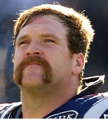
Logan’s Run, continued: Reader Marco Scurati, writing all the way from Italy, has found a photo showing that Logan Mankins had a mustache drawn onto his left helmet decal in the AFC championship game — the first evidence we’ve seen of Mankins having the mustachioed Elvis in a game prior to the Super Bowl. The thing is, the mustaches he wore in these two games don’t match, so they must have been doctored up separately for each game. Faaaascinating.
Meanwhile, reader Joe Kramer has found another shot of Mankins’s Super ’Stache, and it’s a fun one — zoom in on the jumbotron image in this photo. Very cool spot on Joe’s part.
Uni Watch News Ticker: Here’s something interesting: Gerry Muir has noticed that the umpire in the Super Bowl had a little something wired to the brim of his cap. At first I thought it was microphone, but there’s no reason that would be on his cap instead of his jersey. A camera, perhaps..? … Excellent story about infographics here (from Jim Atherton). … Plan B Branding, which has designed the logos and uniforms for countless minor league baseball teams, has now rebranded itself, as Brandiose. Bad move, in my opinion — “grandiose” is a dangerous word to play off of, since it has a largely negative connotation (from Ray Barrington). … Mo Evans of the Wizards is wearing some Capri-length red tights. “Not the best look,” opines Alex Melendez. … The Hershey Bears will be wearing Hershey’s Kisses jerseys for warm-ups on Sunday. And if you like that jersey, you’ll probably love this site devoted to “geeky” hockey jerseys (both from Dane Drutis). … Old-school Chuck Taylor sneakers are very popular in China (from Chad Todd). … Alex Spanko notes that the combined Cohasset/Hanover girls’ hockey team, which has players from both schools, has capitalized on the schools’ “C” and “H” initials by using a recolored version of the Canadiens’ logo. I generally dislike it when high schools rip off pro logos (come on, show some originality!), but that’s rather clever. … New away kit for Germany (from Samuel Schmidt). … Check this out: a baseball umpire’s windbreaker with removable sleeves. Anyone ever seen that before? (From Sam Lam.) … Kind of amazing the SI used the old NFL logo for a story in this week’s issue (as spotted by Matthew Edwards). ”¦ I’m no fan of McDonald’s, but it’s hard not to like these striped socks (blame Phil). ”¦ “I was watching some NFL Films footage from 1994 and I noticed coach wearing a hat and jacket with a logo I’d never seen before,” says HHH. “Out of curiosity, I did an eBay search on ‘detroit lions apex’ and found this. This logo is not even listed on sportslogos.net. Was it a one-year throwback logo for 1994?” This logo is new to me, too — anyone know more? ”¦ NBA Weirdness, Part 1: The Celtics wore their black-lettered road alts at home last night, forcing the Lakers to wear gold on the road — but with their black road shoes. ”¦ NBA Weirdness, Part 2: The Kings wore their new road alts at home, forcing the Thunder to wear white on the road — but with their black road shoes. ”¦ Getting back to the Lakers, here’s an observation from Peter Fahey: “The 9 on Matt Barnes’s jerseys has some really weird dimensions. It seems to be the same on the gold, purple, and white uniforms. Compare it to Pau Gasol’s 6 to see how goofy it is. There doesn’t seem to be any past use of this 9. Barnes even had a regular-looking numeral at his introductory press conference when he signed with LA.” ”¦ Jay-Z has had a big role in the new Nets logo, color scheme, and uniforms, all of which are slated to be unveiled this spring. I’ve already seen prototypes of the uniforms (actual protos, not just mock-ups or photos), and I can say two things about them: (1) They’re almost certainly not what you’re expecting, and (2) I like them. ”¦ Everything we already knew about next year’s Winter Classic has now been officially confirmed. ”¦ Here’s a really fascinating article — including a small mention of uniforms — about the annual race up the Empire State Building stairs. Recommended. … Chad Johnson is Chad Johnson again, presumably because Metta World Peace was already taken. … Halle-freakin’-lujah Dept.: Word I hear through the grapevine is that Josh Lewin, who’s been rumored to be Wayne Hagin’s replacement for a few weeks now, will be officially be given the job today. Thank the lordy. … Here’s some unusual helmet striping. That’s Huntington High School in West Virginia, circa 1978 (from Brice Wallace). … South Carolina baseball is switching cap outfitters, from the Game to Under Armour (from JK Chaney). … A direct-mail company in Idaho is taking some serious liberties with the ESPN logo (from Mark Snider). … FNOB alert! That’s Leonard Smith (duh) of the 1985 Cardinals, who also had Lance Smith, Wayne Smith, and J.T. Smith on the roster (from Bill Kellick). … Reprinted from yesterday’s comments: Check out Paul Pierce waring a heavily autographed jersey in the McDonald’s All-America Game. … More new soccer kits, this time for Canada and Brazil.
My latest ESPN column, about the sports-related artifacts at the Rock and Roll Hall of Fame, was supposed to run yesterday but was postponed. Not sure if it will run today or if it’ll be held until next week. Either way, I’m going to be off the grid for most of today, so I won’t be around to provide a link. We’ll sort it all out on Monday, OK? OK — see you then.
Perfect comic strip for this crowd
link
So can we assume the Nets won’t be returning to their ABA-style unis?
and that Jay-Z should NEVER be involved with a NBA team identity….
Aw, don’t hate… congratulate!
I’m seriously putting aside my hatred for Jay-Z when making that comment, I don’t care if it was NaS, you’ll see…
You can’t say anything bad about Illmatic.
My interest is piqued, but sad that the Dr. J unis won’t be making a comeback.
If Paul likes them, we can assume purple is out (and probably black too)
I’d like these
link
with
Brook-
lyn
instead of
New
Jersey
That might be a microphone on he refs hat in SN XLVI. Today’s NY Times has a story about him being mike’d and the comments between refs and between refs and players
And I’m pretty sure this is not the first time a ref has had a cap microphone before.
The ‘hat-mic’ has been around since 2008, if not sooner, per this Q&A column by former ref Jerry Markbreit link
Yeah, they use it to pick up better natural sound.
They’ve also recently started mic-ing one interior lineman to get the sounds of collisions.
“The 9 on Matt Barnes’s jerseys has some really weird dimensions.” Because it’s a repurposed “8,” probably left over from all those old Kobe jerseys.
as bad as that 9 looks it is correct according to their uniform style guide…
Link?
link
The shape of the ‘hole’ in the 9 is a true octagon. Where the hole in the 6 has a much better looking right angle where the lines intersect. The octagon just throws it off balance.
The shape is one thing, but the actual “hole” appears larger than it should, as the vertical and horizontal strokes look narrower than on the lower part of the 9, or the rest of the jerseys (including the past players’ 9s). Oddly enough, it looks like they’ve gone back and forth between having a full octagon and having a right-angle corner based on those other 9 pics.
I sent Paul something about this last year but never got published nor mentioned :(
Yeah, the inconsistent back-and-forth application of the shape is annoying, but the size of the donut hole is even more infuriating, especially when they can get it right. But, as others have pointed out from Paul’s font and number guide over at his ESPN NBA Preview, the size of the hole is apparently intentional and not a glitch, much to the chagrin of this uni-watcher…
That new 9 is definitely jacked up. Even if they had decided to get rid of the 90 degree angles, the hole IS too big…
“Because it’s a repurposed ‘8,’ probably left over from all those old Kobe jerseys.”
???
The Celtics wore their black-lettered road alts at home last night, forcing the Lakers to wear gold on the road
Were they really forced to, or did they just choose to? I’m having a hard time seeing why they couldn’t have worn their purple uniforms if they’d wanted to. They’d contrast just as well.
And those Laker shoes look to be purple, not black, at least in that pic
Just purple laces… there’s a couple other pics in the gallery that clearly show black shoes.
It looks like Logan Mankins helmet was cracked in the AFC Title game so the Super Bowl Helmet was probably a new one. Thus, a new design of mustache.
It looked to me more that the full horseshoes were added to the existing mustache. Look at differences between the line weight and neatness of the drawing above the lip and down the sides.
If nothing else it was at least a new decal. You can see in the AFC Championship game photo that the top “front” of the decal is ripped (by flying Elvis’ head). In the Super Bowl it’s back to being complete. Even if the helmet wasn’t replaced, the decal was.
Maybe it was a playoff mustache and he let it “grow”!
I hope the new Nets color scheme something different like the color brown & not another red, white & blue (or any shade of blue for that matter) scheme or anything craptacular like teal or purple. Maybe some horizontal stripes, too? Wonder if they’re going to play off the Brooklyn Dodgers typography. I think “Brooklyn” on a home jersey would look pretty bold.
I’d almost guarantee they’ll be red, white & blue. Probably mostly blue.
It’d be nice to see a different scheme in the NBA – green & metallic gold, silver & green, black & yellow, maroon & orange… something… but it won’t happen.
Why aren’t there any black & yellow pro basketball teams?
Cuz Pittsburgh doesn’t have a team (any more)
Or any orange & black teams, either. The Hornets also need to ditch the teal & get to green. And there’s what, 18 NBA teams with a shade of blue??
There’s nothing wrong with one team wearing teal, is there? I don’t know why the Hornets didn’t use the black & yellow of the WFL’s Charlotte Hornets… but nonetheless, they do have a unique color now. What we need is for teams like the Wizards, Pistons or Clippers to come up with something new instead of being red white & blue.
If you’re going to change your orange to gold in New Orleans & you have already have purple and then teal in your color scheme, you might as well go the full Mardi Gras route a la the old Jazz color scheme.
I don’t want to change the Hornets now… I meant when they originally started…why didn’t they go black & yellow/gold then.
God the NBA is a mess. Screw history, we need the Utah Hornets and New Orleans Jazz, like, now.
Nah, send the Hornets back to Charlotte and the Jazz back to New Orleans, and the Jazz can be the Bobcats, ’cause someone has to…
…or the Lakers back to Minnesota. Everybody wins, except for the fans who follow all those teams. Honestly, team mascot names are not a perfect science with their cities. Maybe the Jazz should had changed their name when they moved to Utah, but maybe the team had some lasting team name brand power that they wanted to hold on to. Or maybe they just dropped the ball on it.
Cuz Pittsburgh doesn’t have a team (any more)
When they did, they didn’t wear black and yellow/gold.
link
link
I’d love to see them get another team, and I’d love to see them in black and gold, but I don’t know if Pittsburgh would support an NBA franchise.
…and upon reading the article… I, The Jeff, would like to officially state that Jay-Z is a douche.
Don’t you think putting the word “The” in front of your name sounds a bit conceited? Do you declare yourself massively superior to all other Jeff’s in the world? Something that’s been on my mind for a while now.
Let’s not go down the road of critiquing anyone’s name OR critiquing Jay-Z. This ends now. Thanks.
“Check this out: a baseball umpire’s windbreaker with removable sleeves. Anyone ever seen that before? (From Sam Lam.)”
Yes, alot of golf windbreakers are the same, and some even make it into a vest.
No photos yet, apparently, but yesterday was the debut of a Red Sox-branded Jet Blue plane (Jet Blue has its name on the new Spring Training facility in Ft. Myers, destination of the first flight):
link
We have seen referees with the little fuzzball mics on their hats before, so I would guess the wire on the referee’s hat is attached to the mic.
Umpires.
I just added a bunch of additional stuff to the end of the Ticker (had a mix-up with my own files, so some material had gotten misplaced).
The Brazil kit link is messed up, and there’s a missing “t” in World Peace’s name.
Thanks. Now fixed.
I mean NOW fixed.
I still think Chad should have changed his name to Ronald William Artest, Jr.
I’ve noticed the weirdness of the Lakers’ “9” before. It became really apparent when you did your NBA preview on espn.com with the official number sets for various teams. And upon doing some research, there are some inconsistencies, and I for the life of me can’t understand why they use the large counter that they currently do.
I found some pics… it looks fine here:
link
This looks fine, but the shape is different (more of a raindrop, like in the 6)
link
But here it’s the large counter like in the official number guide…
link
Really cool stuff. I’ve never noticed this before! Yet another reason why this site is awesome. Thanks Paul, and thank you fellow readers and comment writers!
It basically appears that the Lakers have separate 6’s and 9’s, thanks to the cutout. Thing is, the upside-down 6 serves just fine as a 9!
This could be the basis of a fun column. Which teams have explicitly different 6’s and 9’s (instead of having the same digit that can be turned either way), and how many upside-down numbers have made it onto the field?
Just in case people are looking for the number font style guide image: link
… yeah, that 9’s jacked up. Gotta wonder how something like that got through quality control. Or, maybe link.
The problem is that they haven’t had separate 6’s and 9’s throughout the history of their current jersey. It’s always been switching back and forth since the 99-00 season.
This is the graph I composed last April and sent to Paul:
link
Notice that at Barnes’ press conference, the donut hole is not only smaller than the one used on the in-game jersey, as Peter Fahey pointed out, but if you look at my link, the SHAPE isn’t even consistent WITHIN THE SAME JERSEY! Compare the front and the back and you’ll see what I’m talking about.
Note: the jersey used at the press conference was still the old, non-revolution 30, jersey, but why can they keep the same donut hole size on the number 6 (or Gasol’s 16) but not on the number 9?
I meant to do a infographic on all the Lakers 6’s, but never found the time to do it, and since I have super slow internet now, I will leave it to other readers to do it, if they wish. Lakers who wore #6: Jelani McCoy (2002), Maurice Evans (2007-08), Adam Morrison (2009-2010); #16 John Salley (2000), Pau Gasol (2008-present), #26 Danny Schayes (1994)
No, the 6 and the 9 both had the 90 degrees – go back and look. Any chance he didn’t like the 90 degree (or has some weird association with an octagon) and had an equipment guy alter it? If you took the original 9 and cut out the right angle, it would leave you with a bigger hole in the 9…
This reply was to Mike. Awesome graphic, Paul!
Thanks :) But I don’t think Mike was entirely wrong. Salley and Gasol both sport the 90 degree in their #6, but McCoy, Evans and Morrison’s donut holes are all octagons, at least on the front of the jersey, since I didn’t look for any of the back of the jersey photos so I don’t want to assume, especially considering Barnes’ press conference mismatch.
link
@Adam: the first picture (link) might’ve been Photoshopped.
That new Germany kit is as close to perfection as you can get from soccer kits these days.
Green is not a Deutsche colour! It brings back the days of a divided nation. Schwartz Rot Gold!
The Padres have advertised over 1,000 game-used/game-issued jerseys will be on sale at tomorrow’s FanFest at Petco Park. I moved to Cincinnati last summer, but I’m flying back home for this event!
Brazil’s new kits look good, but I don’t like the link (no matter how lightweight the shirt is, I believe that all badges should be sewn-on patches), and the link link look like Shingles to me XP
Have to disagree that they look good. I don’t like the lack of green trim around the neck, and the trim on the sleeves looks too broad.
I’m with George (as usual) that the new elements of the Brazilian kit don’t work so well as the old. However, basic the yellow-shirt-blue pants-green-trim look is so cool that you would need to monkey around a whole lot to ruin it. The all-blue away uni is not nearly so good. Why not white-shirt-blue-pants-green-and-yellow-trim?
Canada’s new kit is OK. Like it matters.
But not Germany’s away disaster. The disaster is not aesthetic. Looks rather good, in fact. The problem id the color. Green. Germany should not wear green.
Let’s read the slithery justification:
“… The guiding design themes are Passion, Tradition, and the colour Green, a historical reference to a glorious (and victorious) past that includes the 1972 European Championship title. Accordingly, the outside neck of the new shirt features a tagline that reads “1972 — the beginning of a success story, 2012 — a new chapter waiting to be written…”
“Guiding design themes” my ass. Germany’s colors are BASICALLY black-and-white, and their white-shirt-black-shorts is a cool classic. Red has been used as a third color since the Franco-Prussian War. Yellow was used for an eyeblink in 1848, and then resurrected after the Second World War to make the national ensign look not quite so, well, traditional. Green is not a national color for the Germans.
Well, you say, neither is blue an Italian national color. The Italians are allowed to do that; the Germans aren’t. Nor are the English allowed to wear blue, by the way. Blue is Scotland’s color.
And green, of course, is Ireland’s color. Straight ahead, greenish green. Always has been. We are a gracious people, from time to time, and will certainly not object if Bulgaria and Hungary wear green. Maybe as an accent color. And we salute the Portuguese for inexplicably dressing their lads in maroon.
But, no, Germany should not be allowed to wear green. As soon as we arrange a quick loan from DeutscheBank, hostilities will be seriosly considered.
Why not white-shirt-blue-pants-green-and-yellow-trim (for Brazil)?
White shirts have been abandoned by Brazil since losing the 1950 World Cup on home soil to Uruguay. The traditional Brazilian kit was all white, with blue trim. After losing in 1950, the country sponsored a national contest to design the new national kit; the winning design of yellow shirt with green trim, blue shorts with white trim being worn ever since
The blue change shirt was adopted on the fly for the 1958 World Cup Final against Sweden. The hosts wore yellow, so Brazil needed to switch. They went with royal blue with white shorts — the manager told the players (who were all at least nominally Catholic) they would be wearing the color of the Virgin Mary. Brazil won.
Except for a one-off match against France for FIFA’s 100th anniversary, Brazil hasn’t worn white since 1950. White is not an option that Brazil would ever consider.
Green and white are the main colours of the DFB, the German football association – where they can’t wear national colours, then association colours make a good second choice.
Waddaya mean, “… where they can’t wear national colours…?” Where can’t they wear black or white in one of its four possible combinations of shirt and shorts? No, they wear green to debase the coin of Irishness, and it will not be tolerated. I will say no more.
they wear green to debase the coin of Irishness, and it will not be tolerated. I will say no more.
Let’s see…Germany has mostly used green as their change color since post-WW II, and have won three World Cups. Ireland has won squat. One would think you’d be glad somebody does well wearing green.
Ordinarily you see photoshop used to enlarge and/or define the breasts of a model. But that McDonald’s model clearly has had something done with her legs. Holy cheese, those are abnormally long.
Still hot. What’s funny is that I liked the SAME EXACT photo on Facebook yesterday, and did a double-take when I clicked the link and saw the photo.
I’m no fan of McDonald’s, but it’s hard not to like these striped socks
Yeah, “socks” that’s the ticket. Btw Paul you missed a, excuse the pun, “golden” opportunity with the McDonald’s line; I’m no fan of McDonald’s, but in this photo, those socks, I’m lovin’ it!
I like what’s at both ends of those socks.
That would be a super-sized contradiction of Paul’s mantras. I hate to speak for him, but a free advertisement for a super-duper-mega chain restaurant while referencing a fairly lame commercial ditty would be really unlikely. I think it would be more realistic to catch Paul wearing purple Air Jordans.
I’m no photoshop or photography expert, but I am guessing the photo was taken with a sort of fisheye lens, not as extreme as an 18mm but less than a 35mm I’m guessing, and the legs are foreshortened quite a bit, her legs are at least 2 to 3 feet closer to the camera than here head making the legs appear long. So not too much funny business in the shot itself, but evidence of photoshopping to create the blur on the walls and background, etc. The bluish-green column next to her head (with the two bolts) is in focus, but the portion of the column just above it (seemingly at a very similar distance) is completely out of focus.
I think it’s just a forced perspective that makes her shin look abnormally long. That doesn’t look like it’s shopped.
I thought that at first, but take a good look at the stairs.
The title of the flickr page may be funnier and more charming than the content:
Valentines: Meat and Weapons
Yeah, but nothing’s funnier or more charming (or more romantical) than this one:
link
Yep, that’ll convince her.
This one’s just as bad:
link
link…
Canada’s new soccer kit sucks. It looks like a knockoff of itself.
I cannot agree. I think it’s pure class, simple and elegant with just enough detail to be distinctive. Umbro scores again.
I’m all for understated, but these look (to me) like a henley you’d get at WalMart. I guess I don’t like the contrast detailing in this application.
Couldn’t they make the Canada logo bigger than the Umbro logo? *Then* I might like this uni.
As in, significantly bigger.
Can’t say I’m a soccer fan, but I am a fan of those Canadian kits. Instant classic.
I’m not from New York and I have never listened to a Mets broadcast, so I have no idea who Wayne Hagin is. But I would love for the Orioles to ditch Joe Angel. His homerun call is “You can wave it bye-bye.” Lame. Wikipedia says he is known for his proper pronunciation of Latin players’ names. He’s a native of Colombia. But I have heard him botch the pronunciation of Latin players’ names. And I was surprised to listen to him wonder about the spelling of Jhonny Peralta’s name. Anyone who has spent any significant time in Latin America should know that the “Jh” is not unusual.
No announcer is as corny as Clippers television and radio voice Ralph Lawler, with such catch phrases as “Bingo!” and “Oh me, oh my!”.
I’d have to guess that he’s trying to appeal to the average US viewer. A “Jh” spelling *is* rather uncommon in the US. I’d cut him a little bit of slack for that.
Wonder how Paul feels about finally losing Wayne Hagin but getting Josh Lewin.
Maybe like Heather Locklear’s parents when she divorced Tommy Lee, only to then marry Richie Sambora?
I’ve never heard Lewin, so I have no opinion of him.
I’m told, however, that he’s a Uni Watch fan. Really!
Gotta run — see you next week.
Josh Lewin is tremendous. I used to talk to him regularly on Baltimore’s WBAL 1090 in 1995 and 1996. I took a keen interest in the Cleveland Browns’ move to Baltimore; so I, as “Freddie from New York”, became a regular caller on that station, and also on Cleveland’s WWWE 1100 and WKNR 1220 (both of which have since changed call letters).
Lewin is well-informed on many sports, and is extremely witty and sharp. While I wouldn’t claim that many people are in the league of Ian Eagle, Lewin is pretty close. I have no doubt that Met fans will enjoy him.
Lewin did Cubs broadcasts for 1 year in the late 90s. He was very good. I don’t think I’ve ever heard Hagin call a game.
mississippi state and ole miss last night went color on color with maroon vs red. not sure if i’ve seen two shades of red against each other before.
link
Looks like Red with blue trim vs BFBS with maroon trim to me.
Yep.
I’ve seen better, and I’ve seen worse.
I agree. Black and maroon… what a horrible color combination. Looks just as bad on their football unis, too.
I don’t know if it has been mentioned yet, but Chad Ochocinco is changing his name back to Johnson before his wedding this July. I guess it is the perfect time to change his name back with the change from Reebok to Nike…and the fact that his jersey isn’t selling that hot any more…no one cares what he calls himself.
Also, his father passed away last month, and Chad probably figured out he needs to grow up…
Considering the whole Ochocinco thing was pretty much just to get under the NFL’s skin… I think everyone knew he’d switch back eventually.
I said it above, but it’s probably more appropriate here:
I think he should have changed his name to Ronald William Artest, Jr.
Another reason to reconsider the “Brandiose” name change: on top of the word having primarily negative connotations, Newt Gingrich has been misusing the word, calling America grandiose and his own ideas grandiose, and otherwise misusing the word, when he clearly meant grand or grandeur.
That Huntington High School helmet is indeed oddball. Sort of looks like they were thinking a Michigan type helmet, minus the wings, albeit two colors? Purdue did a similar thing back in the early 50s: link
definately recall the Lions logo. Gonna say earlier 90s that middle as name on tag says APEX ONE and they later went to APEX.
link
link
That’s strange, because I don’t recall ever seeing it before, and I’m a native Detroiter!
Then again, I never really paid attention to sideline jackets, and the only sideline hats that stand out in my memory are the 1990s Logo Athletic shark-tooth and paint-splash hats.
Like Row B:
link
Yes, I definitely remember that logo too. I only ever remember seeing it in passing though. I never really paid much attention to it. As a Packer fan I saw the Lions pretty regularly though.
I guess it always just struck me as part of that early-mid 90’s design, along with teal and those hats that Rob and concealed mentioned.
I remember seeing this (I believe as a throwback logo) on Madden 2001. I’m guessing no one can prove that anymore.
The Habs logo… on a Sabres uni template… with the Sabres’ colors? That’s just not right!
Green is not a national color for the Germans.
No, it’s not. But it does have a long history of being used as the change color for the (West) German national team. It’s the color of the DFB, the German soccer federation. The green and white have been described as evoking the green grass and white lines of a soccer pitch.
Green is a perfectly historic, valid color for German soccer teams to wear. That said, other German teams (ice hockey, basketball, track), go with red, black, white, and gold.
red, black and white being the colours of the short lived Nazi regime’s flag :/
And the German Empire.
And black, red, gold were the colors of the Weimar Republic.
Had enough flag trivia? I know I have…
Sox plane
link
I’m underwhelmed
Story about the St Louis Cardinals and ther efforts to buy pieces of the Cardinals’ history. link
The real treasure is the close-up image of Hornsby’s jersey showing the chain-stitching! link
Another image of the plane
link
Still underwhelmed. Why gray?
Why gray? Because they wear gray when they aren’t in Boston. If they’re flying anywhere, then they aren’t in Boston.
So on Fridays the plane will have blue paint (appropriate for Jet Blue)?
Better question: if they’re just going to paint it gray, why not go with naked aluminum? It’s lighter and easier to maintain.
I won’t disagree with the easier to maintain, but would it really be lighter? I didn’t know paint weighed that much. Also, paint helps to keep the metal not tarnished…I guess. And it look more uniform too…
At least during the first “energy crisis”, many airlines went “naked”, because the paint weighed some hundreds of pounds, and they got better mileage because of it.
I think only AA stayed naked
Hmm. Guess you learn something new every day.
The space shuttle used to have a white external fuel tank (the big one) until they realized the white paint added 600 pounds to the weight. By not painting the ET they could add 600 pounds of payload to the shuttle.
Average airplane about the same size so weight about 50 to 100 tons so you’re talking about 0.5% of the weight which is probably considerable once you add it up across the airlines.
It’d be cool if the Nets went to a royal blue color like the dodgers.
im always excited about logo/uni changes
Didn’t the Brooklyn Dodgers mix in some powder blue with their color scheme? I guess they had to, now that I think about it, since that’s essentially the color that LA used in their alternates this past season.
How about powder blue, with red offset numerals and a script “Brooklyn” across the front? Yeah I know, probably too much to ask for…
I’m so mad that you get to listen to Josh Lewin. He was my favorite sports voice for all of the Dallas area teams. Pisses me off that the Rangers let him go.
Design the Leafs’ Winter Classic Uniform:
link
My 11 year old daughter was watching a rerun of “Full House” [thanks Nickelodeon]This episode had a Little League game with DJ (the middle child) playing. Her team was dressed as SF Giants and the other team was the Cubs ~ all the details were there. But what caught my eye was that michelle (the olsen’s) was the bat girl. She also was wearing a shirt that said Giants ~ only problem was it was in the NEW YORK FOOTBALL Font !!!! I’m sure there have been other times when that has happened.
Never really watched the show, only stopping on it on occasion back in the day… but I do remember happening upon Uncle Joey (metro Detroit’s own Dave Coulier) wearing a Red Wings 1991-92 throwback jersey… with the NHL 75th Anniversary patch on one of his shoulders, rather than on the upper right chest which was the norm. The Flyers were the only team that wore the 75th patch on the shoulder; the Rangers stuck it on their front left chest, next to the C or A when necessary. (You’d think the Rangers would’ve put it on the shoulder, like they did the Stanley Cup 100th patch, or every other commemorative patch since. I think the Flyers only did it to be symmetrical with their All-Star Game/25th Anniversary patches on the opposite shoulder.)
Canadian Soccer
link
The crest looks like the Soviet Union coat of arms.
link
The Penguins official Facebook page just posted this image of Jordan Staal link. The team is wearing blue practice jerseys with the throwback logo on it. Didn’t even know they had these.
since last years winter classic
link
LOVE LOVE LOVE the Valentines, Paul. Thanks for putting them together and saving us from the rabbit hole. I have collected space ones for years! A tad surprised you hadn’t come across a meat one before, though…
Johan’s already at Port St. Lucie, and link
Maybe it’s my just my Mets fan pessimism, but I have a sinking feeling that the uni changes and the absence of Wayne Hagin may be the highlights of 2012.
Yeah, those are likely to be the highlights of the season, but still, if you can’t win the division – and the Mets can’t win that division – beautiful unis and a good radio team are pretty good highlights to have. Right now, it looks like my Nats could be in contention for second place in the division, but nobody is really talking pennant, and we have middling unis and a mediocre-to-poor radio team. Unless the Phillies completely collapse, I’d almost rather be a Mets fan this year.
On the other hand, we do have Bob Carpenter and Some Random Guy on the TV broadcast (plus Bill Clinton as off-day sub), which gives the Nats one of the better TV broadcasts in the game right now. And if you only watch home games, but not on national holidays or 9/11, then the Nats have terrific unis, so it’s possible to almost simulate the whole 2012 Mets fan experience here.
Have we talked about Peyton Manning’s visage being applied to link yet?
THAT’S fuckin’ hysterical!!!
the broncos is my favorite!
Peyton Manning’s expression is an Internet meme waiting to be born. Maybe the official face of link?
Interesting piece in the Times about retailers and jersey suppliers being caught off guard by the sudden emergence of the Knicks’ Jeremy Lin:
link
I apologize if this has already been addressed but I’m kinda in a hurry so I don’t have time to accurately check the comments.
Is there anyway that the slideshows can be set to where they would have to be prompted to start? Its not an issue today but next week there is a good chance that whilst on campus next week it will take forever to load the site or the operation of my browser will be bogged down due to them running.
Kennesaw State is playing rolling out its fight song tonight before the game against Mercer (our rivals). They already released a video with several athletes singing it (unfortunately for your ears they did not select the more gifted athletes). One was a Basketball player who at first is wearing the standard away uniform but the last time he appears it looks different (as though the numbers are metallic gold as opposed to Athletic Gold), now this could be due to the way the part was shot or it could be a look at a special uniform for the rivalry game.
They are encouraging fans/students to wear Gold to the game, but that doesn’t necessarily mean a corresponding uniform (they have had an Athletic Gold uniform in the past so that may mean they wear those as opposed to the metallic gold accented one I described). I’ll let you know if they did anything special after the game.
link
They just went with the Athletic Gold uniforms, and it wasn’t even the first time they’ve worn them this year (I thought maybe it was the first time they had worn them in the current template but that is not the case).
Red Wings wearing white at home tonight against the Ducks. Was discussing the Winter Classic tonight while at dinner, hoping they go color-on-color for that one!
Knicks. #17. Awesome.