T-Shirt Club update: For months now I’ve been dropping hints about a very special Uni Watch T-Shirt Club offering that’s been in the works. It’s taken a long time to get the design and production issues settled, and then we decided to have some samples made, just to be sure we had a finished product that we felt good about. Now that we’ve seen the samples, I can finally show you what we’ve been up to. I think you’ll agree that it was worth the wait:
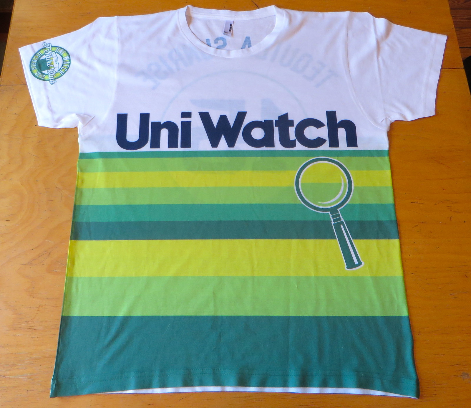
Not bad, right? This shirt, which will be our November design, will be available for ordering from Oct. 13-20. If you’d like to be notified/reminded when it’s available, shoot me a note here.
This shirt is completely unlike any of the others we’ve done, and there are also several aspects of the design that I want to share with you and some issues I want to address. Please bear with me while I explain:
1. All our other shirts have been screen-printed, but this one is sublimated. Why? Two reasons: First, traditional screen-printing wouldn’t have allowed us to print all the way to the sides and the bottom of the shirt. Second, even if we had stayed within the traditional screen-print boundaries, the stripe coverage would have used so much ink that the shirt would have been extremely stiff and heavy. Using sublimated dyes avoids this problem — the shirt is light and flexible. Sublimation has its drawbacks (it’s not quite as crisp or vibrant), but it was the best approach for this design.
2. Once we decided to go with sublimation, we had no choice but to go with a 100%-polyester shirt, which definitely doesn’t feel as nice as our usual cotton. On the plus side, however, the poly fabric feels a lot more like a real jersey, so there’s that.
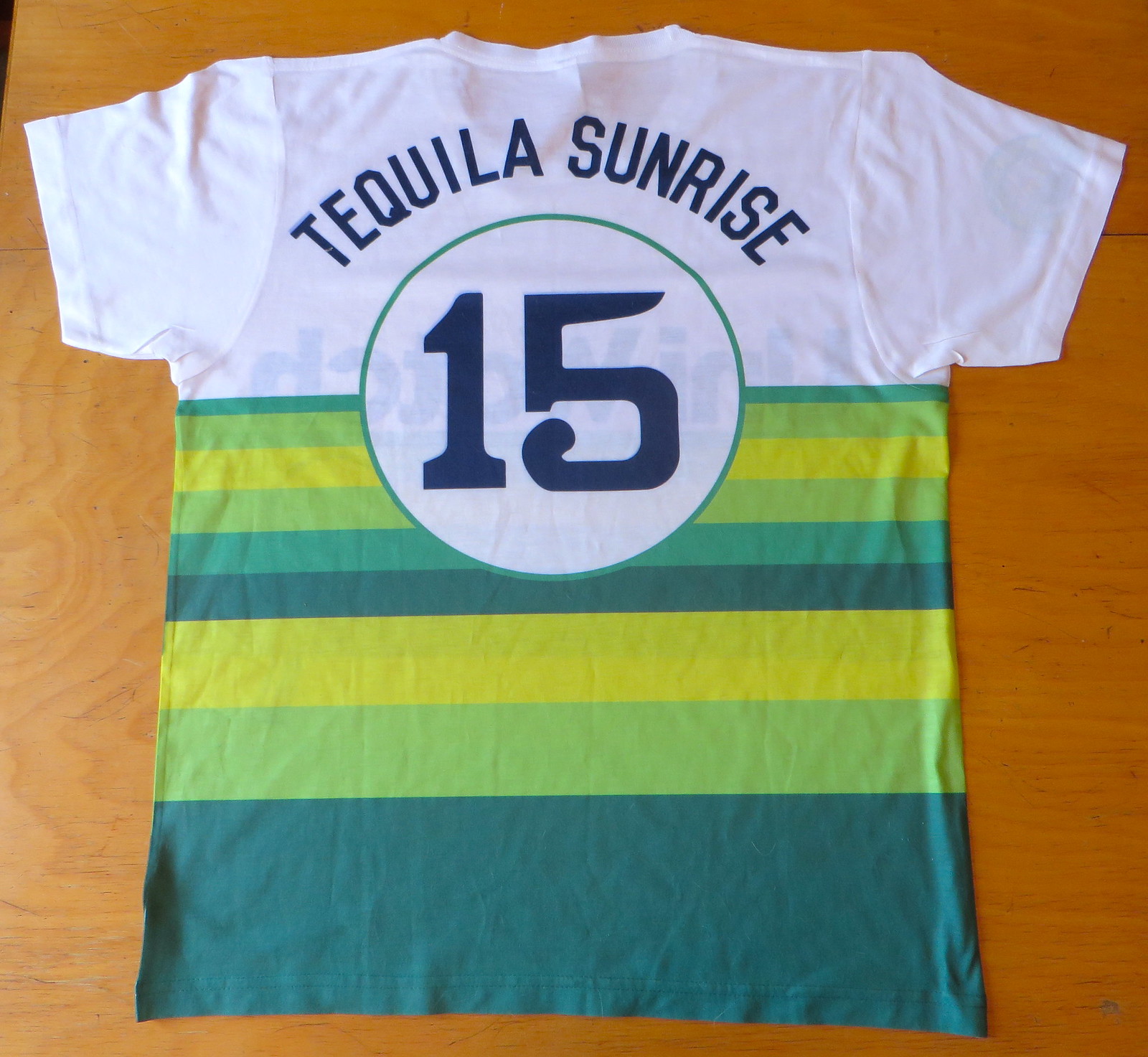
3. If you look closely, you’ll see that the back numerals and some of the NOB letters have a faint shadow. That was basically sloppy work on the sample. Shouldn’t happen with the real shirts. Also, the “1” is sitting slightly higher than the “5”; again, that will be corrected.
4. We usually have the sleeve patch graphic centered on the side of the sleeve, so it’s partially visible both from the front and the back. But as you can see in the photos above, the sleeve patch on this shirt is truly on the front of the sleeve and will not be visible from the back — that’s due to a production limitation. I’ve tried on the sample and can honestly say the front/back issue doesn’t seem like a problem when the shirt is being worn. (The patch on the sample is also too close to the sleeve hem, but we’ll fix that for the main production run.)
5. One problem with the sample shirts is that the front and back stripes don’t align. We’ll give more explicit instrux to our supplier to avoid this problem when the actual T-Shirt Club shirts are being made, but it’s possible that the stripe alignment may be slightly imperfect (although it’ll definitely be a lot better than in that photo I just linked to). Just to allay your fears, anyone who orders a shirt and is unhappy with the stripe alignment will be able to get a refund.
6. For now, it’s looking like the size offerings for this shirt will go from S to 2XL. I know some of you (including some “Collect ’Em All”-ers) prefer 3X, and we’re checking to see if there’s any way to make that possible for this shirt. Stay tuned.
7. Because of the design and production issues involved, this will be our most expensive shirt, with a price tag that will probably be around $28 or $29. (You can make all your jokes about this being an “overpriced polyester shirt” now.) Given how awesome it looks, I do think it’s worth it, and I hope you agree, but I understand if you think that’s too much to spend on a T-shirt.
8. The design, obviously, is based on the Astros’ tequila sunrise jerseys from the 1970s. One difference is that we weren’t able to duplicate the rainbow stripes on the sleeves (production limitations), but I don’t think that’s a dealbraker.
9. We tinkered with using the Uni Watch script on the chest, but that didn’t look right. Then we tried using the wordmark shown at the top of this website, but that didn’t look right either. So we ultimately went with a font very similar to what the Astros used, which I think looks great. We went through a similar range of options on the back before ultimately settling on the circus font that the ’Stros used in 1975.
10. The stripes are in Uni Watch colors (duh), but the typography is rendered in the same midnight navy that the Astros used. We tried doing the type in maroon (a Uni Watch color), but it didn’t look right, so we tried the navy, almost as a lark, and were surprised by how good it looked. I’m really happy with that choice.
11. Some of you might be thinking, “The magnifying glass symbol is in dark green, but it should be navy, like the star on the Astros’ jerseys.” We tried it in navy and decided we liked it better in green. So that’s one place where we decided not to be faithful to Houston’s design.
I think that’s everything. Special shout-out to my Teespring partner Bryan Molloy, who’s put in a lot of work on this one. In addition to creating the design (and dealing with all my nitpicks regarding same), he also had to find a supplier that was willing to do sublimation (Teespring has never done a sublimated shirt before), arrange to have the samples made, and deal with a lot of other behind-the-scenes hassles. He’s also going to have to create separate front and back sublimation patterns for each size of shirt we offer, which I gather is going to be a shitload of work. Thanks, Bry — I know you’ve put a lot of time and effort into this one, and I’m super-duper-grateful. You da man and all that.
———
Here are the shirts we’ve launched so far…
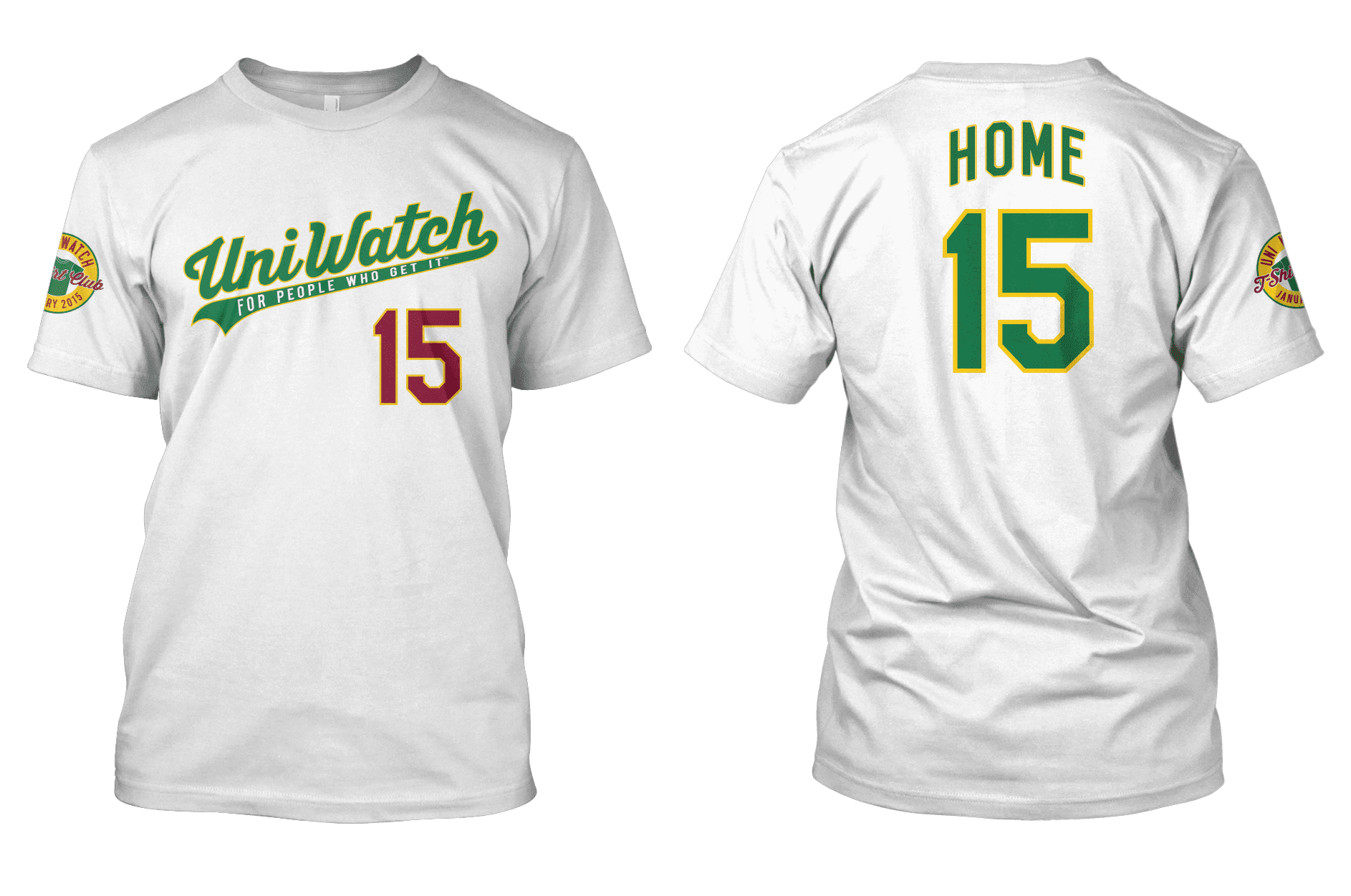
January
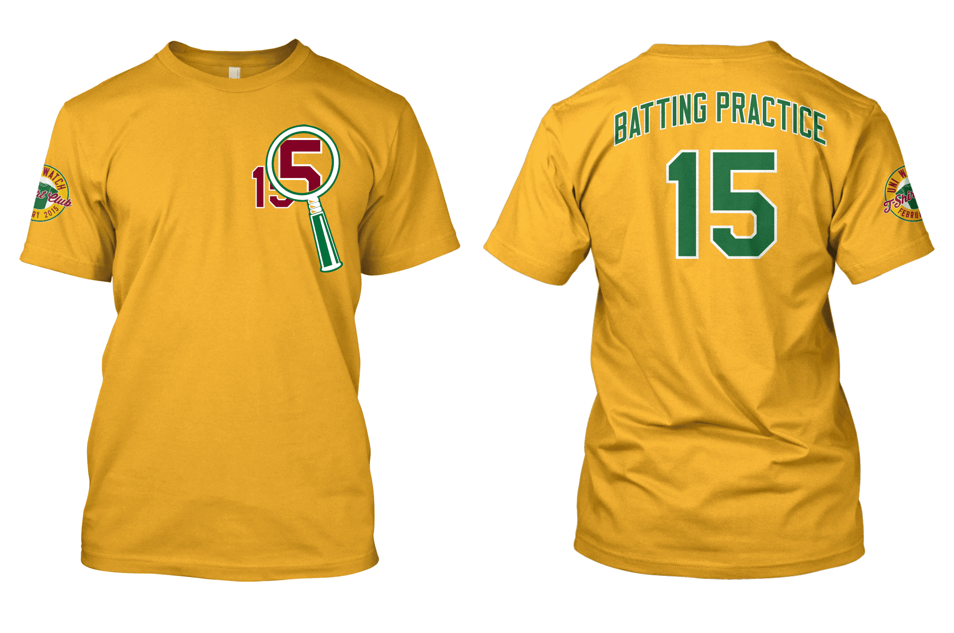
February
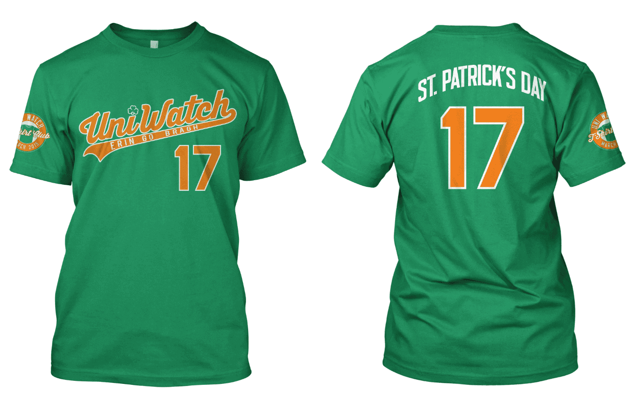
March
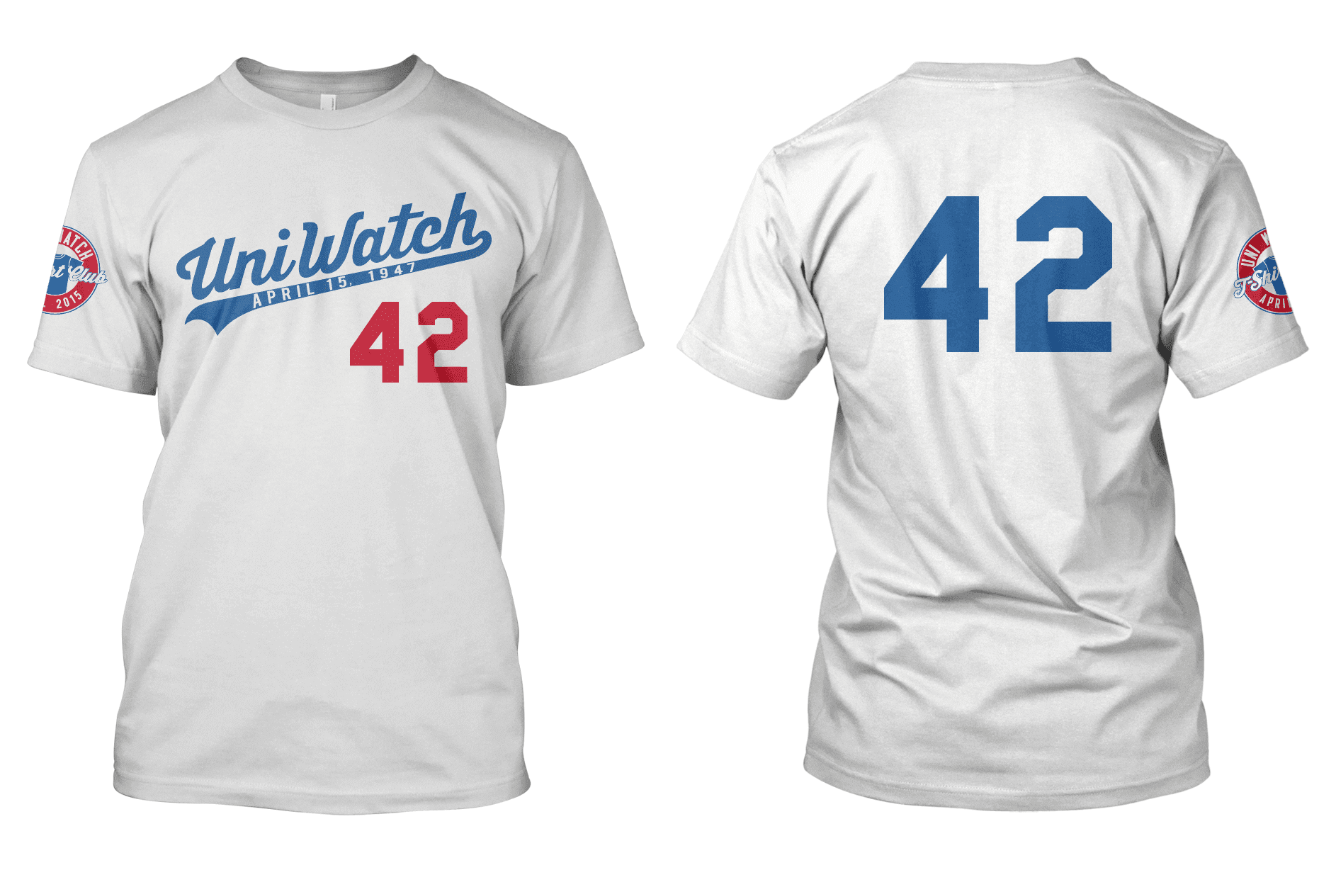
April
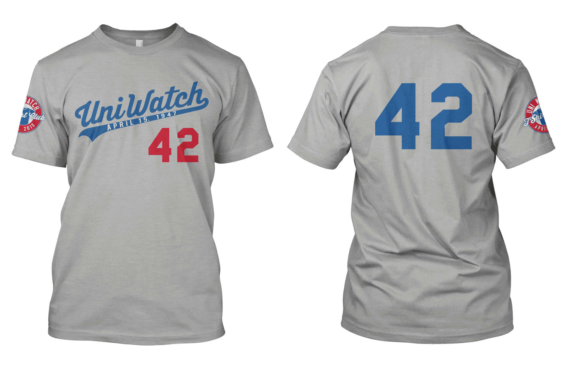
May
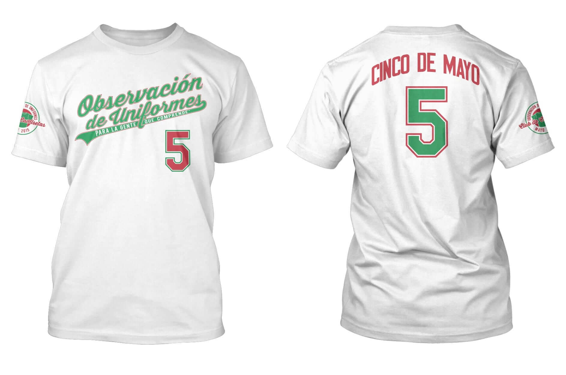
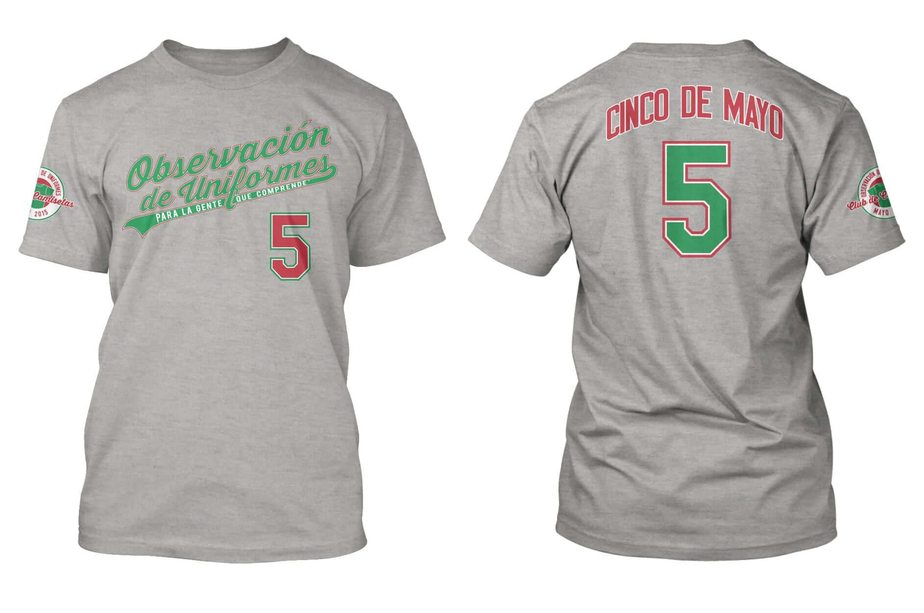
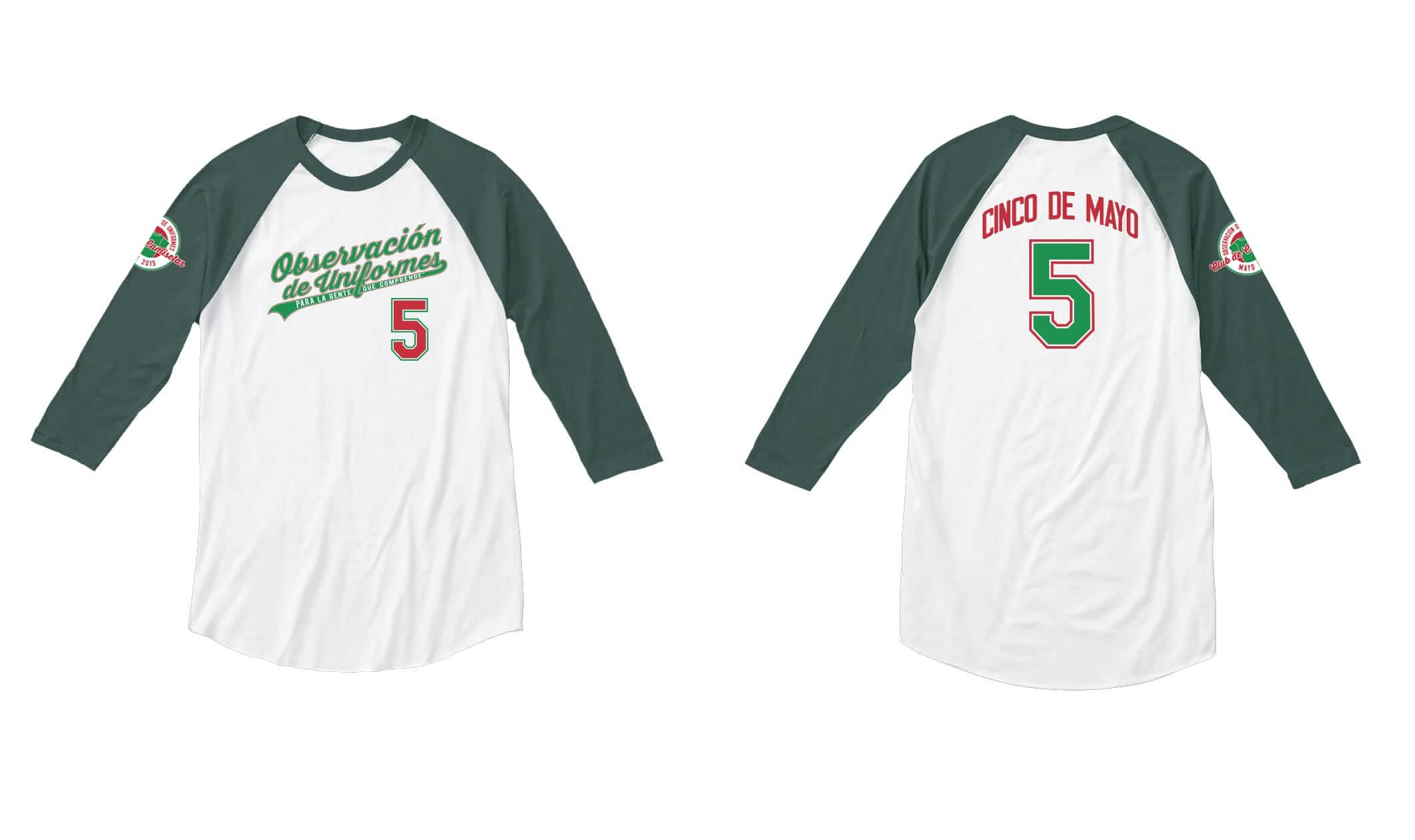
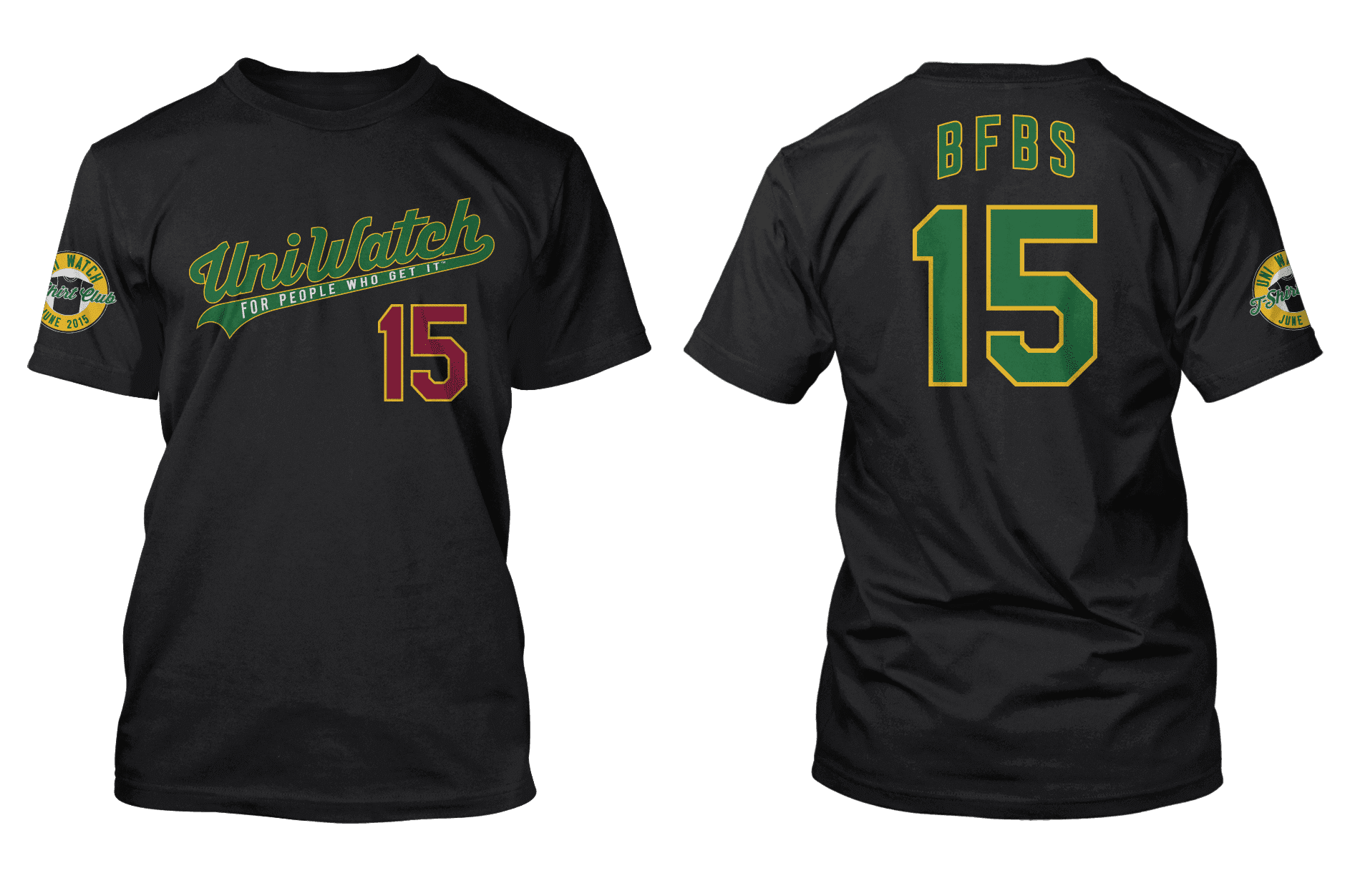
June
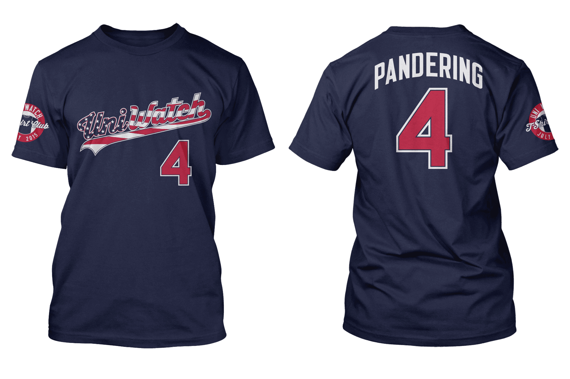
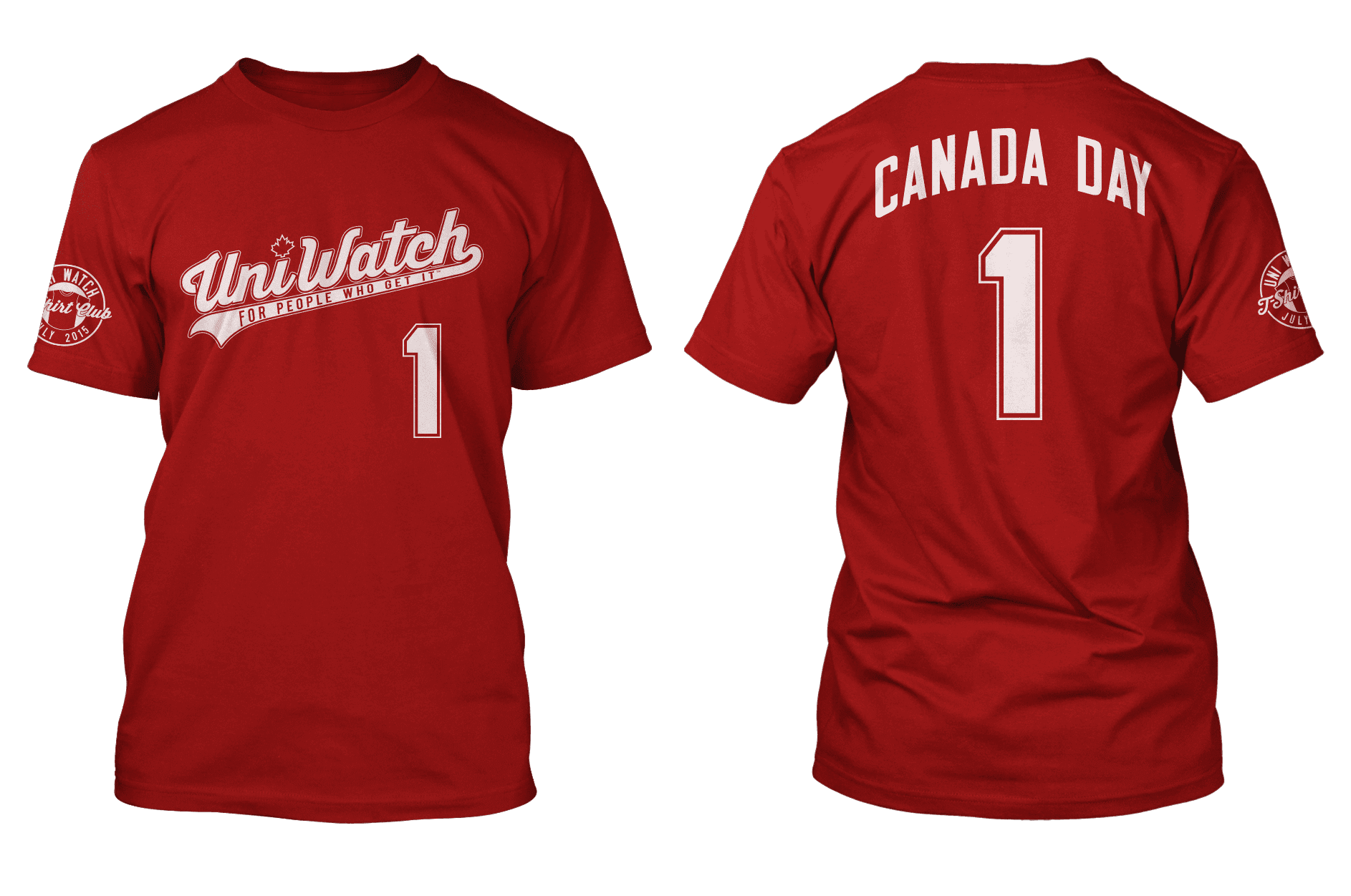
July
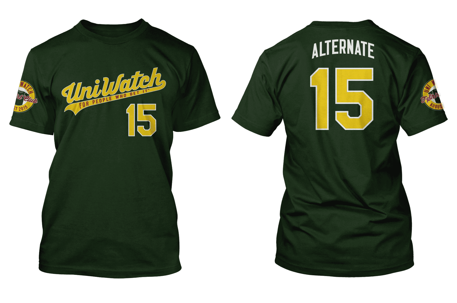
August
September
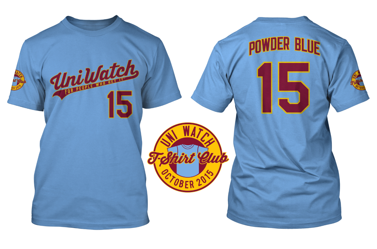
October