
Click to enlarge
[Editor’s Note: Paul is on his annual August break from site. Deputy editor Phil Hecken is in charge from now through Aug. 25, although Paul is still on the clock over at ESPN and may be popping up here occasionally.]
By Phil Hecken
Follow @PhilHecken
For the past two weeks, the NBA and Nike had been doing a fairly good job at milking the shit out of spacing out their uniform unveilings, with one-per-day as an average. Yesterday, we got a new trifecta sextet of uniforms, as the Minnesota Timberwolves, Milwaukee Bucks AND Phoenix Suns all released new uniforms (and later in the day, the Rockets, Pelicans and Grizzlies added to the mix — I made the splash earlier thinking we’d only see three new uni sets). The Wolves had some major changes, the Bucks almost none, and Phoenix had a few. The other three were minor changes as well. Since they unveiled chronologically in the order I have listed, I will run them down in that order as well.
Minnesota Timberwolves

The T-Wolves underwent some major changes, getting an entirely new template and fonts. They have also eliminated all green elements on the new blue and white jerseys, except for a tiny bit on the bottom of the pants (although a rumored third/fourth jersey is entirely green).
The new threads have dropped. Bring on the New Era. #NewEraNewThreads pic.twitter.com/t0PjCcp8II
— Timberwolves (@Timberwolves) August 10, 2017
Both uniforms are essentially mirror images of one another — with the colors used being white, light and dark blue. Let’s look at the white uniform first:


As you can see, the new jersey features a dark blue yoke that stretches across the top of the jersey (stopping just short of the back of the jersey) and is separated by a white stripe (which conveniently showcases the swoosh and jersey ad — the Wolves announced their advertiser would be FitBit), followed by a light blue stripe which is on the front of the jersey only. Beneath that, “WOLVES” is written in a new navy blue font, followed by the numbers, which are light blue with a dark blue outline.
The back of the jersey has a dark blue collar, with the NBA logo underneath. Player NOB is in dark blue in radial arching and the uniform number is rendered in light blue, with a dark blue outline (same as the front number):

It’s difficult to see, but the pants are solid white for the top 60% or so, when they are met with a light blue stripe, another equal width white stripe, and a long blue panel that extends down beneath.

You can see that a bit better here:

You can notice the stark differences between the old and new uniforms:
Side-by-side comparison of old and new Timberwolves uniforms. pic.twitter.com/Z1e5Y6dUwY
— Paul Lukas (@UniWatch) August 10, 2017
Did you notice anything different about this uniform from all the other new uniforms unveiled this season? Look again…
Of all NBA teams to have unveiled new 2017-18 uniforms so far, Timberwolves are the first NOT to have a logo on the waistband. pic.twitter.com/rmn1lDSbQf
— Paul Lukas (@UniWatch) August 10, 2017
That’s right — the Wolves have “broken” Nike’s string of placing a logo on every waistband.
The blue uniform is very similar to the white uniform — the major differences being the colors and the wordmark. The blue ones read “MINNESOTA” across the chest. The yoke on the dark blue unis is light blue, followed by a dark blue stripe and then a white stripe. The workmark is in solid white, followed by a white number outlined in light blue.


Like the white jersey, the middle stripe on the between the yoke and bottom stripe serves to highlight the ad patch and the swoosh.
The pants are solid blue for the upper part, followed by a white stripe, dark blue stripe and finally a long light blue portion at the bottom. A tiny smidge of green is visible on the side of the pants. The back of the jersey features the NBA logo, white NOB in radial arch format, and white number outlined in light blue.

Both pants have the Timberwolves logo down the side, atop the bottom stripes.

And how do these uniforms compare to the prior set?
Side-by-side comparison of Timberwolves' old and new blue uniforms. pic.twitter.com/t30ueTxCzM
— Paul Lukas (@UniWatch) August 10, 2017
I know the team has alternately been taking a beating and receiving lots of praise for these uniforms on social media. I happen to like them. Like, a lot. I love dark and light blue together, and I have never liked any of the fonts the T-wolves have used over the years. This one feels nice and simple.
One thing I didn’t immediately notice, but now that I have seen it, it cannot be unseen.
@PhilHecken is it just me, or does Nike love creating uniform design elements that highlight their logo pic.twitter.com/wvqqfnxLVs
— Kub (@The_Real_Kub) August 10, 2017
I’m not one of those conspiracy theorists who believes that Nike worked with the T-wolves on this uniform simply to highlight their swoosh…but it makes you think.
Milwaukee Bucks

The second team to unveil was the Milwaukee Bucks, and their uniforms are essentially the same as their previous iteration. Here are the differences:
Side-by-side comparison of Bucks' old and new white uniforms (with annoying numbered graphics on new image, sorry). pic.twitter.com/ZYLPjlhI3q
— Paul Lukas (@UniWatch) August 10, 2017
Side-by-side comparison of Bucks' old and new green uniforms (with annoying numbered graphics on new image, sorry). pic.twitter.com/uIhNI4oo7B
— Paul Lukas (@UniWatch) August 10, 2017
The biggest “news” about this unveiling was the fact that now the Milwaukee Bucks have a jersey advertiser, and that is Harley-Davidson. That patch will appear opposite the swoosh on both jerseys.

You can read about the Bucks new advertiser here.
Since not much has changed with the Bucks new uniforms, I have put together a slideshow which is embedded below. If you can’t see it, or click here to see the set.
The other noteworthy thing about these uniforms is Nike’s continued use of Easter Eggs, and this uniform has “FEAR THE DEER” written on the jersey just above the jock tag.

Phoenix Suns

The Suns became the third (out of five SIX) team to unveil yesterday and their white and purple uniforms differ somewhat from the previous uniforms. Gone are the upwardly arching “SUNS” and “PHOENIX” complete with “sunburst” (or sun ray) stripes, and number nestled underneath. The new jerseys feature a centered, slightly arched “SUNS” (or “PHOENIX”) wordmark above a much larger front uniform number. The collar striping has changed to a purple and orange stripe (on the white jersey), and stripes of orange and purple have been added to the sleeves. On the purple jersey those stripes are orange and white.

You’ll notice the somewhat odd stripe pattern down the side (it sort of comes to a point on the top of the pants). A different, solid color stripe begins at the pants waistband and continues down the side (purple for the white uniform, and white for the purple uni). At the base of the shorts, a giant sunburst peeks out.

Better view of Suns' new side striping in these shots. pic.twitter.com/nirMMPkEPa
— Paul Lukas (@UniWatch) August 10, 2017
It's Time! pic.twitter.com/ObRkifIh4s
— Phoenix Suns (@Suns) August 10, 2017
Here’s a couple more looks at the white and purple unis:


You’ll notice the logo on the waistband — it’s a Suns logo. Nike didn’t “forget”.
To see the differences between last year and this year…here’s Paul:
Side-by-side comparison of Suns' old and new white uniforms. pic.twitter.com/fa7kRHsRud
— Paul Lukas (@UniWatch) August 10, 2017
Side-by-side comparison of Suns' old and new purple uniforms. pic.twitter.com/YLwFR9fa1V
— Paul Lukas (@UniWatch) August 10, 2017
I feel like there's a type designer at Nike who can't be fucking bothered with all these redesigns. Same S on 3 diff. unis pic.twitter.com/MBHiO5Q5Cv
— #DeChief (@DeChiefWahoo) August 10, 2017
You can see more images in this article.
I’m a big fan of symmetry, and with the Suns having an ambigram for a wordmark, I dig the new unis. I may be in the minority with that sentiment.
Houston Rockets
.@JHarden13 did it his way. Your time is now… #NBALIVE18 pic.twitter.com/KoGQYZcDGt
— EA SPORTS NBA LIVE (@EASPORTSNBA) August 10, 2017
The Rockets barely announced their new uniforms yesterday, issuing just a single tweet.
New threads for the 2017-18 season. 🚀 pic.twitter.com/AhFbbTTLeK
— Houston Rockets (@HoustonRockets) August 10, 2017
Here’s a closer look at those images:


And one more look at the jersey:

Mr. Lukas? How do these differ from the past set?
Side-by-side comparison of Rockets' old and new white uniforms. pic.twitter.com/bKccVl1cqf
— Paul Lukas (@UniWatch) August 10, 2017
Side-by-side comparison of Rockets' old and new red uniforms. pic.twitter.com/Mp7jvpxTve
— Paul Lukas (@UniWatch) August 10, 2017
A bit more information on these unis can be found here.
New Orleans Pelicans
This is BIG: New @Nike threads coming to New Orleans! #Pelicans #NOLA âšœï¸ pic.twitter.com/7boDbQUvt1
— New Orleans Pelicans (@PelicansNBA) August 10, 2017
Not much change for the Pelicans, with the exception of the new wordmark (it’s bigger, and I think, more legible). Also, as pointed out in the comments, they’ve changed from a radial to a vertical arching of the wordmark — which may also help with the legibility.
Here’s Paul with the changes
Side-by-side comparison of Pelicans' old and new white jerseys. pic.twitter.com/wqhFmmi2UU
— Paul Lukas (@UniWatch) August 10, 2017
Side-by-side comparison of Pelicans' old and new blue jerseys. pic.twitter.com/Jlwdo7yDXu
— Paul Lukas (@UniWatch) August 10, 2017
Maybe it’s not easier to read. At this point, my eyes are literally glazing over (if you’ve made it this far, you’d be forgiven if yours are too). Here’s a flickr slideshow and set I put together so you can check out more of these unis if you want.
If you can’t see that click here. If you want to see the set, click here.
Memphis Grizzlies
Performance tailoring, modern construction, lightweight engineering & modified hemlines.
Association + Icon: https://t.co/AN10y4DveB pic.twitter.com/0XsgqiDmvS
— Memphis Grizzlies (@memgrizz) August 10, 2017
Paul…take it away:
Side-by-side comparison of Grizzlies' old and new white uniforms. pic.twitter.com/CRYMoFWvA8
— Paul Lukas (@UniWatch) August 11, 2017
Side-by-side comparison of Grizzlies' old and new navy uniforms. pic.twitter.com/C11zyvpDT4
— Paul Lukas (@UniWatch) August 11, 2017
By the time the Grizzlies unveiled late yesterday, I’d just about had my fill of Nike and the NBA for the day, so if you’re a Grizzlies fan, please forgive me — I don’t want to take it out on you. But here’s a slideshow and flickr set:
If you can’t see that, click here. If you want to see the set, click here.
It was a “be careful what you wish for” sort of day yesterday — I hoped the NBA and Nike would unveil more than one uniform set, and stop the slow bleed. I didn’t expect (or want) SIX of them. Paul penned a piece for the mothership that looked at most of the teams listed above.
I’ll be glad when all the unveilings are over, that’s for sure. This shit is way above my pay grade.
OK — the floor is yours…

.
And If Three SIX NBA Unveilings Weren’t Enough…

…the Miami Hurricanes unveiled two new uniforms yesterday as well.
I didn’t have time to deal with this, so I’ll just put up the adidas Press Release and some photos. You can ignore all the marketing speak and just look at the unis. Of note, the Hurricanes have introduced a black helmet which they will pair with the all black uniform.
Here’s a short hype video:
Incoming Category 5 âš ï¸
Watch out ACC, @CanesFootball is showin up stylin this season.#ItsAllAboutTheU #teamadidas pic.twitter.com/xy5WbPo7YA
— adidas Football US (@adidasFballUS) August 10, 2017
First, the release:
The University of Miami and adidas today unveiled the Hurricanes’ 2017 alternate football uniforms, collaborative designs that add an all-green theme making its on-field debut at Hard Rock Stadium on Sept. 23 vs. Toledo and an all-black look that will be worn on Oct. 12 vs. Georgia Tech.
Building off the retro theme of “The Legend of the U” uniforms that debuted in 2016, University of Miami Athletics and adidas Football sought to create throwback uniforms that echoes the past while looking to the future. With the dynasty years that saw four national championships over an eight-year span (1983, 1987, 1989, 1991) as inspiration, the new uniforms feature a modern twist on the 80’s aesthetic by adding the new “State of Miami” all-green and “Miami Nights” all-black themes.
In a return to the traditional flair from that time period, the retro style uniforms seamlessly blend cutting-edge innovation with a historic design that serves as a nod to the legacy of the championship teams from the 80’s and 90’s.
Green Uniform:
“State of Miami” ”“ centered around an all-green theme, the jerseys and pants are highlighted with bold white stripes and accented with orange outlines to match the white numbers with orange outlines on the jerseys. White helmets with the oversized ”˜U’ logo on the sides and matching white socks, accessories and cleats with orange accents will accent that all-green look.


Black Uniform:
“Miami Nights” ”“ centered around an all-black theme, the jerseys and pants are highlighted with bold green stripes and accented with orange outlines to offset the white numbers with orange outlines on the jerseys. The team will wear black helmets with the oversized ”˜U’ logo on the sides and matching black socks, accessories and cleats with orange accents.


But wait, there’s more:
The new “State of Miami” and “Miami Nights” Primeknit alternative uniforms are at the forefront of design and innovation, providing players the perfect blend of style and technology for elite performance. Made with a cutting-edge, proprietary yarn blend that increases durability and abrasion resistance, Primeknit is the premier compression uniform system, featuring the latest generation of adidas TECHFIT technology. Primeknit helps keep players cool and increases range of motion, giving athletes an unrivaled level of comfort and allowing them to perform at their highest levels. The jersey’s padlock system secures tension over the shoulder pads, while the bodymap fit adheres to the player, making it difficult for opponents to grab, hold or tackle.
Additional design details include matching green and black adizero 5-Star 5.0 gloves, emblazoned with an oversized graphic of Sebastian the Ibis on the inside of the gloves. The adizero 5-Star 5.0 gloves feature 4-way stretch mesh for compression fit and GripTack for consistent control in all weather conditions. To complete the themes, the team will don matching adizero and FREAK cleats with color coordinated accent colors for each new look.
.
LAST CALL for the Ullman tee: Paul here, reminding you that today is the last day to order our latest limited-edition Uni Watch Artist’s Series T-shirt, designed by the great Rob Ullman. Here’s the base design, followed by a few of the many color options we’re offering (click to enlarge):
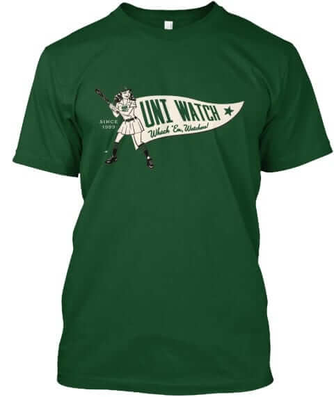
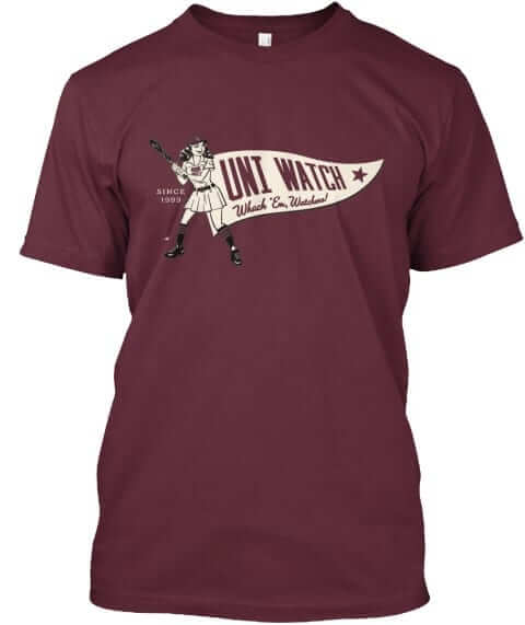
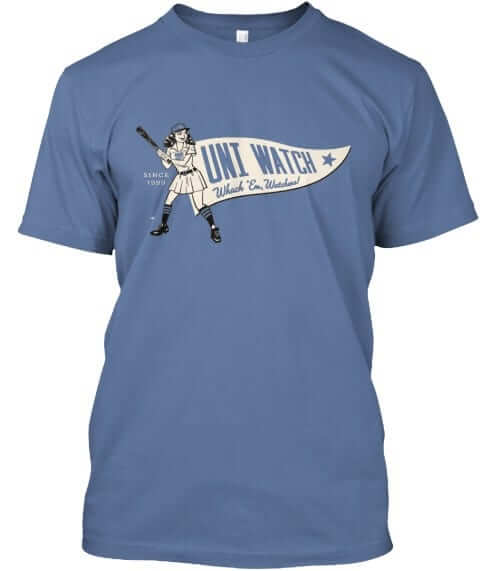
It’s available until 11pm Eastern tonight. Full details here, or just go straight to the ordering page. It’s also available in women’s sizes. My thanks, as always, for your consideration.
Meanwhile, two other reminders:
• In case you missed it yesterday, we launched a bunch of new Naming Wrongs shirts for Boston Garden, Foxboro, the Aud, and the Metrodome. Full details here, or just go straight to the Naming Wrongs shop.
• I’m still accepting submissions for an ESPN contest to redesign the Tennessee Titans. Details here. Deadline is next Tuesday.
.
Griffins Jersey Contest Reminder

In case you missed it, I’m again hosting a jersey design contest in conjunction with the Grand Rapids Griffins (an AHL affiliate of the Detroit Red Wings). All the details are contained in this post.
The deadline for getting your submission in to me is August 15 (at 6:00 pm Eastern Time), and we’ll have reader voting on the concept jerseys beginning on August 17th! Last year we had 85 entries and I’d expect we’ll equal or surpass that this year. Prizes include a custom jersey based on your design and tickets to the game that the Griffins will be playing in the jerseys you designed!
.
Uni Watch News Ticker
By Phil

Baseball News: According to this article, these are the best five Cleveland Indians uniforms of all time. … With all the buzz surrounding the NickNOB’s players will wear for “Players Weekend,” this article imagines what NickNOB’s former Yankee greats might have chosen. … The Pirates apparently enjoyed coming up with their NickNOB’s (from Jerry Wolper). … On Saturday, Aug 19, all fans attending the game will receive a 25th anniversary Oriole Park at Camden Yards replica ballpark (from Andrew Cosentino). … The Omaha Storm Chasers have a 50th Season logo (from Jay Wright). … If you’re into bloodclots, then Saturday night is for you, as the Indians will wear their all red Caveman era unis (h/t Robert Hayes). … A Little League team from Milton, DE had Air Force like batting helmets (eliminated last night). From JJ Sledge.

NFL News: This “ridiculously outdated Bills flag is displayed in the sports section at the JCPenney in the Walden Galleria Mall in the Buffalo area. Submitter Joseph Pitzonka notes, “this Mall didn’t open until 1989, leading me to believe this flag was brought over from a previous store when it was already out of date.” … “This is pretty terrible Ravens-Washington mash-up,” says Andrew Cosentino. … Also from Andrew, last evening the Ravens wore white at home against the Washington team. … The Browns did NOT wear socks with a pattern on them last evening (from Rusty Flynn). … The new VICIS helmet made its NFL debut last night (from Brinke). … So the Browns have both glossy AND matte helmets (good spot by Axl). … Actually it looks like the Browns have satin, glossy AND matte hats (from Luke Corbett). Paul notes why, here. … Back Afta Dis (the artist formerly known as “Funhouse”) thinks Da Bears’ “1”s are too big. I agree.
College/High School Football News: “Thought you might enjoy this article about the man behind MTSU’s new football uniforms,” says Mike McLaughlin. … “Here’s an interesting perspective of Eastern Michigan’s poster,” says Andrew Cosentino. … Georgia State announced on August 8th that their new football stadium, formerly Turner Field, will be named the Parker H. Petit Field (from James Gilbert). … Houston’s Clear Lake High School is having NASA Appreciation Day this season, and wearing special helmet stickers for the occasion. … New uniforms for Savannah State University (from Robert Hayes). … er the Wilson site, Ohio State will have a sublimated graphic football. Joins Auburn, Notre Dame, and Wisconsin (from Clint Richardson). … “A disappointing lack of college football knowledge on Jeopardy. I love the “oh no” by Trebek,” says Andrew Cosentino. Also from Andrew, an article on just this. … It looks like the Crimson Tide have added (or photoshopped) a red swooshie on their football (from Steve). … The Ravens did not switch to the new uniform template this year (from Broc).

Hockey News: Not much hockey news these days with the NBA Uni Unveilings taking up all the valuable ink in the non-playing sports, but new Vegas Golden Knights player Shea Theodore was spotted using Knights gloves & his old Ducks pants (good spot by The Goal Net).


NBA & College Hoops News: Through their storied history, the San Antonio Spurs exhibited many different uniforms. With the unveiling of their Nike uniforms approaching, it’s time to look back on some of their nicest designs and how they could impact a new wave of jerseys. … Check out this thread where the Bucks show off their uniform history (from Robert Hayes). … Based on this, it appears there are no noticeable changes to Lakers jersey for the 2017-18 season (from Johnny Navarette). … Here’s what appears to be a leak of the Clippers new white uniform (from Conrad Burry). … This screenshot from a video game appears to show the new Miami Heat white uni (from SJZIP1). … Here’s a look at some Texas basketball gear (from SCWFootball). … Have the Nets changed the color of their ad patch (h/t Paul). … It appears the Hawks will have few changes when their black unis are released (h/t Conrad Burry). Also from Conrad — the Clippers uniforms can’t get any worse, right? … Is this our first peek at the Orlando Magic uni (via Paul).

Soccer News: New kits for Quinnipiac Mens Soccer. … The Midlothian Football Club has a new third strip (from Ed Å»elaski”. … Also from Ed, there is a a new home shirt for Danish club Odense. … “My annual rankings of the new Premier League kits [w]as been published [yester]day, which you’ve been kind enough to feature on the ticker in recent years,” says Thom Gibbs.

Grab Bag: The Cool Springs Elementary School Board has approved a revised dress code aimed at addressing concerns over gender neutrality and clarity (from Tommy Turner). … Speaking of young people’s clothing ‘rules,’ The Wall Street Journal declares the “Hot New Teen Trend for Parents to Worry About: Short Shorts” (from Jason Hillyer). … Here’s a very cool, circa 1980, Philadelphia Sports print (From Ray Hund). … A Walmart in Hopkinsville is getting into the soda display for #Eclipse2017 (from Caesarscott). … Jimmer Vilk tweets, “My nephew went to Poland and brought me back an official hat from the national ski jumping team!” … The state of Iowa is allowing residents to decide their new license plate design. Take a look! What’s your vote? (from Michael Scebold).
.
That’s it for me for this week. And what a week it was. Please forgive me if I don’t pop in here for a few days…I am physically and mentally exhausted. But I’ll be back to do it all again on Monday :). Hope you guys are enjoying my weekday stint. Once again, it makes me realize how awesome Paul is to do this on a day-in/day-out basis for eleven months a year. We’re lucky to have him guiding this ship!
Ek will take you through the weekend (and hopefully he gets the remainder of the NBA unveilings — I’m only half kidding there). You guys have a good one and I’ll catch you next week.
Peace.
.
As mentioned late last night, I don’t think the Suns have an ambigram anymore because of the arch. That’s really too bad, because it was a cool “see it once and never unsee it” feature. Now I can never unsee a uniform downgrade.
I like the idea of the Suns returning to just purple and orange again, on both white and dark uniforms. It is their traditional colours.
Consistent colour scheme on both uniforms. I know Paul was a big fan of the old home uniforms with just the black and orange. I found it jarring and uncomfortable to my uni watch senses that the Suns were predominantly purple yet there was a complete absence of that colour from their home uniforms.
It’s still an ambigram, as they use a small “n” in a larger font, detailed exactly like the “U.” Hardly “ruined.” I suspect you’d prefer a straight font, but by your reasoning, a convex curving at the top and bottom (like the Dan Diego Padres’ uniforms of a few years ago) would also work.
Yes.
Unless I am missing something in my understanding, ambigrams should look the same whether “right side up” or upside down, to the point where there literally is no right side up or upside down. If it’s an upward arch one way and a downward arch when you flip it, it’s technically not the same.
In my opinion, the Bucks should have gone with a Sprecher Brewery patch, I do like the Harley-Davidson patch though!
I’ll drink to that! Although the Sprecher logo might be even louder than the HD logo.
I’m a Bucks fan and when I saw the headline that Harley would be the ad patch sponsor, I felt a little relieved that it would be a compact logo rather than just a sprawling text logo–was expecting the Kohl’s logo.
Then I saw the mock-up and just yuck. I hate that they are using the orange and black when they could have at least gone with team colors so it doesn’t stick out a sore thumb. Why not a green and white Harley logo?
Ad patches in general are horrible, of course, but this whole process has shown that there is a definite spectrum of aesthetics. The Wolves’ Fitbit patch, for example, is barely noticeable and sort of fits in with the team color scheme.
Of course the Bucks were going to have a HD patch, and of course it was going to be the black and orange shield. Was there ever any doubt of that from the moment the league OK’d jersey ads? So I guess I’ve been mentally preparing for it, and it maybe doesn’t strike me as being quite as ugly as it really is. It’s quite ugly, but I guess I sort of priced that into my expectations of the new Bucks unis, which are otherwise excellent.
Foxconn really missed an opportunity in its campaign to squeeze cash from the state by not sponsoring the Bucks. The Foxconn logo is even Bucks-colored and proportionally less space-taking than the HD logo!
Are the Bucks the only one with the ad not in team colors?
The Wolves/Fitbit ad is one of my least fav – I think it’s the white ad, above the white stripe (really highlights).
Fitting that the Milford, DE Little League team would be sporting Air Force helmets as Milford is but a stone’s throw away from Dover AFB.
The Bucks’ look in my mind is always of Sidney Moncrief or Junior Bridgeman in some variation of those 77-93 jerseys.
Now that I think about it, the Nuggets should always have a rainbow skyline circa Alex English.
Ah, preferences of youth. I understand that my taste in this matter is likely colored by what was on the floor during my formative years, but for me, that’s what’s most memorable. I know the Bucks had purple in their uniforms once upon a time, but for the life of me, I can’t really remember those uniforms very well, and for me, that’s what a good uniform does, immediately call to mind the team. For example, the Padres to me will always be a brown and yellow team, not navy or whatever it is they’re wearing these days.
What is the “right” uniform to me is admittedly subjective, but hey, that’s kind of the point of branding, isn’t it, that identification?
You know what I would buy? A “I Don’t Miss Cleveland Muncipal Stadium” tshirt.
The Mistake by the Lake? Who wouldn’t miss that place? XD
I actually miss it. Because the place on the surface had little to no redeeming qualities, the folks that went there did so only because they loved baseball in general and their Tribe in particular. In my book, that’s a Hell of a great atmosphere. I always had a blast there.
I miss it too.
I’ve never considered myself a Tribe fan but I always loved that place. Three of the last four years I’ve been invited to sit in the Champions suite at The Jake, and each time when I got there and looked at the field I thought, nice…I’d still prefer the right field railing at Municipal Stadium though.
Agreed. Loved it as a kid, miss it as an adult.
I loved Municipal Stadium. I loved taking up three of the wooden seats so that I could sit on one and slam the other two on either side of me down making that wonderfully satisfying “THWACK!” sound that I can still hear in my memories. I remember it feeling like the biggest place I’d ever been when I was little, because it was. It was HUGE to a kid. I remember walking up those treacherous catwalks that made me feel like I was suspended on one of those tiny rope bridges from an Indiana Jones flick, and then having the greenest grass explode in front of my eyes when you popped out of the tunnel. I met some of my early heroes there – Joe Charboneau, Scott Bailes, Ernie Camacho, Rudy Seanez, and a bunch of others. It was a special place that will always bring a smile to my face.
Typo? “HEART OF Midlothian Football Club has a new third strip” (a.k.a. Hearts)
… I’m not seeing how that Bills flag would’ve been out of date in 1989, considering how the red helmets were only adopted in 1984. It has been out of date since 2002, of course, since that’s when the Navy Nightmare began.
Right! And even during the “Navy Nightmare,” the helmets were only subtly different from the one on the flag.
At least from the angle on the flag, that is.
It was out of date in 1989 because of the blue facemask. They went to white facemasks in 1987.
Okay, see, that’s a thing I wouldn’t have noticed. But yeah, I do remember white facemasks in SB XXVII and XXVIII. (Still so disappointed the Bills couldn’t beat the Cowboys one of those times!)
Yeah – They cut out the part about it having a blue face mask which was only on the red helmet from ’84-’86. The helmet on this flag is actually three helmets ago for the Bills. 1) Still made the playoffs era (’87-’01): Red helmet with white face mask. 2) Navy blue era (’02-’10): Red helmet with different helmet strip pattern. 3) Current uniform (’11-preset) White helmet with grey face mask.
Count me amongst those who LOVE the T-Wolves redesign. It’s very different from anything else we’ve seen, and in a good way.
I will miss the now removed elements of the Suns’ jerseys, but I actually prefer this set. I actually love the collar/arm hole piping. JUST STOP WITH THE BEVELED WORDMARKS. This isn’t a 1997 GeoCities site banner.
I dig the new Wolves unis except for using the Mavs colors. Some green (non neon) would have been great. Shame on the Suns, they had nice jerseys.
RE: matte Browns helmets…
DeShone Kizer is one wearing matte.
link
Also, this signed mini helmet appears to be matte. I haven’t seen a matte mini before!
link
Let me preface this by saying that I absolutely hate the fact that the NBA is allowing uniform advertisements.
In a world where uniform advertisements are allowed, I’m finding that, for me at least, there’s a continuum of tolerability. On the extremely intolerable end, I have the Pistons and Flagstar Bank. It’s just so embarrassing. On the other end, the Celtics and GE, the Bucks and Harley Davidson, the Cavs and Goodyear. These advertisers are strong brands with long histories in the regions represented by their respective teams. They’re moderately less repulsive for me. The TWolves and FitBit is somewhere to the tolerable side of the midpoint. At least it’s a fitness-related brand.
This is well said – I’d say the only team that’s gotten it as close to right as possible (which is still wrong) is Utah, with the charity initiative patch.
If they turned around and donated every dollar paid to them for the advertising space back to the charity, I’m 100% for it.
“Not much change for the Pelicans, with the exception of the new wordmark (it’s bigger, and I think, more legible).”
Should also mention the change from radial arch to vertical, which may also help with legibility.
Thanks. I have updated the text above. By the time I’d gotten to the Pels, my eyes had already glazed over.
For the NBA updates:
* Minnesota is definitely an upgrade. Didn’t care much for that old piping and the old fonts.
* Milwaukee is just a sideways transfer. My only issue (which us unchanged from when the current style was first unveiled) is that the white-and-cream cresting on the green jersey is still kind of hard on my eyes, because the two colors blur into each other to make the font look more chunky than it already is. I think they should either add a green inner outline between the white and cream, or change the cream to blue.
* Phoenix’s updates are… okay. Not crazy about the “bridge”-arched TNOF, and really not crazy about the bevels. Change the wordmarks to vertically-arched, non-beveled text, though, and we’d have a real winner.
* Houston – Not much to note here, since the only significant change is to the side stripe pattern to accommodate the revised armhole design. All in all, pretty unremarkable.
* New Orleans – Well, the larger, vertically-arched CNOF is a significant improvement, though the letters do look a little bit bunched together.
* Memphis – ZZZZZZZZZ. Really nothing of note to see here. Aside from the template adjustments, the only real obvious change was moving the bear head from the pants leg to the waistline. Really, their look has been boring ever since they moved away from the teal, red, brown, and black.
When Adidas adopted the chintzy performance fabric for the NBA, Memphis was informed the manufacturer wouldn’t provide the numerals with the pale blue centerline to match the team name/city name (a dick move, IMHO). Now that Nike is in charge, the least they could do is recreate the numbers properly.
-I do not mind the new T-Wolves uniforms when comparing them to the old ones (because the old ones were not good). I am a bit disappointed though with what we got.
I do not like the striping at the bottom of the shorts. That looks fine for casual beach shorts but not for a basketball uniform in my eyes.
Without the team name and logo, it could be mistaken for a new Dallas Mavericks uniform. Instead of double blue, was hoping for navy uniform with full out green trim, even if it is lime green trim.
I agree with your take. Overall I like the new Wolves’ set – I thought the old ones were getting pretty stale – but I do worry about the block-y striping on the bottom of the shorts. That bottom “stripe” is awfully thick. For now I’ll reserve judgement on that aspect until we see how they look on the court.
And definitely agree on the green. I’m not a huge fan of the bright green but could have made for some cool accents to give them a little more color.
hahaahah. i feel sorry for timberwolves and suns fans ! yuck!
i don’t know how yall can give that wolves jersey a pass…boring…but then again it is safe/stale.
the shorts look like board shorts !!! surfs up in minnesota? i showed this kit to my wife she laughed even harder than me! ahahah she said the shorts look like a
“swag bag they give you at a job fair”
like WTF guys put a finger over the NBA logo on the shorts of the wovlves kit and you can’t even tell its a professional team.
and that suns jersey what>????? man Adam Silver go nike playing it safe. im surprised he let them use fonts that big, or fonts that aren’t pencil-thin like the rockets.
don’t even get me started on that D-II Pacers jersey ahahahahahahahahahaha
Really like the TWolves.
The Suns are OK, not great. Glad they got rid of black and gray on these. I hope they wear their retro uniforms often.
I really like that Timberwolves number font. Clean and readable and geometric.
Does every team now have that balance-destroying NBA logo on the backs of their jerseys now? At least put it on the collar instead of having it shove the NOB and number downward.
The NBA uni rollout is taking on the feeling of an NBA game for me: An exciting idea that’s fun at the start, but then just drags on and never seems to end, so that eventually I’m praying for a natural disaster to stop the thing and put us all out of our misery.
The new Clippers uniforms dropped on Twitter and they are really good.
“Houston, we have a problem.” I was hoping for more of a return to their look/colors from the 80’s, but then I suppose they wouldn’t have a “Classic” uni to go with.
Houston’s fonts are awful. Put the Moses Malone-era lettering there in vertical arch, it would be a dramatic improvement.
re: caveman unis
i thought that the MLB teams were wearing the LLWS unis all weekend..
It’s not this weekend. The Bucs & Cards (I think, doing this off the top of my head) are wearing them on Sunday the 20th and playing in Williamsport; the following Friday-Sunday (8/25 – 8/27) they’re wearing the “players weekend” unis.
my mistake then.. thought it was this weekend because of all the hype and the LLWS starting this week
So far, Clips, Nets & Spurs have all released unis today.
Let’s get them all done by Sunday!!!
Lakers now too – they’re essentially the same.
I think the Bucks and the Wolves have the best unis in the NBA right now. I commend the Wolves for trying out a different look from the normal one-color field that usually makes up the front and back of a jersey, and yet they didn’t choose something terrible and “flashy”. Just like most soccer jerseys are single colour, allowing sashes, halves, stripes to stand out more, I think the Wolves have a look they could really own that would age well.
I’m a bit disappointed they didn’t include ANY green on the jersey, but it’s a good leaping point for a team look.
Also, the complaints(?) about the prominence of the Nike logo on the Wolves jersey is – to me – silly when matched up against the way adidas wallpapers as many products as they can with the three stripes. I admit to liking Nike a bit more than adidas, but even setting that aside, the way adidas gets their three strip motif onto so many products (especially all the way down the sleeves of soccer jerseys – well, THAT is overly prominent brand display!
The link about the Nets’ Infor patch changing colors is a month old.
I am a Bucks fan and I am just happy that the K in BUCKS was changed to match the one in MILWAUKEE on the other jersey. It was one of those things you couldn’t unsee
Question in re: the Clippers
– Are they still officially the “Los Angeles” Clippers? All their media stuff seems to refer to them as the “LA” Clippers.
I discovered this last summer!
link
I’m still calling them the Los Angeles Clippers.
I’m still calling them the Buffalo Braves.
I just became a Timberwolves fan. Might be the best thing Nike has ever made.
Speaking of the Swooshketeers, yesterday was the first time I saw this…multiple tweeters were complaining that the Suns’ numbers were too big! People, they’ve been shrinking numbers for so long that you can’t recognize properly sized digits anymore? Well, at least the front numbers are right. The back could use another inch or two.
Silly Adidas, Miami isn’t a state
State of Miami refers to the rich recruiting ground that Miami-Dade county is for football players – as in, “There are as many great prospects in Miami as there are in the rest of the state combined.” Most people include Broward and Palm Beach counties in the State of Miami as well.
That dog ain’t gonna hunt.
If you watch the first 30 for 30 on Miami football, you’ll see that this idea (and heavily recruiting from that area) is a big deal for the program.
Guessing it’s supposed to be along the lines of “Miami is a state of mind” or something.
I really like the T-Wolves’ new unis except for the Fitbit logo (of course) and the “A” in “Minnesota.” I think it would look much better if it had the crossbar and wasn’t just an upside-down “V.”
I thought we were beyond the BFBS era, Miami Hurricanes! I like the green unis just fine but that black helmet is just… wrong. Make it orange or green and maybe we can talk.
I’m guessing that Bills flag was brought over from the old Seneca Mall location, which closed the same year the Galleria location opened.
Yeah – I was thinking either from there or the Thruway or Como Malls? Not sure if there even was a JCPenney in those other malls though, I was just a kid when Galleria opened.
“Old” uniforms never die. They just become throwbacks at some point. By the way, does anyone know what percentage of all uniforms ever worn in the history of the four major sports that has become throwbacks? I would find this information extremely fascinating.
13.7%
The Ravens have been relegated to the college/high school section?
I think people are really downplaying the Rockets redesign, and how much it really sucks. Those rings really called to “Rockets” flying through the atmosphere, but now appear more like a wifi signal running down the side. They just lost any subtle character they had….
Minnesota – I think their lighter blue needed to be a hue lighter, or they should have figured out how to make green split the different blues on the dark jersey. And the thick lower stripe on the shorts makes me see swim trunks. But other than that, and maybe increasing the size of the jersey number slightly, it is a very good improvement.
The Suns, just a mess, sans the sunburst on the lower back of the shorts.
My fav team, the Bucks, comes out nearly unscathed from the Nike switch. Its interesting the best looks have nothing to do with Nike.
Bigger is better for New Orleans.
So, other than the Bulls, it seems like most teams have Citymark on dark jersey, and nickname on white. Does this mean most will be going with white at home? Or is the NBA doing a double reverse from MLB – dark at home, with citymark? And why does NBA allow teams to set this, beyond alternate jerseys? In NFL, I get because it can be a competitive advantage (or like Dallas, they just hate those navy jerseys) but why allow this foe an indoor sport?
I love Minnesota’s new uniforms. The font on the wordmarks and the numbers is a clear improvement over the previous font. The smooth curves are much more attractive than the weird angles found on the old font, a font which would have been appropriate for a children’s book about a haunted house.
Also, the colours are beautiful; and the stripes are very sharp. The look is innovative without being undignified. The overall effect is a very comfortable and cool feel. This is superb.
(This uniform makes me even more annoyed at the Nets, who should have been able to create a clean look that is as interesting as Minnesota’s, instead of their uncreatively drab look.)
Totally and completely agree!
Minnesota looks like something a toddler would wear. They ought to get light Velcro up shoes to go with them.
*light up Velcro shoes
So far, at least, I gotta say that Nike has done a bang-up job with the new NBA uniforms. Seems like they’ve fixed a lot of things that were broken, tinkered with things that needed to be tinkered with, and left well enough alone.
The Cavs set is the only one thus far that is a downgrade, and even then not much of one.
What’s the NBA?
Let’s hope the Bucks’ uni is a lesson to all other teams in how to not do the advertiser’s patch.
I’m struggling with the bar across the Minnesota jerseys. Feels cramped up there. Paul / Phil I’d love to get your thoughts on this quick fan mockup: link
I actually like the new T-wolves unis. Like a lot. So, removing the stripe doesn’t do much for me.
And we have the motherload for new Nike unis…
link
Naming Wrongs: “The Stadium Is Over There” or “I’m Calling It Macombs Dam Park” (NYY)
And the Players jerseys are ugly but I love them. The write-on patch on the side is a cool touch.
Not to be That Guy, but it’s pushing 11 in the morning in the East. Are we not putting up a post for Saturday???
As I would like to think, the Bucks ought to have run with a Sprecher Brewery fix, I do like the Harley-Davidson fix however! link
I always liked the ’84-’87 Bills helmet with the blue cage better than the subsequent version with the white cage.
Nice ! Thanks for sharing.
link
link
link