Matt Maldre appears to be an interesting cat. He lives in Chicago, where he engages in a variety of art projects. He also loves keeping a scorecard during a ballgame. Put those two things together — art and scorecards — and you get something like this (click to enlarge):
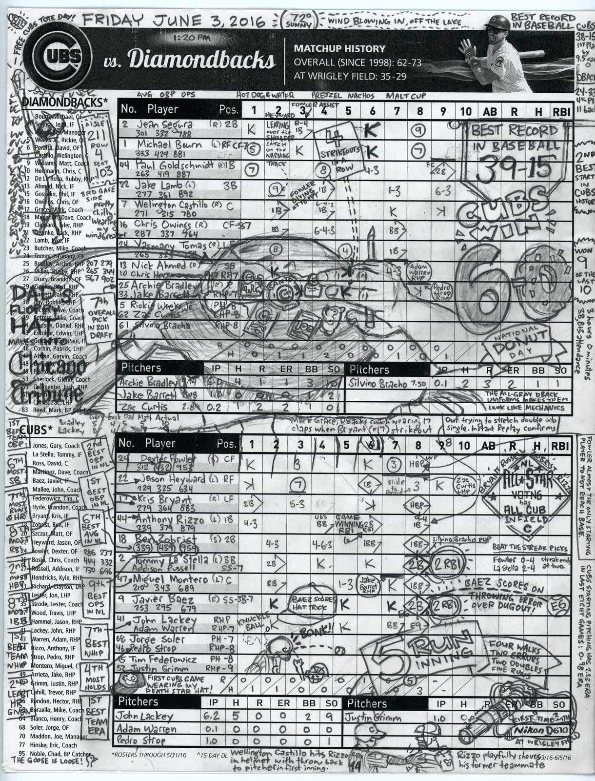
That’s Maldre’s scorecard from a 2016 Diamondbacks/Cubs game. He posted it, along with some other scorecard artwork, on one of his several blogs, and at some point his work came across the radar of the folks at Chicago magazine, who commissioned him to do scorecards for each game of the 2016 World Series. Here’s how those scorecards turned out, from Game 1 through Game 7 (click to enlarge):

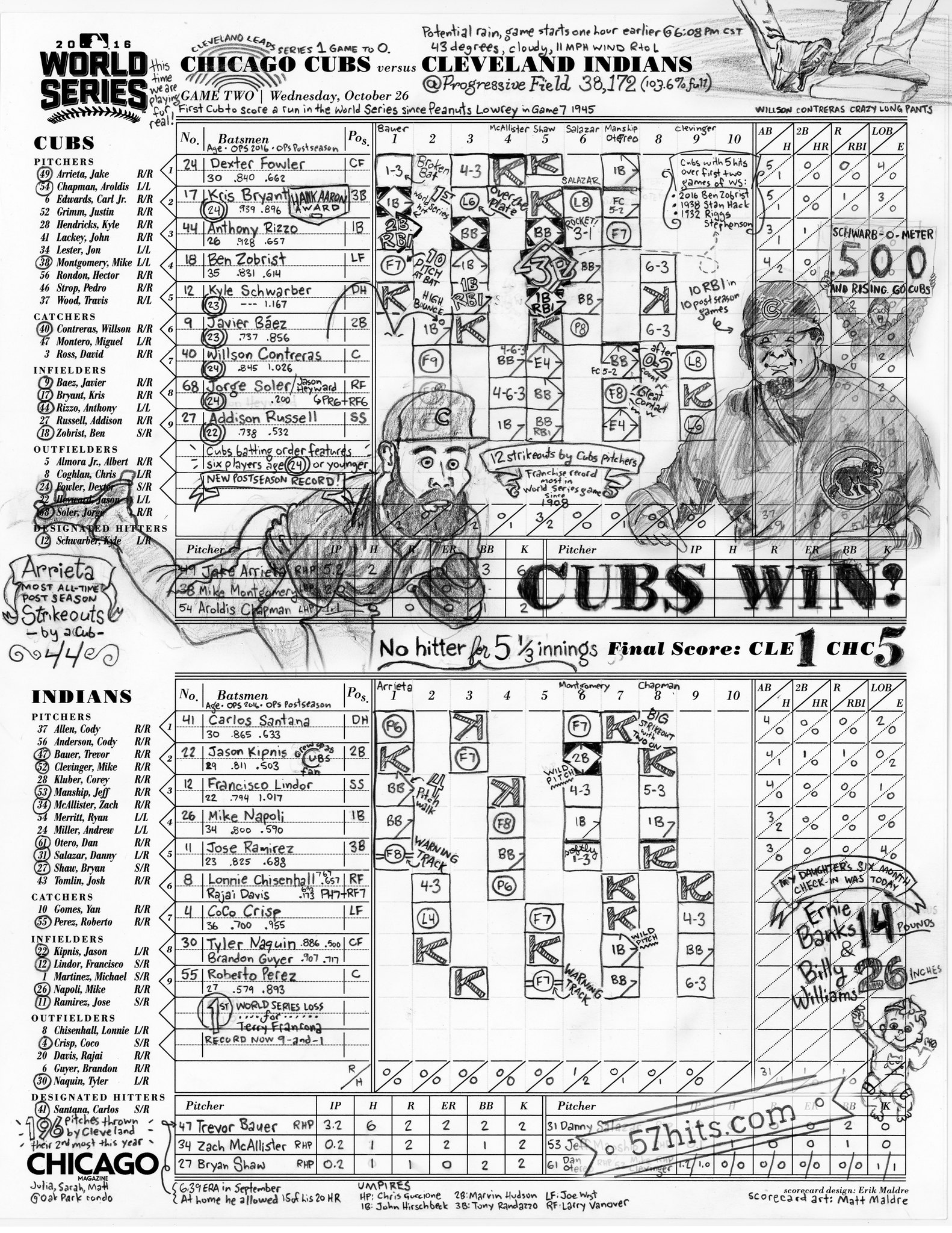
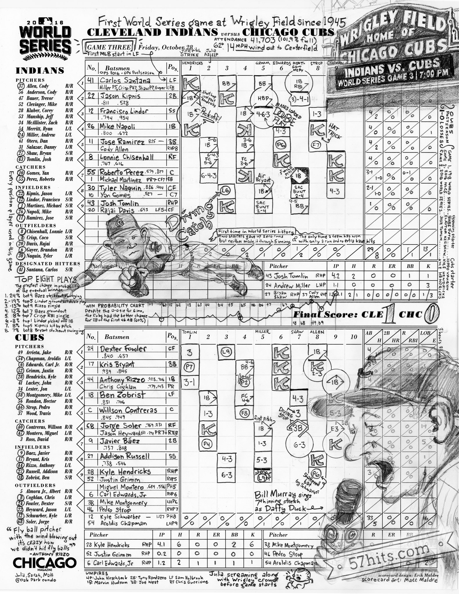
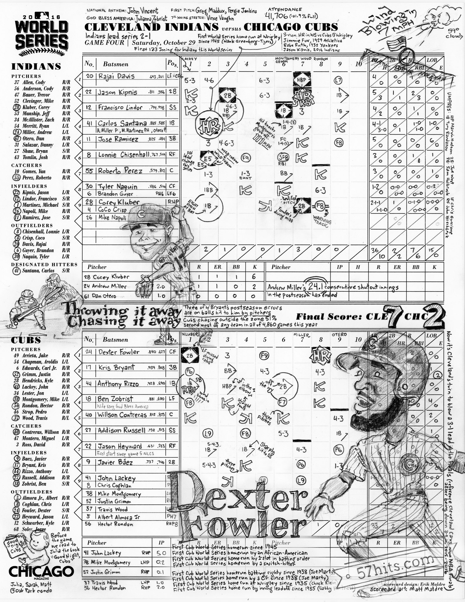

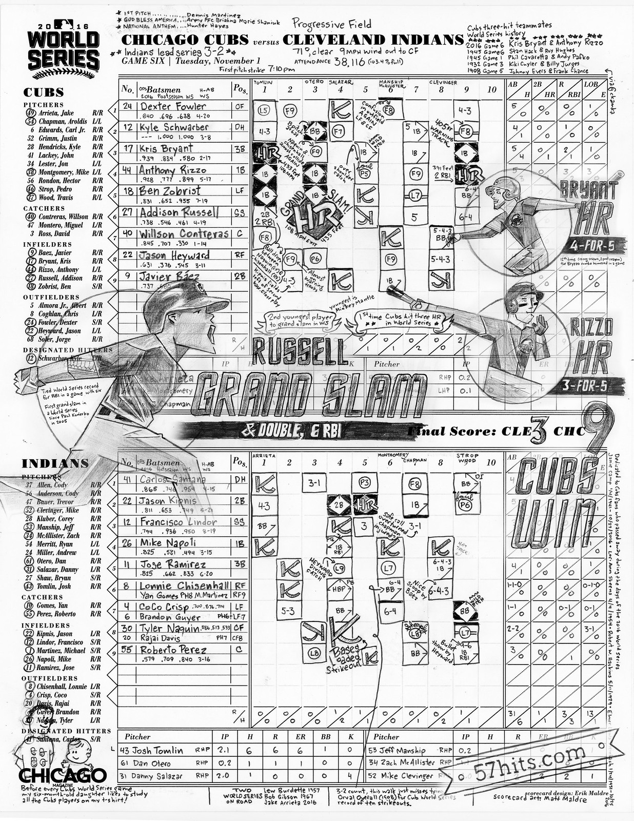
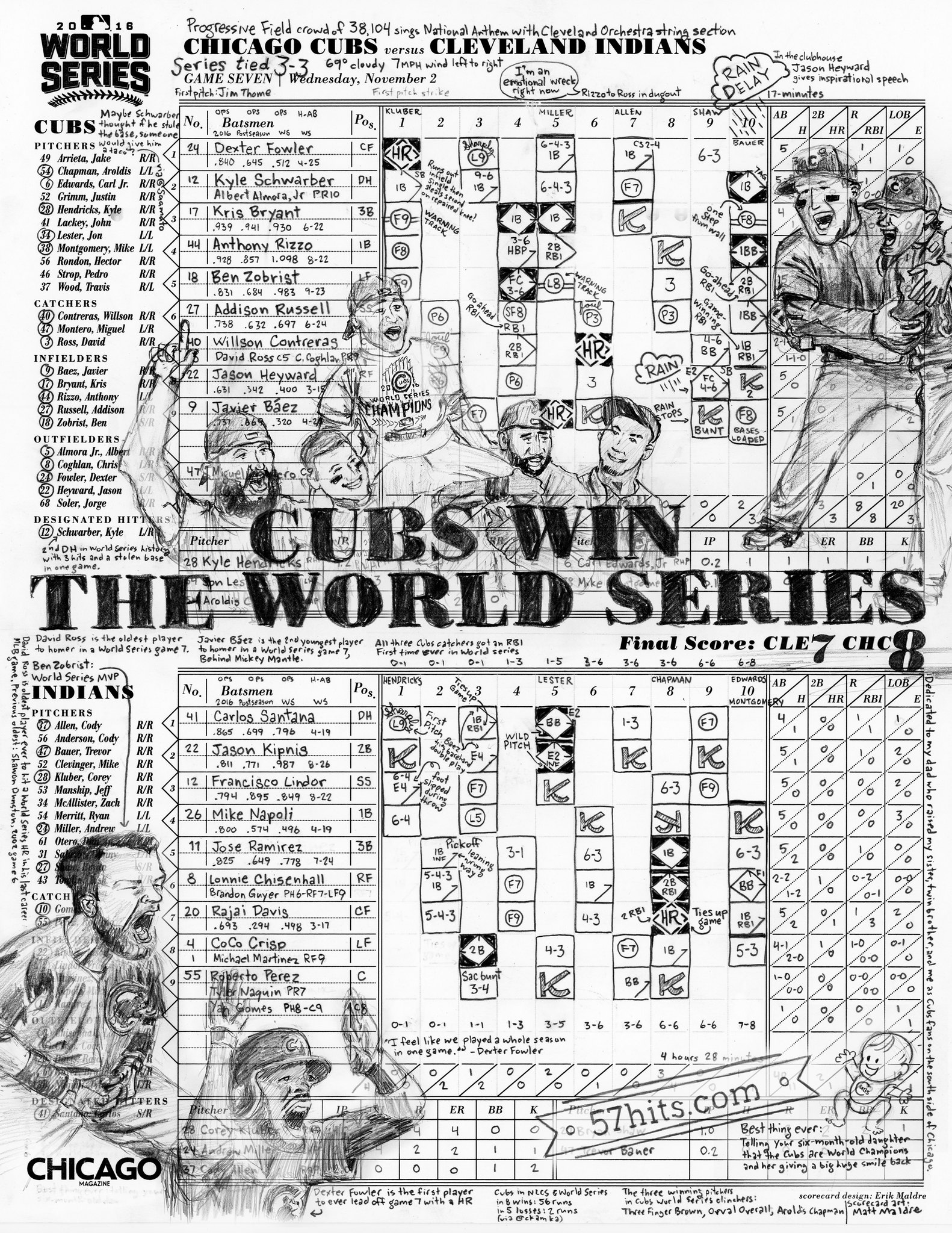
Is that awesome stuff or what? Aside from the great illustrations, there are so many excellent details, like the way Maldre draws a “K” for a strikeout, or the little notes he scatters throughout his scorecards. (He talks about his technique here.) I haven’t kept score in years, but Maldre’s ’cards make me want to get back into it.
You may be wondering why I waited until now to tell you about a bunch of scorecards from last year’s World Series. The answer is that I’d never heard of Maldre until about two weeks ago. I had hoped to interview him for this piece, but he didn’t respond to my tweets or emails — bummer. But at least we can appreciate his wonderful scorecards. Matt, if you’re reading this, keep doing what you’re doing, and get in touch if you ever want to talk more about your artwork.
(Doubleplusthanks to reader Stephen Schaub for turning me on to Matt Maldre’s stuff.)
Spotted in the wild: Paul Rand, the greatest graphic designer of the 20th century, created the familiar IBM logo in 1972. In 1981 he produced a limited-edition poster featuring a rebus version of the logo. The poster has become famous and valuable. Yesterday, while attending my friend Freddie’s bi-monthly 78rpm record hop, I spotted someone wearing the rebus design on a T-shirt, which I’d never seen before (click to enlarge):
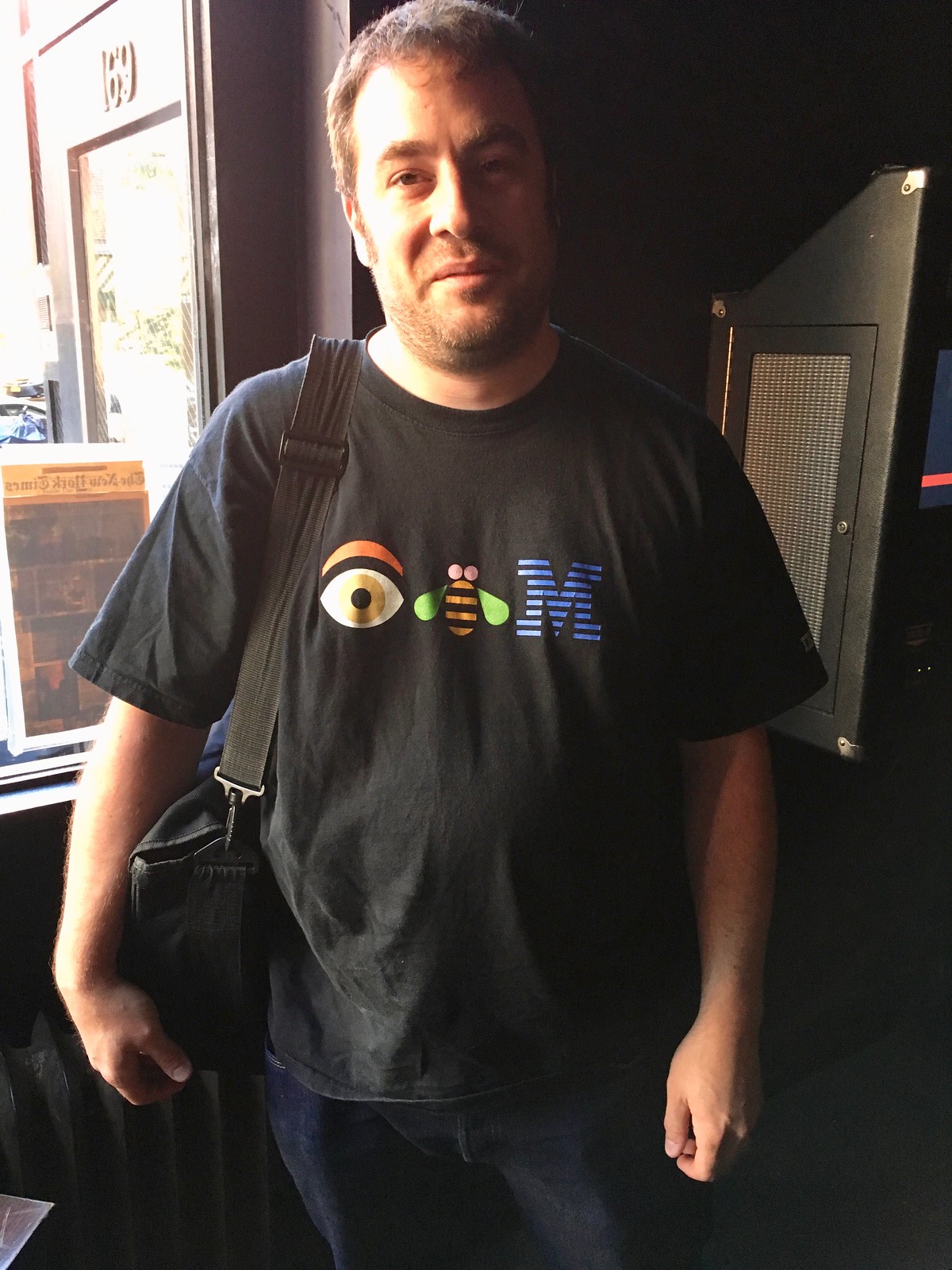
Fun. And as an aside, someone has adapted Rand’s rebus concept to “spell” out Nike.
The Ticker
By Alex Hider

Baseball News: The Cubs and Brewers went blue-on-blue yesterday (from Garrett). … There was some color-on-color action in the second game of a doubleheader between the Nats and Rockies (from John D. Russell). … The Aaron Judge memorabilia market is exploding. The jersey worn during his rookie debut just sold for north of $150,000, making it the most valuable jersey sold in the last 15 years (thanks Mike). … It’s weird seeing Randy Johnson in a Diamondbacks uni that isn’t purple and teal (from Michael). … Goose Gossage wore a cap with what appeared to be a Yogi Berra caricature in Cooperstown this weekend (from Patrick Lavery). … Vlad Guerrero tweeted this photo of Expos Hall of Famers Andre Dawson and Tim Raines. According to Thurm, “Dawson looks like he’s wearing a cheap knock-off jersey,” while Raines has a legitimate jersey. Either way, it’s better than what the Nationals are wearing. … Either David Ortiz’s phone doesn’t have a front-facing camera, or he’s just really bad at taking selfies (from Stephen Hayes). … Color-on-color in Japan, as the Chiba Lotte Mariners wore special “Festa” uniforms (from Graveyard Baseball). … The Orioles’ rare mono-orange ’70s uniform has finally made it onto a Topps baseball card (from Jon Helfenstein). … Christopher Overholt spotted this “Ultimate Patch Collection” poster at a Lids store. … Spotted at a Reading Fightin’ Phils game: a single player with a NNOB jersey (from Stan Capp). … The Sioux Falls Canaries wore “Christmas in July” jerseys on Saturday (from Chris Lather).

Football News: We’ve seen photos of the Falcons’ new stadium before, but I don’t think anyone’s pointed out that it looks like the retractable roof has what sorta looks like a squatchee (from Eric Juergens). … Nebraska held a “Fan Day” this weekend, and many of the players in attendance wore jerseys that more resembled T-shirts than actual on-field jerseys (note the lack of a B1G logo) (from David Westfall). … UConn could be ditching the Husky head helmets for the classic “C” logo (from Matt Necci). … Jacksonville University will sport gold domes this year (from Scott Manze). … Looks like Tennessee QB Quinten Dormady is taking a page out of Peyton Manning’s book and wearing loose-fitting sleeves ”” a rare look these days, especially in the college game (from Eric Haag). … A local T-shirt company in Youngstown, Ohio, is selling a T-shirt with a rare Youngstown State helmet design (from Robert Hayes). … Chargers QB Dan Fouts wore No. 14. But here’s some 1976 footage showing him wearing a No. 11 NNOB jersey. His regular jersey must have been damaged. By coincidence, that’s the number he wore at Oregon. … Auburn blogger Clint Richardson asked fans to come up with some crazy Auburn uniform concepts.

Grab Bag: Here’s a recap of every new NBA uniform that has been released so far this summer (from Phil). … New volleyball unis for Oregon State (from Jeremy Brahm).
Today is my last day on the site before the start of my annual August break. I’ll still be producing ESPN content (I have a doozy of a column coming up in a day or two, in fact), and I’ll make occasional cameos here on the blog to announce new projects or cover for people who have schedule conflicts (I’ll be compiling this Friday’s Ticker, e.g.), but Phil will be running the show here. I know he has some great stuff in the hopper, including a new contest that I believe he’ll be announcing tomorrow. Everyone have a great August, and I’ll see you back here in September. ”” Paul
Kind of random and out of nowhere that he’d use the classic Star Trek font on the Game 6 card.
All in all, pretty nifty!
Star Trek and baseball go hand in hand. Just ask Captain Sisko.
To me the Bill Murray drawing looks oddly like one-time NY Mayor Ed Koch.
Honestly, I had a super-hard time drawing Bill Murray. He’s most recognizable with his receding hairline. When he sang the stretch, he was wearing a cap. Plus, in that game, not much good happened for the Cubs, so I had to focus on Murray. Yipes!
Las Vegas 51s (AAA-Mets) use it for both the wordmark and number font.
Thanks for noticing the Star Trek font! (I’m Matt, the scorecard artist here). The font is “Federation Classic” (and I got it from the DaFont site. I was looking for a font with strong angles to match the angles in the illustrations. The condensed face helps it be a bit larger on the scorecard, too. Any connection to Star Trek? Not intentionally! But I love Star Trek, so I was happy to put it on the scorecard. :)
Happy quasi-sabbatical.
Enjoy National Sandwich Month away and good luck!
I love the scorecards. We were at the game in June. My scorecard did not look as nice. Matt’s captures what a perfect day it was for baseball at Wrigley.
I don’t know for sure but I don’t think he created those scorecards while actually at the games. I would think you would need a desk or other hard surface to create such precise and intricate scorecards, all without people getting up, bumping into you as they went by, spilled beer, mustard, foul balls, etc.
I’m thinking the same
Oh yeah, I totally did the scorecards at home (Hi! I’m Matt! The scorecard artist featured in the post). It was really nice to be able to do the scorecards on a table. Normally I use a clipboard at the game, which gives some good stability. But having that table make it really handy. Plus, that allowed me to have a laptop set up where I can scour around for interesting factoids.
Here’s where you can buy IBM Rebus merch: link
By the way, I remember the rebus as a screensaver, either in OS/2 or for PS/2 PCs with Windows installed. Or it was on my ThinkPads when I worked for IBM. It’s been over 20 years; the memory gets hazy :).
Isn’t having the letter M (or the N in the Nike one) cheating? I feel like putting the letter is the same think as spelling it.
Nike should be N+(eye)(key)
I believe the Yogi cap that Gossage was wearing comes from the Berra museum in NJ.
There’s a guy that does sketches w/ scorecards on the south side of Chicago too. Pretty good stuff, below is link to his website/blog. He also has an instagram.
link
Enjoy the time stepping away from the blog Paul.
The Nebraska player in the ticker looks to be wearing a tshirt that resembles a jersey rather than the other way around. I wonder if it’s a shirt they use for the weight room or at Friday walk throughs.
Some great looks at those all-Orange Orioles unis…wow. Those shoulder stripes are so big as to almost be football jersey stripes. And the black stirrups… wow…
also reminded of those great Orioles vest jerseys. Man, they need to bring those back..
-Jet
I thought the new stadium in Atlanta was having issues opening and closing the roof. (Did I misunderstand?)
I think after several delays in construction, it is working now. I believe the issue that was reported recently is simply that they are still working out all the kinks. So rather than find themselves in an embarrassing situation on gameday if something goes wrong, they are just going to keep it closed until they can get X number of days in practicing successful operations.
I have a hard time believing that Ultimate Patch Collection poster is an official MLB poster. It says the Rays are from Tampa Bay, Florida, which is not a city (its a body of water). It also says the Texas Rangers are located in Dallas, Texas, which they are not.
I refuse to accept the validity of an ultimate patch collection which does not feature the Unisphere patch of the 1964 Mets.
According to Pro Football Reference, the San Diego Chargers backup QB in 1976 was Clint Longley (No. 16). I assumed the No. 11 jersey was borrowed from the backup QB, but there was not a No. 11 on the roster. I could see having extra No. 14 jerseys on hand, but I wonder why they had a No. 11?
Could be just a leftover from previous season that was floating around the locker room. It happens.
That makes sense, although the Chargers did not have a No. 11 on the roster for several years prior to 1976. Maybe there was a No. 11 who did not make the final roster.
New Hornets uniforms HERE
It’s interesting to me that most of the Nike uniforms we’ve seen use the Aeroswift waistband on their shorts.
The Hornets are using a different waistband style
Other teams I’ve seen with this different waistband has been The OKC Thunder , and the Pistons (no pic).
The Pacers uniforms show the Aeroswift waistband.
Wonder if there will be teams wearing different templates, or if some of these are just samples and all of them will be the same template when the hit the court.
Crap…bad formatting.
Here’s the Hornets’ link.
And the link
I wish at least one of the Hornets’ unis had said “Charlotte” instead of “Hornets”
Always seems bad form to me when teams don’t include the city (state/region) and only have the nickname on all jerseys. It is the local fanbase that makes these franchises go. This is why they should have stuck with color at home, white on the road (or vice versa) so you could have the nickname on the home jersey and city name on the road jersey.
I agree that the city name should be worn on the road jerseys, but I think that white should be the standard home look.
Why? Because it allows the fans to see the variety of different colors from visiting teams.
Otherwise, season ticket holders are just seeing their home color vs. white every single game. Boring.
Those scorecards are amazing. Not only telling a story via the scorekeeping but with good visuals as well. Awesome. Thanks for sharing.
What an awesome coincidence. I actually printed out that scorecard yesterday as a memento gift for a friend!
Sweeet! I love hearing stories like this! (I’m the artist-guy behind the scorecards).
Is this the same Shep from the ol’ Cubscast? OMG, if you are, I’m getting happy shivers that you would share these scorecards with a friend. I loved the Cubscast podcast. I refuse to take it off my iTunes subscription list!
That art is awesome!
And I’m a Cardinals fan!
I have a freelance request from a Cardinals fan to create a scorecard for the game 6 of the 2011 World Series (aka David Freese game). I’m very excited to make a scorecard for this game–and I’m a Cubs fan. I love good exciting baseball.
If the client gives the ok, I’ll share an image of the Freese scorecard online once it’s done.
Oh wow! Thank you so much for covering my scorecards, and for your very kind words about my work. Holy cow, I’m blown away. I’m emailing you back now… And I’m going to reply to some of the comments here!
Great to hear from you, Matt. Love your stuff — keep doing what you’re doing!
Matt, really cool stuff! I love keeping score, haven’t done it in years, but plan on doing a card when I visit Toronto in a few weeks. You’ve inspired me to add a little artistic touch… but I’m sure it will pale greatly in comparison to yours!
Randy Johnson played for the Diamondbacks wearing red uniforms for two years (2007 and 08): link