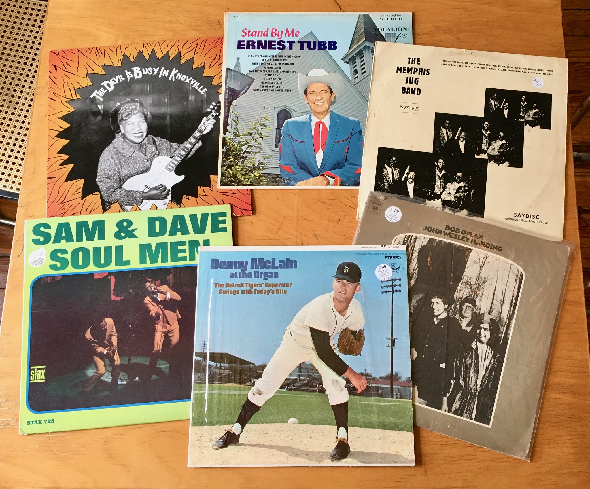
On the Fourth of July, as I was walking to the corner gas station to get some ice for the party I was hosting that afternoon, I saw that someone on my block had put some discarded LPs out on the sidewalk for anyone to take. There’s nothing particularly unusual about that — people on my block leave all sorts of things on the curb, including records. The difference this time around was that the records actually looked pretty good. I grabbed these six (click to enlarge):
The one we’ll be discussing today, of course, is the immortal Denny McLain at the Organ LP, which was issued in 1968 (the same year McLain won 31 games) and has become something of a kitsch/irony classic. I’ve seen lots of copies of it over the years, but I’ve never had my own copy until now.
And now that I have it, I see that it has some uni-notable details. Let’s take a closer look (click to enlarge):
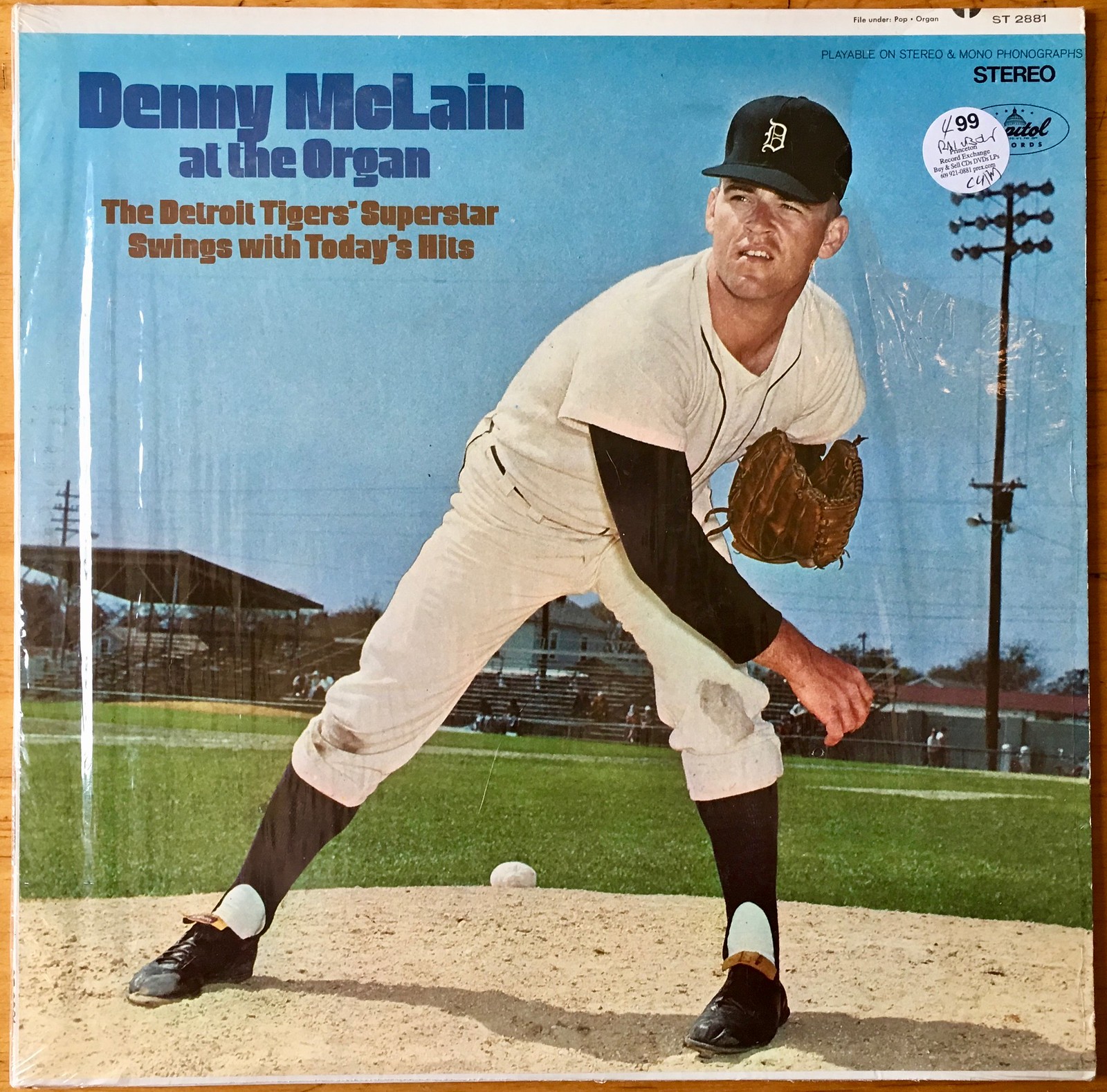
For starters, both of McLain’s knees are dirty, which seems really odd. Like, wouldn’t you want him to have a crisp, clean uniform for the photo session? And while some pitchers routinely dirty the knee of their push-off leg as a natural part of their drop-and-drive delivery (Tom Seaver always said he knew his mechanics were in sync if his right knee was dirty), it’s uncommon to see a pitcher with two dirty knees. Not only that, but the blemishes on McLain’s knees don’t even look like infield or mound dirt. They seem more like watercolor paint or something like that.
In addition, McLain is positioned so as to obscure his jersey logo, presumably because the record company didn’t have permission to show the Tigers’ insignia.
But what about McLain’s cap logo? Let’s take a closer look:
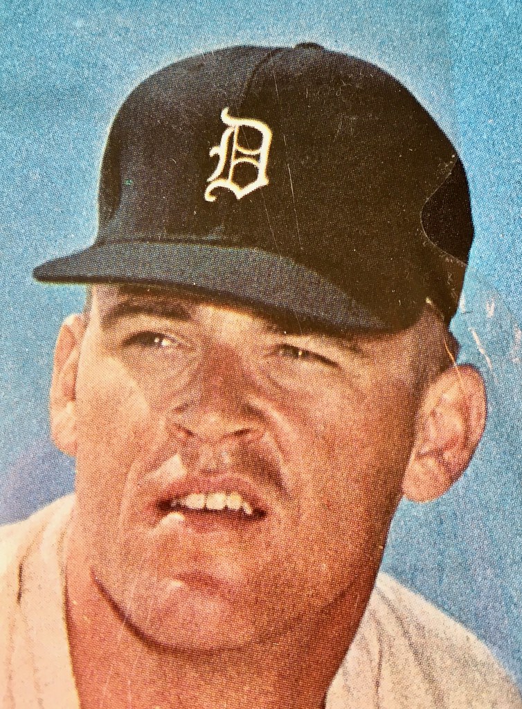
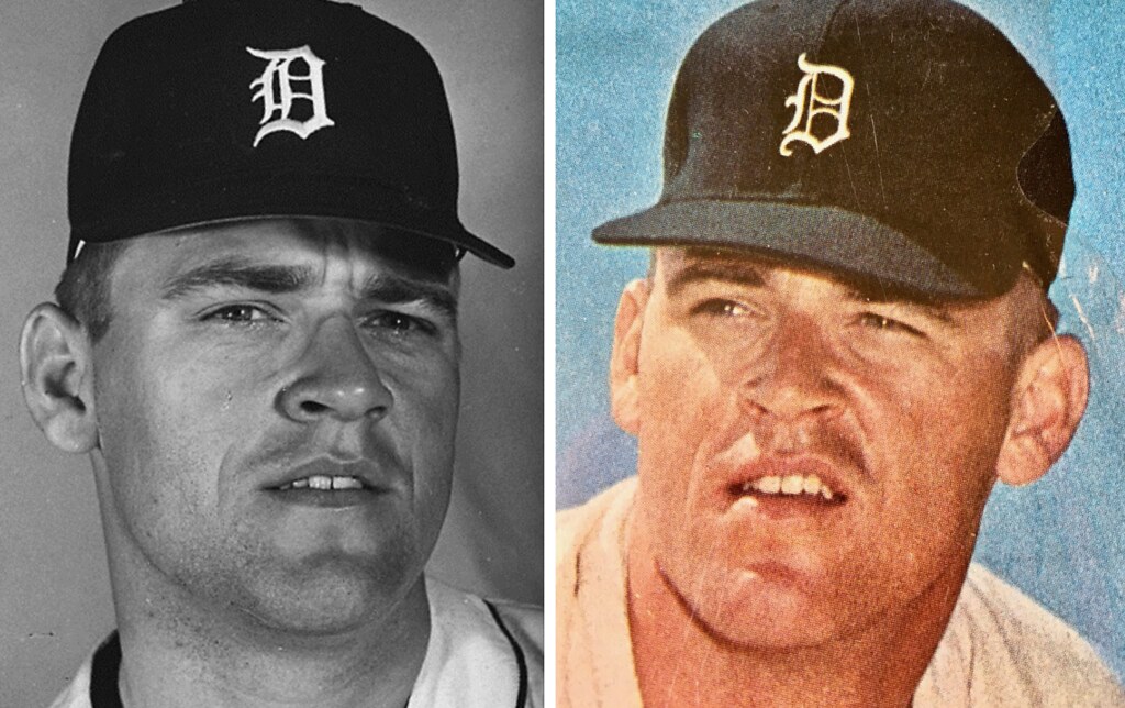
Now, the Tigers’ old English “D” has undergone lots of changes over the years. But is this version the one they were wearing in 1968? Nope. If you look at photos of McLain (or any other Tigers) from the ’68 season, you’ll see that their cap logo was essentially the same one they still use today. Here’s a side-by-side of a 1968 shot of McLain and the cap from the LP cover (click to enlarge):
So if the cap that McLain was wearing on the LP cover wasn’t era-appropriate, which era was it from? In an attempt to find out, I began by consulting SportLogos.net’s Tigers page, where I was surprised to find that the LP-cover cap logo isn’t shown at all.
Next, I looked up this infographic showing the evolution of the Tigers’ logo (click to enlarge):
The closest thing to the logo shown on McLain’s cap is the one labeled “1966-67.” But even that isn’t quite a match. So I looked up another infographic (click to enlarge):
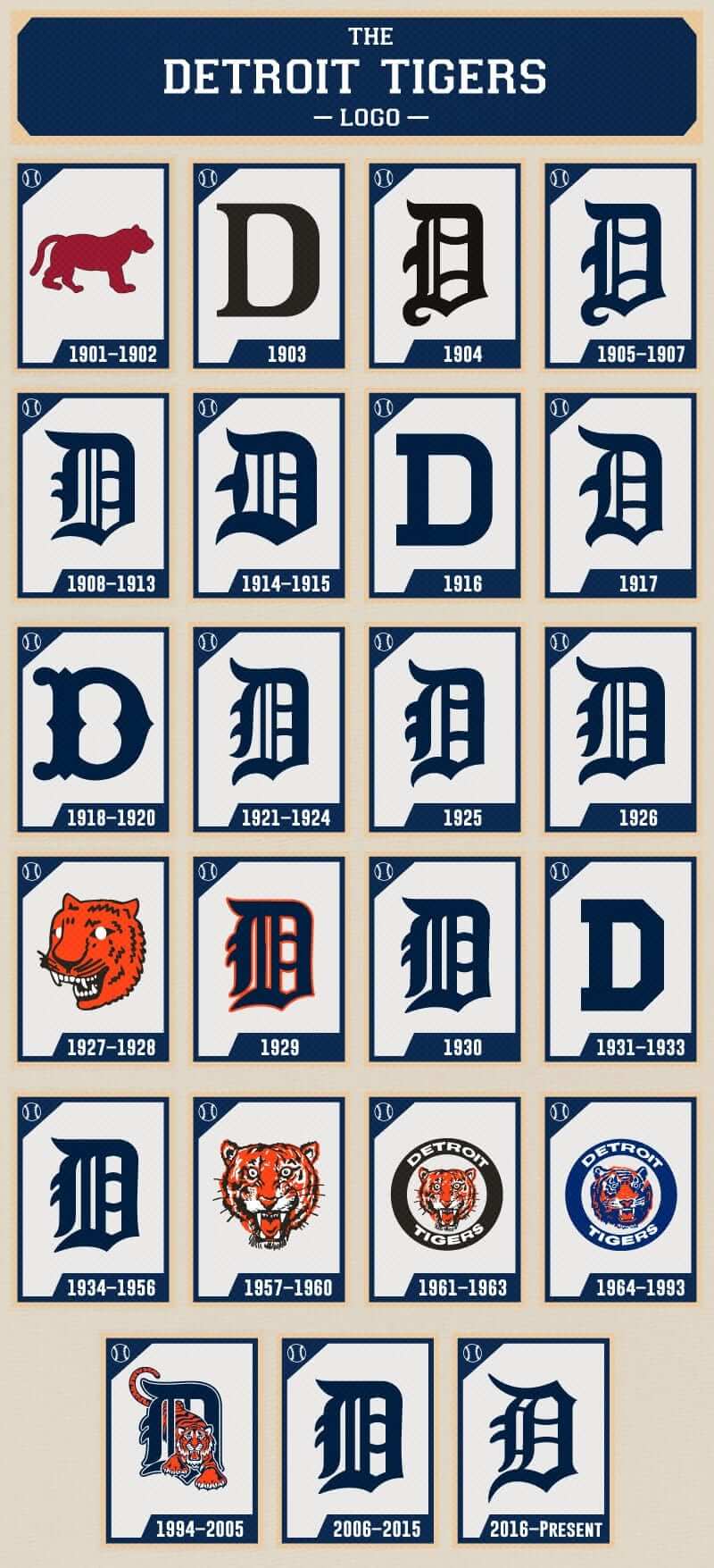
The logo on McLain’s cap does not appear on that infographic (which, incidentally, appears to be just a repeat of the logos shown on the SportsLogos.net page). At this point I was wondering if the LP-cover cap had ever been worn on the field, or if it was something the record company had come up with just for the photo shoot.
Then I came across this tweet that uniform designer/historian Todd Radom posted earlier this year:
The Detroit Tigers' headwear Old English "D" logo-a meandering evolution for a time-honored symbol. pic.twitter.com/CIwYmckA7s
— Todd Radom (@ToddRadom) May 22, 2017
Hmmmm, let’s take a closer look at that 1964 photo and compare it to the LP cover:
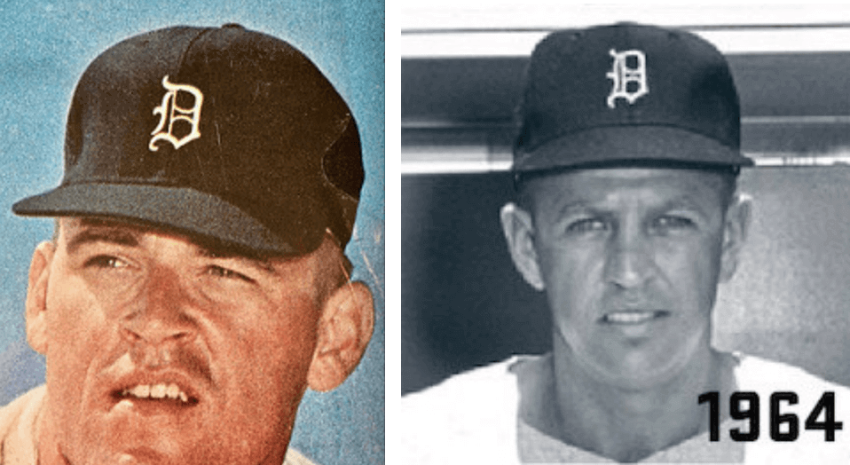
That appears to be a match. So for his 1968 LP cover shoot, McLain was wearing a cap from 1964.
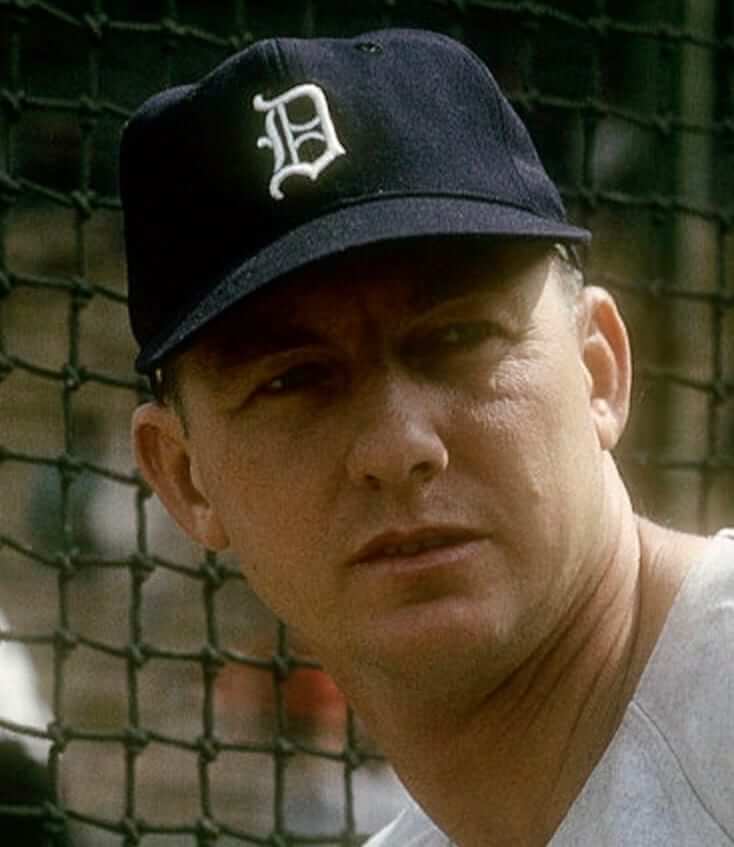
Or was he? While poking around in the Getty archives, I found a shot of Al Kaline, dated 1963 (although Getty dates are always suspect), that clearly shows him wearing the same cap as the one from the LP cover (click to enlarge):
Speaking of Kaline, I featured some old photos of him in a Uni Watch entry about a month ago. That entry also included this photo of McLain:
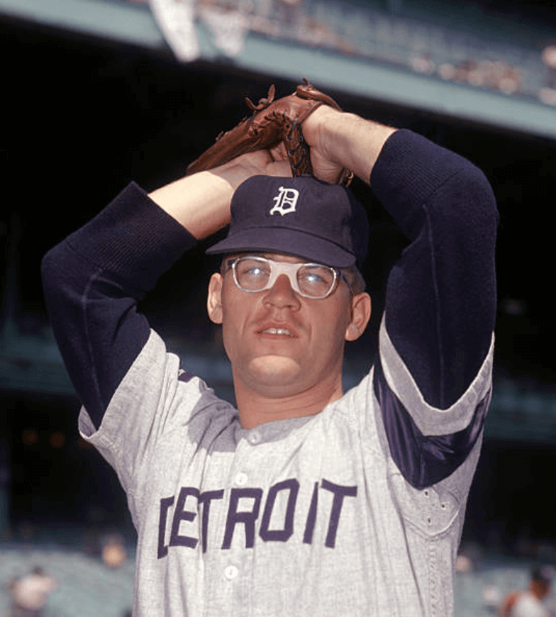
There it is again — the cap logo from the LP cover. And that photo is definitely from 1966, because of the memorial armband for former manager Charlie Dressen.
Getty also has this photo of Eddie Mathews wearing the cap logo from the LP cover in 1967 (and we can assume the date is accurate on this one because Mathews only played for the Tigers in 1967 and ’68):
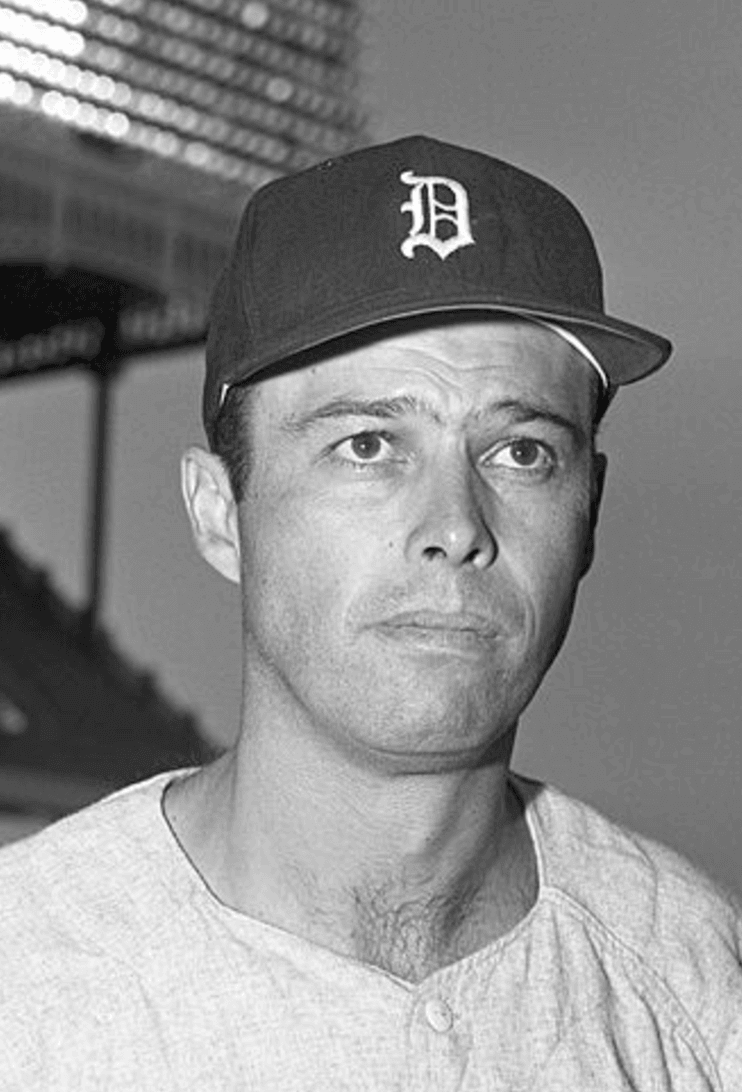
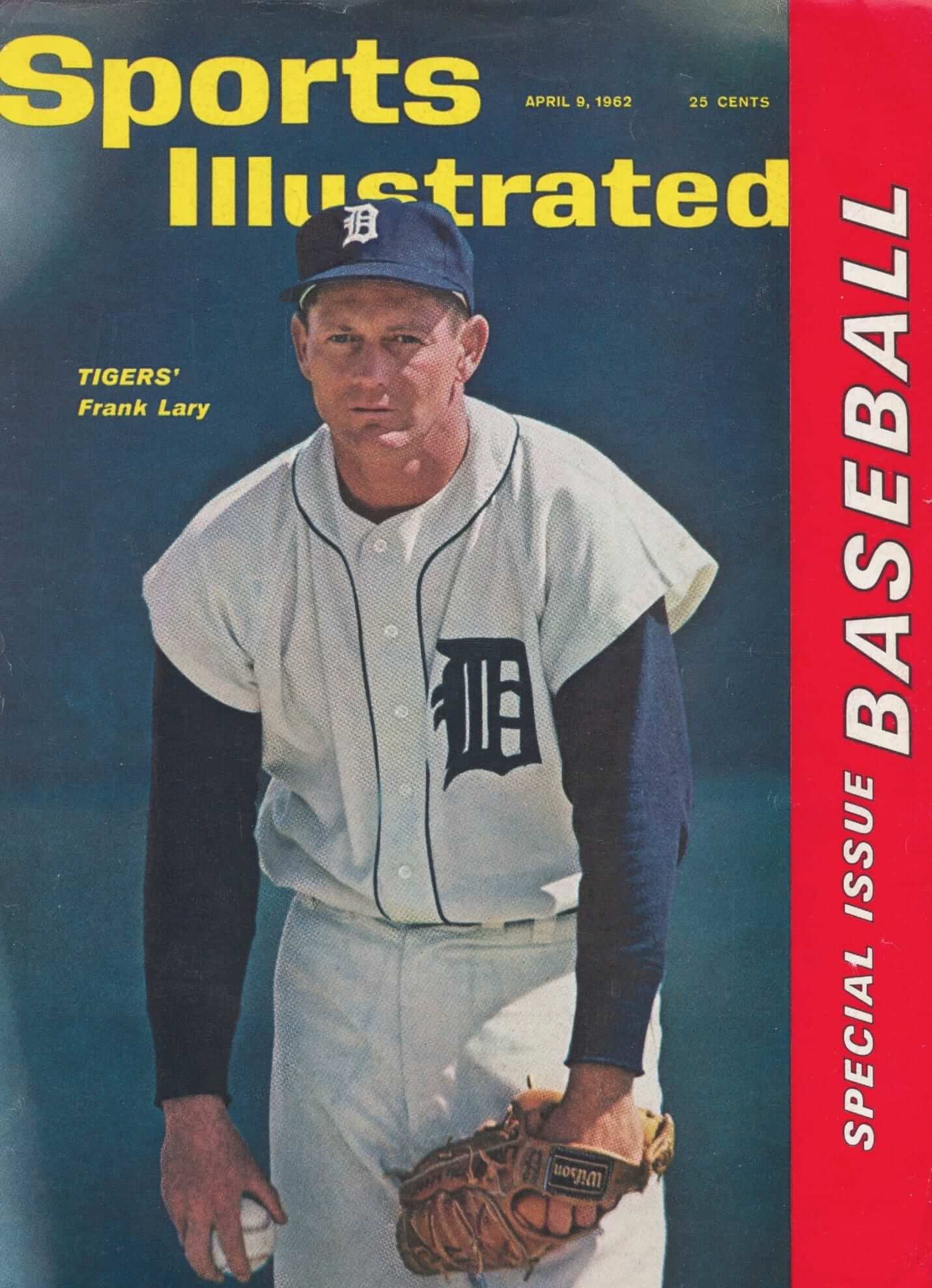
So it appears that the Tigers may have worn this cap logo from 1963 through 1967. We already know that they didn’t wear it in 1968, but what about 1962? Nope, they didn’t wear it that year, at least not judging by this Sports Illustrated cover photo (click to enlarge):
As for the record itself, it’s pretty weak. In fact, it’s almost unlistenable. But hey, the price was right. And it led to some fun uni-watching.
Naming Wrongs update: I’m happy to announce that the latest Naming Wrongs shirts are now available. Here’s the lowdown:
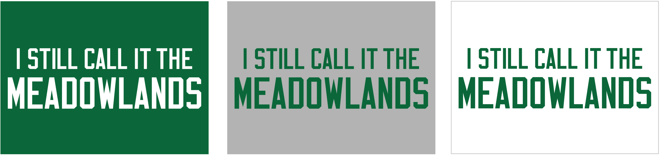
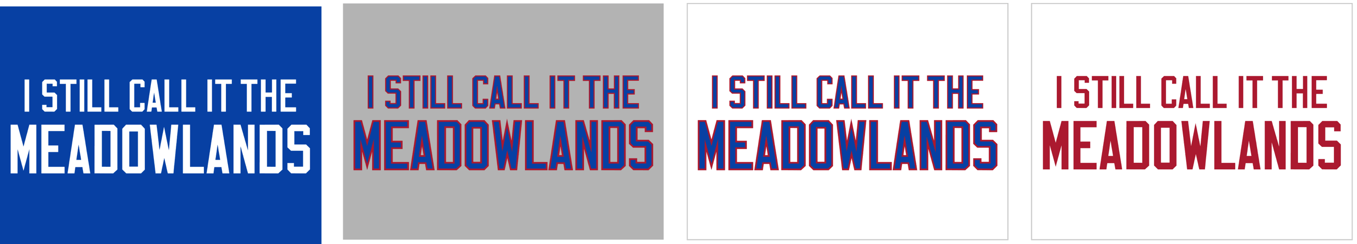
Meadowlands: A lot of people asked for a Giants Stadium shirt, but we’re not doing anything that includes a team name, so we’re doing a Meadowlands shirt instead. It’s available in green, grey with green lettering, white with green lettering, blue, grey with blue lettering, white with blue lettering, and white with red lettering (for all of these mock-up images, you can click to enlarge):
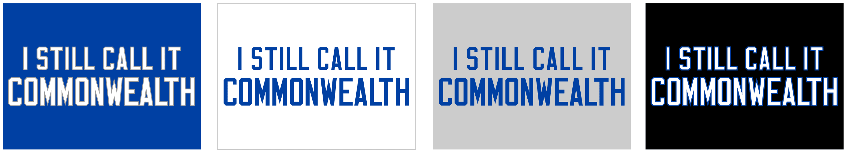
Commonwealth: With Kentucky’s Commonwealth Stadium recently named after a supermarket chain, lots of fans asked us for this one. It’s available in blue, grey, white, and BFBS:
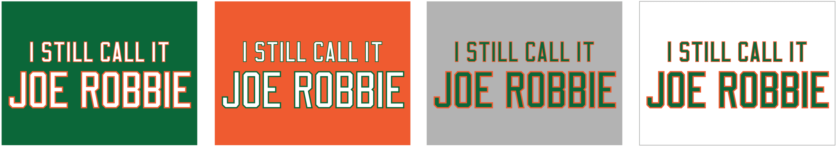
Joe Robbie: With college football season fast approaching, we added some new orange/green designs to our Joe Robbie line. They’re available in green, orange, grey, and white:
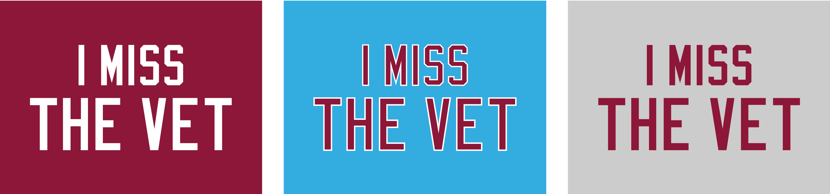
We’re also trying something new: We’ve gotten a lot of requests for shirts honoring old stadiums that have been gone for a long time. These don’t fit into the “I Still Call It” or “I’m Calling It” category — they’re more of an “I Miss” kind of thing. I didn’t want to do that type of shirt at first, because it seemed like more of a straight nostalgia exercise and I wanted to get our anti-corporate mission established first. Now that we’ve done that, I’ve decided to try a few “I Miss” designs, at least for old stadiums that have been replaced by new buildings with corporate names. Here are our first efforts:
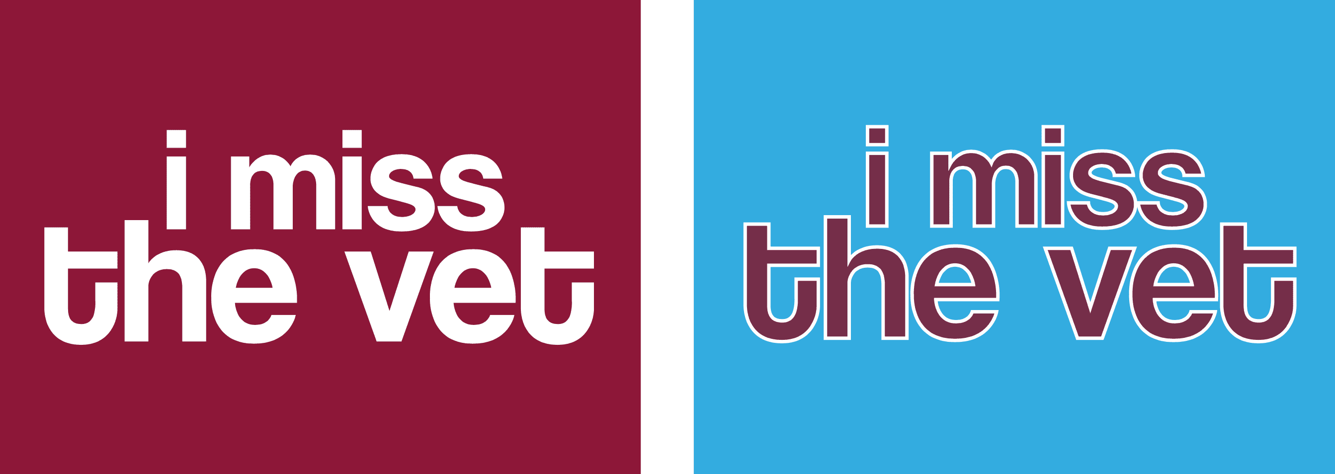
The Vet: We’re doing two different versions of this — a standard-lettered version in maroon, powder blue, and grey, and a more mod/’70s version in maroon and powder blue:
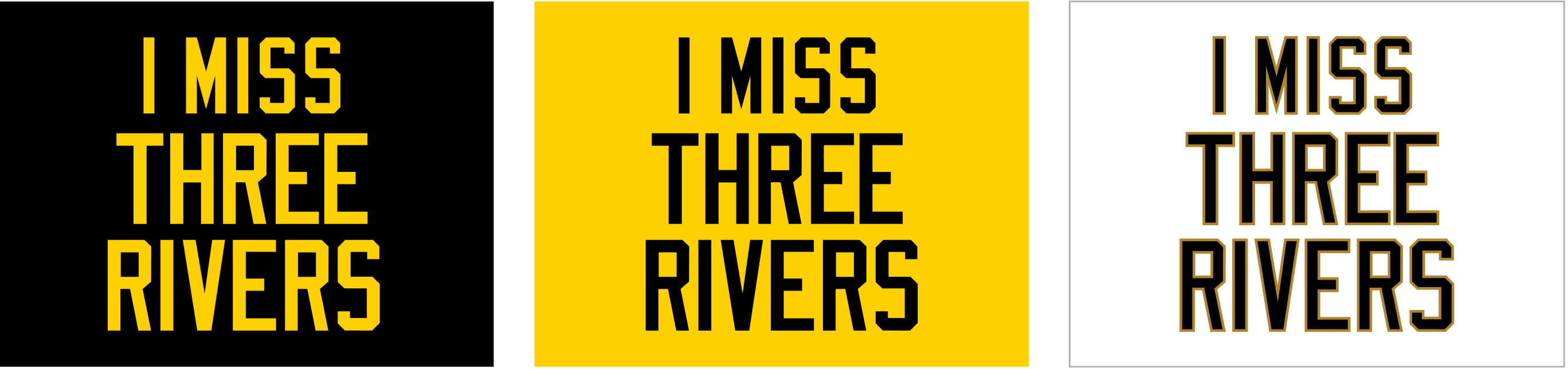
Three Rivers: This one is our first triple-decker design. It’s available in black, gold, and white:
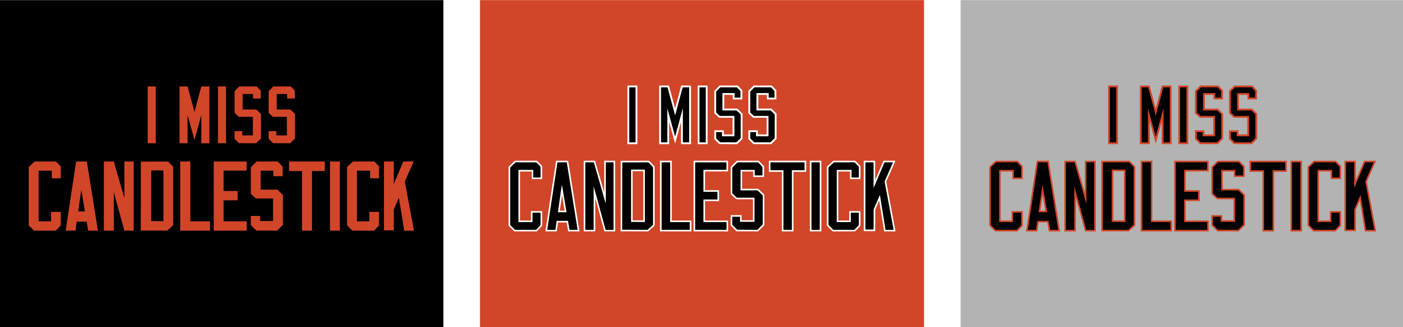
Candlestick: We couldn’t decide whether to call it “Candlestick” or “The Stick.” We ultimately went with the full name, which is available in black, orange, and grey, but we could create a nickname version if we get requests for it:
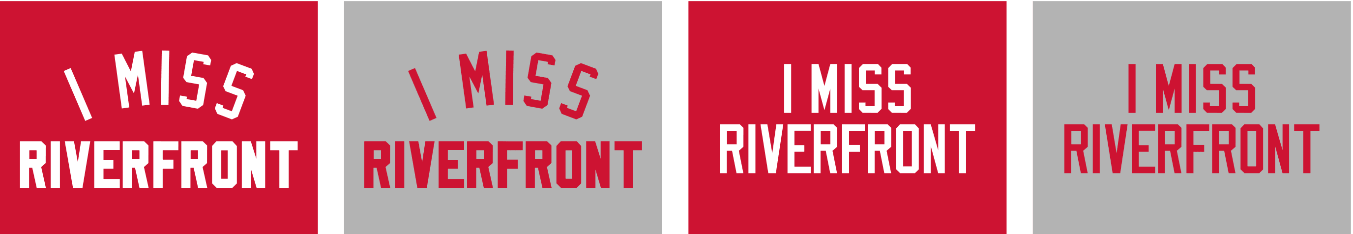
Riverfront: We did two versions of this — a standard-lettered design, available in red and grey, and an arched treatment, also in red and grey:
All of these designs are now available in the Naming Wrongs shop. They’re also cross-listed in the Uni Watch shop, where card-carrying members can get 15% off. (If you’re a member and need the discount code, send me a note and I’ll hook you up.)
Also, in case you missed it on Friday: We’ve also made a shirt for the Tappan Zee Bridge, which is being renamed for a governor. This one isn’t an anti-corporate thing, so it isn’t in the Naming Wrongs shop, but you can check it out here.
My thanks, as always, for your consideration. And big kudos to my collaborator, Scott M.X. Turner, for all his hard work on these.
Click to enlarge
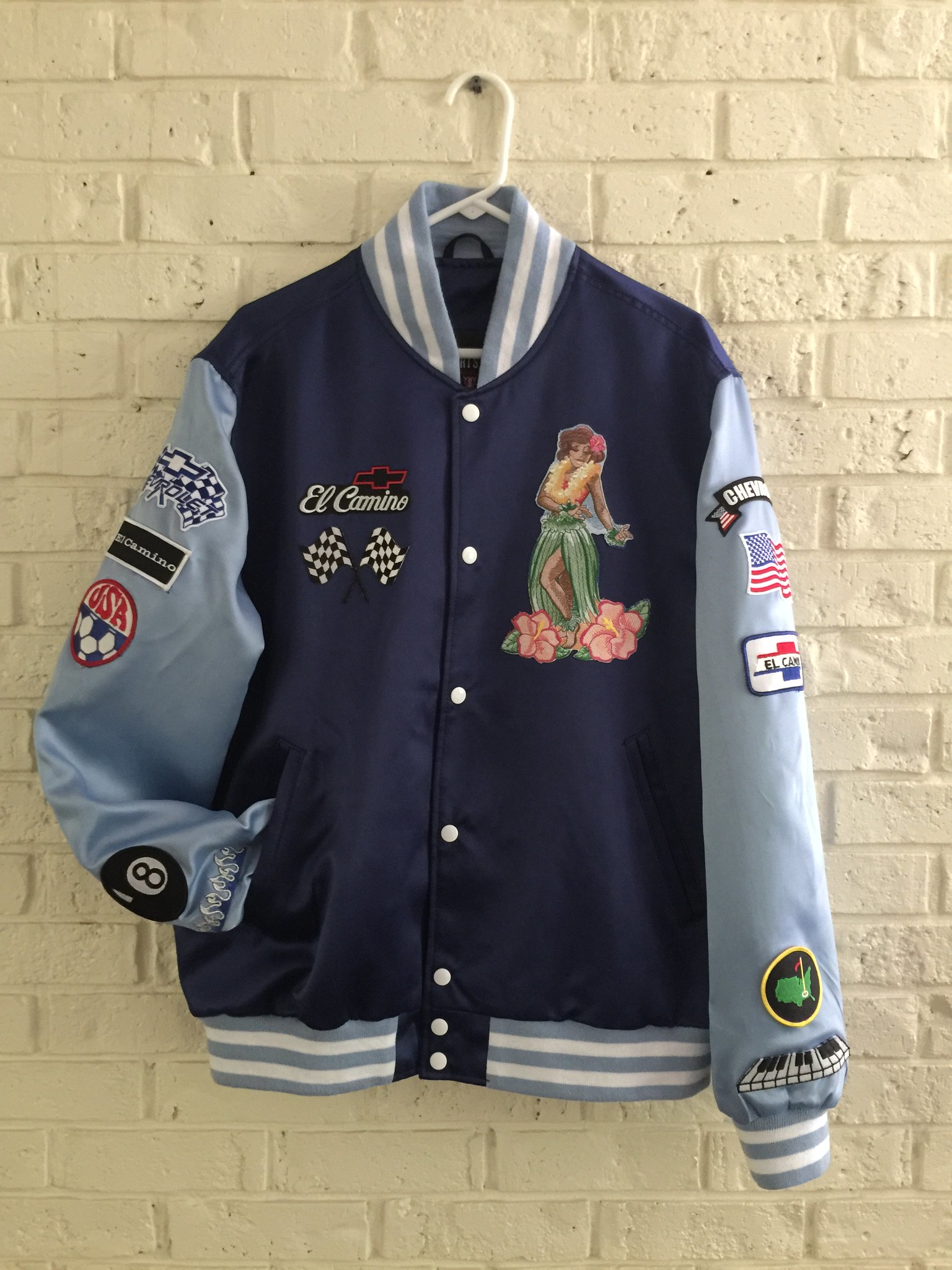
Jacket raffle update: Earlier this year I raffled off a free custom-designed jacket from our friends at Stewart & Strauss. The winner was longtime reader Ben Traxel. That’s his jacket shown above, and here’s his explanation of the design:
I decided I’d do a themed jacket based on my 1986 El Camino. I have a hula girl bobble on the dash named Flora, which is also the name of the car.
I wanted the jacket to have lots of patches, but Stewart & Strauss couldn’t do the patches the way I had them shown. No biggie — I found the patches on eBay was able to get everything attached with the help of my seamstress mother. The non-vehicle-related patches represent my wife and kids and their interests.
While the end result probably isn’t for everyone, I like it and will enjoy it come the fall cruising season. I decided not to personalize the jacket with my name. That way, in case I ever sell the car, the jacket will go with it.
Thanks again for the jacket from the raffle and special thanks to the fine people of Stewart & Strauss.
The Ticker
By Alex Hider

Baseball News: After two games in throwbacks, Milwaukee’s Ryan Braun apparently got tired of wearing sansabelt pants yesterday and wore the traditional, belted, pinstriped pants the team usually wears for Friday home games. The rest of the team was still wearing the sansabelt throwbacks (from Michael J. Miller). … Speaking of the Brew Crew, Scott Rogers found some Brewers-themed frozen waffles at the grocery store. He says the Brewers logos only appeared on the packaging, and the waffles themselves had a traditional grid. “Tastes like blueberry Eggos, but a bit breadier and less sweet,” he said. … The outfield at Comerica Park has been looking rough since the stadium hosted a Metallica concert last week (from Chris Howell). … Reds P Homer Bailey was wearing a cap without the New Era logo yesterday (from Michael). … Players in the Frontier League All-Star game went beyond home whites and road grays (from Steve Johnston). … Funny car driver John Force threw out the first pitch at a Cubs game recently and received a personalized jersey (from David Firestone). … The Salem Red Sox and the Carolina Mudcats went red-on-red yesterday (from Cream City Prospects). … Former Hartford Whaler Ed Hospodar threw out shot the first pitch recently at a Hartford Yard Goats game in a classic Whalers sweater ”” and Cooperalls! (From Steve). … The Hiroshima Carp will wear uniforms based on Japanese tea warlord Soko Ueda in August (from Jeremy Brahm). … Check out this old vintage Dairy Queen pullover baseball jersey (from BSmile). … After fielding a sharply hit comebacker that got stuck in the webbing, White Sox pitcher Derek Holland tossed his entire glove over to first to get the out (from Mike).

Football News: Former NFL player and wrestler Kevin Greene apparently repurposed an old pair of Pro Bowl pants for a wrestling costume in the ’90s (from Kub). … New uniforms for NCAA Division II Ohio Dominican University Panthers. … Here are one observer’s picks for the best-looking new college football uniforms of the year so far (from Phil). … Here’s some more info on Auburn’s logo change.

Hockey News: Devils rookie Nico Hischier signed his first NHL contract Saturday, and the team presented him with an old Reebok sweater that he’ll likely never wear (from Matt Torino). … ICYMI from the baseball section: Former Hartford Whaler threw out shot the first pitch recently at a Hartford Yard Goats game in a classic Whalers sweater ”” and Cooperalls! (From Steve).

Grab Bag: Roger Federer wore shoes with the London skyline and a “7” (to commemorate his past Wimbledon championships) in the finals yesterday (from Dan Medina). … Shortly after Federer won his eighth title, Nike announced the release of a commemorative shirt and pair of shoes. … A champion wood carver at the Ocean County (New Jersey) Fair used the Hard Rock Cafe template for his personal logo (from David Smolowitz). … Jim Vilk’s piece from the weekend about cricket prompted David Firestone to send in this photo comparing the sizes of coins used for tosses in the NFL and T20. … A new LPGA dress code has prompted accusations of slut-shaming (from Brinke).
Proofreading:
“uniforms based Japanese tea warlord”
Fixed.
RE: Brewers waffles….
This company is the maker. Looks like they are set to make all sorts of MLB packaged stuff.
link
I’ve always found stuff like this interesting. Although I live in Connecticut, one of the buyers for my local supermarket was from Philly, and so there was always a bunch of Phillies branded stuff, including Turkey Hill Phillies Graham Slam ice cream, which became a favorite of mine. Alas, apparently he doesn’t work there anymore, and my supply has been cut off.
Great write-up about the Tigers Olde English D! I have a 1965 Tigers cap in my collection, allegedly worn by Bill Freehan, and I kinda consider it a holy-grail of sorts. It’s pretty rare.
Think about the design fun you could have with I Miss The Dome for the Astrodome!
Typo: “Meadhowlands.”
And people may miss the name “The Vet,” but nobody misses that dump of a stadium!
Actually, we got a lot of requests from people who said they do miss it.
Any chance we could get a kelly green and silver Vet shirt? I think we are all quite happy with CBP as our new baseball home, but nobody has much enthusiasm for the Linc.
Yes, we will probably do that.
I’ve always found the name “The Vet” or “Veterans Memorial Stadium” to be rather generic. It could have been anywhere. Now, “Three Rivers” is a great name for an equally lousy stadium. Still, I’d be interested to know how the “cookie cutter” shirts sell. I can’t imagine there’s much nostalgia for them.
What do you base that on? 3rd-generation Philadelphian whose first game was at the Vet in 1980. It was a dump, and the new stadiums are nicer in every way, but it was home and it was ours. I’m not the only one who feels this way.
I’ve always called it The Swamp myself but”meadowlands” has an h in it
Fixed.
I’m confused as to why the album cover could include the cap logo but not the jersey logo. Is there a reason they’d be authorized to show one but not the other?
yeah, I don’t think that’s the reason. I think it’s just a link.
Not sure the orange/green Joe Robbie treatment makes sense, as the Hurricanes never played there when it had that name. Maybe a “I Miss the OB” design is in order?
Ohh, how about a “I still call it Joe Robbie” in Marlins teal and black? For that matter, I’d be interested in one that read “I still call them Florida!”
No one misses the vet, cookie cutter dump, I’ll gladly call the 2 stadiums citizens bank park and the Linc, because they were great replacements.
Apparently some people miss it, because we got lots of requests for that one.
Was an awful stadium for baseball, but certainly miss it for football. The Linc has none of the character or energy that the Vet had for Eagles games. Let alone that the stadium itself feels so corporate and generic, for all the talk of the Vet being a cookie cutter of its era, there is nothing unique or Philly about the Linc, it could be in any city in the country.
Great write-up on the changes to the Tigers’ “D” logo over the years. But I was hoping there’d be a review of that Denny McLain organ album.
Did you not read the last line of the lede?
Missed it. Oh, well, off to YouTube then.
I would be thrilled to see a “I miss RFK” shirt as well. I’d but one in a heartbeat.
Seconded! I would buy one, and also know of several friends who would live to have one. Of course RFK is still there, but that just makes for greater irony.
How many people would think of the man not the building?
John Wesley Harding was the first Dylan album I ever got.
It is really underrated. A good listen and the debut of “All along the Watchtower”.
I envy you for such a nice find.
Paul – I have a tough one for you here.
The original Bucs logo – Bucco Bruce – was supposedly NOT the original logo that the artist that designed Bucco Bruce (Tampa Tribune cartoonist Lamar Sparkman) came up with.
The original logo that he came up with had aqua and owner Hugh Culverhouse was afraid it looked too close to the colors that the Dolphins had.
Have you heard anything about this ?
First time I’ve heard that. Doesn’t mean it isn’t true, but it would be news to me.
To be honest, I doubt a copy even exists anymore. Sparkman probably sketched up some concepts for review before Bucco Bruce was selected.
However, if there are any that are out there they would be akin to the holy grail of logos.
BTW, have you seen any of the prototype Orlando Magic logos that were being reviewed back in 1987/1988 ?
I know they are out there somewhere. There was a book that came out locally here in Central Florida that had many of these prototype names, logos, etc…
Nope. Would love to see.
Paul – i think I have copies of those logos. Somewhere. Regardless, I think the book is available somewhere on Amazon. Let me look and if I can find them I will send to you….
Paul,
Here is a link to the Orlando Magic prototypes I just referred to.
link
Thanks!
There’s an apocryphal story- sorry, no pics or evidence- that Hugh Culverhouse wanted a solid green uniform, with a skull and crossbones on the helmet. Whether that means green pants rather than white, I can’t say, since there was little interest in monochrome in the 1970s.
Yea, that is what I understand too.
I bet that Sparkman DID come up with more than one design but probably just trashed them as they may have been just simple doodles, etc…
Such a shame though that we will never see them….as I said, they would have been the holy grail of logo finds.
I had no idea that the old english Tiger “D” has undergone so many changes. I’d love to know why. Who decided to change it so frequently, and why? I know the Red Sox “B” has been tweaked from time to time, but not nearly as radically.
Different manufacturers, lack of quality control back in the day, etc.
I remember researching the Brooklyn Dodgers’ cap logo, and every time they switched manufacturers they got a different version of the logo.
It’s also complicated by the fact that players didn’t always replace their caps every year, leading to some link.
Paul – I would love to see one of “I miss Tampa Stadium”.
The Big Sombrero didn’t have too many bells and whistles but it was loud and insanely hot but the tickets were cheap – and so was the owner, lol!
It always had a festive, party like fiesta like atmosphere as Bucs fans like myself endured a LOT of losing.
The new Yankee Stadium is such a corporate clip joint that I almost wish it has a corporate name to differentiate it from the REAL Yankee Stadium. Almost.
Paul, I LOVE the idea of the “I Miss” shirts. I have a feeling the Pittsburgh one will be quite popular! Personally, I only miss Three Rivers when it comes to football season. Heinz Field has never been able to compare. When it comes to baseball, you can’t beat PNC Park.
Looking at the other stadia you’re offering, I wonder: how much does success shape nostalgia? The Reds, Phils, Pirates and Giants all had various measures of success during the time those cookie cutters (off the top of my head all but the Giants won WS while being in those venues, and SF wasn’t really a cement monster like the others anyway) were in play. And from a football standpoint, the Steelers and Niners had tons of success in those eras.
While I’m sure ALL fans regardless of success have great memories at old parks, I bet from a standpoint of selling merch you are smart to start off with some “winners”.
Thoughts?
The ones we started off with are the ones we got the most requests for. I imagine success shapes some of this, but I think people’s relationships to the stadiums they grew up with are complex and emotional — not necessarily something that can be rationally explained. In any case, it’s fun to do these shirts.
Well stated! I’m probably the wrong target market! I was four when the Pirates last won a WS! Plus I only got to one Steelers game at the old building (and it was the final season).
It’s hard for me to look at the skyline view from PNC and miss the old place. However, I would definitely not hold it against anyone for feeling differently!
I like the idea of, “I miss…”. especially after passing by The Stick in San Francisco. But what about instead of “I miss….”, what about, “Never Forget The Stick.”
We prefer to stick with first-person statements that let the shirt-wearer express his/her feelings, rather than statements that tell other people what to do.
As for the “I still call it the Meadowlands” shirt I think it’s a naming wrong in and of itself. The area the stadium, arena and horse track are on is called the Meadowlands Sports Complex. It’s been this way for over forty years. Now I understand you don’t want to use the Giants Stadium name for legal reasons but the Meadowlands still exists. I have lived my whole life in New Jersey and has seen many games and concerts at The Meadowlands. When we now go to MetLife Stadium many people still often say “We’re going to the Meadowlands or even still say “We’re going to Giants Stadium”. The term “The Meadowlands” has been a generic way of saying that I’m going to a game at Giants Stadium or a concert at the Arena or even going to the horse track. It’s still used today if someone is attending a game or event at MetLife Stadium.
“Hey, where you guys going?” “We’re going to see Guns n Roses at the Meadowlands!” These types of conversations take place all the time.
Lots of people (mostly Jets fans) specifically asked for a Meadowlands shirt. So there you go.
Of course it was Jets fans asking for The Meadowlands. We Giants fans (or Giant fans in NY nomenclature) always called it Giants Stadium, the Jets fans hated that they played in a stadium named for another team so they called it The Meadowlands.
I still call it (the large toaster thingy known as MetLife Stadium) Giants Stadium.
Seconded.
I always called the stadium Giants Stadium and the arena Brendan Byrne. To me, The Meadowlands was the race track.
Other than 49er fans who have to traipse down to Santa Clara, I can’t imagine anyone who isn’t being hipster ironic who misses the Stick. Miss what? The wind that would come up at around 2:45 PM during a day game? The fog and cold at night that was so bad you had to pack a flask of Old Crow to get through the game, leading to the drunken fights in the stands? The urinals that smelled like an open sewer? Personally, as a Giants season ticket holder back in the 1970s, I never stepped foot in the Stick after they moved to China Basin, and was not overly sad when it was knocked down.
OK, so we’ve established the basic routine here:
1) People ask us for a shirt related to a particular bygone stadium.
2) We make the shirt.
3) Other people say, “Nobody misses that dump.”
4) I respond by saying, “Apparently some people miss it, because we got a lot of requests for it.”
5) Repeat.
Can we please stop now and just accept that some people have nostalgic memories and attachments to certain places, even if those places were, objectively speaking, less than wonderful?
Nostalgia never has much to do with common sense. It’s just a regret for something we can no longer experience.
I never thought I’d miss Candlestick until we got what we got as the replacement.
Lee
Are you referring to the baseball or the football replacement, or both?
Sorry, football of course, and only.
Lee
Gotta be football. Don’t know many Giants fans unhappy about their new park, except perhaps the rotating names.
I’d give a pinkie finger to see one more Indians game in Cleveland Municipal Stadium, and that place was a dump (and I love the Jake!).
Right on! By every tangible measure, the Jake is far superior. But there was just something…..lovable about the old joint.
Don’t miss Municipal at all for baseball. Bad sight lines. Too far from the field. Lousy records. But I get it. I feel the same way about the Browns and that place. The factory of sadness is sterile & the on field product is worse.
You omitted the name of the Hartford Whaler player.
I am guessing this subject has already been covered by uniwatch, but why exactly does the Detroit cap D look so different than the jersey D? That has always driven me crazy. And its not a minor thing like with the Yankees logo, the Detroit logos are markedly different.
Different manufacturers, looser quality control in the pre-merch era, etc. More info here:
link
Thanks. Interesting how that worked out over the years, and how they view the inconsistencies as part of their identity now.
Likely because there was no dumbass minor league promo jersey last night, but still glad to read a ticker without something along the lines of “The Chattanooga Lookouts celebrated National Falafel Day with these jerseys”
Amen to David Bloomquist! even when these clown teams in these puketowns dont have CHEWBACCA EATS LEIA jersey night, scrolling through the baseball section is like tiptoeing through a minefield at Qua Sanh.
Wait, I missed National Falafel Day????
How about: “I miss the Igloo” for Civic Arena in Pittsburgh.
Yes, that’s on our list. We’ll do that one, and some other NHL treatments, when we get a bit closer to hockey season.
“I miss The Corral”
Proofreading:
“Earlier this year I raffled off a free custom-designed jackets”
– jacket
Fixed.
Free Sam and Dave? Nice.
The production on those old Stax albums was ridiculously good.
With Booker T. & the M.G.’s as your house band, you really can’t go wrong.
I miss Market Square Arena. The RCA/Hoosier Dome not so much. But so much happened in Market Square Arena. Elvis’ last concert, Jordan’s return, Hulk Hogan’s WWF title loss to Andre the Giant on live National TV, Starks headbutt to Reggie, 1980 NCAA Final Four, Pan Am Games, Wayne Gretzky’s first professional goal for the WHA Racers and more I’m probably forgetting.
Motley Crue filmed a music video there lol
Waiting for “I Miss County Stadium”…. ;)
Yes please!
Regarding the Cricket piece yesterday you should do a piece on the origins of colour uniforms in Cricket,it involves breakaway rebel competitions(namely World Series Cricket) and taking on the Cricket establishment and money 💰
Also speaking of cricket, Google’s doodle today informed me that there’s a Women’s Cricket World Cup going on right now. I’d love to read a breakdown of the uniforms in that tourney and whether and how they differ from those worn by equivalent men’s teams.
The Red Wings unveiled the scoreboard design at corporate pizza arena.
The big featureless glass box era continues!
link
A few people have already compared it to a Borg cube from Star Trek.
I think it looks gorgeous as long as it’s turned on. Resistance is futile!
My only take on the “stadiums names” t-shirt deal is that Denver’s should be “I miss Mile High” instead of the other “I’m Still Calling It…”. THAT shirt, I’d buy in a heartbeat. I know I’m beating the dead horse on this one, but the new stadium has always been “‘Stupidly Lame Corporate Name That Means Absolutely Nothing to Denver or Colorado Field’ followed awkwardly by @ Mile High” and never just as Mile High Stadium. The whole “@ Mile High” was just to try to pacify everyone that hated the horrible corporate name sell-off in the first place.
That being said, I’d also love to see “I miss Big Mac” with a Nuggets-theme, but the McDonalds folks would probably go nuts.
I miss the Arch Deluxe.
I miss the McDLT. Don’t judge me.
Only if i can get a I MISS THE McRIB
#HoldThePickle
As a native Denverite, the “I’m still calling it Mile High” is the more relevant term for the fan base. And technically, Mile High is still in the stadium name.
When the stadium was being built next door to Mile High, public sentiment was heavily favored to keeping that name. As a result, the stadium has always been formally called “(Corporate name) Field at Mile High.”
There are some stadiums whose names will always carry on. The Yankees will always play at Yankee Stadium, the White Sox will always play at Comiskey, and for Broncos fans, they will always play at Mile High.
It should have just named it as such in the first place and not chased Invesco’s money (and then Sports Authority)…..native Denverite here also, by the way. Hell, half the time people are still referring to it just as the Broncos stadium……the “corporate name of the week” @ Mile High has always been so long and clunky, it’s never worked and never will.
Heck, the Broncos should just eat the naming-rights losses and call it Mile High. I wouldn’t have a problem with it and most people wouldn’t either. Only problem with it as it’s always related to this specific issue is that “Mile High” has never, in itself, been the stadium name.
How about an “I Miss the Kingdome”
Seconded. We may be the only two, but I’d wear it proudly.
Given all the stadium nostalgia talk today, I thought this might be of interest to some…
link
That logo from 1927-28. Woof.
Anybody else remember when “Woof” link?
I love the Tappan Zee shirt. Thank you!
I was thinking about my home town teams. Even though the Patriots play in a corporate named stadium, I can not imagine anyone would be asking for a “I Miss Original Corporate Name/Sullivan/Foxboro Stadium” shirt. Everyone wants to forget everything about that era. But hey, what do I know?
For the Celtics and the Bruins, the only shirt that would work is “Everybody Still Calls it The Garden”, because everyone still calls it the Garden.
Actually, we’ve had several requests for Foxboro and will probably be doing that one.
Here’s a thought: Trying to mind-read 100% of a fan base isn’t a very productive exercise.
Hey Paul, here’s a thought: I said “But hey, what do I know?” because I wasn’t “trying to mind-read 100% of a fan base”.
I don’t know how good of a seller it would be, but if you continue doing the “I still call it x” series for College I have a suggestion.
I know among the Rutgers contingency there would be decent demand for a shirt along the lines of “I still call it The Birthplace”
The LP at the top left of the display looks like it might be Sister Rosetta Tharpe, If so, it would be worth a listen. Gospel all the way but with a kick-ass R&B , early R&R component. See below:
link
After two games in throwbacks, Milwaukee’s Ryan Braun apparently got tired of wearing sansabelt pants yesterday and wore the traditional, belted, pinstriped pants the team usually wears for Friday home games. The rest of the team was still wearing the sansabelt throwbacks (from Michael J. Miller).
There is but one sansabelted, pinstriped uniform worthy of esteem: The 1977 Pittsburgh Pirates. The fat blue “cummerbund” is brutal.
I miss Burger Chef
Is there a reason that the Detroit hat and jersey “D” doesn’t match?
I miss the publicly funded stadium that didn’t have the name of a corporation who paid the greedy owner who didn’t spend a dime on construction.
Might need to get that “I’m Still Call it Dodger Stadium” shirt ready…
link
Hey Paul,
There is a store near the old Tiger Stadium site in Detroit that sells that hat. They refer to it as the 1967 Tigers hat.
link